Click to enlarge
We all know about poetic justice, and this year there’s been a lot of talk about social justice. But today I want to introduce a new term: sartorial justice.
Some quick background: I’ve always maintained that there’s no connection, either real or superstitious, between changing uniforms and on-field success. For every team that wins a title after introducing new uniforms, there are countless counter-examples of teams that played more or less the same (or worse) after getting a uni makeover.
That said, however, I often find myself lapsing into the mindset of equating a franchise’s new look with its overall operational competence. When a team introduces a lousy new uniform set, for example, it’s easy to think, “Wow, if they can’t even get their uniforms right, that probably means they’re really gonna suck on the field too.” Similarly, when a team introduces a good new uni set, it’s tempting to think, “Now there’s a front office that has its shit together! If they’ve gotten their uniforms right, that bodes well for the roster, the coaching, and so on. They’re a well-oiled machine!”
This can definitely affect how I feel about a team on a season-to-season basis. When the Browns introduced that godawful uni set in 2015, for example, I wasn’t exactly rooting for them to lose (I have no emotional stake in the Browns either way), but I kinda felt like they deserved to lose. Lousy uniform decisions, lousy team — it all sort of made sense. That’s what I mean by sartorial justice. (And if they had performed really well in that uni set, that would’ve been a sartorial injustice.)
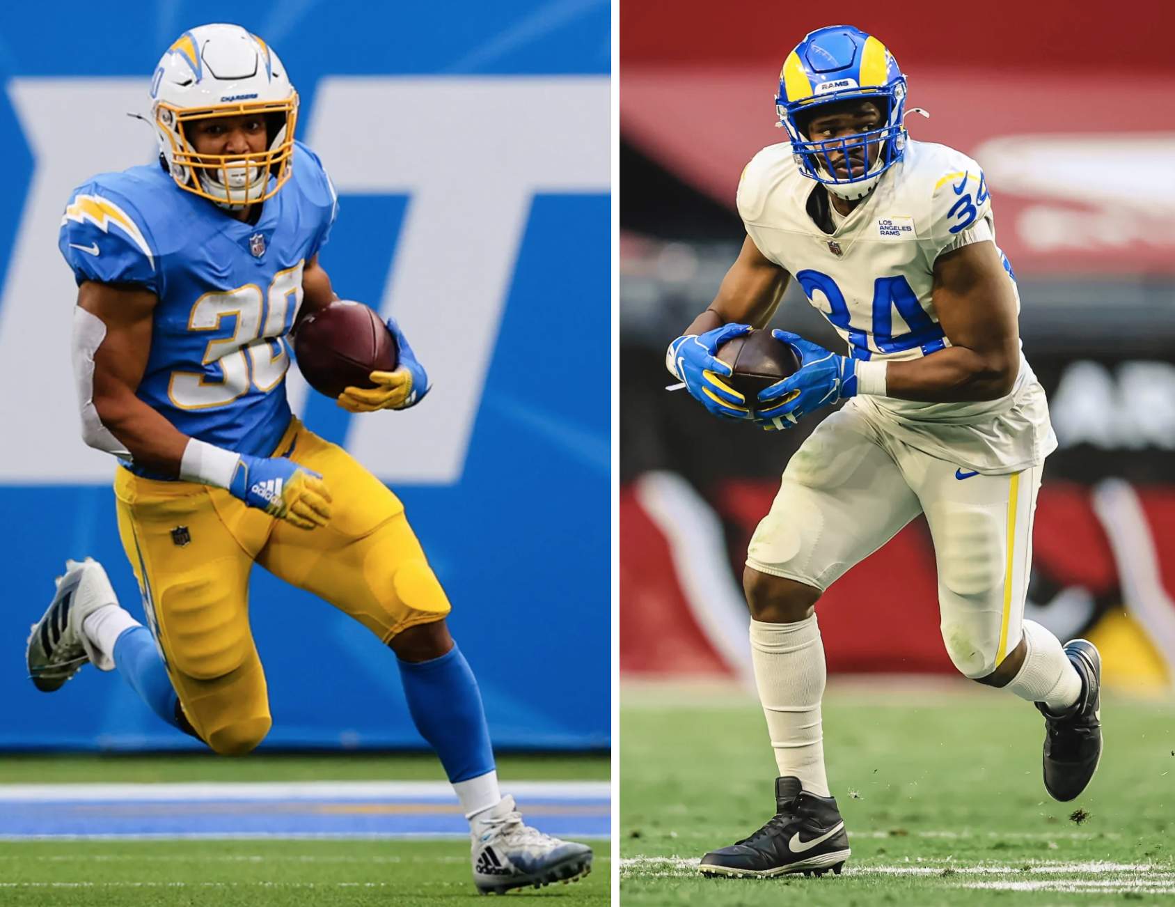
Of course, sartorial justice doesn’t always work out in such a neat and tidy way, as we can see by looking at the two NFL teams in Los Angeles. While I know there are outliers and contrarians among you, I think most folks reading this would agree that the Chargers knocked it out of the park with their new uniforms, while the Rams struck out. And how have those two teams fared so far this season?
Let’s start with the Chargers. They may look good out there, but they’re 3-9, which puts them in last place in the AFC West. (They’re at a particularly low ebb right now, having just gotten shellacked at home, 45-0, by the Pats.) With a uni set like that, they deserve to be better. Clearly a case of sartorial injustice.
As for the Rams, mono-dishwater and all, they’re 8-4, good for first place in the NFC West, and will likely advance to the postseason. We’ve always been told that justice is blind, and that must really be the case regarding this team.
And what about the other NFL teams that underwent significant redesigns this season? Let’s take a look:
• Browns: Cleveland is 9-3 and will likely make the postseason for the first time since 2002. They were 6-10 last season, so their on-field turnaround coincides with their aesthetic revival. And sure enough, just like I felt they deserved to lose over the last five seasons, I’ve been feeling like they deserve to win this year. A textbook case of sartorial justice.
• Buccaneers: The Bucs are currently 7-5, after going 7-9 last season. That feels about right — their uniforms are better than the alarm clock set (duh), but there’s still room for improvement (read: ditch the mono-pewter and bring back Bucco Bruce). Sartorial justice.
• Falcons: Atlanta is 4-8. Another one that feels about right. Sartorial justice.
• Patriots: The Pats are 6-6. Brady is gone, their dynasty is clearly over. They are now a meh team with a meh uni set. Sartorial justice.
(I’m not including the Colts, because their uni changes were so small. Also not including Washington, because their uni changes were made at the last minute and were basically forced upon them by outside circumstances, not by aesthetic considerations.)
So at least for this season in the NFL, sartorial justice has largely been served. Now we just have to get things straightened out in L.A.
Again, I’d never go so far as to claim that a uniform switcheroo caused a change in a team’s on-field fortunes, but I definitely feel like some teams deserve to have their win-loss record reflect their uni-related choices.
This should be a fun topic for discussion. What examples of sartorial justice or injustice (in any sport, not just the NFL) can you think of? And how do you feel when one of your favorite teams unveils a lousy uniform set — if they play well in the crummy threads, does that make you sort of cringe just a teeny bit? If they play poorly, do feel like there’s a certain karmic logic to that?
Click to enlarge
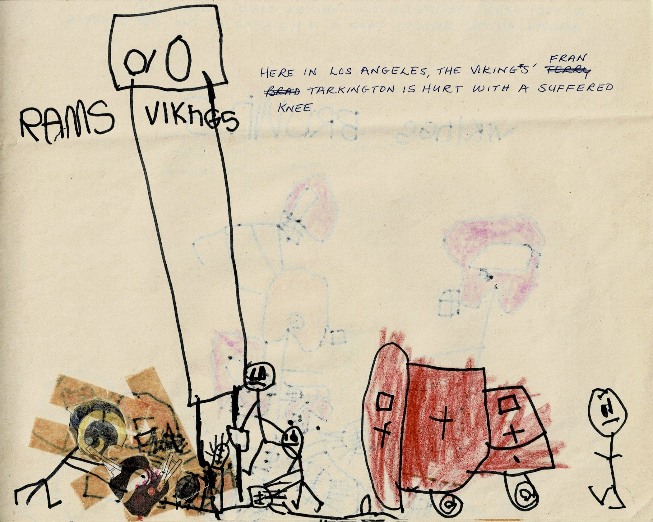
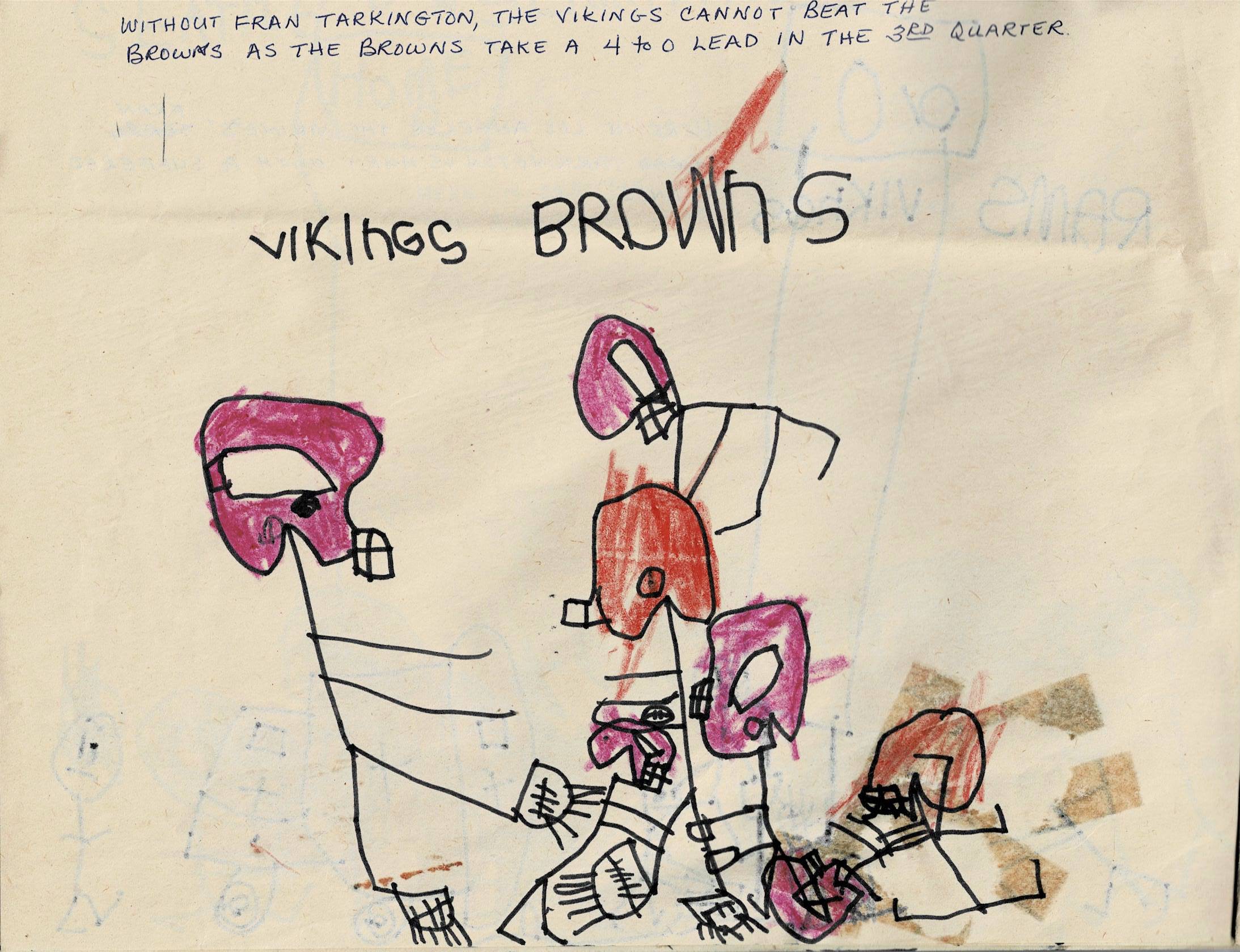
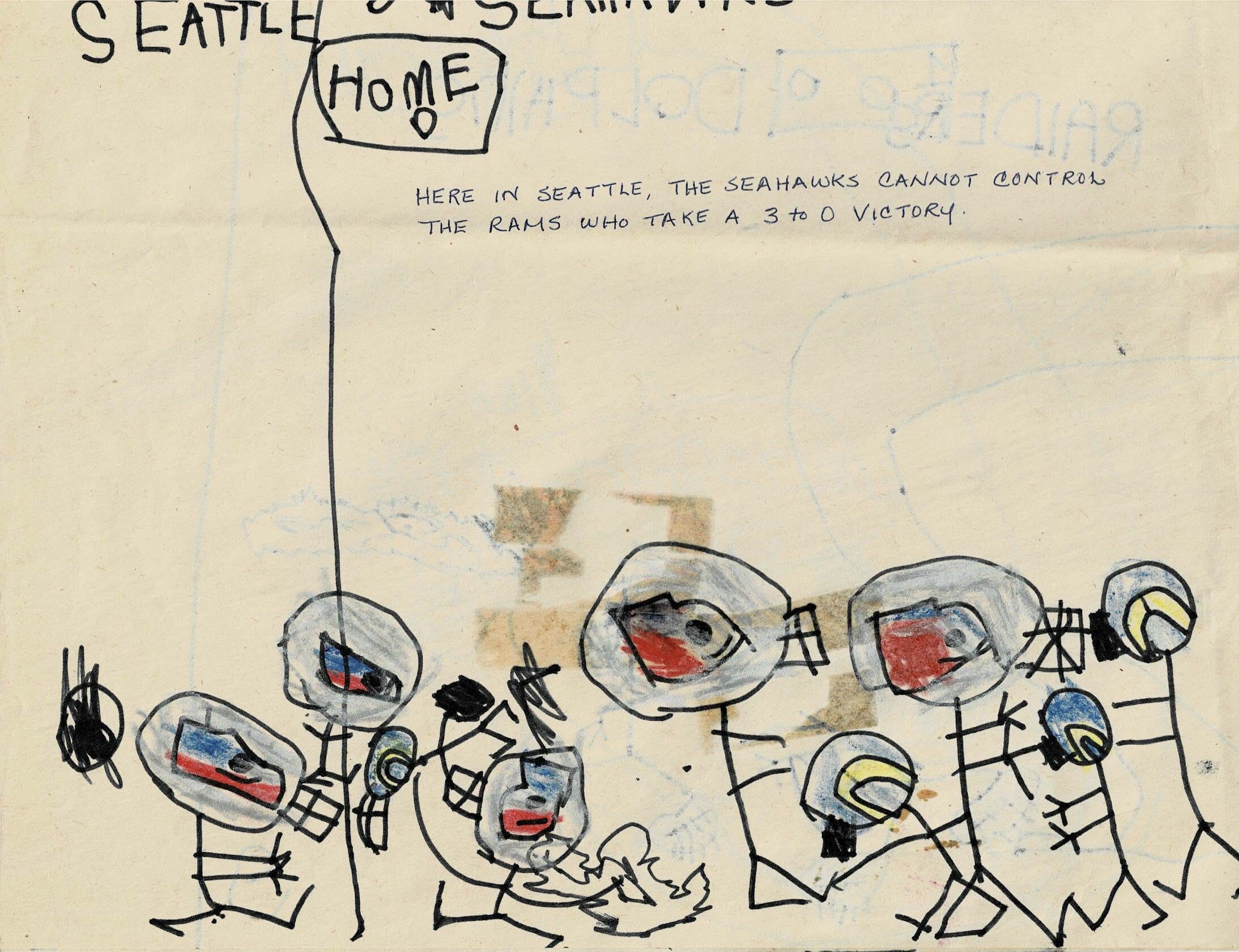
Start ’em young: As most of you know, I love kids’ uni drawings, but I’m not sure I’ve ever seen one quite like this one, which longtime Uni Watch contributor Tris Wykes says he created in 1976, when he was six years old.
“My mom, who knew nothing about sports, provided the captions,” says Tris. “I really like the ambulance and its attendants rushing to help Fran ‘Tarkington’ with his ‘suffered’ knee.”
This masterpiece was one of several that Tris recently rediscovered. “They were in a box with childhood photos and drawings that my mom had saved,” he says. “I recall them, but only vaguely.” Here are the others:
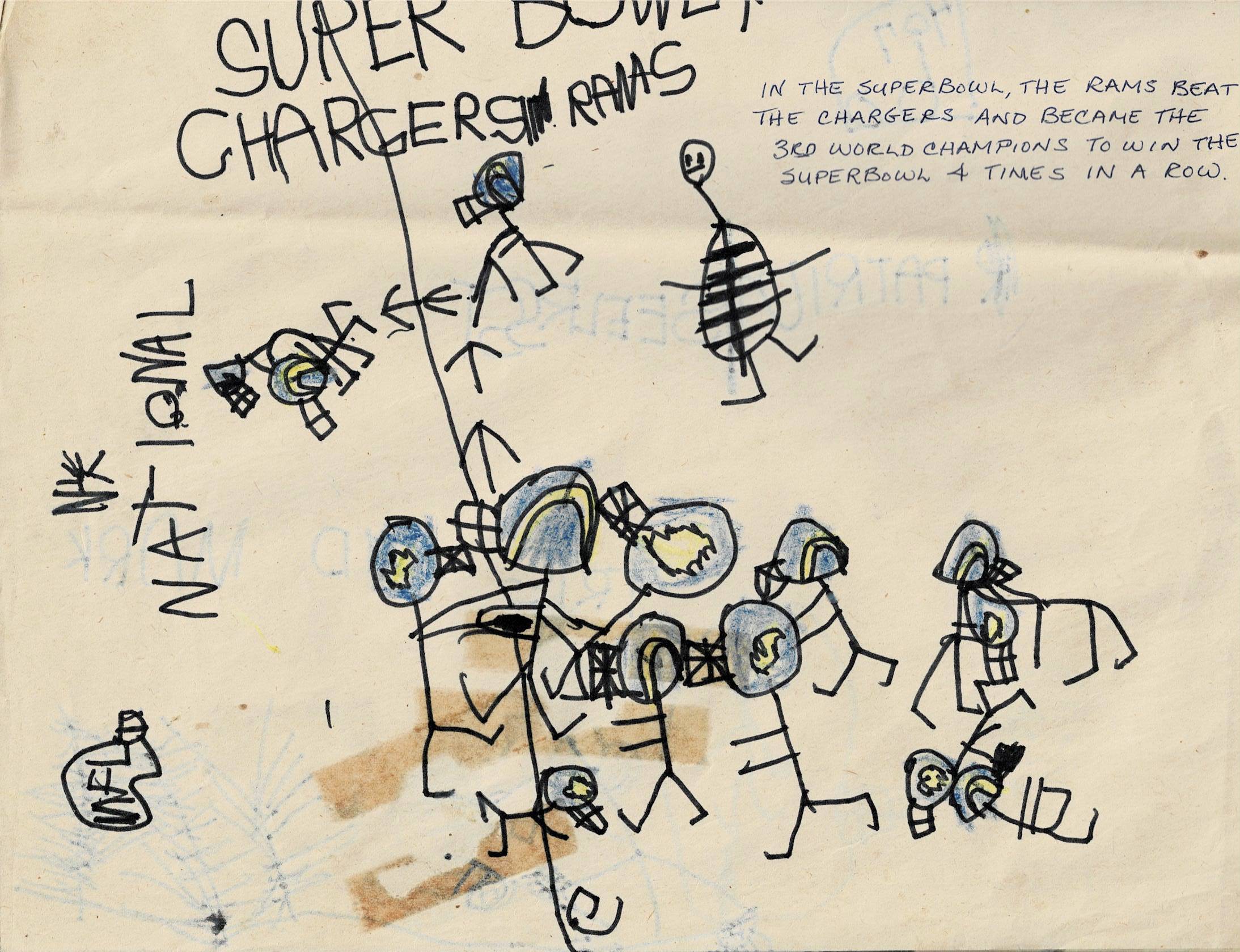
“The big debate now,” says Tris, “is whether the striped thing in that last drawing is a referee or a tick.”


ITEM! New “family-pack” membership raffle: Reader Jeff Worth won one of the donated memberships I recently raffled off and has decided to pay it forward with a very interesting donation of his own: He’s generously purchased three memberships, with the proviso that they be given away as a “family pack.” In other words, the winner of this raffle will get to order a card for him- or herself and also for two family members.
This will be a one-day raffle. No geographic entry restrictions, but please enter only if you have two family members who’d enjoy having the two additional cards (or at least humor you about it). To enter, send an email to the raffle in-box by 8pm Eastern tonight. I’ll announce the winner tomorrow.
Meanwhile, the winners of yesterday’s magnet raffle are Mark Wilkes, John Horn, Karl Newkirk, Ryan Burns, Matt Cann, and Adam Walter. Congrats to them, and thanks to Matt Mosca and Rich Picardini for sponsoring this one.
Click to enlarge
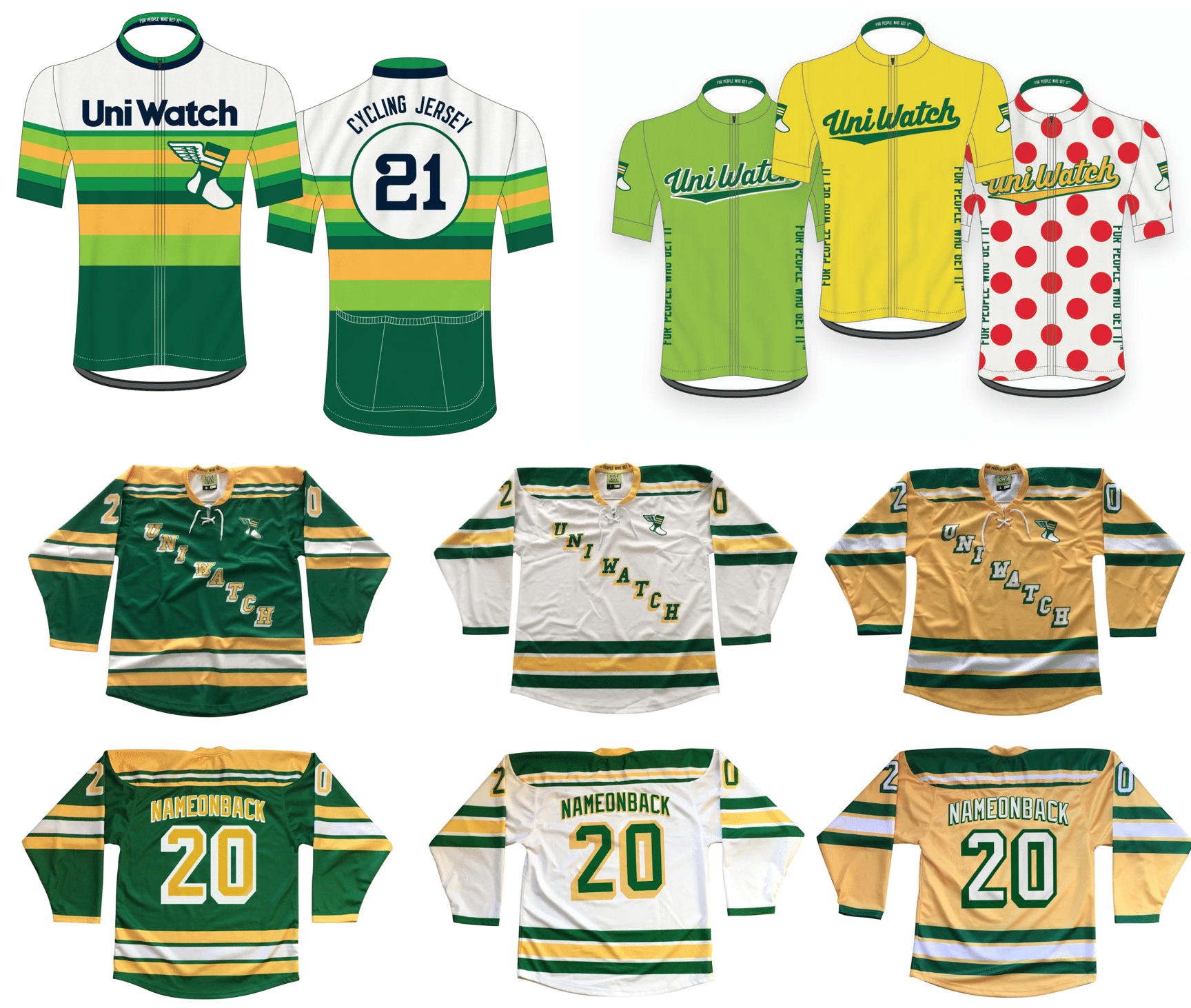
Hockey/cycling reminder: If you want to get in on the latest batch of Uni Watch hockey or cycling jerseys, you must get your pre-order in by this Friday. All jerseys are customizable with your choice of number and NOB. Get the full scoop here.
The rest of our fine Uni Watch products — baseball caps, toques, T-shirts, pins, cufflinks, patches, and plenty more — are listed here.

IMPORTANT “Collect ’em all!” reminder: If you’ve collected all 12 of this year’s monthly Uni Watch Pin Club pins, you’re eligible to get our 2020 All-Star pin as a free bonus.
If you qualify, you must notify me asap by emailing me with (a) your mailing address and (b) some combination of photographic evidence and/or receipts to prove that you’ve purchased all 12 pins. For example, if you order the December pin today (as of this morning, there were 28 of them remaining), you could send me a photo of the 11 pins you’ve already received plus your email from Teespring confirming that you ordered the December pin. Or you could look up all 12 of your Teespring confirmation emails and send screen shots of those. As long as you can prove that you collected ’em all, that’s what I’m looking for.
I will be ordering the All-Star pins this month, with the quantity based on how many people have emailed me their documentation. I’ll definitely order an extra dozen or so (because I know there will be stragglers and late-comers), but that’s it — a dozen extra, not 50. So if you’ve collected ’em all, please prove it pronto. Thanks!
The Ticker
By Lloyd Alaban

Baseball News: Looks like the Tigers are focus-testing some new logos in a new fan survey (from Sean Gagnier). … P Lance Lynn was recently acquired by the White Sox after a stint with the Rangers. Fox Sports Photoshopped him into a White Sox jersey, but forgot to remove the Globe Life Field patch on his right sleeve (from Dylan Bercu). … The Louisville Bats, the Triple-A affiliate of the Reds, have unveiled renderings of their planned stadium upgrades (from Kary Klismet). … The Mexican League revealed the uniforms of its two newest clubs (from @bryant_rf).

Football News: Reader Nate Mueller is currently working on a 3D-printed replica of Dolphins QB Tua Tagovailoa’s helmet. … Each Army player will wear one of 10 subunits’ decals on their helmet this week.

Hockey News: Fun story from Don Martinez, who writes: “During a recent visit with my wife’s parents, we got these two boxes that my wife received as a charter member of the Mighty Ducks of Anaheim Booster Club in 1993. The larger box was a season ticket pack (the tickets themselves are missing; my wife was 11 at the time and in Arizona, so naturally would not be able to use them), which included a collector puck and a bumper sticker, and the smaller box was the fan club kit, which included a different-designed puck, a membership card (plastic credit card-style!) and a lapel pin for the booster club.” … Nate Mueller’s latest project is a 5.5″ 3D-printed replica of the Stanley Cup.

NBA News: NBA coaches will not be required to wear a sports coat during games this season. They are only required to wear face coverings and “business attire” — i.e., not track suits, but khakis and polos are okay (from Mike Chamernik). … For the latest in NBA number assignments, check out Etienne Catalan’s Twitter feed.

College and High School Hoops News: Throwbacks for Rutgers and Syracuse last night (from Billy Rose). … Rough-looking game last night between Virginia Tech and Penn State, as the two teams went orange vs. black/pink last night (from Andrew Cosentino). … In a more visually pleasing contest, UNC and Iowa went blue vs. yellow (from multiple readers). … Timpanogos High School in Utah wears the same “Five for the Fight” patch that the NBA’s Utah Jazz wear (from Greg Roper).

Soccer News: Dutch club Sportclub Heerenveen has printed its NOBs on the back of the collar, instead of their usual place directly above the number, presumably to make more room for ads (from Sean Kautzman). … English League Two club Stevenage’s shirt advertiser is Burger King, which is a bit of a marketing stunt. Burger King also wanted to support Stevenage’s amateur women’s team, so their shirts now have a modified Burger King logo that says “Burger Queen” (from our own Jamie Rathjen).

Grab Bag: With Under Armour falling down on the job, UCLA will be switching to Nike and Jordan. Under the terms of the new six-year deal, which will kick in on July 1, UCLA’s football and men’s/women’s hoops teams will wear the Jordan maker’s mark, while the rest of the school’s teams will wear Nike. … Scroll to 22:00 of this podcast for a uni discussion with the University of Wisconsin’s marching band director (from Scott Hurley).

Another Cleveland example of sartorial justice is the baseball team. In 1994 they moved to a new stadium, changed uniforms, and it coincided with a new era of winning.
Justice was served only if you think those new 1994 uniforms were an *improvement.* Is that what you’re saying?
I might be confused on the concept. They changed uniforms and started winning for the first time in 50 years. Is it only justice if the change was for the better? I guess to me it was a lateral change. I liked the 1993 uniforms as much as the change.
Maybe disregard my previous comment.
Is it only justice if the change was for the better?
Yes.
They seem stale and unexciting now but almost every tribe fan thought the unis were an improvement in 1994. They would hav been called a fauxback at the time, if we had that term then.
On the other side of the coin, both times Lebron has left the Cavs, the uniforms got significantly worse too.
The Buccaneers pewter (mono or not) is way too dark. I appreciate that they tried, but they need to lighten it up. (And Tom Brady needs to shake hands after losses, not wins.)
That’s all Nike – they refuse to make metallic fabrics, so the pewter becomes charcoal.
I don’t know why more teams don’t act like the Packers and tell Nike to pound sand.
I love the Packers’ consistency. I don’t have any idea what has gone into this from their side – shocking that they could stand their ground like that (would love to understand more some day).
As for Tampa Bay – couldn’t they just go a couple shades lighter even if non-metallic?
Satorial Justice: Mizzou football is 4-1 this year since going back to its traditional “Block M” on its helmet vs. the “Oval Tiger Head” they introduced in 2012.
Well, maybe. That block “M” was black on a gold helmet in the victory of South Carolina, hardly traditional. And it was black on a white(!?) helmet in the Florida shellacking. Surely reasonable people can agree that the latter is sartorial justice.
Rats, I can’t type. The phrase “victory of South Carolina” should read “victory over South Carolina.” My apologies.
Thanks for that, Paul. I think I’ve been watching sports with sartorial justice in my subconscious for a long time, I’m going to be more aware of that going forward. I think that concept definitely affects who I root for in games in which I don’t actually have any rooting interest, and also which of those games I decide to watch at all. Another interesting concept is the small amount of self loathing I feel while watching a team I hate (i.e. Cubs, Packers) but can’t help admire how they look on the field.
I wish Iowa would go back to script Iowa or Hawks on all their jerseys. I like the yellow, but felt like they got washed out a bit with the color of their court.
Here’s another vote for permanent ‘script Iowa’ uniforms for the Hawkeyes. They just look so good! Should never have moved away from them but it’s never too late to do the right thing.
I think contrast can play a part in sartortial justice, in that contrast between teams on a playing surface can help some players distinguish teammate from foe. For example, last weekend the Florida Gators switched their helmets to blue against Tennessee. While Tennessee’s helmets are white, the bit of orange on it, coupled with the Gators normal helmet,could lead the two to blend in a bit. The blue helmet however stood out, possible helping a QB locate his receiver.A well timed sartorial change that May have helped the team.
Good point, Ron…wasn’t that the reasoning behind the Jets going to the green helmet, to assist in locating a receiver on a downfield pass. At the time, the other teams in the division (whom they played twice a season) all had white lids (BUF (OJ years), MIA, NE (Pat Patriot)
I recall the Jets’ green helmet being mentioned that way as well. Humorously enough, Leon Hess said the exact same thing when Parcells changed them from green to white (that it would help the QB see his receivers better, i.e., less interceptions). That always cracks me up, like it’s not entirely tied to the team’s play vs helmet color. White, green, purple, neon yellow; hasn’t mattered much for the Jets.
it’s certainly why the bills switched to red helmets for a while. I recall hearing that the bills qb was also color blind. wonder if that led to the jets green helmet to confuse him? or am I just making the color blind bit up? memory hazy…
One MLB example of sartorial justice that sticks out in my mind is the case of the Tampa Bay (Devil) Rays. In their first 10 seasons of existence they had exactly zero winning seasons and no playoff appearances wearing either the original uniform set featuring the multi-colored gradient logos or the drab and boring hunter green and dark navy blue combo. However, after a reboot in 2008 where they “Devil” from their nickname and introduced new (and improved in my opinion) colors, logos, and uniform sets, they immediately had a breakout year advancing all the way to the World Series.
I’m glad they started winning, but that Green/Navy identity they had is wayyyyy underrated and definitely better than the boring, mayonnaise-jar-looking set they’ve had since.
^^^^ What he said!
That green/navy set just screams Carl Crawford and Rocco Baldelli.
The 1994 Phillies added Blue Caps for home day games, which was objectively a bad look. In the strike shortened season, they went 1-7 in those hats. Sartorial Justice.
Need I remind you, the “drought” era for the Bills coincided with that awful navy blue abomination ripped off from the Montreal Alouettes.
Turn of the century Detroit Pistons come to mind. Changed to the teal horse logo and uniforms in 1996, worn for 5 seasons, never winning a playoff series. Changed back to the more traditional, Bad Boys era look in 2001, and then won over 50 games for the next 7 seasons, and won the Finals in 2004.
To be fair, they weren’t good in the early 90s when they changed to the teal, so they didn’t get worse when they started wearing the teal, but did get better once they switched back.
The Pistons are the first team I thought of too. I came of age during the teal era, so I have nostalgia toward those, but the goin’ to work era coincided nicely with the back to the Bad Boys unis.
Laughed out loud this a.m. when I clicked on the Tigers Twitter link and read the “coked Tiger” comment. Took me a second to figure it out but when I did … ha!
All of those Tiger illustrations are too fussy. They really ought to go with something more symbolic, or abstract. And even then, confine it to souvenir t-shirts and stationery.
Lance Lynn was acquired via trade by the White Sox. (Second baseball ticker item says he “recently signed” with CWS.
Definite two-time justice in Florida since the Marlins moved/rebranded in 2012. The gaudy black/orange (with random yellow and blue they never used) set from 2012-2018 coincided with no winning seasons, no playoff appearances, the continued jettisoning of payroll (which they said wouldn’t happen anymore after getting a new yard), and sadly tragedy.
Since the rebrand in 2019 (which, while certainly not perfect, is a massive improvement and ties the team much more closely to both the “Florida”/World Series and historical minor league Marlins eras), they made the playoffs for the first time since 2003 and won a playoff series.
Need to bring back the Dontrelle Willis/Cliff Floyd era uniforms.
The Rams had such a great uniform, and should have just made a few minor tweaks like changing the helmet color from navy to royal. Add an alternate white uniform from the 60s, and they would have had some of the best uniforms in the league.
Four more seasons, and I bet we’ll see exactly that.
The Seattle Seahawks may be an example of sartorial injustice: they’re 5-0 in the current version of their bright green uniforms, and their current run of success kicked off after they introduced their current uniform set in 2012, which isn’t the most aesthetically pleasing.
Historical sartorial justice: The teams with the most WS victories all-time are teams with the most consistently excellent uniforms.
New York Yankees 27
St. Louis Cardinals 11
Philadelphia/Oakland Athletics 9
Boston Red Sox 9
NY / SF Giants 8
Los Angeles/Brooklyn Dodgers 7
Additional sartorial justice – the Yankees have not won a World Series since they started wearing the stupid matte batting helmet.
This Yankees-hater notes with pleasure that it’s been a lot longer than that!
The Red Sox wins in the 21st century starting in 2004 roughly coincide with the introduction of red alternate jerseys and switch from navy to red undershirts in 2003. It’s the inverse of what Paul was talking about in the post, but as a Sox fan, the red jerseys grew on me since the team was winning.
did it also coincide with the use of red letters with blue borders on the away uniforms? I recall that being one of my favorite changes that the sox had done when they started winning the World Series…. It always bugged me that the old away Unis were blue letters on grey rather than red.
Dressed to the Nines says blue letters on gray roadies were worn from 2009 to 2013. So it would have coincided with one championship in 2013 before they switched back to the red letters. I also prefer the red letters on grey, but one nice element that the blue/gray unis brought in was the sox patch on the left sleeve. I’m happy they kept that when they switched back to red letters.
link
Those drawings by Tris Wykes are wonderful!
Yeah – those area great! I like the game scores too.
Well done. Round of applause
The drawings are hugely entertaining. The mom’s captions are works of genius. I read them out loud, in the voice of a Bond villain. It made my day.
The Big Debate is what happened to allow the Browns to take a 4 to 0 lead in the 3rd quarter. I assume this was an alternate universe going by the Rams becoming the 3rd team to win 4 straight Super Bowls in a time before the Steelers became the first 3-time winners overall. Did Tris simulate seasons through the end of the next century?
Received my magnet yesterday and quickly adhered it to my car. Also, thanks for the sticker included in there! It’s one of those awesome stickers where I don’t want to unpeel the back and stick it to anything, lol. Need to figure out what to do with it.
Raiders: Great uni and team name. They should be better.
Sartorial Injustice
The Bengals went to the Super Bowl in 1982 the year after they switched to their iconic striped helmet and unis, and again 7 years later, but have been basically either meh or awful ever since. Does sartorial justice have a time limit?
Orioles brought back the cartoon bird in 2012 and made the playoffs for the first time since 97. I figured that would’ve been one of the first examples mentioned down here!
When they switched to the cartoon bird for the first time in 1966, they won their first World Series title that season.
That was the first thing that came to my mind since I’m an Orioles fan of 60 years. It was a franchise-altering year with the arrival of Frank Robinson and the clear upgrade in uniforms.
The NY Rangers switch back to their (more or less) traditional look from the horrible shield sweaters also came to me as I am also a lifelong Rangers fan. This is mentioned in a comment below.
Three of five years in the playoffs after a 15-year drought was pretty nice… was that also the year they restored “Baltimore” to the front of the road jerseys? As a relocated Baltimoron, I was really excited about that, too, but I can’t remember if that was 2012 or not…
Florida State football hasn’t been the same since “ignition tradition”
Five months after winning the National Championship they change the helmet, the logo and the uniforms. The same uniforms that had stayed mostly unchanged through the 90’s Bowden years.
The white jersey’s couldn’t even be worn because of the golf numbers. The facemask and helmet paint had to be changed as well.
Now look at us
*Gold
Am I in the minority on disliking the idea that NBA coaches can have Casual Friday any day of the week? It’s lamentable that with each passing year (or generation, perhaps), we get less and less formal. While I am not advocating going all the way back to ruffled blouses and breeches, nor getting a fedora, suit and tie to sit on an airplane or outside at a ballgame, there is a certain appeal to looking presentable. There is nothing wrong with being a professional and looking the part. I am all for getting out of my suit after work or on weekends, but I am comfortable putting on nice clothes like an adult. In 10 years, we’re going to be a nation of people wearing athleisure wear and jerseys to funerals and court proceedings. You should dress for how you want to be perceived, and that works both ways.
Everything you’ve said is true — for those who share your definitions of “presentable,” “professional,” “looking the part,” and so on. But all of those terms are relative and open to interpretation.
I’m not saying that your standards are wrong (on the contrary, I happen to share many of the views you’ve just expressed). But standards tend to change over time, and what does or doesn’t constitute acceptable attire in a given situation is just one of many, many areas in which our society no longer has a shared, universal standard.
…all part of the slobification of society. (Or is that term also open to interpretation?
I don’t think it’s a bad thing this season. They’ll be playing in mostly empty arenas (albeit still on TV) and given the situation relaxing the rules seems reasonable.
Things should be back to normal next year.
Things should be back to normal next year.
Famous last words.
I hope you’re right, but sure seems that every crack in the wall knocks it down sooner rather than later.
I blame Doug Moe. -C.
Having grown up on the ABA Spurs with Doug Moe…this is great! HAHA!!
Sartorial injustice : the Cavs, down 3-1 in the 2016 finals, switching to their black sleeved atrocities, then winning the title. I think all concept of sartorial justice died at this time.
I came here to say something to that effect. It’s appalling that their one and only title is forever going to be associated with that mess.
While I 100% agree that the Rams ‘bone’ set is just awful looking, I do find it pretty amusing that you find every possible excuse to make fun of it and the ‘dishwater’ colour, while you end every column with an advertisement for your ‘smoker’s wallpaper’ Uni-watch hockey jersey.
I honestly do not know what you are referring to, or what point you are trying to make.
I guess he means, you think the bone unis are awful, but think your hockey jerseys are beautiful??? Is he questioning your tastes in color/design? Hard to tell.
I guess he isn’t a fan of the hue on the Yellow Hockey Jersey (white wallpaper yellowed by cigarette smoke). Everyone can have an opinion, but that is comparing Apples to Tractor Trailers.
I kind of wonder why the “bone” set looks wrong. I actually love off-white colors like eggshell/cream/whatever you want to call it, and I’ve seen wonderful cream-colored baseball shirts, but something about it just doesn’t work for football.
the tint of the off-white is weird. not quite warm toned but just enough to contrast with the very cold blue of the numbers to be jarring. and half the time the *off* of the off-whiteness is washed out or color corrected out.
sadly I think they are 6-0 in the bone Unis…
I really think it’s the yellow, it’s just not a nice compliment to the bone. It’s too on the fluorescent side.
This isn’t quite the same thing that Paul is talking about with sartorial justice, but as joyous as the Cubs finally winning the World Series in 2016 was, photos and video of that magnificent Game 7 will always be marred for me by those stupid blue softball tops.
Especially with the pinstriped pants, it just doesn’t look right. I don’t think it looks as bad on the road, but overall it’s a spring training look for them.
I’ve been a New York Rangers fan all my life and was devastated when John Ferguson changed to the Shield logo jerseys for 2 years…..when they came to their senses and changed back to the traditional they went to the Stanley Cup Finals….I wasn’t completely happy with New York script on the roads but happy nonetheless….I think to me that was sartorial justice.
In terms of sartorial justice, I feel if the Jets go 0-16 this year, it will be in a fitting uniform set. Similar to the Browns’ 0-16 campaign.
Agreed.
They sure look the part, as did the Browns.
As a (long-suffering) Jets fan, I’d say they fit this situation, somewhat. Their only “glory” is SB III, so that uni is the most, well, glorious. Yes, their best days then were short-lived (about two or three good seasons) followed by mediocre/poor results, which pretty much continued when they changed in the ’70s to the Richard Todd/Sack Exchange set. I always disliked those by comparison. Although they had a few playoff seasons along the way, they continued to be so-so/poor in those. Then, Parcells was hired and he changed the unis to essentially their “glory” unis. I recall him saying something like, “this is the identity of the NY Jets” at the time. In that set, they had more success (although not exactly sustained success) than ever. It’s coincidence of course, but they have been abysmal in the new set, which I absolutely hate by comparison to the Namath/Curtis Martin era duds.
This may not be a great example since the team’s history year by year is really crappy with a few successful blips, but I think the moves away from the “classic” set are sartorial justice.
A sartorial justice that comes to mind is when the St. Louis Rams switched to their millennium blue and metallic gold uniforms a season after winning the Super Bowl and then lost the Super Bowl two years later.
very much this. they gave up one of the best NFL uniforms of all time for a faded glory.
The Lakers wearing Black Mamba jerseys for Game 5 vs the Heat because they wanted to win the championship in a uniform that honored Kobe, then losing is peak Sartorial Justice.
link
They had beaten a Blazers team earlier in the playoffs on 8/24 during a game in which the score was actually 24-8 at one point.
link
Odder still is that they won the title in Game 6 while wearing a very un-Lakers like white Sunday uniform.
I’ve long thought that it was fitting that the Warriors era of dominance coincided with their current uniform program. After ditching “The City” in the 70s they were a blah team for decades. Once they switched to the current identity they became a dynasty. Thanks to Paul for giving a name to this–definitely some sartorial justice at play here!
I don’t have a Twitter account so I hope somebody can get word to Mr. Catalan that he spelled Greg Whittington’s last name Whitthington on his Nuggets jersey.
Buffalo Braves: three distinct uni sets, all of them interesting and aesthetically pleasing (red, gold, and royal in their inaugural year, the orange and black diagonal stripes of their middle years, and the Columbia blue duds of the Bob McAdoo era). Not only did they go from being an up and coming powerhouse to being mismanaged into oblivion, they were part of the strangest franchise switch in NBA history (essentially, the Braves were sold to the owner of the Celtics, who moved them to Boston, the Celtics were sold to the owner of the Braves, who moved them to San Diego, and Buffalo got bupkis).
Monumental sartorial injustice.
I have never thought of it that way. I have never thought a uniform deserves to lose (although I think I have said a uniform deserves to win), but I have said I wanted a team to lose solely because they came out with a horrible uniform. I said that about the Browns; when they came out with that horrible trash they wore the past 5 years, I said I wanted them to lose so the uniform gets associated with the worst moments of the franchise’s history. Here is a team that traditionally has one of the best looks in the NFL, and they tried some modern crap that made them look like a D3 college or high school team. It worked beyond my wildest imagination because whilst wearing that rubbish, the came a shanked Chargers field goal away from having back to back 0-16 seasons. It is safe to say they have thrown away the mold to that uniform and will never break it back out again. To all that, yes that uniform deserved to lose, but it brings up an interesting point of view.
Again, I say I want them to lose when they have a horrible uniform choice. Winning is funny. It makes bad coaching tolerable and classless players seem not so bad and makes people turn a blind eye to tasteless antics. Same thing with uniforms. Your team could look like crap, but if they keep winning, you dig their threads. A lot of it has to do with famous images, i.e. the highlight era. You have the best moments in the franchise you root for’s history forever documented in highlights, and you have an emotional bond to those moments, and part of that moment is the look of it.
The Mariners are a great example, who had the trident look and then the 3d S all while having royal blue and gold as their colors. Then they have a complete makeover, and shortly after that, Edgar Martinez hits “The Double” and Griffey scores from first. I am not a Mariners fan, but I find myself looking for that play on YouTube from time to time because it was such an amazing moment in the history of baseball. That play single handedly solidified that uniform set as “The Mariner Look” and doubt it will be changed again for another 50 years save minor tweaks (either ones they have already done, or those to come). That look is as much a part of the moment as the actual play. Is it a bad uniform? No. Is it the best uniform? Also no, but with winning, it makes its way past all the judgement. Had they unveiled that uniform and had a bunch of dud seasons, maybe the Mariners would be back in royal blue and gold, but their current uniform was worn during the best seasons of the franchises’ history.
Sometimes I have a hard time looking at this. My team is the Cowboys. Love them or hate them, they have a traditional, simple look. Since 1964, they have basically worn the same uniform (specifically the white uniform: of course they changed from serif numbers to non-serif numbers, vis versa with the NOBs, and changed the color on the white jersey from navy to royal, which I love despite most of you hate). I don’t have the personal experience of loving a team with a great uniform set that trashed it all for some flash in the pan Nike gimmick uniform and had to muddle through those years. All I have are frankly great uniforms through the good and bad years. So highlights of Dandy Don, Bob Lily, Bullet Bob Hayes, Roger Staubach, Randy White, Drew Pearson, Danny White, Troy Aikman, Emmitt Smith, Tony Romo and Jason Witten all have the same look. All of my favorite Dallas Cowboys memories have the same look, and the players I named span nearly 60 years. The other side of that is the Cowboys have had two looks during their existence. I like the stars on the shoulders uniform, but it’s kinda just alright to me. Now if I had my favorite highlights of the aforementioned players (albeit the ones that actually played when that uniform was the uniform) in that uniform rather than the current set, would I feel the same? Maybe, it’s hard to tell. Would I like the stars on the shoulders more because the greatest Cowboy moments happened with those uniforms? I probably would. Again, winning is very funny.
I guess I am trying to say I do feel like uniforms deserve to win or lose, but I have always thought of it as “if the team wins in these bad uniforms, the more likely they are to exist.” When the 49ers went back to their current and traditional look, I wanted them to win (even as a Cowboy fan) because I wanted them to keep that look. Same with the Blue Jays and New York Giants. Conversely, I want the bad uniforms to evoke losing so the fans turn on the franchise, they start to lose money and want to spice up the product by putting the players in a uniform the old fans love and adore. The injustice ones are the Seahawks and Broncos. The Seahawks have been a dominant franchise during their current set making them more likely to keep it around despite the fact I find it to be the worst in the league. The Broncos uniform is oaky. It’s not the best, but they won three Super Bowls in them so they are likely to stay put. Now when they came out, they were an improvement over the then high school uniforms that predated them, but and updated for the right reasons look of that uniform could be a huge improvement.
Sartorial justice, Padres brought back the brown full time and returned to the postseason for the first time in 14 years.
Sartorial injustice: Italy wins 2006 World Cup in a dreadful uniform
My first memory of sartorial justice has to be the Twins’ 1987 World Series run. They completely overhauled the uni set — button-fronts and belts instead of pullovers and sansabelts; new wordmark; “M” instead of “TC” on the cap — and won their first title. I’ve since come to appreciate the ’70s and early-’80s look for what it was, but I still believe this is a trademark case of sartorial justice.
I’m going to disagree. The Twins changed to a less appealing design and won a World Series. In fact, they won two WS in the uniform. Further, they won those WS in the awful awful Metrodome. Would that be architectural injustice?
Come to think of it, I have rooted against the Tampa Bay Rays because of their ballpark. But not this year, neutral site World Series.
Sartorial Justice: Seattle Mariners
They changed their uniforms in 1993. Got good between ’94 and 2001. Haven’t really changed anything in design since. Haven’t seen the playoffs since 2001.
And I hope the Mariners never make the playoffs until they undo the changes they made in 2014.
I would argue the Mariners can consider ALL of their uniforms unlucky, given the extent of their playoff failures. But they have a pretty nice set right now; the only change worth making is bringing back the trident.
Army knocked it out of the park with their 25th ID uniform set for the game this weekend.
Go Army! Beat Navy!
And there you have it. I believe UCLA is the first school to go Reebok, Adidas, Under Armour, and Nike/Jordan (in order) and have been attired at one time or another by the four bigs in shoes/uniforms.
Oh, wow — that’s quite a distinction!
There’s a Twitter account called Kit Crimes that judges (usually English) soccer teams for wearing second or third kits when they don’t need to, i.e. for an away game where the team’s first kit doesn’t clash with the opponent.
It believes that any team that does so deserves to lose (and calls it karma when they do) because the object is usually just trying to sell the other shirts by wearing them more often.
So, a form of sartorial justice in action.
Exceptional case of sartorial justice: The 2011 Michigan-Michigan State game. Michigan had a good team that year and had beaten Notre Dame in that Under the Lights throwback game.
Now-reviled AD Dave Brandon decided to spring new alternate uniforms on the team at the last moment. After warmups ended, the players found waiting for them white pants and new jerseys with an ugly maize-and-blue stripe pattern dominating the shoulders and sleeves. Instead of preparing for the game or making last minute coaching adjustments (which would have been useful, as the high winds rendered the pass-heavy gameplan Michigan had prepared impractical), the players had to rush to change clothes. Several players have spoken of how rushed and tiring the process was.
The uniforms are considered by many Michigan fans to be the worst Michigan has ever worn. And Michigan got destroyed in the football game, in part due to a bad gameplan that many believe could have been modified if not for the uniform change.
The only flaw in the sartorial justice concept here is that Michigan State’s uniforms were also bad. But Michigan’s efforts to perform a surprise uniform change do actually match the thesis that the uniform said something about the program, as it was a clear example of meddling from AD Dave Brandon that hurt the program, a pattern that would finally bring Brandon and coach Brady Hoke crashing down with the concussion scandal in 2014.
The uniforms were ugly and really did hurt the team’s ability to perform.
Tris Wykes rendered sartorial injustice in his illustration of the Rams beating the Chargers in the Super Bowl — if that game takes place in 2020. Since it was 1976, it’s kind of a win-win?
funny thing to me is that this conversation about sartorial justice is also how I choose wine. I figure that if the winery liked their product enough to design a beautiful label for it then the wine was likely to be good.
I feel the same about sports teams. if the ownership is dedicated enough to the team to really consider the look of the team, they are likely to do the same for the players/coaches. if they flail about for a look, they are likely to flail about for a playing style. industrial and graphic design matter…
2 sartorial injustices(also teams I began to root against after changing their look):
Tennessee Titans – re-branded in 1999, dumped a great uniform set (while not the best the Oilers ever wore) and made it to the Super Bowl for the first time in franchise history. I suppose the justice is the loss to the Rams and the fact that they never made it back there wearing those.
Roush Racing #16 – ‘traditional’ number-style car (piloted by Wally Dallenbach and Ted Musgrave) ran well, but failed to win until they adopted that horrible jagged-looking font (and it won a lot with Greg Biffle behind the wheel).
Re UCLA’s new deal with the Jordan Brand: I generally couldn’t care less about which “lifestyle brand’s” logo is on a sports team’s uniform, but there’s just something wrong about the silhouette of Michael Jordan appearing on the uniforms of a program with such college basketball icons as Kareem Abdul-Jabbar and Bill Walton (not to mention a handful of other players with multiple championships and All-American accolades whose careers were comparably distinguished to Jordan’s).
“…not to mention a handful of otherplayers with multiple championship and All-American accolades whose *college careerss were comparably distinguished to Jordan’s…”
To be clear, I don’t think most UCLA basketball alumni can hold a candle to Jordan’s NBA career. Kareem, maybe. But my point is that Jordan’s image seems like an odd match with UCLA’s rich tradition as a college basketball powerhouse when they have their own legends were every bit as good if not better at that level of competition.
The Patriots uniforms have received a fantastic amount of criticism in New England. I say fantastic because I myself cannot stand the new look (honestly the loss of the unique number font, save for the mishaps with David Andrews, is the most perplexing of the changes). The old look was not perfect, but this direction just makes no sense on a number of levels. I could go on for a long time.
With respect to this topic, a lot of the conversation around the uniforms have been “Well it’s fitting that this team looks like a high school team now because they’re playing like one!” Even the local talk radio hosts have said this on numerous occasions.
It’s puzzling the Pats would tamper with a uniform associated with an armload of Super Bowl trophies. Don’t get me wrong; I want to see New England return to Steve Grogan/Sam Cunningham uniforms. But to arbitrarily change a look so associated with success and glory is as smart as kicking a skunk.
I think the 1990’s Houston Rockets are a great examples of sartorial justice. They won back-to-back titles in a nice-looking red and yellow set, then switched the next year to pinstriped pajamas and have not revisited the finals since.
Yesterday I mentioned “Legacy Teams” and it’s fitting that teams like the Yankees, Lakers, Cowboys, Steelers and Notre Dame football have a consistent look they are reluctant to tamper with. There are others, these are just the first to spring to mind. In fact, one of the “Legacy” teams dealing with a current string of bad luck is the Montreal Canadiens. Wisely, they realize the uniforms are not the problem. Same rationale with the Cowboys.
I think it’s safe to assume any messing with an image that isn’t broken comes as the result of a cash-grabbing apparel company. Don’t you agree?
Sartorial injustice = DENVER BRONCOS.
Sartorial injustice (less egregious than Broncos edition) = New Jersey Devils
I would make the case, yes, sometimes, a new look can help a team shed a poor past.
The best example I can think of is the Tampa Bay Buccaneers in the 90’s. In today’s age, where everything retro is held in high regard, people recall Bucco Bruce and the Creamsicles with fondness. But by 1996, they were outdated and kinda tired, especially as deeper, darker colors were trendier and the Buccaneers lost in orange year after year.
The Bucs had all of two seasons over .500 with Bucco Bruce, the last being in 1981. The first year they went to red & pewter, 1997, they went 10-6, and they finished at or over .500 each of the next five years afterward, culminating with a Super Bowl win.
Back in 2009, the Packers lost to an 0-7 Bucs team, led by rookie quarterback Josh Freeman. That the Bucs were wearing their throwbacks made it feel even more embarrassing. Not only did you lose to a terrible team, you lost to a terrible team paying tribute to other terrible teams.
The Bucs have felt like a very dangerous team with a reputation for good defense since the pewter came around, save the alarm clock years of Jameis Winston throwing picks left and right. The new look seemed to give the team a new attitude. It worked.
I love the concept of sartorial justice. Like others said, I haven’t thought about it much as being part of my decision making before. It definitely has played a part. Florida native here – Dan’s point about the Bucs is one example. The switch led to the winning mindset. :)
My biggest example of sartorial justice, though, would be the Utah Jazz. I wasn’t a Jazz fan, but I thought their uniforms were pretty great. Until 1996. They went from the classic simple music note Jazz to the WTF mountain range weirdness. Immediately they made two finals and lost. It wasn’t that the team started to stink when they changed; they instead got their hearts ripped out by ALMOST winning. Which as every sports fan know is so much worse. Their punishment for that uniform set wasn’t suckitude; it was heart wrenching loss.
Ah, so there’s still time for the Rams to suffer a similar fate this year!