I feel like I’ve been saying this a lot lately, but yesterday was another big day for the NBA uni-verse, as several teams unveiled new uniforms and court designs, another team’s new design leaked, and we got our first on-the-record info about this season’s Earned designs.
Let’s go one team at a time (for all photos, you can click to enlarge):
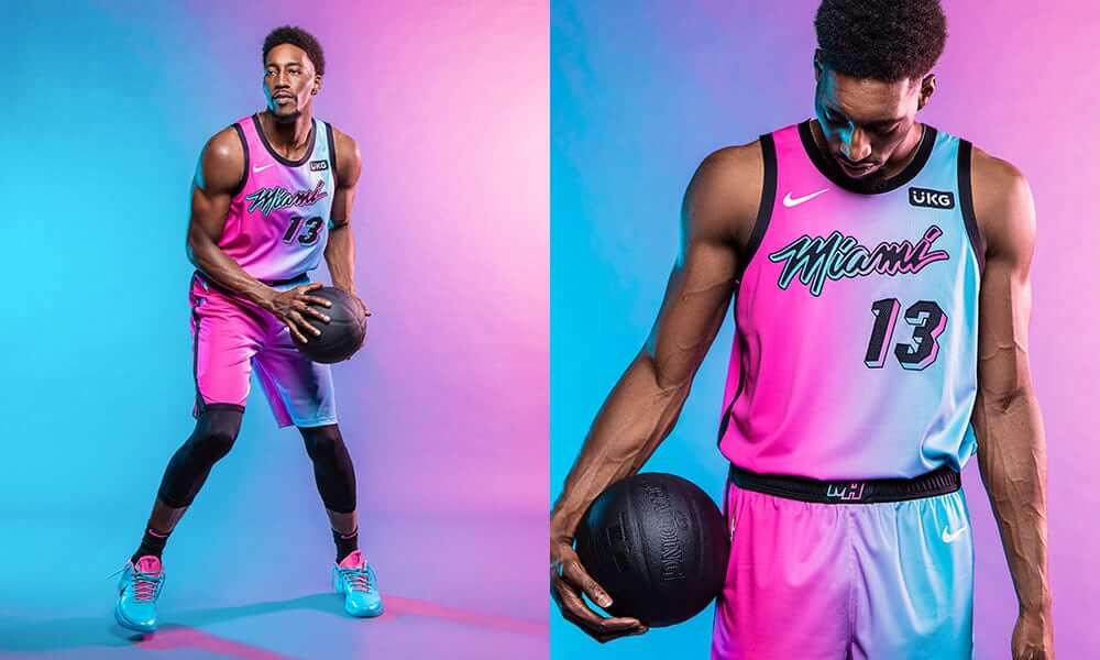
Miami Heat
This one — their latest and supposedly final Miami Vice-inspired design — had already leaked, but now it’s official. I will confess that I love the name they’ve given it: Vice Versa. That’s clever!
Yes, it looks ridiculous (and the black basketball doesn’t help). Does that even matter anymore for this team? They’ve embraced the Vice thing so hard that they should just change the team name from Heat to Vice. Would anyone notice? I wouldn’t exactly call this uniform “good,” but I’d say it takes everything this team has been doing to its logical destination. So while it may not be “good,” at least it makes a certain kind of sense, which is more than I can say for most of the City uniforms.
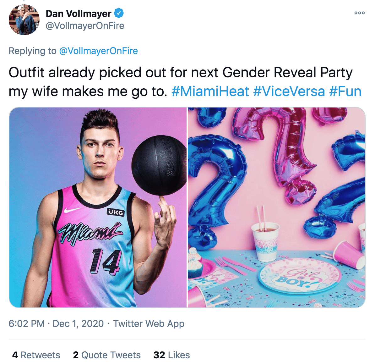
This one inspired a lot of jokes on social media. Here’s the best one I saw:
They’ve also unveiled a new court design to go along with the uni:
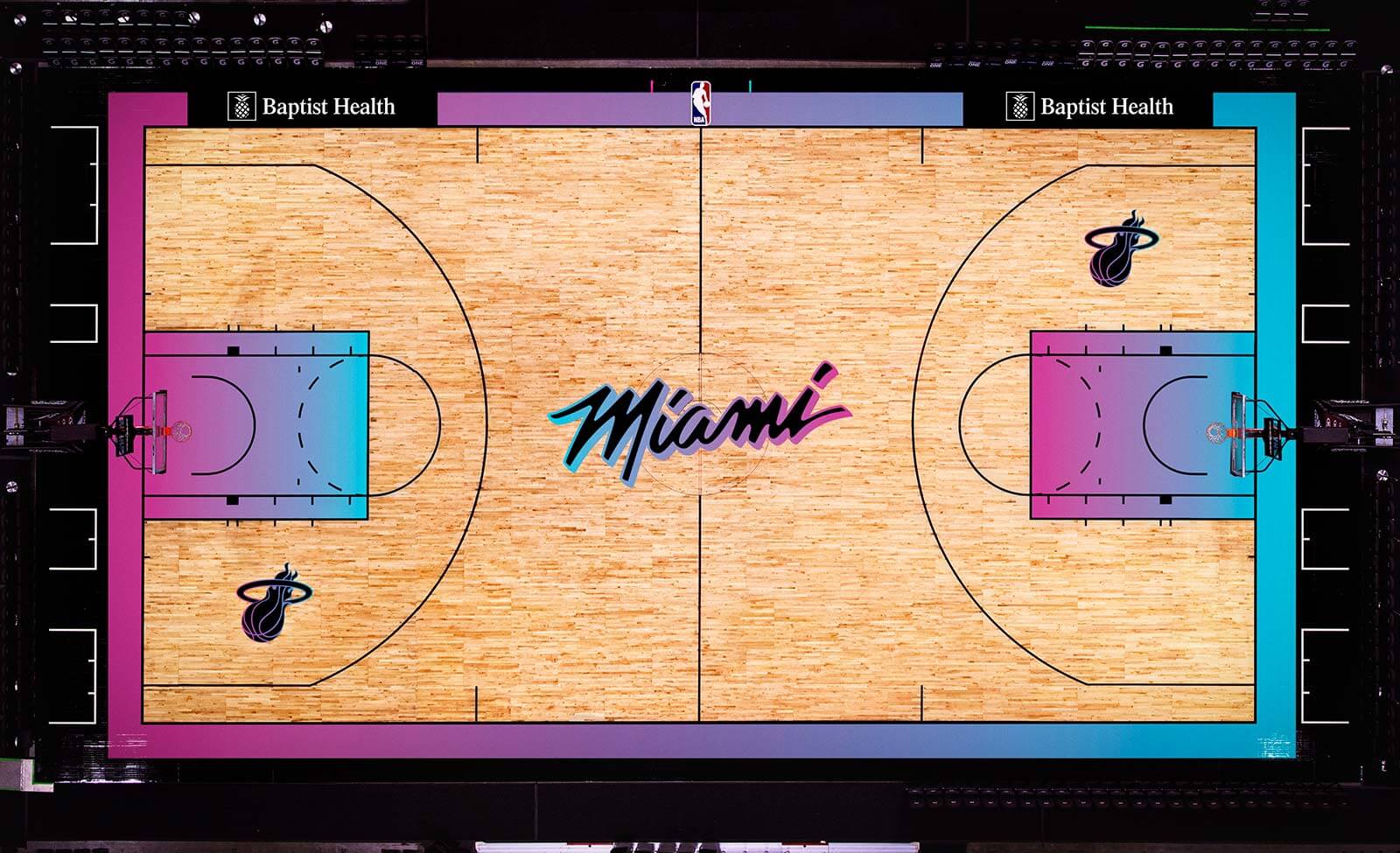
Additional photos and info here.
———
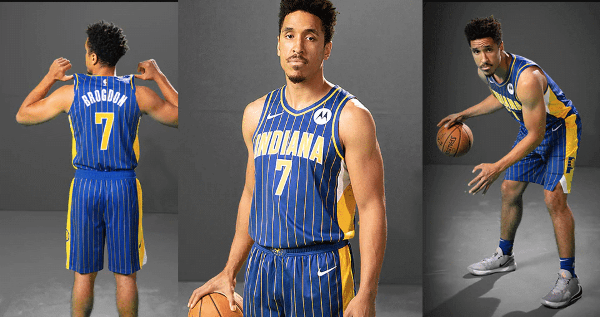
Indiana Pacers
Not bad. I’m not a big fan of pinstripes on basketball uniforms (why accentuate the vertical with athletes who are already eleventeen feet tall?), but at least the Pacers have a history with that design element, as these new uniforms are basically a royal blue version of the old Reggie Miller-era pinstripes. At least you can immediately tell at a glance which team this one is for, which is more than you can say for most of the City alternates. Additional photos/info here.
———
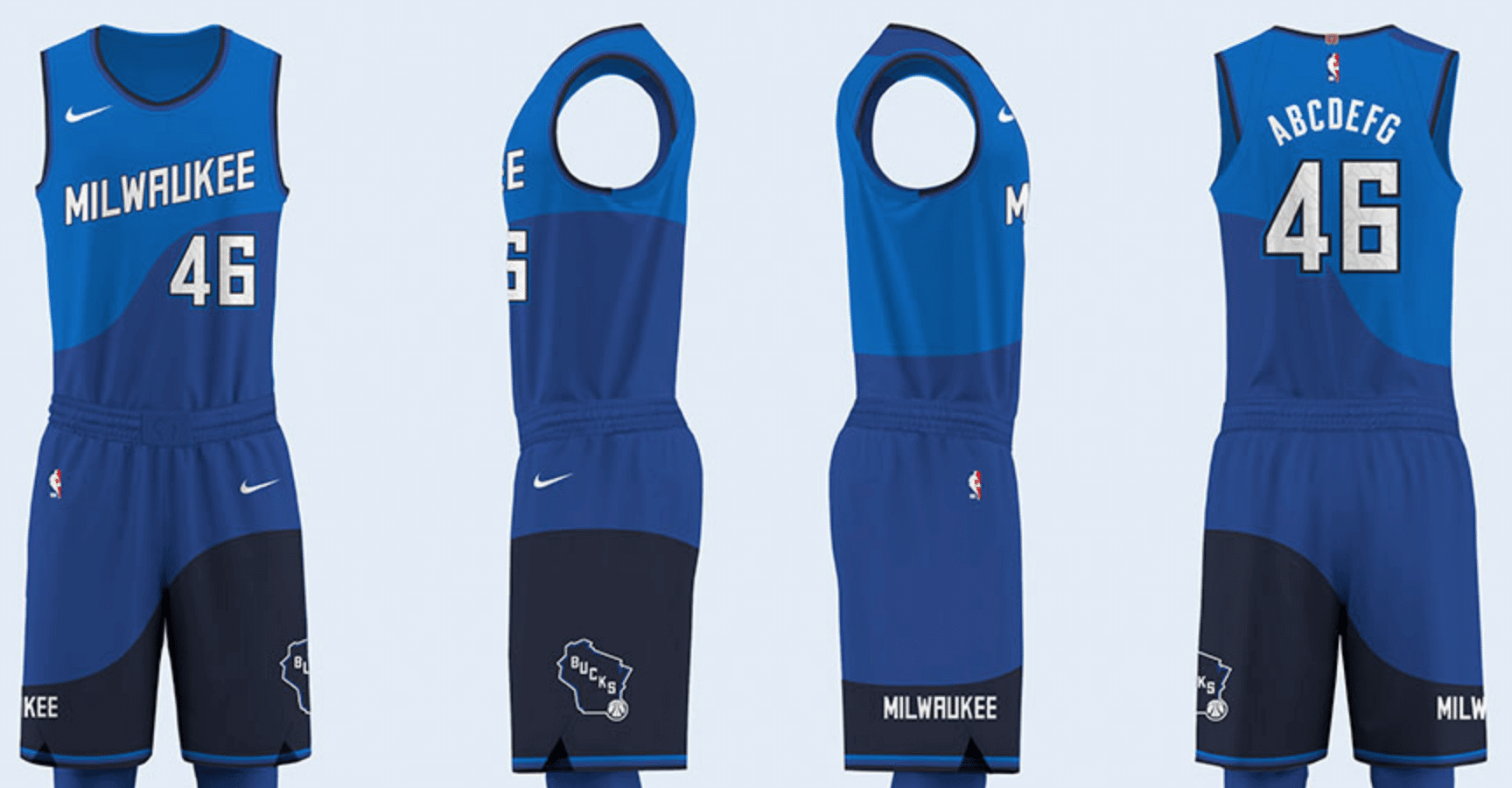
Milwaukee Bucks
It’s blue and flow-y — like Lake Michigan, get it? Right, me neither. Looks like a cross between the worst uni in pre-Nike NBA history and the Islanders’ fisherman/seasick design. Seriously, could that chest lettering possibly be less inspired?
Also: According to the team, “The numbers on the jersey are treated with a special coating that will reflect the light in a way that gives the illusion that the numbers themselves are wet.” That appears to be a boast, not an apology.
Speaking of the numbers: When this design purportedly leaked via a shirsey a month ago, the numbers had a Greek-style marble pattern that was widely interpreted as a goodwill gesture toward Giannis Antetokounmpo. Since that design element didn’t make the cut, reader Caleb Gerbitz asks, “Could it be that this detail provides insight into the Bucks’ confidence (or lack thereof) that Giannis will sign his supermax contract extension?” Hmmmm.
On the plus side, the jersey collar has three different shades of blue, but they managed not to invoke the term “blue collar” in any of the promo text. For this I offer my sincere thanks to all involved. Additional photos and very silly info here.
———
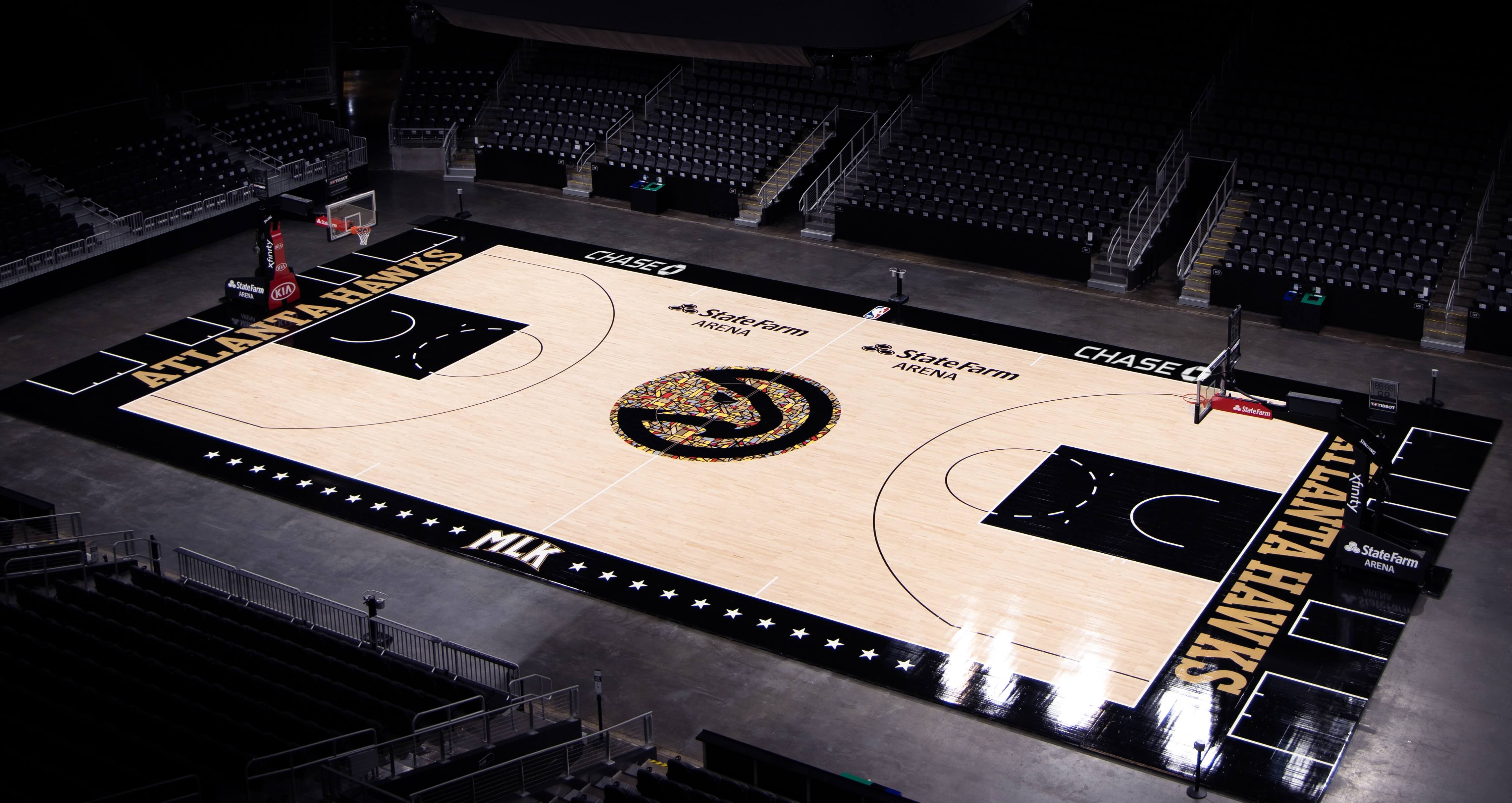
Atlanta Hawks
The Hawks already unveiled their Martin Luther King-themed City alternates two months ago. But they hadn’t revealed the accompanying court design, shown above, until yesterday. Here’s a close-up of the stained-glass motif they’re using at center court, which is meant to reference the windows at the Ebenezer Baptist Church:
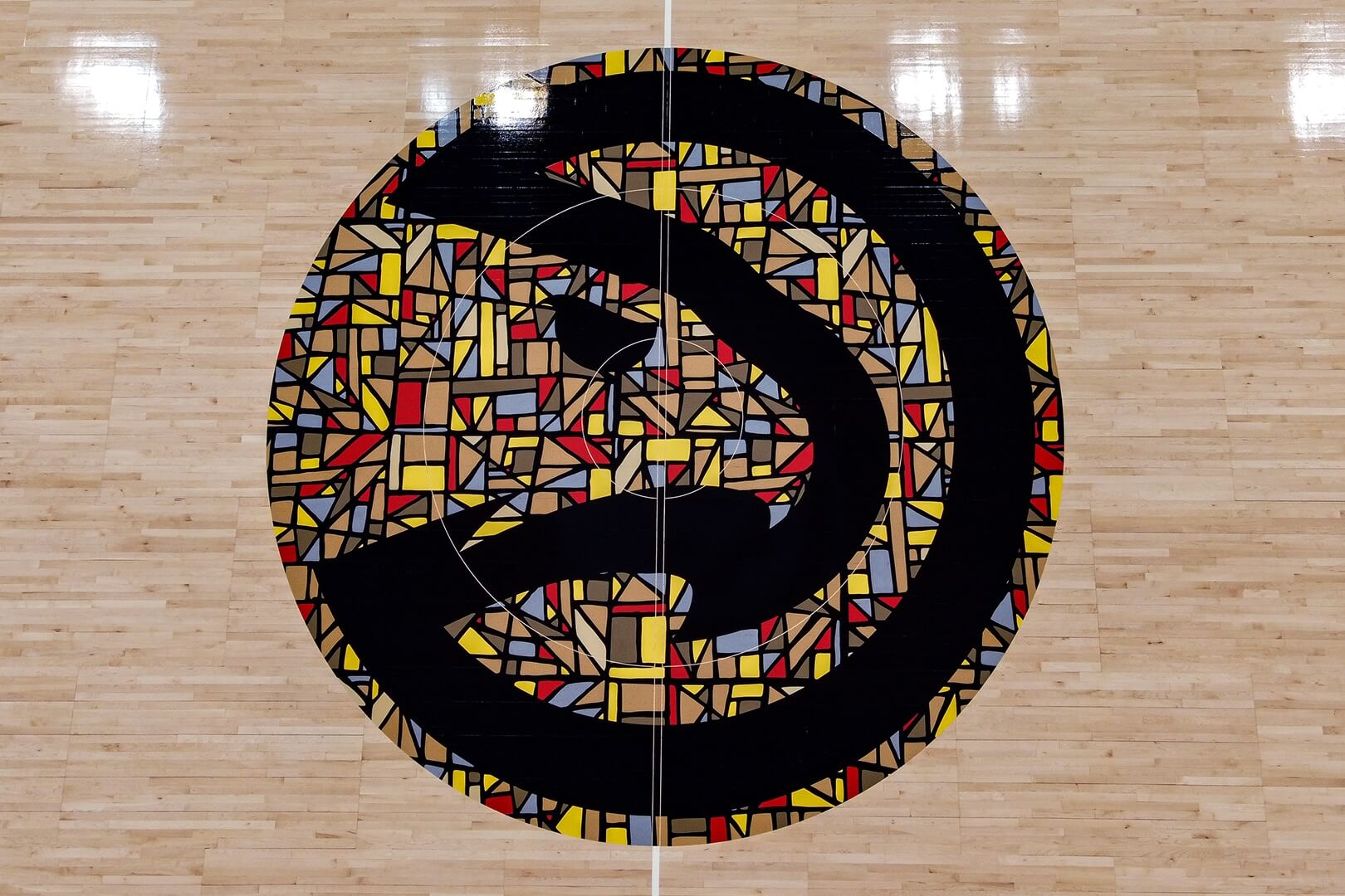
Nicely done. Additional info here.
———
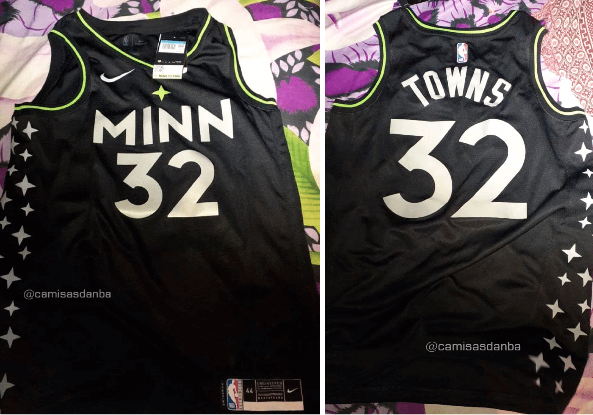
Minnesota Timberwolves
Unlike all the other items shown in this post, which are legit releases, this one is a leak (from Brazilian leakmeister Igor Coelho, of course). It feels sooooo characterless and nondescript to me, like something that might be used in a high school all-star game, plus it continues the Timberwolves’ unfortunate habit of depicting the North Star in neon green (just like in real life!).
But aside from that, it’s great. Official release supposedly coming tomorrow, at which point we can laugh/cringe at the marketingspeak.
———
So that’s what came out yesterday. But there was also an interesting tidbit of news about the upcoming season’s Earned Edition uniforms.
First, some quick background: The Earned uniforms debuted in the 2018-19 season as some extra retail slop a bonus uniform for teams that made the playoffs the previous season (a pretty low bar, considering that more than half of the league’s 30 teams qualify for the postseason each year). Then they scrapped the Earned program last season, but word has been circulating for a while now that they’re bringing it back for the upcoming season. It all feels like a very odd on-again/off-again routine.
So: Heat exec Michael McCullough described this season’s Earned program in a Miami Herald article yesterday. Here’s the key passage:
[T]he Heat will release another new look later this season as part of the Nike Earned Edition uniforms for teams that made the playoffs last season. That Heat uniform is expected to be released in late spring.
“The Earned Edition campaign really kind of flows from Nike,” McCullough said. “They talk to the teams about what the possibilities are. This year’s Earned uniform, what they wanted every team to do … is really kind of take one of your existing team colors and play with that, basically. Make it hyper this or really play up this aspect of your team colors. What you’ll see from us this year for our Earned uniform is something that stays along those lines, as far as taking an existing team color and playing with it. We’ve taken a color that we haven’t used a lot of and haven’t focused on a lot, and created something that we’re really excited about for Earned.”
McCullough’s statements about the color-based aspect of this season’s Earned program match up with what a source recently told me. At least that means this slate of uniforms will be in team colors, which is more than we can say for many of the City designs.
McCullough also had this to say about the Heat’s various Vice uniforms: “You’ll see, hopefully coming down the road, an opportunity for us to give these uniforms more life so they don’t just have the shelf life of a season and they go away. I think you’ll see that.” It’s not clear, though, whether he was referring exclusively to the Heat’s Vice alternates or to the City alternates throughout the league.
(My thanks to @livensleazy for pointing me toward that Miami Herald article.)
Click to enlarge
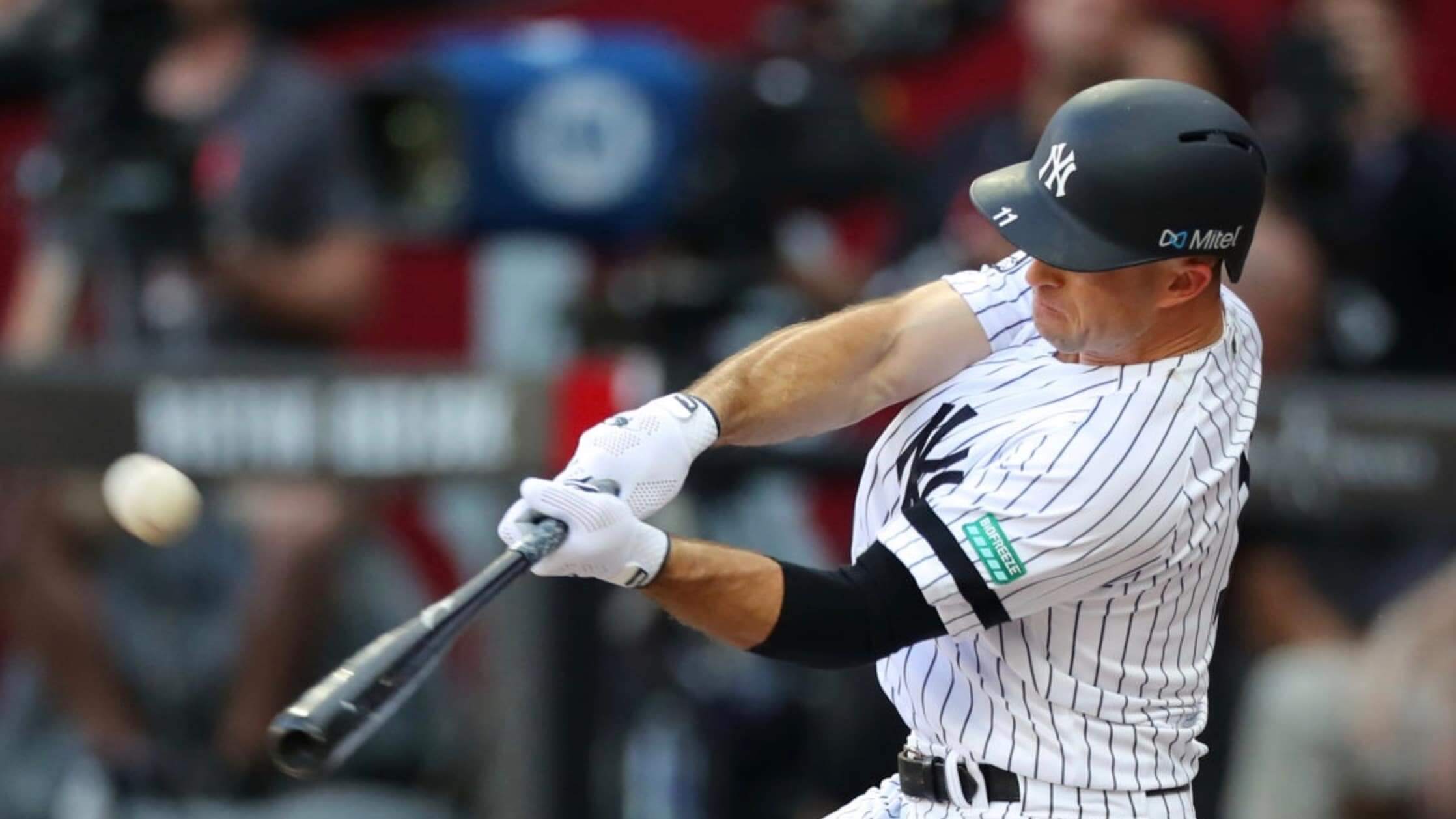
Rut-roh: After what we’ve all gone through this year, the 2019 MLB season seems like ages ago. But as you may dimly recall, the Yankees and Red Sox wore Biofreeze and Mitel ads on their sleeves and helmets for their two-game series in London that year, and the Reds and Cardinals wore Ford ads on their helmets for their games in Mexico. Those were in keeping with a two-decade-long trend of MLB teams wearing uni ads for games outside of the United States and Canada.
Now Sports Business Journal’s Terry Lefton — a very solid reporter — is reporting that MLB is exploring plans for putting ads on sleeves and helmets on a more regular basis. Lefton’s article is paywalled, but his colleague Mark Burns provided a quick summary:
SCOOP from @sbjsbd's Terry Lefton:
MLB recently sent request for proposals to 10 or more sponsorship & marketing agencies, asking for input not only on pricing, value and suitability of a sleeve ad patch, but also for a batting helmet decal, sources sayhttps://t.co/abVTEAGCKj
— Mark J. Burns (@markjburns88) December 1, 2020
This isn’t the first time that MLB uni ads have been discussed. Lefton himself reported in 2019 that ads on jersey sleeves (but not helmets) were considered likely for 2022, and back in July it briefly looked like uni ads might happen as a stopgap revenue move for the pandemic-shortened 2020 season (although that ended up not happening, thankfully). But just because the idea isn’t new doesn’t mean it’s any less appalling.
Since I can’t read Lefton’s paywalled article, it’s not clear to me what MLB’s timeline is here, but I’m assuming they’re still looking at this for 2022, when the owners and the union will have to negotiate a new collective bargaining agreement. Adding uni ads in 2021 would require some sort of concession by ownership in order to get the union to go along with it.
If anyone knows more about all of this — details about the marketing agencies that are involved, details about pricing, potential sponsors advertisers, etc. — feel free to drop me a line. I’m all ears.
(My thanks to @bryant_rf, who was the first to alert me to Lefton’s article.)
175 years of history, tradition, and honor all lead to this.
The 2020 Army-Navy Uniform#BeatArmy | #BuiltDifferent pic.twitter.com/Ffc5SIkeAZ
— Navy Football (@NavyFB) December 1, 2020
All wet: Navy yesterday unveiled their uniform for this year’s Army/Navy game (additional info here). Aside from the design, what caught Nathan Haas’s eye is that the unveiling video, shown above, takes place in water.
Okay, so the Navy is, by definition, about water. But Nathan notes that this unveiling is part of a trend of water-based college football uniform unveiling videos. Here, for example, are the unveiling vids for Appalachian State, West Virginia, and FAU:
Uniforms for week 1 💦#BeatUNCC pic.twitter.com/CLUubFZj7A
— App State Football (@AppState_FB) September 10, 2020
All navy for @WVUfootball #uniswag pic.twitter.com/09XPUXwJMK
— UNISWAG (@UNISWAG) October 3, 2020
New uniforms for @FAUFootball #uniswag pic.twitter.com/5eFbZtYWqU
— UNISWAG (@UNISWAG) October 2, 2020
Note that two of those schools are outfitted by Nike and one by Adidas — and now Navy, which is outfitted by Under Armour, has also gone with an aquatic unveiling. So all three of the major uni manufacturers have embraced this trend.
I have a vague feeling that there are some other schools we may be missing — anyone..? More importantly, what’s the deal with this bizarre trope?
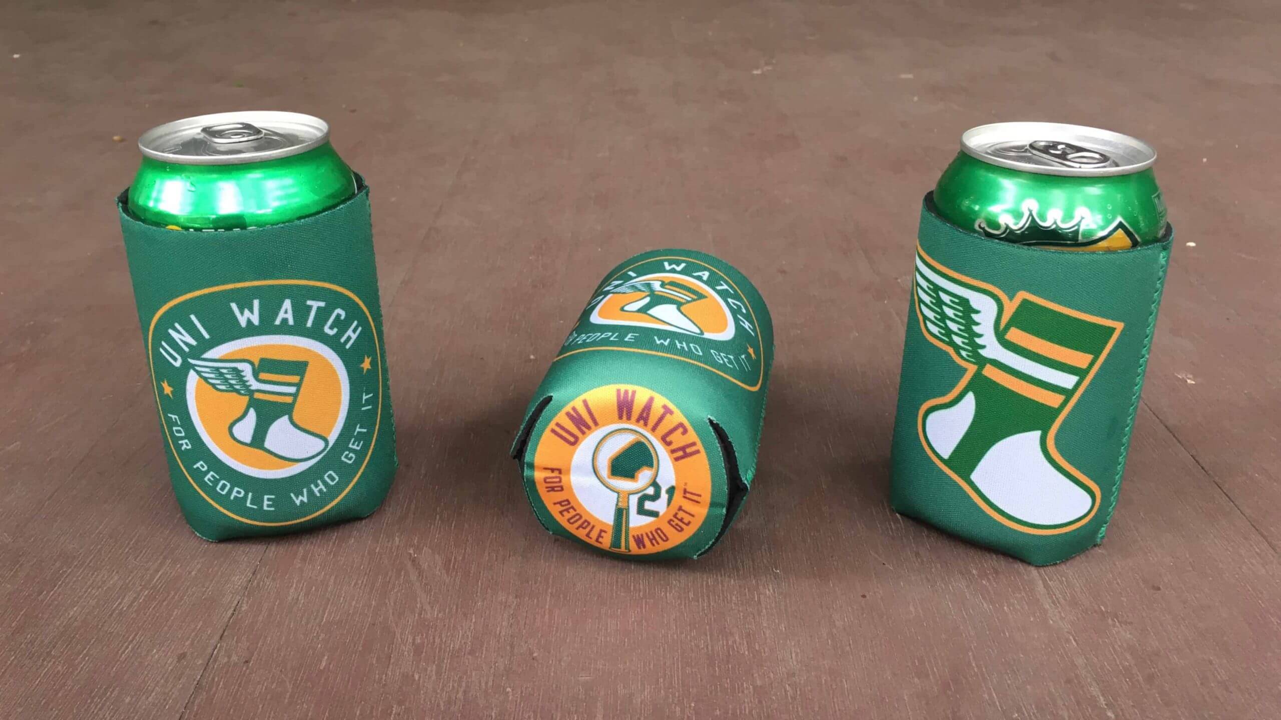

ITEM! Koozie raffle: Reader Bob Novotny has generously purchased three koozies for me to raffle off, so that’s what we’re going to do today.
This will be a one-day raffle. USA entries only. To enter, send an email with your mailing address to the raffle in-box by 8pm Eastern tonight. One entry per person. I’ll announce the three winners tomorrow. Big thanks to Bob for sponsoring this one.
As for yesterday’s membership raffle, the five winners are Jeff Proctor, Ryan Feuerstein, Dustin Jensen, Mark Sanders, and Kristopher Stahr. Congrats to them, and let’s have a standing O for reader Bert Ayers, who provided a total of 10 memberships for me to give away this week. Thanks, Bert!
Click to enlarge
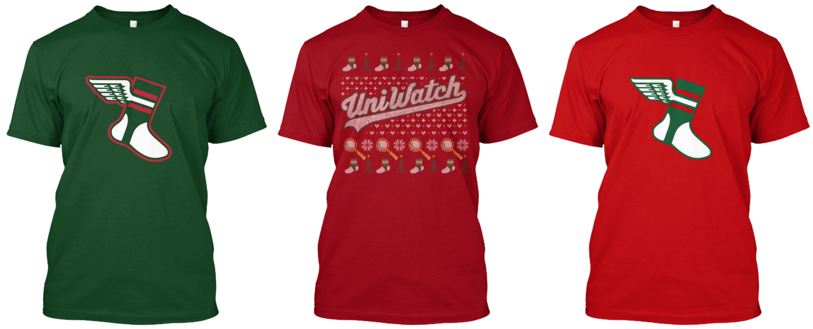
ITEM! Holiday items: As you can see above, we now have Uni Watch Color Remix shirts available in new holiday-themed designs, plus I figured I’d remind you that our Ugly Sweater T-shirt is also a available. (For those asking about new Color Remix caps: We should have those available tomorrow.)
All three of these come in long-sleeved and hoodie versions. Here’s where you can find the green/red Remix, the red/green Remix, and the Ugly Sweater.

While we’re at it:
• The Uni Watch Classic Cap is currently selling at 10% off its usual price. We have all fitted sizes in stock, as well as the adjustable strapback version. Available here.
• We’re currently taking pre-orders on another round of Uni Watch hockey and cycling jerseys, all of which can be customized with your choice of number and NOB. Full details here.
• The rest of our Uni Watch merchandise is listed here.
Thanks, as always, for your consideration and support. It means a lot, really!

Click to enlarge
Pin Club reminder: In case you missed it on Tuesday, the Uni Watch Pin Club’s design for December, featuring our winged stirrup repurposed as a holiday stocking overflowing with gifts, is now available.
This is a limited edition of 200. As of this morning, after one day of sales, there were 72 left. You know what to do.
Also, important: People who’ve collected all 12 monthly pins are eligible to get our Uni Watch Pin Club 2020 All-Star pin as a free bonus. If you qualify, you can claim your prize by emailing me with (a) your mailing address and (b) some combination of photographic evidence and/or receipts. For example, if you order the December pin today, you could send me a photo of the 11 pins you’ve already received plus your email from Teespring confirming that you ordered the December pin. Or you could wait until the December pin arrives and take a photo of all 12 pins. Or you can simply go to “My Purchases” in your Teespring account and take a screen shot of that. As long as you can prove that you collected ’em all, that’s what I’m looking for. Thanks!
As long as we’re talking about pins, here are some inventory numbers on a few pins that we’re running low on:
• 2020 Press Pin: Fewer than 10 remaining.
• November pin (turkey carrying football): Fewer than 20 remaining.
• July pin (bobblehead): Fewer than 30 remaining.
Finally, I’m happy to announce that the Pin Club will continue in 2021. The January and February designs are already in production, and Todd and I have lots of good ideas for the rest of the year that I think you’ll really enjoy. Stay tuned, and thanks for your support of this project!
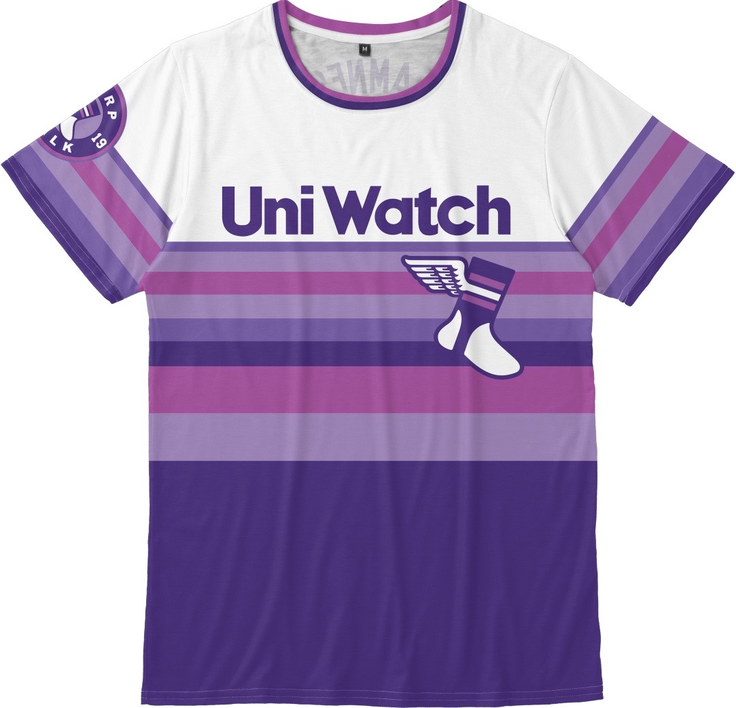
Signal flare: Longtime reader and all-around swell guy Jason Von Stein has an unusual request: He’s seeking our 2019 Purple Amnesty Day shirt — the purple tequila sunrise design — in size Small.
This was a one-day product offering, so it’s no longer available. But if anyone out there has a Small shirt that they’d be willing to sell or trade, and if you’d like to help out a fellow member of the Uni Watch comm-uni-ty, go ahead and contact Jason. Here’s hoping it works out!
The Ticker
By Lloyd Alaban

Baseball News: New logo for the American Association (from Kary Klismet). … Also from Kary: MLB reimagined some of its teams as NFL teams. … One more from Kary: The Orem Owlz of the independent Pioneer League are moving to Windsor, Colo., for the 2021 season, where they will compete in a new stadium being built as part of a multi-sports complex. … Here’s some great 1965 footage of Howard Cosell describing the then-new Astrodome (from Bruce Menard).

Football News: Air Force will go mono-white this week. … Cross-listed from the baseball section: MLB reimagined some of its teams as NFL teams (from Kary Klismet).

Hockey News: More NHL teams are releasing views of their full Reverse Retro uniforms — not just the jerseys — including the Predators, Panthers, and Golden Knights (from Wade Heidt and @Tileeom). … New fifth-season logo for the Tucson Roadrunners.

Basketball News: Tons of uni number news on Etienne Catalan’s Twitter feed. … New social justice patch for Northwestern (from Ross Drucker). … Kentucky and Kansas wore trackers sewn into their jerseys last night to collect data about how far each player was from another during the game. The data will be used in contact tracing should a Covid-19 outbreak happen on the court (from Eric Farrell). … Not much contrast in last night’s ECU/NC Wesleyan game, as the teams went white vs. Vegas gold (from Will Wyss).

Soccer News: The Chinese Football Association will remove company names from team names (from Ed Zelaski). … Also from Ed: New 120th-anniversary shirt for Italian side Sampdoria. … The Montreal Impact will change their name to Montreal FC (from our own Jamie Rathjen).

Grab Bag: Here’s how Bevo, the University of Texas’s mascot, got its name (from Kary Klismet). … Also from Kary: The Luna Ross Prada Pirelli sailing team from Auckland, New Zealand, has unveiled its uniforms for the 36th America’s Cup in March 2021. … A Virginia-based brewery has come up with a Virginia Tech-themed beer (from Andrew Cosentino). … Residents of Pelham, Ga., are demanding that police immediately remove patches that have an old city logo — changed in 2018 — featuring Confederate imagery. The local police chief says the old patches are being phased out as new uniforms replace them (from Timmy Donahue). … Also from Timmy: U.S. Marines are getting new cold-weather boots. … One more from Timmy: The Naval Academy’s cobbler has retired after 53 years. … Did you know McDonald’s has a style guide for their various mascot characters? They do, and it’s fascinating (from @NerdDadAz). … International cricket umpire Bruce Oxenford protects himself from wayward balls with an arm-mounted shield (from Ash Norris). … Fashion designer Ralph Lauren can’t stop ripping off military attire (from Tom Turner).

Click to enlarge
What Paul did last night: If you look closely, you can see a bicyclist going by (that red blur at center-left is his rear bike light). I like how he looks like a ghost!
As always, you can see the full set of daily Pandemic Porch Cocktails™ photos — now 260 of them — here.
Miami football unveiled its “recycled” uniform a few seasons ago using water.
Regarding the Bucks uniform’s perceived “Greek-style marble pattern” on the shirsey…
Now knowing that it is a lake-themed uniform with “wet” looking numbers, I think those that thought it was an effort of goodwill towards Giannis were wrong. That definitely looks like how an illustrator might depict water/wetness on a 2-d object.
I think you are spot on with this take. It was a rendering depicting “waves” or “flow” of water I believe.
As far as the uniform itself is concerned, it is horrendous. When I turn on the TV, I want to know exactly who is playing right away. This dos not achieve that.
When the Bucks re-branded a few years ago, and rolled out their alts/city/earned and all that…they actually still looked like the Bucks. This does not. I am glad it is just for a few games this season.
And whatever the heck that element is supposed to represent, if the image in this column is official, it looks to me like it did indeed make the cut; it’s pretty visible in the back view. Not sure why the analysis states otherwise.
Actually, that element is not included on the uniforms:
link
Interesting…. if you look very closely at the pictured Middleton jersey, there does appear to be a faint pattern of lines in addition to the simple mesh pattern; similar to what was leaked, but much less prominent. Then, in the #46 template included at the bottom of the NBA article (and in this UW article) the lines are clearly visible, but the mesh is not discernable. A trick of the light, perhaps? It should be interesting to see that “wet number” in action. (Though not sufficiently interesting to justify such a horrendous uni design.)
It is absolutely included on the uniforms, it’s just much more subtle than in the leak. link
Now, it’s a whole lot more subtle than the leak. Which is probably the difference between authentic jersey and retail shirsey; the former has some special treatment designed to shimmer under arena lights, while the latter has a cheap and crude nod to the overall effect.
But yes, points for avoiding “blue collar”. Especially since that was link back in 2015.
An, interesting. Thanks, Chance!
Most welcome!
I think the effect is going to fall squarely on the “stupid” side of the ledger, but am still curious to see how it looks under the lights.
They’re also putting the pattern on their phone wallpaper graphics.
Yep, this is definitely stupid.
link
Loved the aquatic uniform unveilings. This brought to mind this one from the University of South Carolina. This video was filmed in Lake Murray.
link
The Tulane Green Wave has to do this, right?
Crimson Tide, Terrapins, Beavers, Ducks
Nike and the NBA are consciously making the next set of uniforms in team colors. The Chinese are aggressively removing corporate sponsor names in their soccer league. We are in the End Times.
Minnesota had a player walk out of a lake last season. I like it a lot less now that I see how common it is. It makes sense for the Gophers since they play in the Land of 10,000 Lakes
link
Plus Gophers are aquatic animals.
I’m annoyed at how the Heat’s jerseys and lanes move from pink to blue, but the wordmark at center court moves from blue to pink. Get off my lawn!
Really looking forward to seeing the rest of the teams release the full uniforms for the Reverse Retro. Some teams will need to have different pants and gloves while others do not.
Some of the jerseys we have seen are experimental with this program and appropriate to see them just a few nights. Others have been so good they need to be considered as regular alternates or even as a new regular primary.
IMO the full Florida Panthers Reverse Retro uniform better than their primary uniforms. Slap the more modern version of the leaping Panther on the front and you have got yourself their new primary.
Rhode Island (Adidas school) has done the aquatic unveiling as well.
link
That water looks chilly!
I don’t know what the patch on the Pacers’ jersey upper right is for – but to this UK soccer fan it looks like the Pacers are repping Torquay United.
(Currently in the fifth tier of Englis league football)
link
I love those heat jerseys. I also got one of those black vice heat jerseys, in my opinion the best one
I am annoyed that the ‘North Star’ on the Wolves jerseys looks like it’s meant to dot the ‘I’ but that they couldn’t line it up right. I know that’s not what they’re going for, but my eyes keep reading it as a mistake.
Has anyone created anything to display their Uni Watch Pin Collection? I’ve had an idea in my head for a pin-board display for several months, but I lack the design skills to make it real. I wasn’t sure if there were any other “collect ’em all” Uni Watchers out there with the ability and desire to run with this idea, but I wanted to throw it out there and see what people think.
This is a very crude mock up I made. Obviously it has a lot of issues and could be greatly improved, but it should give an idea of what I’m thinking.
Backdrop: link
Backdrop with “pins”: link
Anyone else think this is a good idea for a display?
That’s a great idea! I love to see pin displays.
Maybe next year Todd could design a special background print as an incentive for completing the set.
Had I went ahead and purchased the pins, I love this idea. I also like the idea of a grid calendar (or something along these lines link). Large enough to be able to see the months, but covering up the dates. If i had any kind of graphics know-how, I would do one up for people who purchased the pins to use.
They’ve embraced the Vice thing so hard that they should just change the team name from Heat to Vice.
According to link, the Vice merch have brought in 5x more revenue than the Heat saw in their three championship seasons combined. I’m kind of shocked that they don’t change the name or just adopt the Vice æsthetic full-time.
I’m thinking that the water themed uniform releases has something to do with the term “drip” that younger people are using for describing their attire. I’m not sure if that’s true, but it was the first thing that came to mind.
Interesting theory! But none of the tweets with these videos said “New drip” — hmmmmm.
“Strange people lying in ponds distributing uniforms is no basis for a system of uni-unveiling!” A farcical aquatic ceremony?
In a most cringe-worthy year, today’s post might be the most cringe-worthy ever.
From MORE NBA uniforms (and the ridiculous marketing jargon), to college uniform unveilings under water to possible honking ads on baseball uniforms and sleeves … when will it end??
Just to be 100% clear, I’m not knocking Paul here. He’s doing a wonderful job reporting the kind of stuff that I hope gets people as riled up as me. These marketing douchebags have ruined sports for all of us.
In the words of Elaine Benes when asked about The English Patient:
link
I love those Heat uniforms. Maybe because I’m an 80s kid and to me Miami will always be synonymous with Crockett and Tubbs, but to me they’re just perfect. So much more inspired than their usual look.
As a Miami Heat season ticket holder, I’ve seen all the Vice jerseys and merch up close and personal. I thought it was great that they got 4 years out of it, but maybe this year they went too far. The best thing that came out of the Vice trend was the the themed license plates. I’ve seen them on black or blue cars and they look fantastic.
link
They have to be the only team that does that, right? Offer license plates in their City Edition identity?
Also, link. Gross.
The NBA likes to throw a bunch of shit on the wall and sees what sticks. Most of the new uniforms will end up long forgotten, but a few may stick, Charlotte comes to mind, but not much else. Those new Miami uniforms may have a more lasting legacy, but only in that they may appear in “worst uniform ever” lists
Thank you for sharing Paul.
I may be a little late in commenting, but I think the Navy helmets look like their regular blue helmets covered in seagull poop.