By Phil Hecken, with Matthew Drake
Follow @PhilHecken
Hey UW readers! Hope everyone had a good week and Happy Thanksgiving, and you and yours are staying safe and sane.
A couple weekends ago, I featured NFL Concepts from Matthew Drake (if you missed that, click here for Part I and click here for Part II), who graced us with his designs (or redesigns) for the NFL’s American Conference, for the East and North Divisions (Pt. I) and AFC South, West and NFC East (Pt. II). Today we’ll look at his final concepts for the last three Divisions: NFC North, South & West. There’s a lot to look at, so let’s go.
NFC NORTH
Chicago Bears
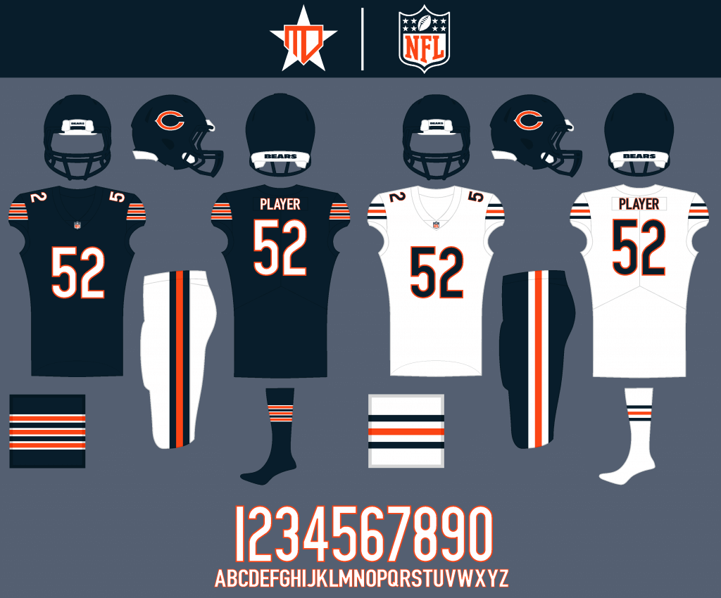
Some of the best uniforms in football remain pretty much unchanged, besides flipping the colors of the stripes on the navy pants.
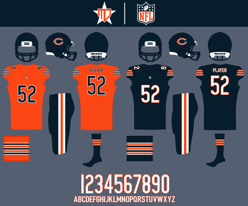
I made the numbers navy on the orange alternate. Navy stays as the Color Rush, as I like the dark look of it.
Detroit Lions
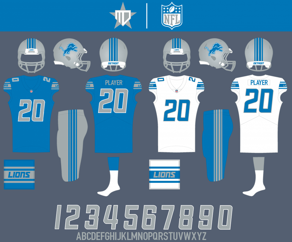
I removed the anthracite gray from the color palette, and made the number outline on the home jersey white. The striping on the helmet and pants is inspired by muscle car designs.
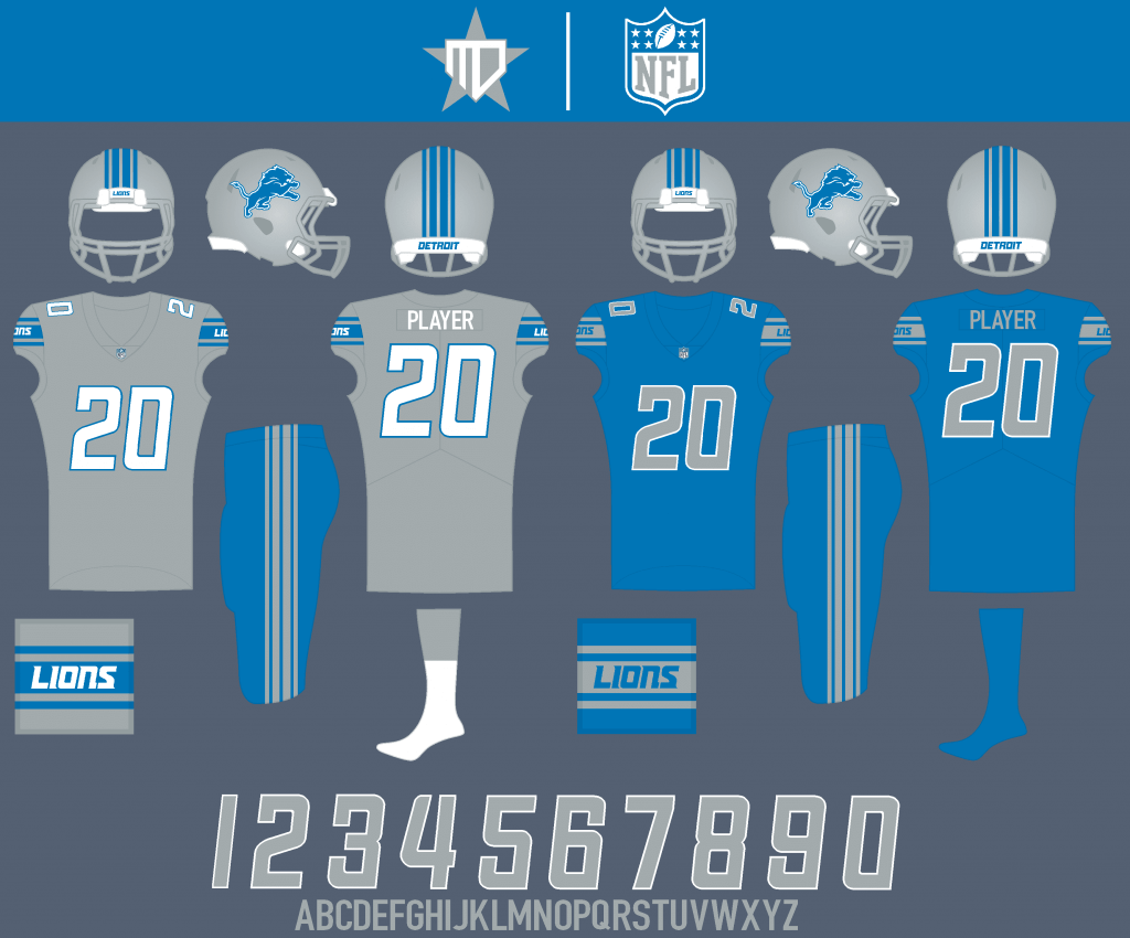
I kept a silver jersey in the rotation, this time the lighter silver to match the helmet, but the Lions’ iconic Honolulu blue becomes the Color Rush.
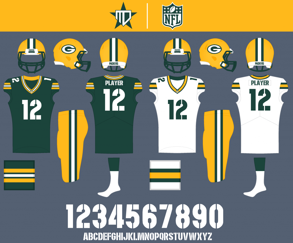
Green Bay Packers
I tried out a new number font to better match the wordmark, and recolored the stripes on the away so that athletic gold and white do not touch.
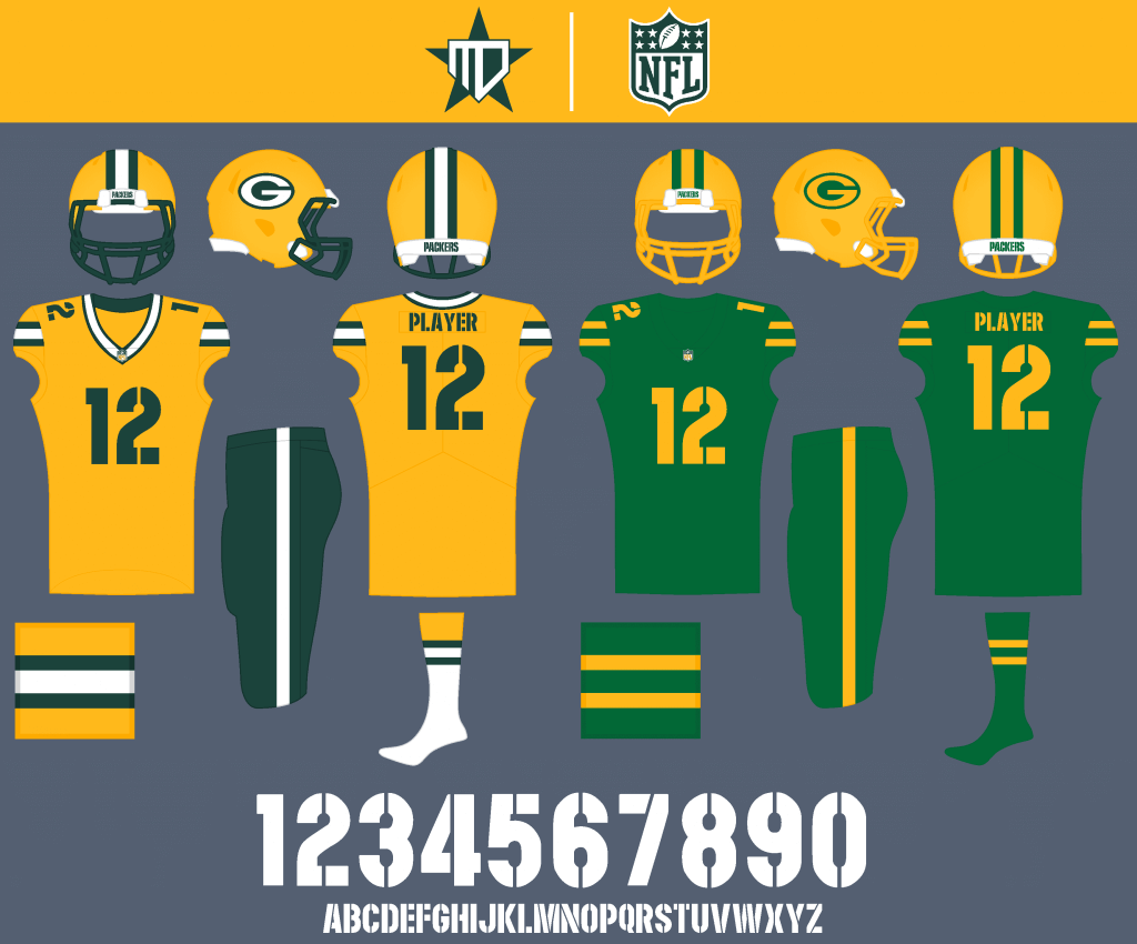
This might catch a lot of flak, but I wanted to try an athletic gold alternate jersey like the one that used to be in Madden games. The Color Rush is inspired by the 1950’s kelly green Packers uniforms.
Minnesota Vikings
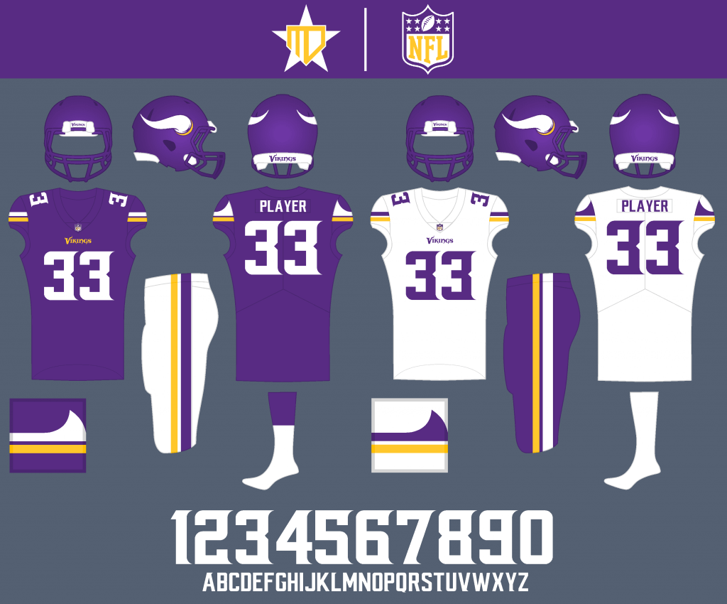
I may be biased, but this might be my favorite uniform set in the NFL, so not much changes. I removed black from the helmet, adjusted the color of the pants stripe on the white pants to match the white jersey, and tried adding the “sails” onto the right and single-digit numbers.
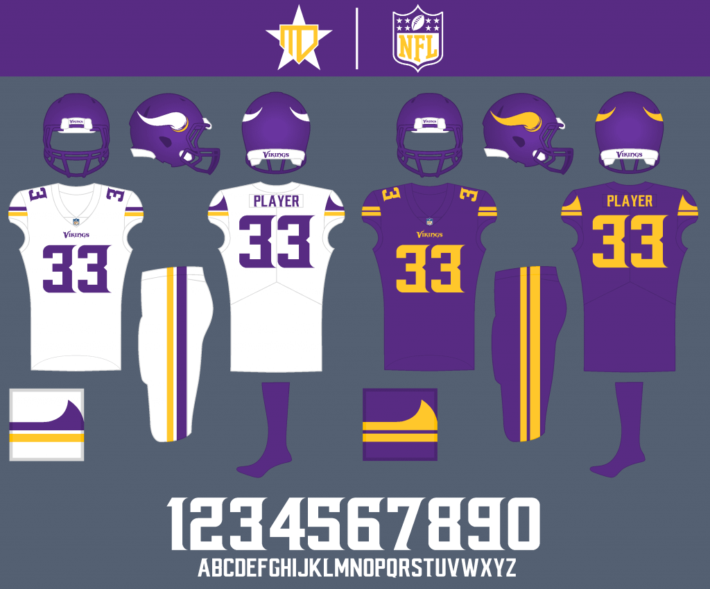
I’d like to see both all-white and all-purple sets maybe once each a year, and the Color Rush set gets a matching helmet.
NFC SOUTH
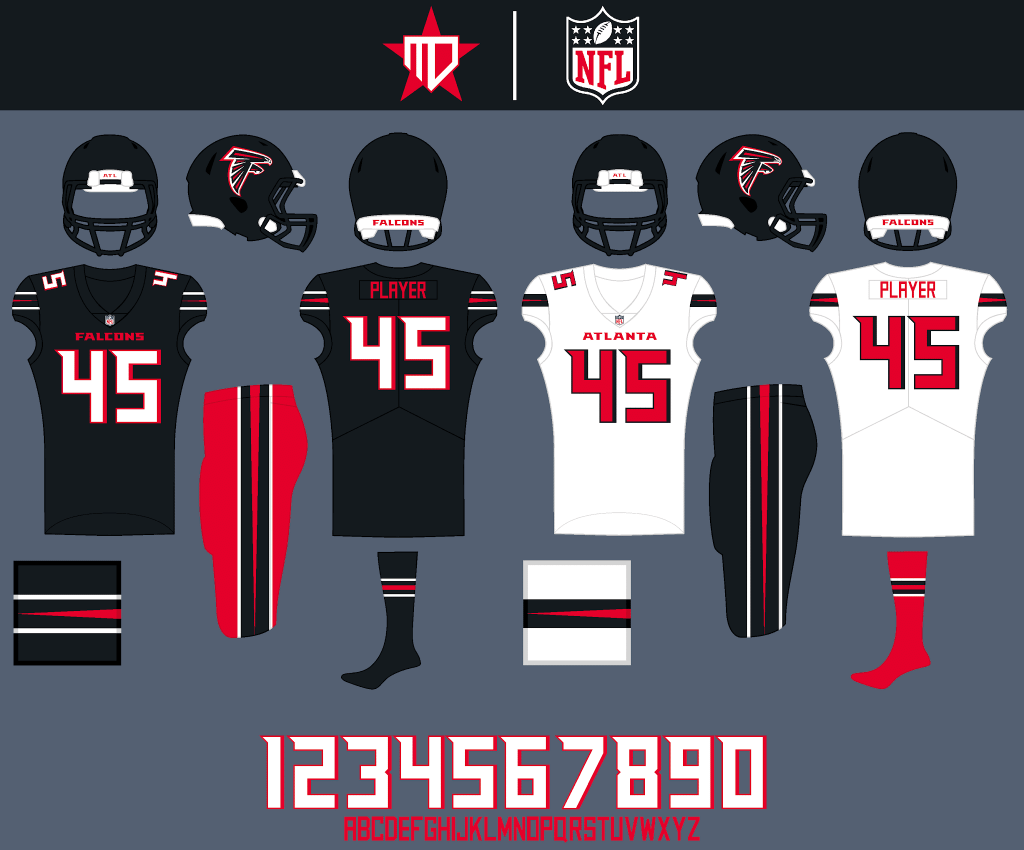
Atlanta Falcons
The Falcons new set has grown on me since it was unveiled, but I wanted to try something with more of a traditional spin. The striping has white borders around it so it can be consistent across all backgrounds. I replaced silver throughout the set with red and adjusted the number font.
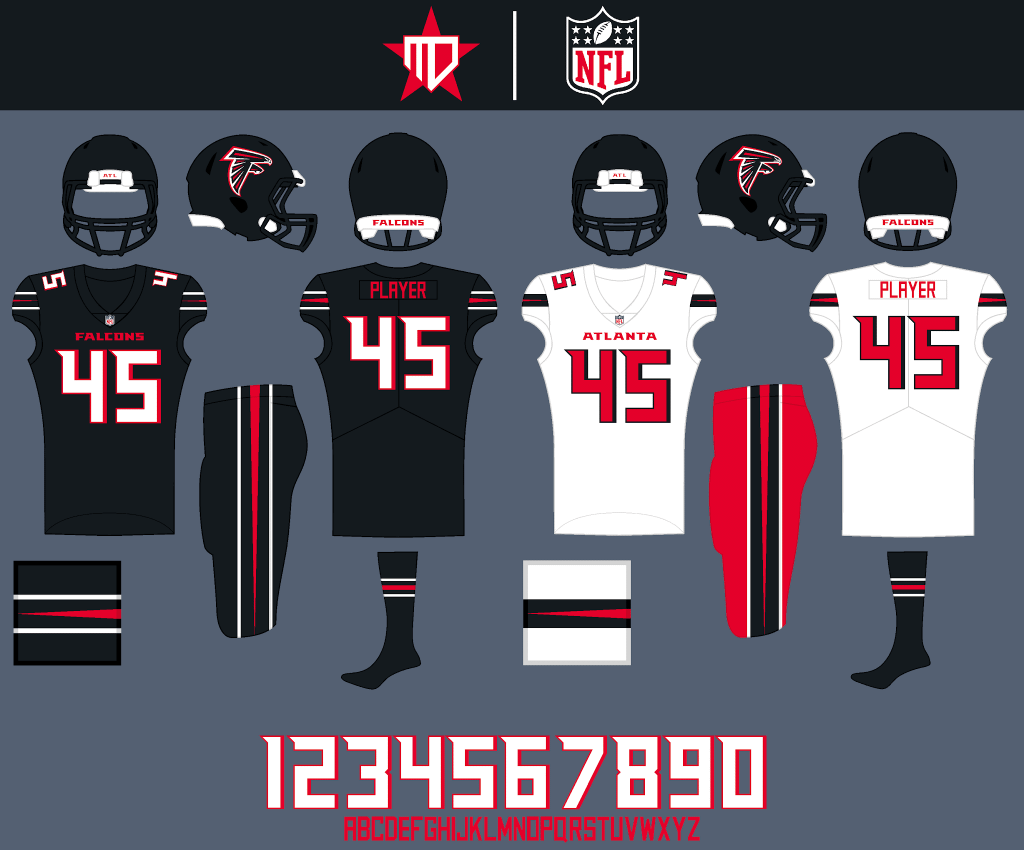
Looks at two extra combinations.
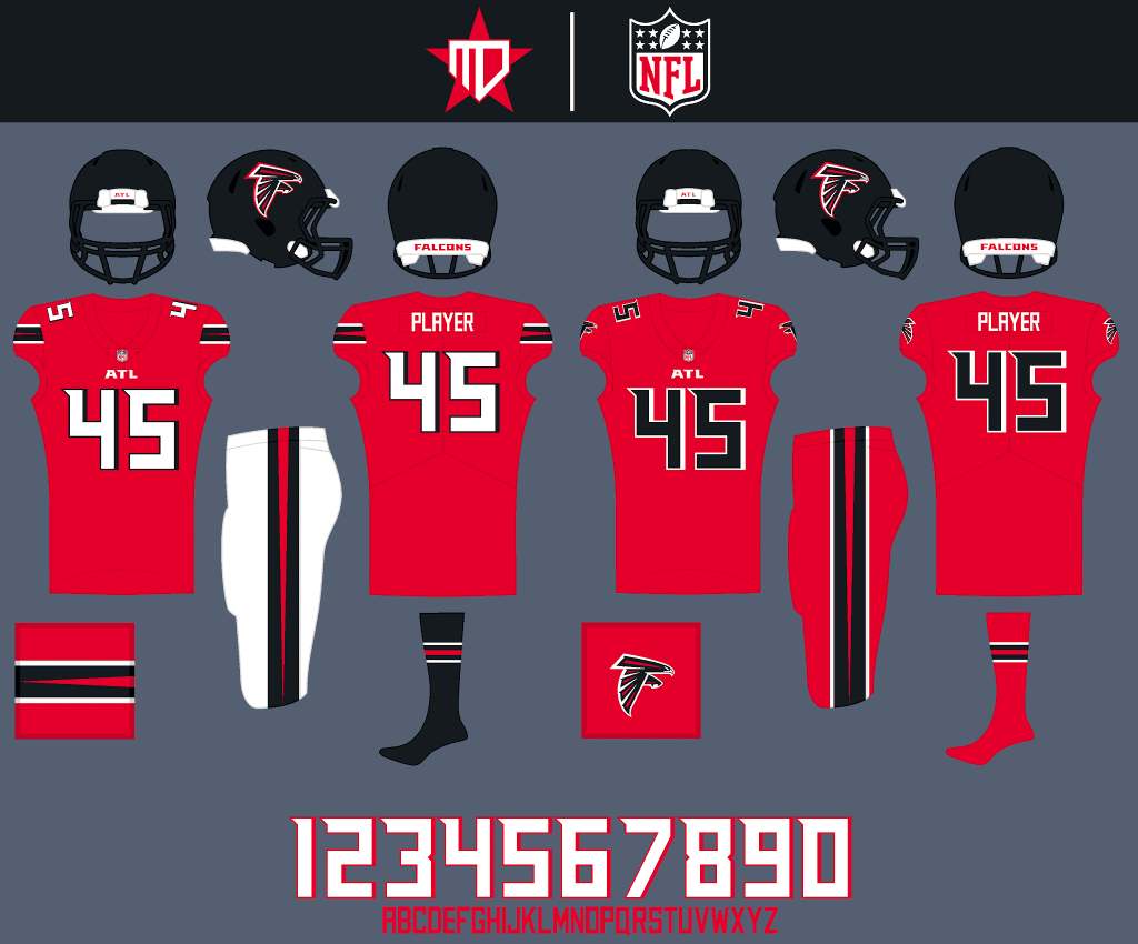
A full-red jersey returns to the rotation, and the black numbers return for the Color Rush.
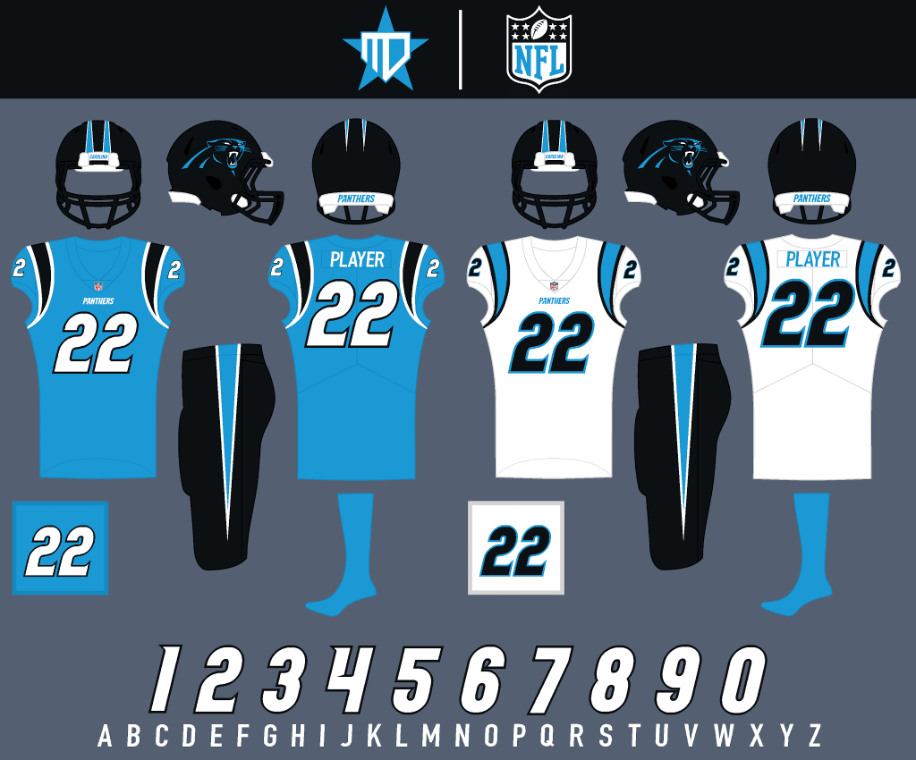
Carolina Panthers
The jerseys stay relatively the same, Panther blue becomes the primary and I updated the number font to match the wordmark. Silver is also dropped from the set, so I decided to go with a black helmet.
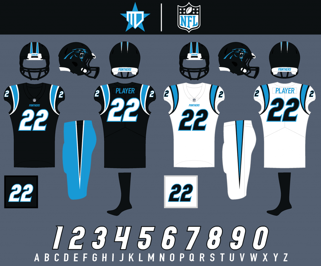
Black becomes the alternate jersey, which I think would pair nicely with Panther blue pants.
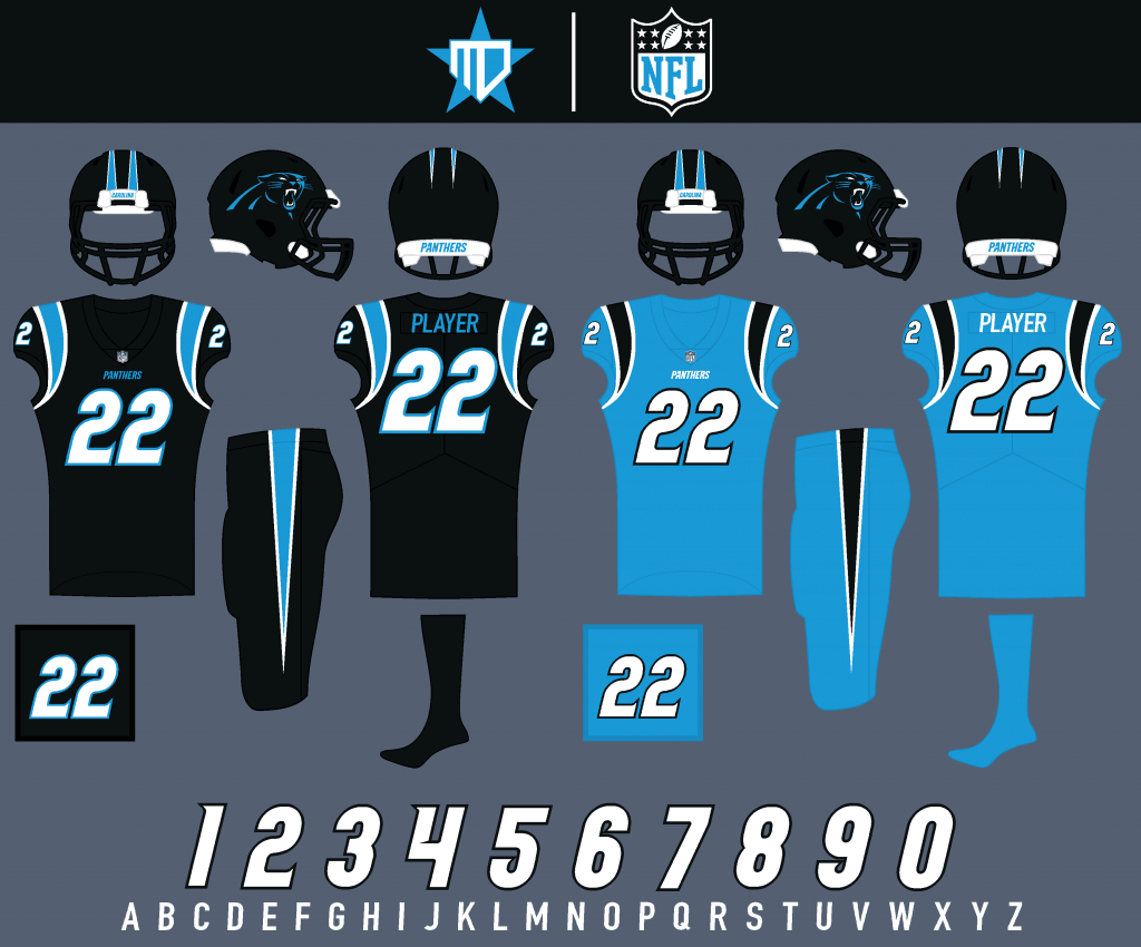
All-black would be the combo for primetime games, and Panther blue stays as the Color Rush.
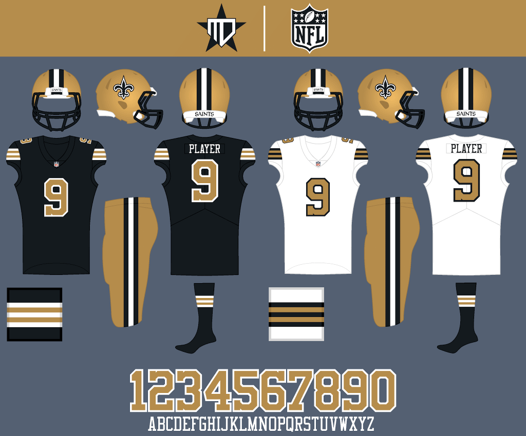
New Orleans Saints
Inspired by the Color Rush, the Saints go with the throwback look full-time, embracing a richer gold that returns as the primary pants color.
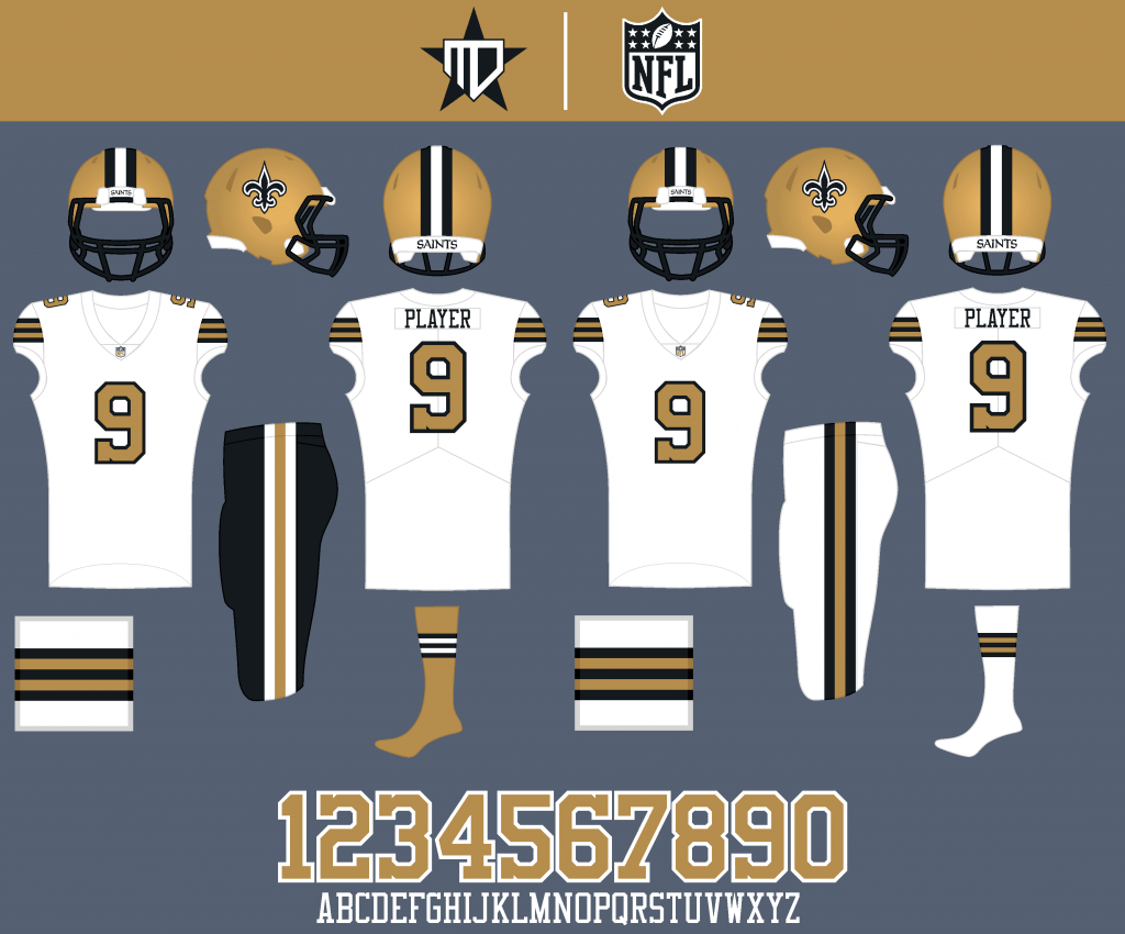
I’d only want to see the Saints wear black pants maybe once or twice a year, and all-white remains as the Color Rush option.
Tampa Bay Buccaneers
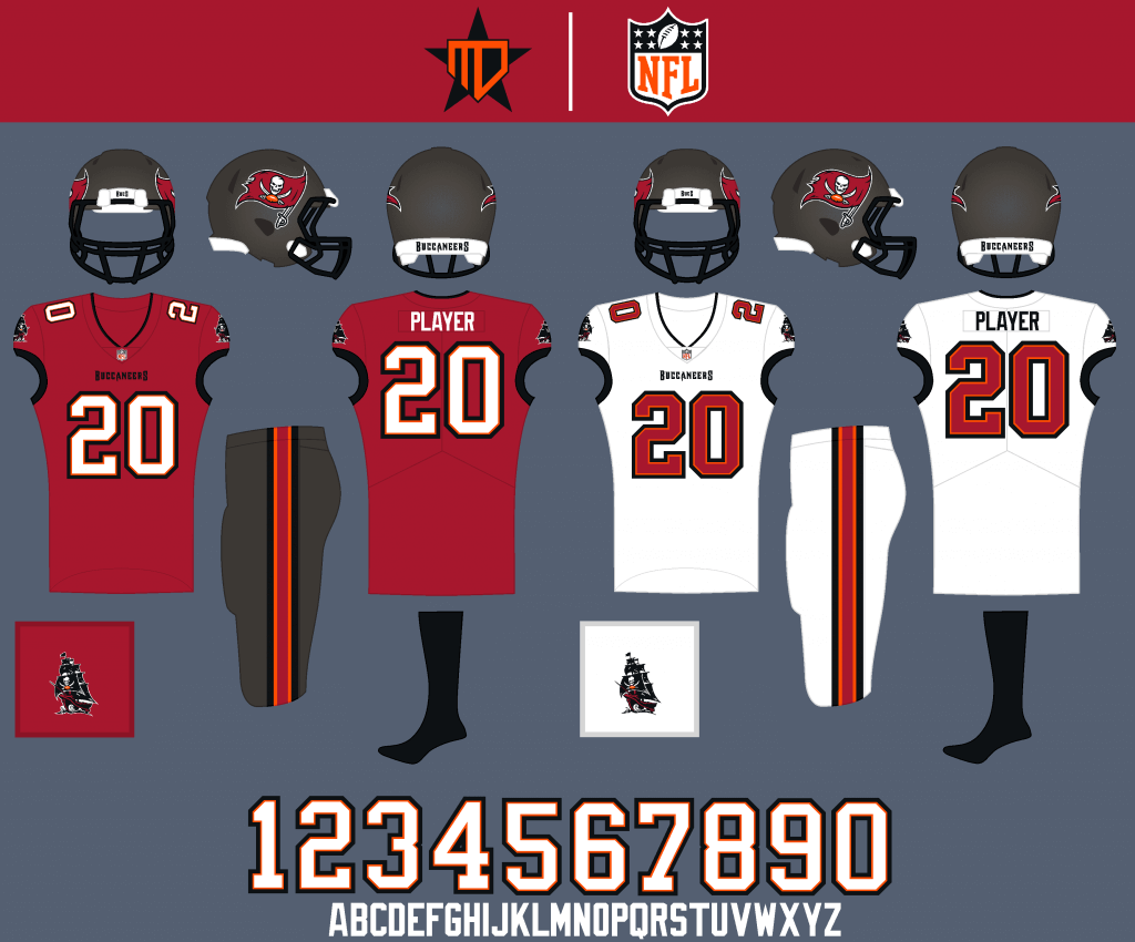
The new uniforms are pretty much perfect, so I barely changed anything. The logo is an updated, more rugged version that @BucsBoy02 from sportslogos.net graciously allowed me to use.
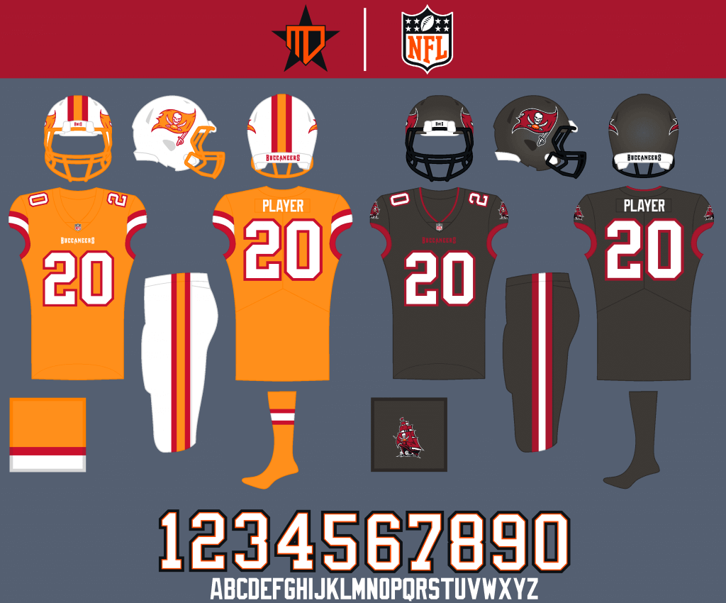
I had to go with a creamsicle fauxback for the alternate, and pewter remains as the Color Rush.
NFC WEST
Arizona Cardinals
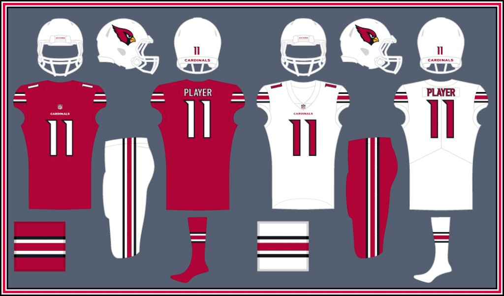
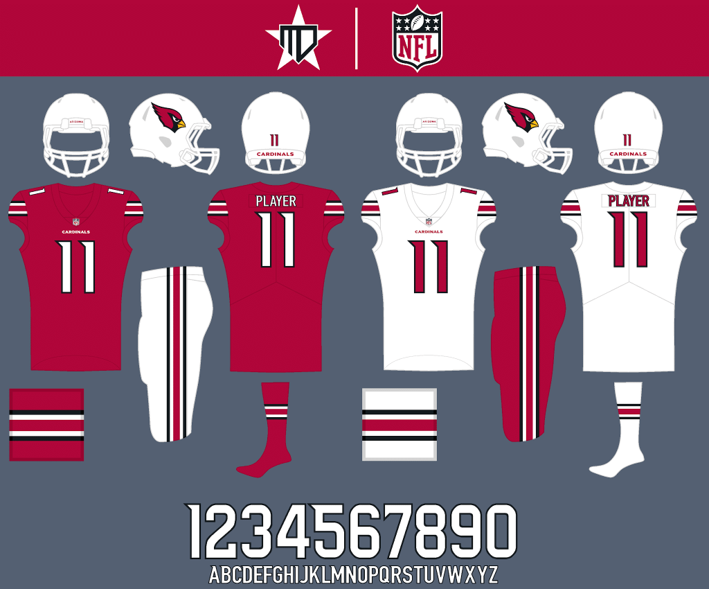
This set is inspired by uniforms prior to the 2005 redesign, but with modern twists to the number font and the current logo.
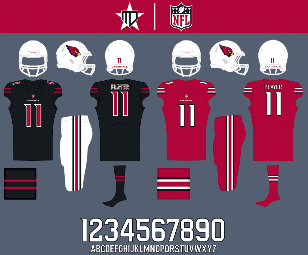
A black alternate stays in the rotation, and cardinal red becomes the Color Rush.
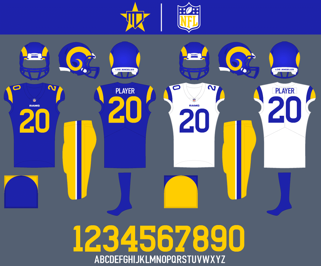
Los Angeles Rams
I just cleaned up some of the unnecessary details of the recent redesign, removing the segments from the horn, removing the gradient numbers, and returning to a pure white away jersey. The number font comes from @nate.sweitz at sportslogos.net.
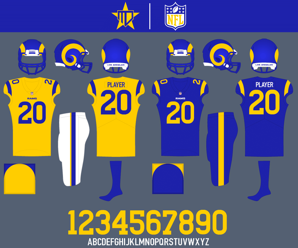
A yellow alternate is added inspired by the 50’s Rams home uniform, and all-royal blue is reserved for the Color Rush.
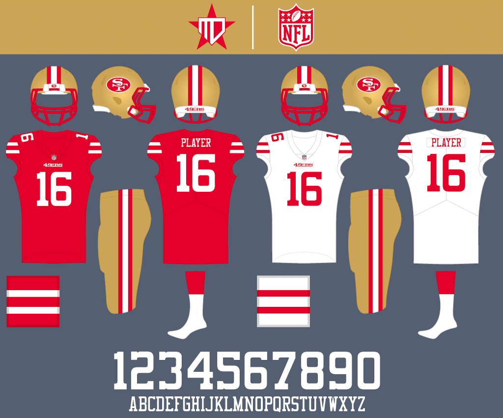
San Francisco 49ers
Not much changes to this classic uniform set, I just removed black from the logo, went with a red facemask, and implemented a custom number font inspired by the primary logo.
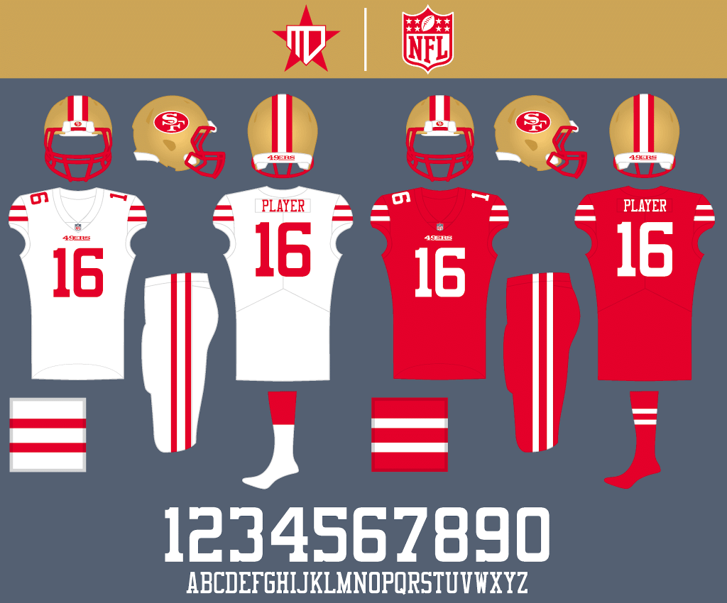
White-on-white could be worn once or twice in a season, and red replaces black as the Color Rush.
Seattle Seahawks
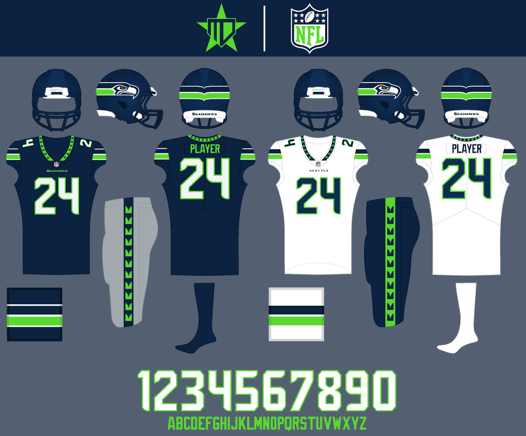
I went with a slightly more traditional design for the Seahawks, with sleeve striping inspired by the primary logo and the original home uniform. I made the numbers on the home uniform white for better readability, but kept the gray pants.
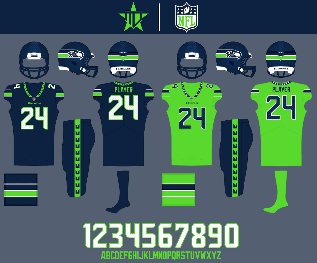
All-navy could be worn for about half of the home games in a season, and lime green stays as an alternate.
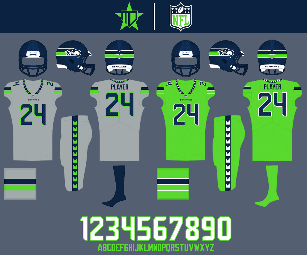
Wolf gray also stays as an alternate, and lime green stays as the Color Rush.
Thanks, Matt! And that’s the last set of Matt’s NFL full redesign concepts. Readers? What say you?


Help Wanted Guest Picker Needed!
For reasons that will be more fully explained tomorrow, the Five and One (Five good looking games and one stinker), which has been ably handled by Michael “Memal” Malinowski” for the past two NCAA Football Seasons, will be retiring after his final swansong 5 & 1 tomorrow.
So for the remainder of the season, I’m looking for one (or more) “Guest Pickers” to round out the rest of the NCAA Football year. As anyone who reads the Sunday Morning Uni Watch knows, this is a totally thankless important part of the SMUW, whereupon the picker chooses five (counting down from fifth-best to best looking, and then the worst-looking) games from the that weeks set of games. What constitutes “best” or “worst” is almost always a matter of opinion, but the general “rules” would be how good (or bad) the two teams playing look when taken together and can be based on many factors, but primarily unis. Other factors can include day vs. night, turf vs. grass, sun vs. clouds (or snow/rain/mud, etc.), lighting, field color, etc., all of which have an effect on the overall viewing pleasure. It’s not a requirement that either team boasts a great looking (or horrible looking) uni set, although it usually helps, but rather how the teams look together. Contrast is always a plus. But other factors, such as the camouflage effect, or inclement weather can affect how good/bad a game looks. Some color vs. color games can look great while others, maybe not so much. Some may think games that look like scrimmages look good. Some games may have colorful unis that really don’t mix. While it’s all opinion (or at least in the eye of the beholder), and sometimes teams who have beautiful matchups (and top 5 potential) can also be bottom feeders in a different season.
So…
I’m looking for a guest picker (or maybe several) who’d like to display his or her 5 & 1 chops beginning next weekend, and through the end of the bowl season. If you’re interested, please shoot me an e-mail (Phil.Hecken@gmail.com) and I’ll go over the parameters. It’s simple in that you will need to select your best 5 and worst 1 (and an honorable mention if warranted) games for the current week’s slate of games. In addition to finding one “splash” photo, you’ll need to find at least one other photo from the game about which you are writing (basically just use the same format we’ve had for the past decade). Depending on your level of interest, and how well things go, the guest 5 & 1 picker may become a permanent position (or it may be something that rotates throughout the readership). But if you would like a chance to show you’ve got what it takes to create the 5 & 1, let me know.
OK? OK!


Guess The Game…
from the scoreboard
Today’s scoreboard comes from birthday boy Christopher Hickey (Happy Birthday Chris!!!!).
The premise of the game (GTGFTS) is simple: I’ll post a scoreboard and you guys simply identify the game depicted. In the past, I don’t know if I’ve ever completely stumped you (some are easier than others).
Here’s the Scoreboard. In the comments below, try to identify the game (date & location, as well as final score). If anything noteworthy occurred during the game, please add that in (and if you were AT the game, well bonus points for you!):
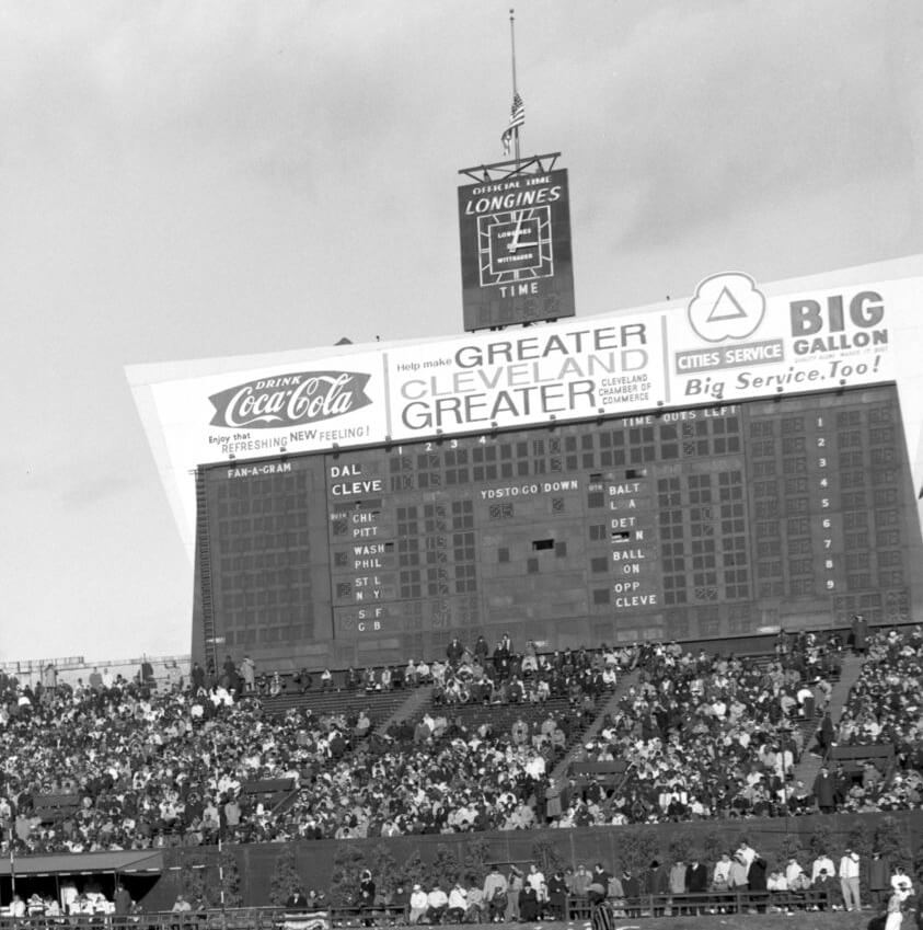
Please continue sending these in! You’re welcome to send me any scoreboard photos (with answers please), and I’ll keep running them.


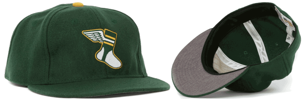

ITEM! Cap raffle: Paul here. Today is longtime reader Chris Hickey’s birthday, and he’s celebrating by generously covering the cost of a Uni Watch Classic Cap for one lucky reader.
This will be a one-day raffle. U.S. residents only, sorry. The winner can choose any fitted size from 7 to 8, or adjustable/strapback. To enter, send an email with your mailing address and preferred size/format to the raffle address by midnight Eastern tonight. One entry per person. I’ll announce the winner on Monday.
Big thanks to Chris for doing this — happy birthday, buddy!


The “BEST OF” Kreindler’s Korner
Hey guys & gals. You’ve enjoyed Kreindler’s Korner for several years now, mostly on the weekends, on Uni Watch, but with the recent coronavirus outbreak, Graig’s time is just too precious and he needs to tend to other things besides coming up with a new writeup each weekend.
So, going forward, for as long as the COVID-19 situation is bad in New York, I’m going to run a few “Best of’s” until Graig returns.
Here’s today’s offering:
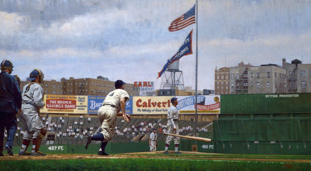
Title: “Gehrig, Gordon and Glenn Back Gomez”
Subject: Lou Gehrig, 1938
Medium: Oil on linen
Size: 58″ x 32″Only 2,773 fans showed their faces at Yankee Stadium on the warm afternoon of September 27, 1938. With the pennant locked up for New York and the cellar-dwelling Senators in town, there wouldn’t be any meaningful action in the city until a little over a week later against the eventual National League champions. In the fifth inning of the contest, Lou Gehrig stepped up to the plate with no one on base and launched his 29th homer of the season off of a Dutch Leonard knuckleball. The ball landed in the Washington bullpen in right field, abruptly scattering the sleepy-eyed relievers benched behind the small fence, and was good for the Yankees’ fourth run of the day. In the end, New York beat the Senators, 5-2.
The Yanks would face Chicago in that year’s World Series, and Red Ruffing would get the nod to open the series for New York. The Bombers easily dispatched of the Bruins in four quick games, flaunting the fine-tuned machine that steamrolled through the American League that regular season. The veterans Bill Dickey and Frankie Crosetti contributed big for the Yanks, as did youngsters Joe DiMaggio, Tommy Henrich and Joe Gordon.
Virtually missing from the action, however, was Gehrig. Hitting only four singles in fourteen at-bats in the series, Lou drove in no runs – a sharp contrast to his usual post-season output. In his previous six series, he had averaged .386, hit 10 homers and batted in 35 runs. The first basemen had a solid 1938 season, though by no means was it standard fare for the great man. He batted .295, hit 29 round trippers and drove 114 runs home – which was a far cry from his stats in 1937, when he batted .351 and slugged .643 – and fans in New York started to think that he had begun the eventual decline of the aging athlete. It is fair to say that nobody seriously considered that the Yankee captain might have been ill.
Gehrig’s homer that September 27th afternoon would be the 493rd of his career, and ultimately, his last.
Thanks, Graig! You can (and should!) follow Graig on Twitter.


Click to enlarge
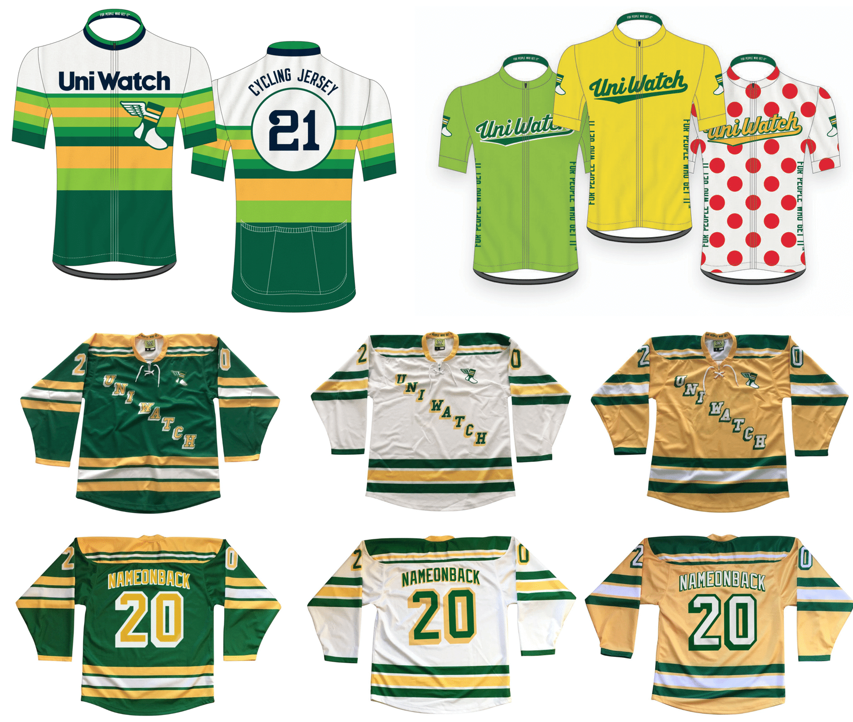
Merch reminders: Paul here again. In case you missed it, we’re once again taking pre-orders for another round of Uni Watch hockey jerseys, tequila sunrise cycling jerseys, and Tour de Uni cycling jersey — all available with your choice of number and NOB.
You’ll need to get your order in by Dec. 11, and they should arrive by mid-January. (Sorry, too late for Christmas delivery — mea culpa on that.) Full details here.
And as long as we’re talking merchandise, keep the following points in mind:
• The Uni Watch Classic Cap, which normally costs $39.99, is now only $35.99 — a 10% break. All fitted sizes are currently in stock, along with the adjustable strapbacks.
• I’ve also reduced the price of Uni Watch trading cards. Full details here.
• You can see our full range of merch offerings here.
My thanks, as always, for your consideration.


And finally… that’ll do it for today. Sorry there’s no ticker, but Paul gave Anthony the day off for Black Friday, but I’ll have a full ticker tomorrow, including anything that had been sent in yesterday.
Big thanks (again) to Matt Drake for his wonderful set of NFL redesigns! I may not agree with some of them (and some are spectacular!), but it’s definitely a fun little project and very well executed.
Everyone have a good Saturday (and stay safe!) and I’ll catch you fine folks back here tomorrow with the SMUW crew. Don’t forget to e-mail me if you have any interest in becoming a Guest Picker for the 5 & 1 (for next weekend and possibly beyond). If there’s a lot of interest, I may pick a couple potential candidates to fill out the remainder of the season (and be looking towards next season for a full time replacement). Get those “résumés” ready!!!
Peace,
PH
Great job, Matthew. Pretty much love the revisions. Couldn’t believe that I’d like any changes to the Bears set, but they work.
Thank you! Yea, I knew I didn’t want to change the Bears much at all, they’re definitely one of the best identities in the league.
GTGFTS: Not the most important thing involving Dallas on November 24, 1963, but the Cowboys were in Cleveland.
The NFL redesigns are again, much more food than bad. Cardinals, Saints, Seahawks are big upgrades. Rams and Falcons undid a lot of mistakes and are a step in a better direction. I get the idea behind making uniform numbers match wordmarks but it doesn’t work as well in practice as it does in theory. The wordmarks were designed to represent the team name, not uniform numbers. Italicized numbers look good on race cars, not NFL jerseys. And the right move on the Vikings would be to drop the sails on the numbers, not add more sails!
Thank you MJ! Yea, I know it’s an unpopular opinion, but I actually like the sails on the Vikings numbers, that and the sleeve striping add a bit of a modern flair to an otherwise traditional uniform.
Thank you MJ! I know this is an unpopular opinion, but I actually like the sails on the numbers and the sleeve stripes for the Vikings, they add a modern flair to what is otherwise a traditional uniform.
Nice Job Matthew. I can’t believe I’m writing this but I really like the Packers yellow Jersey. Panthers and Falcons are also fantastic.
Thank you Basti! The Packers alternate was definitely a bit of a gamble, but I’m happy with how it turned out.
Thank you Basti! The Packers alternate was a bit of a gamble, but I’m happy with how it turned out.
Fun to see those big old scoreboards in football mode.
Name the Game is 11/24/63 after JFK was assassinated. Flag at half-mast. Dallas @ Cleveland.
Just a nitpick with the Lions silver uniforms. Why are the number still white instead of honolulu blue? It never pops enough in my opinion.
Just a nitpick with the Lions silver uniforms. Why are the number still white instead of honolulu blue? It never pops enough in my opinion. Also I really like the falcons design, although if they would just remove the side panels the uniforms would be one of my favorites in the league.
I tried Honolulu blue with the gray uniform, but I just liked the white better, personally. It was a tough call though, as both options looked pretty good.
Just a nitpick with the Lions silver uniforms. Why are the number still white instead of honolulu blue? It never pops enough in my opinion. Also I really like the falcons design, although if they would just remove the side panels their current uniforms would be one of my favorites in the league. I also really don’t like the bears orange unis at all. The navy numbers do help though. Also with the Vikings I really like the normal purple jerseys and pants put together as a combo, because both of the stripes look like the horn. I also really liked the new white pants that make them consistent. I do like the rams helmets a lot more because of the normal horns, and that consistent color with the jersey. The yellow pants stripe should be bigger in my opinion though. Great Job!
I went with the white numbers as opposed to the Honolulu blue just due to personal preference. It was a tough choice though, as both options looked really good.
I never noticed how the Vikings stripe looks like the horn color-wise, thanks for pointing that out!
Love the Cardinals design, except for the number font. I’d probably get rid of the black jersey, but technically black is one of their official colors, and this one looks good as long as they don’t bring black pants into the mix. Actually red pants with this black jersey would look really good, especially with a red face mask. I like the white face mask replacing the grey, but I’d probably prefer red. Or even change it out depending on what uniform they’re wearing.
Lions look great! I’d like to see a white pants option for the road
Thanks! That wouldn’t be a bad option!
As was correctly said, the game in Cleveland was being played on 12-24-1963, two days after JFK was killed. The Dallas reporters covering the game were VERY nervous about the reception they would receive, but other than some of them being ingnored, no major incidents. And of course, no TV.
Sound designs all around. But as mentioned above, retaining and even doubling down on those hideous Vikings numbers is fortifying the first thing I would eliminate.
Thanks Craig!
That scoreboard is the Cowboys vs Browns, November 24, 1963, in Cleveland.
The Browns won that game 27-17, but it is most notable for being played 2 days after President John F. Kennedy was assassinated in Dallas, leading towards a lot of animosity being directed at the Cowboys.
The opinion nobody asked for: Matthew nailed the Saints and Rams redesigns and showed appropriate restraint with the classic designs. Very nice!
I think more work has to be done on the Falcons and Cardinals unis, but I don’t think it’s Matthew’s fault. The Falcons have had so many designs over the years that no combination seems right. The Cardinals have been so plain that it’s hard to come up with something that doesn’t look overdone. I think they should embrace their plainness and go for a Penn State-ish look. It would work for them.
Anyway — THANK YOU MATTHEW!
Thank you Jim! I really appreciate it!
Love the redesign of the saints, cardinals, rams, panthers. I think that black should be removed from the buccaneers uniform. Pewter facemask, red socks with red home jersey, pewter socks with the all white uniform. I think more white outlining the lions numbers and pants stripes makes the uniform pop more. I think the blue/silver combo is one of the nicest in the NFL. I would incorporate gold trim into the 49ers white jersey numbers and stripes and pants and add a white sock with gold and red stripes. I always thought a face mask color that matches the gold helmet was best. I liked the red/silver/black colors of the falcons and would like to see a black helmet ,red jersey, silver pants, black and/ or red socks.
Thank you Gary! Personally, I think black is essential to the Bucs identity, as pewter tends to blend in with the red & orange when applied to the number outlines.
I applaud both the skill and attention to detail in the redesigns.
But, in my opinion, no team needs six different uniforms.
Thank you!
Are you referring to uniform combinations? I don’t believe any of the teams have six different jerseys. I do like having the option of mixing and matching, though.
Coach and GM Fired in Detroit…maybe the start of another redo of the Lions kit.
My one favorite touch of all the redesigns is its change of one of the two “stripes” in the Seahawks’ helmet emblem to green. Of the many things that rub me the wrong way about the current Seahawks uniform is how the one “stripe” on the current helmet emblem is gray when, to my eye, the helmet desperately needs more green to balance out the overall design.
Thanks! Yea, I don’t like how the gray touches the white in the current logo, so I felt that green was a proper replacement. Plus, it allowed me to incorporate the stripe design into the jersey without using too much gray.
Thanks Paul and Phil!
Glad to see many responses to GTGFTS.
Great redesign work again, Matthew! I think the 49ers might be better suited in a white face mask and the Cards in a red one.
Thanks Chris! I never thought of trying a white facemask for the 49ers, that might be worth a shot!
Great job on the NFL concepts! Pretty much every set is equally as good, if not better, than what the team actually uses! Only one that doesn’t work for me is the Packers mainly because I can’t see them using that font for the numbers. But still, good effort. And that 50s set for the color rush is exactly what I’d want to see them try.
Thank you Jonathan! Yea, the more I looked at the Packers numbers, the more I didn’t like them. Not to plug, but if you follow my Twitter (@MJD7Design), I’ll be posting an update soon with the regular numbers.
Fantastic redesigns, Matthew. Glad you added a colored face mask to Cardinals helmet, but wondered if you considered adding stripes that match the pants to it as well? I’ve always thought the white Cardinals helmet with gray face mask and no stripes looks too basic – essentially just a store-bought helmet with a decal slapped on it.
Hi Matthew,
I really like the re-designs. The Saints are spot on. Everything is an improvement to what I see now.
As a Seahawks fan, I appreciate the shoulder stripes similar to the original uniform design. I just wish you did a retro Seahawks design. :)
Thank you,
Matt La Fon
Looks like you have an incorrect name of the opposing World Series team in the Gehrig piece.