By Phil Hecken, with Matthew Drake
Follow @PhilHecken
Hey boys and girls, how’s everyone doing today? Good thing nothing big happened this week. Hope yours was a good one. I’m absolutely physically and mentally fried myself.
Back when the pandemic was just beginning in March and April, today’s featured artist, Matthew Drake, share with us a number of Major League Baseball redesigns, which seemed to be quite well-received by the readership. I asked Matthew at the time if he had any NFL redesigns, as I wanted to run those during the football season (if there was one). Well, with just a few fits and starts, we have made it about halfway through the football season, so I wanted to begin running his concepts while we’re still following the Sunday gridiron hijinx. Like the recently-run concepts by Bowen Hobbs, there are lots of graphics for each team, so I’m going to be running these in smaller sets. Today we’ll take a look at the AFL East and North Divisions.
Lets get started:
AFC EAST
Buffalo Bills
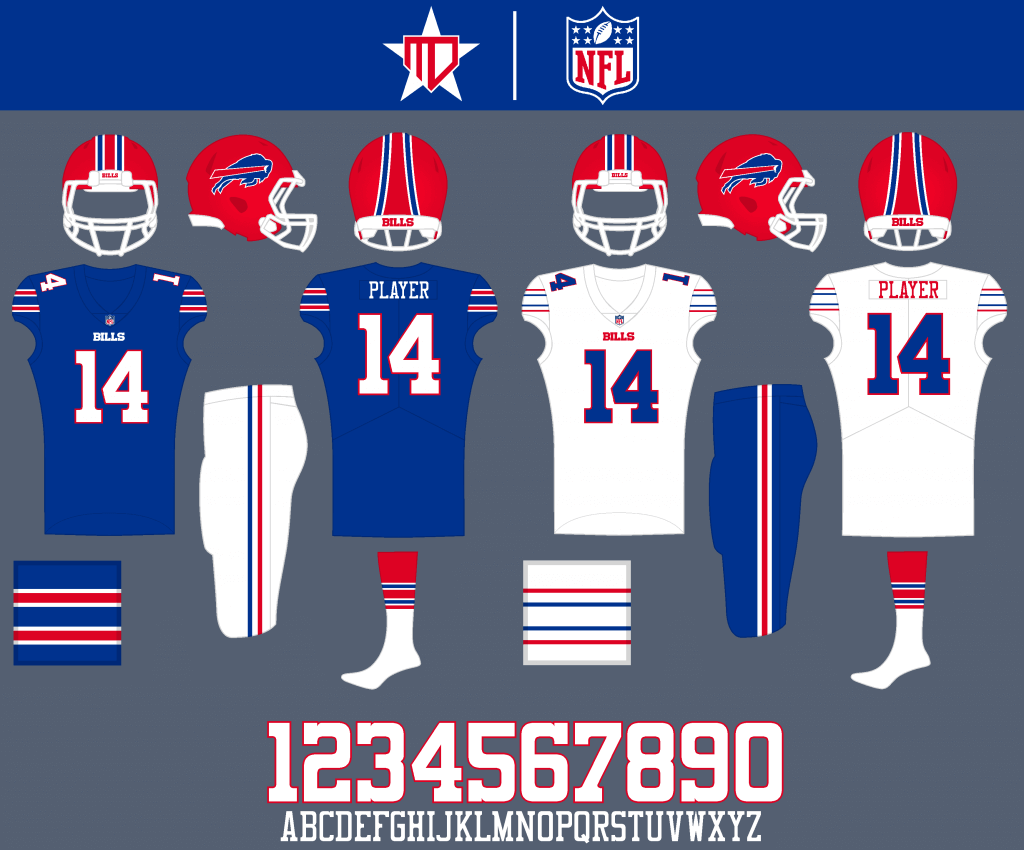
The striping is inspired by the logo “streak” and the throwback jersey. The number font is inspired by the wordmark.
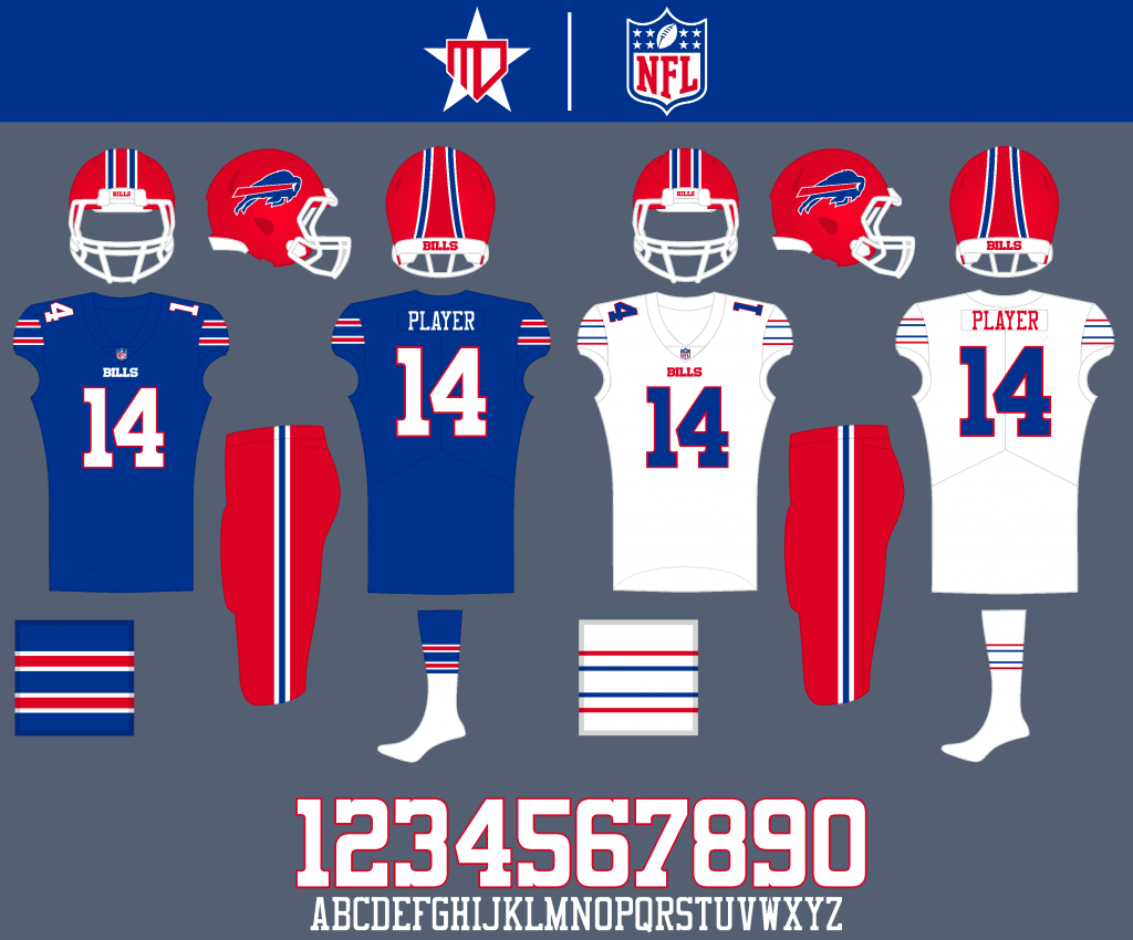
Red pants are added as an option.
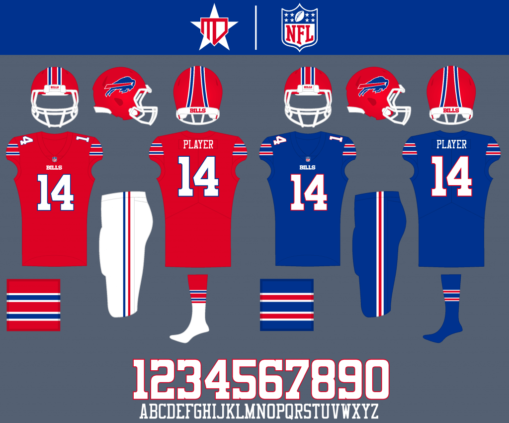
A red alternate is added as inspired by the Color Rush, though that uniform is now blue.
Miami Dolphins
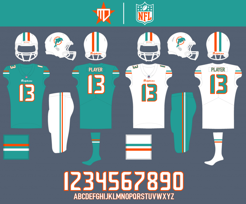
The number font is a modified version of the Seahawks font, and a simplified striping pattern gives the Dolphins a clean, sleek look. I also combined the shape of the previous dolphin logo with the design of the current one.
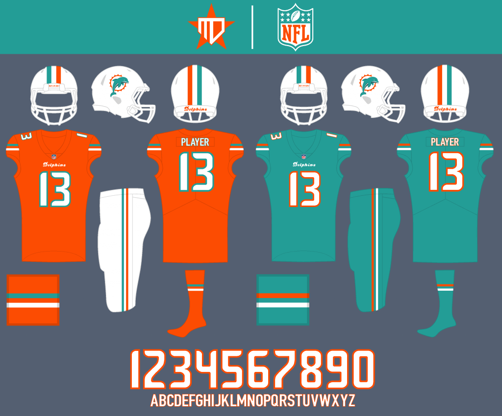
I added an orange alternate back into the rotation, and aqua becomes the Color Rush.
New England Patriots
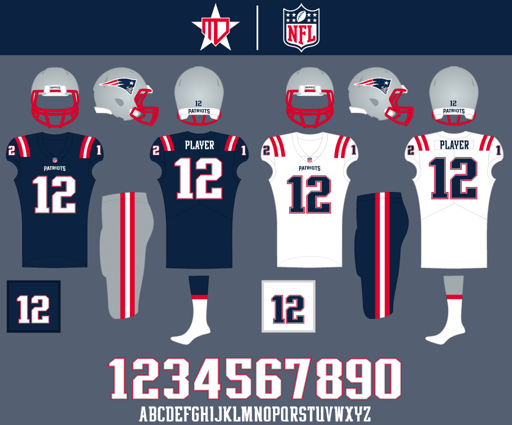
I kept the prior number font, and added silver pants back into the rotation. I also made the middle stripe white on the away to mimic the American flag.
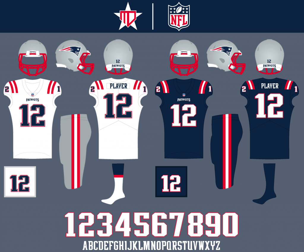
Silver pants could be worn often on the road, and the navy Color Rush remains pretty much intact from what it was before.
New York Jets
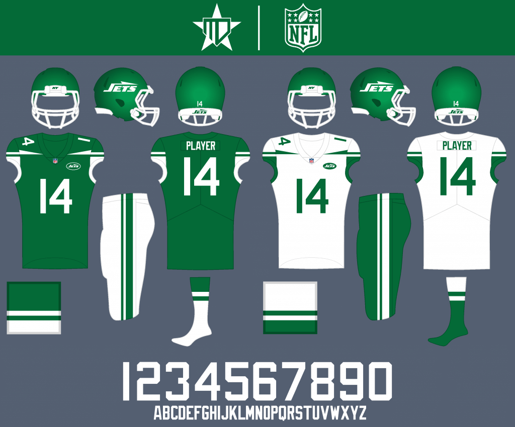
A truer kelly green makes a full-time return, along with a stripe design that blends the Jets past two looks.
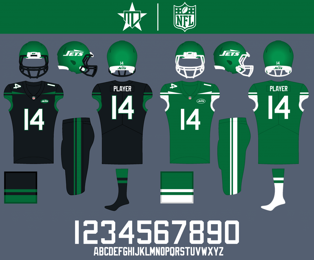
I couldn’t help but keep black on as an alternate, but kelly green is the Color Rush.
AFC NORTH
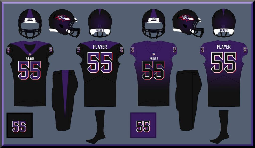
Baltimore Ravens
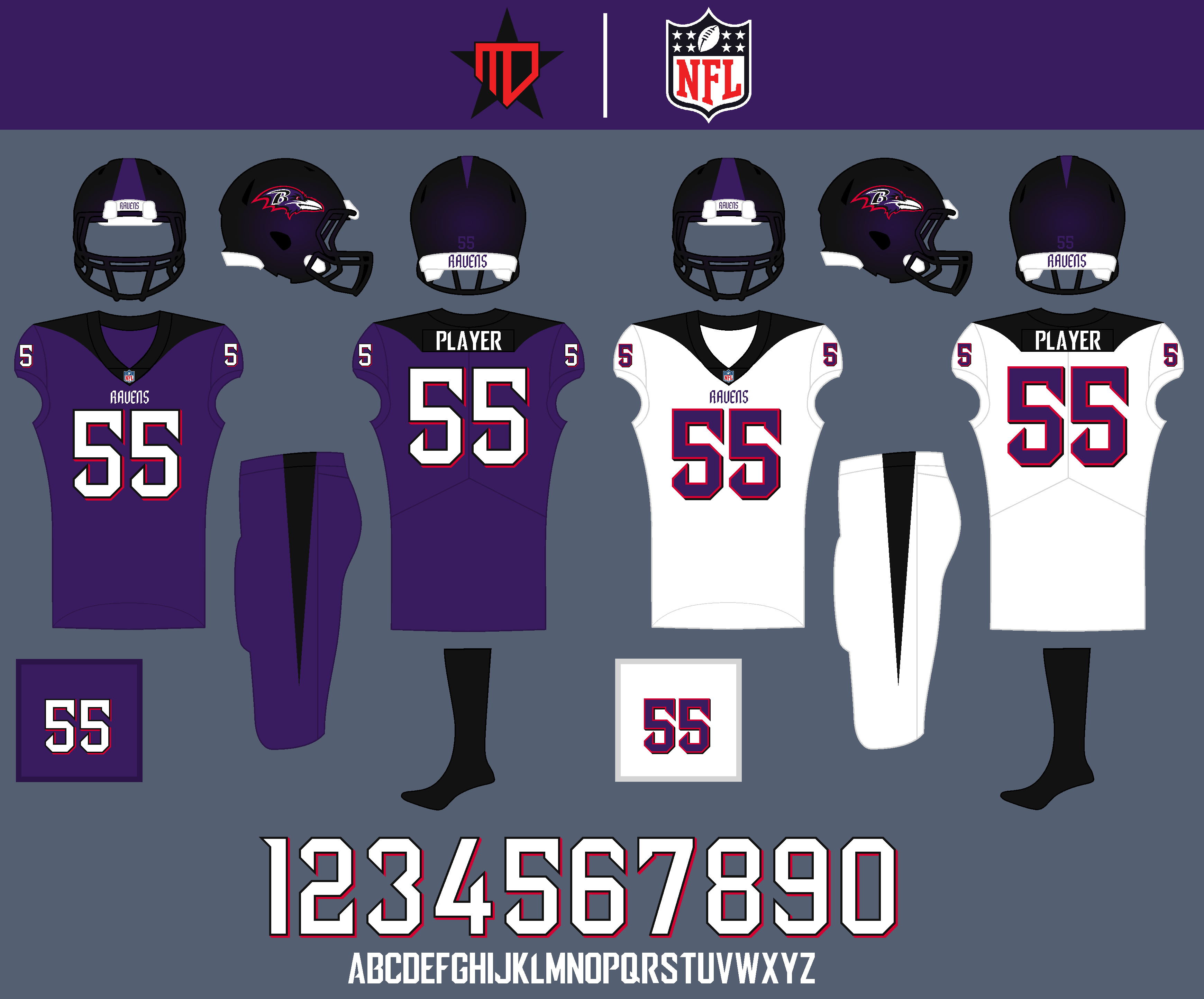
This is one team that I completely redesigned, the “cape” design around the collar comes from the 1967 Steelers, inspired by @oldschoolvikings on SportsLogos.Net. The helmet has a black and purple “sparkle” effect to it, similar to the old Jags helmet, mimicing the sheen of a raven’s feathers.
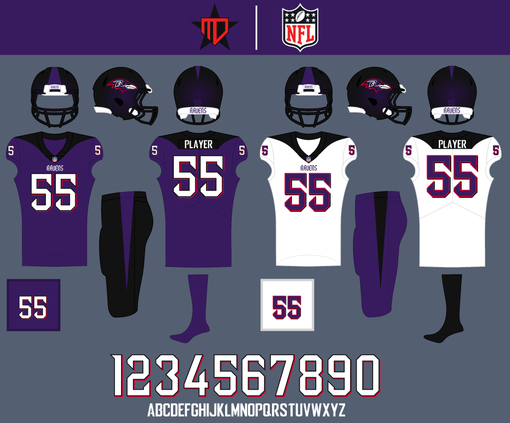
Although the Ravens are one team I would actually prefer monochrome for, they could switch the pants up on occasion.
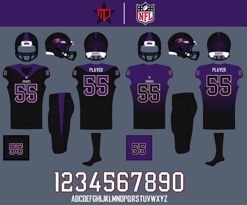
The all-black creates a menacing primetime look. This might be too bold, but I think the gradient effect could work better for the Ravens than it does for the Falcons, so I decided to implement that for the Color Rush.
Cincinnati Bengals
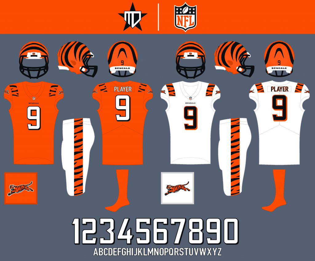
Orange becomes the primary jersey, and the striping is inspired by past Bengals designs.
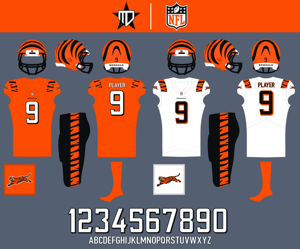
I’d like to see the Bengals wear black pants maybe about half the time.
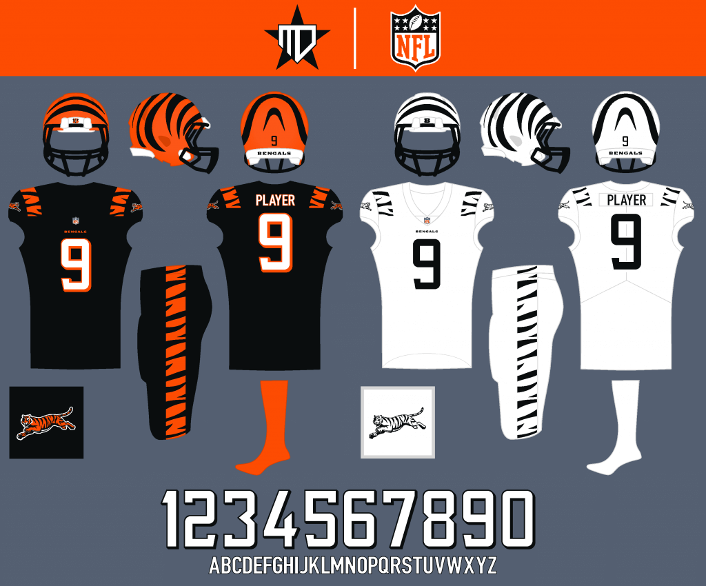
Black becomes the alternate jersey for primetime games, and I couldn’t help but go all-out with the “white tiger” Color Rush.
Cleveland Browns
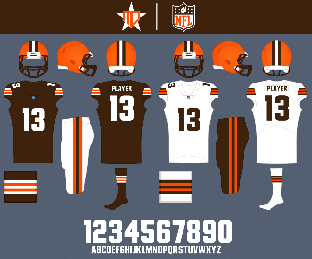
The team’s new uniforms are pretty much perfect, so I decided to just try out a number font that more closely resembles the Browns’ font.
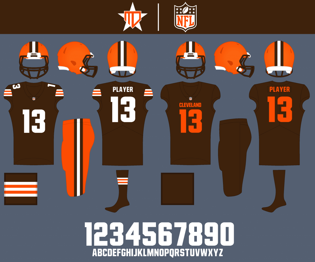
Orange pants rightfully stay on as an option, and I added the “CLEVELAND” wordmark back to the Color Rush, while stripping away all other design elements to focus on the iconic helmet.
Pittsburgh Steelers
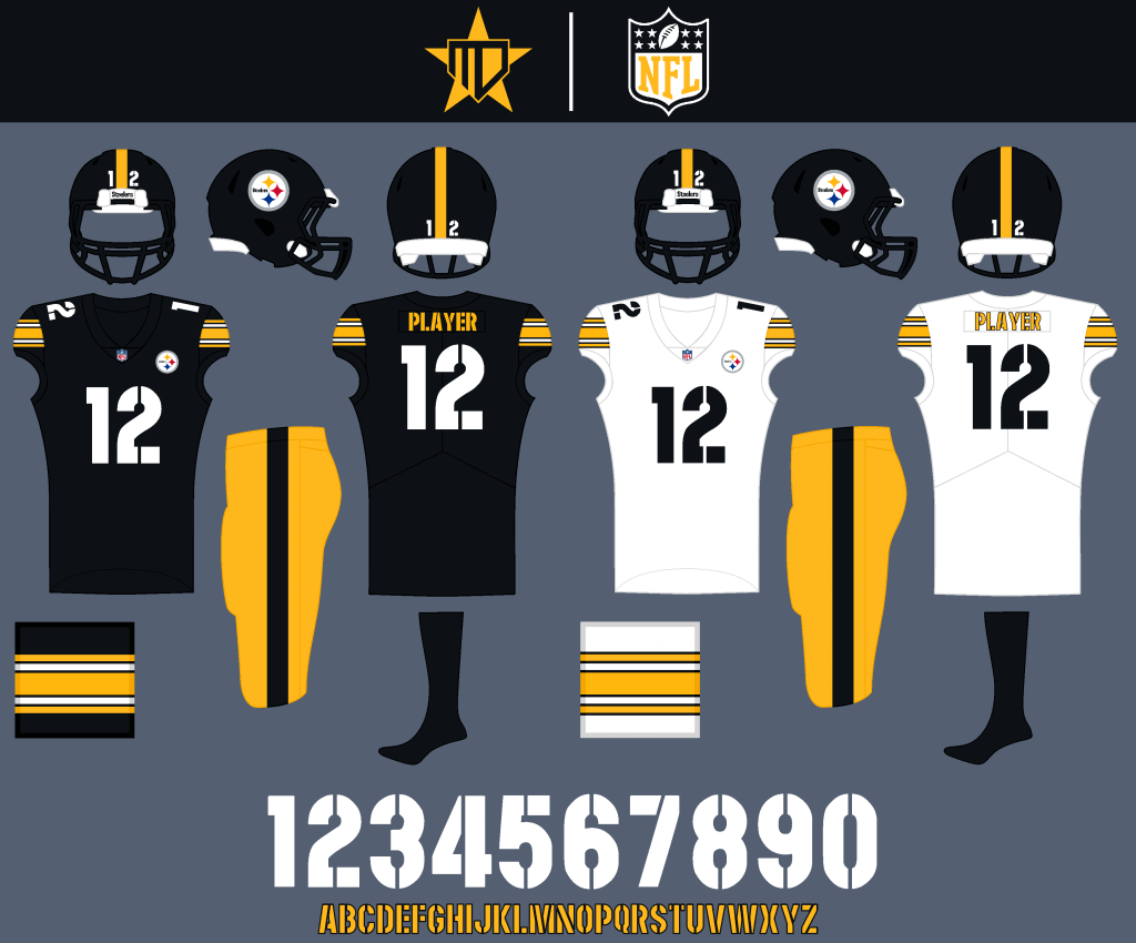
A more industrial font replaces the italics, better matching the wordmark.
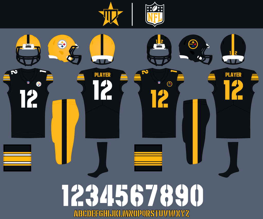
I gave the Steelers an alternate helmet as opposed to a jersey, and the Color Rush basically replaces all white elements of the jersey with yellow.
Thanks, Matt! I’ll be back soon with Matt as we look at some more of his NFL concepts. Readers? What do you think so far?


Guess The Game…
from the scoreboard
Today’s scoreboard comes from Charlie Fogg.
The premise of the game (GTGFTS) is simple: I’ll post a scoreboard and you guys simply identify the game depicted. In the past, I don’t know if I’ve ever completely stumped you (some are easier than others).
Here’s the Scoreboard. In the comments below, try to identify the game (date & location, as well as final score). If anything noteworthy occurred during the game, please add that in (and if you were AT the game, well bonus points for you!):
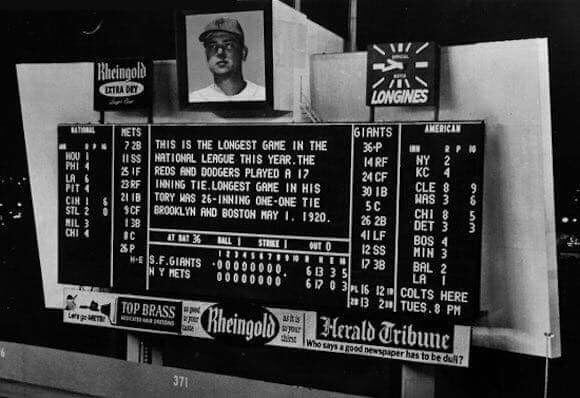
Please continue sending these in! You’re welcome to send me any scoreboard photos (with answers please), and I’ll keep running them.
The “BEST OF” Kreindler’s Korner
Hey guys & gals. You’ve enjoyed Kreindler’s Korner for several years now, mostly on the weekends, on Uni Watch, but with the recent coronavirus outbreak, Graig’s time is just too precious and he needs to tend to other things besides coming up with a new writeup each weekend.
So, going forward, for as long as the COVID-19 situation is bad in New York, I’m going to run a few “Best of’s” until Graig returns.
Here’s today’s offering:
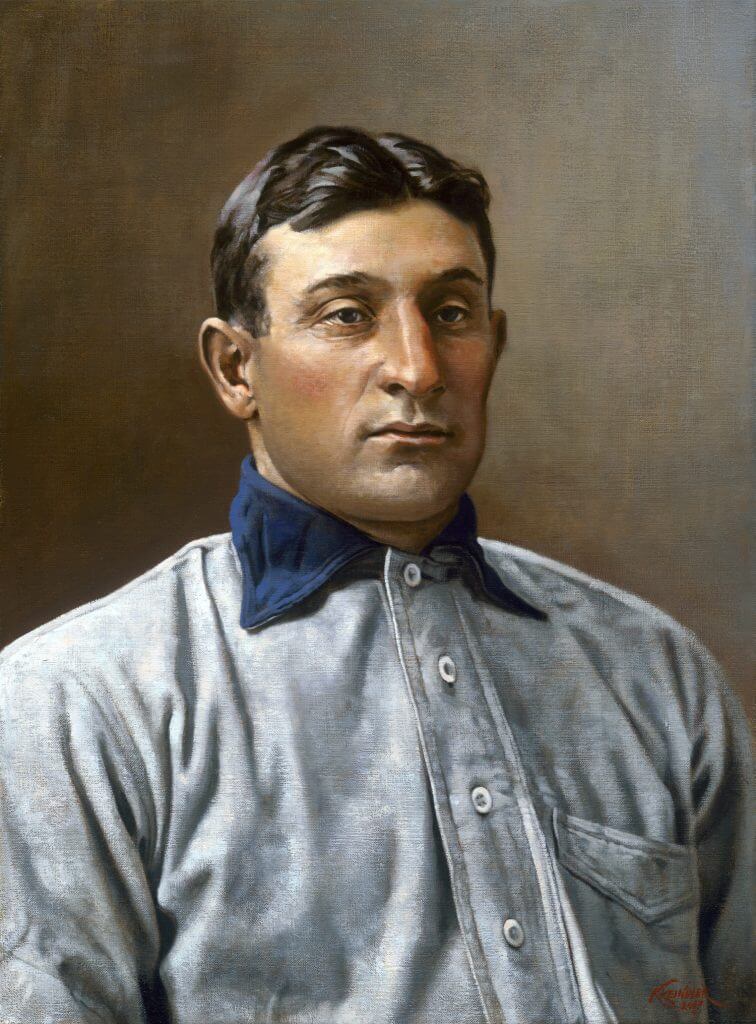
Title: “Hans”
Subject: Honus Wagner, 1902
Medium: Oil on linen
Size: 16″ x 22″Like a multitude of baseball card collectors, I’ve always been fascinated with the T-206s. A card set that was dispersed by means of cigarette and loose tobacco packs, it circulated between 1909 and 1911. Consisting of 524 cards through 16 different brands that were owned by the American Tobacco Company, the set is best known for including a card of Honus Wagner, which to this day is widely considered the Holy Grail of the card collecting industry. The rarity (and story behind that rarity) of the card accounts for its desirability, which was a hot item among early collectors of the set merely a decade or two after its release. The most expensive example to ever sell fetched almost three million dollars, still the most ever paid for a baseball card.
The appealing part of the set to me lays in the images used in the lithography process. The majority of the studio portraiture came from the lens of the Swedish-born Carl Horner, a photographer who was based out of Boston, MA. One of the earlier lensmen of the sport, his depictions of players from the Deadball Era were known for their striking clarity and rich tones. In addition to finding a home in the world of baseball cards, Horner’s work also appeared in numerous newspapers, magazines and board games that were consumed in those first decades of the 20th century.
When I started getting serious about painting portraits of baseball players, I was immediately drawn to those same images that were used to create the T-206 set. I had always envisioned having a gallery show displaying paintings of just those subjects found in that issue – kind of a life-long project. I didn’t want to just paint the faces of these men as they related to the cards, especially considering many of the colorful pastels found in the backgrounds – though those motifs lent themselves nicely to the card designs, I was after a more true realism. It was my goal to try and mimic what it was that Carl probably saw in his viewfinder when he himself took these portraits: polished faces of tough men in their clean uniforms, lit by a northern skylight and backed by a simple muslin curtain, seemingly gazing into the ether.
The Wagner painting was my first attempt, and definitely not my last.
Thanks, Graig! You can (and should!) follow Graig on Twitter.
The Ticker
By Anthony Emerson

Baseball News: The Jacksonville Jumbo Shrimp, Double-A affiliates of the Marlins, have partnered with St. Johns River watchdogs St. Johns Riverkeeper and the state government to offer Florida drivers a Jumbo Shrimp license plate (from @904craftbeerdad).

NFL News: Packers G Elgton Jenkins wore a mask under his helmet during the final play on Thursday night. It wasn’t there for the entire game, as Jenkins had donned it ahead of the post-game handshakes and mingling. … More punishments dropping for mask violations: Steelers HC Mike Tomlin has been fined $100,000 and the team $250,00 for mask violations against the Raiders (fr0m Mike Chamernik). … ESPN has a nice piece on the revival of quarterbacks wearing No. 1, ahead of the Tua/Kyler showdown (from Nicklaus Wallmeyer). … Also from Nicklaus: The Seahawks have filed a trademark for the phrase “Let Russ Cook“. … Here’s a shot of then-Niners QB Jim Plunkett still wearing Patriots shoes on the sidelines. … New Saints wordmark? “I recently signed up for a virtual 5K run the New Orleans Saints organize, and I received my t-shirt and medal the other day,” says Rich Loup. “Note the wordmark for “New Orleans Saints” in the medal picture.” He adds, “I didn’t think much of it until I got this promotional email from the Saints today with the same wordmark.”
College/High School Football News: DKPittsburghSports posted a photo of players at Penn State practice appearing to wear rugby scrum caps over their helmets. Odd (from John Dankosky). … NC State QB Bailey Hockman was wearing a Russell Wilson patch during last night’s game (from Danilo Roman). … Southern Miss is going black-grey-white with a stars-and-stripes helmet decal. … Mississippi State’s “flying M” helmets will be worn today. … So remember those grey camo unis Indiana was supposed to wear this weekend? Turns out that’s not happening, due to a lack of contrast with Michigan’s away unis (thanks to Phil and Mitch Purcell). … Marshall is going with white helmets and green jerseys today, with a camo pattern in the helmet decal (from @RL_Ely). … Nike and Texans QB Deshaun Watson have donated uniforms honoring George Floyd to Alabama’s Yates High School, where Floyd graduated in 1993 (from Timmy Donahue).

Hockey News: This pic of new Blue Jackets C/LW Max Domi in Blue Jackets practice gear is also our first look at the new Blue Jackets pants (from Wade Heidt). … Michigan Tech has announced they will reveal a fifth sweater sometime next week (from Shane Brown).

NBA News: The Sixers will reveal their new “City Edition” uni next week, and they’ve brought Allen Iverson back to help with the launch (from @UntillTheNight). … Here’s an immensely satisfying video of the resurfacing of an old court in Sioux Falls’ Sanford Pentagon (from Greg Enkers).

Soccer News: New home kit for Argentine side Newell’s Old Boys — which, as an aside, is my single favorite football club name in the world (from Ed Żelaski and Germán Cabrejo). … Southampton FC have added poppies to their corner flags ahead of Remembrance Day (thanks, Jamie). … UNC men debuted new GFGS unis ahead of last night’s match against Duke (from James Gilbert).

Grab Bag: Have we ever featured an English muffin anniversary logo before? (from John Cerone). … Also from John, a correction to an article we posted on Thursday: Under Armour’s shift away from wholesalers does not impact the promotional products industry. … Whole Foods has banned Canadian employees from wearing poppies, causing an uproar in Canada (from Michael Sullivan).
And finally… thanks to Matt for the NFL concepts.
2020 sure has been fun so far, huh? What a week. But…lots of college football today (including the return of the PAC-12 and the Oregon Ducks! — so PAC-12 & Duck Tracker Dennis Bolt will make his long-awaited return tomorrow on the SMUW) to take our minds off of…well, everything.
You guys stay safe, sane and well, and I’ll catch you tomorrow with the SMUW crew and a full rundown of today’s gridiron uni-action!
Peace,
PH
Whole Foods management will now allow employees to wear poppies at work in Canada. They decided to use their brains and reverse their bonehead decision.
link
Yet another reason not to shop Whole Foods.
In reference to N.C. State football, the patch on Bailey Hockman’s jersey is nothing new. There are retired numbers by the football program, such as 17 (Philip Rivers), 23 (Ted Brown) and 81 (Torry Holt). Then there are numbers that are honored – but not retired – such as 9 (Mario Williams) and the No. 16 that Hockman is currently wearing (Russell Wilson). The patch on Hockman’s uniform has been there all along.
NFL redesign concepts: Love the Dolphins helmet stripe. Of all the helmet and pants striping options, I’ve always wondered why more teams don’t use this two-color option (University of Georgia and University of Virginia come to mind).
Ditto. Loved the helmet stripe.
Agreed. The aqua and orange look great.
Thank you all! I agree, the two-color stripe option is one of my favorites, I wish more teams would utilize it. For the Dolphins, it was an easy and perfect way to balance the aqua and orange equally.
Scoreboard: May 31, 1964. Giants 8, Mets 6 in 23 innings, second game of a doubleheader!
Gaylord Perry TEN shutout innings in relief for the win!
NFL redesign concepts: I really like what Matthew Drake did with the Baltimore Ravens. I’m normally a traditionalist when it comes to sports uniforms, but I think these uniforms work for the Ravens (even the gradient one…lol). I’ve always thought that the Ravens had the potential for a nice uniform, but their current ones (and most of the concepts I’ve seen so far) fall short. I think these hit the mark. Nice work, Matthew.
Basing a design element for a Baltimore Ravens uniform on one borrowed from the Steelers? A very tough sell.
I think his Ravens uniform redesign is awful: cape, numbers, gradient, helmets all suck.
Thank you Gary. I’m happy with how it turned out, the Ravens are a tough team to do because they’ve essentially had one uniform for their entire history, and their logos and font are pretty dated to the 90’s.
As for taking the design element from the Steelers, I don’t figure it would be much of an issue, since the “cape” was used so long ago, and isn’t really iconic “Steelers,” at least to me, and would be a look that the Ravens could own.
This was definitely one of the more ambitious redesigns of the bunch, and I totally understand why some people might not like it. I feel it was worth a shot though.
May 31 1964 Giants vs Mets 2nd game of doubleheader. Giants win 8-6 after 23 innings. Game ended at 11:25pm.
Penn State has been wearing the extra padding on their practice helmets for some time now. I think it started when James Franklin arrive in Happy Valley. I just assumed that other football programs do the same.
Others do for sure. I know Uni of TN still wears them. Many did a few years ago when CTE made the news. They essentially are just oversized rugby scrum caps, which offer no protection for impact. The company that makes them changed their story to “saving the helmets from scratches” basically. While I have no results to offer, I would think that they would make the potential for injury greater, due to the fact that helmets/facemasks/fingers could snag on the fabric and attachment points rather than glancing off.
At first I figured the scoreboard was a fall game, and that the reference to Colts was an NFL game. Turns out Houston Colt 45s were coming to town. Were they often referred to as just “colts”? A horse seems a lot different than a gun. I get there were scoreboard space limitations, but HOU would have fit, too. Just seems odd to me
The Redesigns are very well done. But I just can’t get into A Black Jersey for the Jets. It’s like the Red Wings would add a black Jersey which is also a no go.
I saw a Wings fashion jersey once that was essentially their road jersey but with the white elements replaced by black. I know the NHL doesn’t need another black team, but in a vacuum it looked great.
Thank you Basti. I understand not wanting black for the Jets, I almost dropped it myself for the sake of a more traditional overall set for the Jets. I just think it could be a really nice primetime look. I hold the unpopular opinion that the Celtics’ black “Statement” jersey is quite nice (though obviously not as good as their primaries). I think this black set would function quite the same.
Yates High School is in Houston, not Alabama.
That Saints wordmark is terrible. Hope it isn’t a wholesale change.
The Jacksonville Jumbo Shrimp are now the AAA affiliate of the Marlins; Pensacola are their new AA affiliate.
Love the Jets redesign. They should be wearing those unis yesterday!
Thank you Johnny! I’m happy with how it turned out.