Click to enlarge
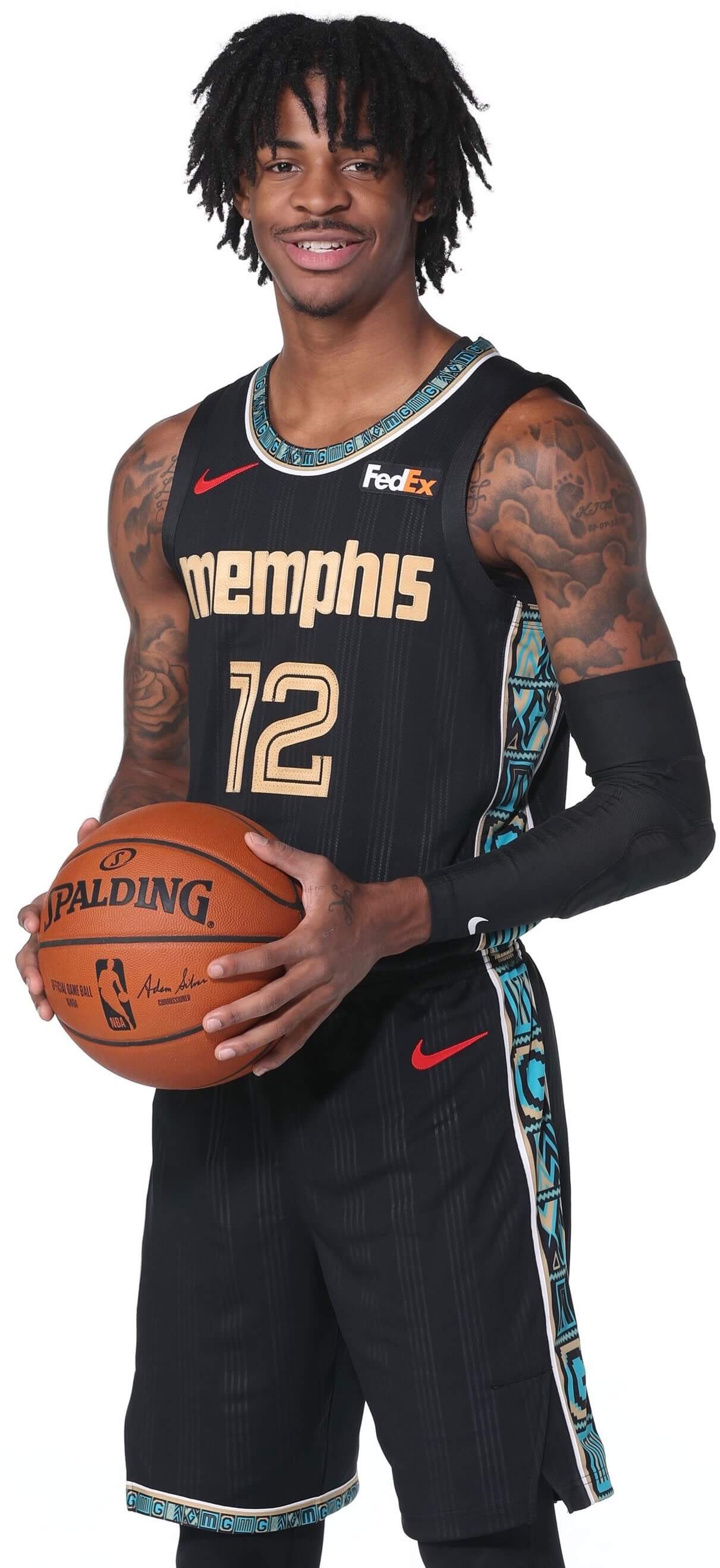
The Grizzlies unveiled their new (and previously unleaked!) City alternate yesterday, and it’s interesting on a number of levels, so I want to talk about it today.
Viewed in strictly aesthetic terms, it’s not bad. The chest lettering looks pretty snappy, and the tone-on-tone pinstriping is nice. But check out the story (or “storytelling”) behind those elements: The lettering is based on the logo from the great Memphis-based R&B label Stax Records (wish they’d also used that font for the numerals, instead of sticking with the team’s standard font), and the striping on the black fabric is meant to simulate the grooves in Memphis soul records.
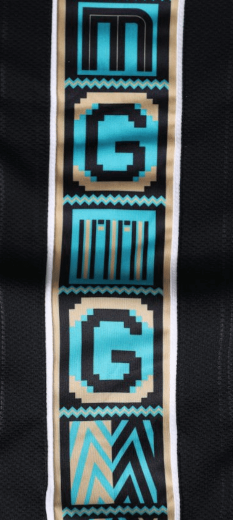
The rest of the uniform stays with that theme. The collar trim, shorts trim, and side panels feature a Kente cloth pattern (for Memphis’s large African American population) with “MG” lettering (which stands for “Memphis Grizzlies” or, if you prefer Stax house band Booker T. and the M.G.’s):
Hidden within the folds of the shorts are the Stax logo on one side and the late Stax artist Isaac Hayes’s signature sunglasses on the other (the uniform was created in consultation with Hayes’s estate):
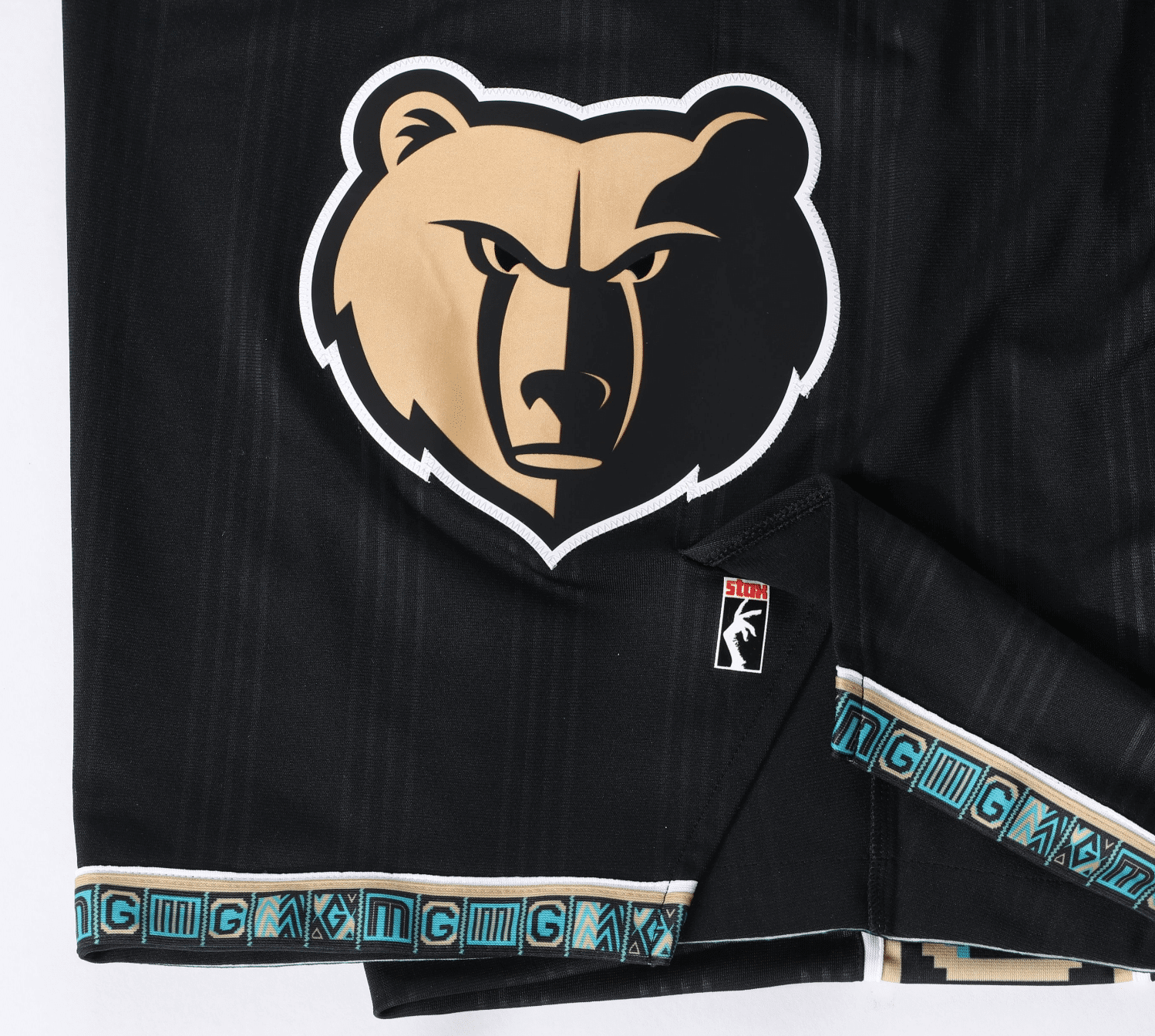
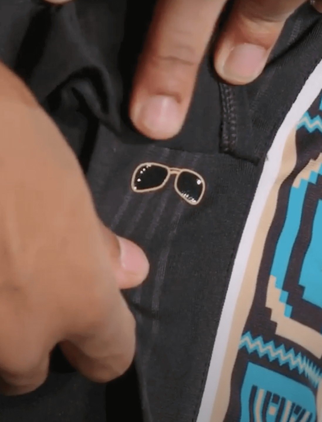
The uniform’s gold/turquoise color scheme is based on Hayes’s gold-plated Cadillac, which is exhibited at the Stax Museum of American Soul Music in Memphis.
The team is promoting the uniform with a video set to the tune of Hayes’s 1971 No. 1 hit, “Theme from Shaft,” complete with images of the Stax Museum, the Cadillac, and Hayes himself:
———
Although the uniform itself is fairly sedate by NBA City standards, this strikes me as the apotheosis of the Nike/NBA/City approach to uni design. It fits squarely within what I like to think of as Nike’s “tourism bureau” format (i.e., promoting the city or region in much the same way that the local tourism agency would), plus it incorporates a major strain of pop culture, plus-plus this particular pop-cultural strain has Black-identified street cred but is also palatable to Whites. Checks all the boxes. (Additional info here.)
As it happens, my longtime Memphis buddy Sherman Willmott was the founding curator of the Stax Museum and even drove Hayes’s Caddy to the museum after picking it up from its previous owner (the car passed through several pairs of hands after Hayes owned it). He’s also published a series of Memphis travel guides, run a Memphis tour operation, and even written and published a book about Memphis pro wrestling, so it would be fair to say that he’s a legit voice of Memphian authority. As soon as this new uniform was released yesterday, I asked him what he thought. His response:
Dig it! Like the font and the colors best. You know I love any Stax hook-ups! Side panels not so much, but I can dig It! Wish they would change the name to a more appropriate Memphis Souls! Or Memphis Sounds! Or Memphis Gold!
But there’s never been a cooler uni reveal video! Grizz gettin’ it on and off the court. Wish we could actually go to a game!
Ladies and gents, if it’s good enough for Sherman, it’s good enough for me. Print it!
Meanwhile, in other City news from yesterday:
• The Mavs’ design had already leaked, but now it’s been officially unveiled (additional info here):
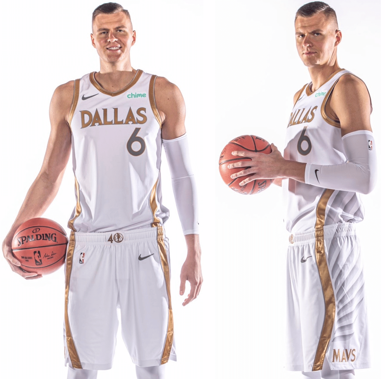
The feather pattern on the sides is a reference to Dallas’s famous Pegasus sign (again with the travel bureau approach). But wait — I thought Skyline Green, not Pegasus, is synonymous with the city of Dallas. It’s so hard to keep track of these things.
• The Raptors still haven’t officially unveiled their City design, but they essentially confirmed a previous leak by announcing their re-signing of point guard Fred VanVleet by posting a video of him in the new City uni:
We're all in on @FredVanVleet. #BetOnYourself pic.twitter.com/Ecry0XTNDy
— Toronto Raptors (@Raptors) November 24, 2020
• Similarly, the Pacers haven’t yet officially unveiled, but their earlier leak from a few days ago appears to have been confirmed by video game screen shots:
2021 Pacers City Jerseyhttps://t.co/Ml2NxKKCrr pic.twitter.com/pmwcVHOC9z
— CHession11 (@chession_) November 22, 2020
Click to enlarge
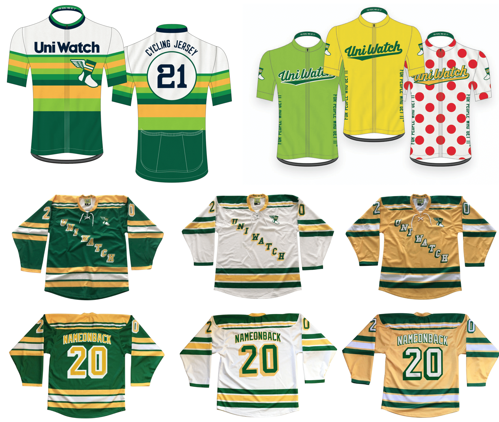
Merch reminders: We’re once again taking pre-orders for another round of Uni Watch hockey jerseys, tequila sunrise cycling jerseys, and Tour de Uni cycling jersey — all available with your choice of number and NOB.
You’ll need to get your order in by Dec. 11, and they should arrive by mid-January. (Sorry, too late for Christmas delivery — mea culpa on that.) Full details here.
And as long as we’re talking merchandise, keep the following points in mind:
• The Uni Watch Classic Cap, which normally costs $39.99, is now only $35.99 — a 10% break. All fitted sizes are currently in stock, along with the adjustable strapbacks.
• I’ve also reduced the price of Uni Watch trading cards. Full details here.
• Today is the last day to get in on Teespring’s free shipping deal for all orders of $50 or more. You can combine items Uni Watch, Uni Rock, and Naming Wrongs shops (or any other Teespring items) to hit that $50 threshold. Use the checkout code FREEOVER50 to get in on the deal, which is good from now through the end of today.
My thanks, as always, for your consideration.
The Ticker
By Lloyd Alaban

Baseball News: A shop in Kansas City is selling Royals jerseys with Kansas City Chiefs QB Patrick Mahomes’s NOB on them (from Cameron Schneider).

Pro Football News: Throwbacks this week for the Bills (from Isaiah Livers). … Football Night in America used a nonstandard Saints helmet in one of its graphics on Sunday (from KC Kless). … Cross-listed from the baseball section: A shop in Kansas City is selling KC Royals jerseys with Chiefs QB Patrick Mahomes’s NOB on them (from Cameron Schneider). … Reader Michael Hoster stumbled on his childhood collection of early-1990s gumball helmets, displayed on a customized shelf made by his father.
College Football News: Ohio State is going mono-white this week at Illinois (from @BlockOCanada). … Iowa State is also going mono-white this week (from Chad Lehman). … Reader Nate Mueller has 3D-printed a BCS National Championship trophy Christmas tree ornament.

Hockey News: The Athletic has a retrospective on the Ducks’ uniform history (from Kary Klismet). … A wrestling team in New London, Conn., is using an interesting variation of the old Whalers’ logo (from Charles, who didn’t give his last name).

NBA News: F Obi Toppin will wear No. 1 with the Knicks. The Knicks botched Toppin’s announcement twice: He is from the University of Dayton, not “Dayton University” and the font size in the announcement doesn’t match the game-size font on other Knicks jerseys (from Eric Farrell). … SF Kelly Oubre Jr. will wear No. 12 with the Warriors (from Etienne Catalan). … Also from Etienne: C Marc Gasol will wear No. 14 with the Lakers, F Aleksej Pokuševski will wear No. 17 with the Thunder, PF/C Ed Davis will wear No. 17 with the Timberwolves, and SG/SF Dwayne Bacon will wear No. 8 with the Magic. For the latest on NBA number updates, be sure to follow Etienne’s Twitter feed. … This Bleacher Report graphic erroneously shows Hawks PG Rajon Rondo wearing No. 9. Rondo will actually wear No. 7, as No. 9 has been retired by the Hawks for PF/C Bob Pettit (from Elijah Newsome). … A Houston-area hair salon is poaching the logo of the Rockets’ former home, The Summit (from Dave Holz).

College Hoops News: UNC is adding a social justice message to the back of its jerseys (from James Gilbert). … New blue uniforms for Duquesne. Old version on left, new on right. … New uniforms for Coastal Carolina University (from Luke Rohan). … New uniforms for UIC (from Jake Epstein). … New uniforms for Fresno State (from Kary Klismet). … Also from Kary: Liberty University has opened its new basketball and volleyball arena. … New uniforms for Quinnipiac (from Jacob Resnik). … New unis for Army women’s (from Justin Rocke). … Virginia Tech will be going GFGS for today’s season opener against Radford (from Andrew Cosentino).

Soccer News: Greek side Panathinaikos has unveiled renderings of its planned new stadium (from Kary Klismet). Also from Kary: The Flint City Bucks have unveiled their championship rings for winning the 2019 USL League Two title. … New mono-black kits for Indonesian side Persija Jakarta (from Trevor Williams). … Sampdoria G Emil Audero was originally supposed to wear the field players’ third kit, which was black. He ended up changing twice before and during the game so at the end he was wearing a mono-green goalie kit (from our own Jamie Rathjen).

Grab Bag: T.C. Williams High School, which gained national attention after being portrayed in the 2000 film Remember the Titans, is getting a new name after the school board voted to remove the name of segregationist T.C. Williams (from Tom Turner). … A mechanical engineering professor has calculated exactly how fast the eagle in the USPS logo is going (from James Gilbert). … Here’s a compendium of particularly absurd marketingspeak terms (NYT link) that have been floating around lately.

Uni Watch will still be open and publishing tomorrow and every day through the Thanksgiving weekend. Stay safe, stay well, and I’ll be back with some holiday thoughts tomorrow. — Paul
“The lettering is based on the logo from the great Memphis-based R&B label Stax Records (WITH they’d also used that font for the numerals, instead of sticking with the team’s standard font)…”
I think you mean WISH.
Yes, thanks. Fixed.
Quite the happy coincidence that MG can signify both Memphis Grizzlies and (Booker T and the) MGs. They should make that striping pattern into a scarf. I bet they would sell lots of them.
Any citation for the proposition that the initials stand for the Memphis Group and not Memphis Grizzlies? The text from the team web site reads “The ornate ‘MG’ pattern inspired by African Kente cloth, trimming the neckband, short and left side panel of the uniform represent Isaac’s flair for fashion and his voice for social activism.” No explicit mention of Booker T. and the MG’s. Not trying to ask a gotcha question, just curious.
Totally fair question! I swear I read it somewhere amidst the boatload of articles and press releases I saw yesterday, but now I can’t find it and am questioning myself. So I’ll adjust the text. Thanks for calling that out!
UIC Mens BB powder blue unis are top 10, IMO. I feel they could do without the skyline look on the shorts. Otherwise, very nice.
Who at Fresno State and/or adidas thought it would be a good idea to have 3 completely different uniforms with different collars, templates, and logo placements? I’m an impartial judge here and don’t have an iron in the fire, but the lack of “uniform-ity” in these uniforms would drive me crazy if I was a Bulldog fan.
“Vancouver Whitecaps keepers have worn the club’s third uniform as a keeper kit at least twice this season.”
Hi Paul, we do need to make a correction in the Soccer Ticker. This occurred years ago and not this season. The Whitecaps wore the Arbutus brown third kit in 2012 and 2013. The David Ousted photo was in 2013. The photo of Brad Knighton would have been either 2012 or 2013.
Removed.
re: USPS logo
Engineers once again proving you can’t teach common sense…this is why bridges collapse & buildings fall down…
Love seeing the gumball helmets. Wondering if the helmets are not from the 1980s and not 1990s due to the red Falcons helmet and (possibly) a royal blue Chargers helmet.
Also, as a Bengals fan, I struggle with a desire to somehow preserve the tiger stripes while making the uniforms less garish. Maybe the reduced stripes sticker on the Bengals gumball helmet could be a start.
Styling question:
“has Black-identified street cred but is also palatable to Whites”
Most publications have moved toward capitalizing Black but not white. Especially in this case when juxtaposing Black culture against other, it fits the criteria the AP describes.
link
Some publications, including this one, have chosen to capitalize both terms.
My Ex-Wife was a journalism major. She routinely critiqued my writing because it wasn’t AP Style.
One of the many reasons she’s my ex-wife.
I’ve lived in Dallas for 40 years and I can confirm that “skyline green” and the Pegasus sign are both, indeed, synonymous with Dallas. The Magnolia Oil building was the tallest building in Dallas for decades before I came here and had a rotating neon Pegasus at the top of it. Since the eighties, the tallest building has been the Bank of America plaza, which is wrapped in green argon lights. It’s no different than saying that NYC is synonymous with the Empire State Building and the World Trade Center.
Likewise, the FC Dallas white uniform has a silver ball on the sleeve (representing Reunion Tower) and thin white stripes (representing the white cables of the Hill bridge). These are also legit iconic symbols of the Dallas skyline.
Dallas is a big city and has a lot of different aspects to its downtown identity. Memphis (the only other city I’ve lived in) could have easily had a tribute to Sun Studios instead of Stax Records and it wouldn’t have been any less appropriate. Both are iconic parts of that city.
None of this is to say that the uniforms that pay these things tribute are any good, just that they aren’t ridiculous to use these themes. That said, the Mavs graffiti uniforms that supposedly paid tribute to Deep Ellum were kind of a stretch, since that kind of art is synonymous with any urban area, not just Dallas.
Agree with all this. If the Mavs really wanted to have a Deep Ellum vibe they should have went with a The Traveling Man on there.
If they wanted to have the Pegasus it really should have been neon red. Obviously that doesn’t go with the rest of the uniform, but it would be a much more immediate “Oh yeah, that’s Dallas” look than just having wings.
Either way, I think it’s a brave decision to have an alternate that is white. I would worry about getting my kids one because any bit of anything will show up on it.
I wonder if the Memphis uniform was also designed to reflect the Grizzlies design history, with ornate trim that ties into the region. Especially the asymmetrical trim on the shorts.
Paul, I got an email from Teespring late yesterday afternoon that said the free shipping on orders over $50 runs through Thanksgiving night, not through today. Your last sentence says “tomorrow” but the first says “Today.” Have a good and safe Thanksgiving.
“Start Cyber Weekend Early
“Get free shipping when spending $50 on merch from your favorite creators! Just be sure to use code FREEOVER50 during checkout.
“Better hurry though, this sitewide, pre Black Friday offer ends Thanksgiving night at 11:59pm PT.”
Hi, Marc!
My understanding was that the Teespring free-shipping deal was good only thru the end of today (I’ve fixed the wording at the end of that paragraph). If they’ve extended it, that’s good news! I’ll double-check with my Teespring rep on that.
Just to be safe: Probably best to order today, just in case!
Interesting to see the Futura Display font on the Grizzlies’ uni. The only other team from the Big 4 that comes to my mind that’s used a version of Futura Display is the Toronto Maple Leafs, with their all-caps use of it on their 1967 logo (which is coming back on their Retro Reverse jersey).
I wonder if any other teams have used that particular font.
I love the Grizzlies saluting Stax in their design. I hope some of the at-home designers who have their alternative team designs displayed on Uni-Watch would incorporate more of this. I don’t know record labels offhand, but I’d love to see the Nats go go design or the Lions wearing something to represent the house music vibe.
The marketing-speak article makes me never want to purchase anything. Ever.
The Knicks just released an image of Obi jersey-swapped into a #1 Knicks jersey, complete with recolored shooter sleeve.
…and then just didn’t bother to recolor his red shoes. Classic Knicks move right there.
One thing that I really liked about this new Grizz set that wasn’t mentioned is that the shorts design are a tribute to the the Vancouver days (sort of). The original shorts had the large Grizzlies logo on one side and the unique design on the hem of the shorts on the other side. link
This one the large logo and design trim are on the same side.
And if we want to go further, the Grizzlies second uniform (the carryover from Vancouver to Memphis) had one side panel from the jersey that ran down to the shorts. This new uniform does that too. It goes with their asymmetrical design. link
“Reader Michael Hoster stumbled on his childhood collection of early-1990s gumball helmets, displayed on a customized shelf made by his father.”
Very cool! I love old childhood collectibles like those! If those helmets truly are from the early ’90s, they have some quirky anachronisms. For example the Giants helmets features center striping that the team wore for the last time in 1979:
link
…but the Bengals are wearing the tiger-striped helmets that they debuted in 1981. Meanwhile, the Chargers helmet features the yellow lightning bolt on a blue shell (albeit without the white outline), which they wore from 1974 to 1987, rather than the white lightning bolt (with a yellow outline) that the team switched to in 1988.
I’m no NBA guy- but I love that Grizzlies uni all day long. And we can dig it.
Is anyone else sick of hype videos as a means of presenting new uniforms? For the love of god, please just show me some decent photos and spare me the 90 seconds of strobes, flexes and lame-ass beats.
[Raises hand.]
Yeah, It kind of makes you wonder what they think about their audience’s – **Oooh! Something shiny!** Sorry, what were we talking about?
Is anyone else sick of … new uniforms? Period.
Yes. Yes I am.
Seconded.
Uniwatching isn’t nearly as fun as it used to be. The manufacturers, teams, universities and politics have ruined it.
Truthfully, I’m sick of turning on the TV and not being able to tell what teams I’m watching. Sports uniforms and logos used to be the most basic form of branding. Now it’s a clusterf*ck. “What team is that…is it Oklahoma State or Oregon State? Neither? Or is it Illinois… or Syracuse?”
Can you imagine what Bear Bryant would think of weekly videos announcing what uniform his team would wear?
In which brilliant marketing minds was the theory “the best way to establish brand identity is to change your branding every week” developed? My own alma mater wore 13 different uniforms in 13 games last year.
Can you imagine if your local McDonald’s changed the logo on the sign every week?
Can you imagine if Twitter or Instagram or Facebook said “let’s change our icon every week! What a great idea!”
And the NBA? What a freaking mess! Maybe all these stupid “uniforms”, which have transitioned every game game into a runway fashion show, is to distract potential viewers from the fact that their actual product is unwatchable. In that case, maybe it is brilliant.
It’s almost ironic that Nike, who has bastardized the logos, branding and identities of universities and teams in every corner of the world, hasn’t changed their own logo in 49 years.
It’s almost ironic that Nike, who has bastardized the logos, branding and identities of universities and teams in every corner of the world, hasn’t changed their own logo in 49 years.
This is a great, great point — one that I’m embarrassed not to have thought of myself.
Good food for thought (and perhaps for future writing as well).
Some logos are destined to never change. Coca Cola, Ford, IBM, etc- those are mini works of art. Nike’s swoosh will never change- nor should it.(IMO)
That should also apply to the Knicks for example… why change their iconic word mark and number fonts? They look so off to me and that is one example of many. Then they conspire with the league to release multiple uniforms the teams don’t need.
One pretty common logo that has changed (and now seems to have both in use) is Nasa. They had the Meatball style, went to the Worm Style, back to the Meatball style and now using both on the Dragon missions they’re a part of.
“It’s almost ironic that Nike, who has bastardized the logos, branding and identities of universities and teams in every corner of the world, hasn’t changed their own logo in 49 years.”
Perhaps not as ironic as it is strategic. There’s an interesting lesson here in primacy in branding.
Did Mr. Fine Wine weigh in on the Stax-referencing Memphis get up? Would be curious to hear what he thinks ;)
The New London wrestling logo in the ticker, besides being an attempted ripoff, is an absolute visual disaster. None of the pieces go together…like the elements are pieces from 4 different puzzles, yet someone forced them together. Fail.
THUMBS UP: Grizzlies’ uniforms. Everything about it, except the storytelling aspects (which are a part, but it could be less over-the-top). Beautiful set.
THUMBS DOWN: The Royals selling Patrick Mahomes jerseys. It’s pandering. He’s (probably) never going to play for the team. And he owns a piece of the team. Stop trying so hard, Royals. You won a World Series a few years back!
THUMBS IN THE EYES AND EARS: for business-speak. Blecch.
I’m sure the Mahomes Royals jersey is firmly connected to his minority ownership stake in the Royals, which he bought with proceeds from his 1/2 Billion contract earlier this year.
Since the Grizzlies moved to Memphis, I had always hoped that they could trade names with Sacramento. Kings would be a great nod to MLK (and Elvis!) and Grizzlies seems more NorCal to me. Of course that would never happen except in my own fantasy league. Anyway, good coverage on the Memphis uni. I’m not much of a basketball fan but I did like the design. Very “tourism bureau”, as you say. Paul, I also enjoyed the callback to the Memphis wrestling scene. I really should get that book.