For all photos, click to enlarge
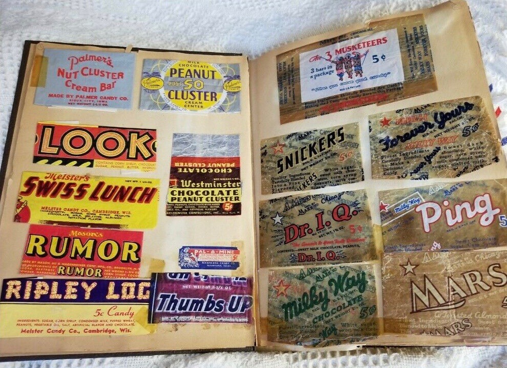
The photo shown above is from an amazing old scrapbook of 1930s and ’40s candy wrappers that recently appeared on eBay and was brought to my attention by my friend David Brown. It’s really fun and interesting, and I want to go off-uni today to talk about it. (Just to be clear, I don’t own the scrapbook. All of these photos are from the eBay listing.)
The scrapbook was owned by someone named Betty Buggs, who signed her name on the first page:
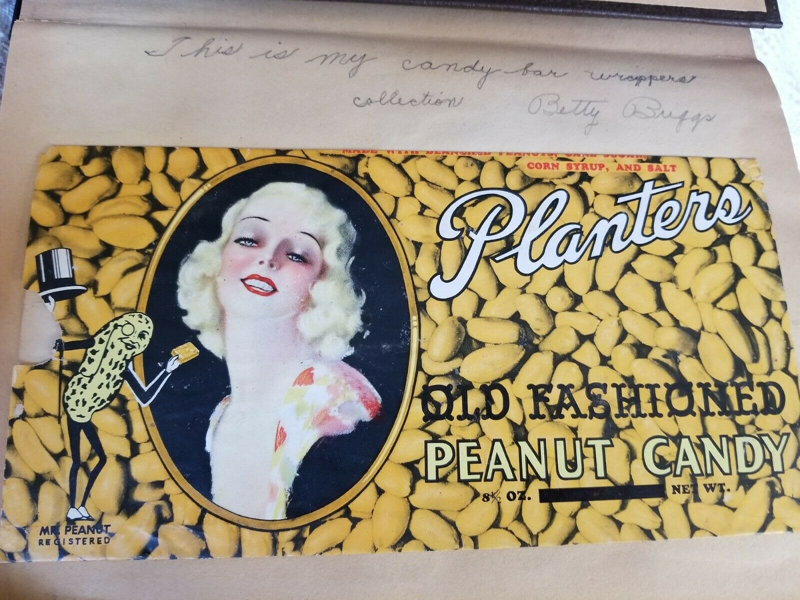
It’s great to see that personal connection from the collector. And I love — love! — that she wrote, “This is my candy bar wrappers collection,” a direct, declarative statement of purpose that any collector of anything can surely relate to.
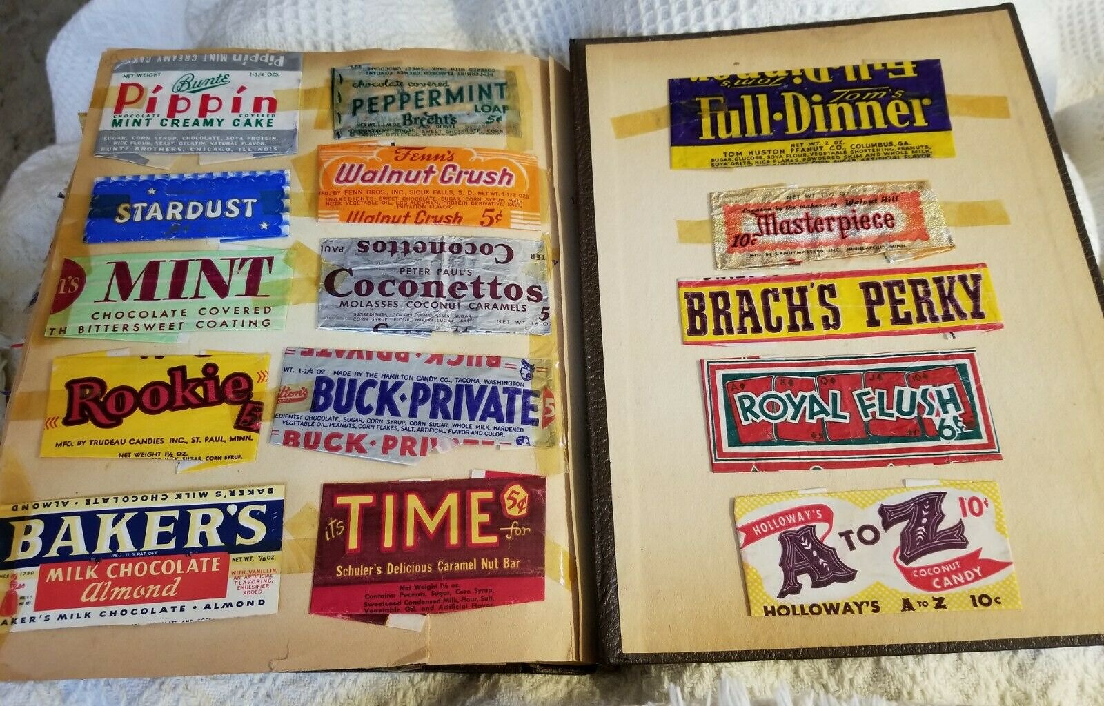
As you can see from that first photo at the top of the page, some of the candies represented in the scrapbook are still with us today, like Snickers, Milky Way (the script logo is clearly related to the current version), Mars, and 3 Musketeers (note that the wrapper touts “3 bars in a package” — that’s because that candy originally had three bars with three separate flavors, sort of like Neapolitan ice cream), while others are probably unfamiliar to anyone younger than, say, 75 years old. But all of the wrappers feature great, bold designs — each one is like a little billboard.
Nowadays, the nuts that appear most often in candy bars are peanuts and almonds. But back in the day, there were candies based on other nuts. The next three photos, for example, include wrappers for Walnut Crush, Pecan Feast, and Planters All Cashews:


Speaking of nuts, it’s interesting to see that Krackel — a Hershey’s product featuring puffed rice, similar to Nestlé’s Crunch — apparently used to include peanuts! Check it out:

According to Wikipedia, Krackel did indeed have peanuts from 1939 to 1941, so the wrapper in the scrapbook must date from that period.
One more nut-related item: I love how the Goober Plank logo was spelled out in peanuts! Check this out:

Some of the slogans are pretty hilarious. I particularly like that Mr. Goodbar was touted as “A Tasty Lunch”:
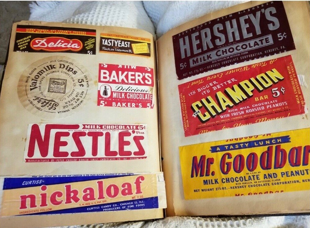
On that same spread, it’s interesting to see that Baker’s used to make candy! Nowadays they’re known for unsweetened baking chocolate. (And they still use essentially the same logo character shown on the wrapper in the scrapbook!)
Some of the candy names are funny, too. This next photo includes one called Chicken Dinner (which apparently featured nuts coated in chocolate, like a jillion other candy bars):

One thing that really comes through is the large number of different manufacturers. The American candy scene has undergone relentless consolidation over the past 25 years or so, so the vast majority of products, including many that were once produced by small-ish, independent confectioners, are now made by just three companies: M&M/Mars, Hershey, and Nestlé. That clearly wasn’t the case when Betty Buggs was taping these wrappers into her scrapbook.
You can see the entire scrapbook here. Personally, I find it endlessly entertaining and pleasing, in part because I still love candy as much as I did when I was a kid, and in part because the wrapper designs are so lively and stimulating. It’s as much a treat for the eyes as the candies no doubt were for Betty’s taste buds.
In fact, I liked the look of the scrapbook so much that I considered bidding on it. But it was a bit out of my range — it went for over $800!
Thanks for indulging me with this non-uni content. We’ll get back to more traditional Uni Watch fare next time around.
(Candy-coated thanks to David Brown for letting me know about this sensational artifact.)
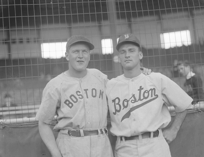
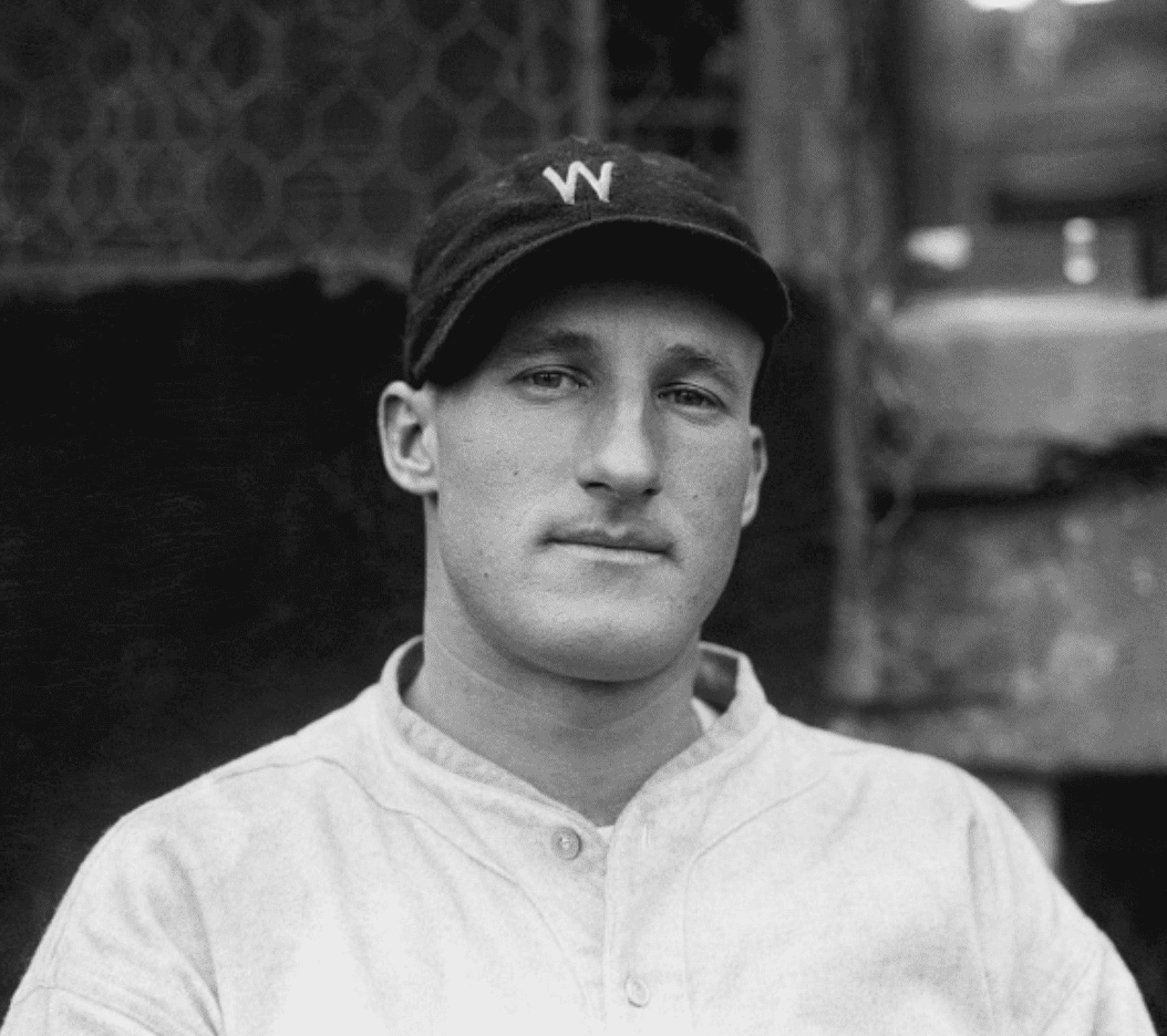
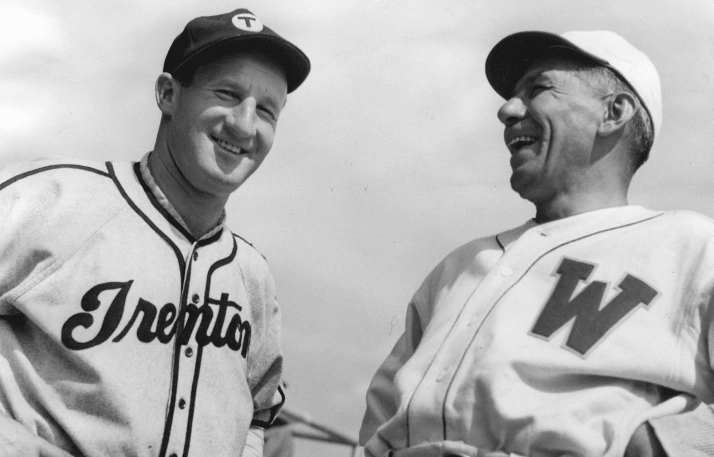
Cap quirk: The guy on the left in the photo shown above is all-time great Joe Cronin. See how he’s wearing his cap slightly off-center, like an early (if less extreme) version of Fernando Rodney? Baseball Hall of Fame curator Tom Shieber has noticed that this cap style was a consistent thing for Cronin. Check this out:
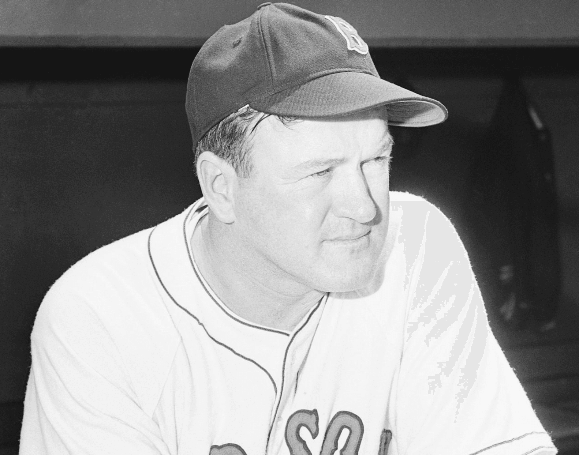
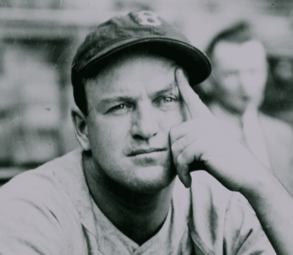
You can see more photos of Cronin, just about all of them showing his cap askew, here.
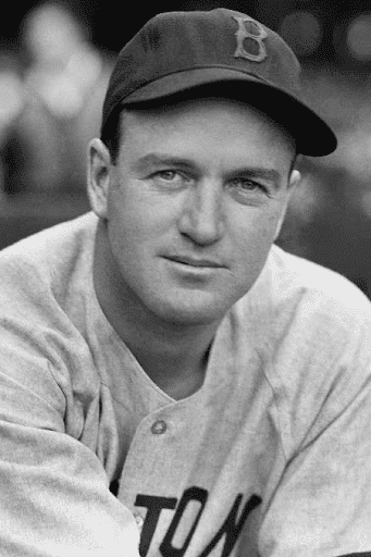
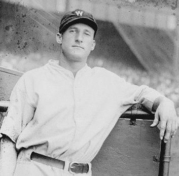
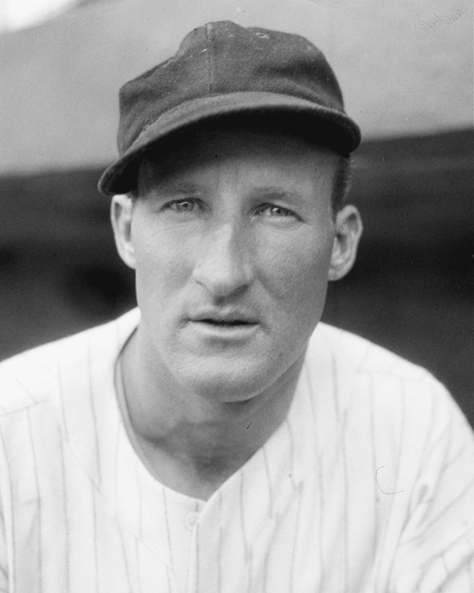
But wait, there’s more! Tom also noticed that another Hall of Famer, Goose Goslin, consistently wore his cap leaning in the opposite direction! Dig:
Faaaascinating! Much like Carl Hubbell’s “long” pants, I wonder if Cronin’s and Goslin’s cap stylings were frequently discussed or even controversial back in the day but have since faded from the sport’s collective memory and oral history. I haven’t had time to research that yet but hope to do so soon.
(Big thanks to longtime pal/ally Tom Shieber, who deserves all the credit for this one.)

ITEM! Free shipping on Teespring orders: The folks at Teespring are currently offering free shipping on orders totaling over $50. That means you can mix and match items from the Uni Watch, Uni Rock, and Naming Wrongs shops and save some coin on on the freight. Use the checkout code FREEOVER50 to get in on the deal.
I’ve been selling things on Teespring for nearly six years now, and this is the first time they’ve ever had a deal for free shipping. The offer is good through next Wednesday, so get crackin’.
Meanwhile, in case you missed it yesterday, Uni Watch Trading Cards are now available at a reduced price.
My thanks, as always, for your consideration.
The Ticker
By Paul

’Skins Watch: Back in 2014, ’Skins owner Daniel Snyder established a charitable foundation to help Native Americans. Yesterday the team, which provided the foundation’s funding, announced that it has ended its relationship with the foundation, effectively shuttering it. There’s a good analysis — along with a photo of Snyder wearing a Washington mask upside-down — here (WaPo link) (from William Yurasko). … McGill University in Montreal — where, incidentally, the Tugboat Captain’s niece is currently enjoying her freshman year — is changing its teams’ name from Redmen to Redbirds (from Moe Khan and proud alum Mike Engle). … The Weyauwega-Fremont School District in Wisconsin is seeking public input on a new name for its teams after dropping “Indians” as its team name (from Kary Klismet). … Also from Kary: Several schools have released lists of potential new team names after having retired their Native-themed names, including Guilford High School in Connecticut, Pocatello High School in Idaho, and Hanover High School in Massachusetts. … One more from Kary: Grafton High School in Massachusetts will now call its teams the Gators, having previously scrapped the name “Indians.”

Working Class Wannabes™: An article about Buffalo Bills QB Josh Allen says his “blue-collar, unpretentious approach fits this rust-belt town.” … An article about the Dallas Cowboys says, “The Cowboys must play like a blue-collar team,” then says the Cowboys are “at their best when they function like a blue-collar outfit,” and then concludes by saying the team should adopt “a conservative strategy that features a blue-collar offensive approach.” … An obituary for Kentucky assistant football coach John Schlarman, who died last week, says he was a “perfect fit for [head coach Mark] Stoops’ blue-collar approach.” … Gardner-Webb baseball coach Jim Chester says his latest recruits “all exhibit what we are looking for in a Runnin’ Bulldog Baseball player: Selfless, Relentless, and Blue Collar.” … Boise State LB Riley Whimpey says teammate Avery Williams has “got a blue-collar mindset to him.” … An article about the Alabama basketball team says coach Nate Oats’s teams are “known for their blue-collar mentality.” … A high school hoops coach in Missouri says one of his players “is the ultimate blue collar player.” … Northern Michigan basketball coach Matt Majkrzak says one of his new recruits is “that hardnosed blue collar player that causes his team to win.” … An article about a new Oklahoma football recruit says “he carries a highly conspicuous blue-collar mentality.” … New York Giants coach Joe Judge continues to be an endless spigot of blue collar bullshit (from Keith Seminerio). … Although I didn’t watch it myself, I’m told by several readers that the broadcasters in Monday night’s Bears/Vikings game used a heaping helping of “blue collar” references. … Here’s a whole article about “blue collar plays” in Philadelphia Flyers history. … A high school basketball coach in Indiana says, “We’ve got to get that blue-collar mentality back defensively.”

Baseball News: To coincide with yesterday’s start of the NBA draft, the Tigers did a Photoshopped uni swap with the Detroit Pistons (thanks to all who shared). … Lots of college teams have received their new school-branded gloves, including Arizona, Tampa, Ohio State, South Dakota State, Oklahoma State, and Toledo (all of those from Timmy Donahue, who apparently has an obsession I didn’t previously know about!). … The jersey that Giants coach Alyssa Nakken wore during her first MLB game has arrived at the Hall of Fame (from Mike Chamernik).

NFL News: The Cardinals will go mono-BFBS this weekend (from Josh Pearlman). … The Vikings may keep wearing mono-white on the road — a combo they wore on Monday night, for only the second time in eight seasons — because former NFL coach Bill Parcells told Vikes coach Mike Zimmer that white-over-white provides a strategic advantage (from Braden Classen). … The Seahawks are apparently wearing their neon-green uniforms tonight (from Michael Princip). … Washington is reportedly wearing throwbacks this Sunday.
College Football News: Georgia might wear black jerseys this weekend. … New uniforms for Idaho (from Braden Erickson).

Hockey News: New mask for Hershey Bears G Zach Fucale (from Kary Klismet). … Whoa, check out this amazing late-1970s hockey poster! It’s up for auction here (from David Altholz).

NBA News: Cross-listed from the baseball section: To coincide with yesterday’s start of the NBA draft, MLB’s Detroit Tigers did a Photoshopped uni swap with the Pistons (thanks to all who shared). … Michael Jordan’s original “shattered backboard” jersey is up for auction (from Phil Spain). … Looks like the Celtics will officially unveil their championship banner-themed alternate uni, which has already leaked, tomorrow (thanks, Anthony). … The Pistons have some new merch featuring little sub-versions of their primary logo. … Here’s an article about the Cavs’ new “artsy” creative director (WSJ link) (from Kary Klismet). … The Hawks, who unveiled their new uniforms way back in July, now have a new court to match. … NBA uni-numerologist Etienne Catalan reports that PG Dennis Schröder will wear No. 17 for the Lakers and newly drafted C James Wiseman will wear No. 33 for the Warriors. Keep an eye on Catalan’s Twitter feed for more NBA uni number news. … After RJ Hampton was drafted last night by the Bucks, someone in his group grabbed his Bucks draft hat from him and tossed it across the room. “The Bucks had traded the pick to the Pelicans before the draft, and moments before the pick the Pels had traded the pick to the Nuggets, so maybe the confusion led to the reaction,” says Mike Chamernik.

College Hoops News: Monmouth teased its new uniforms. Speaking of which, I’ll have my annual College Hoops Season Preview next week, probably on Monday.

Soccer News: Austin FC unveiled its inaugural shirt yesterday. … Yet another new logo upcoming for the Chicago Fire (from Otis Ault). … From our own Jamie Rathjen: The NWSL’s Los Angeles expansion team, Angel City FC, was supposed to reveal today what stadium they were going to play at, but The LA Times has already gone ahead and said they’ll play at Los Angeles FC’s stadium. … The NPSL’s new team in Boone, N.C., will be called Appalachian FC. … There’s a new French book about French national soccer team shirts. “It has the story behind every shirt, with manufacturer, competitions, and star players,” says @Monsieur Win, writing from France.

Grab Bag: Following up on an item from yesterday’s Ticker, the names of Sinclair Broadcasting’s 21 regional sports networks will become ads for a casino, and the goal of the deal is to leverage various forms of online betting. Gross (from Pat Johnson). … Pro golfer Matthew Wolff has a new endorsement deal with Gatorade. He’s Gatorade’s first golf endorser since Tiger Woods. … How well do you know your car brand logos? Take this quiz to find out. … A new series of Japanese postage stamps honors the men’s volleyball team VC Nagano Tridents (from Jeremy Brahm). … England Rugby is filling their empty stadium with local club jerseys (from Andrew M.). … New 125th-year logo for the NYC Dept. of Correction. … The Capital Athletic Conference — a D3 conference — will now be known as the Coast-to-Coast Conference, complete with new logos (from Joel Mathwig). … The latest episode of the great design podcast 99% Invisible is about the design of airplane safety cards. It’s really, really good — highly recommended. … In the latest sign of trouble for Under Armour, the company’s deal with the U. of Cincinnati will be ending four years early (from K.C. Kless). … South Garland High School in Texas will no longer call its teams the Colonels because of the name’s past association with the school’s use of Confederate imagery (from Kary Klismet). … Major League Cricket is redeveloping a stadium in Texas with the goal of growing the sport of cricket in the U.S. … Gaelic football club Dublin GAA will wear Bloody Sunday centennial shirts this Saturday (from Phillip Santos).

Click to enlarge

What Paul did last night: I’m not 100% certain, but I think this might be the first Pandemic Porch Cocktails™ photo to include a police cruiser. I didn’t intend to photograph it — it just happened to be driving by when I set up for yesterday’s photo shoot.
That made me realize that there’s v-e-r-y little police presence on our block. No cruisers, no officers on foot, not even parking cops. (I’m always amazed, in fact, by how much illegal parking there is, and it rarely if ever seems to be ticketed.) That’s a big change from my previous neighborhood, where the cops were much more visible.
As always, you can see the full set of daily Pandemic Porch Cocktails™ photos — now nearly 250 of them — here.
How common was it for the button to go through the T in BOSTON? Quirks on top of quirks today!
Mr. Goodbar is a good lunch? Well, that’s a claim!
I watched a documentary that explained that. Hershey marketed it that way because of the Great Depression as a low-cost meal.
Wow those guys wearing their caps incorrectly really do look like jackasses! If I was their manager I wouldn’t let them on the field.
Ha ha! Thanks for giving me a good laugh — at myself!
Joe Cronin tossed me a baseball at a old timers game at Yankee Stadium. 1958 I think. Can’t remember how he wore his cap
“Whoa, check out this amazing late-1970s hockey poster!”
Whoa, whoa, whoa…what’s with the white-sleeve Penguins sweater? Must be a practice job.
It was actually a pretty great uniform:
link
Thanks!
The navy really looked black to me.
I see another Pen(?) in the shot with the Islander…the light blue appears teal/greenish.
Must be the lighting, or it’s eye exam time!
I think that it’s the lighting of the photograph of the poster. For example the photo of Jack Brownschidle his Blues uniform looks positively black. In real life,they were royal.
link
Or, heck, maybe the poster was just bad at rendering colors.
Agreed, Wade. It’s always been one of my favourites. I have a white Randy Carlyle #25 replica.
I also love the Penguins’ 1974-75 set. I wonder why they only used the white sweater design for that one season. They kept the gorgeous blue road jersey until 1977.
Question for the group — if the Chicago Fire is changing their badge again, why not just rebrand? I would dump the Fire name and go with a more traditional club name like “Chicago FC” or “Chicago Athletic.” I know it’s a trademark/IP nightmare to do that, but why not go for it?
My understanding is that the fans in Chicago like the name “Fire”, but absolutely hated the crest they used for this last season.
I have to admit I always liked the Fire name as well, any name that can draw from historical references is stronger in my opinion.
I always find it so surprising that a professional organization such as the Fire didn’t seem to get any feedback or conduct focus groups with fans to get feedback before they launched this last crest (Doubleday and Cartwright, I’m looking at you). If it was so widely panned by fans, you’d think they would’ve heard some of that before the launch.
Well, from a uniform perspective, we have a new one-season uniform/crest anomaly.
Everton had a similar issue a few years ago. Nike designed them a new crest that was nice enough. There was no fan engagement and the community rejected it. I wondered if the issue was that fans were not included, but the design was a little radical much like the Fire’s crest. They redid it with better PR and everyone was happy. Hope the Fire does the same.
I wouldn’t say the Fire’s new crest is “radical” so much as it is “awful”.
I would fully expect Section 8 and the rest to be involved in the process this time, if only to avoid bringing back all the bad PR.
I remain convinced the current Fire badge and colors were a Real Salt Lake design reject. The color scheme and what looks like a gold crown that they resold to CFFC as a blazing fire. It’s a terrible crest for any club and I’m glad they realized it so quickly.
Bring back the red shirts with the white band across the front. Bring back the Maltese cross shaped badge. Those were an actual identity.
They did hold focus groups for the Fire re-branding … in Los Angeles and New York!! No kidding. Didn’t bother to ask their hometown fans … another symptom of just how bad the previous ownership group was. At least now we have local ownership that has opened itself to the fans.
I’m liking McGill using the name Redbirds. Ties in with the school logo and theme of the female teams who are named Martlets.
McGill did drop the Redmen name a year and a half ago. The male teams have been going nameless during that time.
As a graduate, I would have preferred that all the teams go by Martlets. It’s not separate McGill and Royal Victoria College anymore. It’s one university! Have one name!
But if they wouldn’t choose that, then I agree that Redbirds is fine too. Our logo has martlets, but you can’t say they’re not redbirds! Also, the men’s baseball team was called the Redbirds too, so there’s a little bit of carried-over consistency.
Here’s something I was taught when I was a kid (not about these specific guys, just players in general): Joe Cronin was a right-handed batter and wore his cap askew to the left to help keep the sun out of his eyes. Goose Goslin batted left-handed and wore his hat tilted to the right for the same reason.
Ah, interesting!
Also, sometimes people have oddly shaped skulls and wearing a baseball cap “straight on” puts uncomfortable pressure on the scalp. I cracked my skull when I was in 5th grade which resulted in a bump on my forehead near my hairline that requires me to position a cap just right. Otherwise, it irritates my noggin. Food for thought.
-C.
PS: As for Rodney…who knows.
I do not know.
C.C. Sabathia was the all-time worst offender.
I was going to say this same thing. My cap wearing tendency is just like that: the brim of the cap is always just slightly to the right due to the shape of my head and more specifically, my forehead. I actually never noticed it until one day I caught myself in a mirror just right and tried to straighten out the bill. Just felt wrong, and when I put it back in a comfy position I saw it. The two examples in Paul’s article are much more pronounced, so that’s probably not the reason. It makes more sense about which way they bat, the sun, etc. and perhaps that made the hat’s placement a habit for the players.
As for Rodney, it’s a tribute to his late father, a fisherman who always Co ked his cap to the side in accordance with the sun.
*cocked
Cool tribute. Thanks for the clarification, Joseph. -C.
10-15 years ago the Red Sox called up a young lefty from Double A for a spot start who cocked his hat & got slammed hard for it. Sports radio were calling him a punk, thug & gangbanger who had no respect for the game & should be banned.
An old coach of his angrily called into the station to inform everyone that the kid was legally blind in one eye, & the less glare the better. I can’t remember his name- I think he was Mexican- & that actually might’ve been his only MLB appearance.
You are referring to Abe Alvarez (who appeared in a total of four games): link
There ya go. That was a great read- thanks for sharing!
Boone, NC is also home to Appalachian State University, which makes me think there must be a connection between school and club.
Maybe that they’re both in the Appalachian Mountains? :-D
Good for Dan! I view it the same way the Seahawks pay A&M to use the 12 man flag. No flag = no payments.
Appalachian State also dropped their men’s soccer program in Spring 2020. Part of the group involves their former men’s coach, who will be coaching elsewhere in 2021.
The Nestlé company used pretty much the same packaging for its candy bars through the 1980s. especially the Nestlé’s Crunch bar. Hershey’s main chocolate bar packaging is pretty much unchanged, as is Baby Ruth’s, somewhat.
And yes there’s a back story to the Chicken Dinner candy bar …link
The Robert Opie collection of wrappers, boxes and advertising used to be a museum in Gloucester, UK, near my home.
it now seems to be simply an online shop.
but you may still enjoy looking at it.
link
Oh, I had a hunch, and I was right.
the Museum still exists, but has umm rebranded, to the Museum of Brands
link
I’ve not been to Gloucester for over 20 years but loved the Opie museum. There’s another, smaller branch of the museum on the pier at Weston-super-mare, although I didn’t have the time to check it out during my visit.
Pretty sure the MNF blue collar references were mostly coming from Louis Riddick. Seems to be ingrained in his vocabulary. He used it at least 3 times (and I didn’t watch the whole game).
Gaelic football club Dublin GAA will wear Bloody Sunday centennial shirts this Saturday”
Maybe it’s just me, but incorporating the “100” into the word “Bloody” in the commemorative wordmark feels rather cutesy for such a solemn occasion.
I’m not a fan of the “tilt” on the field, but Cronin doesn’t look that bad. I’m fine with it in public. I’m a slight bender and slight tilter myself. It’s 65% hip hop and 35% Gomer Pyle.
Cardinals in BFBS vs. Seahawks in snot? lovely
This will be one of the ugliest uniform games in quite some time. I live in the Seattle area and the neon green has to go. What was wrong with the old blue and silver color scheme with the silver helmets?
I think Bill Parcells is probably in the camp of those who Get It™. His opinions on the Jets uniforms when I was a kid was probably when I first started thinking about uniforms as more than something I doodle Keyshawn Johnson in with a green crayon.
I remember Parcells’ comments on the Jets’ unis being two-fold. First, he switched them to those more similar to the Namath era unis because he thought they were more the team’s “identity”. I remember just prior to that Leon Hess saying he liked the idea of a white helmet vs a green one so the QB would see them better, and thus might not throw so many picks (yeah, that didn’t exactly work out).
My grandparents owned a small store in the town we grew up in, which was basically the candy store. She would always lament on how she wished they still made the strawberry flavor 3 musketeers. She had 2 sisters and they would all get one piece as kids. Thanks for bringing back that memory. This is why I love Uniwatch!
Back in 2014, ’Skins owner Daniel Snyder established a charitable foundation to help Native Americans. Yesterday the team, which provided the foundation’s funding, announced that it has ended its relationship with the foundation, effectively shuttering it.”
Good! Because as diligent investigative reporting has shown – not only from this article but several others in the past – Snyder’s charitable organization was never anything more than a poorly-run PR mechanism to justify the team’s continued use of the ‘Skins name.
Even the Native groups and organizations that received the small trickle of funds generated early in the “charity’s” existence were carefully curated to further Snyder’s narrative of widespread support in the Native American community for the team name, effectively conditioning funding on a quid pro quo. Not that I blame the communities who accepted the desperately-needed funds, but it reveals Snyder’s true motivations and lack of genuine concern for the plight of America’s indigenous population.
Nestlé sold their candy business in the U.S. to the Ferrero company a couple of years ago. The package designs are still pretty much the same, aside from removing the Nestlé logo (this means the Nestlé Crunch bar is now just the Crunch bar). My favorite, Butterfinger, seems to have a slightly different taste and texture, although it’s still fine.
link
I’m left handed. And I never realized that I wore my baseball cap slightly askew. It just felt normal to me. One day someone pointed it out to me, and asked if I was left-handed. When I replied in the affirmative, I was told yeah, all lefties wear their caps crooked. Now, I don’t think ALL lefties do, but there is a definite trend if you look.
I’m left-handed myself. Hmmmm, will have to take a closer look at my own hat habits!
My dad was an accomplished semi-pro lefthanded pitcher in the 1950s. In the 1970’s, I was quite possibly the most unaccomplished lefthanded little leaguer in the history of baseball. I kept my uniform impeccable, though, except that my hat always ended up sitting slightly crooked on my head.
After another long Wednesday evening of errors and strikeouts, my dad said, “Well, son, at least you wear your cap right. Southpaws’ caps are supposed to be a little crooked.”
Wearing my ballcaps a little crooked remains my greatest sporting accomplishment.
“Yet another new logo upcoming for the Chicago Fire”
Here’s a non-paywalled article from Footy Headlines on the topic of the Chicago Fire’s plans for a new logo for anyone who doesn’t have a subscription to The Athletic:
link
They did hold focus groups for the Fire re-branding … in Los Angeles and New York!! No kidding. Didn’t bother to ask their hometown fans … another symptom of just how bad the previous ownership group was. At least now we have local ownership that has opened itself to the fans.
The Pistons in Tiger colors looks better than any of the City Edition uniforms released recently.
Tremendous post today!
I’ve searched for a timeline of candy bar release dates and not found anything good. This came about after a discussion with friends about how the Take5 is the newest candy bar that has stuck around.
Love the candy wrappers content today, Paul. Thanks for sharing.
Would a newspaper’s copy editor consider the term ‘lazy trope’ (such as the overuse of ‘blue collar’) in itself to be a lazy trope?
What other type of trope is there?
We need an “I miss Goober Planks” shirt NOW!
So many candies rely on their old manufacturers for their identities: Goldenberg’s, York, and Reese’s. It reminds me of venerable toys that have peripheral makers: Wham-O, Lesney, Binney and Smith, and Ohio Arts.
Reese’s has always been connected to Hershey. H.B. Reese was a Hershey dairyman!
My Dad has always worn his baseball hats crooked. At about a 5 to 10 degree angle. You can see it in his baseball team pictures from back in the 1940s and he still wears ’em like that today.
OMG, I’m going to need to use the Tint/Contrast for this game tonight. Cardinals in all black versus Seahawks in Neon Green over Blue.
Might be one of the worst looking NFL games ever.
Detroit at Atlanta – based on tonight’s game you have a competitor for the “All woof Game of the Year”
I actually loving the look of Seattle v Arizona!! These are the colors I would do during Madden and I am happy to see these.
Look, unipeople, you all remind me of what Diane says in Trainspotting and she is right…
“You’re not getting any younger, Mark. The world’s changing. Music’s changing. Even drugs are changing…the point is, you’ve got to find something new”
When you have to resort to generational ridicule to support your argument, that means you don’t actually believe it’s a good argument.
If you like the look of tonight’s game, that’s great! Why not make the case for it on the merits, instead of resorting to the lazy position of saying, “If you don’t like it, that just means you’re OLD”? That’s such a weak way to approach things.
I am not resorting to generational ridicule as evidence by me using a 20+ year old movie reference and I take great offense by you making such an assumption. This from an individual who once wrote, specifically about nostalgia about, trolleys or what those who were reminiscent of what life was life was like for minorities was like in the in the non-nostalgic real world (apologies if I don’t have the 100% memory you do)…but I do recall you posted an article of such a out the Hudson Valley and were not too positive of it and it had a lasting effect on me about those who have some kind of nostalgia and how they hold on to the past too much. I have been a loyal reader for many years and through many ups and downs, inspirations and frustrations, this is the kind of jumping the gun that gets me with you.
Let’s look again at the quote you chose to use: “You’re not getting any younger, Mark. The world’s changing. Music’s changing. Even drugs are changing…the point is, you’ve got to find something new.”
Seems like a fairly straightforward example of generational ridicule to me. At the very least, it’s a textbook case of trying to indict the messenger instead engaging with the message, which as you know is something that doesn’t fly on this website.
I’ll say it again: If you think tonight’s game looks good, that’s fine. How about if you EXPLAIN WHY, instead of denigrating those who feel otherwise (generationally or otherwise). Come on — you know better!
Thanks for being a longtime reader — appreciated.
RE: Cardinals tonight
Do they really think they look good?
Maybe change their nickname to “Red Blacks,” on account of it being such a great nickname.
Paul, I often have noticed the covid flyers on the trees when viewing your cocktail pics. My neighborhood has similar tree lined sidewalks and I was wondering if the city put them up or if you took the initiative? Thx.
It’s from a nearby food bank. People line up down our block on Fridays. The flyers, which were put up by the food bank, remind them to stay distanced, etc.