The World Series begins tonight, as the Dodgers and Rays will face off in the neutral site of Arlington, Texas. This will mark the first time that the entire Series will be played in a single ballpark since 1944, when two St. Louis teams — the Cardinals and Browns — met in the Fall Classic. At the time, they both used Sportsman’s Park as their home stadium, so the entire Series was played there.
While the neutral site is something we’re not used to, many other aspects of this World Series are fairly standard, including the arrival of the annual Uni Watch World Series Preview. I have to admit, I didn’t think I’d be writing this particular preview this year, because I didn’t think the MLB season would hold together all the way to the World Series this year. I’m very happy to have been wrong about that.
As usual, I’ve selected 10 uni-centric fun facts regarding this year’s Series participants. Here we go (for some of the photos, you can click to enlarge):
1. Red Letter Number Day
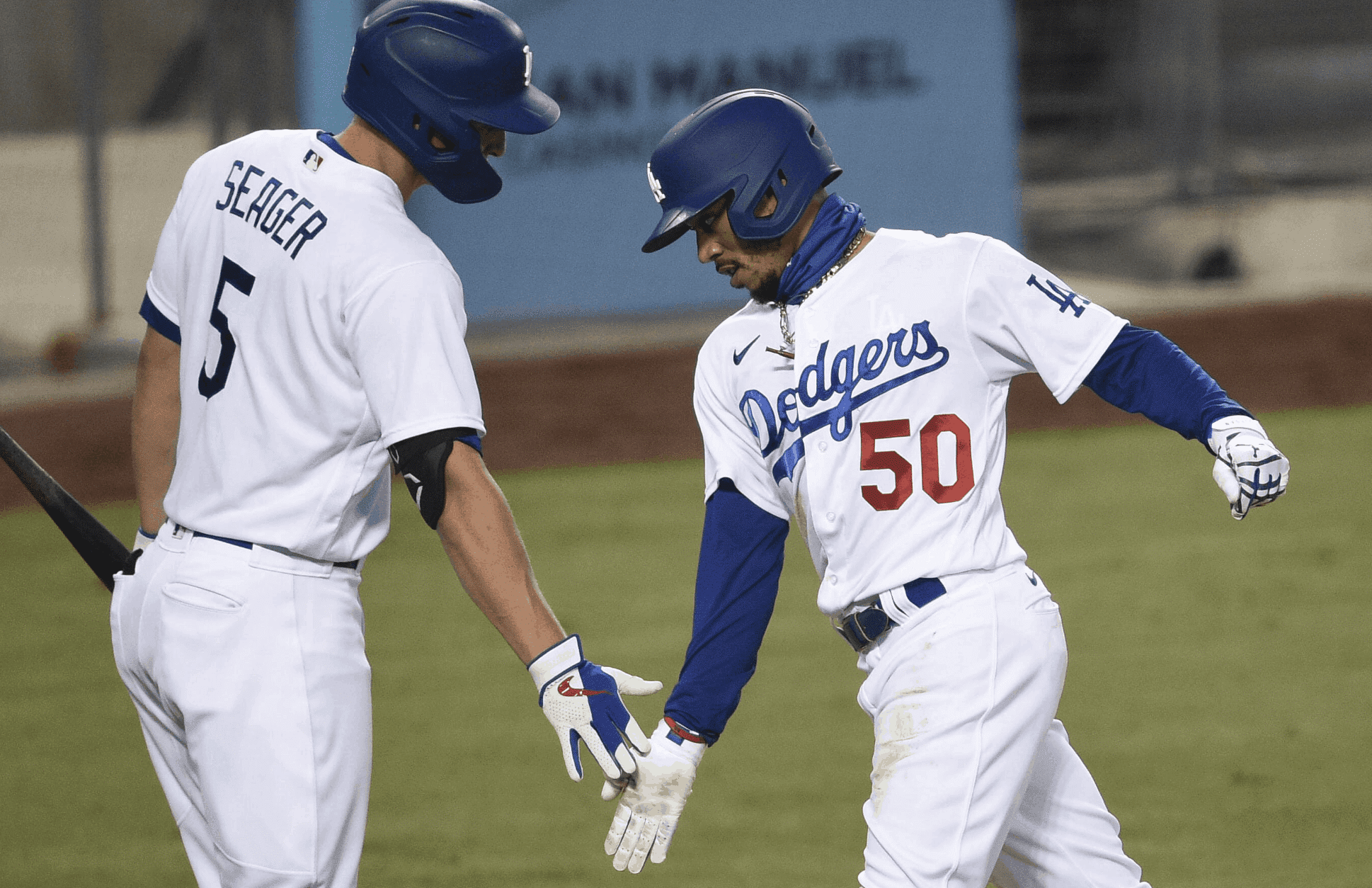
We’ll start with an easy one, because most of you probably know this already, but people still occasionally ask me why the Dodgers have red front-jersey numbers when there’s no red anywhere else on their uniforms. Uniform designer and historian Todd Radom came up with the answer a few year back, when he found an old article indicating that the Dodgers had actually planned to add the red numbers as a special addition for the 1951 World Series. As it turned out, the Dodgers didn’t make it to the ’51 Fall Classic (Bobby Thomson took care of that), but the red-numbered uniforms had already been ordered, so team ownership decided to use them for the 1952 season, and the numbers have been part of the Dodgers’ look ever since. (Additional info here.)
2. In the Navy
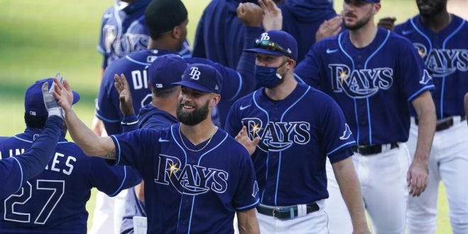
The Rays have worn their navy alternate jerseys for 12 of their 14 postseason games so far (the two exceptions were Games One and Seven of the ALCS, when they wore powder blue and white, respectively), so it seems fair to expect them to wear a lot of navy in the World Series as well. One exception is likely to be Game Five (if necessary), because that will take place on Sunday and they will be the home team, which means they’ll probably wear their home-Sunday powder blues. Aside from that, I foresee a lot of navy. Good thing they’re not facing Atlanta.
3. Sock Hop
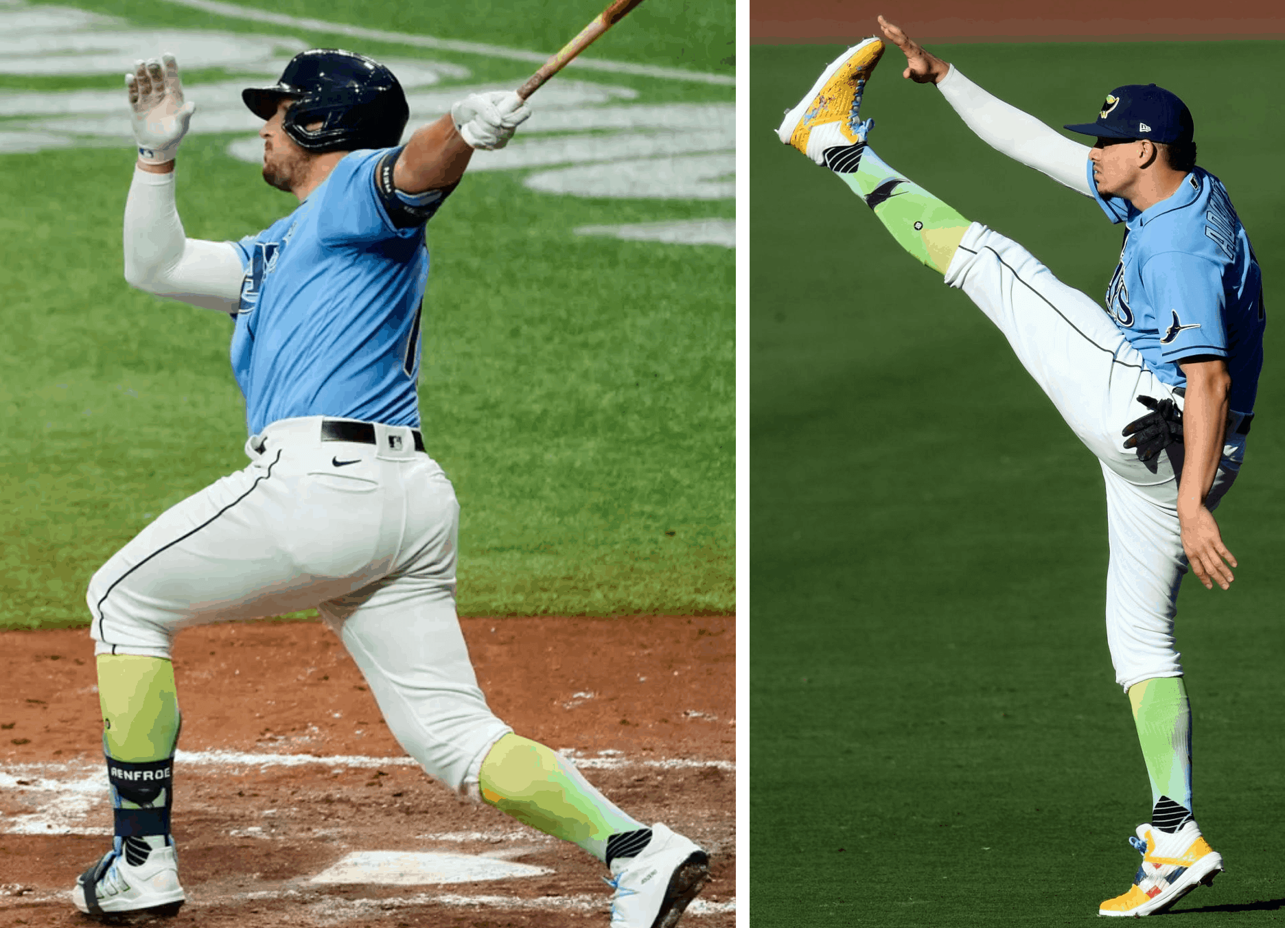
If the Rays do indeed wear the powder blues for Game Five (or any other game), then we’re all in for a, uh, treat, because outfielder Hunter Renfroe (above left) and infielder Willy Adames (right) like to accessorize that uniform with some truly heinous socks. Obviously, I’m a longtime proponent of high-cuffery, but I might make an exception in this case!
4. Mood Indigo
Speaking of navy, this will mark the the 15th consecutive World Series in which at least one team has worn some shade of blue somewhere on its uniforms. (I’m including the Yankees’ midnight blue, although I realize many people think it looks black.) The last blue-free Series? White Sox vs. Astros in 2005.
5. Where You From?
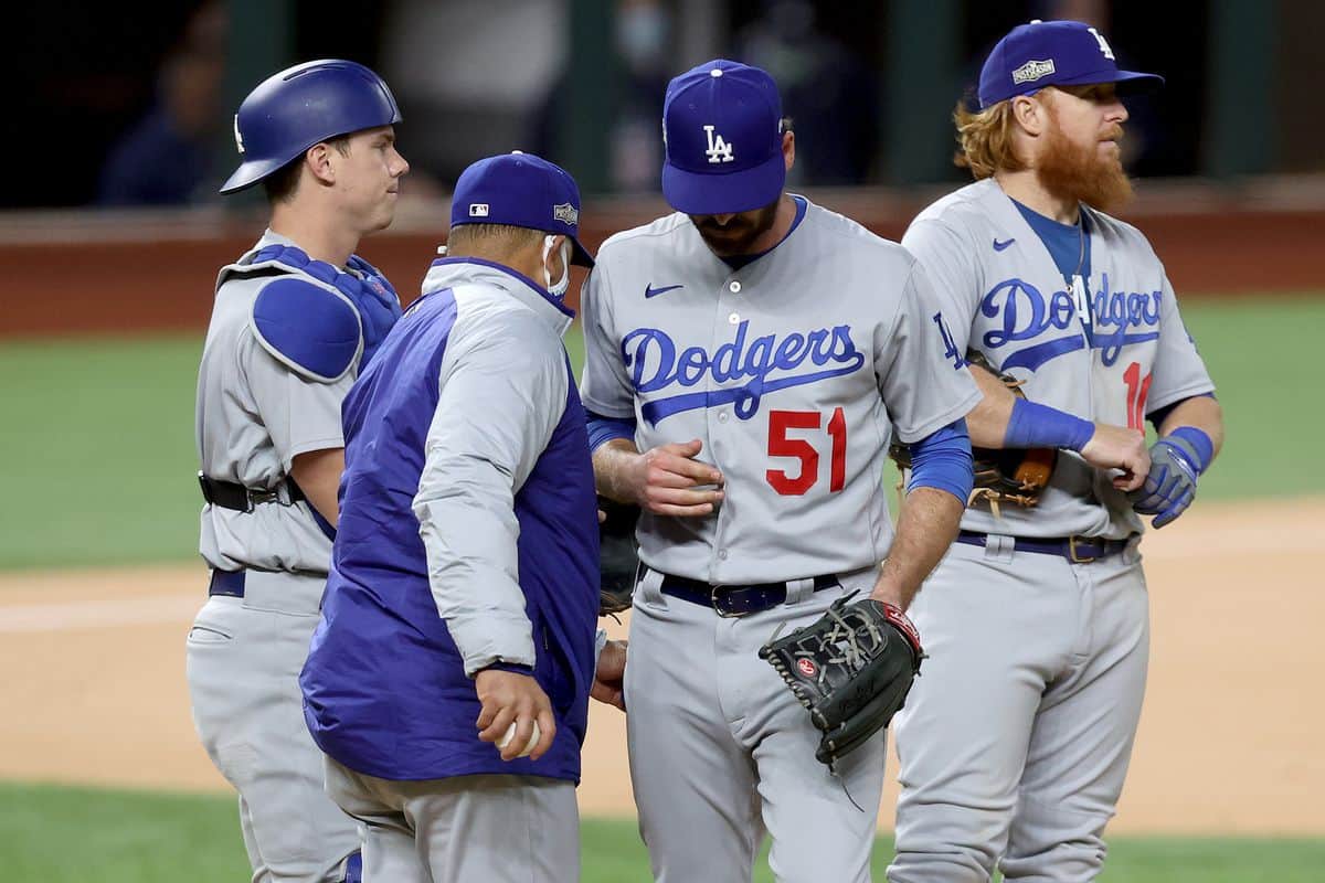
The Dodgers have been the road team for only four of their postseason games so far, and they wore their alternate “Dodgers” greys — rather than their “Los Angeles” primary greys — for all four of those games. That’s no surprise, as they’ve been wearing the alts more than the primaries for several years now. They have home-field advantage in the World Series, which means they’ll be the road team for Games Three, Four, and Five (if necessary), and it seems like a safe bet that they’ll wear the alternates for those games. Since the Rays don’t even have a jersey with “Tampa Bay” on the chest, this could be the rare World Series in which neither team’s regional identifier appears as a chest insignia. The last time that happened? It also involved the Rays, when they faced the Phillies in 2008.
6. Multiple Single Digits
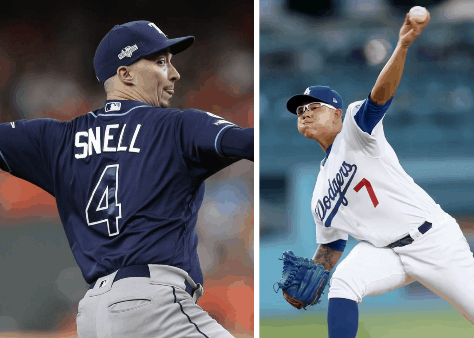
Another World Series rarity — and maybe a first! — is that each team’s roster includes a pitcher with a single-digit uni number: L.A.’s Julio Urías (who also appeared in the 2018 Fall Classic) and Tampa’s Blake Snell (making his World Series debut). Imagine if they ended up facing each other as the starting pitchers in the same game! That might set the World Series record for the lowest combined uni number total for a pitching matchup (well, not counting the pre-number era).
7. NOB Job
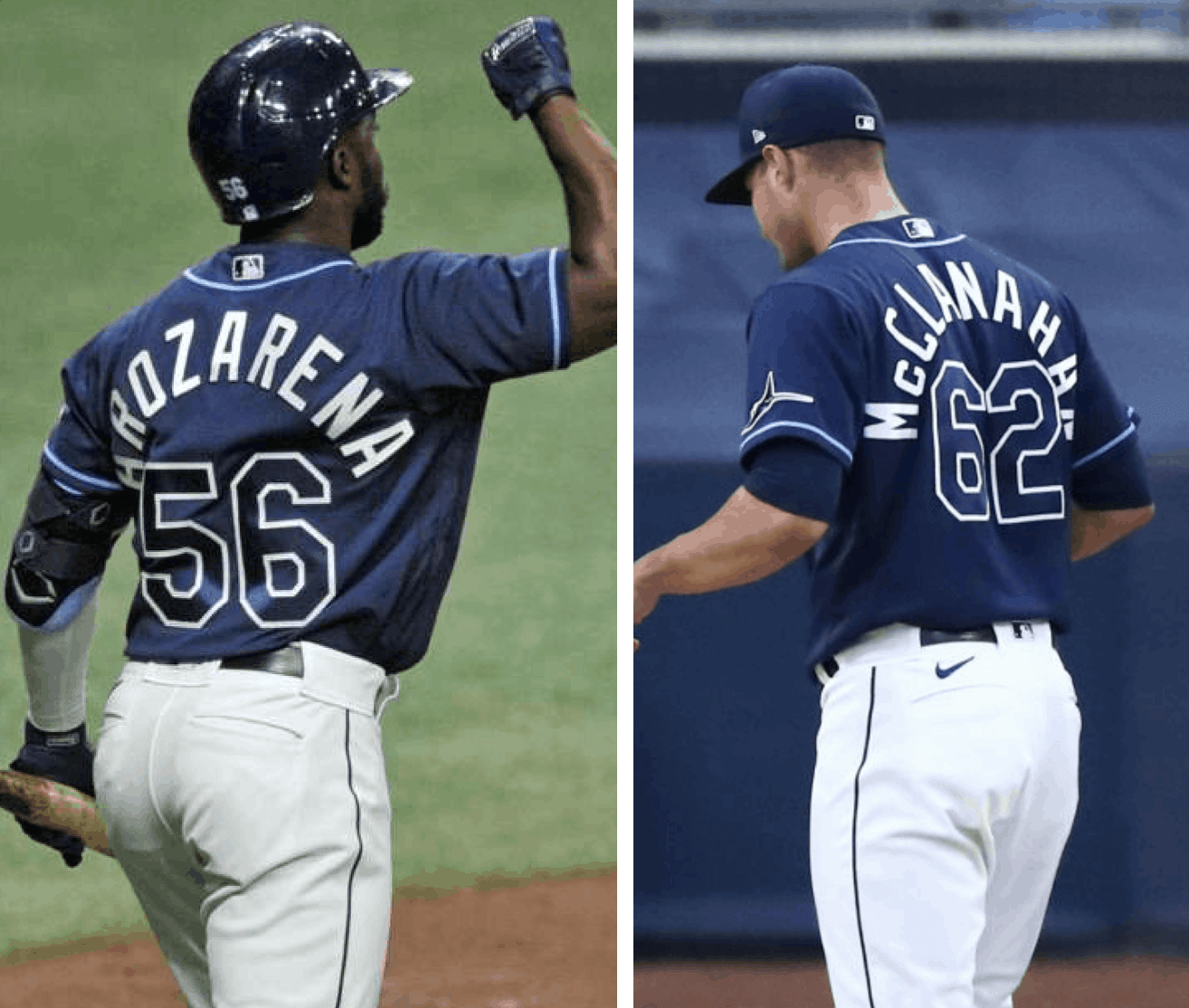
The Rays generally keep their NOB lettering fairly level. But outfielder Randy Arozarena and pitcher Shane McClanahan’s surnames, despite being a relatively manageable nine and 10 letters long, respectively, are apparently too unwieldy to be handled with a gentle arch, so instead they get the Salty-style treatment (and McClanahan has the bonus of wearing a McNOB).
8. Mod Squad
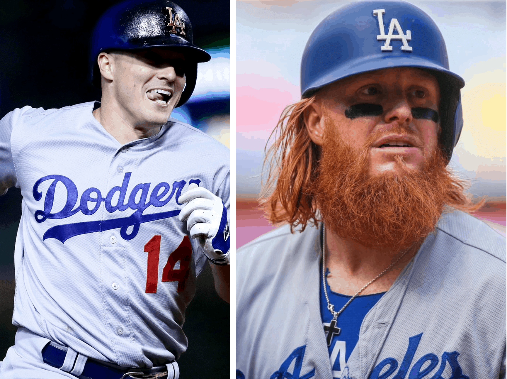
Dodgers infielders Kiké Hernández and Justin Turner both modify their jerseys. Hernández has his sewn shut, so it’s effectively a pullover (you can learn more about that here), while Turner has his collar narrowed (more info here). So much for uniformity! (Turner also has the bonus uni notability of having that ubiquitous pine tar smudge running through his NOB.)
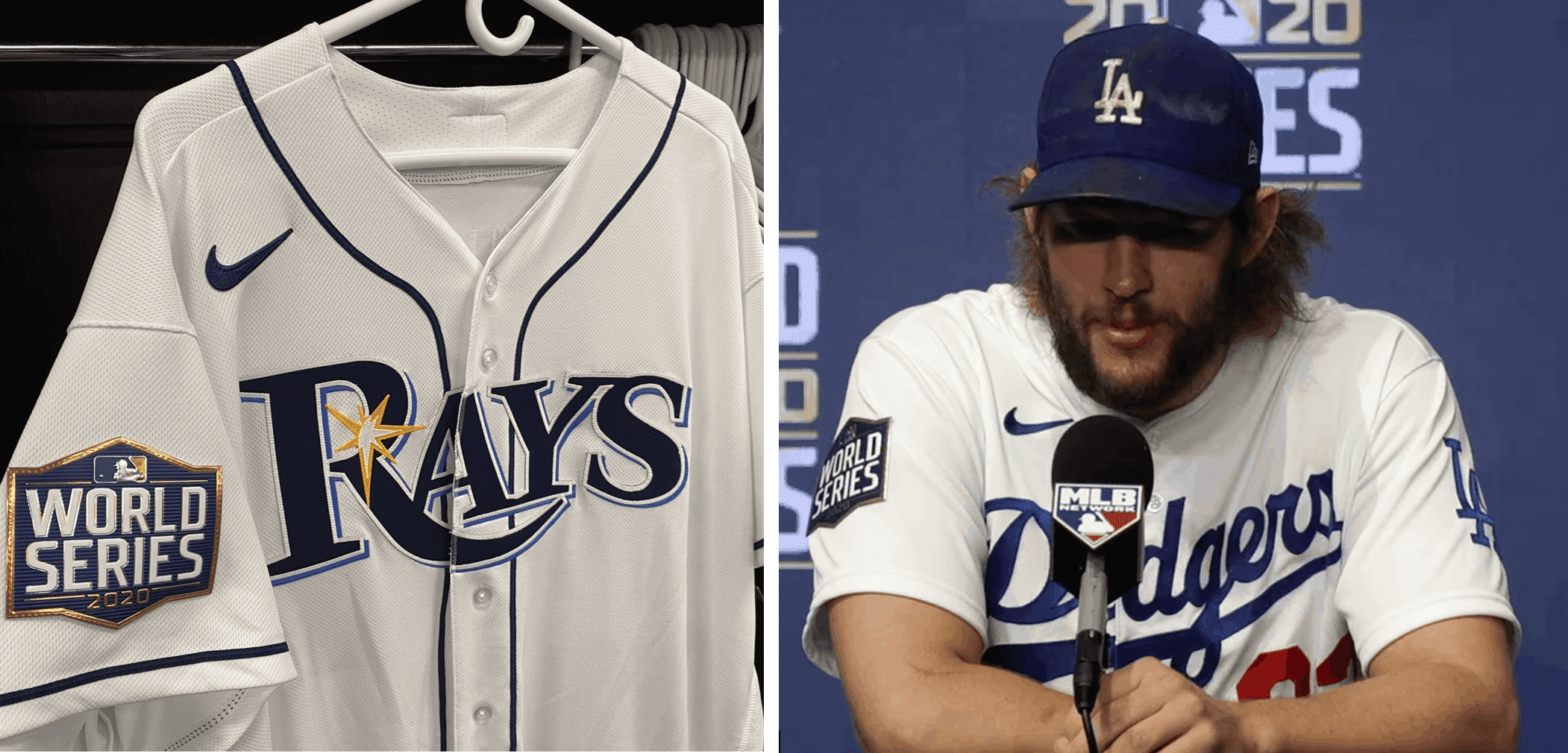
9. What’s the Opposite of “Subtle”?
This year’s World Series logo, which appears at the top of this post, is not exactly long on charm or playfulness. But whatever, it’s just a logo. When rendered as a sleeve patch, however, it’s not just brutal — it’s practically brutalist. A suitably joyless symbol for this largely joyless year.
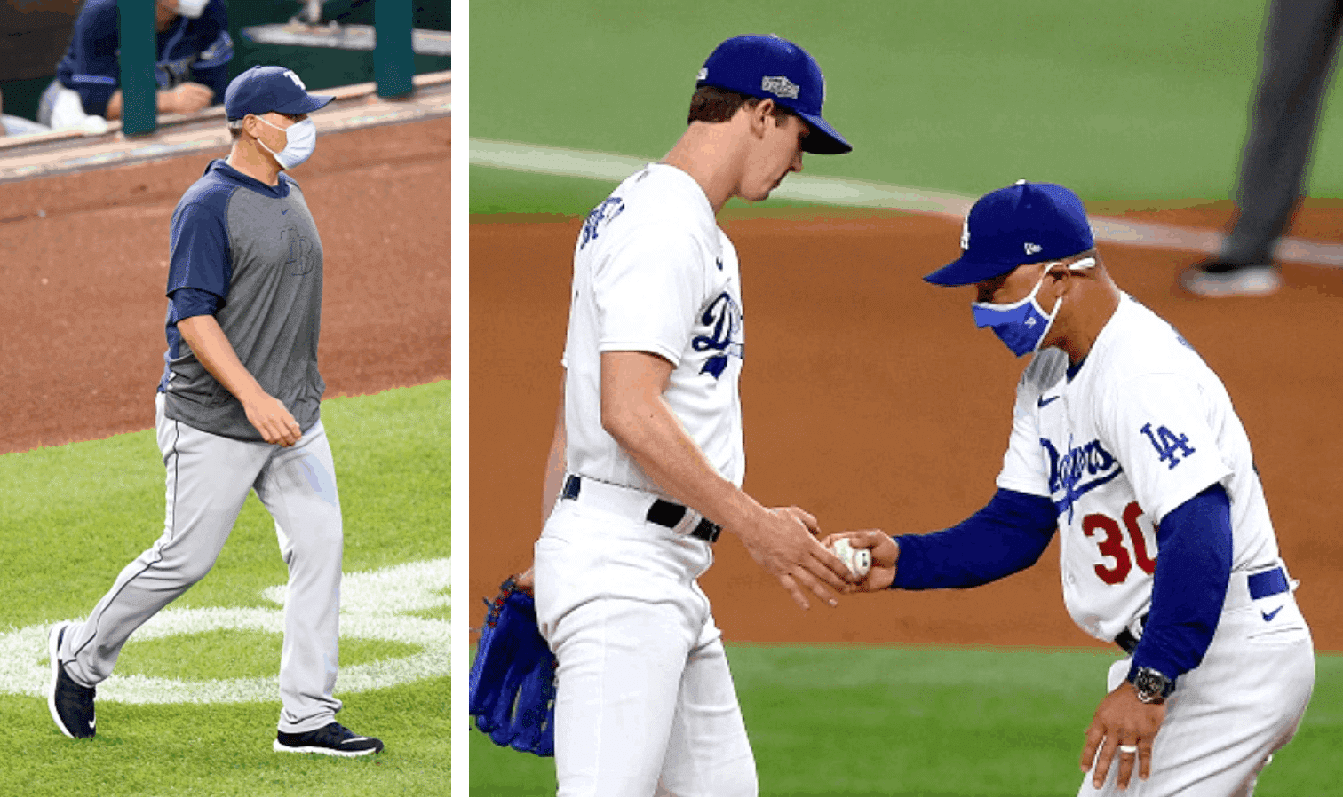
10. Formal vs. Casual
The two managers take very different approaches to their attire. Rays skipper Kevin Cash (who was uni-notable in his playing days for being among the first MLB catchers to wear his helmet with the brim facing forward), like many of his managing brethren these days, just puts on a pullover, leaves it untucked, and calls it a day. By contrast, the Dodgers’ Dave Roberts is among the last — maybe the last? — of the big league skippers to suit up in a full uniform for every day.
Dishonorable Mention: Fun While It Lasted
This will be the first World Series sullied by the presence of the Nike maker’s mark on jersey chests. Based on how the other postseason rounds went, this will presumably also be the first Series with ads projected onto the pitcher’s mound. Sigh.
———
And there you have it. If there are any other good Rays- or Dodgers-related uni tidbits that I overlooked, feel free to post them in today’s comments. Enjoy Game One tonight!
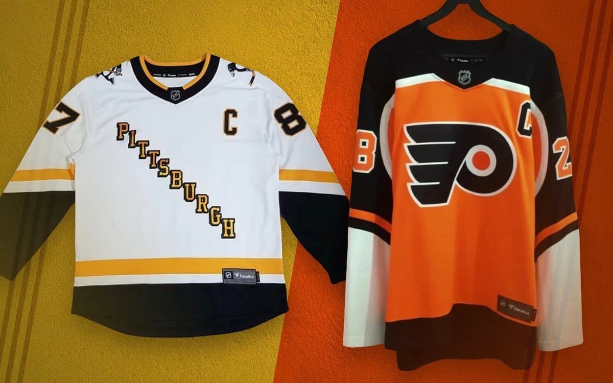
Photos via Icethetics; click to enlarge
New Pens, Flyers jerseys apparently leak: The images shown above, which began circulating yesterday, apparently show the designs for the Penguins’ and Flyers’ entries in the NHL’s new “Reverse Retro fourth jersey” program. I could explain what that means, but Chris Smith of Icethetics, who broke this story, has already done a really good job of that. For the full scoop, go check out his report. You won’t be sorry.
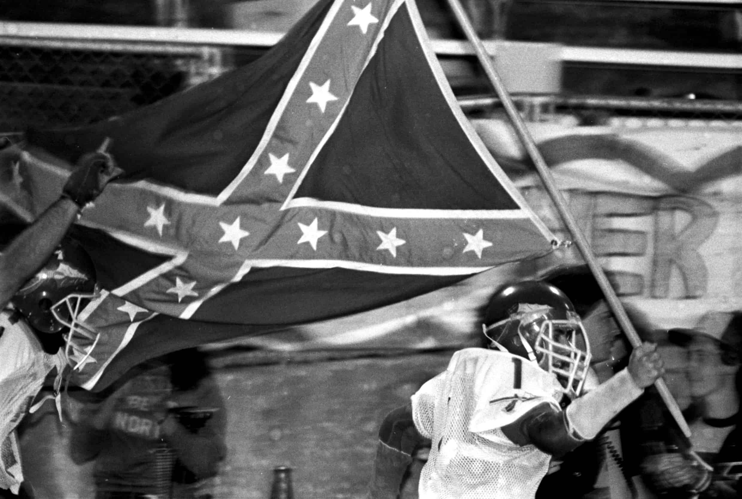
Photo by Mickey Torres; click to enlarge
South Grand Prairie update: Remember South Grand Prairie High School in Texas, where the baseball coach recently removed the Native American imagery from his team’s uniforms but the football coach didn’t want to talk about his use of Native imagery on his team’s uniforms?
“This is not the first time controversy has surrounded the South Grand Prairie football team’s imagery,” says reader Chris Huff. “In 1985, a [Black] football player was dismissed from the team for protesting the team’s 10-year-old tradition of running onto the field with the Confederate flag. That led to the state education board banning the Confederate flag at school events.”
The photo at the top of this section, which Chris also provided, is from a SGP game on Nov. 9, 1985. The combination of the Rebel battle flag and the Native American spear logo on the helmet is quite the double-whammy — ugh.
In my interview with Art Senato, the SGP baseball coach, he said the school is “majority Hispanic” and “definitely a majority-minority school.” I’m guessing the demographics were a bit different back in 1985.
Collector’s Corner
By Brinke Guthrie
Follow @brinkeguthrie
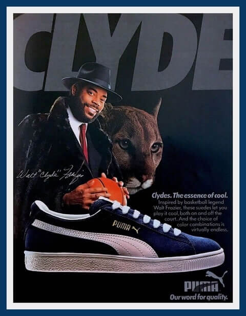
At my Cincinnati high school back in the day (mid-1970s), the sneakers of choice were Adidas and Puma. Nike was lurking — my senior year, our basketball team switched from Converse Chucks to the Nike Blazer. But Adidas and Puma were the popular brands, especially the Puma Clyde (“The Essence Of Cool”) or the Clyde III. A lot of the guys wore the navy style you see in this 1985 Clyde Frazier Puma ad. (I wore the gold suede with black.) The Clyde III was also popular since it came in royal blue suede with yellow, our school colors. Had those, too.
(As an aside, I might’ve been the first at my school to wear Nikes — specifically, the white canvas with the powder blue swoosh “Allcourt” tennis shoes. I distinctly recall someone pointing to the heel tab and asking, “What are Nikes?,” which he pronounced like “Mike.”)
Now for the rest of this week’s picks:
• Staying with sneaks, drawings of Cincinnati Reds star Johnny Bench and New York Knicks star Willis Reed were featured on this 1970s Keds shoebox.
• This 1970s NFL football bank has never been used but the decals are a bit dried out.
• Coca-Cola was the sponsor of this 1970s San Francisco 49ers helmet sticker.
• Philadelphia Phillies fans will love this 1980 World Champions step stool.
• Billy Martin looked awfully cheerful on the cover of this 1983 New York Yankees program. (He is shown kicking dirt on Blue, though.)
• The Union 76 Sports Club printed up this Fine Points of Basketball Defense booklet, starring “Boston Celtic Center” Bill Russell.
• Caricatures of popular St. Louis baseball announcers Dizzy Dean and Johnny O’Hara were featured in this 1940s Falstaff beer ad. “Hiya Fans! Welcome to the Series!”
• Infielder Tom Brookens hit just .246 for the 1984 Detroit Tigers, but since they won the World Series, he made it onto a limited-edition Coca-Cola can.
• Signatures of the 1960 World Champion Pittsburgh Pirates were featured on this commemorative glass.
• Baseball stars Pee Wee Reese and Jackie Robinson were showcased on this 1949 record called Slugger at the Bat.
Click to enlarge
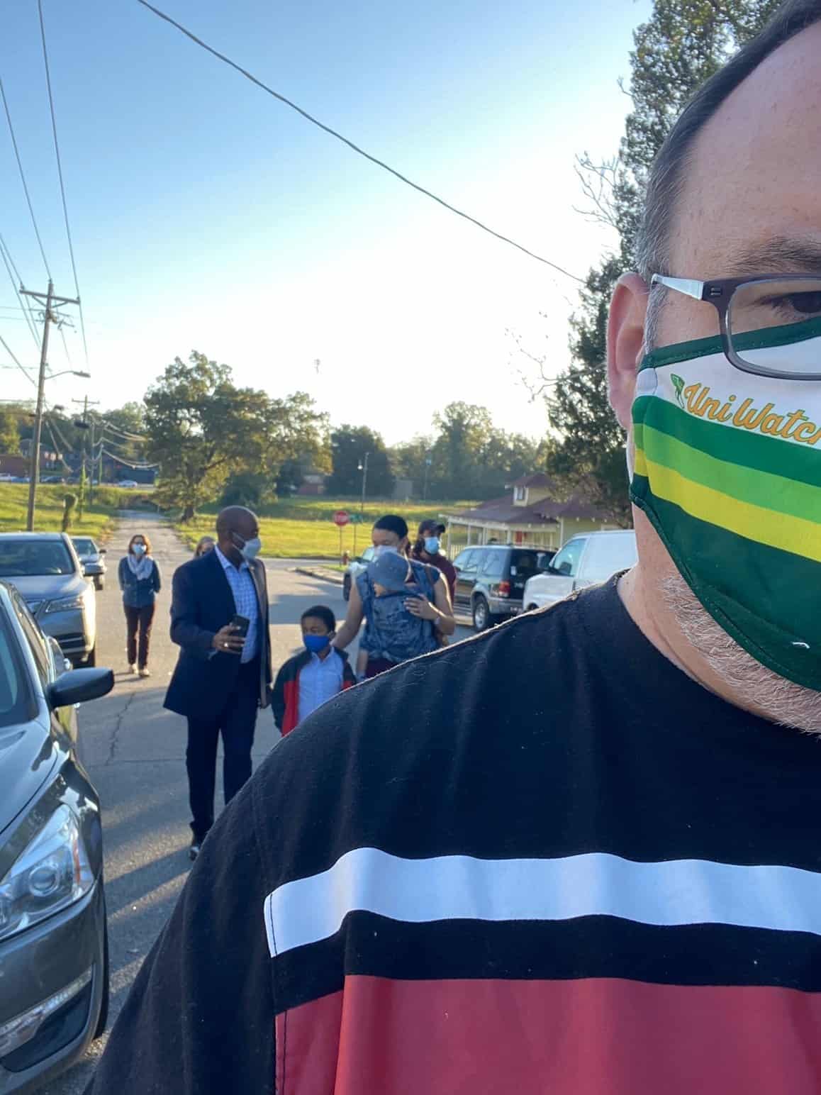
Who are those masked men? Reader David Staples strapped on his Uni Watch mask yesterday and went to vote yesterday in Columbia, S.C. And who should end up in line behind him but U.S. Senate candidate Jamie Harrison, who’s visible in the background of David’s selfie.
“There were cameras everywhere filming him and taking shots, and I am in a ton of these shots,” says David. “The mask’s gonna be everywhere! I’ll keep my eyes peeled to see if we cameo in anything.”
The Ticker
By Alex Hider


Baseball News: Los Angeles Fire Chief Ralph Terrazas has authorized all firefighters to wear a Dodgers cap while on duty until the end of the World Series (from Jakob Fox).
.
NFL News: Our first three items are from Mike Chamernik, beginning wih the news that Fox broadcasters Joe Buck and Troy Aikman were caught on a hot mic criticizing the pregame military flyover at Sunday’s Packers/Bucs game. … This comprehensive video details each team’s stadium and relocation history. … This may have been mentioned in the past, but Tua Tagovailoa became the NFL’s first lefty QB since 2015 on Sunday. … I’ve never seen anyone add an “FC” to the AFC and NFC logos like the Eagles did in this sign commemorating their 1980 conference championship (from Arthur J. Savokinas). … Paul noted yesterday that Patriots wide receiver Isaiah Zuber still has the wrong “Z” on his NOB. The Pats featured a shot of that egregious NOB error as one of their “photos of the game” (from Rob G). … The Colts have a new team airplane, which includes the team’s old wordmark in the paint scheme (look to the right of the door) (from @WeberKing).
College Football News: All Indiana University teams will wear a social justice patch on their uniforms this season. The football team, whose 2020 schedule begins this weekend, will also wear it as a rear-helmet decal (from Kary Klismet and @btownm00se). … New gold helmets for Western Michigan. … Kentucky QB Terry Wilson wore an undershirt on which he wrote, “Records R Broken” on Saturday, referencing the Wildcats’ first win in Knoxville since 1984 (from @BigBlueNat1on). … Nice move by Northwestern, who has added team record by uniform combination statistic to its team program (from Taylor Crabtree). … Miami will be wearing orange jerseys on Saturday (from Phil).

Hockey News: Jets C Nate Thompson will be the first player in team history to wear No. 11 since the franchise moved from Atlanta. That honor would have belonged to Rick Rypien, but he died by suicide before joining his new team in 2010. Thompson, who has dealt with substance abuse issues in his past, says he is wearing the number to honor Rypien’s battles with depression (from Mike Chamernik and Wade Heidt). … C Adam Gaudette has returned to the Canucks, and he’ll wear No. 96. He wore No. 88 in his first stint with the team (also from Wade Heidt). … New mask design for G Tyler Muszelik of the USNTDP (also also from Wade Heidt). … New sweaters for Western Michigan (from Joseph Zurek).

Basketball News: If this retail shirsey leak is any indication — and such leaks have generally been accurate indicators lately — the Lakers will be getting a white alternate uni with blue type (from Rafal Niewiadomski). … It appears that Georgetown will be wearing a more simplified uni set this season (from Dave Giordano). … The city of Alexandria, Va., has renamed a portion of a city road after Alexandria native Earl Lloyd, the first Black player to appear in an NBA game (from William F. Yurasko). … The Smithsonian’s National Museum of African American History and Culture has added one of Kobe Bryant’s jerseys to its display on social activism in sports (from Kary Klismet).

Soccer News: Tottenham has announced its men’s and women’s teams will wear poppies for Remembrance Day on Nov. 7 and 8. Jamie Rathjen believes that’s the weekend when most other EPL and Women’s Super League teams will choose to wear them as well. … Couple of Liga MX notes from Ed Żelaski: Pumas wore pink numbers Sunday, presumably for cancer awareness, and Atlas has a new Day of the Dead jersey.

Grab Bag: Cross-listed from the college football section: All Indiana University teams will wear a social justice patch on their uniforms this season (from Kary Klismet and @btownm00se). … Mark Divine sent along a photo that includes logos for every Big Ten school’s Hillel Club logo. … Google has updated the icons for its workspace applications (from Brinke). …Also from Brinke: Roger Federer has a new sneaker line with Swiss running company On. … The Police Service of Northern Ireland has introduced a new uniform for the first time since its formation in 2001 (from Timmy Donahue). … Also from Timmy: Premiership Rugby club Leicester Tigers have agreed to sell the naming rights to their stadium for the first time since it opened in 1892 in order to survive the pandemic. … Speaking of Premiership Rugby, new jerseys for Bath (from Sy Hart). … More rugby from Sy: New jerseys for SX10, a rugby tens team comprised of Kenyan and South African rugby sevens players. … New jersey set for French volleyball club Tours VB (from Jeremy Brahm). … Rep. Sharice Davids, one of two Native American women currently serving in Congress, has incorporated a feather design into her campaign logo (from R. Scott Rogers). … Some Marines will now have red patches on their utility covers (Timmy Donahue again).

Why is the accent mark written on Enrique Hernández’s nickname on the second syllable when the accent (spoken) is on the first syllable? KEE-kay.
I’ve read that he prefers it that way, to further differentiate it from the anti-Semitic slur “Kike.”
He “is fine with it” – he goes along to get along. Why do we even ask him to render his name inaccurately? Surely people can tell that his name has nothing to do with what first wave assimilated Jewish immigrants called the next wave, from Russia, to look down own them.
Actually, Brian, I did not use the words “is fine with it.” Why would you quote me inaccurately like that?
Moreover, I did not say that anyone “ask[ed] him” to change it. I said he chose to do it that way. Why would you mischaracterize what I said?
It’s *his* nickname, how *he* chooses to call himself. It’s hard to imagine anything that’s more his own business, and less anyone else’s, than that (just like it would be my business if I chose to call myself Paül). I fail to see why this should bother you, or anyone.
I am not quoting you, I’m
quoting Enrique Hernández.
“Teams started using an accent to avoid controversy,” Hernandez said. “I don’t mind it. It’s in Spanish. If you don’t read it in Spanish, it can be offensive.”
English speakers (minor league teams in the US) added something to his name and he did not push back.
I am aware he link on his players weekend jersey. That is his own business, but it was made clear to him how he should operate when he was a minor leaguer.
My (last) name was anglicized generations ago and I just think that should not be imposed on anyone in the 21st century.
Thanks for clarifying, Brian. Since you didn’t cite that source in your previous comment, there was no way for me to know that’s what you were quoting.
Seems to me that he can do what he wants but he’s thoughtful about other people’s sensitivities and how things can be (mis)perceived. Doesn’t seem very analogous to the situation regarding your family’s name (which, of course, you can change anytime if you choose, just as Hernández can change his).
I’ve noticed a lot of Spanish men who use the shorter form of Enrique spell it “Quique”, to avoid the association with the anti-Semitic word.
This makes more sense, as it actually reads correctly in Spanish.
I, too, will be voting for Jamie Harrison (I guess I’m assuming Mr. Staples voted for Harrison) over in West Columbia, SC. Perhaps I’ll wear my tequila sunrise t-shirt to the polls!
Hey Joel! It is nice to know there is a fellow Uniwatcher here in Columbia! I did cast my ballot for Harrison. I unfortunately wore a shirt that made me look like a human Pokeball instead of one of my UniWatch shirts. I got to the poll right when it opened, so the wait was only 30 minutes.
Always fun to see two readers connecting as neighbors (or vice-versa)! But let’s please steer clear of electioneering, OK? Thanks!
Whoops. Sorry about that.
No worries, David. Just trying to put out a potential fire before it starts!
I get up early and usually read the paper before UW kicks in around 8a. So I got the word about the Flyers’ new fourth (ugh) sweaters from the Philadelphia Inquirer. Their source? A tweet from Phil Hecken! Props!
NHL’s Reverse Retro fourth jersey program makes me nervous. We are bound to see some uniforms that look good but possible to see some duds.
As a Canucks fan, it popped into my mind that we may have already seen G Thatcher Demko in a jersey that is similar to something the Canucks could potentially use for a Reverse Retro. His AHL All-Star green jersey from a few seasons back.
link
link
Not retro, but reverse: I would love to see the Rangers’ blue sweaters with the red/white striping on the shoulders, like the white sweaters. Always thought that would look good.
I’d think there will be some changes to the Rangers body to make it look like the mockup for the New York Raiders of the WHA. A red (horrors!) jersey.
Just a thought …
Clydes are still my favorite shoes of all time.
The video detailing each NFL team’s stadium and relocation history is very good. Kinda long but worth it.
Dusty Baker still wears the uniform top. Could have had both managers in uniform tops had the Astros advanced.
Ah, yes, good call!
So does Brian Snitker. That’s three of the MLB final four.
Does anyone know if the MLB rulebook formally forbids managers from wearing street clothing (I.e. suit and tie) on the bench?
Not like anyone would want to channel their inner Connie Mac, but if they did …
-C.
PS: Speaking of dressing up for the occasion, wasn’t it not long ago when the NFL denied the former head coach from the 49ers from wearing a coat and tie on the sidelines (Nolan?)
MLB skippers: The rulebook doesn’t forbid it, but MLB’s apparel contracts probably do.
NFL: That was indeed link, in 2005. The league initially said no, but both Nolan and Jags coach Jack Del Rio were permitted to wear Reebok-supplied suits in 2006.
I love the term MLB skippers but have always wondered, why “skippers”? It’s like the Cadbury Caramilk secret.
Some things are great undiscovered.
One similarity between the Dodgers and the Rays I don’t think you picked up (but could be wrong), is the similarity in their cap logos, two letters, with the second letter placed lower than the first, letters are white, cap is blue, albeit slightly different shades of blue.
Good point!
Dodgers. Rays. I’m reminded of when the Rays put out a Don Zimmer bobblehead of him in a Brooklyn Dodgers uniform. Dodgers wore a faux-back gray road uniform with Brooklyn across the top. You don’t often see a team honoring an employee’s tenure on the other team (closest thing is the Giants giving a Duane Kuiper Indians bobblehead), but it happened!
The Brewers do that from time to time. link, link. Obviously there are city/franchise connections there, but I’ve never liked the practice.
Don’t forget Bob Uecker as a Brave & as the voice of the Indians
Some details about the Rays navy alternate:
With navy numbers and white NOB, it’s in the category of contrasting numbers/NOB that was previously discussed over the summer.
All three script elements on the jersey (team name, number, NOB) have unique color and outlining schemes. The NOB is white with a single navy outline. The number is navy with a single white outlining. The team name is navy with a single white outline and sky blue drop shadow. If you included the cap, that goes up to four different styles because the TB is white with a simple sky blue shadow.
It’s also the only Rays jersey to use sky blue soutache instead of navy (the sky blue, white, and grey jerseys all use navy blue soutache).
One thing I like about the Rays jerseys (in addition to the details above) is their front script is big enough (and high enough on the player’s right shoulder) to have forced the swoosh to an unnaturally high level – it’s definitely placed higher than on other jerseys. I’m sure that bugs somebody at Nike so I’m happy.
I could have sworn that the 90’s angled Pittsburgh font was italicized, like the original 67-68 uniforms, but looking around the internet I was wrong. Hmmn. Berensetin, Berenstain.
And that Flyers jersey is eech.
It’s also a lot narrower than the original, in a way that recalls what they had to do to the Rangers jersey when the Rbk Edge template was rolled out.
I work in the retail bizz and I can confirm everything that Paul and Icethetics said about the Reverse Retro NHL program.
I am amused by the difference in the Dodgers and Rays use of green. Greenbacks to be precise.
Generally I don’t care who wins, but the Rays make it difficult to be impartial. Baseball has always favored the wealthy, and I generally accept a commensurate outcome. That is, a top tier payroll team winning it all while others know their only chance is a good front office and some luck once a decade or two. Has any recent baseball team produced more with less than the Rays? It would be nice to see them win a World Series. The high payroll teams will still get their paychecks and win it all about nine of the next ten years.
Regarding the “more with less” idea, I’d put Billy Beane and the Moneyball A’s in that category. Never reached a World Series but had more success given the financial landscape than anyone had expected.
The Dodgers are easy to like, what with wearing the most beautiful uniforms in sports history. But I have an obscure personal connection to the Rays, and I have a general policy of rooting for any team that has never won a World Series to do so. Even if the Rays weren’t exemplars of making the most out of less resources than most.
So if I had to bet, my money would be on Dodgers in 5, and I would be perfectly fine with that outcome. If I could choose an outcome, it would be Rays in 7, and I would be ecstatic with that outcome.
Hello fellow Uni-watchers! I have a quick favor to ask of anyone who knows their way around the interwebs with clipart. I am looking for a .png or .svg file of the Detroit Lions helmet where the helmet is completely flush to the side, like so:
link
As you can see, that is the old lions helmet with the black mask and striping. The other standard clipart style where the helmet is facing off to the side, like so: link is not quite what I’m looking for. The more flat the helmet is, the better. Thanks so much for anyone’s help in advance!
Hi, Bud-
Does this image work for your purposes?
link
I’ll probably post this again in the comments to Wednesday’s entry in hopes that you see it.
Bud…
I have a PNG version I can email you.
If you see this, include your email and I will send it to you.
Lee
Hey Lee, thanks for the response, but I think I’m all set for now, I was able to grab it from someone Paul put me in touch with. You’ll see why I was looking for it soon enough, via a guest post here on the site! Thanks again!
Sweet!
Looking forward to your guest post! Do you know if it will run during the week, or weekend? I don’t want to miss it.
Lee
I posted this yesterday and didn’t get any responses, I’m reposting it hoping to get some answers, anyone?
I actually prefer the matte fabric for any color except gold and silver. Those 2 colors are represented correctly in the matte fabrics. For any other color I actually like the not “sheeny” look. It appears that the Raiders are the only team that still wears the pants with sheen or dazzle, which leads me to a few questions: if they can do it why doesn’t any other team do it? Are their pants heavier than everyone else? Does Nike still use an old template for the Raiders or pants? Or do they use a current template with old style fabric?
What about the Cowboys?
I do not know the correct answer to your question Pedro, but among other possibilities is that maybe the Raiders have a completely different company create/manufacture their pants to the Raiders specifications, and then slap a Nike logo on them.
Its been done before.
Lee
Love the intel on the Dodgers’ use of red – always something I’ve been curious about. That said, the explanation seems to answer “how” LA acquired the red numbered jerseys, but not “why.”
Maybe I’m missing a dot – is there a reason that red numbers would have been relevant to that years’ World Series? Or do we not actually know why the red was chosen?
From the UW article referenced:
“A uniform manufacturer (most likely Rawlings) suggested the Dodgers use red numbers as a nod to the red baseball in logo used on the team’s letterhead.
• Red was suggested because it would be easier to see at a distance (since the front numbers are considerably smaller than the back blue numbers).”
Thanks! I read the news snippet but stopped there as it seemed focused on the numbers rather than color as well.
I remember reading once (I think!) that the red numbers were originally for “coaches only” in spring camp so players could spot them quicker, and it just stuck.
Of course, I’ve also thought the three stripe Patriots socks were a holdover from when Adidas did the uniforms.
Julio, not José, Urías.
Ugh. Fixed. Thank you!
Enjoyed the article! One correction, however. It is Julio Urias, not Jose Urias, who wears #7 for the Dodgers
Catching up on South Grand Prarie. I take the middle ground. Native American caricatures are inappropriate, but spears are universal across warrior cultures around the world. Native Americans don’t have exclusive use of spears.
The white Lakers uniforms that leaked might be the City Edition uniforms (in the case of the Lakers, it’s Lore Series.) The 2020-2021 season is the 60th anniversary of the Lakers as a team in Los Angeles, so along with the blue throwbacks, many signs are pointing to this uniform referencing Jerry West, an integral part of the Lakers’ first few seasons in Los Angeles.
Interesting to hear Aikman and Buck critique the military flyover, but they’re not going to subside on a “Biden/Harris ticket.” If anything, they’ll increase when attention re-directs back to the Middle East. Just watch.
About those military flyovers as a waste of money or as propaganda… military pilots need to practice flying on a regular basis, so stadium flyovers are actually worked into the budget time and money-wise. Instead of flying some pretend practice route, they might as well get to do something with a precise route and timing that has some purpose.
Except not everyone agrees that this “purpose” is a good or appropriate one.
I had that NFL bank when I was a kid. Dag-gone it was hard getting that base sticker on straight!! (mine was not).
Really? Nobody else has pointed out that it’s link — not Jamie — Harrison?
I’m 62, and probably the “get off my lawn“ guy, but those Rays socks are gawd awful. I’m also “a longtime proponent of high-cuffery”, but I’m for banning them if this becomes the norm. I’m sure this has been covered here, but when did MLB lose control of how the players wear their uniforms?
MLB has never really had control over pant length (I’ll have more on that later this week), but at least there was one set of hosiery for everyone, instead of the current free-for-all. The biggest culprit there, as with so many uniform ills, is merchandising. Once MLB made Stance its official sock partner, players were given multiple sock options (many of them absurd) as a way of moving more product.
I’m looking forward to the pant length exploration (phrasing). As for socks – I hate that MLB lost control of this. And shoes. (As did the NBA re shoes). They should start calling them “outfits” or “costumes” or “game dress” not uniforms.
I’d be curious where you draw the line. I think it’s been written about here before, but at some point you have to decide what is part of the “uniform,” what is slightly adaptable player to player, and what is up to the full player’s preference/individual style.
It sounds like you view socks and shoes as part of the uniform. What about batting gloves? Should every player’s bat look the same? Are sunglasses ok? Should every player have matching sunglasses? What about sweatbands, or true style accessories like chains?
I’m certainly not for a free-for-all, but I think there’s valid debate as to what constitutes “the uniform” – personally I think it’s just the signifiers of the team (namely, jersey/pants/hat-helmet across sports). Those minimum elements that let you see what team that player is from. Other than visual consistency, it’s not like the socks/shoes/gear really do much of that, and as such I think it’s up to the team to decide how much leeway to give players.
There’s a difference between team-issued uniform elements (cap, jersey, pants, etc.) and player-optional equipment/accessories (fielding gloves, batting gloves, bats, wristbands, catching gear, etc). For over a century, socks/stirrups were in the former category; now they’re in the latter. You can decide for yourself whether that’s a good thing or a bad thing, but it’s important to understand the distinction between the two categories and not treat them like they’re the same thing, because they’re not.
As a veteran, at first I had to do a double take when I hear about the Aikman/Buck comments. If you think about it, why spend the money on the flyovers with stadiums no where near capacity or zero fans as well? I read that the money is already budgeted for them, but why not stop them, especially this year? I think its become watered down, along with all the camo unis in sports these days, it’s lost it’s meaning.
I guess it’s advertising revenue to promote the arms forces. The military pays the teams to do these type of advertisements, including when they have military personnel do the color guard and break out the giant American flags.
The jersey that was sewn shut was new to me – but I have seen that horizontal stitching on some Cubs uniforms recently – maybe the same thing?
Yes, a few Cubs do it, plus a few other players scattered around the sport.
Anyone know who makes the decision as to what road jersey the Dodgers wear? Manager? Players? Starting pitcher? I do not like the road script Dodgers jerseys. The script LA roads are awesome IMO.
I personally love the idea of the Los Angeles road greys. I’m a traditionalist (city name on road). And the red front number doesn’t pop as well on the greys so having grey and white be exactly the same makes the greys decidedly duller.
Having said that, I want to like the Los Angeles greys more than I do. It’s just too many letters in the end. Font gets squeezed, all that. I think the current version is better than many have been in the recent past (white outline, etc.) but I wish there was a way to make it not feel as bunched to the eye as it does.
One thing they haven’t done is try grey Dodgers with the headspoon piping to differentiate it from the plane white. Would love to see that mocked up. (Also liked the 1980’s version with Dodgers outlined in white).
Your #1 of the uniforms for the World Series calls to mind the classic George Carlin bit:
“In most sports the team is run by a coach; in baseball the team is run by a manager. And only in baseball does the manager or coach wear the same clothing the players do. If you’d ever seen John Madden in his Oakland Raiders uniform, you’d know the reason for this custom.”