For most photos, click to enlarge
Good morning! Greetings from Uni Watch HQ, where all three inhabitants continue to be safe (although one inhabitant had to go to the vet on Friday due to a case of fleas). Hope all’s well at your home, too.
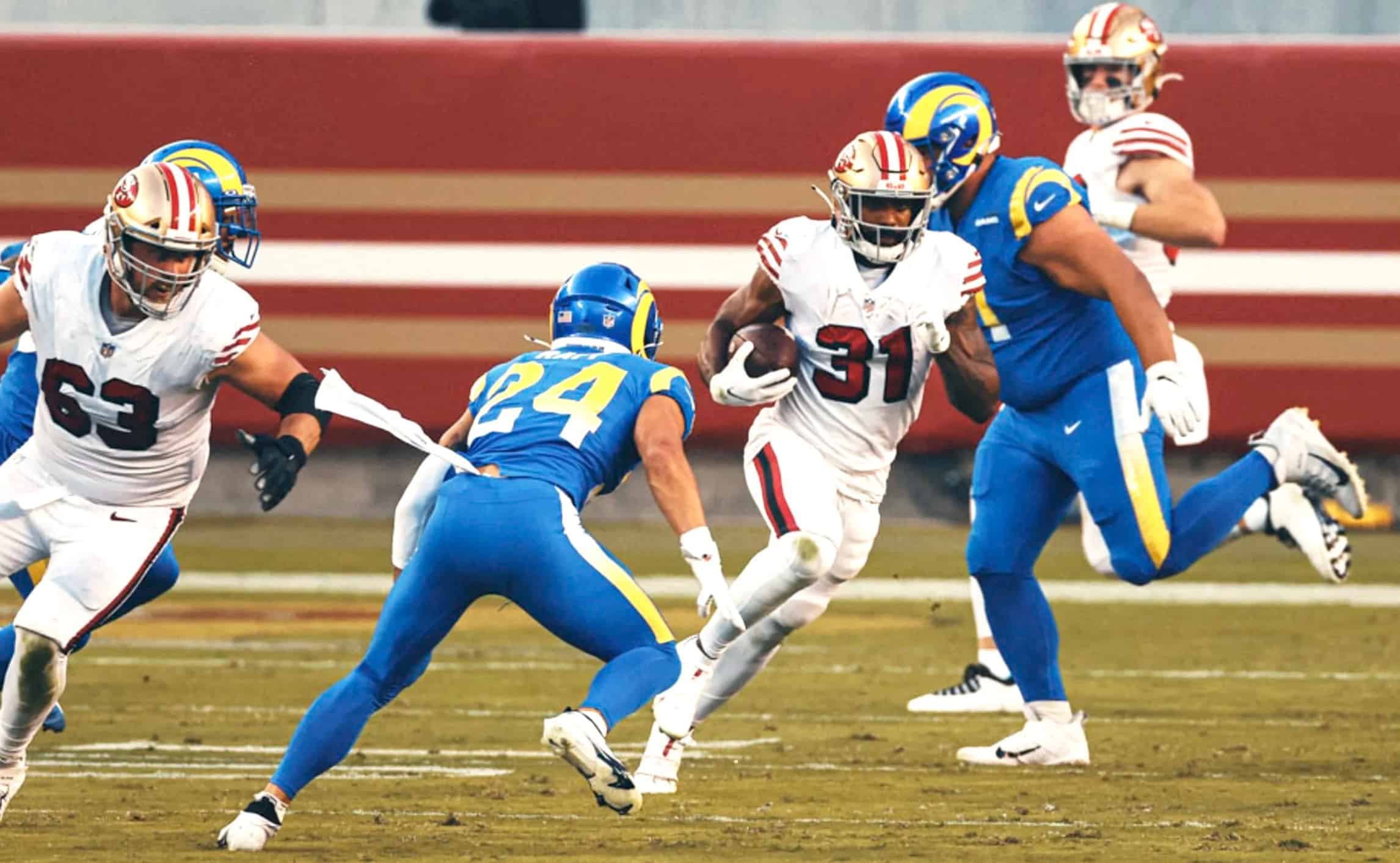
So: Study in contrasts last night in the Bay Area, as the 49ers wore their white throwbacks at home and the Rams went mono-blue. This game was an NFL uni rarity, as neither team wore TV numbers! Lots of additional photos here, here, and here.
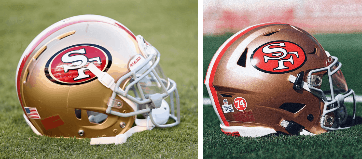
A subtle detail regarding those Niners throwbacks that you might now be aware of: The package includes a throwback helmet logo. Here’s a side-by-side comparison — regular logo on the left, throwback on the right:
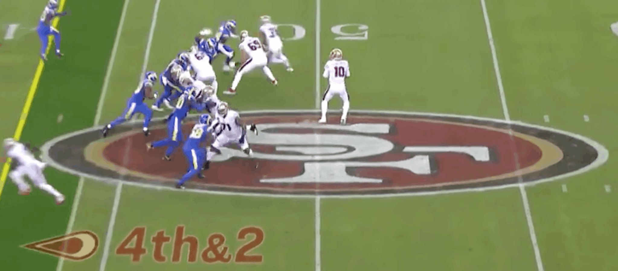
But they still had the current logo, not the throwback logo, at midfield:
In addition (and as you can see in that throwback helmet photo), the Niners added a “74” rear-helmet memorial decal for defensive lineman Freddie Dean, who died last week:
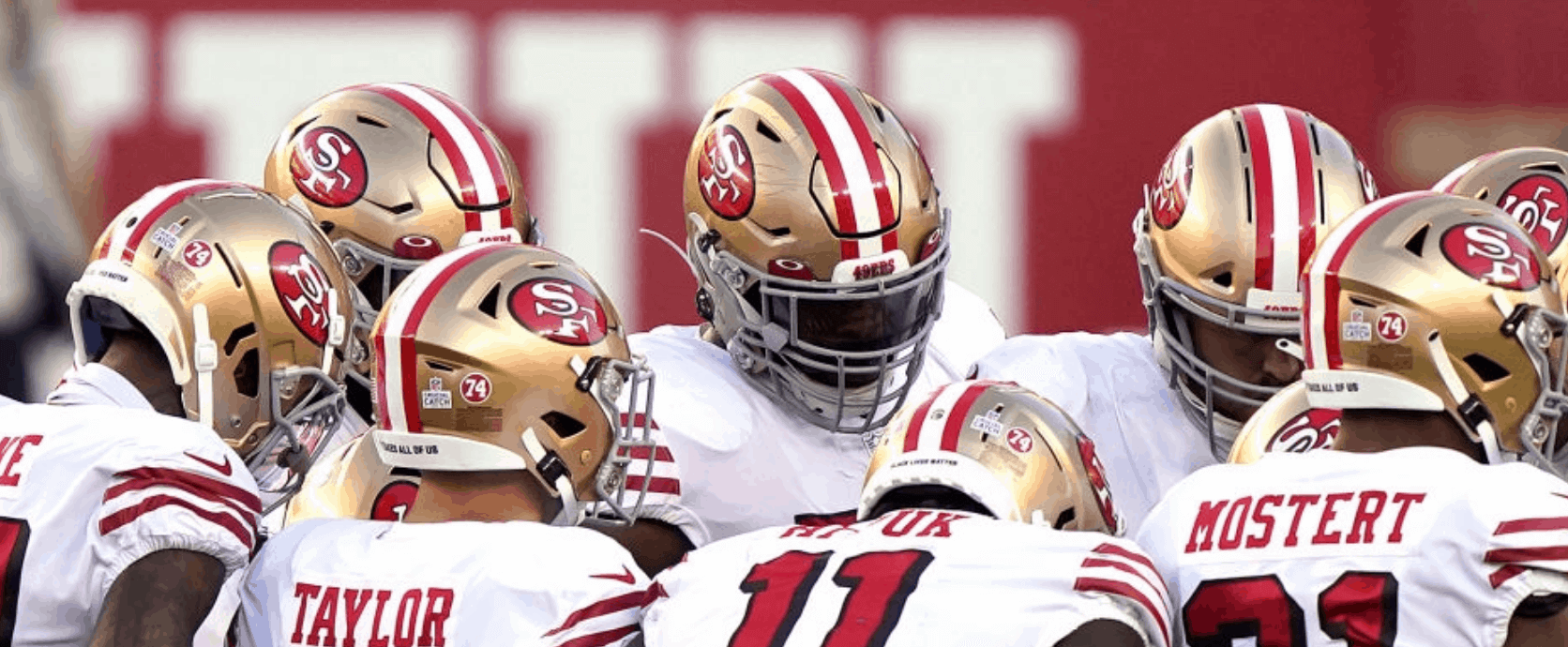
I’m not 100% sure, but I think this memorial decal was just for last night’s game, not a season-long thing. I’ll try to confirm. (Meanwhile, the Bears still haven’t uni-memorialized Gale Sayers.)
In other news from around the league yesterday:
• Weird situation in Carolina, as the Panthers wore their blue alternate jerseys for the third time in the season’s first six weeks (and for the first time at home):
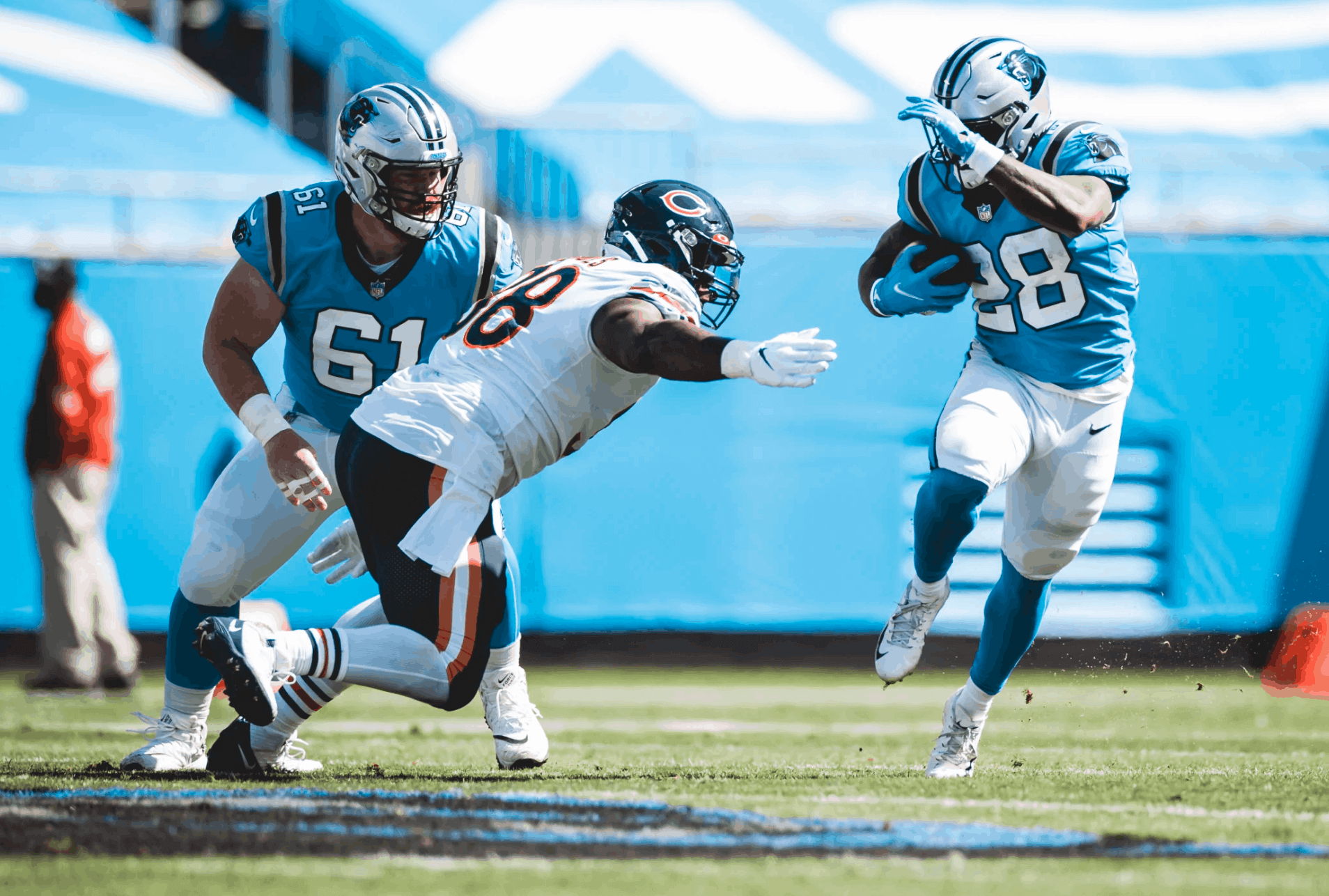
The Panthers have worn white for their three other games, so they’re in the odd position of already having maxed out the use of their alt jersey for this season without yet having worn their primary black colored jersey. They’re scheduled to wear white again next week, and then the black jersey will finally make its 2020 debut the week after that.
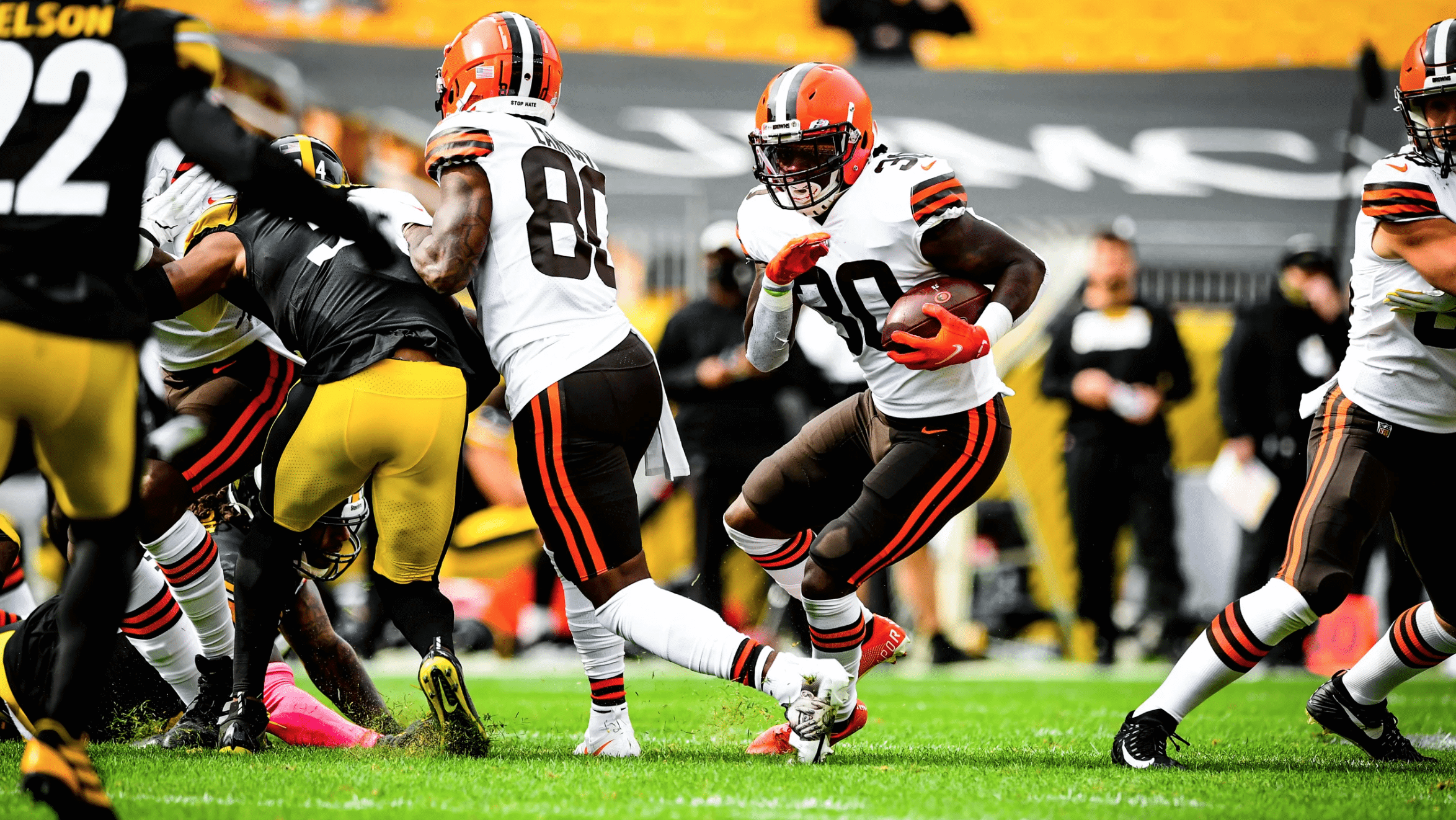
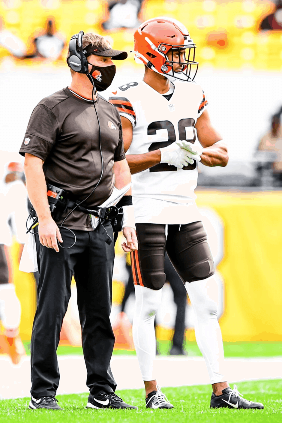
• The Browns wore white over brown in Pittsburgh — the first time they’ve worn that combo from their new uni set. It made for a very nice-looking game:
• Since that Browns/Steelers game was taking place in Pittsburgh, Cleveland wide receiver Jarvis Landry wore cleats featuring portraits of the late Pittsburgh-based rapper Mac Miller:
Jarvis Landry honoring Mac Miller with his cleats today 🙏
(via @MACHE275, @God_Son80) pic.twitter.com/fCr201K8Hw
— NFL on ESPN (@ESPNNFL) October 18, 2020
• In yet another note from that game, Browns cornerback Kevin Johnson’s biker shorts-style pants looked even more minimalist than usual, thanks to his untucked undershirt and white leggings:
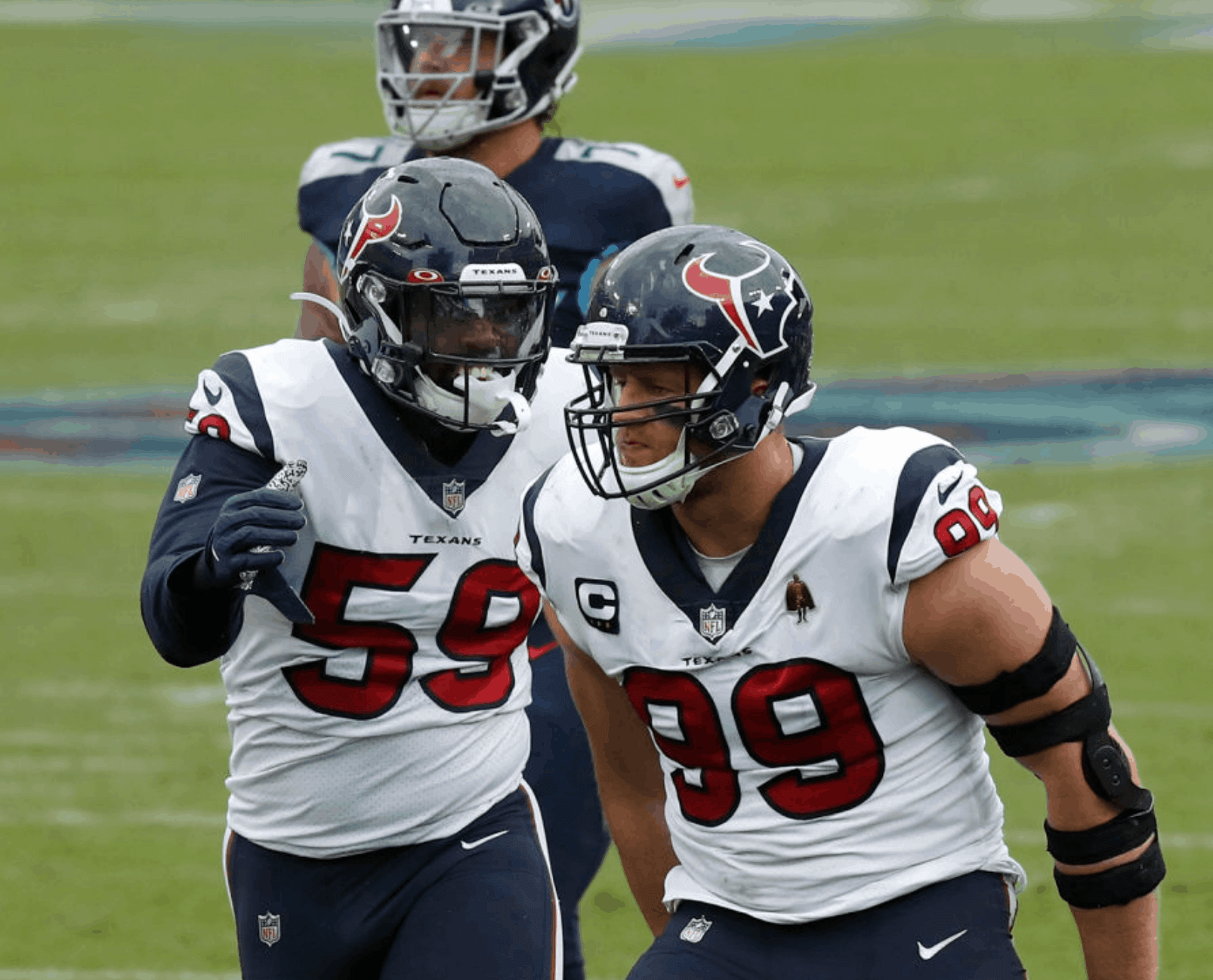
• With Bill O’Brien no longer coaching the Texans, interim coach Romeo Crennel has brought back the team’s captaincy patches:
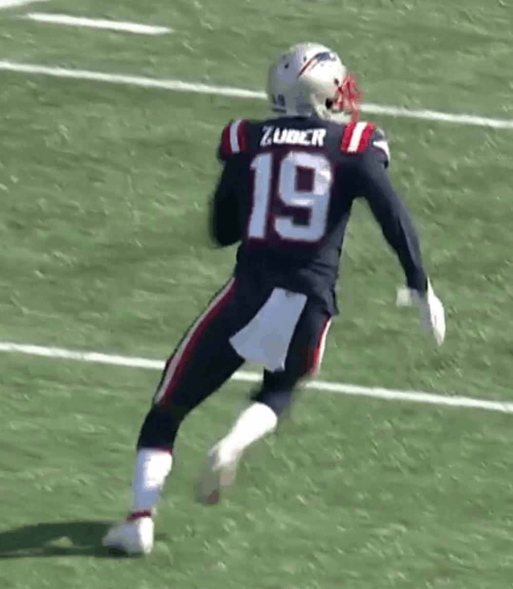
• Here we are in Week Six and Patriots wide receiver Isaiah Zuber still — still! — has the old/wrong font for the “Z” on his nameplate:
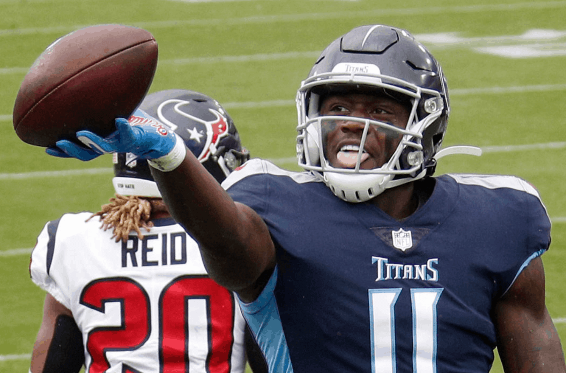
• Titans wide receiver A.J. Brown, who played college ball at Ole Miss, repped his alma mater on his gloves:
• At one point, Ravens cornerback Marcus Peters went bare-legged:
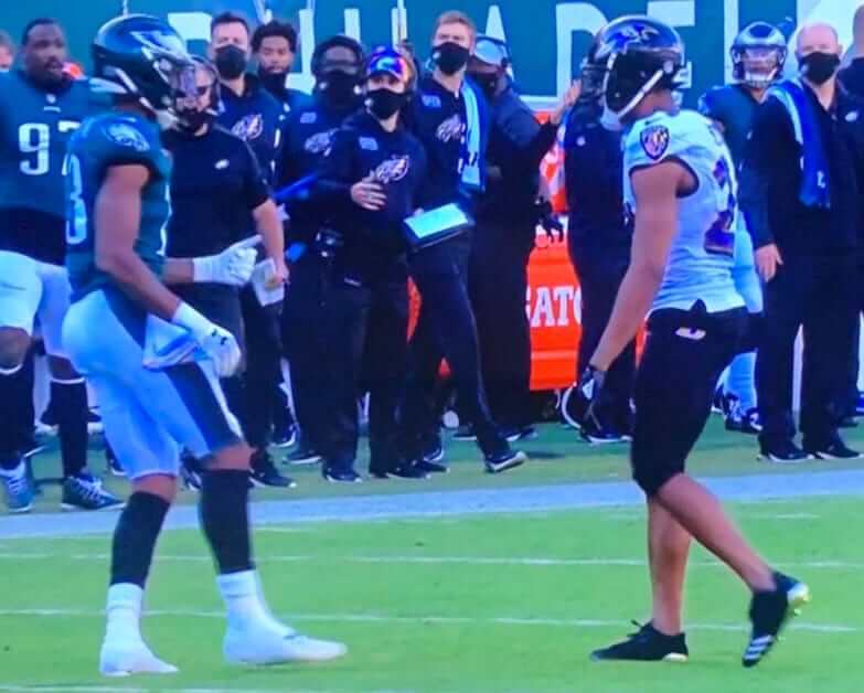
He didn’t do this for the entire game, but it wasn’t just a random thing either, because we’ve seen him do this before.
• Dolphins quarterback Tua Tagoviloa made his NFL debut. His facemask spelled out “808” — the area code for his native Hawaii:
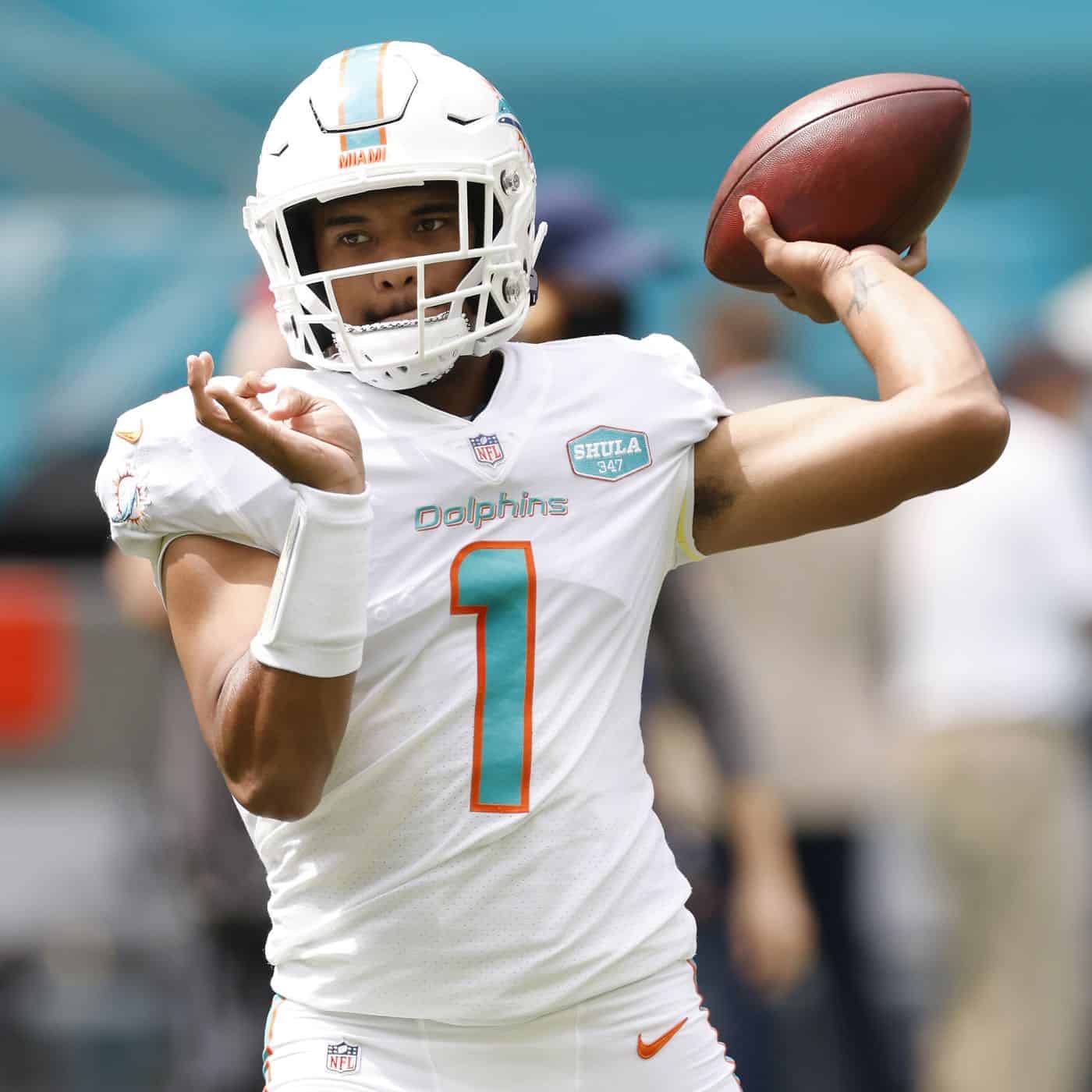
We’ve seen something similar before from another Hawaiian NFL quarterback: Marcus Mariota.
• This isn’t new, but I hadn’t noticed until yesterday that Bears coach Matt Nagy has been wearing a triple-striped mask:
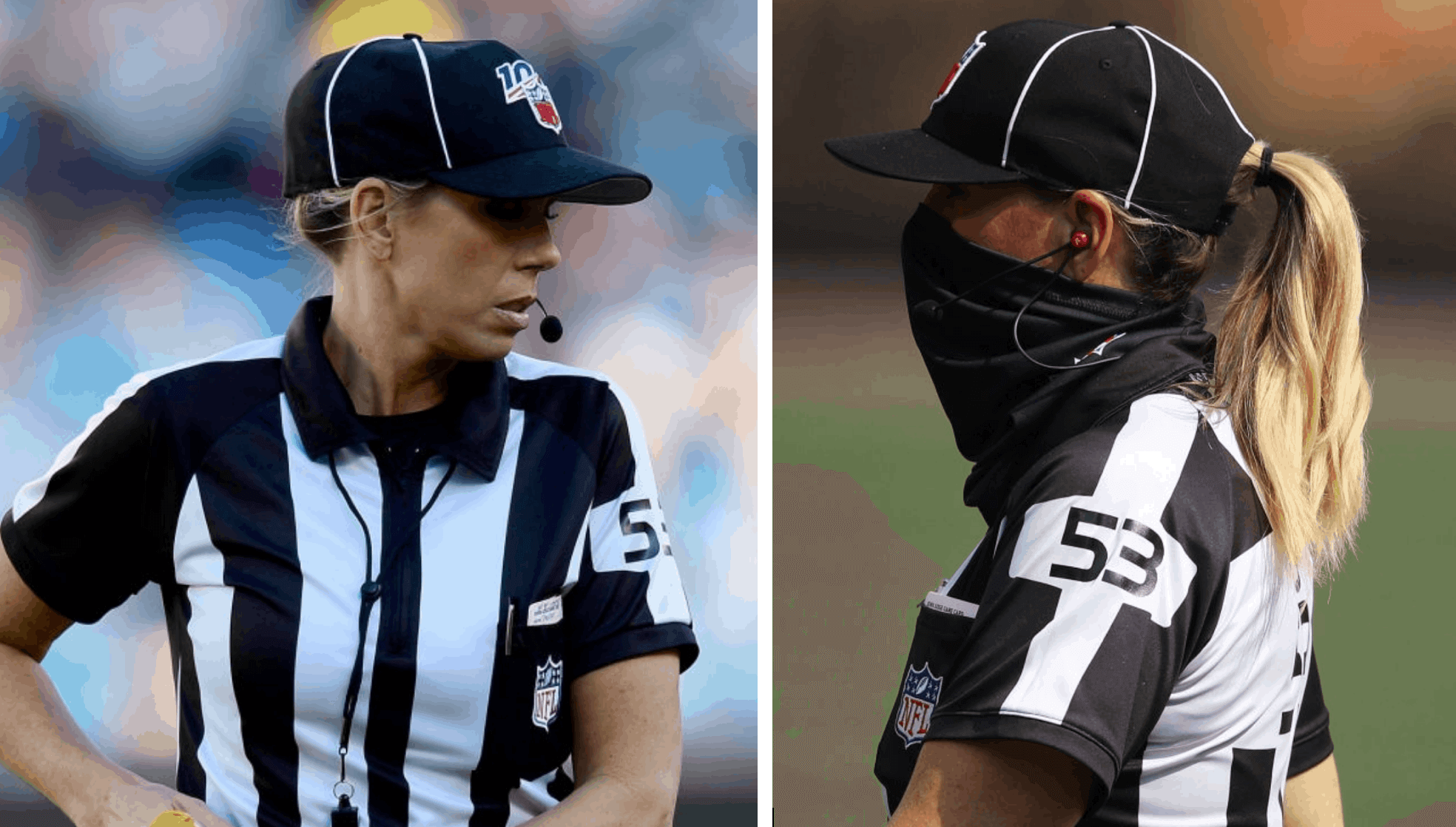
• Although not specific to yesterday’s action, it’s worth noting that line judge Sarah Thomas, who previously had to tuck her long hair under her cap, is wearing a snap-back cap this season, so her ponytail can stick out. Here’s a comparison — last year on left, this year on right:
• In addition to the aforementioned 49ers, two teams wore white at home: the Buccaneers and Dolphins.
(My thanks to all contributors, including Allan Bell, Lance Harris, Ryan Kelly, Jefferson Penrod, Lucas Paquetá, Matthew Wolfram, @mrvinhtran, @notquay, and @1007MountainDr.)
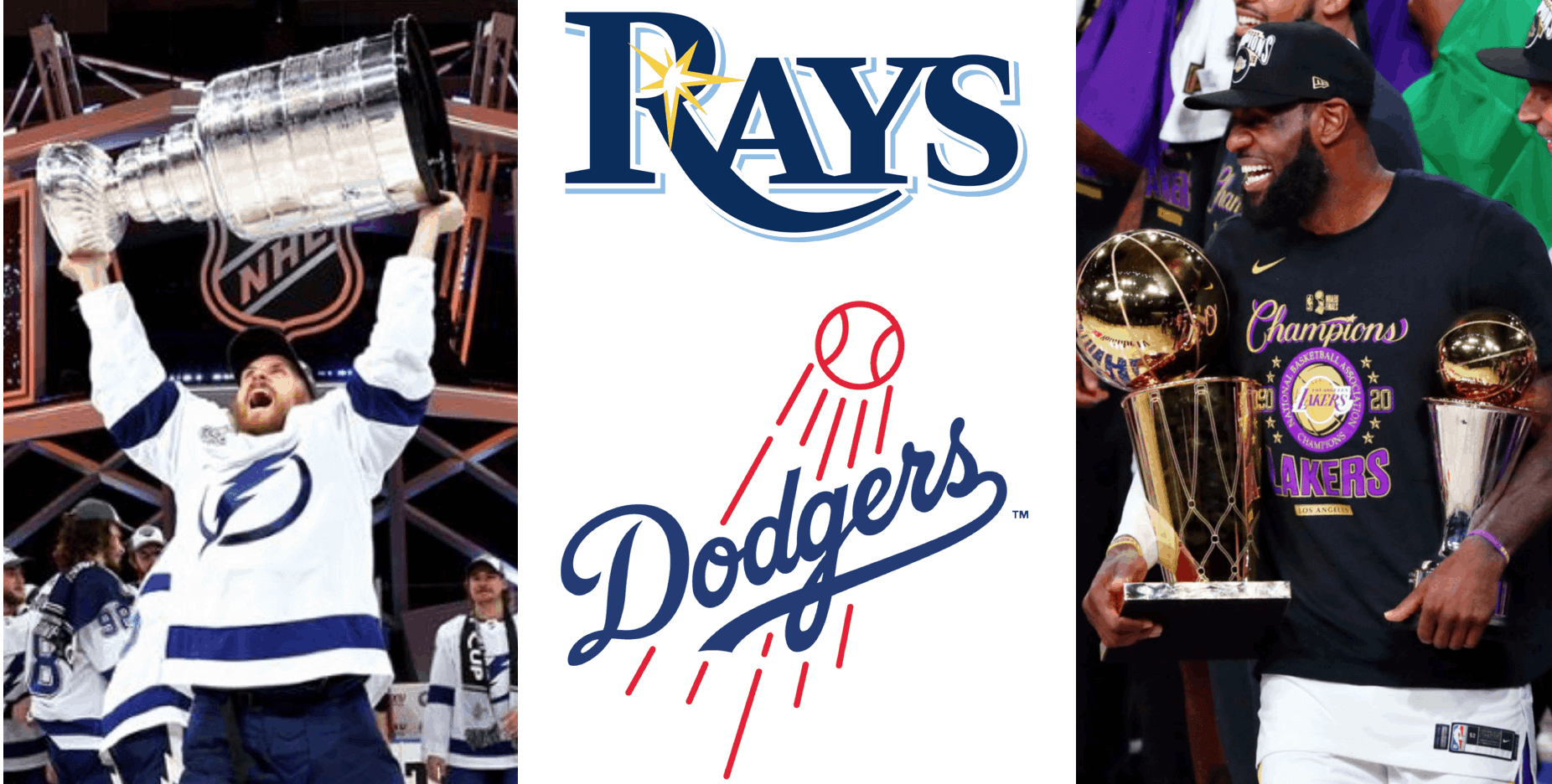
Coastal elites: After the Dodgers won the National League pennant last night to set up a Rays/Dodgers World Series, Twitter-er Colin Short noted something interesting: Due to pandemic-induced scheduling oddness, we’re currently in the midst of a 30-day period in which three of the Big Four pro titles will be decided. The first two of those went to Tampa Bay (the Lightning) and Los Angeles (the Lakers), and the third — the World Series championship — will go to another team from one of those two cities. So this year’s Fall Classic is sort of like a Tampa/L.A. 2020 tiebreaker.
As for the World Series uniforms, it’s no contest (duh), as the Dodgers’ timeless look runs rings ’round the Rays. I’m juggling a bunch of different obligations today, but if possible I’ll try to put together a World Series uni preview for tomorrow.
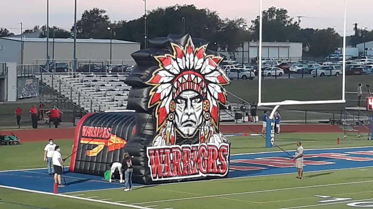
South Grand Prairie update: Last Friday I published an interview with Art Senato, the coach who recently removed the Native American imagery from the baseball uniforms at South Grand Prairie High School in Texas.
In the interests of equal time, I thought it would be good to do a similar interview with the school’s football coach, Brent Whitson, about why he’s chosen to retain the Native imagery for his sport (including the new inflatable tunnel shown above), so I emailed him over the weekend, leading to a brief back-and-forth. Here’s how it went:
Hi, Brent …
Paul Lukas here. I’m a former ESPN and Sports Illustrated columnist, and I currently run a website called Uni Watch, which is about uniforms and logos. (Yes, it’s a very specific niche!)
On Friday I published an interview with SGP baseball coach Art Senato, who talked about how he recently decided to remove the Native American imagery from the SGP baseball uniforms. You can see that interview here
In the interests of equal time, I’d love to do a similar interview with you about how you’ve chosen to *retain* the Native imagery in the SGP football program.
Interested? Hope so! Let me know.
Stay well,
Paul———
Paul, I appreciate your interest. The only imagery that could be characterized as any reference to Native Americans in our program is our SGP spear logo and the spear decal on each side of our helmets. No conscious effort has been made to retain or remove the spear. It is simply the symbol of our Warrior Football program and a tribute to Warriors.
I don’t see any reason to interview about a non-issue in our program.
BW
———
Hi, Brent. That’s [sic] for getting back to me! Just to clarify, I think it would be fair to say that the use of the spear imagery is not a “non-issue” — rather, it is very much part of the issue. And there’s also the new inflatable tunnel.
But if you’d rather not discuss any of that, that is, of course, your prerogative. I appreciate your response — stay well.
All best,
Paul———
I guess I think more of the use of cartoon-like images that are the issue. But I still think it is in our best interest to not discuss any of it.
Again, thanks for your interest.
BW
And that was the end of that. Disappointing. Leaving aside the issue of whether the spear icon is no big deal, it seems pretty self-evident that the inflatable tunnel is the very definition of a “cartoon-like image.” Perhaps Whitson feels differently, but I guess we’ll never get to hear why. Too bad.
Click to enlarge
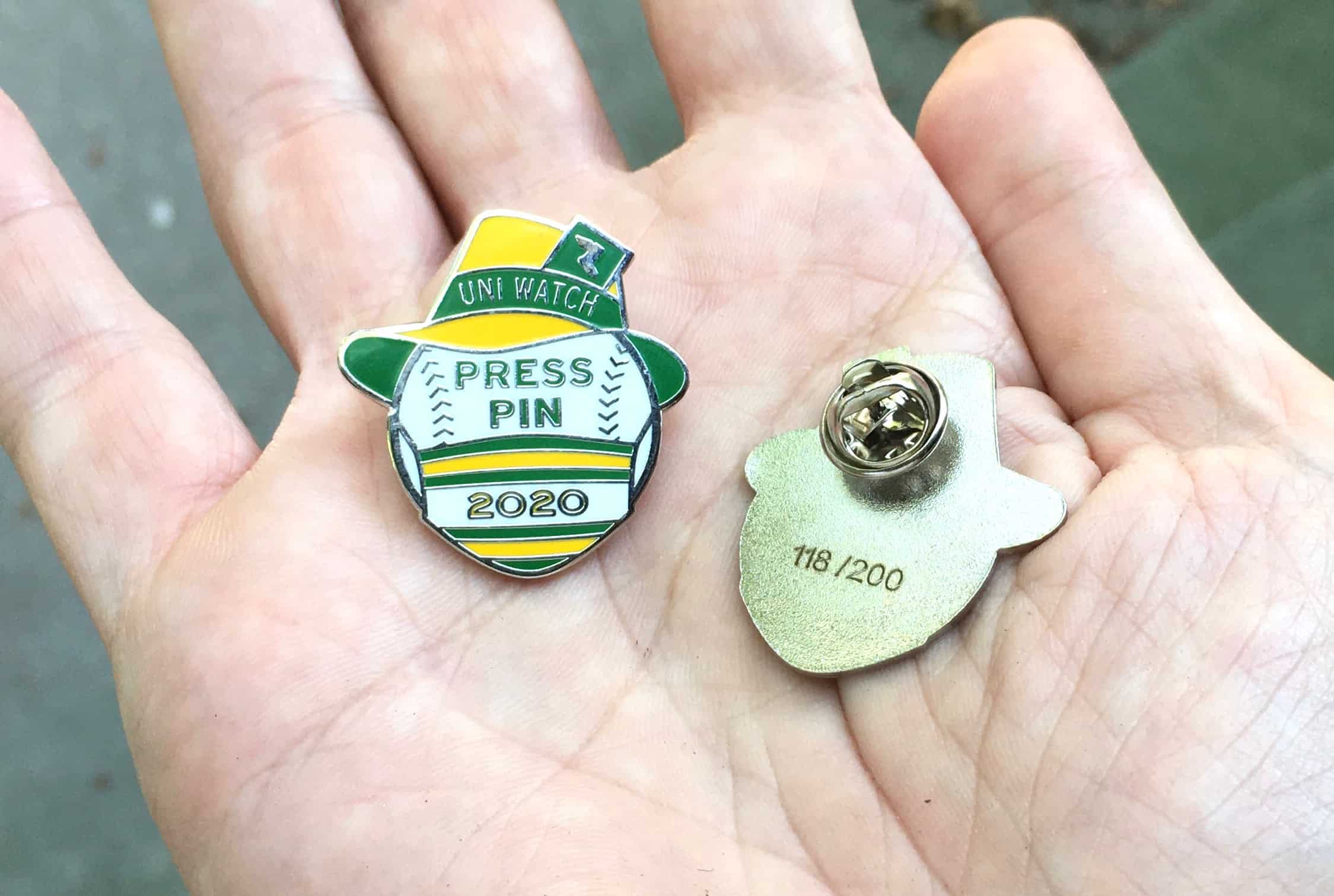
Press Pin update and IMPORTANT question for pin customers: As of this morning, there are fewer than 40 Uni Watch 2020 Press Pins remaining. If you want one, they’re available here while supplies last.
While we’re at it, here are the approximate inventory numbers for all of the Pin Club releases:
• January (pennant): 350 made, 80 remaining
• February (Abe and George): 350 made, 130 remaining
• March (St. Paddy’s Day): 250 made, 45 remaining
• April (signed baseball): 250 made, sold out
• May (Indy car): 250 made, 45 remaining
• June (uni-ty): 300 made, 35 remaining
• July (bobble): 500 made, 35 remaining
• August (scoreboard): 250 made, 40 remaining
• September (football ref): 250 made, 70 remaining
• October (jack-o-goalie): 250 made, 55 remaining

Looking ahead, designer Todd Radom and I would like to keep the Pin Club going in 2021. With that in mind, we wouldn’t mind some feedback from you folks. For example:
• For this year, we’ve put the words “Uni Watch Pin Club” on the front of each pin. Do you like that, or would you prefer it if we scrapped the words “Pin Club” and just stuck with “Uni Watch”? (Making that change would certainly give us more design flexibility.)
• Similarly, we’ve included “2020” on each pin this year. Again, do you like that, or would you prefer that the year be engraved on the back, along with the month? (Again, this would give us more design flexibility.)
• Many of this year’s designs have been seasonal or holiday-themed. Do you like that, or do you not care about a design matching up with its launch month?
• If you have any other suggestions or thoughts about this project, we’re all ears.
You can respond in today’s comments, or feel free to email me directly. Thanks!
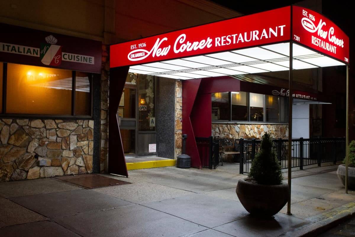
Tasty, but bittersweet: Back in early March, I began working on a story for InsideHook about New Corner, a very special 84-year-old Italian restaurant I’ve long admired in an out-of-the-way part of Brooklyn. Unfortunately, the timing was bad — I filed my story just as the pandemic shutdown hit. So we put the story on the shelf and figured we’d run it when the restaurant reopened.
Earlier this month, the word came that New Corner will not be reopening. I suggested to my editor that we go ahead and run the story now (with an explanatory author’s note appended to the top), so it can serve as a requiem of sorts — not just for New Corner, but for all the restaurants and other local businesses that the pandemic has claimed.
My editor agreed, and the story was finally published last Friday — more than seven months after I originally filed it. You can check it out here.
The Ticker
By Jamie Rathjen

Baseball News: MLB is putting people’s tweets on batting practice balls used during the World Series (from Ignacio Salazar). … Fenway Park is one of many stadiums being used as a polling place, and the “I Voted” stickers there are Red Sox-themed (from Steve Flack).

Football News: A graphic during BYU’s game on Friday featured a blue helmet for them, which I don’t think they’ve worn recently as a throwback or otherwise (from Gregory Lyons). … Cross-posted from ice hockey: Ohio State women’s goalie Quinn Kuntz has new pads that feature one of the entrances to Ohio Stadium (from Moe Khan).

Hockey News: Maple Leafs C Jason Spezza said he offered his No. 19 to new signing Joe Thornton, who had worn that number for every NHL season since 2000-01. However, Thornton declined and is wearing No. 97 for both the Maple Leafs and Switzerland’s HC Davos (from Josh Claywell). … Ohio State women’s goalie Quinn Kuntz has new pads that feature one of the entrances to Ohio Stadium (from Moe Khan). … The Junior A Alberta Junior Hockey League’s Camrose Kodiaks and Drumheller Dragons played a color-vs.-color preseason game on Friday (from Wade Heidt). … Writer and radio host Justin Bourne posted some old jerseys worn by his dad, former Islanders and Kings center Bob, including ones from minor league baseball and celebrity softball (from @markinvictoria).

Basketball News: The British Basketball League’s Cheshire Phoenix have a new logo (from Timmy Donahue).

Soccer News: Real Madrid’s second kit is pink this season, so both the men’s and women’s teams wore it at home this weekend for breast cancer awareness. … In the NWSL, the Orlando Pride wore a pink patch designed by center-back Toni Pressley, who actually returned to the team about a year ago after surviving breast cancer. … Scottish teams are wearing the annual Show Racism the Red Card charity patch for the next two weeks, but it seems that primarily women’s teams did so this weekend and men’s teams next weekend. … Kansas’s women’s team wore both pink and a Black Lives Matter/unity patch on Friday. … A D.C. United blood shirt that almost saw action yesterday was numbered 96, an apparent reference to MLS’s first season or DCU’s first championship (from @OlegKvasha).

Grab Bag: The new NASCAR Cup Series team owned by Michael Jordan and Cup driver Denny Hamlin appears to want its car to have No. 23, though Jordan said it’s up to driver Bubba Wallace and ultimately car numbers belong to NASCAR (from Christopher Hickey). … New kits for Ireland’s County Down’s Gaelic games teams. … The Australian Football League’s grand final is being held outside Melbourne, in Brisbane, for the first time ever, and a piece of the Melbourne Cricket Ground’s grass is being added to the grass at Brisbane’s Gabba for the occasion. Of course, that was almost immediately criticized both as bad optics during the pandemic and as a waste of money. … Also in Australia, landmarks in Perth, including the city’s main stadium, Optus Stadium, turned green to support the West Coast Fever in Super Netball’s grand final. … The next two items are from Timmy Donahue: The Portland, Ore., police are to have ID numbers stenciled on their helmets worn during protests. … Police officers in Newburgh, N.Y., have new uniforms.

Click to enlarge

What Paul did last night: An absolutely perfect fall setting out on the porch yesterday — perfect in its crisp autumnitude, its autumnal crispitude, its October magnificence. As I’ve mentioned before, October is my favorite month, and it completely lived up to my expectations yesterday.
Also, if you look above the Tugboat Captain’s head, you can see that we now have a new porch participant. Here’s a better look:
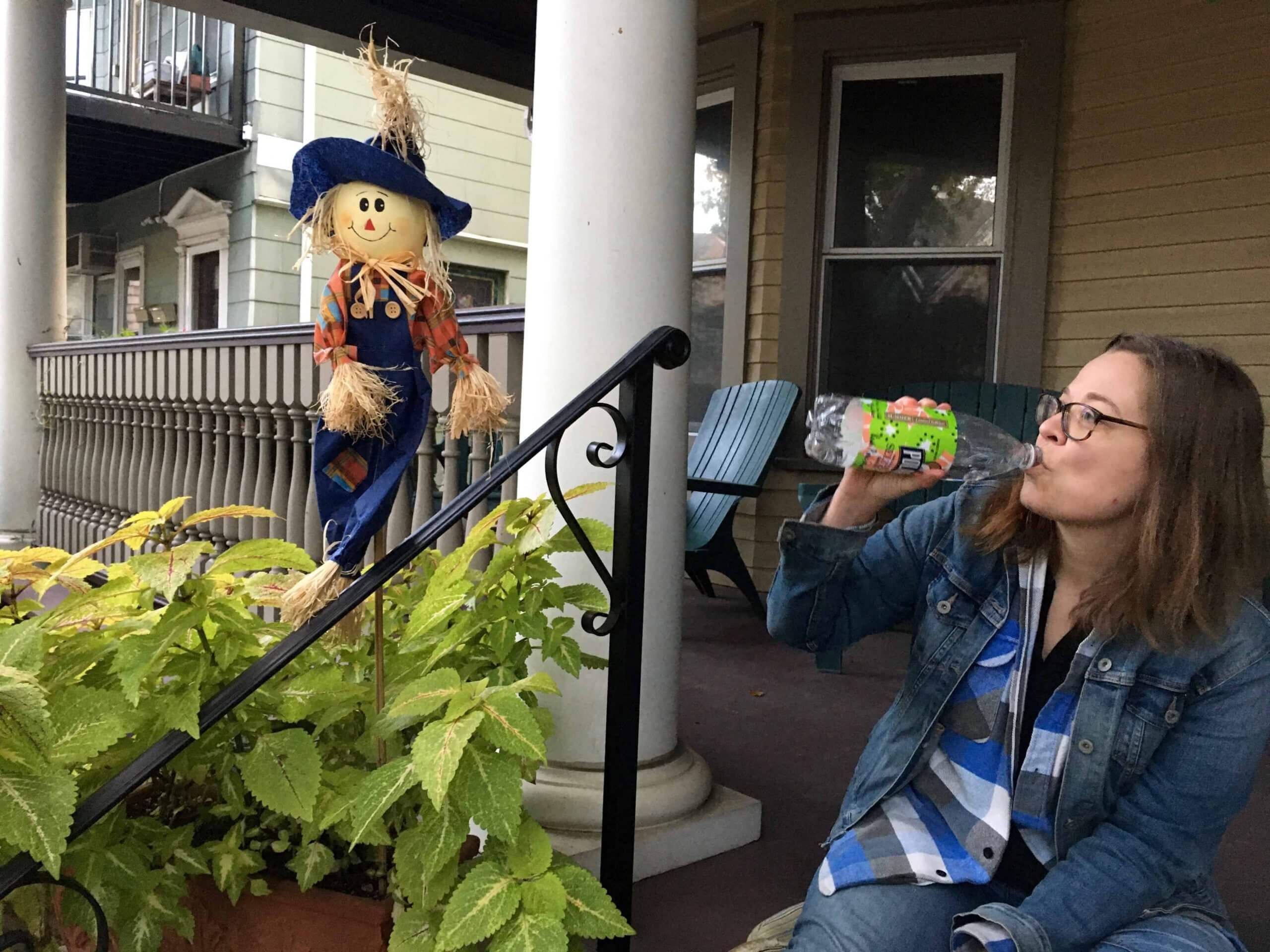
Our landlords added him to one of the porch planter boxes yesterday. He makes an agreeable drinking partner, so we’re happy to have him on board. Maybe today we’ll try to name him.
As always, you can see the full set of Pandemic Porch Cocktails™ photos — now well over 200 of them — here.
Sorry Paul but I agree with the ole ball coach at SGP just leave it alone. If Florida state can have. The same logos on there helmet why can’t the highschool, also I know they have permission from a tribe but that leads me to believe if you grant for one you have to grant for all that do it
I know they have permission from a tribe but that leads me to believe if you grant for one you have to grant for all that do it.
That doesn’t make even a bit of sense. If the Seminole Tribe strikes a deal with FSU, you somehow think that deal applies to all Native imagery at every school everywhere? Uh, no.
Also, I notice that you are conveniently ignoring the inflatable tunnel (just as the coach did).
In any case, as I said, I was simply offering to give him equal time because I thought it would be interesting to hear his side of the story. And as I also said, if he’d rather not avail himself of that opportunity, that’s absolutely his prerogative.
It’s unfortunate that this coach decides to use something as obvious and gaudy as that terrible inflatable tunnel yet he prefers to just pretend there isn’t an issue.
Also, his saying the spear is “a tribute to Warriors” made me laugh. He sounds like a real winner.
Since the baseball coach gets it, I hope he applies a little pressure from within to the principal or others there to be proactive and remove the problematic imagery.
Sorry to hear about Caitlin! I hope the fleas aren’t everywhere in the house too.
From SGP’s site, their tunnel used to be (slightly?) more tame, though still utilizing Native American imagery: link
Truthfully, the football coach’s response isn’t surprising given the school’s academic logo, a Native profile within an arrowhead: link
I think both the football coach and yourself could do a lot better on educating yourselves on the issues at hand before sharing your opinion. At least avoid saying “I know” because you clearly do not.
Where did Paul say, “I know…”?
Pretty sure he was referring to the comment thread’s originator, not to me.
Hey Paul, I believe it’s “Mariota,” not “Mariotta.” As always, love your work!
Right-o. Fixed.
For your pandemic porch buddy, I humbly suggest the name Drinky Scarecrow
Mike, I didn’t realize you were a Tony Millionaire fan! Excellent suggestion.
I was simply going to suggest “Stuffy Guy”, since it IS October and it’s a Stephen King reference!
Btw, looks like you and the Captain have a very nice porch, Paul!
Thanks, Rick. We are *so* fortunate to have the porch! Even growing up in the Long Island suburbs, I didn’t have a front porch, so this is a first for me, and it’s made a huge difference in my quality of life. I love it!
One thing that has always puzzled me about the pin club: why do you change the quantity from month to month? I understand you think some will sell better than others or garner more interest (the bobble one, for example), but I have always felt that a monthly collectible like this should have the same number of available pieces every month. It would make the people collecting them jump on them quickly, and make everyone else have to think fast about whether or not they should get one. Lastly, in terms of uni-formity, it would be nice if the people collecting would have a whole bunch of xx/250 in their collection as opposed to xx/300, xx/250, xx/500, etc etc etc.
Just two cents from a non-buyer, but from someone who also makes and sells things online.
Totally fair question. For the first two months, we were flying blind in terms of what the demand would be — those two designs were put into production back in 2019. When the 350-unit quantities turned out to be too much, I dialed down the quantities to 250. I thought the June pin (uni-ty) might be a bigger hit, so I went up to 300, and I was certain the July pin would do well, so I made 500. Basically, just trying to tailor supply to demand.
But your point is well taken. Next year, maybe we’ll just do 200 for every month. Unless we do another bobble!
Kudos to the Weekend Crew for keeping the ship afloat. I don’t always agree with the 5+1, preferring classic looks, but I appreciate the efforts away from their home lives. ( for the record, I prefer: matching stripes, white numbers on dark jerseys, and no dark pants)
Pedantry alert:
Umm… Tampa Bay is not a city. It’s a body of water (estuary) off the Gulf of Mexico; the name also refers to the surrounding area which includes the cities of Tampa, St. Petersburg, and Clearwater.
I know, I know.
But come on.
Sorry. ;)
Aikman and Buck had some musings over Packers’ punter JK Scott’s pants/leg/sock ratio (sample photo below). I couldn’t record or find the snipet from the game. Sorry.
In keeping with the uni concept, how about porch buddy being called “Mr. Stuffed Shirt”?
Some NFL uni thoughts.
Jaguars look their best this weekend. They should resist their temptation to mix and match. Go teal over white for the dark uniform as much as possible.
The pewter pants for the Bucs would look a lot better if they had some shine to them like they used to. Them and teams that used to wear silver pants (now grey) need to do like the Raiders and secure shinier pants.
May not be a popular opinion but I really like the Browns’ look with the white jersey over brown pants. They got the look right with how the pant striping matches the sleeve and sock striping.
I agree with all three counts, especially about the Bucs and how dull their pewter pants look. I was happy to see them wear them instead of the white this weekend.
Am I the only one who wishes the Browns pants stripe went orange-white-orange to mimic the helmet striping (which is brown-white-brown)? The shirt sleeves match the socks, so if the pants matched the helmet there would be a total of two types of striping instead of the current three.
Overall, not a bad look though.
I’ll play the devil’s advocate and say orange and brown have enough contrast the use of white isn’t really necessary on the Browns’ britches. It’s not like red and blue.
So have the Carolina Panthers retired their silver pants?? When was the last time they wore the silver pants. Starting to feel like they’ve been retired
Here, you can look that up yourself on mighty Gridiron Uniform Database:
link
Enjoy!
Alex,
The silver pants aren’t retired – they were worn late last season – but the Panthers have been trying a lot more combinations the last couple of seasons. Tied, in part, to a new owner who isn’t as constricting/traditional as founder Jerry Richardson was. Also, they have a new equipment manager since Jackie Miles, who was there since they started in 1995, left to work for the New York Giants.
Also, on an unrelated note, their silver pants are really grey and don’t blend with the helmet as much as they used to. That’s probably more Nike’s deal than the team’s … as previously noted, other teams – the Buccaneers and Raiders – have metallic-colored pants with no sheen.
They’ve worn blue jerseys to avoid burning up in black – on the road at Tampa (a more-than-occasional occurrence over the years) and L.A. – and then at home against Chicago on Sunday. The Panthers usually wear white at home during daytime home games in September and October, then switch to black later in the season.
The Panthers are one of the few Blue/Black color schemes that work for me and I think that their Black over sliver/gray look is very good. The increase in use of the Blue Jersey is also okay as long as it’s with the gray or white pants. The pant bingo they’ve been playing for the last couple years has ruined their look. The blue over black is especially brutal, but the white over black is almost as bad. I am one who has said for years that they didn’t need a makeover of their current set if they would stick to the basics, but the last several years of mix and match have changed my mind.
Interesting color-on-color matchup from NCAA field hockey on Sunday as Syracuse wore orange, and Wake Forest wore black.
Also: University of North Carolina field hockey wore white at home during their Tobacco Road derby match with Duke on Sunday. Division I field hockey teams have gone away from white at home the last three or four years.
No mention of the Bucs wearing their standard pewter pants for the first time with their white shirts, a look that was arguably their standard in the original pewter regime.
Looked decent, but while we’ve known that the “pewter” color is darker, wearing these pants really hammers home how much different they look compared to the old pewter set with the dazzle look, and not for the better.
TBH I feel like the switch from dazzle fabrics to the current matte fabrics in football pants, a switch that began with a fabric change by Nike in 2006 (most visible on teams like USC, LSU, and Ohio State) is one of the most significant aesthetic changes of the last 20 years, and deserves a blog post. It has resulted in changes like this Tampa Pewter switch, and very noticeably changed Notre Dame’s appearance and even the color of gold that they use for their pants.
In some ways it is a a change “back,” as before the dazzle fabrics emerged in the 80s, all pants were a duller matte. I favor the dazzle option in many cases, the pants the Bucs wore yesterday being a significant one, but regardless of one’s preference the change was significant and could make for a good write-up.
As you say, it was standard — didn’t seem noteworthy/newsworthy.
But the fabric issue is worth discussing, I agree.
It’s just the first time they’ve used the combo, similar to the Browns this week, is all. I didn’t intend to sound particularly offended, but I suppose it can come off that way.
(BTW, regarding the fabrics, I want to clarify that I am aware that the reason for the move away from dazzle is a function-over-form issue, with the newer fabrics not supporting the look in the same way the older, heavier materials did).
I actually prefer the matte fabric for any color except gold and silver. Those 2 colors are represented correctly in the matte fabrics. For any other color I actually like the not “sheeny” look. It appears that the Raiders are the only team that still wears the pants with sheen or dazzle, which leads me to a few questions: if they can do it why doesn’t any other team do it? Are their pants heavier than everyone else? Does Nike still use an old template for the Raiders or pants? Or do they use a current template with old style fabric?
Basically, teams that wear a metallic colour for pants (gold, silver, pewter) need to go back to the pants with the sheen. Matches their helmets better.
The duller matte works for a few teams:
-The Giants as the grey pants were a nod to a throwback look and the Giants don’t have silver in their colour scheme.
-The 49ers. The duller pant introduction worked well when they returned to their old look worn when they won multiple Super Bowls. That uniform would not really look right with shinier oants.
-The Seahawks. The grey pants work for their current colour scheme as they really do not wear silver.
Paul, great article on the Italian restaurant. One of the things I miss most about not living in the northeast any longer is the lack of just that kind of place. I, too, grew up frequenting spots just like it and have longed to find one where I live now. Found a few that are close, but not quite the same.
Somewhat unexpectedly, the article brought tears to my eyes, particularly the end, “go because it’s special”. So many special restaurants are going under during these tough times. So much history by the wayside. One more neighborhood joint so many folks grew up with gone. Things like this make these days tough; lost youth, lost time and so on (sorry for the melodrama).
That said, thanks for the great work. A bright spot for your loyal readers!
Couple thoughts on yesterday’s games:
-TB white over pewter pants is 50x better-looking than mono white. Enough with mono everyone!
-Speaking of mono, SF should wear their red throwback with drop shadow over those white pants. Old SF logo is far superior. I’d like to see SF drop the oval entirely. Same with Ford Motors. Ovals aren’t very captivating.
-NE desperately needs grey pants.
-NYG need to go back to grey as well.
-Eagles need silver pants more than they need Kelly green.
-CLE is so much better-looking. Thank you CLE for fixing your unis!
-ATL Braves unis are perfection and ATL Falcons are awful.
-Wash football team helmets are awesome!
Thanks Paul and team for the daily content!
Agree with some of this and disagree with some of this.
Falcons unis are awful. Based on the number font alone but other problems. I can’t agree the Braves unis are perfection. Never liked the solid navy blue hat they have introduced as a road hat and also wear with their navy jerseys. They should always wear the hat with the red bill.
Excellent point, Wade. Braves red bill hats are the only ones they should wear. They complement all 6 uniform combos they have. Agree 100%.
This is more of a response/question to something in the ticker yesterday and something else I read. In a story in a southern California newspaper it mentioned UCLA’s head football coach Chip Kelly and his former ties to Nike while at Oregon, and that UCLA could be looking at Nike for its next shoe/equipment deal. If that were to come to pass, would the Bruins be the first team to have been outfitted by Reebok, Adidas, Under Armour and then Nike?
Good question!
Other than looking absolutely ridiculous, the Browns are 5-21 since introducing the turd pant combination in 2010 (not including monotone/color-rash). Stop this madness and replace with Kardiac Orange if not using white please!!
In the interest of women viewership and conversation last week on the post of those “who get it’ one of the things sports media can start doing is making sure women’s leagues are included in the “big four” language used. Sure, it breaks up the Tampa/LA storyline but when people say ‘the last two championships won were by TB and LA and the next one will be one by one of those cities.’ We’re completely ignoring the fact that the Seattle Storm won their 4th WNBA title in between the Lighting and the Lakers victory. The WNBA, NWSL more than deserve to be included in the ‘major sports championship’ language.
It’s just the little things that can lead to more recognition and more positive media attention, etc.
Thank you for that story about New Corner, Paul. We’ve been ordering from our neighborhood red sauce place (family run since the early ’80s) here in San Antonio fairly regularly since the pandemic started. They’ve made it through, but it definitely wasn’t without a lot of pain. Happy to report that their eyes are a little brighter over their masks these days.
I find it interesting that the coach at SGP seemed like he never thought he’d get questioned about the inflatable tunnel. I was ready for some sort of boilerplate reply to you about tradition and the school’s upmost respect for Native Americans. Similar to what the Braves have been sending out to season ticket holders. With the amount of attention that teams with Native imagery have been getting, I find it really hard to argue that this is not an issue. I just assumed any leader on a team with Native imagery would be more prepared for a request like yours.
Hey Paul:
Just letting you know the link to the Newburgh PD’s uniform update is dead. Here’s the correct one:
link
Thanks!
Got it.
It’s worth mentioning (since the article doesn’t) that back in 2006, Bill Lester became the first African-American in about 20 years to qualify for a NASCAR Cup race, doing so in a car #23.
…I always thought a ticket stub looking pin would be cool… or how about a T-shirt looking one that says “I still call it Uni Watch Pin Club”
RE Pin Club:
As context, there’s probably no set of designs that will lead to me “collecting them all.” I bought the April pin because I liked it, but no others. (Also I would sell it to someone who didn’t get April and wanted to get a full set).
I would be more likely to buy a pin if it was just a cool design rather than themed or commemorative of a specific month/year.
I may not be the person you’re after for Pin Club, but there may be more of me willing to buy one off cool things.
Paul, I meant to email you when I heard New Corners (spelling mistake intended) was closing to get your take on the place so thanks for the excellent article. I first went there in high school in the early 70s and would take my mom there every year until her passing in 2019. Its closing and others like it (way past its prime Two Toms) brought a tear to my eye.
Brooklyn changed a lot, some good and some not so good, but knowing New Corners was open was some how comforting to me. La Palina on Avenue O might be the closest thing to New Corners so I will have to get there real soon, just in case it’s next on the chopping block.
Glad I did the place justice, John. Means a lot to hear that from an longtimer like yourself. Please accept my condolences on the loss of this special place.
(And yes, 2T’s was looooong past its prime, but I mourn it as well.)
The Rams offer such a dichotomy between theory and practice. In theory, just about every element of their uniforms strikes me as somewhere between terrible and mediocre. In practice on the field, they somehow just work for me. I mean, between the two mono teams yesterday, the Rams just look so much better. Which I say as a huuuuuge fan of the 49ers visual identity. I keep being surprised by how much I not only don’t hate the Rams uniforms, but how much I actively like them.
I enjoyed your article about New Corner. Sad to say I live a short walk from that restaurant these past 5 years, but never thought to give them a try. Just took it for granted that they’d continue to endure and would always be there. Your article eerily foreshadowed what was to come.
Unrelated, KY Deli rebranded, err… changed their name. Nothing lasts forever.
Proofreading in the Panthers paragraph: They’re schedued to wear white again next week
Excellent article on New Corner. I truly believe that I got a feel for the place based on your eloquent description, excellent ability to tell a story, and mastery(?) of the English language. Seriously, your writing skills are second to none!
Thanks, Paul — appreciated.
The Junior A Alberta Junior Hockey League’s Camrose Kodiaks and Drumheller Dragons played a color-vs.-color preseason game on Friday (from Wade Heidt).
Color-on-color matchups in hockey would be a lot more acceptable if teams kept a third set of helmets in their accent colors (for example, gold buckets for the Bruins and red ones for the Blackhawks) because it is a bit dreary when one considers the prevalence of blue and black.
I just finished your requiem for New Corner and was left sad to see that it closed. I only went there once, for a friend’s baby shower back in 2017 (an ancient time when a large number of people gathered in places indoors with no second thoughts) and remember the sauce being quite delicious. It feels like there are fewer and fewer of these restaurants left. Everything feels like it is replaced by super high concept eateries that are as much about getting plates of food snapped for the ‘Gram (as the kids say) than the culinary experience, and neighborhoods are worse off for it. I feel this way very strongly about the demise of my all time favorite Cuban place here in Central Jersey (and the new place that the owner’s son opened a few blocks away, which suffers dearly from this).