For this and most other photos, click to enlarge
Good morning, and happy Indigenous Peoples’ Day! Greetings from Uni Watch HQ, where all three inhabitants continue to be safe and healthy. Hope the same is true at your home.
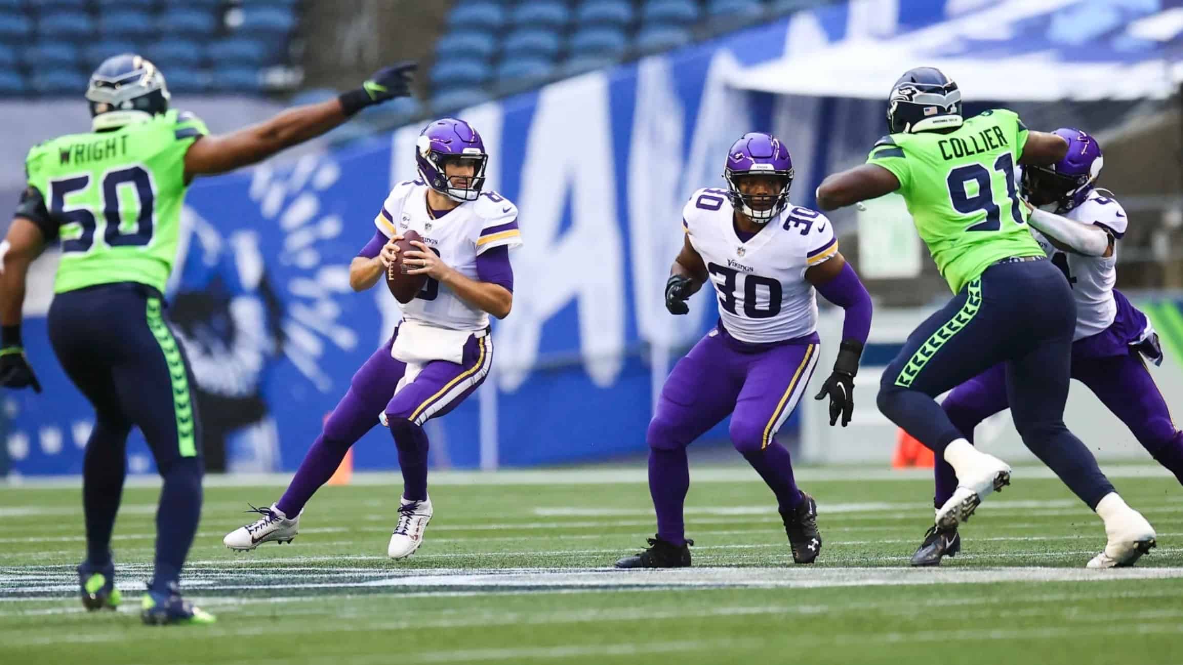
Now then: Epically unattractive game last night in Seattle, as the Seahawks went neon over navy against the purple-clad Vikings. What a mess! More photos here and here, if you dare.
In other news from around the league yesterday:
• I don’t like either the Bengals’ or the Ravens’ uniforms, but there’s something about this particular matchup — white over black for Cincy, purple over white for Baltimore — that works for me:
That’s definitely the Bengals’ best combo, and I like how the orange and purple tones collide. A surprisingly good-looking game.
• In a more traditional visual feast, the Raiders and KC showed everyone how football is supposed to look:
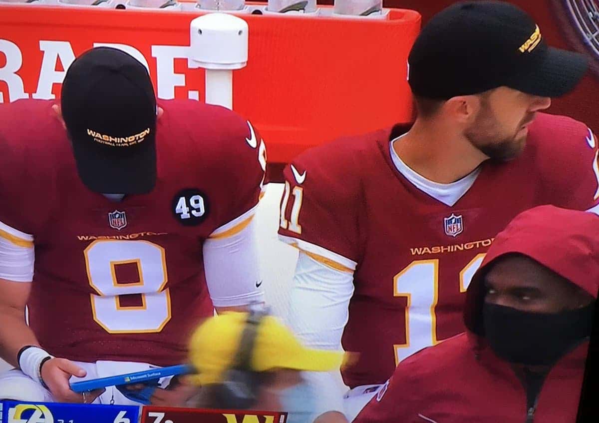
• The good news was that Washington backup quarterback Alex Smith returned to the field for the first time since since suffering his brutal leg injury in 2018. The bad news is that he was missing the Bobby Mitchell memorial patch on his jersey:
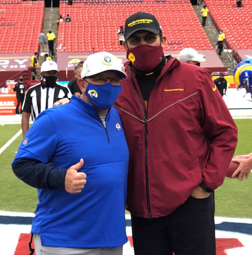
• Speaking of Washington, coach Ron Rivera was wearing a jacket that appeared to have a cover-up “Washington” patch over the team’s old logo:
• Texans offensive lineman Max Scharping’s helmet bumper logo was flush-top instead of vertically centered:
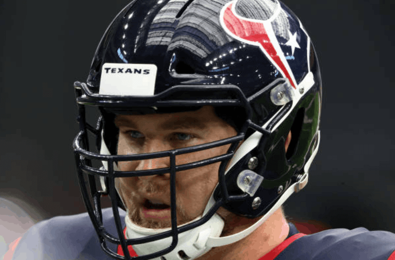
So irksome — someone please fix it!
• Lots of the Steelers’ sideline personnel, including coach Mike Tomlin, were wearing T-shirts that said, “Pittsburgh Is Stronger Than Cancer”:
That shirt is connected to defensive lineman Cameron Hayward’s charitable foundation — further info here.
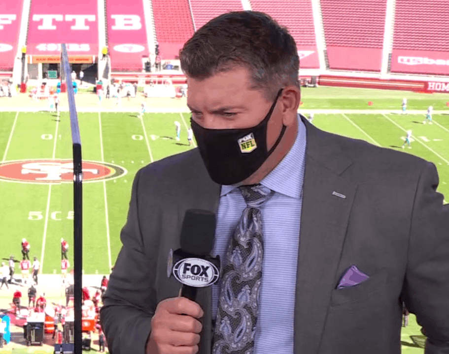
• Looks like the Fox/NFL logo on broadcaster Mark Schlereth’s mask was a sticker — and it was peeling off:
• Only one team wore white at home: the Cowboys, of course.
• Finally, in an off-field development of note, the Uni Watch mask made its NFL debut yesterday, as reader Jeffrey Moulden wore his to the Colts/Browns game in Cleveland:
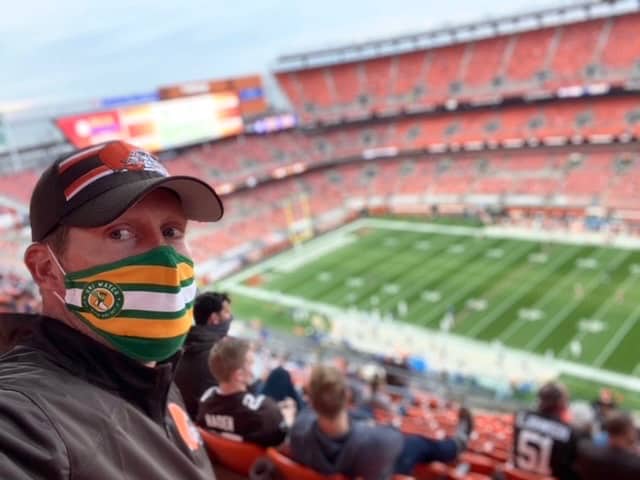
Looking sharp, Jeffrey — thanks for repping Uni Watch at the game!
(My thanks to all contributors, including Gabe Cornwall, Josh Holman, @skinsunis, and our own Brinke Guthrie.)
Click to enlarge
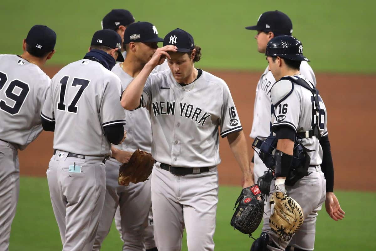
Sweet 16: When the Yankees were eliminated from the MLB postseason by the Rays on Friday night (that noise you may have heard when the final out was made was a squeal of delight emanating from Uni Watch HQ), it created an unusual and possibly unprecedented situation regarding their uniforms.
The Yanks had added a left-sleeve “16” memorial for that game in honor of Whitey Ford, who died the previous day. (As we’ve discussed before, the Yanks use black numbers for players who, like Ford, have had their numbers retired and black armbands for players with non-retired numbers.) But since they lost that game and were eliminated from the playoffs — wait, had I mentioned that before? — that turned out to be the only 2020 game in which they wore the Ford memorial.
There are lots of examples of teams wearing uni memorials for a single game — it’s not all that uncommon. But I’m not sure there’s ever been a previous instance of a team wearing a uni memorial for only one game in a given season with that one game also being the team’s last game of the season. Anyone..?
In any case, the Ford memorial will almost certainly be back next year. That’s how the Yankees handled things when Yogi Berra died just before the end of the 2015 regular season: They wore an “8” on their sleeves for the rest of that season and into the playoffs (a total of 12 games) and then wore it again in 2016, so Berra could get the full-season treatment. They’ll presumably do the same thing with Ford — but I still think the one-game/last-game situation in 2020 may be a first.
Click to enlarge
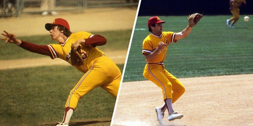
Two-in-ones update: Following up on Friday’s post about the Astros pioneering the use of two-in-one socks in 1976, reader Chris Hickey found another team that was wearing them around that same time: the 1977 U. of Minnesota squad, whose roster included a young Paul Molitor (see above).
Molitor’s two-in-ones are clearly the exact same model that the Astros were wearing (aside from the color, obviously). Molitor is also wearing Riddell shoes in those pics, which is significant because we now know from that Dick Young column that the two-in-ones were also made by Riddell. Maybe they supplied all of Minnesota’s footwear.
Click to enlarge
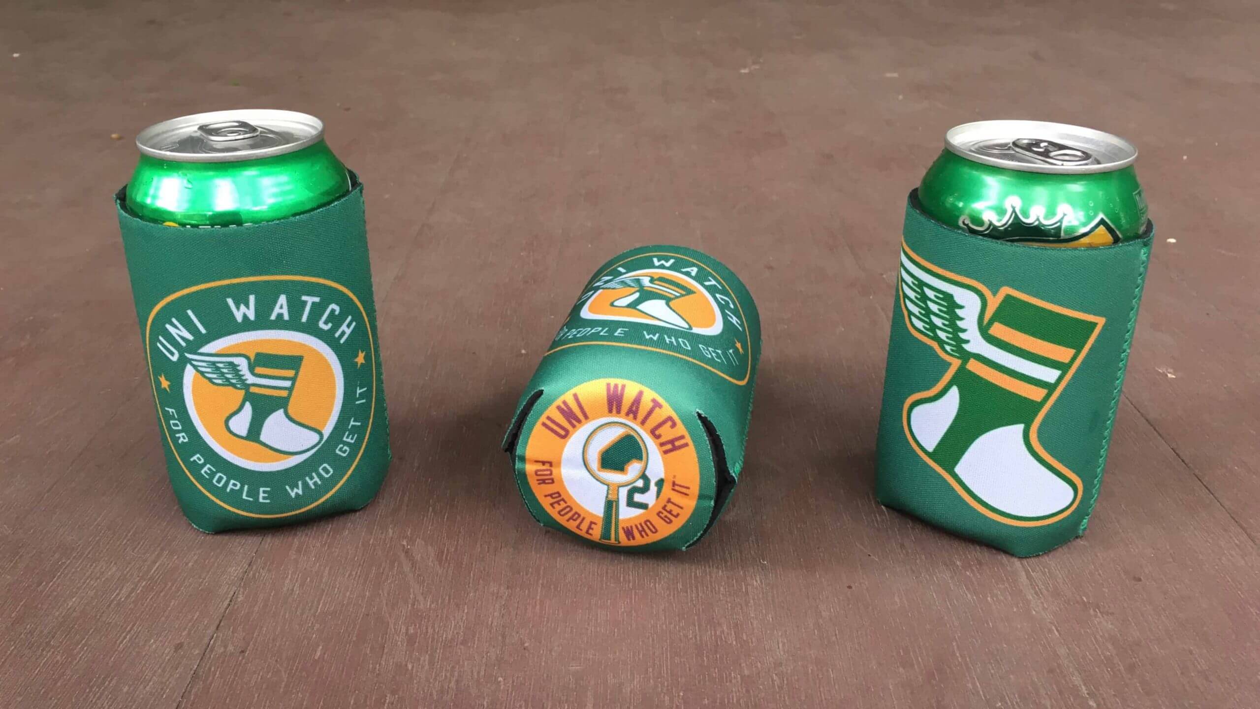
ITEM! New koozie design: The Uni Watch tequila sunrise koozies sold out in no time flat, so I went ahead and had a new batch made, but with a different design. Full ordering details here.
Click to enlarge
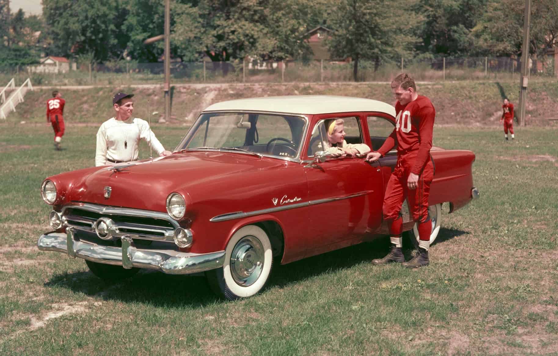
Too good for the Ticker: Reader Andrew Flynn recently spotted this photo from a 1952 Ford ad on the photo-history site Shorpy. Gorgeous, right? Too bad the football player wasn’t wearing a white helmet to mimic the car even more closely!
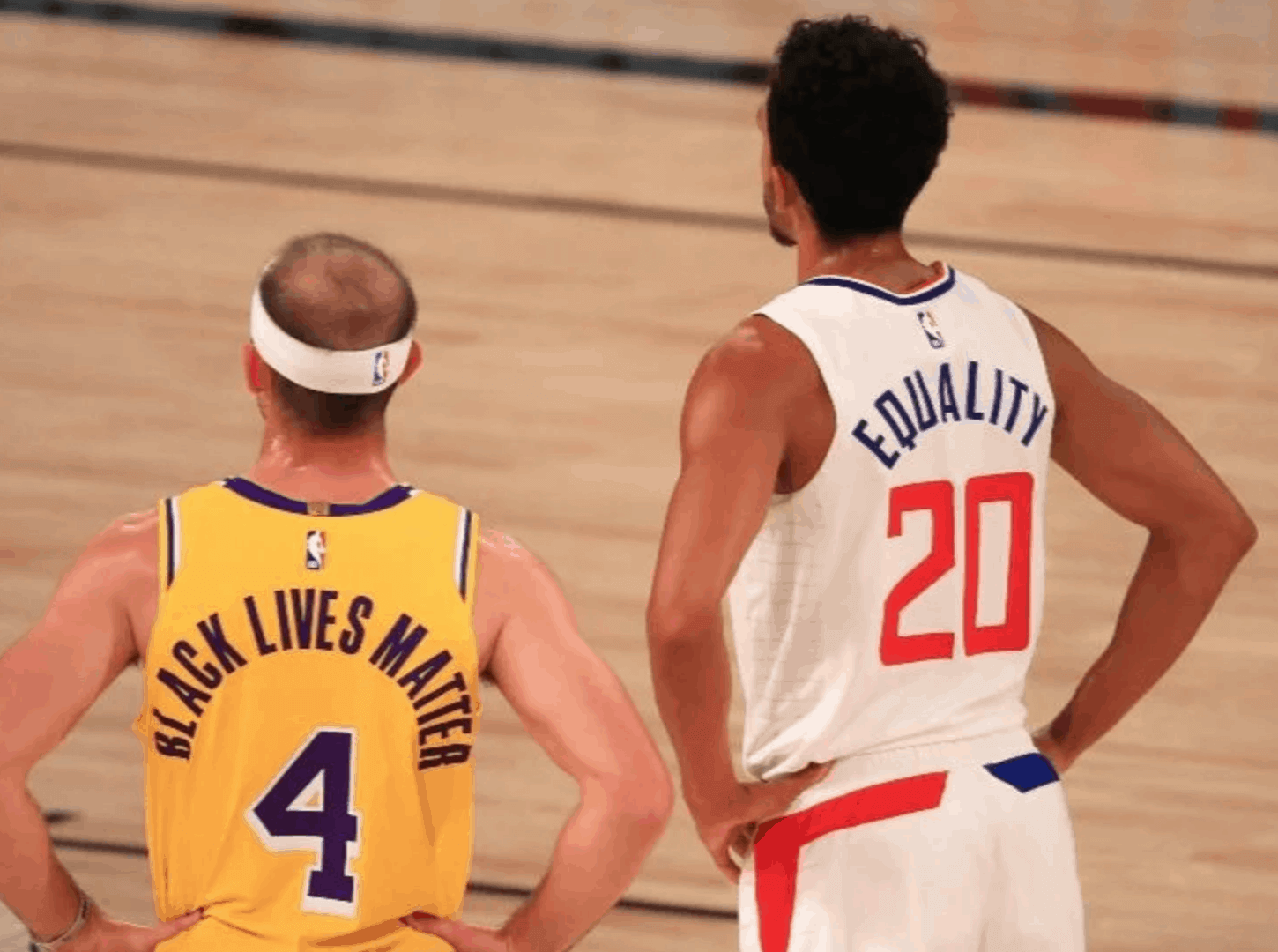
One last virtue signaling reminder: In case you missed it last week, Thursday’s blog post was a lengthy think piece about virtue signaling on uniforms. The reaction to this post was overwhelmingly positive (quite a few people said it was the best thing that’s ever run on Uni Watch), and it was great to see all the thoughtful comments that readers posted.
The full package — the piece and the comments — is something I’m really proud of. If you haven’t already done so, I hope you’ll check it out here.

ITEM! Teespring sale: Teespring is running another one of its periodic sales. Today and tomorrow, you can get 10% off your order by using the checkout code HARVEST10. That means you’ll save some coin and Uni Watch will still get its full share of the earnings — a win-win!
This offer applies to the everything in the Uni Watch, Uni Rock, and Naming Wrongs shops.
My thanks, as always, for your consideration.
The Ticker
By Jamie Rathjen

Baseball News: Baseball-Reference.com adds a black armband graphic to at least certain players’ pages after they die (from Michael Ortman). … Game Worn Guide to MLB Jerseys author Bill Henderson was on the Society for American Baseball Research podcast two weeks ago — and the episode description quotes Paul, for good measure (from Mike Chamernik).

Football News: New helmets for Nevada (from Zach Simms).

Hockey News: The NHL is apparently considering starting next season outdoors (article may be paywalled) at Alberta’s Lake Louise (from Wade Heidt). … At the bottom of this story, it’s mentioned that Golden Knights owner Bill Foley hopes the team’s new alternate can eventually become the home jersey, and that the team’s new AHL affiliate, the Henderson Silver Knights, is planning to reveal uniforms around the start of the AHL season in December (from Trent Guyer).

Basketball News: New gold uniform for Marquette’s men’s team, which is about the same pattern as the navy version in yesterday’s Ticker (from multiple readers). … Connecticut’s women’s team also has new uniforms (from @TheSkyShowCHI). … With the Lakers winning the NBA title while wearing white last night, LeBron James has now been wearing white for three of his four titles.

Soccer News: The website Footy.com finished ranking the top 100 shirts released this year, and the U.S.’s Portland Thorns and Forward Madison reached the top 10. … Georgia’s crest has 30th-anniversary text — dating from the men’s national team’s first game in May 1990, not the country’s independence. … Japan wore some kind of sleeve message for a friendly against Cameroon. … New third shirt for French club Saint-Étienne. … Some French women’s teams wore pink armbands this weekend, including Saint-Étienne again and Paris Saint-Germain. … Missouri’s women’s team also wore pink shirts. … English club Lewes wore warm-up shirts supporting Breast Cancer UK that were not pink. … Scottish women’s team Glasgow City have released their new shirts, which include a sleeve memorial for Ruth Bader Ginsburg.

Grab Bag: A company in Canada has been making masks with sewn-in whistles for officials, seen there on a wrestling referee (from Michael Sullivan and Nik Streng). … Super Rugby’s Pretoria-based Bulls are playing in Super Rugby Unlocked, a mini-competition involving the four South African Super Rugby teams and three others, and again changed shirts at halftime from blue to grey/yellow after also having done so in March, both against blue-clad opponents (from Sy Hart). … Royal Canadian Mounted Police officers are now prohibited from wearing “thin blue line” patches on their uniforms (from Wade Heidt).

TYPO:
• I don’t either like either the Bengals’ or the Ravens’ uniforms,
Thanks, Dave. Fixed.
CORRECTION:
I don’t like the Bengals’ uniforms but the Ravens look good.
Fixed.
the Raiders and KC showed everyone how football is supposed to look
Agreed. But what about link?
It depends on whether you prefer the Browns in the orange pants or the white pants . As long as you prefer the orange pants then yes, it ties the Chiefs/Raiders game. If you prefer the white pants then it was close but still #2. I like both pants but versus the Colts would have preferred the Browns in the white pants.
Also: Would’ve been nice if the Colts had blue socks instead of white tights.
The lack of blue top socks was the only blemish on the aesthetics of that game.
I prefer the Browns in white pants but against the Colts’ in stormtrooper, the orange ones contrast much better.
GAH! where did that apostrophe come from.
‘Tis a catastropehe!
no question mark… misspelled “catastrophe”…
OK, I quit.
Indeed! I was getting a distinct link. Those Colts unis had gray stripes between the blues back then, and of course, they still called Baltimore home. But that looked great then, and it looks great today.
Does history repeat itself when it comes to uniforms? The Colts briefly adopted some silver/grey accenting for a few years in the 1980’s. The Toronto Maple Leafs another blue and white team did the same thing about 20 years later, and it lasted about the same time.
A game in Lake Louise would be absolutely spectacular and I suspect would draw the casual hockey observer in. It could however be very cold.
Have visited Lake Louise (the town) when skiing Lake Louise (awesome ski location) but stayed in nearby Banff.
Super cool about the game there is that it would truly be natural ice. I would love to see them not paint the ice white and go for a natural look but I suppose they would need to paint it for TV viewing.
The Colts looked great going GFGS? Am I reading that right?
That uni-tweak could have been marginally improved if they had swapped out the white facemasks to match, but it was still one terrible decision of the many terrible decisions the Irsay’s made in the 80’s.
They really should retire the olde-timey gray ones they currently wear…I’d support a return to blue but white would look good too.
I wouldn’t really call that GFGS (though I suppose the addition of gray, even if just a stripe, could qualify). And for the record I prefer the Colts sans gray (except for a facemask, but then I think all facemasks should be gray). But it was more the matchup of the Cardiac Kids vs the Colts I was talking about, rather than the Colts uni in isolation.
The only Baltimore Colts team that belonged on blue and silver were the Baltimore CFL Colts! Sorry NFL, I mean Baltimore Football Club.
I was awaiting Brian Sipe to come out of the tunnel with the Browns in the Orange pants…
An anecdote pertaining to the Rams’ new logo and uniforms:
I visited my parents yesterday afternoon, and sat for a few minutes watching RedZone with my dad, who is a sports fan, but a relatively casual one (he didn’t hear until last night, for example, that Bill O’Brien had been fired). At one point, a Rams touchdown was aired… and I turned to him aghast as he absent-mindedly began to sing “San Diego Super Chargers”, having been thrown by the color combination and basic shape of the logo.
Noticed when Washington Football Team wears the burgundy jersey the TV numbers and helmet numbers really do not match well. We will likely have to look at this mismatch just this year.
Yeah, that bugs the tar out of me. I think the helmet could use some stripes too, or at least a single gold center stripe.
The bengals always look oddly pleasing against green bay as well. Those colors SHOULD NOT look good together, but for some reason, totally works.
link
RIP Joe Morgan…another hero of my youth.
Sad to hear, one of the more quirk-ish batting stances – he made a motion with his right arm that was somewhat similar to what we did as kids when we wanted to make the “fart” sound.
Left arm.
Yep, can remember the arm flapping, but forgot he was a left handed hitter. Great player and also if I remember correctly, a character in Ball Four, something about Bouton being impressed that compared to the Pilots, how the Astros were more integrated from a social aspect and credited individuals like Joe Morgan.
It seems like there have been quite a number of baseball legends that have passed away recently: Tom Seaver, Lou Brock, Bob Gibson, Whitey Ford, and now Joe Morgan.
Also Al Kaline this year. That’s five first ballot Hall of Fame players and a sixth (Ford) who probably could have been.
Could you imagine how much worse it would have looked last night had the Seahawks gone Mono-Highlighter? Ugh…
You mean like this from 2018? link
This is the third straight year with a primetime meeting between the Seahawks and Vikings where the Seahawks wore highlighter green and the Vikings wore white over purple. link
2018 and 2019 were Monday night games and last night was a Sunday night game. In 2018, Seattle wore the green pants, and in 2019 and 2020, they wore the blue pants.
It’s all a far cry from what these teams (especially Seattle) used to wear: link
I actually would’ve preferred the solid highlighter look. The neon over navy is , to me, harder to look at.
Forward Madison wore that highlighted jersey yesterday against Union Omaha (in the first live sporting event that I attended since mid-March).
On a separate note, Fort Lauderdale is playing against Forward Madison on Wednesday afternoon… both teams have a flamingo in their logo.
link
The beak looks a bit sharp to be a flamingo on Fort Lauderdale. Thought it might be a Great Egret, but looked it up and turns out it is a White Heron. It’s the same bird as on the new Inter Miami CF, but the MLS club’s has has two herons.
White over black with black socks is my least favorite look in football, regardless of team. The only Bengals combo I like is orange over white.
I don’t get why the Bengals scrapped the orange socks. They would improve their look tremendously.
Oh, right… because they’re the Bengals.
Also, happy Thanksgiving Day to our northern neighbors. Or southern, in my case.
Happy Columbus Day everyone!
I’ve soldiered through some ugly uniform matchups, but that last night was so hard on the eyes that I couldn’t make myself watch it. The clash of colors literally made it painful for the mind to process. Flipped the channel and watched the Lakers blowout the Heat instead.
I didn’t watch the game, but saw some KC/Raiders highlights. It seemed to me that the Raiders helmet paint had less silver in it than in past years. Is that true?
There was some discussion of this on Twitter. For whatever reason, QB Derek Carr’s helmet (which gets the most up-close screen time, obviously) seems to have less sparkle and looks more grey than silver. But the official specs for the finish of the helmets is unchanged, and lots of game photos clearly show plenty of sparkle.
Carr switched to the VICIS helmet this year – or whatever it’s now called since the original VICIS company went bankrupt. It seems the plastic they use for the shell doesn’t take metallic colors all that well; they come off a bit less sparkly than Riddell or Schutt helmets for all teams. It has been particularly noticeable for Norte Dame.
Many of the Rams wore a blue undershirt, not tucked in, which made it look like a wide blue belt. A Terrible look.
The wash-out white is bad enough, and distracting enough, but I can’t un-see the big blue belts…
The Footy.com article showcased lots of great soccer uniforms from around the world. Given the wide color palette (collectively) in the MLS, it’s disheartening that practically all MLS uniforms are completely dull. I wonder if this intentional (as in, MLS thinks flashy uniforms diminish league legitimacy or some such)?
Giants wore white pants on road for first time since Color Rush game. Realize they wear blue jerseys in Dallas, but always wore gray pant
Sorry, Mark, but that is incorrect. The Color Rash game against the Cowboys last season was a home game. Last year’s *road* game in Dallas was the 2019 season opener — and they wore white pants for that one. They haven’t worn grey pants on the road since 2018.
More here:
link
I stand corrected. Thanks Paul
Have the Raiders lightened the silver over the years? They looked almost mono-white to me. Some of the close up shots of the helmets in the sun, really did look almost white.