Click to enlarge
Good morning, and happy September! Paul here, sending you greetings from Uni Watch HQ, where all three inhabitants continue to be safe and well. Hope the same is true at your home.
Before I go any further, let’s have a standing O for deputy editor Phil Hecken, who did a great job of running the site over the past three weeks while I recharged my batteries and worked on the College Football Season Preview (which, in case you didn’t see it late last week, is available here) and the NFL Season Preview (coming next week). Well done, buddy — now take a well-earned break!
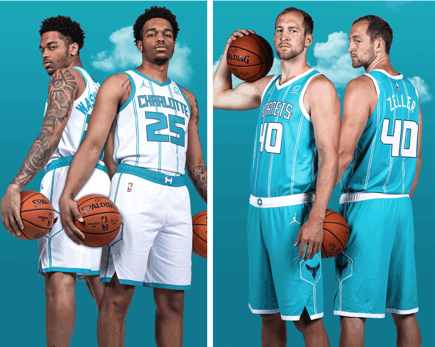
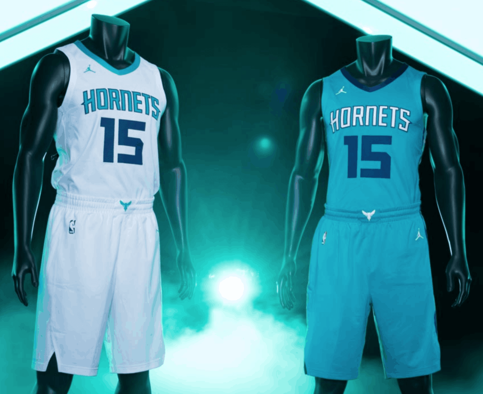
Now then: The current NBA season is still ongoing, but teams that didn’t qualify for the bubble round are going ahead and revealing their new uniforms for next season. We saw that back in July with the Hawks, and it happened again yesterday in Charlotte, where the Hornets unveiled new white and colored primary uniforms (additional info and photos here and here).
This unveiling was originally slated to take place last Thursday, but the team decided to postpone it after the events of last Wednesday, when NBA players engaged in a wildcat strike to protest racial injustice.
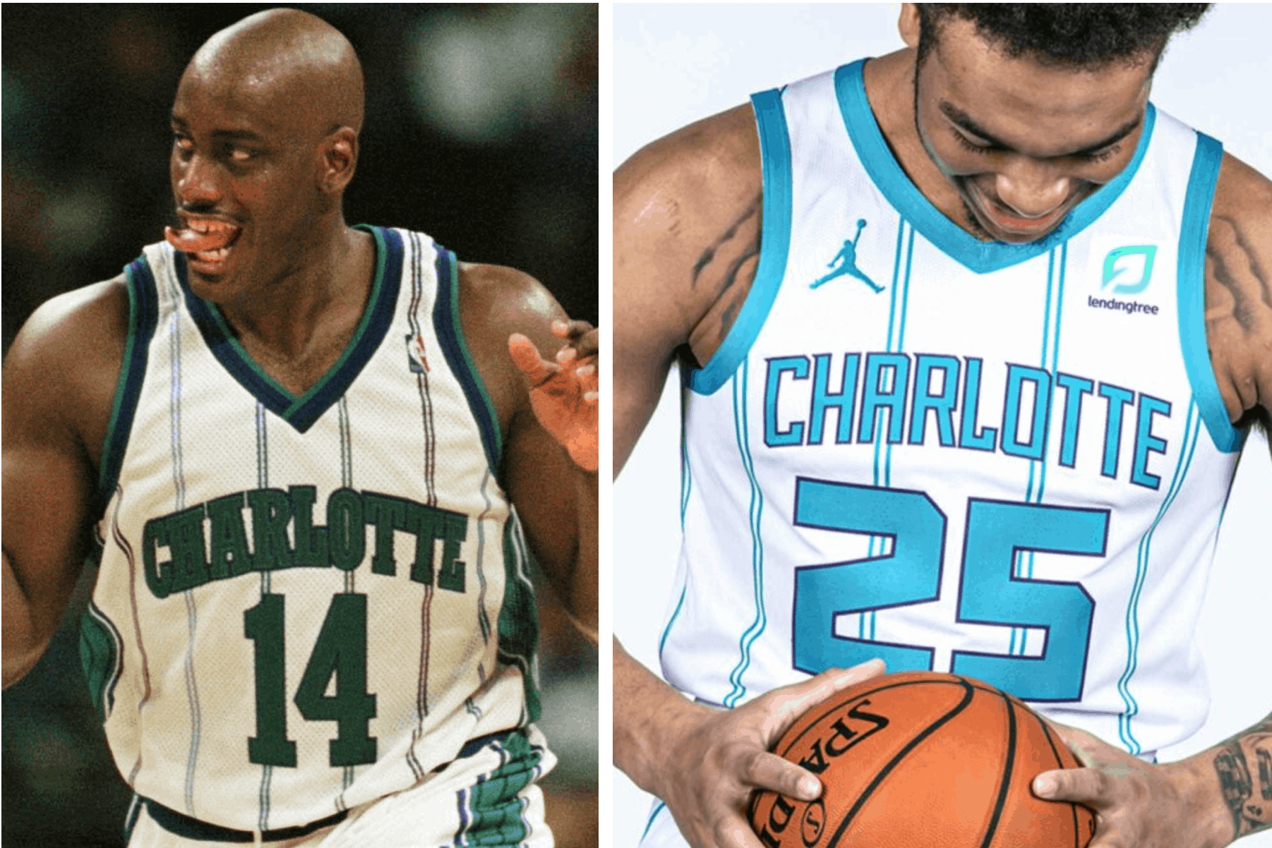
The new set is an updated version of what the team wore in 1997 through 2002. Those uniforms, like the ones unveiled yesterday, featured a double-pinstriped motif. But the original double pins were multicolored, while the new ones are mono-colored. And there are other differences, of course — here’s a comparison (old versions on the left, new on the right; click to enlarge):
Honestly: I was never a big fan of the original version and don’t think much of the reboot either. For starters, I don’t like pinstripes on basketball uniforms. What’s the point of accentuating the vertical when the players are already eleventeen feet tall? But if you insist on having pinstripes, put them on the shorts as well as the jerseys! Makes no sense to be striped above the waist and stripe-free below.
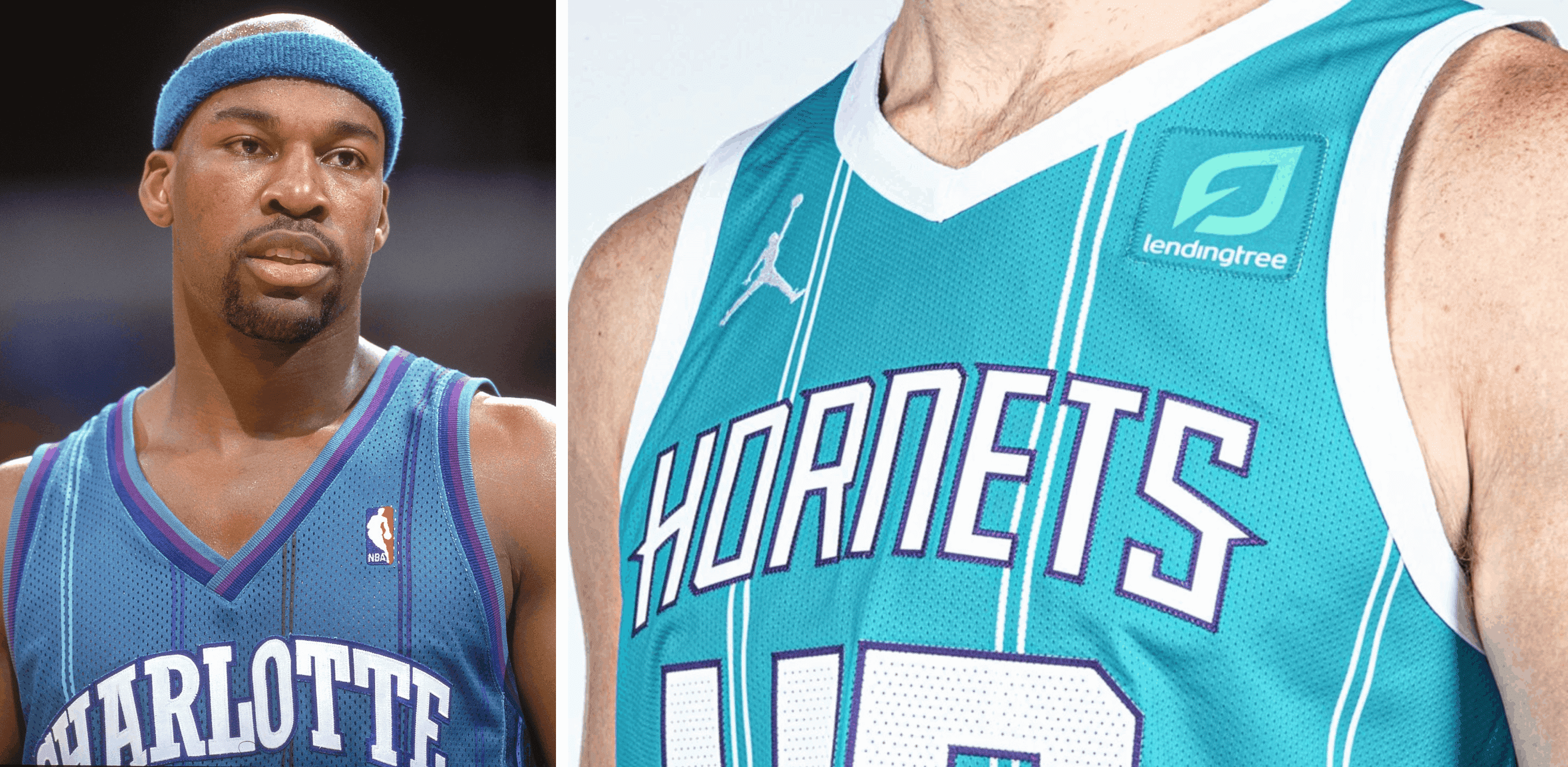
And how do these new uniforms compare to the ones they’re replacing? Let’s take a quick look at the outgoing set (click to enlarge):
I can’t believe I’m saying this, but I prefer the outgoing set, even though it has more purple. The lack of pinstripes, the contrast between the chest lettering and the numbers — much better. The new set is a downgrade in my book.
These uniforms, like the ones they’re replacing (and like many of Nike’s NBA uniforms), were designed by the Mississippi-based firm RARE Design. There will presumably be at least one new alternate uniform revealed at a later date. Also, according to this page, the throwbacks that the Hornets have worn in recent years are “now out of the on-court rotation,” so we apparently won’t be seeing any more of them for a while.
Yesterday’s unveiling also included a new primary court design. Here’s a video that does a good job of showing the difference between the old and new designs:
This I do like — a lot! Love the contrasting patterns, the lanes, the whole package. Nicely done! And for those who like to follow such things, note that the new design’s free-throw circles have six dashes — same as the old design.
Click to enlarge
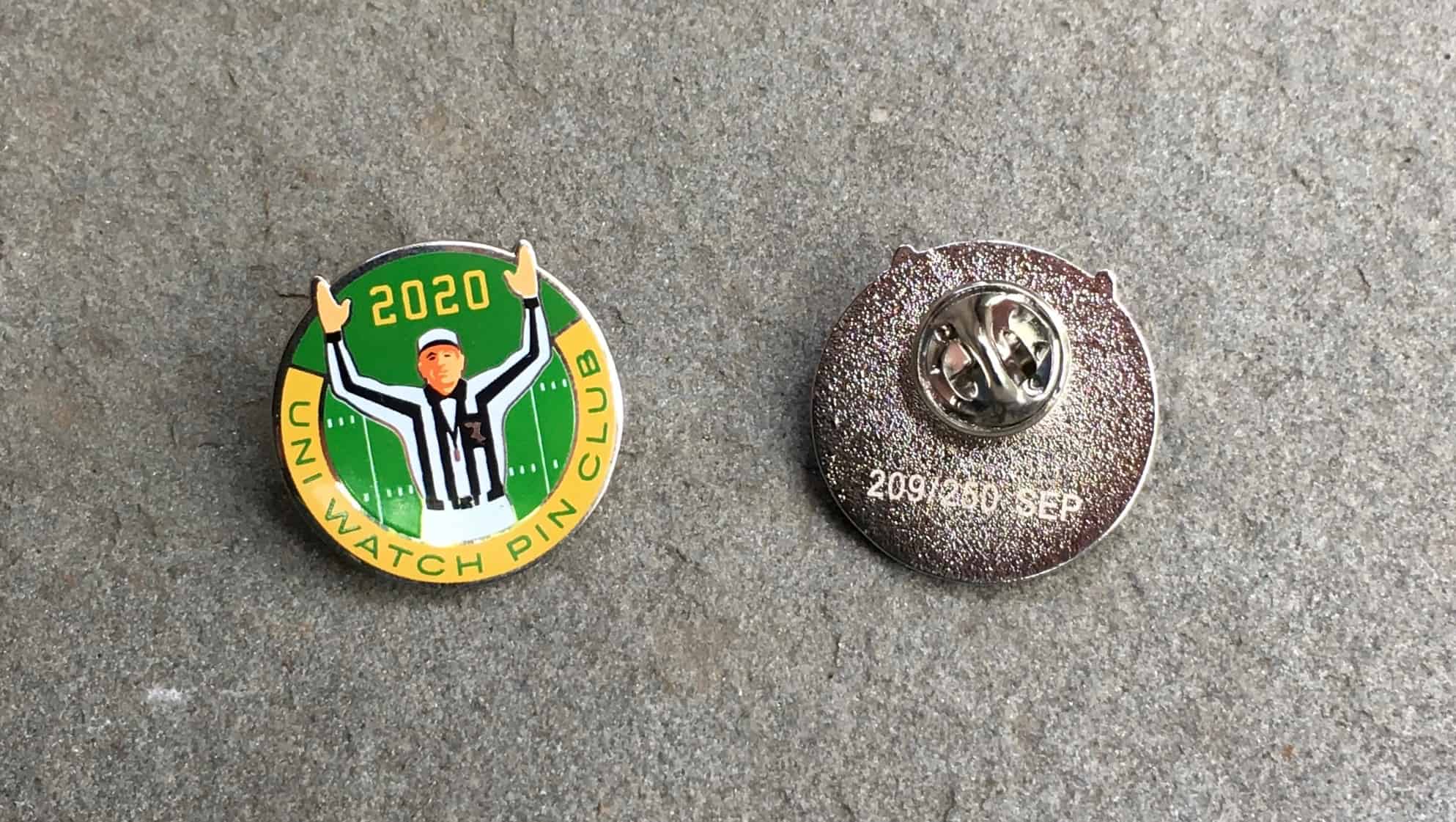
ITEM! September Pin Club launch: Today is the first day of September, which means it’s time for the launch of the Uni Watch Pin Club’s latest design. As you can see above, we’re honoring the start of football season with a shout-out to gridiron referees.
Of particular note: All of our previous pins have had a gold metallic finish, but this time we went with silver — in part to change things up, and also so we could render the ref’s whistle and belt buckle more color-accurately.
This is a limited/numbered edition of 250. Like all of our pins, the design was a collaboration between myself and the great Todd Radom. You can order yours here.
Need to get caught up? Here are our January, February, March, May, June, July, and August pins. (Sorry, April sold out!)
My thanks, as always, for your consideration.
Click to enlarge
Collector’s Corner
By Brinke Guthrie
Follow @brinkeguthrie
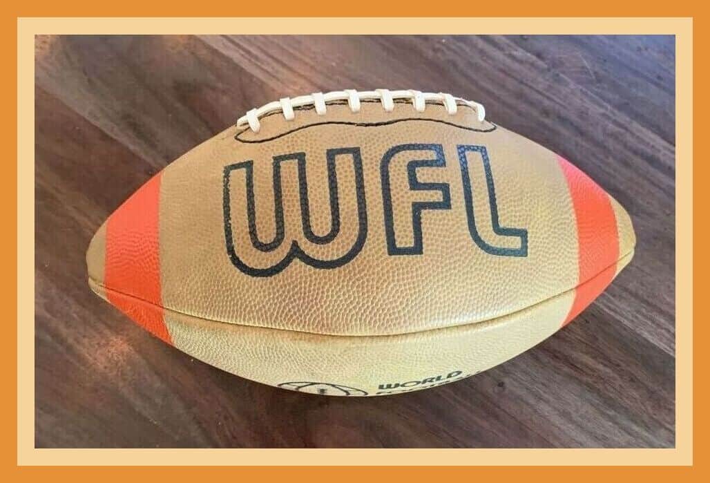
Welcome to September! Let’s kick off the month with this throwback artifact from the mid-1970s. The World Football League was an ill-fated attempt (aren’t they all) to take on the NFL, and it was predictably short-lived. They started in 1974 and folded halfway through the 1975 season, but not before they brought us this official “yellowish-tan” Spalding football, complete with orange stripes. More on that ball here.
Now for the rest of this week’s picks:
• This vendor’s button was worn at 1940s St. Louis Cardinals baseball games, and promoted Kitty Clover potato chips. For some reason, it just says “Cardinal” — singular — at the top. Close, I guess.
• Buffalo Sabres fans will love these MOC (mint on card) hockey stick pens!
• This vintage Munro Hot-Shot table hockey game has some great box cover art. Those two teams look suspiciously like the Canadiens and Maple Leafs. But one of them should’ve should’ve been wearing a dark color instead of white!
• Here’s an auction for 16mm reels of 1948 World Series and 1946 football highlights.
• A couple of interesting 49ers items here. The eBay seller says this Nike-made jacket was team-issued — in blue? Really? And we’ve also got a Niners team-issued valuables bag.
• This WPLJ radio-sponsored button salutes the Yankees in the 1978 World Series.
• Back in the day, if you slapped this bumper sticker on the family station wagon, you let everyone know that “This Is…Bruins Country!”
• Here’s a pocket-sized 1979 NFC/AFC Schedule sponsored by Heileman’s Old Style beer. What’s interesting here is that the sketch art they used was nowhere near contemporary. The defensive player is using an old-style 1950s facemask, and the QB is wearing No. 25!
• This 1971 Official National Football League Player’s Association Foot Locker Toy Chest featured the faces of players like Alworth, Lamonica, Butkus, and Page, but no team or league logos.
• Here’s another item that’s NFLPA-endorsed: It’s a board game called Pro Football Franchise. You can Buy! Sell! Trade! Draft! Build a Winning Team! Also: “Featuring over 300+ Pro Superstars!” With games like this, who needs a scouting department?
• And to wrap things up: I know I feature a lot of Dave Boss artwork, but this vintage NFL poster is definitely worth checking out.
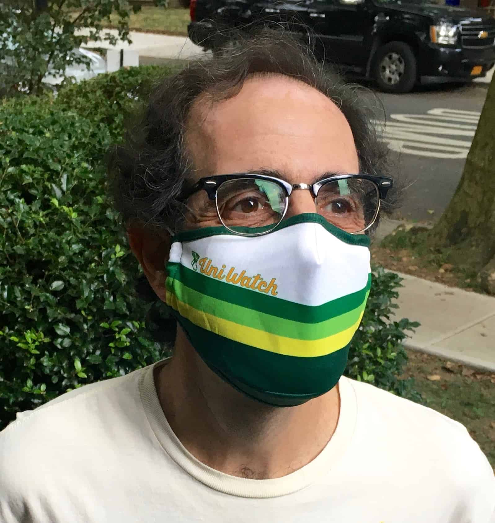
Mask update: As of this morning, there are about 30 Uni Watch Tequila Sunrise Masks remaining from the original batch of 500 (which means we’ve raised nearly $2500 for the National Alliance to End Homelessness!). We probably won’t be getting another batch of these. They’re still available here while supplies last.
These masks were originally available in two sizes — S/M and M/L. The M/L masks are sold out, but S/M size is the same size as a “normal” mask. So unless you have a really big head and/or face, it should fit you fine.
Thanks for supporting all the charities we’ve been partnering with via your mask purchases!


ITEM! New membership raffle: I have a bunch of accumulated things to raffle off in the next week or two, beginning today with a membership donated by reader Michael Zerbib.
This will be a one-day raffle. To enter, send an email to the raffle address by 8pm Eastern tonight. I’ll announce the winner tomorrow.
Big thanks to Michael for sponsoring this one!
Click to enlarge
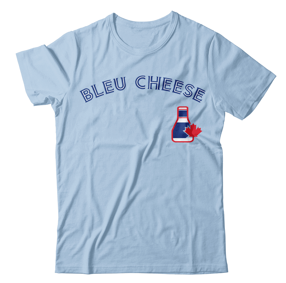
ITEM! Hypothetical idea: With the Blue Jays playing their home games in Buffalo, wouldn’t it be good — just in theory — if the T-shirt concept shown above actually existed?
If you agree, drop me a line and we’ll discuss. Thanks.
The Ticker
By Alex Hider

Baseball News: Yankees P Miguel Yajure finally got into a game last night, making him the first MLBer to wear No. 89. Every number from 0 to 99 has now appeared on the field. … Andy Chalifour found a few photos of former Twins 3B Gary Gaetti wearing a Minnesota-shaped pin on his cap in the late ’80s. Anyone know more? … In this Detroit Free Press article about former Tigers in the 2,000-hit club, former RF/3B Harry Heilmann is pictured wearing a strange uniform with something on the back. Heilmann played in an era before uniform numbers, but I’m not quite sure what’s on his back in this photo (from Doug McBurney). … For those who have never heard of the Yankees’ short-lived mascot, Dandy, I suggest you read up (from Johnny Garfield). … @BallparkHunter has shared some more vintage MiLB commercials from the ’80s and ’90s. … Sen. Ed Markey rocked a new Worcester Red Sox jersey during a Zoom meeting with his campaign staff yesterday (from our own Anthony Emerson).

NFL News: We now have our first look at how the NFL will allow players to honor the victims of systemic racism on their back helmet bumpers. The league is also instituting several other initiatives, including cap patches for coaches and officials, messaging on the endlines, and messages on pregame T-shirts (from Jerry Wolper). … The 49ers are selling fan cardboard cutouts to be placed in their stadium this season (from Kary Klismet). … Eagles QB Carson Wentz has been wearing a compression sleeve with a quote from Martin Luther King printed on it. It reads, “Hate cannot drive out hate; only love can do that.” … Here are the official face coverings that NFL personnel will wear this season. Unlike the MLB masks, the NFL versions have a visible maker’s mark.
College/High School Football News: This website features an extensive database of University of Iowa football programs and ticket stubs dating back to the early 1900s (from Kary Klismet). … North Carolina and Virginia Tech are both selling custom fan cardboard cutouts for their home games this season (from James Gilbert and Kary Klismet). … Back in the day, some players at Millard North high school in Nebraska used long strips of tape across the front of their helmets and above their facemasks to hold down long chin straps. The trend became so ubiquitous on the team that the tape is now an official part of the uniform (from @Perez_Cristian3).

Hockey News: New, modified logo for the ECHL’s Allen Americans (from @_alxjones_). … Check out the football helmet-inspired hockey lids that the Minnesota Golden Gophers wore back in the day (from Ben Hargen).

Basketball News: All WNBA teams wore pregame shirts promoting breast cancer awareness on Sunday, and at least one team in each game wore BFBS uniforms with pink accents to mark the occasion (from our own Jamie Rathjen). … Bucks F Giannis Antetokounmpo’s wife and baby son showed up to the team’s game last night, and Antetokounmpo’s son was wearing an old Bucks jersey with an outdated maker’s mark (from @solidbogey). … New jerseys for the women’s basketball team of Polish sports club Polonia Warszawa (from Ed Żelaski).

Soccer News: New away kit for Romanian club FCSB (from Ed Żelaski). … Also from Ed: New shirts for Poland. … New jerseys for the Canadian men’s and women’s national teams (from Mark Ward). … New uniforms for Oral Roberts women’s soccer. … AS Roma had to tweak their third game kit for European play because UEFA doesn’t allow clubs to have more than two logos on it, even if it’s only part of the background (from Ryan Maquiñana). … A bunch of Nike-outfitted European national teams released new shirts this morning, including England, Finland, France, the Netherlands, Norway, and Portugal. “Most national teams haven’t played this year because the first window for their games was right after the world stopped,” explains our own Jamie Rathjen.

Grab Bag: UCLA is suing Under Armour over the company’s termination of its apparel contract earlier this year (from John Cerone). … Chinese telecom company Huawei is ending its nine-year advertising relationship with Australian rugby league club Canberra Raiders amid trade negotiations between the two countries (from Ted Arnold). … The city of Hutchinson, Minn., has a new logo (from Kary Klismet). … New logo for the Michigan Intercollegiate Athletic Association, an NCAA D3 conference. The set includes colorways for every member school (from @ponyupdoc and Ian Lee). … Landmarks in Melbourne, Australia, were lit up in purple in honor of International Overdose Awareness Day (from James Gilbert). … Russian men’s volleyball team Zenit Kazan has new uniforms for 2020-2021 (from Jeremy Brahm). … Auto racer Tom Sneva once wore a helmet with a football facemask when driving in an Indy Car race in 1983 (from Kyle Dawson). … A Navy corpsman ran a 10K “ruck” in a full Star Wars Stormtrooper costume to raise money for charity (from Timmy Donahue). … Many books about politics this year have similar cover design motifs (from Jason Hillyer). … New logo for comics publisher Fantagraphics (from John Cerone).

Click to enlarge

What Paul did last night: Although I’ve been away from the blog, pandemic Porch Cocktails™ have continued every day. We’re now up to 167 daily photos.
Yesterday was particularly notable, because we witnessed a remarkable nature scene unfolding in the tree across the street from us (the same one from which Branch Rickety once swung): There was a squirrel that was gathering leaves from the tree branches and using the leaves to build a nest. The amazing thing was that he kept leaping back and forth from the nest site to where the leaves were. He’d launch himself from the nest to his preferred branch, harvest some leaves, hold them in his mouth, and then launch himself back to where he was building the nest. It was amazing!
I shot two videos. The lighting wasn’t ideal, but I think they’re good enough for you to get a decent sense of what was happening:
Occasionally the leaves would fall out of his mouth and flutter to the ground as he jumped, but whatever — he’d just go back for more. At one point he miscalculated his jump and fell down to the sidewalk (it had to be at least 25 feet) but didn’t seem any worse for wear. He just scampered back up the tree and resumed his task.
I know there are such things as flying squirrels, but I’m pretty sure this fella isn’t one of those, at least not genetically. But he’s a squirrel that flies, and that’s good enough for me!
New Hornets uniform needs more purple trim.
Astonishingly enough, I agree!
Double agree. Any combo of collar and arm trim, pinstripes, and the text could all be primarily purple on either set to make a huge difference, but I also think the teal is too pale for this design, the stripes on top, plain on bottom would make even a nice jersey into a bad mismatched set. And the reduction in the amount of pinstripes takes it from a “pinstripe jersey” to “a jersey with some stripes on it”. What’s worse is I feel certain that reducing the amount of stripes (thereby increasing the spacing between stripes) was done at least in sort part to avoid interfering with the Jordan mark and the sponsor patch. All in all lots of problems but even at first glance this set is not a good one.
Squirrels cannot die by falling.
link
Welcome back Paul!
I just can’t get over the grayness of the squirrel. Out here in the Mile High, squirrels are grayish with brown, and it’s the brown that really stands out when you see them. I just about flipped when I was in Brooklyn some years ago and saw an all-gray squirrel for the first time.
That is literally part of the species name:
link
Gray squirrels are super common on Long Island. Not so common are the fully black squirrels, which are much more aggressive than their gray counterparts. I don’t think we have any with a brown tinge round these parts.
The black ones are actually the same species as the brown-tinged ones. They’re both Eastern Fox Squirrels (Sciurus niger), which come in a variety of colors and patterns. Some are even pale gray with a black mask around their eyes like a raccoon.
The fully black squirrels and the brown-tinged squirrels are actually the same species – Eastern Fox Squirrel. They’re bigger than gray squirrels, and they come in several different color variations.
Interestingly, the first time I left this comment I tried to include the Eastern Fox Squirrel’s scientific name (“Sciurus” followed by the Latin word for “black”), and it looks like it got auto-blocked for being too similar to a racial slur.
In rural Ohio we have gray, brown, red, and the occasional black.
Cool pin! But I may be biased.
Great Job in August, LI Phil!
Thanks Rod!
Obligatory: good thing the Stormtrooper runner is a Corpsman because everyone knows those guys never hit their targets with their blasters. ;-)
Excellent work with the college football preview; the CFB and CBB previews are always my favorites pieces every year! Not sure if it’s too late to edit, or if you’ve already received feedback on this, but there are 10 FBS conferences and 6 are playing (not 5, as is stated in the opening paragraphs). I think CUSA was the omitted league.
Anyone notice the link in the Dave Boss poster? Guessing he saw 1969 preseason shots and thought it would be used regular season.
Hate to say it, but I think Harry Heilmann is wearing a uniform ad. The word on the lower right is GOODS, and it’s right-justified, indicating there’s another word to the left of it. Perhaps DRY or SPORTING?
I agree. I zoomed in and it’s either “Dry” or “Sporting,” followed “Goods.” The top could either be Turner, or Bruner. Likely a local shop that’s sponsoring the event. The crop mark wax pencil blocks more clues.
Welcome back Paul!
So usually I agree with you on the uniform critiques but I do like these new hornet’s uniforms. Sure there could be a little more purple but I love when teams have certain quirks about their uniforms and the pin-striped jersey with non pin-striped shorts is theirs.
Thanks (Phil)ling in Phil, you always do a great job.
Cheers guys!
Paul, there’s no pinstripes on the shorts because the Hornets of the 90’s did not have pinstripes on the shorts either. They were harkening back to that. I think it would have been interesting to see pinstripes on the shorts too.
I agree with you that more purple is needed. I wish they would have changed the number font as well. It’s big, clunky, and the “open 4” in Zeller’s #40 looks awful on a uniform.
Paul, there’s no pinstripes on the shorts because the Hornets of the 90’s did not have pinstripes on the shorts either.
Yes, I know. I didn’t like the original look for that same reason!
Question about MLB uniform numbers – I did a brief search on the interwebs and on the 2018 Official Baseball Rules. Is there an official rule prohibiting triple-digit uniform numbers??
Not that I’m aware of.
This much may be obvious, but Geatti’s pin is the POW*MIA logo squeezed into the shape of the State of Minnesota.
link
Doesn’t specifically mention the pin, but there’s this:
“In ’87, after meeting some Vietnam vets and researching their plight, he became deeply involved in the POW-MIA movement, donating a van to the cause.”
Confirmed. Gaetti’s career in Minnesota overlapped with the height of the POW-MIA movement, and the POW flag became ubiquitous at public events, such as during the anthem at the start of ballgames. Though I don’t think the Metrodome ever hung the POW-MIA flag from the rafters alongside the big US flag up there; I mainly recall it usually being marched in whenever color guards were present for the anthem.
I believe they did fly the POW-MIA flag at the Dome starting around that time — I remember asking my dad what it meant when I was a kid!
They definitely had a POW-MIA flag, its a prominent memory of mine of the Metrodome decor. When you sat in the left field nosebleeds as much as I did it was very noticeable.
Those Hornets uniforms aren’t quite throwbacks and aren’t quite original, which just leaves me feeling confused and annoyed.
Can’t we just judge the design on its own merits rather than worrying about whether it’s old or new or something else?
It’s hard to do that in this case when the uniform is clearly trying to evoke the 90s uniforms, but the modern touches just make the design look mismatched.
I would say we’re doing exactly that! Judging the design on its own merits. This includes the question, “What is this? Is it old or new or something else?”
Toronto Blue Jays: Clear modern update of the throwbacks, bringing the iconic look into the 2010’s. And it’s awesome.
LA Rams: An overly modern chop and screw where the most iconic elements are barely recognizable. So modern, it’s bad.
Chicago White Sox: “Let’s pick up the beach blankets.” It’s pretty faithful to the 80’s, but I personally don’t super love it.
Miami Dolphins: Fun modern helmet logo! It’s not throwback at all…it’s aqua and orange because those are the team colors.
Now, Charlotte Hornets: I can see what they’re doing, mixing new fonts with an old idea, but somehow it’s less than the sum of its parts.
One thing that absolutely is an upgrade to be is that Hornets AND the number both have an outline now.
I HATE HATE HATE the recent trend of the past 5 years of team names being outlined but the numbers will just be 1 solid color, looks weird and incomplete.
I watched a squirrel fly every Saturday morning on TV.
link
Regarding Sen. Markey wearing the Worcester Red Sox jersey. This was possibly (probably?) a jab at his opponent Joe Kennedy.
Kennedy ran a full page ad in the Worcester Sunday paper where he made a cardinal sin of spelling Worcester as Worchester.
Nothing screams “not from around here” like that error.
Does anyone else find it weird that the white (home) uniforms say Charlotte, and the dark (away) uniforms say Hornets?
There have been no more home or road uniforms in the NBA since 2017. Teams can wear any uniform at home or on the road, as long as there’s enough contrast with the opposing team’s uni.
I hate that…it’s so disorienting. It’s a visual mess. I can’t instantly tell who’s the home team and who’s playing (b/c of so many uniforms). Do you think we’ll ever see the pendulum swing back the other way and have designated home/road uniforms?
Anything’s possible, but I don’t envision it happening soon.
Welcome back, Paul!
Given how 2020 is going, the September pin should’ve shown the referee making the incomplete sign instead of a touchdown.
“Hands Up, Don’t Shoot”
I wish I could convey how iconic those early Hornets unis were to the region. Alexander Julian was commissioned to design the team’s uniforms, and the pinstripes became the uniform’s calling card.
link
Riding the wave of notoriety, Julian went on to tweak the uniforms of the University of North Carolina’s men’s basketball team, using the argyle that has become synonymous with the school’s program. The football program eventually took to the idea and has used argyle on field at Kenan Stadium.
Back to the Hornets … I agree with Paul on the lack of purple, and I dislike purple even more than Paul does. Looks like the Hornets went for classic and got too plain.
I wish the NBA would allow teams to return to an earlier look like NFL, NHL, and MLB teams. I remember reading in 2014 that MJ wanted to return to the 90’s Hornets logo and uniforms, but was denied since it’s now a “hardwood classic.” Such BS. If teams want to return to an identical look they once had, they should be permitted to do so.
Seeing this botched swing-and-a-miss at the Hornets uniform only reminds me of how great the first ones were. Having pinstripes on only the jerseys gave the appearance players were wearing a sweater-vest with pleated tennis shorts. And the grace note was the use of accenting colors (lime, cyan, maroon) rather than team colors for the stripes themselves. My favorite detail was the arm hole trim in white, purple, maroon and turquoise. Alexander Julian is a master of colors.
Welcome back, Paul!
Always neat to see a shout-out for Fantagraphics. I am a long-time fan of Los Bros Hernandez and Peter Bagge, and I remember the weird looks I would get from DC and Marvel fanboys after I plunked down my money on a bunch of black+white comic books.
I actually like the new Hornets uniforms better than the old, though like others I wish they featured just a bit more purple. The number font could be better, too.
So…I went to Millard North High School, and that is not the history we were given for the tape around the helmets. The history given to us (Class of 2007) was that a helmet, or helmets, started cracking and they used tape to keep it from getting worse.
That being said, I like this updated history better, because it is less of a safety risk and is more “functional”. Let’s be honest, tape is not holding a cracked helmet together under the forces they experience throughout a game.
It is also important to note, that this is only applicable to the Varsity Team. The JV and Freshmen Teams do not wrap their helmets in tape. At least that was the case when I graduated.
Overall, it is a great tradition, and original at that.
Tom Sneva was normally an IndyCar driver, but in that clip he is in a NASCAR race
Wow! That’s an awesome find!
I hope James Davison (who will be driving the #53 throwback car for the Cup race at Darlington) can be outfitted with a helmet painted up to resemble that of Sneva’s…faux facemask and all.
Sneva used to run the old track in my hometown, New Bremen, Ohio. He drove Sprints at that time.
We’ve had the Brooklyn Branches… can we get the Soho Squirrels?
Do you plan to have two pins in October, the POTM and the Press Pin?
Yes. We’ll have the October Pin Club release on Oct. 1, and the 2020 Press Pin sometime in the middle of that month. Both are already designed and in production.
There are flying squirrels Paul. They are just not indigenous to our part of the country I believe. I know this because I’m a hunter. Squirrels are cute, but annoying when whitetail deer hunting. :-)
There are flying squirrels Paul.
Yes, I know. That’s why I wrote, “I know there are such things as link.”
BROKEN CODING
In today’s section announcing Michael Zerbib’s sponsored raffle, there is a picture I can’t see.
Fixed.
Wow, those pinstripes look bland. Especially the white stripes on the teal jersey. It just doesn’t look right at all.
I read that story (linked) about the UCLA – Under Armour conflict. I found it interesting that the UCLA AD said he’d been talking to four entities about taking Under Armour’s place once this situation is resolved. Obviously two of the four would be Nike and Adidas, but who would the other two be (and would it be separate deals for apparel and footwear)? Just wondering
I have had a few people contact me over the years when they see a WFL ball like the one pictured today to ask me if it is real or a knockoff? It is a real WFL football, Gary Davidson didn’t finish the 1974 season as the commissioner, after he left the league the newer balls did not feature his name on the ball. So they have a plain look to them with no signature on there. Of course in 1975 they switched to a regular brown football, I didn’t even save that one when it was given to me as a kid I liked the mustard 1974 one that I still have today.