[Editor’s Note: Paul is on his annual August break from site. Deputy editor Phil Hecken is in charge from now through the end of the month, although Paul may be popping up here occasionally.]
By Phil Hecken, with Skott Schoonover
Follow @PhilHecken
Hey everyone — it’s Tuesday, and I hope everyone is doing well and staying safe.
One of my favorite things about Uni Watch is that rarely does a single day go by when I don’t learn something (usually uni-related!). Paul is obviously a font (or, if you prefer, fount — it seems both are acceptable) of knowledge, and his daily imparts are a welcome diversion from life. And I hope you guys learn something when I write the ledes. But I also gain a ton of knowledge from reading the comments, and you guys are truly amazing in your sharing of various uniform minutia as well. It’s one of the reasons I frequently reach out to the readership to pen a piece here or there — I may know a lot about unis, but many of you do as well (and often things I do not), and there are some of you, Paul first and foremost, who have probably forgotten more about uniforms than I’ll ever know.
That being said — today is one of those days when a reader (and guest author) Skott Schoonover, is going to drop a ton of his knowledge on us in the form of facemask history and overviews. Now, I’m admittedly not a guy who is into facemasks (other than I think they should be gray), so it was a treat learning all about them, from their beginnings up to the present day, from Skott. I think you will too.
So, without further ado, here we go:
Football Facemasks
By Skott Schoonover
As a kid in the late 80’s and early 90’s I loved drawing athletes and designing uniforms, much like Kary Klismet and Marty Hick.
Before the digital age, I used pencils and markers. My favorite thing to draw was always football players because although all my illustrated faces looked the same, I could differentiate the players by their facemasks. I would watch games closely with my sketchpad in hand to make sure I had the exact right facemask design for each player. Thus, my obsession with facial protection began. Today I’m going to give a crash course on NFL facemasks along with some of my favorites.
HISTORY
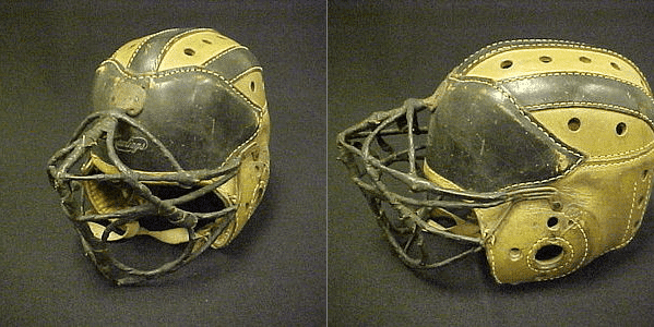
The first facemask as we know them was invented in 1935 by a man named Vern McMillan in Terre Haute, Indiana. It was rubber-covered wire and attached to a leather helmet. There were multiple efforts to improve upon the design, including one made of barbed wire and tape!
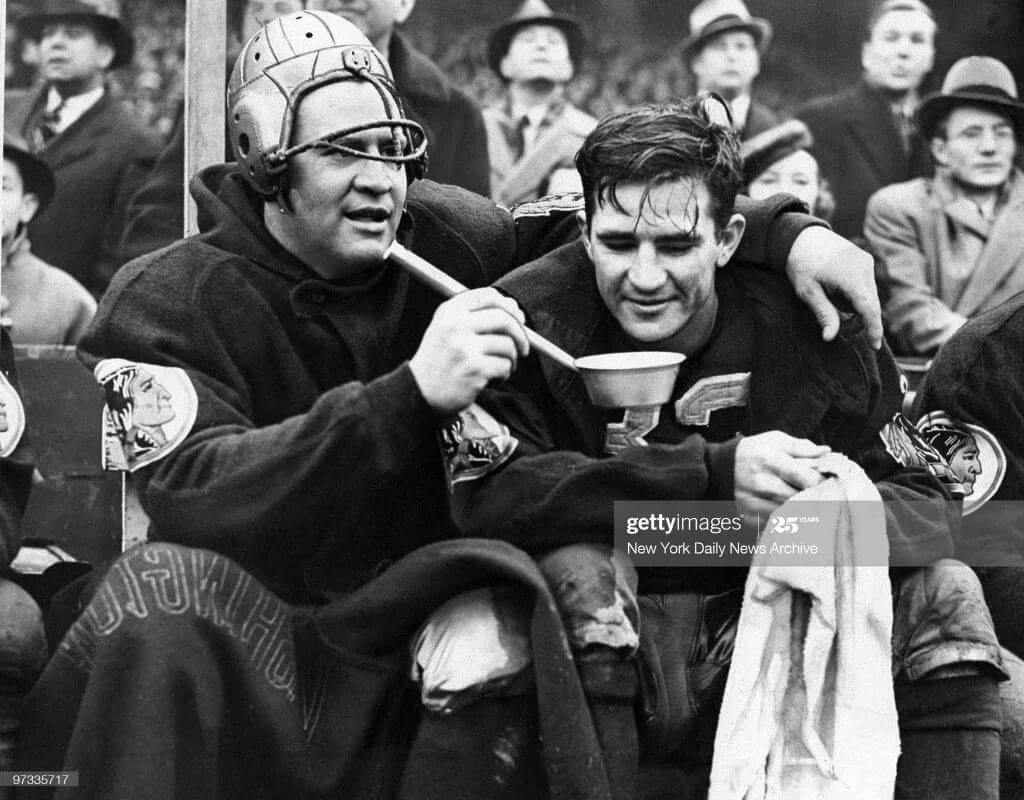
While many people credit Otto Graham and his Lucite face shield in 1953 to be the first facial protection in the NFL, the first documented professional football player to wear a facemask was Ernie Pinckert of the ‘Skins in 1937.
In 1954 Paul Brown patented the BT-5, which stood for Bar Tubular-5th attempt, but is more popularly known as the Single Bar, and it was produced by Riddell. This would be the beginning of modern facemasks that could be attached to plastic helmets. By 1966 the double bar Kralite-2 facemask was the most popular in the game and would remain that way through the mid ‘70s. At the same time, Dungard masks were introduced. And while far more protective, they were less popular.
By the late ‘70s the Clip On Mask had taken over. They were made of rubber-covered wire and had a lot of variations to make them position specific. Now you could choose a mask to fit your preferences.
In the ‘90s there was a brief period where plastic facemasks made a return in the form of the Kralite MB2 and MB5.
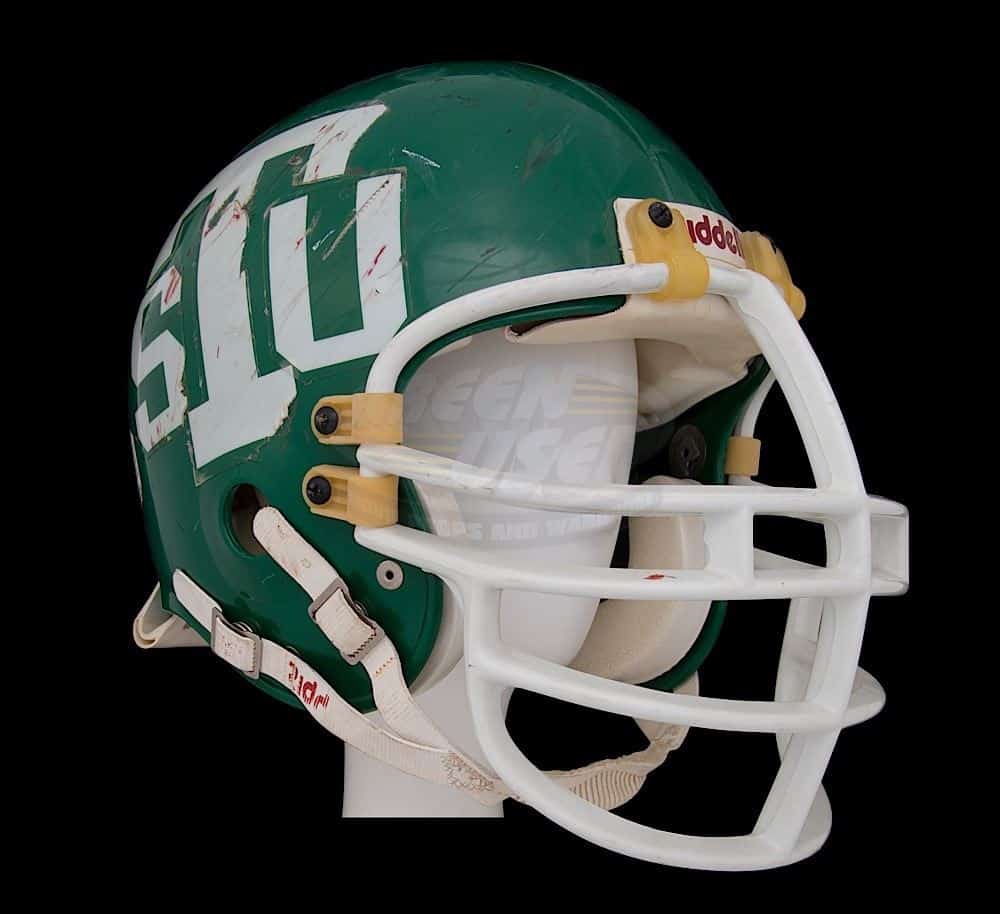
These were popular for replica helmets and in the WLAF. Some linemen wore them in the NFL, but they never gained mainstream popularity due to their immense thickness and view obstruction.
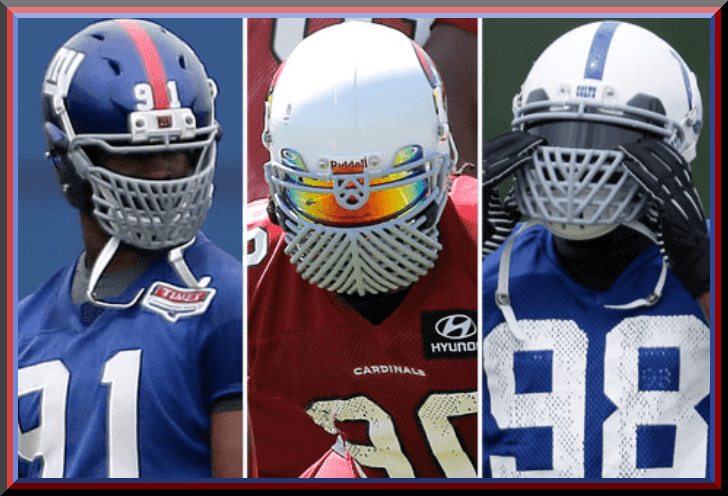
In the early 2010’s Riddell introduced a new style of helmet called the Revolution. This helmet moved the side clip attachments down to the jaw area to help spread impacts and reduce concussions. It also had an effect of the aesthetic of the facemask. Recently they’ve gone a step further and introduced the Speed Flex helmet, which moves all the clips to the side of the helmet.
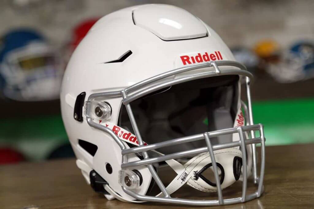
But they’ve reverted to more standard looking facemasks with the new model. Riddell isn’t the only company that has changed the way helmets and facemasks look recently. Vicis, Schutt, and Xenith have all released helmets that have drastically changed the way facemasks look.
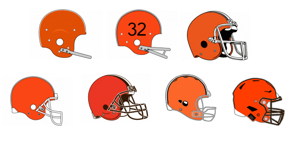
Team logos and television graphics have also evolved over time to reflect the current popular mask:
STANDARDIZATION
With the wide variety of clip on masks, Riddell couldn’t use just a quick abbreviation like the BT-5, they had to invent a classification system. This system included five basic styles that could be further customized. They are:
• OPO: Oral protection only
• JOP: Jaw and Oral Protection
• NOPO: Nose and Oral Protection Only
• NJOP: Nose, Jaw, and Oral Protection
• EGOP: Eyeglass and Oral Protection
These are all customizable with additional options by having a single or double horizontal bar across the middle, having two or three vertical bars protecting the mouth area, being reinforced with a second bar along the top, or a U-Bar at the top which helps protect the bridge of the nose.
MY FAVORITES
One of my favorite pieces of sports minutiae is football players wearing facemasks that are unusual for their position. The one that always sticks out to me most is when Brett Favre was a rookie on the Falcons, he wore an EGOP, which as far as I know had never before, and hasn’t since, been worn by a QB. I remember being so excited that a Quarterback was wearing the same facemask as Deion Sanders!
And speaking of Prime, it’s not that it’s an unusual facemask, but the fact that when he lined up at WR for the Cowboys, he had a second helmet with an ROPO because it gave him better vision than his typical EGOP.
Ted Ginn wore a kicker’s RKOP facemask with a visor to protect his face in college.
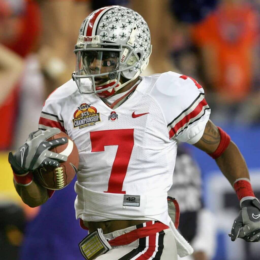
Notice the top bar of his mask is coming off the bottom attachment, not the top like a normal OPO-SW. He wore the same thing in the NFL for a year before they banned any non-kicker/punter from wearing them.
We all know that Joe Theismann was the last position player to wear the BT-5 single bar throughout his career, but did you know that Doug Flutie kept a second helmet with one when he was with the Chargers because he was also their emergency/back up kicker until 2004?
Rickey Jackson wore a crazy mask that had more bars than Bourbon Street.
Along that vein, Justin Tuck wore a variety of multi-barred masks because he was tired of getting poked in the face. He’s also one of the players who wore a version of the “Shredder Mask” before it was banned by the league. Terrell Suggs wore a Wishbone Style mask around that same time.
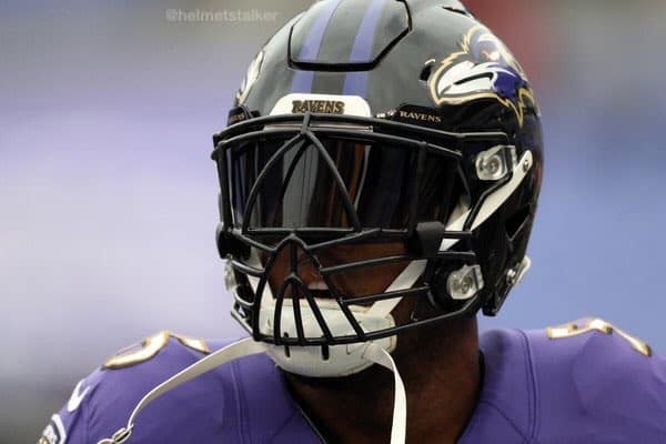
And what list of interesting facemasks would be complete without John Williams and his double Dungard concoction?
Thanks for coming with me on this journey through the history of NFL facemasks. I hope you enjoyed it, or at least learned something new. Have a great day!
Wow. Thanks, Skott. Tremendous job on this one! Readers? What say you?
Collector’s Corner
By Brinke Guthrie
Follow @brinkeguthrie
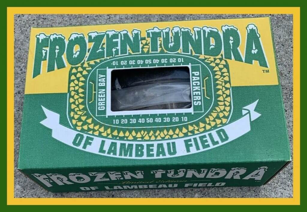
The summer temperatures are soaring around the country- don’t ask about my part of Northern California- so this is the perfect time for an actual chunk of (say like Chris Berman) “The Frozen Tundra of Lammm-beau Field.” The COA card says this is from the 1996-1997 Super Bowl season, and the Packers “accept no responsibility regarding the growth potential of plant material contained herein.”
Now for the rest of the week:
• Here’s another one from that successful Packers season- a 5″ (b&w) screen Packers Helmet Television with AM/FM radio.
• Most of the helmet buggies you see on eBay are the little plastic kind, with the plastic baseball batting helmet or gumball football helmet. So this 200o-era Danbury Mint New York Yankees buggy really caught my eye. Great detail here, and I read elsewhere this one is 9″ long.
• Normally, you never see NFL helmet face masks pointing left on retail products- they’re always pointing to the right. The makers of this Steelers bicycle plate decided to go left, and didn’t realize…there is no logo on that side.
• Staying with the helmet theme for a sec- this Kansas City Royals Magnetic Car Topper is three feet long! You plop this massive thing on top of your car with four sturdy magnets- but as the disclaimer says, “Do Not Exceed 70 MPH Speed Limit!” (No convertibles, either, it adds helpfully.)
• One of The Masters, Bart Forbes, did the cover for this 1973 Pro Bowl program; (The Third Annual Meeting of American Football Conference and National Football Conference All-Stars.) That AFC player looks quite a bit like the Cowboys player on this NFL Action ’72 Sunoco album. But hey, good artists borrow- great artists steal. Forbes could certainly steal from himself!
• Here’s a rather unique item- a 12″ reel of the 1966 NFL Championship Game (Packers-Cowboys) marked “Coca-Cola™ version.” It was from Coke’s Bakersfield bottling plant, and loaned to Shafter High School in Shafter, California.
• One more item from The Real Thing™; this vintage Mickey Mantle collector’s glass.
• Speaking of collector’s glasses, Chargers fans will love this 1965 Chargers glass commemorating their 1964 AFL Western Division title. Brought to you by your friends at Plymouth.
• One can only imagine how hot and sticky you got inside this 1970s Denver Broncos Storm Suit from Uniroyal. Gotta be plastic-vinyl, right?
• Here’s a nice looking Atlanta Falcons gear bag of unknown vintage. It’s 18″ long and 8″ in diameter.
WooSox unveil … NINE jerseys and Seven Caps
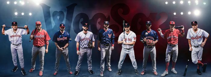
Yesterday, the Worcester Red Sox unveiled the club’s official on-field game jerseys and caps for their inaugural season at Polar Park in 2021. The display of “Whites & Grays and Blues & Reds … Introducing the WooSox Threads” was um … something.
Here’s a look at the new merch dump jerseys & caps:
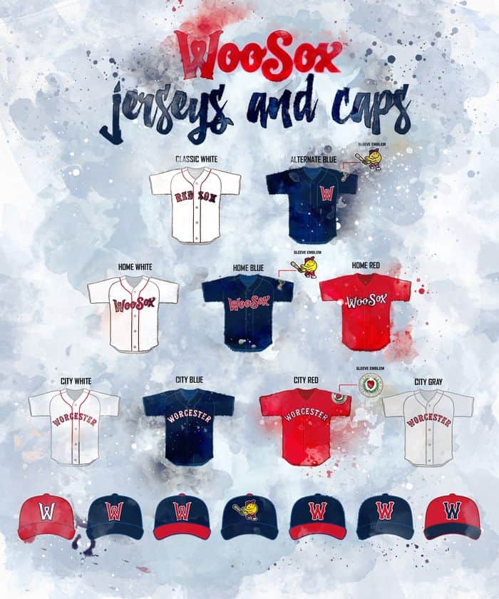
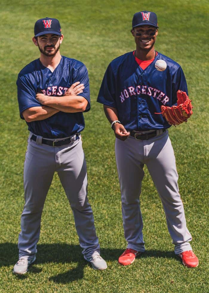
Perhaps surprisingly (and thankfully), the team has only white and gray pants (because fans don’t buy replica pants in large quantities, I’m sure that’s not the reason more weren’t introduced). But there are those 9 jerseys and 7 caps. The team showed them off. There are too many combinations to actually show, but I’ll try to include as many caps and jerseys below, to give you an idea of their “identity” for 2021. You’ll note from the graphic above there are three white jerseys, three blue jerseys, two red jerseys and one gray jersey, each with specific names and also whether they are “home” or “city” (road?) jerseys.
Blue Tuscan “W” Cap, White “RED SOX” Jersey:
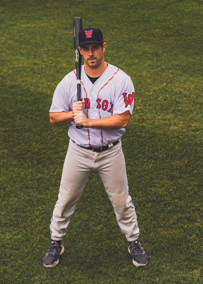
Blue Smiling Guy Cap, Blue “W” Jersey:
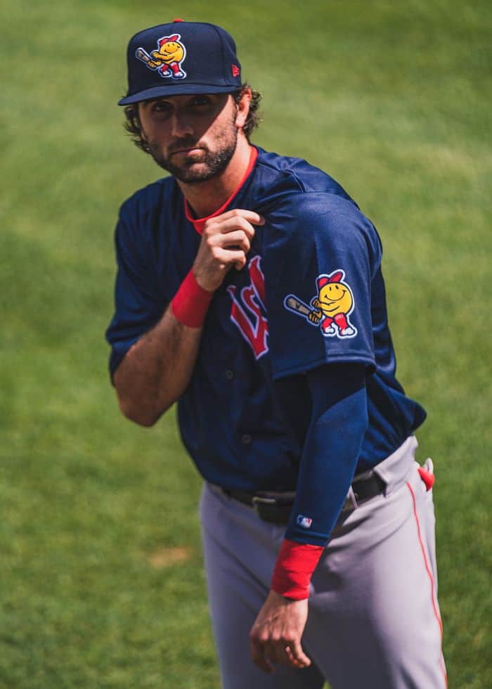
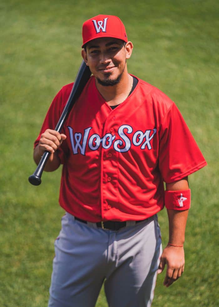
Red Curly “W” Cap, Red “WooSox” Jersey:
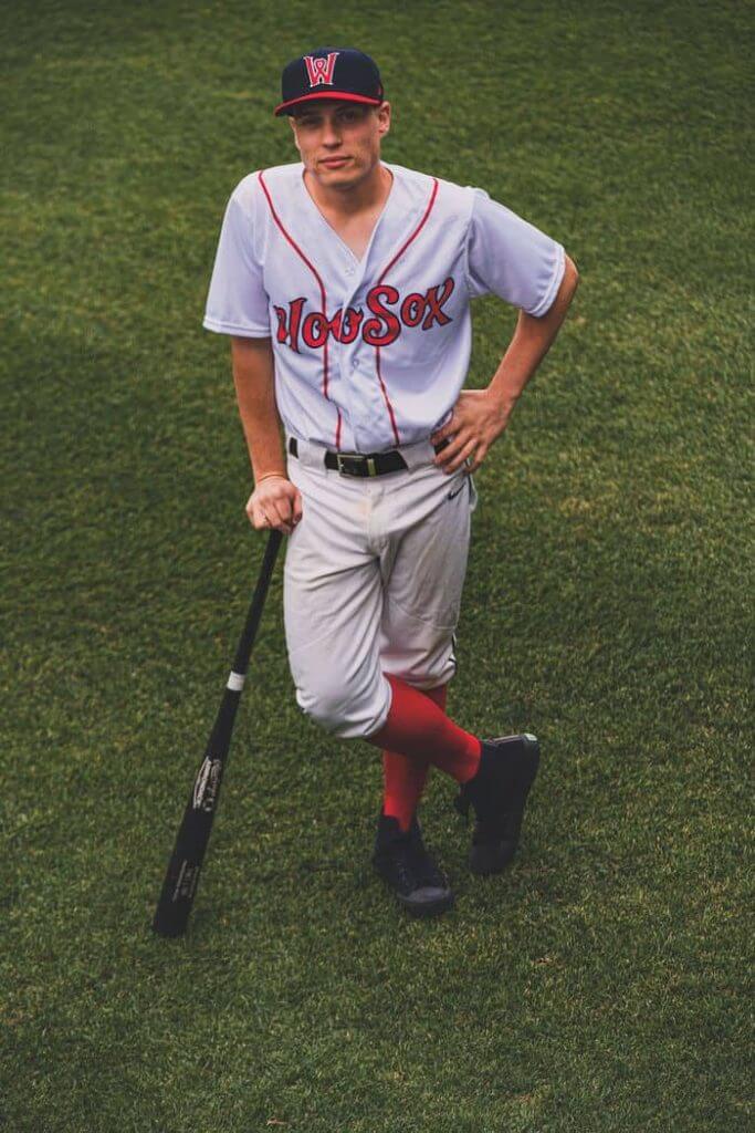
Red/Blue Hybrid Cap, White “WooSox” Jersey:
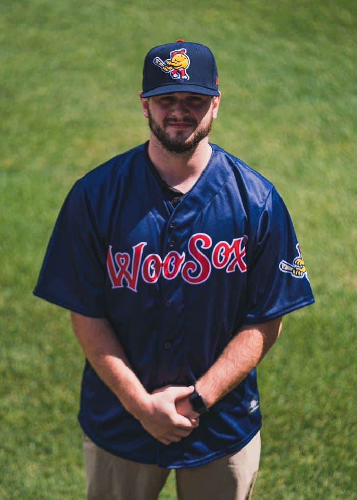
Blue Smiling Guy Cap, Blue “WooSox” Jersey:
Red/Blue Hybrid Cap, Red “Wooster” Jersey:
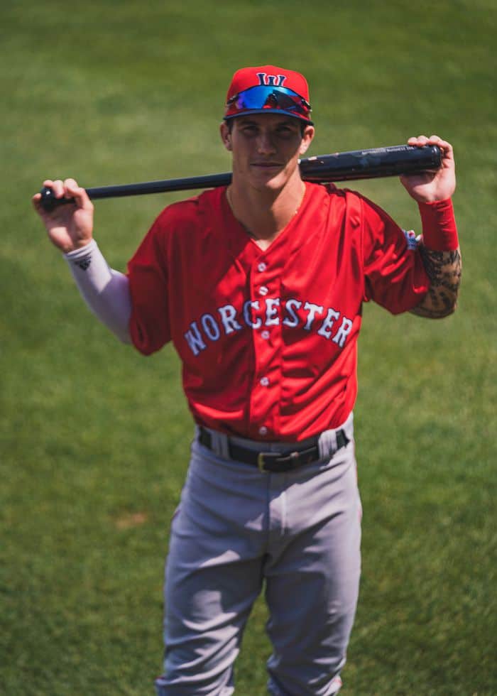
Blue/Red Hybrid Cap, White “Wooster” Jersey:
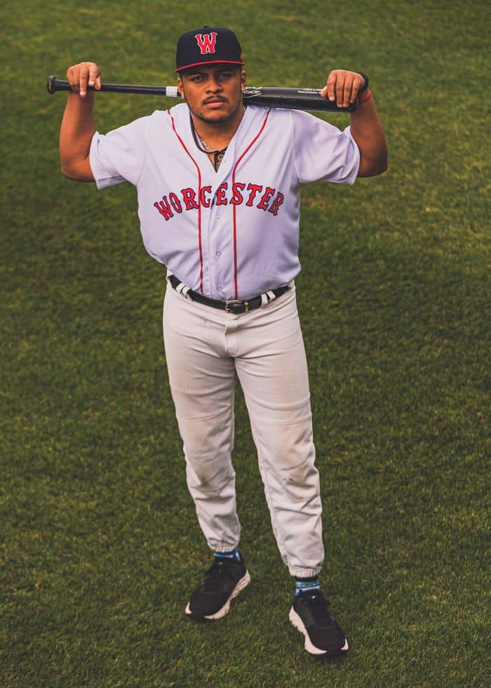
Blue “W” (Tuscan & Wavy) Cap, Blue “Wooster” Jersey:
Blue Tuscan “W” Cap, Gray “Wooster” Jersey:
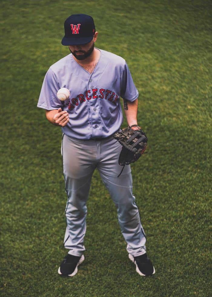
This is the minor leagues, so I have much less of a problem with the multiple jerseys and caps as I would with a big league squad, but this still feels like a bit much. One feature I do really like: The “wavy” “W” logo forms a heart shape in the middle:
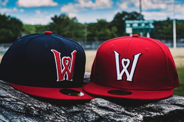
The club has described the nine jerseys thusly:
The nine jerseys include three whites, two reds, three blues, and one gray.
The Classic Worcester Whites—first revealed Sept. 17, 2018—displayed the name of the city in red letters, along with a navy cap bearing the Classic Worcester W in red—all in the original Red Sox font.
The Beautiful Worcester Reds with the City Seal on the sleeve—first revealed Nov. 12, 2019, when the club retired No. 6—show the name of the city in white letters in the Red Sox font, accompanied by a navy cap and red bill, featuring the heart-shaped W in red.
The Navy Worcester Blues, making their debut, feature the name of the city in white on navy, again using the Red Sox font. The jersey, which can be worn at home or on the road, was shown with a red cap and navy bill, featuring the Classic Worcester W in navy, again in the Red Sox font.
The Classic Red Sox Whites—showing the continuity of the Boston Red Sox, the Pawtucket Red Sox, and now the Worcester Red Sox—were shown with the navy cap and red bill and featuring the Classic Worcester W in red, in the Red Sox font.
The Vibrant WooSox Reds, bearing in white script the team’s nickname for the first time, were shown with the navy cap and red bill, featuring the heart-shaped W in red.
The WooSox Whites were introduced with the team’s nickname in red script, shown with an all red cap featuring the heart-shaped W in white.
After the WooSox Reds and WooSox Whites, the WooSox Blues were unveiled in navy, featuring the WooSox script in red—shown with a navy cap and red bill, featuring the heart-shaped W in red.
The fun Batting Practice Jerseys in navy with a red heart-shaped W (that can also be worn in games) bear the insignia of the WooSox’ mascot and Worcester’s native son, Smiley Ball. The jersey was accompanied by a navy cap that also bears the image of Smiley Ball—intended to be a hit with kids of all ages.
The Classic Road Grays, batting ninth, and worn only on the road, showcase the name of the city boldly in red. This jersey was shown with the traditional navy cap with the heart-shaped W.
And there you have it. You can read more about the unveiling here.

Click to enlarge
And now a few words from Paul
Hello! I’m happy to announce that the Uni Watch Tequila Sunrise Masks are now available. Like our previous masks, these were generously made for us at no cost by ProLook Sports, and we’re once again donating all of our Uni Watch profits — that’s $5 per sale — to charity. After previously donating to Doctors Without Borders and Feeding America, this time I’ve chosen the National Alliance to End Homelessness.
One important difference from our previous masks: This one is available in two sizes — S/M and M/L. (For reference, all of our previous one-size masks were S/M.)
Again, the masks are available here.
In other news:
• The lone purple-signed Uni Watch trading card has emerged:
No way!! I pulled the purple signed card! Glad to support @UniWatch ! pic.twitter.com/MSAuQA4W2o
— Charles (@cold_fashioned) August 15, 2020
There are still five or six of the green-signed cards remaining. You can order the cards here.
• Inventory levels: I have fewer than 30 Uni Watch Key Rings, fewer than 50 August pins, fewer than 40 July bobble-pins, and three chain-stitched patches.
• Phil has this Friday off, so I’ll be writing that day’s lede (it’s a good one!) and coordinating the rest of the content. Looking forward to the rare mid-August cameo!
Speaking of Phil, I’m passing the baton back to him now. Over to you, buddy.
Thanks, Paul!

Guess The Game…
from the scoreboard
Today’s scoreboard comes from Mike Chamernik.
The premise of the game (GTGFTS) is simple: I’ll post a scoreboard and you guys simply identify the game depicted. In the past, I don’t know if I’ve ever completely stumped you (some are easier than others).
Here’s the Scoreboard. In the comments below, try to identify the game (date & location, as well as final score). If anything noteworthy occurred during the game, please add that in (and if you were AT the game, well bonus points for you!):

Please continue sending these in! You’re welcome to send me any scoreboard photos (with answers please), and I’ll keep running them.
The Ticker
By Alex Hider

Baseball News: Cardinal P Kwang Hyun Kim wore the team’s batting practice cap during the first inning of St. Louis’ doubleheader with the Cubs. He switched caps the next inning (thanks to all who shared). … Speaking of the Cards, they wore their road jerseys for the second game last night despite being designated the home team at Wrigley Field (again, thanks to all who shared). … Rare sight yesterday: Nationals rookie 3B Luis Garcia, No. 62, homered off Atlanta P Touki Toussaint, No. 62 (from Patrick J. Murphy). … Following the news that the Giants will add NOBs to their home jerseys next season, the San Francisco Chronicle ran an opinion piece about why that’s a bad idea (from Patrick O’Neill). … This blog explores the different types of cardboard cutouts “attending” MLB games (from @29_sunset). … Dodgers C Keibert Ruiz lost his Negro Leagues centennial patch during Sunday’s game (from @cmduncan8). … The Somerset Patriots of the ALPB are auctioning off fan-designed jerseys in support of a local charity supporting victims of childhood cancer (from John Cerone). … Aaron Pinto found a Dodgers-era Mike Piazza figurine for sale that strangely depicts him atop Philadelphia’s Veteran’s Stadium. … Andy Chalifour wonders, “What is up with Christian Vasquez helmet? Spray paint accident? Used his helmet as a foot rest to spray for athletes foot?” … The NLB patch may have been cheaply affixed (a few fell off on Sunday), but Justin Dunn of the Mariners’ apparently won’t come off, as he was wearing it last night (from Matthew Wolfram).

Football News: New York Giants S Julian Love’s No. 20 had a different style “2” than his teammates at training camp yesterday (from Neil Vendetti). … Speaking of the Giants, coach Joe Judge says his players don’t wear NOBs during training camp because it’s important for coaches and teammates to get to know each other (from Brooks D. Simpson). … Don’t think we’ve ever seen the Chargers wear these practice pants before; they must be new for this year (from Keyvon). …It appears Virginia may be using their new shield logo as a merit decal this season (from Jamie Rathjen). … Grandview High School in Texas — the Zebras — is poaching both the Broncos logo and the Bengals helmet stripes (from @HawkeyeOnAir).

Basketball News: If the Lakers advance out of the first round of the playoffs, they plan to wear black snakeskin-patterned jerseys in honor of Kobe Bryant for the remainder of the playoffs (thanks to all who shared). … The Thunder have unveiled their uniform schedule for their upcoming playoff series (from @AlexMShirley and Chris Corbaz). … In a lab at Yale University, there hangs a No. 19 Minnesota Timberwolves jersey with a “COVID” NOB (from @ajenkinsCLE). … Earlier this year, we thought we had seen the jerseys that would be worn in Space Jam 2. But yesterday, we got a look at LeBron in a never-before-seen turquoise “Toon Squad” jersey (thanks to all who shared).

Soccer News: German club Borussia Mönchengladbach has a new away jersey (from Ed Zelaski. See more jersey unveilings over on his Twitter page). … Also in Germany, third-tier club SV Wehen Wiesbaden has new uniforms (from Greg Phillips). … New home jerseys for English Championship club Watford F.C. (from Spencer Hollis). … Alebrijes, a second-division club in Mexico, has new uniforms for next season (from @bryant_rf). … @CrystalPalaceDC notes that Italian club AS Roma unveiled a uniform with a tequila sunrise pattern just months before the team was bought by Houston billionaire Dan Friedkin. Coincidence?

Grab Bag: Anaheim Ducks G Ryan Miller will have a new pad set next season (from @GoalieGearNerd). … A few international notes from Jamie Rathjen: Australia’s National Rugby League’s North Queensland Cowboys released a shirt for the league’s annual Women in Rugby round. The promotion sees at least one game where both teams wear pink or pink accents; The Sydney Swans of the Australian Football League released an Indigenous guernsey; In the Indian Premier League, which is a Twenty20 cricket league, the Rajasthan Royals added a sanitary napkin company as a shirt advertiser, which is apparently the first ad of its kind. … William F. Yurasko was riding by a D.C.-area rail yard and noticed two metro systems cars wrapped completely in yellow. Turns out, they’re the cars that collect money throughout the system…shouldn’t they be green? … This blog recaps 17 trends that defined the evolution of fashion in rock and metal music (from Ephraim Vorzman). … Long Beach State has unveiled its new mascot: Elbee the shark (from @boxseatbanter). … NASCAR driver Tyler Reddick will drive a car with a throwback paint scheme honoring Jeff Burton rig in the ’90s at Darlington on Sept. 6 (from Jakob Fox). … Biking is an awesome outdoor pandemic activity. Unfortunately, the sudden increase in demand for bikes has caused a shortage (from Tom Turner). … Not a good week for Dale Arnold. This time holding a piece of green paper while in front of the green screen (from Justin Hicks).
And finally… big thanks to Skott for that tremendous piece on facemasks, as well as Brinke for CC, Mike for the scoreboard, and Alex (congrats on your nuptials and welcome back!) for the ticker. You guys are all aces.
I drove back from the summer house back to my condo yesterday (gotta deal with a minor legal matter — no worries, it’s good) and also need (desperately) a haircut & beard trim, so I don’t have a “new” pic for you today. But there are a ton of windmills out there, and I always pass at least three during my daily walks, so here’s one I wanted to share. This one is of the Hook Mill in East Hampton Town. I’ve probably photographed this one 100 times over the years, and I’ve probably sold a print or two at that annual art show I participate in (although not this year due to COVID). Here’s a nice angle (they’ve removed the “sails” this year):

Everyone have a good Tuesday, and I’ll catch you guys tomorrow.
Peace,
PH
In the 70s I remember football folks going gaga if they could get a Bob Griese mask like he used with the Dolphins, or the Joe Namath mask. Even the little “U” shaped mask added to the top.
Ben Rothlesberger periodically went EGOP. Lamar Jackson EGOPs.
You’re right! How could I forget that the most electrifying player in the game today goes EGOP? *face palm*
Easy to do in this crazy game called life.
I have been a face mask freak since I became a uni freak. Many moons.
Thanks for referring to me in your opening graph. A bit of an honor.
Mike Piazza Vet figurine is for the 1996 AllStar game
Love the deep dive on helmets! The wrap up on logos is a bit misleading though – those two final “modern logos” aren’t actual Browns logos, presumably just a fan mock up.
If anything that raises an interesting question – the team has updated the helmet through the years to adapt to helmet design changes, but kind of stopped with the 90s template and has just updated colors since (namely the facemask with little other tweaks). I wonder if it’s due to helmets increasingly becoming recognizable between manufacturers and having details (like the flex point on the crown) that feel overly busy/gimmicky to add to a logo.
Personally I wish the browns would go back to one of the old school versions so it feels more intentionally out of date
Thanks Joe, I appreciate the kind words.
Great catch! You’re correct, the Browns official logo only goes up to the ’90s template, and hasn’t progressed from there. I wanted to use that section to show graphics from MNF, NFL Primetime, etc. to show how they’ve progressed through the years, but then I found that template of Browns official logos and copied and pasted the helmets used on the GUD website for the last two iterations because I couldn’t find enough old graphics to illustrate what I was trying to say.
I agree, having the old 2-bar logo at midfield would give a great old school feel to the game!
The TV angle is especially interesting – obviously the Browns are one of the few teams that predominantly use a helmet as the logo, so it’s funny to see outlets use what almost looks like a knockoff logo in that context. Just a funky example all around.
Now don’t go putting things at midfield – I’ll pass on that and keep our plain field if possible. I was more interested in seeing the helmet logo revert to the 60’s/70’s version (though we really should be using Brownie anyway)
Phil, I love the variety of content. As a former runner and someone who is looking to ‘come back’ again this piece on new shoe technology was well timed. Great work.
The piping on the Woo Sox jerseys is too wide. It goes through the D and S of Red Sox, and the spoon is almost to the shoulder. FAIL!
All of the decoration on the WooSox uniforms is sublimated. Disappointing, but perhaps the only way to create the uniforms cheaply enough for the team’s budget.
A AAA team that’s going to be making a lot of money, assuming fans are in the stands next year, shouldn’t be doing anything on the cheap.
I have a box of Frozen Tundra turf just like that in our downstairs freezer. Been there for 23 years, since I bought it in 1997.
That picture brought back some memories. The field was utterly destroyed in that mud bath playoff game against the Niners. Then the re-sodded (word?) the field for the NFC championship game against Kerry Collins and the mighty Panthers. I’m guessing these chunks of turf came from that switchover.
I know I’m a geezer, but I still want to give credit when it’s due.
Blowhard Chris Berman got the term “frozen tundra” from legendary NFL Films narrator John Facenda.
WooSox’ hand-me-down pants ruin the look imo
I’m thinking they simply don’t have the official pants yet and just used Pawtucket pants for the photo shoot. Considering how much money has been sunk into this franchise and their shiny new park, I can’t imagine they’d take to the field next year in mismatched pants.
Notable baseball item that is Ticker worthy. Powder blue uniform worn last night as the road uniform (as it should be). Blue Jays at Orioles.
link
Home whites and road blues on a field together is a beautiful sight.
I played football for three seasons when I was a kid. I had the double bar Kralite-2 and I hated it. If you got in a pile, it didn’t keep anything out. My second year I had the OPO SW, but I really wanted the OPO with the doublebar. A teammate had one and we considered trading, but I didn’t feel like manually unscrewing two facemaks. Would have been a different story with a power screwdriver…
I sympathize, was a lineman in high school but also did kicking so they gave me a Kralite-2 double bar. Every time I got blocked I would get hit by their shoulderpad under my jaw, snapping my head back, and it was not fun. Seriously considered quitting. Eventually several kids quit that team so with a buddy’s help I was able to do some swapping and got someone’s EGOP design.
This article sure brings back the memories!
Loved the facemask historial. I’ve noticed how the full cage has virtually disappeared in the NFL. Even interior lineman now wear masks formally worn by running backs.
Friday, June 23, 2017. A’s 3, Sox 0. I was at this game. Unfortunately didn’t order my tickets the right way so I didn’t get the White Sox cowboy hat.
Great to see some fan pushback on those Giants NOBs, and that some of them agree that their home uniform is one of the best in baseball. (They position the numbers slightly too low, but seemingly everyone has done that in the Majestic era.)
I really wish my Cubs would go back to their classic NNOB look, particularly at home. I don’t mind the link. At least make a home alternate; maybe link. And with the Shepard font!
GTGFTS: 6/23/17 Oakland 3, Chicago 0
link
Really enjoyed the lesson on facemask evolution and the pics were spectacular. Flutie with the BT-5 produced a gasp when viewed and John Wiliams sporting the double Dungard secured with dirty athletic tape was the cherry on top. The double Dungard…
Thanks, I appreciate the kind words so much!
Great article today! I hardly ever watch football anymore so I’m not up to date on modern quirks, but I recall that at the University of Oregon, Marcus Mariota had oral and jaw protection with only a horizontal bar on the left and right segments–not the middle. Why? The hole made the face mask look like “808,” the telephone area code for his home state of Hawaii.
I remember being stunned to hear that was the reason, because I always thought it was done out of convenience to more quickly and easily be able to remove and put back in his mouth guard.
I looked up the double Dungard and found other facemask oddities…
link
Hi guys,
Mike Piazza is standing atop Veterans Stadium in the Starting Lineup figuring because it’s an All-Star Game edition, and the Phillies hosted that year.
It’s a neat figurine!
He also had a pretty memorable game that night.
I always loved the way EGOP looked – makes me think of Charles Woodson at Michigan the year he won the Heisman.
As a Michigan Man, that’s exactly what I wanted to use for the reference, but I couldn’t find picture that showed it clearly enough.
As a side note, it killed me to use an OSU picture in my article! Hahaha
Another reason to stay NNOB for the Giants – when a player gets traded, you don’t have an outdated jersey – they aren’t tied to a specific player.
Sometimes I think that’s the main thing behind the increase in NOBs in recent decades and the snuffing out of returns to NNOB like the Cubs and Dodgers had, and the Giants still have.
I love my NNOB jerseys and inherit whichever player is wearing that number every year.
Flutie in the BR-5!
link
Others wore the EGOP before Dickerson (Joe Cribbs, Lionel James) but ED wore it the best. (Eyeglass & Oral Protection)
link
Some good follows on Twitter
link
link
Image links appear broken, but great facemask info here too
link
Thanks, Tee! from @WTHelmets
It’s “Tune Squad”, not “Toon Squad”.
I’m fairly certain that Justin Tuck example is a doctored image. He did wear a visor with that face mask, but I don’t recall every seeing those vertical bars. Quick Google image search shows that one to be an outlier.
You’re correct. It’s photoshopped. But Tuck did wear several different styles of “big grill” cages later in his career.
has the NFL said that they are going to have an official “face covering” for the players? Lids and New Era are marketing these as the official on-field face coverings
link
wait did you use the helmet from the movie NECESSARY ROUGHNESS in this entry??
I’m pretty sure it is. I came here to say the same thing. I definitely remember noticing the “cool” new facemasks used in the movie when it came out in the 90s. I wanted one to wear one of them in my youth league but didn’t get one when helmets were distributed.
As soon as I got the green light to write this, I knew I was going to put the TSU helmet in there somewhere!
It looks to me like Vasquez used pine tar on his helmet and then slapped some rosin on it as well. That is why it would appear whiteish. You see the same thing on black bats.
that TSU helmet is from the movie Necessary Roughness
Just a side note, the OPO, EGOP, etc. standardization was a system that Schutt Sports developed. Riddell uses a very different system for naming facemasks. The Schutt system was easier to decipher and potentially the reason why people still use that way over the Riddell system, which counts the number of bars below the top bar and then incorporates the other aspects. Here is an example of Riddell’s “Nomenclature” system.
link
I always had the kralite double bar helmet as a kid and hated it. Middle school always had the hand-me-downs from the highschool and the day we got equipment the helmet I got had NO MASK. I thought this was my shot at getting a more modern mask – NOPE, the coach screwed on the same double bar I always had but did it so tight it changed how the helmet fit. Suddenly the helmet was too small and my face pushed out like Jim Plunkett! He said I had to “deal with it” (remember these were crummy suspension helmets) or bring my own helmet. I DID own a Houston Oilers helmet that fit and was NOCSAE approved but he said I’d have to peel the oil rig stickers off the sides and the stripes off the top. I wouldn’t ruin the helmet so I ended up quitting football in 7th grade because the school wouldn’t provide me a helmet that fit properly!
Man, that sucks! You were done dirty back then, Chuck. Glad you still have facemask fever, though.
The Space Jam jerseys are actually “Tune Squad” not “Toon Squad”. Although myself and others I saw on Twitter seem to be experiencing a sort of Mandela effect as I could’ve sworn it was “Toon”.
Not specific to today, but just curious from others: I finally bought a face mask having missed the other two before they were sold out. I hesitate to buy Uni-Watch merch, though, because it will bug the hell out of me to have one thing I like and miss out on the whole “set.” It’s also probably the only thing that keeps me from buying team jerseys and such. Anyone else or just me?
Russell came out with the revolution in the early 2000s, not the early 2010s.
Riddell. Dang autocorrect
Riddell came out with the Revolution in the early 2000s not the early 2010s
Re: WMATA’s yellow money train.
That’s a relatively new train (note the number; starting with a 6.) The previous money train used six cars starting with a 1. These were the original cars when MetroRail started in 1976, and the door-closing klaxon was still in use. Because of the deadly Takoma Park June 2009 crash (piloted with a 1-series car), they started shifting 1-series cars from the front and rear ends because of questions about crashworthiness. And all 1-series cars were retired entirely around 2017, with only a handful being kept for history.
And yeah, they had armed guards with a big-ass assault rifle guarding the money.
Can anyone tell if any of the new Woo-Sox jerseys (even though the city is NOT pronounced WOO-ster but that’s a lost cause) have tackle twill lettering/numbering? Or is that considered passé these days?
How do you guys pronounce Worcester?
Here, the originasl Worcester is pronounced ‘Wooster’. The vowel sound is as in ‘wood’ rather than ‘womb’
“Wuss-ter”. Add Beavis and Butthead references to taste. Your mileage may vary.
Mask ordered <3
Great stuff today! I believe I had a Kralite MB5 one of my years of varsity football. There was one of them and I think my buddy that graduated before me had it as well. Nothing I asked for, just what I was issued. I think Gregg Lloyd wore one as a Steeler. link
I didn’t feel any different while I was wearing. It seemed lighter to carry that’s about it.
That Falcons gear bag is probably from between ’84 and ’89…the only years Atlanta paired the red helmet with the black facemask.
Love that #8 throwback scheme! I really dislike the beveled number they normally use for that car. Here’s hoping there won’t be a “Days of Thunder” tribute car in this year’s field.
you don’t see that facemask depiction much, either!
Ridiculous that the Red Sox AAA club has more uniform combos than the parent club.
Ridiculous perhaps, but this has actually been the case the last few years in Pawtucket as well.
And this doesn’t even include the one-offs they’ll use during the season. In 2019, the PawSox “Played as” the Fighting Quahogs, the Hot Wieners and the Osos Polares as part of the minor leagues’ Hispanic initiative.
That’s @NFL_Journal on Twitter. Big subspecies of us “Helmet Nerds” on there where we get into facemask minutae all the time. I run @WTHelmets, fwiw. Enjoyed Skott’s article as well. You on Twitter? Gashouse, keep doing badass work with that scroll saw!
Appreciate the deep dive on facemasks; essential to draw them correctly to lend authenticity to football drawings. But the new helmet models make rendering the team decals really challenging.
Great read today! I love football facemasks. I too drew them as a kid and always referred to anyone who had the same facemask as Deion Sanders as having a “Deion facemask.” They always looked the coolest! Thanks for taking me back to being a kid.
If any Boston fan wants a Red Sox jersey without having to pay for the privilege ($120) of giving Nike free advertising can buy a Worcester “classic white” jersey, which is essentially the same except for the lack of advertising and the “W” on the sleeve.
I’m always fascinated by the guys who’s helmets/facemasks look like they ‘have’ to change to conform to a team or their position group. For awhile, during the Favre and early-Rodgers era, especially before Rodgers changed his helmet as a reaction to sustaining multiple concussions, it seemed like every QB who was on the Green Bay roster would go with the old, basic Riddell helmet and one or two bar OPO facemask design. I always wonder how much influence a team or their equipment staff, especially before the NFL started treating concussions more seriously, had in ‘selecting’ helmets & facemasks for their players.