If you’re a regular reader of the site, you’re surely familiar with the name Kary Klismet (that’s him at right). Kary is one of our most prolific Ticker contributors, plus he organized the Denver edition of last year’s Uni Watch 20th-anniversary party and more recently founded a Colorado-centric Uni Watch Facebook group.
Kary recently rediscovered a uniform project from his teens. I’ll let him tell you about it — take it away, Kary.
My Early Uniform Concepts
By Kary Klismet
In the summer of 1986, when I was 15, I visited the Baseball Hall of Fame for the first time during a family vacation. Seeing all the amazing artifacts and uniforms from baseball history kicked my previously casual sports fandom into overdrive.
I’d always loved to draw, so I turned that passion toward my newfound obsession with sports. This naturally progressed to creating uniform concepts. Around this time, I also concocted fictional sports leagues to enliven my backyard baseball and football games, so these imaginary teams became the vehicles for my early forays into uniform design.
I tried my hand at baseball uniforms first. Inspired by the uniform guides in the American and National Leagues’ Red and Green Books, I increasingly used those illustrations as visual reference for the uniforms I drew. You can see that influence in details like the jerseys’ tailored silhouettes and different sleeve styles [for this and all the images that follow, you can click to enlarge]:

After drawing the baseball uniforms freehand, I realized I could save time on my football uniform designs by creating a traceable template. For my master copy, I hand-drew most of the uniform elements, then traced a sticker of a 1970s-era NFL helmet with a two-bar facemask (a bit outdated by that point in the late ’80s, but I found it easier to replicate than more contemporary mask styles — and besides, a few players were still wearing them).
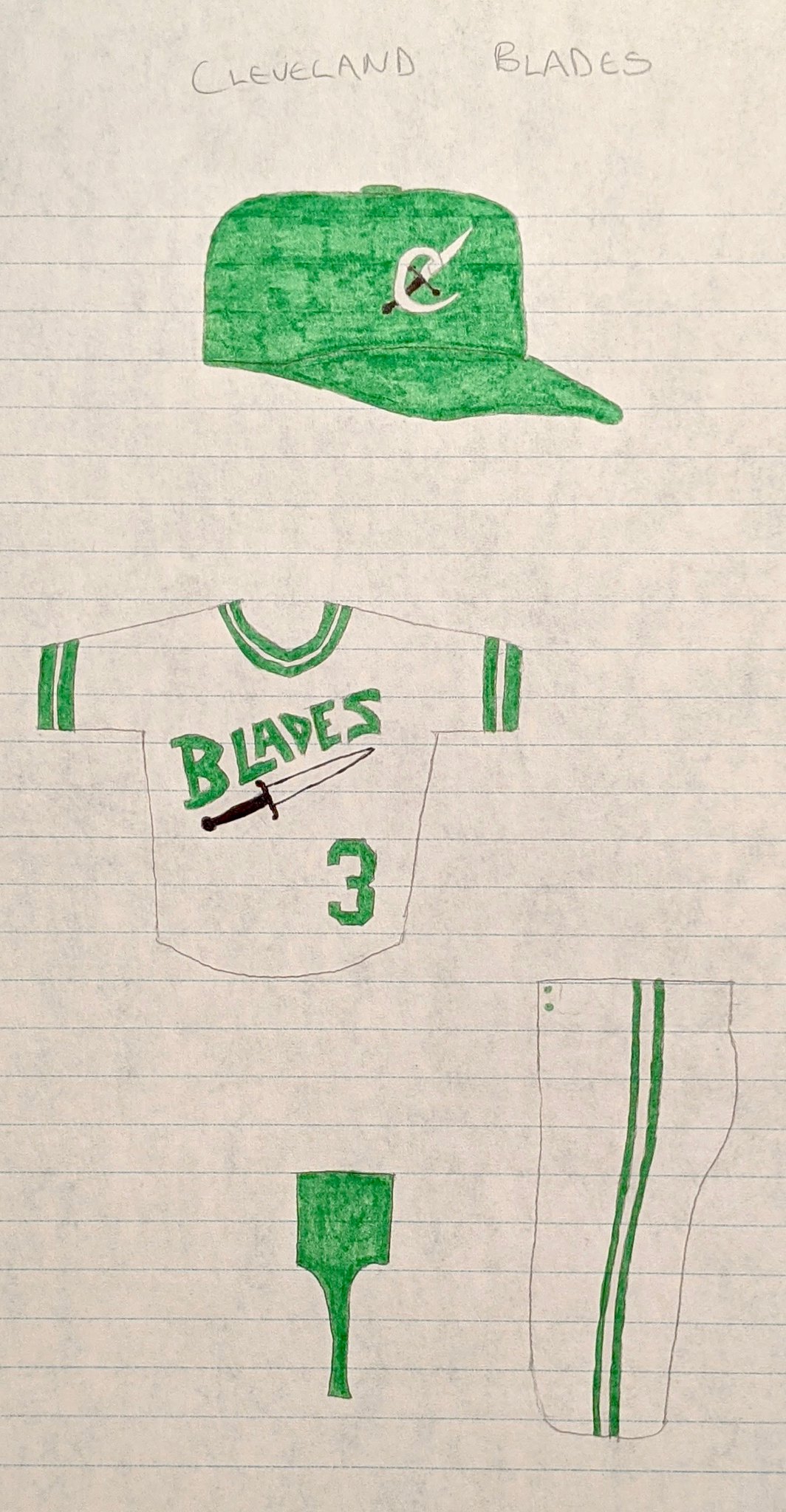
For team names, I often found inspiration from the teams’ geographic locations. I always loved cities that had unified themes across multiple sports teams — like how St. Louis had both a football and baseball team called the Cardinals — so I tried to create my own unified themes when possible. For my fictitious Cleveland teams, for example, I called the baseball team the Blades and named the football team the Sabers [sic], with the cutlery-based imagery intended as a reference to the city’s history as a steel town, and also gave them similar color schemes:

I also included some team identities that simply appealed to my own sense of whimsy. I of course had to include a team from my hometown of Cedar Rapids, Iowa, which I named after my best friend’s dog:

As for the tools of my trade, I meticulously created each drawing with my trusty yellow Pentel Sharplet-2, then colored them with Crayola markers, which were surprisingly durable and versatile. Ruled notebook paper was my go-to because it was easier to acquire than higher-quality paper (especially on my allowance).
All the logos were products of my own imagination and drawn freehand. I didn’t use much in the way of models or visual reference. Even with the more detailed logos, like the San Francisco Streetcars’ trolley or the Richmond Seafarers’ frigate, I had enough of an idea in my head of what I wanted them to look like that I was able to draw them from memory.

I created all of the baseball uniforms more or less on the first take. The beauty of working with pencil is I could erase and refine the drawings as I went along, so it wasn’t unusual for me to make tweaks before coloring in the finished design.
Most of the football uniforms were also done on the first take, although I mocked up a few ideas before creating the final versions. For the Sacramento Redwoods, for example, I experimented with layering red and brown markers to approximate a shade close to redwood bark for the team’s color scheme:

After spending months working on these drawings when I was 15 and 16, I eventually drifted away from the project as schoolwork and extracurricular activities took up more of my time. I shoved the drawings into the back of a folder with various other personal papers. There they stayed, largely untouched, for decades.
I never completely forgot about the drawings, but I lost track of where they were. They came to mind for the first time in ages earlier this spring, when I briefly referenced them in my entry for the “When I First Got ItT™” series, then again when I mentioned them in a phone conversation with Paul. I was pretty certain I still had them, but it took lots of time digging through boxes in my garage and several anxious moments fearing I might have inadvertently thrown them out before I finally stumbled on the right folder. Not to sound too cheesy, but finding them did feel something like reconnecting with a long-lost friend.
Now that I’ve rediscovered these uniform designs, I’m pleased with how well most of them have held up. A few pullovers and sansabelts notwithstanding, I can discern a preference for classicism that I still have today. You might say these drawings chronicle the development of a young sports fan who was just starting to Get It™.
———
Paul here. I always love childhood projects like this one — big thanks to Kary for sharing it with us. If you want to see all of his uniform drawings, check out the slideshows below (or, if you prefer, here are the baseball and football designs):


Culinary Corner: I suddenly realized the other day that crawfish season had come and almost gone already (one of several ways that the pandemic has messed with my sense of time). I’m still not willing to ride the subway, so yesterday morning I strapped on my Uni Watch mask (more on that in a minute), biked over to Manhattan — my first time crossing the river since my barbecue field trip back in April — and visited my favorite Chinatown fishmonger, where I was happy to find, as you can see in the video above, that they still had some crawfish available. The standard equation is three pounds per person, so I bought six pounds.
As I biked back home over the Manhattan Bridge, I wondered how many of the other cyclists I saw were toting live crawfish. I mean, probably zero, right? Then again, nobody would have thought that I was toting crawfish, so who knows!
When it was time to cook them, we made up our own spice boil by using some Old Bay, paprika, cayenne, dill weed, and whatever else looked good in the spice cupboard. Then we added some red potatoes, corn, and kielbasa — and then, finally, the bugs. What a feast! Turned out great (click to enlarge):
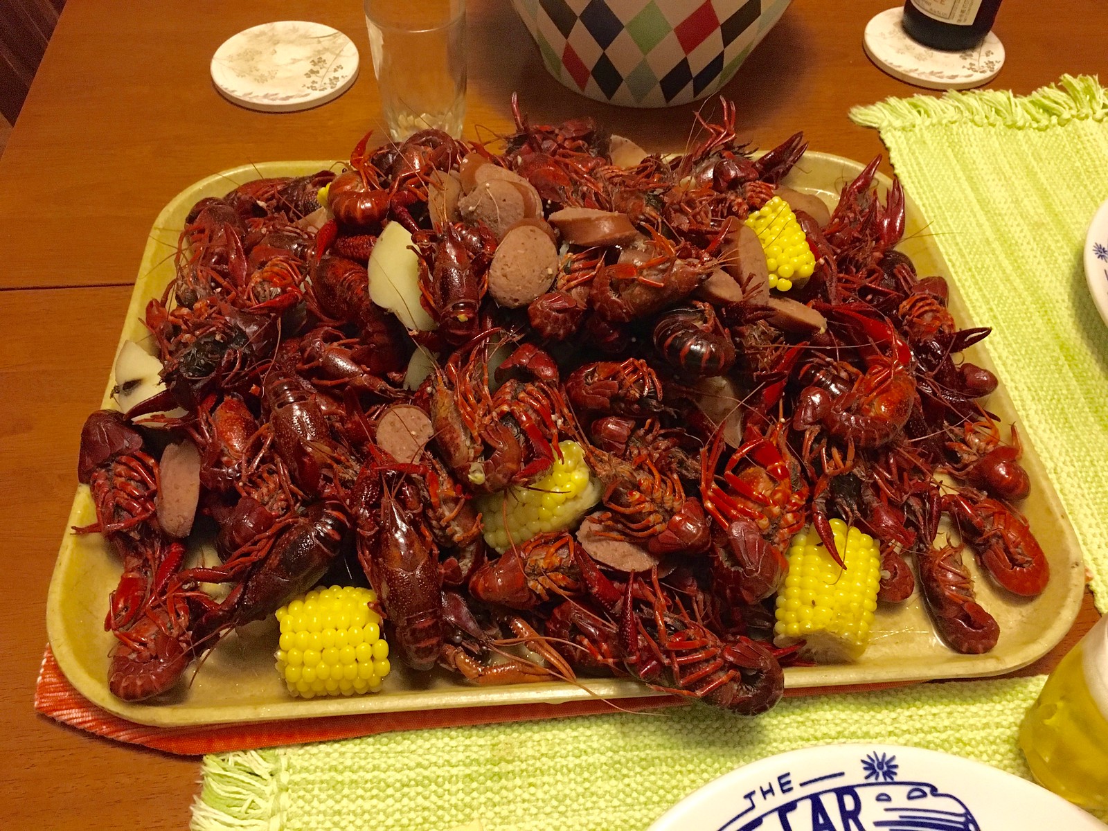
Soooooo good! Man, I fucking love crawfish. And we had enough left over to make some étoufée for tonight — can’t wait!
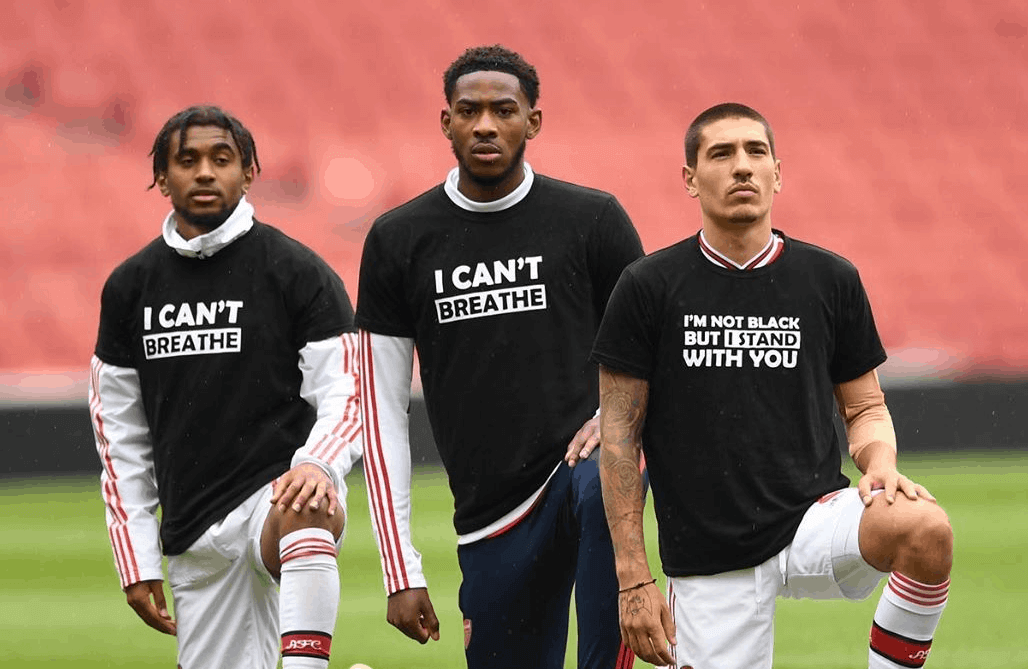
3 DAYS LEFT: In case you missed it last week, my latest Uni Watch design contest for InsideHook is to create a logo for teams or leagues to wear in acknowledgment of the current racial justice protests.
We’re probably going to see a lot of these logos/patches/etc. when American sports leagues resume (well, if they resume). What should they look like?
Full details over at InsideHook.

Click to enlarge
Mask update: Yesterday morning I made the long-awaited Uni Watch face masks available, with all Uni Watch profits being donated to Doctors Without Borders — and all 85 masks sold out in about 40 minutes. Holy shit — I figured they’d go pretty quickly, but not that quickly! I actually felt bad for our West Coast readers, who were still asleep by the time the last mask was sold.
These masks were donated to me by Dan Mullins of ProLook Sports. So I contacted him yesterday to see if I could order 300 more. Of course, I didn’t expect him to do another donation, so I asked him to give me a quote. But in an incredible act of generosity, he said he’d do another 300 for free — how amazing is that?!
I’m not sure how long that will take. But as soon as they’re ready, I’ll let you know. And once again, all Uni Watch profits will be donated to Doctors Without Borders. Thanks for making this such a successful project!

Membership update: Fun fact: From 1977 through 1988, the Blue Jays’ road jerseys did not have NOBs — except in 1980, when they did have them! Reader Gavin Whitehead chose that 1980 design as the motif for his new membership card, which is part of a new batch that’s been added to the card gallery.
Ordering a membership card is a good way to support Uni Watch (which, frankly, could use your support these days). And remember, as a gesture of comm-uni-ty solidarity, the price of a membership has been reduced from $25 to $20 until further notice.
As always, you can sign up for your own custom-designed card here, you can see all the cards we’ve designed so far here (now more than 2,800 of them!), and you can see how we produce the cards here.
The Ticker
By Lloyd Alaban

Baseball News: Dr. Anthony Fauci, the director of the National Institute of Allergy and Infectious Diseases, wore a Nationals-themed face mask yesterday (from our own Anthony Emerson). … Umpire Dan Bellino wore a cap with a very off-center MLB logo in this photo (from @StateofMIMan). … Even the Nationals’ dentist received a championship ring for last year’s World Series title. Instead of a player name, the dentist’s ring has “MED” (from Griffin Smith). … Reader Jon Springer, like many other New Yorkers, voted in the state’s primary yesterday. Jon’s polling place was Frank Sinatra High School in Queens, where the school has a Sinatra-themed Mets jersey in one of their trophy cases. … Reader Michael Cooperman came across these sports-themed cigar box guitars. There’s a David Ortiz “Big Papi” guitar, a Dodgers guitar, and, for basketball fans, a Karl Malone guitar.

Football News: Bucs QB Tom Brady, who has an endorsement deal with Under Armour, posted a photo on Instagram where he obscured the Nike logo on his practice jersey (from Rick Friedland). … The Rose Bowl will be used as a drive-in movie theater starting in July (from Kary Klismet). … @TheLegalV found this 1990s NFL Christmas-themed blanket.

Hockey News: New logo for the Greater Ontario Junior Hockey League (from Wade Heidt). … New pads for Sabres G Linus Ullmark (from Drew, who didn’t give his last name). … The Blues are practicing with a goalie “shooter tutor” wearing a Blackhawks logo (from Mike Chamernik).

Basketball News: Here’s an article about Barkley Hendricks, a digital artist who has had a role in designing keys for various courts (from Adam Herbst). … Cross-listed from the baseball section: Reader Michael Cooperman came across these sports-themed cigar box guitars, including one with a Karl Malone design. There are also designs for former MLB star David Ortiz and the Los Angeles Dodgers.

Soccer News: New shirt for French side Lens (from Ed Zelaski). … Also from Ed: New home, second, and third shirts for Belgian side Genk. … Manchester United celebrated MF Scott McTominay signing a five-year contract extension by giving him a shirt with No. “2025”, the year the contract will expire (from our own Anthony Emerson).

Grab Bag: Lots of new sports branding for UNC Charlotte (from multiple readers). … D’Youville College is changing its athletic nickname from the Spartans to the Saints. The school’s new mascot and visuals will be released at the end of the month (from Jeffrey Link). … The U.S. Air Force has put in orders for maternity flight suits (from James Gilbert). … The FBI determined that the noose found in NASCAR driver Bubba Wallace’s garage stall had actually been there since October and that Wallace was therefore not the victim of a hate crime. … A Black high school cross country runner in Texas whose school is partially named for Confederate general Robert E. Lee wrote a letter to the local school board explaining why she will no longer wear the school’s name on her uniform. Three of her teammates also plan to boycott the school’s name (from Jason Hillyer).

Click to enlarge

What Paul did last night: One thing about making crawfish is that you need to boil a really big pot of water. And a really big pot of water takes a while to come to a boil. So last night we put the pot on the stove, added the spices, turned the heat up to high, and then went out onto the porch. A little over half an hour later, we could smell the spices wafting out from the kitchen, which meant it was time to go back in and start putting things in the pot.
The branch is still there.
As always, you can see the full set of Pandemic Porch Cocktails™ photos here.
I could easily mistake those for my own childhood drawings. Nice work, Kary.
I loved seeing your drawings last year, Marty!
I don’t think I had any drawings displayed last year. Are you sure you’re not thinking back to ‘07?
Never mind. You saw them live. Hope all is well.
Thanks, Marty! I appreciate the kinds words! I’d love to see the drawings you and Scott reference. Were they featured on Uni Watch back in ’07?
I think I answered my own question:
link
Great stuff, Marty! I’m glad you shared these back in the day!
Word up.
Being that you’re only a year older than me, I think we would have been friends in high school. Gotta love Uni Watch.
No doubt, Marty! And you would have certainly been one of the only people I shared these drawings with. I guarded these like they were top secret government documents, being so concerned that no one else would Get It(TM).
I made sure to collect reams of typing paper (no lines) for my own uniform drawings, which were shown on these pages many years ago. Lots of good stuff, especially the sailing ship on the football helmet.
Just tell me you used a bike rack or messenger bag or something actually designed for bike transport with those crawfish. The idea of you cycling all over NYC with plastic bags dangling from your handlebars makes me very nervous. I worry about ya.
It was just a single plastic bag, and it was fine.
I love the drawings Kary!
I wish I still had all the drawings and uniform mock ups I’d done as a kid. I loved creating new teams, and hoping that one day I’d be able to get them made in real-life.
I still design a uniform for my Fantasy football team each year, and actually got one made (which I wore to the Uni Watch birthday party last year, hosted by the Great Marty Hick, who just happens to be the author of the comment above me!)
These bring back such great memories of simpler times of sitting at the kitchen table, or in my grandma’s garage with a box full of markers strewn about, and running in to show off my latest creation!
I enjoyed seeing the partial roster of the Sacramento Redwoods.
When I did this as a kid I’d put myself and all of my school friends on one of the teams….always the one with the coolest unis, of course.
Thanks, Skott and Nestor! Glad you enjoyed the drawings as much as I enjoyed sharing them. It’s fun to hear how many uni-watchers out there had very similar experiences to my own as kids, expressing their fascination with sports uniforms by drawing their own imaginary creations.
I suppose I shouldn’t be surprised that someone picked up on the partial roster on Sacremanta Redwoods mock-up. I actually kept that feature for the final designs but moved it to the reverse side of the page. And yes, the starting QB and WR on the Cedar Rapids Terriers (my hometown team) were me and my best friend, respectively!
I was surprised to see Barry Sanders on the Redwoods as I used almost exclusively imaginary players on my team rosters. It’s too remote of a possiblity to be a coincidence, especially since his listed number (21) is the same one he wore at Oklahoma State. But I would have created these drawings in 1986 or ’87, before he catapulted to superstardom with his Heisman Trophy-winning sesaon in 1988, so I’m not sure how we would have been on my radar screen. Maybe I caught a few minutes of him playing as Thurman Thomas’ backup and the name stuck with me or something.
Fun stuff Kary! Cleveland Blades logo with the nickname might not pass the PC boundary today.
Then again, when I was a young man I thought Snipers might be a good name for a hockey team. Because when you shoot the puck you are trying to pick out the corners of the net. That name would definitely not pass the PC boundary today.
Thanks, Wade! Indeed, “Blades” probably wouldn’t make the cut these days. (Pun not originally intended, but recognized as soon as I typed it!) It’s in a similar category to the Houston Colt .45s and the Washington Bullets, I think.
Looking over these old drawings, I’m relieved to see that I didn’t go with any Native American-themed names. I recall being vaguely aware, even back then, of some of the controversy surrounding such names. I can’t say I was particuarly enlightened on the issues at the time, but I think it influenced me subconsiously just enough that I didn’t veer toward those choices when coming up with names for my imaginary teams.
Great drawings Kary….I imagined and drew uniforms for a baseball league of the then 12 NHL franchises….wish I had kept them….!
Thanks, Randy! I appreciate it! Your NHL/baseball project sounds very cool! Do any partciular desing details still stand out to you? It would be fun to hear about whatever you do remember about the drawings.
Well I do remember they were all color specific to the actual NHL teams….this was 1970 so I had the LA Kings road jerseys all yellow like the A’s had and remember the Maple Leafs having powder blue roads and white stirrups like the White Sox of that time…most Jersey fonts were team name at home and city name for road….glad to see so many other people spent time doing this!
Those sound very cool! I have always loved the White Sox’s short-lived white stirrups (feels like it should be a mandatory uniform element for them, in my opinion). And glad to hear someone else incorporated that into their designs!
Wouldn’t it have made more sense for the Nationals’ dentist’s ring to have “DDS” instead of “MED”?
Fantastic drawings, Kary. Thanks for sharing them with us!
Thank YOU, Chance, for the kind words. I’m pleased you enjoyed them!
Perhaps this topic has already been discussed… but I am FASCINATED by Paul’s preference for Budweiser beers. I’m not judging his taste at all (I am indifferent towards Budweiser) but I definitely would not expect him to gravitate towards an omnipresent brand in sports advertising.
My thoughts about Bud can be found here (although the byline says “By Pacific Sun,” it was written by me):
link
Thank you for providing this! That story provides a perfect explanation of your reasoning behind your preference and you are absolutely right to be unapologetic. I also totally agree with you on the need for an “everyday” beer versus special occasions.
I have been bitter towards InBev for years after they purchased the everyday beer of my college days, Rolling Rock, and turned it into a “lower-tier” brand (the type that is most commonly sold in 16oz cans). I do have to give InBev credit for one thing though… Rolling Rock has maintained the same taste that I remember from when it was brewed in the glass-lined tanks of the Old Latrobe brewery in Eastern Pennsylvania. I do still enjoy “The Rock” now and again when I can find it in the trademark green bottles.
Latrobe is NOT in Eastern PA, it is in Western PA. It is about an hour or so east of Pittsburgh. In fact, outside of Covid times, the Steelers hold their training camp in Latrobe at St. Vincent College. Latrobe also has claims to fame as the birthplace of Mister Rogers, Arnold Palmer, and the banana split.
If you get the chance, order a Deer Hunter sometime. It’s a shot of Wild Turkey and a Rolling Rock. If the barkeep loves the movie, you might just get it on the house.
Western PA for sure… that was just a brain fart I guess. I definitely knew that from drinking Rolling Rocks while visiting my buddy at Slippery Rock University back in the day!
For me, Budweiser = Instant Headache. I avoid it at all costs.
Also probably isn’t helpful I lived in Golden, CO for years, very close to the Coors Brewery.
Keeping in mind that I believe that what Duke Ellington said of music applies to foodstuffs, “If it sounds good, it is good.” There’s no right or wrong for taste.
I came to beer later than most, and via richly flavored British ales and American craft beer. Lately I’ve been going out of my way to try various American adjunct lagers. I’ve been surprised to find that some I actively enjoy and more are perfectly OK than I expected.
I won’t lie; a lot of the mass market beers I’ve tried have been nigh-undrinkable dreck. Like, everything made by Coors, most beers with the Miller name, and anything with the word Lite/Light on the label. But Narragansett is excellent – its makers seem to embrace the sweetness of the corn adjunct and use it as a flavor additive to balance alongside the barley and hops instead of trying to hide it like most mass-market beers do. After that, PBR is surprisingly good for a beer that doesn’t have to be, I’ll never turn down a Leinie’s Original, and Miller High Life and modern Hamm’s are perfectly drinkable. Not great, but OK. For me, regular Budweiser comes out somewhere between the ‘Gansett/PBR rank and the High Life rank. Not a favorite, but better-than-adequate. I don’t enjoy it enough to seek it out or keep it in the fridge, but if it’s on offer I’ll happily accept a Bud. It’s a tasty beer! Which came as a shock to me a few years back when I finally tried it.
Thanks, Paul! I really appreciate all your help in getting this pulled together!
There’s aways a risk involved in putting something very personal like this (especially from one’s youth) out there on the internet for all the world to see. But the response has been very encouraging, and I’m glad it resonates with a lot of fellow uni-watchers, many of whom did something similar themselves in their own youuth.
One more thought – I hope, if nothing else, today’s entry encourages all the uni-watchers out there to dust off their own childhood uniform drawings and consider sharing them with the uni-verse. The respone to mine has been a good reminder of how much those of us who love uniform design have in common, and how seeing drawings like these trigger good memories from our youth. What a fun way to recapture some of those feelings we all had when we first started to Get It(TM)!
We were all children, there’s no shame in that. Heck, many of us probably still doodle logos and stuff during “important” meetings.
If anything, it’s great to see that other people were doing the same thing at a young age.
Thanks, Marcus! I appreciate the support!
I wish I had kept my sketch pads and notebooks which chronicled my own football league when I was 12 (1984). The “United Football League” featured 16 teams in its first season and expanded to 24 teams in its second season. I had helmet designs and uniforms for the “Arizona Sundowners,” “Dallas Texans,” “Seattle Swoosh” (“owned” by Nike), “Hialeah Wave,” “Boston Blast,” “Birmingham Bandits,” “Atlanta Redbirds,” “El Paso Pioneers,” and “Tulsa Tornado” among others. Oh the memories!
Very cool, Michael! Thanks for sharing those memories. As I requestd of Randy Clement above, do you recall any particularly fun or original design elements that you can share? Even if you didn’t save the actual drawings, you can honor their memories (so to speak) by remembering some of the details that made the project so enjoyable when you were working on it as a kid.
Today’s Membership update reminded me to recommend to fellow Uni Watch readers the tremendous website MLBCollectors.com, founded by Clint Farrell who lives/works in New York’s Westchester Co.
The Blue Jays page is linked here: link
For baseball uniform/cap fanatics, you will find the site is amazing with details. Unfortunately, updated only to 2017, and can understand with the work/time commitment that must be involved.
Would also be a great Uni Watch story with Mr. Farrell close to NYC.
Paul,
Bummed out!
I looked for your masks on Teespring & here past 2 days and didn’t see them… :(
Hopefully I can snag one of the next batch :)
(my homemade ones keep breaking elastics & are not as stylish…..)
They sold out in just 40 minutes — crazy!
But we’ll have more soon. Stay tuned!
Paul,
does every new membership card get shown in the membership update, in due course? or just the more noteworthy ones?
In the updates I post here on the blog? Just the most noteworthy. But they all end up in the gallery. link
I support D’Youville changing their sports mascot to whatever they want. You do you, D’Youville.
You enjoyed typing that, didn’t you? :^D
Paul, I just read “Old Reliable,” and I really enjoyed it. I’m not a beer drinker, but my son is, and I will share this with him.
I could probably think of several common products I enjoy at the ‘expense’ of more hip alternatives – and dang it, I won’t apologize, either!
Kary,
These designs are brilliant and very nostalgic for me. My best friend and I created an entire pro football league in the summer of 87 (right before 6th grade) that we operated into high school. I’ll say we lacked the artistic skills you have; yet it was so much fun. We would play the games out with Tecmo Bowl and keep stats. Season passing leaders, rushing leaders, sacks-you name it. This brought back so many memorable of that.
Those are some great designs. And how prophetic your design of the Sacramento Redwoods is in comparison to what Stanford has adopted. You were ahead of your time. Again, great logos and fluid designs. Makes me want to dig out some markers and have at it.
Thanks, Jason! Very nice of you to say that!
I also kept all kinds of stats for my imaginary players in my made-up leagues, including myself as the QB of the Cedar Rapids Terriers! You wouldn’t believe the kind of Hall of Fame numbers I put up! :^)
I also apparecite the kudos for the Sacramento Redwoods logo. I could have sown I was influenced by the Stanford logo, but I can’t find anything online to indicate the version of their logo with the tree in it goes back any earlier than 1993, several years after I would have made these drawings:
link
Rather than Stanford’s block “S” with the tree in it (since that may not have existed at the time), it’s quite possible that I borrowed the tree idea from Stanford’s university seal:
link
In any event, I’d still take my Sacramento Redwoods desing over anything worn by the short United Football League teams known as the Open link in a new window or tab: link and Open link in a new window or tab: link!
I agree Kary. So many of these semi-pro, offshoot league logos are so homogeneous and lifeless. You’d think the free reign of creativity would be on display. The visual appeal is priceless. Drab logos and uniforms only reinforces the notion that we aren’t getting the “real deal.”
Again, appreciate all the detail in your designs. Really unique. I will definitely be digging through my parents garage to see if I can find my old “league” the next time I travel home to visit.
Kary,
Thanks for sharing these, they are really great, and I agree that most (if not all) of the designs hold up well decades later. For the football designs in particular, I would much rather see these than some of the absurd designs that we have today.
I had aspired to do the same sort of thing when I was younger, but my drawing skills just weren’t there. I started off simply trying to replicate some existing pro team designs just for practice, and got so discouraged that I never moved forward.
I also had one of those Pentel Sharplet-2 pencils at one point, but I think I had the sky blue barrel color. Come to think of it, I might still have it! My pencil of choice today is still Pentel, but I use the venerable P205 & P207. I’m OCD about having a sharp point at all times, and wooden pencils just dull out too fast for me. When I was in college studying engineering, I tried out lots of different mechanical pencils before settling on the Pentel “P” series ones.
Thanks, Joe! That means a lot to me!
Glad to hear there’s another Pentel fan out there! I was intential about including the brand name and a photo of the pencil in my write-up because of the nostalgia it invoked for me – and a hunch that it might do the same thing for antoerh reader or two! I used that Pentel Sharplet for years. It probably got lost in a move at some point. It was so durable, I’m not sure I could have ever worn it out!
Magnificent work, Kary. Thanks so much for sharing it with the rest of us here. And, again, thank you Paul for creating such a tremendous spot here on the ol’ Intranets where magnificent stuff like this can be shared & appreciated!
Thanks, Hugh! I have really been touched by the response these drawings have received, and I appreciate your encouraging comments! And I also agree that Paul deserves the credit for creating this forum where uniform nerds like us can geek out on things like the drawings we did as kids that helped turn us into uniform nerds in the first place!
Hi Paul. Any more thought to offering the UW “Gold Circle” caps again? I recall you mentioned before it was being considered for Summer. Thanks!
Thanks for the reminder, Tim. Let me see about that!
I still have my drawings of the football teams I created. Uniforms, helmets and pennants. I then made up statistics kind of like fantasy football for them wrote out all the info on graph paper. Eventually I merged some of the teams into the NFL to create a 36 team league.
That’s cool, Jim! I think I can speak for many of us uni-watchers to say I’d love to see those football uniforms! Despite some brief initial hesitation at sharing something as personal as a bunch of drawings from my teenage years that I didn’t think anyone else would get, I’ve been really enjoying hearing how much these ideas resonated with other uni-watchers! I hope the response can be an encouragement to you to do the same!
And as I believe I mentioned in a comment above, I also kept all kinds of stats for the players in my imaginary leagues! I even created a fictional award – a la the Cy Young Award – for the best pitcher in my imaginary baseball league. I named it after a “legendary” imaginary pitcher from the turn of the previous century called Green Collins, complete with a backstory on his nickname. (He was called “Green” as a rookie because he was the youngest and most inexperienced player on hist team.)
Glad to be a West Coast reader summering on the East Coast yesterday. Placed my mask order within 5 minutes of your FB post. Had a feeling they would go fast.
Regarding the Bubba Wallace situation (mentioned in today’s ticker); I’m glad it wasn’t what it was initially thought to be, however, I’ve seen so many posts on social media calling Wallace a fraud, or referencing Jussie Smollet and saying it’s the same thing.
I would like to think anyone that can use deductive reasoning and be able to understand why someone, especially during this time, seeing a rope fashioned into a noose in the garage area of the only African American driver in NASCAR could understand why the incident got the attention it did and why Wallace reacted the way he did. People calling this a hoax, and this is my opinion, are diminishing what is happening in our country right now. Pretending it’s something it wasn’t (by thinking this was a hoax) must help them feel less threatened that things are changing and we may actually be moving toward equality for all.
I too breathed a sigh of relief that the investigation was conducted quickly and that the initial conclusion by the sanctioning body and others was found to be baseless.
The comparisons to Jussie Smollet are ridiculous; however, Wallace’s social and televised media statements, and those of a few ‘prominent’ others prior to and following the release of the investigation’s findings are spawning a lot of negative reactions and aren’t exactly helpful in providing clarity or healing. The beautiful moment of solidarity on Sunday was quickly replaced by this ugly one.
IMO, this event was not a “hoax”…it was a misunderstanding with devastating fallout…and Bubba Wallace is by no means a “fraud”.
The results of the FBI’s investigation should be taken by everyone concerned with a sense of relief that there wasn’t something more sinister behind what happened. Everyone invoking the Jussie Smolett situation or claiming that this was some sort of fraud or conspriacy cooked up by Bubba Wallace is intentionally ignoring the facts, such as the rope pull on the garage door having been fashioned into the shape of a noose at least eight months ago if not more, and Wallace’s crew finding it and relaying word to him about it as opposed to him finding it himself. That so many commenters are quick to point fingers at Wallace in the wake of the investigation’s findings demonstrates those commenters’ bad faith and, frankly, exposes the ugliness of their own characters.
I check the site at different times every day. Sometime I purposefully save it for the afternoon. Therefore, I’mquite happy that there will be more masks available.
Also, Kary, thank you for sharing. I wish I still had the lists of teams that my brother and I dreamt up. We even used to write a nightly recap of the happenings for our sports video games. Great memories.
Thank you! I’m glad you enjoyed them! It’s been fun to hear the memories these drawings have evoked for other uni-watchers. I guess it shouldn’t have surprised me that so many of us had simliar imaginations at roughly the same ages!
Kary, thanks for sharing those youthful ideas. As a fellow native Cedar Rapidian, I endorse the Terriers concept!
Thank you, Scott! As a longtime admirer of your many contributions to Uni Watch, it means a lot to me to hear that from you.
As a fellow Cedar Rapidian, I’m sure you’ll appreciate that in my imagination, I had the Terriers playing in a heavily-expanded versin of link! And since this seems like the kind of day for nostalgic remembrances, link from the Cedar Rapids Gazette about the stadium’s rich history.
Doesn’t surprise me that ProLook sports is so great to work with. I’ve bought two sets of uniforms from them at two different schools. They grew a TON between the first and second order, but the service was still tremendous. (And, I really want one of those masks!)
That’s great to hear, Greg. I had honestly never heard of them until they approached me with the offer to make Uni Watch masks. It’s been a very positive experience!
Great stuff, Kary! I’d wear those.
Wow! Thanks, Jim! That is indeed high praise coming from you!
The runner refusing to wear the “Tyler Lee” uniform is an interesting comment on half measures and intentional action. The Tyler, TX school district was trying to avoid a situation by calling themselves “Tyler Lee” instead of changing the name from Robert E Lee. But dealing with it is most of the point. There have been polls about schools named after Robert E Lee changing their name and one popular choice is name the school after Bruce Lee keeping the Lee High School name for convenience. I’d say that isn’t good enough. It is important to make an effort for real change. If Jefferson Davis High changes to Bruce Lee High, that is a statement. If Robert E Lee High does the same, it is a dodge.
I love that this comment is from Michael Lee.
Funny how Paul gets all high and mighty on most liberal issues but celebrates animal cruelty!
Go vegan, Paul. Meat is murder.
Critiquing my consumption of animals is totally fair, as I’ve said several times previously.
Then you should either stop doing it or stop being so judgmental towards others.
Actually, the fact that I am not a perfect person does not mean I forfeit my ability and right to express opinions.
Similarly, I’m assuming you are not a perfect person, yet you are being judgmental about me. That’s certainly your prerogative. It would be nice if you could be more intellectually honest about it, though.