[Editor’s Note: Paul is on his annual August break from site. Deputy editor Phil Hecken is in charge from now through the end of the month, although Paul may be popping up here occasionally.]
By Phil Hecken, with Bowen Hobbs
Follow @PhilHecken
Hey kids, back again today, and I’ve got a real treat in store. Weekend readers will remember the absolutely outstanding design work done on the NBA by today’s featured artist, Bowen Hobbs. If you missed either of those articles, click here for Part I, and click here for Part II. Bowen also did some amazing posters in an earlier post with me. All those were met with great enthusiasm in the comments section, and I promised I’d have Bowen back when I started my August weekday run.
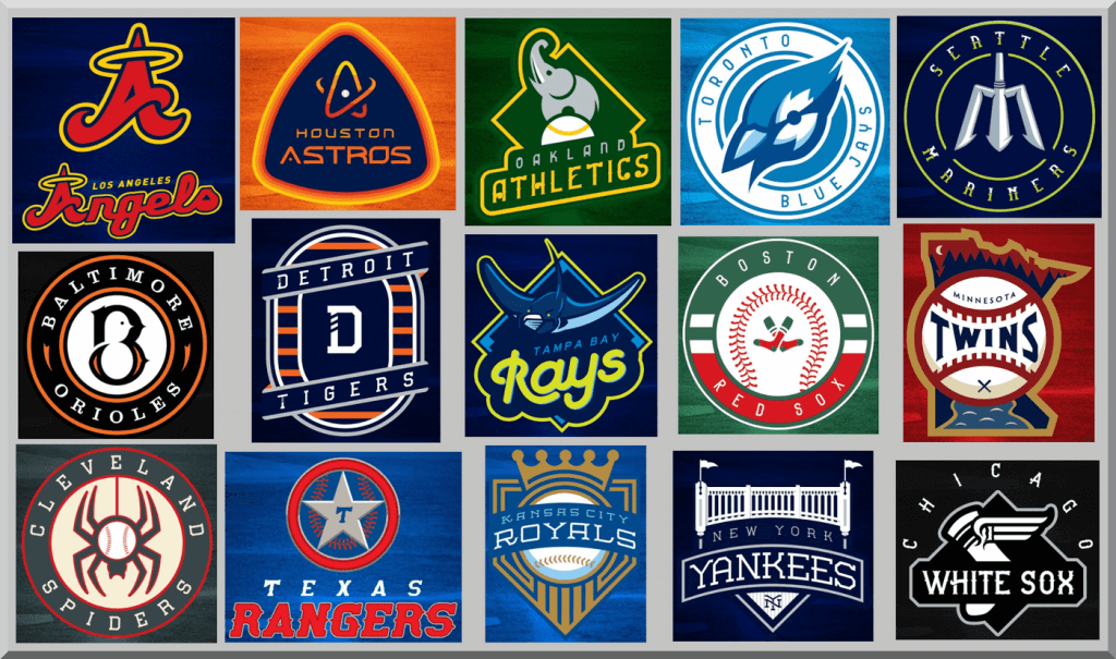
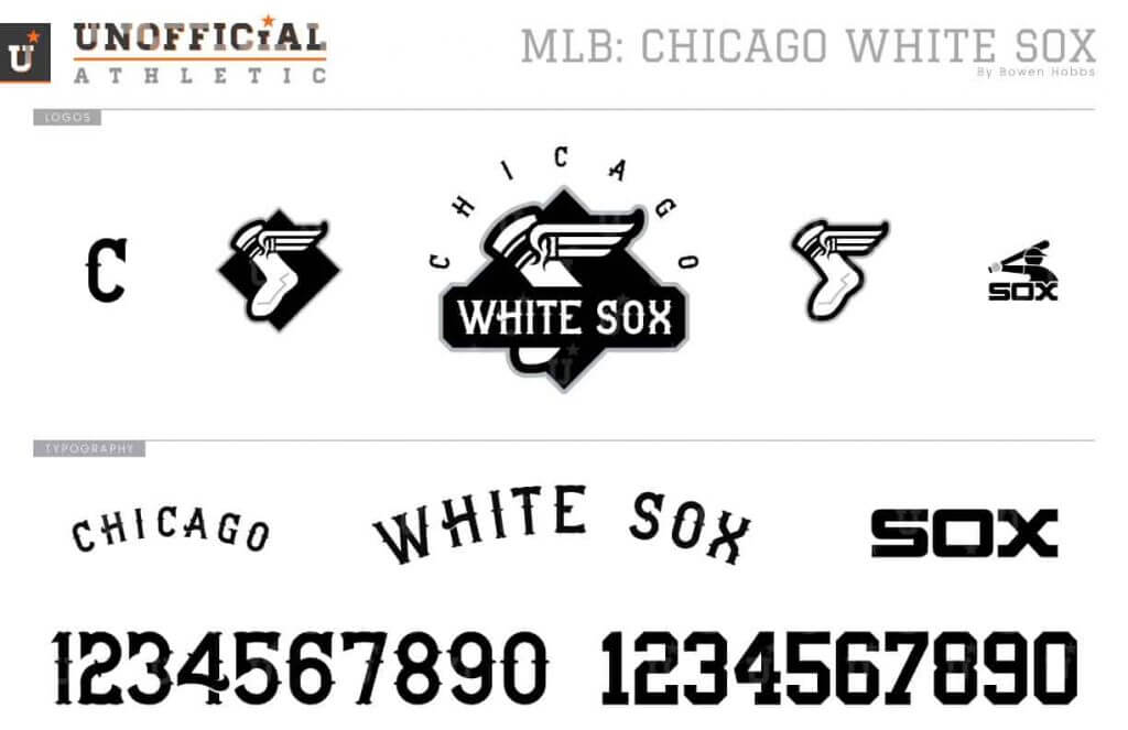
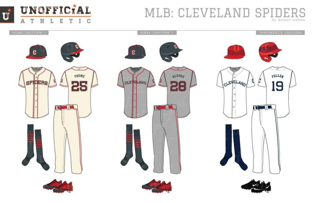
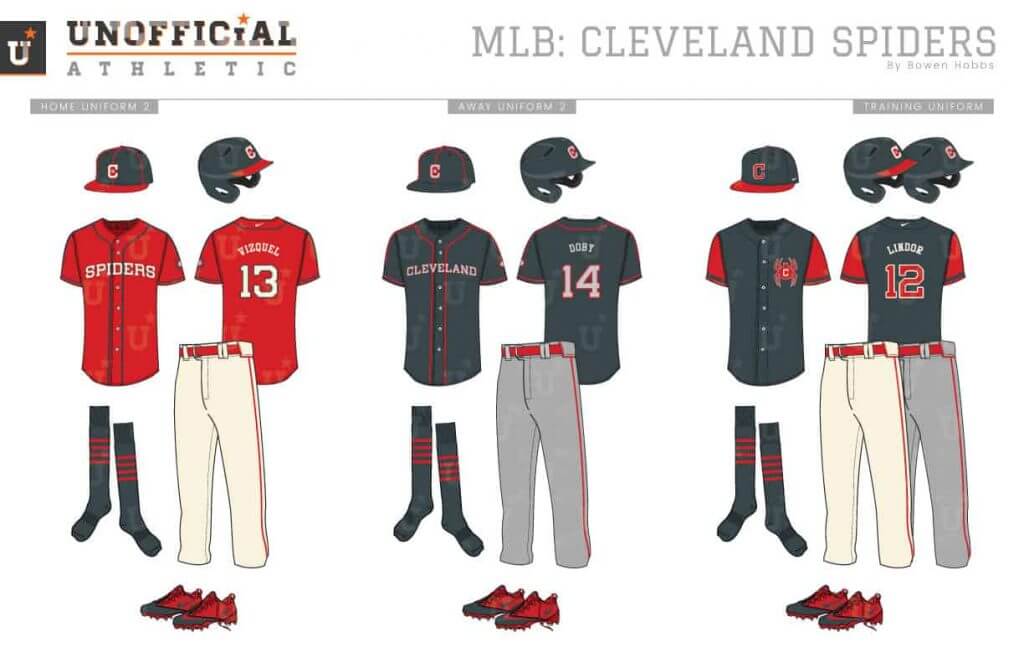
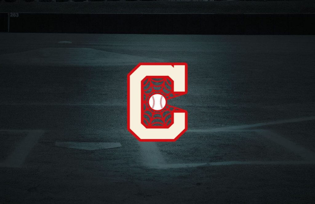
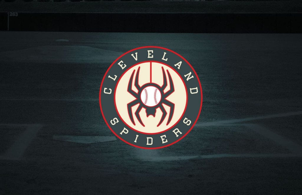
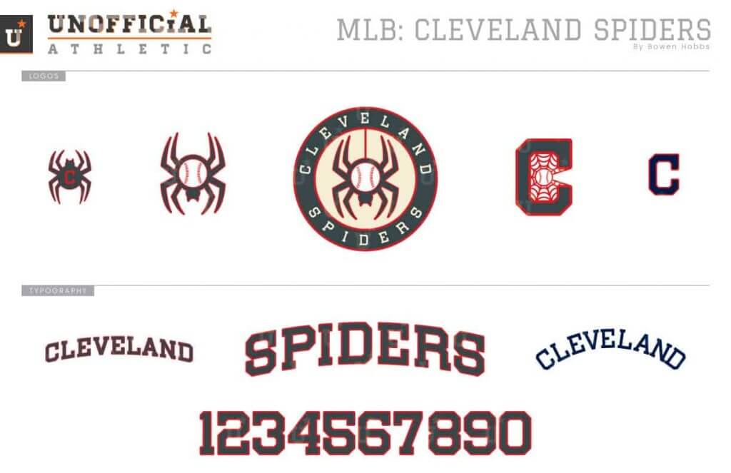
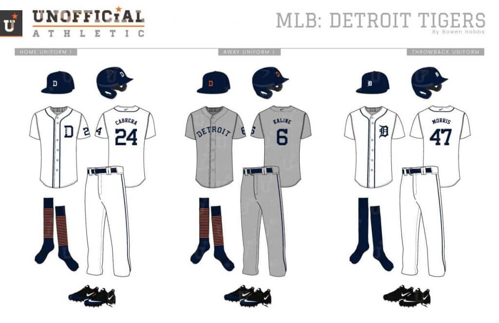
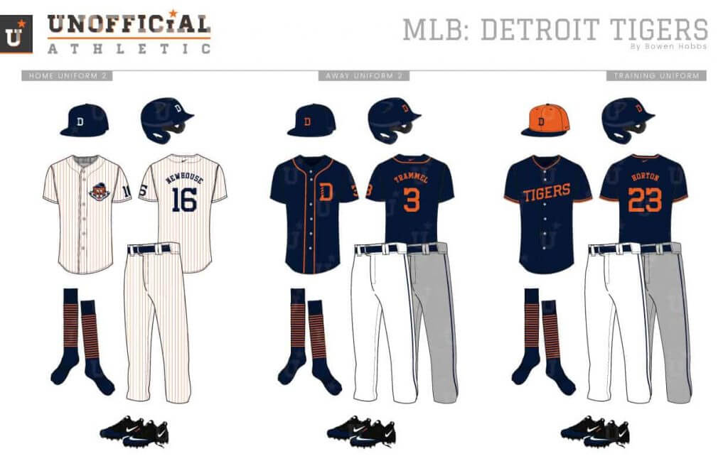
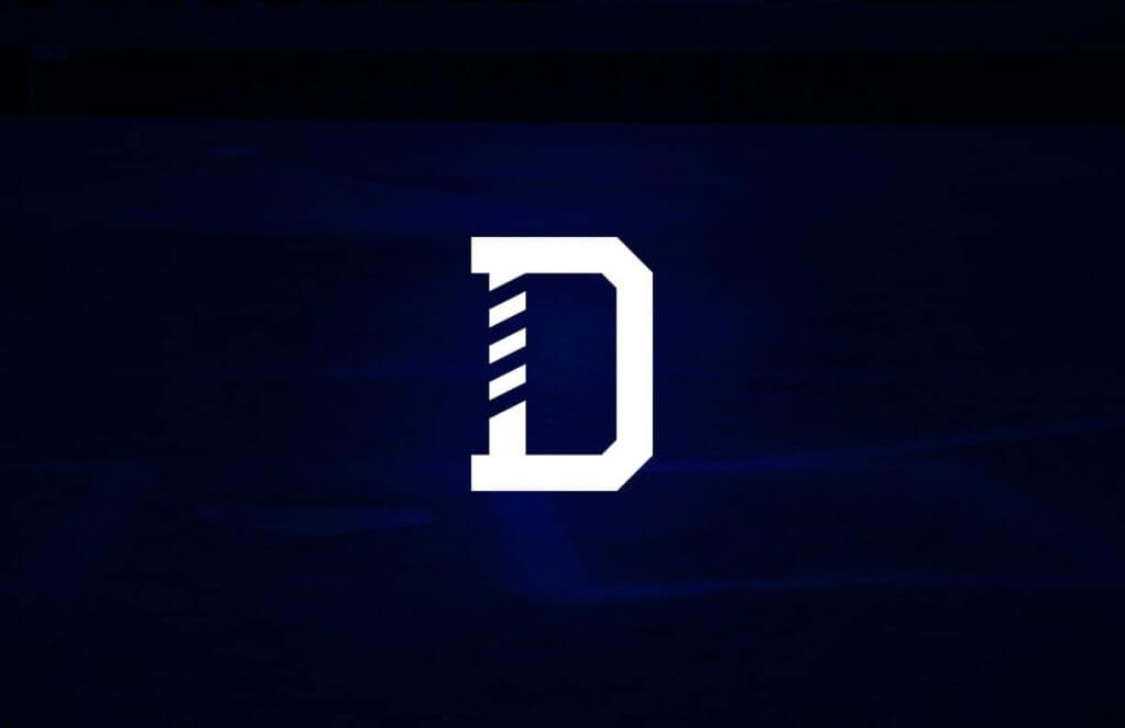
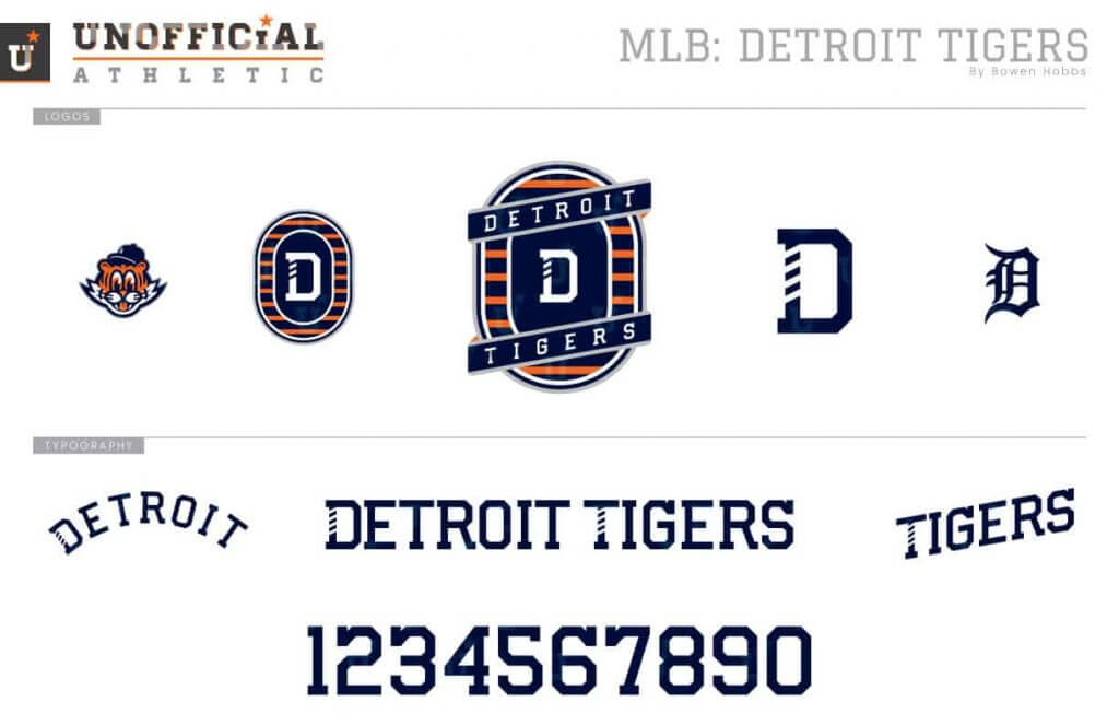
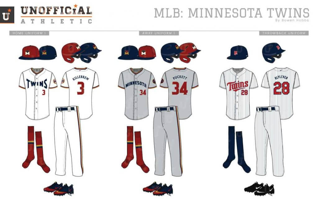
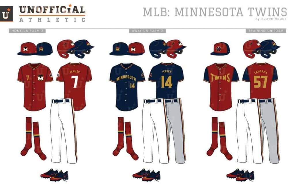
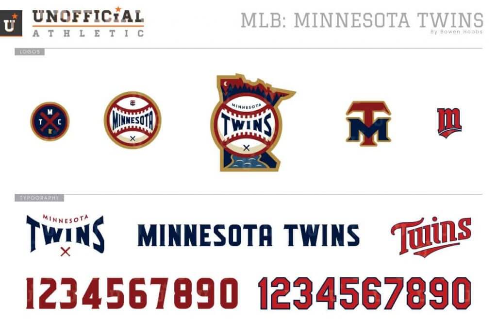
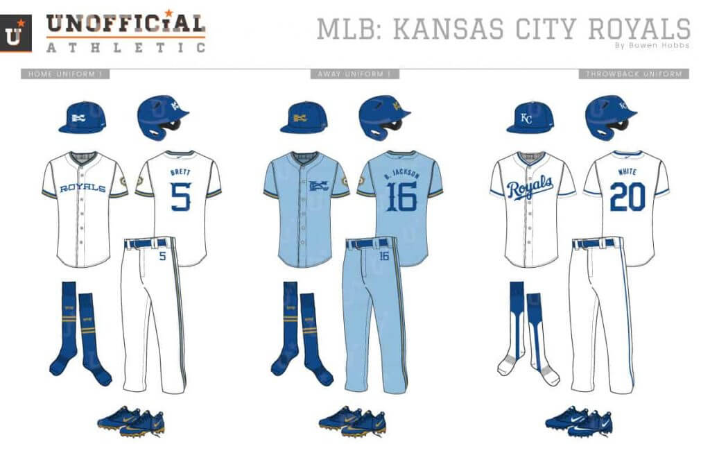
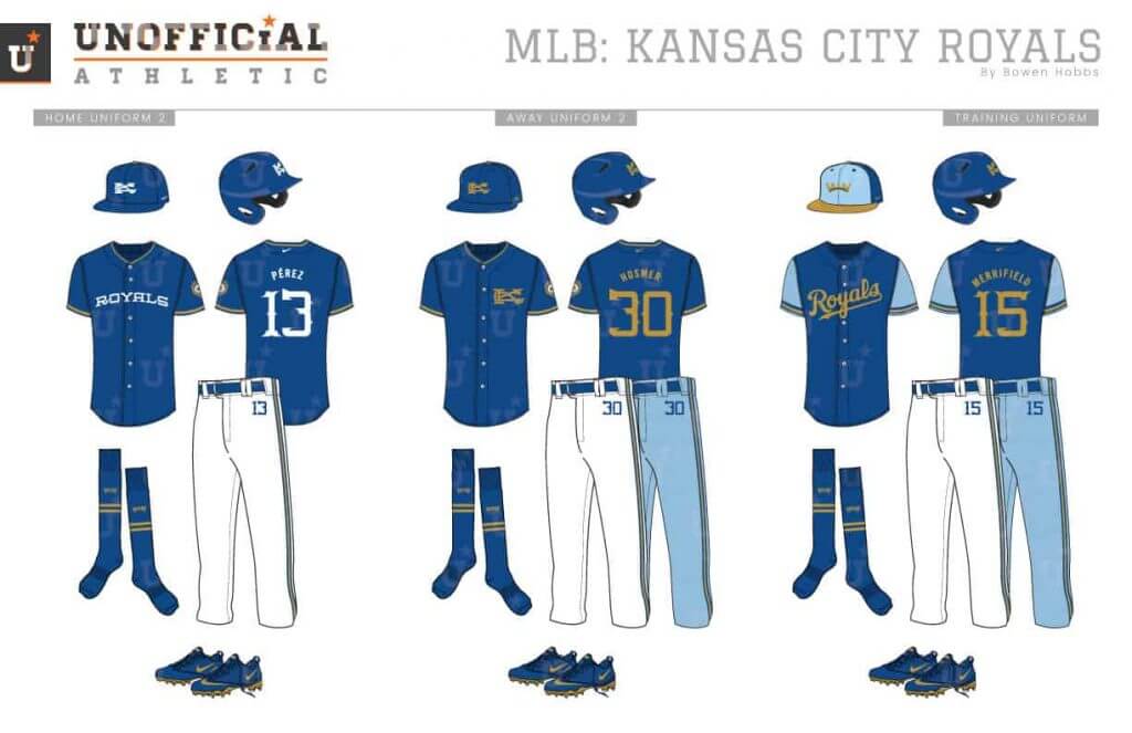
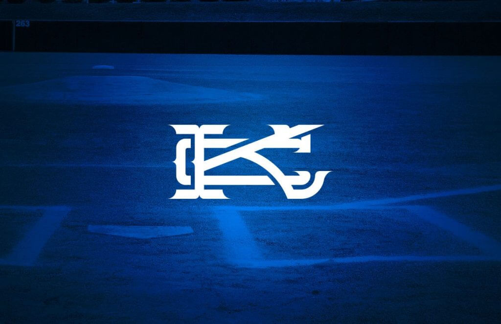
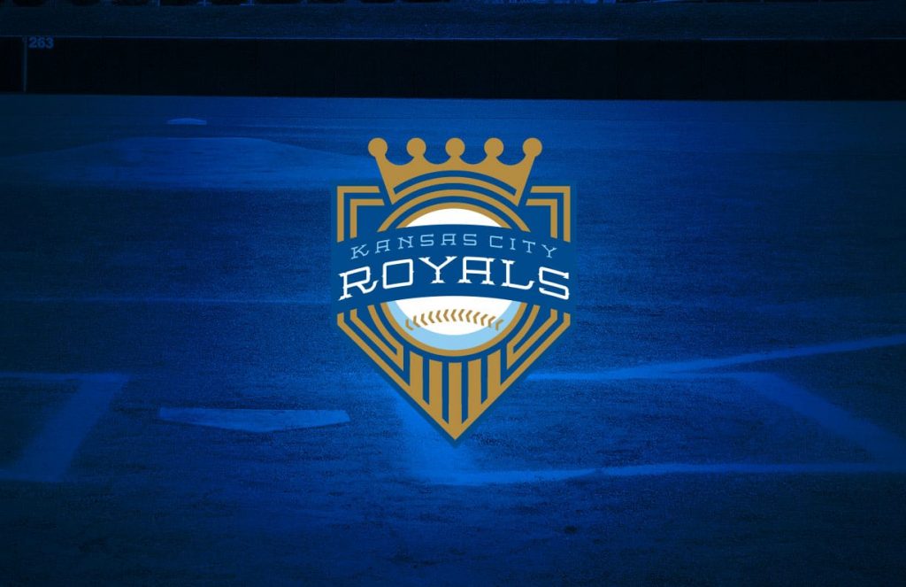
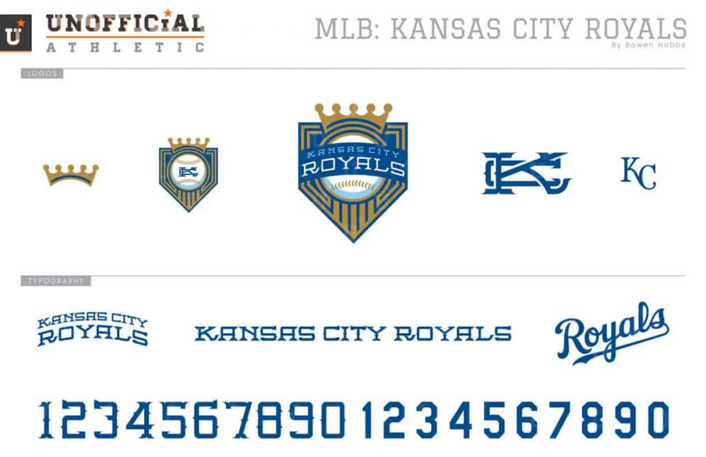
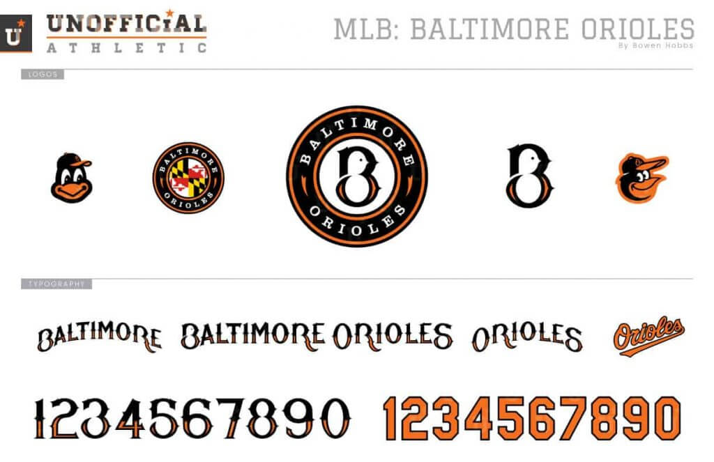
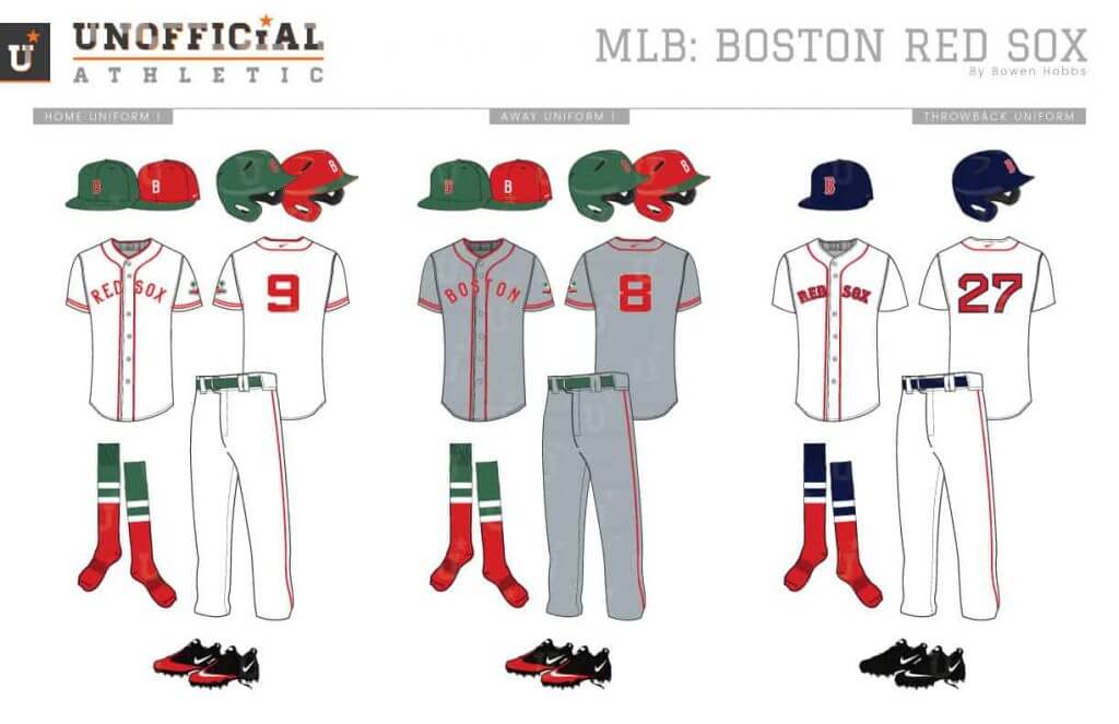
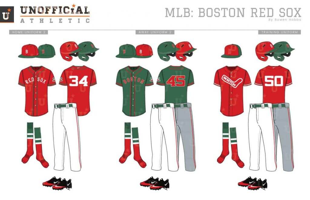
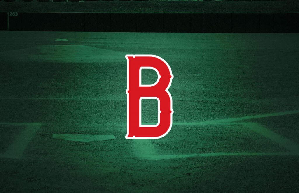
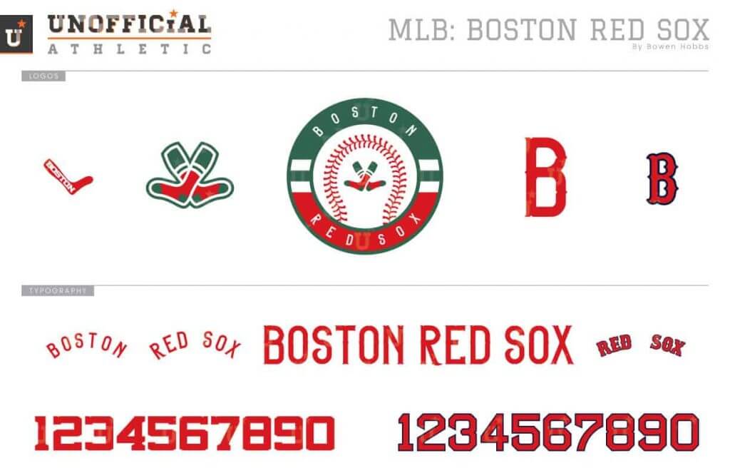
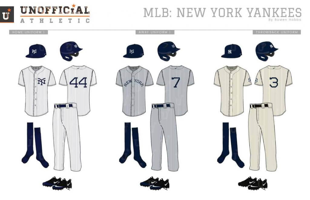
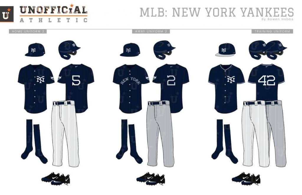
Today, we’ll be treated to Bowen’s redesigns for the American League. If you’re not familiar with his work, you’ll note he creates his own bespoke fonts and logos for each team, and the uniforms are all unique as well. It’s quite an undertaking, and a brilliant one at that. Click on any image to enlarge. Upper left would be the main uniform(s), upper right are the alternates. Middle left is the cap logo. Middle right is the team logo, and the bottom image is the logo slick. All original, all amazing!
There’s a lot to get to today, so let’s get right to it.
By Bowen Hobbs
Hi everybody! It’s Bowen Hobbs back with a collection of redesign concepts I developed for MLB. Each team has a handful of logos, a custom font, and six uniforms (home, away, throwback, home alternate, away alternate, and BP/training). One of my goals in this series was to find a way to deal with the overabundance of navy and red teams, which account for roughly one quarter of MLB with seven squads (BOS, CLE, MIN, LAA, ATL, WAS, and STL) wearing that one color palette.
AL West
Houston Astros


Chicago White Sox


Baltimore Orioles
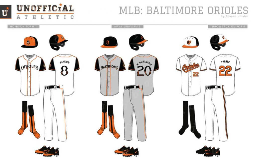
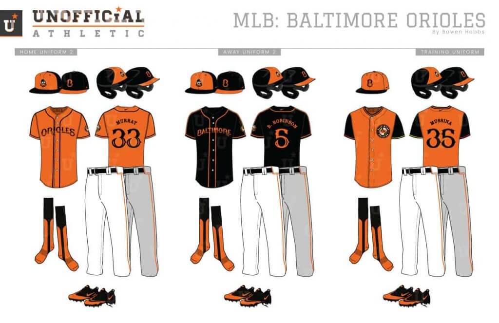
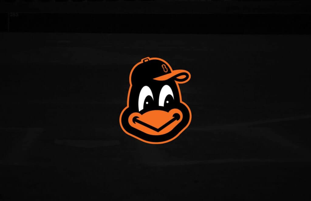
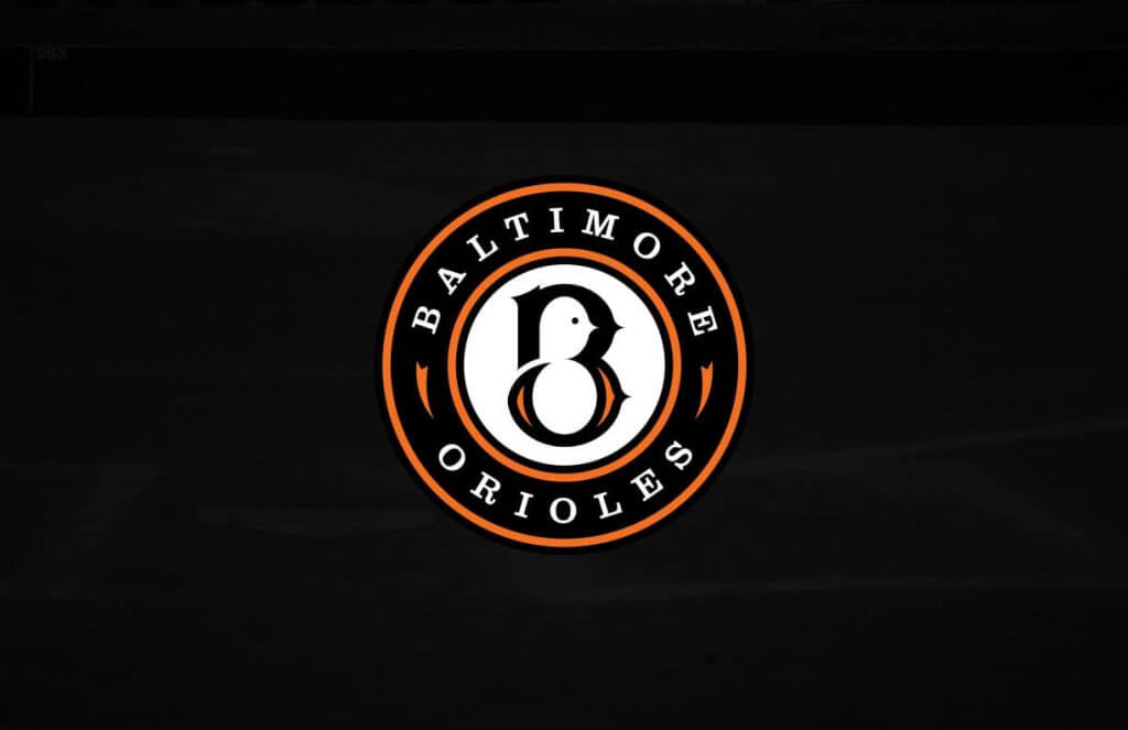
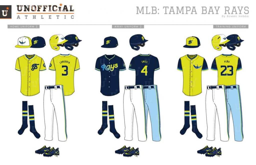
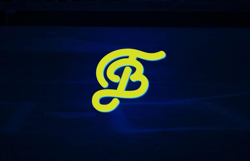
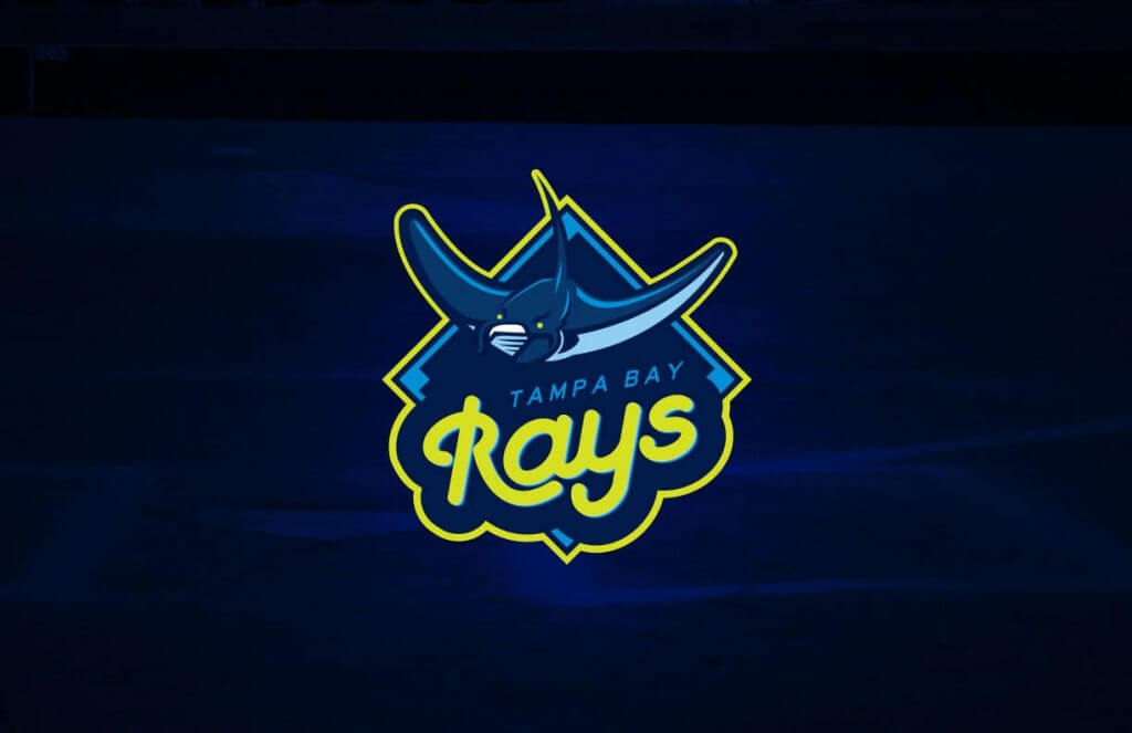
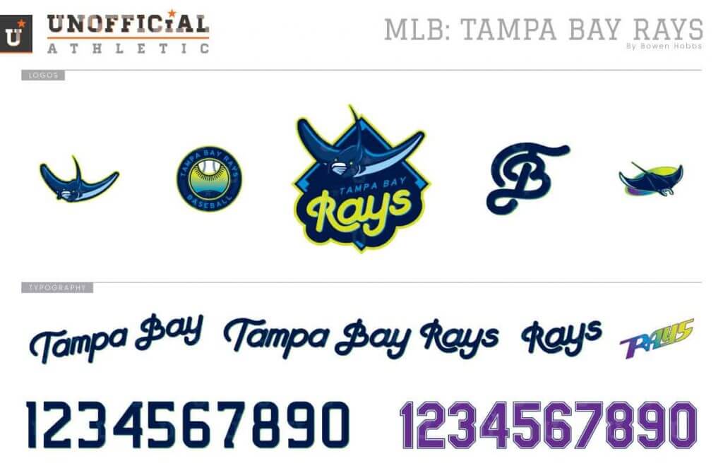
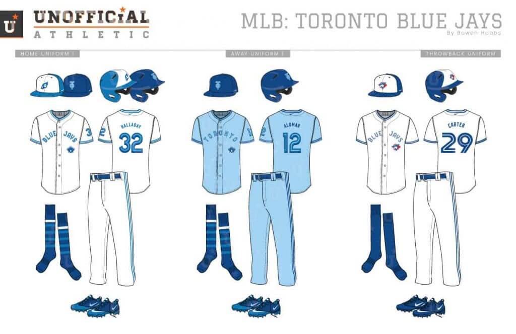
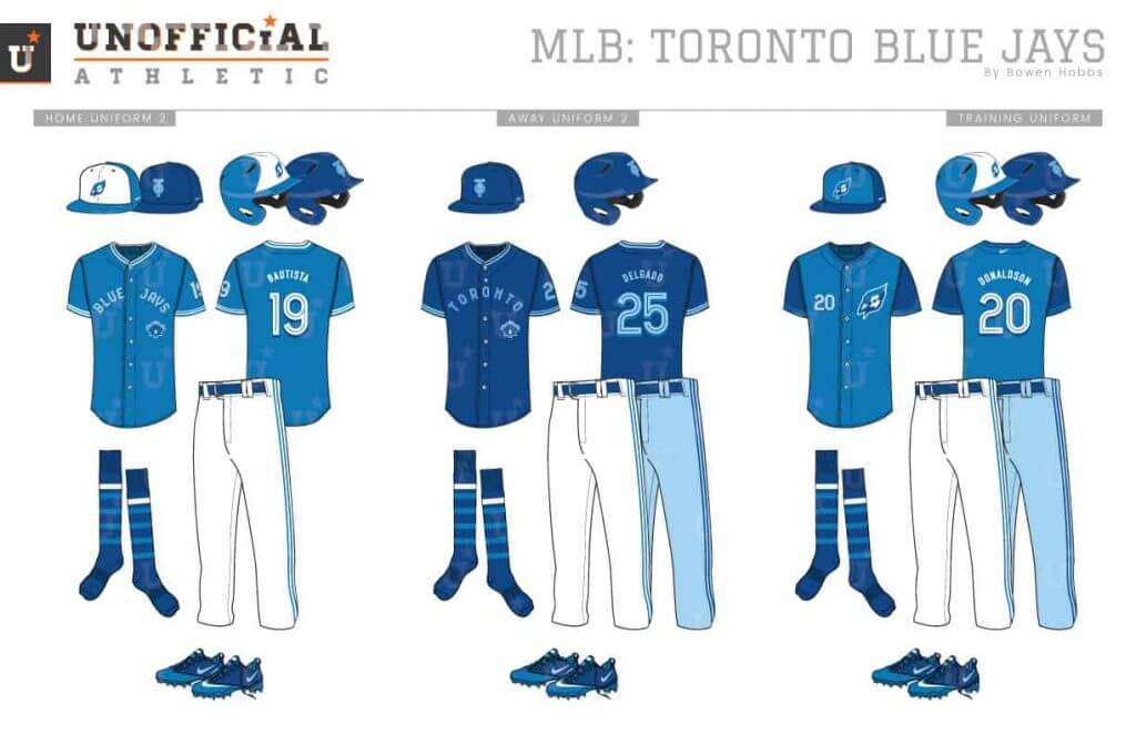
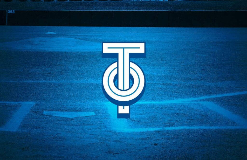
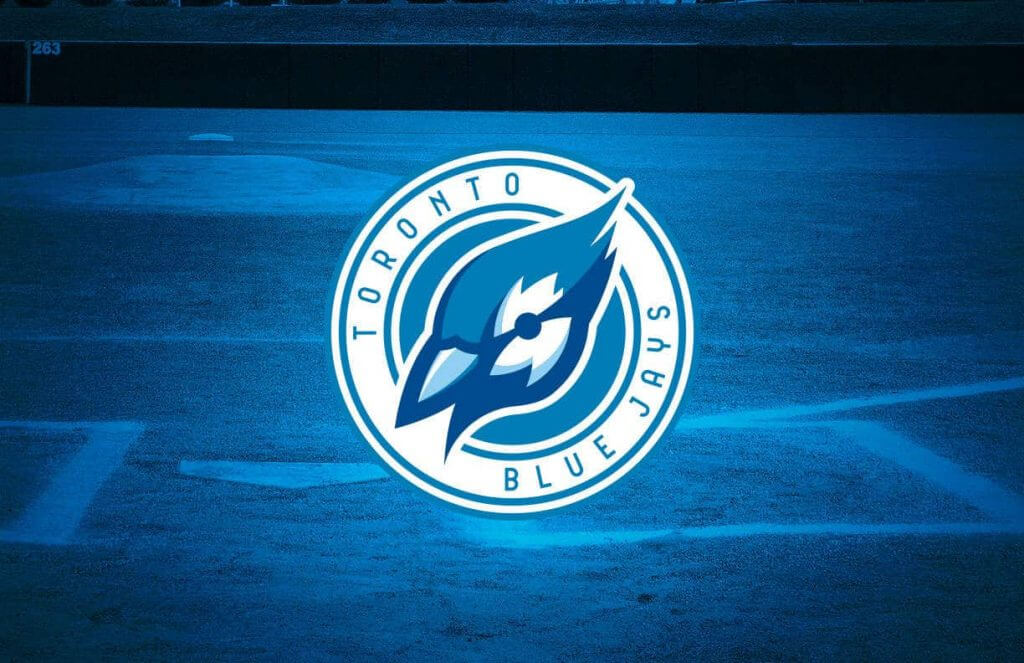
I’m going to be back with Bowen for the National League in the near future, and I hope to get in a Q & A session with the man, so that you can get to know him and his work a bit better.
Readers? What do you think? Please let Bowen know in the comments below!
By Brinke Guthrie
Follow @brinkeguthrie
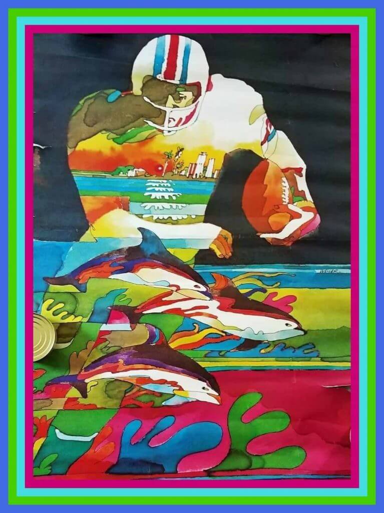
Leading off this week with a spectacular example of 1970s NFL poster art. This one for the Miami Dolphins has all the requisite South Florida references; the ocean, beach, high-rises, and of course, dolphins. The seller says it has pinholes and rips on edges- well, fine, it’s also 50 years old. (It says 1970 NFL Collector’s Series- 1970 National Football League Properties.) What concerns me a bit more is it looks to me like it has some ripples, which would be a bit tough for me to take if I were going to display it.
Now for the rest of the week:
• The logo on this Dallas Cowboys gym bag is one I’m quite familiar with- it was on our family station wagon when we lived in Dallas. But I’ve never seen it on a product like this before- just on decals and key rings.
• Over the past couple of months, several vintage Pete Rose-endorsed items have turned up here on Collector’s Corner, like chocolate drinks and candy bars. This week? A leather baseball glove wallet!
• Here’s a No Smoking sign from the old San Francisco Candlestick Park.
• And another stadium-related item here- this is a nice looking small scale model of Seattle’s then-named Safeco Field.
• The New Orleans Saints had black helmets ever so briefly in the 1969 preseason, and someone has decided to make a helmet buggy in their honor. That’s a great look IMO.
• Dig the cover art font on this 1981 Philadelphia Phillies Eastern Division Series Official Program.
• This Minnesota Twins ashtray commemorates their 1965 AL pennant.
• Wanna spice things up? How about a bottle of “Ron Guidry’s Very Own Lightning Hot Sauce. It’ll probably light you up just like his fastball did!
• St. Louis Blues players Barclay (scrappy defenseman) Plager and Garry (mod, blonde) Unger were featured on this 1972 “Tips On Hockey” 45rpm record, brought to you by Shakey’s Pizza.

from the scoreboard
Today’s scoreboard comes from Bobby Hunter.
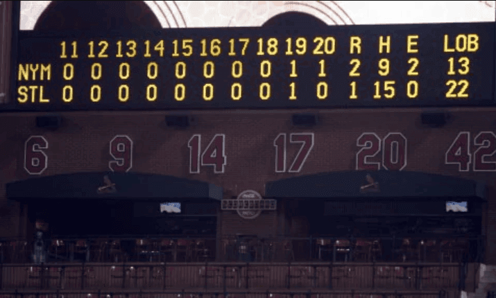
The premise of the game (GTGFTS) is simple: I’ll post a scoreboard and you guys simply identify the game depicted. In the past, I don’t know if I’ve ever completely stumped you (some are easier than others).
Here’s the Scoreboard. In the comments below, try to identify the game (date & location, as well as final score). If anything noteworthy occurred during the game, please add that in (and if you were AT the game, well bonus points for you!):
Please continue sending these in! You’re welcome to send me any scoreboard photos (with answers please), and I’ll keep running them.
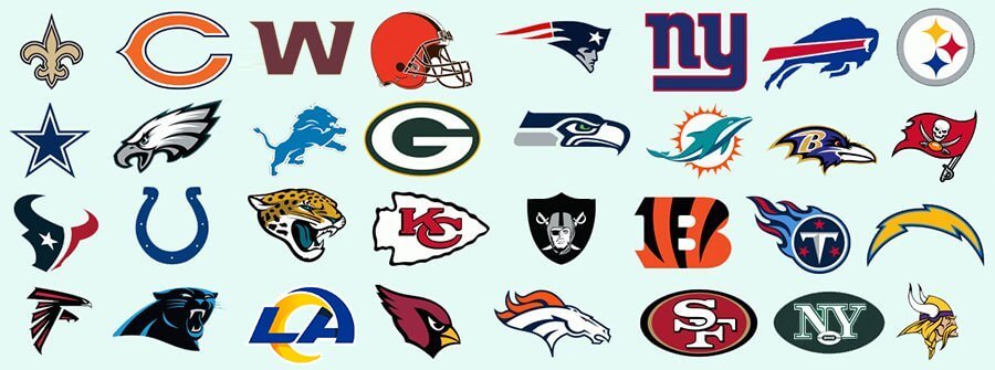
Got a fun quiz in the e-mail from Michael Cahalan, which asks you to name the NFL teams from the clues provided below (he left out one team who remains nameless for now).
Yesterday I ran the quiz — and here are the answers (a couple of you already solved these in the comments yesterday, so congrats to them).
1. Pope’s minions: Cardinals
2. Lone star staters: Texans
3. Udder young males: Cowboys
4. Revolutionaries: Patriots
5. Panned for profit: 49ers
6. Before the movers: Packers
7. Indigenous to India: Bengals
8. Pic-a-nic basket pilferers: Bears
9. Credit card users: Chargers
10. Luxury autos: Jaguars
11. Mythological foes: Titans
12. Christianity’s MVPs: Saints
13. Monthly expenses: Bills
14. Jungle kings: Lions
15. Rodeo buckers: Broncos
16. West side gang: Jets
17. Jim, Tim, Paul, Charlie: Browns
18. Desperado crooners: Eagles
19. Head butters: Rams
20. Clouseau foe: Panthers
21. Ace Ventura’s Snowflake: Dolphins
22. Mr. Ed’s Sons: Colts
23. 8th Commandment breakers: Steelers
24. Ocean Osprey: Seahawks
25. They kill bugs dead: Raiders
26. Head honchos: Chiefs
27. Made the Kessel Run in 12 parsecs: Falcons
28. A dollar for corn: Buccaneers
29. Poe quotes them: Ravens
30. Soldier Joe insects: Giants
31. Roman 6 monarchs: Vikings
By Paul (pinch-Tickering today for Alex Hider)

’Skins Watch: Good backgrounder on how Native iconography is still a stubborn issue in high school sports (from @OlegKvasha). … The Missouri town of Savannah is divided over a campaign for the local high school to stop calling its teams the Savages (from Kenneth Traisman). … Many Ohio schools, however, are dropping their Native-based team names (from Tom Pachuta).

Working Class Wannabes™: A high school football coach in Ohio says his key for defensive success in 2020 is that “we’re going to be the blue collar, get down and dirty and get it done.” Sounds like a real mastermind. … The University of Charlotte football team announced a new helmet design by saying, “New hard hats are here. Time go to go work.” … Cincinnati Bengals defensive back Vonn Bell describes his daily routine as “Just having a blue-collar working mindset and just going to work and getting it every day.” … Over in Australia, an article about the AFL’s Port Adelaide club described two of the team’s players as “blue-collar midfielders.” … An article about the restarted NHL season says the Toronto Maple Leafs “don’t abide by the virtues of blue-collar hockey or have anything close to a small-market attitude.” … An article about the East Fairmont High School boys’ soccer team in West Virginia says, “Role players have humbly taken up the blue-collar tasks of infusing games with hustle and work rate.” … An article about the Slocomb High School football team in Alabama uses the term “blue-collar” four times in the first five paragraphs. … Offensive lineman Brian Winters says he signed with the NFL’s Buffalo Bills because “it’s a hard-nosed blue-collar area and that’s type of football I play.”

Baseball News: Just as my own trading card is based on the 1973 Topps baseball set, someone has made a series of cards for Dr. Anthony Fauci, based on assorted old Topps templates (from Bruce Adams). … The A’s usually wear their Kelly alternates only at home, but they took them on the road for last night’s game in Anaheim because of a six-game winning streak when wearing them (from R.E. Stern). … Here’s a thread featuring lots of photos of the Blue Jays’ new “home” stadium in Buffalo (from Andreas Papadopoulos). … Here’s an article about the artist who created the logo of the Albuquerque Dukes, the Dodgers’ former Triple-A affiliate from 1963 to 2000 (from Kary Klismet).

NFL News: Here’s something I don’t think we’ve ever seen before: Tom Brady — now with the Bucs, of course — wearing a red-tinted visor (from William Clancy). … KC’s practice shorts have pretty cool name/number/skyline tagging (from Ted Taylor). … This 1996 Sports Illustrated piece includes an interesting bit of info about former NFL RB Herschel Walker’s shoulder pads: “Walker has less than 1.5% body fat on a body that has never lifted weights. It seems that whatever food goes into his mouth gets turned into fiber and sinew. Most marathoners have more body fat than he does. He is, in fact, dangerously muscular, with very little cushioning for the blows of his sport and in constant jeopardy of having a muscle snap from its own force. That is why he stretches rigorously and wears massive, customized shoulder pads” (from Johnny Garfield).
College and High School Football News: New advertised name for Georgia State’s stadium. … New turf for Neosho (Mo.) High School and Santa Maria (Calif.) High School (from Kary Klismet). … This article about UVa’s workouts includes the following tidbit: “As in years past, no numbers have been awarded this early in camp, but there is a twist this summer. On the back of each player’s jersey is his last name.” So the players are wearing numberless practice jerseys with NOBs. Weird! (From proud UVa alum Jamie Rathjen.)

Hockey News: The Sabres will unveil their new royal blue uniforms, to be worn for the 2020-21 season, today. Phil will have full coverage tomorrow. … New logo for the Fort St. John Huskies, a Junior B team in British Columbia (from Kary Klismet). … Here’s a look at the Ping-Pong ball that gave the Rangers the top pick in the next NHL draft (from Alan Kreit).

Basketball News: New court design for Bethel University, an NAIA school in Tennessee (from Kary Klismet). … Here’s a podcast interview with longtime sports designer Tom O’Grady, who created a lot of the NBA’s boldest looks of the 1990s. … Suns G Devin Booker apparently wore his mask upside-down during a press conference yesterday, resulting in an upside-down Nike logo. … Mavs G/SF Luka Dončić previewed the team’s throwback shorts yesterday (from @profjimmyc).

Soccer News: Renderings have been unveiled for a new stadium to be built in 2021 in Sumgait, Azerbaijan, home of Sumqayit FK of the Azerbaijan Premier League (from Kary Klismet). … New shirt for Fairant Kraków. “They play in the A-Klasa, the seventh tier of Polish soccer,” says Ed Zelaski. … The Portland Timbers are adding “MLS Is Back Final” lettering to their jerseys for today’s tournament title match (from @bryant_rf).

Grab Bag: Here’s a profile of a designer who creates vehicle logos for GM. … Speaking of cars, here’s a weird one: The “Edge” nameplate on this Ford Edge is misspelled (from @NYCommenter). … New uniforms for Pittsburgh Forge Rugby Club (from @MrBudziszewski).
Like Paul said above, today the Sabres are unveiling (I think) a Royal Blue and White sweater, and hopefully they’ll show the breezers and socks too. I’ll have full coverage of that tomorrow.
Everyone stay safe.
Peace,
PH
Outstanding work Bowen! I can’t think of one team treatment you’ve done that I didn’t prefer over the current.
the Red Sox…. I can’t. Great design work of course, but oh my god you’ve hurt me.
Oddly enough, that version of the Red Sox font was somewhat prevalent in the 50s and 60s. I seem to remember more flourishes on the serifs on some of the publicity photos from the time. I seem to remember it from Daniel Okrent’s Ultimate Baseball Book (scurring off to see if I can find a copy).
Just cross-referenced with the Internet. Apparently the writing on the home jersey for 1952 was slightly different from the continuity of the font from 1933 to today.
I’ve long believed that the Red Sox need to swap navy for green, and every concept I see that does so reinforces that opinion. Personally, I wouldn’t change any other aspect of their uniforms, just swap the colors, but Bowen’s designs here are solid.
Black would have been a better choice than green.
Mets/Cards box score is from 4/17/10.
Not that it really matters, but Bethel in Tennessee is NAIA. The D3 Bethel is in Minnesota.
Great work by Bowen, with the somewhat jarring exception of adding green to the Redsox everyone was a dramatic improvement over the current designs. I’m looking forward to seeing the Pirates eventually.
You misspelled “Indians”.
I’m a fan of the Indians, too. But they (and the Braves, Blackhawks, and Chiefs) are on the clock, and need to contemplate their post-Indian identities. Better to begin their studies and vetting now so they don’t get caught flat-footed like the Redskins.
Amen.
The majority of us know how to spell “Indians” and our voice is much louder than might be expected. The Cleveland Baseball Club will not be rebranding to some absurdity, such as, the Spiders.
Maybe it will and maybe it won’t, but “Cleveland Spiders” is link
I’d swear I’ve seen the Angels and Astros one at a burger drive-thru.
The Red Sox started using blue two years before “their biggest rival”. Let them wear green.
The Red Sox did drop blue entirely, however, from 1908 through 1920, used it only for pinstripes from 1921 through 1931, and didn’t make it a real part of their identity until the blue caps made their appearance in 1933.
At least the Yanks have used it consistently since 1909. ;)
How many fans today remember those years from 1909 to 1933 when the Yankees were using blue and the Red Sox weren’t?
I knew the lack of navy on the Red Sox would be the most jarring redesign. Maybe I’ll make a re-color version with with current colors.
2020 is a crazy year. The Sabres did not screw things up.
Sabres make it official
link
Sabres’ new/old look
link
Huge, huge fan of the Astros and Angels rethinks, particularly their primary logos and moving the Angels back to navy. I wish I’d thought of using powder blue for them in my tweaks from last year!
Also a big fan of the redesign of the Orioles roundel logo with the state flag in the middle. They should swap their current sleeve patch for it immediately.
Nice work!
Thanks! I appreciate the kind words! Ideally, I would have moved the Angels away from navy, but after trying almost every color I could think of to pair with red, only navy looked non-demonic. The strong use of athletic gold helps counteract that, IMO.
Interesting AL concepts!
Very disappointed you did not eradicate the horribly racist and vile Texas Rangers team name though as you thankfully did for Cleveland.
hoo boy
Let’s get one thing straight: You are NOT advocating the retirement of the Rangers’ name for the NHL squad, just the baseball team?
Fascinating work, Bowen. Love your stuff.
That Toronto monogram is downright pornographic, though. ;)
The “Edge” nameplate on this Ford Edge is misspelled
The letters are also a little crooked; looks to me like the owner removed them and re-arranged for fun.
Love the interview with the Albuquerque Dukes logo designer.
Can we just stop for a moment to appreciate link? Beautiful.
I……don’t hate the Red Sox redesign. Jarring for sure, but certainly an interesting twist. I don’t love the red alt with the sock logo across the front, but I’m tenuously on board otherwise.
In general I love all of these redesigns. Bowen, you’ve solved a lot of visual identity issues these teams have. That said, I don’t think you’ve made the Rangers uniforms any less scattered. I imagine they’ll never do this because they probably sell a ton of both color hats, but the team really just needs to pick either red or blue as a hat and alternate jersey color and that solves the problem entirely.
Good points on the Rangers. Maybe they’ll always be sartorially schizophrenic. But at least I didn’t throw powder blue (and a sloppy script) into their crowded identity?
Absolutely! I think there’s no going back on the red vs. blue for the Rangers at this point, but I appreciate that you’ve given them a consistent and clean look in terms of lettering. (Other than the throwback, which I really enjoy. Those late 80’s/early 90’s uniforms for Texas were really great.)
That’s an awesome Pete Rose leather baseball glove wallet, but it’s not a product he endorsed.
It was made from a glove that he did, however.
Bethel is in the NAIA not NCAA D3, fyi.
Luckily, the “big sock” Red Sox design is just the BP jersey. I wanted to try to have a little extra fun with the the Training jerseys.
Actually, Bethel in McKenzie, Tennessee is NAIA. I would provide a link, but your link in the story already mentions they are NAIA.
The Bethel in Minnesota that you linked is D3.
Great work Bowen! And how nice that the new Astro’s logo looks so much like an asterisk!
Buffalo Sabres.
They didn’t “need” to go back to royal from navy to look good. But it is an upgrade. Kudos to the textured crest.
My favorite thing about the upgrade is: It looks like the front jersey numbers are gone. I *HATE* that hockey jersey feature. Too much front clutter, and completely redundant since every NHL team adopted helmet numbers on the front in 2011.
My least favorite thing about this change is: In “throwing back,” the Sabres reverted to the wrong thing and edited the wrong thing.
The white jersey is a straight throwback, complete with the arm stripes being a silly flip flop of the hem. That was preserved, but it should have been fixed.
On the other hand, the royal jersey’s stripe pattern now has some gratuitous white stripes in the mix. This is too cluttered for me. If the Sabres would have reverted to ONLY gold striping on the royal jerseys, without trying to “fix it,” that would have been great.
Naw, they hit the right notes, this time. The flip-flopped stripes of the white sweater are a happy quirk the Sabres seem pleased to continue. Hopefully they refrain from the overdone socks of the 1970s uniform. The white accents of the blue sweater are a nice touch and compensate for the lack of white on the breezers. No superfluous chest number, no extra crests on the shoulder yoke. A solid “A”.
While I greatly appreciate and respect the work and talent Bowen has, almost every logo seemed too “computer generated”. Everything seemed too rounded off, too generic, and pretty much every team’s logo they currently have would be downgraded using those logos.
I am in no way trying to negate the time and effort of the post, they’re just not my cup of team
I’ve learned to only redesign a team or two at a time, after that my focus wanders and the other teams get the treatment as part of a rote exercise. The common look of all the teams is an unfortunate side effect of taking on a project this big. Even Todd Radom had to learn to say “no”.
-A Mariner is not a fish. Why did you make the S look like a fish?
-You’ve ruined the classic looks of the Tigers and Yankees.
-The Twins logo makes me think T/M rather than M/T.
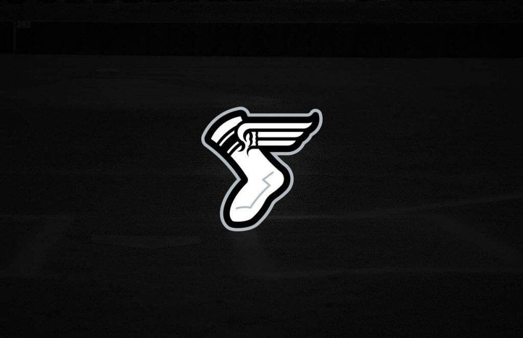
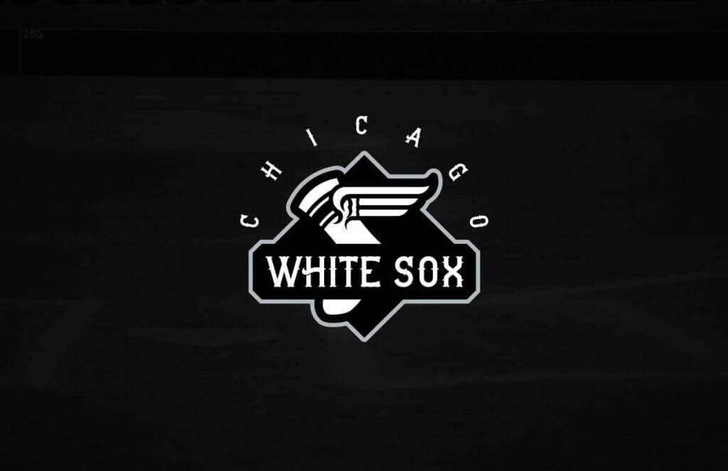
-You’ve used the Uni Watch Winged stirrup for the logo of the White Sox (you just changed its direction and omitted the stirrup)
-Red and Green for the Red Sox? Looks like a bad Christmas sweater. Again, ruining a very classic look. And I’m in no way a BoSox fan.
-Should have made a much clearer use of the Asterisk for Houston.
-The Angels Uni/logo is only a little bit better than winged vests from the 90s. Go back to the Halo on the hat.
Can’t wait to see what you do for the Dodgers, Cubs, Cardinals, Pirates…
You’ve used the Uni Watch Winged stirrup for the logo of the White Sox (you just changed its direction and omitted the stirrup)
The Uni Watch stirrup logo is itself a play on link. Goes back at least as far as link.
Didn’t like the reworked Angels “A”. It’s just the Braves “A” with a halo.
Tom Brady with the Bucs sort of reminds me of Joe Namath and the Rams….or Johnny Unitas with the Chargers.
Or Joe Montana with the Chiefs.
Wayne Gretzky with the New York Rangers, Babe Ruth with the Boston Braves, and Jerry Rice with the Broncos.
The collection as a whole makes me think of what you would get at Meijer or Wal-Mart for 15 bucks. That being aaid That Astros redesign is truly inspired and would be officially licensed and worth the price.
Bowen’s redesigns:
Astros-Love the promotion of orange to primary status, really dislike the gradient and the Star Trek-esque font.
Angels-The new A is too similar to the one the Braves use. Call them California, add the state-shaped logo to the throwback, ditch the ‘sky’ blue.
A’s-I say yes to the vest! Get them back in ‘kelly’ green.
Mariners-The wavy wordmark works, the updated trident and lime green do not.
Rangers-I don’t mind their split-personality. The pointy-sided numbers have got to go though.
White Sox- White socks! But black pants?
Indians-I’m warming up to a name change…only because Spiders is an excellent replacement. This is my favorite update!
Tigers-I realize messing with a classic is a hard sell, but these are nice. I dislike the use of those white stripes.
Twins-Not a fan of the use of gold or the bowtie wordmark. And only the Phillies should bring burgundy back to baseball.
Royals-Numbers on the pants? Let the White Sox own that look.
Orioles-Like the olde-timey features, but the cartoony bird doesn’t pair well with them.
Red Sox-If the New Jersey Devils were a baseball team, they might (and should!) look something like this. Again, it’s tough to redesign a team with such a great, familiar look.
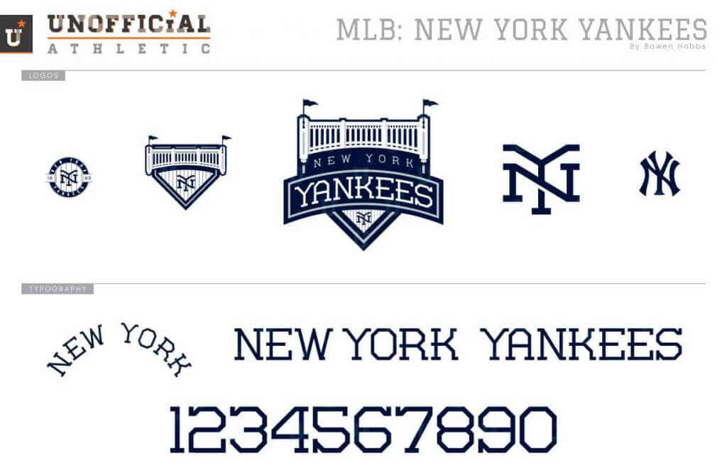
Yankees-I support the road pinstripes, but the new interlocking NY logo seems to borrow heavily from NYC FC (didn’t Chance Michaels design that?)
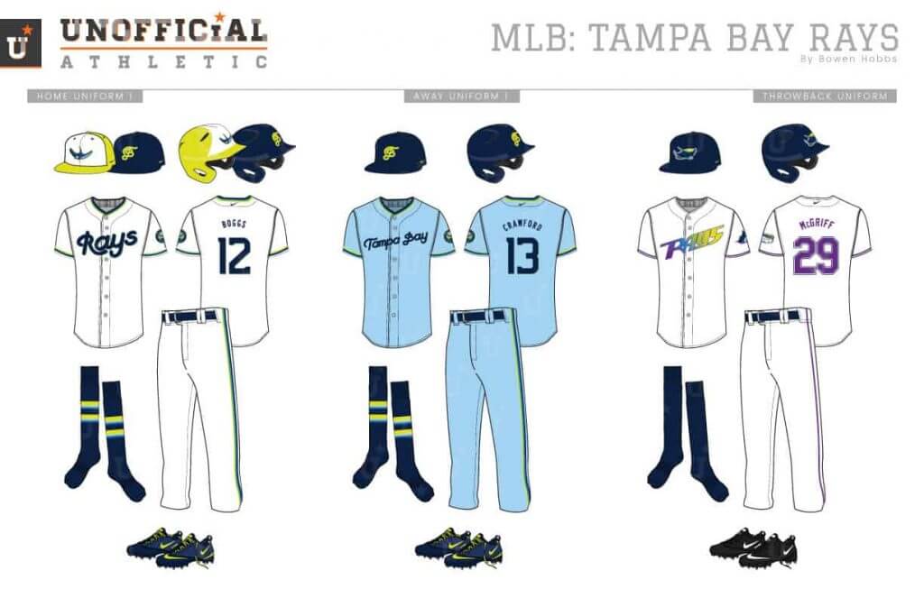
Rays-This is a fun re-imagining, but looks very minor league…maybe that was the point ;). The Rays should return to their dark green days.
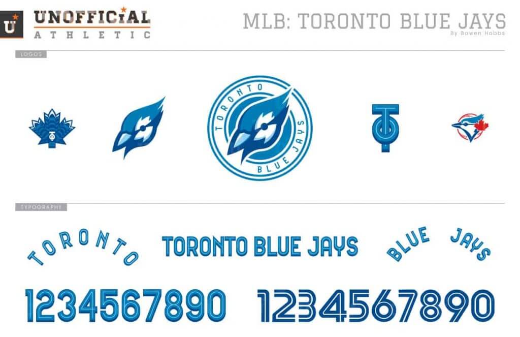
Blue Jays-That’s quite a lot of blues to use. The white front panel cap is all they need at home and on the road.
You flatter me, but I had nothing to do with the logo. The monogram was designed by New York graphic designer link.
I like the mission patch concept for the Astros. I think it would be a fun application and a great way to separate eras. I’d love to see a patch for each of their uniform eras.
I love the mission patch idea for the Astros. I’d love to see a (retroactive) mission patch made for each of their uniforms. It would be a fun way to separate eras in the teams history.
My only issue is with the Oakland A’s. The elephant has to be white.
I like almost all of Bowen’s designs quite a lot, and I’m looking forward to his NL work.
That said, only a few of these pass my test of whether I’d prefer them to what the team currently wears. Like, the conceptual thinking behind much of the Twins identity is terrific, but there are just enough details that don’t quite gel for me that I wouldn’t take Bowen’s concept over what the Twins currently wear. Even though I am super-duper not a fan of the current Twins uniforms. It’s not that I think Bowen’s Twins concept is bad – it’s not! – but that it just isn’t quite right yet. I could see a design-review meeting generating comments and notes that would lead to a next draft of this concept that goes from Good to Great.
But a for a few teams, I would absolutely take Bowen’s concept over their current uniforms. And in a couple of cases, this is true for teams whose uniforms I basically like.
Cleveland – easily one of the two best Spiders concepts I’ve seen. A team dressed thus would be difficult for me to root against, inveterate hater of Cleveland’s AL Central team that I am.
Oakland – A basically good-looking team, but the A’s could benefit from a bit of a refresh. Bowen’s ideas of harking back to the PLC Oaks and emphasizing the elephant are a sound basis for a refresh. And personally, I just prefer teams whose cap logos reflect their civic home, not their team name.
Texas – This approach squares the circle of whether the Rangers are a red team or a blue team. The correct answer is “both,” but the team itself has consistently flubbed and muddled its color balances. This concept does a terrific job of keeping the colors in balance throughout.
Baltimore – As a former Mid-Atlantic resident, I wish the Orioles organization deserved uniforms and logos that look this good. It doesn’t. But I suppose the long-suffering fans do, so Bowen’s concept gets my nod here. It’s an absolute chef’s-kiss perfect blending of all the best aspects of Orioles uniform history (and the aesthetics of their ballpark).
Paul, not that I’m offended or anything but as attentive to details as you are I’m surprised you are still using “Skin’s Watch” and the logo since they are finally things of the past.
Like them all. Except the Tigers and Red Sox.
Am I the only one not seeing the White Sox unis? Seeing all the others, but not the ChiSox.
Re: UVA practice uniforms. N#OB?
I can’t be the only one that caught the modified 1967-1986 Pirates logo (thanks, SportsLogos.net) on the Pittsburgh rugby team sleeve (last grab bag item)? He’s wearing a ruby helmet (?) and has a tooth knocked out. Nice!
WHy does Bowen Hobbs hate front numbers so much? And why does he keep the White Sox in those hideous black monstrosities? UGLY.
I find it interesting that no Seattle team currently, whether in redesigns or current uniforms, use different color schemes. Although I have nothing against the blues, greens, and grays (in fact I quite enjoy them) I don’t see very many different concepts.
The poor BoSox, the green didn’t go well. Im not a fan, but those look gosh awful. My favorite redesign is probably the orioles