For all photos, click to enlarge
So it turns out that MLB summer camp is waaaaay more uni-interesting than MLB spring training. For spring training games, teams wear lame-o merch-dump apparel that makes my brain hurt. But for summer camp intrasquad games, teams wear, well, all sorts of interesting things!
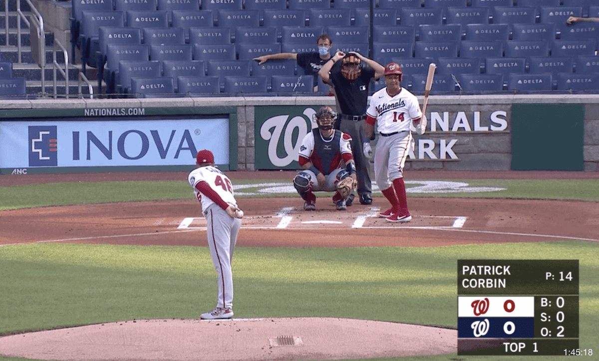
As noted earlier this week, we’ve already seen players wearing blank jerseys and makeshift uni numbers made from tape. But the Nationals took things to a new level yesterday by having an intrasquad game with both teams wearing white jerseys paired with grey pants!
It’s a little odd that they had both sides wearing the same uni combo. Why not have one team in white/grey and the other in grey/white? Maybe the idea was to avoid wearing the white pants because pants tend to get dirtier than jerseys (sliding into bases, etc.) and white is harder to clean than grey. But even if that was the case, why not have one team in white jerseys and the other in red or navy? I emailed the team to find out more but got no response. (They also never responded to multiple inquiries about the grammatical error on their championship rings.)
At least the Nats had a real MLB umpire for their game. The Phillies appeared to be using a backup catcher to call balls and strikes for their intrasquad game last night:
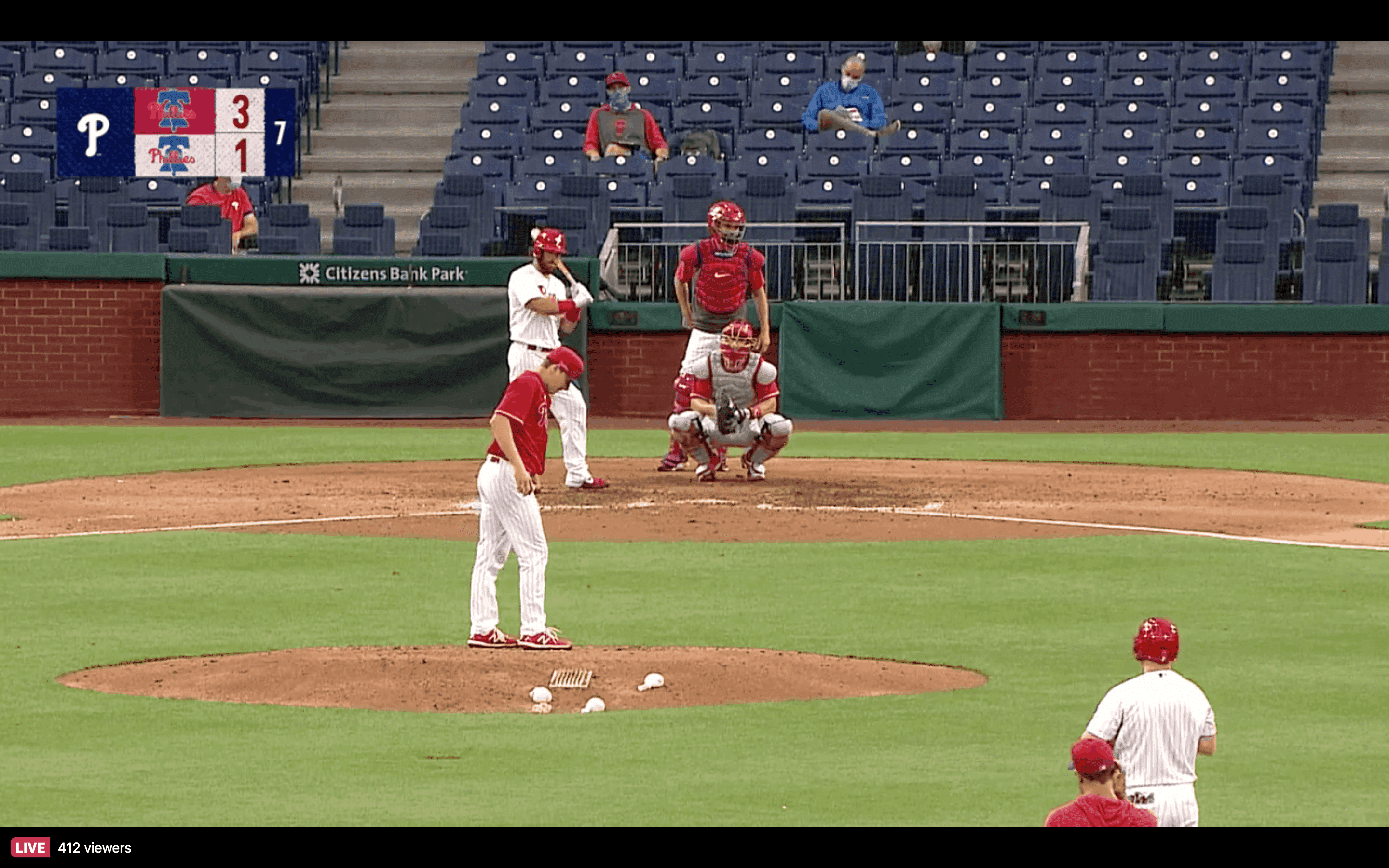
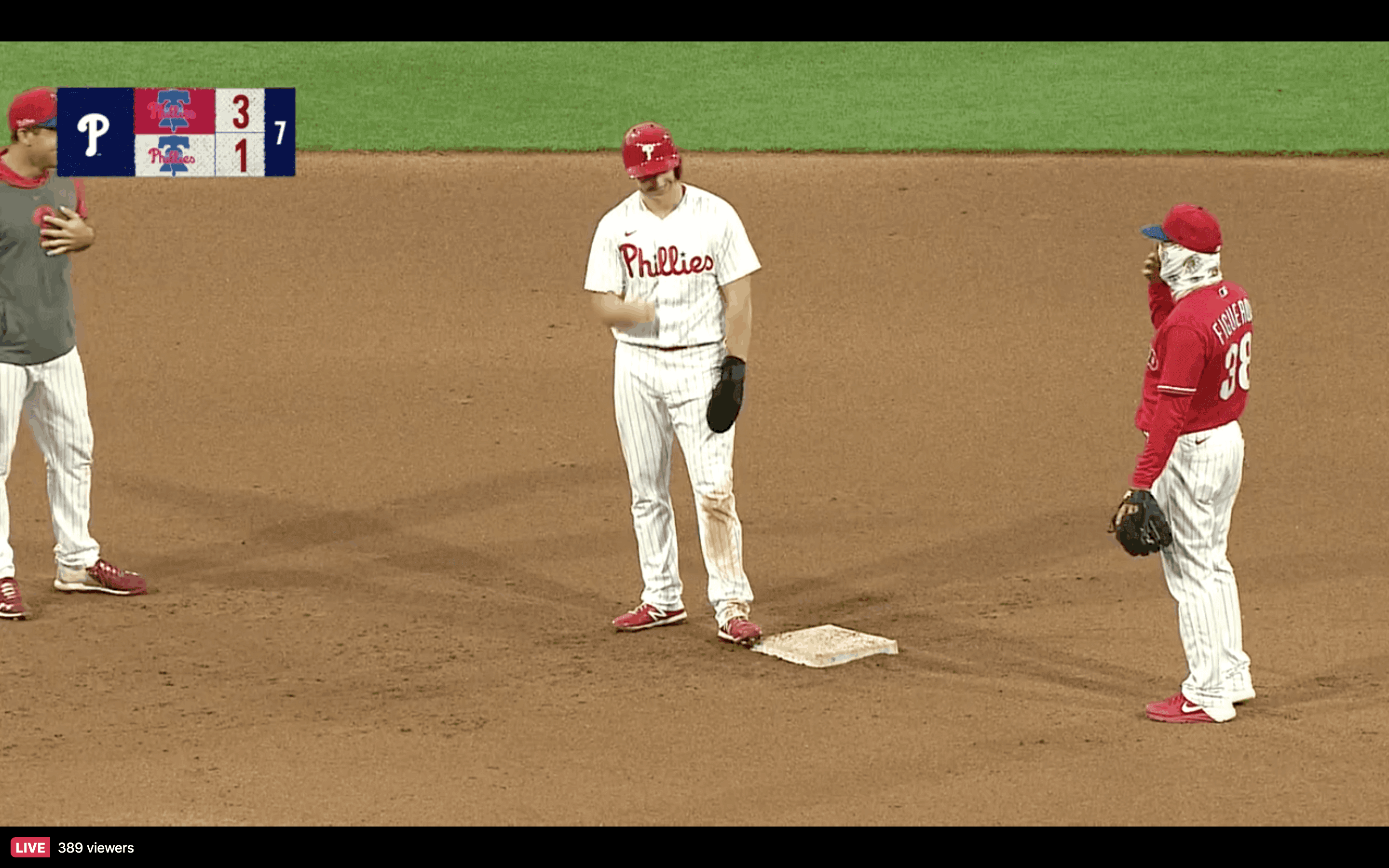
As you can see, the baserunner on second had a blank jersey, and the shortstop for the red-jerseyed team wore a hoodie! Here’s how that hoodie looked from the front, along with a look at the second baseman’s gaiter mask:
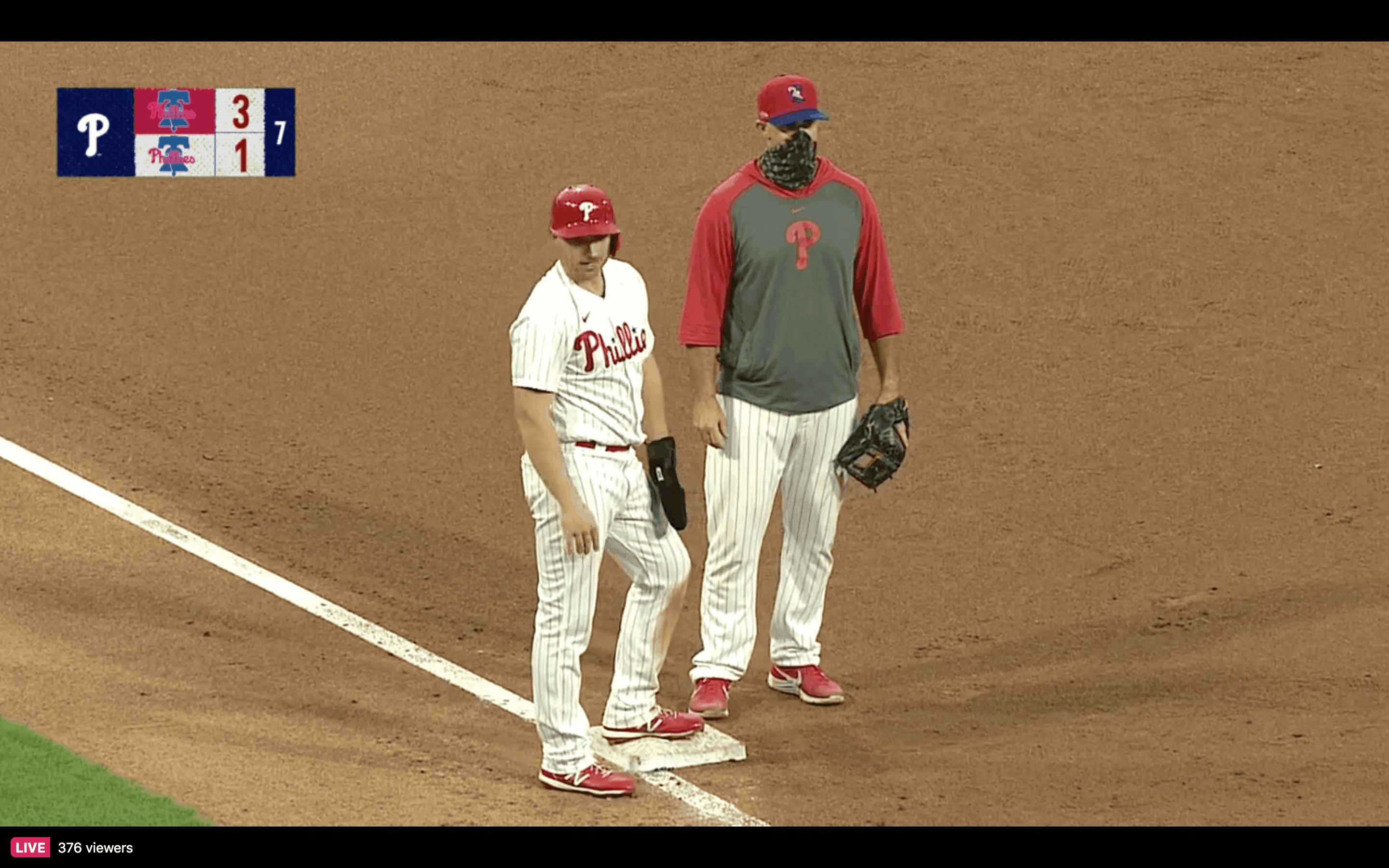
The third baseman was also wearing a hoodie in that same style — red in the back, grey in the front:
Even the batboy had an unusual uniform:
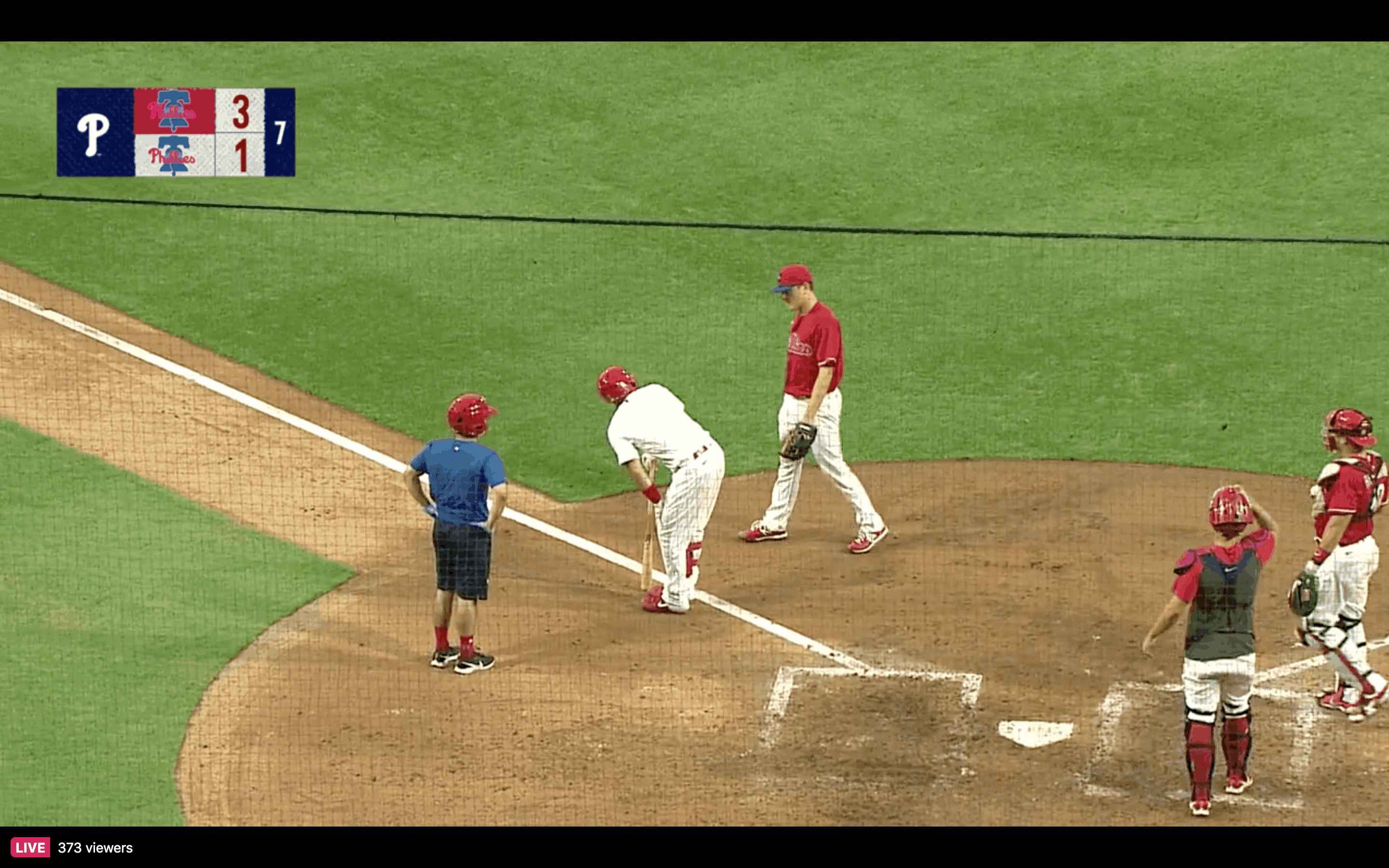
Meanwhile: If you were really missing the Padres wearing brown, you had to like last night’s brown-vs.-brown scrimmage — with both teams wearing the espresso road pants!
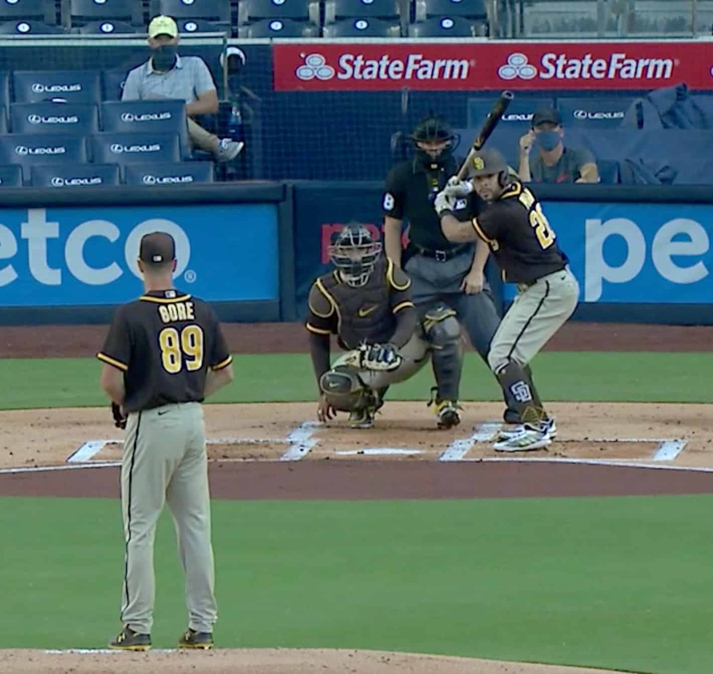
The two sides apparently wore the matching outfits because outfielder Robert Hassell III was playing for both teams:
@UniWatch Padres outfielder Robert Hassell III playing defense for both lineups. Necessitates both squads wearing same uniform set. He’s skipped in the batting order when his spot comes up. https://t.co/vWG21BOz3I
— Tim Stoops (@timmer82) July 17, 2020
In Chicago, the White Sox played a game with both teams wearing black jerseys, but with one team in white pinstriped pants and the other in grey pants. It’s a little hard to see, but you can get the idea here:
The parrot flew to Chicago for the summer. pic.twitter.com/JhBAeeLJDE
— Chicago White Sox (@whitesox) July 17, 2020
Over in Queens, the Mets had one team wearing the white pinstripes and the opposing side wearing the orange-trimmed home alternate jersey with the grey road pants (a combo that, to my knowledge, has never been used in a regular season game):
It's final from @CitiField. Thanks for watching tonight's sim game. #LGM pic.twitter.com/aIbuz14UZg
— New York Mets (@Mets) July 17, 2020
I’m sure there have been other interesting on-field looks this week. Feel free to post them in today’s comments.
Most of what we’re seeing here is probably nothing new, because teams play intrasquad scrimmages during spring training too. But spring scrimmages aren’t televised or streamed, so these summer scrimmages have given us a window into a corner of the uni-verse that we don’t normally get to see. For that matter, I wonder if some of what we’re seeing is being driven by the fact that the games are being streamed — in other words, would everyone just wear a mishmash of jerseys, without even a perfunctory attempt at team uni consistency, if the games weren’t visible to fans? I wonder.
In any case, I like it. With no fans in the seats, lots of the players wearing masks, and so on, everything already feels weird. Why not have some uni weirdness too?
Speaking of which: Just to add to the visual weirdness, the White Sox (and, I assume, other teams) are adding dugout extensions to their ballpark:
Dugout extensions unveiled. pic.twitter.com/xCJhciAbqL
— Daryl Van Schouwen (@CST_soxvan) July 16, 2020
This is presumably where the non-starting players will sit during games, because only players in the starting lineup will be permitted in the main dugouts, due to spatial distancing requirements. All part of the brave new MLB world — which, in case you haven’t been keeping track, is due to start in just six days. Will it actually happen? If it starts, will it run through to its scheduled conclusion? We’ll see. But for now I’m enjoying the intrasquoddities.
(My thanks to Ryan Andrew for the Chisox dugout item, to @NYCommenter for the Padres item, to @1NepC for the Mets item, and to everyone else who’s been pointing out MLB intrasquoddities.)
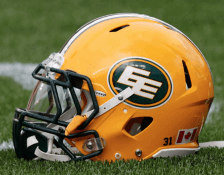
The next domino to fall: TSN — basically Canada’s version of ESPN — is reporting that the CFL’s Edmonton Eskimos, who’ve been under pressure to change their team name, will announce a name change shortly.
This move comes mere days after the team dug in and insisted that the name evokes “toughness, hardiness and the ability to perform in cold weather,” and that the team’s “record of winning Grey Cups in part comes from this toughness” — a statement of such Onion-like self-parodic absurdity that it was probably the final nail in the team name’s coffin.
Meanwhile, back here in the States, where a Tuskegee Airmen nonprofit group and the Navajo Nation have both expressed interest in working with the ’Skins on their new name, maybe they might want to think twice about that. It’s hard to imagine why anyone with an ounce of self-respect would want to be “honored” by this clearly toxic organization.
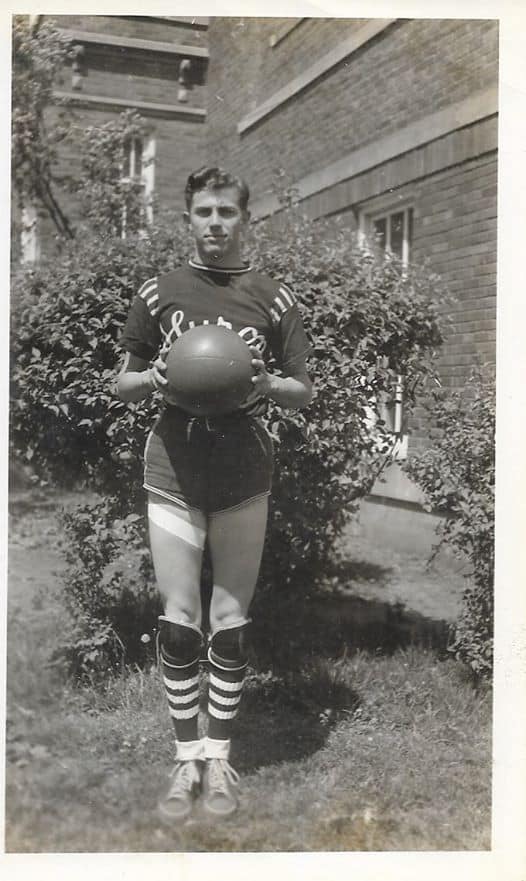
Too good for the Ticker: Reader Dale Allison sent along this 1942 shot of a player from the Huron (Iowa) High School basketball team. It’s killing me that the ball is blocking our view of the jersey chest, but you can still tell it’s a doozy of a uniform.
Basketball uniform styles have changed just a bit in eight decades, eh?
Click to enlarge
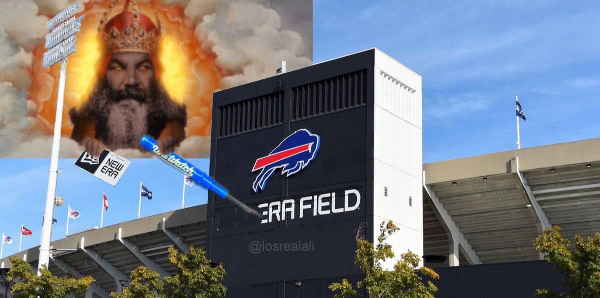
I still call it the Ralph: As noted in yesterday’s Ticker, New Era is ending its naming rights deal for the Bills’ stadium. As the news circulated, several observers joked that they’d need a giant Uni Watch seam ripper to remove the New Era name from the building, and Twitter-er @losrealali decided to create a rendering showing just that! Nice use of the blue ripper — very Bills-appropriate.
(If you want a normal-sized Uni Watch seam ripper, you can get one here. All colors are currently in stock, although I’m running low on green and blue.)

For all pics in this section, click to enlarge
All dressed up with no place to go: I scored this vintage softball jersey on eBay the other day. I love so many things about it — the colors (duh), the script, the texture of the sewn-on insignia, the excellent collar and sleeve trim, the way the star is balancing on one point instead of the more conventional orientation of sitting on the two base points — it’s all so good! I suppose it might’ve been nice to have an odd number instead of an even number, but that’s a minor quibble.
Here’s a closer look at the chest script and some other details:


And here’s the kicker: This gorgeous garment was only 15 bucks — wotta steal!
Now if I could just go out somewhere to show it off….

Click to enlarge
Cycling jersey reminder: In case you missed it on Thursday, Adelph Wear’s Nathan Haas and I have come up with a line of new Tour de France-inspired Uni Watch cycling jerseys: yellow (for the overall leader), green (Points Classification leader), and polka dot (King of the Mountains).
Each jersey can be customized with your choice of number (there’s a bib-style panel on the back for that) and/or NOB — or you can skip those elements and leave the back blank. Up to you!
We’re taking pre-orders from now through July 24, which should allow us to get the finished jerseys to you by Aug. 29 — the first day of the Tour de France.
Full details, including rear views, a sizing chart, and more, here.

Membership update: Every now and then, someone asks for a card based on the number on the side of a NASCAR car. I’m not a NASCAR guy myself, but those card requests almost always turn out looking really good. That’s the case with Scott Thomas’s new card, which is based on this Kyle Petty car.
Scott’s card is part of a new batch that’s been added to the membership card gallery. And with that, I’m happy to report that we are now essentially caught up! Two months after the deluge of Purp Walk orders, every single card order but one (we’ll get to it soon, Drew) has now been designed and added to the gallery. For a few dozen of you who haven’t yet received your card, it either mailed out yesterday or will mail out early next week.
Ordering a membership card is a good way to support Uni Watch (which, frankly, could use your support these days). And remember, as a gesture of comm-uni-ty solidarity, the price of a membership has been reduced from $25 to $20 until further notice.
As always, you can sign up for your own custom-designed card here, you can see all the cards we’ve designed so far here (now more than 2,900 of them!), and you can see how we produce the cards here.
The @UniWatch Pin Club just went next level. If this isn’t the coolest pin I’ve ever seen I can’t recall what would top it. #GetsIt pic.twitter.com/0Zt3NimlP3
— Brett Baker (@BrettSBaker) July 16, 2020
Bobble-pin reminder: People are loving their Uni Watch Pin Club bobble-pins. I’m happy to report that we’ve now sold through about two-thirds of them, but that means we sill have more than 150 to go. You can get yours here while supplies last.
Speaking of the Pin Club, reader Kevin Seekely has collected all seven designs so far (click to enlarge):
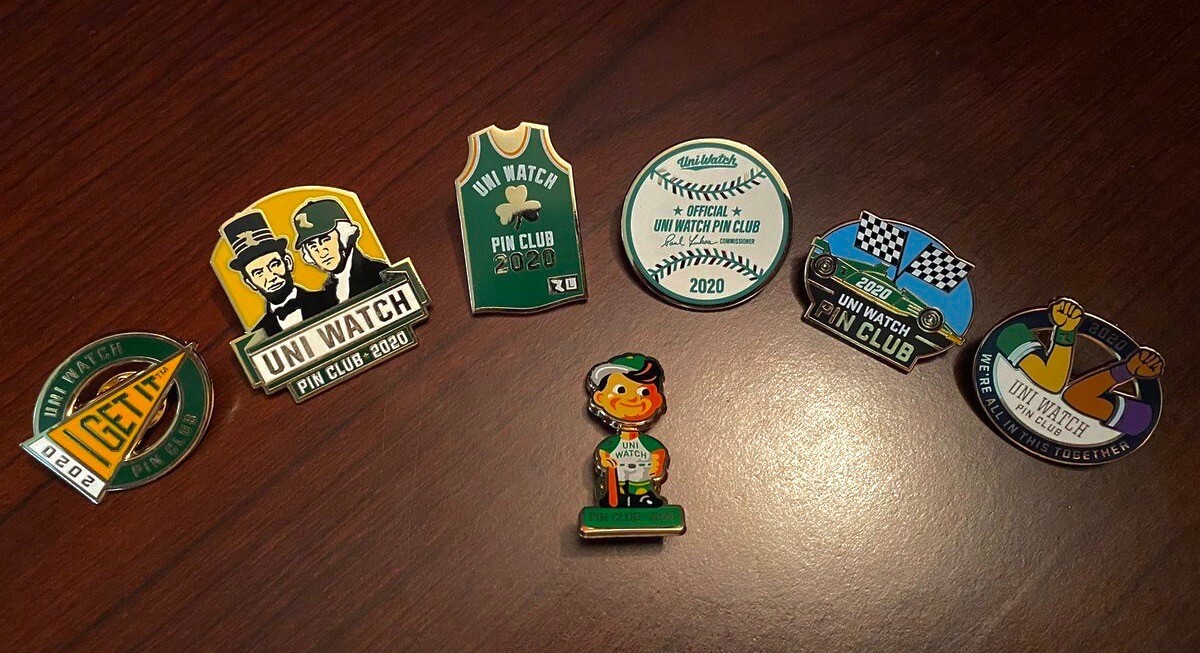
There’s something very pleasing about seeing all the designs laid out like that. Thanks for your support, Kevin!
The Ticker
By Anthony Emerson

Baseball News: MLB parks will use crowd noise from the MLB: The Show video game series, in-stadium. In European soccer, broadcasts have been adding crowd noise on the broadcast end, and offering viewers the ability to watch matches without it (from Geoff Poole). … Phillies SS Didi Gregorius says he will wear a mask during games due to a kidney issue (from Mike Chamernik and @PhillyPartTwo). … Most Dodgers players were still wearing the All-Star Game patch during the team’s intrasquad game, but not P Alex Wood. Paul says he’s been told that the patch will not be worn when the season starts (from Matthew Wolfram). … Mets fan cutouts are being added to the team’s ballpark (from Alan Kreit). … The West Coast League’s new team, the Nanaimo NightOwls, will play as the Nanaimo Bars during day games, effectively giving the team two identities (from Wade Heidt and Dwayne Stern). … FiveThirtyEight’s latest is about how Major League ballparks are shifting away from the retro-inspired design that was prevalent after Camden Yards opened and shifting toward more modern designs (from Andrew Cosentino). … Check out these sweaters Kentucky’s baseball team had, c. 1930.

NFL News: Here’s a New York Times article about fans who’ve collected Washington NFL merch for their entire lives (from Tom Turner). … Packers OT David Bakhtiari assisted a fan’s marriage proposal by writing the proposal on a jersey he autographed (from @mikeobs).
College/High School Football News: New black-on-black helmet logos for Louisville (from @ACC_Tracker). … Pitt State’s new turf will include an on-field advertisement (from Ryan Atkinson). … A deaf senior at Bracken County High in Kentucky will finally be able to play football due to a custom helmet that can fit over his cochlear implants (from Timmy Donahue).

Hoops News: The WNBA’s Washington Mystics will join the Washington Wizards in wearing a memorial band for Wes Unseld (from @RealRosebud and @Starkman55). … ESPN has a list of unique items NBA players brought to the bubble in Orlando (from Nicklaus Wallmeyer).

Soccer News: Deutsche Welle has a great (English-language) video on the history of the football jersey, and how changes to jersey design reflected the broader cultural times (from Jonathan Epstein). … Sheffield United keeper Dean Henderson wore a baseball cap on the pitch to keep the setting sun out of his eyes during yesterday’s game against Leicester. That’s two matches in a row that he’s done this (from Colin Dillworth and Josh Hinton). … Manchester City’s home kit was officially unveiled yesterday. Hate to admit it, but I actually really like it (from Josh Hinton). … Also from Josh, Paris Saint-Germain’s away kit has leaked. I swear they make the ad bigger every year. … Fox Sports 1’s digital on-field adverts glitched and leaked onto the field of play. Maybe it’s a sign to not do this, Fox (from Jeff Legaspi).

Grab Bag: The city hall of Connersville, Ind., has a mural that depicts the progression of the local high school’s band uniforms. Connersville High has the oldest high school band in the US (from Andy Moeschberger). … North Carolina civil rights advocacy group the Union Soldier Campaign is calling on UNC to drop its “Tar Heel” nickname, alleging a connection with Confederate troops (from Kary Klismet). … ESPN’s Twitter account posted more of those NBA/NFL uni mashups (from Shaun Rhodebeck).

Click to enlarge
What Paul did last night: Last summer, right around this time, we were hit with an infestation of beetles. We tried traps, an exterminator, training Uni Watch girl mascot President Caitlin to kill them, the works, but they persisted for months until finally dying out in the winter.
The good news is that the beetles haven’t returned this summer. The bad news is that we got hit yesterday by a sudden invasion of big, black ants — gross. The only good part about this is that I know from experience how to kill those.
Anyway: The mosquitos and other bugs on the porch didn’t seem so bad yesterday evening, because at least they weren’t inside our house.
As always, you can see the full set of daily Pandemic Porch Cocktails™ photos here.
The Nanaimo Night Owls will be playing as the Bars, not the Bears.
It’s a nod to these delicious treats – link
Not to be confused with the Hershey Bears, who changed their name from the Bars when some newspapers were unwilling to run a name that was an ad.
Fixed.
Sounds good… except for the coconut.
For the intersquad games the White Sox played last week and the beginning of this week it was mostly one team in normal Spring uniforms and one team in an assortment of different black White Sox t-shirts… You can see a bit of it in this video: link
The games on tv the last few days have had more traditional uniforms, both sides with black Spring Training tops but home and road pants…
The Yankees player wearing the “Sockman” shirt appears to be Mike Ford, not Mike Tauchman.
The item about the White Sox dugout extensions and the Iowa high school basketball player got 2 mentions – 1 each in the ticker and their own separate space.
Yes, I mistakenly published the pre-edited version of the Ticker. Proper version now swapped in.
As much as I like the idea of honoring the Tuskegee Airmen, I can’t get enthused about the name “Red Tails” (or “Redtails”) for the Washington football team. Given that most people are morons who don’t know much about much, and as such won’t get the historical reference, I think that that name (and please, please forgive me for this) would become the link of too many jokes.
I’m much more enthusiastic about “Warthogs” which, although it might make people think of link (or link), should be based on and make visual reference to link.
Hakuna matata my friend.
Good intentions pave the way to hell, and it doesn’t take much imagination to anticipate Washington getting scorched in a divisional game, leading to a headline like “Cowboys Make Redtails Redder in Blowout loss”. Hard pass.
I’m waiting for them to be renamed the Washington Monuments, just to the headlines after a loss can be “Monuments Toppled!”
The more I hear it, the more I’m warming to “Warthogs”. It’s original, mascot-friendly, applicable to more than one usage (mammal or airplane), and references a popular fan tradition. Not all that crazy about alliterative names, but I’m seeing a lot of upsides.
And this could be the new fight song!
link
But if they come back from behind and win the game, it will be a “Monumental Ending”
Seinfeld had his favorite shirt, “Golden Boy”. Paul, seeing today’s shirt, along with your recent posts of all your green plaid shirts, got me thinking which one is your “Golden Boy”? Maybe you need a countdown each day of your top 10 shirts.
Is the #8 on the front of your new jersey upside down?
Nope. It’s a truly symmetrical 8 — you can turn it upside-down and/or backwards and it would look the same.
I came here to ask the same thing!
The Nats did play in red shirts vs white shirts the day before, so I dunno. Someone must have wanted to have a little fun.
What’s your trick for those ants, Paul? I’ve got some here as well.
A bowl of sugar water is a good start. And traps, of course.
Tried Zevo? It works and it is safe around pets.
I absolutely love white over gray in that Nats photo. Contrast is awesome. I’m sure I’m in the minority, but I find mono in baseball just as annoying as it is in football. Soccer too. Mono only works in basketball for me.
Padres ~ “ with both teams wearing the grey road pants!”
That’d be brown or tan or khaki road pants now
Right you are. Will fix.
I heard this old Primus song last night & thought of you Paul.
link
Not sure if anyone mentioned this yet but with the speculation on the potential monikers for the renamed Washington NFL squad, the Washington Warthogs played in the summer Continental Indoor Soccer League (CISL) from 1994-1998, I believe. They played at the old Capital Centre in Landover, MD. I worked for the team one of those summers (97, I think) and spent one game as the team’s “timeout coordinator,” standing in one of the penalty boxes with a headset to let the refs know when the TV broadcast was going to or returning from commercial so they could coordinate the on field action. Didn’t pay anything but I got a couple team jerseys out of the deal. Their logo was an over the top, cartoon warthog bursting through jungle brush, a real ‘90’s design. I imagine the new Washington NFL logo will be much more understated whether it’s the animal or the plane. Or maybe a warthog pilot flying a Warthog!
My thought on the nationals is that it’s been in the mid to upper 90s in the DC area and the white jerseys are probably a little cooler than the grays. Additionally, due to the games being practices we probably won’t see any face first slides getting the shirts as dirty as the pants.
Brewers aren’t using their new yellow-front cap with their new blue road alts.
Maybe just so everyone on the field has the same cap, but it’s interesting after unveiling the one uni-combo with a different cap last fall.
link
Great to see how that FiveThirtyEight piece on the new Rangers’ stadium debunks the myth that the post-Camden retro parks are more intimate:
In order to eliminate obstructed seating and add layers of revenue-generating suites and club levels, many seats in modern stadiums have been pushed further up and away from the playing surface. According to a collection of stadium profiles at Clem’s Baseball, most fans were never more than 60 feet above the playing surface at the old Tiger Stadium in Detroit. That elevation was similar to other “jewel box” parks of the early 20th century. But at Comerica Park, Detroit’s retro park, the first row of the upper deck is more than 60 feet above the playing surface. The top rows of the upper decks at Progressive Field, the new Yankee Stadium, Minute Maid Park and Globe Life Park are all higher than 120 feet. Retro parks also pushed fans away from the action. That can be measured by “shade” percentage, or the amount of second deck overhang above the first level of grandstand. For example, 55 percent of Wrigley Field’s lower deck is covered by overhang — the greatest mark in baseball, according to Clem’s database. That means the upper tiers of Wrigley are closer to the playing surface than those of parks that opened from 1992 to 2017, which have an average lower-deck shade of 26 percent.
Great point! Time for more stacked second decks with pillars. I think Paul did a post about an Oakland proposals a few years ago that highlighted this phenomenon.
Enjoyed seeing the Blue Jays go NNOB in their intrasquad game (white jerseys vs. blue jerseys). The teams wearing white wore the white front panel hats which I like.
RE: The article about the new Texas baseball stadium:
“It also featured another MLB first: The center section of the roof is translucent, allowing natural light to filter in.”
Wasn’t the Astrodome the MLB first translucent roof?
Indeed! And then they painted it. And then the grass died. And then we got Astroturf!
Paul, good thing you spotted that Kwik Stop jersey before I did!!! The star totally makes it. Great, great jersey.
Number 8 is the luckiest number in Chinese culture, so there’s that.
It seems like almost a done deal for the Edmonton Eskimos to be changing their name to the Edmonton Empire. They trademarked that name back in 2018. Earlier this year when they were looking for game day employees (obviously not needed now…) they urged applicants to “Come join the Empire.” And it allows them to keep their double E logo in place.
And we need to do what we can to raise our voices and try and stop that. They need to go with Edmonton Elks. I know they want a name to start with E, but Empire is not good. They have done the trademark but they need to step back and put some thought into this before deciding to accept Empire as the team name.
Empire is (a) a stupid team name to begin with and (b) exactly the wrong name for this moment. It’s like going with Imperialists or Colonizers.
Thumbs up for Elks!
Meets with my approval: It steps on no other team’s intellectual property, has a great graphic element (antlers), and lacks the lazy, unhappy quality of obvious compromises like “Redhawks”. I’d buy the shirt!
Growing up, id always assumed that Rich Stadium was named after a person, not a company.
Same here. I didn’t realize it was a corporate name until I started working on the Naming Wrongs project!
Put me in for the Edmonton Elks choice.
Empire would be a down ending ;)
link
Paul, I’m not sure whether this has been mentioned, but in the Brewers’ intrasquad games, one team is wearing the new home “Creams” and the other the blue “Milwaukee” alternate that look like boyscout uniforms. However, the Blue team is not wearing the yellow and blue cap, but rather the all-navy cap (so the uniform looks a lot less like a boyscout’s uniform.”
What’s the matter on the even number on your jersey?
Do you have a personal preference for odd numbers?
What’s the matter with the even number on your jersey?
Do you have a personal preference for odd numbers?
Heh. ‘Intrasquoddities.’
Nice coinage.
On top of everything else, Uni-Watch yields more than its share of portmanteaus!
The Kwik Stop jersey is fabulous. So now I’ve got two must-stops on my morning surf around the interwebs. Uni Watch and then ebay. Lastly – please not Empire. Elks would be great.
I’m guessing the description of their road pants comes from the Padres themselves, but if someone served me an espresso that colour I would send it back.
I guess, it could refer to the crema…
An excellent post, thank you!