Good morning! Greetings from Uni Watch HQ, where all three inhabitants continue to be healthy and safe. I hope things are also going well in your household.
Now then: One of the many things put on hold by the pandemic was the unveiling of the Nationals’ championship rings. They finally went ahead and revealed the design over the weekend. The “storytelling” elements, which are spelled out in the video shown above, scale new heights in ridiculousness, and the explanations for some of them seem reverse-engineered (“Hey, we got 55 rubies in there, so come up with some combination of stats that adds up to 55!”), but whatever — it’s a handsome design, and I’m sure the players and fans are happy with it.
Just one thing: The ring contains a grammatical error.
Yes, really. It’s on the shank, which is stamped with one of Nats skipper Dave Martinez’s motivational mantras:
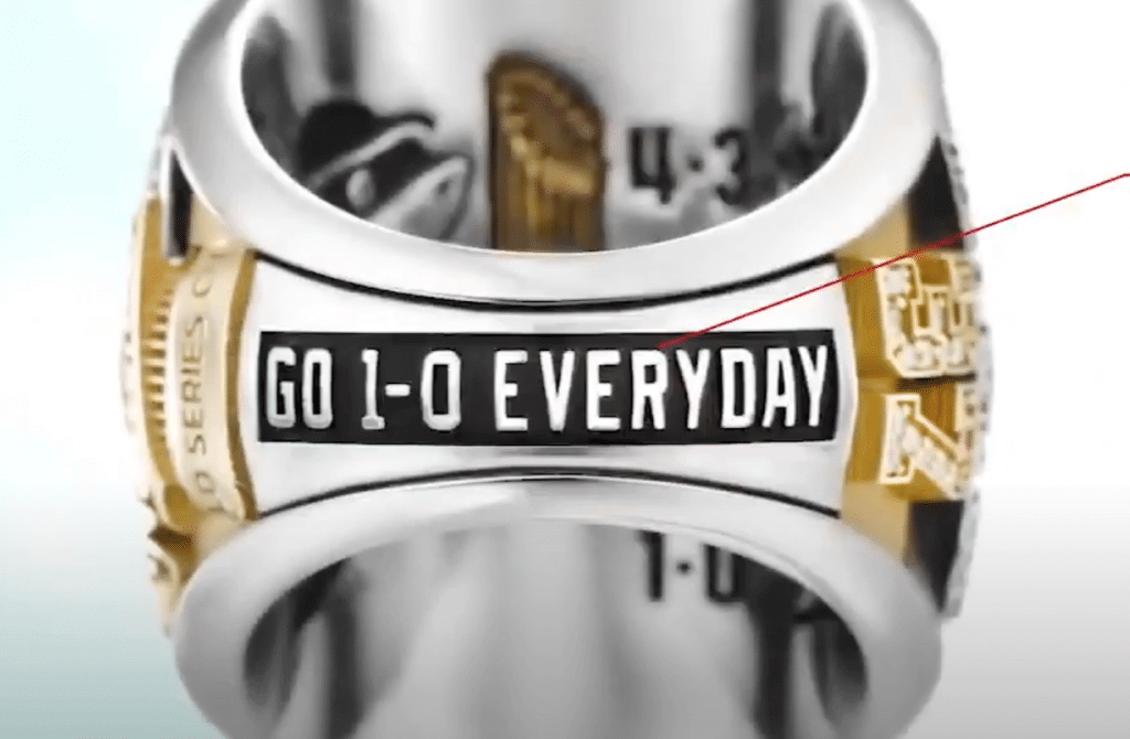
As you can see, it says “Go 1-0 everyday.” But that’s wrong — it should be “Go 1-0 every day.”
Everyday, when styled as a single word, is an adjective, as in “These are my everyday pants,” or “Sean Doolittle is the Nats’ everyday closer.” But as phrased in Martinez’s mantra, it’s a determiner followed by a noun — every day.
If you’re not quite grasping the distinction, imagine if the mantra was actually “Go 1-0 every single day” or “Go 1-0 each day.” That makes it easier to see why “every day” should be two words, not one, right? (If you’re still not convinced, just Google “go 1-0 every day” — that’s clearly how it’s been phrased and referred to all along.)
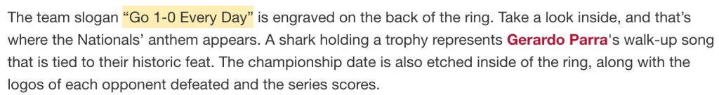
Interestingly, the article about the ring unveiling on the Nats’ own website referred to “Every Day” as two words, even though the ring clearly has it as one word:
Other media outlets were a hodgepodge. ESPN, The Washington Post, and CNN all had it as two words (but didn’t call out the ring’s use of one word), while CBS Sports and NBCWashington.com had it as one word.
Perhaps you’re squinting at that ring image I posted and trying to convince yourself that there might actually be a space in between EVERY and DAY. Nope — here’s another view, straight from MLB’s Twitter feed:
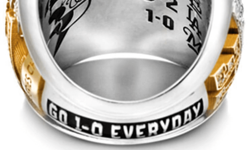
There’s no getting around it: The ring has it as one word, and it should be two.
Obviously, typos and such happen (I make lots of them myself). But between the Nats’ front office and the ring manufacturer, dozens of people presumably signed off on this design. That’s a whole lot of people who apparently don’t understand the difference between everyday and every day. Do we attribute this to the inevitable and understandable downtick in quality control during the pandemic? The increasing rise in American illiteracy? Something else?
I emailed the Nats yesterday to ask about all of this. No response yet (completely understandable considering the holiday and the pandemic), but I’ll post an update if I hear back from them.
(My thanks to Jeremy Lupo, who was the first of several readers to bring the grammatical error to my attention.)
Click to enlarge
Uni Watch now of legal drinking age: May 17 was the 14th anniversary of the first post on this website. But today is an even more important date on the Uni Watch calendar: It was 21 years ago today — May 26, 1999 — that the very first Uni Watch column was published in The Village Voice. It was basically the first edition of what we now think of as my annual MLB season preview column, even though we were already nearly two months into that season:

It’s become mildly irksome to have the two uni-versaries — the one for the blog and the one for the first column — just nine days apart. It would have been smarter for me to launch the blog on May 26 so the two dates would align, but that didn’t occur to me at the time, and I certainly never dreamed that Uni Watch would still be going, in any capacity, so many years later.
In any case: Twenty-one — Uni Watch is now old enough to drink, gamble, and adopt a child! Who’da thunk? On the one hand, it’s completely remarkable that a media project could keep going this long. On the other hand, as I wrote last year on the occasion of Uni Watch’s 20th anniversary, you could say my whole life was leading up to Uni Watch, so maybe it’s not so surprising.
In any case, as I like to say each year on this date, the uni-versary is not just mine but also yours — the whole comm-uni-ty made this happen. So here’s to all of us on the occasion of Uni Watch turning 21, and my thanks to each of you for your role, large or small, in making that happen.
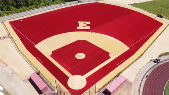
Seeing red: Ever seen a red baseball field before? I don’t think I have until now. That’s the new field for Edison High School in New Jersey. Additional info here.
(My thanks to reader Timmy Donahue for this one.)
Click to enlarge
Collector’s Corner
By Brinke Guthrie
Follow @brinkeguthrie
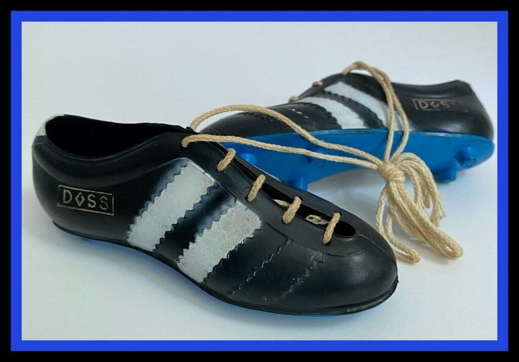
Hope you had a restful Memorial Day yesterday! Now here is an interesting little item. The seller calls these “Doss miniature soccer shoes from Spain,” and the year given is 1973. These look like they could go on a key ring, right? Well, I have one of these from around the same period, but these are for Adidas and came straight from Germany. They’re now hanging from the hand of my Tony Bennett/San Francisco Giants bobblehead — a fitting showcase.
Pretty darn similar, wouldn’t you agree? Note the Doss version has two white stripes and one that isn’t colored in. Funny seeing a different version after all these years! (I also found real Doss soccer shoes. Just two stripes on those!)
Now for the rest of this week’s picks:
• Really great artwork on this 1970s NFL towel. I wanna say Ron Johnson is No. 30 and Bob Tucker is No. 38, and the runner on the right with No. 43 looks to be Don Perkins because of the socks (Cowboys), but he only played through 1968.
• Nice cover art on this 1971 record album documenting the Pittsburgh Pirates’ World Series title. Sponsored by All-Star Dairies and narration from Bob Prince.
• Check out the old-school graphics on this 1945 football game titled, aptly,
“The Footballer.”
• We’re going back to 1939/1940 for “Babe Ruth’s Baseball Game.” The seller tells us, “Both the box and the game are in fantastic shape … And, as I was setting it up to take pictures after all of these years, I had the batter take a few swings again and it still works great and it’s a fun game to play, both functionally and visually!” Made by Toy Town.
• Going back nearly a century for this one: a 1933 Goudey Big League Chewing Gum wrapper. If you sent in 50 wrappers (!), you could get a picture of Babe Ruth or of one of the MLB All-Star teams! Offer expired on Nov. 1, 1933, alas.
• This promo item goes back even further! Some 98 years ago, Myrl Brown of the Pittsburgh Pirates got his face on a button for Kolb’s Mother’s Bread. A check on his record shows that Mr. Brown was only in the bigs for a month, going 3-1 with a 5.97 ERA in his only stint with the Bucs. But he still got a pin!
• After 10-plus years, I can’t always remember all the things that have previously shown up in this column. But I promise this is the first New York Giants Miller Lite Beer Tap Handle I’ve ever listed (or for any team, for that matter).
• Got a couple of soft drink items from back in the day here. First, a pair of advertisement cards for Mickey Mantle (Yoo-Hoo) and Ted Williams (Moxie). Ted also plugged a drink simply called “Ted’s Creamy Root Beer,” as shown on this tin sign.
• Here’s another soft drink item that’s a bit more contemporary: Shaquille O’ Neal had plenty of endorsements, one being for Pepsi. So give a bonus to the copywriter who came up with the term Shaq Attaq Paq for this six pack of Pepsi, still in the carton from 1992-1993.
• Your 1971 Philadelphia Phillies are presented on this ruler. The seller says it was given out to the first 5,000 fans attending an early season “family night” promotion.
Click to enlarge

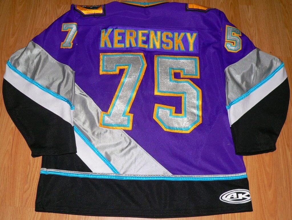
Membership update: Reader Will Scheibler had an interesting Purple Amnesty Day membership request. It’s based on a Hamilton Steelheads jersey that was worn on an episode of the Canadian TV show Power Play. He wrote about the jersey on his own blog several years ago.
Will’s card is one of many disturbingly purple designs that were added to the membership card gallery over the weekend, as card designer Scott M.X. Turner and I continue to work our way through the 100-plus Purp Walk orders we received (thank you!).
Ordering a membership card is a good way to support Uni Watch (which, frankly, could use your support these days). And remember, as a gesture of comm-uni-ty solidarity, the price of a membership has been reduced from $25 to $20 until further notice.
As always, you can sign up for your own custom-designed card here, you can see all the cards we’ve designed so far here (now more than 2,700 of them!), and you can see how we produce the cards here.

ITEM! Yet another membership raffle: Longtime reader/pal Anthony Verna recently purchased four memberships for me to raffle off (and paid for them via e-check — a first for me!), so that’s what we’re going to do today.
This will be a one-day raffle. To enter, send an email to the raffle address by 8pm Eastern tonight. One entry per person. I’ll announce the winners tomorrow.
Speaking of raffles, the five winners of last weekend’s raffles are Seth Hilgert, Sean Kauffman, Ryan Houdayer, David Dahl, and the pseudonymous Block “O Canada.” Congrats to them, and big thanks to Stan Sulkowski for sponsoring that one.
Uni Watch Hit Parade: While listening to Suzy Hotrod’s show on WFMU on Sunday, I heard a new song called “Daily Jobs” that blew me away. It’s by an Italian band I’d never heard of before, Bee Bee Sea. Turns out it has a really fun animated video, too. Enjoy!

Click to enlarge

What Paul did last night: When I started this daily photo series, I figured it would show the long-term progression of leaves coming in on the trees, the shrubs getting shrubbier, and so on. It didn’t occur to me that we could get the same effect from a single plant in less that two weeks’ time.
And yet: The house directly across the street from us has a rose bush in the front yard, and our new porch activity is to track the progress of its flowers. A check back at my daily porch photos shows that the bush was completely green on May 14 — that’s 12 days ago:

The following day, May 15, a red flower appeared on the left side of the bush (sorry, some of these photos aren’t so great — most of them are just crops of my daily porch pics, so I wasn’t focusing on the rose bush):

I think we started noticing the roses a few days after that. Here’s the daily progression from May 16 through yesterday:


Man, nature is so fucking cool!
The branch is still there.
As always, you can see the full set of Pandemic Porch Cocktails™ photos (now up to 70 of them!) here.
Sorry, no Ticker today because the entire Uni Watch team had yesterday off. The Ticker will return tomorrow. — Paul
That particular grammatical error is one of the most nails-on-chalkboard for me. It’s mostly because when people misuse lose/loose or their/they’re/there it usually feels like they just can’t be bothered to get it right, but people seem to earnestly use “everyday” when they should use “every day,” fully confident that it’s grammatically correct.
Lose/loose drives me nuts because it’s two common words that people never confuse while speaking, but writing? Jeez….
I see ‘lose’ written as’loose’ and think ‘moron’ and stop reading.
Another one is lightning/lightening.
And when people tack on an “e” when trying to spell “heroin.” I would always ask such offenders “did the poor man overdose on Jane Eyre?”
As a bike geek, I often see people write “breaks” when they mean “brakes” drives me nuts, as do the other common misspellings above.
Also in the realm of bike parts, those who use “peddle” instead of “pedal”.
Where shall I start? “Baited breath”, “Wets one’s appetite”, “Chomping at the bit”, “Bares a resemblance”, “Stationary store”. The only good Nazi is a Grammar Nazi.
Should “of”, would “of”, could “of“. ACK!
Not sure why I have an apostrophe catastrophe on the third “of” above. ACK!
One more; a lot of people write “no one” as one word.
…and when they do I want to hear Herman’s Hermits for some reason!
I love my Nats but, this is the team that ran out jerseys that said ‘Natinals’
Obviously they gave the wrong person free reign.
Cheers, Uni Watch!
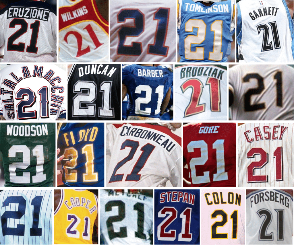
Boos…for not including the Wood Bro’s. #21 in the collage!
Irregardless, happy anniversary!
; )
Re: your uni-versaries; you could always go the merged holidays route and pick a date between them, like the bouillabaisse that is now Presidents’ Day.
(I know, I know; it’s technically still Washington’s Birthday and we all just unofficially renamed it to give Abe some props, but in my lazy reasoning, “yeah, but still, though”).
“Universary (observed)” is a holiday I can get behind.
“The increasing rise in American illiteracy?” Irregardless, it seems Americans could care less about proper use of the English language.
But, those shots of the bush blooming each day are very satisfying.
I see what you did there, Greg.
It’s funny, I still remember where I learned irregardless was incorrect, it was in a reader’s digest I got in junior high that had some common language errors. I’m 40 now, so that stuff has stuck with me for nearly 30 years
I know it’s on the inside of the ring, completely out of view, but it strikes me as odd to have the playoff opponent logos on the ring.
That’s been pretty standard for several years’ worth of WS rings now.
In this era of various dull, metallic car colors, nice to see a bright red car make an appearance in the daily porch photo.
My owns a silver car. I own a blue car. My wife is insanely jealous of that.
Oof—can’t wait for on-the-field sports to come back if the lead story is about a grammatical error on the shank of last year’s WS ring. Can’t say I’m surprised, this coming from the Natinals, of course.
Evan, this story is right in Uni Watch’s wheelhouse and would have been the lead item today even if sports were in full swing.
Wasn’t Babe Ruth a lefty?
Yes he was
I considered the same thing at first, but concluded it was a Babe Ruth sponsored game, but not all the figurines had to represent Babe.
Do we know if the rings have been produced yet, or just designed? I imagine if they are just designed there is still time to correct. But if they were intended to originally been handed out in early April, they might be well down that path. Was just curious.
“Reverse engineering” was my exact thought as I read all the bullshit calculations for how many jewels were in each section of the Nat’s rings. Why can’t they just say, “I dunno, it took that many to make a circle. No more, no less.” Baby Shark on the inside is pretty sweet, though.
Speaking of grammatical errors, your comment says “Nat’s rings” – should’ve used the plural “Nats’ rings” for the possessive apostrophe.
You didn’t like how there’s a diamond for the “duality of the franchise”?
I can’t wait to root against the Nats’ duality.
Ugh. Watching a game at that red baseball field would be so distracting to me. I can’t stand oddly-colored sports fields. (Looking at you too, Boise State!)
At the very least the smurf turf isn’t visual overload. Our eyes are sort of conditioned to see shades of green, blue, gray, and and brown in large amounts in the natural landscapes around us. It is different in the realm of sports but not to what our eyes see throughout the world. But that bright shade of red sticks out like a sore thumb. I think there are a few football teams that have gone with red turf too, yikes.
The color blind would say, big whoop.
At least a team in a green uniform now gets to stand out.
The “E” is for Eyesore.
Happy legal birthday!
Similar ones that really bother me are when people write “high school” and/or “best friend” as one word.
I was really happy to see Frank Gore’s number 21 jersey in the anniversary picture. He’s such an underrated all-time great and I don’t know why he never gets talked about like that though. Congrats on 21 years of excellent work!
Happy Uni-versary, Paul and all UW contributors! Thanks for providing a fun read every morning for so many years.
Just wanted to say thank you to Stan Sulkowski. I won one of the Uni Watch memberships you generously donated and I’m looking forward to picking the jersey/design for the card.
– Block “O Canada”
I cringe when I read ‘Superbowl’ in an article. Just like the other two words mentioned, how difficult is it to hit the space bar?
If there is a space is it bowl or Bowl?
It’s a proper noun, which makes “Super Bowl” correct.
As a guy with a case of color blindness (fairly mild), I would have never noticed the rose bush blooming. Even in your pictures it’s hard to make out the progression from green to having red rose blooms. But, I enjoy your porch pics and observations, keep ’em coming!
Now that Uni Watch is old enough to drink, maybe now would be a good time for some nice glassware! I would buy a pint glass or two in a heartbeat! Since I’m primarily a beer guy, a rocks glass or shot glass would be less attractive to me, but I would still probably buy either one if those were the only options.
Second that. A pint glass with the winged stirrup would instantly become my go to glass for my in-home bar.
An emphatic third
I’d buy any beer specific glass, though I’d prefer something other than a pint glass.
But still YES, I’d buy at least one, maybe more.
Lee
Happy Universary, Paul & Co.!
This weekend I saw one of those flashing roadside highway signs with the alternating messages, and an apostrophe catastrophe. Something about “Save Lives / Wear a Mask / I’ts the Law.” I really, really wanted a photo….
Link for 1970’s NFL Towel shows Phillies Ruler.
Guesses for how long until an advertiser’s logo appears on the inside of a championship ring?
I played pool on a red table once and it was so bright I found it uncomfortable. I wonder what playing baseball on a red field is like? And yes, at one point I found myself in the type of place that would have a red pool table.
And of course, congrats to Paul on the 21st, a great accomplishment!
The Nats’ ring video is like a Da Vinci Code for idiots. I wonder what the 1922 New York Giants’ communication and marketing team was thinking when they handed out the first series ring.
link
Happy birthday, Uni Watch! I’d grab a beer with you any time!
The link for the NFL towel in collector’s corner goes to a Phillies ruler
Thanks to both Paul & Scott for getting the Steelheads card design done.
As for that ring video:
What? No story on the symbolism of the white and yellow shredded paper the ring box is nested in at the start of the video?
I’m so disappointed.
Paul, I’m asking because I don’t know. Shouldn’t it be “ever-changing” (with a hyphen) in your column for the Village Voice?
Most style guides say that a compound adjective like that should not be hyphenated when, as in this case, it occurs after the verb.
My god that jersry that the membership card is based on is SO 90s
THANK YOU for writing about this! A parody rap about “Everyday” misuse you might enjoy:
link
The University of Northwestern Ohio also has a red(ish) baseball field–since at least 2016!
link