For all photos, click to enlarge
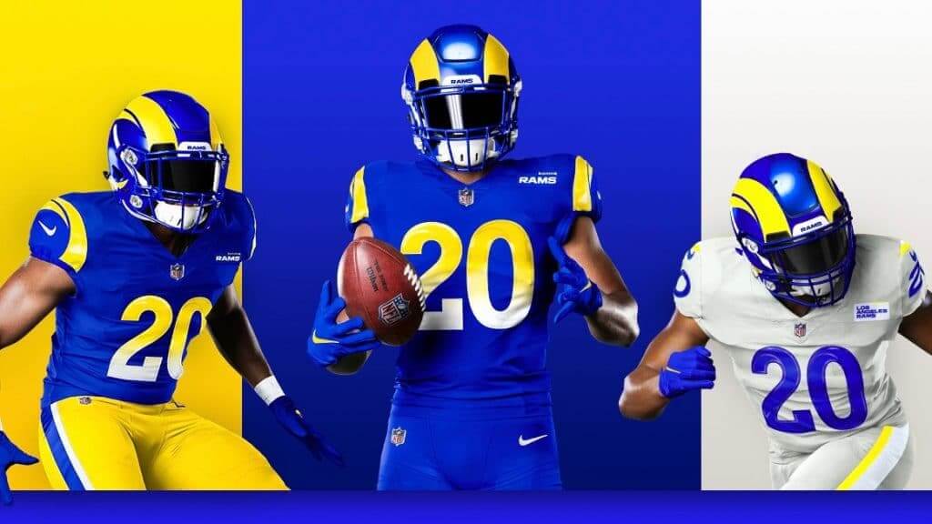
The Rams unveiled their new uniforms yesterday, confirming the leak that had begun circulating several hours earlier.
There’s a lot of ground to cover here, so let’s get to it. I’ll cover the most noteworthy elements, one at a time:
The Helmet
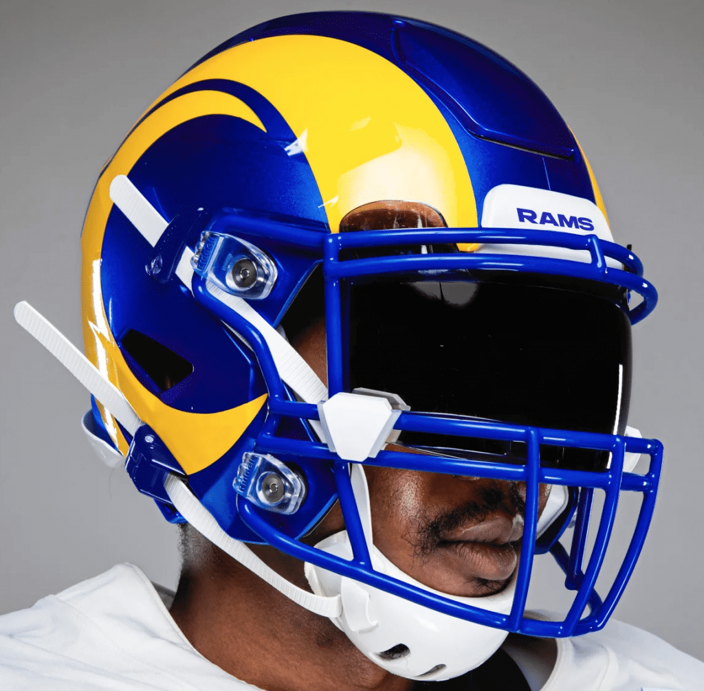
Is it basically okay? Yeah. But is it as good as the previous version? I’d say no. I like the shell color but I think the horn is a downgrade — not because of the segmentation (which I don’t love but can live with) but because it doesn’t have the curlicue at the end. Here’s a side-by-side comparison:
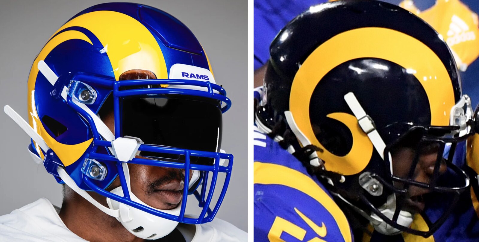
From a visual standpoint, I really miss the curlicue. But as you can see, one advantage of not having the curlicue is that the tip of the horn doesn’t get tangled up in the mask and/or chinstrap sockets. Depending on the helmet model, the Rams sometimes had to cut the tip of the horn into a separate piece. That won’t be a problem with the new horn design, so let’s give them some points for form following function.
Overall: It still looks like the Rams.
The Fabric Colors
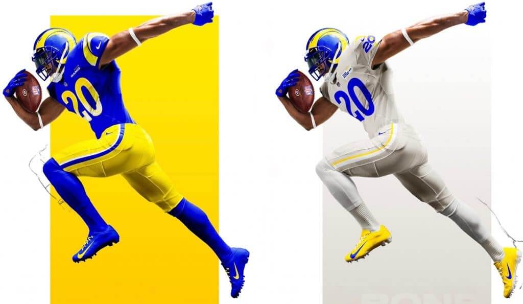
We already knew the shades of blue and yellow that the Rams would be using (those were revealed back in March). What we didn’t know was that their white uniform would actually be off-white. They’re calling this new color bone, and the “storytelling” rationale for it is that it’s supposedly the same color as a ram’s horn.
A few thoughts on that:
• Although a ram’s horn has bone at the core, the exterior — the part that we see, and the part whose color the Rams are supposedly matching — is not bone. It’s actually keratin, which is the same stuff human fingernails and toenails are made of. So this “bone” color name is not only silly, but the stated rationale for it is inaccurate.
• If they’re claiming that the color is based on a ram’s horn, why aren’t the horns on the helmet rendered in that color? Why isn’t the horn on the logo rendered in that color? Makes no sense.
• On the field, this color will have the same visual effect as the Seahawks’ grey alternates: It’ll look like unwashed laundry.
• What’s the over/under on how many “boner” jokes there will be when the Rams wear this color?
Obviously, we’re going to need a new name for this color going forward, because there’s no way I’m going to write “bone” over and over again. Since we’re talking about L.A., I was thinking maybe we should call it smog. But then I saw in yesterday’s comments that Uni Watch reader/commenter Justin Hicks was referring to it as “dishwater,” which sounds about right. Dishwater it is!
Now we get to the really weird stuff. Most NFL teams try to have fairly consistent design themes running through their uniform set, but this Rams set has a split personality, with certain elements appearing on the blue uniforms and others on the dishwater uniforms. That’s not necessarily a bad thing, but it’s definitely an uncommon thing. Let’s start with…
The Uniform Numbers
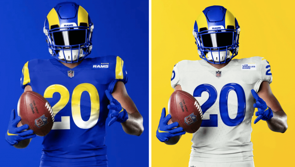
The numbers on the blue jerseys have a color-to-white gradation (more photos here); the numbers on the dishwater jerseys do not (more photos here). So odd to take such distinct approaches on the two jerseys — it’s like they couldn’t decide which one to choose, so they chose both. Again, there’s nothing necessarily wrong with that, but it’s definitely atypical for an NFL uniform design.
One thing both both number sets feature is a reflective treatment that you can see more clearly here:
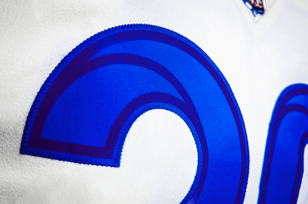
I asked the team for more information on this and was told that they used an application called Framis, which creates reflection and pop in the numbers (and also on the pant striping). I’d never heard of Framis before, so I googled it and found myself at the Framis website, which says, “Framis Italia is the market leader in polyurethane heat-bonding applications for the clothing industry.” You can get a better sense of what that entails here. Definitely new to me, and presumably an NFL uniform first. I asked the Rams if they had any photos or video showing how this reflective effect would look under the lights at a night game but was told that no visuals of that sort are yet available.
The Shoulders and Sleeves
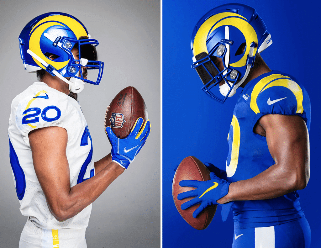
The dishwater jerseys have TV numbers and the blue ones don’t — bizarre! Again, it’s like they couldn’t decide which dessert to order, so they went ahead and ordered both.
Similarly, the blue jersey has a modified horn treatment on the shoulders (ironically, it looks more like St. Louis’s Gateway Arch than a horn, because it doesn’t do the full wraparound) while the dishwater jersey has a weird little sunburst stripe snaking its way through the number — here’s a closer look at that:
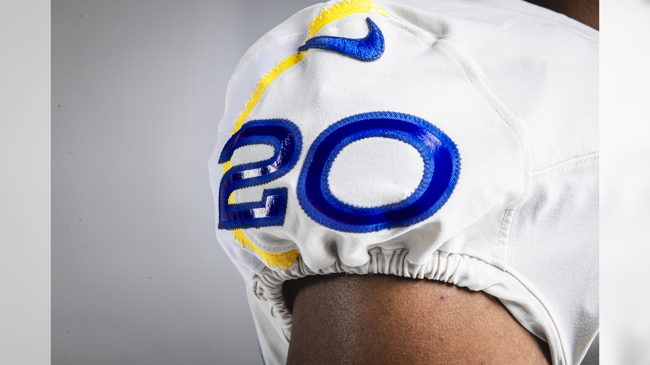
Meanwhile, the proportions of the TV numbers bear no resemblance to the front and back numbers. It all feels like something created in an web-based team-builder app.
The “Hello, My Name Is…” Patches
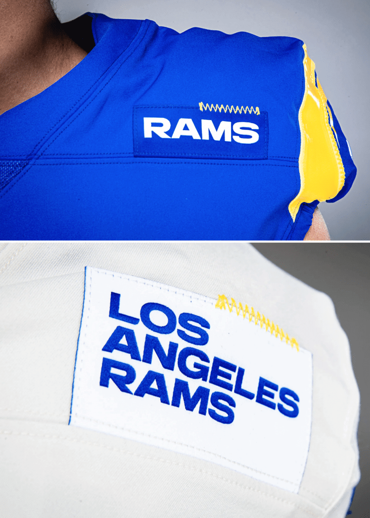
Again with the split personality. The blue jersey just has the team name while the dishwater jersey has the team and city names. Even stranger, the patch on the blue jersey is blue, so it matches the background color, but the patch on the dishwater jersey is white, so it sticks out like a sore thumb, as you can see more clearly here:
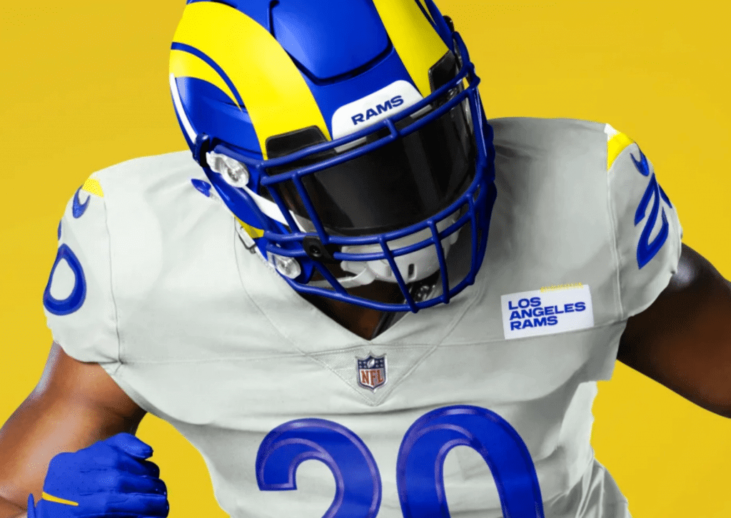
I asked the team about the yellow zigzag stitching along the top edge of both patches and was told the following: “This is a unique design feature that we are excited to introduce. This stitching above the patch is the same stitch used throughout our jerseys — it’s a feature we could potentially use across other merchandise going forward.” An article posted yesterday on The Athletic (paywalled) added this: “The zig-zagging ‘signature stitch’ was inspired by some fashion designers’ iconic ‘mark’ on the clothing they create.” Oooookay.
(As an aside: Lots and lots of people yesterday — including some in the Uni Watch comments section — responded to these patches by saying, “These are obviously placeholders for the inevitable addition of ad patches!” That is almost certainly not the case. I’ll have more to say about it in the next section of today’s post. For now, let’s keep looking at the Rams’ new uni set.)
The Back-Collar Logo
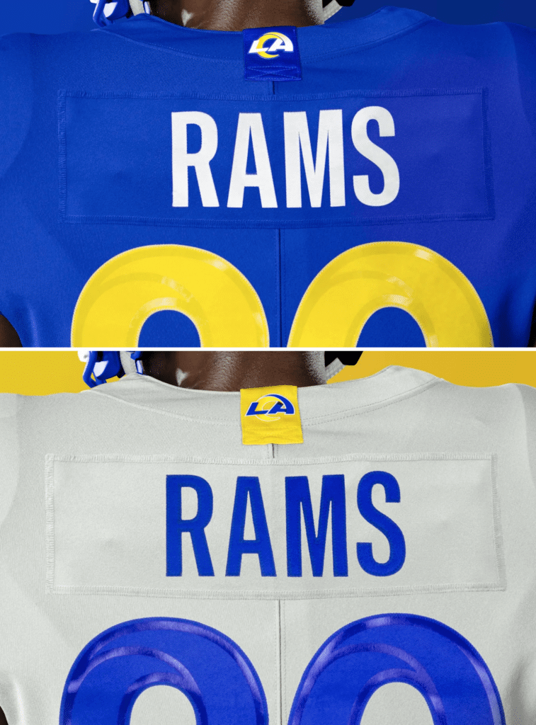
Same as with the chest nametags, the back-collar logo on the blue jersey matches the background fabric, while the one on the dishwater jersey does not — only this time it’s yellow, not white (so it looks a bit like the NBA’s gold championship tabs — ugh).
Either way, they both look very, very rough.
The Pants
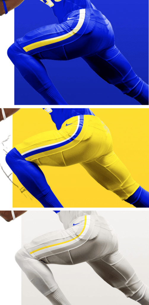
Okay, so the blue ones have a gradation, the other two don’t, the stripe widths feel inconsistent — whatever. The pants seem mainly like an afterthought here, which is probably for the best. Also, remember that the pant stripes are supposed to be reflective, so they’ll probably look different on the field than they do here.
Those are the major uniform elements. A few additional notes about this set:
• After all the talk about how they held up the release of these uniforms to coincide with opening of the new stadium, I’m surprised there isn’t an inaugural-season patch or decal.
• A team spokesperson tells me that the only uni combos in the mix for now are mono-blue, blue over yellow, and mono-dishwater, the latter of which can be paired with either matching socks or blue socks:
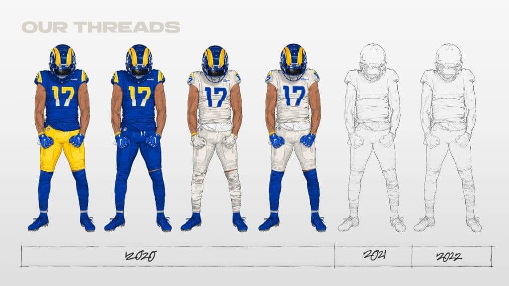
No plans for any other mixing and matching of the jerseys and pants. Also, as you can see in that graphic, they will apparently be adding a new uniform in 2021, and another in 2022.
• I’ve also been told that there is no designated home or road look, and that any of those basic combos could conceivably be worn at home.
———
I think that covers everything. So what do I think? As I’ve already said, I think the helmet is fine — not great, but fine. Everything else, though, is a mess. Gradient numbers should be reserved for the Pro Bowl, I don’t care at all for the dishwater color, the chest patches are embarrassing and the back patches aren’t much better. What a disappointment, especially for a team with such a proud uniform heritage.
Like so many failed uniform sets, this one feels like it’s trying too hard to be of the moment. And like most things that try to do that, it will quickly look dated and passé. The only question now, as many people pointed out yesterday, is whether a cancelled NFL season will count toward the league’s five-year uniform-change rule, since the Rams definitely won’t be wearing these much longer than that.
Finally, I leave you with this:
Los Angeles, this is …awkward. pic.twitter.com/uW8ASBve6W
— Pat Thorman (@Pat_Thorman) May 13, 2020

Now about those chest patches: Okay, now let’s talk about whether the Rams’ new chest patches are really just “placeholders” for upcoming ad patches, as so many people seemed to think yesterday. I want to nip that conspiracy theory in the bud before it spreads too far, because it really doesn’t hold up to even a modicum of scrutiny. Here’s why:
1. Plenty of NFL teams have put a team logo or wordmark in that same exact spot in recent years, including the Steelers (who’ve had it there since 1997), Seahawks (since 2012), Jaguars (since 2013), and Jets (1998-2018), plus that’s also the spot where the Chiefs wear their Lamar Hunt perma-memorial (since 2007). In all of those cases, the logo or wordmark or patch hasn’t been a “placeholder” for anything — it’s just been a team logo or wordmark or patch. Now the Rams have put a team wordmark in that same spot — big deal. There’s zero evidence to think it indicates anything more than what it is, which is a team wordmark.
2. Seven NFL teams have released new uniforms this spring, and this is the only one that has included a “placeholder” in that spot. If this were really a nefarious plan to foist uniform ads upon us, don’t you think at least some of those other six teams — or maybe all of them — would have used similar “placeholders”?
3. The whole “placeholder” notion doesn’t even make sense. What would be the point of it — to get people used to the idea of a logo being there? Yeah, that’d go over really well with a potential uniform advertiser: “Don’t worry, people won’t even notice your logo on the jersey because they’re already used to seeing ours.” Look, the reality is that there’s already a “placeholder” in that spot on most NFL jerseys — it’s called blank space. If you really want to put ads there, just leave it blank and it’ll be available when you’re ready to use it. Simple.
I think the reason so many people tried to connect the dots between the Rams’ patches and uniform ads is that these new Rams patches already look like uniform ads — and I agree, they do! But that’s not the same as them being part of some secret plot — they aren’t.
(As an aside to this aside, there’s also been a lot of chatter this week about how leagues can get themselves up and running again and make up for lost revenue by adopting uniform ad programs like the NBA’s. That too does not hold up well to scrutiny. I’ll have more to say about that tomorrow.)
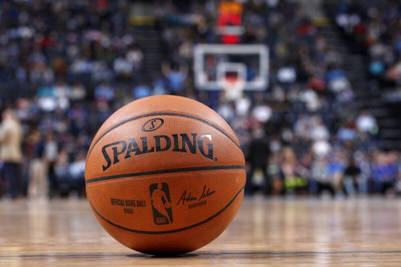
It’s a whole new ball(game): Yahoo Sports broke the news yesterday that Spalding will soon stop making the NBA’s official basketball. Beginning with the 2021-22 season, the contract will revert to Wilson (which had previously made the NBA ball for several decades before Spalding got the contract in 1983).
Two thoughts on this:
1. I don’t find it surprising that the NBA would move away from a legacy sporting goods company like Spalding, which has little to none of the lifestyle appeal that the NBA is all about these days. But I’m surprised that they’re going with Wilson — another legacy brand with no lifestyle profile to speak of. I would have expected Nike to take over. On the other hand, Wilson is the official ball of the NCAA tourney and is also, according to the Yahoo article, “used in most high school games around the country,” so maybe the move makes sense in that regard.
2. As longtime Uni Watch reader Dan Pfeifer points out, Spalding doesn’t just make the NBA’s game ball — they also make (and have their logo on) the backboard, rim, and stanchion. It’s not yet clear, at least to me, whether Spalding will also be losing those gigs.
ITEM! Another Purp Walk raffle: Earlier this week I raffled off three memberships for people who can redeem them this coming Sunday or Monday — that’s Purple Amnesty Day and Purple Amnesty Day (Observed) — for purple-inclusive membership cards. Today, thanks to a generous contribution from longtime reader Judy Adams, we have two more purple cards to raffle.
This will be a one-day raffle. To enter, send an email to the raffle address. One entry per person. I’ll announce the two winners tomorrow. Those winners will only be able to redeem their prizes by ordering purple membership cards this Sunday or Monday. If you snooze, you lose!
Big thanks to Judy for sponsoring this one. We’ll have another Purp Walk raffle — but not for membership cards — tomorrow.

Click to enlarge
Who is that masked man? A few people have asked me to make and sell Uni Watch masks, and I’ve respectfully declined because I have too many projects going on as it is. So Uni Watch reader Bob Andrews decided to take matters into his own hands — tremendous!
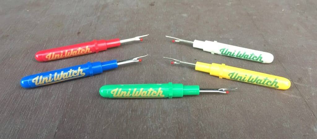
Just give me all your money already: In case you missed it earlier this week, all colors of Uni Watch seam rippers are now back in stock (although green is already going fast). They’re available here.
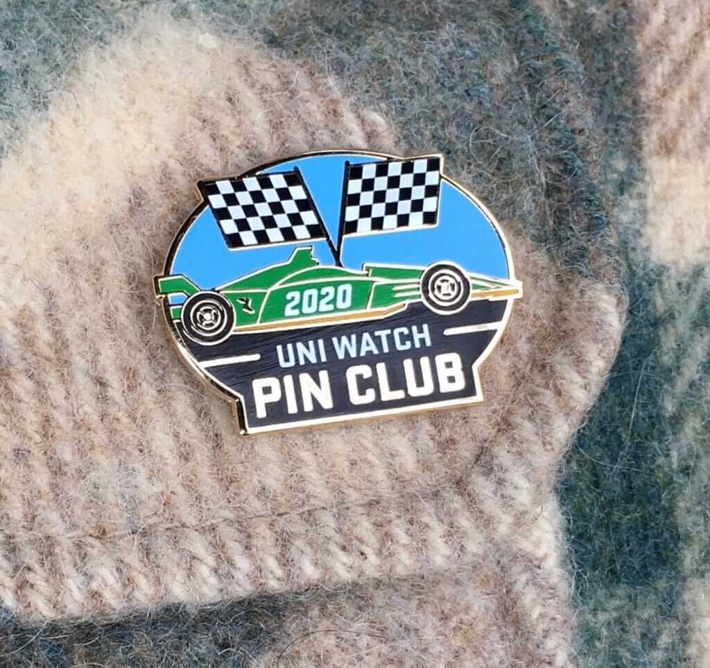
While we’re at it:
• Supplies of the Uni Watch Pin Club’s design for May, featuring this super-cool auto racing theme, are dwindling, but you can still get one here (plus the January, February, and March pins are also available; April is sold out). You can save 15% on any of these by using the checkout code COMMUNITY.
• That 15% COUMMUNITY discount also applies to everything else you’ll find in the Uni Watch Shop and the Naming Wrongs Shop.
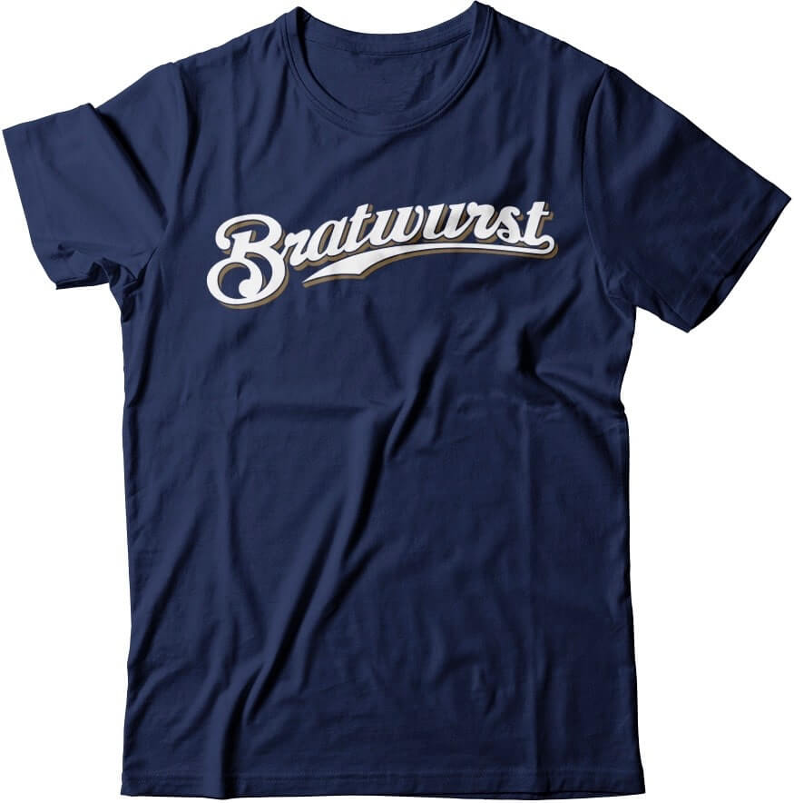
• Wouldn’t it be fun, just hypothetically, if this Bratwurst T-shirt actually existed? You know, just theoretically? If you agree, let me know.
• I still have Uni Watch caps available in sizes 7 and 7-7/8. I’m told that we should finally be restocked on all other fitted sizes, and also on adjustables, in about a month.
• Don’t forget that we also have beautiful chain-stitched patches, pennants, and stickers and magnets.
• If you’d rather support Uni Watch via a donation instead of a merch purch, here’s how you can do that.
The Ticker
By Paul

’Skins Watch: Two items from Kary Klismet: A student at Sanborn Regional High School in New Hampshire has gathered over 400 signatures on a petition to change the school’s “Indians” team name, and a columnist for The Middletown Press in Connecticut has challenged his newspaper’s parent company to stop using the Native-themed names of local high school teams.

Working Class Wannabes™: Notre Dame football coach Brian Kelly describes one of his former players, DE Isaac Rochell, who now plays for the Los Angeles Chargers, as “just unassuming, blue-collar.” … Frostburg State football coach DeLane Fitzgerald says of new recruit Don Woodworth, “Don’s personality fits our football program, blue collar all the way.” … Fansided’s Clemson blogger, Jeff Benedict (a man who uses this as his avatar) says the key game on the Clemson’s schedule this fall is the game against Boston College, because “they will still have that blue-collar work ethic that BC teams are known for.”

Baseball News: MLB players have approved the use of a DH for all games this season (assuming there is a season). Paul Panganiban points out that this means we won’t be seeing pitchers wearing jackets on the basepaths in 2020 (or maybe ever). … Let’s hear it for the MLB Draft, which finally fixed the apostrophe catastrophe in its logo! Hey, Orioles: If the draft can do it, so can you! … A Cardinals blogger has sleuthed out that Hall of Famer Rogers Hornsby, who supposedly never wore a number as a Cardinal, actually wore No. 6 (from Perry Sailor).

NFL News: The Ravens have announced the uni number assignments for their draft class (from Andrew Cosentino). … Lots of people have mini-helmet collections, but Christian Zummer has something I’ve never seen before: an NFL mini-mug collection!
College Football News: Past is prologue: Here’s a great shot of fans wearing masks at a Georgia Tech game during the 1918 flu pandemic (from Michael Rich). … Here’s an infographic that breaks down Arizona State’s helmet, jersey, and pants colors since 2011 (graphic by @JediASU, sent my way by @_mikeylikes_).

Hockey News: Flyers G Neil Little’s mask was stolen between Games Three and Four of the 1997 Stanley Cup Finals. For practice before Game Four, he borrowed a mask from Red Wings G Chris Osgood, a good friend of his. “The idea that opposing goalies during the Cup Final would borrow gear is incredible almost unthinkable, even among backup goaltenders,” says John Muir. … A Canadian infectious disease specialist says that if the NHL resumes play during the pandemic, all players should wear full face shields and fighting should be banned, among several other recommendations. Don Cherry could not be reached for comment (from Wade Heidt). … Also from Wade: Here are some of the names that have been suggested for the NWHL’s new Toronto expansion team. … The New England Senior Hockey League is shutting down after 40 years (from @nhjuangator).

NBA News: Last Friday we Ticker-linked to a bunch of NBA-themed
logos for Australian Football League teams. Now the same designer who produced those logos has come up with basketball uniform concepts for those same NBA/AFL team combos (from Kary Klismet).

College Hoops News: Florida has repainted its basketball floor, which it just renamed in honor of former coach Billy Donovan back in February, to make Donovan’s signature larger and put it at center court (from Kary Klismet).

Soccer News: Watford is changing outfitters, moving from Adidas to Kelme. “Provided the Hornets can avoid relegation, this will be the first Premier League side Kelme has outfitted,” says Josh Hinton. … Do you want to vote on the greatest soccer shirt of all time? Sure you do (from Rob Matuga). … The NWSL’s Portland Thorns will release their new shirts next Wednesday. “But they’ve already leaked, and the graphics used here line up with the leak,” notes our own Jamie Rathjen.

Grab Bag: Here’s the best four minutes you’ll spend today, guaranteed: Enjoy this great video featuring highlights from the great Saul Bass’s movie title designs. Don’t miss (big thanks to Adam Herbst). … Japanese women’s volleyball player Yurie Nabeya, known for wearing goggles due to an eye injury from practice, has signed a contract with Swans for 3D-printed goggle frames (from Jeremy Brahm). … A Pennsylvania company changed from making jerseys to coronavirus masks, but employees walked off the job, saying that the working conditions were unsafe. … Posh Spice — aka Mrs. David Beckham — is facing criticism for making her daughter wear a school uniform while home learning. … Here’s a look at the history of the DC Comics logo. … Mat Swatek has done a deep dive on how teams from a given city do or don’t have similar color schemes. Good stuff — recommended. … Military service members are being required to wear masks, but the top military brass is not wearing them, apparently a trickle-down effect from President Trump and some of his cabinet members not wearing them (from Timmy Donahue). … Also from Timmy: New retro-style police badges for Eureka, Calif. … South Africa has enacted a slew of bizarre and confounding clothing rules related to the pandemic (from Max Weintraub). … Milligan College, a private Christian liberal arts school in Tennessee, has unveiled its new logo as it transitions from a college to a university (Timmy Donahue again). … In Korea, baseball broadcasts are showing cardboard cutouts of fans in the empty seats. But American broadcast networks are reportedly considering the idea of “using virtual reality to enhance the at-home viewing experience, by superimposing realistic-looking fans onto screens.” … When Richard Nixon was president, he apparently wanted White House guards to wear absurdly gaudy uniforms before dropping the idea due to widespread ridicule (from natteringN).

Click to enlarge
What Paul did last night: I usually try to take our daily photo soon after I’ve refilled my glass, so the glass looks full or at least full-ish, and ideally it has a bit of a frothy head to boot. But yesterday we were so busy talking (or maybe I was just so worn out from a day of concentrating on the Rams’ uniforms) that I forgot about the photograph. At some point Mary said, “Aren’t you going to take your photo?” By that time I’d finished my first beer and didn’t feel like having a second one, so here’s a rare Pandemic Porch Cocktails™ photo in which my glass is empty.
No dogs yesterday. Disappointing.
The branch is still there.
As always, you can see the full set of Pandemic Porch Cocktails™ photos here.
Heh heh … heh heh … he said “boned.”
The problem with that comparison with the Rams royal uniform and the Chargers royal alternative is that one is a uniform we’ll likely see once a year (Chargers) and the other is a set we will see roughly half the season (Rams). We’re not going to see the (lack of) contrast that often. And, when they play each other, we aren’t going to see royal on royal either.
I said back when they unveiled them that the Chargers went 1 too far with 2 color rush, including the royal. They should’ve left the royal blue out, since it belongs to the other team in town. Lean into the powder, with the mono navy as a one-off.
The Chargers have just as much of a claim to royal blue as the Rams do. The Chargers wore royal blue from the early 1970s through the 1984 season, which included almost all of the Air Coryell era.
One huge detail you missed on the Rams “dishwater” jersey you missed is that the sleeves also have a white quasi stripe or something. If you look at the retail version it’s much more obvious
link
He mentioned it
No. He only mentioned the yellow sunburst stripe. Not the white part that goes under the arms/armpit. Go look at the authentic retail version and you’ll see it
I work in sports marketing and it never ceases to amaze me how stupid writers can be when they try to sound smart when hyping their products.
Stitching … they’re actually excited to promote the stitching.
Good grief, do they even hear themselves speak?
-C.
Funny you should write “good grief” about the patch stitching, since I came here to write that it reminds me of the pattern on Charlie Brown’s shirt.
You got to wonder how Kevin Demoff feels after seeing the criticism for these unis that he has been hyping them up and trolling people over them for so long.
On a side note, they totally look like they were designed for the MLS, not the NFL (especially that number font).
“they totally look like they were designed for the MLS, not the NFL”
What do you mean by that?
I heard the same thing yesterday, so I looked it up. It does bear a resemblance to the official 2020 MLS font. I personally think the MLS font looks more like the Blue Jays font, but I do see the weird “horn wrap” thing in the numerals.
link
I can’t say it reminded me of the MLS font. It does look like a font that wouldn’t be out of place in the soccer universe, and that’s not a bad thing.
I think the numbers remind me of a font that wouldn’t look out of place on a soccer kit. The design overall would probably look better as a soccer kit than a football uni in my opinion.
Didn’t mean any offense by it
Dishwater takes too long to type. I’m calling them WHYte.
Even shorter: dull.
Even shorter: no.
I thought about this a bit last nite. The Dishwater is without question the worst looking and most over-thought NFL uniform I’ve ever seen.
The royal blue, well, shrug. Whatever. But the dishwater is the absolute worst. Wait ’til it gets wet.
The Chargers should’ve broken out the bubbly last nite.
I’ll bet a signed dollar the Bolts change unis before the Rams do.
Chargers upgrade — I’m a Chargers fan, and I also support the Rams — was so lazy. Feels like very little thought was put into it. Reminds me of Homer Simpson’s car design: helmet numbers? cool! huge shoulder bolts? cool! yellow pants? cool! Very little thought into how the whole package would look.
Rams changed the game. It’s always hard for certain people to appreciate game-changers. (Recall how many people clung to Blackberrys after the iPhone debuted.) Clearly a well thought out, progressive NFL uniform. They weren’t slaves to template-itis with their sleeve, numeral and back logo design. The shiny plastic on the numbers is such a cool touch, as is the 3-D effect on the helment horns.
Rams changed the game. It’s always hard for certain people to appreciate game-changers. (Recall how many people clung to Blackberrys after the iPhone debuted.)
Yeah, the iPhone is clearly in the same category as those other “game-changers,” like the Browns’ and Bucs’ uniforms, the Jags’ two-tone helmet, etc. Yup, I’m convinced: “Game-changers” are inherently good things, and they’re always durable, here to stay, etc.
Yup.
See, that’s the problem with viewing the world thru the lens of “game-changing,” or “innovation,” or even “new” — it avoids the simpler and more important lens of “good vs. bad.”
“It’s always hard for certain people to appreciate game-changers.” To use your analogy, pretty sure everybody thought the iPhone was awesome when it debuted. The response to these abominations has been overwhelmingly negative. These uniforms are “progressive” just for the sake of being progressive. They had the perfect uniforms ready to go with their royal blue alternates and they blew it. This will be right there with the Falcons getting redesigned in 5 years.
Blackberry truthers said the same thing. “It’s not about ‘innovation’, it’s about the fact that hard keyboards are ‘good’.”
You’re a smart guy, Paul. You know that “gimmick” and “game changer” are two different things.
The Jags weren’t trying to be the first with a two-toned helmet. Same with the Bucs’ numerals or the Browns’ giant leg wordmark. All three were looking for a gimmick to differentiate them from the rest of the league.
Nothing about the Rams unis says “gimmick”. They aren’t trying to be different for the sake of being different. They are trying to reimagine what a uniform can be, given the advancements in uniform fabrication.
Nothing about the Rams unis says “gimmick”.
Possibly the funniest thing that’s been posted on this website in a while.
We’ll have to agree to disagree, Ben. Take care.
Patrick B, I can assure you that the response to the original iPhone was overwhelmingly negative among enterprise smartphone admins. Even among enterprise users, there was initially more hate than love.
OK, you’ve got me. “Nothing” was the wrong verbiage there.
If you break it down pretty much the only innovative thing the Rams did was make the numbers reflective, even then that’s a maybe since it’s possible it’s been done in college by someone. Everything else has been done: non-white “roads”? Done by Seahawks. Metallic helmets? Too many to name. No TV numbers? Again too many to name, but for the sake of example 2 weeks before by the Patriots. Not to mention many, many college teams, Original fonts in numerals? Many teams, Steelers for example. Gradients numbers? Arizona used gradient numbers some years back, NCAA made them change them. Patches? Paul listed on main post. Monochrome, bright colors, all done before. What am I missing? What’s innovative? The only thing you can point to is the reflective numbers, and as far as that goes Oaul didn’t really say if he hated it or liked it, seemed neutral on it to me.
Pedro, you’re overlooking the zigzag stitch on the front patches — a total game-changer, and not at all gimmicky!
Ah yes! Missed that, thank you. SMH.
Agree with this 100%. Can we please NOT refer to this uni as dishwater, the dishwaters, mono-dishwater, etc.? I was kind of annoyed with reading “dishwater” about halfway through this entry.
Also, not sure what color most people would associate with dishwater but for me it definitely would not look anything like the Ram’s color. I thought “smog” was a pretty clever nickname. Or just use “bone” since that name and the color itself are already so lame as to be an insult onto the uni itself.
I was kind of annoyed with reading “dishwater” about halfway through this entry.
What a coincidence — I was annoyed at reading “bone” throughout the day yesterday.
I’ll be sticking with dishwater. YMMV.
I honestly thought the smog nickname that you came up with was far more clever and also a more accurate description of this color than dishwater. LA has smog, smog looks greyish , dishwater is more like a darker brownish… no? Of course YMMV depending on how dirty your dishes were to start.
“Mono-smog” certainly also rolls off the tongue more smoothly than “mono-dishwater” and SFSS is an acronym that the Uni-Watch community needs!
Honestly, one reason I hesitated to use smog was that I thought these might not be dark enough to qualify as smog. I don’t live in a particularly smoggy city (NYC has lots of pollution problems, but smog isn’t one of them), so I wasn’t sure. Didn’t want to use smog as the color name and then be told “Smog looks nothing like that!”
So I ran with the dishwater idea. I still like it!
Fair enough! I also do not live in a city with smog and have had a dishwasher for the past 10+ years… so I certainly am no authority on those “colors” either!
Paul is laser-focused on his goal of never writing about uniforms for a major publication again. No chance you’ll convince him to give up a cornball term like “dishwater”.
The nice thing about Uni Watch is having readers who are so concerned about my career.
Paul is the last person who needs my help, but I’ve been reading him for the better part of two decades — and he was no different when he wrote for ESPN for *years* than he is now.
Rich, based on Ben’s comments I think he is saying Paul is so out of touch now. He doesn’t like all these “cutting edge” “forward thinking” “revolutionary” uniform designs. And since he isn’t in touch with the demographic who likes that crap he’ll never have a job again.
Of course Paul and his strong following all know that those stupid buzzwords are just ways to describe dumb design elements that are trendy (at best) and won’t last to ever become a classic uniform. I suppose for Ben, the reason Paul will never get another gig is because he prefers uniforms good enough to become classics as opposed to uniforms which are cycled out every few years.
“ Nothing about the Rams unis says “gimmick”. They aren’t trying to be different for the sake of being different. They are trying to reimagine what a uniform can be, given the advancements in uniform fabrication.”
They spent so much time trying to reimagine what a uniform can be that they didn’t stop to imagine what a uniform should be.
Another detail that bothers me: The gradient on the numerals goes yellow-to-white (top-to-bottom), but the gradient on the pants stripe is white-to-yellow. Maybe they’re going for a yellow-to-white-to-yellow effect, but whatevs.
The numeral font looks like something an amateur would have submitted in one of Paul’s redesign contests. No offense to anyone who actually did that, but seriously.
I find myself softening a bit on the superiority/necessity of varsity/block numerals on NFL jerseys, but some custom fonts work and some don’t. The ones that try to invoke anything other than numbers, like what the Falcons did this offseason and the Bucs’ late, unlamented “alarm clock” numerals (didn’t they have reflective elements like this?), tend not to work. Non-block numerals that still look like sports-jersey numerals, e.g., the Eagles and Bears, do, albeit some better than others, and some (e.g., Broncos and Ravens) take getting used to.
I think the problem with the Rams’ font is that at first glance the numerals just look like they belong on something else, like an elementary-school classroom math poster, rather than a football jersey.
It really is hard to fathom how the Rams could have come up with such a mess, in an effort to clean up another mess (viz., what they made of the uniforms over the last couple of years), which they are now stuck with through at least 2024. Especially when their co-tenants, the Chargers, did so well.
I agree on the custom number font thing. There is nothing wrong with it as long as it doesn’t try to be something special. None of this storytelling nonsense you saw from the Bucs, Falcons, Vikings or Titans. Something like the Dolphins font, or the Chargers font on their last set come to mind as decent enough options. They are custom, but still easily readable and don’t have excessive design elements.
“The numeral font looks like something an amateur would have submitted in one of Paul’s redesign contests. No offense to anyone who actually did that, but seriously.”
I find that the designs submitted for Paul’s redesign contests are, by and large, considerably better than what we actually see on the field.
Agree, and not just the ones that stick to a more traditional approach. I think even the folks who submit more of the out there, and original design ideas do far better than just about everyone of the “revolutionary” NFL designs we’ve actually seen on the field. Aside from perhaps the Texans pointy, truncated shoulder stripes (which seems a good example of form following function of modern jersey tailoring) I cannot think of any of the new design elements that will have any staying power in the long term.
The gradient numbers look like they ran out of color as they got near the bottom.
They somehow got the blues on the helmet and uniform to match. What a miracle.
Let’s wait til we see it on TV under different lighting conditions. There is plenty of room for this to go wront.
About the Rams uniform. The colours are right and the blue over yellow uniform does not look that bad. Blue of the helmet matches the jersey. Otherwise, a lot of weird stuff and the bone over bone uniform gets my thumbs down.
-Cross stitching above the patches look silly, as do these patches.
-A bone uniform featuring white trim. Barely any contrast. What is the point of that.
-TV numbers on one jersey and not the other is strange.
-The striping on the sleeves of the bone jersey gets my thumbs down.
They did not need to go back to the throwback, but the bone jersey should have been white and matched with the template used for the blue jersey. Just yellow pants would have been fine though blue pants would have looked good subbed in with the white jersey. Should not go mono-blue.
The tv numbers aren’t proportional to the front/back ones… why???
I think I get the intent: They’re trying to fit the numbers to the available space.
The torso is a tall, narrow space, so a narrow width works better typographically. The shoulder — once the manufacturer gouges out useable space for it’s own logo — is a low, wide space. The number 20 doesn’t make for a good sample, but if you look at the “2”, you can see that the serif at the end of the bottom stroke is the same on the front and shoulder. So that is the same font, only narrow and bold on the front/back, and wide and light on the shoulders.
It’s certainly *different*. It might be a bit jarring in this font, but I could get used to this. I can’t think of another football team using that kind of typographical treatment on a jersey off the top of my head. I guess the real test will be with the spotters for TV and radio crews. If they like the legibility of the Rams’ TV numbers, you’ll probably see that style on more new designs in the NFL and college.
Those Rams uniforms are just horrible.
Now the bottom three in my opinion are:
32. Atlanta (by a mile)
31. New England
30. LA Rams
I can’t believe they messed with the helmet!!!!
Bungels would be #32 – IMO; amazing they’ve kept such an ugly uniform, but that’s part of what makes them the Bungels
Have to agree with pretty much all of Paul’s comments. I really like how the colors of the helmet pop, and don’t mind the new horn shape (could obviously do without the segmentation, but also not a dealbreaker). Everything else is a mess. About all the Rams go right was the use of a vibrant blue and yellow in the design. But when I look at the blue jersey I just get nauseated how in a place reserved for numbers, stripes, or a team logo, all we see is a big nike ad. It is the most noticeable thing on that jersey.
I think the porch cocktail comment sums it up best “or maybe I was just so worn out from a day of concentrating on the Rams’ uniforms”
I think my reaction to this is so negative because the Rams have always had such great uniforms (even the navy St Louis set was good during a trend when everyone was going to muted colors). I’d don’t really care about the Rams in general, but loved their uniforms, to see them vomit on themselves like this just takes away a visually pleasing element of Sunday afternoons. Almost like if there was some beautiful old house you walked by every day that suddenly got replaced with a mcmansion.
I’m so glad that Paul pointed out the Gateway Arch on the sleeves.
All I can see is the Arch, I don’t see horns at all.
Is there anything more epitomal of the LA Rams than to update their uniforms for their new LA stadium with the most iconic landmark of the city they just left?
Now they will quickly claim it’s a nod to their midwestern heritage. But they will use more words than I just did because that’s how it works.
“Harkening back to Lewis and Clark, the original team who moved West from st. Louis, we’ve placed the gateway Arch on our sleeves to remind our fans of the sacrifices made by past American heroes, as well as reminding them of the roundness of the sun in the California sky”
LMAO. Fuck, it’s TOO real!
Nailed it!
Their new Stadium is shaped like The St. Louis Rams sleeve logo. Most teams like to remind fans of the good old days, but usually not when those days took place in a different city you abandoned. “The Raven’s eye is shaped like Lake Erie.” “The Negative Space in OKC creates an image of a Thunderbolt striking the Space Needle.”
Are those real examples? I don’t see either.
The Rams and Chargers share a stadium and a color scheme so they won’t have to change the colors over and over as at the Jets and Giants stadium.
I first started getting into sports right around the time when the Kurt Warner Rams won SB XXXIV. Those pictures were everywhere, so I put 2 and 2 together and concluded that good, winning teams looked good and wore awesome colors like blue and yellow.
Then they immediately changed their uniforms, and now wear these…let’s say missed opportunities.
I’m not a Rams fan, but it’s sad to see tone deaf ownership pushing an unpopular change when they could have gone the (I think) wise path of the Browns and Bucs, tapping into a successful part of their history.
Grab bag had that great link to Saul Bass. Immediately reminded me of the opening title to Catch Me if You Can, which was clearly a nod to Mr. Bass. Only made better by the excellent Mancini-inspired score by John Williams.
If you want to watch: link
It’s simple the Wilson Evolution is the best basketball made.
Asking from a position of ignorance: What makes for a “good” basketball or a “bad” basketball? Why is the Wilson Evolution better than, say, the Spalding ball that the NBA has been using? If there was no branding on the balls, would you be able to tell the difference? If so, what would tip you off (basketball-related pun fully intended)?
The channels (or seams). A lot of people (myself included) prefer the deeper channels for shooting. That also usually coincides with thicker, softer leather which just feels better and has better grip. I haven’t dribbled an official NBA basketball (or any basketball) in a while, but I know years ago, I was never a fan. I think most basketballs nowadays are some form of composite which helps with grip, thickness and deepness of the channels, etc.
Excellent point. Back in the late 70s/early 80s, the Wilson NBA ball was the ultimate – because it had such nice, deep seams for shooting. It cost a zillon bucks then, and being leather you could only use it inside, but that ball was fabulous. Nothing else at the time was like it. There was huge status in having one.
I remember it just like Greg.
Has anyone pointed out that with the Rams and Dodgers, Los Angeles now has two teams with (almost) opposite names?
Maybe in a few years the Raiders will move back and become the Evaders? Rams/Dodgers/Chargers/Evaders. Ok, sorry.
So… does that make “Dodge Ram” an oxymoron? :D
The same could be said for the Chargers and Dodgers.
Good point. So, LA’s two football teams’ names are synonyms, with similar-looking uniforms. Seems like a branding issue!
…”Dodge Charger”…?
One of the things that bothers me most is the inclusion of both white and bone in their color scheme. No pun intended, it just muddies their identity. You have bright blue, an almost neon yellow, and then an off-white color? Doesn’t seem to go with the bright, LA vibes. Not to mention that the gradient design goes from yellow to a pure white. And then, as others have mentioned, there are white accents on the bone jersey that (1) have almost no contrast and (2) just look horrible together. No visual identity between the bone and blue jerseys at all.
I like calling them “smog”. A couple things…I don’t mind the blue set, but the only thing on the shoulder/sleeve is the horn, which puts emphasis on the swoosh. A number or logo could have fit there. Meanwhile, the smog jerseys cram a smushed number, swoosh, and candied lemon peel in the sleeve, making it way too busy. Seems unnecessary, when the whole shoulder is left open. The other thing that bugs me are the smog pants. The patches on the shoulder…not a bad idea, but terrible execution. The white patch looks looks like if you bought a brand new white patch and tried putting it on an old white shirt that you’ve washed a lot. If they had put the Ram head there, like the Steelers and Jaguars do with their logos, it would have looked a lot better. Finally, the pants. This bugs me. There are a couple other teams who do this. The smog pants have no identity. You should see a teams pants and know exactly who the team is who wears them. They should be able to stand alone, like the jersey. Look at all the teams in the NFL North, for example. Just by looking at the pants, you instantly know the teams.
The smog pants do have an identity, their color. No other team has pants that color. A number of teams have gray or silver pants, but no one has pants quite that color. The Seahawks gray pants come closest, but they have a distinctive stripe pattern that is very different from the bright yellow and white stripes for the Rams.
Hornsby link in baseball section reads “Rogers Hornsby, who supposedly never wore a number as a Cardinal, actually wore No. 6”. Actual link reads “We know from numerous sources that Hornsby wore #4 that season.” Musial, of course, is – and always will be – #6 hereabouts. Four, we don’t care about four.
Fixed.
According to that article, Hornsby wore 4 in 1933, but 6 in 1923 and 1924.
As the person who submitted the Hornsby piece and said “#6,” I was shocked to see that it had been changed to #4 in the ticker entry. It’s been known for some time that he wore 4 at the end of his career — if you read the piece, the new info that the sleuthing uncovered is that long before that, in his prime in 1924, he wore #6! So Paul’s “fix” actually took away the whole point of the article and the reason I submitted it. Please change it back to #6!
Re/unfixed!
Can we even be sure that his number is 6, and not something in the (uh-oh) 60s?
The 6 is pretty far forward, toward the front part of his arm; there could be another digit there, particularly a (thin) 1; we also see a 71 in the photo and the positioning of that guy’s 7 looks similar to Hornsby’s 6.
I’m wondering if the numbers on those sleeves weren’t in numerical order, but instead reflected what was printed in the stadium scorecard. Back then, sometimes players got arbitrary numbers in the scorecards and they were changed frequently (so that fans would buy them each time they went to the game). I know I’ve seen some bizarre numbers there, even three digits. Today all I could find was this one from Los Angeles, where the starting lineup was all in the 20s and the numbering began with catchers and then pitchers.
I’m pretty sure I’ve seen something like the shortstop getting 6, and the backup shortstop getting 61, which seems bizarre today but could have made sense at the time (football numbers sort of work like that).
Here is one from the 1930 Cubs, for whom Hornsby played. The likely starters are numbered 1 to 12, and when either of two guys could start, they’re both there, in order (which is how they get to 12). Then they skip 13, then the pitchers are 14 to 23. Then come other (less likely to play?) backups, one of whom is Hornsby. He was on the bench (fighting an injury all year) and his “scorecard number” is 41.
It’s probably from early in the season, as George “High Pockets” Kelly hasn’t been acquired yet.
So we have evidence of Hornsby “wearing” a higher number here; if the Cardinals arranged their sleeve numbers like the Cubs did for their scorecard, with a few more irregularities (and we can clearly see a 71 in the photo), Hornsby could conceivably have something in the 60s. (No wonder the players hated wearing numbers at first!)
I really wish we could see the full sleeves in that picture. We could learn so much. Does anyone have any 1923 or ’24 Cardinals scorecards? I’d love to try to match the numbers up that way.
Oops, I totally botched the links there.
The 1930 Cubs scorecard, with Hornsby listed as number 41, is link.
Not until two years later would the Cubs’ jerseys have numbers sewn onto them, and when they did that, their numbering scheme was kind of like what was on that scorecard, with link.
Mark, I agree it could be 60-something and said as much in the Cardinals blog where the original story ran. But I didn’t have the super-cool artifacts you cited!
@Perry – I completely missed the comments section in your blog entry! We’re thinking the same thing.
I also found a link (the first game they played in Wrigley Field; Paul, check this out as it is amazing):
link
link
Now here’s something interesting: the scorecard maker uses the same “starts out normal, then gets weird” numbering system for both teams: 1 to 12 for people likely to start, no 13, then 14 to 19, skipping 20-21, then 22, 23, 24, 31, 34, 41, 49, 56, 57, and (Reds only) 67.
The Cub pitchers are 14 to 22 (Mordecai Brown), then starting with 23 (Joe Tinker) are the Cubs’ bench players. The Reds have pitchers up to 23, then their bench.
Are there any scorecard collectors out there who can comment on this unusual series of numbers? I’m thinking that it must have influenced the numbers that soon appeared on people’s backs, because many teams used the “likely regulars 1-12, then pitchers, then bench” ordering, and the Cubs in particular didn’t just go from 1 upwards; they would have most of the lower numbers, then skip around a lot but have a few each in the 30s, 40s, and 50s.
Much later the Cubs went to the “single digits for manager, coaches, and catchers; 10-19 infield, 20-29 outfield, 30-49 pitchers” system and they seemed to mostly stick to that, though not slavishly, as long as Yosh Kawano was running the clubhouse. The Phillies had something like this too at one point in the ’30s; it wasn’t always “starting lineup first”.
Somebody must have some Cardinals scorecards for those years. I’m betting that whatever system the Cardinals used to number the players was based on that; the sporadic high numbers support it.
I still haven’t seen any lists of the numbers worn by the Indians and Cardinals in their initial forays into jersey numbering — Baseball Reference doesn’t have them — and there must be lists of them somewhere; we shouldn’t have to rely on photographs. The numbers must have been publicized at the time; listed on scorecards; listed in press releases.
Thanks for the link to the Saul Bass video. As an avgeek working in industry, I have always had an affinity for his logo design — particularly the United tulip.
link
link
#BringBackTheTulip
I love the United tulip!
I’m gonna need a full blog post on the events of the day when the branch is finally removed. It’s hard to not scroll right down every day to get my update.
(100% serious, I realize this probably reads as snarky, it’s not!)
Anytime the Rams wear bone on bone I will be reminded of my arthritis diagnosis. But enough about my old goalie hips.
I don’t like gradients or in-number graphics, but I do like the overall shape of the numbers. I like block numbers, I like rounded numbers, not a big fan of the middle like the Browns or Chargers.
I guess the best thing I can say about the Rams uniforms is that I like the color of the shell. I really don’t mind the new ram horns, I prefer the old ones and didn’t even think about the curlicue that Paul pointed out (that’s why he’s the uni-man, spotting things better than most) but he’s 100% spot on. It just adds “something”.
Other than that, that patch looks out of place and the “signature stitch” is the type of BS we’ve come to expect/dred these days.
It’s always a bummer when a team has a great uni and decides to make it worse. Can’t wait until 2025 and the new set.
Everyday it’s windy here I wonder, will that branch in Brooklyn fall today? It’s been windy the last week or so (in the Tri-State area).
We’ve had several windy days here (I’m very attuned to this because I bike every day and *hate* biking in the wind), and each time I think, “This is the day it’s finally gonna come down.”
But it never comes down. I’m beginning to think it never will, at least not until we get some serious snowfall, which could weigh it down enough to bring it crashing down.
Uni Watch Pool – When will the branch come down??
Appreciate all your posts Paul. Thank You!
can you give us a link to the original branch post tomorrow I seem to have missed it.
I feel like this clip is obligatory in any discussion of “bone” as a color… link
I hope the new Wilson ball they use for the NBA will go over better than the “New Ball” that Spalding introduced in 2006. Was there any Uni Watch coverage on that event?
(I think I need a “Naming Wrongs” shirt that reads “I still call her the Tugboat Captain”.)
Yep. Pretty much every NBA team has a basketball in the logo, so Paul wondered, “Will teams change their logo to match the basketball?” He hypothesized, “Probably not just because of that one thing, because the Boston Celtics still have a super-old-time basketball in theirs.” Well, sure enough, that synthetic ball was literally in play for a half-season, and that’s not enough time to cram in a logo change, so it’s a moot point.
Anyway, the best NBA logos (IMO) lack a basketball: Hawks, Cavs, Bulls, Trail Blazers, Spurs, Grizzlies, Warriors. The best insignia with a ball is the Jazz.
Rams unis are complete dog$hit & dropped the ball just like the Falcons did.
NBA spalding ball being made by Wilson still better then Nike making it. Which I thought I was going to read after I saw the headline.
I wonder if the reflective stripe company (Framis) the Rams used is the same group that Adidas used for Nebraska’s hideous 2014 alternates.
In the release images, the NU numbers looked black, with a little bit of reflection.
Under stadium lights, they looked like silver duct tape, and were damn near impossible to read.
link
Was the Tugboat Captain’s name accidentally “leaked” in What Paul Did Last Night?
Someone didn’t read Tuesday’s blog post….
;)
Not to hate — just giving my perspective:
Tuesday’s post took a long time to load on my smartphone, ostensibly due to the tattoo pics. I gave up on it. That may be why some regulars missed Mary’s name. (Please relay a belated Congrats!)
Today’s post also took a while to load, but I stuck with it because I wanted to read the Rams review.
I must have missed the reference to Mary yesterday, whoops! I am glad that the TBC’s name isn’t Mary (or in a battle of wits, it is? lol) not to knock a lovely name like Mary in any way. I just imagine in my head that the TBC’s real name is something more “Exciting” for a lack of a better term. Tanya or Alex or Gladys or Cindy…just not something we’d guess easy.
Regardless, her name could be Alfalfa and she would still appear to be a lovely person who’s got some cooking chops, and would be a nice partner to live with or a good hang. If we ever get back out into the public and you have a gathering in Cleveland, I’ll make sure to be there with a homemade “Hello, My Name is Glenda/Tabitha/Holly” sticker for her.
Oh, shit…..Tabitha or Holly could totally be her name. Lol
OMG I am all over the damn place! I blame being in my house every day for what feels like 9 years.
I went back and read the post and I see that TBC is Mary and Mary is a lovely name, even though I just created another comment where I was trying to guess what name I’ve invented for Mary in my head.
Now I feel like I’ve slandered all the Mary’s of the world and basically said it’s not exciting enough for TBC….I hope she doesn’t read these comments and interprets me as the idiot I am coming off as.
(I will die on the hill that she looks like a Holly or Tabitha though)
If Mary would like to break down the exciting / boring nature of the name Rich, I think that’s fair play.
I am stepping away from the keyboard for the rest of the day, lol.
I don’t think it’s an accident because when Mary graduated from the MLIS program, Paul referred to her as “Mary (real name).” Even absent that, I perceive Paul as being too methodical and professional to have that kind of accident. He’s a journalist. If you can’t leak a source, you wouldn’t leak your partner’s name without her blessing and his willingness to do so.
Mary’s name has never been a secret. Until now I’ve simply maintained the protocol of using her nickname, just like I maintain the protocol of referring to, say, “the mighty Gridiron Uniform Database.” Sort of a style rule. But now I’ve decided to change the rule.
I’m still calling her the Tugboat Captain, dammit! Lol
I mean, she follows me on Twitter; IIRC, the nickname had something to do with just not wanting reams of Paul stuff to come up when people Google her, right? It’s not some state secret.
When the wind finally blows that branch down: link
I liked to imagine you asking Mary what she wanted to be called on the blog and giving simple suggestions like “partner” or “companion” and she comes out of nowhere with “Tugboat Captain.” I know you said there is an actual personal story behind it, and her real name has been used (like on posted photos from her social media accounts), but I’ll miss “Tugboat Captain.” Many websites have used pseudonyms to protect loved ones from Trolls, but “Tugboat Captain” was unique.
Oh, I haven’t abandoned it completely — just decided not to be bound by it 100% of the time. Don’t worry, it’ll still be used!
man some people really don’t pay attention….that cat was out of the bag ages ago…..;-0
The numbers look a little like the mixture of fonts Barcelona Used in 2014/15 and 2015/16
link
link
Rams unis are okay but I agree with Paul about the “trying to hard to be in the moment.” I miss the dark helmets the same way I miss the Tigers’ mismatched Ds. The NY Giants had a slightly darker blue helmet in the 80s and 90s as well that I loved. Going to miss the contrast and visual interest of an imperfect helmet match. These are too polished, too mono, and really missed with bone instead of crisp white. Not awful though!
In 1989 Wilson Sports was acquired by the Finnish company Amer Sports. Last year Amer was purchased by Anta, a Chinese company.
Pretty wild for a company that, at the start of the season, was boycotting the league to become the official ball.
Interesting that Wilson supplied the NBA ball for 37 years until 1983 and now will return as supplier after 38 years of Spalding supplying the ball. Let’s see if they change the ball supplier again in 2059!
It seems to me that “blue collar” is almost exclusively used when referring to white athletes. There are exceptions, of course, but not many. I don’t think this is conscious racism, but I think it betrays the way a lot of people subconsciously look at athletes. Good white players are seen as hard working underdogs; good black players are seen as naturally talented. Never mind that this isn’t true (and that there are plenty of non-white people in this country working blue collar jobs). It drives me crazy.
Actually, there are many, many examples — not just “exceptions” — involving black athletes. The Alabama college hoops team, for example.
Or “Goin’ to Work” Pistons.
I’ll respect your position and assume you’re correct – I don’t follow sports or sports media as closely as you do. Still, though, in my experience, it always struck me as an innate bias among a lot of sportswriters and broadcast types. It seems to be an extension of this cultural notion we have in the US about “earning” something versus being given something, and how that relates to opinions about race in other contexts. (I should disclose that I’m a white guy from a ‘blue collar’ background.)
Leave it to Nike to take one of the easiest uniform redesigns in the NFL to get right and to screw it up.
Exactly, just take the Greatest Show on Turf Super Bowl look, make the blue on the helmet match the blue on the jersey and you’re done.
Naw this is on the team. Sure Nike will go crazy if you let them but they’re also the same company that made the Chargers new unis. The team has complete creative control and it’s on them to get it right. This look has all the hallmarks of a bunch of people with no design background making design decisions.
I agree that the Rams are ultimately responsible for signing off on this mess, so they deserve much (if not most) of the blame. But it seems Nike is often pretty good at pitching their wild ideas to teams, so I’m not ready to let them off the hook.
The only set that looks half-decent is the blue-over-yellow, but those shoulder “stripes” are really bugging me. When they were “horns”, they were a nice design feature and variant on the typical shoulder stripe, but by cutting of the actual tips, they are just odd segmented loops.
And, agree with you on the little bits of oddity: the stitching “signature”, the weird off-color patches, the gradient to the numbers, etc. Just odd.
Looks like only the Chargers have unveiled a nice upgrade set…Atlanta and LA have stepped back, Tampa Bay and New England inched forward (but they had literally nowhere else to go).
You left out Cleveland!
I totally did! That update was a nice upgrade!
The shoulder stripes fully encircle the shoulder for the “quarterback” cut of the Rams’ blue jersey. The “linebacker” cut, which is what Paul posted, looks like an arch because of the way the shoulders on that template is handled.
To clarify: I didn’t go out of my way to choose that photo; rather, I chose it because it’s the side-view photo that the Rams provided on their website. In other words, this is *the team’s chosen version* of a representative view of the sleeve and shoulder.
And indeed it *is* representative, because a lot more players will wear this cut (or lineman cut, etc.) than the QB cut.
My bad if my comment about the pic came off snarky. I was just trying to make it clear that I was referencing the photo in this post.
The retail versions of the blue jerseys have the full shoulder stripe. One could, of course, debate whether the on-field or the retail version of jerseys is more “representative” of today’s NFL.
As is always the case here at Uni Watch, the retail versions are not particularly relevant to our discussion. Uni Watch is concerned with what we’ll see on the field when we watch the game. And what we’ll mostly see is a “horn” that actually looks more like the Gateway Arch.
Team City/Team Color chart is pretty cool. One note: The Hurricanes are in Raleigh, not Charlotte. That’s a little far to be considered “in market”
In sports, “Carolina” would be considered one market the way Milwaukee and Green Bay are considered as one, or to a lesser extent, Nashville and Memphis.
The new Rams uniforms are a complete sh*t show! How do you go from one of the best looks (throwbacks of course) in the history of the NFL and go WITH THAT??!! I give these ridiculous uniforms 5 years before they come to their senses and go back to a more classic look; a’la the Browns and Bucs.
You heard it here first. When the NFL decides to add sponsors ads to jerseys, it will 100% be located on the sleeves/shoulders in place of the TV numbers. This is why you are seeing more and more teams with new templates that eliminate the TV numbers.
Also, do not be surprised if you start seeing more green screens on stadium walls, especially behind end zones. Just like MLB does with home plate ads, the NFL will begin putting green screens on stadium walls so they can sell localized ads in different media markets.
I saw the stitching on the patches as an attempt to replicate the laces on a football. As dumb as that is, it makes more sense that what the Rams’ spox proffered.
“The zig-zagging ‘signature stitch’ was inspired by some fashion designers’ iconic ‘mark’ on the clothing they create.”
So this means the jersey’s will in essence have TWO marks, no? The Nike swoosh (maker’s mark) and what I’m calling the britch (branding stitch as the designer’s mark). Especially since they say, “it’s a feature we could potentially use across other merchandise going forward.” I’m curious to see how it would be it used on items other than clothing.
Rams would have the coolest, modern football unis…
If their name was the Los Angeles Fibonacci’s….
Remember how cool it looked when a Ram RB like Dickerson hit the line with that Ram lid lowered?…..looked just like the real thing & made them look real tough..no more.
Note: sports logos are supposed to represent the teams name & identity….so what are these guys…a bunch of nerdy sheep good at math…..??
Team on 3! 1; 1; 2; 3, TEAM!
The only thing that takes the overall look down a notch for me is the number gradient. Otherwise, I think it’s a decent redesign that probably gets a B or B-. I don’t mind the bone since I’ve always been a fan of the seahawks grey uniforms and there aren’t any majorly offensive design elements anywhere. The patch and framis are easy to overlook.
Speaking of framis…are we sure we haven’t seen it (or some type of shiny material that didn’t have it’s corporate name yet) on uniforms before? I can’t imagine this wasn’t tried at the college level yet. Although I can’t pinpoint which uniforms I’ve seen this on, I could have sworn this may have been used on an Oregon uniform or those ugly adidas tread mark uniforms from a few years ago.
The number font is interesting – that kind of rounded font is something you rarely see in the US, but was really commonly used in historic rugby and soccer uniforms in the UK – kind of their version of the ubiquitous “varsity/block” font we used. Pretty much any game from the 70s will have that.
The biggest problem I have with these is the white set. Yellow-on-white never, ever looks good unless some kind of piping or outline is used.
The last two names for Toronto’s NWHL team are Knights and Stallions.
For a women’s team. Knights and Stallions.
When I heard that the Rams were going to use a color called “bone” for their away uniforms, I actually thought that might be kind of cool. I was invisioning something akin to the cream-colored home uniforms worn by the San Francissco Giants or the “Cream City” alternates worn by the Milwaukee Bucks. That is, a color with a lot more of a yellow/tan base.
Instead Nike trots out this washed out shade of grey. This feel like another attempt to make grey road uniforms a thing in pro football, sort of like what they did (and largely failed) with the Seahawks’ “Wolf Grery” uniforms.
But to call this shade of light grrey “bone” and say that it’s the same color as a ram’s horn? That’s demonstrably false. Beyond what Paul pointed out about rams’ horns not being made of bone, the actual color of a real ram’s horn is not grey, but much more of a tan hue:
link
You know, sort of a cream color, which is what I thought would have looked cool. Or at least much cooler than this ugly, faded shade of grey that Nike has ramrodded into the team’s visual identitiy.
link
link
I’m surprised no one brought this up yet. Their logos have a gradient on the crescent but the helmet logo is solid yellow. Why???
We have a virus to worry about . And murder hornets! And the economy is in shambles. Rams, why do you add to our misery with this bullshit?
Rams new set reminds me of Oregon football. Lets do something totally different and unusual. That was accomplished. Like Oregon, the problem is that these uniforms look like crap. Especially when compared to their new stadium mates the Chargers. They have no consistent style theme throughout, what a mess as Paul said.
As I recall, the Rams had the very first helmet logo in football. Tradition would tell you to leave that the same as an homage to that history. The added split of the horn and shortening of the curlique were unnecessary, and it gets even worse as you work your way down the uniform. Yuck.
After seeing the Rams new logo, most were concerned that they would use the segmented horns on the helmet. Crazy that this is now the least objectionable part of this new uniform reveal.
The two placeholders, one for 2021 and the other for 2022, are definitely worth noting with the Rams unveil. You have to think this confirms the rumored lifting of the “one shell” rule for the 2021 season. The Rams could have two throwbacks: the classic blue/yellow look that they should have gone with, the fearsome foursome blue/white, or a yellow throwback from the early 50s.
That was my first thought. That will only make the torch carrying mob even more angry with the new set.
Rams Unis – Def a Mess! I …….and the dishwater unis, didn’t the Astros use a dishwater color road uni during the late 80s for the road ?!?
Yes…they didn’t have grays. They had a pure white for home, and an off-white for road. I believe it was the same template just rendered in white or off-white after they changed from the tequila sunrise home set.
So disappointing that the Rams, who had one of the greatest uniform sets in NFL history, couldn’t just go back to that full time. Couldn’t they learn from the Browns? You don’t see the Cowboys or the Bears messing with what isn’t broken. I agree with Paul; there will be another change as soon as the 5 year clock is up. Fail on almost all accounts Kevin Demoff. At least you got the blue and yellow colors right.
Speaking of “placeholders” and the porch photos … that white van hasn’t moved in two weeks.
Either:
1) Someone put the Uni-Watch HQ under video surveillance. or;
2) A loyal reader wants the branch to finally fall and total his/her vehicle for the insurance money.
Thanks to Paul and the Uni-Watch team for the daily content and updates during this outbreak.
I guess I’m in the minority here, but I really like the ‘Bone’ color (Silly name aside.) I wish more teams used a color besides white for their ‘road’ uniforms. The white patch, however, looks terrible.
That white patch is different from the others you mentioned because it’s not just the shape of the logo or word mark, but a superfluous, badly contrasting rectangle. It looks exactly like the white square advertisements most teams have on their practice jerseys, as opposed to an intentional part of the uniform.
Whether it intentionally looks like an ad or not, it reaaaaaaaaalllllllyyyyy looks like one.
Giants – White square
link
Eagles – White square
link
Colts – White square
link
49ers – White square
link
Bills – White square
link
Saints – White square
link
Without linking to pictures of all of them, I found visual evidence of 21 of the 32 NFL teams wearing practice jerseys with white square/rectangle advertisements in that exact spot.
Of the remaining 11:
3 wore different color rectangle advertisements (Bengals, Cardinals, and Panthers)
1 wore a white rectangle ad on the other shoulder (Jags)
4 wore ads that aren’t rectangles (Cowboys, Washington, Steelers, and Falcons)
3 I couldn’t find evidence of a practice jersey advertisement (Bucs, Raiders, and ironically enough the Rams). That, of course, doesn’t mean they don’t just that I didn’t find it with a quick google search.
Essentially, 75% of NFL fans are used to seeing their team wear that shape/location as an advertisement.
Sigh — yes, as already stated, the Rams’ patch looks like an ad.
But (a) it is not an ad, and (b) it is not a harbinger of an ad.
Let’s please move on. Thanks.
My concern for future ads lies with the top of the shoulderpads, the area above the trap muscles. I noticed that the Pats, Chargers and Rams all have clean traps. All three also ditched the TV numbers on their jerseys. The Rams said they needed permission from the NFL to do so.
I hope it doesn’t happen, but I could see the NFL eliminating TV numbers and putting ads on the top of the shoulderpads.
Sorry, wasn’t trying to say that it is an ad or is previewing an ad. I’m just pointing out why I hate it so much. My gut reaction to seeing that picture was that it was a practice jersey with an ad patch. I was pointing out that’s why I (and I’m assuming others) associated this with ads when other jerseys with patches there (Steelers, Jage, etc.) don’t elicit that response.
Why wouldn’t they make it a white square on the blue uniforms then, too?
Actually, I explicitly acknowledged that it looks like an ad.
But that doesn’t change the fact that it’s just another logo patch.
To clarify, I’m not claiming that it’s a nefarious logo patch, just an exceptionally terrible logo patch (due mostly to it’s resemblance to practice jersey ads).
I’d much rather see the team name up there than have it above the front jersey number, shoving the number downward. But really the color scheme should tell you who the team is and it shouldn’t be necessary to write it out anywhere.
Longtime Rams fan here.
The uniforms have been kind of a mess ever since the post-Superbowl win changes. (I did like the first year with the gold side panel on the jerseys.)
I agree that the “ad copy” reasoning the Rams are deploying are pretentious, specious, and reaching at best. It’s actually ridiculous. They are trying too hard to fit in the most arcane Google Search facts to explain the least important details. (I’m the kind of person
that likes learning those kinds of things, but this stuff is just BS coming from the Rams.
So, that said, I was actually hoping for some use of gray by the Rams when I saw the new shades of blue and yellow, because I thought a shade of gray would give the blue and yellow some “pop” like the silver does for say, the Memphis Grizzlies. The bone is actually OK, but I wanted it a little darker. I want to see it on the field.
My quibble with the all-bone uniform is that they could have easily applied the classic blue trim template from the 60s white uniform onto the bone base, which would be bolder and heavier looking than the ephemeral white and yellow.
Whatever the heck is going on with the quarter curve on the shoulders of the gray jersey, man, you got me. I like the TV numbers, though.
(As an aside, Sorry, Mr. Lukas, but “dishwater” doesn’t work for me. I’m pushing “smog.” In fact, I think “smog + maize = smaize” should be a thing.)
The home (blue) uniforms are definitely a step down from the 70’s Rosenbloom-Frontiere years’ look. Gradient numbers are the worst.
The helmet horn is growing on me. I just feel the modern helmet shell, with all the different planes, just doesn’t accommodate
the old horn.
I will say this: Nike has underwhelmed in their efforts at modernizing looks. The Jets, the Falcons, and the Rams uniforms all have a chintzy look to them. The striping and accents are a bit too “precious” for a contact sport, esp. football.
B9000 – “Chintzy” sums it up
The helmet is not an upgrade but it is a lateral move to something different and more “now/not so distant future”. As for the bone color, ram horns are typically brown and at lightest beige, so they can cut the crap on that explanation, but more to my point, an off white jersey feels more appropriate in baseball because historically the white fabrics used for baseball jerseys were often just undyed natural fabrics which were not pure white. When the sixers went for that look, it worked because they paired it with a more old fashioned design, when the bucks and rams try to mix it with modern design it’s hard to look at. The same can be said about their new ram’s head logo. They took an old school rough and ready hand drawn logo and tried to shoehorn it into a modern minimalist vextorized and precise look and it’s hard to look at.
Overall the whole set looks like a design study. Something where you throw everything you’ve got at it so that you can see what works and then strip the rest away. But they didn’t strip anything away. As though Nike showed them a bunch of options and said “here’s one with tv numbers, and one without, here’s one with the horn on the sleeve and one with a subtle crescent, here’s one with a gradient, and one without, here’s one with the “rams” patch and one with the “Los Angeles rams” patch, here’s a monochrome set and here’s a mix and match set.” And when the presentation was over the rams said “no notes!” And bought one of everything. Personally I love the off center tv numbers but would like them on all jerseys and all jerseys to have the actual horn pattern like the blue set has. I love the font but would greatly prefer it without the swirly reflective pattern. I don’t like any of the gradient because bright yellow to white looks like a printing error, not a strong design choice. And I’d shy away from too much use of monochrome sets. They have a color set that can be mixed and matched in any permutation and look good. Embrace that.
I’ve been forced to buy shoes online lately & after searching thru tons of shoes on Nike’s website I’m convinced ‘bone’ is the new color Nike is pushing. It’s an option on styles everywhere. Reminds me of the neon/action green period a number of years ago.
This when the NFL’s 5 year rule really sucks. We have to look at those stupid “bone” jerseys for 5 years. My guess is the Rams will see by the lack of sales for those jerseys they really screwed up. With all 7 redesigns, only 3 were spot on (Browns, Bucs and Chargers). Even if 2 of those 3 we basically throwbacks. I hated the Pats “color rash” uniforms. Now we are going to be subjected to them at lease 8 games a year. They wouldn’t be so bad, if they had silver pants to go with. If they wanted to mix new/old, should have kept Flying Elvis, changed helmet/pants to white and gone with the red jersey instead of blue. Could have been a pretty good mash-up of the two uniforms.
I just hope MLB doesn’t get Nike-fied like the NFL. Also thankful Da Bears have such an iconic uniform, that I doubt the McCaskey family would let Nike have their way (other than moving the TV numbers from the sleeve to the shoulders).
It looks like the Warriors
It looks like the Warriors
It looks like the Warriors
Those Rams uniforms are historically bad. This is what I was expecting from the Chargers, despite their claims of “Don’t worry, we got this”. It’s like Nike threw every design cliche in the book at them thinking they’d only get a few to stick, and the Rams just said “yes” to everything. I actually don’t mind the helmet. I think the 3D effect of the segments shows much better on the helmet than the LA Logo. The Dishwater is horrible, and made even worse by the use of white accents. I work in a furniture store and every designer in here makes me move white coffee tables, etc. away from off-white furniture because it makes it look dirty. That’s Design 101. The numbers with their reflective material and Fibonacci swirls, the lack of white on the socks…it’s bad. Just bad. With the one shell rule supposedly going away, I assume that then new uni in 2021 and 2022 will be a royal and gold throwback and a navy and white throwback. That will just make the calls for the end of the new set that much louder.
“It’s like Nike threw every design cliche in the book at them thinking they’d only get a few to stick, and the Rams just said “yes” to everything.”
This is exactly what I was thinking. As I was reading Paul’s description, I got the feeling that if there were 10 different designers on the project, they each designed their own set and then at the end each one got to have one of their ideas incorporated in a big mish-mash instead of a cohesive plan.
My take on the ad patch placeholder thing is this. Much like they put numbers on the front of the helmets in the NHL for no real reason, they are filling that spot with something until ad patches come along. But the NFL will make it feel like it wasn’t their choice, for instance…(yes I understand it is an NFL wide decision, but this just makes it feel like they’ve done nothing wrong.)
“So and so company approached us about placing an ad patch on the uniform. We realized you already know who your team is, so there is no reason to have the team name on the jersey, they mentioned placing their ad patch in that space and it was decided a small inconspicuous patch wouldn’t diminish the value of the jersey at all, in the same space we already had a patch, we’re just replacing one patch with another. This is a win for the team and a win for so and so company with this outstanding company on board as a team partner.” And they’ll probably try to imply something along the lines of “what’s the difference if the patch says Jaguars or AT&T on it?” It’s still a patch in the same spot.
I know I know, Paul asked us to move on.
When I first noticed the widened, contrasting stitch found on the left shoulder’s wordmark patch, I was reminded of Virgil Abloh’s “Off White” brand, which frequently utilized a contrasting stitch during his collaboration with nike.
(link, link, link)
I’m wondering if Abloh’s “Off-White” brand was the influence for this random aesthetic quirk, and if so, I wouldn’t be surprised given the immense popularity of the nikexoff-white collab.(link)
I think it’s also important to note that since their partnership, nike has appropriated some of Off-white’s signature “marks” onto their current shoes and apparel.
(link, link)
Won’t ever happen but the NBA should adopt the red, white and blue ABA ball. It’s easier to follow, looks cool when it rotates and it was the most unique design ever used for a major sports game ball.If they are worried about turning off international fans for using a ball that matches the American flag, they can just call it an homage to the Jerry West logo.
Rams will eventually go the way the Browns did and realize the classic look is the best look.
Why do these off-white uniforms look like unwashed laundry, but cream-colored baseball unis don’t?
Instead of comparing them to cream-colored baseball uniforms, why not go further compare them to baseball’s road greys? Now *that’s* a good question!
And the answer is that different sports have different heritages and protocols. Same-colored jersey and shorts looks great in basketball; same-colored jersey and pants looks not-so-great in football. … White is typically worn at home in baseball; white is more often worn on the road in football. … Grey makes sense in baseball; grey doesn’t work so well in other sports.
And so on.
Because these new “bone” uniforms are greyish blech, not “cream.” I posted a comment earlier today on this very difference.
Interesting contrast in design study today between Quality (Saul Bass video) and Crap (Rams)! Thanks, Paul!
No ‘Bad to the Bone’ headline?
“Bone to the Bad”?
In the promo pictures, and even the video of players at home in sunshine, I like the dishwater unis. But normal-lighting pictures as from the retail merchandise, gosh it’s fugly.
Give the Rams credit for rectifying one glaring issue. The royal blue helmet (not navy) will finally match the royal blue jersey.
Bummed about the dishwater shade of gray. When I saw “bone,” I envisioned off white like the Oklahoma Sooners throwbacks. I still think off white should replace white in the Browns uniforms, but that ain’t happening for at least five years.
I’m really glad none of the awful uniforms that have come out this year will play my team… provided they actually play.
The classic blue over yellow is fine. Gradient is lame and some of the other mentioned elements, but fine. The Blue Rash Group uni seems outdated already.
The bone would be fine – stupid but fine – if it didn’t also have two very light shades as accents in white and yellow. Since it does, worst in the league, and there isn’t a close second. Yes, Seattle’s “Wolf Grey” looks like dirty laundry, but if that was truly their primary road set, we’d all be used to it by now. The bone could have been the same thing, but the white and yellow additions make it hideous.
paul~real quick because i have a bundesliga animation to finish by midnight that i need(?) to get back to, but…
it seems to me that most people would like just a return to the vince ferragamos, and those were sharp with the mismatch navy helmet that probably just started with cost savings in the transition from the deacons to the ferragamos. still, it was a cool look.but like the great boozer jet sets, the look just doesn’t translate as well into today’s cuts. there are not sleeves to the elbow, tube socks, etc. so i can feel for the reasons to try something new while keeping with tradition. i think these new togs are every bit as good as a throwback, and here is why.
the helmet is a gorgeous shade of blue, and the logo is an improvement even though it doesn’t have the curly-Q. if in fact the new horn doesn’t warp over the bumps and holes of modern helmets and their continuous design changes will be a massive improvement in the long run.
the pants actually have full stripes! i can’t believe i have to get excited about a straight hip to knee stripe, but i did. i’m not a huge fan of this eagle-esque one fat one skinny stripe, but i think it works. and while i only want to see the gold pantaloons with the blue collars, i am intrigued by these blue britches, they in themselves might be kind of quirky in the way these were. i’m excited by this reflective stretchy material.
which leads me to the jersey. love the simple and elegant font; love the stitching/material on the font to give it depth without 4 strokes to completion; and i love he ombré effect of the the blues even though i should hate it. and if i may, the lack of TV number clutter gives me a bone that will be rubbed away with dishwater later. but speaking of tv#, the teevee number font they use on the dishwaters i love, it’s a great old helmet # font tweek(no not literally the same font), and i think they are going to pop with the new materials too. maybe i’m wrong about the materials, time will tell, but we just don’t know yet, and i don’t think this is as simple as jets and falcons boring for anybody complaining about that…YET.
problems: obviously the dishwater, and obviously the name patch. but other then that, my only real complain is the ironic STL shoulder arch, that bugs the bees in my bonnet to no end.
Interesting. The Comrade has spoken! I don’t completely agree, but I’m always happy when the Comrade is happy.
har har. and i know this set might turn out to be a dog, but i think this might wind up being the surprise set of the summer. dishwater drained from the equation.
My son played football with a kid that wouldn’t wash his practice uniform all season. By the end of the year the white looked like the Rams away unis.
I think that plasticity material for the numbers was mentioned with regards to a patch not that long ago. Maybe it was in the ticker (so not Paul’s direct line of sight), or maybe that was close but different and I’m confused …
Question:
How much does counterfeiting figure into NFL redesigns?
Its easy to imagine the gradient and various patches are intended, at least in part, to make producing knock off version slightly more difficult. This would also explain some of the attraction for each team to have a its own number font.
Am I onto something here or is that just not the case?
I think anti-counterfeiting may very well factor into modern NFL design considerations. I heard some rumors several years ago that that’s why the Seahawks have that intricate stylized “feather” pattern inside their jersey numbers.
While that may explain somee of the design choicse for the Rams’ new uniforms, it doesn’t justify them. Bad design is still design. And, if this is another example of the merchandise tail wagging the dog, it’s further indication of all that’s wrong the teams’ current design priorities.
Don’t understand the italicized tv numbers on the bone jerseys, when nothing else, wordmark included, is italicized. Rams best new look is by far the blue tops with yellow pants. Those bone jerseys are going to look awful when playing against a team in true white pants. Lastly, it almost seems like Rams are taking a soccer-style approach, having two different styled kits. Not sure how many NFL teams have gone that route.
Also seeing a lot of love for the Chargers new uniforms, but I haven’t really seen much of them outside their template heavy intro posts. I haven’t seen a picture yet that makes me think they’re better than the old ones.
The Rams already had two perfectly fine options: The navy and white unis from the 60s or the royal and gold (yellow) unis from the 70s. For the 70s unis I could see them changing the helmet to match the royal jerseys…then leave it alone. In 5 years, I bet they go back to either past uniform set.
“Bone,” the zig zag, the shiny plastic numbers, all those “design elements” are just- I think PL said this so maybe I am stealing from him- these are just ‘of the moment.’
Nothing classic about this design. It’s a disposable Swatch instead of a timeless Rolex, IE the Packers,the Bears, etc. We live in a disposable society, and we’ve got throwaway design. Five years, do it again.
Just WAIT til we get alternate helmets. Bone helmet, anyone?
Gets in DeLorean, sets clock for 2025…
Blech…for bleach that doesn’t work well…
They BLEW IT!! It’s the biggest downgrade I’ve ever seen (worse than the Browns and Bucs). In some way, looks like they want to be Chargers’ fraternal twins. Let´s see if the numbers can resist the savaging of the game and apparel sales.