
By Phil Hecken
Follow @PhilHecken
Hey there! How’s everyone doing this weekend? I hope all y’all are doing swell (or as good as can be expected under the circumstances). I’m pleased to announce my grad school classes for the Spring have finally concluded (although my summer classes start up in about 10 days…ugh), and while it’s brutally cold (both relatively and in reality) in New York today, hopefully a nice warmup will be headed our way soon. Hope at least the weather is good in your neck of the woods.
Now then, for many weekends since the COVID-19 pandemic set in, I’ve been featuring the uniform designs of Matthew Drake. Last weekend I promised you’d get to meet him, and today — at long last — you will. Following the interview, I’ll have another set of designs from Matt, this one being his “Cooperstown Collection Outtakes” for the American League. But first, let’s get to meet Matt and then we’ll check out his latest handiwork.
Uni Watch: First question I ask of everyone: how and when did you “discover” Uni Watch, and how long have you been a reader?
Matthew Drake: I honestly don’t remember how I discovered Uni-Watch, but I know it had to be more than 10 years ago at this point. I’ve known about the site for about as long as I’ve been interested in uniform design.
UW: How old are you and where do you live?
MD: I’m 20 years old and I live in Jacksonville, Florida, though I’d been spending a lot of time in Tallahassee before the pandemic, studying at Florida State.
UW: Before I go any further, do you prefer “Matthew” or “Matt”?
MD: I tend to prefer “Matthew,” but all of my life there have been other Matthews so I’ve always been designated as “Matt,” so I’m fine either way, haha.
UW: OK, I’ll probably keep using them interchangeably.
As readers know, I’ve always loved uniform concepts, and feature them often (including yours over the past several weekends). When did you first begin designing unis?
MD: I love them too! It’s such a fun element of sports design to see people’s ideas. I probably started making concepts around the time I discovered Uni Watch and the SportsLogos.net boards [That’s Chris Creamer’s site, for anyone who didn’t know — PH] around 10 years ago. At first I was just editing the Wikipedia images of each teams uniforms pixel by pixel, and since then I’d like to think my design skills have slowly but surely improved!
UW: Did you do “refrigerator art” (as we call them) — basically drawings of unis — as a kid?
MD: Yes! I actually mailed some drawings of Twins uniform concepts to Joe Mauer when I was just starting out (they were basically just the early 80’s uniforms the team threw back to in 2009)— he responded and said he liked the drawings!
UW: What template do you use? And did you create that yourself or was that something that’s available on the Interwebs? Are these all done in Photoshop?
MD: The template I’m now using was provided by my friend @SFGiants58 on the SportsLogos.net, and I modified it to be workable in MS Paint. I don’t believe it’s available on the Internet yet, though I’m sure he’d be fine to share if anyone was interested in using it.
I actually do most all of my designs in MS Paint, I’ve always wanted to learn how to use Photoshop, but never have gotten around to it.
UW: Is this a hobby or do you do any of this professionally? If not professionally, would you like to try to turn it into a money making venture?
MD: I have not done anything professionally yet, though I’d love to somehow turn this into a money-making venture, were the opportunity to arise!
UW: How long does an “average” design set take? What took you the longest?
MD: I think the longest part of any design is figuring out what I want to do, but once I actually know, I could probably crank out a few teams in a day. The Mariners probably took me the longest of all the teams, as it was the most “start from scratch” of any of the sets.
UW: While you redesigned MLB and most of the “main” designs were pretty traditional, your “Cooperstown Collection” are what really caught my eye. What gave you the idea to basically mimic what the NBA has done (with their ridiculously named uniform sets)?
MD: Well, it was pretty much just that. With Nike taking over the NFL and NBA and implementing their own special designs with Color Rush and City Edition, I figured MLB would do the same, now that Nike has taken over for them as well. Since baseball is the sport probably most steeped in tradition, I decided to embrace that and draw on past designs for the special uniform.
UW: You probably know by now my tastes in uniforms, especially baseball uniforms, are pretty traditional. And while you’ve done a fair share of very traditional looks, a number of the Cooperstown Collection are more of the “out there” looks teams have sported at some point. Have there been any teams you’ve completely blown up and created new, from scratch?
MD: This series was actually probably more on the traditional side of the things I’ve done, as I’m normally not afraid to try things out, such as new color schemes, number fonts, or other designs for my concepts, since they’re just that, concepts. In the past I’ve tried doing expansion teams for cities from Las Vegas to even London with completely new logos and color schemes. If I was better at creating logos, I’d probably do that more often. The closest thing to “blown up and created new” in this MLB series was the Mariners, probably.
UW: Have you designed any other sports besides baseball?
MD: Yep! I’ve done both football and basketball designs in the past, and I’m actually currently working on a new NFL series of designs.
UW: (says to self: “I see another set of posts coming”.)
When you first approached me, you noted you’d been collaborating with a number of other designers from the Creamer boards. Can you tell me a little bit about that?
MD: Sure thing! I believe I started posting my concepts on the SportsLogos.net boards around 2016, and I received a lot of helpful comments from the same group of guys, who each also had their own concept series running, which showcased similar design sensibilities. I don’t remember how we decided to all meet up (it was probably through the private messages of the boards), but since then we’ve collaborated on MLB City Edition, Statement Edition, and World Baseball Classic concept series. It’s been super enjoyable to collaborate with those guys, as sometimes it’s easy to feel like the only person with an interest in uniform design, communities like that can help remind you that you’re not alone.
UW: Where can we see more of your work? Do you have a website or blog? I know when I first ran some of your concepts a couple readers asked if you had a Twitter account devoted to unis. You didn’t then but you do now (@MJD7Design). Do you have any other social media presence(s)?
MD: I do not yet have a website or blog, though that could definitely be something to look into for the future. I did recently create a Twitter account for design per your recommendation (@MJD7Design). I’ve thought about creating an Instagram for my designs too, but I haven’t gotten around to that yet.
UW: Great! Thanks, Matt — let’s take a look at your “final” set of Cooperstown Collection uniforms (the “outtakes”) for the American League! (You can click on the images below to enlarge.)
MD: Thank you Phil for the opportunity, and all the work you’ve done to help showcase my designs, I really appreciate it!
Cooperstown Collection Outtakes — AL Edition
By Matthew Drake
Baltimore Orioles

A couple of options inspired by the St. Louis Browns and @SFGiants58.
Boston Red Sox

A 1912 fauxback complete with the white cap, as well as a ‘Patriots Day’ variation of the home uniform.

Not that I would ever advocate the Sox actually wear these, but they are based on the old Boston Bees, and can act as a tribute to the Boston flag.
Chicago White Sox

An inverse pinstripe set based on 1917, as well as a black & white fauxback to the 1942 set.

Gray versions of the 80’s set.

Red & powder fauxback to the early 70’s, doubling as a tribute to the Chicago flag.

These are based on unused designs from an 80’s fan-designed uniform contest. The uniform on the left was originally teal & orange, but I recolored it powder & red to fit more with Chicago. [If you’re not familiar with these unis, Paul covered it on the Deuce way back in 2011. — PH]

A black & red set based on the 50’s Sox, as well as another unused 80’s design.

Two more unused 80’s designs.
Detroit Tigers

All-navy sets based on the 1906 Tigers.
Houston Astros

Navy and Orange versions of the tequila sunrise set.
Los Angeles Angels

A set based on the navy-heavy Angels.

Navy versions of the PCL Angels.
New York Yankees

Plain gray sets based on the Murderer’s Row Yankees.

A couple of gray pinstripe sets.
Oakland Athletics

A yellow version of the kelly green vest set.
Texas Rangers


Four different iterations of the powder blue Rangers set, inspired by the current alternate.
Toronto Blue Jays

Again, not that I would ever advocate this, but the modern Blue Jays set in the 2000’s colors.
Wow! Great stuff again, Matt. And thanks for the interview. I’m pretty certain I’ll have Matthew back again where we’ll be taking a look at some of his NFL concepts. But for now, that’s a wrap on the MLB designs from Matthew Drake.
Readers? What say you?


Guess The Game…
from the scoreboard
Today’s scoreboard comes from Ojai67.
The premise of the game (GTGFTS) is simple: I’ll post a scoreboard and you guys simply identify the game depicted. In the past, I don’t know if I’ve ever completely stumped you (some are easier than others).
Here’s the Scoreboard. In the comments below, try to identify the game (date & location, as well as final score). If anything noteworthy occurred during the game, please add that in (and if you were AT the game, well bonus points for you!):

Please continue sending these in! You’re welcome to send me any scoreboard photos (with answers please), and I’ll keep running them.
No Graduation? No Problem!
One of the many… MANY …things the COVID-19 pandemic has interrupted, and if you’re a young adult, probably one of the most important events in your life, has been graduations (in my grad school, as I’m sure many others, we’re having “virtual” graduations; fortunately, I’m not expected to complete my degree until December of this year, so *hopefully* the epidemic will be enough under control by then that “normal” activities have somewhat returned). But, not having a graduation wasn’t (apparently) a big problem for the nephew of one of my buddies, Jimmy Corcoran. Jimmy’s dad, you may recall, was the one and only “King” Corcoran, quarterback for numerous pro teams, including the WFL’s Philadelphia Bell.
I received an e-mail from Jimmy earlier this week, and I’ll let him take it from here…
Hey Phil,
Like many other high school kids who are not having a Graduation ceremony this year, my nephew had his own Graduation at his house. I was surprised when he came down for photos instead of wearing his gown he was wearing a Philadelphia Bell practice uniform. He said I know he has been gone eleven years now but I think the King would have liked this! For some reason my sister didn’t think this was funny, I guess she was expecting him to wear a gown?
Jimmy C.
Thanks Jimmy — and here’s the photos he shared with me of Graduation:


Pretty cool idea, no?
UW readers: have any of your kids (or nieces, nephews, etc.) or YOURSELVES done anything “uni related” for (home) graduation (or are possibly now planning on it)? If so, shoot me a line and a brief writeup (and of course a pic wearing a uni!) and maybe I’ll run ’em here.

Uni Concepts & Tweaks
After being dormant for a while, the Uni Tweaks/Concepts have returned!
I hope you guys like this feature and will want to continue to submit your concepts and tweaks to me. If you do, Shoot me an E-mail (Phil (dot) Hecken (at) gmail (dot) com).
Occasionally I’ll have some concepts tweeted at me. A couple weeks ago I had this set of Arizona Cardinals uni concepts from Brad Wolf tweeted:


Thanks. OK readers, tweeters (and concepters). If you have some tweaks or concepts, shoot ’em my way with a brief description of your creation and I’ll run ’em here.
And now a few words from Paul
Hi there. Here’s a bit of news and some reminders:
• On Friday I finally received the large batch of seam rippers I had ordered nearly two months ago, so Uni Watch rippers are now full restocked and ready for ordering. If you’ve been wanting to join the #NoEra remove-ment, there’s no time like the present!
• I got soooo much positive feedback about Friday’s Uni Watch post, which featured an interview with a corporate CEO who’s been approached by six different NBA teams that want to put his company’s logo on their jerseys. It’s a fascinating look into the NBA’s ad patch program, and I really believe there’s no other place where you’ll find this type of info. If you didn’t already read it yesterday, check it out here.
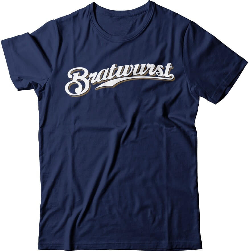
• Just hypothetically, wouldn’t it be fun if this Bratwurst shirt actually existed? You know, just theoretically? If you agree, let me know.
• Supplies of the Uni Watch Pin Club’s design for May are dwindling, but you can still get yours here. It’s a super-cool auto racing design created by me and the great Todd Radom, produced in a limited/numbered edition of 250, and you can save 15% by using the checkout code COMMUNITY.
• Speaking of which, that same checkout code will get you a 15% discount on anything and everything in the Uni Watch Shop and the Naming Wrongs Shop.
• If you have a very large or very small head, we still have Uni Watch caps available in sizes 7 and 7-7-8. All other sizes and adjustables are currently sold out, although I’m told that our factory will be opening soon-ish, so we may be restocked by mid-June.
That’s it from here. Enjoy your weekend! Now back to Phil.
The Ticker
By Anthony Emerson

Baseball News: Spike Lee used a Mets-inspired font for the opening titles of his new short. The font is closest to the “New York” wordmark the Mets used on their road jerseys for one season, 1987. Lee is, of course, a huge Yankees fan (from Scott Rogers). … Some KBO players wear snapbacks on the field (from Brian Felkowski). … A baseball blog has ranked all 27 MLB mascots (from Kary Klismet). … A 1910 Shoeless Joe Jackson baseball card has sold at auction for $492,000 (from Mike Chamernik).

Pro Football News: The Browns posted two gifs on their Instagram showing off their new players’ uni numbers. Note the weird “7” in their number font. Yeesh (from Josh Levy). … An NBC affiliate in the Buffalo area used a ton of incongruous logos for the Bills’ schedule launch. … The Panthers are eyeing a site for a potential new stadium (from Kary Klismet). … One more from Kary: new unis for the West Virginia Roughriders of the American Arena League.
College/High School Football News: Samford posted a cool gif of their new NFL players’ Samford jerseys turning into NFL jerseys (from Lucas Reed). … A blog is trying to figure out which Arizona high school has the best football unis (from Jace McKeighan).

Hockey News: The Cranbrook Bucks, an expansion team in the British Columbia Hockey League debuting next season, have unveiled their mascot (from Wade Heidt). … The St. Cloud Blizzard of the NAHL have rebranded as the St. Cloud Norsemen (from Timmy Donahue).

NBA News: After ESPN ranked the Kings’ gold unis among the worst in NBA history, and the Kings own Twitter account seemed to distance the team from the them, a Kings beat writer decided to defend them (from Mike Chamernik).

Soccer News: Ipswich Town’s shirt advertiser has donated their advertisement to a charity, and the charity will have their logo featured on Ipswich’s kits (from Josh Hinton). … Also from Josh: New Zealand’s pretty nice new kits have been leaked. … New kits for Scottish team Dunfermline (from Ed Żelaski). … Also from Ed: English 10th-tier side Durham City is launching a green-and-white hooped third shirt, inspired by new manager Didi Agathe’s former club, Celtic FC. … Brazilian side Fluminense have unveiled their new kits, their first with Umbro (from Kary Klismet). … Also from Kary: Check out this rendering from a propose Chelsea FC stadium in London that fell through for a myriad of reasons. … One more from Kary: new renderings have been released for a new stadium in Milan, which would play host both to Inter Milan and AC Milan.

Grab Bag: UT Martin’s chancellor posted the school’s new athletics logo on Facebook (from Kirk Davison). … The Athletic has taken a look at the best and worst uniforms in Cincinnati sports history (from Kary Klismet). … In the Call of Duty League, in-game characters actually wear jerseys. … Alabama Sen. Richard Shelby wore a Crimson Tide facemask while on the Hill yesterday (from Paul Friedmann).
And finally…
That’s it for this fine Saturday. Big thanks (again) to Matt for all the uni concepts, not just today but over the past several weekends and the interview. I’m sure I’ll have Matt back with some NFL (and maybe NBA) concepts down the road.
Hope all of you are hanging in there as (hopefully) the COVID-19 sitch is getting better (at least in some places) and we begin to open up again. It may be a while before we have any live sports, and certainly a lot longer until we can actually watch live sports in person, but uniform news waits for no man or woman, and we’ll keep on top of things here at the You Dub.
As I mentioned at the top, I finished my spring semester of grad school, somehow managing to keep up the good grades along the way. It was difficult, and weird, to have all classes suddenly go from in-person to Zoom-enabled mid-way though the semester, but somehow we all managed. My professors were great and we seemed to get through it all without a hitch. I hope anyone in any similar situation had as good an experience as I.
Back at ya tomorrow. Till then,
Peace,
PH
GTGFTS is September 11, 1983 in Wrigley Field. The Cubs lost to St Louis, 2-1, but the Chicken is there to save the day!
So why does the scoreboard indicate that nine innings were in the books (no yellow number indicating an inning is still going on), and that the Cubs have won 4-2, scoring three in the bottom of the ninth?
Because The Chicken put a white “3” there! All the other scores check out for 9/11/83.
Those Cardinals concepts just make them the 49ers with a white helmet.
That is to say: I like them, but the pants should be a different color. Use the whites from the alternate for the home, and a red pair for the away and these are great.
Grad Grades- Well done for a Semester like no other.
Thanks, Bill. Indeed, nothing (including education at every level) will ever be quite the same.
You Dub? That made me gag.
Cranbrook Bucks’ mascot is also wearing the new BCHL team’s jersey. Was not much of a jersey unveiling. All I ever saw about this was an announcement on their Twitter feed that you can buy the new team’s jersey from their shop. They are going forest green and white.
You Dub man, Phil!
I’m curious why the tan pants and beak for the Cardinals? I’m a fan of the Cardinals going to a simplified old school look. I really liked their all white look back in the St Louis days. And even though they do have a little bit of black, I hate their BFB uniforms.
Maybe it’s ‘desert sand’ or something.
Whatever it’s called, I like it!
Recommendations: ditch the jersey striping and go back to the 1960 logo.
Too bad the Jags went minimalist…the Cardinals would look awesome with their template.
Absolutely ridiculous that the Carolina Panthers want a new stadium. Their current stadium is obsolete after 25 years? Crazy.
And right next door, no less.
Wonder how much public money he’s looking for, to move across the highway?
So agreed! Their current stadium is perfect for football and beautiful !!! This idea has to be put to a stop!
So nice to see MLB and Fanatics marketing team branded face masks
Matthew Drake — Thank you for your contributions. I really like them, especially the White Sox designs.
Congrats on another semester down, Phil. Looking forward to buying you a congratulatory beer in December!
Thanks Chance! Yeah, was hoping to catch a Mets game with ya this season. Not looking too likely now.
Cheers!
Congratulations on surviving spring semester Phil! As a college Freshman myself, I know how hard it was to keep up good grades with everything going on virus wise.
Thanks Ian! Hope your first year wasn’t too emotionally fraught with all this shit. It gets better!
Lee famously grew up a Mets fan but switched to the Yankees in the late 1990s, for some reason. ;)
Thank you Jim!