For all phtoos, click to enlarge
[Editor’s Note: Back in January we had a guest entry from Bill Henderson about his restoration of an old Mickey Mantle jersey. That post was extremely popular, so today Bill is sharing the story of another fascinating project from his jersey-restoration business, the Dream Shop. Enjoy. — PL]
By Bill Henderson
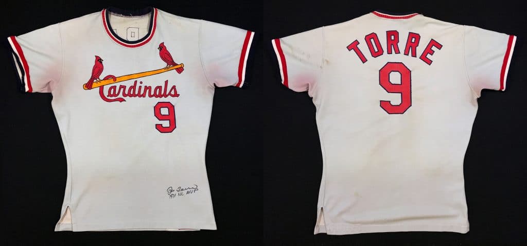
I was recently asked by a collector to restore the player name on back of Joe Torre’s Cardinals road jersey from 1971, the year he was named the National League’s MVP.
This type of project is why I started doing this work. A job like this will take me four hours or so to do correctly, but I’m willing to invest the time for collectors who care about the results.
The finished product is shown above. Notice the rounded crew-neck, instead of a v neck; this style was used in only 1971 and ’72. The early nylon fabric was susceptible to staining from other fabrics, as you can see from the sweat stains under the arms that have transferred the red color from the player’s undershirt.
As was the practice at the time, after Torre wore this jersey in 1971, it was stripped of its player name and sent to the minors to be used and reused, probably for multiple seasons. It seems unbelievable now, but jerseys were not considered collectable at the time. They were treated like balls, bases, and other team equipment that were basically considered practical commodities.
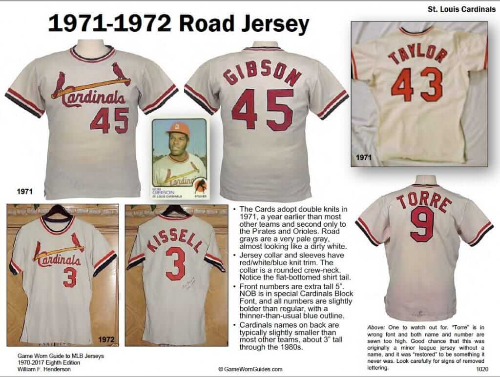
Here’s the page from my book on this jersey style (note the entry at lower-right — that’s definitely not the jersey I was working on in this restoration project!):
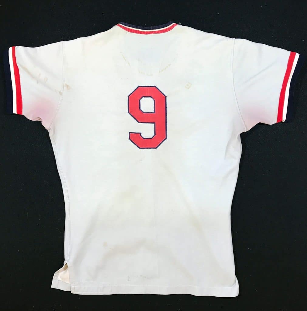
When I received the jersey, it showed lots of weear and had ghosts of what had been sewn onto it during Torre’s MVP season:
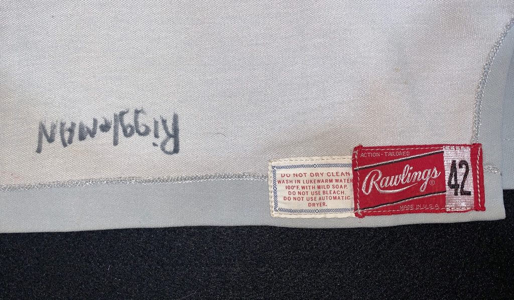
The Rawlings manufacturer tag and washing instructions are sewn inside the front-left hemline. 1971 was the final year that Rawlings used this style of tag, which is more closely identified with the flannel era. There is no sign of a year tag ever having been present. Another player’s name is written in marker next to the tag, another clue that this jersey received extracurricular use.
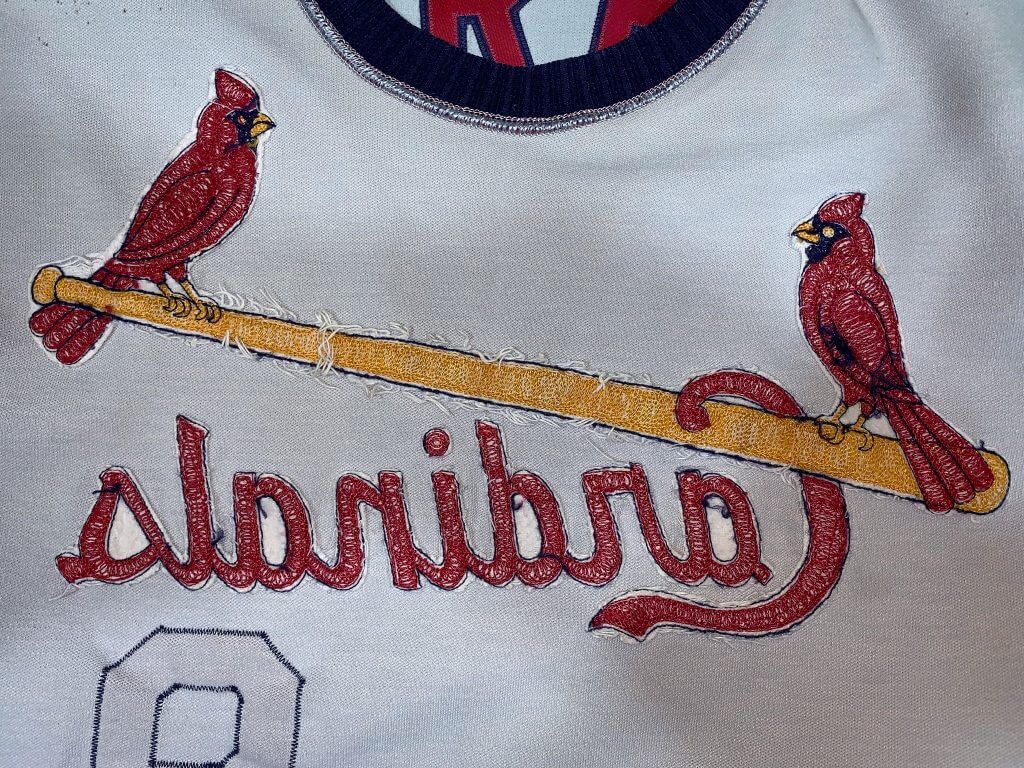
Look at the inside of the hand-embroidered Cardinals logo. Following a pattern, a worker at a chain-stitching machine sewed each of these by hand. The white strings are what remains of a piece of backing fabric, or “interfacing,” that had been sewn there originally to stiffen the fabric during embroidery and was then torn away when the stitching was done.
Remember, what the client wanted here was to have the player’s name restored to the jersey. So here are my hand-created patterns for the Cardinals’ lettering, all based on the many dozens of game-worn jerseys I’ve seen and handled over the years:
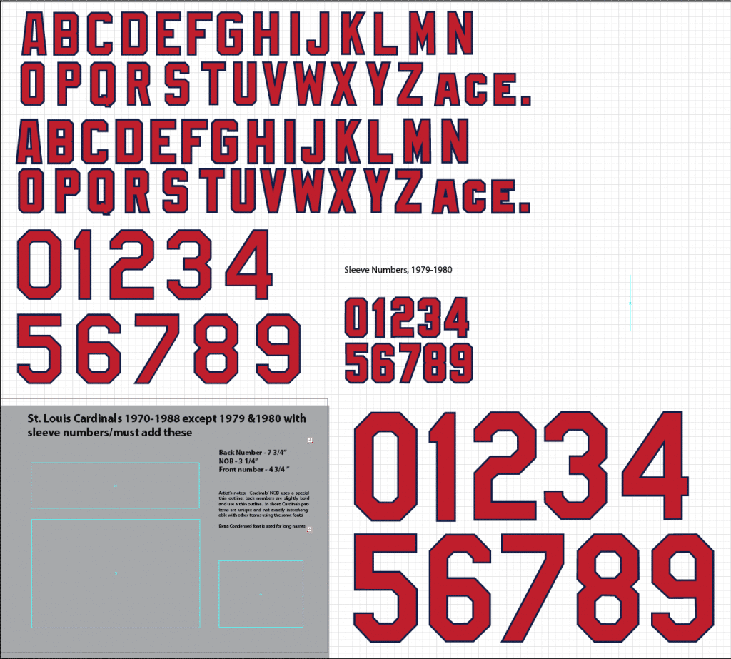
Notice there are two distinctly different alphabet patterns. The Cardinals’ lettering is close but not identical to what’s used by other teams. I know what sets it apart and what to look for when I’m authenticating original examples.
If we put the jersey on the light table and look very closely, we can see the faint ghosts of the lettering that was once there. These ghosts tell me which of the two alphabets was used on Torre’s jersey originally. Not surprisingly, the ghosts are a fraction of an inch smaller than the stock pattern, because the jersey has shrunk after being washed hundreds of times in hot water:
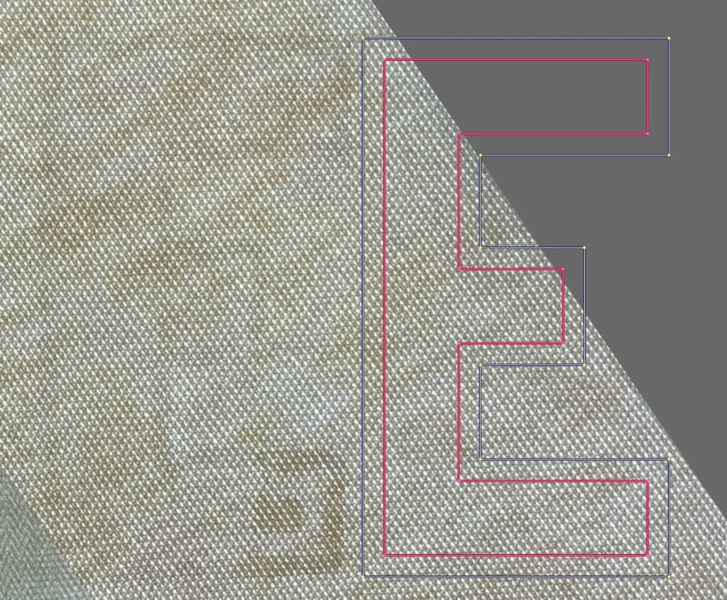
Using a scan of the light table’s image at 100% of actual size, I modify the patterns of the lettering’s size very slightly to get an exact match. Now we are ready to cut fabric using this pattern:
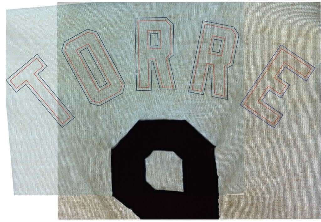
I have a computer-driven cutter that’s like a plotter with a knife. I create digital patterns and then send the result to the cutter (here’s a video of the process, from a different project). Here are the resulting letters:
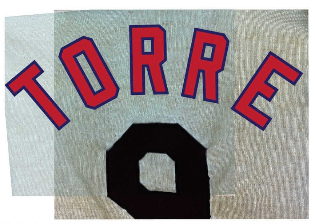
The next step is to create a proof for the customer’s approval. This step is essential to customer satisfaction, and I would never skip it. The time to catch errors or make changes is here, not when the job is done.
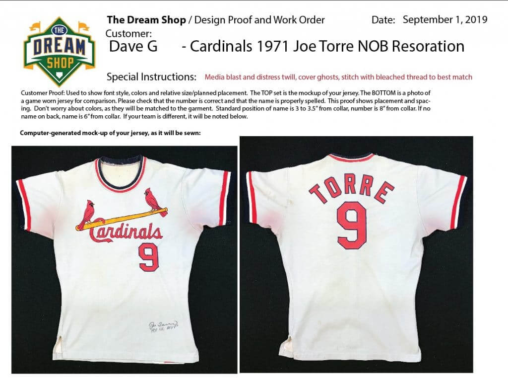
Here are three slightly different variants of the same lettering design. One is a scant 1/8″ larger than the others, because I intend to “age” it by boiling it in an organic dye and then steaming it to make it wrinkle and shrink. Another one of these uses slightly different shades of red and blue, from dye lots that are are slightly faded to match the well-worn numbers:
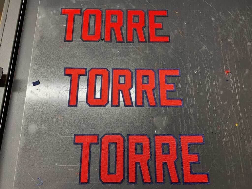
I chose the individual letters that best matched the color of the old “9.” New lettering on an old jersey looks jarringly bad, so I use an industrial sand blaster with baking soda as the abrasive to sand-blast the lettering. This removes the sheen from the fabric, to simulate years of use and washing. I also dye the lettering with organic materials to make it match the rest of the garment. “White” is never really white after it’s been washed 100 times.
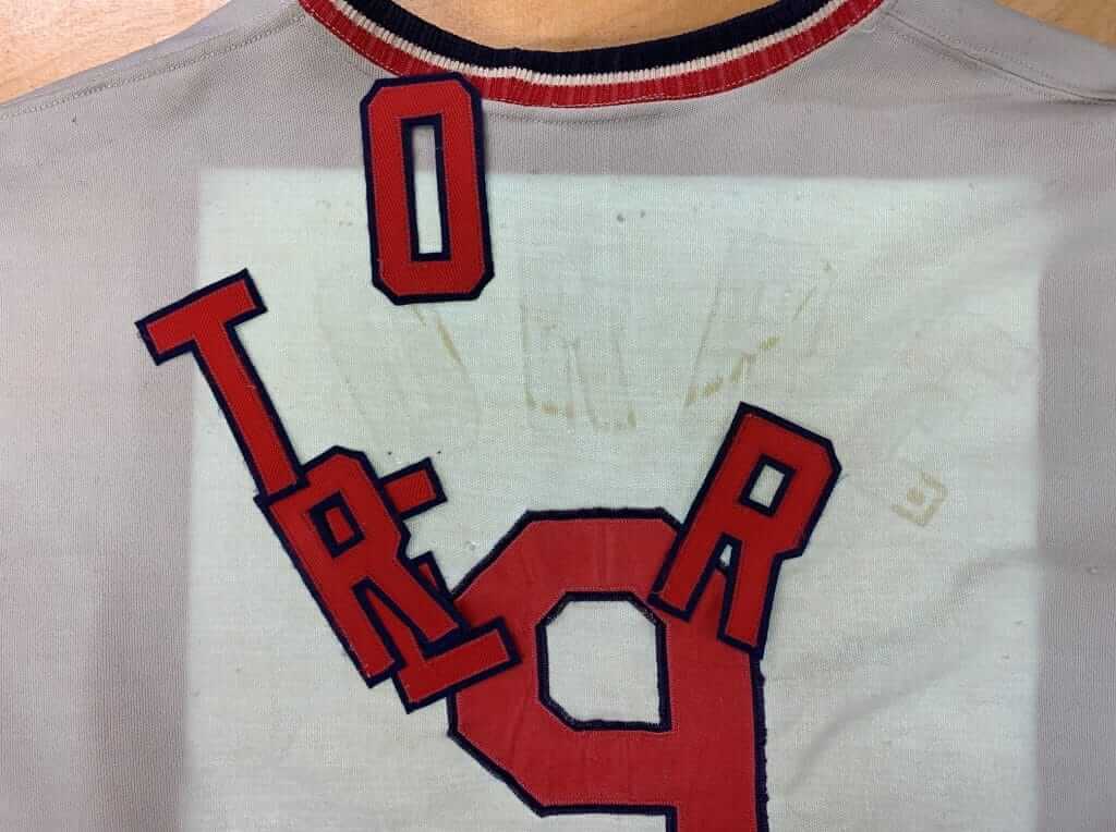
Here are the letters on the light table ready for their initial placement, and then in their proper placement, ready for final stitching:
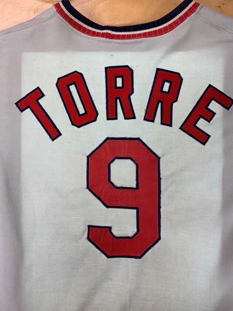
Here’s a shot of the letters stitched in place, next to the original number. The newly forced-faded colors match, the stitching has been done using bleached thread, the edges are slightly frayed from the media blasting — all done not to deceive, but to create a harmonious presentation for display:
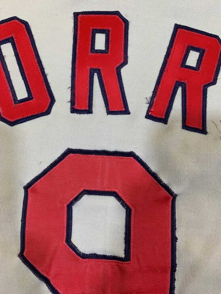
From the back, notice how puckered the fabric is beneath the original number. Also notice how the fabric under the number is clearly stained red. Meanwhile, the fabric underneath the newly stitched NOB lettering is unstained and unpuckered:
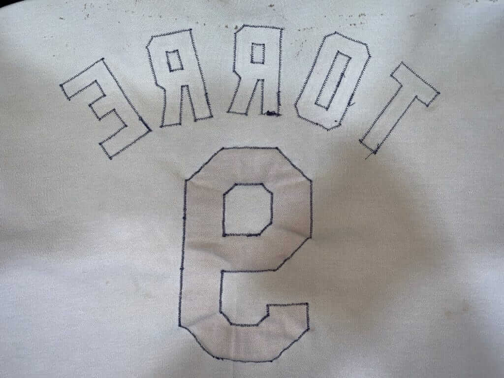
This would indicate to an authenticator that the NOB has been replaced.
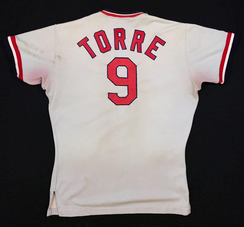
Here’s the final result, ready to enjoy and display:
———
Paul here. Was that awesome or what? Big thanks to Bill for sharing his expertise. We’ll continue to have more of his jersey-restoration projects on a semi-regular basis.
Some Allen & Ginter threads heading to the factory to become relics! 👀 pic.twitter.com/HOEvHT6FMB
— Topps (@Topps) February 29, 2020
ITEM! Topps card update: As I’ve discussed a few times now, I will soon be featured on my very own Topps trading card. In my last update, I mentioned that I’d given the Topps folks a Uni Watch tequila sunrise shirt — the same one I wore in the photo shoot for my card — so they could chop it up into little pieces for my “relic” cards.
On Saturday, Topps tweeted a photo of some relic items that were being shipped to the factory to be processed — and sure enough, my shirt was included! So funny to see it being included in this phase of the process.
(My thanks to eagle-eyed John Okray and @heythereitsWill for spotting my shirt in the Topps tweet and letting me know about it.)
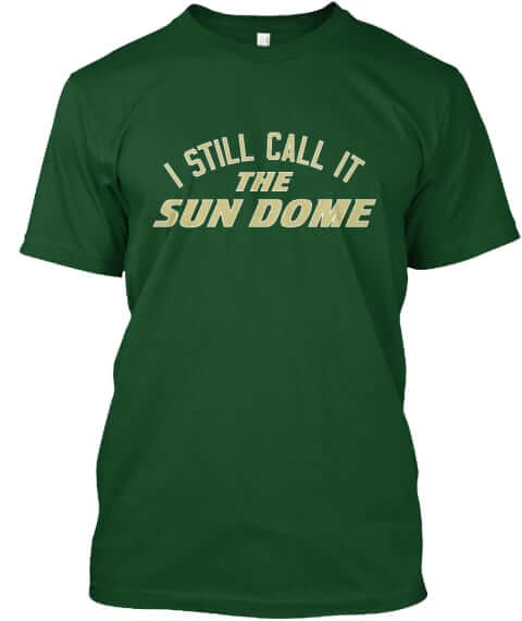
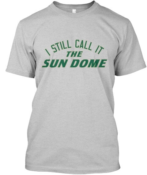
ITEM! Naming Wrongs update: We have some new Naming Wrongs shirts to share with you. First, for the USF Sun Dome, we have shirts available in green and grey:
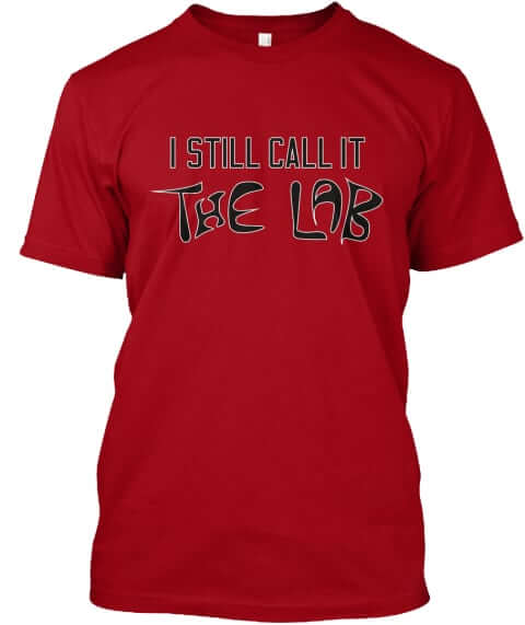
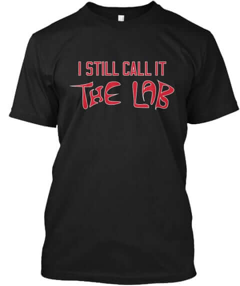
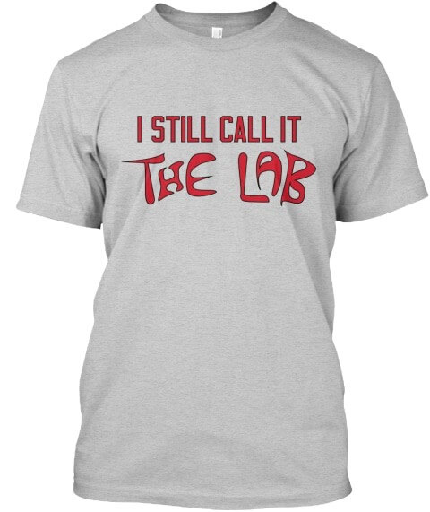
And for you Albuquerque Isotopes fans who are disappointed by your ballpark’s new corporate-advertised name, we have shirts for the Lab in red, black, and grey:
All of these designs are now available in the Naming Wrongs Shop. As always, card-carrying Uni Watch members are eligible for a 15% discount. If you’re a member and need the discount code, get in touch and I’ll hook you up. My thanks, as always, for considering our products.
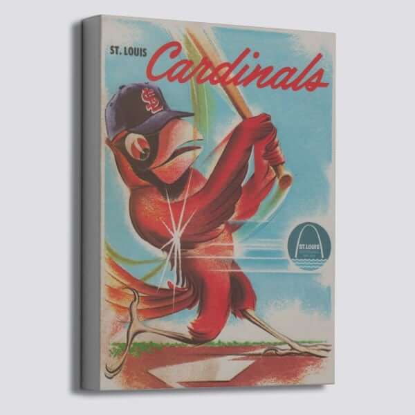

ITEM! Another Vintage Brand raffle: The folks at our longtime advertiser Vintage Brand are doing another giveaway. The winner will get to choose any item from the VB site (including the groovy Cardinals canvas shown above).
To enter, send an email to the raffle address by 8pm Eastern this Wednesday, March 4. One entry per person. I’ll announce the winner on Thursday. My continued thanks to Vintage Brand for sponsoring these giveaways.

Membership update: Two new designs have been added to the membership card gallery. That includes Chris Spisak’s card — he’s the recent membership raffle winner who, as I mentioned the other day, wanted his cased to be based on this 1970s Cleveland Force jersey. As I hope you’ll agree, it turned out great!
Ordering a membership card is a good way to support Uni Watch (which, frankly, could use your support these days). And remember, a Uni Watch membership card entitles you to a 15% discount on any of the merchandise in our Teespring shop and our Naming Wrongs shop. (If you’re an existing member and would like to have the discount code, email me and I’ll hook you up.)
As always, you can sign up for your own custom-designed card here, you can see all the cards we’ve designed so far here (now more than 2,400 of them!), and you can see how we produce the cards here.
The Ticker
By Jamie Rathjen

Baseball News: In Japan, Tohoku Rakuten Golden Eagles P Sung Chia-hao had a cherry blossom-themed glove during a spring training game (from Jeremy Brahm). … Brewers 1B Logan Morrison was wearing a headband of the team’s racing sausages yesterday (from multiple readers). … Grand Rapids Community College sent us their new baseball and softball uniforms. … NC State’s jerseys have some serious kerning issues (from Matthew Schmuck). … “Nationals C Welington Castillo wore a NNOB No. 92 jersey in Thursday’s spring training game, causing Mets broadcasters to have trouble identifying him,” says Joanna Zwiep.

Football News: An unidentified player on the XFL’s Houston Roughnecks was wearing an Apple Watch on the field (from Curtis Galvin). … Here are the uniforms for a game played last night between a team representing The Spring League, a developmental league that mostly serves to get players in front of scouts, and Japan’s national team (from Timmy Donahue).

Hockey News: With the Islanders retiring No. 91 for Butch Goring two days ago, they posted this video featuring the one helmet that Goring wore for his entire career (from @OlegKvasha). … RPI goalie Owen Savory appeared to have slits cut into the back of his pants on Saturday (from Tris Wykes). … Two junior hockey items from Wade Heidt: the WHL’s Swift Current Broncos wore Hockey Night in Canada blazer-themed jerseys as part of the WHL Suits Up promotion, and the team’s permanent shoulder-patch memorial to four players killed in a 1986 bus crash became the jersey’s “lapel pin.” … The WHL’s Spokane Chiefs wore cancer-awareness jerseys.

Basketball News: Ohio State’s men’s team wore red alternates at home to create a color-vs.-color matchup with Michigan (from multiple readers). … Louisville’s men’s team also wore red at home against Virginia Tech, who wore white on the road (from Andrew Cosentino). … Xavier’s men’s team wore throwbacks (from @MoSokhane). … The D-League’s Long Island Nets wore cancer-awareness uniforms yesterday (from @CJSFFLCommish).

Soccer News: With MLS’s season starting, there’s now a Nashville SC Kit Tracker that plans to track the new team’s record by combo, as well as by specific elements, such as yellow shirts or yellow socks. … A team-logoed goalie cap made an appearance on the New York Red Bulls’ David Jensen (from multiple readers). … The USL Championship’s Birmingham Legion apparently changed the crest on their white second shirt so it’s true-color instead of gold and white (from Josh Hinton). … Two more from Josh: Wales’s Euro 2020 second shirt, which I imagine is to be released soon, has started appearing in stores. … Inter Miami didn’t wear an ad for their first game, and wore the normal MLS logo instead of the 25th-anniversary logo. … You can see more on Josh‘s Twitter feed. … The Vancouver Whitecaps wore their new second kit at home, but with dark blue shorts instead of the light blue originally revealed. Wade Heidt also points out that the Whitecaps now seem to have two pairs of dark blue shorts, because the ones worn with their first kit have Adidas stripes down the sides. … Los Angeles FC’s captain’s armband was a Kobe Bryant tribute (from Moe Khan). … Chicago Fire fans brought a banner protesting their team’s new color scheme. I think it says “You can’t buy our history; we are red and white” (from @_scott_g_). … Fans of several Bundesliga teams attracted controversy with vulgar banners this weekend protesting Hoffenheim owner Dietmar Hopp’s majority ownership of the team — something that isn’t ordinarily allowed to be held by one person in Germany — most notably Bayern Munich, who played Hoffenheim, and Union Berlin.

Grab Bag: Virginia’s men’s lacrosse wore orange alternate jerseys at home yesterday, creating a color-vs.-color matchup with Air Force (from @Ace95Boiler16). … Wade Heidt tells us that a third of the NLL wore alternate uniforms this weekend: the Rochester Knighthawks wore black “military appreciation” jerseys, the Colorado Mammoth wore grey camouflage-accented jerseys, and both the Buffalo Bandits and Halifax Thunderbirds wore variants of the same lymphoma-awareness theme. … Wade also says that the uniforms for all the teams at the Brier, the Canadian men’s curling championship, feature the city hall of the host city, Kingston, Ont. … Adding to the Kobe Bryant tributes at yesterday’s NASCAR Cup race in Fontana, Calif., driver Daniel Suárez wore a Bryant jersey before the race (from Jakob Fox). … Australia’s field hockey teams are to wear an Aboriginal-themed kit next weekend of a red shirt with black shorts and socks, the color scheme of the Aboriginal flag, which works wonderfully well on a uniform. Hockey Australia also interviewed the designer, Nova Peris, who as part of the 1996 women’s field hockey team was the first Aboriginal Australian to win an Olympic gold medal. … Australian Football League team Sydney wore a pride guernsey this weekend. … Two high school bands weren’t allowed to march in Staten Island’s St. Patrick’s Day parade yesterday because they wouldn’t remove rainbow pride stickers from their uniforms (from Timmy Donahue). … Also from Timmy: The police department in Braintree, Mass., is selling puzzle-piece police patches for Autism Awareness Month.

Click to enlarge

What Paul did last night: In the recent Martin Scorsese film The Irishman, there’s a scene that takes place in a bowling alley. I immediately recognized the location as Van Nest Lanes, the old-school bowling center in the Bronx where I’ve been bowling for the past few years. My friend Michael celebrated his birthday party there last night.
Since it was a birthday party, someone brought balloons, and that led to a completely mind-blowing phenomenon. You know how there’s usually a fan at the end of the ball return, so bowlers can dry their hands? Check this out:
Is that amazing or what? It just hung there, suspended in the air stream — like, permanently! (As an aside from indie-rock fans: The woman in the black sweater with green heart in that video clip is the great singer-songwriter Amy Rigby, who’s the birthday boy’s sister.)
And it wasn’t just that one time. Check this out:
I was completely mesmerized by it. As you can hear in the background of that last clip, some folks theorized that the confetti inside the balloon provided extra weight to keep it in place, but I still don’t understand why it didn’t just, you know, blow away. How did it stay so perfectly within the fan’s air stream? Can any physicists out there explain this?
Here’s one more, with another guest rock star: The grey-haired gentleman bowling on left side of the frame is Amy’s husband, the great British new wave artist Wreckless Eric:
Okay, so that’s enough balloons and rock stars. There was also a nice uni-related moment when I noticed that a woman bowling in the lane adjacent to ours had this excellent Rockford Peaches tattoo (click to enlarge):
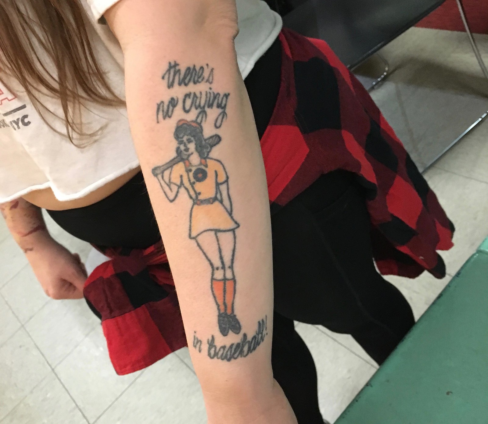
The woman, whose name was Amanda, told me she had the player depicted in orange socks and black shoes because she’s a San Francisco Giants fan. Bonus uni content!
Hope your Sunday was as enjoyable as mine! Thanks for listening.
Great tattoo! And great piece about restoring the Torre jersey! I really enjoy reading about the little details that go into your work Bill!
The balloon is held in place by the air stream itself by the same Bernoulli forces that produce lift on an airplane wing. The real key is not the weight of the balloon but its size: It it needs to be small enough, relative to the upward air flow, for the upward air to flow around it and for some portion of the air flow to come back together above the balloon. Throw a bigger beach ball over the air vent, and it will just deflect to the side and fall. A physics explanation:
link
link
My favorite Theorem – thanks Mr. Bernoli!
In the last millenium, We were taught Bernoli’s theorem – our instructor used a model kit wing and refrigerator magnets (The L’s specifically) to explain how the theory worked. By changing the angle of attack upward, you changed the flow of air on the wing, and the trees get smaller.
But be advised, if you keep moving the angle of attack upward – then all your LIFTIES, (the “L” magnets) slide off and you fall from the sky.
Never forgot that rule.
Bernouli, apologies
Love the restoration stories. Keep them coming!
Seconding the motion!
The Red Bulls goalie cap reminded me that yesterday Manchester United scored a long distance goal past the Everyon keeper, who was looking into a bright sunny Merseyside sky,one of the announcers on TV commented that you dont see goalie caps much anyomore: “They say the game has changed. The sun hasn’t changed.”
I saw the goal, and heard the comment as well.
The gentleman is correct!
Lee
What Bill Henderson does, in my world, is equivalent to taking a rusted out 67 Mustang body and turning it into a classic street machine. Great work!
Rick, your message made me laugh, because I have done THAT, too:link
The Riggleman on the Jersey is Jim Riggleman. So a future manager wearing another future manager’s jersey.
That was my first thought. Jim Riggleman didn’t play in the Cardinals’ minor league system until 1976, and when he did, it was for the New Orleans Pelicans and Arkansas Travelers and Springfield Redbirds. Its a pretty big time gap and the wrong team name.
On the other hand, he’s the only Riggleman even close in time.
link
What’s even more interesting is Riggleman was one of Whitey Herzog’s coaches in 1989-90. If Baseball-Reference.com is to be believed, Riggleman stuck around after Whitey was fired shortly before the All-Star break and, therefore, served as an assistant for 50-odd games to the Redbirds’ new manager, Joe Torre.
link
Perhaps he wore it during Spring Training, before heading off to the minors.
Another Cleveland Force-based card! Great look, and welcome to the club!
Thanks Bryan! I saw yours, the blue roads, very cool!!
re: balloon in the airstream – this is an aerodynamic effect – the flow of the air around the balloon creates “lift” (which is actually sideways). If the balloon drifts to the edge, the inner side has lift, but the outer side does not any more, so the net force on the balloon is to bring it back to the middle. (I am an aerospace engineer, but am not working in aerodynamics per se, so there may be subtleties I’m leaving out of this.)
Ninja’d
Holy cow, Amy Rigby! She’s great.
She sure is!
But not at bowling. ;)
Loved today’s story with Bill Henderson on the restoration of the uniform top. Hope we will see some more!
Jerry, you have been such a help with my research over the years. Your willingness to search the dark corners of your brain to answer my inane questions is always appreciated.
The Rochester Knighthawks “military appreciation” uniform looked less like a special event uniform compared to what we would normally see. That look would be really good as a permanent alternate uniform for Rochester.
Beautiful work on the jersey restoration. Riveting step by step. I’m happier because something like this is going on in the world I live in! Can’t wait for more.
Really enjoyed Bill’s piece about the jersey restoration. Not only is the process fascinating, but it was cool to learn a few new things…for example, I had no idea that major league jerseys were once shipped down to the minors. But…it makes sense given the era.
Last night’s episode of Last Week Tonight ended with a segment on the Phanatic lawsuit, culminating in a Costas-voice-overed plea to join on as the show’s mascot should he (it? they?) cut ties with the Phils.
Saw that…pretty funny, especially with the Costas narration.
What did everyone think of the Chicago Fire’s new kit?
link
Chicago Fire revealed their new kits versus Seattle, completely scrapping their traditional Red & White for Blue (purple?) with Red trim.
While not a terrible look, one wonders what the actual point is to trade in a consistent kit/badge history for something so unremarkable.
Lee
My theory is that they got a rejected RSL logo and kit colors. I mean, look at this thing in total. That “fire” in the logo looks like a sad crown.
Bring back the red with white stripe across the front! That’s pure Fire!
Bill should totally have someone film a restoration. I’ve watched plenty of thrift store furniture and electronics restoration videos and I feel like this would be fun to watch as well.
I don’t really care about the ASMR that some people do, I just love watching things be restored.
Anyways, keep these stories coming, the attention to detail is awesome.
Don’t know if I’m the first to say this, but those splits in the goalie’s pants are probably from the factory. More manufacturers are doing it with all ‘breezers’ these days. Most guys will put their skates on before the pants, then slide the pants on after; if you’re not careful, a sharp skate can cut through the nylon. If you look carefully, there are two ways of doing this: either the split in the back as shown, or a larger split along the inseam, closed with a bit of Velcro.
The jersey restoration article, by Bill Henderson, was absolutely fascinating. (Wow, that guy is good at what he does!) Thank you for posting that, and I’d look forward to more of that sort of content any time. It’s amazing to get a glimpse of the thought-process he goes through while restoring a jersey. Cool stuff!
Top notch article on jersey restoration. Please keep them coming.
Also, always love a bowling alley with manual scoring.
How did the Mets announcers take so long to notice the number 20 on Welington Castillo’s helmet?