
By Phil Hecken, with Kyle Evans & CJ Fleck
Follow @PhilHecken
Hey everyone — it’s time for the annual MLS Preview, and I’m back once again (for their fifth season!) with soccer guys Kyle Evans and CJ Fleck, who’ve not only previewed and reviewed the MLS kits and jerseys for five straight years, but have also reviewed other leagues plus the Olympics and World Cup. As always, we break this into two days, with the Eastern Conference today and the Western Conference tomorrow.
There’s a lot to get to — so let me turn this over now to the lads as they bring you their…
2020 MLS Preview – Eastern Conference
By Kyle Evans & CJ Fleck
Thanks Phil! We’re back for another season of MLS with another two new teams (Inter Miami and Nashville SC) and at least one new kit for each of the now 26 teams in the league. To begin, here are the league-wide uniform updates:
• As usual there’s a new Adidas template which supplies all of the league’s uniforms and this time with 3 stripes are asymmetric as they are only located on the right shoulder. This is meant to evoke a “90s-retro” look as it is the league’s 25th anniversary.
• There is a new number and name font appearing on all uniforms that was also “retro but modern” inspired.
• For the first time, sleeve advertisements are allowed and so far four teams (Atlanta, DC, LAFC, and Toronto) have announced a second jersey ad.
• We recently learned that some teams will have third kits next season which haven’t been in the league for a couple of years now. This, along with the decision to sell long-sleeved versions of uniforms, are completely based on business and their profitability (or lack thereof).
The season kicks off today and we’ll showcase the new jerseys for the Eastern Conference teams today and the Western Conference teams tomorrow. Enjoy!
Eastern Conference
Inter Miami
Primary: all-white with subtle light pink accents
Secondary: all-black with pink shoulder stripes
(Both have subtle printed flamingo pattern from crest on chest)

Kyle: Their unique color scheme isn’t quite realized in this set, especially in the plain-as-can-be all-white primary kit. I would expect more pink on future kits, and Miami fans are simply hoping that the team’s performance makes a splash this season.
CJ: So much wasted potential; Kyle was being polite. An interesting color scheme is now just a simple template design.
Atlanta United (secondary)
All-white with gold accents

Kyle: Yet another addition to the boring “all-white kit” club in MLS. The gold is nice though and I do like that all of the logos and ads match.
CJ: I second Kyle on the matching logos and ads. But, the white change kit will not go away, so I guess we must accept it.
Chicago Fire
The Fire have an almost universally disliked new logo and are moving back to the city and playing in Soldier Field again.
Primary: Navy with thin red diagonal stripes
Secondary: all-white

Kyle: First and foremost I can’t stand the new logo which looks like someone accidently stretched a circle. The navy look is perfectly fine, just don’t get me started on the white.
CJ: I’m not against the new logo, but it isn’t good, either. I actually like the navy design. However, that may be because it’s essentially what the Union’s affiliate team, Bethlehem Steel, wore in 2018.
FC Cincinnati (both)
Primary: halved blue/dark blue with orange shoulder stripes
Secondary: all-white with blue/orange accents, sublimated pattern matching Bayern Munich from last season (to acknowledge the German heritage and Munich – a sister city of Cincinnati)

Kyle: I know it’s a classic design but I’ve never been a fan of the halved look. I guess the nod to Bayern is nice, but it’s interesting given that Bayern has an official partnership with FC Dallas, not Cincinnati.
CJ: The shoulder design mars the halves design so badly. It’s jumbled in a bad way.
Columbus Crew (secondary)
Black with grey/black checkerboard design

Kyle: The checkerboard pattern has always been a part of the Crew’s design and I actually don’t mind this look – the pattern isn’t too bold and the yellow pops nicely.
CJ: I’m sure this will not be noticeable on the field, but I do like the design and agree with Kyle/
DC United (primary)
All-black with white shoulder stripes and thick red on sleeves

Kyle: A standard and classic look for DC which is a good thing because it works.
CJ: Yup, that’s DC. Brand recognition!
Montreal Impact (secondary)
Grey with black shoulder stripes, thin white vertical stripes

Kyle: Only grey and black? This is far too generic and unfortunate given that Montreal has one of the best primary looks in the league.
CJ: I have to disagree with Kyle here. I like the greyscale, in that it’s something different. Maybe not an A+ for execution but definitely an A for effort.
New England Revolution (primary)
Navy with white horizontal stripe and red shorts

Kyle: This “whooshed stripe” design for the Revs nicely matches their logo and the red shorts (which they haven’t worn since the 90’s) will create a nice contrast.
CJ: I’m not sure I like this. The stark contrast of the paintbrush design next to the sharp sleeve stripe silliness doesn’t sit well with me. Then again, could be worse.
NYCFC (secondary)
Navy with diagonal pattern, white shoulder stripes

Kyle: I’m not really seeing the “Brooklyn Bridge inspiration” but again the not-too-loud design works here.
CJ: This reminds me of those “fashion inspired” alternates some other major leagues make for public consumption. Count me out.
New York Red Bulls (secondary)
All-black with red accents / shoulder stripes

Kyle: Not much to add here other than this being a clear example of BFBS.
CJ: So many colors to choose from for RBNY, and they do this. Boo.
Orlando City (secondary)
White with purple “starburst” sublimated design, purple shoulder stripes

Kyle: You may have noticed how this template separates the shoulders from the front and this has the most negative impact on this particular design in my opinion.
CJ: Kyle has a good point. I get 90s vibes from this design, which seems to be a common theme.
Philadelphia Union (primary)
All-navy with gold shoulder stripes, subtle sublimated snake design

Kyle: The Union are missing the boat by not returning to their original gold center vertical stripe design and the snake may be the subtlest of all sublimated designs.
CJ: Year after year my team comes up with boring designs that both annoy me as a fan and an amateur critic. I don’t care about sublimated snakes, and why is the advertising still a different color? Why would I ever buy this?
Toronto FC (secondary)
Light grey with sublimated diagonal thick and thin stripes

Kyle: I like this, and the pattern I’m recognizing is that “non-standard” designs seem to work well when they don’t take over the jersey.
CJ: I feel like this is an old wild goalkeeper kit that someone dialed down from an 11 to a 3 and put into the adidas template. Which is to say, I think I like it?
Thanks, guys! As always, a great p/review! Looking forward to seeing what new kit tops the Western Conference has in store tomorrow.


Kreindler’s Korner
I had the distinct pleasure of featuring the wonderful artwork of artist Graig Kriendler on two occasions over the summer and fall of 2017, and more recently, in August of 2018.
For those who don’t wish to click the links, Graig paints baseball heroes (and regular guys) from the past, and is an immense talent.
Occasionally, I will be featuring his work on Uni Watch.
Here’s today’s offering (click to enlarge):

Title: “Alejandro Oms, 1924” (color study)
Subject: Alejandro Oms, 1924
Medium: Oil on linen mounted to board
Size: 5” x 7”One of the greatest center fielders of the era, Alejandro Oms spent most of his career – one that stretched from the early 1920s to the mid 1940s – playing in the various Cuban Leagues on the island. He also found himself in the United States on Alex Pompez’ Cuban Stars, a ballclub based in New York.
In 1922, he supposedly hit 40 home runs with the Stars, which prompted writers to call him the “Cuban Babe Ruth”. The next year, with the club now joining the Eastern Colored League, they found themselves as contenders – the Stars wound up in second place to Hilldale. Oms himself was said to have batted .357 in 20 league games. Though the Stars declined as they marched further into the 1920s, Alejandro continued to play well.
In the years of the mid-1920s, he also found himself on the Leopardos de Santa Clara – the 1923-24 team being one of the best to ever play on the island. Here’s Oms with the Leopardos a year later – still one of my favorite uniforms of the Cuban Leagues. This is one of 200+ paintings of mine that is on display at the Negro Leagues Baseball Museum until May 31.
Thanks, Graig! You can (and should!) follow Graig on Twitter.

Guess The Game…
from the scoreboard
Today’s scoreboard comes from August West.
The premise of the game (GTGFTS) is simple: I’ll post a scoreboard and you guys simply identify the game depicted. In the past, I don’t know if I’ve ever completely stumped you (some are easier than others).
Here’s the Scoreboard. In the comments below, try to identify the game (date & location, as well as final score). If anything noteworthy occurred during the game, please add that in (and if you were AT the game, well bonus points for you!):

Please continue sending these in! You’re welcome to send me any scoreboard photos (with answers please), and I’ll keep running them.
And new a few words from Paul
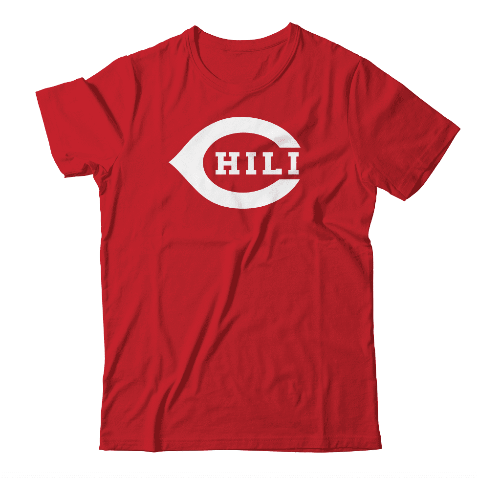
Hi there. In case you missed it a few days ago, Thursday was National Chili Day. Of course, for many of us, every day is National Chili Day. So I had this design mocked up. Just hypothetically speaking, wouldn’t it make a great shirt — you know, theoretically? If you agree, feel free to tell me.
Meanwhile: The results of our “Redesign the Patriots” contest are now available over on InsideHook. Enjoy!
Okay — onto the ticker!
The Ticker
By Anthony Emerson

Baseball News: The Brewers have added an “MC” patch to their jersey’s chest, in remembrance of the victims of this week’s shooting at the Molson Coors brewery in the city. Unsure if it will be worn all season (from multiple readers). … Yankees 3B Gio Urshela accidentally had his uniform left behind before a road Grapefruit League game, and so was forced to wear unassigned No. 68 during the game (from our own John Ekdahl). … SNY has been using a mash-up Mets logo for their Grapefruit League broadcasts, taking the skyline from the primary logo and the cap logo. It’s actually kinda nice (from A.J., who didn’t give their last name). … Jerry Wolper noticed that Gaylord Perry’s FIOB makes his entire NOB off-center in this highlight. Gaylord’s brother Jim also pitched for Cleveland that year, making me think that it was an old jersey with the “G” added after the acquisition of Jim. … Angels manager Joe Maddon wore a Disney-era Anaheim Angels jersey in honor of former coach Bob Clear, whom Maddon called “the greatest coach in the history of this organization” (from Jakob Fox). … East Carolina are wearing late-1990s throwbacks in memory of former coach Keith LeClair, who coached the team from 1998 to 2002 before passing away from ALS in 2006.

![]()
Pro & College Football News: Not often you see WLAF gear in the wild. That jacket is at least 28 years old (spotted by Jonathan Millican). … Among the proposed rule changes for college football next year is a limit on how many players can wear the same uni number (from James Gilbert).

Hockey News: When the Blues wore their Gretzky-era throwbacks on Thursday night, the team’s athletic trainer broke out an era-appropriate Chalk Line jacket (from @GoatJerseys). … It appears that the Islanders’ Brooklyn experience is over, as the club has announced all playoff games this year and all home games next year will be played at the Nassau Coliseum (from Wade Heidt). … Also from Wade: The Seattle NHL team has broken ground on their training facility (from Wade Heidt). … One more from Wade: here’s a good article on how goalies update their gear after they’re traded.

NBA News: NASCAR driver Ryan Blaney will debut his car’s Kobe memorial livery at Fontana (from our own John Ekdahl). … Uni number updates from Etienne Catalan: Grizzlies PF Jarrod Uthoff will wear No. 19 and Warriors SG Mychal Mulder will wear No. 15.

College Hoops News: Iowa and Minnesota women went color-vs-color Thursday night (thanks Jamie).
.

Soccer News: The Canadian Premier League published a power ranking of the league’s 2020 kits (from Wade Heidt). … English side Sunderland are moving to Nike kits next season.

Grab Bag: The Connecticut Hammerheads, the newest team in Major League Lacrosse, have unveiled their inaugural unis. Unfortunately, it’s hard to tell the details from the photo (from Timmy Donahue).
The birds on Inter Miami’s crest / pattern are herons, not flamingoes: link
The pink is a bit too light on Miami’s uniforms. Would be better if it was more vibrant. Would contrast better on the white uniform.
I feel like if you have to explain to everyone what your logo actually *is* (not the meaning behind it or why you chose the colors, etc.), then you have failed abjectly at uniform/brand design.
But they look exactly like herons.
They don’t look anything like flamingos.
The “Soccer Guys” who wrote this clearly didn’t even look at the crest!
GTGFTS: May 21, 2016, Yankee Stadium, Hudson River derby.
Same day I graduated college. I remember looking at the score and wishing it was flipped…
NY is Red (well in soccer only, and really NJ, so……)
May 21 2016 Red Bulls set club record with 7 goals at Yankee Stadium
New York Red Bulls. I think I get why the went black and red. The team was founded as the NY/NJ MetroStars. But they had stripes. The Red Bulls here don’t. So that’s why I’ll give a F on execution. They look like DC United from far away, and that’s the worst thing you could say about a charter member rival. Literally any kind of stripe job in any color would have made the Red Bulls look more unique and more in keeping with the 25th anniversary that the league is trying to observe.
The Angels need to return to the Disney era uniforms. They are so great.
Ugh, no. My only issue with the current set is the ghosted numbers on the red alternate top. The Angels have consistently had great uniforms, going back to the halos on the caps… except for the Disney years. Sorry. Agree to disagree.
Ugh. Those are the worst uniforms in American league history and possibly Los Angeles sports history. And yes, I’m saying the Rams recent mish mash is better.
As a longtime Angels fan, no way do I want to see those hideous monstrosities that are the late-’90s uniforms to come back. I can’t believe anyone complains about the current ones, considering what they replaced.
Strange thing is, Bob Clear was on the Angels’ coaching staff from 1976 to 1987, so as far as I know, he never wore those Disney-era uniforms. Maddon should’ve worn the 1980s-era jersey.
Angels need to go back, permanently, to wearing caps with halos stitched into the top. The rest? Meh…
I get that adidas is trying to stir up nostalgia with the description of the current MLS set’s 3 stripes over the shoulder being a shout-out to the kits of the ’90s. But those stripes were thick to the point of not looking like stripes. And on some kits (USA white primary), the middle stripe was a different color. It looked more like a design element. The MLS25 set looks like a crass ad logo trying to be passed off as a faux back design element.
Is the reviewing crew aware that NYRB were previously New York Metrostars, who donned red and black? I would think that would change the perspective considering they’ve labeled it as BFBS, when it’s clearly not. Sure, they wore stripes, but the colors were very clearly red and black. Seems like a lack of awareness to me.
Always look forward to the colorization on the weekend! Great work, as always Graig!
Man, that MLS number font does my head in. First of all, there’s no reason to make every team, each of which has its own traditions and styles, use the same number font. None of the other sports would even consider this. If you *have* to do that, pick something generic that goes with everything. This weird optical-illusion thing they’ve got going looks awful.
The German DIN font that they’re using for the “25” in their anniversary logo looks just fine; they could have used that!
Props to Miami and Columbus for not having advertising, though. And semi-props to Orlando for having one that doesn’t entirely look like an ad. The Revolution have this big giant paintbrush thing on their jersey… so that an ad can sit there? And the ad is too big for it.
Columbus has advertising now. Pretty sure it was covered in yesterday’s Uni Watch: link
Miami was in talks to have Qatar be an advertiser back in January. If there’s no advertiser now, I imagine it is not for altruism: link
Point 1. None of the original MLS teams from season 1 had especially unique numbers. Generally Block Varsity or some variation thereof. No timeless classics in the bunch.
Point 2. Traditions in MLS. Ah yes, like the good old days of the KC Wiz, Miami Fusion and Tampa Bay Mutiny.
Point 3. MLS went to a leaguewide font 10 years ago. So, 12 of the teams in MLS never had their own unique font of any kind.
Point 4. Other leagues: English Premier League, Spanish La Liga, France Ligue 1, Portuguese Primera Liga…
Point 4a. Other sports: Australian Rules Football, also international cricket.
Point 5. I dunno, I like the mindbending font. Similar to one adidas uses for bespoke kits.
Point 6. The DIN font would have been sufficient and it is a great font. Except the Bengals use it; is that what you want to associate with?
Point #whatever: MLS uniforms suck
Regarding point 2, I have fond memories of the ’90s MLS, especially Alexi Lalas playing for the Revolution (who had a very ’90s handwritten number font at one point but also had a more geometric and readable one).
International cricket and the horrible style-less Arial font that they uglify their jerseys with shouldn’t even be in the conversation. They took classic, timeless sweaters and uglied them up with something that looks like an illegal Chinese knockoff.
Just because soccer leagues in other countries do something doesn’t mean the US has to too. And there are plenty of soccer leagues that don’t do that; the J-League has some great individual number fonts that fit well with each team’s look.
I never noticed that the Bengals’ font was DIN. For all their other uniform faults, the font is not one of them.
Interesting Dear Abby column, today, concerning an office manager in New Mexico who roots for a certain college football squad (not UNM or NMS) and bullies his coworkers who aren’t all-in. Sad commentary on the lack of restraint which passes for public discourse nowadays. This jerk should get the axe.
I saw that Dear Abby too. Apparently, he gets upset that the letter’s author wants to wear her “maize and blue” sweater and he insists that a certain B1G state be referred to as the “M-state.” Obviously a fan of the school that insists on using “The” as part of its name.