Click to enlarge
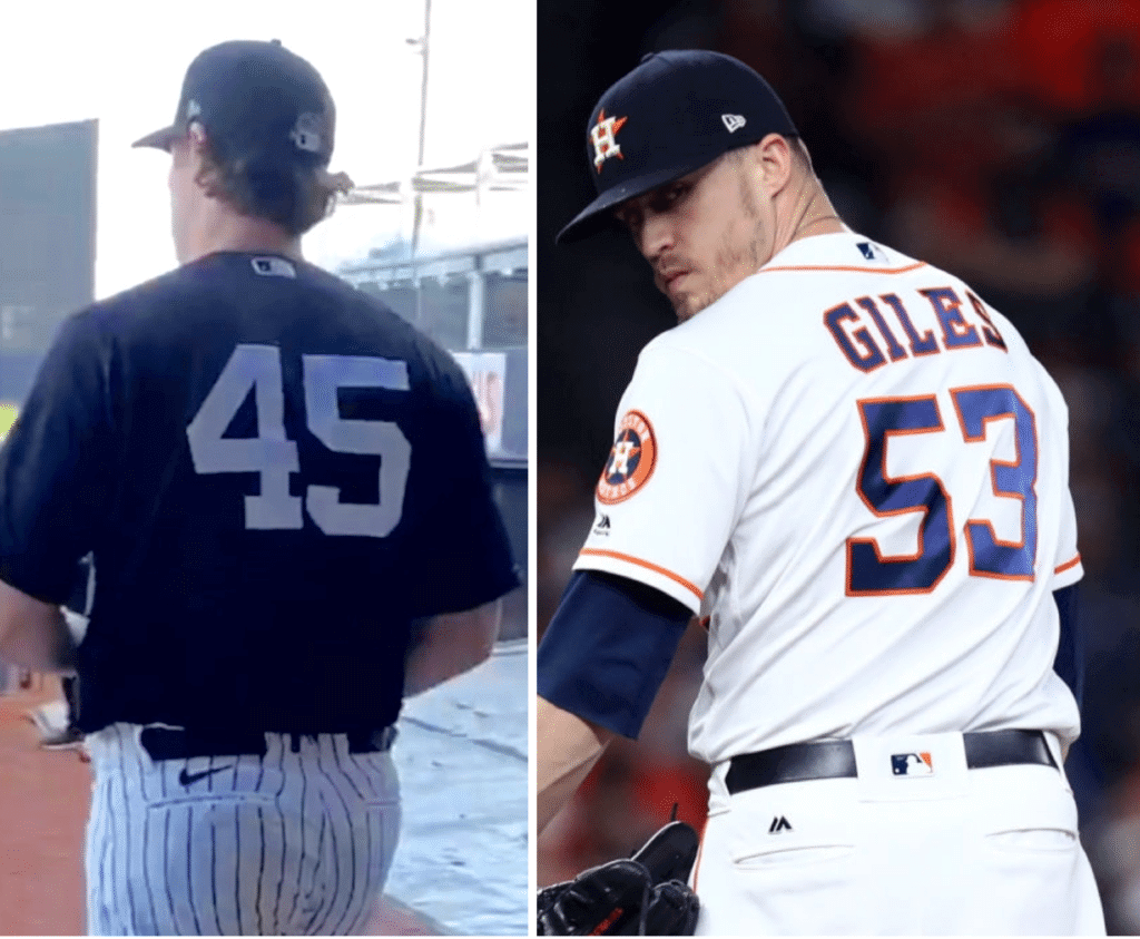
As MLB players hit the field yesterday for spring training workouts, an interesting thing happened: A fair number of people got in touch to let me know that Nike had added its logo above the back-left pocket of MLB pants. Several of these people did so with a “Can you believe this shit?” tone.
As I pointed out to these people (and as you can see above), the Majestic logo was in that exact same spot for more than a decade. Everyone said they had no idea.
Not only that, but in the 1990s and early 2000s — before Majestic secured the exclusive MLB uniform contract — the Rawlings and Russell Athletic logos also appeared above the pocket (click to enlarge):
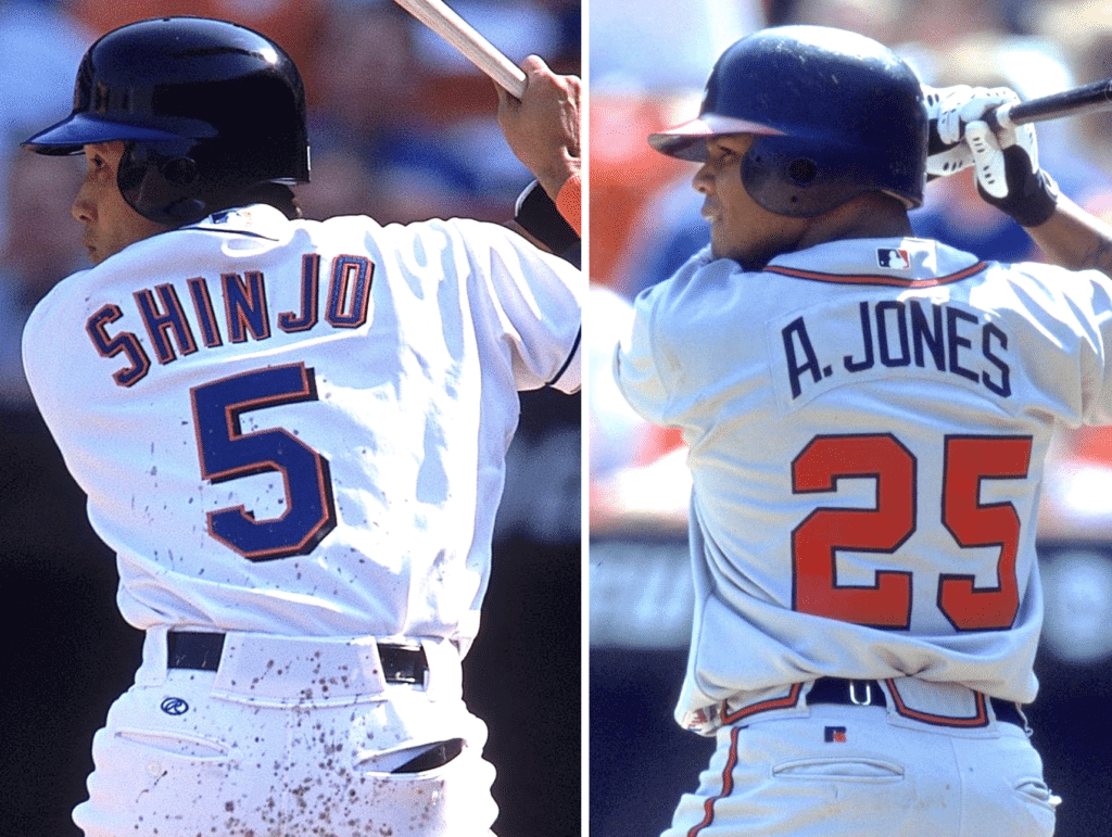
Naturally, I’m opposed to all of these logos, for reasons I’ve explained countless time and won’t repeat today. But it’s worth noting that Nike’s not doing anything here that Majestic, Rawlings, and Russell didn’t already do. So it’s interesting that a bunch of uni-watchers found the Nike symbol so provocative yesterday.
That got me thinking. Why did people respond so much to the swoosh? For one thing, those other companies are legacy sporting goods firms — they’re not global lifestyle brands that have a history of carpet-bombing their logos onto every available surface. So when we see the Nike logo, it registers differently than when we see, say, the Majestic logo. With Nike, it’s easy to think, “There they go again,” even though they’re just doing the same thing the other outfitters were doing.
Also, let’s face it, the Nike logo is a much better piece of design than those other logos, especially in a really small application like this one. I mean, at that tiny size, you’d never know that the old Russell Athletic logo (they’ve since updated it) was a stylized “R” featuring an eagle’s head. Similarly, the script Rawlings “R” doesn’t have much impact in this setting because it’s transparent. And while many of you are no doubt familiar with the Majestic logo on collar tags and jock tags, it never had much impact as an embroidered mark on the pants (or on the jersey sleeve, for that matter). All of that was bad for those companies, but it was great for those of us who care about logo creep.
The Nike logo, by contrast, is a simple, solid shape. It doesn’t have to be deciphered, decoded, or interpreted. It works just as well (unfortunately) above an MLB pants pocket as it does on a pair of sneakers or on a giant billboard or whatever. So when people responded to the sight of it yesterday, they were really paying Nike a well-deserved compliment.
Anyway: I’m just relieved that MLB didn’t allow the maker’s mark to appear on the front of the pants, as is the case with most of Nike’s college baseball uniforms, instead of above the pocket. Phew!
Meanwhile, as long as we’re talking about spring training, here’s some news: The Yankees are wearing a 25th-anniversary patch for Steinbrenner Field, their spring facility in Tampa.
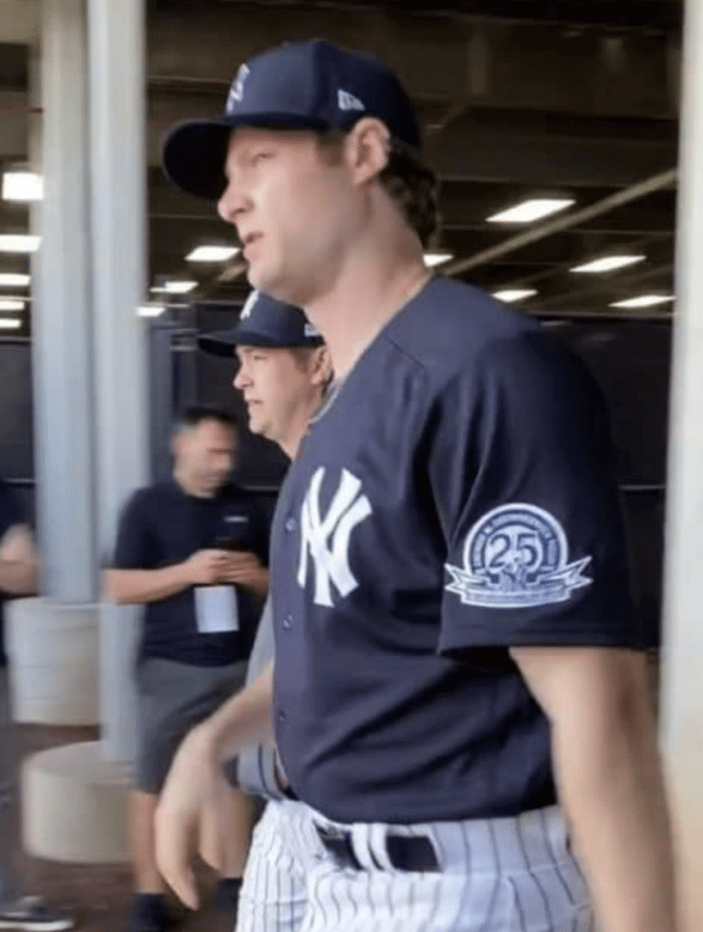
@UniWatch @PhilHecken the @Yankees are wearing a patch on their spring training jerseys for the 25th anniversary of George M. Steinbrenner Field pic.twitter.com/9oTkuM311d
— Jakob Fox (@JakobLFox) February 12, 2020
— Tampa Bay Buccaneers (@Buccaneers) February 12, 2020
And not a moment too soon: We’ve known for a while that the Rams and Browns will be unveiling new uniforms this spring. Then we recently learned that the Falcons will also be getting a redesign. There have also been rumors about the Buccaneers, but nothing solid — until yesterday, when the team posted the teaser video shown above.
So we can now add the Bucs to the list of NFL teams getting 2020 makeovers. I don’t yet know anything else about this redesign, but I’m sure we’ll hear more soon — stay tuned.
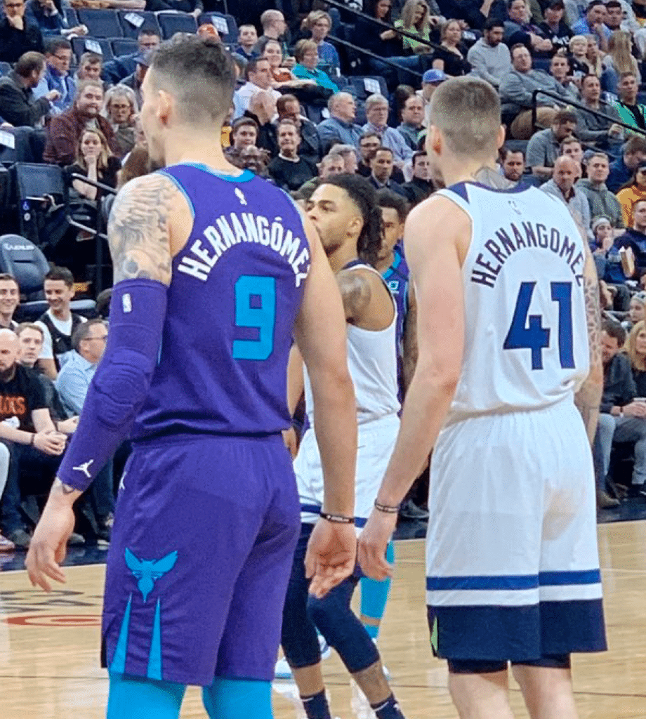
O brother, where hath thine accent gone? The Hornets and Timberwolves played each other last night, which meant Charlotte center Willy Hernangómez and his brother, Minnesota forward Juan Hernangómez, appeared together on the court. Interestingly, the Hornets use an accent on Willy’s NOB but the Timberwolves don’t use one on Juan’s.
(Photo by Marney Gellner, brought to my attention by @Balden303.)

Click to enlarge
Too good for the Ticker: You know how coaches always tell players to play for the name on the front of the jersey, not the name on the back? Check out the American History High School Bald Eagles from Newark, N.J. — that eagle motif on the back is really something (even with the purple!). So much better than Nike’s sweatback patterns.
Also, while it’s a little hard to make out unless you enlarge the photo, the team in black — the Roselle Catholic Lions — has TNOB, so their players can also play for both sides of the jersey!
(Big thanks to @VictoryCB for this one.)
Uni Watch’s highest rating, part one: The great design podcast 99% Invisible is always essential listening. But even by their already impressive standards, their latest episode is really, really good.
The first part of the episode is about answering a seemingly simple question: Who wrote the song “Who Let the Dogs Out”? The answer turns out to be really complicated and maybe even impossible to nail down, and really shows how the creative process isn’t always as linear or tidy as we’d like to believe.
That part of the episode — the part about the song — is excellent. But then they use that as a jumping-off point for an awesome tangent: They note that the song title “Who Let the Dogs Out” does not include a question mark, which turns out to be fairly common for interrogative titles, especially movie titles. So they explore that for a bit as well — a brilliantly minutiae-based topic. (Yes, I also just wanted to say, “interrogative.”)
The episode is 40 minutes long and worth every moment. Check it out here.
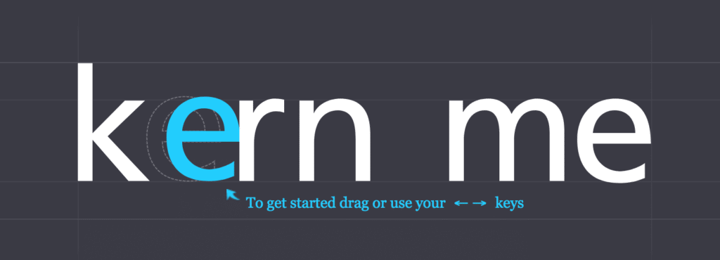
Uni Watch’s highest rating, part two: I awoke this morning to find a short note from Gregory Baxter, who said, “You’re the only other person I know who might enjoy this — it’s a web-based kerning game.”
I tried it and immediately found it addictive (so addictive, in fact, that it ended up delaying the publication of today’s blog post by about half an hour). If you care about typography, or just about getting things to look Just Right, you’ll definitely want to try this. But be warned — it’s hard to stop. See for yourself here.

ITEM! Another Teespring sale: Teespring is running another of its 10% sales. From today through Sunday, you can get a discount on anything in the Uni Watch Shop (including the new February Pin Club design) and the Naming Wrongs Shop by using the checkout code CANDY. You’ll get 10% off but Uni Watch will still get its full profit — a win-win.
As I’ve been doing lately, I will match this discount for our Uni Watch Classic caps, which will be $35.99, instead of the usual $39.99, from now through Sunday.
Also, in case you missed it yesterday, I’m running a 50%-off clearance sale on the handful of Uni Watch gumball helmets I still have in stock.
My thanks, as always, for your support of Uni Watch.
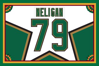
Membership update: I’ve always said that the most outrageous jersey designs make for the best membership cards, and that’s certainly the case with reader Patrick Neligan’s Dallas Stars-themed card, which is one of seven new designs that have been added to the membership card gallery. I expect the printed/laminated versions of these cards to ship out by the middle of next week.
Ordering a membership card is a good way to support Uni Watch (which, frankly, could use your support these days). And remember, a Uni Watch membership card entitles you to a 15% discount on any of the merchandise in our Teespring shop and our Naming Wrongs shop. (If you’re an existing member and would like to have the discount code, email me and I’ll hook you up.)
As always, you can sign up for your own custom-designed card here, you can see all the cards we’ve designed so far here (now more than 2,400 of them!), and you can see how we produce the cards here. Thanks!
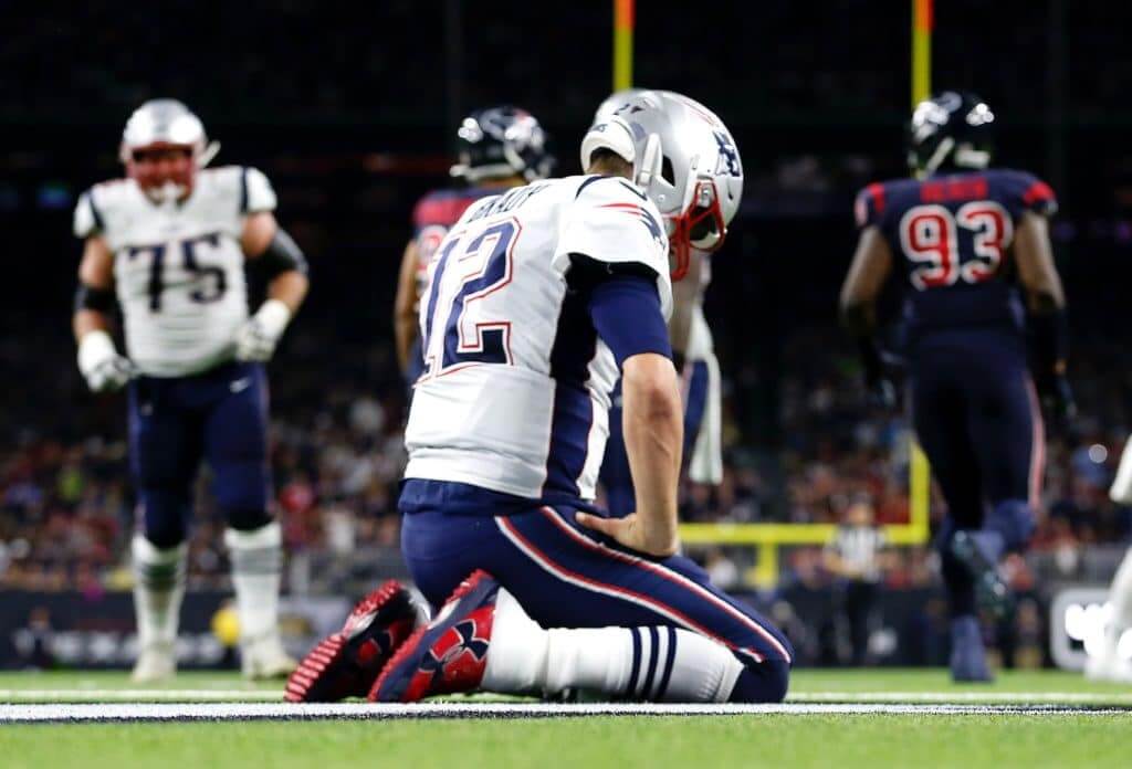
Design contest reminder: In case you missed it last week, my latest Uni Watch design challenge, which I’m doing in conjunction with InsideHook, is to redesign the New England Patriots. With the Brady/Belichick era nearing its conclusion, this seems like the right time for it. Full details here — get crackin’!
The Ticker
By Paul

’Skins Watch: The Katonah-Lewisboro school district in New York State’s Hudson Valley, having already decided last November to stop calling its teams the Indians, is now seeking public input for a replacement name (from Timmy Donahue).

Working Class Wannabes™: Troy football coach Chip Lindsey says, “I think it’s important to us to get back to that blue-collar, work-ethic kind of deal.” Sounds, uh, inspiring (from Timmy Donahue).

Baseball News: New batting helmets for Florida State. … Gross: The Team USA softball team has been wearing a Dick’s Sporting Goods ad patch (from Griffin Smith). … With spring training now underway, there are lots of new uni numbers to keep track of. That includes Twins C Mitch Garver, who’s now on his fourth number in four years (from Logan Sass and our own Anthony Emerson). … Aron Baynes of the NBA’s Phoenix Suns has an impressive MiLB cap collection. … It’s not that unusual these days to see ballplayers wearing team-colored base-layer shirts with their own personal logos (I once wrote a whole blog entry about Mets P Matt Harvey doing that), but Reds P Trevor Bauer has a base-layer shirt that features both his personal logo and the team logo. I could be wrong, but I feel like we haven’t seen that very frequently, if ever. And no, his personal logo doesn’t show him holding a bow and arrow — it’s this training gizmo (from Jason Hillyer). … New display of Chi-town baseball jerseys at Chicago’s Midway Airport. … I still call it Isotopes Park (from Sam Kissel). … The Yankees have signed P Tony Zych and invited him to spring training. If he makes the final roster cut, he’ll have the lowest-alphabetized surname in big league history. … Yesterday’s Ticker mentioned that new Dodgers P David Price will be wearing No. 33. Turns out he’s wearing that number as a nod to former teammate James Shields (from Mike Chamernik). … Price, incidentally, wore a squatcheed Dodgers cap for his introductory presser. Might be the only time we see him wearing one of those. … Price and OF Mookie Betts were also given uni-numbered hard hats while touring some construction taking place in Dodger Stadium’s outfield pavilion (from Billy Ballas). … Wondering who made Cleveland’s 1929 home uniforms? It was apparently Spalding. No word on who made the road greys (from Jim Vilk). … D-backs P Archie Bradley was high-cuffed for yesterday’s spring workout but wore black tights with white crew socks, much like an NFL player (good spot by @allcapstory). … Here’s how the Nike maker’s mark looks on a Cubs home uniform (from Jeff Stark).
College Football News: Whoa, love this vintage Iowa coach’s jacket! The chest logo is particularly awesome (from Kary Klismet).
.

Hockey News: The Canucks retired the Sedin twins’ numbers last night. They had new locker nameplates and helmet decals for the occasion, plus players wore Sedin jerseys during pregame activities. The opposing team, the Blackhawks, also wore the helmet decals. … The Canucks also gave away T-shirts that allowed fans to form the Sedins’ numbers in the crowd. (from proud Vancouverite Wade Heidt). … Some of the NHL Shop’s St. Paddy’s Day merch improperly shows a four-leaf clover instead of a three-leaf shamrock. … From Wade Heidt: “The OHL’s London Knights introduced new uniforms this year when the major junior team made the switch to CCM Quicklite. But for Alumni Night on Tuesday, they brought their recently retired black uniforms out of the closet.” … Whoa, check out the Avs’ helmet design for their upcoming Stadium Series game! (From Kevin Rice.) … The AHL’s Syracuse Crunch will wear 1980 “Miracle on Ice”-inspired uniforms tomorrow (from Nick Tamurian).

NBA News: Cross-listed from the baseball section: Suns C/PF Aron Baynes has an impressive collection of minor league ballcaps. … SF Bruno Caboclo will wear No. 5 for the Rockets. … We had already seen the uniforms for this weekend’s NBA All-Star Game, but here they are with the newly added memorial patch for the people who died in the Kobe Bryant helicopter crash.

College Hoops News: New floor design for CCNY (from Kary Klismet). … Throwbacks tonight for Louisiana Tech (from Chris Mycoskie). … Northern Iowa wore a memorial patch last night for the son of DJ and Natalie Deery. Although no explanation is given in that tweet, some googling reveals that DJ is apparently a former member of the team. Is there any other connection I’m missing? … Oklahoma State will wear 1995-inspired uniforms on Saturday to mark the 25th anniversary of the school’s Final Four run (from Glen Brockenbush). … Nevada and UNLV went navy (or was it black?) vs. red last night (from Jeffrey Seals). … New Orleans wore their new Mardi Gras alternates last night. … And so did Tulane (from Patrick Barnett).

Soccer News: From our own Jamie Rathjen: “League of Ireland Premier Division team Bohemians released their new second shirt on Wednesday. It has ‘Refugees Welcome’ on the front, in place of an ad, and ‘Love Football, Hate Racism’ on the rear collar.” … Looks like D.C. United may have red shorts in the works (from many readers).

Grab Bag: Very cool find here: a bunch of old media guides for various U. of Maryland sports (from Thomas Langan). … The new Paralympics logo is cleverer than you think. … Hmmm, does this JMU Dukes cap say “Dukes” or “Duices”? (From Jon Solomonson.) … New logo for the state of Oklahoma and also for the Michigan town of Midland (both from Timmy Donahue). … New 150th-anniversary logo for Colorado State University (from Kary Klismet). … Pro golfer Justin Thomas, having already worn a Kobe Bryant jersey on the course, will now wear Bryant-themed shoes (from Griffin Smith). … After getting a lot of flak for its redesigned logo, Sears has re-redesigned it. … The LSU’s golf team’s cap logo features this awesome golfing tiger! No maker’s mark, to boot. (from Stephen Millet). … The Texas State golf team has something very similar. … A former Adidas exec is taking “waste” retail jerseys and other unwanted fabric and upcycling them into new products (from Tom Turner). … New minimalist logo for Molson-Coors (Timmy Donahue again). … The Canadian military is trying to attract more female recruits by using, according to this article, “shorter, tighter skirts, more stylish shoes, and cringeworthy social media campaigns featuring slogans like, ‘My bling are my medals.'” … The upstate New York town of Owego is holding a logo-design contest for its annual strawberry festival. … The state of Georgia now has a “Georgia Made” logo to promote in-state manufacturers.
Please join me in wishing a speedy recovery to “Collector’s Corner” columnist and all-around swell guy Brinke Guthrie, who had to undergo an unexpected medical procedure yesterday. Feel better, big fella — hope you’re soon nodding and smiling like a vintage bobblehead! — Paul
Shamrocks instead of four leaf clovers on St. Pat’s is something I’ve never thought about. Thanks!
One time as an editor I mistakenly allowed a stock illustration of a four-leaf clover to run when a shamrock was called for, and that mistake generated the second-most voluminous and angry pile of letters to the editor in my career. (Only exceeded by an editorial on an Australian referendum. Don’t piss off Aussies.) As an Irish-American born on St. Patrick’s Day, I know the difference, and I have no idea how I let the wrong Illo through. Anyway, ever since, I maintain a strict boycott of anything that uses a four-leaf clover in place of a shamrock.
Why does the number of leaves matter? Because St. Patrick: link
That’s a great story! I love me some Ireland (and the North).
I’ve made it a point to call-out anyone around me when they say “St. Patty’s Day” for this very reason you described.
Boycott Patty and boycott the clover.
While we’re at it, “St. Pat’s” is a pretty big no-no (unless you’re talking about the soccer team in the Dublin suburb of Inchicore). St. Patrick’s or St. Paddy’s.
Best wishes, Brinke!
thank you!
Get well soon!
Maybe I’m just dense, but other than the headline “uniform effort”, what about that video even hints at new uniforms? I see a ship logo, but that’s about it. I guess this is one time I just don’t get it
@Paul – Will you be running “re-design the [___]” for the Bucs, Falcons, Browns and Rams? Usually the designs are better than anything official. Would be good!
Well, we just did the Bucs a few months ago:
link
Did the Browns and Rams for ESPN within the past few years, so I don’t plan to do those again this time around (google them!).
Considered doing the Falcons, but we’re currently doing the Pats instead because it seemed to offer more interesting possibilities (and because they’re in the same division as the Bucs, who we just did).
Thanks!
With Nike now MLB’s uniform supplier, does that mean that the rest of the previous Majestic dugout wear will now be made by Nike? Is Nike going to make the dugout jackets?
Yes.
Those jackets are hideous, I have no idea what they were going for.
Regarding UNI’s memorial patch, the Deery’s are big name in Iowa in the automotive sales business. They are huge UNI supporters along with donating $$$ to the school and athletics. Basically if your in good with the team as a booster, you end up getting patches like what you see.
I’m actually am from Cedar Falls, where UNI is, and went to school there at the same time as DJ. He didn’t play basketball, but his family are huge Panther fans and supporters. It’s cool that the team did a patch like that for him. Losing a child is such a terrible situation that I could never imagine. Prayers to DJ and his family.
I went to UNI as well.
I know the embedded ads are out of your control, but that earwax ad that is repeatedly here is disgusting.
Not sure what you’re referring to, but the network-served ads are based on your browsing history, your IP address location, etc. So what you’re seeing is not necessarily what other people are seeing.
Hmm. Those might be different ads I’m referring to then considering earwax is not one of my interests.
I’ve receive the earwax ads as well. I think the algorithms must just be off.
Hope you feel better soon Brinke!
Get well soon, Brinke!
I hope the Bucs fully embrace the creamsicle era.
1. Bucs: about damn time.
1a: Bucs: go with white helmets and make true Creamsicle throwbacks a thing, if you don’t just go outright retro.
2. Best wishes for a speedy recovery to Brinke, my online birthday bud.
The outrage over the ass swoosh is, obviously, fueled by associated outrage over the tit swoosh. If the Majestic logo had moved from the sleeve to the tit, or the UA logo, Rawlings, etc., the ass logo would have become much more annoying by association.
Didn’t know cleverer was a word lol
I’ve been listening to 99pi for about 7 years now and like to pick out my favorite episode each year (2019 was Usonia, link and 2018 was the navy chairs episode: link)
This one’s gonna be hard to beat!
Tuesday is my favourite dog walk of the week, with the new 99PI. That, and Saturday with Wait Wait.
One of my favourite episodes, which is tangentially related to this week’s discussion of punctuation, is the episode on the interrobang.
link
The Rawlings logo probably has the same proportions as the swoosh but it was noticeably smaller back in the day on MLB uniform pants and tops.
The new Paralympics logo looks like a Nike knockoff.
The back of the American History High School Bald Eagle jerseys reminded me instantly of the old Washington Capitals logo, as seen here: link
I think it works much better on the back of their jerseys than it ever did on a hockey sweater.
Someone didn’t practice on the kern test before designing the JMU Dukes cap.
So The Jags, Browns and Bucs will have all taken a crack at fixing their Nike era mistakes by next season.. Lets hope the last two do as well as The Jags did. Nice trend.. Why do I feel it will be at least 3 more #1 QB drafts will occur in Cincy before they take a run at fixing that mess they currently have..
Regardless, the trend to (hopefully) fix last decade’s trend of terrible, modern uniforms is a move in the right direction…
Best wishes for a speedy recovery, Brinke! I’m not sure how long we can make it around here without new installments of Collector’s Corner! :-)
Feel Better Brinke.
You know that picture you have of Brady on his knees brings to mind the classic Y.A. Tittle photo taken in 1964.
link
“…Why did people respond so much to the swoosh?…”
Well, I think in addition to the independent thinkers who read Uni-Watch, there are also a number of very impressionable minds who read Uni-Watch who see time and time again the way Nike is looked upon here, and it’s not too hard to discern that that view is generally unfavorable.
So you also think certain people are (a) “very impressionable,” but also (b) astute and calculating enough to devise a way to brownnose me, because (c) they crave a certain kind of affirmation from me, for reasons you have not specified.
OK. I suppose it’s possible, but it seems like a reach.
(Footnote: Today’s entry praises the Nike logo and dismisses criticisms of the Nike pants mark.)
Paul, I don’t think they’re brown nosing or looking for affirmation from you, but rather they’re echoing the things they see here. You’re well articulated in your arguments (one of the reasons I read the blog) and I think folks can easily be convinced of some of the things you write. So I think if you see a little bit more of dislike for Nike, it could be your influence.
As for today’s post, i felt it was more neutral than praising Nike, they did the same thing everyone else did, but at least they didn’t make it worse.
As for today’s post, i felt it was more neutral than praising Nike, they did the same thing everyone else did, but at least they didn’t make it worse.
Quoting from today’s entry: “Also, let’s face it, the Nike logo is a much better piece of design than those other logos, especially in a really small application like this one. … [Unlike the Russell and Rawlings logos,] the Nike logo, by contrast, is a simple, solid shape. It doesn’t have to be deciphered, decoded, or interpreted. … So when people responded to the sight of it yesterday, they were really paying Nike a well-deserved compliment.”
I agree whole-heartedly.
There is a Hive Mentality where it seems that most people who comment on this site seem to follow Paul’s lead on opinions.
The swoosh has been on the front of college jerseys for years without a peep in the comments of how bad it ruins the uniform.
The site also refers to the Swoosh as The Mark of The Beast quite often, which I believe also helps steer people towards the opinion that all Nike logos are bad, and shouldn’t exist.
I base a lot of this on the fact that the Sportslogos.net message boards very rarely talk about logo-creep, or that maker’s marks are intruding on sacred uniform space. So to me that means that the disdain isn’t a common thread between uniform fans and aficionados, but more to this site.
And I do think that people crave affirmation from Paul! (and that’s not a bad thing at all)
He worked at ESPN and Sports Illustrated. He has Todd Radom, and half the equipment managers of the world on speed dial. He gets invited to unveilings. And lastly, he’s accessable. For all intents and purposes, Paul is the biggest celebrity that most of us will ever get to converse with, and I think a lot of people want to impress him because of that.
Soooooo many inaccurate or misleading things in this comment. One at a time:
There is a Hive Mentality…
The use of “hive mentality” suggests that people are engaging in groupthink and are not making decisions independently. There is zero evidence of that. It may simply be that like-minded people tend to congregate here, just as they do on many other websites.
[I]t seems that most people who comment on this site seem to follow Paul’s lead on opinions.
Actually, I engage in a fair amount of debate with people on this site (just like I’m doing with you right now). As for the people who do share my opinions, there’s actually zero evidence that they are “following my lead.” Sometimes people simply agree, without anyone leading or following.
The swoosh has been on the front of college jerseys for years without a peep in the comments of how bad it ruins the uniform.
Actually, we rarely if ever discuss college baseball here on Uni Watch in *any* capacity.
The site also refers to the Swoosh as The Mark of The Beast quite often…
Actually, I can’t remember the last time I used that term, but I’d be willing to bet that I haven’t do so more than, say, twice in the past decade.
…which I believe also helps steer people towards the opinion that all Nike logos are bad, and shouldn’t exist.
Actually, I have never said all Nike logos are bad and shouldn’t exist. What I have said is that maker’s marks on uniforms are bad and shouldn’t exist, and that Nike tends to take a carpet-bombing approach to its logo application throughout the consumer landscape.
I base a lot of this on the fact that the Sportslogos.net message boards very rarely talk about logo-creep, or that maker’s marks are intruding on sacred uniform space. So to me that means that the disdain isn’t a common thread between uniform fans and aficionados, but more to this site.
Actually, nobody ever claimed that logo creep was a universal concern. But it is a concern to me, so I write about it. It is not particularly surprising that people who share that concern tend to read this site. Again, that doesn’t necessarily indicate any lack of independent thought; it simply means that like-minded people tend to self-sort into communities and subcultures.
Finally, it’s worth noting that everything you’ve said is based on the assumption that the people who contacted me about the pants logo are readers of the site. But all of the people in question contacted me via Twitter, and I have waaaay more Twitter followers than this site has readers. Most of my Twitter followers don’t even look at the site (despite my best efforts to get them to do so).
Meanwhile: I don’t really think I’m a celebrity (or close to one), but I do appreciate your thoughts in that regard — cheers.
“ The White Sox appeared to be wearing Majestic jerseys for their first day of pitchers/catchers (from Mike Lox)”
The tweet linked here has been deleted.
Thanks. Now removed from Ticker.
Checking out the photo of the Avs’ helmet for the outdoor game in Colorado Springs, and I can only say… gaahh, what a mess. It’s clear that someone painted, or applied the decals, that create the A to the helmet while it was adjusted as small as possible. Then to take the photo, they opened it up as LARGE as possible, creating the cluster**** you see here. If only someone had taken the initiative to adjust the helmets to fit the players, THEN added the decoration.
It’s brilliant thinking like this from the North American trustees for the greatest game in the world (or at least, on ice) have marketed it to reach all of, oh, 10th or 12th place in popularity with the US public.
The “Who Let the Dogs Out” podcast reminds me of “Who Dat” (New Orleans Saints) and “Who Dey” (Cincinnati Bengals)
thanks for all the best wishes!
Why does “Who Let the Dogs Out” need a question mark? Perhaps it’s just a statement. Substitute a name for Who and it’s just a statement. Paul let the dogs out! Granted I didn’t listen to the podcast or song so…
Unless the person’s name is Who (see: Abbott & Costello), the words in question form a question.
Yes, if you substitute a person’s name for “Who,” then the statement becomes declarative instead of interrogative. But that’s like saying, “If the sky was green, we wouldn’t say it’s blue” — it would be true if those conditions existed, but they don’t actually exist.
The reality is that the sky *is* blue, and the song title doesn’t have a person’s name; it has “Who.”
I’m an university of Iowa alum and have a decent collection of Iowa memorabilia, but have never seen the logo on that coaches jacket. It’s a great herky logo and now I have to hunt down more stuff with it! Tha ks
That Bauer logo addition is interesting because it’s not actually on base layer clothing, it’s on outerwear. Imagine the logo on a dugout jacket or sweatshirt… Though that is Majestic outerwear that he’s wearing so maybe the rules are different and he’s just playing by the same rules as Nike without spending billions to do it.
I’m looking forward to seeing you again Brinke! Everybody here does too. Get well soon man