
For most of today’s images, click to enlarge
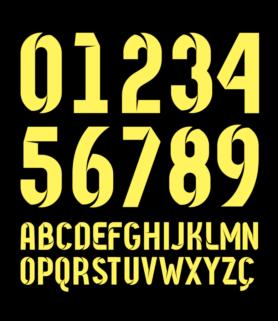
When FC Cincinnati announced the signing of forward Yuya Kubo last month (above), it provided our first sneak peek at MLS’s intriguing new shirt font, which was supposed to have been kept under wraps until the MLS kit unveilings on Feb. 5. Although I’m not a big soccer guy, I liked the font immediately, especially the way it played around with perspective, sort of like a classic widget illustration.
Now that the font has been officially released, I got in touch with the guy who created it — a British graphic designer named Rick Banks, who’s a serious student of soccer typography. In 2013 he authored a book called Football Type (there’s a bit more about it here), and he has a follow-up volume in the works for later this year.
Banks and I conducted this short interview via email. Here’s how it went:

Uni Watch: First, please tell us a bit about yourself. How old are you, where do you live, and what do you design besides soccer fonts?
Rick Banks [shown at right]: I’m 34 years old. My wife and I lead an award-winning graphic design studio called Face37. We service a global roster of clients from our Manchester base, specializing in branding, type design, and publications.
UW: Just to provide some context, what do you think are some examples of particularly good and particularly bad soccer number fonts?
RB: I really like fonts that have an idea behind them. In 2012, Nike commissioned the branding agency Vasava to create Barcelona’s 2012 typeface. The mission was an aggressive, fast, and sporty image with a major artistic element. The subtle cuts and angles of the chimneys on renowned Catalan architect Antoni Gaudi’s building La Pedrera were Vasava’s main inspiration. Gaudi’s architecture is one of the city’s best-loved visual trademarks. Imbuing the team’s kit with a hint of Gaudi connects Barcelona’s cultural history to its cherished football club. The typeface is a contemporary sans serif with a dynamic feel to match FC Barcelona’s high-energy style on the pitch:
With my branding hat on, I also love Tottenham’s font designed by Bruno Maag in 2006. Tottenham are the only English Club I know that approached a branding agency to look at their identity and brand. The design agency redrew their logo, making it modern and clean, and commissioned a typographer to draw a distinctive font:
This font is still featured in all their communications and fans have the choice between the Premier League lettering or Tottenham’s lettering when they go to the club shop. When you see Tottenham’s motto “To dare is to do” set in their typeface, fans instantly know it’s Tottenham, even if it’s on a subconscious level. This consistent approach makes them unique.
Paul Barnes’s duotone lettering for England in 2012 is another beautiful example. His use of using two different reds had never been done before and was very memorable. It also linked to the kit design, which gave a unique holistic approach:
UW: Soccer teams and leagues seem to change their number fonts pretty frequently. To an American sports fan, that can seem odd, especially since some of our teams, such as the Chicago Bears (NFL) and Boston Red Sox (MLB), use distinctive fonts that have been closely associated with those teams for generations. Do you think the constant change in soccer fonts, especially when they’re used on a league-wide basis, detracts from the teams’ individual brand identities?
RB: I have mixed opinions on this. On one hand, I love the approach that brands like the Premier League, MLS, and La Liga employ. They decree that all teams must use the same font for all shirt names and numbers. This gives the brand and the league a consistent look and feel (and also makes them a lot of money). Before La Liga’s new ruling, only clubs with big budgets (Real Madrid and Barcelona) produced nice lettering. The rest of the clubs looked like a shit show.
On the other hand, I like seeing what clubs produce every season for their European cup games. Some work and some don’t, but it keeps it interesting.
In terms of the NFL, from my limited knowledge, most of the teams employ the same similar style (Condensed slab-serif) and it’s simply the coloring of the outlining that ties it to the club. It would be interesting for a team to break away from that style.
UW: Since soccer number fonts change so frequently, is it a challenge to come up with something new? How do you balance visual creativity with legibility and other practical considerations?
RB: Yes, with MLS, the biggest challenge was coming up with a unique design idea that will please everyone. After collating all the lettering for my books, Football Type and Football Type 2 (out later this year), it was hard to design something that no one else had done before.
There were lots of technical requirements, too. It had to be produced in one color but work across a variety of colors (eight to 10). It also had to be designed in certain dimensions for the manufacturer, along with terminals that had a two-millimeter cornered radius.

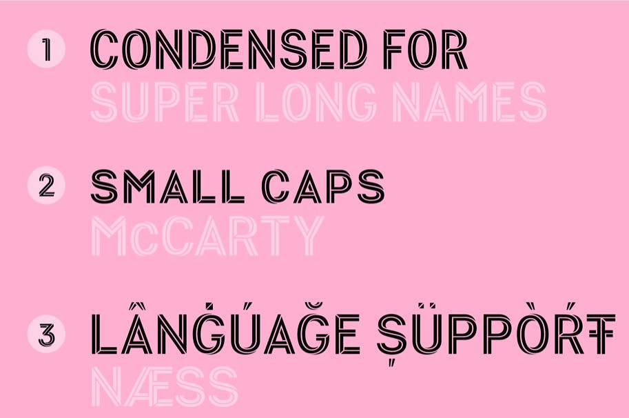
Bearing in mind that footballers of many nationalities play in the league, the font needed to have massive language support for accents and diacritical marks — something the old font couldn’t do. We also produced a condensed weight for super-long names — again, something the old font couldn’t do.
UW: A font that works well for large numerals may not work as well for the smaller lettering for the players’ names. How big a challenge is it to come up with something that works well in both contexts?
RB: This was the challenge that was set in the brief. MLS is a modern, progressive, and innovative league that is underpinned by being edgy and embracing technology. They wanted this progressive mantra to be reflected in the lettering. It also needed to be used “beyond the jersey” on other products and marketing materials, so it had to be a kerned OpenType font — not just a bunch of vectors.
They were keen not to follow other football leagues around the globe. They wanted something with originality, character, and a strong idea behind it — not another vanilla condensed sans serif like you see in other leagues. That’s why we came up with the idea of using a layered font. You can use a normal sans-serif (MLS Pitch) for small size use and the other two weights for expressive communications.

Our design is inspired by Necker art and the idea of the Penrose triangle to create a bold, graphic, and dynamic typeface. It’s a simple optical illusion that makes you look twice — and then look again. It seems impossible, but there it is.
The font comes in three weights. When they’re layered on top of each other, it creates a “tri-line,” something never before seen in football shirt lettering. This creates an energetic, swooshing optical effect, representing the movement and energy in the game, like a Beckham free kick or an Ilsinho step-over. The tri-line also symbolically ties into the three stars found in the MLS logo. Where possible, the angle of the number terminals follows the points of those three stars in the logo.
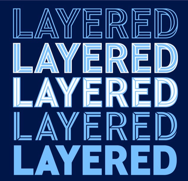

Like a versatile player capable of shining in any position, the MLS font can be used in many different configurations to suit different applications. MLS Streets is featured on shirts and shorts, while the other weights can be used on banners around stadia, online, and for social media.
We think it’s super-unique. We don’t think any other football league uses a dynamic layered font, giving multiple effects, across a variety of communications. We are looking forward to the rolling out this season.
UW: Anything to add? Anything I haven’t asked that you want me to know?
RB: My next book, Football Type 2, is coming out in the next few months, which I’m super-excited about. It’s written with Denis Hurley and jam-packed with new fonts and stories. For anyone interested in football and typography, it will be available on my website.
———
Fascinating stuff! Big thanks to Rick for sharing his time and expertise, and thanks also to reader Denis Hurley for connecting me with Rick.
Wilt Chamberlain rejects the skyhook twice in five seconds like Kareem is just some scrub. Amazing. pic.twitter.com/MTQsJZEiDn
— Super 70s Sports (@Super70sSports) February 8, 2020
Free throw circles, continued: In our ongoing look at the number of dashes in NBA free throw circles, check out the clip above, which shows an early-1970s Lakers/Bucks game. I count 14 dashes — a new record!
(My continued thanks to Twitter-er @nomuskies for keeping this issue on my radar.)
Click to enlarge
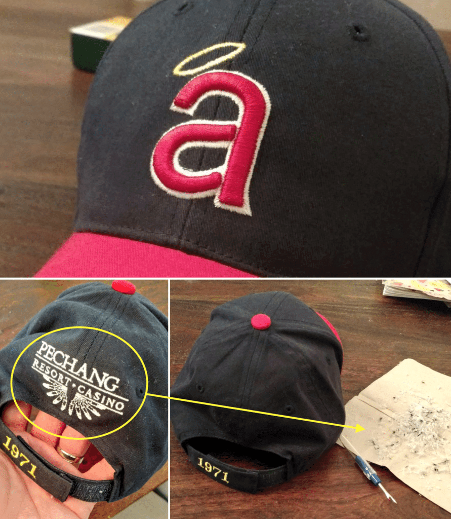
Not just for maker’s marks: Reader Tim Stoops has a nice giveaway Angels cap that he received at a ballgame in 2008, but he didn’t like the unsightly casino ad on the back. So he grabbed a seam ripper and removed it! Nice work, Tim.
Meanwhile, readers Shawn Coombs, Jeremy Williams, Dan Gerig, and @finerific have also been productive lately:
@UniWatch another successful surgery in the. To dat the fastest. Under 10 minutes and the cleanest looking one to date pic.twitter.com/qg2x0YPMVl
— Shawn “MidNight Hockey Legend” Coombs (@Coombsie77) February 8, 2020
@UniWatch Happy to inform that the surgery went well today. 1st rip and many more to come. pic.twitter.com/n7kHOUKMRY
— Jeremy Williams (@jcraigw0) February 8, 2020
First successful @NewEraCap logo surgery. Thanks, @UniWatch! pic.twitter.com/j9uoL1ejVq
— Dan Gerig (@dgerig) February 9, 2020
Thanks to the advice from my super good friends at @UniWatch, my new Red Sox hat no longer has a logo creeping off the side.
It took a lot of time and patience, but it will all be so worth it. pic.twitter.com/ZUDDPvehdj
— Finerific (@Finerific) February 7, 2020
I find it very inspiring to see so many people getting on board with this. I realize it’s just a niche thing and that most people don’t care, but it’s fun seeing that people who do care are taking the matter into their own hands — literally!
If you want to do some cap surgery of your own, Uni Watch seam rippers are available here, or you can just grab a seam ripper from your local fabric store. Have fun!
Design contest reminder: In case you missed it last week, my latest Uni Watch design challenge, which I’m doing in conjunction with InsideHook, is to redesign the New England Patriots. With the Brady/Belichick era nearing its conclusion, this seems like the right time for it. Full details here.

Click to enlarge
LAST CALL for the hockey jerseys: Today is the final day to get in on the first-ever Uni Watch hockey jerseys. You can place your order here by the end of today, and there’s more info here.
The Ticker
By Jamie Rathjen

Baseball News: New batting helmets for Kentucky. … A country band called Elliot Brood uses an Expos-style logo. … New spring training uniforms for the Taiwanese team Uni-President Lions (from Jeremy Brahm).

Football News: Fox uses the new score bug introduced in the Super Bowl for its XFL coverage, and team logos are cropped to fit. The front half of the New York Guardians’ logo was cropped yesterday, leaving only the indistinct trailing lines behind the head (from multiple readers). … Meanwhile, XFL officials are wearing standard zebra stripes, not the navy design that was originally announced (from @southsidehitman). … Also, somehow the Dallas Renegades have a helmet ad, even though the XFL is supposed to have no uniform ads (from multiple readers). … The NFL midfield logo was still visible under the XFL logo at the Meadowlands (from Rob Daniels and Preston Feiler).

Hockey News: Many NHL players’ sticks are made in China, so the coronavirus is affecting their supply (paywall) (from Jerry Wolper). … Blackhawks D Nick Seeler was recently traded from the Wild, and still had his old team’s mouthguard (from multiple readers). … St. Lawrence’s men’s and women’s teams wore two patches this weekend for the latest renovation of their arena (from Moe Khan). … Colorado College already has its new athletic logo at center ice, and wore a second new jersey on Saturday (from Kary Klismet). … Yesterday was National Pizza Day, so the ECHL’s Orlando Solar Bears wore pizza-themed jerseys (from Jason Branch). … Junior teams that wore pink (or purple) jerseys included the WHL’s Winnipeg Ice and the OHL’s Sault Ste. Marie Greyhounds (from Wade Heidt). … Other junior teams that did uni-related promotions included the WHL’s Moose Jaw Warriors, for the team’s hall of fame induction weekend, and the WHL’s Vancouver Giants, who participated in the league’s WHL Suits Up promotion by wearing powder blue jerseys with the vintage Hockey Night in Canada logo, as some other teams did — but with white pants (from Wade again).

Basketball News: Filmmaker Spike Lee wore a purple Kobe Bryant tribute suit at last night’s Oscars (from multiple readers). … You can see some new or changed NBA numbers on Etienne Catalan’s Twitter feed. … Brad Eenhuis sent us this late-’80s ad with then-Lakers SF James Worthy wearing a generic New Balance uniform. … Women’s college teams that wore pink or pink accents included Purdue, Mississippi State, Vanderbilt (from Chad Bishop), and both Alabama and Auburn (from Griffin Smith). … Texas A&M’s women’s team also wore grey against Mississippi State (from Jakob Fox). … Men’s college teams that created color-vs.-color games by wearing yellow at home included Marquette yesterday (from Josh Hinton) and Iowa on Saturday. … Wisconsin wore their 2000 Final Four throwbacks (from C.M. Hawkins). … Rare sight of Julius Erving wearing No. 50 in a 1983 76ers preseason game. … The Clippers and Cavs went throwback vs. throwback last night.

Soccer News: On Saturday, Everton midfielder Djibril Sidibé was about to enter as a substitute, and tried to pull up his socks only to realize he forgot to put one on (from Mark Coale). … Aside from the Heads Up patches that we’ve mentioned English teams wearing this weekend, many also wore warm-up shirts. The patch also seemed to vary in color, with at least one purple version appearing in place of blue. The promotion is to continue next week, and women’s teams were also to participate before every game in the top two tiers was postponed because of this weekend’s windstorm. … English Championship team Middlesbrough wore last season’s second shirt on Saturday, and also wore this season’s first shorts and second socks to create a combo spanning three kits and two seasons. They didn’t outdo Manchester United, who in 1981 wore three manufacturers at once. … German team Schalke 04 had rainbow corner flags this weekend (from Kary Klismet). … In Scotland, Celtic striker Patryk Klimala had his NOB spelled wrong (from Ed Żelaski). … Scottish Championship teams Greenock Morton and Queen of the South, two blue and white teams, partook in a double change to yellow and grey respectively on Saturday, with Morton saying league rules require both teams to change when there’s an otherwise unavoidable clash. … Australian team Adelaide United replaced the ad on their second shirt with a hashtag in support of the victims of the country’s bushfires, which is to be worn for several away games and one home game. … Japan’s J. League annually holds a mascot poll before the start of the season, and the winner this year was Yokohama F. Marinos’ Marinosuke (from Jeremy Brahm).

Grab Bag: After Colorado College got new athletic logos last week, it revealed uniforms for many of its teams. All except men’s ice hockey and women’s soccer play in Division III (from Kary Klismet). … Also from Kary: Here’s the latest from that Michigan newspaper’s series on high school mascots. … South Africa’s cricket team wore pink, and England wore pink accents, in a One Day International yesterday. The day before, New Zealand’s women’s team also wore pink shirts against South Africa. … Three members of Argentina’s men’s field hockey team all somewhat recently reached appearance milestones and received commemorative shirts. … The Premier Lacrosse League’s expansion draft this week has its own logo (from @PhillyPartTwo). … NASCAR’s title advertising has gone the way many of its teams’ liveries have, with one advertiser for the Cup Series replaced by four for this season, but patches for the old one could still be seen on Fox yesterday (from Ben Davis). … Ireland had an election yesterday, and national broadcaster RTÉ created a color-wheel graphic for the day with red and claret switched from where they should be (from Denis Hurley). … Two police-related items from Timmy Donahue: the departments in Toledo and Trenton are trying to do away with military-style uniforms and accessories. … New logo for the Premier Lacrosse League expansion draft (from @PhillyPartTwo).
Raffle results: The two winners of the NHL Gameday Hoodeez are Justin Panno (who’s chosen the Rangers hoodie) and William Beebe (Golden Knights). Congrats to them, and my repeated thanks to FOCO for sponsoring this one.
And finally, big congrats to frequent Ticker contributor Timmy Donahue, whose new son, Cillian, was born yesterday and is already starting to Get It™:
@UniWatch @PhilHecken
Teaching my newborn son, Cillian, the fine art of uni watching. He is not overly interested in the @xfl2020 right now. Born @ 0248 hrs on 9FEB2020 in Forest Hills, Queens NYC. Weighing 6 lbs 8 oz & 19 inches long. #NYC #Queens@XFLRenegades @XFLBattleHawks pic.twitter.com/iB0IO7tSWn— Timmy Donahue (@timmydhue) February 9, 2020
As it happens, yesterday was also the Tugboat Captain’s birthday, so Cillian already has a good Uni Watch connection. Congrats to the Donahue family on the new addition to their clan! — Paul
Thanks for that great interview with Rick! The new MLS font is a huge leap in the right direction from their previous league-wide fonts.
It has echoes to soccer fonts from across the decades, but stands on its own.
XFL teams already breaking league rules? C’mon, man. This is Vince McMahon’s league – rules are more like suggestions, and someone’s inevitably gonna make a heel turn. I’m just waiting for the refs to start giving five-counts to players involved in any after-play tussles.
I find this comment to be highly ignorant. If you actually watched a game this weekend, this time around unlike the 2001 attempt has no crossover or ties to wwe other than Vince McMahon funding it and being the owner. It’s purely just a football league and one I hope had success since I like there being football on tv during these months.
Give it time. Take it from a wrestling fan. Inevitably, at some point, Vince is gonna Vince.
Lighten up, Francis.
Paul, a small correction for you: the Angels hat was given out in 2008. I wish that still a year ago!
Fixed!
Man, those caps look better without the new era ad. Clean like a Major League Baseball cap should look like.
Coombsie taking care of business!
Better look at an Elliott Brood (Expos) cap.
link
Not really covered in the (really fascinating) interview but I really do love the old school rounded numbers which were regularly used prior to the big kit design revolution in the 70s. Those rounded numbers seem really specifically “european”, while here in the States we used varsity-style numbers with angled shapes.
Best XFL Uni of the weekend? DC
Worst XFL Uni of the weekend? Tampa
Agreed on both. I didn’t expect to have either conclusion based on the not-in-action uniform photos I’d seen. Illustrates for me the significance of the on-field and in-action contexts for uniforms.
( a ) It’s Tampa BAY.
( b ) No, it really wasn’t. Houston’s was.
The NFL midfield logo was still visible under the XFL logo at the Meadowlands
Fair enough, because during the ’86 NFL season (and possibly ’87 and ’88 as well) you could see the ghost of the USFL logo there.
Maybe it was just the ’85 season. I was trying to watch some YouTube videos of the ’86 Giants but the picture wasn’t that great.
I’m sure I’m very late to the party on the XFL unis, but I really liked most of the helmets(minus the Bud ad) once I saw them on TV. The huge Dragon on the Seattle Helmet was possibly my favorite, and I usually hate big helmet logos. I wasn’t completely sober however, so this might have skewed my view.
I think that second block on Kareem was goaltending … the ball just starting to come down
Agreed. No doubt about it.
Kareem’s skyhook could not be legally blocked once the ball was out of his hand because it was released above the rim and the ball was never on an arc upward. Just goes to show how Wilt got away with murder late in his career.
Both top tier American soccer leagues have steadily improved their fonts since the early part of this decade — I’m thinking of the MLS font from now two fonts ago, but the first NWSL font was weird as well (and stuck around for five/six years).
Great threadwork, Tim!
I recently bought a couple of NASCAR hats that have the annoying trademark dot stitched right on the number…removed them with ease but I was hesitant to try my hand at taking off the sponsor patches and/or team designation marks.
You’ve inspired me to give them the seam ripper treatment…any tips?
In soccer why do they call it a “clash” when the two team’s kits are actually going to closely match?
In uniform contexts, “clash” always means “similar enough that you can’t tell them apart.” I realize that’s the opposite of what it can mean in reference to clothes in general, but it achieves the same goal of designating two items that can’t be worn together (in the same game).
On Spike Lee’s purple suit: I’ve been trying to figure out whether the Lakers have ever had yellow numbers with white, non-drop shadowed outlines on any of their jerseys and I’m pretty sure that they have not.
I can’t wait until tomorrow to learn of any new logos for Colorado College.