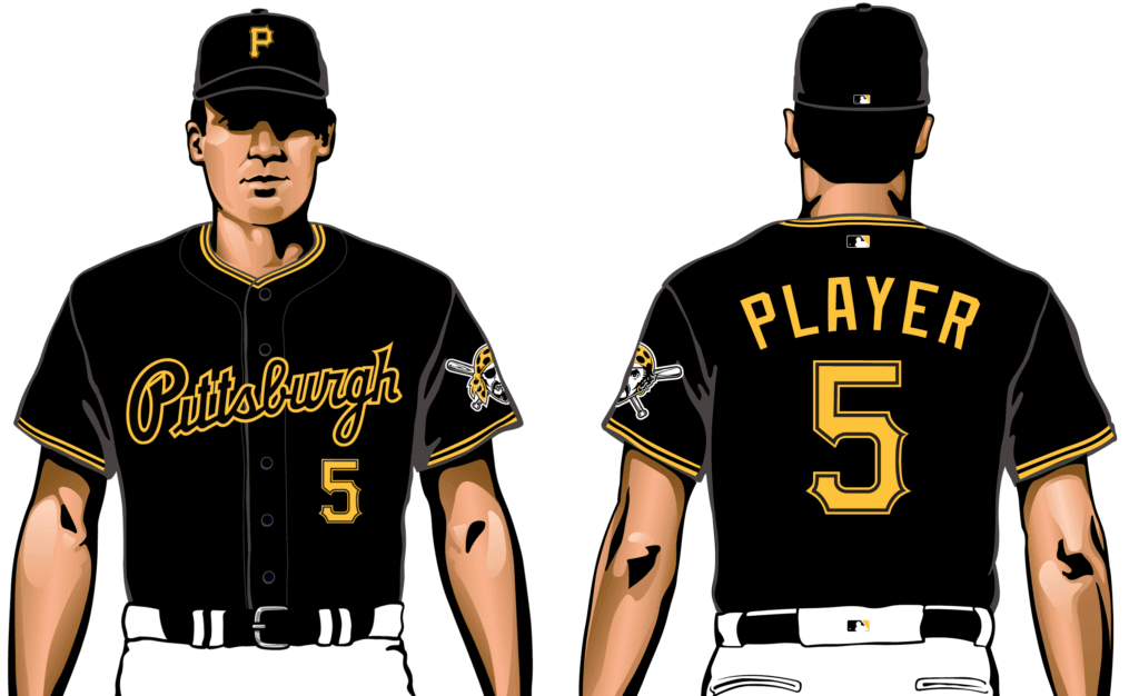
The Pirates are scheduled to reveal some new uniforms this afternoon. But as you can see in the Instagram post above, last night they jumped the gun on their own unveiling by posting a photo of a new black alternate jersey, which features a revival of the team’s old 1990s road script.
They also teased the unveiling of their new road uniform:
— Pirates (@Pirates) January 24, 2020
Now, assuming you got past all the Nike close-ups, it doesn’t take a genius to see that the new road jersey has a script chest insignia. And it doesn’t take even a dullard to deduce that it’s going to be the same script shown on the black jersey — anyone can connect those dots.
I’ve known about these designs for a few months now and haven’t said a word. When an accurate description of the designs (but no images) began circulating on Twitter a few days ago and people began tweeting it at me, I declined to retweet it or put it in the Ticker — why ruin the Pirates’ unveiling? But if in light of how much the Pirates have already given away here, I no longer have any qualms about showing you this (for this and all subsequent images in this section, you can click to enlarge):
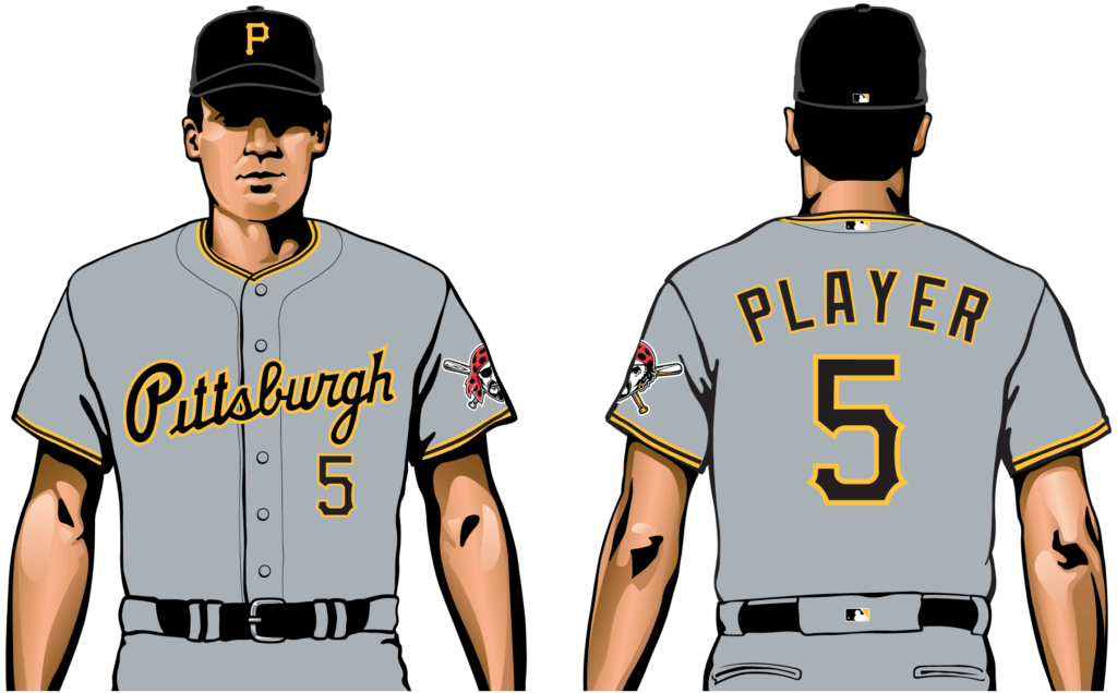
That’s the new road uni they’ll be unveiling today. And here’s a better look at that alternate:
A few quick notes:
• Although that mock-up shows the black alternate being worn with white pants, it’s actually listed in the MLB Style Guide as a road alternate. I gather its status will be clarified at today’s unveiling event.
• The other black alternate — the one with the big “P” — is being retained. Ditto for the military cosplay alternate and the home whites, both of which are unchanged. The bumblebee throwbacks, however, have been mothballed.
• The script is the same one they wore on their road uniforms in the 1990s — first on a basic grey uni (1990-1996) and then on a pinstriped uni (1997-2000; and yes, they also had a grey road cap at one point):
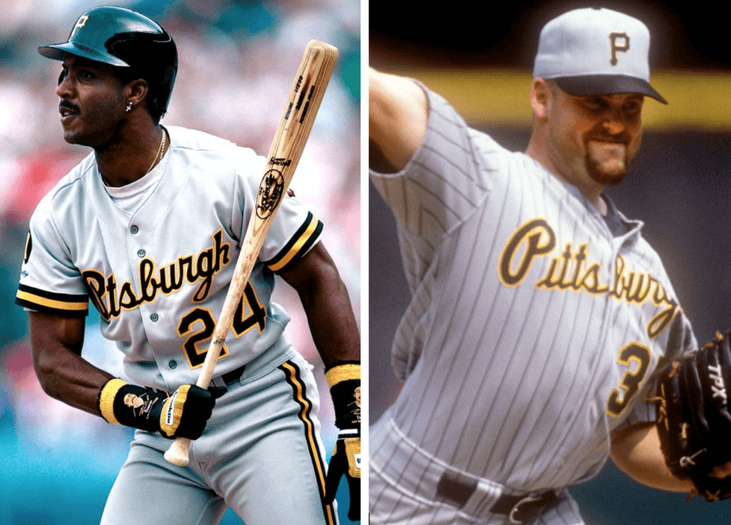
Since that script was designed three decades ago, I wondered if they might have tweaked it a bit — a nip here, a tuck there. But I compared digital versions of the original and revived scripts, and they appear to be identical.
• However! While the old and new script designs themselves are identical, the way they’re positioned on the jerseys is not. As you can see in those 1990s game photos, the jersey placket intersected the old script right between “Pitts” and “burgh” — a very natural break. But let’s look again at the new script:
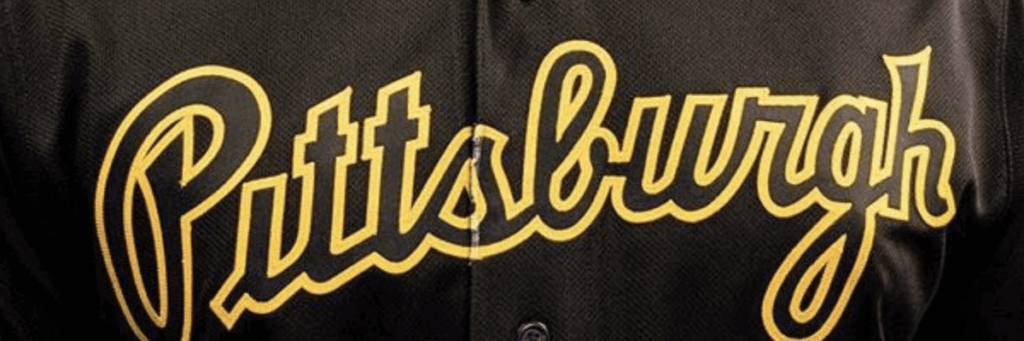
That’s unfortunate.
• One interesting thing about that script is that there’s no dot over the i. That’s always bugged me a bit. But aside from that, I’m happy to see it back on the field — a nice move by the Buccos.
Finally, since we’re talking about the Pirates, here’s a little show-and-tell on something I’ve been playing around with — a reminder that food and sports, as always, are two great tastes that taste great together:
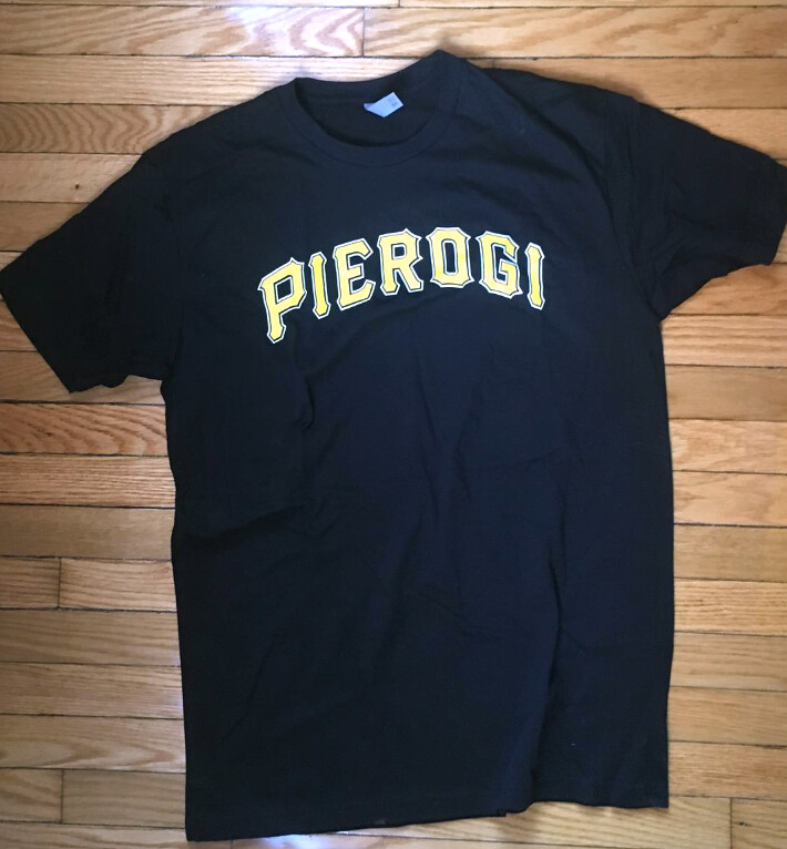

Click to enlarge
Maybe pitchers and catchers should just stay home: As long as we’re talking baseball, spring training caps have started circulating on social media, and apparently they’re all going to have this weird logo-within-a-logo format.
Now, I’ve always said that I don’t care about spring/BP caps because they’re just a merch program masquerading as a uniform program. And has that ever been more obvious than with these designs? Even if you like them enough to buy them because you think they’re edgy or innovative or fresh or whatever (I wouldn’t describe them that way myself, but I realize some other people might), I hope we can all agree that they’re utter failures as on-field uniform elements, because they’ll just look like a jumbled mess, even on TV.
Why does MLB maintain this charade? Why not just market these designs as fashion caps and be done with it?

For all photos, click to enlarge
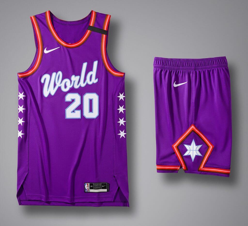
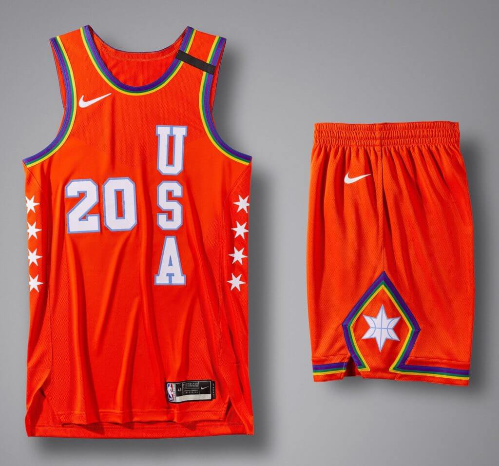
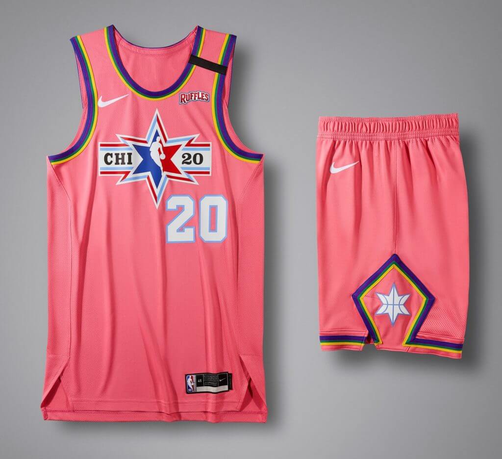
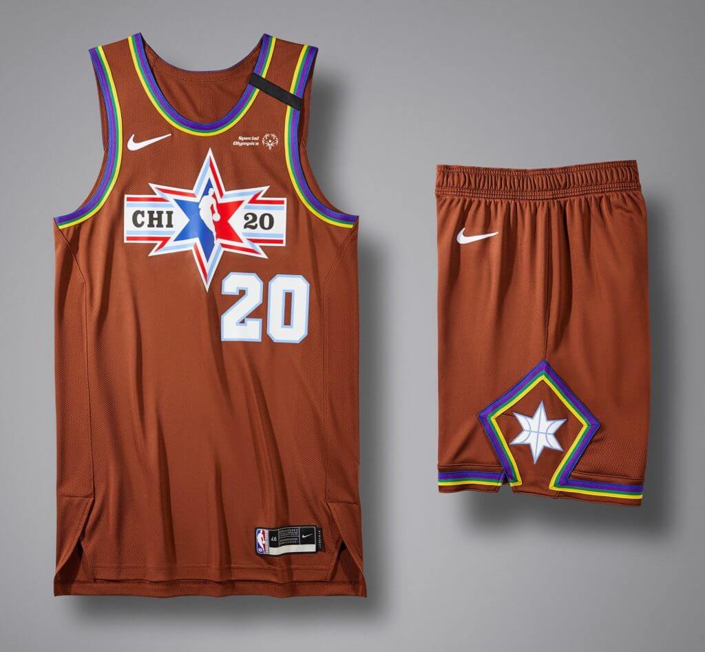
NBA All-Star uniforms released: The NBA All-Star game is coming up on Feb. 16, and yesterday we got our first full look at both of the uniforms (at least one of the jersey designs had previously leaked). I’m told that they “draw inspiration,” as the marketeers like to say, from the transit system in Chicago, where the game will be played (there’s more info on that here), but to me they seem both unremarkable and unobjectionable — your basic all-star design that could be from almost any season in the past two decades or so.
Interesting that they added the David Stern memorial band. Here’s a closer look at the jerseys:


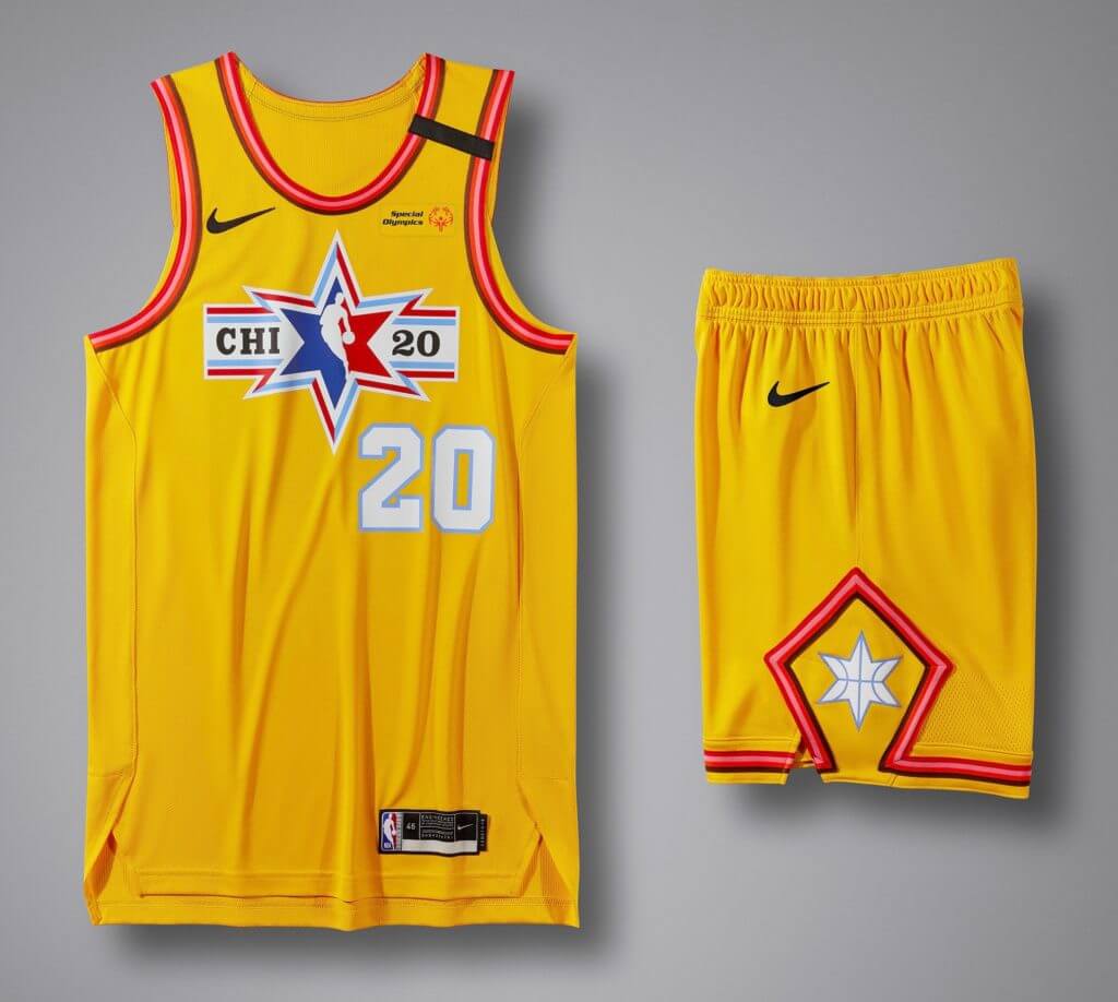
They also released the uniforms for the other games that are part of All-Star Weekend. Let’s start with the Rising Stars game:
Next up are the designs for the All-Star Celebrity Game:
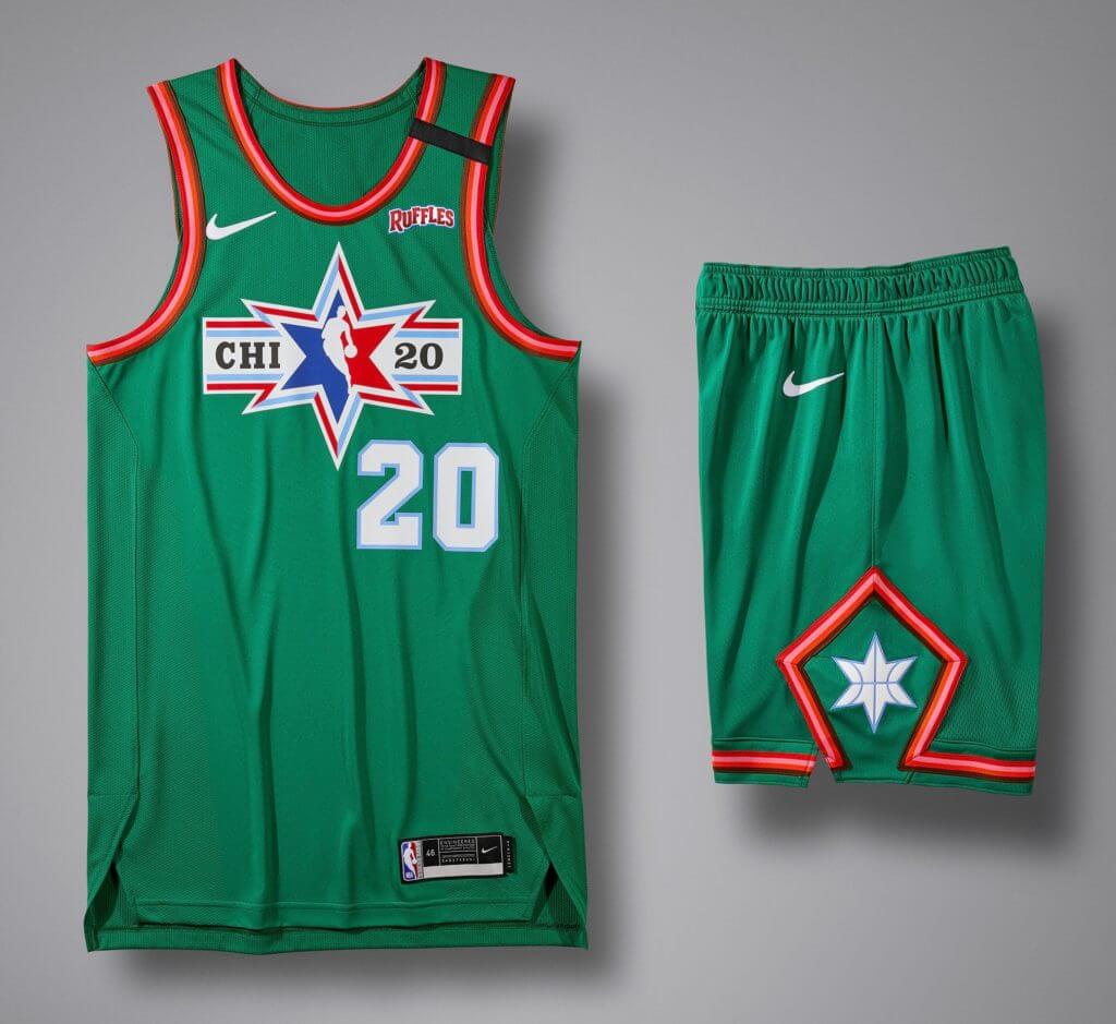
And we round things out with the (deep breath, because this one’s a mouthful) NBA Cares Special Olympics Unified Basketball Game:
Bron over Kyrie 👀 pic.twitter.com/RSOuQOfnWd
— Bleacher Report (@BleacherReport) January 24, 2020
And speaking of the NBA: This isn’t the first time we’ve seen this, but the combination of the Nets’ grey court, the Nets’ black/white color palette, and the opposing team’s colored uniforms can make for a striking visual effect — especially when the opponent is wearing something bright, as the Lakers were last night. See the video clip embedded above — weird! Twitter-er Ryan Pence described it as being like the 1998 movie Pleasantville, where most of the world is black-and-white but a few things are in color — a really good description.
I don’t know if the Nets intended to create this effect with their grey court, but it seems weird to repeatedly amplify the visual presence of the visiting teams, no?
@NBAonTNT had a little segment and I saw the @UniWatch @EbbetsVintage hat. I yelled at the TV, my family was confused. pic.twitter.com/nKknyyTHAR
— shawn baker (@sluggers009) January 24, 2020
ITEM! Most unlikely Uni Watch product placement ever: I’ve watched TNT’s Inside the NBA postgame show exactly (double-checks math, carries the two, solves for X) zero times. So I’m not sure why analyst Kenny “The Jet” Smith’s face was Photoshopped onto a screen shot of the great Hal the Hot Dog Guy wearing a Uni Watch cap from last spring, but several people on Twitter told me about it, and reader Shawn Baker got the screen shot of it that you see above.
I asked Shawn if he could provide some context. His reply: “After the Lakers’ win at Brooklyn, they showed LeBron talking to President Clinton. The next thing I saw was Kenny wearing the cap. But I was watching with the TV on mute, so I’m not sure what was going on.”
Fortunately, reader Ignacio Salazar filled me in: “Charles Barkley was roasting Kenny Smith because President Clinton was at the game and Barkley said Clinton would recognize him and Shaq but would ask Kenny for a hot dog.” Ignacio then found video of that exchange, which is pretty funny:
Charles Barkley roasts Kenny Smith "If President Clinton was at the game and he noticed me or Shaq he would come say hello, you can walk by and he might say come bring me a hot dog" pic.twitter.com/Xb2Ljfu0O0
— gifdsports (@gifdsports) January 24, 2020
Okay, so that’s why they depicted Smith as a hot dog vendor. But of all the vendor photos to use, why did they use that one? Someone in the TNT graphics department must be a Uni Watch fan and/or a Hal the Hot Dog Guy fan! (If that someone is reading this, I’d love to hear from you.)

Click to enlarge
Pin Club update: The sport with the strongest tradition of commemorative pins is, of course, curling. As a curler myself, I love that reader Tim Wood has chosen to display his January pin from the Uni Watch Pin Club on his curling pin board. It’s great to see our pin in such good company, and I’d say it holds its own quite nicely!
If you don’t yet have the January pin, it’s available here. And if you’re not caught up on what the Pin Club is all about, that info is here.
Working Class Wannabes™, continued: As you’re probably aware, I’ve written several times in recent weeks about the sports world’s fetishizing of the working class. Now I’ve expanded upon those thoughts in a new article for The New Republic. You can check it out here.
The Ticker
By Anthony Emerson

Baseball News: The Brewers are going to have five different throwback unis this season, one for each decade of their history (from @JohnnyOeleven). … The Royals have added an extremely nice memorial patch for owner David Glass (from multiple readers). … Here’s our first look at the Nike logo on the White Sox home jerseys (from Dylan Bercu). … Larry Walker will be depicted wearing a Rockies cap on his Hall of Fame plaque (from multiple readers). … Did you know old Yankee Stadium had an autograph room under the lower stands? Apparently, you needed a special ticket to get in (from Russ Havens). … Michael J. Miller writes in: “Frank Thomas circa 1992 wearing wristbands around his ankles for whatever reason. Closer inspection shows that he generally wore MimsBandz with his own iconography on both his ankles and wrists. Also seems to have mixed in some Mizuno wrist, errr, ankle bands to pair with his Nike’s in his pre-Reebok days.” … NBC Sports ranked the names of all 30 MLB ballparks (from @titan4ever2488 and our own Brinke Guthrie). … Mexico has unveiled their jerseys for the Serie del Caribe (from Arty Curry). … The Wisconsin Timber Rattlers, Class A affiliates of the Brewers, will bring back their “Udder Tuggers” promotion in 2020 (from Brian Kerhin). … In the ’60s and ’70s, Chicago-area children’s show host Ray Rayner wore a Cubs/White Sox frankenhelmet while reading out baseball scores (from Tom Ekstrand). … New unis for University of Houston baseball, which include the same Texas flag patch that the Rangers use (from Ignacio Suarez). … New unis for Georgia Tech (from @MistaMaxG). … New uniforms for the Tohoku Rakuten Golden Eagles, who’ve changed their outfitter from Majestic to Mizuno. They also have new batting helmets made by the Japanese lacquerware manufacturer Tohoku Kogei, including a nanocomposite layer to prevent UV damage (from @bigdaddy45_1969 and Jeremy Brahm).

Football News: With the Browns preparing to replace the uniforms they introduced in 2015, here’s a breakdown of the team’s record by uni combo for that set (from Patrick Gaughan). … The 2020 edition of the CFL’s Touchdown Atlantic game will be played in Halifax, Nova Scotia, between the Saskatchewan Roughriders and the Toronto Argonauts. The previous four editions were played in Moncton, New Brunswick (from Wade Heidt). … New unis for McMurry, a D2 school (from Jordan Hofeditz). … Reader Jordan Elo is the latest to perform a successful logo-ectomy, as he removed the New Era mark from his Chiefs Super Bowl cap.

Hockey News: The Sabres seriously messed up their ’90s Night jerseys, with misaligned logos and misspelled names for alums (from Kevin Musolino). … The ECHL’s Cincinnati Cyclones are having a “wizard weekend” in February, and here are the sweaters (from @labflyer). … EA Sports announced that Willie O’Ree — the NHL’s first black player — has been added to the NHL 20 video game, but their announcement depicted O’Ree in a Bruins uni he never wore. “O’Ree played for the Bruins in 1957-58 and 1960-61. The pictured jersey wasn’t incorporated until ’67,” says Kevin Rice. … A Peoria Riverman fan has a collection of 118 of the team’s jerseys. “Also that article says Peoria will soon be wearing three different superhero uniforms in one game, changing each period,” says Mike Lucia.

College Hoops News: Wisconsin men are wearing 2000 throwbacks on Feb. 9, in honor of their 2000 Final Four team (from multiple readers). … UConn and Tennessee women were color vs. color last night, with UConn in black. The Huskies’ unis were auctioned off after the game, with proceeds going to the Pat Summitt Foundation. A rare case of BFBS for good!

Soccer News: PSG has released their new fourth kits (from @mikedfromct). … Macedonian club FK Sileks don’t wear Adidas, but their kits are basically a repurposed version of an Adidas template, according to Ed Żelaski. … Manchester City will not renew their kit advertisement deal with UAE airline Etihad, which expires after the 2020-21 season. Etihad has been the primary kit advert for City since 2009 (from Josh Hinton). … Also from Josh, Leeds, currently in the second division of English football, have landed a kit deal with Adidas for next season (from Josh Hinton). … One more from Josh: New Galaxy FW Javier “Chicharito” Hernández is wearning No. 14, which he’s worn for the majority of his career, and his nickNOB, which he’s worn for the entirety of his career (also from Ryan Bugaj). … Another day, another MLS tease, this time for FC Dallas (from Pete Freedman). … New kits for Phoenix Rising FC of the USL Championship. The sleeves include the names of every city in Arizona (from Josh Pearlman and Jerry Wolper).

Grab Bag: Rich Township High School District 227 in suburban Chicago is consolidating all of its schools’ athletics programs into one district-wide program, and they’re in the process of choosing a new district-wide mascot (from Kary Klismet). … Also from Kary: The University of Delaware is building an on-campus esports arena. … Alaska Airlines crew members have new uniforms, designed to top safety standards (from Timmy Donahue). … Female police officers in Kalamazoo, Mich., are getting new uniform pants tailored for women (from several readers).
I did a Google Images search for “hot dog vendor” and that picture of Hal the Hot Dog Guy was fourth – and the first one with a clear face shot that could be photoshopped. My guess is that’s what they did at Inside the NBA.
And if you Google “hot dog guy” (which is what I tried), he’s the first real vendor that comes up in the results.
I ran this search as well and found the obituary for Hal’s colleague Jimmy. Worth reading, especially if you’ve read the interviews here with Hal.
link
Oh no — that’s terrible! I had no idea.
Fun little detail about the All Star uniforms: the trim piping isn’t a random collection of colors.
The stripes are colors of the other L lines in Chicago. So the Red Line uniform has piping for the Brown, Pink, and Orange line. The Blue Line uniform has the Green, Yellow, and Purple lines.
Interesting that they seem to have used the warm colors for the Red Line and cool colors for the Blue Line. It doesn’t seem like it’s organized by city geography. The Yellow and Purple lines are in the North suburbs, the Brown line is on the North side, the Green line runs on the South and West sides, the Pink line runs on the West side, and the Orange line on the South side.
I actually like the look of the piping – it really DOES do a good job of referencing the L lines.
I do agree that it’s slightly sad that they merely organized the colors by what looked best with the red/blue unis. It would have been next-level cool if they’d put lines that run together/connect on the same jersey. So, on the red one put the Brown/yellow/purple (those connect/share tracks with the red) and the green/pink/orange on the blue one (less direct connection with the blue but the three go the same direction on the loop).
Yes I am a transit nerd, why do you ask?
Seeing as the Yellow is the only one that doesn’t make it to the Loop, technically all the others could transfer to one another.
Maybe put a Pace bus transfer on there from the end of the Red and Blue lines? :)
Much prefer the Pirates block to the script, and the black script on a black jersey looks bad. And I’m not sure why a team needs two jerseys of the same color. Why not have a gold alternate jersey?
I’ve loved the Pirates since I was a kid, but they don’t get much right.
Prefer the block but don’t mind the script. Don’t like the ghost script on the black alternates. And they probably did not address the biggest issue with their current set – the number 7 looks like a 2 with its base chopped off.
YES. The 7 does look like a 2 with the base broken off! And I agree with you completely. The vertical arched city name wordmark in the custom font is great. The script is nostalgia for the sake of nostalgia, not a disaster but a clear step backward. And ghosted monochrome is terrible.
Agreed about the 7 and 2. The font should be for lettering only, not numbers.
I like the block or script equally, but not the way the dumbasses at Nike handled it. It’s more than “unfortunate,” as Paul said, that there’s no longer a “Pitts burgh” clean break, it’s lazy, sloppy, careless and bush-league. The only thing they managed to not screw up is the fact that they didn’t ghost the. numbers too.
This will be a baseball season made for radio.
I agree. I feel like if it weren’t for the fact it’s a script they’ve worn before we’d probably be lumping it in with the new Rangers script as kitschy and generic.
In fact, quite a lot about this seems like such a rush job. That they’re just recycling old uni elements rather than coming up with something new combined with the fact they seem to have just dropped the script down on the centre of the jersey without even considering the placket all seems to shout “we spent all afternoon* on this”.
*with an extended lunch hour in the middle
I agree. There’s no need for another alt of the same color. As was already stated, yellow would be better. I’d even like to see them go to a full black uni as an alt. No one has done that in a long time. I think PIT was the last team to do that during their bumblebee phase.
Outstanding article in The New Republic Paul.
Thank you!
Very much agree, sir.
I read the article on New Republic site. Enjoyed it – and appreciate the thinking and your angle. I wonder, however, if Chris Creighton and the EMU staff (or whoever dresses them, because I imagine that’s a position in D1 college football) could have been trying to pay homage to the bowl game’s sponsor, Quick Lane, which is an oil change chain of stores? Seemed like he was disproportionately called out, if so.
I’m repeating myself from last night – but a Lakers uniform – in all its glorious history – has never “popped” more than it did last night.
And very good point – it’s like a heavenly shine from above on the visiting team.
Agreed!
Growing up in SoCal in the early 80s I hardly ever got to see the Lakers’ gold uniform because all we saw on local TV (channel 9 with Chick Hearn!) were road games. As a kid, I wondered when the Lakers ever wore the glorious gold uniforms I only saw in advertising or Topps basketball cards.
1) The Pittsburgh script is a great look for the Pirates. I’m happy to see it return.
2) But ghosted lettering, like the black-on-black with yellow outline, is always a mistake. Legibility is a sine qua non of any jersey lettering, and ghosting minimizes legibility. It is, objectively, poor design. Bad move, Pirates.
3) The lack of a dot over the i is fine in theory, and the fact that almost everyone will read the script as “Pittsburgh” without even noticing the absence of the dot makes the script OK in practice. But it would be even better if the loop of the P extended just a touch farther to the right to really cover the i. By doing so, the P would effectively dot the i, or even permit the addition of a negative-space dot within the line of the P. Either would be an improvement.
4) The new script placement nicely illustrates why perfectly centering jersey lettering is usually a mistake.
My wife and I grabbed a quick dinner out on our way home from work. She is not uni-savvy but she tolerates me (and one of the 4 kids) Getting It™️. The Lakers/Nets game was on TV over the bar and even she thought the visual effect was compelling.
I liked the Blue Jays spring cap, with the bird face but still a lot of leaf in there. Each of the elements was pretty clear. But it works because the leaf gave them a lot of real estate to work in. Some of the others — the Reds and Dodgers in those photos — with the logos placed in letters, just don’t work as well. Anticipating a letdown with the Mets.
The recently announced “clubhouse caps” are in all the instances where I’ve also seen the new Spring Training caps much, much better designs for on-field use. I haven’t yet see the ST caps for the three teams I care passionately about, and I’m kind of girding myself for deep disappointment.
“Manchester City will not renew their kit advertisement deal with UAE airline Etihad, which expires after the 2020-21 season. Etihad has been the primary kit advert for City since 2009”
I wonder if this will affect all CSG owned teams: NYCFC and Melbourne City also have Etihad sponsorship.
Good point! How about the naming rights for the (I Still Call It) City of Manchester Stadium – now more commonly known as “The Etihad.”
Apparently, there’s been some shadiness going on with respect to funding transparency (shocking, I know).
link
So it looks like the recently replaced Milwaukee Brewers uniforms that were worn for the last couple of decades will return in 2020 for one of the “decades” weekends. Is that a record for the quickest on-field return of a defunct uniform?
Ha! Quite possibly.
I dislike multiple uniforms for teams. I’m definitely a one home uniform and one road uniform guy in all sports. But as a Brewers fan, I’m happy they are going to have all these throwbacks. I’ll take anything over the sadness that is a team reverting back to uniforms that include a logo best suited for a minor league team.
The UNC shorts link isn’t working in the ticker.
THey seem to have disabled the link. Now removed from Ticker.
The Pirates changes are very nice. I wish they would change their number font. The 7 is horrible and looks like an unfinished 2.
Kenny Smith doesn’t appear to have capers as an available hot dog condiment. Shame on him.
Is the bandana on the new alt going to be yellow? Have they done that before?
Yes, and I don’t think so.
Only on those awful Turn Ahead the Clock uniforms. Kris Benson must still be having nightmares. -C.
My favorite Phillies hat that I still wear is their bp/st hat from 2012 (blue P on the red hat).
I highly doubt anyone has ever thought of them as edgy… just another option to wear, some work and make a great addition to.a teams look, (like my favorite color is blue so when the Phillies had a blue st jersey, was great to wear) while others don’t.
I will say I am not a fan of the bp/st now all having a similar theme, feels tol templated it.
The Phillies could work if they put their P in the bell logo, but again I preferred their previous hats.
I don’t really have a comment on the content today, but just wanted to salute you for the length and detail on this post. Even for UW’s standards, today felt like a Herculean effort. Hopefully a national outlet recognizes your work and takes advantage of ESPN and SI’s mistake.
Thanks, Joe. It would be fair to say I had a very busy and productive Thursday night! But it was fun — the Pirates’ self-leak, the crazy Kenny the Rocket thing, etc. More, more, more!!
Though I’m a little bummed to see the block PITTSBURGH go, I’ve always dug the script and I’m happy to see it return. I don’t even mind the second black alt, as unnecessary as it is. But the break in the middle of the “s”? Come on!
Paul, it may be worth pointing out that the colored collar trim on the NBA ASG jerseys are part of the homage (whatever) to Chicago’s transit system. Our L lines are named by color: blue, red, orange, yellow, green, brown, and pink.
The Pittsburgh script on the grey jersey is a downgrade. I liked how the home and road fonts previously matched.
I’d really like a Uni-Watch work shirt. It would help me go through the blog in a blue-collar manner every day. Read it from top to bottom as I sip Starbucks in a comfortable office.
A few questions on the NBA All-Star uniforms:
Are there really no front numbers?
Are 6-pointed stars typical for the NBA ASG?
Is the maker’s mark missing on the red pants?
Six-point star is from the Chicago flag.
“Why does MLB maintain this charade? Why not just market these designs as fashion caps and be done with it?”
I imagine sales increase when merch functions as a form of cosplay.
Why doesn’t the Univ. of Pitt logo dot the I? Bugged me recently.
Hoping that curling and bowling inspired Uni Watch lapel pins might be part of the pin of the month project.
Holy crap Paul, that article on The New Republic is terrific; extremely thought-provoking. Honestly, it’s a subject I hadn’t done much thinking about. In short, when the coaches wore the work shirts recently I simply rolled my eyes and moved on. Your article explains so well why some additional consideration was/is in order. Well done!
Thanks, Tim — appreciated.
Just realized, I just told myself to THINK HARDER! HA!;)
I really enjoy seeing the finished products from removing the new era logo creep, is there a way to remove patches and reattach them to the left after removing the new era logo? As it always was in sports before manufacturer logos, all the special event patches or commemorative patches were on the left. I am not brave enough to attempt doing so, I was just curious.
Enjoying the Brewers, Pirates and Jays going back to “old school” uniforms and the Padres going back to brown. Reminds me of being a kid growing up in the 80s and 90s.
TCU also wears the Rangers Texas Flag Patch if I’m not mistaken. Heres a link: link
Paul, your article in The New Republic is a worthwhile read, and the quote “It’s a class-based version of stolen valor” is exceptionally worthy of our attention.
Once again you’ve succeeded in bringing a clear-eyed context to how the world of sports coexists with societal (political/class/financial, etc.) influences.
Well done!
Thank you!
I agree, 100%. I grew up in Buffalo, when it was a decidedly blue collar town. The local sports teams never discussed their blue collaredness back then. That didn’t start until all the steel plants closed down, and everybody who had jobs was working for a bank or one of the local universities.
Cort, the thing that really sticks in my craw was the coach who included among his list of supposed “blue collar” or “working class” values the notion of being “in your face.” I was born and for a while grew up in an industrial down in Iowa; my dad’s family were white-collar folks and my mom’s family were blue-collar folks and farmers, and most kids in school and in my neighborhood had working-class parents. As a kid, one of the ways that I could sort of tell people’s social class, or their parents’ social class, was precisely whether they behaved with deference or acted “in your face.” Even with strong unions that workers at the local plant had back then, if you punched a clock for your pay, you couldn’t afford to get up in anybody’s face, at least not anybody who was or might someday be management, and parents who had to live by that ethic in their own lives by and large didn’t tolerate outbursty behavior at home from their kids either. I was a basically shy, bookish kid, but looking back I can see that sometimes I behaved like an entitled prick, but then again both my parents had white-collar salaried jobs, in my dad’s case a job that made him locally kind of famous. So to the extent that I personally was ever in anyone’s face as a child, I was displaying the fact that my family was a white-collar household.
If you’re a coach and you want your team to practice and play with working-class values, great. You want your team to with play in-your-face attitude? Fine. But you’ve gotta choose. You can’t have both.
The Pierogi t-shirt is a thing of beauty. When do they go on sale?
I second this. As a sports fan of Polish heritage, I would buy this in a heatbeat.
I’d sure like to see the Brewers resurrect the under-rated/over-looked 1997-99 uniforms for ’90s throwback weekend:
link
The Motre Bame’s is what we’ll probably get. Sigh.
You really couldn’t find a pic of the “bumblebee” throwbacks that wasn’t of Felipe Vazquez? Come on, man.
That Cincinnati spring training cap is kinda creepy. Mr. Redlegs peeking at me!
I really dislike the grey court used by the Brooklyn Nets. Hope this fad dies quickly.
I just a fucked a hoe in the ass.