For all photos, click to enlarge
Many of you know longtime Uni Watch pal Bill Henderson as the guy behind the definitive guide to post-flannel MLB jerseys. Lately he’s been putting his encyclopedic uniform knowledge to good use by running a jersey-restoration business called the Dream Shop.
Bill will sometimes show his step-by-step restoration process for a given jersey on Facebook, and he recently invited me to share that content on Uni Watch. Today is the first of what I hope will be a series of step-by-step projects from Bill, and I think you’ll really enjoy it. I’ll now hand the baton over to him.
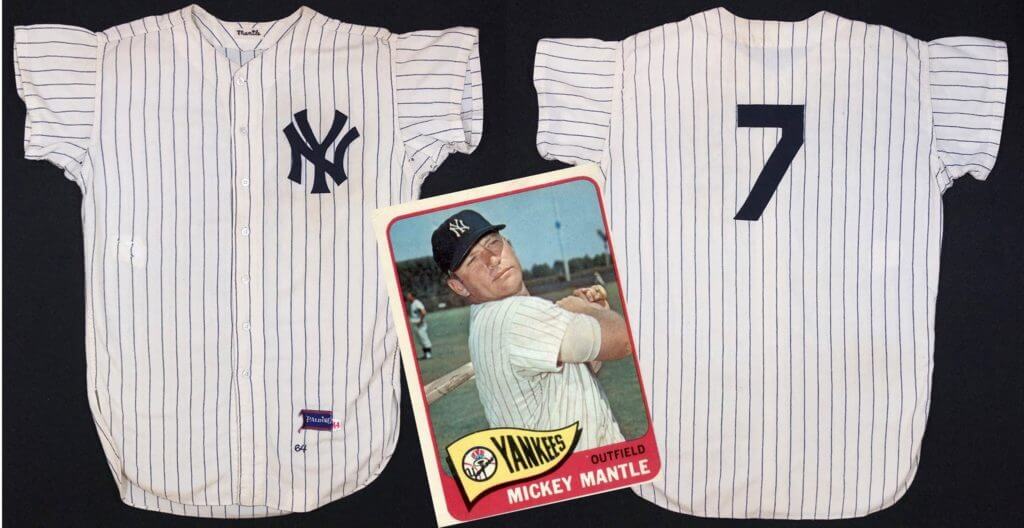
Restoring a 1964 Mickey Mantle Jersey
By Bill Henderson
I’ll be candid: When someone writes and tells me that he has an original Mickey Mantle Yankees flannel jersey he wants me to look at, I mentally prepare myself for the disappointment I will need to share with him. There are very few actual Mantle jerseys and lots of questionable re-creations, so encountering a real one is unlikely at best.
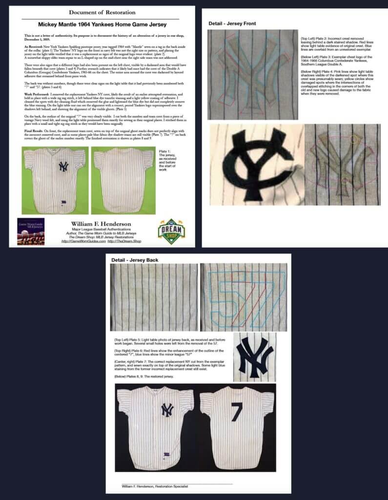
Here’s how the jersey looked when I received it:
The “NY” on the front looked a bit off — probably not original — and there were no numbers on the back, but Mantle’s name was embroidered in the collar. The jersey was a Spalding, year-tagged as 1964.
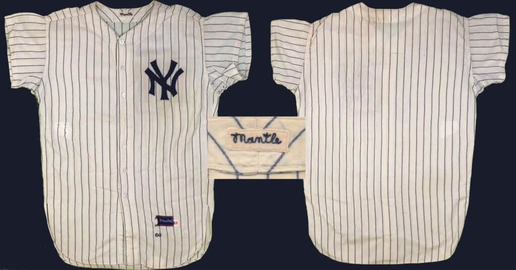
An examination on a light table showed that there had once been a “7” on the back, and also a “57”:
Old jerseys often have multiple numbers if they’ve been reissued in the big league team’s minor league system. But would the Yankees really do that to a jersey from one of their most famous players? Yes, actually, they would — I have seen many Yankees “star player” jerseys that were sent to the minors and used to death. To the Yankees, these were not priceless collectables; they were simply team-owned gear, and reusing them in the minors saved the club money. The Yankees were very protective — almost hostile — about sharing any of these with collectors. Players were generally issued two sets of home and road jerseys for the year, and a backup or two from the prior year were often kept around as spares for emergency use. It was nothing like today, where a player might wear a different jersey every few games to help feed the collector market.
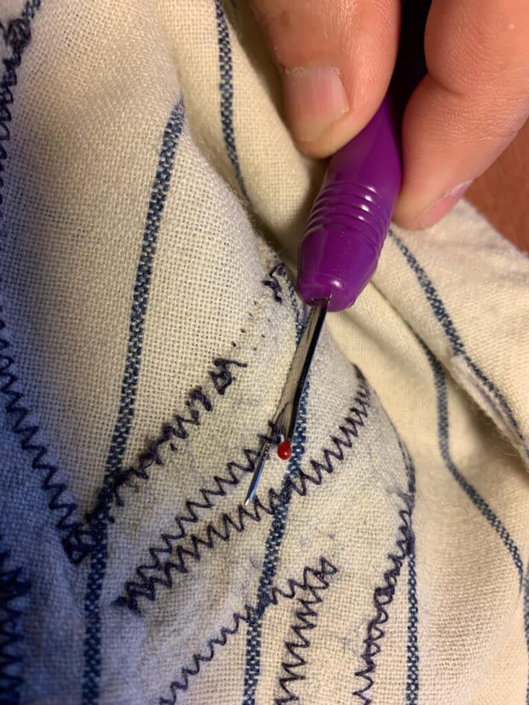
Having the front of the jersey bare would be important for further light table investigation of the garment’s history. So I used a seam ripper [clearly not a Uni Watch model! — PL] to carefully remove the stitching holding the “NY” logo on the front, one scant stitch at a time:
Luckily, it was not glued on and came off without a fight. Unfortunately, though, its presence over time had stained the underlying flannel fabric.
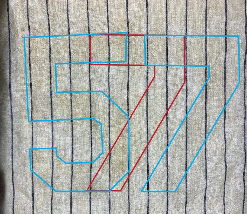
As I suspected, a light table examination of the front confirmed that the “NY” logo was not the original one. Slight shadows of the original logo were evident. On this photo, the red lines are the residual ghosts I can see, and the blue outline is the Yankees’ standard template for a 1964 front crest:
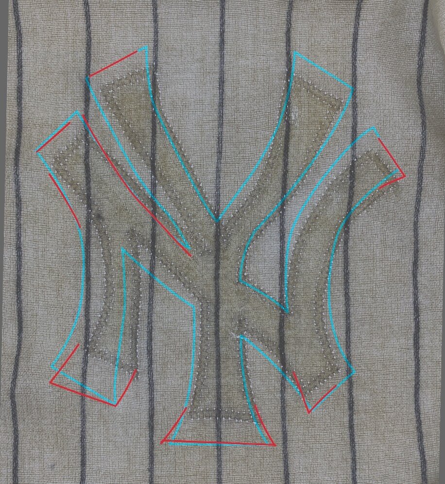
Notably, the entire left side of the chest was darker, as if something else might have been glued there — but what? There were no stitching marks elsewhere on the chest, so a full-chest wordmark from the minors had clearly never been applied. I wondered, which team might have used this jersey, causing the “NY” to have been stripped and then reused?
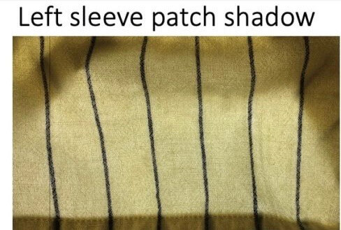
Internet research turned up a possible answer: In the mid-1960s, the Yankees had a short-lived minor league team improbably named the Columbus (Georgia) Confederate Yankees, whose uniforms featured a Confederate flag sleeve patch. [I wrote about this for ESPN back in 2011. — PL] I wondered: Had this jersey been repurposed to the Confederate Yankees? The light table provided the answer. While it’s hard to see in this photo, there it was — faint signs of the Confederate flag patch having been sewn onto the sleeve, perfectly sized and positioned:
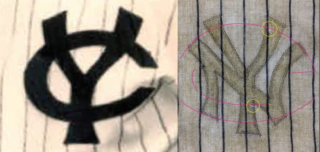
Back to the light table! Now that I knew what I was looking for, spotting the edges of the discoloration on the left chest allowed me to pick out the points of intersection between the “NY” logo and the Columbus Confederate Yankees crest that had also been sewn there. There were also a few small holes exactly in the places where the stitching would have intersected between the old logo and the new:
This was getting exciting! My next task was to run a search of Mantle jerseys that had been authenticated and sold at auction. My search of auction catalogs showed that this one hadn’t made the public auction scene before, or at least not in the past 20 years. This seemed to be the baseball equivalent of an automotive “barn find,” like discovering a Corvette or a Duesenberg covered with a tarp and pushed to the back of a storage shed. I also noted, with a gulp, that a 1964 Mantle road jersey had sold at auction in August 2018 for $1.32 million!
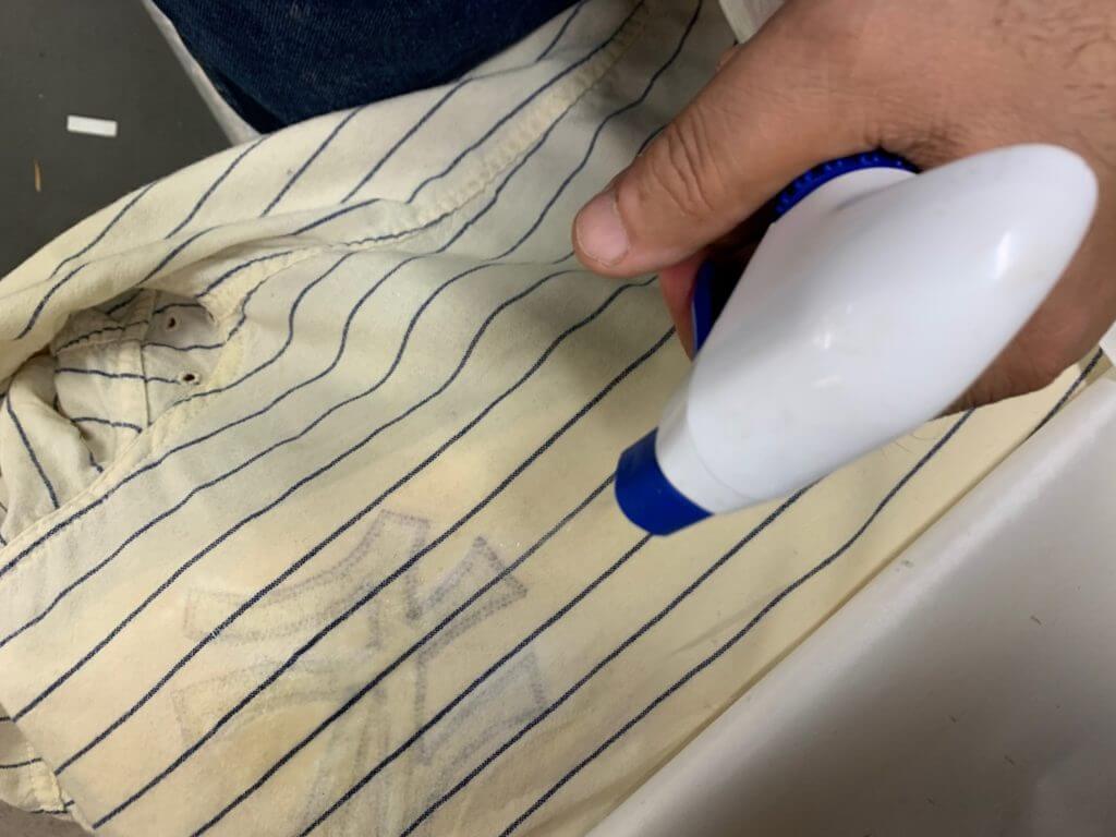
The darkened glue marks mostly came out of the fabric with a careful application of dry cleaning chemicals. I worked gently to try to remove the blue staining, but succeeded only in lightening it slightly:
That’s not the end of the world — I believe every mark left behind tells a story, and sometimes relics can be spoiled by trying too hard to make them perfect.
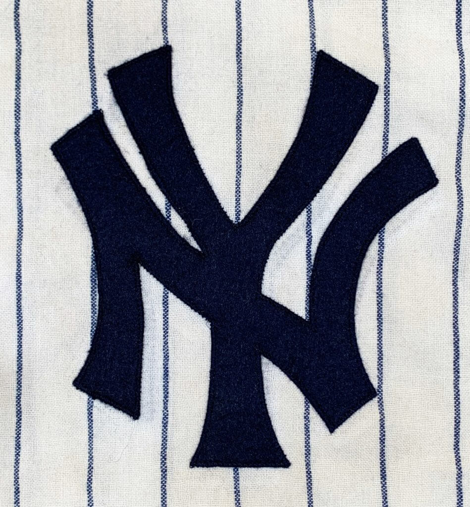
I used heirloom Merino wool felt to create a 1964-correct “NY” for the front and a “7” for the back. The front logo, based on the team’s original pattern, matched the telltale ghosts perfectly! I positioned the felt to ensure that the new lettering covered the ghosts exactly before I stitched them on.
As a restorer and authenticator, I always recommend creating a separate Document of Restoration to chronicle the restoration process. Why? Once exactly restored, the new lettering will perfectly cover the old, original ghosts, leaving behind only the shadows of what was once altered there. A future authenticator looking at this jersey on his light table might reasonably conclude that this jersey was originally numbered as No. 57 and confidently declare it to be a Mickey Mantle counterfeit! Our work-in-progress documentation is designed to prevent that from happening.
Exact restoration of the original elements was critical, because the next step was to try to photo-match this jersey to Mantle. My sponsor in this discipline is Sports Investors Authentications. They are properly licensed to use the photographs from which they photo-match, are insured, and have an impeccable reputation for quality and honesty. I am proud to authenticate for them.
We examined dozens of photos of Mantle from the 1964 through 1966 seasons, trying to find at least one shot that would provide a 100% positive match. Even though this jersey was tagged 1964, we knew to check photos from 1965 and even 1966, as this jersey may have served as a backup for Mantle. I won’t go into all the details of photo matching technique, but no detail is too small to ignore. Everything must match: pinstripes, logo placement, seam alignment, even stitching. After several days of work, we were able to positively match the jersey to game photos from both 1964 and 1965! We can surmise that it went to the Columbus Confederate Yankees in 1966.
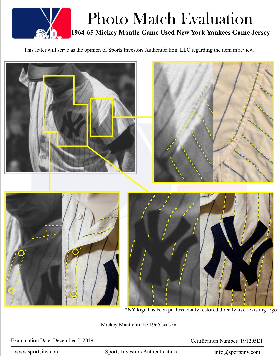
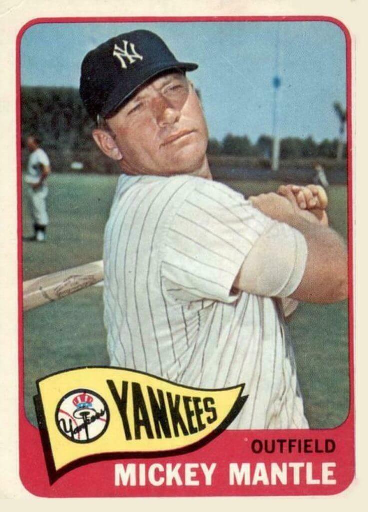
Mantle is also wearing the jersey in the photo used for this 1965 baseball card, which was taken during 1965 spring training. There is a positive match to the way the stripes align in the underarm gusset and the exact location of the vent holes.
It is also possible, but not conclusively confirmed, that this jersey is the same one that Mantle is wearing on this book cover:
Unfortunately, some of the detail I would like to be able to see in the photo has been obscured by its lack of definition and overexposure. Since we already have two positive matches, we don’t absolutely need a third one.
When photo-matching, it’s relatively easy to rule out images that don’t match, but confirming every tiny detail to ensure the match is 100% positive is much more difficult. On an item of this significance, being positive is critical. While I was 95% sure this is the same jersey shown on the book cover, that’s not good enough.
Here is my finished restoration:
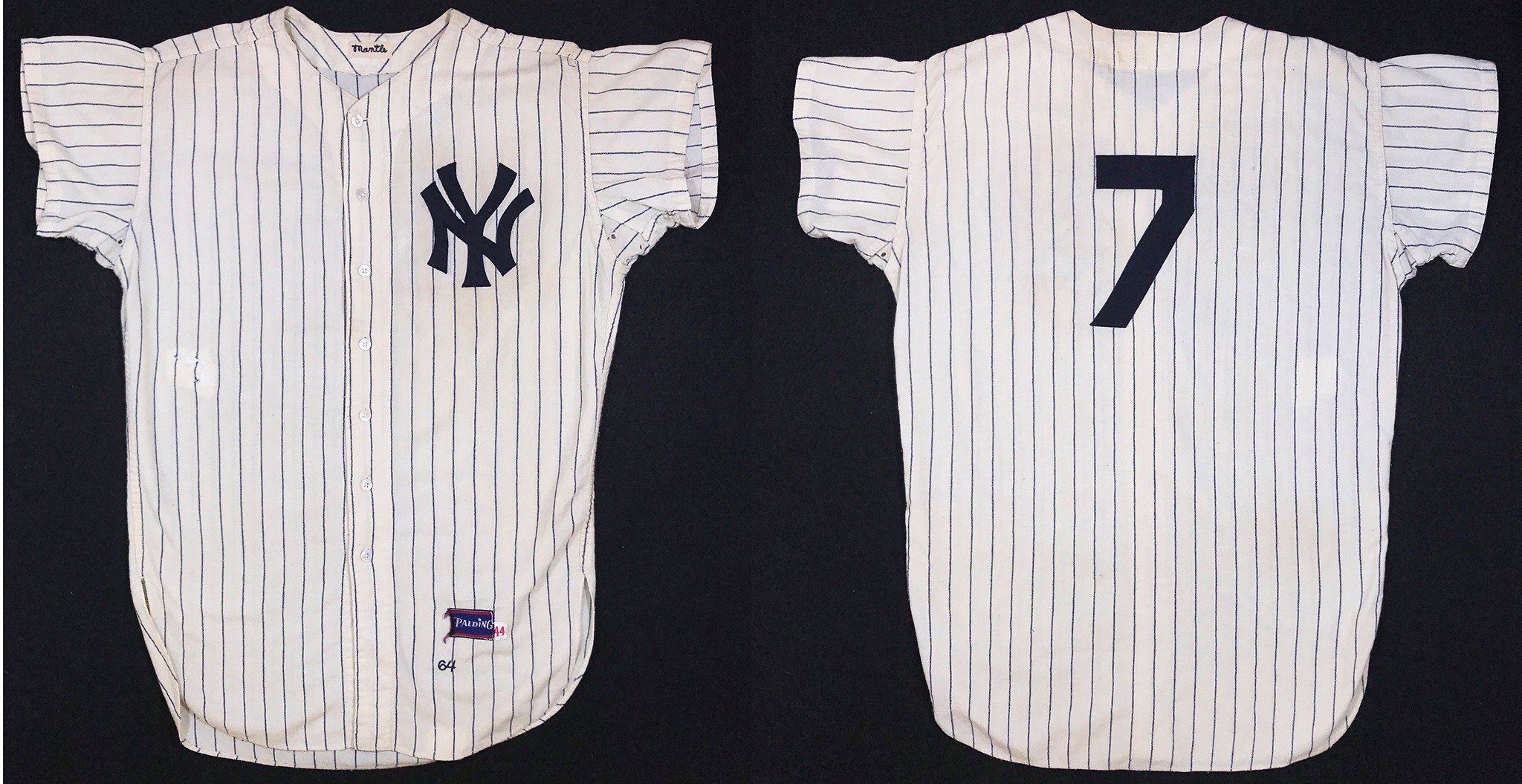
The jersey’s owner, who wishes to remain anonymous, was very pleased with my restoration. He tells me that this jersey will be auctioned with Goldin Auctions in the near future. I am proud to have been a part of discovering its history and returning it to look like it did when Mickey Mantle wore it in the 1964 and ’65 seasons.
———
Paul here. Man, is that sensational or what? I want to thank Bill for sharing his expertise with us. I plan to share more of his step-by-step restoration projects in the weeks and months to come. Meanwhile, if you’re interested in engaging Bill’s services, further info is available on the Dream Shop’s website.
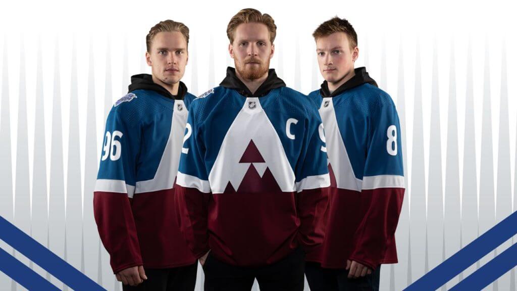
Click to enlarge
Rocky Mountain low: The Avalanche yesterday unveiled their brutal Stadium Series jersey (but not the full uniform, grrrr), confirming earlier leaks.
Here’s the rear view:
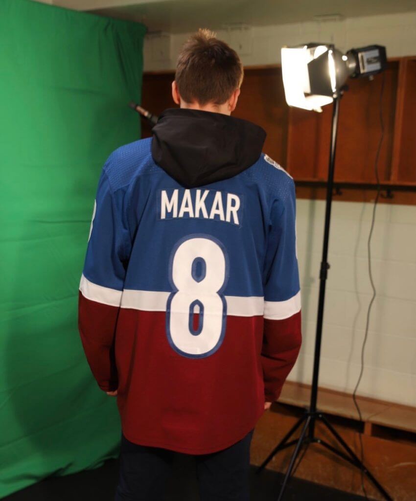
You can see additional photos here. The Stadium Series game will take place on Feb. 15 at the U.S. Air Force Academy’s Falcon Stadium. The Avs will be playing the Kings, whose purported design has also leaked. We’ll find out soon if that leak was accurate.

Click to enlarge
Spot the error: On the left is the seal of the U.S. House of Representatives. On the right is that seal appearing on a lectern earlier this week. Can you spot the key difference between the two seals?
Look closely at the letter “U,” which appears twice in the upper arc of lettering. In both instances, the letters on the lectern are reversed. The thicker vertical stroke should be on the left, but instead it’s on the right. Someone applied the three-dimensional letters backwards!
This error was first spotted by Twitter-er @vogon and has since been sent to me by several people. Great catch!
Update: Reader/commenter Pete notes that the “V” in “Representatives” is also reversed!

Click to enlarge
Pin Club update: Nice move by reader Jim Howicz, who put his Uni Watch Pin Club pin, which depicts a pennant, on his Uni Watch pennant — very meta!
Reader Wes Muniz is taking a more traditional approach, wearing his January pin on his jacket lapel:
@UniWatch I Get It™
No. 320/350 pic.twitter.com/N0JzOEJzXw
— Wes Muniz (@Wes_Muniz) January 16, 2020
How are you displaying or wearing your Pin Club pin? Feel free to send photos my way.
Meanwhile, if you want to order the January pin, you can order it here. If you missed the story of this project, additional info on the Pin Club is available here. And if you want a Uni Watch pennant to put your pennant pin onto, those are available here.
Naming Wrongs update: Rupp Arena, home of the University of Kentucky’s basketball team, had some ugly corporate nonsense appended to its name yesterday, so we have some new shirts for Wildcats fans. They’re available in white, blue, and grey:
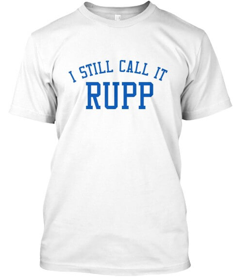
These shirts are now available in the Naming Wrongs shop. My thanks, as always, for your consideration.
Click to enlarge
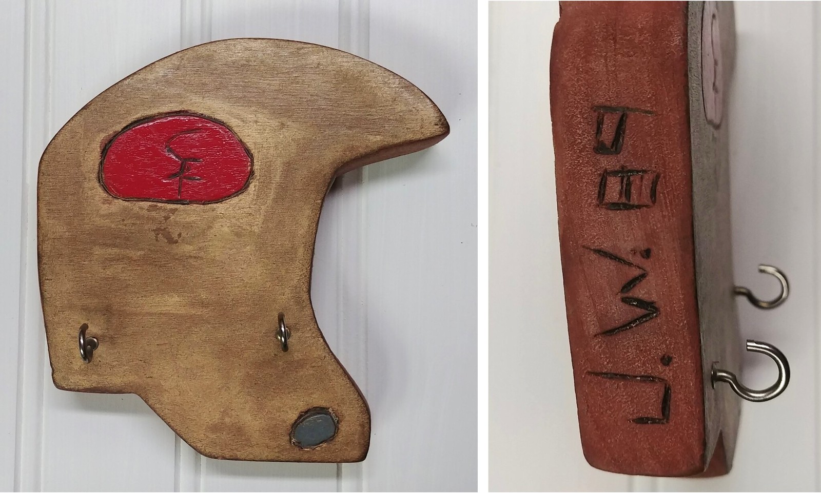
Childhood DIY project: Got a note last night from reader Joe Werner, as follows:
I keep meaning to share this with you, and with the Niners in the NFC Championship Game this Sunday, this is probably as good a time as any.
Way back in 1989, when I was in seventh grade, I got to take woodshop for the first time. Our project was to draw something on a piece of wood, cut it out on a jigsaw, decorate it, and add some hooks to make it a key holder. So of course, I did a football helmet!
The block of wood we were given didn’t really have enough room for a properly proportioned facemask, so I made it a super-old-school helmet. And even though I grew up in Pittsburgh and have always been a Steelers fan, the 49ers’ logo was easier to draw. They were also a more fashionable team at the time. (I was quite the frontrunner at 13 years old. I also had an Oakland A’s hat!)
Please don’t be too judgmental of my work, as I was 13 and using power tools for the first time. It’s debatable whether my skills have improved much in the subsequent 30 years.
Good luck on Sunday!
Isn’t that nice? The only thing better than this junior high project is the fact that Joe has saved it for all these years. Thanks for sharing, Joe. Give that helmet a little rub for good luck this Sunday — go Niners!!
The Ticker
By Anthony Emerson

Baseball News: Following up on yesterday’s lede, Billy Ballas points out that the 2014 Dodgers had a No. 00 (Brian Wilson) and a No. 99 (Hyun-jin Ryu) on their pitching staff. … Speaking of uni numbers, MLB.com has a cool article about legendary players wearing numbers other than the ones for which they’re best known, like Hank Aaron in No. 5, Stan Musial in No. 19, and Don Mattingly in No. 46 (thanks, Brinke). … If this photo is any indication, it appears that Spring Training caps will have Spring Training patches over the MLB logo on the back (from Taylor Ness). … Also posted in the NBA section: Phillies OF Bryce Harper worked out while wearing Philadelphia 76ers throwback shorts (from Jack Connell). … In this photo of the Cubs’ Tyson Miller and Brad Wieck, Miller is in a Nike jersey and Wieck a Majestic (from Bryan Redemske). … The Salisbury Post out of North Carolina ran an editorial decrying the Kannapolis Cannon Ballers’ new mascot’s name, Boomer. The editorial alleges that the name is derogatory to baby boomers. OK (from Kary Klismet). … Hiram College has new unis (from Jim Vilk).

NFL News: Retail outlets are showing this year’s Pro Bowl jerseys. The design is similar to the one used back in 2016. … Steve Hoyle notes that “all four teams playing this weekend have their location initial on their helmet. SF for San Francisco, G for Green Bay, KC for Kansas City and T for Tennessee (but it might be for Titans).” Only three other teams — the Ravens, Giants, and Bears — do that. … A Reddit user posted this image of NFL team pencils, circa 1980. So cool (from Brendan Armstrong).

Hockey News: The Maple Leafs and Capitals wore Hockey Talks helmet decals last night to promote awareness and empathy around mental health (from Moe Khan and our own Jamie Rathjen). … Pens G Tristan Jarry’s gobbler — that’s the plastic throat protector that hangs down from a goalie’s mask — was broken in two by a shot in the second period last night, so he removed it and played the rest of the period without one. … The NHL All-Star Game ice has been installed in St. Louis. Look at that blue line design! (From @2xAught7.) … The Canucks have released renderings of their recently approved new practice facility in downtown Vancouver (from Wade Heidt). … The NHL is once again hosting its All-Star Weekend Mascot Showdown (thanks, Paul). … Speaking of mascots, here’s something I’ve never seen before: an anniversary logo for a mascot — in this case for the Caps’ Slapshot (from David Raglin). … A company called Foco has a pretty cool new line of NHL jersey-style hoodies. … The ECHL’s South Carolina Stingrays are going G.I. Joke and flag-desecration tomorrow night (from @the_casserole). … Also tomorrow night, the Jacksonville Icemen will wear this flag-desecration costume (from @904craftbeerdad). … As part of the fallout over Don Cherry’s xenophobic remarks on Hockey Night in Canada late last year, the WHL is distancing itself from Cherry by scrapping previously planned uniforms designed to look like his trademark suits as part of the WHL Suits Up program, which promotes organ donation. “Instead, the uniforms will now for the most part resemble the vintage powder blue Hockey Night in Canada blazer,” says Wade Heidt. … USA Hockey’s U-18 team will wear these Spongebob sweaters for Nickelodeon Night (from Jakob Fox). … Georgia Tech’s club team has some pretty gorgeous sweaters for the upcoming season (from Michael Zoid). … Waseca (Minn.) High honored fallen police officer Arik Matson with jerseys featuring “Matson” as the NOB, “Waseca Police” as the crest, Matson’s badge number as a jersey patch, and a picture of Matson and his daughters on the inner neck (from Trey Volk).

NBA News: Oregon Public Broadcasting has a great article on how the Blazers’ pinwheel logo has remained iconic even 50 years after its introduction (from Kary Klismet). … Bucks PG Eric Bledsoe showed up to yesterday’s game against the Celtics wearing a knockoff Vin Baker jersey. It’s not even a good knockoff, either! (From Ryan Franke and Alex Laedtke.) … Fun while it lasted: The Mavs, who’ve been the NBA’s only ad-free team this season, are poised to announce their new jersey advertisement this evening (from Matthew Spencer). … Cross-posted from the baseball section: Philadelphia Phillies star Bryce Harper worked out while wearing Sixers throwback shorts (from Jack Connell).

College Hoops News: Arkansas men will have new unis for tomorrow night’s matchup against Kentucky. … UT Martin revealed their new alternate logo before last night’s game (from @the_ralphinator).

Soccer News: Orlando City, FC Cincinnati, and Minnesota United posted very similar teaser images of their new kits yesterday. DC United also posted a teaser image (from @labflyer and Josh Hinton). … You can catch all of Josh’s other submissions on his Twitter account. … New home keeper kit for Minneapolis City (from Ed Żelaski).

Grab Bag: The US Navy has authorized a new black leather jacket for surface warfare officers (from Kary Klismet). … Unlike former Chief Justice William Rehnquist, Chief Justice John Roberts will not wear a striped robe while presiding over President Trump’s impeachment trial. … And speaking of the impeachment-related aesthetic details, it turns out that the Capitol Police have special uniforms for things like trials. … RoushFenway Racing is having fans vote on one of three remaining designs for Ryan Newman’s No. 6 car for this weekend’s race (from James Gilbert). … Washington High in Cherokee, Iowa., is soliciting donations to replace their 30-year-old marching band uniforms, which do just scream 1990 (from Timmy Donahue). … Alabama gymnastics has taken to posting which leotard they’ll wear on social media prior to their meets (from Griffin T. Smith). … Fascinating article about boys in cold-weather regions who insist on wearing shorts all year long. … Gross: Advertising creep has hit a new low, as passenger announcements on a NYC subway line are being turned into a promotion for a new TV show (from @FreyDaddy4).
The appears to be stars in the flag of the US House of Representatives Logo on the Lectern, but no stars in the flag featured in the official logo on the left.
That was the first thing I noticed, too. -C.
excellent article re: the restoration process. Would request having posts like these more frequently please-thank you!
I second this! Very interesting. Thank you for sharing.
Why I come to Uni Watch.
Agreed. This was a great interview and a fascinating topic.
The Mantle restoration piece is one of the most fascinating items ever posted on this site.
The new Navy leather jacket looks a lot like the Air Force’s A-2, the main difference being the lack of epaulets. Clearly, of course, it doesn’t have the fleece collar of the Navy aviator’s G-1 “Top Gun” jacket.
Love that restoration process. I can’t even imagine that feeling he got when he realized, conclusively, that he was holding a jersey that Mantle wore on the field. Let that sink in!
Gobbler?!? I’ve been a hockey fan ever since I was a kid, and I wore one of those in a local inline league as a goalie. I’ve never heard the term “gobbler” for it. I know it as a “dangler.” Gobbler is hilarious, I get it (because of turkeys), and I’m not saying anybody is wrong or misheard it, but that’s a first for me. Dangler, for dangling Lexan throat protector.
The term is new to me as well. But I love it!
I always thought of that as a Stevie, after Steve Yeager, the Dodgers catcher who was the first major leaguer to wear one.
OMG, I love the term “Gobbler” for that equipment (I hadn’t heard that one either). Hysterical. Hadn’t heard “Dangler” either, but an announcer saying “that slapshot broke his gobbler in two” leaves me with less-painful thoughts than “that slapshot broke his dangler in two”. So many jokes to be made there…
I realize that the dangling throat protector invokes the image of a gobbler, but why not call it a “wattle”, the actual term for the part of the gobbler they are referring to?
Harry Neale once referred to it as a cow catcher which I thought was perfect.
The jersey restoration peice is terrific! Really fascinating!
And for the record, I actually really dig that Avs jersey. It really works and I think with some gentle massaging it could be really great. Definitely bold and different, but it’s refreshing to see something other than the standard “logo on front and sleeve patches” treatment.
Came here to say pretty much identical things about both the jersey restoration and that Avs jersey.
That jersey is a bit clunky, but I like the overall aesthetic. However, once paired with the rest of the uniform I reserve the right to say, “It’s an ugly piece of crap, and I’ve always felt this way.”
My first reaction to the Avs jersey was that the logo looked like shark image on the poster from the movie Jaws. Admittedly, I was looking at it on my phone so I could not see all the detail. I wonder if anyone else had that reaction or if I’m the only one that has a deeply recessed shark phobia.
I like the Avs jersey as well.
I don’t like the “triangle” in the middle of the white patch – I think it would be a stronger look with just the three mountain peaks and then white above. But then maybe the “A” wouldn’t be obvious
“Restoring a 1964 Mickey Mantle Jersey
By Bill Henderson” ~ Great lede today, really enjoyed it!
Great jersey restoration.
With the NHL All-Star game coming up, do we have any news on when the Seattle NHL team was going to announce their name/logo/etc.? I thought it was supposed to be around now.
Probably All-Star weekend.
Great post today!
Looks like the “V” in “Representatives” is also reversed on the lectern!
(Also, edit: “Spot the error: On the left is the seal of the U.S. House of Representative.” … missing an “S” at the end)
Typo fixed, and great spot on the “V” — I’ll add that to the text!
Can’t believe nobody else has said this, but: those All-Star blue lines at I Still Call It Kiel Center need to stay there, always and forever.
They’re not just blue lines — they’re Blues lines!
Not usually a fan of these things, but DAMN, that blue line is amazing.
We know center red lines get variations by building and year over year, but are there any other blue lines decorated like this? Is it even allowed for regular season games given how integral the blue line is for offsides?
In theory, I’m not aware of any rule against patterned blue lines. In practice, it’s convention from the black-and-white TV era (because red and blue can look similar) that the blue line never gets a pattern, but the center red line can and often is patterned.
I follow Bill on Facebook and the level of detail on every aspect of jersey design, materials, and restoration is mind boggling. The amount of information I learn with every post is hard to put into words, plus Bill is very generous with sharing info when asked. Great to see this post, and look forward to whatever comes next.
The lede today was amazing. More please. I think any restorations where Bill was optimistic he had a gem, and then discovered late in the process it wasn’t authentic would also be fascinating.
Kudos all around.
Good luck to your Niners this weekend Paul.
In the MLB mis-numbered piece… did I miss Joe DiMaggio wearing #9 when he came up?? Seems like a significant omission.
Also, in my ‘obsession’ with McAuliffe numbers I researched the use of the font for Yankee jerseys and found they stopped using them for the 1946 season, yet the MLB article shows Berra wearing #35, in McAuliffe, in 1947.. Odd.
I fowarded that lectern tweet to the Architect of the Capitol which, if you don’t know, has a tremendous Flickr account.
Ticker thought: Anthony posits that the Cherokee uniforms scream 1990, but I’m fairly certain the the picture is of the NEW uniform. Non-symetrical, long coat and crazy shako? Those are current (unfortunate) uniforms.
A 1990 uniform I would guess is a more traditional cadet jacket, perhaps with a sash (all of this before I bother to search: I wonder if I’m even close, when I get to work, I know what I’m doing!)
Am I the only one who finds it weird that all four of the neutral zone ads on the ice for the NHL all-star game are facing the same direction? Most games I’ve attended, the far side ads are facing my side of the rink, but the near side ads are upside down to me, so that people on the other side of the ice “get” to read ads too.
I assume they’ve done it this way because all the ads are facing the side with a hard camera position, maximizing the exposure for TV viewers?
My apologies if this is a dumb question, but does restoring a jersey in this manner (cleaning, new logo, new number) reduce the potential value? A non-collector like myself would feel it is less authentic since some of the major parts aren’t orignal.
Also, not knocking this method at all, it is amazing what was done.
That’s a great question, Steve. Conservators in all fields confront that question every day — is it more “authentic” to leave something in its current state or bring it back to simulate an earlier state?
If it’s anything like car restoration, it depends. The markets there seem to change every few years from enjoying cars as-is, liking a light restoration with original parts, a full restoration to original spec using NOS or restored parts, or a full restoration to better than original. They’re all worth money, just different amounts to different people, and highly depends on who is at the auction on a given day. It only takes two people to want something at an auction to drive up an individual price that then ends up suddenly changing everyone’s perspectives on what is worth more, and then changing the entire market for a couple years.
To preserve or restore?
This competing approach can also be found in historic homes. While in Charleston, SC, on my honeymoon in November, my bride and I toured the Aiken House, once owned by the former state governor. We found ourselves constantly looking at each room in the home and the servants’ quarters nearby and lamenting the fact that their condition had deteriorated to the point where we questioned the overall structural safety of the floorboards, walls, etc.
Yet, curiously, there were numerous patches of clear fabric (mylar?) placed strategically over parts of the old wallpaper in the main house to prevent it from peeling away further. There also was one section where faux marble wallpaper (applied in the 1980s) was left in the front entranceway. As marble goes, this would be wonderful to see. But as a phony application, it came across as horridly tacky.
But when you stop and think about it, that application came during a later chapter in the history of the home, so shouldn’t it warrant being left there, too? Ugly as it may be, if you’re gonna preserve rather than restore, it deserves to stay as is, a moment in time.
The point is, where do you draw the line in restoring something before it loses its value (or, in the case of a house, before it completely falls apart and can no longer be entered safely)? What period of time should be dismissed? 1880s, fine? … 1980s, garbage? … how far back should we go?
Preserve or restore. It’s a hard question to answer. Personally, in the case of today’s subject here, I might’ve left Mantle’s jersey alone, with that very cool backstory chronicled and documented to always have at the ready, to share.
Awesome entry today, Paul. Well done!
-C.
I once attended a talk by Fenway Park’s official preservationist (yes, that job exists), who explained that a big part of her job was deciding which era to preserve and what counted as “original.” The Green Monster, for example, was not originally part of the ballpark, but of course it’s now something you’d want to preserve. It’s all very tricky!
I enjoyed that a lot too.
I often think like this when I visit my local castle – Edinburgh Castle. It’s an interesting place to visit with some great history but deciding what is original always intrigued me. There’s been something there for nearly 2000 years, a proper castle for nearly 900 – but as an active military garrison in times of war it went through a lot of phases and they often built a new structure on top of an old one. It’s interesting to think about all the different eras it’s been through and why certain parts have been restored in a certain way.
Fortunately, they didn’t actually change Rupp Arena’s name and just the name of the Lexington Center.
Well, they did change its full name, and you can bet that broadcasters and PA announcers will be told to say it that way.
From the NFL ticker – those 1980s NFL pencils ARE cool. I actually have a handful of them still from when I was a kid. I distinctly remember thinking how cool they were when I was sitting in class in elementary school. I used a few of them, but still have some unsharpened. There is another style of NFL pencils from the late 80s or early 90s that I still have too that are also really cool. Maybe I’ll send in a picture as a ticker submission.
Great post today – I loved the restoration/discovery process and that 49ers wood shop hook helmet would be a pride and joy of mine, so cool.
Looking closer at the NFL pencils, the ones I have may be slightly later in the production run. The Tampa Bay Buccaneers one I have doesn’t use white for the font and helmet color, but the pencil is orange.
I had those pencils too. When I see “Houston Oilers No. 2” it makes me think of the old fight song.
link
But in my head I change the number to match the pencil.
I always tried to get those NFL pencils when I was starting the school years. Of course, they didn’t last long as your friends were always trying to get one off you. They were as good as currency in the classroom back then. I really wish they would put those out on sale again.
One thing though: The sets I always got didn’t have the secondary stripes on them. It was just a solid team color with the lettering of another team color.
I have that full set of NFL Pencils shown today in the Ticker! I always loved the team colors and striping. I guess I Got It (TM) way back then!
Seems like the Salisbury Post doesn’t realize that cannons go “BOOM!” when firing cannonballs, or that the “OK, boomer” thing will be long forgotten before the team changes mascots again.
I also get the sense that this editorial board has probably recently bemoaned how the kids these days are overly sensitive little snowflakes who get offended at the slightest real or perceived slight.
Excellent work and write-up on that restoration!
I’m pretty sure there’s no NASCAR Cup race this weekend, and the winning paint scheme won’t be seen for weeks after the season beings.
I applaud the Cannonballers for honoring the results of the fan vote…as lame as Boomer is.
That’s what I was thinking: the motorsports season in North America doesn’t really begin until the 24 Hours of Daytona, which isn’t until next week.
One week after is when NASCAR boots up.
I’m from Phenix City Alabama, which is only separated from Columbus Georgia by the Chattahoochee River. The ballpark the Confederate Yankees played in is called Golden Park, and it’s actually still standing. I go there every once in a while just to walk around. I’ve even played there once!
What was Henderson thinking? That photo of a purple seam ripper being used to restore a vintage Mantle jersey must have ripped Paul’s heart out. It just ain’t natural. Maybe Bill could have justified it if he was working on a vintage Lakers jersey.
“all four teams playing this weekend have their location initial on their helmet. SF for San Francisco, G for Green Bay, KC for Kansas City and T for Tennessee (but it might be for Titans).” Only three other teams — the Ravens, Giants, and Bears — do that
The Giants used to, until they moved to New Jersey.
Titans are like my favorite baseball team… is the P for Pittsburgh or for Pirates?
Anyway, fantastic piece today, Paul.
The G on the Packers helmet stands for greatness, not Green Bay.
Well, by that standard (a silly one, in my opinion), the Niners don’t qualify either.
(And by “that standard,” I meant the one that Jim suggested disqualified the Giants.)
The Dolphins, Jets and Broncos used to be part of the group that sported a location initial on their helmets. Really wish Miami would return to any of those four logos for their helmets.
Either getting ahead of myself or already covered…
Would Chiefs go with retro end zone font for the Super Bowl?
Assume 49ers would go with retro font their end zones have had all year…
Would Packers do a retro end zone if they end up playing KC?
If the Packers and Chiefs play, they HAVE to bring back the every-five-yard field numbers.
link
Do that and go with retro end zones… I’d watch that.
Would love it, too. But ain’t gonna happen. In 1972 the NFL revised field marking specs, which eliminated the every five yard numbers, set a minimum height of such numbers to 6 feet and also eliminated such things as the Raider shields and Chargers diamonds encircling the numbers. In 1978 the directional arrows were added to the on field numbers for TV viewers.
Thanks to Bill for sharing the details of the Mantle jersey restoration and to Paul for sharing Bill’s story with us! I especially appreciate the insights into Bill’s research and how he documents and preserves his research so that any future appraisals of the jersey will have the benefit of his work.
After almost two decades, I recently chased down my own personal jersey white whale – 2002 NL All Star GAme BP/HRD jersey – and sent it to Bill for customization. I’m going to choose to believe that it was in his workshop at the same time as the historic Mantle jersey! Anyway, point being that I thought I knew everything there was to know about the 2002 HRD jersey, but Bill did his own research and identified a very slight difference in how the numbers on back were done from my own understanding. I knew the numbers were then-current Brewers “Times New Roman”, but Bill identified that the one-color HRD numbers used the bottom or “outer” layer of the Brewers normal multi-color number style. Effectively, the outline layer with no inner layers on top. Reviewing the documentation and photos Bill found, darn if he wasn’t exactly right.
Another option for the U’s and V on the seal:
Somehow it was created from a mirror image of the seal, however when the creator put the U’s and V on they did them the right way, and not the mirror image of them.
I’m not really understanding the “Roberts won’t wear a striped robe” story.
Nobody wears a striped robe. Striped robes aren’t a thing.
Except for Rehnquist, who always wore a striped robe. He saw a community production of Iolanthe, in which the Lord Chancellor wore robes with stripes. He added stripes to his robe in 1995 (after he’d already been a judge for 25 years) because he liked them so much, and wore those striped robes for all judicial functions, including ordinary court sittings.
There’s no connection between striped robes and impeachment. They weren’t his “impeachment robes”. Other than that impeachment is maybe the only time most people have seen the chief justice.
Roberts has never worn striped robes (nobody else has, except for a few years of Rehnquist), I don’t know why anyone would think that he would.
I’m liking the Avalanche stadium jersey.
Great weekend for football games and their uniforms. Thank you to nice looking colors and not black vs white.
(I hope the Titans go with the double blues, my favourite)
Mentioned earlier, but there are also stars in the blue box on the lectern and no stars in the official seal picture on the left.
There is no “modern precedent”. Rehnquist began wearing stripes on his robe in 1995. The Clinton Impeachment Trial ran December 1998 to February 1999. It would be a precedent if Rehnquist STARTED wearing the stripes for the impeachment. But he didn’t.
Pretty lazy journalism by NY Magazine.
This new Avs jersey looks like nothing else in hockey (The Caunucks’ flying V, maybe?) so big points for standing out. It has a ’70s vibe to it in a cool way. It’s a major upgrade of the very ’90s cartoony logo they have worn since day one. Avs should make their current Rockies-inspired alternate their main jersey (absolutely gorgeous look) and make this new one their alternate.
Congrats to Ken Jennings for winning GOAT Jeopardy and to the Jazz for offering him jerseys. It’s a shame his home town of Seattle hasn’t done the same with a Supersonics jers… wait a minute… I remember now
I wonder why Green Bay only has a G and not a GB on their helmet?
See my comment above on this topic.
The Mantle jersey is up for auction, get those bids in..
link
Thanks for the link to the story on the Portland Trail Blazers’ “pinwheeel” logo. Until just a couple of years ago, I never knew that the logo is an abstract representation of basketball. When I became a fan of the team in the 70s, I always figured it was just another nondescript modern corporate logo. It did have the attribute of not looking like anything else in Oregon, so it was instantly recognizable as the icon for NBA basketball in Portland.
This begs the question – when is abstract too abstract? Not just in sports, but in any sort of design?
The fake Vin Baker jersey looks like the type of jersey used at autograph and memorabilia shows: make it convincing enough to be framed, but not infringing enough that it would run afoul of trademark protections.
Zooming in, it seems like the number is autographed, too.
Just great post all around today! No doubt fascinating post on the mantle restoration jersey and great stuff in the ticker (as always)! Was that vin baker throwback a prototype ?!?!! I remember the original same jersey with bucks across the chest but never Milwaukee!
I’m browsing the site today and see that the number under the magnifying glass is switching between 15 and 7.
Is this because of Bill Henderson’s work on the #7 Mantle jersey, or is it because the Mets’ #15, Carlos Beltran, is getting a little too much scrutiny and is now vacating that number?
It was originally 7. We changed it to 15 for Uni Watch’s 15th anniversary in 2014. Now it randomly switches back and forth between the two.
Yes, the site is long overdue for an update — I know.
Will there be a “Design Uni Watch” contest?
I didn’t read UW until late tonight but I spotted the error on the US House of Representatives sign right away because (1) I’m in the sign business and (2) there is a similar sign here on Long Island that drives me crazy every time I pass it — it’s a car wash with CAR WASH in huge cut-out letters on the front of the building, except that both A’s are flipped/reversed!!! HORRIFIC!!!!
-Jet
Interesting how the Stingrays GI Joke page is not found. The power of Uniwatch strikes again!
SCOREBOARD PHOTO:
Houston Astros vs. Cincinnati Reds
at Crosley Field, Cincinnati
May 1, 1969
Astros’ Don Wilson pitching to Reds first baseman Fred Whitfield in ninth inning of Wilson’s no-hitter. Wilson walked Whitfield, then got a foul pop-out from Reds second baseman Tommy Helms to complete the no-hitter.
In picture, the Astros’ shortstop is Denis Menke. The left fielder is Jesus Alou.
Wilson’s no-hitter occurred the night after the Reds’ Jim Maloney threw a no-hitter against Houston.