Click to enlarge
[Editor’s Note: As reported in yesterday’s Ticker, the Canucks will wear “flying V” throwback jerseys for tomorrow night’s pregame skate. With that in mind, we have a guest entry on that topic by the pseudonymous Wafflebored. Enjoy. — PL]
By Wafflebored
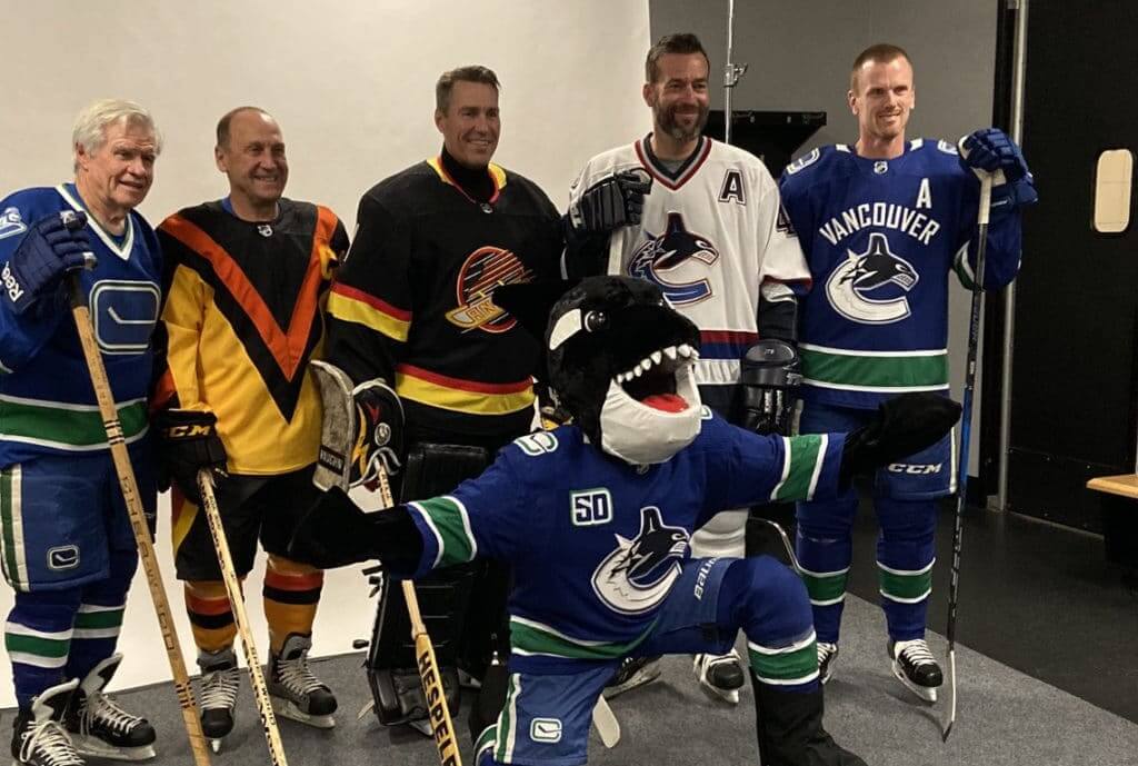
The Vancouver Canucks caused a bit of a stir on on Oct. 9, when they featured former player Stan Smyl — second from left in the photo shown above — wearing the outrageous 1978 “V” jersey as part of the team’s 50th-anniversary celebration. But the elation I felt over the team formally acknowledging this groundbreaking and wonderful design gave way to disappointment as I realized there was something not quite right about the way the jersey looked. In short: I think they messed it up.
A bit of background: I was born in Vancouver and still live there today. I was nine years old when the cool blue and green gave way to the retina-searing V jerseys. At the time, no one could believe the Canucks would really be wearing that design. But over time, the look has become legendary, both with Canucks fans and with uniform fans in general. As a member of both camps, it would be fair to say I’m somewhat obsessed with the design.
More recently, and with the support and encouragement of Paul here on Uni Watch, I have become a hobbyist jersey maker. I’ve dabbled in lots of designs, and some time ago I decided I would try to unlock the secrets of the V by creating a pattern for the design. I didn’t know what I was in for. There is nothing about this design that bears any resemblance to traditional jersey making.
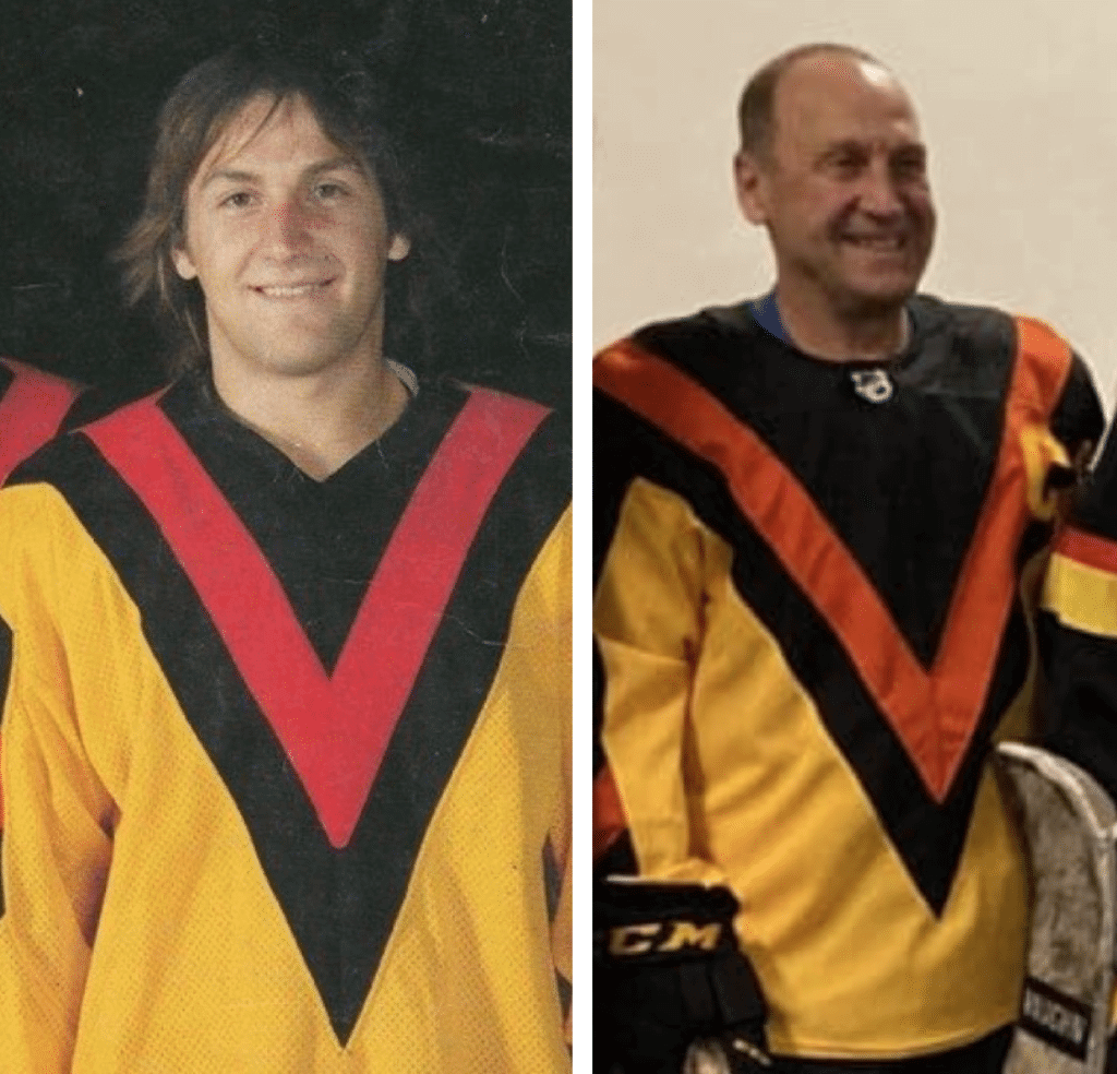
But back to the Canucks’ recent ceremony for a second. As soon as I saw the jersey, my initial thought is the orange V was positioned too low within the black triangle section. Also, it looked to me like the black V section was too large compared to the originals. Here’s a comparison — original version on the left, Smyl’s throwback on the right:
Surely they would have noticed this? But then I realized that trying to make throwbacks work within modern jersey templates can’t be easy. The older jerseys were much smaller and cut differently. Maybe I was being too hard on them.
My own foray into patterning this design was much more difficult than I imagined. It’s all about the geometry of the V shape, and how it fits onto the jersey. It’s all about angles and scale, and if you mess anything up it affects everything else. It’s a very unforgiving design.
At first, I suspected the issue might be with what I found most surprising about this jersey: the two small Vs on top of the shoulders are not symmetrical. I found this out, of course, by first making them symmetrical. I thought a V was, well, a V — I assumed symmetry, balance, and a harmony of design. What I actually found, at least I think, is that the designers had to fudge the angles on these for everything to come together.
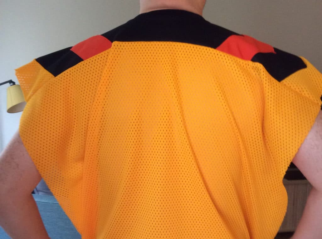
The photo above shows my first attempt. The orange sections don’t come together at the back, which would form the 10th V on the entire uniform (two on the socks, two on the pants, one on the front of the jersey, two on the sleeves, two at the top of the shoulders, and this one on the back of the shoulders).
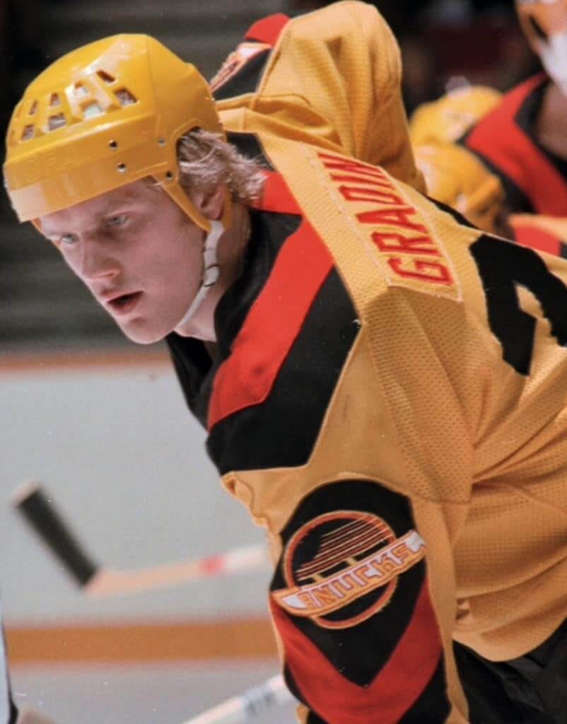
I know what you’re thinking: 10 Vs was probably overkill anyway. But if you look at this photo of Thomas Gradin [see above], you might agree with me that having the orange sections come together at a V at the back is much more attractive than my attempt where they don’t meet. To use symmetrical Vs at the top would require the meeting point to occur too far down the back.
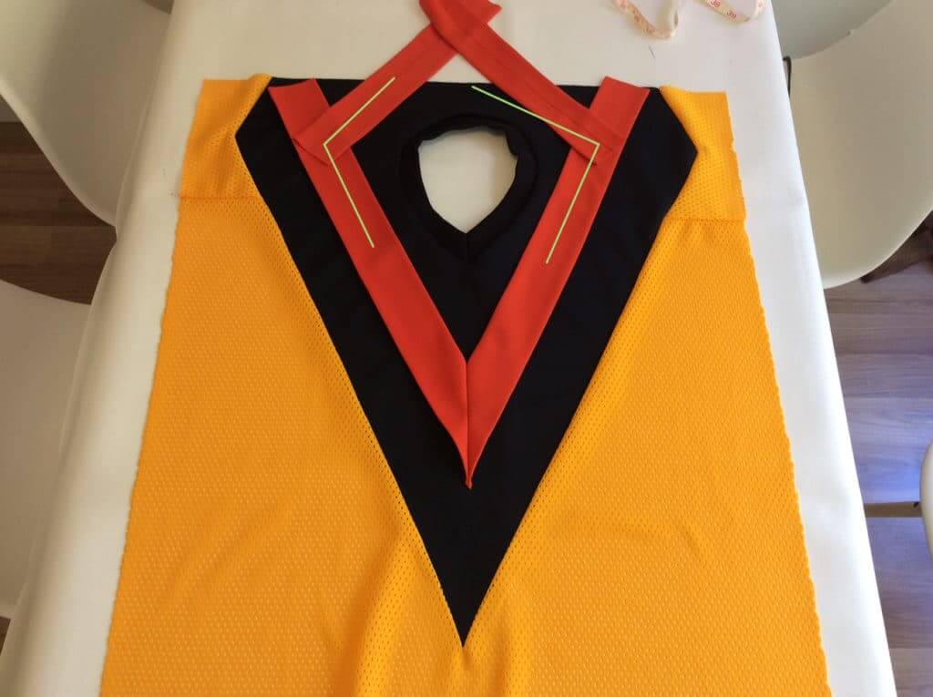
Here’s a look at how the angles on the shoulder Vs need to be offset to meet at the back. The lines on the left side show the angles for a symmetrical V, while the right side shows how the angle needs to be adjusted so both sides meet in the middle.
At this point, I had only seen front photos of Smyl, so I didn’t know if the designers had made the same mistake I had. There were no rear-view photos of Smyl that I could find on the internet. I wondered why they didn’t just move the orange section up higher so it was more centered on the black field?
Finally, I watched the Canucks’ video of the event, which finally allowed me to see what was happening on the back. Here’s a screen capture:
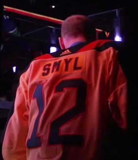
It finally dawned on me: The V did not come together at the back, likely to accommodate the Adidas logo, which appears at exactly the point where the Vs should meet. Was the design compromised to accommodate the maker’s mark?

At this point, knowing there are a lot of moving parts to the design, I couldn’t say for sure what happened. And to be fair, my own measurements might not be accurate. And this photo makes it look like maybe the shoulder V’s actually are the offset style with more angle at the back as per the originals. But the overall large size of the black V on the jersey, plus the lower orange V, makes me think maybe everything was made wider than the original so the orange lines didn’t meet at the back to allow for logo placement.
My solution: If logo placement was the issue, they could have gone with a smaller black V, raised the orange V higher in the black, and relaxed the angle of the shoulder V so they didn’t meet at the back as per my first attempt. This may have provided a closer look to the original, while accommodating the logo placement.
My understanding is the Canucks will be wearing these as a pregame jersey later in the year. The pregame jerseys usually wind up for sale in the Canucks arena store, if they are not first bought by collectors. If they do wind up at the store, I will definitely do my best to check them out to see how close my best guesses were.
Meanwhile, here are two V-style hybrid jerseys I recently made — very on-topic!
Been a long time since I finished a DIY jersey. Canucks navy orca/V hybrid with Anson Carter cresting. Silver dazzle cloth per the original. Logos were removed from a thrift store junior size jersey that had full size patches.@UniWatch @PhilHecken pic.twitter.com/UXJZKfVtQa
— Wafflebored (@wafflebored) October 23, 2019
Just finished this hybrid Flying V/WHA Vancouver Blazers jersey. Lace-up collar as used by the Blazers in both years of their existence. This style is a nice way to use smaller vintage patches which are still available.@UniWatch @PhilHecken pic.twitter.com/1ujr27zIbD
— Wafflebored (@wafflebored) November 4, 2019
ICYMI: earlier in the week I posted this jersey I recently finished, which is a hybrid Flying V/WHA Blazers jersey. Some different pics outside on a nice sunny fall day. Former Blazer Claude St. Sauveur. Lace up collar as the Blazers wore for their two seasons in Vancouver. pic.twitter.com/alLPQrScSG
— Wafflebored (@wafflebored) November 9, 2019
———
Paul here. Great stuff from Wafflebored, who I know will be watching closely when the throwbacks take the ice again tomorrow night!

Click to enlarge
Gift Guide reminder: In case you missed it on Wednesday, the annual Uni Watch Holiday Gift Guide, featuring all sorts of cool stuff (including artist Pop Chart’s scratch-off stadium posters, shown above), is now available for your enjoyment over at InsideHook. My thanks to everyone who suggested items for inclusion!
Also: The good people at Tokens & Icons have two worthwhile items that, for reasons not worth explaining here, didn’t make it into the Gift Guide, both of which are being sold exclusively at UncommonGoods (the same people who made and sold our Uni Watch 20th-anniversary plate):
• First, they have some very nice friendship bracelets made from unwound yarn from game-used baseballs (shown at right).
• And they also have money clips made from game-used NFL jerseys.
Teen drama: My former ESPN colleague Kevin Seifert has written a tremendous piece about NFL wide receivers choosing uni numbers in the 10-19 range instead of in the 80s — including how the trend started with Jets wideout Keyshawn Johnson and how there may actually be some science backing up the preference for the lower numbers. Great reporting, great info, and well worth your time. Check it out here.
Mets musings: As you may have heard, the Mets will apparently have a new owner within five years, and possibly sooner. There’s been a lot of chatter about what this may mean for the team’s payroll, for the team’s rivalry with the Yankees, for the lame-duck period until the new owner takes over (Mets Police blogger Shannon Shark had a particularly good take on that topic), and more.
But as a lifelong Mets fan who thinks the team looks pretty good right now from an aesthetic standpoint, I’m more interested in a question that nobody seems to have addressed so far: What might new ownership mean for the Mets’ uniforms?
Some quick background: In the Mets’ nearly 60-year history, there have been only two ownership eras, although the second era has actually been several mini-eras folded into one. The first era was from 1962 through 1980, when the team was owned by Joan Payson and her heirs. The second era has been from 1980 to the present, with majority ownership first held by the publishing firm Doubleday & Co. (1980-86), then jointly by Nelson Doubleday and Fred Wilpon (1986-2002), and then solely by Wilpon (2002-present). So for better or worse, the team has had, for the most part, ownership stability.
Perhaps not coincidentally, the Mets have also had aesthetic stability. Throughout those two ownership eras, the team’s uniforms and related graphics have largely remained stable. Sure, they’ve tinkered at the margins, often due to prevailing fashion trends (pullovers, racing stripes, BFBS, etc.), but the team’s primary colors, primary logo, cap logo, script, and mascot have remained mostly intact. As I like to frame it, they’ve been more of a Coke team than a Pepsi team. In fact, if you compare the Mets to MLB’s other expansion franchises (the Angels, Senators/Rangers, Astros, Royals, Expos/Nats, Padres, Pilots/Brewers, Mariners, Blue Jays, Rockies, Marlins, Diamondbacks, and Rays), they’ve had more aesthetic stability than any of those teams except for the Rockies. Indeed, it appears that Wilpon’s chief aesthetic legacy, aside from the BFBS hiccup, will probably be the team’s new ballpark.
But now it looks like a third ownership era is approaching. What might that mean? Here are some thoughts:
• On the one hand, the new owner-to-be reportedly grew up as a Mets fan on Long Island, so maybe he cherishes the team’s aesthetic heritage as much as I do and will leave it alone.
• On the other hand, when fabulously wealthy people purchase a vanity trinket (which is essentially what the Mets would be for the new owner), they often like to put their own stamp on it as a way of saying, “This belongs to me now, and we’re starting a new chapter.” One way to do that is by introducing new uniforms. We’ve seen lots of new team owners do that in various sports, so it’s certainly possible that the Mets’ new owner would do it as well. Interestingly, he is a serious appreciator of the arts — his art collection alone reportedly has a higher value than Fred Wilpon’s entire net worth — so aesthetics clearly matter to him. And like many fabulously wealthy people, he may have a high regard for his own tastes. Maybe he’s been spending much of his life thinking, “If I ever get to own this team, first thing I’m gonna do is fix those fucking uniforms.” (It’s worth noting that the logo of his former company featured brown, orange, and yellow, while his current company’s logo has multiple shades of blue. Hmmmm.)
• On the other-er hand, lately we’ve seen several owners giving the fans what they want when it comes to uniforms — think Padres and Brewers. The Padres’ case is particularly interesting because owner Ron Fowler was on record as not liking brown, but he eventually approved the team’s move back to brown anyway because the fan base wanted it. In the case of the Mets, I’m fairly certain the fan base would not be in favor of a uniform overhaul, so maybe the new owner would listen to that sentiment.
Do I really think the new owner will change the Mets’ look? Frankly, I doubt it. But it’s definitely a possibility, and that scares me. You know, it’s funny: Like so many Mets fans, I’ve been hoping for many years now that the Wilpons would sell the team. Now that it’s finally happening, I’m reminded that we should always be careful what we wish for.
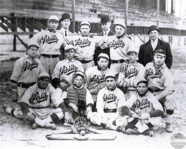
Too good for the Ticker: Reader Mark Chiarucci recently tipped me off to a site called Good Old Sandlot Days, which features tons of team portraits from Bay Area sandlot baseball teams of the early and mid-1900s (including the Schlitz-sponsored team shown above). There are soooo many great uniforms waiting to be discovered here — definitely worth it to spend some time poking around. Big thanks to Mark for letting me know about this one!

Membership update: Eight new cards have been added to the membership card gallery, including reader Chad Menefee’s Babe Ruth-style treatment. Obviously, it’s a simple design, but card designer Scott M.X. Turner really nailed the old Yankees pinstripe style, with the pins much lighter-colored than the numeral. Slightly off-white background tone, too. Looks perfect! These cards should mail out by next Thursday-ish.
Ordering a membership card is a good way to support Uni Watch (which, frankly, could use your support these days). And remember, a Uni Watch membership card entitles you to a 15% discount on any of the merchandise in our Teespring shop and our Naming Wrongs shop. (If you’re an existing member and would like to have the discount code, email me and I’ll hook you up.) As always, you can sign up for your own custom-designed card here, you can see all the cards we’ve designed so far here (now more than 2,400 of them!), and you can see how we produce the cards here.
The Ticker
By Anthony Emerson

Baseball News: We got our first look at the Nike logo on the Reds’ primary home unis yesterday. … MLB’s Cut4 blog says about 20% of MLB players are going high-cuffed these days. That’s roughly the same figure we came up with back in 2016 (thanks, Brinke). … Some Royals fans want the team to bring back their powder blues — pants as well as jerseys (thanks, Phil). … The Rangers’ FanSided blog ranked the team’s new unis (thanks again, Phil). … The Braves announced the signing of P Cole Hamels on Twitter with an image of Hamels in a Rangers uni, even though Hamels had been with the Cubs for the last season and a half (from Wesley Muniz). … “Yes, the Yankees should have alternate uniforms” argues someone who is wrong (thanks, Phil). … MiLB’s Florida State League has introduced a new league logo. Here’s the old one for reference (from Wayne Koehler). … The Lehigh Valley IronPigs, Triple-A affiliates of the Phillies, have launched new “Gold Standard” uniforms, to be worn for Friday home games (thanks, Phil). … The Connecticut Tigers, Single-A Short Season affiliates of the Tigers, have completely rebranded as the Norwich Sea Unicorns. I’m not usually a huge fan of minor league teams carrying basically the same identity as their major league affiliate, but the Connecticut Tigers had some of the very best uniforms in MiLB, and the new identity feels so totally generic, just the same as every other MiLB rebrand from the past ten or so years. A shame, in my opinion. Also, why “Norwich Sea Unicorns” instead of the obviously superior “Norwich Narwhals”? (From multiple readers.)

NFL/XFL News: The Bears wore their gorgeous 1936 throwbacks last night. … In that game, Bears DB HaHa Clinton-Dix was spotted on the sideline with a Sean Taylor-style tape job on his facemask, although he doesn’t seem to have worn it in the game. … Eagles DE Vinny Curry has a lot of Jordans. Like, a lot (from Sam McKinley). … The Los Angeles Times ranked every XFL uniform and UAB Seattle came out on top (thanks, Phil).
College Football News: Navy and Army revealed their uniforms for their annual rivalry game. As usual, Phil will have a detailed assessment of these uniforms on the day of the game, which is next Saturday. … Speaking of Army, they’ve stopped using a team motto after it turned out to be tied to white supremacists. … Virginia is going mono-white for the ACC Championship. Here’s a look at the patch (thanks and congrats, Jamie). … Oregon will wear their “nightmare green” unis for the Pac-12 Championship (thanks, Phil).

Hockey News: Habs rookie G Cayden Primeau wore No. 30 in his NHL debut (from James Beattie). … Jerry Wolper sends along a great story about how a sports decal retailer refused to charge for memorial decals for a beer league.

Hoops News: The G-League’s Maine Red Claws had these insane/awesome jerseys for Aerospace Night last night. … Wyoming men have teased a new GFGS uni coming out sometime today (from Sean Stevens). … The Athletic has a good piece (paywalled) about Cincinnati’s tenure as one of the first three teams wearing Jordan unis (thanks, Alex). … It appears that the SEC Network’s score bug for basketball is designed to look like a free throw line circle, complete with the dotted lower line. Cool design — except, of course, that college basketball doesn’t have the dotted line. … Good-looking color vs. color game last night, as the Louisiana Tech and McNeese State women’s teams went blue vs. red (from Chris Mycoskie).

Soccer News: MLS unveiled its 25th-season logo yesterday. Not confirmed yet, but it will likely be worn as a patch on every MLS team’s sleeve (from @FTCUTD). … New kits for El Paso Locomotive FC (from Chris Avila). … Polish side Ruch Chorzów has introduced a centennial logo (from Ed Żelaski).

Grab Bag: Yesterday, NASCAR unveiled their Premier Partner model for their top-tier series, complete with a new logo featuring four corporate logos. Yuck. … Fresno State athletics is switching from Nike to Adidas. … Was UNC’s famous blue almost orange? James Gilbert dug up some old newspaper clippings describing orange football and basketball jerseys. … New Zealand’s Olympic uniforms have been released (thanks, Phil). … Shutterstock has released their “2020 Color Trends“. Unsurprising that we’re getting a bright red and a dark blue going into an election year (from Tim Dunn). … DCist has a good piece on an art exhibit exploring the history of black film through posters (from John Muir). … The typography trend in the food world is away from sans serif fonts.
Our latest raffle winner is Tyler Haney, who’s won a free Uni Watch membership card. Congrats to him, and my continued thanks to David Cline for sponsoring this latest round of membership raffles.
I give you the Poca (WV) Dots. link
Paul,
What are your thoughts on the 1987 Mets road jersey script? I’d love to see that make a comeback at some point. The 1987 road jersey is one of my all time favorites, and I’ve always wondered why it lasted only one season.
Not a fan. Prefer the classic/current road lettering.
I kind of liked the neon-sign look of that ‘87 ‘New York’ script and thought it was the best match for the racing stripes. Very 80s.
Was it ever discussed here how it came to be a one-year quirk?
I read somewhere years ago that the New York script looked better on paper than it did on the field and it was hard to read so that’s why it was mothballed after only one year. I can’t even explain the rationale why they went with the Yankees road script the following year. When I saw those on Opening Day on TV my heart sank just a little…didn’t see that coming. I admit I have a fondness towards the 1993-94 road script, but when they returned to the Tuscan font “NEW YORK” in 1995, that’s their best look IMO.
Thanks for teaching me “Tuscan font”….I always called it “those Red Soxy letters”.
I always liked the 1987 road script but didn’t remember the 1993-94 version at all (I’m not a Mets fan, but a Yankee fan in NY so I see plenty of the Mets). It’s sharp, but the classic look (1995-present) is their best.
Perhaps bring out light-blue neckties like the 19th-century New York Metropolitans?
Naaah, that’s the dumbest idea ever ….
Re: the CT Tigers/Sea Unicorns, major step backwards design wise. The ironic thing is that team is on the list of MiLB franchises to be contracted.
Go, you fightin’ Narwhals!
i had no idea this was happening. glad i picked up a CT Tigers hat when i did
More of a lateral move in my book. The new name is terrible – “Sea Unicorns” is too long, has an awkward-for-English-speakers vowel-to-vowel transition between the first syllables, and doesn’t really mean anything. Whereas Norwich Narwhals is alliterative, easily pronounced, has a clear meaning, and also by happenstance ties into a current global news phenomenon. The world is generally and unusually very pro-narwhal this week.
But aside from that, I disagree with characterizing it as “generic.” It’s quite specific! Sure, the logos kind of share a visual style with the logos of many other minor-league teams, but those teams don’t play their home games in Connecticut. So to potential Norwich fans this is a new thing their team has done, not a cliched thing that dozens of other teams have done. Absent a uni-watcher’s awareness of the fine details of the whole MiLB universe, the new Norwich logos seem fairly distinctive and well-executed to me. The hints we’ve seen about uniforms are promising; a good use of locally meaningful colors rather than trendy black or gray or tired red-white-blue.
As an aside, the Sea Unicorns are a new entry for my list of teams with cap mascots who wear a different cap than the team itself. I tend to think that if a cap is good enough for the mascot to wear, it’s good enough for the players too.
I’ve never thought about the hats mascots wear before. What a great opportunity for infinite mascots wearing hats of themselves wearing hats of themselves… (I forget the term for that)
I just can never take any of Brandiose’s work seriously, as their logos all look boilerplate—theres always a mascot with the same snarling face and always a mascot carrying a bat. Just look at any of their redesigns and it’s all the same formula, down to the artistic style.
Great article Wafflebored! We appreciate the Flying V expertise and love all your jersey projects.
They screwed up the arms too on the new Canucks Flying V. The number, logo, and striping on the arms too low on the new version.
The Canucks will be wearing their black Flying Skate uniforms that night. So in warmups we will see the Flying V yellow jersey with black socks. Reminding us of the days when the Bruins came to town and the Canucks would wear the black socks.
link
Love the lede, Wafflebored. The Canucks, to me, have a uni history that is perhaps the most directly reflective of the times.
And that’s a great article about the teen numbers for receivers. Leads me to this question —
Why do defensive players have any restrictions at all on the number they wear? There’s no “eligible receiver” concerns there. Why couldn’t we have a DT wearing 2 or a DB wearing 66?
A DT wearing #2? Can happen in the pro game in Canada. Kentucky grad Micah Johnson of the Saskatchewan Roughriders wearing #2.
link
Wade, I think that’s what I don’t get. It seems a rather arbitrary rule to have number restrictions on defensive players.
Just want to clear something up…the Canucks were never actually “Orange” – at least in print. The Flying V unis matched to Warm Red C from 1978-1979 through 1991-1992, and then to Red 032 C (they called it “Pacific Salmon Red”) from 1992-1993 through 1996-1997.
I’m more terrified that there’s a groundswell within the Mets fan base who are clamoring for a return of the black jerseys and black accessories, but I suspect that a majority of those fans were very young during the “Mets in Black” phase. Besides that two year hiccup with the “Swoosh” jerseys (1993-94), the Mets wordmark has been the same for almost 60 years.
Every time I read “for reasons not worth explaining here” I find myself really wanting to know the reason, more so than if there was simply no explanation at all. Any one else have that reaction?
Pet peeve of mine too. If the reason is not worth explaining, then it’s also not worth mentioning. So many ways to mention the thing without insinuating a nefarious back-story.
Back in the day, as a newspaper editor, I let the staff members who ran a humorous weather-forecasting front page feature address a last-minute computer problem that prevented the printing of their feature in the next day’s paper with a replacement box that read, “Due to evil, today’s xxxx does not appear. Xxxx will return tomorrow.” The specific reason wasn’t worth explaining, but a reference to the reason is expected in that context, and I stand by “due to evil” as a legit phrasing.
I knew very little about the NHL when I was a teenager. I saw the Canucks’ “Flying V” design and thought that Vancouver was probably one of the founding NHL teams, and the Flying V was their ‘legacy design’; something they’d had since their inception.
When in later years I saw that they’d abandoned the design, I couldn’t believe it. I honestly thought it was like the Yankees giving up pinstripes. True story!
Be wary of those art collectors/dealers! Jeff Loria is an art dealer with aesthetic “taste” and he flat out changed the Marlins look to the 2012-2018 train wreck because he personally didn’t like the color teal – without consulting with the fanbase at all. In fact even before that from 2004-2011, 99% of the teams marketing and promotional giveaways were colored black and orange, despite the color orange appearing nowhere on the team’s uniforms (the only place orange was used in the team’s original identity was the baseball laces in the circular primary logo which was removed from the uniform sleeves in 2003 and rarely if ever used in promotions or marketing).
Hopefully the Mets new owner has a little more restraint lol.
Agreed, re: wariness. FWIW, Mrs. Payson, the teams first owner, was an arts patron with a gallery named after her at the Met Museum.
link
With new ownership for the Mets , there should be some type of contest to redesign new home Road and alternate uniforms for the New York Mets. Especially with Nike running the show it should be something modern almost Oregon like!!!!
I would really like to see a complete we design uniform From head to toe. Let Nike run with it and bring the Mets in to The modern era of sports uniforms.
As a lifelong Phillies fan and Mets hater, I wouldn’t change a thing. The royal/orange represents both New York city and the 2 previous NL teams in the city. Why jettison almost 60 years of tradition to be xxxtremely kewlz? It ain’t broke. Don’t fix it.
The Mets colors are orange and blue . Just saying..
260 Types of Blue Color. Blue is a primary color that can be combined with red and green to make all other colors. The eye perceives short wavelengths of light between 450 and 495 nanometres as different hues of blue. 128 Types of Orange Color. Orange is the color between yellow and red on the visible spectrum of light that is evoked by wavelengths of light in the range of 570–590 nanometres. It is not considered a primary color because it can be produced by mixing red and yellow
I re-read your post on Coke vs. Pepsi teams. In that that post, you explained that you included an exclamation you made, (“They put crack in the Pepsi!”), in a short article you put together for Fortune. You didn’t reveal that you were the one who said it in the Fortune article, and it’s certainly written to sound like it came from someone else. It’s obviously a very minor issue from nearly 20 years ago, but is that journalistically ethical? Earnestly curious about your thoughts.
My submitted draft of the Fortune article made it clear that I said it. Editor changed it.
Got it. Thanks for the quick reply.
The new Mets owner is 63 years old. I’d say there is virtually no chance he touches the standard home/road jerseys. The backlash and outcry from the fanbase would be palpable.
I *could* see him bring back the black as a stand alone alternate. That means black jersey and black cap. No black added to the home/road jerseys like before the 2012 changes. That might be a good compromise with the segment that wants black.
I hate the Mets alternate cap with the silver in the interlocking orange on the blue cap. If the Mets have an alternate cap, I would rather see the all black one.
Home: standard pinstripes
Road: standard gray
Alt 1: blue jerseys, standard blue hat, Mets on front
Alt 2: black jerseys, black hat, New York on front
If the Mets did that, I can live with it. As long as no black elements creep outside the black alts.
link
Great article on NFL receivers numbers. I always wondered why they opened up 10-19 instead of 1-10. My impression is the single digit numbers are the most popular, both with players and fans, so I would have thought they would have gone with that as a merchandise driven decision. As it stands the low numbers are worn by quarterbacks (only one of note per team), and kickers. As opposed to a number of receivers on each team.
I also wish one of the top leagues would open up 01-09, in addition to 1-9. No different than having 0 and 00 on one team.
link
please disregard, website freaked out for a sec and put my reply in the wrong subsection
I personally HATE the NFL receivers trend to wear numbers in the teens. To me, it is too high school or college. Seeing Jerry Rice in #80 & Lynn Swann in #88 still brings a smile to my face!! Leave the 0-19 numbers for the kickers and quarterbacks. If Johnson was anywhere near as good as he thought, people would remember him for his play, not his number!
One other note, the worst year of Jerry Rice’s career was when he tried to hook on with Denver. Remember what number he was going to wear – #19! Thank God he didn’t follow through with it and just retired.
Rice probably would have worn a number other than 80 when he was with the Seahawks had he and Steve Largent not been snookered by the front office:
link
Maybe the #19 was a sort of tribute to Joe Montana’s KC Chiefs designation (#16 was already spoken for…Jake Plummer)?
I loved seeing Charlie Joiner with his #18 for he Air Coryell era Chargers. He might have been one of the last to wear a number in the teens before Keyshawn brought them back for WR’s.
link
Harold Carmichael was my favorite teen digit receiver
It looks to me like the orange “V” isn’t just positioned too low, its positioned too wide. In the original jersey, its much closer to the neck. If it were closer to the neck, wouldn’t it come closer to meeting in the back?
Is that just because the 2019 jerseys are bigger and there’s more front (and shoulders) to cover?
Off the top of my head I can’t think of another regular jersey (other than one-offs like the Burger King) where the design is so dependent on what size the jersey is. A regular jersey with a logo works whether its a S or an XXL. This jersey seems to require different designs for different sizes.
It definitely looks like an adidas botch job. Here’s a “modern” one that seems to come closer to the original look.
link
In any event – I’ve been following you on Twitter and enjoyed your tales of constructing jerseys following this template.
The least thing the Mets need to worry about is uniforms. Although I agree the worst thing about the Mets uni’s over the past number of years is that black junk they wear/wore.
Cano is an albatross for them for the next 4 years. Diaz looking like a one hit wonder. Losing pitching in free agency. They’re not going to win it all relying upon a 1B ROY in his sophomore season…
MEET THE METS,
MEET THE METS,
Step right up and greet the Mets!
Bring your kiddies,
bring your wife;
Guaranteed to have the time of your life
The website The Ringer reported on the shift in wide receiver uni numbers over 2 months ago. That’s a great site, so want to give them credit for reporting on it first.
link
It’s not like it was a “breaking story”…
You’re right, but it was a very unique story, and the ringer is well known enough that I’m surprised Seifert would publish that just a few months after.
The greatest or second-greatest receiver of all time, Don Hutson, wore #14. Yes, he was listed as an end, but it’s the comparable. He shouldn’t be forgotten.
What about #17 Harold Carmichael or #19 Guido Merkens?
If you never heard of Guido Merkens:
link
link
…and Lance Alworth (19), Lance Rentzel (19) and Don Maynard (13).
I also HATE wide receivers wearing kicker and qb numbers. It looks so wrong. They should have opened up the 40s them. When I used to play Madden, I’d go into edit mode and give every single receiver a proper number.
Proofreading/debugging:
It looks like “have a new owner” is meant to be a link (in “Mets musings”), but there’s a coding error (missing href in the HTML tag).
From what I’ve heard from people in the know…..adidas will not have a retail version of the V available. Only way would be to get a pre game worn through the Canucks auction.
Also. 7 line army have been pushing hard for the Mets to wear black in Fridays. I know at least Alonso is on board and stroman through Twitter.
Hmmm. CCM did a “heritage” jersey for the Canucks a while back. Did a decent job.
Now, I’ve actually felt a game-worn Canucks jersey from the 1980 season and there’s one thing that is different from what is in play today.
While the “V” in the CCM jersey (and, I would presume, whatever is on the ice this year) is an orange mesh insert, the orange V in the original one looks like it is made of Durene fabric. Not very breathable, but stiff and not as stretchy as today’s mesh.
Years ago I ordered a yellow V canucks style jersey on Ebay.
Should have asked for pictures of the back; the back also had the V.
Luckily the seller had some yellow material and was able to send it me, for free, to fix the back.
Typo alert:
“Norwish Narwhals”
Also, the first link in the Mets item appears to be dead.
At my first UniWatch gathering, about fifteen years ago, I wore a 1979 Flying-V Canucks replica made by Gerry Cosby’s. They didn’t try to replicate the behind-the-collar “V”; the stripes simply continued directly to the trailing end of the shoulder yoke.
As for an alternative Yankees’ uniform, I’m afraid I agree with the traditionalists. Not that it’s impossible to make a good-looking new Yankees’ design; I have several of them in my portfolio and posted some of them to this website. I’m particularly enamored of a grey suit with navy pinstripes that has “Bombers” in the Yankee block across the front. But put yourself in the place of the fan going to his first game, and instead of the famous uniform, he sees a Players’ Weekend mish-mash. The uniforms are a part of the mystique, and must be factored in to the circumstance that the Yankees are held to a higher standard than all the other MLB teams.