
By Phil Hecken
Follow @PhilHecken
As you’re all aware, this year marks the 150th Anniversary of the first ever college football game, played between Princeton and Rutgers, and throughout the season, teams have marked the occasion by wearing the ubiquitous “150” patch. Many schools have taken the opportunity to introduce fauxbacks or throwbacks, and we’ve seen a bunch already. Under Armour announced more than a dozen of the schools they outfit will be joining the faux-throwback party, and we’ve seen several on the field already. Today three more teams will be donning the duds of yesteryear: Utah, Temple and Cal. Utah goes back to the sixties with a harkback, Temple fauxsback to the first Sugar Bowl, and Cal (again) dons the beautiful and popular “Joe Roth” throwbacks from the 1970s. They all play today. Let’s take a quick look at each uni.
Utah Utes

The Utes (who were also known as the “R–skins” back then; that derogatory slur was dropped from use in 1972) will be “throwing back” to their 1966-67 uniforms. According to UA:
University of Utah, the eighth ranked team in the nation, revives a uniform design that hasn’t been seen since the 1960s. The throwback uniforms are a nod to the Utes who played for the 1966 and 1967 teams; the only players to have ever donned this exact uniform…until now, when this perennial powerhouse looks to channel legends of old and climb up the College Football Playoff rankings.
Here’s a look at those original uniforms in action. It should be noted the 1966 and 1967 years were the only time the team sported the red/silver (gray) colorscheme:


You’ll note these uniforms are not throwbacks (UA doesn’t claim them to be), but harkbacks or fauxbacks to the originals. Here’s what the team will be sporting today:


Note the sleeves will say “UTES” (differing from the original), but the pants (silver with red/white/red stripes) fairly closely replicate the pants worn in the 1960’s. The “UTES” on the sleeve replaces the helmet and feather which appeared on the originals:


Perhaps the most interesting feature of these unis is the helmets, which are hand painted.


According to this article
The classic helmets were hand-painted by Armano Villarreal, who works at Schutt. Villarreal has been painting them for the past year.
The helmets are painted to look worn. The idea behind that was to make the helmets look as if they were nine games old in 1966, because back then, players wore the same helmet for the entire season.
Villarreal painted scratches and grass stains across the entire helmet, similar to what a helmet from 1966 would look like.
The ear holes are widened and protrude because in 1966 the earpieces were enlarged.
Rivets are painted onto the helmets so that they look old and rusted.
You can see a hype video for the unis/hats here:
Saturday. You in? @JulianBlackmon #GoUtes
pic.twitter.com/7nQOpTilAm— Utah Football (@Utah_Football) November 14, 2019
Pretty neat. As I’ve previously stated, I’m NOT a helmet guy, but I like the effort here. How it will look on the field (and from the stands) remains to be seen, but up close they look pretty good.
The Utes have had a bunch of interesting looks this year, but I think this (almost) throwback may be their nicest so far. And at 8-1, the Utes are looking for a PAC-12 championship and either a Rose or CFB Championship bid. They play the UCLA Bruins tonight at 8:00 pm (EST) on Fox.
You can see a few more photos here
Temple Owls
Temple is “throwing” way back — to the uniforms worn by the team that played in the first Sugar Bowl, played on January 1, 1935 against Tulane — the same team they’re hosting today at noon in Philly.

Photos from that game are grainy and in black and white, but they do exist:


Obviously, with leather helmets being de rigueur, Temple can’t quite replicate what was worn on the field that day, so they’re going with a basic white helmet with the modern “T” logo. Interestingly the first photos of the helmets were shown with the modern diamond stripe, but it looks like they’ve since changed that to a Northwestern stripe:


As for the rest of the uniform, if you look at the grainy b&w photos above, you can discern that Temple is the team wearing white jerseys with a Northwestern stripe on the sleeve and dark pants (those were cherry in color). Here’s the uniform they’ll be sporting today:


It’s pretty basic, as was the uniform in 1935. Temple put out a look at some of their helmets this week:
Some of our favorite #TempleTUFF Football helmets through the years! ⏳ pic.twitter.com/r5wOR0gphA
— Temple Football (@Temple_FB) November 15, 2019
The game is at noon today (EST) on ESPNU.
Cal Bears

The California Golden Bears will be wearing a throwback they’ve worn before — the “Joe Roth” uniforms. Since they’ve worn this iteration previously, I’ll be brief. Here’s how UA describes them:
The University of California Golden Bears take us back to the 1970s as they square up against the USC Trojans. Every year, the Golden Bears play a memorial match-up in honor of Joe Roth, a former Cal quarterback who passed away in 1977 at the age of 21. As part of that enduring tribute, Cal honors Joe with uniforms that call back to his heyday.
The bright yellow and blue uniform is a nod to the 1970s-era style that Joe himself sported when he took the field as a Golden Bear. The retro helmet decals and logo that sits at the upper left of the pants, coupled with the colors and vintage sleeve stripes, gives the team a nostalgic look that memorializes a Golden Bear great.
Normally I wouldn’t include these since they’re not new — but they are oh so so gorgeous. Cal could easily return to this look and I’m not sure anyone would complain:


Honoring Tradition on Saturday. pic.twitter.com/NGGL4D1gO0
— Cal Football (@CalFootball) November 14, 2019
Beautiful! The Bears will be playing the USC Trojans in a PAC-12 After Dark matchup at 11:00 pm (EST) on FS1.

Nationals Have Two New Caps & A New Jersey

Yesterday the Nats “unveiled” two new caps and a new jersey for the 2020 season. You can see the jersey above. I put unveiled in quotes because technically the team didn’t unveil them — but they were on the MLB website which were immediately tweeted. I’ve known about these for some time, and the jersey and one cap were actually worn in spring training last season.
You can see how that looked here:

This coming season, the team has taken that 2019 ST jersey and designated it as one of their alternate uniforms.

You’ll note from the style guide, that lists the uniform as “Alternate 3 Uniform.” The Nats actually have two additional alternates, in addition to their primary road and home uniforms.
The cap they’ll pair with the new home alternate was their ST cap last year:

The second new cap unveiled yesterday appears to be a new Spring Training cap:

I say that only because it wasn’t shown in any of the style guides showing the Nats 2020 uniforms. A close up of that new logo is here. Our pal Chris Creamer notes the new logo plays off the Senators, version 2.0 logo, which was used between 1961 and 1971 (that version of the Senators moved to Arlington and became the Rangers for the 1972 season).
This Has Gotta Be A First…
Thanks to Paul for pointing me towards this. I’m just gonna leave this here:
Jonathan Isaac will not play tonight against San Antonio because he has a sprained ankle. Isaac rolled the ankle during the Magic’s City Edition uniform unveiling event Thursday night, a team official said.
— Josh Robbins (@JoshuaBRobbins) November 15, 2019
Paul had coverage of the new unis on yesterday’s UW, and you can read/see more about the new unis here. Unfortunately there is no video or images of Jonathan Isaac actually hurting himself (please don’t take that sentence the wrong way — I never wish injury on anyone, but since it happened during the unveiling, it’s too bad we can’t see how he ended up hurting himself).
This has gotta be the first time anyone has ever injured himself during a uni unveiling, no?

Kreindler’s Korner
I had the distinct pleasure of featuring the wonderful artwork of artist Graig Kriendler on two occasions over the summer and fall of 2017, and more recently, in August of 2018.
For those who don’t wish to click the links, Graig paints baseball heroes (and regular guys) from the past, and is an immense talent.
Occasionally, I will be featuring his work on Uni Watch.
Here’s today’s offering (click to enlarge):

Title: “Pedro Cepeda, 1949” (color study)
Subject: Pedro Cepeda, 1949
Medium: Oil on linen mounted to board
Size: 5” x 7”When baseball fans hear the name “Cepeda”, most of them think of Orlando, the Hall of Famer who spent most of his career with the San Francisco Giants and St. Louis Cardinals in the 1960s. But in the world of Latin American baseball – especially in Puerto Rico – the name conjured images of Pedro Cepeda, Orlando’s father.
Though he started playing ball before there was any official professional league on the island, Cepeda was considered the first superstar in Puerto Rican Professional Baseball. Signing with the San Juan Athletics in 1928, he came up as a shortstop. Considered to be as fierce and aggressive on the basepaths as Ty Cobb, he was eventually called “Babe Cobb”, with the nod to the famous slugger being by his reputation as a hard-living, hard-drinking man. Though certainly, most people remember him as “Perucho.”
The 1930s saw him him playing for various clubs in Puerto Rico, Venezuela and the Dominican Republic. The most notable of those teams were Los Dragones de Trujillo from the latter of those countries. The team was created to promote the re-election campaign of the Dominican dictator Rafael Trujillo, and featured many of the best players of the Latin and Negro Leagues. Included among his teammates were Sam Bankhead, Cy Perkins, Silvio Garcia, Josh Gibson, Satchel Paige, and Cool Papa Bell. The latter three were future members of the Baseball Hall of Fame in Cooperstown. In its first year it won the Dominican professional baseball league championship. Speaking of championships, Cepeda’s Brujos de Guayama also won the ’38-’39 and ’39-’40 Puerto Rican League championships, with Pedro winning batting titles both of those seasons.
Though invited to play in the American Negro Leagues (and even supposedly signed to the New York Cubans by Alex Pompez in the mid-’40s), he declined because of the racism that permeated the country at the time. During the 1940s, Cepeda stayed in the Puerto Rico Professional Baseball League, spending time with the San Juan Senators, Mayagüez Indians, Cangrejeros de Santurce, Criollos de Caguas, and finally, the Leones de Ponce.
Here he’s pictured with the Leones during the ’49-’50 season, his last. This is one of 200+ such paintings of mine that will be on display at the Negro Leagues Baseball Museum in the spring of 2020.
Thanks, Graig! You can (and should!) follow Graig on Twitter.

Colorize This! Returns…
…with George Chilvers
Long time readers know that for years I’ve run a feature on Uni Watch called “Colorize This!” which feature the colorization efforts of Uni Watch readers, most often run as a sub-lede. Lately I haven’t had any submissions for this, although I have done a few ledes with new colorizers being featured.
Today, long time friend and colorizer (colouriser) extraordinaire George Chilvers is back with a few fantastic colorizations. Great to hear from George and pleased he’s made a triumphant return! Click to enlarge both the colorized photo as well as the original that is beneath it!
Here’s George:
Hi Phil
Thought I’ll drop you a few colourisations before people forget about them altogether :)
There is no real common theme, just a hope that someone will maybe find one or other interesting.
• • •


We have Liverpool FC, right from their earliest days. LFC were formed in 1892 when they split from Everton, and this picture dates to about 1893. Of note is the fact that they wore blue and white, not the red that they are now renowned for round the world.
• • •


We have the Arsenal team that won the FA Cup in 1950. They played Liverpool, and with both teams normally wearing red both teams changed their kit; Arsenal wore these gold shirts.
• • •


The rather splendid looking figure in his 1895 outfit, is Donald Robertson Gow who played for Glasgow Rangers and Sunderland. He also played one game for Scotland. Isn’t the outfit magnificent? And he wins the Moustache of the Year award.
• • •


And finally a bit of pre-match action, with Borussia Dortmund v Borussia Monchengladbach from Germany in around 1970, where the referee has lost the coin he used to toss for ends in the snow.
• • • A melange in colour.
Best wishes to all
George
Thanks George! Great stuff as always. PLEASE let him know if you enjoyed this so he graces us with more of these beauts in the future!

Uni Concepts & Tweaks
After being dormant for a while, the Uni Tweaks/Concepts have returned!
I hope you guys like this feature and will want to continue to submit your concepts and tweaks to me. If you do, Shoot me an E-mail (Phil (dot) Hecken (at) gmail (dot) com).
I received a follow-up e-mail from reader Tore (who’d prefer I don’t use his last name), who has some additional redesigns for the Sonics. A couple weeks ago I posted his first tweak, and here’s how he described it then:
I got some NBA concepts/tweaks of Seattle Supersonics and/or Milwaukee Bucks – one set with the irish rainbow and one which I call «woodland» since I used brown to create a different dynamic.
Tore’s back today with some additional tweaks. Here he is with them:
Thank you so much for posting the Sonics association edition. Here’s the rest of the set and my as short as possible description:
I am not going to write my whole thesis here but basically I am sick and tired of the oversaturation of red, blue and yellow in the NBA. 13 teams are using red as either primary, secondary or tertiary. And the same with blue. Four teams uses purple(including teal for the Hornets), three with orange and three with green (including the jazz).
Green and gold was my original intention for these Sonics concepts but as the Celtics has more or less taken over that torch, I felt it would be more exciting going with a new combination of colours with a more aggressive tone. For the alternate, now called “statement”, I recoloured the 00’s Sonics uniform. For the other alternate, now called “city”, I just remade one of the coolest frickin uniforms in the history of sports.
I would very much appreciate it if you just used “Tore” … when posting. Tore is also my username on sportlogos.com.
I’ll send you my Milwaukee Bucks “woodland” concept and the irish rainbow concept later today or tomorrow. Thanks again for posting!
Regards,
Tore


Thanks Tore. OK readers (and concepters). If you have some tweaks or concepts, shoot ’em my way with a brief description of your creation and I’ll run ’em here.
Click to enlarge
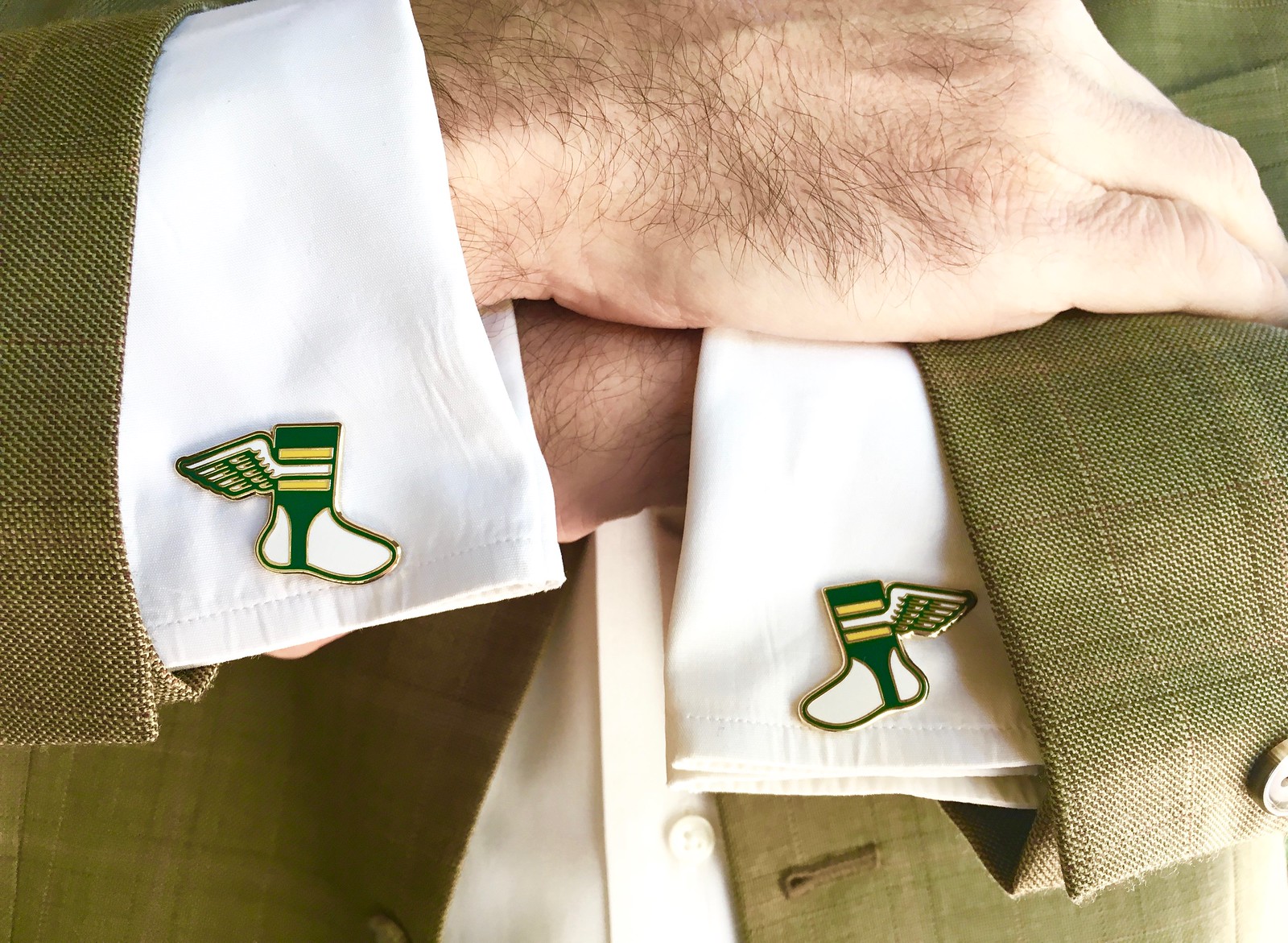
Assorted reminders: Paul here. In case you missed it earlier this week, Uni Watch cufflinks are now ready for ordering in our Teespring shop. A nice way to add a touch of class and formaily to your holiday season! (And for those who’ve been asking, our enamel pin doubles nicely as a matching tie tack.)
While we’re at it, there are only a few days left for you to get your orders in for our Uni Watch basketball jerseys and/or the matching shorts:
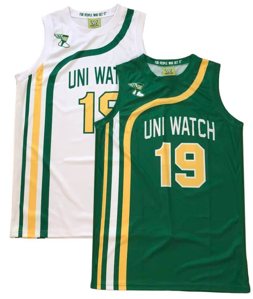
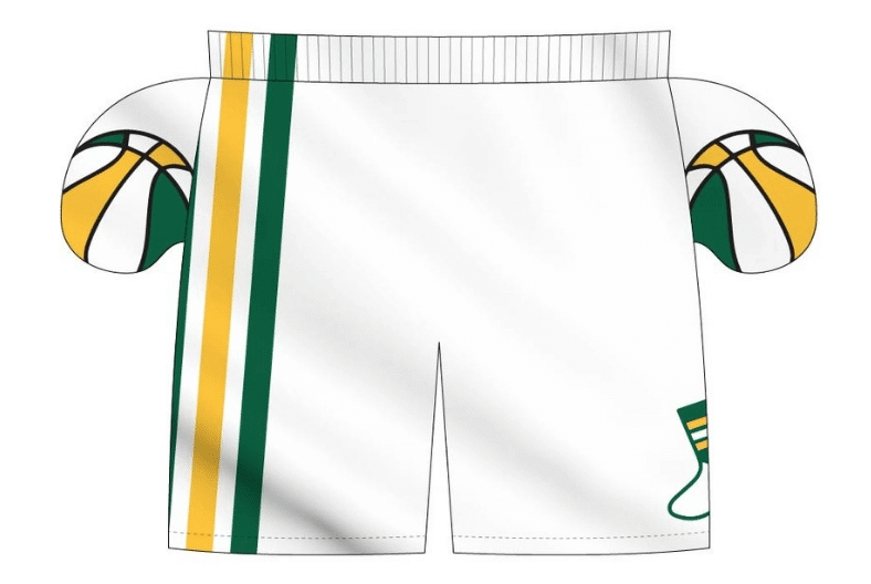
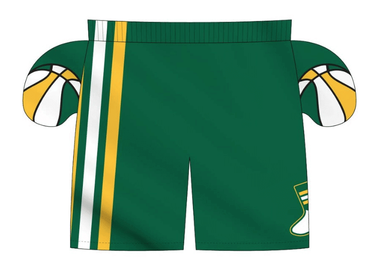
We’re taking pre-orders on these through this coming Wednesday, Nov. 20, for Christmas delivery. Full details here. (Also: The pre-order page doesn’t offer an option for international shipping. But if you want that, email Nathan Haas at Adelph Wear and he should be able to help you out.)
The Ticker
By Anthony Emerson

Baseball News: Artist Tom Valente has some great baseball mascot paintings on exhibition at Galleries1988 in NYC (from Steve Flack). … Auburn has unveiled new pinstriped unis, and are bringing back the white caps, mothballed since 2013.

NFL News: Also posted in the soccer section: Trayton Miller created American football uniform designs for the 20 Premier League soccer teams. … The NFL’s “Thanksgiving Caps” (why are these a thing) are the same base design as their Super Bowl LIII caps (from Rocky Krsnich).
College/High School Football News: The bowl game in Mobile, AL, has a new corporate sponsor, their fourth in 20 years since its creation (from multiple readers). … Iowa is going mono-black today with a flag desecration helmet decal (from many readers). … New Mexico is going mono-white against Boise State. … Virginia Tech will be maroon-maroon-white today (from Andrew Cosentino). … Kentucky is going mono-white against Vanderbilt (from Josh Hinton). … Air Force is going mono-white with a new white facemask today (from Mike Wagner). … Mizzou is going white-black-white, with special US Navy helmets (thanks, Phil). … A player for the Solon High (IA) Spartans had a decal malfunction in the state semifinal (from Al Gruwell).

Hockey News: The Kings had some helmet decal kerning issues on Thursday night. What’s more surprising to me is that each letter is (evidently) its own decal, instead of the entire wordmark being one decal (from Chris Zadorozny). … The Canucks wore special warm-up jerseys in honor of the Canadian Armed Forces for Armed Forces Night on Thursday (from Wade Heidt). … The SPHL’s Huntsville Havoc have unveiled their Star Wars Night unis, designed by reader Tyler Earles. … Quinnipiac men have seemed to invent a new kind of NOB: PNOB, for Pandering Name On Back. … Canisius unveiled some gorgeous new sweaters yesterday (from Geoffrey Drower).

Pro Hoops News: The Sixers and Conscious Basketball have launched “76ers Crossover“, combining art and Sixers basketball. The art exhibition will run for four days starting today at the Filter Club, and will feature more than 200 works from Philadelphia-area artists. More info here (from Patrick Bourque). … The Rockets have posted a teaser video for their new city edition uni on Twitter. The uni itself will be released on Wednesday (from @RocketsTracker). … New Nets SG Iman Shumpert will wear No. 10 (from Etienne Catalan). … In what may be a first for the uni-verse, Magic F Jonathan Isaac missed last night’s game through an injury sustained during the team’s city edition uniform unveiling (from @andiggity1). … Looks like the “Houston” typeface on the Rockets throwback jersey is slightly different than the original (from Mike Sullivan). … “The dad bought the son an Iverson jersey on tonight’s Fresh Off The Boat,” writes Chris Flinn. “The son noticed there was a Q in the name and the dad said ‘explains why it was in the clearance bin’.”

College Hoops News: Stony Brook men have unveiled their new alternate unis (from John Carpenter and Patrick Muffley).
.

Soccer News: Inspired by an Oct. 23 Ticker item about Brazilian club Bahia’s black-necked jerseys to bring awareness to oil spills, Greg Franklin sends along this Guardian article about how Bahia became “the most progressive club in Brazil.” The article is filled with details like replacing the corner flags with rainbow flags, “taking the field with the names of 20 historic black Brazilians on their shirts, and a video showing indigenous Brazilians symbolically painting the white lines of a football pitch with #DemarcaçãoJá (“Demarcation Now”),” Greg writes. … A couple of potential new Chicago Fire crests leaked onto Twitter yesterday (from Ed Żelaski). … Also from Ed: every ball given to the teams in the Bulgarian First League have the logo of the Polish Ekstraklasa logo. … Cross- posted from the NFL section: Trayton Miller created American football uniform designs for the 20 Premier League soccer teams. … USL Championship side Colorado Springs Switchbacks are getting a new stadium (from Kary Klismet). … Also from Kary, the “MLS expansion team Inter Miami FC has released renderings of its new Fort Lauderdale stadium, which will serve as its temporary home (and future home of the club’s USL1 developmental team) until its proposed Miami Freedom Park opens in 2022.”

Grab Bag: Some field hockey notes from Jamie: Delaware wore their BFBS alternates, and Connecticut wore white at home — field hockey teams usually wear dark colors at home. … The Muskegon (MI) City Council will vote on a corporate rename of Walker Arena, which is currently home to an arena football team, an indoor soccer team, and a USHL team (from Alex Dewitt). … NASCAR driver Joe Nemechek made his 1,186th career start in NASCAR yesterday, and his son John Hunter surprised him with a special helmet (from James Gilbert).

And finally
Please join me in wishing our own
Brinke Guthrie
a very happy birthday!
Enjoy it big guy!
I really hate that new Nationals hat. The ’60s Senators logo is ugly but it has a kind of clumsy logic to it at least: “here’s the capitol, here’s a generic baseball player on top of it, therefore it’s the baseball-playing Senators.” The new Nationals hat decontextualizes half of it and now we’re just left with…a generic 60s-era baseball player image. And a block W. Lame
Nothing generic about it. That pitcher is Don Newcombe!
Of course it’s meant to be generic. That it was based on a photo of Don Newcombe for whatever reason is irrelevant. The Senators and now Nationals had no reason to intend it to actually represent Newcombe as he never played for the Senators or had any connection to DC etc.
I’d wear that!
The hand-painted “worn look” Utah helmets are a cool idea, but it seems like this effect could have been achieved more easily and effectively by having a few guys take the helmets and rough them up with sandpaper, hammers, etc.
Why would you compromise the structural integrity just to give it a look? The paint is good…
1. The Sixers art show is at Philadelphia’s FITLER Club, not FILTER Club.
2. Thumbs down on the new Nationals cap. I like the white front panel but this is now another cap logo for a team that has already used the Curly W monogram, the interlocking DC monogram in 15 years. It’s like the Diamondbacks going between the A monogram, the D/snake monogram and the db snakehead monogram. Consistency matters!
3. From one birthday boy today to another – Happy Birthday Brinke!
I dont like that they are bringing a white version of the world series jersey for 2020. The majestic blue alt was discontinued and hard to find unless you wear a M or S on ebay. Just bring back the blue alt NATIONALS and wear that. Now that they won the world series in THAT jersey it way more Iconic than some white washed version.
They loved the blue alt so much they couldn’t, wouldn’t stop wearing it…and dump it right after they reach the pinnacle? What’s happening here?
I really dislike white panel “trucker” caps. They had their place in the 70s, but with today’s long white pants and white shoes the players look like Good Humour men or cricket players or something. Too much white.
I love cricket, so there’s another reason to say I’d wear that.
Cheers to George and the return of the colorization feature.
Cheers, Gary
I second this.
Also, happy birthday, Brinke!
Thanks much!
Nats should have an Expos cap alternate. Could even use the logo of the Expos’ International League affilate, the Winnipeg Whips, or just turn the Expos logo upside down.
Happy Birthday Brinke!
As the biggest Expos fan remaining in my state, I wish the Nationals had gone full pinwheel with the new caps.
Colorized photo of Bundesliga: Curious as to when northern European leagues started using a winter ball.
I’d have to look up the exact dates that various leagues started using a yellow ball in certain months rather than the white one. But at the date of this picture it was quite common if there was snow on the ground to use an orange ball. I suspect that this practice will date from the start of the use of white balls normally. But these orange balls were used only intermitently when needed, rather than the standard now of from 1 October or whenever.
Ah, here we go.
The Premier League is still using a yellow winter ball, but for the EFL (where my team Wigan play, in the Championship) they no longer use a winter ball.
From the EFL site “The EFL’s Official Match Ball for the winter period will be used for the last time this week (post was 26 February 2019).
Introduced 21 years ago during the 1998/99 season, the yellow ball was brought in for the period between the end of October and the end of March, when adverse weather conditions are more likely to occur.
Though it will continue to be used in the event of snow, tonight’s EFL and Checkatrade Trophy fixtures will bring an end to its use in a seasonal sense.”
My guess is about when the picture was taken. A white/black ball was first used at the World Cup in 1970.
Happy birthday, Brinke! I love all that you bring to – and do for – Uni Watch. Your insightful knowledge, your great storytelling, your sense of humor, and your resourcefulness in finding all those amazing items for Collectors’ Corner. You make this community a better place, and I’m glad you’re a part of it. Enjoy your day!
I second this. Collector’s Corner is a delight.
I’ll third that. Happy birthday, Brinke! Keep up the great work on Collector’s Corner!
Thank you! This coming May (10th) will be..TEN YEARS of Collector’s Corner. Wowsers.
Marcus Stroman changes his number to 0:
link
And if he played for Houston he could be called Astroman. (groan!) In a similar vein, has there ever been any player with a last name the same as the team name? I suppose St. Louis Browns would be the most likely team. I always hoped Martin St. Louis would have played for the Blues.
Jim Brown jumps to mind in a different sport.
Dave Philley played for the Phillies in 1958-60.
May you many more Happy Birthday’s Brinke!
Thank you!
Does Temple have an issue with the Hardin-Arians era?
They skipped over decades of helmet history (ok, it’s was the same helmet IIRC) in that video.
Joe Nemechek has one of the greatest nicknames in NASCAR.
Happy Birthday, Brinke!
Of course it’s meant to be generic. That it was based on a photo of Don Newcombe for whatever reason is irrelevant. The Senators and now Nationals had no reason to intend it to actually represent Newcombe as he never played for the Senators or had any connection to DC etc.
The Muskegon (MI) City Council will vote on a corporate rename of Walker Arena, which is currently home to an arena football team, an indoor soccer team, and a USHL team
Since they’re not in the Arena Football League, technically they are an indoor football team.