It’s been over three months since we had an entry in the Okkonen files, the series of entries in which I’m examining the work and legacy of pioneering baseball uniform researcher Marc Okkonen, who died in late May.
But we’re back today with a new entry, courtesy of two Uni Watch readers who’ve shared their decades-old correspondence with Okkonen. Let’s start with Ryan Leong, who recently found a letter and two postcards that he received from Okkonen in the early 1990s. I’ll let him set the scene:
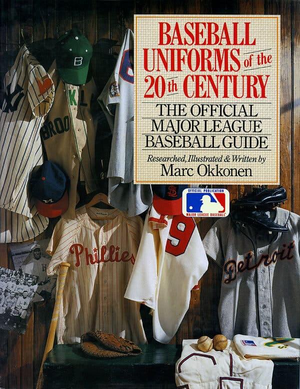
The first edition of Marc’s book [published in 1991] invited readers to write to him if they spotted any errors. Now, of course the internet didn’t exist back in 1991 and I honestly felt I was the only one who was a uniform geek. The only resource I knew that existed in video form was this series called Baseball’s Greatest Games that aired on SportsChannel, which became Fox Sports Net and is now NBC Sports Bay Area.
This series was hosted by Steve Garvey and aired classic games, most notably the 1971 All-Star Game. I recorded it on VHS and watched it over and over. The easiest mistake in Marc’s book that I spotted was that the A’s cap had a yellow bill — not green, as the book showed. So I wrote to Marc about that and a few other issues, and he wrote back [for all images in today’s entry, you can click to enlarge]:

The interesting thing about this postcard from Okkonen is that Ryan apparently asked him about including throwbacks in the book and Okkonen said he opted against it because throwbacks are a “cute idea, but not representative of regulation attire!”
But that was just the beginning of Ryan’s correspondence with Okkonen. “After I heard back from him that first time, I scoured through baseball books i owned and I also often loitered in bookstores to find other evidence,” says Ryan. “I wrote to him three more times, and he wrote back twice.”
He sure did — and not just on postcards:

Is that great or what? This is the first time we’ve seen Okkonen’s personal letterhead, complete with a jersey-style script. Since Okkonen was a graphic artist, I assume he designed that himself.
Here’s the last missive Ryan received from Okkonen — another postcard this time:

“As you can see in his replies to me, he was definitely a curmudgeon but loved baseball,” says Ryan. That’s consistent with what we’ve seen in other entries from the Okkonen Files series.
I also received some materials from reader Bob Evans. He knew Okkonen through SABR and corresponded with him prior to Baseball Uniforms of the 20th Century’s 1991 publication. I’m not sure which year this letter is from, but it was definitely sent from Okkonen to Bob prior to the book coming out, for reasons I’ll explain in a minute:

Another nice piece of Okkonen letterhead! And it was sent on my birthday, whatever year it was from. How do I know it predates the book’s publication? Because Bob saved a copy of a letter he sent to Okkonen in 1991, shortly after the book’s publication:

As you can see, Bob’s 1991 letter refers to the magazine spread about German uniforms, just as Okkonen’s undated letter does (although Bob appears to have mixed up Esquire and Fortune magazines).
Unfortunately, Bob didn’t save copies of the specific feedback mentioned in the next-to-last paragraph. But we can get a sense of what he brought up by looking at the response that Okkonen sent back to him a few weeks later (on that same snazzy stationery that he used for the letter to Ryan):

Such a great letter! If you look at point No. 4, it looks like Bob had said that the Twins wore the MLB centennial patch on the right sleeve, not the left as Okkonen had shown it in his book. Okkonen cited several 1970 Topps cards to back up his left-sleeve position (including this one, this one, and this one). Bob apparently responded by sending him a photo of Twins pitcher Jim Perry, which led to this response from Okkonen:

This isn’t the first time we’ve seen Okkonen basically dismiss the importance of patches. Still, it’s a bit of a stunner to see the world’s foremost baseball uniform historian saying, “I don’t consider patches an integral element of the uniform design.” I for one beg to differ! (Also, single-year patches are a godsend to any researcher, because they can help date a photo to a particular season. Surprising to hear Okkonen poo-poo-ing them.)
“It’s interesting to read some of the commentary in these letters,” says Bob. “Most of the details we were debating are now relative common knowledge, largely thanks to Marc. One also gets a feeling of his angst and frustration at such a huge endeavor.”
Indeed. My favorite part is this bit at the end of Okkonen’s Dec. 12 letter:
I also think I’m driving the publisher nuts by making all these corrections — they’re not too thrilled about spending money on new color plates, etc. — but that’s the nature of the beast. I can’t sleep nights knowing there are thousands of my books out there with all these mistakes in them.
Okay, that’s a wrap for this (final?) edition of the Okkonen Files. If you had any communication or dealings regarding Marc Okkonen that you’d be willing to share for future installments, please let me know. Meanwhile, you can see all of the installments in this series here.
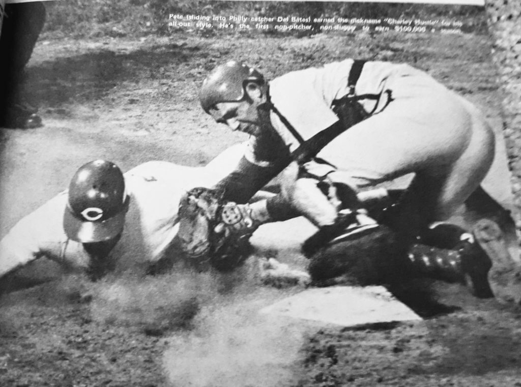
Headstrong: Check out the helmet being worn by Phils catcher Del Bates in this 1970 photo. Interesting design, no?
Of course, lots of catchers wore brimless helmets in the 1970s, ’80s, and ’90s, but most of them looked like this. I’ve never seen one quite like the one Bates is wearing in that photo. Intriguing!
(Big thanks to Tim Jenkins for this one.)
In case you were wondering: With college basketball now getting underway, people have been asking when they can expect to see the Uni Watch College Hoops Season Preview.
Unfortunately, there won’t be one this year. Sorry about that — I wanted to do it, and InsideHook would have published it and paid me a fair price for it, but my life and work have been too tumultuous over the past six weeks or so. It’s a huge project (351 schools!) and I just didn’t have the time to devote to it this year. We’ve tried to keep up with new uni designs in the Ticker and will continue to do so as new designs come across our radar.
One thing worth noting, because it will affect literally every game, is that the refs have new jerseys this season (click to enlarge):
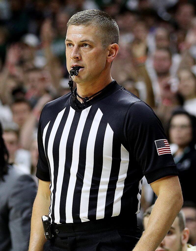
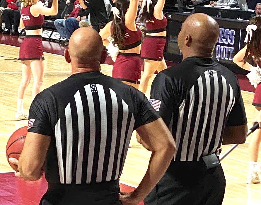
The odd thing about that is that it’s not an actual raglan-sleeved design. It’s a standard set-in sleeve with a chevron-shaped pattern to simulate raglan tailoring. Weird.
Screen shot by Adam Hoge; click to enlarge
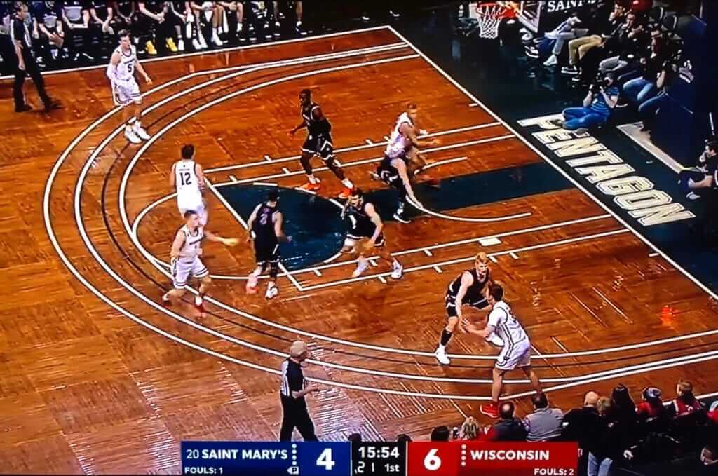
And speaking of college hoops…: Check out all the court markings in last night’s St. Mary’s/Wisconsin season opener, which took place at the Sanford Pentagon in Sioux Falls, S.D. “They call it a Heritage Court,” says reader Matt Newbery. “It has historical markings on it, including the original key. The four 3-point lines are for high school, college (women’s), college (men’s), and NBA.” There’s some additional info here.
Footnote: six-dash free throw circle.
(My thanks to Ben Gordon for first bringing this court to my attention.)

Click to enlarge
ITEM! You can now wear your heart on your sleeve (cuff): Back when I launched our winged stirrup pin, one of my Twitter followers suggested doing cufflinks. I liked that idea, so now I’ve had some made. They should be available in our Teespring shop in a week or so.
Personally, I love wearing cufflinks. Back when I worked in an office, we weren’t allowed to wear jeans, but I was determined to do so anyway, so I got away with it by wearing very nice shoes and dressing really well above the waist — which often included French cuff shirts. As a result, I own a lot of cufflinks, although I rarely have an opportunity to wear them these days (one of the few downsides of working at home). It’ll be fun to add these Uni Watch ’links to the collection!
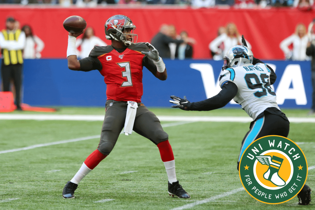
Bucs-redesign contest reminder: My latest Uni Watch design contest, conducted in conjunction with InsideHook, is to redesign the Tampa Bay Bucs. Full details here.
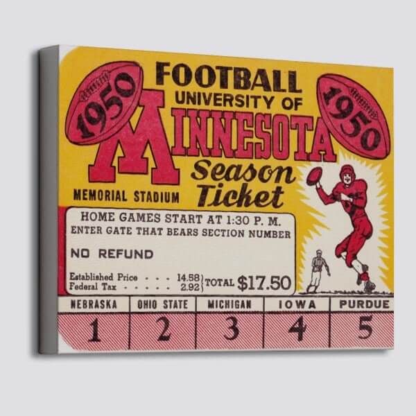

LAST CALL for this week’s raffle: Today is the last day to enter the latest raffle from our longtime advertiser Vintage Brand. The lucky winner will get to choose any product from the VB website (like the 1950 Minnesota season ticket canvas shown above).
To enter this raffle, send an email to the raffle address by 7pm Eastern today. One entry per person. I’ll announce the winner on Thursday.

Membership update: David L. Cummings had a very simple membership card request — the Browns’ helmet striping on an orange background. Simple but very effective, and a testament to the strength of the Browns’ design.
David’s design is one of several that have been added to the membership card gallery. The printed/laminated versions of these cards should mail out next week.
Ordering a membership card is a good way to support Uni Watch (which, frankly, could use your support these days). And remember, a Uni Watch membership card entitles you to a 15% discount on any of the merchandise in our Teespring shop and our Naming Wrongs shop. (If you’re an existing member and would like to have the discount code, email me and I’ll hook you up.) As always, you can sign up for your own custom-designed card here, you can see all the cards we’ve designed so far here (more than 2,300 of them!), and you can see how we produce the cards here.

Click to enlarge
Tasty: Strange but true: Whatever you’re serving for dinner, it always tastes better on a Uni Watch 20th-anniversary plate! Took a long time to get these done, but I love how they turned out. Big thanks to Scott M.X. Turner for the design and to illustrator extraordinaire Rob Ullman for rendering the little cherubs who are lifting the Uni Watch script into place at the top of the plate.
Speaking of Rob Ullman, he gave me a nice gesture of solidarity the other day. Check this out (click to enlarge):
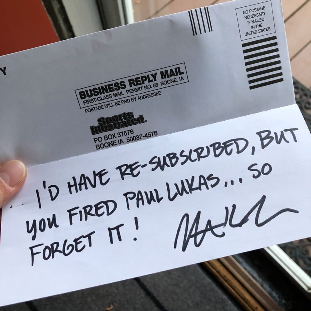
I’m sure the circulation department workers in Iowa will be puzzling over that one, but I still really appreciate it. Thanks, Rob!

Requiem for Deadspin, continued: This week’s episode of Slate’s sports podcast, Hang Up and Listen, features three former Deadspin writers and editors talking about the death of Deadspin, the impending death of Sports Illustrated, the state of journalism properties being owned by private equity douchebros, and more.
It’s really good stuff — check it out here.
In a related item, the executive who wrote the “stick to sports” memo that led to Deadspin’s demise — and who was speculated to be the anonymous writer who was producing unbylined Deadspin content over the past few days — has resigned.
(My thanks to reader/commenter Drew for bringing the podcast to my attention.)
San Diego party reminder: To all our SoCal readers, remember we’ll be gathering at the Wonderland Ocean Pub this Sunday, Nov. 10, beginning at 4pm. We’ll be there until at least 7pm, but Wonderland has great ocean views and sunset will be at 4:51, so plan accordingly!
Guests will include SportsLogos.net founder Chris Creamer, L.A. Kings equipment guy and Bobcat Athletic founder Bob Halfacre, and the Brandiose guys. Hope to see you there.
The Ticker
By Lloyd Alaban

NFL News: The Steelers will wear their throwbacks this week to commemorate the 40th anniversary of their Super Bowl XIV win (from Joshua Powers). … Giants QB Daniel Jones and RJ Barrett of the New York Knicks swapped jerseys after Monday’s Cowboys/Giants game. Both are Duke alumni (from Moe Khan). … Four Houston-based quarterbacks — former Oilers QB Warren Moon, Texans QB Deshaun Watson, former University of Houston QB Andre Ware, and former Texas QB Vince Young — have started Brothers in Arms, a scholarship foundation. Here is the foundation’s logo (from Ignacio Salazar). … Former Steelers RB Rocky Bleier is auctioning off his personal memorabilia (from Joe Werner).
College/High School Football News: Georgia Tech will go with white shells and gold facemasks this weekend (from Michael Zoid). … Minnesota head coach PJ Fleck sent a paddle signed by his team to Georgia Southern after their freshman OL Jordan Wiggins died two weeks ago (from @lundsfordschair). … Blaise D’Sylva showcases Dartmouth’s helmet history for today. … With more and more kids playing non-tackle high school and rec league football, Xenith has come out with a new halo-style headguard. Previous non-tackle headgear had mostly looked like this, but Xenith says their research shows that full-head coverage isn’t necessary. Additional info here. … Looks like reader Nate Mueller is making PocketPro helmets of his own. That’s his Virginia Tech Riddell SpeedFlex model. Great work!

Hockey News: The Flames wore Hockey Fights Cancer warmups last night (from @SunnyHMoon). … Someone at the Islanders game last night wore a D Devin Toews sweater with what appears to be a backwards “2” for the “5” in Toews’s No. 25 (from Alexander Ganias).

NBA News: Reader @StrokerAce_ found a sign in Belize that uses a very Trail Blazers-like font. … Cross-listed from the NFL section: Knicks SG/SF RJ Barrett and New York Giants QB Daniel Jones swapped jerseys after Monday’s Cowboys/Giants NFL game. Both athletes are Duke alumni (from Moe Khan). … The Thunder presented family members representing each of the 168 victims of the 1995 Oklahoma City bombing with a personalized Thunder City edition jersey, which is based on the Oklahoma City National Memorial (from Sam McKinley).

College Hoops News: New unis for Buffalo men’s (from John Warthling). … New home and away sets for UCF men’s (from @UCFUniTracker). … Stony Brook F Elijah Olaniyi wore a compression sleeve with an NBA logo on it last night (from Alan Kreit). … The banners at the Xfinity Center, the home court of Maryland basketball, have been updated to the school’s custom “Terrafont.” Here are the old banners for comparison (from Josh Kail). … Drake men’s received their Missouri Valley Conference championship rings this week, and they have a throwback motif (from Drew Hicks). … Interesting mix of gum and mints on the scorers table at the Denver/Colorado State men’s game (from @youngreid71). … As we dive deeper into the court-dash rabbit hole, we noted that college basketball courts do not have any dashes in their key, since the NCAA doesn’t do jump balls in the paint. However, reader Brian Weingartz noted that East Carolina’s court does have a circle in its key, and it’s rendered entirely as a solid line!

Soccer News: Here’s why Stoke City winger James McClean refuses to wear a poppy (from Ed Zelaski). … Also from Ed: Slavia Prague wore new shirts in yesterday’s Champions League match. … For more soccer news, check out Josh Hinton‘s Kit Watch Twitter feed. … The Champions League broadcast feed keeps track of red cards in its score bug. Notice the two small red cards above Ajax’s tally (from Jakob Fox).

Grab Bag: Adidas announced a partnership with the International Space Station U.S. National Laboratory to test its Boost footwear in space (from James Gilbert).
What a basketball court! And it’s parquet too!
They have also managed to make the wood look old. Impressive attention to detail.
Now you youngsters can see why the call it “the key”.
I am interested in how the changes in journalism have changed your work as a freelancer. Is it more or less difficult to sell your writing? Has it changed what you are able to sell an article for? Just wondering if there are fewer stable jobs in journalism, does it make freelancing more valuable, or is the entire industry dropping. Thanks!
Much, much harder to sell work, and work sells for much less than it used to. The entire industry is in a tailspin.
I am reasonably well established, so I can still find outlets for my work. But it’s much harder and less lucrative than it used to be. Freelance budgets are smaller (or non-existent), and the huge number of unemployed writers who are now freelancing has created more competition.
Something that appears to have missed the Hockey Ticker. May have submitted it too late last night.
Major junior’s Canada/Russia series started this week featuring the QMJHL all-stars and Team Russia. It is a yearly tournament held between a select team of Russian players and all-star teams representing the QMJHL, OHL, and WHL.
The uniforms that the CHL teams wear have changed. They are predominantly black now with red trim. New CCM Quicklite jerseys. Here are some photos:
link
Prior uniforms were predominantly red with black trim:
link
Clicking the link to the James McLean article gives us another reminder of why Deadspin was as revered as it was. RIP Deadspin
PROOFREADING: Warren Moon has an extra letter in the football ticker.
Thanks. Fixed.
Not that I play basketball, but I would be so confused on a basketball court like that.
I have played plenty of volleyball at gyms with lotsa markings, but there’s only one size volleyball court.
The basketball ref picture reminds me of my fascination with the different types of whistles used by refs of the various sports. My favorite has always been the finger mounted hockey ref whistle.
Regarding “cherubs” in the section about the plate.
I understand that the term has become commonplace in the English language. But, it is technically not the proper plural of “cherub.” I would have never known had I not taken Hebrew in college, but “cherubim” is the proper plural.
Minor, I know, but it’s a bit of an OCD thing in me when it comes to some words.
Didn’t know that. Thanks for schooling me!
“Cherubim” is the proper plural in Hebrew. In English, we generally make plurals by adding an s, even with loan words, though exceptions are both rare and widely varied, and typically depend on the word entering the language as a common word prior to 1066. (English having by far more loan words than any other human language.) So cherubs. Just as in Hebrew, the from-English loan word for computer bug (“bug”) takes the plural -im (“bugim”), not the English plural -s (“bugs”). Same for all Hebrew nouns borrowed from English, such as “zombi,” “archipelag,” “derbi,” and so on.
See also octopuses.
Nice to see somebody was as nuts for “Baseball’s Greatest Games” as I was. And particularly the 1971 All Star Game episode.
15 years before Youtube, that series was a godsend. Almost-complete baseball games preserved mostly on archival video. No original commercials, just a slew of ads for Sports Illustrated Michael Jordan or Larry Bird videos, or MLB “Sounds Of The Game”…
Setting the VCR to capture it at the odd hours of the night it ran was a weekly ritual for me.
With like a billion channels and streaming, it should still be a thing for every sport.
Too bad they can’t standardize on the 3 point line. Either NBA or international, and go with from high school on.
YES.
No.
A high school player’s skill level is not the same as an NBA player’s.
I don’t want to watch high school players missing from 23′-9″, and it should be more of challenge for the pros than 19′-9″
Maybe, but at least eliminate the college line and have both college and NBA the same, either current NBA or go to international. And couldn’t the high schools at least be at the women line.
Just wondering how former SI people feel about SI Swimsuit? Multiple models flying off to Bali for a shoot. Seems there was no cost cutting in that dept. Maybe if they shot in Florida people could keep their jobs.
As I noted link, I wish the swimsuit issue didn’t exist, regardless of photography locale.
Can’t speak of any other ex-SI people, of course.
It is interesting that the Terrafont is considered a proprietary brand, because 1) it is a font seen in a lot of other places, especially within the sporting world, and 2) because of its ubiquity, I don’t associate it with Maryland, and 3) the font I associate with Maryland is the one in their word mark graphics and NOBs on uniforms.
What, no credit on my picture of the referees?
Apologies, Ryan. As I hope is apparent, I try very hard to give due credit throughout the site. Sorry this one got lost in the shuffle. Please remind me of your full name or Twitter handle and I’ll add the proper thanks.
Daniel Jones didn’t wear that blue jersey in the game, the Giants wore the retro white Rash/Throwback Jersey.
Those NCAA basketball referee tops look like old-time tackle football, with friction strips. Somehow a little unsettling.
Albert Burneko’s response to Maidment’s departure from “Deadspin” made my day.
link
Were I someone with a large amount of disposable income, I’d hire every former Deadspin writer and reboot the whole thing in a heartbeat.
I feel kind of bad for Okkonen. He kind of opened a can of worms.
I feel like he had an obsession, found a way to make some money on it, then got bombarded by corrections. (Much like the commenter editors of the internet today)
Not to mention, all that time and effort, to then get lambasted, and realize a bunch of your info was wrong. That can’t feel good no matter how much of a professional you are.
As much as I love Uni-Watch, I can’t imagine trying to do this before the internet…
Paul, so we are not able to track down a family member of Marc’s to learn more about him? This is it? I’m disappointed the trail ends here. The work doesn’t have to be on you, but I think someone should be able to find a family member or close friend.
His sister is mentioned in this obit:
link
I’m not sure what you’re looking for. Conventional obits have helped fill in other details about his life. My goal with this series has been to explore his work through his interactions with people in the uniform world.
I’ve heard of form-fitting uniforms but… good grief, the black and white rendering makes it appear that catcher Del Bates is not wearing any pants?!
-Jet
Hmmm… A boss says stick to sports and you don’t. Then you get fired and cry about it…. Interesting.
Actually, with one exception, they weren’t fired. They resigned.
I know, I know — pesky facts are so inconvenient when you have an axe to grind.
If that was your takeaway from the whole Deadspin saga, you may be the most oblivious person on the planet. Are you Jim Spanfeller? Criminal, man – open your eyes and see the whole picture.
Nemanja Matic, a Serb who plays for Manchester United, also doesn’t wear a poppy due to British military action. Particularly, he doesn’t wear it because his village in Serbia was bombed during the Kosovo conflict in 1999. “However, for me it is only a reminder of an attack that I felt personally as a young, frightened 12-year old boy living in Vrelo, as my country was devastated by the bombing of Serbia in 1999”.
link
I think I found the inspiration for the Del Bates brimless catcher’s helmet:
link
ed