
For all photos in this section, click to enlarge
As I think most of you know by now, I love vintage salesman sample catalogs. Soon after I scored the gig at Sports Illustrated, I treated myself (oops) to a new one — a 1939 beauty from the Hardwood Products Co., which was jointly headquartered in Mayville, Mich., and Guilford, Maine. (I’m pretty sure the moose on the cover is meant to evoke the latter locale.) It’s pretty great, and I’m going to go off-uni today to share it with you.
What sort of hardwood products did the Hardwood Products Co. make? The catalog’s table of contents gives us some clues:

As you can see, they made wooden utensils and cutlery. That might not sound very exciting, but wait until you see the rest of the catalog!
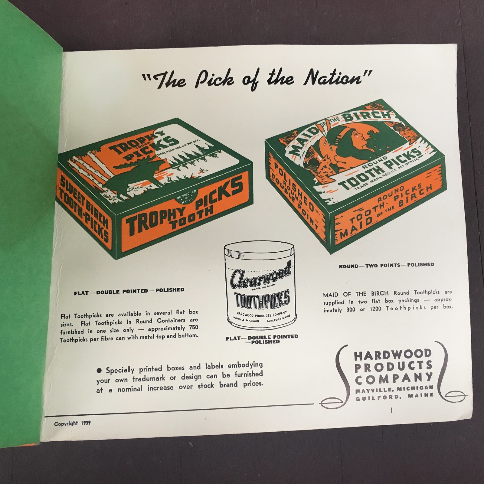
The first page, admittedly, doesn’t have any samples — just illustrations. But the illos are gorgeous, especially to someone who loves the green/orange color combo as much as I do:
Things start getting more interesting on the next page, which features samples of “Round Candy Sticks,” presumably for making lollipops or other candy-on-a-stick treats. Nowadays, of course, the sticks are paperboard. It never even occurred to me that they might once have been made of wood:

Next up is a page of sticks for “flat candy” and ice cream pops:

Next is my favorite page of the catalog. It features a bunch of flat and “real-shape” spoons. “Real-shape,” it turns out, means curved, and the curved samples are v-e-r-y satisfying:


Of course, you can’t have real-shape spoons without some matching real-shape forks to go with them:
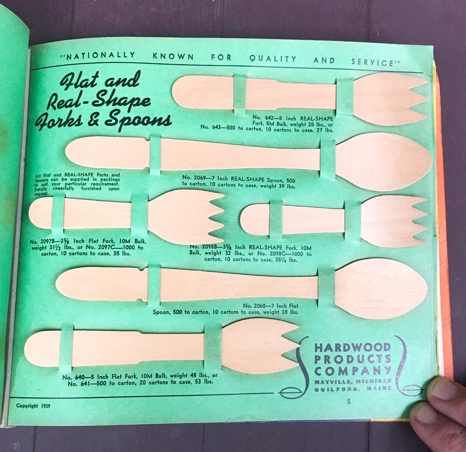
Check out those little notches in the handles of the spoons — such a nice little detail!
Next is a page of packaged ice cream spoons. Man, when I look at this, I can almost taste the mediocre Dixie cup ice cream and feel the wooden spoon against my tongue. It’s the taste of summer camp.

The good news about the next page is that it features mustard paddles. Mustard paddles! Do those two words go great together or what? The bad news is that several of the samples are missing, making this a much less satisfying page than it would otherwise have been:

Fortunately, the catalog makes up for that shortcoming with the next page, which is — well, see for yourself:

Oh man, that is the bomb. Look how the two utensils in the middle are spearing the cherry and stirring the ice cube and lemon slice — sensational!
Up next we have something near and dear to my heart — steak doneness markers:

I particularly love the sales copy:
A customer has just entered a restaurant and placed an order for a thick, juicy steak “cooked RARE.” The restaurant is crowded and after a long wait, the steak is finally served. But after the first cut, the customer is annoyed to find his steak well done. Mistakes like this happen every day, and may result in loss of business.
Correctly styled, clean White Birch STEAK MARKERS eliminate embarrassment to the management of a restaurant and annoyance to the customer. … The value in service is high, but the cost is only a fractional part of one cent per customer.
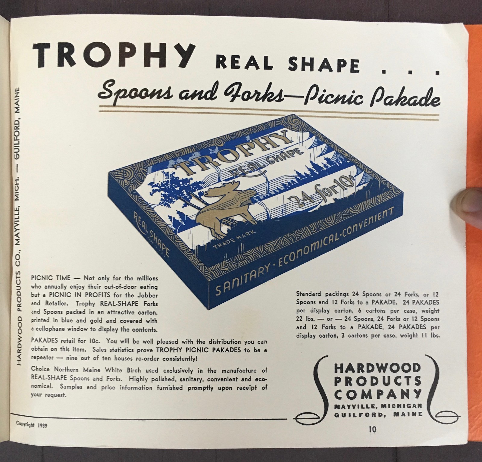
And then we wrap up with another sample-less page, this one promoting something called a “Picnic Pakade”:
And that’s it. Eighty years old and still very informative and entertaining! Alas, the company appears to be out of business. And the company is still in business!
Thanks for listening. We’ll get back to more conventional uni-related content next time around.
Padres manager/brown update: Following up a topic from a week ago, the Padres introduced new manager Jayce Tingler to the media yesterday — and sure enough, they gave him one of their current/outgoing brown jerseys, which he’ll never wear on the field.
The twist is that they gave him one of their new brown caps — sort of a soft launch of the new uni set. Here’s a closer look (click to enlarge):

In a related item, the Royals introduced new skipper Mike Matheny yesterday. They presented him with a jersey that included the MLB 150 sleeve patch – -which he’ll never wear on the field:
The new manager pic.twitter.com/sQstr9Zji3
— Joel Goldberg (@goldbergkc) October 31, 2019
(My thanks to Jared Buccola and Brendan Mongey for their contributions to this section.)
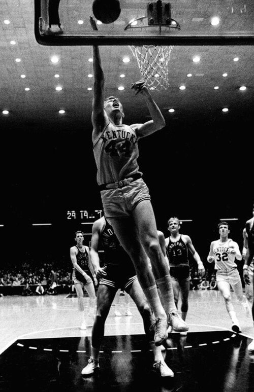
Free throw circle update: Yesterday’s post about the number of dashes in NBA free throw circles — sometimes six dashes, sometimes 10 — prompted a few people to come up additional configurations. The photo above, for example, shows the University of Kentucky’s Memorial Coliseum in the late 1960s (college courts apparently included free throw circles back then, unlike today) with a 15-dash circle!
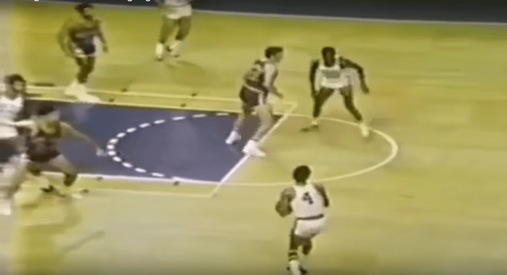
Fifteen dashes can also be seen in this early-1970s Milwaukee Bucks shot (click to enlarge):
I’m now officially obsessed. I can’t even look at a basketball court anymore without fixating on this detail. If anyone knows more about the history and protocols of this court design element, please speak up!
(My thanks to Andy Dandytale and Tim Shriver for their contributions to this section.)
Click to enlarge
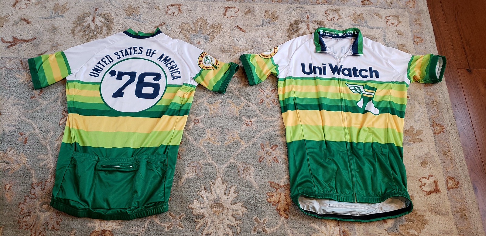
EXTENDED: One more day fo cycling jersey orders: If you want a Uni Watch Cycling Jersey, you can still order one today, and then that’s it. As always, you can customize the back of the jersey with your choice of number and NOB.
The Ticker
By Anthony Emerson

Baseball News: Immediately after the Astros’ Game 7 loss, P Gerrit Cole donned a Boras Corp cap during post-game interviews, with his impending departure in free agency already a foregone conclusion (from many readers). … Paul writes: “I noted in my World Series Preview that the umps were adding an ‘EC’ memorial patch for ump Eric Cooper, who died just before the start of the Series. But I didn’t notice until now that they also added a ‘CM’ patch for the final two Series games. That’s for former ump Chuck Meriweather, who died last weekend. (The ‘JM’ patch, for Jim McKean, was worn all season long, not just for the Series.)” … Welcome to the MLB’s Nikefied hell: Nike has demanded exclusive rights to sell official MLB merchandise near Yankee Stadium, which may put several Bronx shops out of business (from multiple readers). … Missouri State baseball has custom Rawlings gloves (from @stlcards109901). … Jorge Cruz tweets: “Interesting from a uni perspective. Las águilas Del Cibao (Dominican Pro League) honor its legends with statues in traditional all yellow uniforms & MLB Alumni are showcased wearing rarely used orange alternate. Teams colors [are] Yellow [and] Black.”

NFL/CFL News: The Cardinals wore their black monstrosities on Thursday Night Football last night. … Not uni-related, but Daniel Gipson found the Super Bowl LIV program cover, and it’s utterly gorgeous. … A 1974 news feature goes into detail about the symbolism behind the then-new Montreal Alouettes logo (from Marc Vizquez).
College Football News: Pitt posted a pretty fun Twitter video of assistant director of player personnel Karlo Zovko dressing in a Pitt uniform and posing as a mannequin to frighten passing players (from James Gilbert). … For Virginia Tech, Frank Beamer’s No. 25 jersey will be given to CB Armani Chatman for Saturday’s game against Notre Dame (from Andrew Cosentino). … The Coloradoan has ranked the best and worst Colorado State unis (from Faraz Naqvi). … Youngstown State is debuting new alternate helmets this weekend (from Joshua Medore). … Georgia Southern went with new mono-white unis for their Halloween Game. More looks here (from Preston Feiler). … NC State is going mono-white (from @ACC_Tracker). … New Mexico is going grey-white-white against Nevada this weekend. … Colorado State has a pretty good video about their State Pride unis (from Benjamin Brune). … Also posted in grab bag: Aussie F1 driver Daniel Ricciardo is a huge Texas fan, and he’ll be wearing a Longhorns-inspired helmet during this weekend’s US Grand Prix in Austin (from Rob Altman). … The following are all from Phil: Kansas is going blue-grey-blue. … South Carolina is going white-red-white if you can make it out from this slick but ultimately difficult-to-discern Twitter video. … Syracuse is going mono-orange against BC. … Northwestern is going white-white-black against Indiana. … Purple-purple-white for ECU.

Hockey News: Every Flyers goalie should be required by league rules to wear these Gritty-themed pads from now until forever (from Bill Fenbers).
.

Hoops News: Here’s an old article about the ABA wanting to have ref uniforms that “popped” in color (from Marc Viquez). … New unis for Missouri Baptist women (thanks, Phil).

Soccer News: The Sporting KC fan podcast “No Other Pod” has a great interview with Sporting KC’s creative director Chad Reynolds (from Darin Doughtry). … The England national team is adding legacy numbers to their jerseys. They’ll appear under the crest for England’s match against Montenegro in November, and be moved to inside the collar for subsequent matches. The Welsh national rugby union team and Bradford City both do this already (from Thomas Courtman). … This Atlanta United fan had a pretty unique and awesome take on Leandro González Pirez’s jersey. Leandro González Pirez is also known as “LGP” (from Michael Rich). … Manchester United has a horrendous Chinese New Year kit in the works, but fortunately it won’t be worn in an actual match (from Josh Hinton).

Grab Bag: Virginia’s field hockey team annually does a practice in Halloween costumes, which included some of the second- and third-year players wearing the uniforms of the graduating fourth years (thanks, Jamie). … Cross-posted from the college football section: Aussie F1 driver Daniel Ricciardo is a huge Texas fan, and he’ll be wearing a Longhorns-inspired helmet during this weekend’s US Grand Prix in Austin (from Rob Altman).
I know I said I’d have more to say today about the Deadspin situation (which actually got worse yesterday, as even more staff members resigned), but I didn’t have time to write that. Next week, promise. — Paul
The new Padres manager and a 1950s Vincent Price horror gimmick movie share the same name – TINGLER.
The free throw circle stuff is incredible. Keep at it. It’s the essence of this website.
Thanks. I completely agree — this topic is peak Uni Watch!
And note how many dashes were used in the “keyhole” era of basketball when the free-throw lane was narrower.
I’m going to dig out my old (1994-ish) copy of the NBA rules and regulations to see if the number of dashes is specified – seem to recall all other court markings were specified in detail!
Would hot candy be something like a caramel apple?
“Hot candy” seems to be “Flat candy”, by comparison with the next page.
Which makes a little more sense.
Good call.
Typo in your transcription of the sales copy for the Steak Markers: “clean White Birth”
Thanks. Fixed.
Yes, definitely Flat Candy.
Fixed.
I also read it as flat sticks for candy and ice cream, not sticks for ice cream and flat candy.
I have wondered if the Yankees would try to quietly buy up real estate around the Stadium and turn the area into a “village” concept, like we see incorporated into newly-built stadia. This Nike move sounds like a small step in that direction. Portions of River Ave and 161 street are already being closed on game days, creating a de facto pedestrian mall on surrounding streets. It’d be awful if anything like that comes to fruition.
I wrote about the kind of legacy/cap numbers introduced by England yesterday link. There are a lot more than two other examples.
Love that wooden sample book. I’m just old enough to remember steaks coming out of kitchens in Eastern Iowa’s finest dinner clubs with the wooden skewers identifying their doneness. But a wood cocktail spear? No thanks. A cocktail spear should not be buoyant!
Are we sure that the current brown Padres alt will not be part of their 2020 set? Seems the path of least resistance to build the new identity around that jersey, and the Padres front office is generally all about least resistance.
Nike/Yankees thing: This is more than just a dick move by one global conglomerate. It’s an example of anti-free-market behavior that as a society we didn’t used to tolerate. Vertical integration is the natural end-point of capitalism, but it’s the death of free markets, competition, and customer choice. We used to have and enforce laws in many sectors that basically boiled down to, you can make stuff, or you can sell stuff at retail, but you’ve gotta choose. What’s outrageous here is not that Nike is being a bad bad guy to a couple of local shops in New York, it’s that we as a society now permit Nike or any big company to use its market share and economies of scale to seek monopolies in both the manufacturing and the retail marketplaces. Nike and companies like Nike: Make things, or sell things, but choose one.
Are we sure that the current brown Padres alt will not be part of their 2020 set?
Yes, they said as much at the Tingler presser.
Ah, thanks! The Padres keep exceeding my admittedly very low expectations with the reintroduction of brown. Maybe they’ll look good in 2020 after all!
I am crossing my fingers and hoping there is no camo alternate jersey.
I’m assuming there will be a camo alt. Although maybe now that the Navy has adopted non-camo navy and tan everyday uniforms, perhaps the Padres can revive their under-appreciated tan look for military recognition day? Or since military service dogs are cool right now and so many of them are raised and trained at Camp Pendleton, maybe instead of camo the Pads can go with a sublimated dog-fur jersey?
Many college courts kept the free throw line jump circles after the alternating possession rule was implemented (1981) link Theory: Courts weren’t refinished/repainted as often.
Next study subject: Temporary dashed circles for NBA games on college courts
UNC’s basketball arena opened in January 1986 and it still had a free throw line jump circle: link
That’s a great catalog! Thank you for sharing. I can’t remember the last time I got a small ice cream out somewhere and ate it with a rounded wooden spoon.
FWIW, every Deadspin staffer (at least in terms of editing/writing, I don’t know what their setup is with art/video types and if they’re shared across all the GMG blogs, though I think they are) has resigned. Diana Moskovitz is technically still employed for the time being because she gave her two weeks notice last week, but after the “underexplained list” she just posted, I have a feeling that may get revisited by management today.
I’m super bummed about Deadspin, especially on top of Splinter’s demise. As a progressive, I really enjoyed the approach to sports (and non-sports topics) in more of a left leaning perspective, especially since so many sports sites are bro/right leaning in their takes.
If there is a silver lining to all of this, I hope the fools that bought and tried to mess with what they had going get no value out of this.
Oh, and you gotta love how management just shut down comments, they know what’s coming their way, so they take the weak way out and just shut down any discourse
Waiting patiently for that Deadspin write-up. Part of me really hopes a few of them get together to write an oral-history at some point. I feel a weird connection to that site since I feel like I grew as a person and fan along with the nature of the site change from a collection of snarky posts by 20 somethings full of teenage humor, to a thoughtful collection of journalism that truly pushed back against the evils of society through the lens of sports….while not losing that tongue-in-cheek teenage humor. I used to being against paid subscriptions for sites for some reason, now I’d gladly pay for one from Paul and from a handful of Deadspin folks.
I enjoyed Deadspin primarily because of its “sports without access” approach.
The other outlets write about sports while also being “partners” of the teams and networks. Many of them act as de facto league media outlets – MMQB (or whatever its called now) is basically a collection of league press releases and fawning coverage. I don’t know if Deadspin broke many stories but they were often the only ones presenting an “league is full of shit” or “team is full of shit” angle when it was warranted.
Deadspin, and Uni Watch for that matter, has been huge in my life. I say that honestly and without hesitation. So much of how I think about the world around me today has been shaped by the great writers and their work on these sites.
My dream blog is the entire former Deadspin staff plus Paul Lukas. I’d readily pay for that.
In a heartbeat! And add a subscription upgrade to get an ad-free version of this fictitious site too.
Deadspin was the pin into the puffed up balloon of monetized sports world.
The best stunt ever was crowdsourcing the HOF ballot for one of the BBWAA writers. The votes pretty much were in line with the writers’ votes anyway. It cost Dan LeBatard his yearly vote, but it took a lot of the puffery out of the self-importance and pious nature out of the process. Fans know who’s a HOF’er and know when the writers are putting them on. Deadspin (with help from Le Batard) merrily showed it as such.
I’ll miss the site. I miss Splinter, too.
My wife would have an anxiety attack seeing that Wooden Utensil Catalog. She HATES wooden utensils and ice cream with wooden sticks. Something about the consistency of them.
I know how she feels… Those wooden ice cream spoons give me shivers just looking at them. Yeeeeeeeeesh!
I thought I was the only one!
Yeah, no spoons for me, but I could use a mustard paddle.
me too, my wife & I have often talked about the way old ice cream treats tasted with that wooden spoon on the tongue and gives you the shivers…….eeeeeeeh! LOL
but as someone in the timber framing industry, I just love that catalog!!!! The samples are so cool..
STICK TO SPORTS!!
I’m just kidding, this is exceptional! I love anything you unearth like this catalog. Cheers for the great content Paul, and I think it may be time for me to re-up my membership.
You could say the Cardinals wore their “monostrosity”
There were other interesting features to the new 1974 Montreal Alouettes uniforms aside from the logo and colour change.
Biggest one was the unconventional placement of that new logo on the helmet in 1974. Placed on the front with the uniform numbers on the sides of the helmet:
link
Another interesting feature, the letters in the nameplates of the jerseys were quite small:
link
The Alouettes went to the more conventional placement of the logo on the sides of the helmet for 1975.
Seems history tends to repeat itself with regards to unconventional logo placement on a helmet for the Als, considering the switch to a large version of their new logo on the top of the helmet this season.
It is Mike MATHeny, not Metheny.
Thanks. Fixed.
…but we could be talking about the jazz flugelhornist, right?
The Metheny brothers are from Lee’s Summitt after all…
Love me some Pat Metheny…
Hi Paul, looking forward to your thoughts on the whole Deadspin thing. When I saw that writers were actively walking out on their jobs, you were the first person that I thought of
Re: Man United Chinese New Year uniforms
I think we’ll see a version of this on MUFC’s next Asian tour, but with the dragons very subtly woven into the jersey so as not to violate FIFA rules on what constituted a “solid” color jersey.
The uni noteworthy item in that Pitt football video was the blue britches. It’s not been worn on gameday, it’s not listed by Rex as a present or past uniform item. Maybe it’s a practice item or it was in the original announcement.
That book is absolutely glorious, and as the two missing items are 1/4″ skewers they should be easy enough to replace. I totally want a mustard paddle now…
Paul,
In yesterday’s comments you posted a link to what seems to be the tweet that got the ball rolling on the semi-circle dash discussion. That original tweet also included a picture of a Lakers court with five dashes. Is there any particular reason you didn’t include it in yesterday or today’s post?
Oh, I somehow missed that! Thanks for pointing it out!!
Here’s the photo Justin’s referring to:
link
That photo I included of the lakers court seems to be a screen shot from NBA2K a few years ago. It doesn’t seem to match the real court.
As an Irish-American from “Southie” I’d like to thank you pushing negative stereotypes. Lord knows no one from Brooklyn has ever got drunk and done something stupid. It’s just the Irish kids from Southie. Got it.
Where did it say he was Irish?
No mention of Irish, you’re reading way too much into it, and the link was to something factual. To be fair, it might have been some townie from Everett, feel better now? lol
Google “Southie” and tell me it has nothing to do with Irish Americans.
The “facts” do not mention “drunk” “dude” or “Southie”.
But whatever. It’s funny so it’s cool!! Amirite!!
I’m also Irish-American (from Brooklyn where we never do anything stupid) and I took it as a gratuitous knock on the Irish. At least there was no mention of Lucky Charms this time around ; )
Given that the company is based at least partly in Maine, one of the things they might be referring to with “hot candy” is what I believe is referred to in the northeastern U.S. as maple taffy (and I knew growing up in eastern Ontario as ‘Jack Wax’).
You boil maple sap past the point of being maple syrup but not long enough to become maple sugar, and then pour it onto snow – before it hardens completely, you can then roll it up with a wooden stick and then eat it off the stick.
Had a great trick-or-treater last night dressed as Peyton Manning. Helmet, shoulder pads, and jerseys were all spot-on. White football pants with thigh pads didn’t have Bronco striping, but major points for proper length. Bonus: navy stirrups over white sannies. I thought better of asking the kid if i could take a photo. he was about 11 and with just one younger kid. Either he, mom, dad, or some combo thereof gets it though
the coolest thing about the Honey Badger’s (F1 driver Daniel Riccardo) Texas Longhorns helmet, and what makes it more Uni-Relevant is the NFL style face guard design that makes the whole thing look more like a football helmet than a race drivers lid.
Just another reason he’s the coolest of the F1 drivers….that and his penchant for drinking his victory champagne out of his driving boot….lol
Chocolate Brown and Yellow ! No one has noted two obvious changes. Padres are evolving to a deeper chocolate and from mustard gold to yellow. You can see the contrast with Tingler’s 2019 Friday jersey. This portends well for updated upgrade!
Paul/Brinke
tried twice to email an item for collectors corner.
bounced back both times.
has the email changed from the one posted in the contact section?
With very rare exceptions, Will, you were the only person to use that email link, so we’ve deactivated it.
Paul, this lede is excellent. I can also taste the wooden spoons from my youth while reading this and looking at the photos. I’d say that sounds weird, but your copy echos the same sensation.
Well done.
Isn’t this the same Hardwood Products Company? Looks like they are still in existence: link
Oh! So it is! Not sure how my admittedly cursory attempts to find the company failed to turn that up. I’ll add that to the text!
Best part of that website is the candy apples. I never see those in the Midwest, only carmel. I miss those cinnamon ones from my youth in the east
“…every Season is Cocktail Season..”
Indeed
Really like the Cardinals black outfits. Makes the red just pop
Caught part of last night’s game on Westwood One (radio) & Matt Millen seemed to think otherwise.
I like that at the end of the Matheny video he starts buttoning his jersey from the bottom, not the top. After all, they’re called button-up shirts (whereas “button-down” refers to shirts that have collars with buttons that fasten to the top of the shirt).
The name is a clothing quirk I’ve long loved, and it caught my eye because I never put on a shirt this way. I always button my button-up shirts from the top down, and only sometimes remember to call them by their right name.
Extra article in the ticker:
“Welcome to ****the**** MLB’s Nikefied hell:”
About that catalog: what is the font it is using for its body text? It looks a little like Futura, but is different (the 1 is a straight line with no serifs, for example).
It was really popular until computers came in, and I’ve always liked it. What is it called?
I was reading an old book yesterday and that’s what they used for the captions. Always liked that font.
It was everywhere for decades; maybe no one ever converted it to TrueType because Futura is so similar? It deserves a comeback!