[Editor’s Note: Paul is on his annual August break from site. Deputy editor Phil Hecken is in charge from now through the end of the month, although Paul may be popping up here occasionally.]

By Phil Hecken
Follow @PhilHecken
What you see above are the caps (yes, plural) that will be worn by all 30 teams for MLB Players Weekend, 2019 edition (taking place August 23-25) — there is a cap on the right side (the Reds, I think), but it’s hard to tell. You can make out the Rockies cap on the left due to it being against a white background. If the background were black, I’m not so sure. Oh wait, you can see the New Era stickers on both brims, and of course, the New Era logo on the black cap is white. I’m surprised the NE logo on the white cap isn’t black. But I digress.
After eschewing the colorful tops & caps worn in 2017 and 2018 (which were basically the same as the previous year), MLB has gone minimalist (and not in a good way) for 2019, by outfitting every NL and AL team in either an all-white (cap, jersey, pants and kinda/sorta socks) or all-black (including black pants) uniform. Which will your team be wearing? Our pal Chris Creamer from SportsLogos.net had the exclusive on this one again this year:
National League:

American League:

How did teams decide whether to wear black or white? Coin toss? Home team in white? Not quite. The home team was given first choice of either mono-black or mono-white, with the road opponent being given the inverse. So if your team is home and wearing black, well, that was their choice.
You can read Chris’ full post on this, which covers everything in great detail, here. I’d recommend starting there then hop on back here for my take below.
Like the past two years, player nicknames will be the NOB — apparently a big hit amongst both players and fans. There are other subtle changes — most teams will keep their normal logos/scripts, but the White Sox will have a new script and the Mariners will use an alternate script which was also worn on past years’ PW unis. But the most shocking change, obviously, will be the all white vs. all black uniforms.
Even more jarring will be the black pants which will be worn by all teams wearing black caps/jerseys. So every game will basically look like this:

Now, I’ve always been a fan of monochrome in baseball (in fact, way back in 2010, I did a six part series on the phenomenon), but this is taking things waaaaaaaay too far.
As bad (and purposefully loud) as those 2017 & 2018 outfits were, they were (1) limited to jerseys and caps only and 2) meant to evoke a “Little League” vibe. These are just…I’m not sure if words can do it justice. I don’t want to say MLB threw in the towel on this one (or maybe they really think fans will eat up the all white and all black jerseys & caps they’ll be selling), but it almost feels like they were the equivalent of being late with an assignment and just said, “fuck it, just turn in the draft.” In other words, was there no thought involved, or too much that it resulted in uni-paralysis.
Thankfully Chris came up with the schematic for all teams, because I couldn’t possibly be bothered to show you every team, since they’re all pretty much identical.
The black and white jerseys and caps will have wordmarks outlined in silver, but the wordmark (or logo) itself will be in the same base color as the jersey. So will the numbers. NOBs will be solid silver as well. There have been very few photos of players actually wearing the jerseys (and none featuring the special pants), but it’s hard to imagine they’ll be particularly legible on the whites, and barely legible on the blacks.

The black unis in these photoshoots below look OK, legibility-wise, but the whites (especially as seen on Vlad Gurrero, Jr. above) might be brutal.


But if you look at the MLB images, the white jerseys/caps don’t look really pure white (compare the jersey to the number, for example). I’m not sure if that’s actually the case or if the numbers are of a reflective tackle twill, or what. The black caps and jerseys a bit better (also note MLB is allowing the players to use symbols in lieu of NOB).


Of course, the players will probably go nuts with shoe stylings (and hopefully there will be some color in/on those), but even the socks are black/white (the white dominate socks will be worn with the white unis, and vice versa:


Normally I’m all about players high cuffing and showing hosiery, but in this instance, it might not matter.
But the intent (at least according to MLB) is to make the unis stand out as little as possible, so players can get creative with the non-uniform accessories (shoes, sweatbands, shin guards, arm wraps, etc.):
The fashionable monochromatic uniforms allow for each custom accessory design to stand out more than ever before. During Players’ Weekend, photoshoots will be conducted with players at ballparks to highlight the standout designs, which will be amplified over social media between MLB, the MLBPA, Clubs and most of all, individual player accounts using #PlayersWeekend.
So in a way, it’s not even necessarily about a merch dump (but who wouldn’t want a plain white hat for $50???? or a plain white jersey for $300???), but a way to turn a team sport into a bunch of styling individuals who happen to all we wearing a monochromatic kit. No wonder the players like this so much.
It’s also a weekend designed to highlight stuff that doesn’t happen during the game. In other words, not the stuff we’re concerned with on Uni Watch, where we focus on the on-field product. According to this article,
On top of nicknames on jerseys, players will be allowed to use custom designs for various pieces of equipment, including spikes, batting gloves, bats, and catcher’s gear.
During the weekend, there will be a much more relaxed mobile device policy. Players will be able to use smart phones and tablets on the field or in the dugout up until the national anthem. Before and after games, players have the option to wear a shirt highlighting a cause or charity of their choice.
A number of MLB stars have been named Players’ Weekend Ambassadors for the festivities. They’ll be tasked with representing and leading their clubs. There will be 30 ambassadors in total, one representing each team. Ronald Acuña Jr., Pete Alonso, Cody Bellinger, Mookie Betts, Alex Bregman and Hunter Pence are among the players who will act as ambassadors during the weekend.
You can read lots and lots of comments with the #PlayersWeekend hashtag on the Twitter. Initial reactions to the mono-unis haven’t been kind, to say the least. And if you’re curious as to what your favorite team/players NickNOBs will be, most of the teams have released lists on Social Media and which can be viewed in that thread.
As far as helmets? Get this: every team will wear either a solid black or solid white helmet, with no team logo on it. They will be in matte finish (which might be the best thing about this whole ridiculous exercise).
One last thing: I enjoyed seeing the PW unis during the MLB game played the Sunday before PW in Williamsport, PA, due to the whole little league connection (and thought it was a cool idea for just the two teams playing to wear the PW uni — having the other 28 teams do a full weekend of it was overkill). MLB will play again on August 18th in the “Little League Classic”, but I haven’t been able to find out if the two teams playing (Cubs vs. Pirates) will also be wearing their PW unis. But the Cubs have been assigned white unis for PW, and the Pirates black, so we could see that matchup.
Aight, I’ve said more than too much. But I’m not a fan of this uni charade at all.
Your thoughts?


Uni Concepts & Tweaks
After being dormant for a while, the Uni Tweaks/Concepts have returned!
I hope you guys like this feature and will want to continue to submit your concepts and tweaks to me. If you do, Shoot me an E-mail (Phil (dot) Hecken (at) gmail (dot) com).
Occasionally I’ll have some concepts tweeted at me. This one comes from Kody Allenson, who simply tweeted this new Tampa Bay Buccaneers concept at me.
Yes, I know the “one shell rule” would prevent the helmet from being worn and it’s still on that goddawful template with the “alarm clock” numbers, but I found it somewhat thought provoking:

Normally, I wouldn’t even bother to post this, but the comments on the tweak are, well, interesting. It’s worth it just to read those. Just click on the tweet and it will take you to the “thoughts” Kody requested:
Bucs Modern x Throwback
Thoughts? @PhilHecken @UniWatch pic.twitter.com/NQy7YUKsmq
— Kody Allenson (@KodyAllenson) July 29, 2019
Your thoughts would also be appreciated.
Thanks. OK readers, tweeters (and concepters). If you have some tweaks or concepts, shoot ’em my way with a brief description of your creation and I’ll run ’em here.

Guess The Game…
from the scoreboard
The game has returned! At least for a trial basis, but I got a lot of positive response to its return, so we’ll see how long we keep this one going.
Today’s scoreboard comes from reader “ojai67”.
The premise of the game (GTGFTS) is simple: I’ll post a scoreboard and you guys simply identify the game depicted. In the past, I don’t know if I’ve ever completely stumped you (some are easier than others).
This one might be easier than most, especially since it’s a completed game, but it could still stump you. Pretty impressive comeback by the home team there.
Here’s the Scoreboard. In the comments below, try to identify the game (date & location, as well as final score). If anything noteworthy occurred during the game, please add that in (and if you were AT the game, well bonus points for you!):

If you guys like this, please continue sending these in! You’re welcome to send me any scoreboard photos (with answers please), and I’ll keep running them.

ITEM: Help Wanted for the Sunday Morning Uni Watch…
…5 & 1
Hey guys and girls. I have some good news and some bad news. The good news is that Sunday Morning Uni Watch will be returning again this fall, and I should have all of the usual suspects back: Terry “TJ” Duroncelet with the main article, and Rex, Dennis and Ethan (and I hope Kyle) for the uniform tracking, but unfortunately, due to his own refereeing commitment, Joe Ringham, who produced the “5 & 1” section for the past several years, will be retiring. So I am looking for a committed (perhaps you should be committed, lol) individual to take over the 5 & 1 duties, beginning this September.
If you’re a weekend reader in the fall and winter, you know exactly what the 5 & 1 entails — so I’m hoping one of you out there would like to take over for Joe. Joe himself took the reins from Catherine Ryan, who herself took over for Jimmer Vilk. So there’s a nice pedigree involved with this one.
Please shoot an e-mail to Phil.Hecken@gmail.com (Phil [dot] Hecken [at] gmail [dot] com) if you’re interested.
Thanks!
Griffins Jersey Design Contest Reminder
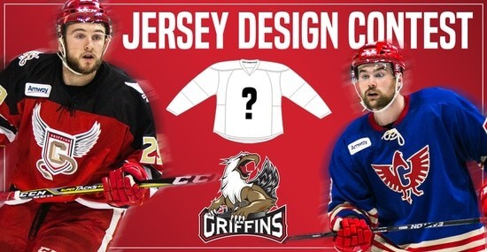
In case you missed it, Uni Watch is again partnering with the Grand Rapids Griffins to allow readers to design an alternate jersey to be worn this upcoming season.
As before, the winner will receive a personalized jersey, tickets to the game when the jerseys will be worn (February 22, 2020), and public recognition at the game.
The jersey is going to be worn on the Griffins’ 90’s Night (with either red or black pants and red gloves/helmets), so for this contest, the team is looking for a “90’s inspired jersey.”
The deadline for submissions for this contest is Friday, August 16th, 2019.
All the details are spelled out in detail here, so be sure to read that.
Good luck to all who submit!
The Ticker
By Lloyd Alaban

’Skins Watch: According to this article, a Boise, Idaho, high school is considering changing their mascot from “Braves” to “Brave.” The change can come as early as this fall (from Joe, who didn’t give his last name).

Baseball News: It’s been leaked before, but here’s a now-official look at this year’s World Series and postseason logos (from multiple readers). … Reds 1B Joey Votto had a heart symbol and “Dayton” scrawled on his cap last night to honor the victims from Sunday’s mass shooting in Dayton, Ohio (from multiple readers). … No pictures, but the Cardinals are quietly rolling out some minor tweaks to their cap logo. Scroll down to the LOGO SNEAK PEEK section of this article to read about it (from Ron Cook). … Phillies P Vince Velasquez has elected to wear his pants a bit tighter (from Patrick Bourque). … The Texas Northern Little League team wore the logo of former National Hockey League team Minnesota North Stars last night (from @GoatJerseys). … Red vs. red last night between the Okotoks Dogs and the Medicine Hat Mavericks of the Western Canadian Baseball League (from Kim Johnston). … Here is the cap the Pawtucket Red Sox (Boston’s Triple-A affiliate) will wear on August 30 when they will become the Fighting Quahogs for one night (from Jon Lew).

Football News: New field design for Arkansas (from Matt Snyder). … Virginia Tech DT Jarrod Hewitt explains why he switched to a single-digit number, something uncommon in the sport for his position (from Andrew Cosentino). … Some Patriots are wearing the team’s custom number font, while some are wearing a varsity number font in this training camp photo (from @JohnDoyle603). … The hard hats for workers at Hollywood Park, the future home of the Chargers and Rams, have miniature stickers of both teams’ logos on the back (from @HitTheGlass). … Union Craft Brewing in Baltimore. Md., have created a commemorative beer can in honor of Ravens S Ed Reed’s induction into the Pro Football Hall of Fame (from Andrew Cosentino). … Here are the Tar Heel-themed Air Jordan I cleats UNC will be wearing this season (from James Gilbert).

Hockey News: A sportswriter has ranked the Sharks’ uniforms. … The Kalamazoo Wings of the ECHL have opened their third annual fan-designed jersey contest (from Jon Rathbun). … Here’s the 25th anniversary logo of the Barrie Colts of the OHL (from Wade Heidt). … A Michigan leather shop turns old goalie gear into useful items (from Kary Klismet). … Cross-listed from the baseball section: The Texas Northern Little League baseball team wore the logo of former the long-defunct Minnesota North Stars last night (from @GoatJerseys).

NBA News: Head over to Etienne Catalan‘s Twitter feed for the latest in uni number assignments.
.

Soccer News: New third shirts for Real Betis (from @DJHankWood). … Here’s an item from our own Jamie Rathjen: “English Championship team Derby County announced the signing of F Wayne Rooney (and I’m a D.C. United fan, so this is the worst) with a No. 32 shirt that has a suspiciously large extra ad for the team’s advertiser on the back, where there is normally no ad. Rooney is actually going to wear No. 32, but as the advertiser has 32 in its name, I can’t help but think that this is some kind of ridiculous marketing stunt by the advertiser. The team said he was “assigned squad number 32,” but there are lower numbers available and this is way too convenient to be a happy coincidence.” … Dayton-based FC Cincinnati fans are offering scarves that say “HELL IS REAL” for the club’s match against in-state rival Columbus Crew. The scarves are based on a longstanding billboard on Interstate 71, which runs through Columbus and Cincinnati. Interestingly enough, the Cincinnati-Columbus rivalry is known locally as the Hell is Real Derby (from @100pctAkronite). … Bordeaux announced the signing of D Laurent Koscielny by having him take off an old Puma Arsenal top to reveal a Bordeaux shirt from Ed Zelaski). … New kits for Washington women’s (from Josh Kirshenbaum). … For the latest on kit unveilings and updates, check out the Twitter feeds of Ed and Josh Hinton.

Grab Bag: NASCAR driver Darrell Wallace Jr. will use an Adam Petty-inspired paint scheme for the Southern 500 in September. Throwback paint schemes have been the norm for the race since 2015 (from Christopher Hickey). … This appears to be the Staples Center’s 20th anniversary logo. The anniversary logo utilizes Staples’s old logo, which was updated earlier this year (from Jakob Fox). … New floor for Abilene Christian University basketball and volleyball (from Corey Patterson). … The Netflix documentary Basketball or Nothing features a high school that used the Kentucky Wildcats’ old logo (from @BearsnCats). … Gorgeous new uniforms for Pitt’s marching band (from James Gilbert). … New logo for Idaho State. Here’s the old logo for comparison (from Mychal Lowman). … Here are some facts about the Ferrari logo.
Lifelong Buccaneers fan here. WRT that Bucs uni concept, I think the yoke should be Buccaneer red instead of white. I would also prefer to see red on the outside of the numbers.
Wrigley 1953? First year Milwaukee, last year for Browns?
The Browns became the Irioles, so, no.
June 22 1953
Out of town scoreboard has LA and SF so it must be 1958 or later. Personally I’d like to know how the O’s rallied from 4-0 in the ninth
E-8, Gus Triandos hit a 2-run HR, then 5 straight singles.
There seem to be eight teams in each league and I don’t see any of the 61/62 expansion teams listed. But we do see LA and SF – the last moves before expansion. So: from 58 to 60. Unless all the expansion teams had the day off and the board hadn’t been enlarged to include five games in each league. Eventually the area on the left with the umpire info became the fifth AL game, but only four NL games were listed in Baltimore after the 62 expansion.
Correction – they did erect a small auxiliary scoreboard to the right of the big one in Baltimore that included two extra games. I don’t know when that went up though.
Sorry: Warren Hacker W Carl Erskine L Dutch Leonard SV. Ralph Kiner and Hank Sauer homered for the Cubs
The Players’ Weekend uniforms reminded me of the Colts’ April Fools joke from a few years ago
link
That was my first thought; this must be an April Fools joke. Maybe they’ll come to their senses and scrap it.
The silliest thing is the addition of “Weekend Ambassadors”.
I just realized I was researching the wrong scoreboard lol
Orioles 5, Yankees 4. Walkoff win with 5 in the 9th.
Friday, 19 September 1958.
Memorial Stadium, Baltimore.
The following afternoon, September 20, 1958, Hoyt Wilhelm pitched a no-hitter for the Orioles as they defeated the Yankees 1-0. Orioles catcher Gus Triandos hit a home run for the only run in the game.
The Texas Little League logo recalls the old North Stars logo but it doesn’t copy it exclusively. They added serifs to the bottom and the arrow had a full head on the North Stars, with negative space between the arrowhead and the star.
Re: The Player’s Weekend Unis
My question is how well batters on the “black” teams will be able to pick up the ball from the “white” pitchers?
But yeah it looks like the color printer ran out of ink at MLB headquarters.
According to the link below from MLB.com: “Pitchers on teams wearing white will wear black caps to ensure umpires and batters have clear visibility of each pitch.”
link
So this is basically MLB’s way of acknowledging that they didn’t think about anything other than “how cool they’d look”.
This is the dumbest part to me… It isn’t a functional uniform
“It isn’t a functional uniform.”
What the hell does THAT mean?
Am I not seeing something that is going to prevent the players from I don’t know, MOVING ie; walking, swinging a bat, running, sliding, sprinting, jumping, pitching, throwing?
“It isn’t a functional uniform.”
PLEASE.
GO AWAY.
RE: Players Weekend Unis
I love the idea they’re trying to use, but I don’t like the execution. I especially love the NNOB, but will we be able to even see them out on the field?
These unis look like someone saw a black on black New Era cap, wondered how that would look as a uniform, figured out how much they could make selling merchandise, and then sold the MLB on that.
RE: Bucs uni
It’s interesting to me how a change in colors makes me like a uniform I’ve previously despised. I would like those better than the color options they currently have, but I would still prefer they just go back to their previous uniform set and stick to pewter pants, helmets, red jerseys, and throw back Bucco Bruce mixed in from time to time.
RE: Pitt Band unis
As a Pitt alumni, I never thought I would say I have to go to a game this year just to see the marching band uniforms, but I like those so much that I may have just been sold on attending more than just the customary one game this year!
This is easily the worst crap that mlb has ever done, even worse than any tacky camo crap.
Horrendous, I will not be watching any baseball that weekend.
The article about the Boise high school switching their mascot from “Braves” to “Brave” gives me hope that one day my Atlanta Braves could do the same. It seems like, from the article anyway, that everyone involved has been reasonable about the idea with little resistance.
Those players weekend uniforms remind me of MLS’ Parley for the Oceans week in 2018:
link
And equally suboptimal.
Phil, I already wrote link you can use for Players Weekend. Just replace all the MLS references with MLB and all the soccer pictures with baseball…
HAH! Fortunately, Ek will be covering that weekend, so he can have it ;).
“Brown Eye”?? They’re letting someone wear that? Does that mean what I think it means?
No, Max scherzer has one eye that is brown and one that is blue. he wore “blue eye” last season.
Yes, it means what you think it means: a “Brown Eye” is a butthole. Maybe Max Scherzer’s teammates don’t like him very much.
The MLB PW uni looks to be a take on the NBA All-Star game’s recent black & white theme. It kinda makes sense based on the general popularity of basketball to try to copy that design on a baseball field. The results are disastrous though, both for MLB and NBA. In a time when people are excited to see the Jazz bring back purple and the Hornets retro teal unis, it seems odd to go B&W for the signature games.
Used to be that I could turn on *any* game and immediately know what teams were playing, who was the home team, etc. Now it’s hard to tell what league you’re watching, let alone which teams!
Note to all pro sports leagues: there was *value* in that that went way beyond whatever you’re making in jersey sales….
I’m old enough to have seen every Superbowl since SB III & if I can’t recognize an NFL or NHL teams uni as soon as I flick channels, there’s something seriously wrong…
As for these new uni-trocities from MLB, just another reason I don’t even watch baseball in October anymore…..lol
Back in your old days they didn’t have the score on the screen all the time. Now they do. Not that difficult to tell who is playing. They’re not marketing to you anyway. You watch baseball from April-September but not October because of uniforms? That’s the real LOL. I’ll get off your lawn now before you yell at me.
And JUST. AS. LAME.
The only sport that has teams named after the color of their socks will have those teams wear DIFFERENTLY colored socks. I’m getting too old for this.
Football news:
It’s ‘Tar Heel’.
Fixed.
Wow the player weekend hats from the last few years sold really well, I’m a little surprised they nixed them. Maybe there’s only so much you can do with those designs.
Oof, that other half of that Cincinnati FC scarf is funny in a vacuum, but given the events of the past few days they should’ve probably pull or reworked that scarf
If we pull the scarves, the terrorists win.
#DBAP
I originally thought that was the point (to be morbid), until I saw that the rivalry is apparently called that. I think it’s fitting
These unis are worse than a joke. MLB has become a parody of the game many of us grew up with in so many different ways; rules, structure, uniforms, etc., etc., etc.. It’s absolutely unbearable…
I like the idea of the Bucs concept, but I can’t get past the numbers. That’s a deal breaker for me. Of course if given the choice of current ones and the concept I’d go concept.
Agreed. The numbers are the worst thing ever in the NFL.
Disagree…that would be the Cleveland Browns ;)
But seriously, The Jags’ 2-tone helmet is far far worse than Tampa’s numbers.
I really think ANYTHING is better than those infantile Little League unis of the past two years.
Always wondered why they weren’t dressing the kids in big-league unis and letting THEM play in a big-league park.
To anyone who thought that MLB couldn’t do worse than the 2017-18 Players Weekend uniforms, Commissioner Manfred has just replied, “Hold my beer!” These desultory monstrosities are far, far worse.
Anyone seen in public wearing one of these jerseys or caps ought to be tied to a post and whipped with a rolled-up “JETER 2” Yankees jersey.
“Anyone seen in public wearing one of these jerseys or caps ought to be tied to a post and whipped with a rolled-up “JETER 2” Yankees jersey.”
What an idiotic thing to say over a uniform. And don’t say you were joking to cover up, you weren’t.
No, this is worse. Much, much worse.
Well, I just can’t predict the responses of this board.
If they came up with a design for these, y’all would hate them. So they basically wipe the slate clean and have no design at all, and y’all hate them.
But I do like, as the crusty old fuck of this board, feeling like I’m okay with something new; like I don’t automatically hate anything new. So thanks for that.
I’m with ya man. Over 50 and know that they aren’t marketing to me. But it’s not going to stop me from watching them. But people on here just enjoy hating for sport.
“Okotoks Dogs” should be “Okotoks Dawgs”.
I’m sorry to have to submit that correction.
pw unis are terrible
Someone’s putting “Brown Eye” as the nickname on their jersey? Just wow….
Max Scherzer has Heterochromia iridium. Two different colored eyes. Brown eye is one of his nicknames. Blue eye is another. Hell, even his dog has it.
If there’s one thing in uniforms I’d like to get rid of, it’s ghosted writing. So MLB decides to take it up to 11. Awful, awful, awful.
And just to twist the knife: the Yankees and Dodgers are two of the most iconic franchises in the sport, and have tons of history between them. And they have two of the best-looking uniform sets, each a timeless classic. And they only play once ever few years–and they’re going to be wearing THAT! Criminal.
The Players’ Weekend is gonna look like the hockey game in the movie Strange Brew.
Potentially the only weekend out of the past 30ish years where the White Sox actually could AND should wear white socks. Maybe MLB will make an exception and give them the white versions of the stance socks? Maybe ever team should be given the inverse socks of the pants they’ll be wearing?
For Jamie Rathjen re Wayne Rooney:
link
Look at Rooney’s first video with DCFC. There are seven (7) ads visible. The advertiser might be just a little excited.
MLB should be ashamed, though it’s obvious MLB has no shame.
oof oof oof oof not good not good at all. Howbout for player weekend have every single team wear through backs from a certain year? Albeit they keep the NNOB, which is just about the only good thing this year
I think these MLB Player unis would be executed nicely in wool uniforms, but with contrasting team names/numbers/logos. Kinda makes me think of the 1890s. But the whole world was in black in white then , so…
world series logo: my first thought was, where’s the logo? that’s the 90s.
reading the article and reviewing the history of logos, i am pleased with the current version. It is definitely a nostalgia trend right now.
New York Yankees at Baltimore Orioles, September 19, 1958. Memorial Stadium.
link
Well, MLB obviously doesn’t care about my 38 year old ass any more, so I won’t care about them either.
Not only will I not buy any of this Hot Garbage, I will not be going to, or watching any more MLB this year.
I’m done!
Have fun with your Black and White ShitShow!
I could almost get past the Black vs. White stupidity if you could actually read the graphics.
These Players Weekend unis are best viewed on radio. Unfortunately for me I’m a Tigers fan. Double unfortunate means I have to hear Jim Price.
I don’t even want to listen on the radio then, because any self-respecting announcer will be complaining vociferously about this trash.
Phil, you were far too kind in your assessment. I thought this wouldn’t happen until Nike took over the uniforms, but Majestic went and out-Niked Nike. And of course, the one chance the “White Sox” have to actually wear white socks… they’re one of the teams in all black. What an absolute joke.
I don’t need any more reasons to stop watching MLB, but they keep giving me more and more. I’m about done with them.
A little late on this one, but the Cardinals have been using that updated logo in their lineup announcements on Twitter: link