[Editor’s Note: Today we have a guest entry from Ticker assistant and soccer maven Jamie Rathjen, who’s going to fill us in on the latest MLS developments from the weekend. Enjoy. — PL]
By Jamie Rathjen
When this season’s MLS kits were revealed, many observers, including myself, felt that they were bland. Too many monochrome and mono-white kits, not enough use of team colors.
Then the league had this past weekend’s Earth Day promotion.
MLS gave us a glimpse of a dystopian uniform landscape, because all of the teams were outfitted in mono-white or mono-black for the promotion, supporting the charity Parley for the Oceans:
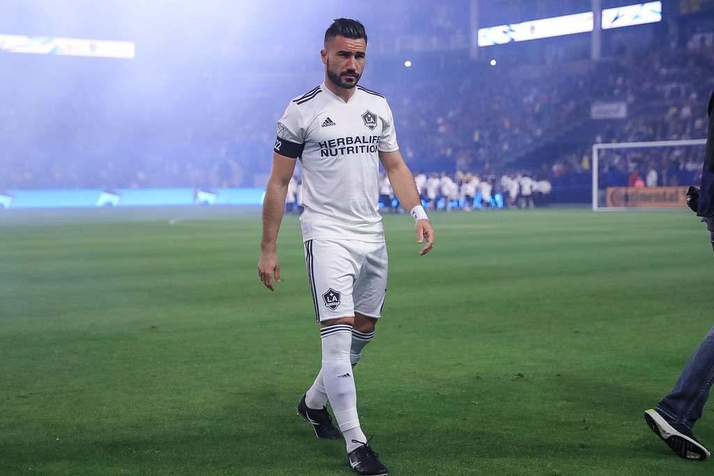

The Earth Day promotion started last year with four teams participating: New York City, Orlando City, LA Galaxy, and the Seattle Sounders. They wore either grey or white.
This year, though, every game throughout the league looked essentially the same. It was impossible to pick out which team was which from a distance:


There was no pattern regarding which teams wore which colors, though most home teams wore black. As the league has an odd number of teams this year, there was one more black than white shirt released because of D.C. United, the team not playing this weekend.
The kits were the exact opposite of each other, except for the New York Red Bulls’ black shirts, which were combined with another promotion for autism awareness and featured sky blue numbers on the back:
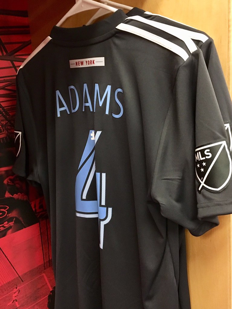
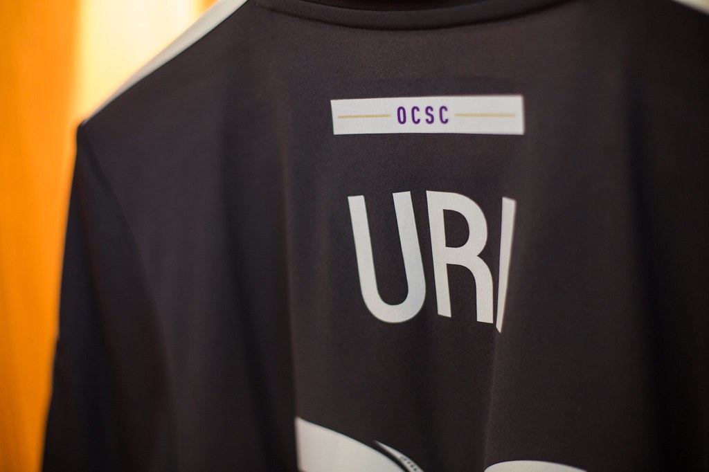
Each team wore its name, or an abbreviation of it, on the rear neckline. A close-up look reveals that this was rendered in team colors on a white box, even on the white shirts:

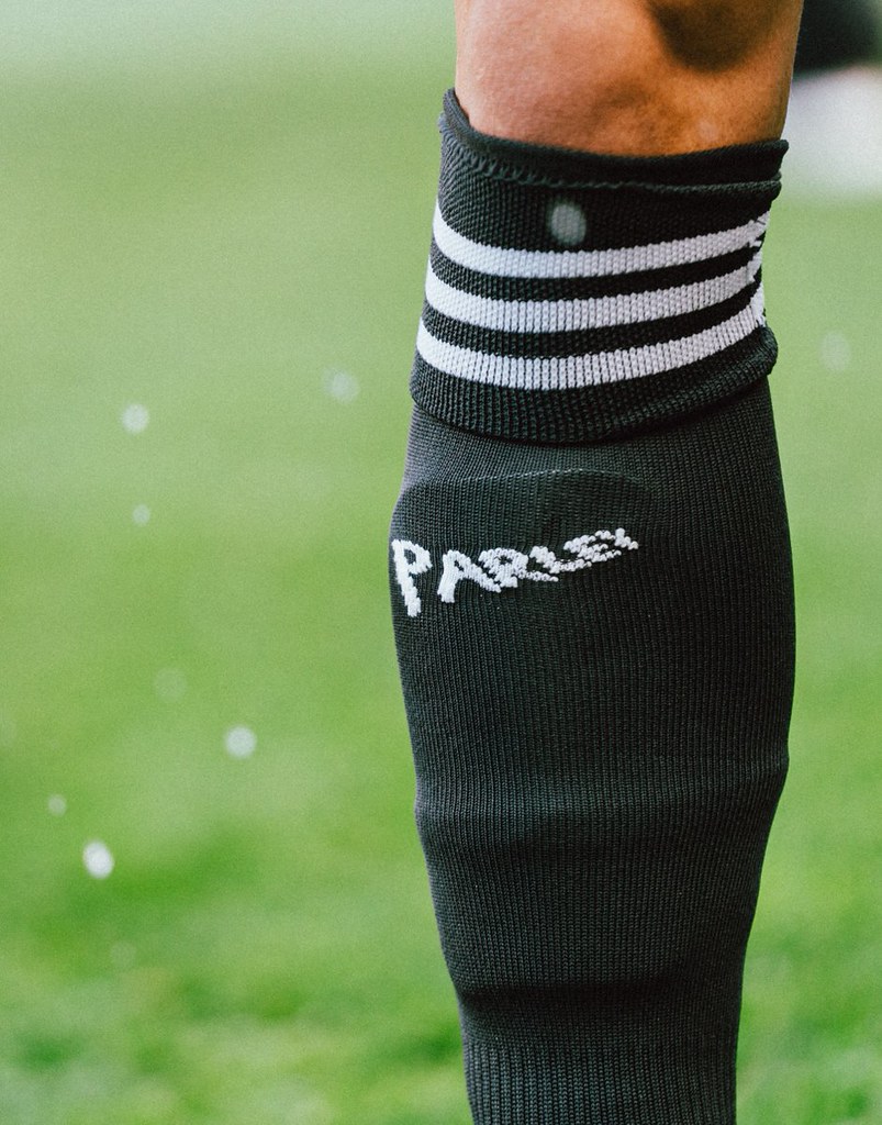
In addition, socks carried the Parley for the Oceans logo:
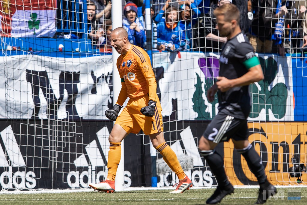
Goalkeeper kits were apparently not included in the promotion, as they were in conventional colors such as blue, red, and orange without monochrome team crests:
League-wide uniform standardization actually was proposed more than a century ago. England’s Football League took more than 30 years after its 1888 founding to come up with the convention that the away team changes if there’s a kit clash. At the 1906 league meeting, it was reported that the Liverpool representative, perhaps partial to his team’s colors, proposed ending the kit clash problem by having the league annually declare a universal home uniform. One of two options would be chosen: red over white or white over a dark color, with the remaining kit worn by all away teams. That is, every game would look the same.
Nothing of the sort ever came to pass — until this past MLS weekend.
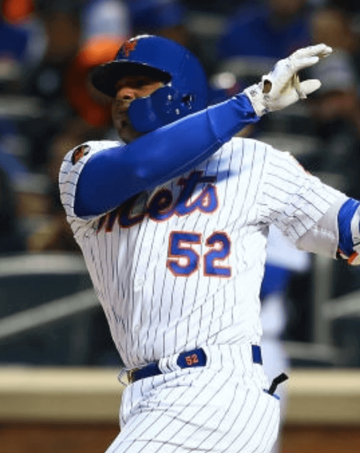
The most overlooked uni element: Paul here. As a lifelong Mets fan and dedicated uni-watcher, not much escapes my notice regarding the Amazin’s. But reader Joanna Zwiep spotted something I missed in this shot of pitcher Noah Syndergaard, which is from Opening Day:
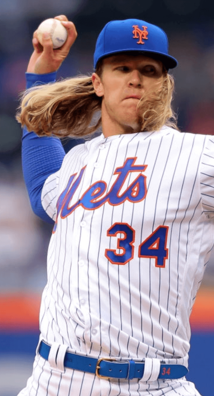
That’s right — Syndergaard was wearing a uni-numbered belt. I don’t think I’ve ever seen that before on an MLB player, and definitely not on a Met.
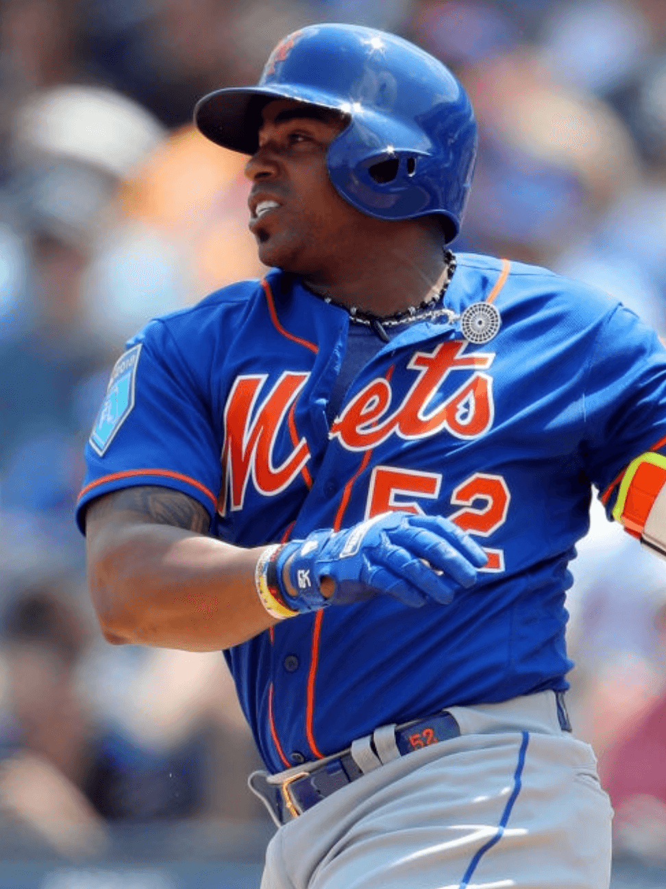
And there’s more: Joanna also found that Mets outfielder Yoenis Céspedes has worn a numbered belt on at least three occasions — once in spring training and then on April 17 and 18:
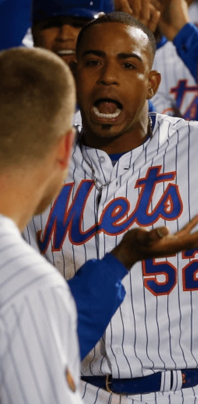
Have other Mets been wearing numbered belts? This bears further investigation — stay tuned.

Click to enlarge
Camera-raderie: My father was a photography buff. When he died in 2009, he left behind a bunch of his old film cameras. I sold a few of them but still had several of them stowed away in a cupboard when I met the Tugboat Captain in 2015. She was an enthusiastic and talented photographer, plus I liked her a lot, so I gave her one of my father’s cameras, along with one of his old light meters.
She has other cameras that she likes to use (plus, like most people, she takes a lot of photos with her phone). But every now and then — just often enough to surprise me — she brings my father’s camera with her on one of our outings, including when we visited the Brooklyn Botanic Garden on Saturday (see above). It always makes me so happy to see her using it. I know Pop would be happy to know that his gear is in good hands.

Culinary Corner: My local butcher shop is always coming up with interesting new cuts and presentations (read: always coming up with new ways to recontextualize low-priced cuts as higher-priced cuts). One example of this came last Friday, when the Tugboat Captain and I stopped in at the shop to pick up some meat for burgers. While we were there, I noticed that the butcher’s case included something I’d never seen before: “Greek-style Rolled Lamb Belly Roast.”
Much like pork belly, it was fairly fatty, but it still looked intriguing, with a stuffing of spinach, herbs, and garlic. I was intrigued, so I had them hack off a small portion for us — it weighed out at a little over a pound. Here’s how it looked when we got it home (for all photos, you can click to enlarge):


Two days later (i.e., last night), we had it for dinner. The prep couldn’t have been simpler: Salt, pepper, and a 375º oven for a little over an hour. We added some new potatoes to the mix:


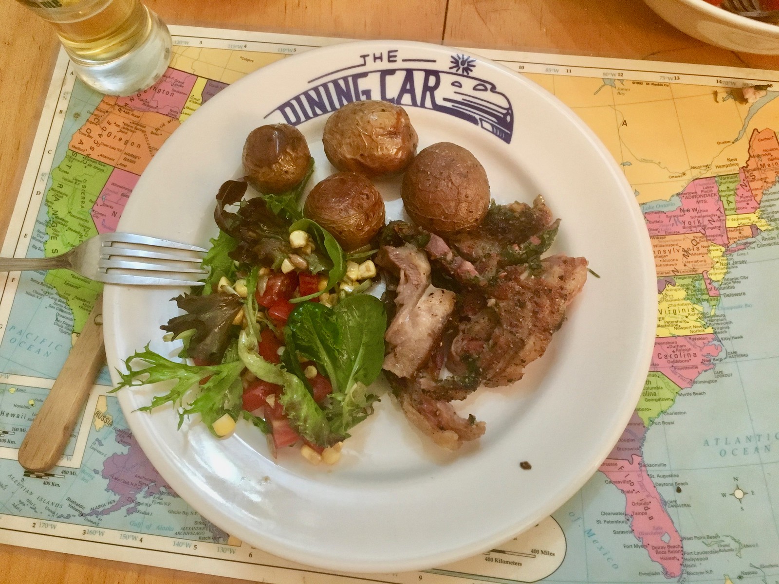
So good! Very rich — all that fat takes its toll — but very, very tasty. Okay, so I basically got suckered into buying something based mostly on the presentation, but still — made for a swell dinner.
Raffle results: The winner of the New York Knights T-shirt from Ebbets Field Flannels is William Hart. Congrats to him, and thanks to all who entered. More raffles coming soon.
The Ticker
By Jamie Rathjen

Baseball News: The Orioles wore green-trimmed jerseys and caps for Earth Day yesterday. No photos, but the pants and batting helmets were unchanged (from Will Shoken and Joseph Willock). … The Phillie Phanatic is still wearing last season’s Dallas Green memorial patch (from Frank McGuigan). … The Phillies’ batting helmets seem to have a mix of 3-D logos and flat decals (from Joe Nocella). … The Triple-A Omaha Storm Chasers are to wear a runza-themed cap and uniforms several times this season. What is a runza, you ask? “It’s essentially our [Nebraska’s] take on the German/Russian bierock. Ground beef, onions, cabbage and salt/pepper all sealed up in bread dough and then baked to a perfect shade of brown,” says Brett Baker. … The seats at Angel Stadium still have logos from when the stadium was known as Edison International Field from 1998-2003 (from Andres Cardenas). … Here’s a look at one of Japanese Central League team Chunichi Dragons’ blue alternates. They have another one (from @GraveyardBaseball). … Virginia wore mysterious blue pullovers Saturday (with white pinstriped pants, on the road) which appear to be throwbacks. In any case, the jerseys haven’t made an appearance since the 2016 NCAA tournament and the team didn’t say anything about them either time. Anyone know more? … This article about Brewers P Josh Hader (NYT link) includes the following: “As Hader thrives, he would clearly merit a more traditional uniform number than 71. He used to wear 17 — the number his favorite Oriole, B.J. Surhoff, wore in Baltimore — but the Brewers have not issued 17 since their longtime second baseman, Jim Gantner, last used it in 1992. ‘It’s like a retired number that’s not retired, so I just said 17 backward is 71, and I just rolled with it,’ Hader said. ‘I’m not that picky; 71 works perfect for me.'”

Football News: Reader Bill Schaefer was looking for photos of a 1965 Browns/Packers preseason game and found this newspaper report featuring Packers QB Bart Starr wearing No. 42, instead of his familiar No. 15. … Gene Sanny did an excellent painting of Cardinals S Larry Wilson, who played for the team in St. Louis for his entire 1960-73 career and remained with them in some capacity until 2002. … Someone on Reddit found a bunch of old game-used Bills jerseys at a thrift store (form Josh Allen).

Hockey News: Following up from yesterday’s lede, Ray Hund sent us pictures of both Chicago Stadium and United Center under construction. Both stadiums briefly stood together before Chicago Stadium was demolished in 1995. … Swedish sports newspaper Sportbladet has a tradition of doing photoshoots with gold-painted athletes who have just won championships. That’s Vaxjö Lakers winger and Canucks first-round draft pick Elias Pettersson, who was the playoff MVP as his team won the Swedish Hockey League championship. He’s also wearing a golden helmet, which the entire team received post-game. … Many teams allow season ticket holders to paint their ice sheets after the end of the season. Here’s Penn State’s effort (from María Canales).

Basketball News: Also posted in hockey: Following up from yesterday’s lede, Ray Hund sent us pictures of both Chicago Stadium and United Center under construction. Both stadiums briefly stood together before Chicago Stadium was demolished in 1995. … The Portland (Ore.) school board wants to investigate Nike’s providing of sneakers to some of the state’s high schools, separately from any apparel deals with the company the schools may have (from Tom Turner).

Soccer News: Atlanta United midfielder Jeff Larentowicz had his numbers falling off Saturday (from David Kendrick). … The NWSL’s Portland Thorns debuted their second-choice kit at home against the Washington Spirit. … Also in the NWSL, the Chicago Red Stars (black) and Sky Blue FC (white) changed against one another, though New Jersey-based SBFC’s blue shorts and socks saved the game from resembling MLS. … Scottish team Celtic wore a pink and black kit from last season as a fourth kit against Hibernian, as they did on their previous visit this season. … German team VfB Stuttgart released its first-choice kit for next season (from Josh Hinton). The article claims the kit is to be worn May 5, the last home game of this season, which is a growing practice for the revealing of kits and other uniform elements. … VfB also replaced its advertiser Saturday against Werder Bremen with slogans and hashtags supporting the DFL Foundation, run by the organizers of the Bundesliga. The promotion extended to the match balls as well. Each player’s shirt featured a different hashtag, which led VfB to claim they were the first Bundesliga team to play with 18 different shirts. … Here’s a logo-based overview of the winners of every U.S. men’s and women’s outdoor professional league since 1968, the Canadian Championship since it was founded in 2008, and the U.S. Open Cup since 1990 (from Andy Moeschberger). … Aston Villa has a new “technical kit partnership” with Fanatics and the menswear brand Luke 1977 (from @LiamC191).

Grab Bag: NASCAR team members now wear sleeve patches identifying their role on the team — whether pit crew or logistical — and to what number car they belong. This is part of an effort this season to standardize the team personnel present at the track (from David Firestone). … New 2018 guernseys for Australian netball (from Jeremy Brahm).
Great lead (lede?) Jamie, love seeing soccer posts on the site. And while the kits were extremely dull and boring, at least there weren’t kit clashes like last year.
Thanks!
Agreed – I’m thrilled to see a soccer lede! A really good one, to boot! More, please!
But “It was impossible to pick out which team was which from a distance” made me actually laugh out loud at the breakfast table just now, especially as it’s followed by a series of at-a-distance photos in which it literally could not be easier to tell which team is which on each field. I understand that Jamie means to say that it’s nigh impossible to identify teams on a league-wide basis, such as when watching highlights on TV, but there is no actual distance at which one ever sees more than two teams, the ones playing each other on a particular pitch. Making every team wear black or white is a stupid gimmick, but unlike making every player wear the same uniform number, it doesn’t actually make it more difficult for spectators, players, or officials to play or watch the game. The teams remain easily differentiated from each other on the field of play, which is what uniforms are for.
I believe what he meant was that, when you first turn on the game, at that distance it’s impossible to tell which team is wearing black and which team is wearing white. And that is a significant problem.
Not good looking MLS highlights this weekend considering all in same uniforms. Not a fan of that.
Also, especially not great highlights from my perspective considering the Friday night score in Kansas City :(.
“Austin Village” should read “Aston Villa”
Damn autocorrect. Fixed.
Now it says “Austin Villa.”
Sorry, Jamie. *Now* fixed.
Now it says “Astin Villa.”
ASTON VILLA
Austin Villa would be a great expansion team name in MLS. Way better than Sporting KC or Real Salt Lake
+1
I agree. When I first saw the typo I thought it was some team in the depths of the minor leagues or something I’d never heard of.
“Austin Village has a new ‘technical kit partnership'”
It’s Aston Villa. (I know it’s weird that I’m proofreading my own Ticker but some stuff comes in overnight.)
Also, the phrase in quotes, which can also appear as “technical sponsor” or something like that, is just a fancy way to put “uniform manufacturer.”
Here’s a logo-based overview of the winners of every U.S. men’s and women’s outdoor professional league since 1968,
The poster gets the Chicago Sting logo wrong, as Creamer’s site gets it wrong.
About that Bart Starr photo. It’s likely a publicity photo almost certainly taken after a practice. In the ’50s and ’60s, and especially under Lombardi, the Packers routinely wore randomly numbered jerseys at practice.
Exactly. You can also see that’s clearly not the Packers white/dark green jersey.
I’ve seen it before – it was taken at training camp in 1957, as part of the same photo shoot that gave us link.
That lamb belly looks very tasty. It reminds me of a porchetta. If you get another chance at it, I would recommend trying it on a rotisserie grill. The skin on the belly gets crackling and crunchy.
That Earth Day promotion by MLS is absolutely absurd. One of the biggest threats to the environment is our materialistic, one use, throw away culture. So MLS decides to celebrate Earth Day by wearing one-off uniforms that won’t be reused?
And they even went to the trouble of printing advertiser names and logos on them!
You can answer that for yourself after they’re all auctioned off to benefit the charity.
What stops teams from auctioning off game worn uniforms for charity after they’ve met the end of their useful lives? That’s far more sustainable than doing one-off uniforms and auctioning after one game. It is less about money for charities and more about using sustainable practices, such as not having single-use items.
Supposedly the uniforms were made from recycled plastic litter. There’d be far less plastic litter if we really curbed the amount of single use plastic products out there!
Having multiple playing floors in NBA basketball is worse.
Having multiple playing floors in NBA basketball is worse.
“MLS black-vs-white” looks like something the (original) NASL would have introduced, to make it easier for fans to follow the teams, like large numbers on the front of the uniforms. It would have been natural if MLS also brought out the black-and-white Telstar balls that appeared on the league’s first logo, to go with the uniforms yesterday.
New York Red Bulls uniforms with uniform numbers in NYCFC colors?!!
That’s the first thing I thought when I saw that. NYRB with sky blue numbers just doesn’t look good, though I understand why they did it.
Apparently, “inklusion” in the Bundesliga includes love for leather daddies in gimp masks, judging by #20’s facial protection. But I digress. :)
Regarding Josh Hader’s number, I know he said he’s not picky but Surhoff wore #5 for the Brewers (his current team), so he could go with that. Jonathan Villar currently wears it but could switch to #2 which he wore in Houston. Would also contribute to the growing trend of pitchers wearing single digits.
That’s a trend that should not continue. Like pajama pants, BFBS, GFGS, camo uniforms and longwinded Nike corporate speak describing a uniform “rebranding reveal”.
Any particular reason why other than “that’s the way it has always been”?
I think it looks aesthetically improper. Like a soccer or hockey player other than a goalie wearing #1 (which never happens). Or a QB wearing a number above 19 (which rarely happens). It’s tradition-heavy to be sure.
I wish he would have just asked for 17 and gotten it.
Gene Sanny,…..
Nice painted rendition of this Getty photo.
link
Thanks, and good eye…. I spend far too much time looking up old photos on Getty :)
You’re right that the black vs. white look of MLS was drab. I got an email from the Union promoting the Parley uni a week or two ago, and it said the entire kit was made of recycled plastic pulled from the oceans and worked into various fibers. I think it also said the colors were white and black to avoid any unnatural dyes, or something like that, also. So at least there was an Earth-friendly reason for this, if not exactly promoted properly.
When do we get special uniforms for 4/20 day?
And they should be made of eco-friendly, locally sourced and renewable, biodegradable hemp fiber.
Paul,
As another photographer, what kind of camera did your father have that the Tugboat Captain is using in your image? What film or films does she prefer? With the rise of digital photography, film sales and processing are not nearly as mainstream as they were not that long ago.
The dinner plate you used for the belly roast has some striking graphics. Was/is “The Dining Car” a restaurant? There is a hobby collecting dining car china from the old railroads that is similar to uni-watching.
Camera: Not sure which one that is. Will find out!
Plate: It’s from Fishs Eddy, which sells old overstock china and also makes retro designs: link
I’m pretty sure I’ve seen those NASCAR pit crew/role patches worn on chests and backs too.
My understanding is that the teams are only allowed a certain number of people at the track, and that the patches are monitored by NASCAR, so they need to be visible from multiple angles.
Here’s the placement guidelines:
link
Wonder how good Aston Villa kits will be next year, from my understanding it’s an odd, three-partner deal (the club, Luke 1977, and Fanatics)
Apparently the guy that founded the menswear company is a huge Villa fan and he/they get to do the designs so if I had to guess, I’d be surprised if they weren’t really plain.
Right, I think they’ll be aesthetically pleasing, I’m wondering about the quality of the material that is used to make the kit; from what I read, Luke 1977 doesn’t do much with football kits.
So the runza promo is actually a corporate dbag thing in the end, isn’t it? I clicked on the link and the hat’s colors are the restaurant chain’s and not really a generic promotion of a unique Nebraska thing. Don’t get me wrong, I enjoy runza when I go to Nebraska, but uni-watch is about exposing this corporate nonsense
I like your map placemat – I thought I was the only one still living with some elementary-school nostalgia over dinner. I actually have a Mexico map placemat now, as my significant other is from there and I’m trying to learn the geography better.
Sorry if this has been in other photos, as I’m not the most religous reader of the cooking section. But that lamb belly looked delic!
Thanks!
UVA baseball video here: link