
For all photos, click to enlarge
Saturday’s uni-versary party in Brooklyn was a super-special affair, with several dozen attendees and lots of good chatter. Here are some of the people who were on hand, with apologies for the less-than-ideal lighting in some of the shots:
It was great to finally meet Uni Watch Ticker assistant and de facto soccer editor Jamie Rathjen. He’s been part of the Uni Watch team for nearly two years now, but this was our first face-to-face:
Jamie came up from Virginia with his twin brother, Nate, who was also on hand for the party:

Naturally, weekend editor L.I. Phil Hecken was on hand, wearing a Todd Radom-designed T-shirt from 2017:

Gordon Blau, who guest-wrote the entry a few weeks ago about his recent baseball/sumo vacation in Japan, showed up with his wife, Chrysse, and their son Kevin. Such a nice family:


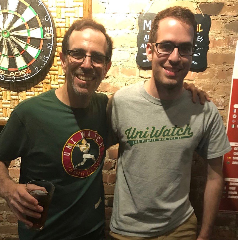
The great Bryan Molloy — the man who designed the winged stirrup (and also designed many other Uni Watch items, including the T-shirt I was wearing) — came down from Providence and wore a jersey customized with one of our chain-stitched patches, among other things:


If the hat Bry was wearing looks a little different, that’s because it’s a prototype of a new cotton cap that he surprised me with. Looks really good:

Not sure if we’re going to offer this for sale, but possibly! Stay tuned.
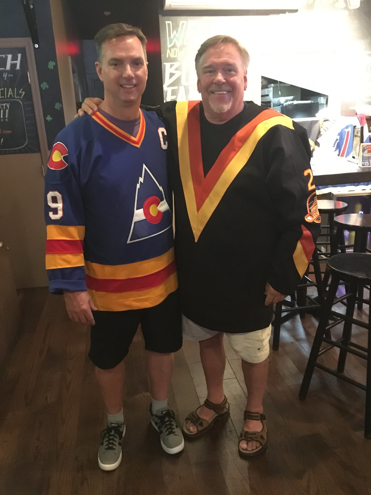
The prize for having traveled the longest distance for the party goes to reader Tim Cox, who actually flew in from Denver earlier in the day, got a cab to the party, and then flew back out in the evening!


Tim also brought his 2019 Purp Walk shirt — the same one he recently wore for Photo Day at Coors Field — and had me autograph it with a purple pen!

Here’s Tim again, this time posing with Devils P.A. announcer Kevin Clark (who I wrote about a few months ago), with both of them repping some bold NHL throwback stylings:
I think Marc Rivlin has been to every Uni Watch party we’ve ever had in Brooklyn (or at least most of them). He wore a rare T-shirt we briefly offered as part of the membership program back in 2007:

Marc wasn’t the only one wearing a rare Uni Watch tee. Check out this number Jeff Lang was wearing:

That shirt is from the very first Uni Watch party, which took place on March 12, 2006. That was more than two months before this website launched — Uni Watch only existed on ESPN at that point. Scott M.X. Turner, who at that point I knew as an enthusiastic reader who’d sometimes email with me about this or that, offered to design the shirt. When webmaster John Ekdahl and I launched the blog later that spring, we used Scott’s T-shirt design as the basis for the home page’s look — and we still use that tri-colored striping today!
I don’t recall how many of these shirts we made for the event, but I know for sure that I don’t have one myself, so this is a real collector’s item!
Also in that photo: Mets by the Numbers poobah Jon Springer and his buddy Jake.
Dave Rakowski and I wore the same Packers-themed StripeRite socks:

Dave also gave me — get this — a Styrofoam cooler full of turkey tails! I plan to get wood-smoked later this summer. Thanks, Dave!
Dave wasn’t the only one who arrived bearing gifts. Longtime reader/neighbor/pal Jeff Fedenko brought me a beautiful Durene jersey — Packers No. 26, Herb Adderley, made in Ripon, Wis. — that looked like it might be big enough to fit both of us! Dig:


Thanks so much, Jeff — you’re the best.
Another guy who never misses a Uni Watch party is longtime reader/contributor and supreme Super Bowl numerologist Jay Braiman. He’s also an actor, so he wore a baseball-style jersey that he designed for a production of Pippin that he recently appeared in:

Robert Brashear has been contributing Ticker items for years now, but I’m pretty sure this was the first time we’ve met. It was great to finally have a face to put with the name:

The guy wearing the Uni Watch cap in this next photo is Jordan Mayblum, who made the trip down from Boston. I’m embarrassed to say I don’t recall the name of the other fellow, but I do remember that I enjoyed talking with both of them!

It was great to see all of these people. But there was one person whose presence meant more to me than anyone else’s — Miles Seligman, who was the sports editor at The Village Voice when I came up with the idea for Uni Watch 20 years ago:

When other editors couldn’t wrap their heads around the idea of a column about uniforms, Miles immediately embraced it. It’s no exaggeration to say that all the Uni Watch goodness that’s unfolded over the past 20 years is due to that decision he made when I first approached him.
Shame on me for not getting a photo of illustrator/designer extraordinaire Larry Torrez (aka the great Eltee of DC, and the guy who did that caricature of me) and his wife, Jo Carol, who came up from Virginia and were kind enough to give me a book. Great to see both of you — hope to see you both soon! Ditto for helmet designer Mike Princip, MLB.com’s Dan Cichalski, and artist Graig Kreindler, who were also on hand but somehow avoided the camera (although they’re all in the group photo at the top of this page).
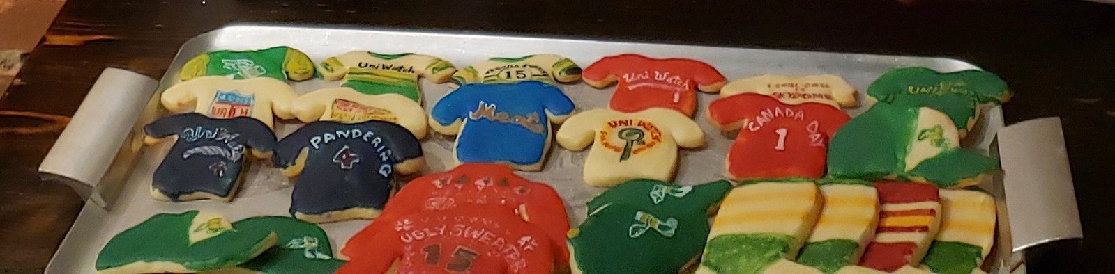
In addition to the 773 Lounge’s excellent food and drink, the Tugboat Captain surprised me by making a uni-versary cake (yellow cake, green icing), and we had Elena Elms’s wonderful Uni Watch cookies (the latter of which I somehow neglected to get a good photo of, but here’s a partial shot that should give you an idea:

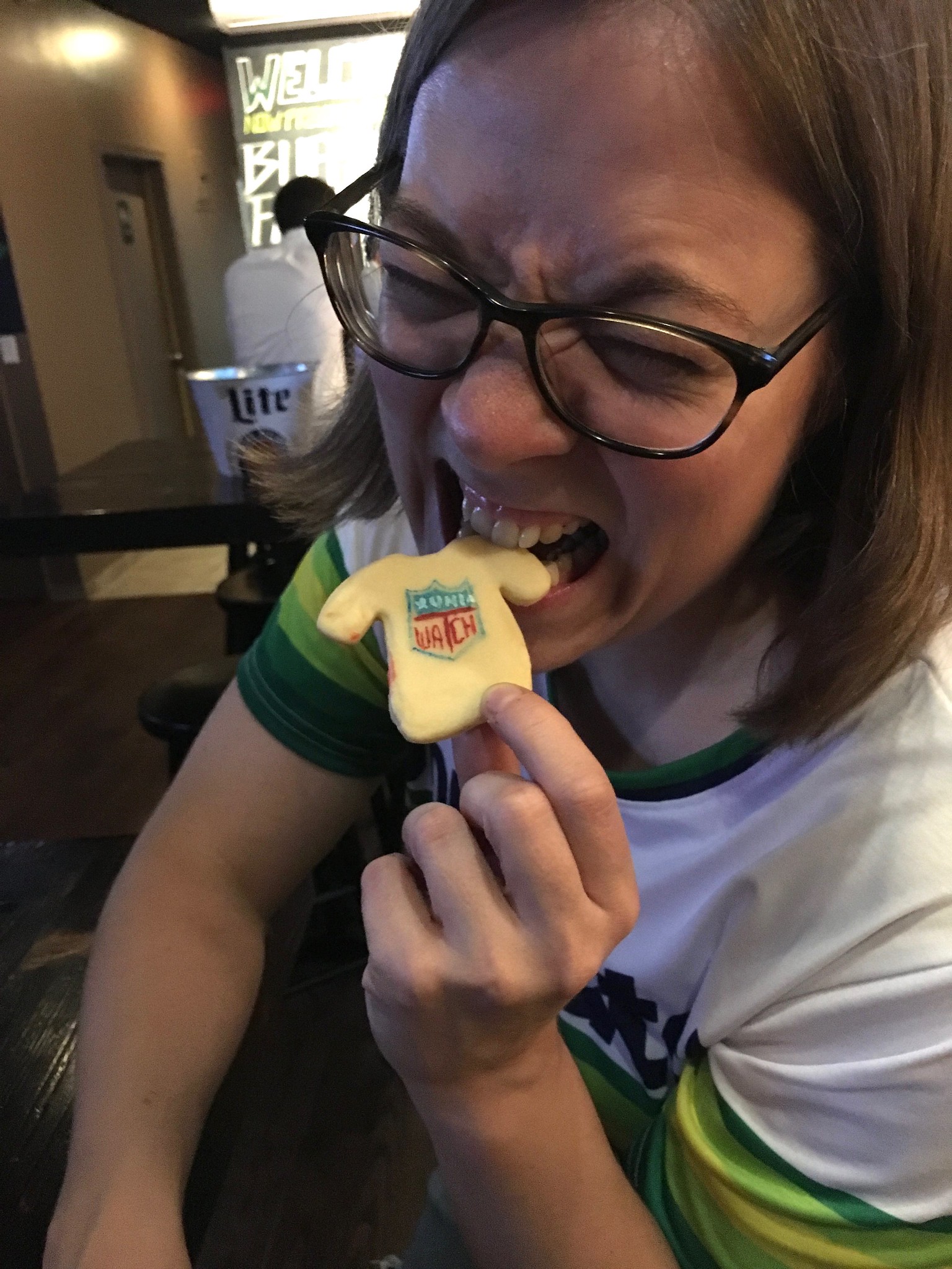
It was a little weird to be “eating Uni Watch,” so to speak:
———
So that was the Brooklyn party. If there’s anyone else I missed, or if I got anyone’s name or info wrong, feel free to let me know.
As you know, there were also satellite parties taking around the country and around the world, in places big (Chicago and small (Uniopolis). Phil had some good photos from the various locales in Sunday’s post, and you can see a lot more photos here. There’s also a very nice gallery of photos from the Denver gathering here.
People, I cannot even begin to express to you how amazing this whole experience has been. You all made me feel very, very special for this special occasion. Thanks so much for that, and for being part of the comm-uni-ty that has made Uni Watch such a rewarding project.
Big, big thanks to everyone who attended these parties, doubleplusthanks to the people who organized them, bonus thanks to Brinke Guthrie for his help with promotion and photo-gathering, mega-thanks to Marty Hick for coming up with the idea of doing satellite parties in the first place, and biggest thanks of all to satellite party coordinator JohnMark Fisher, who did a tremendous job of connecting people and tracking all of the various meet-ups. You’re all awesome.
Although the uni-versary parties are now over, the uni-versary itself is not! I’ll have more announcements in the weeks and months to come, as we continue to celebrate two decades of Uni Watch.
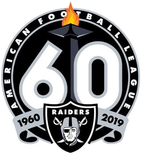
Ray-duhz: The Raiders yesterday unveiled a 60th-season logo (shown at right; click to enlarge), which will be worn in 2019 as a jersey patch. Normally this wouldn’t merit more than a sentence or two in the Ticker, but in this case there are a few points worth noting:
• As I’ve said many times before, I strongly prefer to have teams celebrate anniversary seasons, not ordinal seasons (here’s a primer on the difference between the two), and this logo is a good example of why I feel that way. Look at those dates: 1960 and 2019. If they had just waited a year and done the logo and patch next season, the dates would be 1960 and 2020, which would look so much better — more balance, more symmetry.
• The flame at the top of the logo is for the Al Davis memorial torch, which is lit prior to each Raiders home game. It’s nice that it’s based on a real thing, but man, it is seriously weird to see anything Raiders-related with colors other than silver, black, or white.
• Interesting that the lettering reads “American Football League,” with no NFL reference.
• The numerals are based on the Raiders’ original uniforms (although they had gold trim, not silver, back in the day).
• Here’s an intriguing detail, as quoted from this page:
The logo will be worn on the Raiders’ home and away jerseys throughout the 2019 season. For each Raiders home game, the three-time Super Bowl champions will tailor the logo to celebrate a particular achievement, including victories in Super Bowl XI, Super Bowl XV, and Super Bowl XVIII; the 1967 AFL Championship; the club’s history in Oakland and Los Angeles; and the fans of the entire Raider Nation.
At first I thought this meant they’d be customizing the patch for each home game, but then I double-checked with the team, just to be sure, and was told, “The patch on the jerseys will not change, but the logo that is used digitally and on game-day materials will be tailored to the specific home game.”
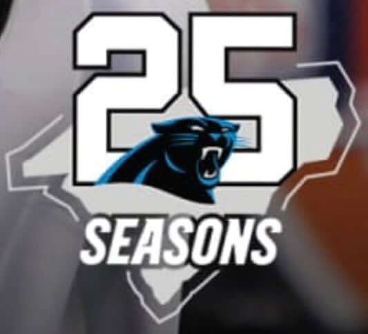
While we’re at it, a new Panthers 25th-season logo began circulating on the team’s website and social channels yesterday. It’s not yet clear whether it will be worn on the team’s uniform — again, I’ve asked the team for some clarification on that and will report back if they respond. Stay tuned.
Just to refresh your memory, here’s the patch that the Panthers wore five years ago for their 20th season.
Click to enlarge
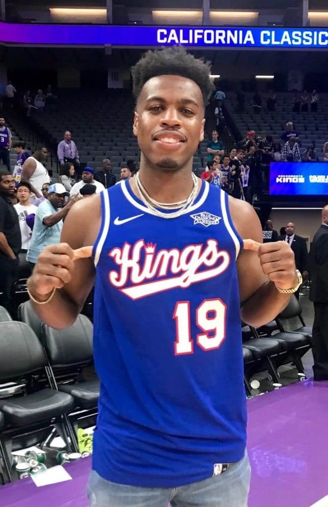
Retro in ’Mento: The Kings revealed a new Classic Edition throwback yesterday. They originally wore this design from 1990 through 1994. They’ll announce the games when it will be worn when the full NBA schedule is released in August.
I like this design, but there’s one thing about the script that has always puzzled me:
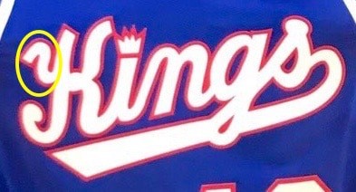
Like, what is that squiggle? What is it doing there? I’ve never understood it.

Click to enlarge
Cruisin’ to a leak: The U. of Washington is switching from Nike to Adidas this season. The new outfitting contract went into effect yesterday, and the plan was to reveal the new football uniforms to the media on a boat cruise tonight, with media members permitted to provide written/oral descriptions but no photos or video. The full launch was slated for July 10.
Naturally, there have already been leaks (the first one, shown above, was on Reddit), which I suspect was the idea all along. Here’s another one (click to enlarge):
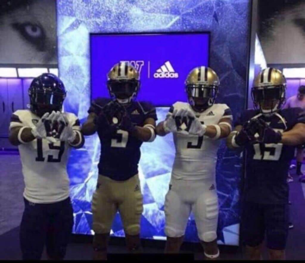
There’s more info on the Huskies/Adidas deal, including unveiling dates for other sports, here.
(My thanks to @MikeLFBCB, who was the first of several people to bring these leaks to my attention.)
Click to enlarge
Collector’s Corner
By Brinke Guthrie
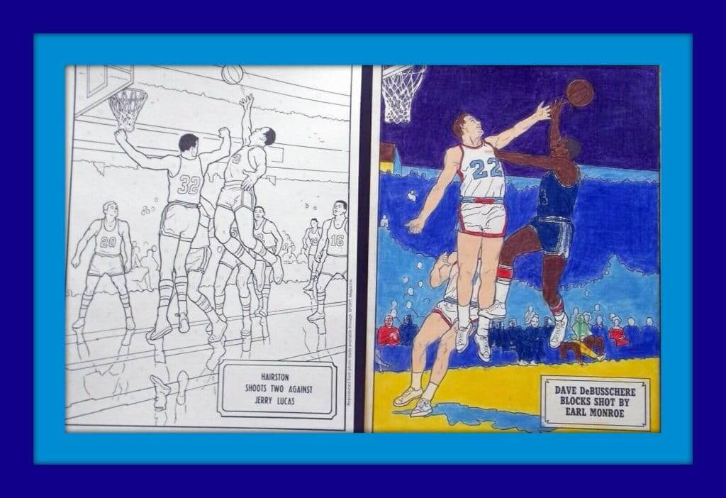
My first question when I came across this item was, “Do kids still do these?” (Answer: If there’s an app for it on a phone or tablet, sure.) Anyway, check it out — a 1970s NBA color-by-numbers set. You color it up with actual colored pencils. Remember those? The auction notes, “Set comes with 6 sketches, 5 uncolored and 1 colored (1 has yellowed in the upper-right and lower-left corners), and 8 of the 9 pencils, all used. The box is in rough shape, creased and bent up, but does stay together, somewhat.”
Now for the rest of this week’s picks:
• While I admire the retro concept of these 1970s Miami Dolphins AM radio headphones, they must have weighed a ton. You have the big ear cushions, the Dolphins helmet on both sides, heavy band across the top — a long way from today’s earbuds! The seller says they work just fine, so if you’re a Fins Fan, go for it!
• The seller says this 1970s Baltimore Colts coach’s sideline jacket is game-worn.
• Here’s a 1970s baseball bat coin bank with 10 6″ MLB bats.
• Here ya go — a 27.5-yard roll of 1970s NHL official hockey stick tape, still sealed in the package.
• This 1970s Packers helmet key chain might be good for Paul’s “Key Ring Chronicles” project.
• Take an “Official” baseball quiz as shown on this 1968 card from Major League Baseball Promotions. Would an “unofficial” card have different questions?
• This selection of 1970s Slurpee™ NFL helmet cups includes the Giants’ short-lived “disco” NY logo.
• Here’s a set of three 1970s Tampa Bay Buccaneers buttons. One says, “The Major League Team of Tomorrow,” (odd wording for an NFL item), one says, “Chamber of Commerce, Largo Florida,” and the other has the actual helmet with “Robinson’s Quarterback Club” (Robinson’s being a now-defunct department store chain).
• J.C. Penney sold this 1970s MLB fabric used for drapes, curtains, etc. The teams shown include the Giants, Dodgers, Yankees, Cubs, Phillies, Red Sox, and Reds.
• This vintage button says “Beat the Browns” and includes the NFL shield — but it doesn’t make any reference to which team would be, you know, doing the actual beating. I guess all of them..?
That’s it for this week’s CC. Have a safe and happy Fourth of July — that goes for you and your pets, too!
Seen an item on eBay that would be good for Collector’s Corner? Send any submissions here.
Bengals contest reminder: In case you missed it last week, I’m teaming up with Sports Illustrated for a Bengals-redesign contest. Full details here.
The Ticker
By Alex Hider

Baseball News: Yesterday was Canada Day, so the Blue Jays went red. The Royals, the Jays’ opponent, played along with a Canadian flag patch — a gesture that Canadian fans appreciated. The Jays broadcast team also noted that Royals manager Ned Yost had personally checked each of the patches on his team’s jerseys for today’s game. Yost was a coach for the Braves in 1992, when the Canadian flag was famously flown upside down in Atlanta during the World Series. Down in the minors, the Vancouver Canadians added a maple leaf flag to the field. (thanks to all who shared, especially Jonna Zwiep and Wade Heidt). … The blue/orange cleats that Mets 1B Pete Alonso was wearing on Sunday night weren’t Mets-themed — they were representing his alma mater, Florida (from Matt Fitzsimmons). … Remember the black jerseys the Orioles began wearing in 1996? According to this clip, the players designed the jerseys themselves in mid-June, the team placed an order, they arrived on June 22 — 45 minutes before the Orioles took on the Royals (from Neal Dorfman). … Speaking of the O’s, they’ll wear 1989 throwbacks on Aug. 9 to celebrate the 30th anniversary of the “Why Not?” Orioles (from Andrew Cosentino). … Cooper Joe spotted Tigers IF Darrell Evans wearing a McDonald’s wristband in this 1984 photo. … Back in the ’80s and ’90s, the Giants used to practice sliding in the San Francisco 49ers’ old football pants (from Sports Gumshoe). … Yankees caps were already popular in Europe even before baseball came to London last weekend, but many people wearing the “NY” caps don’t really know they have anything to do with baseball. … There will be an exhibit of artist-designed Louisville Sluggers and Fender guitars at next week’s All-Star game. … Couple of minor league teams wore stars/stripes unis recently: the New Jersey Jackals of the Canadian American Association of Professional Baseball and the Somerset Patriots of the Atlantic League (from John Cerone). … The Tennessee Smokies will desecrate the flag on Wednesday (from @00obscuredviews). … The Kane County Cougars will become the Atomic Pork Chops a few times later this season. … The Class-A Everett AquaSox have a new 35th-anniversary logo (from @DisMagicBands). … Israel’s national softball team was wearing striped stirrups yesterday — or are those two-in-ones? I can’t quite tell (from Joe Farris). … The Wyandotte Stars vintage base ball team has an incredible logo that tells you exactly how to pronounce the city’s name (from Burrill Strong). … After yesterday’s news that Angels P Tyler Skaggs had died, Rays P Jose Alvarado added an impromptu memorial inscription to his cap (from Justin Wages). … Uni-watching from Bull Durham: Crash Davis’s helmet number didn’t match his jersey number.

Football News: Cross-listed from the baseball section: Back in the ’80s and ’90s, the San Francisco Giants used to practice sliding in the 49ers’ old football pants (from Sports Gumshoe). … Bucs TE O.J. Howard wants the team to return to the old pewter and red unis they wore during their Super Bowl run in 2002 (from Lucan Denfield). … This Steelers blog offers uniform advice to all 32 NFL teams (from Phil). … Conference USA has a 25th-anniversary logo they’ll be using throughout this season. … The Toronto Argonauts debuted their new all-white look yesterday against the Roughriders (from Wade Heidt).

Hockey News: G Sergei Bobrovsky, the Panthers’ prized new free agent, will wear No. 72 with his new club (from Jack Wade and Alan Kreit). … Also from Alan: The Rangers are asking fans which number newly signed LW Artemi Panarin should wear this season.

NBA News: The Rockets have made a teeny-tiny adjustment to their primary logo. If you can’t see the difference, look closely at the drop shadow, especially at the the tip of the rocket, the point of the “R,” and the paint drips (from Donovan Moore). … With Kevin Durant leaving Golden State for Brooklyn, the Warriors say they’ll they’ll retire his No. 35. Durant will reportedly continue to wear No. 35 for the Nets (from Mike Chamernik and Etienne Catalan). … Speaking of the Warriors, this story indicates they’ll continue to wear their “The Town” alts even as they play in San Francisco next season (from @johnjwyatt). … New Lakers F Anthony Davis is on the cover of NBA 2K20. The cover was apparently shot when he was still with the Pelicans, because he’s pretty clearly wearing a New Orleans jersey on the cover (from Bronson Block). … Couple of number notes from Etienne Catalan: Sixers SF Marial Shayok will wear No. 35, Blazers F Jaylen Hoard will wear No. 6, Hawks SG Charlie Brown Jr. will wear No. 4 and SG Jaylen Nowell will also wear No. 4. … Speaking of numbers, Shaq explains why he chose all the numbers he wore during his basketball career in this clip (from Neil Vendetti).

Soccer News: July 1 was a huge day for kit unveilings around the world. Beginning in England, Manchester City, Burnley FC, Arsenal (as well as an alternate leak), Norwich City FC, Sheffield United, and Cardiff City all got new jerseys. In Italy, Juventus got new away kits. In France PSG had its new road jersey leak and Olympique de Marseille got a new jersey ad. In Germany, Kaiserslautern got new home, away, and third kits, and Hamburger SV had its new away jersey leak, In Spain, Real Valladolid announced a new Adidas kit deal, Girona FC announced a new Puma apparel deal and Valencia CF got new training kits (all of those were from Josh Hinton). … More kit unveilings from Ed Zelaski: Legia Warszawa of Poland’s Ekstraklasa league has a new black jersey, and Portugal’s Sporting CP has new jerseys and German 4th division side Chemie Leipzig has a new away shirt and advertiser. … New home, away and third kits for SC Braga of Portugal’s Primeira Liga (thanks to all who shared). … FC Cologne’s new jerseys feature a stitched crest, an excellent detail (from @PeskysPole). … Gamba Osaka of Japan’s J1 League will wear these EXPO jerseys on Aug. 18 (from Jeremy Brahm).
The best thing about college teams changing their uniform suppliers? Getting the old stock with the old uniform supplier at deep discount.
Please sell those hats. I’d definitely buy one if they’re in the $25-$30 range.
Take all my Money…I need this Uni Watch Hat
Typo
“The Rockets have made a teeny-tiny adjustment to their primary logo. If you can’t see the difference, look closely and the drop shadow, especially at the the tip of the rocket,”
Should be, “…look closely at the drop shadow,….”
forgot to close the tag.
Closed.
also,”…. and the paint drips.”
Paint drips??
Are you being facetious or is that what people *really* think these are supposed to be?
It’s just what I’ve always called them. Pretty sure I’m not the only one.
yeah not paint drips, motion lines from a “Rocket” taking off.
Fixed.
Awesome pics from the parties….The first thing I noticed was Paul writing with his left hand (fellow lefty!) in that one pic.
Also some house-keeping…seems there’s a typo/emission of a word in the Ticker:
Yankees caps were already popular in Europe even before baseball came to London last weekend, but many people wearing the “NY” caps don’t really (THINK?) they have anything to do with baseball. …
Fixed.
Hey Paul – you’re very welcome! It was fun hear from everyone throughout this past month and I’m glad there was quite the showing all over!
Dear adidas,
How will we ever know that the University of Washington is in the (Pacific) Northwest if your new uniform numbers don’t have a hyperbolic back story frought with breathless prose about minute details, like Nike’s did? O, the humanity!
Sarcastically yours,
MJ
P.S. – thank you for making a clean, well-designed, functional and attractive uniform.
Oh they probably will, that wasn’t a full reveal, just a leak. Stay tuned.
I’m just hoping they don’t try to do anything crazy for one game like. They do with Nebraska
This is the Raiders final season in Oakland so that’s why they’re probably doing an ordinal anniversary celebration instead of waiting a year
I’m not sure but all the original AFL teams may be doing an AFL 60th season patch along with the NFL 100 patch. The Chiefs are modifying their normal Lamar Hunt memorial patch into an AFL 60th patch. We’ll have to see if the Broncos, Chargers, Bills, Jets, Patriots and Titans also add them.
Broncos published a really ugly commemorative logo, but said it would not be a patch.
link
Minor team name typo in baseball Ticker. It should be Vancouver Canadians. Not Canadiens like the Montreal hockey club.
Fixed!
Proofreading:
In the Raiders logo section, I’m assuming you meant ‘primer’ not ‘primary’, right?
Congrats again on 20 years!
Yes, thanks. Fixed!
I still have one of those original ’06 t-shirts…
Of course you do, Donovan!
Hope all’s well with you. Thanks for the great Rockets logo comparison!
Robert Brashear Is pictured wearing just about the most beautiful ballcap I’ve ever seen, but I have no idea what it is. Robert or anyone, can you please tell me what that cap is?
The Smokies are double-desecrating the flag. First, a giant literal image of a flag on a sports uniform is flag desecration. Second, the flag on the back is backwards. The union must always be displayed on the left of the flag. Always. With only two exceptions: the union may be shown on the right on the right side of certain vehicles, and it must be shown on the right on the right sleeve of a US Army uniform. In no other instance, including a civilian’s right sleeve, is it respectful to depict the union on the right. But the Smokies sleeves are terrific, and are a good example of the right way to incorporate stars and stripes into a uniform.
I know for sure that his jersey was from the 1939 Washington Red Birds, a Cardinals affiliate that played in the Pennsylvania State Association. I *think* his cap was for the same team, but I’m not 100% sure.
The Israeli softball players are definitely wearing two-in-ones. Those are the first ones I’ve seen with a full stirrup design, instead of just a stripe.
I had both the hoops AND the hockey color-by-number sets as a kid!
The party looked like a blast, wish I could have made it!
-Jet
That “squiggle” belongs at the TOP of that stroke of the K, not awkwardly welded to the side of the stroke. It would make the letter look *somewhat* better as it’s an awkward K to begin with, squint and it almost becomes an “H”…
-Jet
In handwriting analysis it is called a “beginning stroke” or “lead-in stroke”.
I’m still calling them the Hings.
it just hit me that the raiders’ 60th logo includes colors featured by each of the three other original AFL west teams: orange for the Broncos, yellow for los angeles, and red for the chefs. likely not intentional
Who are the Chefs?
link
Great googly moogly.
Lee
If there is a TV commercial HOF, that one needs to be in there!!
The Beat the Browns pin appears to be black and gold. In Pittsburgh in the 70s, when the Steelers finally got good, beating the Browns was a very big deal. So I’m guessing that pin is somehow Pittsburgh related.
Regarding that Collector’s Corner item J.C. Penney 1970s MLB fabric, they also sold bedding with that same print. That was my primary bed sheet set when I was a kid, circa 1979-1980. I remember trying to figure out the identity of each player.
Is the beat the Browns button foe Steelers supporters? The colors look like they could be black and gold…
As I’ve said many times before, I strongly prefer to have teams celebrate anniversary seasons, not ordinal seasons
It took the Mets to screw up by celebrating the ordinal and calling it an anniversary. It was a lucky patch though and I have several, including one on my vintage warmup.
link
Well, don’t I look terrible…. :/
You do not!
I am so bummed that I was out of town for the Brooklyn Uni Watch party, and I missed out on congratulating Paul, and seeing so many Unifolks. Being the big old Devils fan that I am, I particularly missed meeting Kevin Clark!
In any case a belated congrats to Paul!
Digging Hecken’s Kluszewski sleeves. -C.
Did Phil have a permit for those?
I really love that old Raiders number font, but the real one looks absolutely amazing — link — and the patch looks like they just substituted a modern computer font (perhaps Century Gothic bold, from Windows) in for the curvier and much more beautiful original.
Oakland Raiders picture – note that the “6” and “9”are not upside down images of each other.
That would probably not happen today
Hey I was sitting behind home plate at Sky Dome for the Canada Day game. In honor of Uni Watch’s 20th Anniversary and also just wanting to wear something neutral, I had on the Uni Watch hat plus I still call it the Pit shirt. Watching the highlights my head was cut off but you could see the shirt. I was to the left of home plate in the third road.