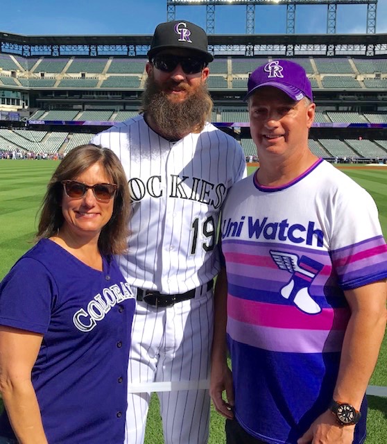
Saturday was Photo Day in Colorado, so fans got to pose with Rockies players before the game. Reader Tim Cox — shown above with his wife, Joy, and Rockies outfielder Charlie Blackmon — decided to wear his new Uni Watch 2019 Purple Amnesty Day shirt for the occasion. Looks like it fit right in!
Tim sent along some very entertaining info with that photo, so I’ll pass the purple baton to him:
Several people either commented knowingly about the shirt or asked about its significance. At a local watering hole, where we passed the time between the photo session and the game, a young guy came up to me and said “Awesome shirt! I had to decide whether to order one of those or get my Rockies-themed membership card, and went with the card on Purple Abstinence Day.” He quickly corrected himself, but not before my wife quipped, “You mean ‘Amnesty’ — every other day is Purple Abstinence Day at Uni Watch.”
During the photo hour, Rockies assistant hitting coach and former big league outfielder Jeff Salazar asked about Uni Watch. I gave him the 30-second version, which admittedly fails to capture some of the nuance, and he asked, “Why does the guy hate purple?” I took the easy way out and told him you call it “the Celine Dion of colors.” His response: “My wife LOVES Celine Dion!”
I also had a brief encounter with Julian Valentin, a guy I’ve known for a while who works in communications for the team. He commented on the shirt, and when I asked if he was familiar with Uni Watch (felt a little like an Amway moment for me — “Ask Me About Uni Watch”), he said, “Yeah, it’s a great site.”
This is all too funny (especially the Celine Dion bit). And I love Tim’s Amway line — maybe we should have “Ask Me About Uni Watch” buttons or shirts or something (longtime readers may recall that the New Girl — the woman I dated before the Tugboat Captain — collected such buttons). Also, looks like we have a new slogan: “Uni Watch: Where It’s (Almost) Always Purple Abstinence Day.”
Incidentally, I’m hoping to have something really big for next year’s Purp Walk. Way too soon to share any details, and a lot of pieces will have to fall into place for it to work, but it could be epic! Stay tuned.
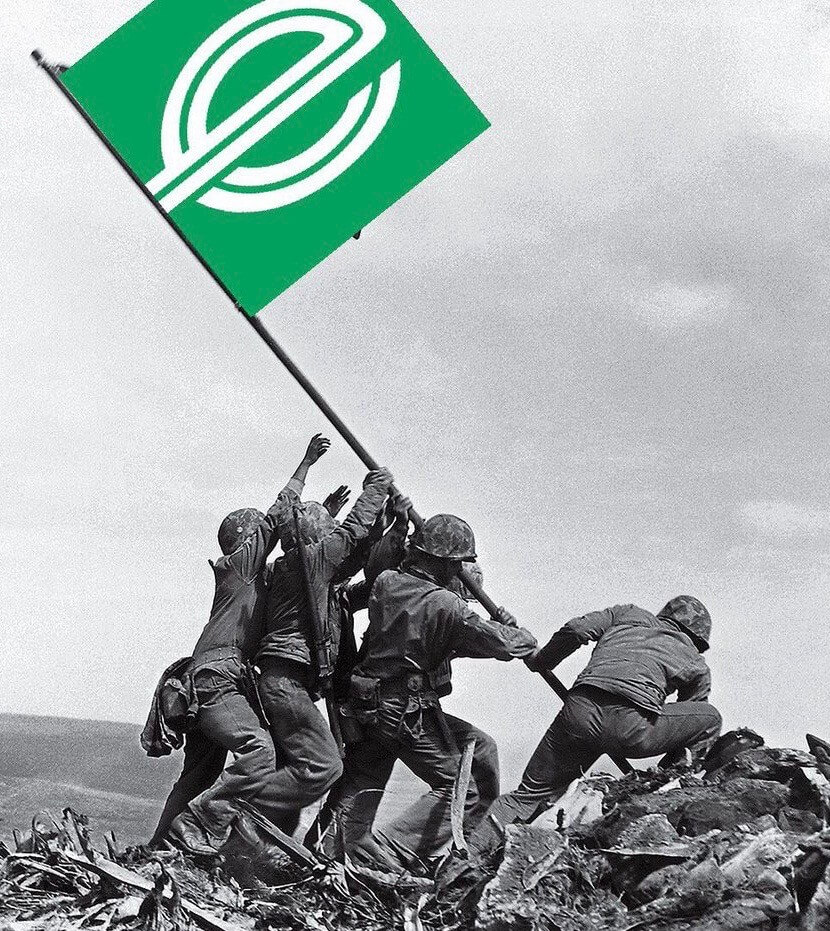
#NoAnthemAds update: The Blues apparently got the message. After yesterday’s Uni Watch entry publicly shamed them for including an Enterprise Rent-A-Car advertisement as part of the color guard during the singing of the national anthem prior to Saturday night’s Stanley Cup game, they scrapped the ad flag for last night’s anthem. The team flag that had also been part of the earlier color guard display was likewise scrapped. (Now we just have to get rid of color guards at sporting events altogether, but one thing at a time.)
To the many of you who responded in kind when I first tweeted about this on Sunday, well done. And to those who said, “It sucks but that’s just the way things are now, get used to it,” this is a good reminder that sometimes you can push back successfully, and sometimes the higher-ups really do respond.
Meanwhile, the military podcast Zero Blog Thirty will apparently be discussing the ad-clad color guard in their latest episode today. Judging by that preview, it should be entertaining.
Possibly the best thing to come out of this — aside from the Blues beating a hasty retreat — is the Iwo Jima-esque image shown at the top of this section. It was created by @TomHeartsTanks and brought to my attention by Trevor Wilson Patterson. My thanks to both of them.
Catch Around the Block: More than two months ago, on March 26, I was one of about 50 people who gathered in Brooklyn to celebrate the start of the baseball season by throwing a ball all the way around a single city block. We did it (twice, in fact), and it was a blast.
The guy who organized all of this was the artist and TV commercial director Mac Premo (who I became friends with after I wrote about his double play machine last year). He was documenting the whole project on video — much of which he shot while scooting around the block on a skateboard, which was really something to see — and said he’d have the whole thing edited and ready to go in a couple of days. As it turned out, it took him more than two months, but now it’s finally done.
The video is fun (you can see me catching the ball at the 0:36 mark), but it doesn’t capture the giddy spirit of the day, which was amazing. Mac is a very charismatic guy, and his enthusiasm is infectious, so he’s good at getting people on board for his projects — even if they involve doing crazy shit like having dozens of people throwing a ball around in the middle of Brooklyn traffic.
Many people, myself included, showed up wearing jerseys; for those who didn’t, Mac had a bunch of Ebbets Field Flannels jerseys on hand. Before fanning out around the block, we all warmed up by tossing a few balls around in front of Mac’s studio. Here’s Mac catching a ball thrown by his dad, who wore an Angels halo-topped cap and a Padres jersey (click to enlarge):

I took a bunch of additional photos, which you can see here.
The only thing I feel bad about is that a Uni Watch reader showed up and introduced himself to me. We chatted a bit — really nice guy. I didn’t write down his name because I figured I’d remember it. But because of the delay with the video, so much time has gone by that I no longer recall this guy’s name. Anyway, we posed for a nice photo (click to enlarge):

If that guy is out there and sees this, please shoot me a note so I can identify you properly. Thanks!
Click to enlarge
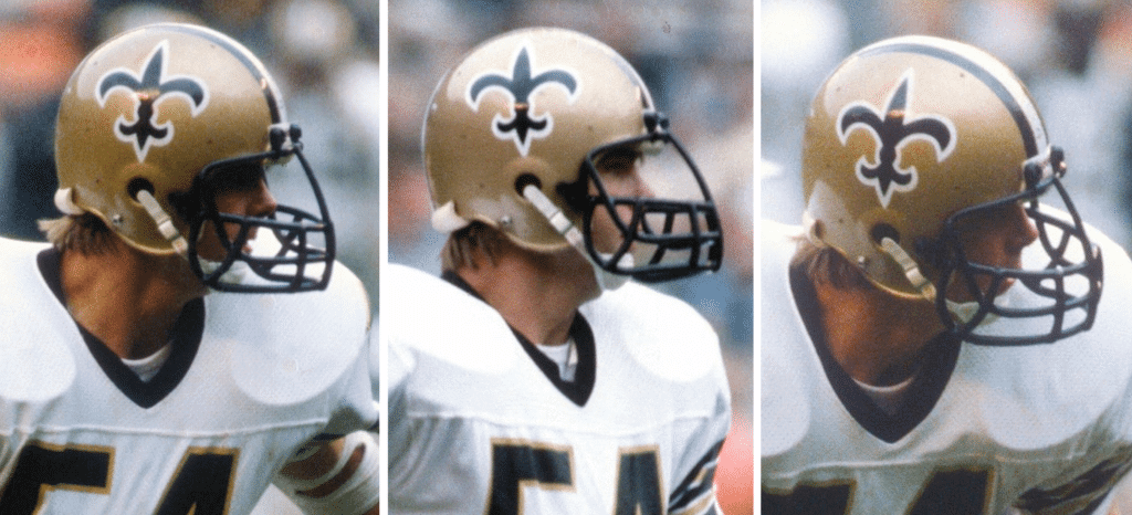
Mystery mask: Check out the very unusual facemask worn by former Saints linebacker Pat Hughes. It projects so far out from his face! These shots are all from a Oct. 28, 1979, game against Washington. Anyone know more..?
(Props to @1970sNFL for finding these photos and to @MJM5477 for bringing them to my attention.)
Click to enlarge
Collector’s Corner
By Brinke Guthrie
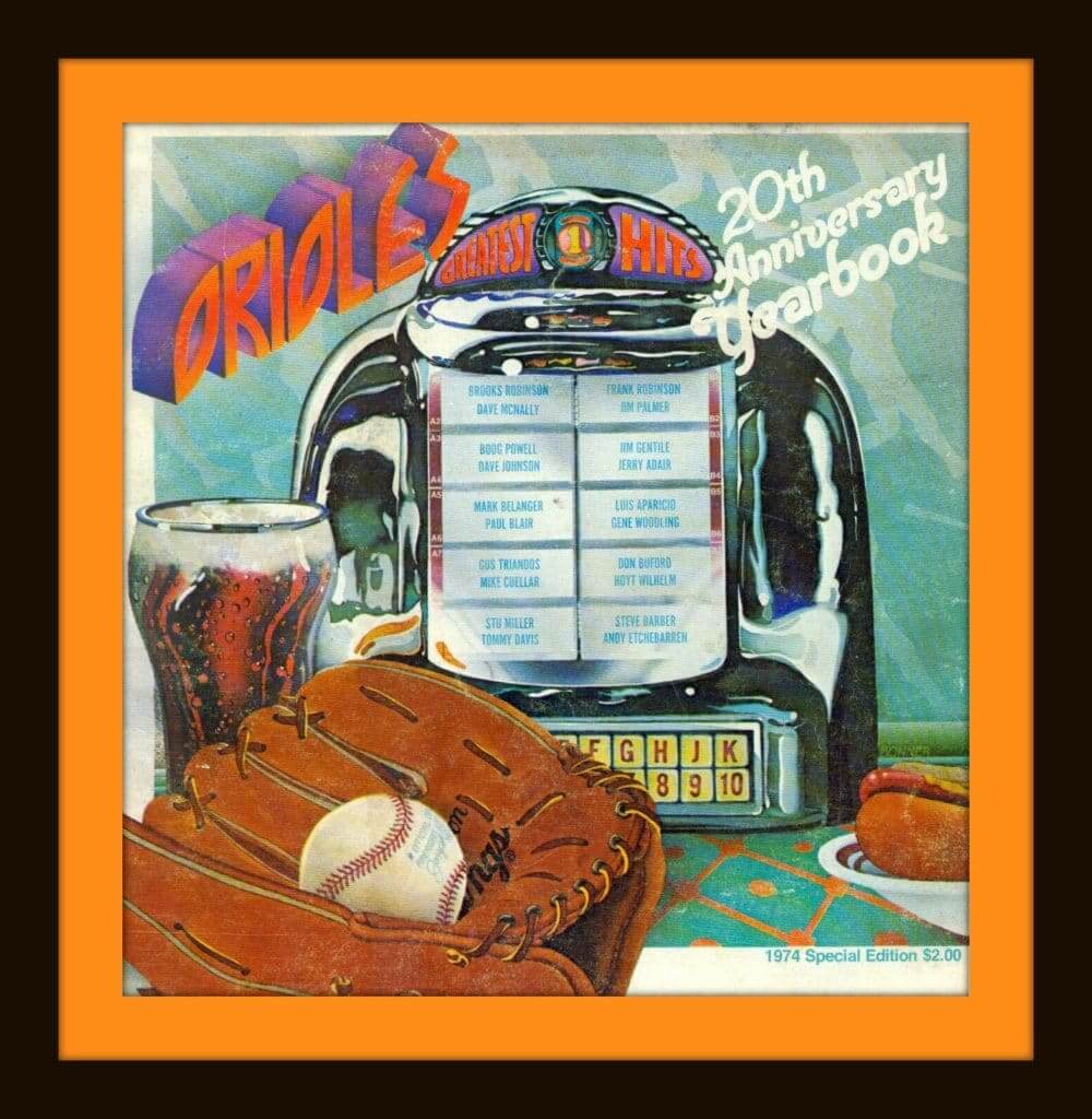
Terrific artwork for the cover of this 1974 Orioles yearbook, right? It instantly reminded me of the movie American Graffiti, as well as 1976’s Best of the Doobies and Foreigner’s Records from 1982.
Now for the rest of this week’s picks:
• This 1960s Washington Senators glass mug has powder blue colors, even though that wasn’t really a Sens color.
• While this Sears Chicago Bears helmet plaque is genuine — check the label on the rear — the “C” on the helmet is not.
• You can get a good idea of how the halo looked on this 1960s California Angels baseball cap from the photos the seller provided.
• One more from Sears: This Baltimore Colts kid’s bathrobe looks to be early-1980s (they moved from Baltimore in 1984).
• I like the batter silhouette as shown on two of the four designs in this lot of New York Mets pins.
• Maybe this was just made up by someone, but I don’t recall the Pirates ever using the mascot shown on this “travel decal sticker” as part of their visual program.
• I think the drawing of the batter was just thrown on this 1960s Oakland A’s pennant. Not a part of their visual identity either.
• Here’s a lot of 1970s Sportoys helmet buggies for four AFC East teams: the Colts, Jets, Pats, and Bills. And I finally found one for the Niners, but the condition doesn’t warrant the seller’s asking price.
• Got a pair of matching 1970s AFC/NFL thermal cups, from the International House of Pancakes. Also check out this 1974 iHOP NFL placemat (which we’ve previously featured here but it’s still cool).
• Also previously featured but worth an encore: this pair of 1970s red canvas sneakers with MLB logos about the outsole.
Seen an item on eBay that would be good for Collector’s Corner? Send any submissions here.
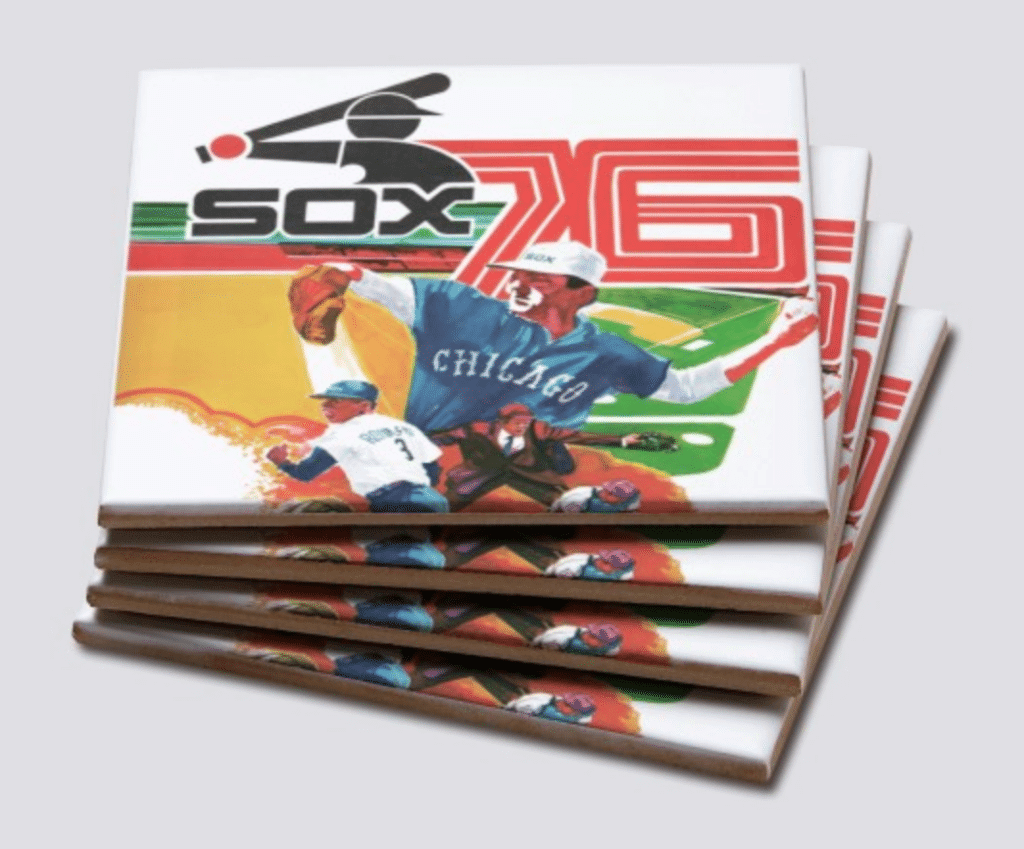

Raffle reminder: In case you missed it on Monday, our longtime advertiser Vintage Brand is running another raffle. The lucky winner will be able to choose any item from the Vintage Brand website (like the groovy White Sox coaster set shown above).
To enter, send an email to the raffle address by this Thursday, June 6, 7pm Eastern. One entry per person. I’ll announce the winner on Friday.
In addition, Vintage Brand is currently running a site-wide 20% sale. No need to enter any discount code — when you get to the checkout page, you’ll automatically get 20% off. Not bad!

Membership update: We don’t usually like to design membership cards in a vertical orientation, but every not-so-often it becomes necessary. That was the case with Zach Barnes’s new card, which he ordered on Purple Amnesty Day, because he asked for it to be based on the Coyotes’ infamous alternate jersey, whose only purple elements are down at the bottom of the desert landscape on the lower part of the jersey. If we had done it horizontally, showing that much of the lower jersey would have forced us to make the uni number and NOB really small, so instead we opted for the vertical format.

We faced a similar issue with the card request from Alec Jokubaitis, who wanted another infamous design from another Arizona-based team: the Diamondbacks’ TATC jersey. As you can see, rendering the NOB in the proper stacked format forced us to make the uni number fairly small. Orienting the card vertically would have solved that problem, but it would have short-changed the wraparound snake design, which is really the whole point of the jersey, so we kept it horizontal.
These two cards are among several new designs — all featuring purple! — that have been added to the membership card gallery (which is now up to 2,200 cards!).
Ordering a membership card is a good way to support Uni Watch (which, quite frankly, could use your support these days). And remember, a Uni Watch membership card entitles you to a 15% discount on any of the merchandise in our Teespring shop and our Naming Wrongs shop. (If you’re an existing member and would like to have the discount code, email me.) As always, you can sign up for your own custom-designed card here, you can see all the cards we’ve designed so far here, and you can see how we produce the cards here.
Uni-versary reminders: In case you haven’t seen it already, here’s the spreadsheet showing all the Uni Watch 20th-anniversary gatherings that have been set up so far, along with a list of cities where readers have expressed interest in attending a gathering, although no organizer has yet stepped up. If you want to host or attend such a gather, contact party coordinator JohnMark Fisher.
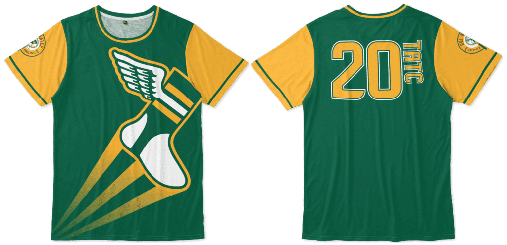
Meanwhile, I hope by now most of you are aware of our awesome “Turn Ahead the Clock Shirt,” which celebrates the dual 20th anniversaries of Uni Watch and MLB’s infamous 1999 TATC program. You can order it here.
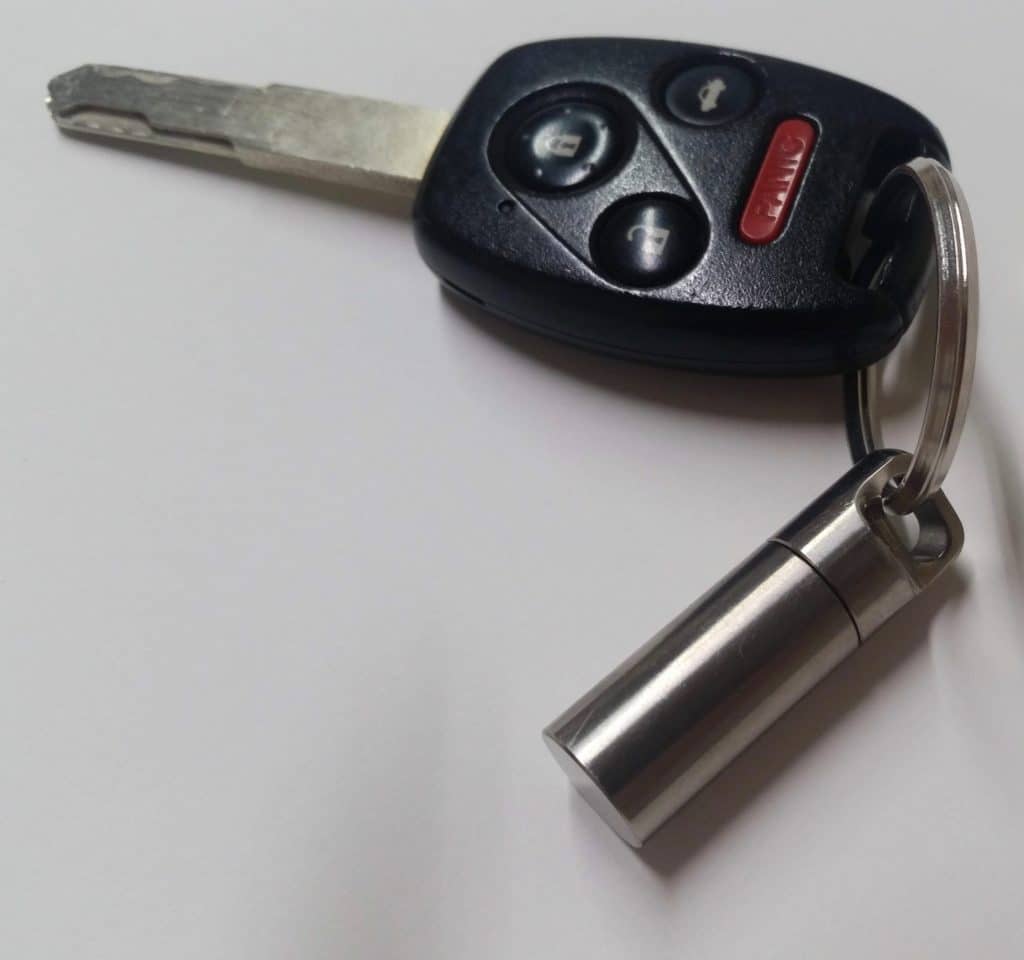
KRC update: The latest installment of Key Ring Chroicles is a short but powerful entry about a woman who keeps a titanium pill container on her key ring. Check it out here.
The Ticker
By Paul

’Skins Watch: Light-middleweight boxer Jarrett Hurd had the ’Skins logo on his trunks for a bout last month. Don’t think I’ve ever seen a fighter wear a pro sports team’s logo like that before (from @GuyDeBordsGhost). … A Philadelphia neighborhood is reconsidering its logo design, which features a Native American figure in an area-inappropriate headdress. … The Brooklin Lacrosse Club of Major Series Lacrosse — which as you may recall recently stopped calling itself the Redmen — has new uniforms to go with its new identity (from Wade Heidt).

Baseball News: Star Wars uniforms this Saturday for the Sussex County Miners of the CanAm League (from John Cerone). … Latest one-game MiLB makeover: The Wisconsin Timber Rattlers will become the Udder Tuggers on June 20 (from Brian Kerhin and John Okray). … Jewish Heritage Night upcoming for the Brooklyn Cyclones, complete with a Hebrew-lettered jersey. It translates to “Cyclonim” (the “-im” suffix indicating plural in Hebrew), so it’s grammatically correct! (From @UntilTheNight.) … Here’s a new one: The Akron Rubber Ducks will rename themselves after an insanely huge ice cream sundae sold at their ballpark on June 14. … Credence Clearwater Revival-themed jerseys upcoming for the Stockton Ports (from Mike Chamernik). … The Orioles will give away this Maryland flag-themed jersey on June 29 (from Andrew Cosentino). … Brewers players have been saluting broadcaster Bob Uecker by wearing “Air Uecker” apparel. … Didn’t realize that Heisman Trophy winner Kyler Murray had been part of the pants-over-the-knee brigade during his baseball days at Oklahoma (from @Webbdingus). … In a related item, reader Steve Tilders had a front-row seat behind home plate at a recent Rockies/D-backs game and got several up-close-and-personal shots of D-backs players wearing their pants disturbingly high. Click on those thumbnails if you dare. … Michigan had multiple coaches wearing No. 23 last night (from Don Schafer).

NFL News: Looks like the Rams’ new stadium will be shaped like their logo (from Luke Buckley). … Fred Gaudelli, executive producer of NBC’s Sunday Night Football telecast, thinks the NFL should scrap the Rash. Key passage: “I think the NFL should flush the Color Rush uniforms. My gut says this is an age thing and your preference reflects your age. Regardless, there is tremendous equity in the uniform of an NFL team. When you turn on a game you know exactly who’s playing. At least that’s how it was for about 95 NFL seasons. The 49ers never wore black, so why now? Maybe some 10-year-old boy loves it. Me, not so much” (from Gil Neumann). … Check out this old St. Louis Cardinals team portrait. Look at the logos below the photo — odd to see that white outline on the cardinal’s face (from Pro Football Journal). … You have to look closely to see it, but it appears that Bucs DL Ndamukong Suh was still wearing his old Rams gloves for this photo shoot (from many readers). … Here’s an extreme close-up of the NFL 100 collar logo on a Saints jersey (from Blake Parker). … New York Mets fans, upset by the news that Patriots QB Tom Brady has filed a trademark application for the term “Tom Terrific” — a term that Mets fans believe should be applied only to Tom Seaver — are planning some sort of idiotic rally today where they plan to burn Brady jerseys. Yeah, that’ll show him. … UNC’s new stadium surface will be AstroTurf (from James Gilbert).

NBA News: NBA team owners may be backing away from the title “owner,” instead using terms like CEO or chairman, due to concerns raised about racial insensitivity. The linked article misspells the word “feudal” and “futile” in a key quote (from Tom Turner). … GE spent all that money on a Celtics ad patch and they wouldn’t even show it on The Bachelorette. Ditto for the maker’s mark. You have to admit, it looks better that way. … Raptors F Kawhi Leonard is suing Nike over the rights to his “Klaw” logo (from Brian Smith).

Soccer News: The daily download from Josh Hinton: New leaks for PSG, Barcelona, Manchester City, and Real Madrid; legit releases for Cameroon’s women’s team, Botswana, Walsall, Venezuela, and Shrewsbury Town; new shirt sponsors advertisers for Blackpool and Wolverhampton; how to tell the difference between authentic and replica shirts for the top five Adidas-outfitted teams; and a Champions League ball design. Phew! … The president of the Angolan Football Federation stated that they chose Lacatoni over Nike, Puma, and Adidas because Lacatoni was the only company that listened to the federation’s design ideas (from Mike D). … New home kit for Oxford Uinted (from Ed Zelaski).

Grab Bag: Here’s a breakdown of what both fighters wore in last Saturday’s heavyweight title bout as Andy Ruiz Jr. upset Anthony Joshua. That’s from a blog called Styles Make Fights that looks at boxing attire. Hadn’t known about that one before (big thanks to @GuyDeBordsGhost). … Organizers of this year’s Sacramento Pride parade will not allow local police officers to participate in the parade while in uniform. … Presidential candidate Pete Buttigieg’s “uniform” is to roll up his sleeves. … Here’s the backstory on the redesign of The Philadelphia Inquirer’s logo. … A Florida corrections officer was charged for DUI while in uniform. … New logo for the Philly sports talk station 94 WIP (from @PhillyPartTwo). … ” The Brampton Excelsiors of Major Series Lacrosse have a long history, dating back to 1883,” says Wade Heidt. “The team had been community-owned but was struggling to make ends meet, so last year it was sold to Joe Norton, owner of Detroit-based Bug Juice Co. Now they’ve traded in their old look for new uniforms are a walking billboard for Bug Juice.” … New logo for the rugby union side Glasgow Warriors. “Very unpopular with fans,” says Josh Gardner. “Feels very Brandiose.” … The son of a fallen Louisville police officer was given a teddy bear made from her uniform. … Now-dethroned Jeopardy! champion James Holzhauer wore a purple ribbon in what turned out to be his final appearance on the show. Although no explanation was given, purple is the color of support for victims of pancreatic cancer, which has afflicted Jeopardy! host Alex Trebek.
Bob Eucker should be spelled Bob Uecker.
Fixed.
*Uecker
Fixed.
ERRATA:
1. East Passyunk is a neighborhood in Philadelphia and not its own town.
2. Bob Uecker, not Eucker.
3. Link to the LA Stadium isn’t working.
Great work articulating why the corporate logo in the color guard is wrong. Good to see that someone paid attention.
Fixed.
Should be Angolan FA not Algerian, and broken link for Rams stadium
Fixed!
” Check out this old St. Louis Cardinals team portrait. — odd to see that white outline on the cardinal’s face.”
Also, there is no beak/mouth line, and the eye is different. But the overall shape of the logo is correct. Odd indeed.
Setting aside the weird external footprint of the new LA stadium, it’s nice to see that they built it as a complete oval on every level. I never understood why some football stadiums have quirky cutouts (looking at you, Lincoln Financial Field). It isn’t baseball. The fields are all the same dimension. The best home-field advantage in football is getting as many loud people near the action, so why some teams chose to not build 2 (or 3) complete levels ringing the field is beyond me. More seats, more revenue, and so on. Stadium aesthetics is less important in football than in baseball, and nobody can say with a straight face that billionaire boys’ club running the NFL teams would prioritize aesthetics over getting more paying butts in seats.
The process of designing a stadium is much more than just designing the least amount of architecture to get the most amount of seats.
There are city design standards to deal with, design managers, The NFL, an owner who may want certain things, the long negotiations over the budget and value engineering, building codes, etc etc etc.
As for the budget, there is a sweet spot for each stadium regarding number of seats. Too many seats and you’ve spent too much on construction, too few seats and you’re losing revenue. Budgets and shareholders and ROI are always driving forces, it’s not just some owner saying here’s $2B, go build me a stadium.
In regards to the St.L Blues removing the “Car Rental Co.” Flag, I do hope the Team ultimately responded to backlash, led by Uni-Watch. However, I have to also wonder if NBC had anything to do with it in terms of an advertising contract with the NHL and the Stanley cup broadcast. In other words, is car-rental-co already paying for ad space during commercials? If not, is this seen as extraneous advertising not paid for and thus obligated to be excluded under the contract between and BC and the NHL?? An academic curiosity…
* NBC and the NHL
That company, aside from turning the Blues arena name into an ad, also happens to be an official NHL
“partner”advertiser. Also, the Blues team flag was likewise scrubbed from the color guard. These two factors suggest that they were responding to the backlash.Destroy Your Own Stuff has got to be the lamest form of protest ever conceived.
Very true but it’s not a bright move on Brady’s part to trade mark “Tom Terrific”, especially when it was recently revealed that Seaver has dementia.
I wonder if the above the knee trend in baseball is connected to the shorter shorts trend in basketball?
That entire SNF piece with the Color Rush anecdote is awesome.
Let us pray the NFL color rash doesn’t morph into the NCAA lunacy where some teams wear different uni’s and colors every week.
Mad respect for Kawhi if he did in fact create his logo himself by tracing his hand! Hope the suit (and finals) goes well for him.
On first read my thought about them covering up the Celtics uni ads on The Bachelorette reminded me of something a friend said to me a long time ago in the early days of corporate stadium names. He and I are both onetime newspaper reporters; he’s a longtime Detroit Tigers fan. When I bumped into him at a wedding shortly before New Tigers Stadium opened and asked him “what the hell is Comerica, anyway?” he responded with an inspired rant against corporate naming, one part of which was this: News outlets should not use any corporate name in their reporting unless that corporation has paid that specific outlet for advertising. In other words, it doesn’t matter how much money Comerica paid the Tigers, if they aren’t paying the Detroit Free Press to advertise for them, the Freep shouldn’t use that name. It was the first time I realized that the free advertising gimmick inherent in corporate stadium naming only works if people go along with it, and that media outlets (who ordinarily don’t give away their ad space for free) are the ones most guilty of perpetuating the gimmick.
So, at first glance, I said “aha! GE and Nike did not pay ABC to run ads on The Bachelorette. So therefore they get their logos/ads on the Celtics jerseys blocked out. Bravo, ABC!”
I still hope that’s really what happened. I can’t help but think what actually happened is that one or more of the corporations that DID pay ABC to run their ads on The Bachelorette insisted that the uni ads get blocked on the jerseys. (Along the lines of the NCAA cup-sponsor douchebaggery visible during March Madness.)
I would love for somebody to figure out if uni ads could be pixelated during live action at a sporting event, though.
But ABC/ESPN broadcast NBA games, with the logos in plain view. They spent billions for the rights to NBA games and the association therefrom; the logos are part of the deal, I would think.
ABC doesn’t have a deal with the Jersey ad sponsors (GE and Nike, here) just by virtue of their deal to broadcast the NBA.
Essentially the basis of the Naming Wrongs shirts.
News outlets should not use any corporate name in their reporting unless that corporation has paid that specific outlet for advertising.
Neither should individuals. Yeah, sometimes I slip up and use their names but I make it a point to just say “the Tigers’ stadium” or “the Cavs’ arena” or “the Steelers’ field” in my everyday conversation. If Comerica, Rocket Mortgage and Heinz want me to advertise for them, pay me a reasonable fee.
It’s also the media’s job to report accurately.
While I certainly understand the opposition to naming rights deals, the owners of the facilities – whether municipal or private – get to say what a venue is called.
You may not like it, the newspaper may not like it. But to call it by something else because an outlet “likes the sound of it better” is, IMO, not good, basic journalism.
If an outlet wants to use its bully pulpit to advocate for a change through columns, editorials, coverage of those with that point of view, so be it. But that doesn’t change the venue’s proper, legal, name.
I may think it’s dumb that Dunkin’ Donuts is just now Dunkin. Or that Weight Watchers is WW. But it’s their choice to name themselves.
I may think it’s dumb that Dunkin’ Donuts is just now Dunkin. Or that Weight Watchers is WW. But it’s their choice to name themselves.
I think it’s a little more nuanced than that. What a company chooses to call itself is one thing — that is an issue of identity. But when you sell the name of a building to a third party, that is an issue of commerce. Once you sell off your identity, that muddies the waters, especially if you sell it to someone who’s essentially using it as a billboard. Just because an advertiser has paid for our attention does not mean they are automatically entitled to that attention.
I agree with your general point that reporters should report accurately. But referring to “the Tigers’ stadium” is every bit as accurate as “Comerica Park” (just as “the Washington NFL team” is just as accurate as “Redskins”).
I disagree in the sense that news articles are supposed to be written with as little bias as possible, and therefore intentionally obfuscating the actual name of a place or team reflects a bias (namely, that the news outlet or reporter doesn’t think they *should* be named what they are).
1) Not every piece of journalism is a news article. There are analyses, critical reviews, opinion pieces, etc.
2) Every single piece of journalism, including news articles, reflects bias. The simple choice of what to cover and what not to cover is the biggest bias of all (that’s why the lineups of news stories at MSNBC and Fox News are so different). Every single word choice, every single edit, the choice of whether to include a photograph, what to photograph, how to crop the photograph, who gets quoted and whose voice is left out, whether to put the story on the front page or bury it inside, etc., etc. — it’s an endless series of choices and decisions, each of which reflects bias.
The myth of unbiased journalism is just that — a myth. That doesn’t mean journalism can’t be responsible, ethical, and accurate. But as long as we’re human beings, there will always be bias.
I know, I know — you said “as little bias as possible.” But one could just as easily argue that saying “Comerica Park” instead of “the Tigers’ stadium” shows a bias toward Comerica, or toward capitalism run amok, or toward any number of other things.
One problem with advertising worming its way into every corner of our lives, including stadium/arena names, is that it disrupts many longstanding norms about journalism by turning simple reporting — of a stadium’s name, say — into another vehicle for advertising. That’s a problem in our society, and it’s one we’re still working out. I’m not saying it’s *wrong* for a media outlet to say “Comerica Park,” but I definitely don’t think it’s wrong to say “the Tigers’ ballpark.”
At the risk of sounding like a douchebag, I will just say that from the point of view of somebody who has a journalism degree, if you are reporting on events that took place at Comerica Park then you should refer to it as Comerica Park, because your job is to provide to the reader all the essential information about the story in as concise a manner as possible.
Once you decide to replace the actual name of the setting of the game with a euphemism that you wouldn’t have used in a situation where the stadium didn’t have a corporate name (for example, you’d never call Fenway Park “The Red Sox’s ballpark”), you’ve made an editorial decision based on your feelings of the way things should be, as opposed to the way things are.
But, yes, you are correct that journalism encompasses much more than straight news stories, and if a writer wants to omit a corporate name in an opinion piece nobody will object. But if a newspaper refuses to acknowledge that a game that took place at Comerica Park took place at Comerica Park, that’s bad journalism.
Of course, one response to the “[Corporate Name] Stadium is the name of the stadium and should be referred to in news stories by its accurate name” argument is that sports columnists (who by definition are writing opinion pieces, not news stories) could refuse to use the corporate names, on the grounds outlined above. I have not seen any columnist do this as an across the board policy but would love it if one did. (With more to follow.) Their editors would have to back them up on it, but at least the hard-news “accuracy” argument wouldn’t be a reason not to allow it.
The other response to the “accuracy” argument is the one I made in my main comment. The entire reason that naming rights are a thing is to receive free publicity. And before you say “the Tigers are a corporation too, and besides news stories are written all the time about all sorts of companies, which is also free publicity,” the difference is that other than having paid money to put their corporate name on the ballpark there’s no connection between Comerica and any news story written about the team. So the mentions of the corporate names are truly free publicity in that the name otherwise would not appear in the story. To repeat, news organizations do not usually advertise for free, but yet they do it in this context without blinking. Those who purchase naming rights are counting on the news organizations to use the corporate names, probably because of the “accuracy” argument, and if the news orgs pushed back and said “we can write accurate articles without using the corporate names,” the practice might disappear altogether.
Great looking Kutztown U Jersey, Paul!
Thanks! Got that about a dozen years ago at a vintage shop.
Michigan’s head coach Erik Bakich and assistant Nick Schnabel played at East Carolina fro Coach Keith Leclair. Coach LeClair died several years ago from Lou Gehrig’s Disease. Coach LeClair wore #23 so they wear that number to honor him. Head Coach Cliff Godwin at East Carolina wears 23 as well. Both East Carolina and Michigan advanced to the Super Regionals last night do it was quite a night for Coach LeClair’s coaching tree.
Great info, Brian. Thanks!
I lived next door to the pizza place (sesame seeds on the crust in case anyone’s wondering) on Smith at Bergen for three years (pre-Dunkin Donuts days).
Fun to see my old stomping grounds in the “Round the Block” clip!
@Paul Is Boat still there?
Yes!
Maybe not quite as good as the Iwo Jima photoshop, but I do like the notion that Hertz is the Confederacy
link
Aren’t the Chargers going to use the new LA football stadium, along with the Rams? If so, didn’t the Rams go out of their way to brand the stadium as theirs, making the Chargers appear to be a mere tenant?
The Chargers essentially are a tenant. The stadium was originally planned for the Rams before the Chargers moved to LA.
Yes, but the Chargers essentially are a tenet. Rams owner is funding the entire thing.
What a great lede today.
I got my purple amnesty shirt in the mail yesterday, I was going to wear it to my son’s little league game tonight and get a photo with the kids wearing stirrups (making a comeback here as I mentioned on twitter a while ago!), but I can’t top this.
As usual, my wife claimed to the Purple Amnesty Day shirt as soon as it arrived.
Today’s lead photo is a great illustration of the fault in the Rockies uniform design. On the one hand, the Rockies have a nice home uniform. A B-plus uni. But the black cap and black-and-silver lettering make the uniform look like a predominately black uni, and even the pinstripes don’t “read” as purple under the black cap and black lettering. The Rockies end up looking like an almost-as-good White Sox like how the Royals look like an almost-as-good Dodgers.
Whereas the purple cap and the purple-dominated Purple Amnesty Day shirt, each with minor black accents, look fantastic and make the distinctive color pop. The Rox look fine, but with color tweaks that would emphasize the purple, they could look great.
I’m kind of surprised regarding Adidas authentic vs replica soccer jerseys that the authentic have heat pressed club logos while replicas are embroidered, would have thought it was the other way around.
As an aside, I follow FC Porto and have had some replica stuff over the years. When adidas and kappa made their kits, the kit advertiser used to be sublimated and with Nike and New Balance I believe they switched to heat pressing and the latter definitely feels cheaper and I can’t imagine it would be super comfortable to play in
I watched a good PBS documentary about Ted Williams on Netflix a week or two ago. I’m not sure if they have any other players.
Off topic question: does anyone have any recommendations for baseball documentaries? I’d love to see more good ones but the sport doesn’t seem to have the library of, for example, NFL Films. Also, I’ve seen the magnificent “Baseball” by Ken Burns.
If you are interested the history and evolution of baseball parks, try this one:
link
Dave, YouTube is the place to go for a ton of great sports related documentaries! It’s a godsend for us historians.
HBO’s ran a series many many years ago called “When It Was A Game” which featured ‘never-before seen’ home movies shot by players (mostly?). Highly recommended.
Seconded.
My opinion. I happen to like color guards. While some might not like the demonstration of national pride before games, I do like it. Mainly because it represents the sacrifices made by those in our country who made and continue to make it safe and free.
And at any rate, we all know the last two words of the National Anthem are “Play Ball”.
While some might not like the demonstration of national pride before games, I do like it. Mainly because it represents the sacrifices made by those in our country who made and continue to make it safe and free.
Except that this color guard was comprised of St. Louis police officers, not U.S. military members, and therefore had nothing to do with “national pride.” And as noted yesterday, the Blues dangle participation in the color guard as a way to pimp ticket sales, so the whole thing becomes just another dress-up play exercise.
(Now we just have to get rid of color guards at sporting events altogether, but one thing at a time.)
Plenty of Public Service organizations form color guards, among them include the Military, Public Safety (Police, Fire), Boy Scouts, Knights of Columbus and various other paramilitary organizations. These organizations take on patriotism as part of their core services/beliefs, and as part of their provided services, provide Color Guards.
I agree that the Blues and Enterprise flags were inappropriate.
I in no way agree that a color guard is a “dress-up play exercise”.
Tim, if you’re reading this I wanted you to know I saw you walking into the stadium with your UniWatch shirt on but I couldn’t get to you. I hoped I would see you again at some point, but I never did. Anyway, thanks for representing!
Fellow Rockies/UniWatch fan,
Keith
Hey Keith, I just caught up with your comment. Sorry you lost me in the crowd on Photo Day – you have to admit I did about as much as I could to make myself visible!
Enjoyed the Around the Block video, but it really irked me that half the people turned the wrong way on the relay. Glove side people. Loved the flannels as well.
“Incidentally, I’m hoping to have something really big for next year’s Purp Walk.”
Baseball sweater or varsity jacket!
The multiple Michigan baseball coaches wearing #23 is not a one time thing, not sure why but it has continued and they are wearing #23s again today (6/8/19 Super Regionals Game 2). I would love to know why if anyone knows.