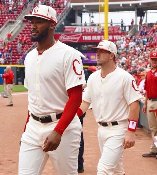
The Reds played the third of their 15 throwback games yesterday, turning back the clock to 1912. As you can see above, this uniform had a minimalist design, with nothing on the front of the jersey (although the cadet collar, which I really like, adds a bit of visual interest). The original 1912 version was even more minimalist, because uniform numbers hadn’t yet been invented, so the jerseys were blank on both the front and back. But that wasn’t the case yesterday, as the Reds used an old-timey number font:
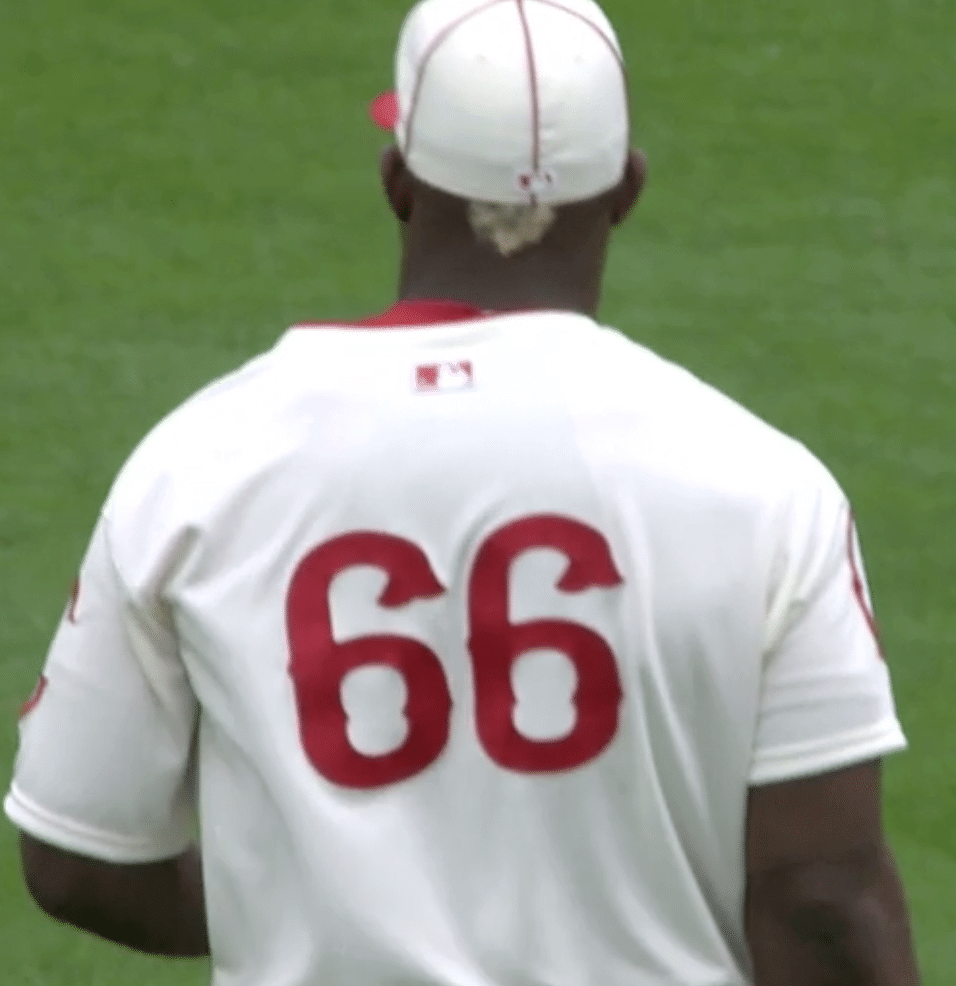
I really liked this one — no-frills, sure, but handsome.
A few other notes from yesterday’s game:
• If you look again at the header photo, you can see that the two caps don’t match. That’s because pitcher Amir Garrett, on the left, mistakenly wore the cap from the 1902 throwbacks, which the Reds wore on May 4. Garrett didn’t appear in yesterday’s game, so it didn’t really matter.
This jersey, like the Reds’ two previous throwbacks, was a henley pullover, not a full button-front:

• Another weird thing about this jersey is that it had matching left and right sleeve emblems:
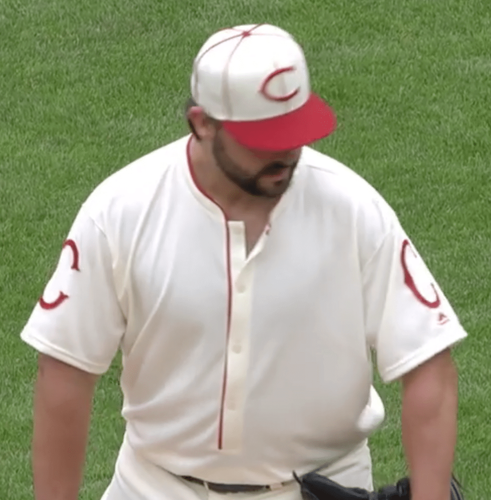
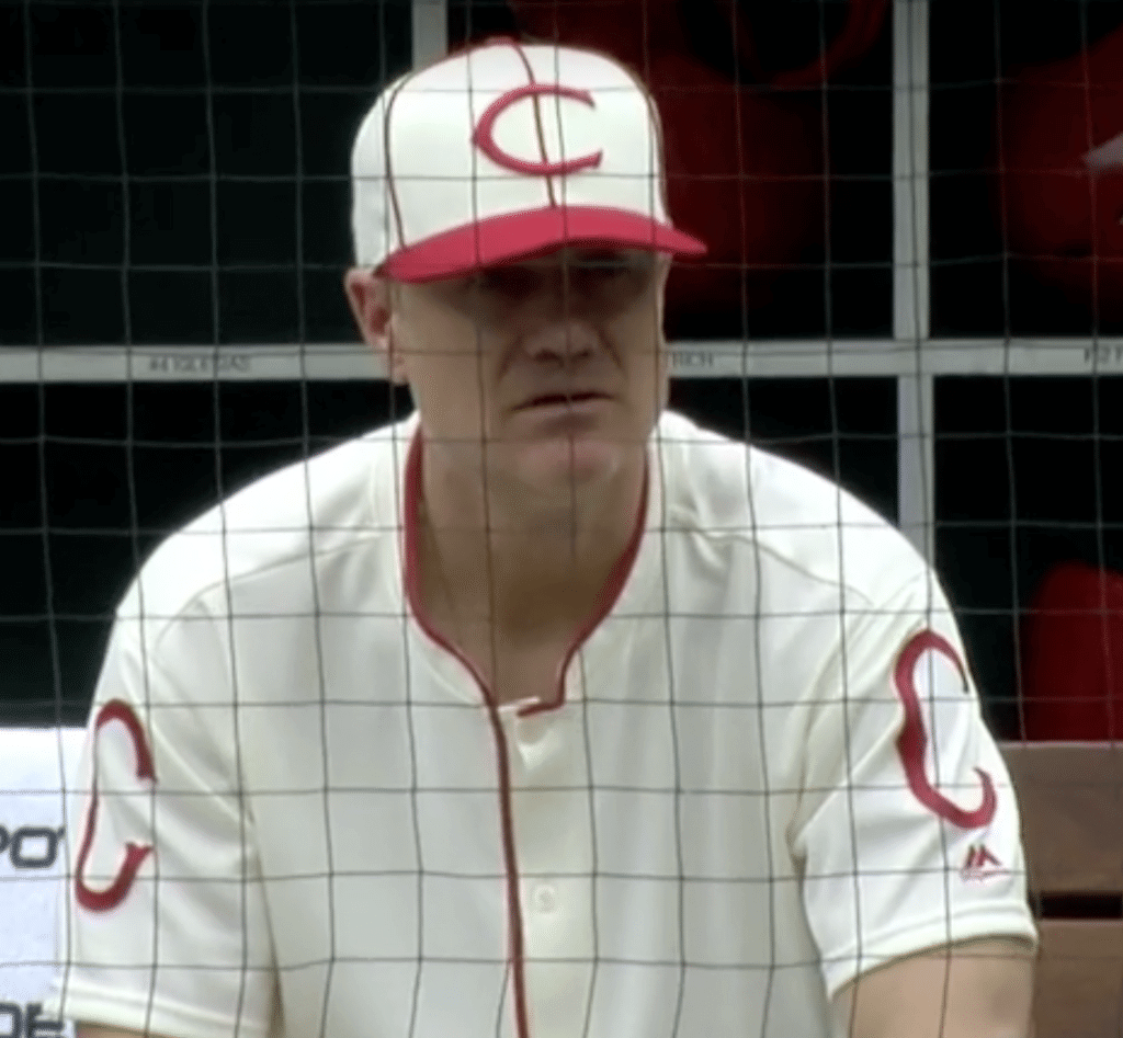
That’s pretty rare. I know there have been a few other examples, but I couldn’t think of any off the top of my head, and it’s not an easy thing to research on Dressed to the Nines because the mock-up template doesn’t show the right sleeve, so I asked uni designer/historian Todd Radom, who said, “That was a Washington Senators hallmark for many years, long after anyone else still did it. Dodgers and Pirates did this too, I believe.” Sure enough, here are some Sens examples from the 1920s and ’30s. I haven’t had time to look for the Dodgers and Pirates examples that Todd was referring to. Anyone..? (Update: Todd just sent me examples of the early-1930s Dodgers and the late-1920s Pirates.)
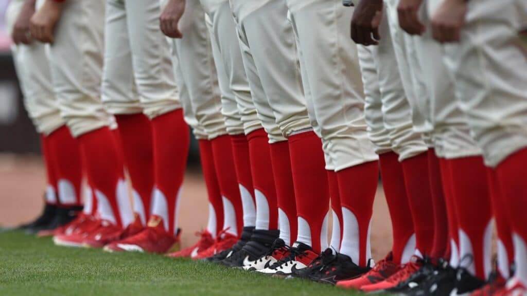
• The good news is that most players wore stirrups; the bad news is that the stirrups’ foot openings were much too large, resulting in an era-inappropriate amount of white showing through (click to enlarge):
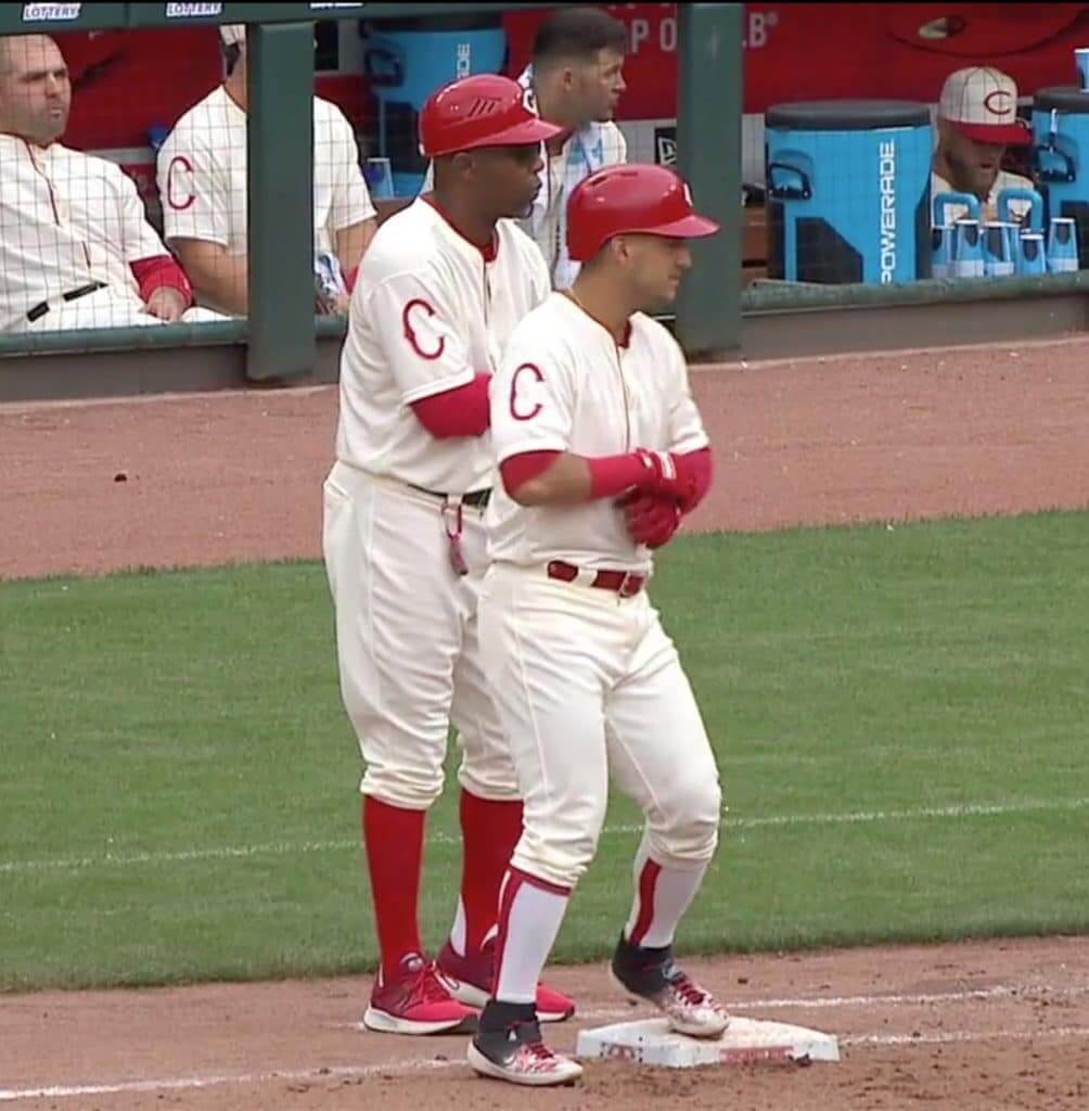
• The worst news is that shortstop Jose Iglesias wore some absolutely brutal two-in-ones that should never have been allowed on the field for a throwback game (or, really, for any game, but especially yesterday; click to enlarge):
• While everyone else wore the godawful G.I. Joke caps yesterday, the Reds avoided that nonsense by wearing their throwbacks — brilliant! Looking ahead, they’ll catch a similar break on July 6, when they’ll be wearing their 1939 throwbacks while everyone else will be stuck wearing the flag-desecration caps for Independence Day Independence Four-Day Festival. So the Reds have shown how to game MLB’s holiday-creep merch-dump system: Just schedule a throwback game — problem solved!
Next up: The Reds will wear 1919 World Series throwbacks — including pinstriped caps, complete with pinstriped brims — on Sunday, June 2.
(My thanks to Hunter Childress, Jakob Fox, Steve Polce, and our own Alex Hider for their contributions to this section.)

Click to enlarge
Entertainingly confusing situation in the making: Interesting development yesterday in Detroit, where the A’s/Tigers game was suspended due to rain after seven innings. It was later announced that the game will be resumed on Sept. 6 — but in Oakland, where the two teams already have a game scheduled for that date. They’ll finish the suspended game first, and then play the regular game. So for the resumption of the suspended game, the Tigers will be the “home” team (i.e., batting last) and the A’s will be the “road” team, even though the remainder of the game will be taking place in Oakland.
Now, it’s possible that the Tigers will pack their home unis for that September road trip, and that they’ll suit up in their home unis for the resumption of the suspended game and then switch to their road unis for the regularly scheduled game. But I think it’s much more likely that they’ll just wear their road unis for both games (especially since there are only two innings to go in the suspended game), which means the Tigers will be wearing their road design as the home team, with the A’s doing the opposite. Crazy! I’ve asked both teams for clarification and will report back if I get more info from them.
Whichever uniforms the teams wear, I’m assuming they won’t wear the G.I. Joke caps for the resumption of the suspended game. So there you go, another way to avoid the holiday nonsense: Get rained out, problem solved!
ITEM! Purp Walk recap: Purple Amnesty Day, which took place on Friday, was a hoot. We got 45 membership orders (an all-time record) and sold nearly 100 of the spectacularly hideous purple sunrise shirts. Fun!
But the most interesting thing was the way people started posting their favorite purple uniforms over on Twitter. This seemed to happen pretty organically, without any help from me, and it was really fun to see. For next year’s Purp Walk post, I’ll post a ranking of my own favorite purple uniforms (yes, I do have some!), instead of just trotting out my boilerplate explanation for why I dislike purple.
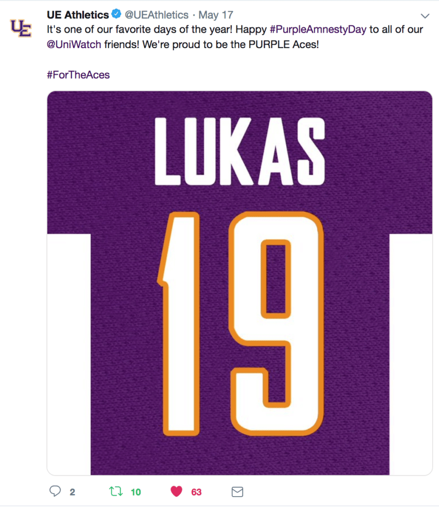
The funniest moment of the day came when the Evansville athletics department, whose teams are called the Purple Aces, posted this:
So cool. Thanks, guys, and thanks to everyone else for a very enjoyable 2019 Purp Walk!
And speaking of purple…: I’m not the only one who’s professionally opposed to the world’s most accursed color. I got a note over the weekend from reader John Harvatine, who runs an animation shop in Los Angeles, as follows:
I’m lucky enough to direct the stop-motion Goldfish commercials for a wonderful client who’s so much fun to work with. My job on those spots is to make these already good-looking crackers look even better, which I achieve through story, design, and color. All the colors of the rainbow help paint the picture in these spots — except purple. Purple has no place for the hero of the story, and only works, sparingly, for bad guys or things you shouldn’t trust. So the subtle Easter egg in these spots is purple, or the lack thereof.
Thanks again for promoting purple on only one day of the year, and honestly even that seems a bit much.
Ha! To see what John means regarding his Goldfish work, here’s a spot where three of the Goldfish are wearing colored winter hats — green, pink, and blue, but no purple:
You can see more of John’s Goldfish commercials here.

Click to enlarge
Membership update: It’s always fun to meet Uni Watch readers “in the wild,” and even more fun when they’re card-carrying members. That’s what happened on Saturday afternoon, when I was out at an event in Queens (more on that at the end of today’s post) and a guy approached me and asked, “Are you Paul Lukas?” It was reader Garrett Kramer, who promptly reached into his wallet and produced his card (based on the Nets’ black uniform) to prove that he Gets It™.
If you want to be like Garrett, ordering a membership card is a good way to support Uni Watch (which, quite frankly, could use your support these days). And remember, a Uni Watch membership card entitles you to a 15% discount on any of the merchandise in our Teespring shop and our Naming Wrongs shop. (If you’re an existing member and would like to have the discount code, email me.) As always, you can sign up for your own custom-designed card here, you can see all the cards we’ve designed so far here, and you can see how we produce the cards here.

And speaking of memberships, today I’m raffling off two complimentary membership cards that were purchased and donated by longtime reader Jay Palmer. Thanks, Jay!
I’ll pick two separate winners for this one. To enter, send an email to the raffle address by 8pm Eastern tonight. I’ll announce the winners tomorrow.
I have several more reader-sponsored raffles in the pipeline, along with a reader-sponsored auction. I very much appreciate all the generous people who’ve chosen to support Uni Watch in this way (thank you!), but for now let’s please hold off on more of these until I can work my way through the raffle backlog, okay? I’ll let you know when I’m ready for more raffle donations. Thanks!
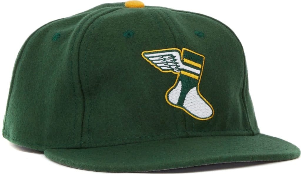
ITEM! Cap update: After a brief period when we were sold out of two sizes, I’m happy to report that all fitted sizes of the Uni Watch Classic Cap are once again back in stock and available for ordering.
We also have adjustable caps with a handsome leather strap and burnished metal buckle, but we only have one of those available at the moment. So if you want an adjustable, grab it fast! (We should have new inventory on the adjustables by mid-June.)
(My continued thanks to reader Mark LaFountain for serving as Uni Watch’s cap fulfillment manager, an arrangement that’s worked out ridiculously well.)

Click to enlarge
ITEM! Collection Agency update: What you see above is a very small portion of a collection of baseball-themed postage stamps from around the world. That collection is one of many, many collections (most of them not sports-themed) owned by an extremely interesting guy named Mitch Blank, who lives in Manhattan. He’s one of the world’s foremost collectors of Bob Dylan memorabilia, but that’s actually the least interesting thing about his collecting habits. I’ve written a profile of him and his collections for Gothamist. I really, really enjoyed getting to know Mitch and writing about him, and I’m very happy with how this piece turned out, so I hope you’ll check it out.
As you may recall, earlier this spring I wrote for Gothamist about a guy who collects vintage police mug shots, so this new piece is the next article in that series (which I’m continuing to call “Collection Agency,” even though Gothamist hasn’t yet adopted that rubric). I’ll be doing more of these, so if you live in the NYC area and have an interesting collection, or if you know of such a person, Collection Agency would like to hear from you. Thanks.
The Ticker
By Jamie Rathjen

Baseball News: The White Sox wore their 1983 throwbacks this weekend, but still wore their Armed Forces Day Weekend caps. The difference between their situation and the Reds’ appears to be that the Reds’ throwbacks were a one-off, while the Sox’s throwbacks are their usual Sunday home uni (from Matt Linder). … Both starting pitchers in yesterday’s Nationals/Cubs game, Jeremy Hellickson and Kyle Hendricks, had belt problems (from Mike Davidson). … The Nats’ racing presidents were replaced with members of the ESPN broadcast crew (from William F. Yurasko). … Dodgers OF Joc Pederson was wearing two pairs of sunglasses on Saturday (from Max Wagner). … The next two are from Mike Chamernik: Braves players created an impromptu shrine to OF Ronald Acuña Jr.’s broken bat. … Dodgers 3B Justin Turner ran into a baserunner and had his glove fall off while he was trying to make a catch. … Paul Friedmann happened upon a vintage 1880s-style base ball game in his neighborhood in Boston. … Alabama softball players apparently wear the SEC graduate patch over the number on the back — a very odd placement (from Griffin Smith). … Two Single-A teams, the Bowling Green (Ky.) Hot Rods and the Lake County (Ohio) Captains, both emerged wearing blue yesterday, so Bowling Green changed to orange (from Joe Brand). … Another Single-A team, the Clinton (Iowa) LumberKings, wore local fire department-themed jerseys with the NOB of a firefighter who was killed while responding to a fire in January (from @istudytrees). .. The Orix Buffaloes wore 1990s throwbacks over the weekend.

Football News: Eagles DE Chris Long announced his retirement this weekend. Sam McKinley points out that Long won the Walter Payton Man of the Year award last season but will never wear the patch unless he unretires. … In yesterday’s Ticker we had a sighting of a Chargers basketball jersey with RB Melvin Gordon’s name/old No. 28 on it. Here’s Gordon himself wearing it, although he wears No. 25 now and it’s unclear when that picture is from (from Matt Shevin). … The Calgary Stampeders received their 2018 Grey Cup rings (from Wade Heidt). … Brazilian soccer club Atlético Mineiro (see below) has its own football team, who revealed uniforms for this season along with the soccer team.

Hockey News: The OHL’s Erie Otters have new logos and uniforms (from Wade Heidt). … The QMJHL’s Halifax Mooseheads are wearing the Memorial Cup patch below and to the side of the crest because they have a maker’s mark and the QMJHL 50th-anniversary patch on the chest and a team 25th-anniversary patch on the shoulders (from Stephen Badger). … The photo of Bruins D Bobby Orr’s flight through the air as he scored the Stanley Cup-winning goal in 1970 is legendary, but here’s a picture of Orr afterwards wearing what Mike Malcinof says must be one of the first championship shirts.

Basketball News: Here are some Virginia uniform concepts, including orange alternates, which are now only worn by the women’s team, but the men last wore something similar to the one shown in about 2011. Yes please to that and the throwback and hard pass on the BFBS (from my brother Nate Rathjen). … Reader Christopher Jones sent us some more college concepts that he made when he was a kid, and it appears he is raising a uni-watcher as well. … Great story: It took a Knicks fan 47 years to get all the members of the 1969-70 championship team to autograph a Knicks placemat that he got from IHOP as a kid. … Cross-listed from the football section: In yesterday’s Ticker we had a sighting of a Chargers basketball jersey with RB Melvin Gordon’s name/old No. 28 on it. Here’s Gordon himself wearing it, although he wears No. 25 now and it’s unclear when that picture is from (from Matt Shevin). … The WNBA’s Dallas Wings have two players with hyphenated McNOBs, one that’s double-decker and one that isn’t (from @TheSkyShowCHI). … The Brunson League, a Baltimore summer pro-am league, has new uniforms for this season.

Soccer News: New kits for Italian team AC Milan (first), German 2. Bundesliga teams Dynamo Dresden (first) and Greuther Fürth (first) Austrian team Sturm Graz (first, second, third, and GK), and Brazilian team Atlético Mineiro (first, second, and third). … In Scotland, Hibernian midfielder Marvin Bartley entered yesterday’s game without a front-of-shirt ad, but changed to a corrected shirt after about 15 minutes. … The NWSL’s Washington Spirit have let me down by introducing an ad five games into the season. … A graphic designer in Brechin, Scotland, is attempting to illustrate every club stadium in the world. Some of his work is already used by several leagues in the country, including the top two women’s tiers. … The Polish soccer season wrapped up yesterday. This graphic shows the shirts for all the title-winning sides in the 21st century (from Ed Zelaski).

Grab Bag: Officials in Major League Rugby, the North American rugby union competition, wear ads on their backs (from @bryanwdc). … For this year’s 100th anniversary of the Tour de France’s yellow jersey, there is to be a different version of the jersey for each stage (except the first) showing famous people or places from the Tour’s history. … Let no surface go without a maker’s mark: Players on Great Britain’s field hockey teams now have team-specific mouthguards with a manufacturer’s logo smack in the middle.

Click to enlarge

What Paul did last night on Saturday: St. Michael’s Cemetery in Queens is the final resting place for a bunch of notable people (including Baseball Hall of Famer Cool Papa Bell’s daughter), and arguably the most notable one of all is the great ragtime composer Scott Joplin, whose gravestone is shown above. The area near his grave is marked by a large maple leaf, because Joplin wrote “The Maple Leaf Rag.” Every year the cemetery honors him by holding a free ragtime concert, which I’ve sometimes attended. This year’s edition was on Saturday, which was also the nicest day of the year so far, so a bunch of friends and I decided to make a picnic out of it.
It was a great time, in part because of this elderly couple that was dancing through many of the numbers (the guy also had a cigar at one point, but someone made him put it out):
The concert lasted about two hours. When it was over, the band walked down from the bandstand and down a hill to Joplin’s grave site, where they played an unamplified version of “Maple Leaf Rag.” It was pretty perfect (click photo to enlarge):

Incidentally, this event is where card-carrying Uni Watch member Garrett Kramer approached me, as referenced earlier in today’s entry, which just made the proceedings even nicer.
Yeah, the Reds 800 throwbacks aren’t a merch dump cash grab attempt afterall…. Well played by them.
Do you honestly think that’s what it’s about? Like, you actually think the Reds trotted out a *blank* jersey yesterday so they could sell it to the hordes of fans who can’t wait to buy a blank jersey?
Those throwback vests they’ll be wearing later this season will be big sellers, too…..
Think harder.
It’s only $280.99 in the MLB shop…it’s a collectors item!!
Yes, they’re selling it. But there’s a difference between (a) wearing a uniform and selling it, and (b) wearing it because you can sell it. The latter can justly be called a merch dump; the former is just retailing. Not the same thing.
(Personally, I’d rather not see any uniforms for sale, as I’ve said many times. But save the term “merch dump” for situations that it actually applies to.)
I know you think you’re some sort of authority on anything and can’t listen to opinions, but those jerseys are not cheap and there are people who collect jerseys. They’re making money off of them. They’re not doing it out of the kindness of their hearts. You don’t get it because you put down people when buy jerseys. Think harder!
I’m aware that they’re selling them and making money off of them.
But as already stated, there’s a difference between (a) wearing a uniform and then selling it, and (b) wearing it because you can sell it. That latter can properly be called a merch dump; the former is just retailing. And what the Reds are doing here is clearly retailing. I’m not saying it’s a good thing (or a bad thing); I’m just saying that it’s not a merch dump like the holiday caps, whose primary reason for existing is so they can be sold. There’s a very real difference. That’s not my “opinion”; that’s reality.
Again: I’m opposed to uniform/cap retailing, and have been consistent on that point for my entire career. But not all retailing can be accurately described as a “merch dump.” That’s all.
If you can’t grasp that distinction, regardless of whether you personally buy jerseys, I don’t know what else to tell you.
Hi Paul,
You say, “…I’m opposed to uniform/cap retailing…”–have you ever written an article explaining why?
I think I’ve bought 2 or 3 caps in my life, and have never bought a jersey–not because I’m opposed to doing so, I’m just not interested in doing so.
I’m interested in your reasons for opposing this.
Also, how do you feel about ballpark giveaways of jerseys or caps, at least in kid sizes? Again, just curious–not taking a position on the issue at all!
I’m opposed to uni retailing/merchandising for several reasons:
1) The retail tail wags the on-field dog, which leads to bad design. So many awful uniforms and uniform trends (most notably BFBS) would never have happened if not for uniform merchandising/retailing. Holiday merch dumps would not have happened if not for uniform merchandising/retailing. And so on.
2) Uni retailing has led to too many fans conflating fandom with consumerism. Like, you can’t be a “good fan” unless you shell out for an overpriced polyester shirt. And anyone who doesn’t do that is a “bad fan.” And if you wear the wrong overpriced polyester shirt, you are committing a “jersey foul” or some such nonsense. Not my scene.
3) Uni retailing has increased the power of the uni outfitters (Nike, Under Armour, Adidas, New Era), primarily to the detriment of good design.
In short: The uni-verse would be a better place if none of this stuff had ever become available for sale. (That said, obviously, there’s no putting the toothpaste back in the tube now.)
Kids’ jersey/cap giveaways: I’m mostly fine with them, although it feels like they’re basically training kids to be consumers when they grow up, which is a little bit gross.
Great–thanks for the reply–makes total sense!
The Dodgers had the “B” logo on both sleeves on their 1932 and 1933 home jersey (and possibly the 1931). The Pirates had the “P” logo on both sleeves in 1923 & 24 and again from 1926 through 1931. The logo was on the right sleeve only in 1925 because they wore a National League 50th Season patch on the left.
Yup — Todd R. just sent me pics of both, and I’ve added them to today’s text.
“All of the remaining jerseys in the Reds’ 2019 throwback program will be button-fronts, although some will be vests, not sleeved jerseys.”
Aren’t the Reds throwing back to the Big Red Machine uniforms at some point this year? If that’s the case, then they’ll wear pullovers, too.
Just checked the Reds’ website, they’re wearing pullovers 2 times: 1976 (on August 17th), and 1990 (the next day, August 18th).
Yes, you’re right. Text now adjusted.
Yes, you’re right. Text now adjusted.
Is the tuba guy sitting on a headstone in that last pic? If so, geez, couldn’t he have found another place to sit? (Or stand)
I was just about to make the same comment. Honoring one dead man by sitting on another dead person’s grave seems inappropriate.
If Chris Long is going to retire the NFL should take the award away from him and give it to someone else who will wear the patch.
How selfish of Long not to honor the award!
Had to read this a couple times before I got the sarcasm!
What is the substance on the back of Justin Turner’s glove? They zoom in at the end of the linked video. Looks like grip tape from a skateboard or gaffer’s tape.
Looks like a coding error on the Dressed to the Nines link (on the text “doesn’t show the right sleeve”).
Also, on the ticker item about the Tour de France yellow jersey. It says there will be a different jersey for every stage “except the first”, but that’s likely because no one wears a yellow jersey on the first stage (since the is no leader yet). And I wonder what they will be doing about the team sponsor logo that is usually affixed to the front of the leader’s yellow jersey, as that would cover up most of these designs.
Fixed.
The defending champion is allowed, but not required, to wear yellow on the first stage. If they’re not participating, nobody does.
Dunno what they’ll do about putting the big team logos on.
Tying two of today’s topics together: Can you produce a UW membership card based on that Reds jersey, or on one of those Nats, Dodgers or Pirates jerseys? If the card could include the sleeves and sleeve logos in addition to the number on the back, I might be up for ordering one of those.
The good news is that we can do a card based on those jerseys; the bad news is that we don’t depict sleeves, because it just opens up too much of a Pandora’s box. Just the back of the jersey, sorry.
Velvets!
I knew you’d notice!
Not a fan of the G.I. Joke caps. What makes it even worse is looking at the caps combined with the uniforms. The caps do not match the uniforms and it just does not look good. This is Major League Baseball and I get to watch highlights of teams wearing a uniform where the hats and uniforms do not match? Time for MLB to step back and consider this.
I’d say just as bad the Phillies wore their cream alternates Saturday and Sunday along with the caps not meshing several players wore G.I. Joke high socks which looked as tough expect awful. Sad to think not even 10 years ago there wasn’t all this crap.
And yet nary a complaint is made when teams trot out their ridiculous softball looks all the time. Go back to wearing white at home and gray on the road full time and I might have more sympathies for people complaining about MLB teams wearing a variety of specialty caps.
Speaking of the CHL and The Memorial Cup, the game Sunday night was Guelph vs. Halifax. The CCM makers mark is on the chest where the C and A for captains go. For Guelph, the Captain wore the C above the CCM, but the Assistant captains wore the “A” below the CCM. I do not have any pics. Halifax wore the C and A both below.
Also, NHL news, Sabres released 50th anniversary logo, but also released another secondary 50th logo.
link
Found a photo of Guelph Storm’s weird letter placement.
link
Really good eye on that, Dan! Of all the major junior teams, it does really vary between teams that wear the captaincy patches above the maker’s mark or below the maker’s mark. However, they usually don’t have a variation on the same team.
I gotta say, was hoping more for the Ottawa 67’s to make it through the OHL Final rather than the Guelph Storm. Simply because I wanted to see the barber pole uniforms in the Memorial Cup.
link
Definitely not a fan of this Reds uni. I like simple, but I need more than minimal. Looking forward to their 1919s, though!
Speaking of throwbacks, I’d wear that ’90s Orix Buffaloes uni.
The red one they wore last weekend, which was beloved by Buffaloes fans in the Tuffy Rhodes era, is a pretty nice one; I have both the white and black versions of it. Everybody loved how it said “Osaka” (the city) and not “Kintetsu” (the owner).
Before that, when they were the Orix Blue Wave, they had a great road uniform, with the now popular but then unheard-of usage of a number that is the same color as the body of the jersey, but with a contrasting border. I remember seeing it for the first time and thinking how amazing it was.
Just a note to state that the article on illustrator Jack Davis over the weekend was among the best content ever produced on this site. If you haven’t read it, don’t miss it!
Paul,
Loved the Gothamist column. I met Mitch at Larry “Ratso” Sloman’s record release party. An interesting and very nice guy.
Glad you liked, John. I was put in touch with Mitch by a mutual friend. Very interesting guy! I very much enjoyed getting to know him and profiling him, and I hope I managed to capture at least a little bit of what makes him special.
Honestly, the hat Amir Garrett mistakenly wore would have made more sense to wear (even though it may not be correct for the time period) because the colors work and the “C” matches those on the 1912 jersey sleeves. The logos on the hats from 1912 and 1919 should be switched to match those on the uniforms. It is difficult to tell on the Baseball HOF uniform database what logo the “C” was on each hat but it would be better for continuity of the “C” unless the Reds have photos showing otherwise. link
Interesting thing about the A’s/Tigers game that resumes on September 6th is that it is a Friday, so in theory the Tigers could go with their “home” whites and then “road” grays while the A’s could wear their “Friday” Kelly Green uniforms for both games and switch pant colors in between. Too bad the Tigers don’t have a navy jersey that they wear both at home and on the road to make it easier (although I am honestly glad they don’t do that). Also what happens with the expanded September rosters for that game, are all guys on the 40 man able to suit up and potentially play? Would be funny to see guys in the box score wear the same number as a guy who started the game but may get traded mid-season. Will be interesting to follow up with in September.
I’ll be so glad in 2020 when that becomes *only* a 28 man roster.
This game is so far in the future that I’m hoping to see someone get traded between the A’s and Tigers so that he can appear for both teams in the same game.
Yes! That’s what I want as well!!
Re: first picture at top. The Cindy guy in the background has a totally different (red) cap from the two foreground guys. May be wear8ng different pants also, but tough to tell.
Nothing on Brewers going the extra mile w/G.I Joke camo green batting helmets?
Phil covered that over the weekend.
Twice, in fact. In Saturday’s lede (third item of a long lede) and in yesterday’s ticker as well. And that’s even more coverage than the camopander three day weekend warranted.
Couple things about the concert at Scott Joplins grave:
1)The couple dancing is ADORABLE.
2)What the hell is the red instrument the rather portly bearded fellow in the black suit is playing? I’d guess some kind of harmonica, but I’ve never seen one that you play like THAT.
That was the pianist, who (obviously) couldn’t bring his instrument from the bandstand down to the grave site, so he played that red thing instead. He mentioned what it was, but I’ve forgotten — sorry.
It could be a melodica, a mouth-blown keyboard instrument. link
Jon Baptiste, the leader of the band on the Late Show on CBS, also plays one.
Yes, thank you, that’s exactly what it was!
I wanted to leave a few remarks about the new Erie Otters jerseys and logos.
I think its great they brought back the original Otter logo, albeit with a clever helmet shading that makes it say ERIE…neat touch.
I am dying to have that river otter logo over the keystone on a t-shirt. Personally, for the Keystone State team to symbolize that in a Canadian Hockey League is friggin awesome.
The colors, well, hey. I liked the original blue, yellow, and red, but times change. Simple is better, and sticking with the blue and yellow that symbolizes recent success is better than going with a full color re-design.
Anyway, there ya go. On the internets for life.