There’s nothing new about MLB players who prefer to leave their jerseys partially unbuttoned. But reader Marc Gilbert has noticed that Dodgers third baseman, leprechaun lookalike, and Met-who-got-away Justin Turner does something more radical: In addition to going unbuttoned, he’s had his jersey modified to create a deeper V-neck.
Let’s start with this shot of Turner from Photo Day 2019:

Note how the uppermost visible buttonhole is just to the left of the “d.”
Now here’s a shot from this season’s Jackie Robinson Day (click to enlarge):

Again, look where the uppermost buttonhole is, and also look at how the jersey placket appears to be folded under on both sides, just below the level of Turner’s undershirt collar.
Those photos both show home jerseys. Here’s a game-used Turner road jersey — again, look where the uppermost buttonhole is:
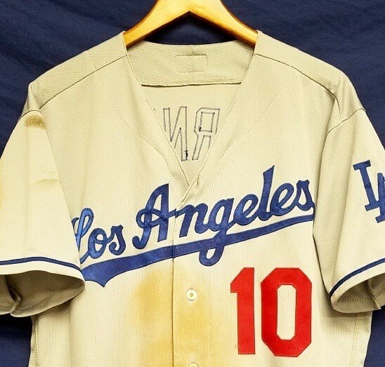
All of those photos suggest, but don’t quite prove, that Turner has had his jersey modified to create a deeper V-neck. And here’s the smoking gun — check out this photo of Turner from 2017 (click to enlarge):

As you can clearly see, the top part of Turner’s left placket, including the top buttonhole, was folded under and sewn back against the inner placket — all of which became visible when the modified placket flopped open.
Here’s are two shots from this season, showing the same thing:


And here’s a shot from last season, showing a corresponding modification on the left side of Turner’s jersey:

Isn’t that interesting? We’ve previously known about Dodgers who’ve sewn their jerseys shut, but I’ve never seen Turner’s style of custom-tailoring before. I imagine he does it because he prefers to keep go unbuttoned and wants to cut down on the resulting volume of flapping fabric.
It’s worth noting that Turner hasn’t always done this. Here’s a 2016 shot showing him with an unbuttoned jersey that has not undergone any modifications:

I’ve asked Dodgers equipment guy Mitch Poole about this. No response yet, but I’ll let you know if I hear back from him.
(My thanks to eagle-eyed Marc Gilbert for spotting this one.)

Click to enlarge
Oopsie: We’ve been talking a lot lately about the Canópening, but Marlins left fielder Pete O’Brien took button mishaps to a new level last night — torso-level, to be specific — as he stepped up to the plate with an unsightly open button. Don’t think I’ve ever seen that before.
(My thanks to Chris Feminis for this one.)
Click to enlarge
Collector’s Corner
By Brinke Guthrie
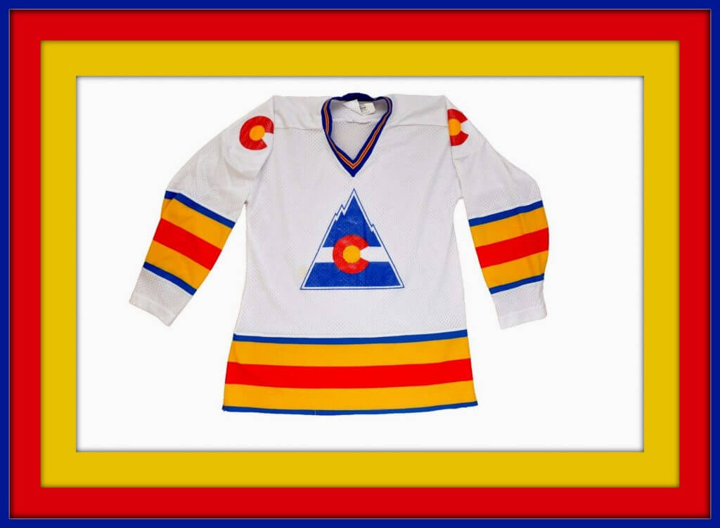
Let’s start off with this jersey for the NHL Colorado Rockies. Yes, kids, before they had a baseball team with that name, there was an NHL team. They started out as the Kansas City Scouts from 1974-1976, then played in Denver from 1976-1982, and finally settled in New Jersey as the Devils. In my opinion, both the Rockies and Scouts logos are terrific.
Now for the rest of this week’s picks:
• Here’s a 1970s MLB sticker measuring 5.25″ in diameter that includes all teams of the period, including the then-new Mariners and Blue Jays.
• From reader E. Wolfe, this 1972 Monday Night Football game. “I spent countless hours playing this game with friends and family. When offense selected Bomb and defense selected Blitz, it was an automatic touchdown for the offense, regardless of field position. ”
• Sand-Knit was the manufacturer for this 1970s youth-sized Houston Astros tequila sunrise jersey.
• This vintage K.C. Chiefs Starter pullover jacket looks nice in white with the red/yellow trim, but this guy is dreaming with the price he wants for it.
• Here’s another team jacket, this one from Apex for the mid-1990s Utah Jazz. Always loved that logo (especially the tri-colored basketball in the J), even if it’s a bit incongruous to have a team named the Jazz in Utah.
• This seller is offering a set of three 1970s Detroit Lions glasses, two of them being promo items from Mobil and Burger Chef.
• This is a nice Miami Dolphins paperweight from the 1970s. I still have two of these, for the Cowboys and Bengals.
• How about this never-used Julius Erving beach towel? The seller doesn’t mention the year for this, but Dr. J played for the Sixers from 1976 through 1987.
• I can promise you that this item is a Collector’s Corner first: a pair of women’s Pittsburgh Steelers jeans, from Sears. They look like a regular pair of jeans to me, except you’ve got that fancy Steelers patch sewn onto the back pocket. You can just picture the early-1970s NFL Properties marketing meeting: “Hey, I’ve got an idea! Let’s put some NFL branding on women’s wear! There must be a few of ’em who like football, right?”
• Those jeans would look great with this 1979 Steelers belt buckle from Lee jeans.
• These 1970s tube socks (made of Orlon!) say B E A R S on the side. The seller has other teams available.
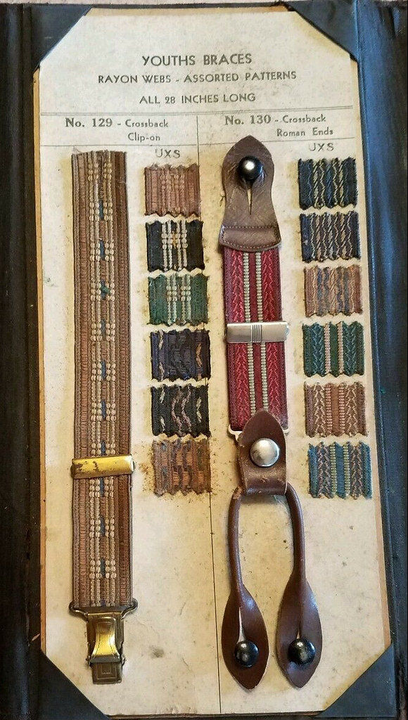
Bracing: I love old salesman sample catalogs, and I especially love apparel catalogs that have fabric swatches. Until now, though, I didn’t know that I loved old suspender catalogs with swatches, because I’d never seen one before. So cool! Unfortunately, this one is way too expensive for me, so I won’t be adding it to my catalog collection.
I’ve never actually worn suspenders. I know hockey players used to wear them beneath their sweaters. Do they still? Seems like such an anachronistic piece of gear.

Membership update: We recently got a really interesting membership card request from reader Adam Yarnevich. He wanted his card design based on the road uniform of the 1998 Croatian national soccer team (the kind of out-there that translates really well to a membership card), plus he wanted his NOB to be Jarnevic, which is how his family name is spelled in Croatia. “My great grandfather changed it to Yarnevich when he came to America, so English speakers would pronounce it correctly,” he explained. An excellent request!
Adam’s card is one of several that have been added to the membership card gallery. I expect to get the next batch of printed/laminated cards in the mail by the end of this week.
Ordering a membership card is a good way to support Uni Watch (which, quite frankly, could use your support these days). And remember, a Uni Watch membership card entitles you to a 15% discount on any of the merchandise in our Teespring shop and our Naming Wrongs shop. (If you’re an existing member and would like to have the discount code, email me.) As always, you can sign up for your own custom-designed card here, you can see all the cards we’ve designed so far here, and you can see how we produce the cards here.
ITEM! Purp Walk countdown: Don’t look now, but we’re only 10 days away from the 2019 edition of Purple Amnesty Day. As always, it will take place on May 17, the (13th!) anniversary of the very first post on this website.
As per our annual custom, Purple Amnesty Day will be the only day of the year when I’ll accept purple-inclusive Uni Watch membership card orders. So if you’re a fan of the Ravens, Vikings, Rockies, Northwestern, Hornets, TCU, or some other purple-themed team, next Friday will be your only chance this year to order a card. If you miss this 24-hour window, you’ll have to wait until next year’s Purp Walk.
In addition, I’m collaborating again with designer Bryan Molloy for a one-day sale of a special Purp Walk merch item (here’s what we offered in 2015, 2016, 2017, and 2018), and I don’t mind saying that this year’s item is a real doozie. I’ll show it to you on May 16 — Purp Walk Eve Day — and then it’ll be available for 24 hours. Get ready!
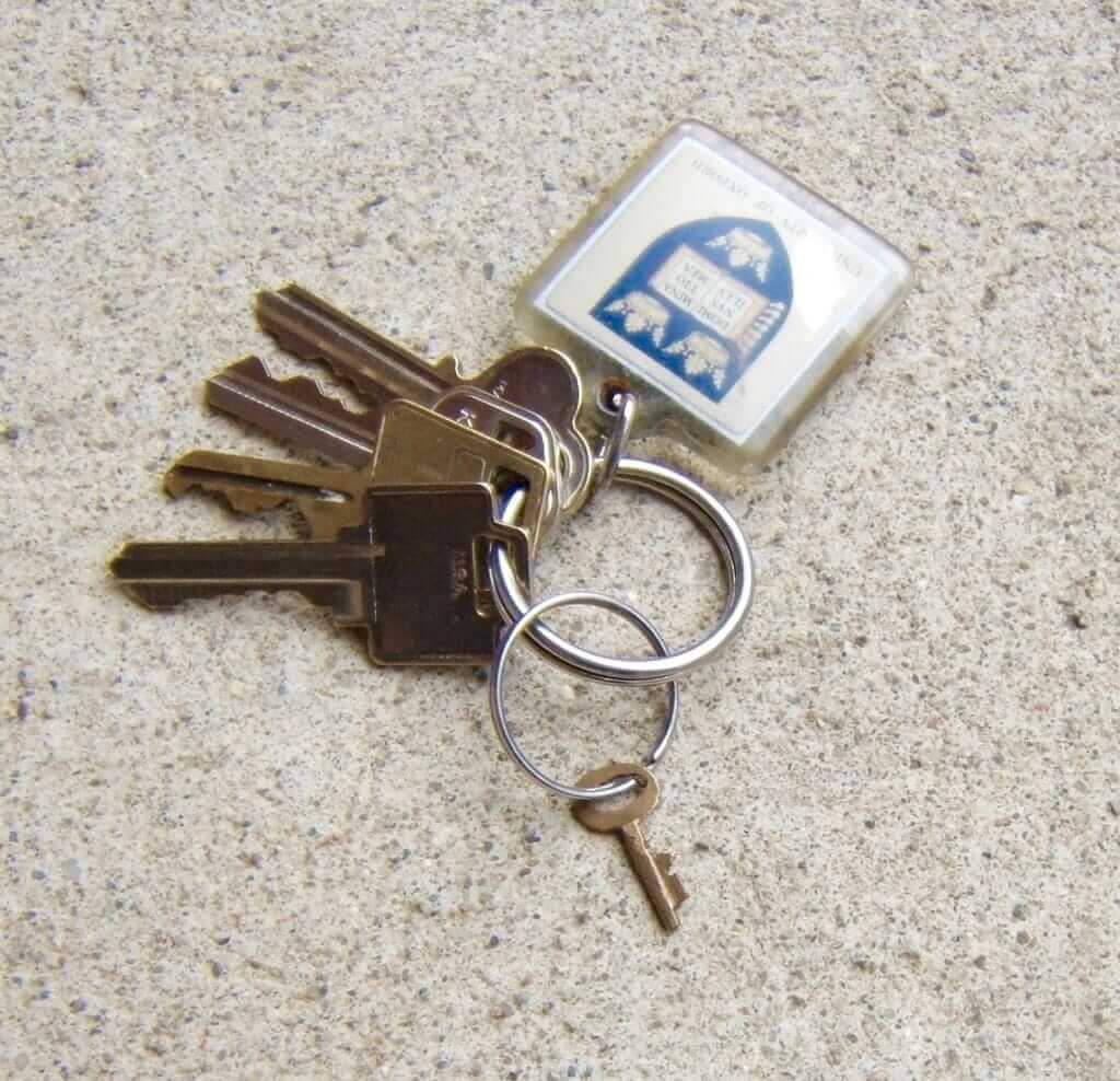
ITEM! Best KRC ever: I’ve been editing Key Ring Chronicles for well over two years now, and I don’t mind saying that today’s entry is one of the best — maybe the best — we’ve ever run. It’s the short, funny, and generally excellent story of a small key that has taken a very unusual path to the author’s key ring. Check it out here.
The Ticker
By Alex Hider

Baseball News: Yesterday’s Reds/Giants game was briefly delayed after a swarm of bees took over the playing field. Reds utility man Derek Dietrich — one day removed from wearing a fake mustache for throwback day — responded by donning an impromptu beekeeper’s costume. … Also in that game, Reds RF Yasiel Puig wore cleats with the Cincinnati cityscape … ESPN used a throwback Phillies logo in their score bug last night, even though they weren’t wearing throwbacks (thanks to all who shared). … Speaking of the Phils, Bryce Harper’s equipment still has his old number (from Mark Morgan and @snorlaxatives69). … More Phillies: This 1954 Phils patch is currently for sale on eBay. A similar Dodgers patch is also available. Has anyone seen these logos? (From Chris Lewis) … According to Mike Vassallo, the Brewers wore their white home jerseys for the first time since Opening Day yesterday. … Yankees P James Paxton suspects the sticky, compact clay on the Yankee Stadium mound is the source of his knee irritation. The Yanks’ grounds crew has agreed to sprinkle loose clay (NYT link) on the mound during his home starts. … Cardinals reliever Dominic Leone had Cards bathrobes made for his fellow bullpen mates (from Erik Spoonmore). … Astros P Lance McCullers Jr. wore a Jeff Bagwell jersey to Monday’s game (from Ignacio Salazar). … Jimmy Lonetti notes a number of differences in “TC” logo construction on Twins caps in the 1970s. … The Class-A Greensboro Grasshoppers wore one-off jerseys inspired by their parent club, the Pirates, on Monday (from Scott Trembly). … Monroe Central High School in Indiana has old-school Padres-style uniforms (from Braden Pretzsch). … The latest Hall of Very Good podcast features uni designer/historian Todd Radom and Uni Watch’s own Phil Hecken discussing MiLB’s Copa de la Diversión uni program. … John Valdez’s wife has asked that he get rid of his extensive mini-helmet collection. So far, he’s standing firm. Please give John your support and/or contact info for a good divorce lawyer.

NFL News: Could the Raiders’ move to Las Vegas lead to a logo tweak? According to signage at the construction site at the new stadium, the new logo could read “LAS VEGAS” instead of “RAIDERS” (from Nick Sanchez). … Alex Evans celebrated his 33rd birthday yesterday, and his wife surprised him with this impressive Chicago Bears cake, complete with the Chicago skyline.

Basketball News: Calling Louisville’s new practice court “wild” is an understatement (from Josh Claywell). … Check out the uniforms the 1929 Southwest Bell Telephone women’s basketball team wore — like an inverse Harlem Globetrotters uni! (From Bud Brooks). … Either this lawn care service is poaching the NBA’s logo or Jerry West has gone into the landscaping biz (from Zach Wadley). … Check out this amazing patch that the Bucks used for a Boy Scouts promotion in 1991 (from Steve Hurley).

Soccer News: Oldham Athletic AFC of England’s League Two unveiled its 2019-2020 jerseys yesterday (from Ed Zelaski). … FC Cologne of Germany’s second division planned on wearing all-black uniforms on Monday, but the referee put the kibosh on that. They ended up wearing red uniforms (from Pesky’s Pole and our own Jamie Rathjen). … The neon logo at Forward Madison FC’s stadium doubles as a clock — the flamingo gradually fills with pink as a half progresses (from Brian Guilbeault). … The Chicago Red Stars of the NWSL have sold out of their light blue alternate jerseys — and for good reason. That’s a sharp-looking jersey (from Phil). … This cobbler in Mexico makes soccer cleats by hand (NYT link), one pair at a time (from Ryan Keberly).

Grab Bag: After a revision and nearly $1 million, USF has decided to ditch its newly unveiled (and controversial) academic logo and stick with its athletics logo in all instances. … Sri Lanka has unveiled their uniforms for the upcoming Cricket World Cup. The unis will be made out of recycled ocean plastic (from Phil). … The former Federation of Indoor Lacrosse has rebranded as World Lacrosse (from Michael Sullivan). … Another new lacrosse league, the Oregon Box Lacrosse Association, has an MLB-style logo (from Michael). … The New York Times published a piece that takes an in-depth look at the Army’s new service uniform (from Gregory A. Shemitz and Chris). … Brands Unfiltered is a project by School of Visual Arts student Jason Park that edits brand logos to “reveal certain truths” behind large corporations (from James Gilbert).
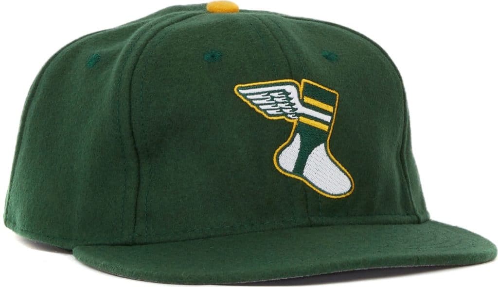
Our latest raffle winner is Tanner Hewlette, who’s won himself a Uni Watch Classic Cap. Congrats to him, and big thanks to reader Tim O’Malley for the cap purchase. We’ll have another raffle tomorrow. Meanwhile, if you want to buy your own Uni Watch cap, you can order one here.
Why a Major Leaguer wants to look like a slob is the next question.
+1
I wanted to write that but didn’t know if it would be too un-PC to do so. I hate it when you have millionaire athletes and they look like they just walked out of a homeless shelter. I can’t stand to look at the pictures long enough to see the details Paul is mentioning.
Why it’s allowed is my first question. MLB needs a dress code!
MLB has a dress code, but like most of their rules, nothing is enforced. Players uniforms must be of the same “style” would put an end to all the mismatched pants, for example.
Indeed. But MLB isn’t alone in that, unfortunately.
The NFL has a rule about how high white socks must be.
SECTION 4 EQUIPMENT, UNIFORMS, PLAYER APPEARANCE
Item 6. Stockings. Stockings must cover the entire area from the shoe to the bottom of the pants, and must meet the pants
below the knee. Players are permitted to wear as many layers of stockings and tape on the lower leg as they prefer, provided the exterior is a one-piece stocking that includes solid white from the top of the shoe to the mid-point of the lower leg, and approved team color or colors (non-white) from that point to the top of the stocking. Uniform stockings may not be altered (e.g., over-stretched, cut at the toes, or sewn short) in order to bring the line between solid white and team colors lower or higher than the mid-point of the lower leg.
Seems pretty straightforward. link
I had that MNF game and my brother and I banned “the bomb” from being used, because it was an instant and automatic touchdown.
I bet the “Las Vegas” Raiders logo is likely a DIY by the construction company. Not a leak.
I can’t see the Raiders making any changes to their famous logo.
They’d just have to change it again when they move to Fargo or Lubbock or Guadalajara in a few years.
“My great grandfather changed it to Yarnevich when he came to America, so English speakers would pronounce it correctly”
One suspects Christian Yelich’s ancestor did the same.
There was a Chris Jelic who played for the Mets years ago who probably has the exact same name.
Come to think of it, if the “c” in Jarnevic is pronounced like English “ch”, shouldn’t it have a haček on it – Jarnevič – or an acute accent (Jarnević)?
I don’t speak Croatian, but as far as I know, there are two kinds of “ch” sounds; one which is English-like (č) and the other where your tongue is up near where your palate meets your teeth (ć).
Which one is it?
It probably should. I have a 2004 Croatian jersey with Jarnevic on the back, but Nike didn’t have č available, so I just left it off. Also, design-wise, it creates awkward padding above the name to make room for the haček on the card. So, I just left it off. Pretty much everyone with a Croatian, Serbian, and Bosnian last name that ends with a “C” should be pronounced “CH.” But a lot of folks on this side of the world don’t pronounce it that way (think Joe Sakic or Christian Pulisic, etc.)
Adam, thanks for the reply!
I totally agree about the extra padding; I feel the same way when I see recent baseball NOBs with accent marks shifted downward rather than having the NOB stay where it is and the accent mark go above the letter, like it’s supposed to.
It’s still great to see these accent marks becoming more mainstream in American sports, though. A lot of these Eastern European players have been putting up with Anglophones mispronouncing their names for years!
Re; USF ditching new/bad logo….
I wonder how a logo designer feels when their logo is chosen to be the new identifier for a major something, and as soon as it is reveled it is hated by the masses (and quickly gets nixed).
USF alum here. I’m sure that designer is probably all jacked up in the head now. With that said, there was nothing wrong with the gold “USF” in the dark green rectangle, the academic logo that the widely panned logo replaced for some reason. We at USF HATED the now-mercy killed logo with the passion of 8,000 Suns. Check this out, though…
Our marketing people actually had the unmitigated gall to replace the spirit marks (the Bull U and the Bull USF) with that awful logo and even tried to pass off that chartreuse-looking color that the new bull was in as one of our main colors. USF Athletics (thankfully) called BS on replacing the spirit marks and we really should stick with dark green and gold as our main colors, not that light green-looking stuff I’ve seen used so prominently lately.
If you skipped Key Ring Chronicles, scroll back up and give it a click.
Paul, how much editing do you do on these entries? The last 2 sentences in this entry are really good, but it wouldn’t have worked as well if the last line wasn’t given its own paragraph.
It varies. In some cases, I go thru a lot of back-and-forth with the writers. In this instance, though, I did only a slight amount of touch-up line editing. And the stand-alone final graf was already written that way. Very good writer!
I also enjoyed the KRC. It was concise and well written. I did not know that vets travel to India for “medical missions” types of trips. That key is an excellent memento.
Out of curiosity, has the KRC always been hosted at that website? Or has it jumped around over the years? I have not read a lot of them. Normally, I look at the picture and read the blurb. If the key ring item peaks my interest I click.
Yes, it has always run on McSweeney’s.
Not a particular fan of the very bro-y joke about contact info for a good divorce lawyer.
Not sure why she wants him to get rid of his collection. It’s not like it massive and over-running the house.
I haven’t been following it closely, but it seems about a decade ago with the Nike undershirt is when baseball players stopped using the top button. The jersey has become more and more of an afterthought.
Players were skipping the top button for a *long* time before Nike got the undershirt contract. Speaking as a Mets fan, I recall catcher Todd Hundley doing it more than 20 years ago.
The first image I search for shows Hundley in his unbuttoned glory.
As a general feeling, it seems to me baseball players are the least professional dressed of the major sports. The first word I think of is “sloppy” when I think MLB compared to NFL, NBA, NHL, NASCAR or MLS. https ://cdn.vox-cdn.com/thumbor/sehQnrJH_SVtGP-a0K91TXkyGG4=/0x644:2100×3072/1220×813/filters:focal(891×1078:1227×1414):format(webp)/cdn.vox-cdn.com/uploads/chorus_image/image/59180561/257185.jpg.0.jpg
I dunno. Lots of football players go untucked, right?
How about the sleeveless look some NFL players sport, or the biker shorts? Looks worse than anything I see on a baseball diamond.
The KRC reminds me of when my cattle raising Grandfather introduced me to “cow magnets” which are very strong magnets that are inserted into a cow’s stomach which then attract metal that the cow eats so it can be (more) easily removed.
Great story!
Not that it matters, as it’s the deadname now, but it was the Federation of International Lacrosse, not the Federation of Indoor Lacrosse, that has rebranded as World Lacrosse.
Mu sponge hockey team wore those gorgeous Colorado Rockies jerseys in the 80s. We ordered them directly from McNichols Arena in Denver. I still have mine.
Paul, I highly recommend giving suspenders (or braces) a shot. It’s surprisingly far more comfortable than having a belt cinched around your waist. I actually have buttons sewn into my suit pants to accommodate the leather straps; I’d advise against getting the clips, because they can damage the fabric at the waist. Try a pair and let us know what you think!
Yup – suspenders a style that I wear with suit pants and a tie. A great fashion. I think I was inspired by the first Wall Street movie.
Need to go with the buttons sewn in. That’s the great style with the leather straps. I would never, ever wear suspenders with the clips.
Answering your question, Paul, yes, hockey players still use suspenders. Lets you tighten the belt not too tight but just right (yay, torso flexibility) and also keeps the pants up in case the belt fails.
Many hockey players still use suspenders. Especially fatter ones that can’t cinch their belts tight enough. Fortunately I still have a couple years before I get to that point.
Goalies have to be close to 100% usage of suspenders
The reason why the referee wanted Köln to change from red to black appears to be that the other team’s (Greuther Fürth) goalie was wearing black.
As to athletes looking like slobs, many (possibly most) soccer players don’t tuck in their shirts, but that’s not really noticeable. There can be some sock-length stuff (really high or really low, like in football) going on, though.
Aren’t soccer jerseys meant to be worn untucked?
So then make the goalie change. You don’t inconvenience an entire team for one player.
I must respectfully disagree with the KC Scouts logo assessment. The racist imagery of a Native American is nothing I care to validate.
How about this never-used Julius Erving beach towel? The seller doesn’t mention the year for this, but Dr. J played for the Sixers from 1976 through 1987.
Mid 80s. I had one, except mine didn’t have the blue border. My brother had a Michael Jordan one (red uni with script Chicago), with blue stripes and no border. Until a couple of years ago it covered the window of his front door.
I had the same MJ towel! It had royal blue trim in places that should have been black.