Click to enlarge
[Editor’s Note: With the NFL Draft commencing tonight, we have a draft-centric guest entry today from longtime reader/contributor Jay Braiman. Enjoy. — PL]
By Jay Braiman
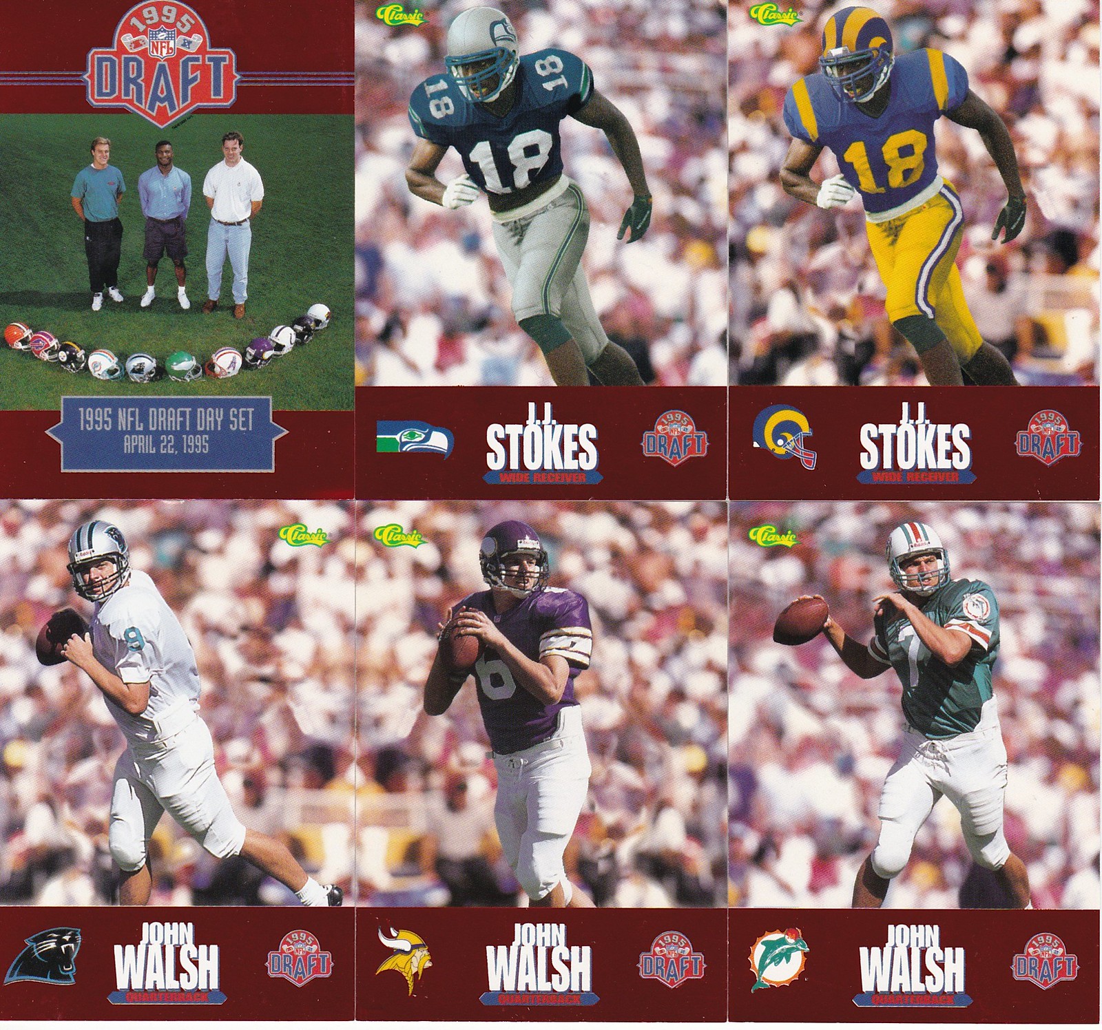
Back in the mid-1990s, I used to produce radio broadcasts of the NFL Draft at the Madison Square Garden Theatre for KLIF (Dallas) and ESPN Radio. The cards shown above were part of the 1995 draft press kit, which I recently found in a box while looking for something else. Here’s how they looked on the back (click to enlarge):

.
And here’s another batch of cards from the same set, showing different players, front and back:


Obviously, the cards were trying to anticipate which teams might end up drafting these players, and at first glance it seems safe to assume that they Photoshopped NFL uniforms (and generic crowd backgrounds) onto their college action photos. That certainly appears to be the case with the two J.J. Stokes cards, and at least one if not both of the Ki-Jana Carter cards.
But upon closer inspection, the other cards appear to have been posed rather than Photoshopped. Note that the players are all wearing the same plain white pants with the same hip pads (I can’t remember the last time I saw a college or pro quarterback wearing protruding hip pads like that), along with the various team jerseys and helmets, including the Steve McNair Jaguars card, while the Carter Jaguars card has pants stripes and no hip pads. Also, the Stokes and Carter cards show the players in the same pose in two different uniforms, while the other players’ cards show multiple poses and different jersey numbers.
Of course, the Stokes and Carter cards could have been both posed and Photoshopped, but it seems likely that these are college action shots; Stokes’s number at UCLA was 18 and the Bruins had block numerals at the time; Carter wore a No. 32 jersey at Penn State that looks a lot like the jersey on his Panthers card, and also wore plain white pants at Penn State. Note also that Carter’s Jaguars card shows the TV numbers on the sleeve (like his Penn State jersey), while McNair’s Jaguars card (correctly) shows the jaguar logo on the sleeve.
Another interesting detail: Note the back of Stokes’s Rams card, showing the old L.A. Rams wordmark, and the “cover” card reading “Los Angeles Rams.” The Rams had received league approval to move to St. Louis shortly before the ’95 Draft (but after the cards were made), and were routinely referred to at the draft as “St. Louis,” while the L.A. Raiders, who had not yet announced their return to Oakland, were called simply “Los Angeles” for the first, and only, time.
It’s also notable that as of this draft, the Panthers (who picked fifth, having traded the first overall pick to the Bengals) and Jaguars (who picked second) hadn’t yet played a game. The Panthers cards (Carter and John Walsh) don’t even attempt to simulate what the team’s jerseys would look like, although the Jaguars cards (Carter and McNair) do. Presumably, Carolina’s jerseys hadn’t been finalized when the cards were produced.
For the record, only one of these cards got the team right, even given multiple tries. McNair (shown as an Oiler, Jaguar, and Viking) was drafted by the Oilers, third overall; Carter, as anticipated, went first overall to the Bengals; Kerry Collins was taken fifth overall by the Panthers (although he played for the Colts later in his career, so that card eventually turned out to be right); and Stokes went to the 49ers with the 10th pick.
The biggest and most curious miss was that the card makers projected Walsh, a junior out of BYU, as a first-round pick. He was drafted in the seventh round by the Bengals with the 213th overall pick, was cut shortly thereafter, and never played in the NFL.
Come on, blue: What’s weirder that both teams wearing blue in an MLB game? Try both teams wearing blue and getting involved in a multi-runner, multi-baseline rundown play! That’s what happened during yesterday’s Royals/Rays game, and the blur of blue made it hard to keep track of which player was on which team. Check this out:
Well, hope you got enough room on your scorecard for this one!#RaysUp pic.twitter.com/gXCqzILzK4
— Tampa Bay Rays (@RaysBaseball) April 24, 2019
Good luck scoring that one!
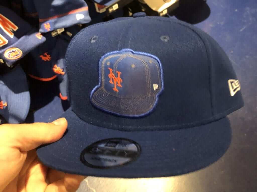
Photo by @McJesse; click to enlarge
Let’s go meta!: I can’t decide if this is the lamest baseball cap ever or the best baseball cap ever. At the very least, it’s certainly the most meta baseball cap ever. Who sits around at New Era coming up with this stuff? (And sure, they could have done an infinite regression, but I kinda like that there’s just one degree of separation. A cap with a cap, the end.)
If the Browns ever add a helmet logo, this is how they should handle it. Just put an image of the helmet on the side of the helmet!
(My thanks to @JakeCapp — yes, that’s really his handle — for letting me know about this one.)

Click to enlarge
And speaking of caps: Reader Jordan Roberts bought himself a pair of Uni Watch caps yesterday (thank you!), but it turns out that his taste in good headwear goes beyond that. Jordan plays on a rec-league hardball team called the Oakland Beers, and he designed the team’s cap, shown above.
“I’m proud of it,” he says, and he should be — that’s a snappy-looking cap!
ITEM! Hoodie update: I recently mentioned that our sublimated tequila sunrise deluxe shirt might soon be available as a hoodie, but first I wanted to get my hands on a sample so I could assess the production quality and the feel of the fabric for myself.
The sample has now arrived, and I’m happy to say that the print quality is outstanding. Check this out (for all pics, you can click to enlarge):

The stripes inside the hood are a nice touch, right? And there’s another fun detail lurking inside of the pocket:
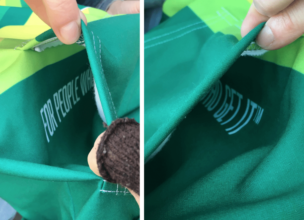
Okay, so that doesn’t really mean anything in the grand scheme of things, but it’s a nice little Easter egg. My Teespring contact, Jimmy Nutini Jr,, gets credit for that one.
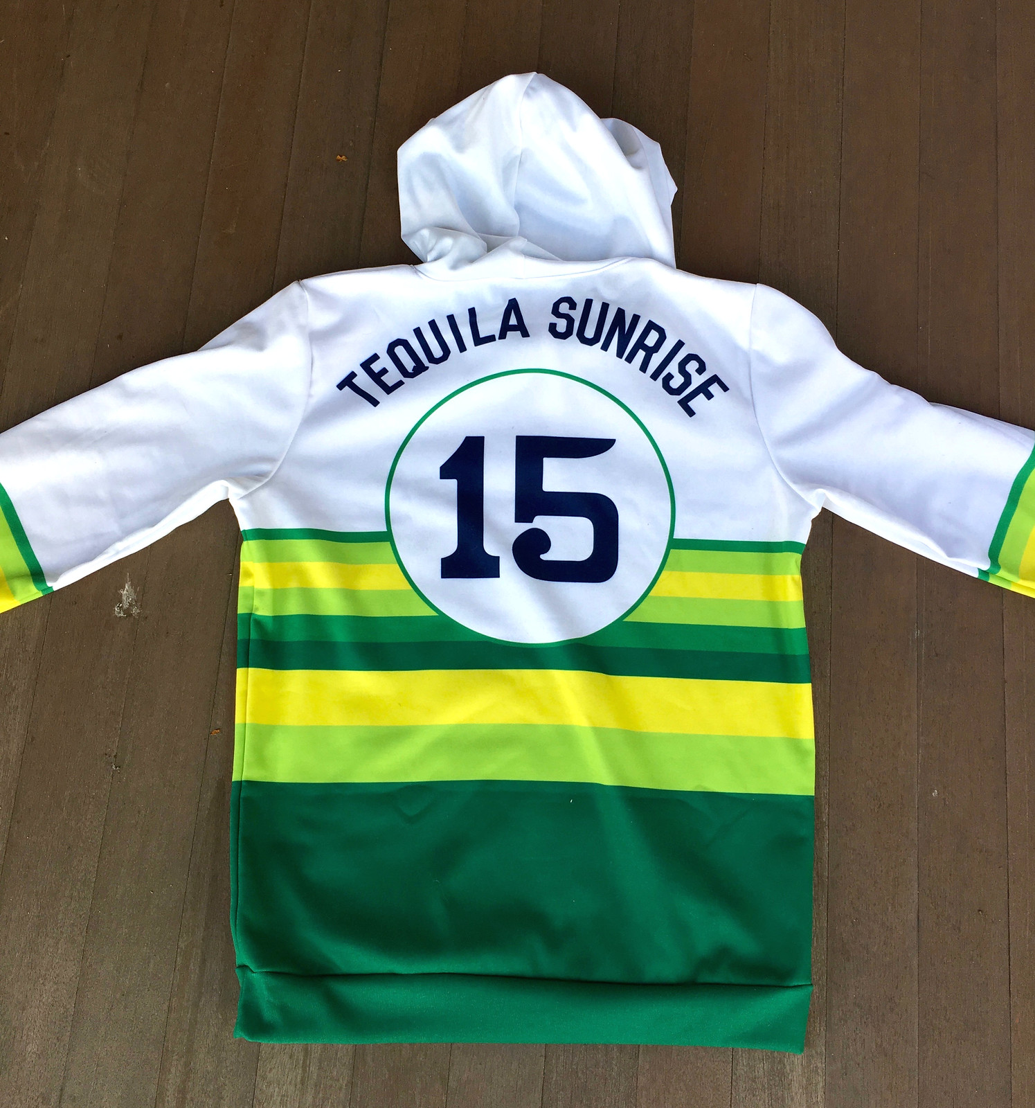
Here’s how it looks from the back:
As for the fabric: It’s 100% polyester (that’s the nature of the beast when doing sublimation), so it’s not as plush as a cotton hoodie. But it’s not bad — it feels properly substantial, like a hoodie should, and the interior is a bit fleece-y. All in all, very comfortable:

As with all sublimated products, this one will cost ya — the price is $47.99. That’s all because of the wholesale unit price, not due to any gouging at my end (my cut for this item is the same as for a normal screen-printed T-shirt).
But I honestly think it’s a pretty sweet item. You can order it here.
And that leads us to….
ITEM! 48-hour Teespring sale: Teespring, which hosts our Uni Watch shop and the Naming Wrongs shop, is running a 48-hour sale. From noon Eastern today through noon Eastern on Saturday, you can get 10% off any of our products by using the checkout code TSPRING10. Uni Watch will make the same profit on each item, and Teespring will cover the difference.
This discount applies to everything in both shops, including the hoodie I just described, as well as our popular Goodywear-inspired T-shirt, our tequila sunrise deluxe sublimated shirt, all of our coffee mugs, the full slate of Naming Wrongs shirts, and more.
My thanks, as always, for considering our products.
Design contest reminder: In case you missed it on Monday, Uni Watch is teaming up with the Portland Pickles — that’s a college wood bat summer team — for a contest to design the Pickles’ “Future Baseball Night” jersey, which will be worn on July 4. There’s a $150 cash prize for the winning designer, along with a free futuristic jersey.
Entry deadline is Friday, May 3. Full details on the contest rules and entry requirements, along with the full scoop on what “Future Baseball Night” will entail, can be found here.
The Ticker
By Paul

’Skins Watch: Yet another team has decided to stop calling itself the Redmen. This time it’s a box lacrosse team from Ontario, the Brooklin Redmen, who are now being known as the Brooklin Lacrosse Club (from Michael Sullivan). … A bill to to ban Native American mascots from public schools in Maine is advancing through the state legislature (from our own Anthony Emerson).

Baseball News: Bomb Pops bursting in air: The Jacksonville Jumbo Shrimp’s Independence Day jerseys this year will feature a Bomb Pop pattern (from David Ratz). … A game-worn Babe Ruth jersey is expected to sell for a record $4.5 million this summer. … Wilson Sporting Goods has a new line of products to raise awareness of autism. The company will donate $100,000 this year to the advocacy group Autism Speaks. … New uniforms for the High Point Rockers (from John Cerone). … New 3D helmet numbers for the Reds (from longtime Cincy beat reporter and Uni Watch pal C. Trent Rosecrans). … The White Sox played their 22nd game of the season last night — and wore their road greys for the first time. … An Orioles fan was so tired of people dumping on Chris Davis during his slump that she got this awesome tattoo (from Jonathan Coffey). … I noticed during last night’s Mets/Phils game that Philly 1B Rhys Hoskins has his jersey sewn shut. You can tell from the telltale seam beneath the button under his chest insignia. Other players have done this, but I hadn’t realized until now that Hoskins also does it. … New throwback caps last night for Kansas (from @ClassicBallCaps).

NFL News: To help pimp the ABC’s coverage of the NFL draft, the women of The View wore NFL jerseys yesterday (from Johnny Griswold). … Packers S Josh Jones has changed his uni number from 27 to 24 (from Garrett Van Auken). … The head of the Houston World Cup Bid Committee gave Texans WR DeAndre Hopkins a USMNT jersey from the USA/Chile game (from Ignacio Salazar). … Jeopardy! juggernaut James Holzhauer, who grew up near Chicago, incorporated the Bears’ logo into his signature on last night’s show. Holzhauer, who now lives in Las Vegas, had previously worked the NHL’s Vegas Golden Knights’ logo into his name (from Jason Rezvan). … At the 18-minute mark of this podcast, once and future Cowboys TE Jason Witten says he’ll have to get a new helmet now that he’s come out of retirement, because his old Schutt model isn’t allowed anymore (from Tod Meisner).

Hockey News: The Long Island paper Newsday has published an article about the Islanders’ Long Island-based primary logo. … ESPN’s PTI show used two different Bruins logos in the same segment yesterday. … Oooh, look at these great old NHL lapel pins (from Carpenter Riley).

Basketball News: Warriors G Shaun Livingston had his shorts on backwards during last night’s playoff game against the Clippers (from @mt_vern). … The Iowa women’s team has retired Megan Gustafson’s No. 10.

Soccer News: English side Queens Park Rangers are donating their stadium’s naming rights to a charity. Good for them (from James Gilbert). … Tottenham Hotspur’s new away kit has leaked (thanks, Phil). … Cross-listed from the NFL section: The head of the Houston World Cup Bid Committee gave Houston Texans WR DeAndre Hopkins a USMNT jersey from the USA/Chile game (from Ignacio Salazar).

Grab Bag: The Air Force has issued new rules regarding its Operational Camouflage Pattern uniforms. Additional info here. … Speaking of the Air Force, they’re having a “jeans as uniform” day to help start a discussion about sexual assault. … President Trump says the Army’s new service uniform is “very expensive.” … A bill moving through the city council in Jacksonville, Fla., would bar city employees from campaigning for elective office while in uniform. … New logo for TV station WOIO in Cleveland. … New 25th-anniversary logo for apparel brand Supreme. … New logo for Exeter Township, Pa. … A Tennessee man was arrested as he was walking down the street in a stolen karate uniform. … Merriam-Webster has added “garbage time” and “Tommy John” surgery” to its dictionary (from Mike Chamernik). … Mississippi, whose state flag includes the Confederate battle cross, is now allowing residents to order a specialty license plate with an alternate, Confederacy-free flag design (from Max Weintraub). … Kansas has inked a new deal with Adidas (from Josh Claywell). … A Marine Corps uniform was found on a street in Holden, Mass. … South Africa unveiled a kit for this fall’s Rugby World Cup (from our own Jamie Rathjen).
Our latest raffle winner is Byron Tatum, who’s won himself a Uni Watch membership card. Congrats to him, and thanks to previous raffle winner Scott Curl for paying it forward by providing this raffle prize. We’ll have another raffle tomorrow, and it’s a doozy — you’ll see.
Like the meta Mets cap, but for the double logo creep
The cap on cap looks terrible. The only one who can pull off that look is the dolphin in the old Dolphins logo. Helmet on helmet.
The Oriole Bird has been wearing a cap whilst on a cap for years.
My favorite uni-watching subgenre is mascots wearing caps, especially when mascots wear a cap that the team itself doesn’t wear. Which is most mascots, actually. In most cases, I prefer the mascot’s simplified cap to what the team actually wears.
The Mets cap is almost genius. It only needs a line of text saying, “This Is Not a Cap.”
The hoodie looks great, but I would like it more if it had a makers mark on the chest. Also, it would feel more authentic if the colors and stripes told some kind of story. I do, however, eagerly anticipate the release of official Uni Watch fingerless gloves.
What does the number of stripes represent?
Officially dubbed “Lukas green” and “other Lukas green,” our different colored green hoops are inspired by the many shades of personalities that populate the uni-verse — from hard-nosed trolls to “hey Paul, did you catch the Titans’ 64th unique uni combo last night?”, while the yellow hoops, officially dubbed “Lukas gold,” represent our creator and poobah, Paul. All the stripes lead up to our wordmark, the ever-present goal of rising to perfection and looking forward to a better uni future (e.g., hopefully towards a better Browns uni set, although we’re not holding our breaths). . The magnifying glass magnifies (get it?) the importance of scrutinizing past terrible uni decisions (such as anything the Diamondbacks have worn, ever), while also symbolizing the magnification needed by Mr. Lukas in the form of eyeglasses (also get it?). Keeping with our “Always Upward” theme, our wordmark is sans-serif, because we’ve shed all the different things that have held us down in reaching our perfect uni-verse, just like how the font has shed itself of serifs. But we never forget our past, which is why our numbers are rendered in a throwback-style font to acknowledge all the uni-verse creators who came before us. Our numbers are encompassed in a circle, which calls back to our tequila sunrise theme because of its sun-like shape, while also symbolizing what we see at the bottom of a glass of tequila — an empty circle. Finally, our motto is stitched into our collar so that we may never forget all those who Get It.
(Sorry, long work projects at the office fry your brain a lot :))
Hire that guy! (Oh wait, I already did…)
Now that I know the meaning and symbolism behind the hoodie, I’m much more inclined to buy it. (My favorite part is the circle at the bottom of an empty tequila glass.)
How does the hoodie fit around the waist? I have a hoodie like that currently, and it seems like the elastic is a tad too tight, and tends to slide up to about right above the belt line
Well, it would depend on how big your waist is, where the bottom waist panel hits you, etc. But at least on me, it’s not too snug. Just right, in fact.
I was actually going to ask the same question kind of, how are the sizes? I ordered a size bigger then what I wear cause pullovers generally are a little snug. Any option for a zip-up coming?
There’s a link to a size chart right there on the ordering page, although you have to poke around to find it. Here:
link
They transposed the columns, though — the “Length” measurements are actually the chest width, and vice-versa.
Oh, and about zip-front: I’ll look into it!
What size are you modeling in the picture?
Medium. I’m 5’8″, 150lbs. I could probably fit in a small.
Meta Mets cap needs an orange squatchee (two orange squatchees) to make it perfect, right?
Regarding the new additions to Merriam-Webster, they should have also added “moral loss.” A moral loss is when a much favored team or individual barely beats a significantly inferior opponent.
Two questions about the Montreal Canadiens centric “I miss the Forum” shirt.
Numéro un : I recall a French version. Le Forum me manque. Can’t find it. Did it disappear?
Number two: if the McNichols shirt can get rainbow guts and if the Astrodome shirt can get a tequila sunrise, can the Habs shirt get the signature torso stripe to make it tricolore? No need to venture into copyrighted fonts—it’s just colors! S’il vous plaît ?
Le Forum in red: link
Grey: link
White: link
Will consider the design request!
I feel like I should’ve caught this, but why “15” on the tequila sunrise merch again?
An earlier version of that design was originally part of our Uni Watch T-Shirt Club in 2015. Most of the designs in that series were No. 15, for 2015.
Which is why I wish the new version didn’t have a 15 on the back.
But if a full-zip version becomes available, it might become my curling shirt for next winter’s season.
But it’s still a perfectly fine number, even if it has no deeper meaning!
A bit more detail about Brooklin of Major Series Lacrosse dropping the Redmen name, which they’ve had since the 1960s:
link
As it is close to the start of the season, expected to wear plain jerseys in their usual red and black colour scheme. Probably just removing the crest and shoulder patches.
They have been commended in the decision to change their name by fellow MSL club Six Nations Chiefs, a team based on a First Nations reserve.
The “Beers” cap makes me think of Baseketball
Meta? Or Mets-a?
Re: Rays and Royals
Royal blue vs navy blue has just the bare minimum of contrast and I don’t think of it as a case of not telling the teams apart. But I also get the dislike of that particular pairing of colors (does give off a big spring training game kind of vibe). I know a few readers love pointing out dark blue versus Royal blue or sky blue versus Royal blue as seemingly bad color clashes but those are fine with me.
To me it’s only bad when both teams wear the same exact shade, like when the Mets and Giants both wore black for a game in San Francisco in the early 2000s.
Where can I buy one of those Beers hats?
To be honest, I’ve never thought the issue of shirt contrast was that big a deal in baseball considering that it’s not a sport where contrast is critical (unlike basketball or something), and the default colors are white vs. off-white.
In general, I agree (and white and grey don’t have that much contrast, after all). But it definitely looked weird on that rundown play!
Thing is, that’s exactly the sort of play where players and umpires most need the clearest possible visible distinction between players’ teams. So yeah, uniforms don’t matter most of the time in baseball, except when they do.
It’s like, most of the time when I ride my bike, I don’t crash, so therefore a helmet doesn’t protect me. Or, I rarely have infections, so therefore I never need to take antibiotics. The rarity of a need is not an argument against satisfying it.
Did they even have photoshop in 1995?
If only there was a place, perhaps on the internet, where you could look up the answer to a question like that…..
AltaVista?
AskJeeves.
Lycos or Webcrawler maybe?
yes, I was in college and had been using it, I think it was version 3.0 or around that, no layers and only 1 undo allowed.
Love the move from QPR to give a local charity the naming rights to the stadium (provided they still call it Loftus Road). On a side note from that article, it’ll be sad when they move out of there to a new stadium. Much like Tottenham’s White Hart Lane, there’s just something special about these smaller venues where the stands almost look like they’re right on top of the pitch.
Can anyone comment on the “feel” of the Tequila Sunrise t-shirt? I don’t own any polyester t-shirts, so I’m not sure about the feel as opposed to cotton. I’m considering buying one, but I don’t want to spend that much money on a shirt that I might find to be extremely uncomfortable to wear.
It definitely feels synthetic on the outside, a bit less so on the inside. I can’t imagine anyone finding it uncomfortable, but it isn’t as plush or cozy-seeming as a cotton tee.
Anyone else want to weigh in?
I have one (not sure of which batch) the t-shirt part feels fine but not as smooth as a cotton shirt, while the parts with the stripes are a bit scratchy.
NHL lapel pins:
Can’t say I’ve ever seen branding refer to the team as THE Atlanta Flames.
And the Canucks pin’s use all lower case except for the K triggers my OCD (even though that makes design sense I guess).
But they are all totally gorgeous!
for anyone who is interested, the New Era cap on the front of the cap is taken directly from the artwork/spec sheets they use to show the products to the factory’s and is also the image used when a photo isn’t available to show a buyer
Bomb pop? Firecracker?
link
‘A game-worn Babe Ruth jersey is expected to sell for a record $4.5 million this summer.’
…David Wells must need the money.
Interesting to see JJ Stokes. Fascinating how that draft went.
Niners traded their first, third and fourth picks in the 1995 draft along with their first pick in the 1996 draft to the Browns to move up from 30 to 10 and get Stokes.
In 1995, the Browns turn that trade into Craig Powell (Ohio State), Mike Frederick (Virginia), Tua Papua and another low round choice in 1996.
In 1996, Browns move from Cleveland to Baltimore and draft Ray Lewis with the #26 pick gained from the 49ers.
What could have been?
Something from 1995 is now considered vintage? Boy do I feel old. That was half my life ago!
Merriam-Webster finally getting around to adding Tommy John surgery? Take your time!
Odd that you call the hoodie “expensive” yet it’s only $5 more than the hat…
I wonder what it means, exactly, for a team to donate the naming rights to a stadium. Is the stadium going to be called, say, White City Soup Kitchen Stadium? Or would the local soup kitchen (if they got the rights) sell the rights to an advertiser and keep the money?