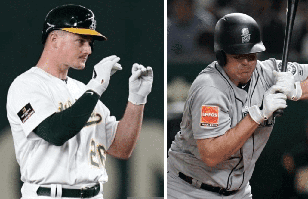
At this very moment, the A’s and Mariners are playing their season-opening game in Tokyo (I woke up and started writing this in the top of the fifth, and pressed the “Publish” button in the top of the eighth). As we knew would be the case, both teams are wearing advertising sleeve patches — MGM Resorts for the A’s and the Japanese petroleum firm Eneos for the Mariners. As we’ve previously discussed, this is not a new thing — MLB teams have always worn uni ads when playing season-opening games in Japan, going back to 2000.
But in all of those previous instances, the teams wore ads on their batting helmets in addition to their jersey. There are no helmet ads this time around, so this is actually a rare case of ad reverse-creep, at least relative to previous MLB games in Japan.
Also: As far as I can tell, the Mariners haven’t made any announcement or even tweeted anything about their Eneos ad, which is refreshing, if somewhat surprising.
Speaking of which: It turns out that one Mariner has a longstanding connection to Eneos. Ichiro has been appearing in Eneos commercials for years. Here he is in a 2011 spot:
Other notes from the season-opening game:
• Mariners pitcher Marco Gonzales, who wore No. 32 last season, made his single-digit debut:

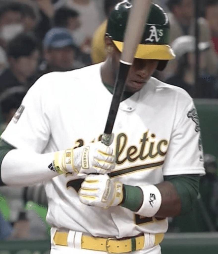
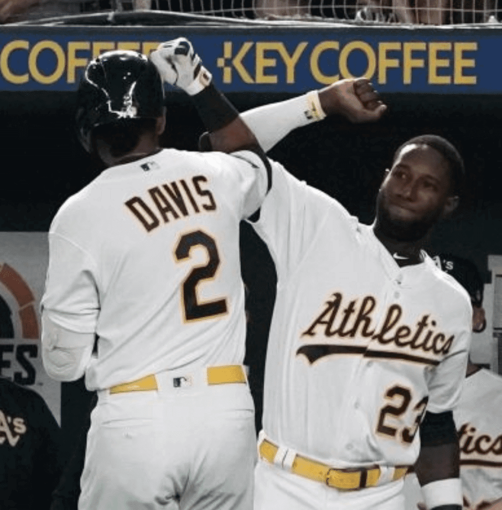
• Several A’s players wore gold belts, instead of the usual green:
• Speaing of belts, A’s left fielder Chad Pinder broke his while diving for a ball. The buckle came off, leaving him with a belt that was both unfastenable and unfashionable. So he tucked one end into his pants and left the other end hanging there — ugh:
Yo #BELTWATCH on Opening Day is lit. Chad Pinder's belt no match for the turf. pic.twitter.com/ULneB39NOE
— Cespedes Family BBQ (@CespedesBBQ) March 20, 2019
• Last week A’s equipment manager Steve Vucinich told me that despite MLB’s new footwear rules, which allow players to wear any combination of white, black, grey, and team colors, ““We will still wear white 98% of the time. No green shoes, but some have a heavy green presence.” Sure enough, everyone wore white for the game, but I spotted three coaches — Mark Kotsay, Mike Aldrete, and Scott Emerson — wearing solid-green in the front row of this pregame team portrait (click to enlarge):
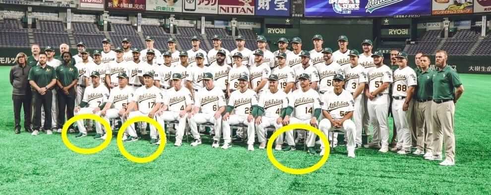
Maybe green shoes will become the new version of the white caps that A’s coaches used to wear!
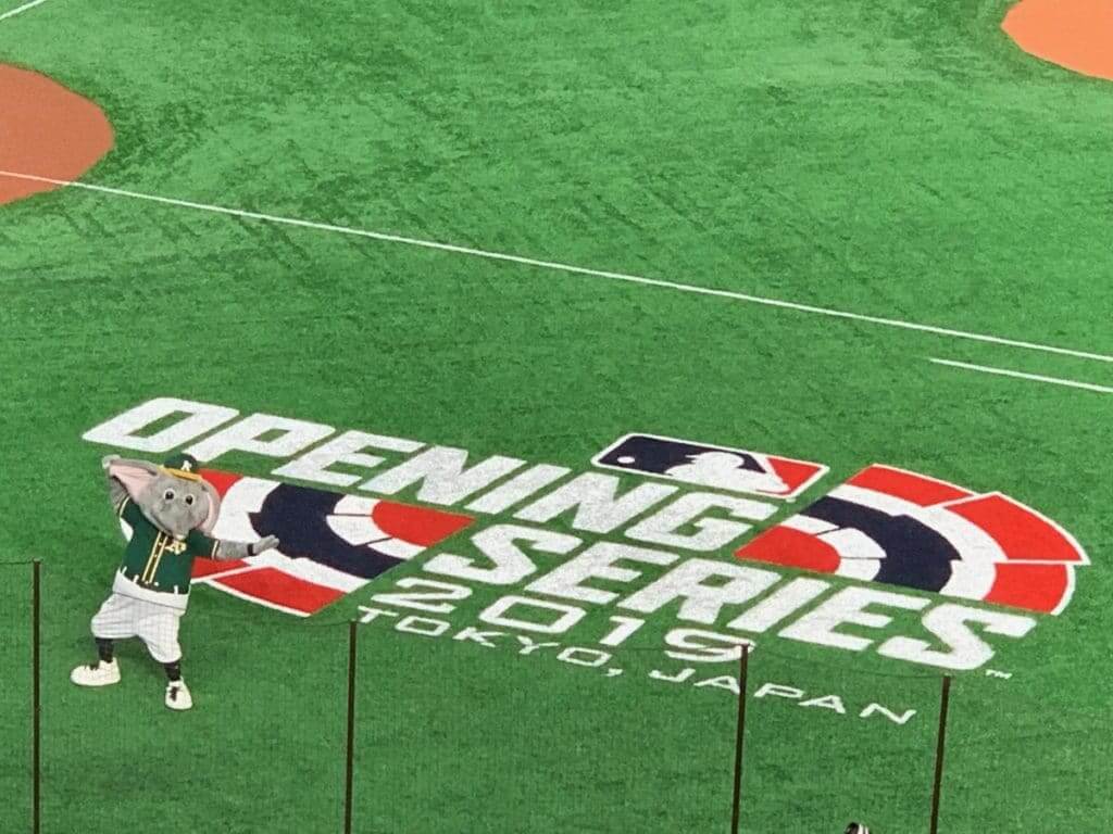
• Although the A’s wore white, their costumed mascot wore green:
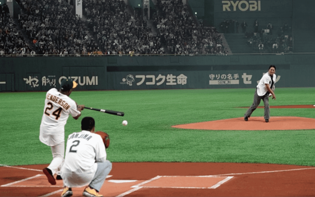
• Not sure I’ve ever seen this before: The ceremonial first pitch featured a batter — and it was Rickey Henderson (I haven’t seen video, so I don’t know whether he hit the ball or not):
• I couldn’t find a photo or screen shot, but the batboys and ballboys appeared to be wearing uniforms of Japanese teams, not Seattle or Oakland uniforms.
The A’s and Mariners will play in Tokyo again tomorrow, and the remaining 28 MLB teams will open their seasons next Thursday, March 28. I’ll have my annual Uni Watch MLB Season Preview on SI.com next Tuesday, March 26.
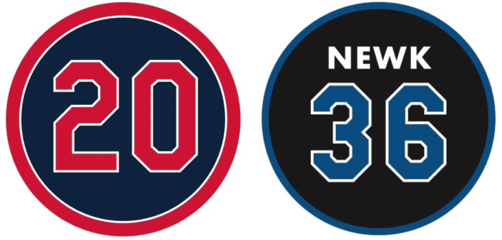
Patchwork: We got our first look at two new MLB memorial patches yesterday. First, the Indians announced that they’ll wear a Frank Robinson “20” patch for their home opener on April 1. This patch, unlike the similar Robinson patches being worn this year by the Reds and Orioles, will only be worn for one game, not for the full season.
In addition, the Dodgers shared their Don Newcombe patch with me. They had announced a few weeks ago that they’d be wearing a patch, but they hadn’t revealed the design until now. This one will be worn all season long.
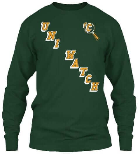
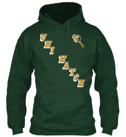
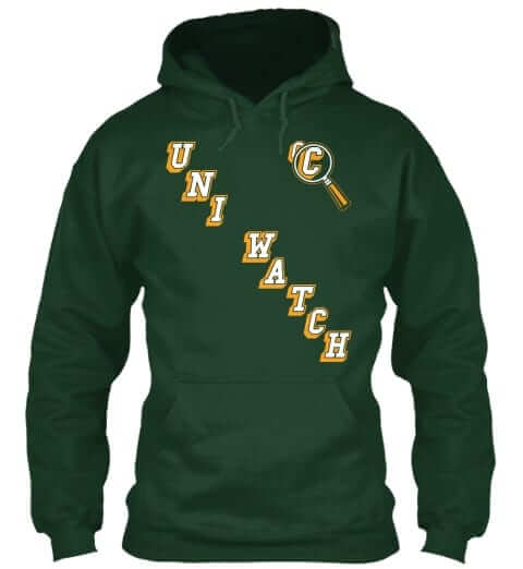
ITEM! New Uni Watch T-shirts: Remember the Wafflebored-made hockey jersey that we recently auctioned off, which in turn was based on an illustration of a hockey player wearing a Uni Watch jersey, which we featured on a T-shirt in 2016? After we auctioned off the Wafflebored jersey, a few people asked for a T-shirt with just the diagonal lettering. Say no more (click to enlarge):

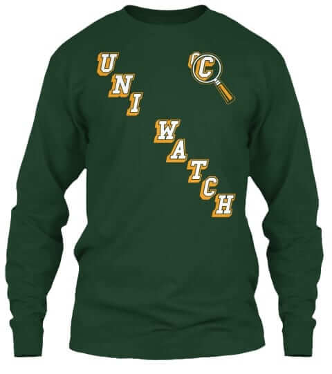
We also did it with the lettering colors reversed — white over gold instead of the other way around (I like both versions and couldn’t decide which one to go with, so I decided to do both!):
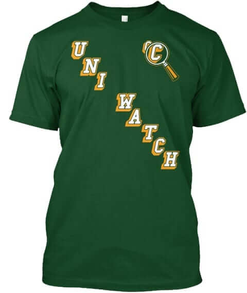
Here’s where you can order the gold-lettered and white-lettered versions.
We’ll also have white versions, like the Wafflebored jersey. Should have those sometime today.
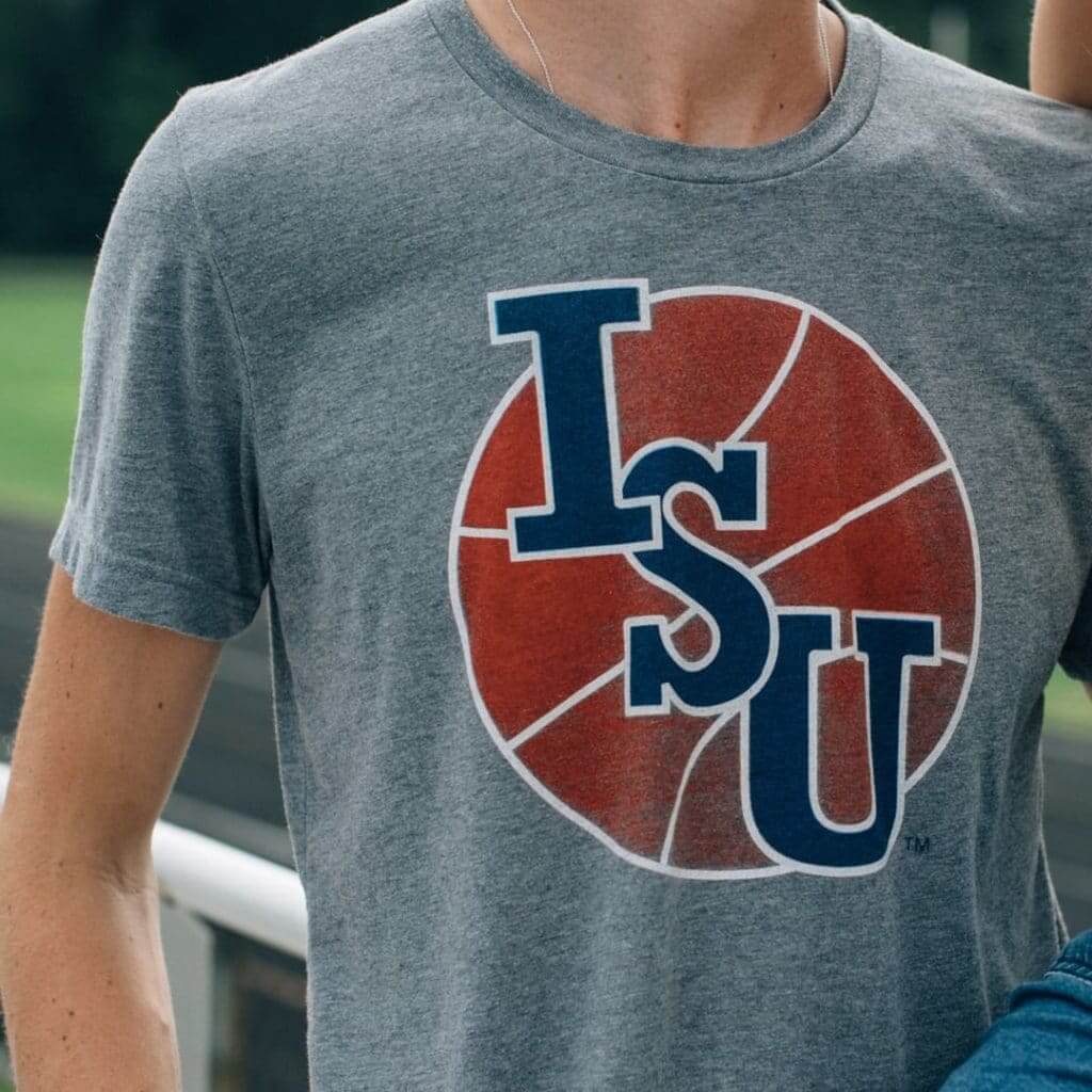

Raffle reminder: In case you missed it on Monday, we have a new raffle from Homefield Apparel, which specializes in T-shirts and hoodies from smaller schools– mid-majors, DII, even DIII. Two lucky Uni Watch readers will each get to choose any item from Homefield’s site.
To enter, send an email to the raffle address by tomorrow, March 21, 7pm Eastern. One entry per person. I’ll announce the winners on Friday.
The Ticker
By Yianni Varonis

Baseball News: In an effort to curtail sign stealing, MLB is experimenting with watches that pitchers and catchers can use to communicate with each other. … Here are the team-branded socks that Stance is advertising as on-field products. It’s yet to be determined, however, if some of the more unique designs will, in fact, be worn on the field (from Charles Noerenberg). … Check out this Dodgers-Angels Franken-jacket that was spotted in Tokyo (from multiple readers). … The video game “Rocket League” has partnered with MLB to allow gamers to adorn their cars with the logos and colors of their favorite baseball team. … Iowa once again went solid-black yesterday (from Jay Wright).

Football News: This is awesome: A New England man carved the Patriots logo into a woodpile (from multiple readers). … Have the Cowboys’ draft caps leaked? (From Oswaldo Quinones.) … According to one fan poll, Auburn has the best home uniforms in the SEC, while Arkansas has the worst. … Oklahoma is marketing its spring game with an homage to Animal House (from Jordan Sogn).

Hockey News: We’ve previously noted that the Canadian women’s curling team has new uniforms for the world championships. Reader Jean-Philippe Laroche noticed that the new uniform the team is wearing is strikingly similar to the one worn by the nation’s junior hockey team a decade ago.

Basketball News: Newly signed F/C Deyonta Davis will wear No. 4 with the Hawks (from Etienne Catalan). … The D League’s Salt Lake City Stars wore uniforms that honored first responders last night (from Josher Walla). … The D League’s Fort Wayne Mad Ants will be giving away this very interesting bobblehead to fans during an upcoming game (from @PhillyPartTwo). … Reader Matthew John Prigge is interning at UW-Milwaukee and found photos of the Milwaukee Does, a 1970s women’s pro team, in the school’s archives. Note the untucked jerseys! Their first logo was controversial then, and would likely not make the cut today. … Last night’s color-vs.-color matchup between Marshall and IUPUI had a distinctly Christmas-like feel to it (from Michael Berry and Jake Keys). … NBA players are showing up for games wearing hoodies under their blazers (WaPo link) (from Tom Turner).

Soccer News: U.S. president Donald Trump and Brazil president Jair Bolsonaro exchanged national soccer team jerseys yesterday. The shirt that the White House gave, however, looked a lot like a rush job, especially compared to the one it received (from multiple readers). … The Mexican men’s national team has a new BFBS kit (from @Bryant_rf). … Fans of the Egyptian men’s national squad disapprove of the team’s new shirt designs. … Giorgio Armani will design the formal uniforms that the Italian national soccer teams will wear off the pitch. … In the English FA Cup final and semifinals, color clashes are resolved with a coin flip to determine which club will have to wear alternates. When Brighton and Hove Albion won its coin toss vs. Manchester City, the team had a little fun with its moral victory (from our own Jamie Rathjen). … Also from Jamie: In a bit of an oddity, the Chicago Red Stars will wear their 10th-anniversary kits for a second year in a row. … Apparently some fans who ordered Montreal Impact jerseys instead received Vancouver Whitecaps shirts (from multiple readers). … Not sure how this got approved, but a retailer selling Minnesota United gear is erroneously using an apostrophe on one of its professionally-made signs (from @OlegKvasha). … The Swedish club Malmo FF has a new set of kits (from Ed Zelaski).

Grab Bag: The Ohio History Center has an exhibit about the state’s athletic champions that features, among other items, drawings of runner Jesse Owens and the rookie jersey of Lakers F LeBron James. The videos describing both are recommended (from Jason Hillyer). … The test cricket uniform is about to undergo a major change across the world when player numbers and NOBs are introduced (from multiple readers). … Cross-posted from the hockey section: Reader Jean-Philippe Laroche noticed that the new uniform of the Canadian women’s curling team is strikingly similar to the national junior hockey team’s uniform from a decade ago. … The 2021 Winter Special Olympics unveiled its official logo (from James Gilbert). … Here’s a nice story about a local grandmother who designs socks with empowering messages and a special design to make it easier for people with disabilities to put them on. … A young woman has spent the last three years designing her own wedding dress and bridesmaids’ dresses. Now all she needs is to be proposed to. … A while back we wrote that the University of South Florida introduced a new academic logo. Apparently the design and its subsequent edits are not popular with students (from our own Alex Hider). … Cuyahoga Community College (Tri-C) designed a new school logo featuring a triceratops, and now the school is asking the community to vote on the name of its new mascot. … It looks like C-SPAN has modernized its logo (from DB Cooper). … The logo of Google’s cloud gaming service, Stadia, has been criticized for its comparison to things from the 1990s. … New rugby-themed livery for Japan Airlines.
I don’t think that’s Ichiro wearing the Eneos jersey at the end of the commercial.
Right you are. Will fix.
The Canadian women’s curling jersey is intended as a tribute to the old Canadian hockey jersey.
Yep – both the curling tops and the Canadian Juniors jersey a nod to its predecessor, the 1976-1991 Team Canada jerseys used in Canada Cup tournaments.
link
And they are beautiful. The vest of the canadian team during the scotties (And the vest of every provinces) were ugly as hell. I was affraid it would be as ugly during the WWCC.
They also have the maple leaf on the back.
link
The batboys and ballboys are wearing a a jersey that says “Tokyo Dome” on the front. Sorry, I don’t have a picture.
What is the t-shirt behind the Cowboys caps? MOM 4?
With the number 4 it seems like it could be related to Dak (sik), but I don’t think so.
Hard to believe the Cowboys would go down the road of the tired Texas flag theme.
Looks like it says Mind over Matter above the MoM logo. Quick google shows Dak has other apparel branded with MoM: link
Most likely a tribute to his mother who died of breast cancer.
It’s actually quite common in Japan for a batter to stand in for the first pitch.
Pitchers and catchers with watches? I’m surprised, because pitchers are generally prohibited from wearing wristbands. (Sweatbands incorporated into the wrist strap of open-backed gloves are a common, approved workaround.) Wouldn’t the pitcher’s watch be distracting to the batter?
It’s pretty exceptional that Brazil gave Trump a #10 jersey. Generally, POTUSes get jerseys with the year number, the POTUS number (in this case, 45), or #1.
The Number 10 jersey goes to the best or more important player on the field, normally the striker. That’s probably why Trump was given that.
link
Thanks!
Just learned from Ken Griffey Jr that it is “Japanese custom to swing at the ceremonial first pitch”
Literal jaw drop seeing those Waffleboard shirts. I’m definitely purchasing one as soon as they’re available. Thank you Paul and Waffleboard!
Wait, you mean the T-shirts? They *are* available — click on the links I provided!
Or did you mean the white versions..?
I think I read the white version would be ready later and mistook it for them all. Thank you!
Purchased! It’s a beaut!
I should clarify the shirt design was done by Paul and Brian, I just made a version of it. It looks great on the shirts and hoodies!
The hoodie under a blazer look was a brief thing back in the early/mid 00’s–I remember going to many a house party in college with a brown blazer over a blue zip up hoodie. It……doesn’t look good.
T-shirt purchased! I love that one.
And I’ll want a white one, too!
Ft. Wayne native here…
The Mad Ants Bobblehead is their mascot on top of a famous statue located in the city. Anthony Wayne is the reason the city is called Fort Wayne and the Mad Ants take their name from his nickname. Lotta city synergy right there!
Typo: here he is in 2011 spot.
Should be: …a 2011 spot.
Got it.
I love the use of the Rangers’ font (or at least a very near approximation) on the hockey-related UW merch. Does the font have a name?
Honestly: I don’t know! Whatever it is, I think it’s just a standard font, bold italic with block-shadow.
The As wearing different color belts bothers me more than different color shoes.
I guess the Japan games aren’t technically Opening Day for these teams? There were no MLB 150 patches on the jerseys or caps.
Oh — good point! I should have called that out.
I know I’m that “get off my lawn” guy, but different color belts isn’t good. Why not just have the players chose from the various hat options and wear whatever they want for any particular game. I know it’s too late to ever go back to all the players being “uniform” in their pants and socks, but this belt thing is just wrong.
I agree… The players get to wear whatever socks, undershirts, sleeve thing-ys, shoes that they want, not to mention pant style [insert crying emoji].
They all should all have to wear the same hat, shirt and belt as everyone else, at least.
Should!
Lee
Iowa once again went solid-black yesterday
Not trying to be That Guy, but technically they didn’t. The cap is yellow.
The test cricket uniform is about to undergo a major change across the world when player numbers and NOBs are introduced
About time!!
The Oakland A’s are wearing the Nokona Show belts link
In this 1981 fight between the Bruins and Minnesota North Stars, the Stars have two players with FNOB – Greg Smith and Bobby Smith.
link
-Jet
Rickey whiffed – on purpose.
link
I really hate how cheap the Stance stocks look. The faded/trasnparent stripes drive me insane.
Agreed.
The new USF logo looks like a cross between the Merryl Lynch bull logo (link) and the Schlitz Malt Liquor bull(link)
I wonder if the Athletics and Mariners actually forgot to bring bat-boy uniforms, or if it was a way to display the host team’s “brand.” It could be teams expect that the home team has a locker full of all the other teams road jerseys – in various sizes – so that bringing bat-boy uniforms has dropped off the road to-do lists.
Wonder if Clay Matthews will go with a Matthews III nameplate w/Rams?
Wow…Those gold belts look awful.
….and there is no excuse for a gray haired coach to wear pajama pants.
I agree that the Stance MLB socks look pretty subpar on the field. Why are the colors so dull? Stirrups are fun because they’re usually bright and colorful but the Stance socks are washed out and lame. Tell me they can’t dye the fabric brighter shades that actually match teams!
Clearly, they don’t “get it.”
Agreed.
Pete Rose stood in as a batter for the first pitch of a game in Cincinnati in 2016 when he was inducted into the Reds Hall of Fame. I had never seen it happen before then, but considering he was a batter, not a pitcher, as a player, it seemed appropriate.
link
Wow, nice job White House. US national jersey with office printer iron-on numbers and name. Numbers aren’t even trimmed!! How much you want to bet those numbers are just under 11″ in height!
Mizuno experimented with a number of gloves back in the early 80’s. One was a glove that had “sunglasses” embedded in the pocket to help track the ball in the sun. Another had a keypad on it so the pitcher and catcher could communicate pitches, and the only one that saw the light of day productionwise was the “Black Magic” glove that featured Kevlar on the outside portions of the glove that didn’t touch the ball. It made the glove lighter and much easier to break in.