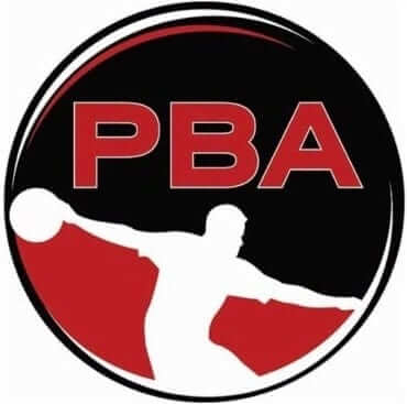
The logo for the Pro Bowlers Association, shown at right, depicts a bowler silhouetted in white against a black background. Just as with Jerry Dior’s classic MLB logo, the silhouetted figure is cleverly positioned so that he could be either left-handed or right-handed, depending on whether you’re looking at him from the front or the back. Either way, the silhouetted figure is the very picture of proper bowling form — a model of pin-bashing perfection.
Just one problem: The best bowler in the world doesn’t bowl that way.
In case you didn’t know (and let’s face it, you probably didn’t), the best bowler in the world is a 35-year-old Australian named Jason Belmonte. Over the past decade, he has been by far the most dominant player on the PBA tour, at one point racking up three consecutive Player of the Year awards. But he looks nothing like the silhouetted figure on the PBA logo. He bowls like this:
Weird, right? Belmonte uses what’s called the two-handed shovel technique. He’s not the only pro bowler to deliver the ball this way, but his runaway success has made him the standard-bearer for this style. I’ve seen him dozens of times on TV (yes, I watch televised bowling), but it still looks so weird to me. It’s sort of a like a golfer using a belly putter instead of a conventional putter, except Belmonte bowls this way for every single shot — even when picking up spares.
Belmonte, like all PBA bowlers, wears a PBA logo patch on his right sleeve. Or to put it another way, he wears a logo showing a bowler who bowls nothing like he does. The conflict between the two is captured nicely in this shot (click to enlarge):
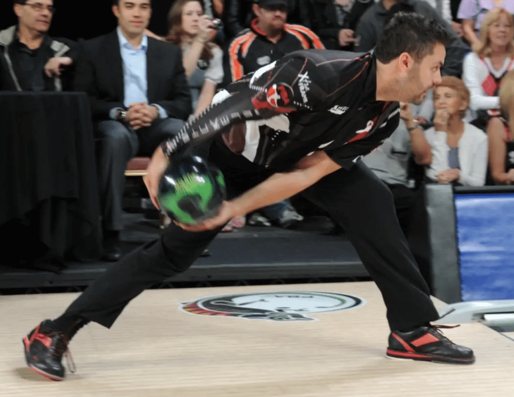
This wouldn’t matter so much if Belmonte were just, you know, any old bowler. But to repeat, at present he is the best bowler in the world, and there are reportedly a lot more two-handed up-and-comers in the pipeline. So Belmonte’s style is probably the future, and the style shown on the logo is likely to become the past. All of which makes you think the PBA will soon need a new logo.
Are there any other leagues whose logos are so out of step with their best player? I know people sometimes complain about how the NBA logo clearly shows a white guy wearing short-shorts and should be upgraded to something more contemporary, but the difference between the existing logo and a current player isn’t as radical as the difference between the PBA logo silhouette and Belmonte.
As it happens, Belmonte has his own silhouette logo, which shows him doing his two-handed delivery. You can see it on his chest in this next shot (click to enlarge):
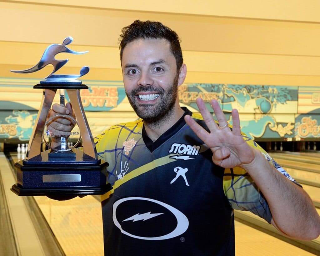
Could that, or something like it, be the PBA logo of the future? Given the extent to which bowling is struggling to maintain an audience and a participation base these days, that might not be the worst idea.
Leaving aside the issue of the logo, there’s also the larger question of the aesthetics of Belmonte’s style. Two and a half years ago I did a blog entry that explored the question of whether shooting basketball free throws underhanded, like Rick Barry used to do, is unaesthetic, and I think it’s worth asking the same thing about Belmonte’s bowling style. It’s certainly interesting, because there’s a certain novelty to it, at least for now. But I find it lacks the grace and fluidity of the more classic bowling style as depicted on the PBA logo. If everyone bowled like Belmonte, would I want to watch that on TV? I’m not so sure. Hmmmmm.
Click to enlarge
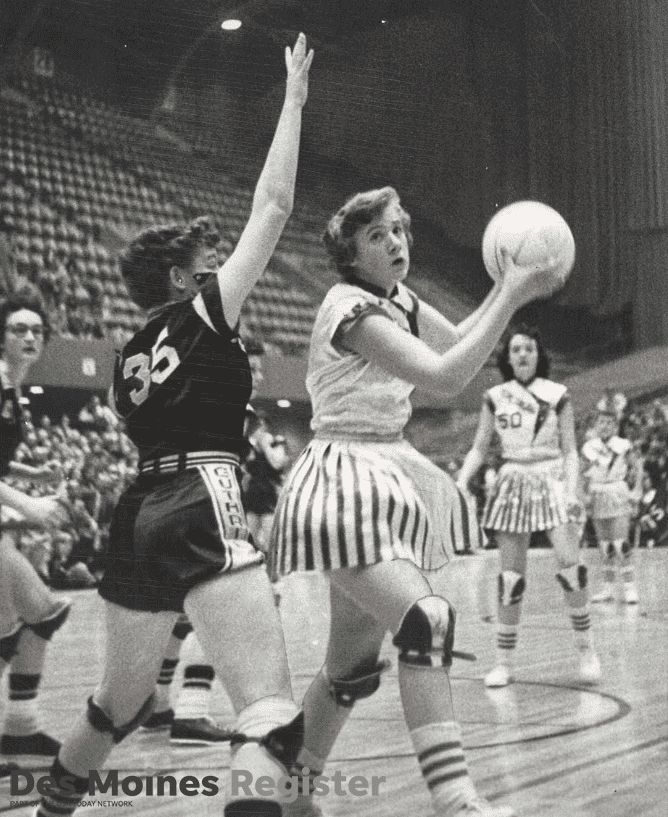
Too good for the Ticker: Chris Williams pointed me toward this amazing photo yesterday. The Twitter-er who posted it describes it like so: “From 1956: All-state forward Karen Anderson of Blakesburg makes a move in the post during a 6-on-6 Iowa girls’ state basketball first-round game against Guthrie Center.”
Leaving aside Blakesburg’s amazing uniforms (not just the skirts but the jerseys and the knee pads!), I’d never heard of six-on-six basketball, but it was apparently a thing for women and girls at one time, and in 2009 there was even a musical production called Six-on-Six: The Musical, celebrating sport’s popularity in Iowa, so there you go.

A good cause: The guy on the right in the photo shown above is Uni Watch reader Jon McCue, who is the defending champion of Climb to the Top — a 5K race up 66 flights of stairs in Manhattan. It’s a fundraiser for fighting MS, which Jon’s mom is afflicted with (as is a good friend of mine).
This year’s Climb to the Top is on Sunday, and Jon will be wearing a Uni Watch T-shirt! If you want to donate to help support him, you can do so here. Thanks for your consideration.
The Ticker
By Yianni Varonis

Baseball News: The Phillies are finalizing a deal with OF Bryce Harper. This is what he’ll look like in uniform with his new team. The news also means that MLB The Show 19 can finally unveil its cover. … … Down toward the bottom of this article is the news that Giants P Chris Stratton is particularly bummed that Harper didn’t sign with the Giants because Stratton, who wears No. 34 — the same number as Harper — was hoping to sell his number to Harper (from our own Brinke Guthrie). … The Lakewood BlueClaws will give away bobbleheads of Phillies 2B Scott Kingery for “Wizards and Wands Night” (from John Cerone). … The Athletics have released the latest iteration of their proposed stadium design. … According to this article, a prospect with a lower jersey number is a positive sign for his career (WaPo link) (from David Goodfriend). … The Charlotte Knights will wear commemorative uniforms to honor the 50th anniversary of the Charlotte Hornets’ Southern League championship (from Josh Claywell). … Also from Josh: The Louisville Bats will hold a press conference on March 7 to unveil the temporary name change and companion uniforms the team will have this season. … Grey, script “Alabama” jerseys are returning for the Crimson Tide in 2019 (from Hayden Kay). … Because of the spring training sleeve patch, the Orioles are wearing their Frank Robinson memorial patch on the upper chest. It will move to the sleeve for the regular season (from Marcus Hall).

Pro Football News: With broadcaster Jason Witten announcing his return to the Cowboys yesterday, he will presumably reclaim his Walter Payton Man of the Year jersey patch, which is worn by all active players who’ve won the award. … A Virginia high school is changing its name from Robert E. Lee to Staunton. It also has a new team name, Storm, which was apparently inspired by a quote that Patriots QB Tom Brady posted online (from multiple readers). … The Colts’ stadium, which is currently being used for the NFL combine, has that crummy NFL centennial logo at midfield. It’s not clear if this is just for the combine or if it’s for the upcoming season (from Cino Commisso). … The Indoor Football League will officially be tracking its teams’ uniform combinations this year.
College Football News: More than a decade ago, an Iowan purchased an Iowa State vanity plate that reads: “BPURDY.” Now her car keeps being mistaken for that of current Iowa State QB Brock Purdy’s (from Griffin Smith). … Idaho WR Collin Sather passed away from cancer this week. The Vandals basketball team remembered him with a black uniform stripe last night (from Dan Hunt).

Hockey News: G Keith Kinkaid was recently traded from the Devils to the Blue Jackets. Reader Mike Engle notes that Kinkaid has been wearing his Team USA mask, presumably because it matches the Blue Jackets’ color scheme and isn’t from a rival. It also works out that the Blue Jackets are named for the Civil War’s Union soldiers. … The Tulsa Oilers will wear autism-awareness sweaters and auction them off for charity. … The Adirondack Thunder will also wear sweaters that it will auction-off for charity, a purple set to benefit the fight vs. cancer (from Mike Lucia). … The Huntsville Havoc will wear three different Disney’s The Mighty Ducks-themed uniforms that it will auction off as well (from Tyler Earles).

Basketball News: The Erie BayHawks have new uniforms inspired by the Battle of Lake Erie during the War of 1812 (from @GobertOrGoHome and @_SlippinJimmy). … Cross-listed from the NCAA football section: Idaho football WR Collin Sather passed away from cancer this week. The Vandals basketball team remembered him with a black uniform stripe last night (from Dan Hunt). … Utah State will give 1,500 fans free bacon before its upcoming game vs. Nevada (from multiple readers). … Yesterday’s Ticker had an item about DII school IUP forgetting to bring their uniforms for a game against Edinboro and having to wear old Edinboro road unis instead, but Paul couldn’t find a photo that showed the resulting Edinboro-vs.-Edinboro matchup. He’s now come up with this.

Soccer News: Puma will now be the kit manufacturer for English club Manchester City. … English sixth-tier club York City revealed a 1970s-era fauxback that will be worn for the last home game of the season, which will also be the last at that stadium (from our own Jamie Rathjen). … Perhaps in part because the Columbus Crew was saved, the team is bringing back its original mascot, Crew Cat (from John Flory). … New away kit for New Mexico United (from Josh Hinton).

Grab Bag: Southern Illinois University unveiled a new athletics logo in a video featuring the evolution of each of its previous logos (from multiple readers). … Blue Ridge Community College has a new logo to celebrate its 50th birthday (from Jake Patterson). … Reader Kevin Vautour shared four Boston Police Department patches featuring Patriots, Red Sox, and Bruins logos. … On Sunday, NASCAR driver Kurt Busch will commemorate the 20th anniversary of his Southwest Series championship with a throwback paint design on his car (from Christopher Hickey). … Someone is selling a Dale Earnhardt-themed truck, inside and out. … There are several ways that an office’s environment and design can impact a person’s mental health. … Alaska Airlines bought Virgin America in 2016 and has now redesigned the cabins of the acquired fleet. … Can you really get rich by “investing” in sneakers? Maybe, but it’s risky (from Jason Hillyer). … A federal judge has blocked prosecutors’ efforts to strip the Mongols motorcycle gang of their trademark (from Jack Wade).

What Paul did last night: I’ve written before about my friend Daisy, who makes really interesting clothing, like this bread tag jacket that I showcased on the site two years ago. I saw her last night (we’re both fans of the band Susquehanna Industrial Tool & Die Co., which plays at Otto’s Shrunken Head on the last Thursday of every month), and she was wearing her latest creation — an outfit ingeniously accessorized with coffee stirrers. Check this out (for all pics, you can click to enlarge):

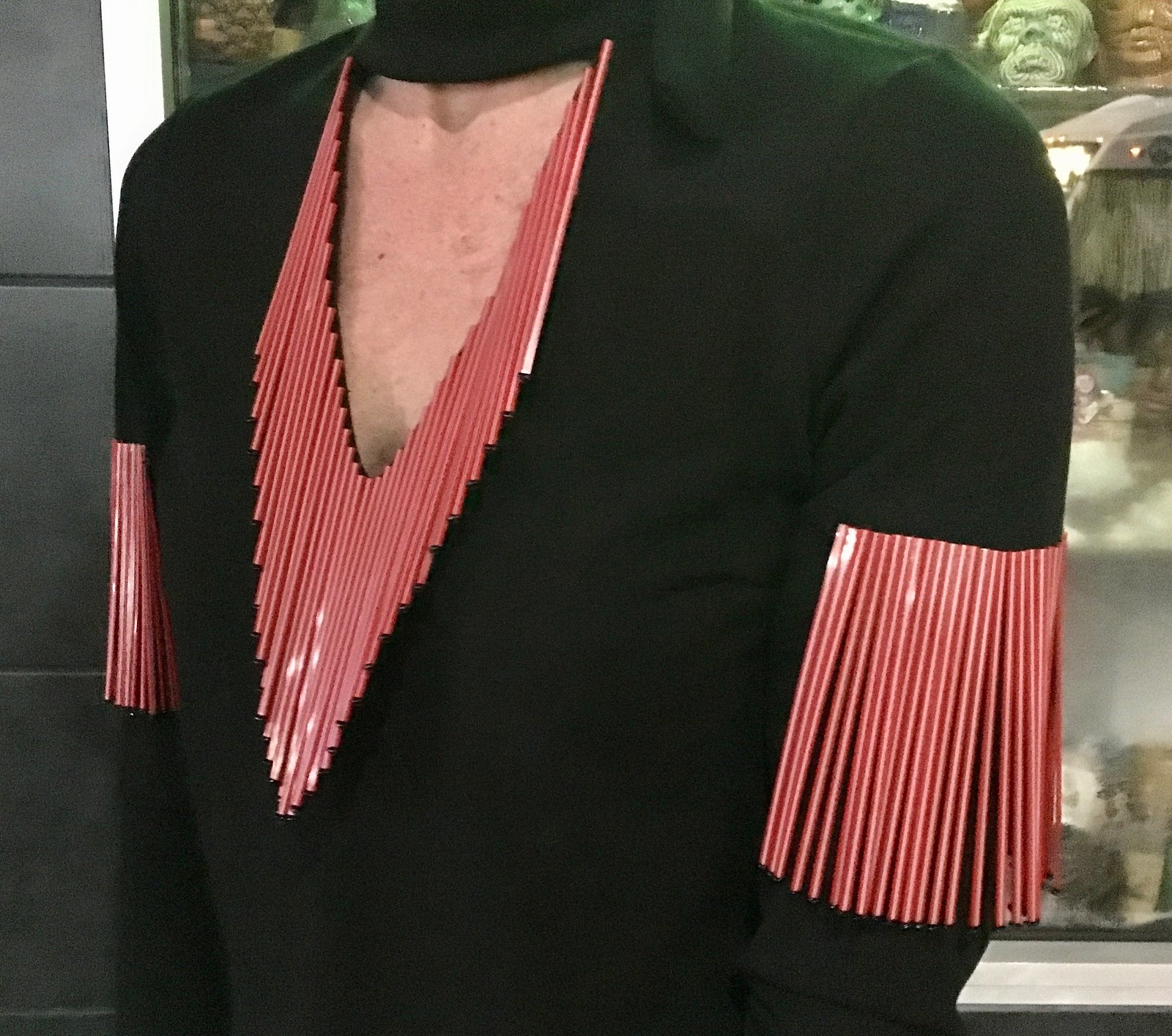
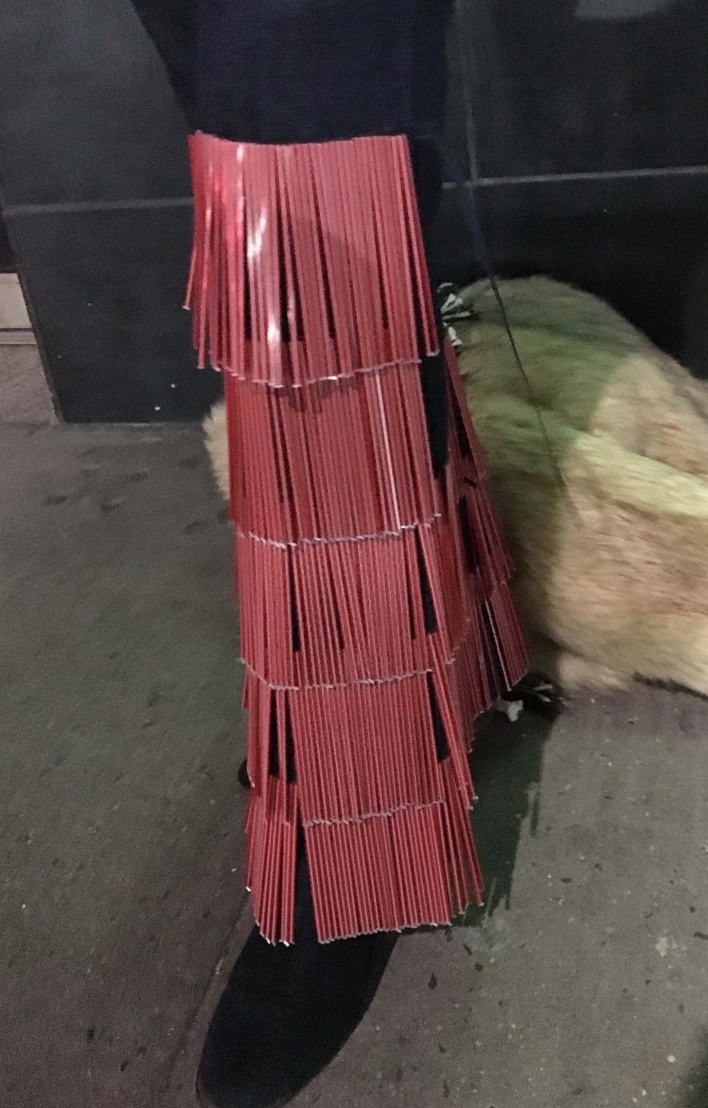
Isn’t that fantastic? She sewed the stirrers onto ribbons and then sewed the ribbons onto the clothing. But then she found that the stirrers waved around too much, so she glued a little bead onto the bottom of each one to weigh it down — incredible! I really should have shot a bit of video so you could see how they swayed when she moved. Great, great concept and execution.
Puma will take over as Man City’s kit manufacturer. Etihad Airlines will remain their primary advertiser.
The BayHawks should have left the nautical flags in their proper colors or not used them at all. The colors matter for clarity of communication; the Clippers managed to do it right.
Fewer sports should use athlete silhouettes as logos. Even the ur-silhouette logo, MLB, kind of got lucky. Batter stances have evolved over the years, but basically ever batter who’s ever reached the bigs gets set into a stance like the batterman when initiating a swing. Pause video of Craig Counsell and Ted Williams at the beat just after each has committed to swinging, and they both look like the batterman. Had MLB gone with a pitcher, its logo would be made obsolete every 20-30 years.
Curling is another sport too often depicted with athletes in delivery, and so trophies, plaques, and event graphics usually look dated. Where techniques and equipment change or evolve, something other than technique and equipment should be used to depict the sport,
i think soccer (in the US) is a huge sufferer of this. The most iconic depiction of a soccer ball is the black and white panel ball which is simultaneously iconic and dated. A logo like Barcelona’s with the old style ball link always look better than the San Jose Earthquakes link and their logo which looks like clip art with the black and white panel ball.
6 on 6 basketball
One of my mother’s oldest cousins was a player on my high school’s first girl’s basketball teams. (This cousin went on to play at a D2 college and became a basketball coach for high school girls.) Last December our family shared a meal together as this cousin is rarely in town. My father asked her about her basketball days. She responded with, “Oh, back then, girl’s/women’s basketball was 6 on 6. But, really,” she clarified, “It was three on three.” Each team and three defensive players and three offensive players. The only thing that crossed the center line was the ball. Meaning one would inbound the ball, break some sort of press, and then pass the ball over the half court line to your offensive team mates.
If you look at the photo you posted, you can clearly see teammate at the half court line. No, she isn’t hot dogging it like an NBA player refusing to come down the court. She is waiting for a change of possession in order to guard someone a they get to the half court line.
I do not know when the girls at my high school switched to 5v5. I do know the 6v6 was at least 12 seasons at my school.
The last 6 on 6 championship was 1993. Not only was 6 o 6 actually the original form of girls’ basketball with 3 on 3 play in two zones, there was also a two-dribble rule. Interestingly, Title 9 is credited with bringing about the end of 6 o 6. All new programs were 5 on 5.
Oklahoma’s last 6 on 6 championship was in 1995.
“How Girls Basketball in Oklahoma has Evolved from its 6 on 6 Roots”
link
I believe there were schools (mostly small schools) here in Iowa still playing 6-on-6 ball until the mid/late 80s; prior to that I think the 6-on-6 game was still being played in Oklahoma, but Iowa is where it made its last appearance. Since the transition to the 5 player game was gradual, there were many years where girls had two separate state tournaments, and the 6-player version had some unique traditions associated with it, along with several unusual rules about certain numbers of passes and limited numbers of dribbles per possession. Iowa Public Television did a tribute special to the 6-player game awhile back. Definitely interesting viewing for historical, athletic, and of course uniform purposes!
I spent several years growing up in Iowa, so today’s discussion of six-on-six girls’ basketball is a fun little walk down memory lane for me!
To add a bit more visual flair to the discussion, here’s a slideshow from the Des Moines Register showing all kinds of great photos from the girls’ basketball state tournament over the years:
link
Definitely worth a look!
Aaron is right that Iowa held two separate girls’ state basketball tournaments, from 1985 through 1993 for the six-player and five-on-five variations of the game. The five-on-five tournament was added as the result of a Title IX lawsuit filed by several high school players a couple of years earlier.
Most of the state’s large schools switched to the five-on-five game right away, but lots of small-town and rural communities clung to the tradition of the six-player game right up until the Iowa Girls Athletic Union announced it would stop sanctioning six-player competitions after the 1993 state tournament.
The decision to end the six-player was big news in the sate at the time – and very controversial. There’s still lots of nostalgia for it among certain generations of Iowans.
Regardless of whether there was an inherent inequity in playing the game by different rules for boys and girls, to their credit, Iowans really turned out in droves to support the six-on-six state tournament. The girls’ tournament in those days always rivaled – and at times surpassed, from what I’ve been told – the boys’ tournament in attendance. It was definitely a source of pride for lots of Iowa communities.
Love that info, thanks for sharing it. The 6-player tournament lasted longer than I’d remembered.
I hope that crummy NFL 100 logo is gone for the home opener for the USL Indy Eleven on March 30th.
Yeah I am really worried about that too!
Harper wears a C-Flap, which obviously is not depicted on the video-game cover
from baseball section: “will wear commemorate uniforms”
commemorate is a verb
com·mem·o·ra·tive is the adjective
Yup, already fixed.
“To is a preposition…”
“would you like to come up and see my etchings” is a proposition
…you don’t know your Lenny Bruce?
In my opinion, the biggest problem with the Colts’ field is not the NFL 100 logo. It’s the fact that if you look at the field with the midfield logo facing you, for years, they have “Colts” in the left end zone, and “Indianapolis” in the right. So when you take in the field in a broad view, it reads “Colts Indianapolis.” I hate when schools and teams do that.
If you’re going to have the city or school in the end zone, put that in the left end zone and the team nickname in the right end zone. Then when you take in the field in a broad view, it would read, in the Colts’ case, “Indianapolis Colts.”
Yes, I’m probably being really ridiculous, but it irks me. The University of Florida is another school that follows the Colts’ lead.
link
What’s interesting about the logo that Belmonte has had developed and uses is it kind of looks like a basketball player with a ball looking to pass etc.
Have there been calls to ban this style of bowling? I can see an argument that it goes against the spirit of the rules?
I believe two-handed bowling has always been legal. You can walk up to the foul line and underhand it between your legs if you want, as so many kids do. Belmonte’s style is sort of halfway between the “normal” way and the kiddie two-handed way.
As of today, USBC rules dictate that you can deliver the bowling ball in any way, so long as you:
A) do not cross over the foil line
AND
B) the number of fingers in the hole of the bowling ball is EQUAL TO or ONE LESS than the number of holes drilled into the ball.
“A” goes without saying, but “B” is the more crucial rule – many pros and high end amateurs have their bowling balls custom drilled in order to enhance the hooking potential so the ball can cut through the oil on the lanes – the thing is, Belmo does not use his thumb in the ball, so he can only have, at most, THREE holes in his ball. If he had FOUR HOLES (see next paragraph), then bowling two handed without a thumb would be an illegal delivery and he would revive zero for that shot.
I bowl with one hand and theee fingers (like the bowlers most grew up watching on TV), and my bowling balls have a “balance hole” to allow for positive “side weight” and a better roll on my ball. If I were to take my thumb out of one of my four holed balls, it would be an illegal shot.
Belmo’s style wasn’t unprecedented when he burst onto the scene in 2009 – back in 1991, Mike Miller, a seasoned pro with limited success, began bowling without a thumb in the ball and saw instant success in his style change – same rules applied back then regarding hole quantity, and his style was viewed as polarizing.
This thing is, next year the USBC is changing it’s rules regarding balance holes, so nearly every player will be affected by this new rule, and it will be interesting to see how Belmo and the other pros (not to mention competitive league bowlers like myself) adapt to this.
Personally, I’m not a fan of the two handed style as, like Paul, I grew up watching the greats from 1987 to 1997 like Parker Bohn, Mike Aulby, Mike Scroggins, Amleto Monacelli, Danny Wiseman, Randy Petersen and Walter Ray Williams. But over the last 10 years this style is trending High and not going
Anywhere – there are many tactical advantages to it which I could get into if you’d like.
Thanks for the excellent explainer, Danny.
Great stuff, Danny! Thanks for sharing. I am curious about the tactical advantages of the two-hand style. It seems that Belmonte’s ball curves much more right before impact with the pins than I’ve seen with most bowlers’ more traditional deliveries (certainly more than mine)! Is this a results of the two-handed technique? Also, is their any stamina/fatigue advantage in using the two-handed style?
All great questions, I’ll try to break it for you.
Using two hands creates more revolutions on the ball as it travels downlane, which generates more power potential – speed, revs, and type of ball can affect how the pins react to being hit.
A well practiced one handed bowler will generate between 300-500 revs per minute, compared to a two handed who can get into the 700s.
Speed goes without saying – faster you hit the pins the more action they have banging into each other.
Ball composition is the other factor, and I can go for hours on the history of bowling ball construction (wood pre 1920s, rubber, plastic, urethane, reactive resin, and now particle), but essentially the COVER of the ball and the weight block at the CORE are the crucial elements – a symmetrical ball core will roll smooth, and an asymmetrical core will have a violent snapping hook that you associate with guys like Belmonte; BUT, the oil on the lanes (both volume and how far down the lane it is applied) and the cover of the ball will impact this because more oil means more skid, and some ball covers absorb oil and some will push it further down the lane.
Next time you watch PBA on tv look for blue spots on the ball (they began using blue oil a few years back to show casual bowlers this transition) – if you see a thin blue ring, chances are it’s a one handed traditional bowler who knows how to repeat their shots. If you see a blue pattern looking like two tornados touchin at their tips, that’s typically a two handed bowler’s ball because it is spinning faster over more surface of the ball.
To summarize, just because you bowl with two hands doesn’t mean you have an advantage – there are lots of factors that play into it.
As for fatigue, there is more of a strain on the back when you throw a two handed shot (assuming you throw 15-16 pounds like the pros do). I’ve seen people who have bowled for years with one hand try a two handed shot and be it of action for weeks to heal back up. To go back to Mike Miller te no thumb bowler who I referenced in my past post, he had to go down to 10 pounds and build his stamina up to 15 before coming back to the pro tour in 1991, and he STILL suffered injuries often. But to be fair, anyone throwing 16 pounds at 18mph for 16 games a day 4-5 days a week needs to be in peak physical shape and there’s always a risk of injury – unless you’re a very large person, you’re throwing 10% of your body weight each time and that adds up!
On a side note, and this is for Paul – HOW ABOUT SOME UNIFORM COVERAGE ON THE PBA TOUR? there are some fantastic styles and uniforms on display every week on the pro bowlers tour, and that doesn’t event take into account legends from the past who made a name for themselves with their flamboyance and panache, i.e. Ernie Schlegel, Guppy Troup, Danny Wiseman, and many more…
Thanks, Danny! This was a fascinating read. I really appreciate the thorough explanations. And I second the idea of more bowling uniform coverage! I admit I’m not much more than a casual fan, but I do enjoy televised bowling coverage, and I find the aesthetics of bowling fascinating (like I do most other sports, too).
My pleasure, happy to contribute to a bowling conversation in any way.
Paul, it would be my pleasure to provide some additional information regarding insight on the PBA, bowling uniforms, or anything bowling related, please contact me via email if my services can be of any help.
I wasn’t suggesting that this style was against the written rules but I assumed that other bowlers would have suggested that the rules should be updated to ban it (for adults). This article does a good job in presenting both sides of that argument – link
Re. the York City fauxbacks: the best part of this is that they are referring to them as Y-Fronts. This is the term for men’s underwear in Britain.
But are they “fauxbacks”? Didn’t they wear a kit just like that in the 70’s?
Yes, they did wear one like that. In red/white, and also white/red, per the pix at Historical Kits.
lt’s a fauxback because it’s not an exact reproduction of the original. It uses the current crest, ad, maker’s mark, and likely number font as well.
However, when submitting it I used the term “quasi-throwback,” because the underlying design is a reproduction of what was worn (but with white socks), the above points aside.
Seems like a gap in our nomenclature. I’d propose that until we have a more precise term, any uniform that’s intended to resemble an actual past uniform is a throwback. A fauxback would be any uniform that’s intended to evoke an imaginary, rather than actual, past uniform. Wearing your modern badge and numbers on a shirt with the same underlying pattern as a 1970s jersey is a throwback; wearing a uniform designed to look like it might have been worn in the 1970s but wasn’t is a fauxback.
Given the historical development of throwbacks, perhaps a better term for an attempt to more-or-less-accurately reproduce an old uniform would be “turnback,” and an attempt to merely evoke or generally resemble an old uniform would be a “throwback.”
Diggerjohn111,
York City team photo from 1974-75, showing the original Y-front design:
link
Crazy that 2 Erie items were in the basketball ticker. With Erie being my hometown, I love to see this. Edinboro is about 15 miles down I-79 or PA-99 from Erie.
You have some strange (in a good way) and fascinating friends, Paul. That coffee stirrer outfit is cool.
I think we can all agree that an NBA logo featuring a close-up of Shaq’s crotch would not be an upgrade!
Re: the bowling logo, my first thought of a dramatic change in the way a sport was performed was the high jump. That would definitely call for a logo change. Maybe there’s something in the Olympics sport-specific logo history that shows that.
I can’t help but fantasize about an NBA played 6-on-6 with that pseudo 3-on-3 play. It would be like soccer where you have players who are specifically defenders or forwards depending on their natural skill set. Let’s be honest, there are plenty of guys in the NBA who are WAY better on one end of the floor than the other.
Paul, since you like to be as technically correct as possible, you might want to change the Charlotte Knights ticker entry, as they are not celebrating their own Southern League championship from 50 years ago but that of the Charlotte Hornets baseball team. Even though the present-day Knights franchise has had several different names, the Hornets team left Charlotte in the early 70’s with the current franchise appearing a few years later.
Thanks, Dan. Fixed!
Grab bag: Alaska Airlines purchased Virgin America, not Virgin (Atlantic) Airlines.
Jason Witten. The background for the captaincy patch on Witten’s jersey appears to be navy blue, even though the white jersey doesn’t include any navy blue. Probably because they use the same patch for both jerseys, and it will match the rarely worn navy jersey.
That close-up pic emphasizes some of the problems with the Cowboys home unis. Silver helmet with navy stripes. White jersey with royal blue stripes outlined in black. And of course the greenish-gray pants.
If an AAF team rolled out those unis, we would blast them for the inconsistencies.
It is interesting how the looks of some teams become celebrated as classic and attractive, even with strange inconsistencies which would be ridiculed for new uniforms today. The endurance of time assists with this.
I find it is the same thing with the Los Angeles Dodgers. How strange is it to just have a random red number on the front of a uniform that is just blue and white? Yes, we accept this as a classic look. Not sure how praised this wound be if a team did the same thing in a new uniform today.
I assume Bryce Harper will wear number 34 for the Phillies. As I recall 34 was retired by the Phillies for one year (2018) to honor Roy Halladay. I believe Halladay is eligible for the HOF this year. Would the Phillies then retire the number and continue to let Harper wear 34?
Halladay isn’t just eligible, he’s been elected
Thanks mike 2, you’re right. I knew that but somehow “eligible” stuck in my mind.
And Halladay was elected to the Phillies Hall of Fame in 2018, alongside former GM Pat Gillick.
That Blakesburg uniform might see the ultimate mid-century sports uniform I’ve been hoping to find. The boomerang button front looks amazing, I will have to see if I can find clearer pictures.
And I love the bread clip jacket and stir stick project!
Paul you are friends with some very interesting people, and I mean that in the nicest way possible. You’re inspiring me to get out and talk to strangers more!
Daisy’s outfit reminds me of the tasseled look sported by many pro wrestlers in the 1980s.
I think to PBA logo should be similar to the trophy Belmo has in the picture above. There are a couple good videos that show that even a two-handed bowler has a near identical release point to their one-handed counterparts. The best analogy I can think of would be a hitters batting stance in baseball. Regardless of how different hitters may seem in the batters box, they all look very similar when actually making contact with the ball. The PBA could easily design a logo at the release point, that could be a right-handed, left-handed, or two-handed bowler.
Why does Harper always have to look pissed off in his photos? He’s getting $330 M over 13 years. You’d think he might be happy.
It’s a tough guy thing.
Today is an example of why I love to read this site.
I like to think of myself as a fairly knowledgeable sports fan. However, knew nothing about this two-hand bowling delivery or 6-on-6 basketball until today.
Come here for uniforms, but also learn something I didn’t know about sports, travel, food, music. This is a great community of readers too, as we always a great variety of information from all sports.
Paul I also watched televised bowling. I used to run 12 team league but life got in the way amongst other things. I wouldn’t ask if the PBA Logo might change. I would ask why bowling shirts (to me)are so ugly? Why the patterns are so outrageous? Can we just have a solid color top? Please do an article on this some day! Thanks in advance!
I hope the NFL puts that 100 logo at midfield of EVERY field in the league… WHY? Because there really is nothing wrong with that logo and I’d love to see this site bitch about it for a season.