Cleaning out the office and found this.
What should I do with it, @UniWatch?
(CC @zach_goodall) #Jaguars pic.twitter.com/MM3buCuk2d
— Jeff Sharon (@Jeff_Sharon) February 12, 2019
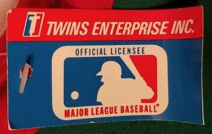
Last week a guy named Jeff Sharon found an old Jacksonville Jaguars cap and tweeted a photo of it at me (see above). Soon after that, Twitter-er @dbloomy responded by saying, “I designed that cap when I was Art Director for Twins Enterprise in 1995!”
I was intrigued, so I ended up back-and-forthing a bit with @dbloomy, who turned out to be Dave Bloomquist — a longtime Uni Watch reader and membership card holder (as you can tell from his card, he’s a big Seahawks fan). I asked him if he’d be willing to write about his experiences at Twins, and he readily agreed. Here’s his story.
My Time at Twins
By Dave Bloomquist
Twins was a souvenir store across from Fenway Park started by two twin brothers, Henry and Arthur D’Angelo, in 1947. Through the years it grew into a successful baseball cap wholesaler. During the 1990s licensed sports product boom, Twins became an industry giant, owing a lot to smart supply chain management and the ability to provide highly sought after stock like Raiders and Bulls caps with a short lead time. We also had special licenses for things like the 1996 Atlanta Olympics and the 1998 World Cup.
Eventually Twins partnered with Sam’s Club, Lids, and Walmart to grow exponentially. In 2010 the company changed its name to ’47 Brand (now known simply as ’47). They now hold one of the few MLB cap licenses.
Before I worked at Twins, I went to college at Massachusetts College of Art in the late 1980s. I developed a reputation as a big sports fan while I was there, as many of my projects were sports-related: a Red Sox season ticket brochure; a color-aid paper collage of the Seattle skyline that prominently featured the Kingdome; a foam core mock-up of a stadium that was a combination of Fenway and Veterans Stadium; and my Senior Degree Project, which was a study of NFL logos. I contacted and heard from every team. The highlight of the project was speaking with Fred Gehrke and having him tell me the story of creating the first helmet logo for the Rams. Unfortunately, I no longer have any of these projects, and I’m kicking myself for not keeping all the letterheads, stickers, and photos that were sent to me.
One of my classmates was neighbors with the Twins owners and recommended me to them, so I started working for them in 1990. It was a pretty bare-bones operation at the time, running out of a small office behind the store with about a dozen employees. I was happy to join — it was the perfect job for a sports fanatic like myself.
Twins had no in-house creative before I came in. All they really wanted at first was one basic cap design, because all they did for design in those days was circle a logo on a stat sheet and send it to China to be manufactured. There were many mistakes in colors and logo use, and the interpretation was often wrong. My first priority was to accurately render the logos for our manufacturer. I started with tracing paper and markers, as computers weren’t widely used for digital design in 1990. Eventually, I lobbied for a PC and a scanner, and used Corel Draw to create vectors for all of the logos.
We held the license for MLB (26 teams at the time), the NBA (27 teams), and the NHL (21 teams). We didn’t hold the NFL license until 1995, but sublicensed it through Starter. We also held licenses for 120 colleges and all of the countless Minor League teams. That was a lot of digital transformation! And it doesn’t even count all the logo changes and expansion that took place during 10 years I worked there.
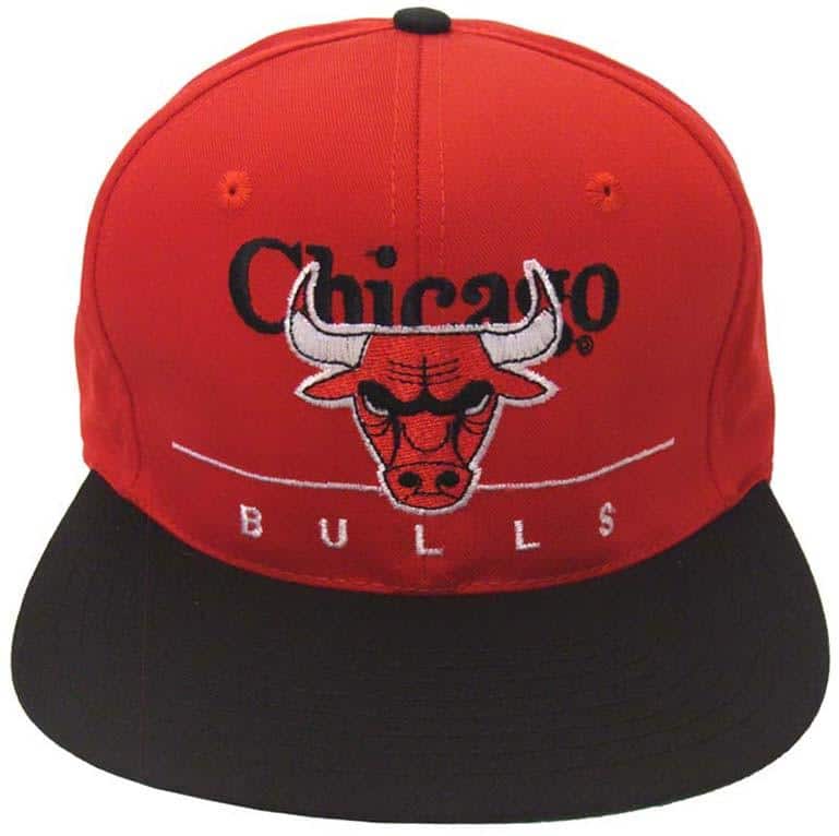
At first we offered either a logo hat or a hat with script writing. When I came on I designed “The Super,” as it was called, like that Jaguars cap I saw on Twitter. The Chicago Bulls Super was the best-selling sports cap in the US from 1992-95. Soon, as demand increased for new designs, we started experimenting with ’90s-style excess by creating all sorts of contrasting-panel caps and oversized logos.
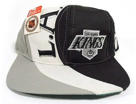
Our “Vortex” cap was the next huge seller. I designed that by drawing on a white cap, then cutting the panels and sending them to the manufacturer. Here’s an example:
Finally, as with all things, the cycle ran its course and demand switched to more subtly designed brushed-cotton slouch caps in the style of Abercrombie & Fitch and American Eagle.
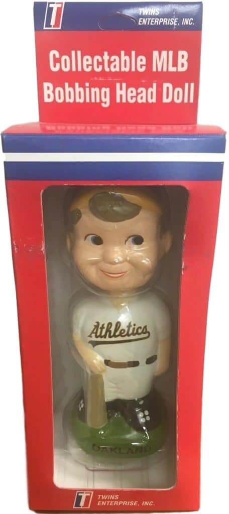
We also manufactured bobbleheads, which we called bobbing heads. These were also made in China, which cause a great deal of grief for me, as the manufacturer tended to make the faces look very Asian (yellow-tinted flesh, exaggerated wide eyes). Also, as the molds became second-, third-, and fourth-generation, they started to lose definition in the arms and gloves. But the worst was when we got the football license. It took five or six tries and they still couldn’t get the helmet right. I finally sent my own Seahawks helmet for them to reference, but they never sent it back! Well, at least they finally got the helmet right. We eventually started getting away from the player look and started doing mascots. Again, lots of misinterpretation came out of that, but they were quite popular.
Despite the assorted frustrations, it was a great job. I saw my caps while watching games on TV, in stores, and I even ran into an Italian guy wearing a Mighty Ducks Vortex on a trip to Rome in 1998. Blew my mind. I also became very friendly with the league licensing directors and would often trade boxes of caps for all kinds of swag. I even got a ticket for the Titans/Rams Super Bowl from my NFL connection.
And that wasn’t the only ticket I got. If I traveled anywhere from Sacramento to Tampa, I got great seats for any game I wanted. Finally, because of all the trade shows and personal friendships that the bosses had with Red Sox players, I met a load of sports celebrities like Tim Brown, Roger Clemens (who used to hang out in the office before starts), Bill Russell, David Justice, and Cam Neely, to name just a few.
I also had access to the leagues’ various style guides, so I knew about all the logo changes a full year before they were unveiled. If Twitter had existed back then, I would surely have been the king of leaks. Unfortunately, I didn’t get to keep any of the style guides, as there were strict rules about that. As far as caps, I have boxes of them in storage at my parents’ house.
Nowadays I live in Hong Kong and work as the Senior UX Designer at Sun Life Financial. Meanwhile, Twins has become bigger that I ever could have imagined. I’m sure many people reading this own ’47 Brand caps. It’s nice to know that I had a part in that growth.
———
Faaaascinating stuff. Thanks for sharing, Dave!
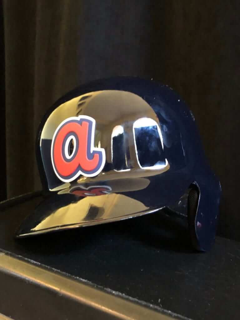
Click to enlarge
“a”-volution: Back in 2014, the Braves introduced a new spring training cap with a white front panel and an oversized “a” logo. They later came out with a navy version of the cap and then put the oversized “a” on their spring batting helmets.
Now, as you can see above, they’ve taken it to the next level by going with a 3D version of the helmet logo, which I gather will be visible from space.
A team source tells me there are no current plans for this logo to be used during the regular season — it’s only for spring training.
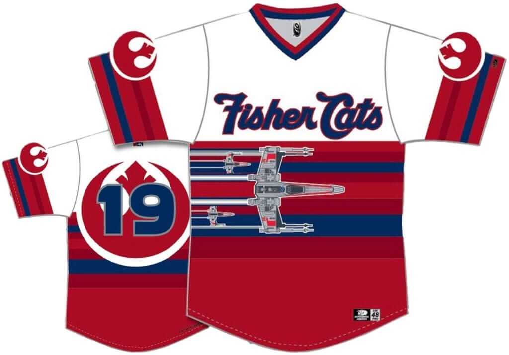
Click to enlarge
Too good for the Ticker: MiLB uni worlds collided yesterday, as the New Hampshire Fisher Cats — the Blue Jays’ Double-A affiliate — announced that they’ll be wearing a Star Wars uniform with a tequila sunrise pattern on July 27.
Star Wars jerseys generally bore me to tears (see, for example, what the Omaha Storm Chasers unveiled yesterday), but I like how the Fisher Cats have made this one work. Nicely done!
Click to enlarge
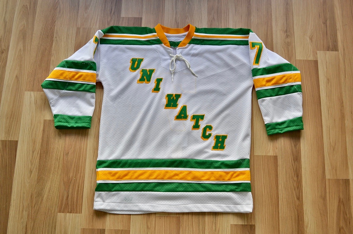
Wafflebored jersey reminder: We’re currently auctioning off the very excellent Uni Watch hockey jersey shown above, which was made by the one and only Wafflebored. Full details here.
While we’re at it, we also announced this week that Uni Watch is once again partnering with Grey Flannel Auctions to provide free appraisals of your sports-related collectibles.
If you have game-used jerseys, autographs, or other potentially valuable memorabilia, you can submit photos and descriptions to GFA and get a free appraisal, with no further obligation, within 72 hours. It’s like an online version of Antiques Roadshow. If you want to consign your item to GFA, that can be arranged, but you’re under no obligation to do so.
For full details on all of this, look here.
The Ticker
By Paul

Baseball News: No surprise here: The Dodgers will add a “36” memorial patch for Don Newcombe. … Here’s some great spring training footage of the 1939 Cubs (from Bob Gassel). … And in the interests of equal time, here’s some spring training footage of the 1960 White Sox. … And while we’re at it, here’s some spring training footage of the 1960 Dodgers. … The Round Rock Express will wear tequila sunrise alternates for Saturday home games this year. Here’s the accompanying cap design (from Ignacio Salazar). … INF Josh Harrison, now with the Tigers, will wear No. 1 as a tribute to former Detroit great Lou Whitaker. No word on whether he’ll also wear a Sharpied replica jersey. as Whitaker had to do in the 1985 All-Star Game (from Mike Engle). … More numerology: 3B Mike Moustakas, who wore No. 18 with the Brewers last season, is switching to No. 11. … The latest team in the Futures Collegiate Baseball League is the Westfield Starfires. … Twelve players in Giants camp, including C Buster Posey, are wearing a C-flap. Last year the team had only one flapped player. … Manny Machado will wear No. 13 with the Padres (from Randall Sanders).

NFL News: A Chiefs blogger has written a tribute to the team’s uniforms (thanks, Phil). … Eagles WR Alshon Jeffery wants the team to bring back the Kelly green uniforms, but you probably shouldn’t get your hopes up about that.
College and High School Football News: Check this out — a 1928 high school football program that appears to indicate that one team used uniform letters instead of numbers. The listing for the other team has conventional numbers (good find by Josh Kagavi). … New uniforms apparently in the works for Baylor (from Josh Lassiter). … Clint Richardson’s look at Auburn’s uniform history has now reached the 1960s.

Hockey News: Good article about NBC’s TV coverage of tomorrow’s Stadium Series game. Key quote from broadcaster Mike Emrick: “When you are identifying [uni] numbers, you can’t go by the backs of players because they don’t always turn that way for you,” so Emrick more often looks for the sleeve number. … Speaking of uni numbers, new Bruins F Charlie Coyle will wear No. 13, and new Wild F Ryan Donato will wear No. 6. … New uniforms, including a pretty crazy sock design for Canisius. Additional info here (from Andrew Meyer). … It’s one thing to wear a jersey, but singer Arlette Roxburgh, who sang the national anthem at last night’s Devils game, wore a reasonable facsimile of a full uniform. … Speaking of last night’s Devils game, singer Wyclef Jean dropped the ceremonial first puck and wore a Devils jersey for the occasion. … The Panthers wore white at home last night against the Hurricanes, who once again wore red on the road, as they’ve been doing quite a bit in recent weeks (from Josh Berkowitz).

Pro Hoops News: The Hawks’ affiliate — previously the Erie Bayhawks — will now be called the College Park Skyhawks. .. Raptors 905 of the D League will wear Degrassi uniforms, from the Canadian teen drama show, on Saturday (from Mike Chamernik). … Also from Mike: Newly acquired Raptors G Jeremy Lin, who’s been assigned No. 17, says he accidentally put on teammate Kyle Lowry’s gear because he’s used to wearing No. 7. … More numerology: New Suns F Ray Spalding will wear No. 26, and new Thunder F Markief Morris will wear No. 5. … The Bucks have teamed up with a local roaster to create “Bucks Blend Coffee.” … The Philippines and Qatar went color vs. color yesterday. “Probably the first time I’ve seen that in a FIBA-sanctioned game,” says @marcomanipon). … Here’s a basketball sneaker made from pieces of jerseys and nets. … Here’s a look at the Kings’ record broken down by uniform going into last night’s game (from Rich Ripley). … The 76ers had an Australian Heritage Night promotion last night, which probably explains why Sixers G Ben Simmons, who’s an Aussie, wore one green shoe and one yellow shoe (from Mark Mogan and Phil). … That promotion also included a giveaway T-shirt featuring a boxing kangaroo wearing basketball sneakers. (from Aaron Pinto). … When Duke F Zion Williamson suffered a sneaker blowout two nights ago, he was wearing Thunder F Paul George’s signature shoe, so now George has asked Nike WTF.

College Hoops News: Good story on Syracuse’s equipment manager. … Iowa will wear black at home tonight (from our own Jamie Rathjen). … The LSU women’s team wore pink last night (from @__7ate9__). … Cross-listed from the pro hoops section: When Duke F Zion Williamson suffered a sneaker blowout two nights ago, he was wearing Oklahoma City Thunder F Paul George’s signature shoe, so now George has asked Nike WTF.

Soccer News: Middlesbrough MF John Mikel Obi posted photos of his young twin daughters in Middlesbrough jerseys. … Paris Saint-Germain is getting a new jersey sponsor advertiser. … New secondary kit for D.C. United (from our own Jamie Rathjen, among many others). … New embarrassingly named kit for the Houston Dynamo. … Tomorrow, English Championship team Stoke City is remembering former G Gordon Banks, who was England’s 1966 World Cup-winning goalie, with a plain green No. 1 goalie shirt with no badge, ad, or NOB (from our own Jamie Rathjen).

Grab Bag: I’m not a NASCAR fan, but I do love these old spotter guides. Many additional examples can be found on this website (from Blake Pass). … Selkirk College in Canada is asking the public if it should change its team name and logo. … Two children in Kenya have been arrested for stealing Kenyan navy uniforms. … A California teen is challenging her high school’s dress code after being told she couldn’t wear a “Make America Great Again” cap. … The Virginia state flag includes a depiction of Virtue with one breast exposed. Now an activist campaigning in favor of the Equal Rights Amendment has been arrested — and held without bond! — for mimicking the scene on the flag, complete with breast exposure (from Max Weintraub). … Update, the judge has now permitted bail for the protester. … Kylo Ren may have a new helmet in the next Star Wars movie. … The hot thing in NYC restaurants: new and unusual pasta designs. … Under Armour has extended its outfitting contract with Virginia Military Institute. … Tennessee Gov. Bill Lee says he regrets having worn a Confederate uniform during an “Old South” frat party when he was in college. … A teaser photo for a new Kia car shows a new Kia logo. … Some of Nike’s new self-lacing sneakers aren’t working properly (from Mike Chamernik).
Good stuff. Thanks for sharing, Dave.
The 2nd link in the Alshon Jeffery story doesn’t make any allusion to the Eagles going back to kelly green. It’s about the Phillies going after Bryce Harper.
Apologies. Now fixed, and here’s the proper link:
link
The Twins Enterprises is phenomenal. Thanks for sharing.
“a 1928 high school football program that appears to indicate that one team used uniform letters instead of numbers. ”
What up G??!!
oh wait, there is no G.
I dig the first name abbreviations too!
Two members of the team are wearing the letter A. Oops.
Love the idea of the Stoke City GK tribute, but they left the standard “EPL” crappy number format. Would have been a classier mover to have the number font without the EPL logo, etc.
This. Very much this. I seem to remember Manchester United wore its plain kits with non-EPL number font when they memorialized the Busby Babes who died in the Munich Air Disaster in 1958.
Interesting side note about the Dodgers 36 patch for Don Newcombe: Frank Robinson wore 36 for the Dodgers during his one season in LA.
the Virginia protester ended up getting bond yesterday: link
Thanks, I’ll add that update.
In the Grab Bag it should read Virginia Military Institute. My nephew is a graduate.
My bad. Fixed.
When was the last time two teams honored a deceased former player with jersey patches like what the Orioles and Reds will do this season for Frank Robinson?
Great feature today. I definitely own a few of those different Twins style hats for various teams, I should dig them up. Great to hear from the man who designed them. Really interesting in how the change in quality has come along through the years. Not quality of design, but materials and manufacturing. I always remember those Twins hats seeming almost knock-off like (like unlicensed stuff you see people selling out of boxes outside of stadiums). I think that was just quality of merchandise at the beginning of the licensing boom. If I compare the feel of one of those Twins hats to even the first bunch of franchise style hats, when they hadn’t even fully transitioned to the ’47 name, it is like night and day.
Regarding that Jaguars hat Mr. Sharon. Hang on to that precious item. I imagine would be hard to find considering it had the first logo which ended up not being used due to the threat of litigation from Ford Motor Co.
Similar situation to some Maryland football fans out there that might be hanging on the those few Baltimore CFL Colts hats that made it to market.
link
I imagine given the boom in merchandising at that the time, and the sheer amount of stuff made, the unused Jags logo gear will never really become too rare or valuable. If I recall it was used for at least a year or two until the legal stuff was finalized and they switched to revised logo. And with the love of all things teal in the early 90s I know there were lots of people in my town with Jags gear before they even took the field. I think I have a vortex style hat with the unused Jags logo in a box somewhere.
On the ’47 team store next to Fenway. I visited a few years ago and one of the twins, Arthur I believe, was still holding court. He let me sit in his kinda thronelike chair which is in the form of a glove and let me try on his world series ring. He struck me as being a swell guy.
Arthur was and is still great! He had a fantastic rags to riches story. He’s a well loved by all coonected with Twins and the Fenway community.
Any reason why they made the switch to ’47? I can recall a transition period, and am fairly certain if I go through some of my franchise hats there are ones that say both Twins and ’47 on the tag. I had always assumed the name changed happened because Twins was bought out, merged, or something like that.
I was long gone before the name change. There was no sale- still the same owners. My guess is they wanted a more retail friendly brand name. 1947 was when Arthur and Henry started Twins
Great read on Twins today- didn’t know they became ’47. Also PS:
“INF Josh Harrison, now with the Tigers, will wear No. 1 as a tribute to former Detroit great Lou Whitaker.”
The Tigers never retired that one?
Nope! Cross referencing with Wikipedia, all the Tigers retired numbers are HOF members *except* for Willie Horton, who was a civic political figure during the 1968 riots and was a star on that WS team. I’ve seen good arguments for Whitaker to make the Hall, but not yet, so apparently the Tigers won’t retire his number yet. Heck, Gary Sheffield wore Trammell’s #3!
Double chuckles today Paul…
Getting heavy pop-up action on Uni-Watch today from Ticketmaster for the Ottawa Senators.
#1 Considering they benched their 3 best players last night & the fan base is evaporating. (Even the local news anchor stated he is disengaged from the team last night at the end of the news)
#2 But the real kicker is that the ad features #65 Erik Karlsson…..
Move Ottawa to Quebec City!!
The Viedtron is ready to go!!
Perfect time for new jerseys!! Say NO! to Houston!!
Agree and disagree:
-Get that arena built in Ottawa if you can. Start winning and attendance will be fine no matter what. Keep as many teams in Canada as possible. Move Florida to Quebec City. Panthers lost $21.3 M last year. Can only bleed that type of money for so long.
-Videotron is ready to go.
-Anytime a perfect time for new jerseys for the Senators. Please fix that uniform mess.
I assume that you’re getting Ottawa Senators ads because the ad-tracking cookies on your computer show you’ve been following Ottawa Senators news? I think that’s how internet advertising works?
Because I’m getting “wealth after 50” and local Calgary stuff. And Ashley Madison for some reason.
Great Post Today!! Awesome to learn how brand ‘47 started !!!
Great post today. I’ve bought a bunch of 47 stuff (only since they cornered the market on brushed cotton) and their stuff is the best, great to hear more about their history.
I have a Hornets Twins cap hanging up in my library! Great to hear from the guy who likely designed it.
Apropos of nothing, I had an interesting conversation with a neighbour earlier about sports design, in particular the Astros’ tequila sunrise unis. Living in a tiny, quiet English village it’s not the type of conversation you expect to have – didn’t think to ask if he was a fellow Uni Watcher, but I’ll be sure to ask next time I see him.
I’m sure I took special care in designing that one. I loved the Hornets logo and colors. They were my favourite team back then. Quite a bit of detail on the embroidery. The manufacturers must have hated that, lol
Being a guy who likes logo and uniform design, I had a catalog of minor league caps (back in the 90s). One of the young artists at work said “I probably designed some of those.” Turns out he worked at New Era right out of college and teams would just ask them to create logos instead of going through any design firms.
We went through the catalog and found about five teams. And, sure enough, they all looked similar. He had a few stories behind the concepts and what the team was looking for.
As for me, I was amazed that he created team identities at such a young age. He said it was entry-level job, entry-level pay, boss took all the credit for his work, etc. That’s why he left.
a foam core mock-up of a stadium that was a combination of Fenway and Veterans Stadium
Sounds interesting and scary at the same time.
The assignment was to combine a building constructed before 1950 with one constructed after 1950. Most people were doing stuff like the Chrysler Building and the Pentagon or the Trans America Pyramid and Big Ben. Not Mr. “I Can Crowbar Sports Into Anything
Re: Fisher Cats Star Wars uniform.
Oh, man, that’s a bit of a frankenjersey for me. Besides, the Rebel Alliance wears orange, not red.