As you know, they Reds are celebrating their sesquicentennial with 15 throwbacks this season. But longtime reader/contributor Bruce “BSmile” Menard has come up with an old Reds uni that wasn’t on anyone’s radar, and it appears to be a major historical find.
The source material is a video clip that was shot at the Reds’ spring training camp on March 5, 1956, it’s been up on YouTube for more than two years, but apparently nobody else noticed what Bruce noticed. Take a look, and pay attention to the second guy from the left, No. 27 (the key sequence flies by in just a few seconds, so you may want to pause it, replay it, etc):
That player appears to be wearing a mono-red vest uniform with white graphics and a white belt! I’d never seen that before, so I ran it by uni designer/historian Todd Radom and Hall of Fame curator Tom Sheiber, who said they’d never seen it either.
Although there’s no audio, the YouTube page includes a transcript of the original voiceover. The relevant passage reads, “The Redlegs are sure to have a new look. Here are their new uniforms, being modeled by Smoky Burgess, Gus Bell, Wally Post, and Ted Kluzewnki [sic].” So the mono-red design was apparently a new alternate uniform that was planned for 1956 but never made it onto the field (at least not in the regular season).
It’s odd that the transcript only lists four names when there are actually five players modeling the uniforms. Did they leave out the guy wearing the mono-red design? It’s hard to tell, because the uniform numbers that some of the players are wearing don’t actually match up with some of the names mentioned in the voiceover transcript. I’m pretty sure the guy wearing the mono-red uniform is actually Al Silvera.
Another question: Why did they have three separate players modeling the home whites?
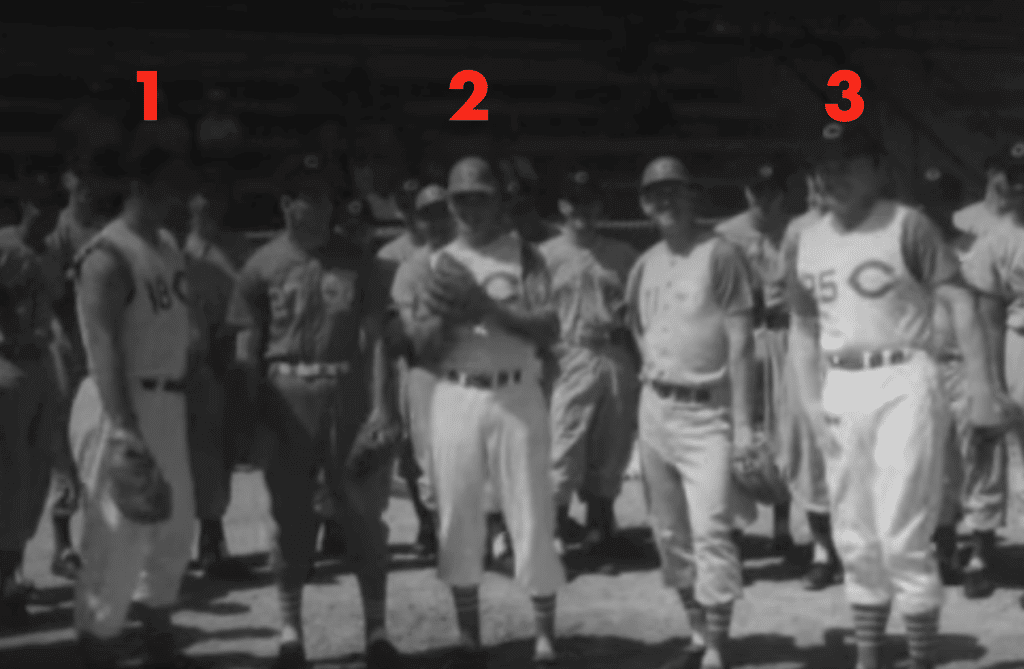
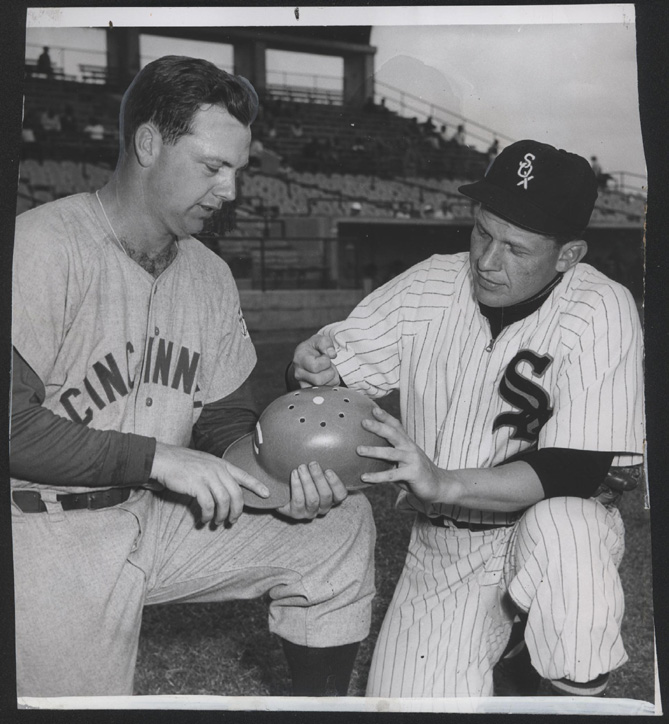
I think I can answer that one. The guy at far-right, No. 25, is wearing the standard home uni. Big Klu, at far-left, is showing how he planned to remove his undershirt sleeves. (1956 was the Reds’ first season wearing vests, so this photo shoot may actually have been Klu’s first time going fully bare-armed!) And as for the guy in the center, take another look at what he does when the camera pans toward him:

See how he drops his head and shows the top of his batting helmet? And see how his helmet had lots of little holes? That’s because the Reds were experimenting with added holes in their batting helmets for greater ventilation (click to enlarge):
So each of the five players was there to show a particular aspect of that year’s uniform program. But team management apparently decided not to go ahead with the mono-red design.
Big, big kudos to Bruce “BSmile” Menard for discovering this, and even bigger thanks to him for sharing it with me and allowing me to share it with the uni-verse.
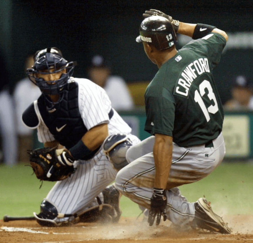
The latest reason to hate the Yankees: The photo shown above is from one of the two season-opening games that the Yankees and Devil Rays played in Tokyo in 2004. The Devil Rays were the designated home team for both of those games, but as you can see above, the Yankees nonetheless wore their home uniforms (and yes, the jerseys and batting helmets had advertisements, but that’s another story for another day). At the time, the explanation was that Japanese fans wanted to see native hero Hideki Matsui in the famous Yankees pinstripes, but everyone knew it was really about promoting the Yankees and screwing the lowly Devil Rays.
Fifteen seasons later, the Yankees and Red Sox will be playing in London this June. Those are both Red Sox home games — but once again, the Yankees will wear their home uniforms. The Yanks don’t have any UK-born players that I’m aware of, so this time it’s clearly just a branding thing to showcase MLB’s most famous uniform for an overseas audience.
Hey, don’t you think it’s a drag that the fans in Minnesota, Baltimore, Anaheim, Seattle, and so on have to look at those drab “New York” road greys instead of the iconic pinstripes when the Yankees come to town? Let’s just have the Yanks wear their home uniform for all 162 games. They’ve earned it, after all.
(My thanks to reader/commenter Ian Isanberg for bringing this one to my attention.)
Click to enlarge
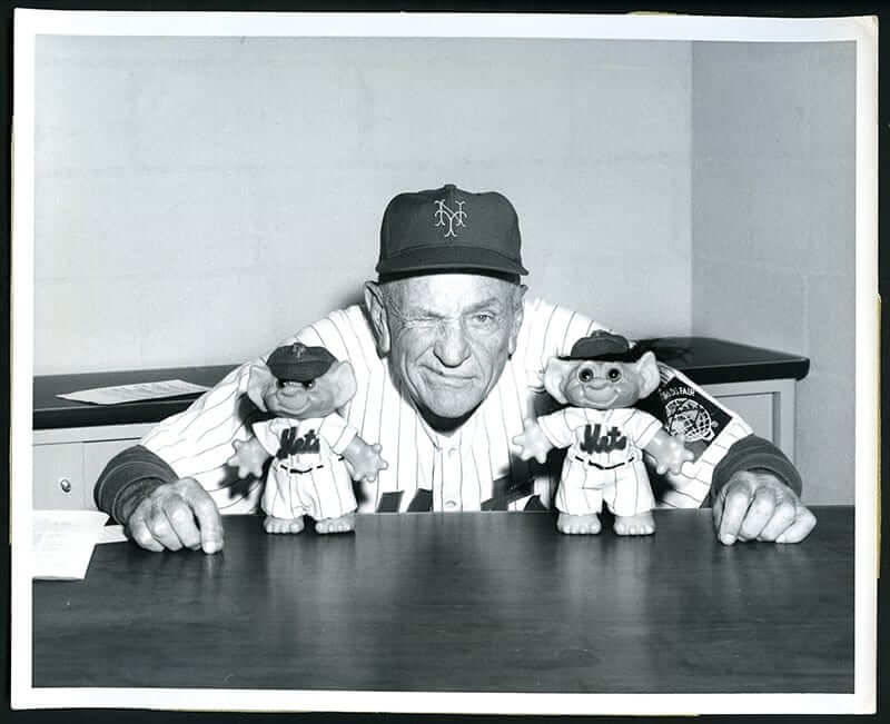
Trolling the Old Perfesser: Check out this spectacular 1964 photo of Mets skipper Casey Stengel flanked by a pair of Mets troll dolls! I’m reasonably familiar with Mets memorabilia and have never seen those before.
Reader Brian Nelson, who sent this photo my way, notes that the pinstriping on the trolls’ uniforms is not to scale. “Probably made from the same fabric as Stengel’s jersey.” Could be! Great, great find.
Click to enlarge
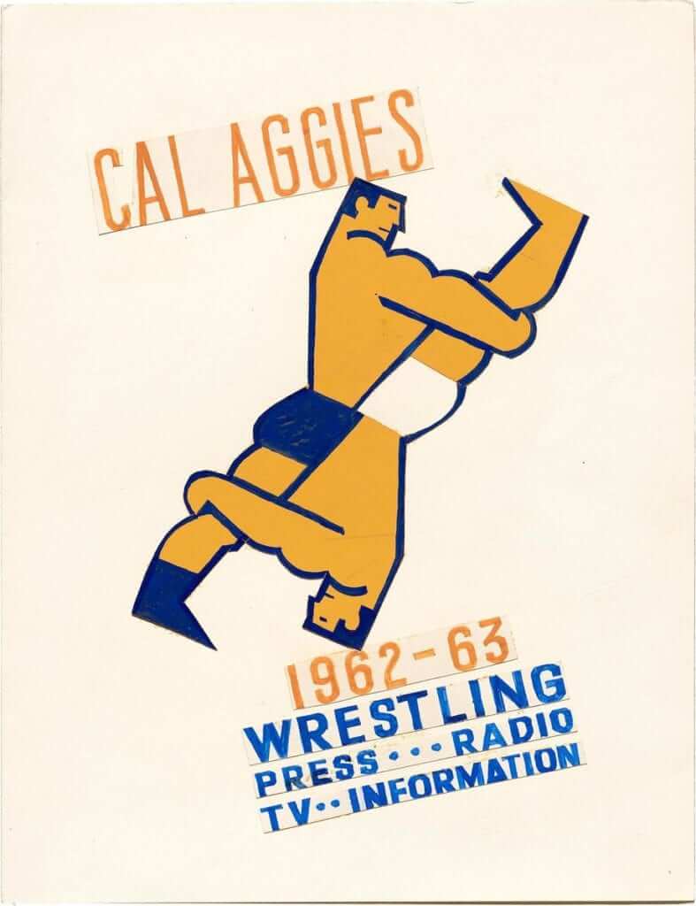
Too good for the Ticker: We all know that Wrigley’s Gum art director Otis Shephard did tons of great program cover designs for the Cubs. But he also did this cover design for what appears to have been a 1962-63 UC Davis wrestling media guide. Love the yin/yang wrestlers (although the upside-down guy should have white shoes, no?).
As you can see, this was the original artwork, not a printed cover. The Twitter-er who brought it to my attention, @footballfuntime, found it in this incredible-looking design archive. Definitely worth exploring.
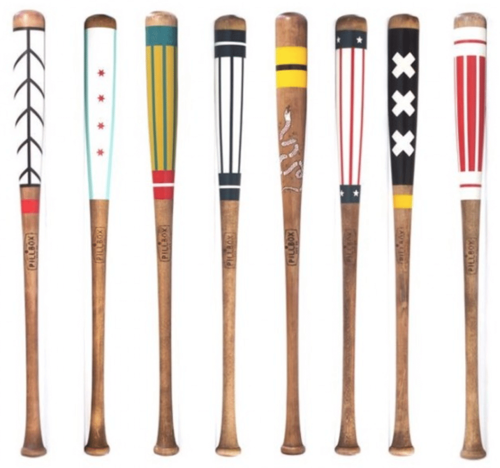

Raffle reminder: In case you missed it earlier this week, the Pillbox Bat Co., which has been advertising with us for quite a while now, is now offering a free item from their website for a lucky Uni Watch reader. In addition to beautifully painted bats like the ones shown above, they also have a variety of pennants, apparel, leather goods, and more, so the winner will have a lot of options to choose from.
To enter, send an email to the raffle address by this Thursday, Feb. 14, 7pm Eastern. One entry per person. I’ll announce the winner on Friday. Good luck!

Click to enlarge
It’s the little things: I’m a longtime subscriber to The New Yorker. For years their address labels (above left) have been small, rectangular, and, for lack of a better word, very official-looking.
But a few issues ago, the labels changed. The new labels (above right) are larger, have rounded corners, and have lots of white space, all of which gives them a goofy, sort of unprofessional look, like someone just ran over to Staples and got some Avery labels. It’s what I’d expect if I were subscribing to a low-circulation niche publication like Condiments Quarterly, not The New Yorker. (To my knowledge, there’s no such magazine as Condiments Quarterly, but there surely should be.)
I know, I know — all that really matters is that the labels should be easy to peel off (which both of them are). But I’m talking strictly about the aesthetics. The new label bugs me. Grrrrrrr.
(And yeah, I know, I know — “What’s a magazine?” Yes, you’re hilarious.)
The Ticker
By Paul

’Skins Watch: Here’s an excellent article and radio report on the fight to get McGill University in Canada to stop calling its teams the Redmen. Really strong reporting — recommended (big thanks to @RamoneCat).

Baseball News: Here’s another look at the MLB 150 patch on various teams’ jerseys. … Here’s a slideshow of all 15 throwbacks that the Reds will be wearing this season. … Kentucky is celebrating its new ballpark with an inaugural-season sleeve patch on its BP jerseys. … The Peoria Chiefs will once again do a game as the Peoria Distillers this season. … The NHL’s Minnesota Wild wore Joe Mauer tribute jerseys for last night’s pregame skate (from Jack Wade). … Buried within this article is the news that the Inland Empire 66ers will become the California Burritos on May 25 (from Chris Cruz). … A rare one-game MiLB makeover that isn’t food-based: The Bowling Green Hot Rods will become the Bowling Green Sinkholes. … The new Mexican national team jersey has a sublimated Aztec calendar pattern (from @bryant_rf). … Free agent SS Manny Machado has picked a bunch of black-and-white gloves for this season, fueling rumors that he might be heading to the White Sox. … We have a new addition to the ranks of single-digitized pitches, as Mariners starter Marco Gonzalez has changed his uni number from 32 to 7. He previously wore that number as a Cardinals prospect and in college (from Tim Dunn). … An early-’90s flashback scene in last night’s episode of This Is Us featured a Pirates cap with era-inappropriate logo creep. … The Brewers have set up a locker with a No. 10 jersey for a Milwaukee police officer who was recently killed in the line of duty (from @mikeobs).

Pro Football News: Neglected to mention until now that two AAF teams — the Orlando Apollos and Arizona Hotshots — quietly added ad patches to their jerseys prior to their first games (from Bill Schaefer). … Love this old Saints popcorn holder/megaphone. … Speaking of the Saints: Membership card designer Scott M.X. Turner, who lives in New Orleans, tells me that a local ministry has been leaving these Sir Saint-themed koozies for free around town. “There are far worse logos to poach,” says Scott. “All of them, in fact.” … We’ve seen this before, but it’s worth re-watching this 1981 local news report on the Bengals’ then-new uniforms. The reporter’s evident disgust over the whole assignment is pretty hilarious (from Brad Eenhuis). … With the annual Westminster Kennel Club event taking place here in NYC, Alan Kreit came across a magazine intended for the dog breeders and found a photo of a champion Akita’s handler wearing a Broncos jersey under his suit. Looks like a football jersey on his assistant, too.
College Football News: Reader Clint Richardson is doing a decade-by-decade look at Auburn’s uniforms on his blog. This week’s topic: the 1950s.

Hockey News: Kennebunk High School went G.I. Joke two nights ago (from Heath Carignan). … Here’s a message board thread about dressed skates. “That’s when players have to dress up their preferred skates (usually one brand) to look like the skates they’re signed to endorse (a different brand),” explains Jaymes Progar. “Apparently this is done with sticks as well.” I don’t think we’ve covered this much, if at all, in hockey. Those in the know, feel free to educate us in today’s comments. … Cross-listed from the baseball section: The Wild wore tribute jerseys for Minnesota Twins star Joe Mauer for last night’s pregame skate (from Jack Wade). … Pink in the Rink uniforms this Saturday for the Tulsa Oilers. … Penguins Gs Matt Murray and Casey DeSmith have new Stadium Series masks (from Wade Heidt). … There’s a big exhibit of hockey sweaters at the Stewart Hall Cultural Centre in Pointe-Claire, Quebec (thanks, Phil). … The Senators wore white at home last night (from Owen Shields). … Mismatched number fonts for the Canadian women’s team (from @The_Road_Guy).

NBA News: In yesterday’s lede, which was about Cathedral High School’s uniforms, which are very plain on the front and have an unusual FNOB format on the back, I said I’d never see that type of FNOB before, with the first name above the number and the surname below. But Alex Steinke points out that the entire concept appears to have been cribbed from the 2015 NBA All-Star uniforms. Totally forgot about that one! Good call, Alex. … The NBA 2K League — that’s an eSports league, which is something I don’t pretend to understand — will now be outfitted by Champion (thanks, Phil). … Between the court design and the uniforms, last night’s Lakers/Hawks game in Atlanta was a bit of a mess, color-wise (from @Haylow). … Jeremy Lin will wear No. 17 with the Raptors.

College Hoops News: Kentucky coach John Calipari, who goes to Dunkin’ Donuts for breakfast every morning, received custom Dunkin’ Donuts sneakers for his 60th birthday (from Josh Hinton). … Breast cancer-awareness jerseys tomorrow night for Texas A&M’s women’s team.

Soccer News: Here’s a really good Twitter thread from a kit designer, explaining the practical factors that go into kit design. Recommended (from @holycalamity). … New jersey sponsor advertiser for the USL League One team Lansing Ignite (from Ed Zelaski). … Here’s a story on the making of FC Cincinnati’s new jersey. … New kit for FC Dallas. Additional info here. … This 1960 footage, Oldham have a white block behind their numbers, while the Crystal Palace numbers are placed above the twin hoops on the shirt (from Graham Clayton).

Grab Bag: A drug bust in Calgary turned up, among other things, a bunch of Canadian military and postal uniforms. … The Vatican has combined Christian and Islamic symbols in one logo. … Australians are livid because a government regulatory body spent $100K on a new logo that’s barely discernible from the old one.
Paul, do you receive any periodicals that arrive wrapped in plastic? What are your thoughts on this method?
link
Just curious.
Not currently, no. Not a fan of that method, which seems wasteful.
Keeps it from getting torn up!
link
For the University of New England ticker item it was not the University of New England but rather Kennebunk High School.
Sorry, Heath — my bad. Will fix.
very odd that the two AAF jersey ads are both for the same company, though i did notice stadium ads for that company during the San Antonio broadcast
Condiments Quarterly sounds like a worthy project
So I’ve just recently started listening to a podacst from Popular Science called “The Weirdest Thing I Learned This Week” and a few times in the first batch of episodes, a scientific paper called “The Psychology of Condiments” has been referenced (link).
With your comment about “Condiments Quarterly” I imagine this might be an interesting read for you and the broader UW readership.
Also – highly recommended podcast! Lots of little details to learn from these PopSci editors and writers!
The Mexican national soccer team has done the Aztec thing before:
link
New Yorker has some nice artistic covers. I subscribe to magazines that print science fiction and fantasy stories, so they also have nice covers. I hate that the labels cover important elements of the cover. I wish they would put the label on the back, or have a regular spot with uninteresting art to put a label on. If you look at artwork commissioned specifically for book covers, the action is centered a little low because the top is reserved for the title and author. They could do the same thing for magazine covers.
Before you hate the Yanks was it MLB that wants them to wear their home pinstripes on the road & not the Yanks? Why not have the gripe with MLB?
Fine, I hate MLB for giving me yet another reason to hate the Yankees.
Ha, blame MLB!!
Damn enablers!
Yes, because the Yankees are a team playing in the MLB. The MLB moved to game to London, and maybe the Red Sox didn’t want to wear their home unis. Why is it the fault of the Yankees then?
One other home-jersey-on-the-road item in the ticker: the reason Ottawa wore white at home is Carolina wants to wear their home reds on the road
If only there were a way to schedule a baseball game so that the New York Yankees would be considered the home team, and so naturally wear their home uniform. I’m sure the Office of the Commissioner has its best minds working night and day to figure out how to make this seemingly impossible dream a reality.
When I lived in northern Europe last decade, Yankees caps were very fashionable. But there was basically no interest in the Yankees as a team, not even in Holland, where baseball (“honkbal”) has a real following. There was real interest in the Red Sox though during their 2004 postseason run.
I never need an excuse to hate the Yankees but for whatever it’s worth I seem to remember that both the Diamondbacks and Dodgers wore some version of a “home” uniform when they began the season in Australia. Diamondbacks were wearing colored alts but wore their home white pants and Dodgers did too
Thanks for running the ’56 Cincinnati Redlegs uniform scoop Paul. I figured that the Uni Watch community would be the place where it could be appreciated the most…especially since it’s time for spring training baseball!
Cheers!
~ Bruce
Why can’t the Yankees and Red Sox both wear white in London? I wouldn’t want that to become a thing, but for two games it’d probably be OK.
Actually, maybe they both *will* wear their home uniforms. But that’s not the point. The point is that the Yankees are wearing their home uniform for a road game.
Paul, I don’t mean to be a creep, but the 4 digits at the end of your zip code reveal your address.
You don’t want to be a creep yet you zoomed in on his address label anyway?
“Hey, don’t you think it’s a drag that the fans in Minnesota, Baltimore, Anaheim, Seattle, and so on have to look at those drab “New York” road greys instead of the iconic pinstripes when the Yankees come to town? Let’s just have the Yanks wear their home uniform for all 162 games. They’ve earned it, after all.”
I mean, maybe not all 162, but a a scenario like this certainly seems viable in 2020, considering Nike is taking over as the uniform supplier. The NBA, presumably being egged on by Nike, eliminated home/road/alternate designations in favor of Association/Icon/Statement/City. And we know Nike scripts the uni match ups for the entire season in advance. Maybe it’s a dry run for doing something similar in MLB?
1956 Reds are #18 Klu # 27 Al Siveria #16 Johnny Temple #11 Roy McMillen #25 Gus Bell
After Silvera was released that season, the #27 was worn by Curt Flood:
link
Big Klu rocking his personal brand way back when personal brands weren’t even personal brands yet. He’s an OG influencer. (JK)
Another reason to hate the Yankees because the MLB wants to showcase them in pinstripes? I agree that home teams should wear home designated uniforms (Boston will probably wear their alternate red home jersey), but this is a literal non-issue. 2 game special event that showcases their 2 storied franchises in their most recognizable and marketable (I’m not naive) looks. But c’mon, another reason to hate them? yikes.
You hit the nail on the head. That was a pathetic, petulant rant for an utter non-issue.
If it’s so important for the Yankees to wear their home unis overseas, why not make them all Yankees home games?
If you ask me, both teams should wear roadies.
Well gray vs gray is problematic, but I agree that both teams should wear there road jerseys in so much as road jerseys have geographic identifiers on them. Since the Yankees home jersey has NY, which is also a geographic identifier rather than a nickname, it makes sense for the Yankees to wear white.
Don’t the Red Sox have some alternate that says “BOSTON”?
Not that I want to see it, but I don’t think gray vs gray would be problematic. One team is on offense and one is on defense. It isn’t like hockey or football or soccer where you are passing a ball/puck back and forth and getting chased, so it isn’t like it would cause much confusion to the players. And if a viewer at home can’t decipher the difference between someone playing in the field with a big glove on their hand vs someone batting/running the bases with a helmet on, well that might signal some other problems within their own brain.
I don’t really see the big deal for the Yankees home uniforms in neutral site games even when they are the “designated” road team. Neither team is home, and the designation is simply for who bats first. Given the iconic nature of the Yankees uniforms, and that lots of other teams have colored jerseys (be them home or away) they could wear to contrast with the Yankees home set, this actually makes the most sense (even though I am a hard line white vs gray in baseball). I’d also argue this make sense because both teams are “away” and under typical baseball uniform convention the away jersey has the city name and home jersey has the nickname, so in this case, with the NY on the Yankees home set and presumably the other team wearing road grays or a colored road jersey, the would also be displaying their city name, as they should when they are away from home. Seems Tampa was wearing batting practice jerseys with TB on them. Presumably Boston could wear their navy Boston alternates.
Given the iconic nature of the Yankees uniforms…
Stop right there. See, this is why the Yankees are so hate-worthy. Oh, they’re so fucking “iconic” that we create special rules for them, or bend rules for them, or whatever. Fuck that. Let them wear their road uniforms for a road game like everyone else instead of treating them like a special case.
Hey, you know a good way to teach foreigners about baseball? Have the team batting first wear white! That’s how it always works! What an excellent way to teach UK residents how baseball works when we’re having a game there for the first time ever!!
Fuck all of that. Embrace the hate!
Preach, Senator Palpatine. Preach! -C.
I love seeing the fandom passion come out in Paul on this subject!!! I’m a super traditionalist when it comes to baseball uniforms, but this is very much an international exhibition to showcase all the great and iconic things about baseball to a new audience. And the Yankees pinstripes and tradition is iconic, be it an iconic thing to hate or love. As you stated, you hate them all the more for being iconic and treated as such, even more reason to go with it. Let the villains keep on doing what makes them villains, if they stop doing things that make you hate them, where is the fun in that?
Plus, as a Phillies fan I find the Mets and their fans much more vile ;)
That last line made me laugh out loud.
Great video on the Reds unis.
Hi Paul. Occasionally a stadium in the USA will host 2 high profile soccer teams from around the globe – I remember a few years ago Manchester United played Barcelona in Santa Clara at Levi’s. Mexico is having a game next month at Levi’s. Wonder if they do some home away uni switcheroo with those games.
I knew that there was a reason why I liked you…
Man, I lost a bit of respect for you with this profanity-laced rant. Really not a side I expected to see.
Just a point of order here – the Red Sox are not simply the “designated” home team. They gave up two actual home games at Fenway Park for the London series, so they are the real, actual home team.
This is the most unfortunate, immature, stupidest thing (strike that, 2nd most) you’ve ever written.
We all know how copy-cat the world is nowadays, and the sports world is no different. However, I’m really, REALLY tired of all these minor league baseball teams playing as the “Pensacola Chili Dogs” for one game a year. Not only is it an annoying trend, but seems to go against another annoying trend: “Branding”. Teams do so much to market their “brand” and then for one game, they completely change that brand. We all know it’s about $, and they want to sell new merchandise, but to me on the official “Is it good or is it stupid” test, the answer is most definitely stupid.
In the minor leagues, aren’t the alternate jerseys more about getting people in the seats instead of selling jerseys. Often these one-offs are donated by a company too. So to cash strapped minor league teams it is a desperate need to bring in money and sometimes they donate game used jersey money to a charity.
This hate for food-related minor league promotions is so weird to me. I get it, we read a site about uniforms so we know about ALL of these promotions, so it may seem overdone. BUT…someone in Pensacola (your example) or any other city might see a different city’s team doing it and say “Holy crap, that is awesome, I wish my team would do that too.” You have to keep in mind that 99% of the people in this world don’t follow uniform news like the rest of the people who read this site, so it isn’t an overdone thing for them, it is something to get excited about.
I understand the sentiment – I basically share it. But MiLB teams don’t derive much merchandising revenue from these stunts – a little bit of t-shirt and cap sales. Mostly they’re about attracting attention and giving casual local fans an excuse to bring their families to see a game in person. And most baseball fans don’t keep track of industry-wide branding trends like uni watchers do. So if a MiLB team puts on a big Hometown Delicacies mini-rebranding promotion, the average fan experiences that as a fun thing their local team is doing, not the latest instance of an already tired national trend.
And while we’re at it……Screw the Yankees and their “Iconic” uniforms. As a biased Tigers fan, the Tigers home uni is every bit as iconic and classic as the Yankees, but never gets mentioned. So again, Screw the Yankees!
There you go. That’s the spirit!
Hasn’t the Tigers home uni been in its current state for… exactly 1 year?
But more to the point, Fuck the Yankees ;)
Hey, the Yankees have the greatest home uniforms in the history of sports and MLB realizes this and knows that international fans want to see them.
Don’t hate the Yankees for being beautiful!
The Tigers actually earn “iconic” status with their uniforms. As opposed to the Yankees, who have mediocre-at-best uniforms. The Tigers can defend the mismatch between their cap and chest logos on solid design grounds. The Yankees’ mismatched logos are gratuitous. If the Yankees hadn’t been wearing their C-minus uniforms without change or improvement for eight decades and instead unveiled them today, nobody – not even hardcore Yankees fans – would defend them as anything other than a design failure. And that’s just the home uniform, which at least isn’t as actively ugly and generic as the road uniforms.
The mediocrity of the Yankees uniforms, and the degree to which the team has perpetrated the Emperor’s New Clothes on the sport with their supposedly iconic mehlicious uniforms, is the prime reason why I hate the Yankees so much. Absent the cult of the pinstripes, I really wouldn’t care about the Yankees either way, and would probably root for them ahead of the Red Sox and Orioles in the AL East. Well, the uniform thing and Chuck Knoblauch. Er, the uniform thing, Chuck Knoblauch, and the Jeter/A-Rod situation. And Steinbrenner. And the national sports media’s monomaniacal obsession with the Yankees. And the “God Bless America” bullshit. And …
Are the Reds players first, second, and fifth from the left all wearing navy blue caps?
At first I thought it was just a difference between the fabric and the plastic shell but if you look at the “C” it definitely seems to be red.
Which means that the Reds were going to have batting helmets that were different colors from the caps.
Further, if you look in the background, the other players all seem to be wearing the 1955 road uniforms which were paired with blue caps.
link
Yes, the Reds wore their ’55 unis during spring training, except for that uni-modeling shot.
That’s why the last photo in the lede, showcasing the ventilated batting helmet for 1956, shows a player in the ’55 uni. That was their standard attire for spring of ’56.
It’s funny that they don’t seem to have the red caps available to match the prototypes.
Maybe the cap manufacturer was later in delivery?
As a Dodgers fan, I’d just like to say… if they ever *win* the World Series, and invariably go into the gold-trimmed trope, I’d rather have gold trim on the script ‘Dodgers’ than have the red numbers in gold script. Heck, just make the interlocking LA logo the only gold piece on the unis and the caps. Seems like it’d help things pop, yeah?
I noticed the change in the New Yorker as well. Seems to have gone along with (although perhaps not directly caused by) their decision to promote their website on the address label.
Not only did the Wild wear Joe Mauer sweaters during warmups, they also tucked them in “baseball style”.
link
I was at the National Corvette Museum in Bowling Green 3 days before the sinkhole developed and swallowed some of the collection. So, that seems like an appropriate name (even for a day).
link
It’s a little odd that Calipari received “Dunkin Donuts” sneakers since the company recently announced a rebranding to just “Dunkin”, no?
I guess a rebranding like this for a large chain takes some time to implement across the company, but the change became official starting in January so the shoes would have been an ideal time to highlight the company’s new name, you’d think.
I was thinking the exact same thing. But I see them sticking with the “DD” logo and of course their DDPerks program remains with the same name, just seems inconsistent and probably a sign that dropping the donuts isn’t all that smart!
Here is 70’s prog-rock band GENTLE GIANT in concert, with drummer John Weathers wearing an A’s cap and jersey…
…and bonus — when he comes to the front of the stage to play vibraphones at around 10:00, he has a NOB!!!!
link
-Jet
Paul, I believe you alluded to a possible Bengals re-design contest a while back. Any further thinking on that? I may have some dynamite ideas ready to go.
This spring, definitely. Not maybe, DEFINITELY.
Excellent! Firing up Photoshop.
Both the Yankees and Red Sox have such beautiful home uniforms, and such dull road uniforms, I wish both teams could wear home whites. Given that the Yankees identity is so wrapped up in the pinstripes, and those uniforms are probably much more well known by casual international fans, I can understand the thinking behind this. As much as I dislike the softball tops, I think the Yanks in pinstripes and the Sox in their home red alternates would make for a damn fine looking game.
This reasoning is completely sound — for an exhibition game.
But these are real games that count in the standings, and the Sox are giving up two Fenway games for these dates. You want to teach casual international fans something about baseball? Teach them that the team that bats second wears white, not the other way around. Aside from being annoyingly Yankees-boosting, this is the baseball equivalent of bad civics.
Why not make it a home-and-home?
New York teams almost never play home games out of NY. The Knicks and Rangers, in particular could risk losing their deal to not pay taxes if they play home games elsewhere.
It could also be that shifting Red Sox games from Fenway, with its limited capacity and lack of suites, would make more money for MLB than taking a game out of the Bronx.
Mets played a home game in Japan in 2000.
I mean every team almost never plays a home game not at home. The world doesn’t revolve around New York.
He’s wasn’t suggesting that the world revolves around NY. He was suggesting (although I’m not sure how accurately) that NY teams are subject to special tax requirements.
Ah, thanks, read it more closely now. Does that only apply to MSG then?
Classic rant, Paul. You are obviously an individual who “gets it”.
The unis in that Hawks-Lakers game were great. It was just the court design that sucked.
What an incredibly weak reason to hate the Yankees.