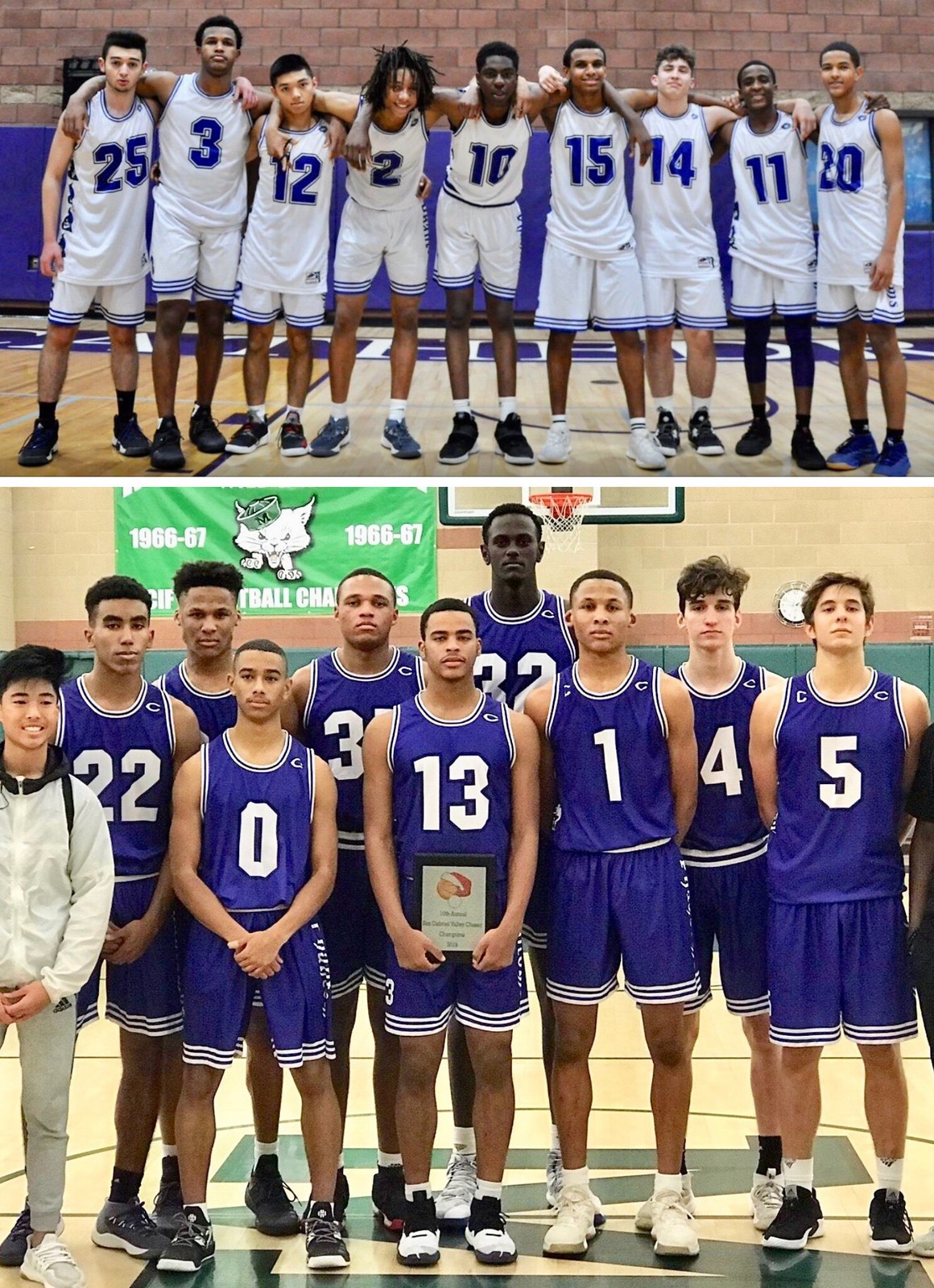
Click to enlarge
The basketball team shown above is from Cathedral High School in Los Angeles. As you can see, their front-jersey design is very no-frills — no chest lettering, huge chest numbers. The wishbone-C on everyone’s left shoulder is for “Cathedral,” and three players also have a block-C on the right shoulder because they’re captains.
Look on the back of the jersey, however, and things get a bit more interesting (click to enlarge):
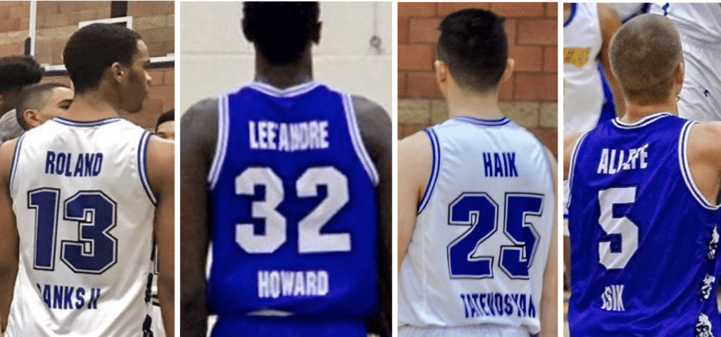
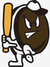
Intriguing, right? It’s rare enough to see an entire team going FNOB (that’s full name on back) — and a high school team at that! — but it’s even weirder to see them putting the players’ first names above the number and their surnames below. Not sure I’ve ever seen that design format before.
I wanted to know more, so I got in touch with Cathedral coach William Middlebrooks. We spoke on the phone yesterday. Here’s how our conversation went:
Uni Watch: A lot of high school teams don’t put the players’ last names on the jersey, but you have their first names and last names. How long have you been doing it?
William Middlebrooks: I’ve been putting last names on jerseys for 10 years. This year is the first time I added the first name.
UW: What was the thinking behind that? How’d you decide to do it?
WM: You want to keep kids engaged, so I’m always looking for things that can do that. I try to stay, you know, relevant. When you talk to kids, deal with them every day, you just come up with different ideas that will inspire them, and this was one of those ideas. I figured nobody else was doing it, so let’s do it.
UW: Having the first name above the number and the last name below the number — was that your design concept?
WM: Yeah. I designed the entire uniform.
UW: We often hear coaches say that they don’t want the players’ last names on the jerseys because they want to emphasize the team, not the individual. You know, the whole “Play for the name on the front of the jersey, not the back of the jersey” thing.
WM: Yeah, I don’t believe in that at all. In the market — I’m in the elite basketball market, whether it’s high school or travel ball. I understand the importance of the kids having their own brand, which is equally as important as any team, school, or what have you. I think if you overlook that, then you miss where sports in general have gone. Everything we do, every decision we make, is based on what’s in the best interests of the kids.
UW: How have your players responded to having their full names on the jerseys?
WM: Oh, they were excited. I mean, the whole community was excited, not just the kids. The parents, the fans, alumni, administration — everyone loved it.
UW: What about players or coaches on opposing teams — have they reacted to it in any way?
WM: Sometimes they ask who designed our uniforms. I tell ’em me!
UW: Speaking of which, let’s talk about the front of your uniform. You don’t have your school name, you don’t have your team name — you just have a big number. Why is that?
WM: Well, the school’s logo is there…
UW: You mean on the shoulder area.
WM: Right. And it’s purposely on the left-hand side, which is over the heart. We’re a school that’s about brotherhood, and it’s about Cathedral being in your heart, and that’s why it’s on that side. Then the number’s big, and that’s just a design thing — nothing deeper than that. No real thought beyond that. Then, because we’re the Phantoms, we have our phantom-head logo on one side of the jersey and a word logo on one side of the shorts. So the school is definitely represented, just in a different way.
———
This is the second highly unusual high school basketball NOB style we’ve examined in recent weeks. The first was from McEachern High School in Georgia, which uses a motivational “WE>ME” slogan instead of the players’ names. It’s interesting that while McEachern’s coach has chosen to emphasize the team over the individual, Cathedral’s coach explicitly rejects that approach. So there are your old-school and new-school approaches to sports in a nutshell — two different philosophies, both manifested on unusual uniforms.
As long as we’re here: How many other examples are there of a team going FNOB for its entire roster? I can think of only two:
• The Oakland Raiders, then in the AFL, went FNOB for part of 1960 and all of 1961. This is shown in the Gridiron Uniform Database, but photos are rare. There’s this shot (which actually shows one guy with a conventional surname-only NOB; additional info here) and this shot, and nothing else that I’m aware of. (Update: There’s also this shot, from Nov. 27, 1960.)
• The WHA’s Alberta Oilers — forerunners of today’s Edmonton Oilers — began their inaugural 1972-73 season by wearing PNOB (that’s province name on back), but later in the season they switched to team-wide FNOB. Here’s a color shot of a gamer, showing their odd typeface and rounded-corner nameplate.
Are there other team-wide FNOB examples that I’m overlooking?
(Big thanks to Twtter-er @ezbutton11, who brought the Cathedral uniforms to my attention.)
No Big Whoop
[Editor’s Note: Last week the Double-A Portland Sea Dogs announced that they would play a game this season as the Maine Whoopie Pies. Ticker assistant Anthony Emerson, who compiles the Tickers that appear on Saturdays, lives in Portland and has some thoughts on this matter. Enjoy. — PL]
By Anthony Emerson
As a Maine native and diehard baseball fan, I was so excited for MiLB’s food promotion to finally come for my hometown Portland Sea Dogs. And now that it’s happening, here’s what I think:
Terrible. Awful. Sucks.
Maine has so many great foods, and they focused on a sugary-sweet, largely inedible, dry pastry? A pastry so sugary you need to brush your teeth after you eat it?
Yeah, the whoopie pie is the “official state treat” (not to be confused with the official state dessert, which is blueberry pie), but come on. The Maine Lobster Rolls would be so much better! Or the Maine Blueberries, or even the Maine Potatoes! I’d argue that all of those things are more associated with Maine, at least by us Mainers, than the whoopie pie.
And don’e even get me started on the logos. Compare the Whoopie Pies logo to the Pizza Rats logos. Or the Plates logo. Or the Pork Rolls logo. The Whoopie Pies logo looks slapped together and incomplete, like an undergrad design student submitted it and got a C+ (although I will admit I quite like the secondary logo that shows the outline of Maine in the form of a whoopie pie).
I should also note that while all the news accounts say that the team will be called the Maine Whoopie Pies, the actual jerseys say Portland Whoopie Pies, which aren’t even a thing. The whole project seems inconsistent and misconceived.
My disappointment knows no bounds.
Click to enlarge
I spy with my little eye: Hmmmm, what have we here? Why, it’s the latest DIY project by our friend Wafflebored. Savvy readers can probably guess where this one is headed. More info soon — stay tuned.
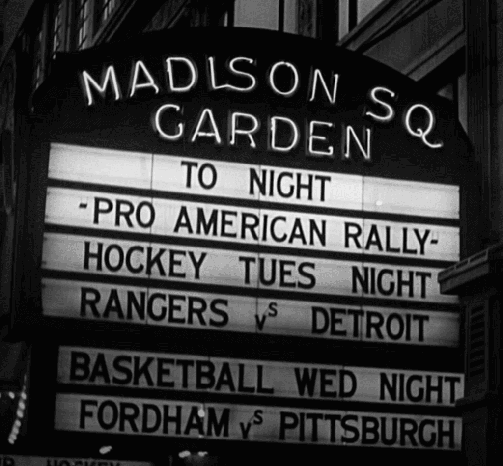
It can happen here — and it already did: The marquee shown above was photographed at Madison Square Garden in Manhattan on Monday, Feb. 20, 1939 — almost exactly 80 years ago. As you can see, there was a Rangers/Red Wings game coming up the next day (the Rangers won), and a Fordham/Pitt college hoops game the day after that (Pitt won).
But the real story is the event at the top of the marquee — “Pro American Rally.” It was actually a Nazi rally, held by the German American Bund. Nearly three years before America entered World War II, 20,000 New Yorkers showed up and gave Nazi salutes while Bund leader Fritz Julius Kuhn railed against the “Jewish-controlled press” and demanded a “white, Gentile-ruled United States.” The backdrop behind him featured a huge portrait of George Washington flanked by swastikas.
This event has largely disappeared from New York City history, and even from American history. I’d heard mention of it now and then but didn’t really come to grips with it until I learned about the recently released short movie A Night at the Garden, which has been nominated for Best Documentary Short at the upcoming Oscars. You can see the entire film — it’s only seven minutes long and consists entirely of footage from the rally — here:
And then the next night, the Rangers played the Red Wings.
Want to learn more? There’s a really excellent Q&A with the director here.
(My thanks to Jerry Wolper for the Pitt/Fordham newspaper clipping.)

Click to enlarge
Collector’s Corner
By Brinke Guthrie
This Dodgers jacket has the classic satin styling of the 1970s with the white zipper front. Can’t you see LaSorda stuffed into one of these, maybe with LASORDA lettering on the back? It also has a tag inside that reads “Danny Goodman Los Angeles Dodgers.” And who was Danny Goodman, you ask? A local vendor that whipped up jackets for the team before MLB got with the marketing plan and signed up big companies like Starter, perhaps? Turns out Mr. Goodman was a true baseball marketing genius in every sense of the word — read all about it here! That article mentions that Goodman “provided replica Dodger satin jackets for sale. A very popular item among Dodger fans,” so this must be one of those. More on Mr. Goodman here from 1981.
Now for the rest of this week’s picks:
• Remember the 3D cards you’d get in a box of cereal? This 1970s card is for running back Ken Willard of the Niners — and Paul says it was this very card that made him a 49ers fan! (It’s true. Reached into a box of Corn Flakes, pulled out that card, been a Niners fan ever since. — PL]
• This 1960s NFL poster from SI is billed as a “Baltimore Colts poster,” and that’s clearly Ray Berry on the right. But that’s just as clearly a Chicago Bear on the left.
• Rather stern-looking San Francisco Giants ballplayer standing inside the Stick on this 1970s pennant.
• Here’s a nice-looking 1970s Big Red Machine road jersey replica. I always liked how there was white after the red sleeve stripe, not gray.
• Lots of NFL logos to love on this 1970s sleeping bag.
• Nice-looking 1970s youth Franklin Dolphins helmet, though they missed on that shade of green.
• Here we are with a pair of 1970s Buffalo Sabres drinking glasses — team logo on one side and a pair of crossed sticks on the other.
• This set of 1970s Slurpee NFL helmet cups includes the Giants’ terrific “disco NY.”
• An eBayer from the Great White North is offering this 1970s NFL logo towel, although he doesn’t mention the key detail of how big it is.
• This white NFL helmet bank includes the words “Helmet Bank” underneath the shield, just so you wouldn’t forget what it was for!
Seen an item on eBay that would be good for Collector’s Corner? Send any submissions here.
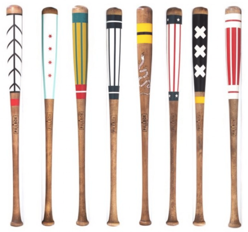

Raffle reminder: In case you missed it on Monday, the Pillbox Bat Co., which has been advertising with us for quite a while now, is now offering a free item from their website for a lucky Uni Watch reader. In addition to beautifully painted bats like the ones shown above, they also have a variety of pennants, apparel, leather goods, and more, so the winner will have a lot of options to choose from.
To enter, send an email to the raffle address by this Thursday, Feb. 14, 7pm Eastern. One entry per person. I’ll announce the winner on Friday. Good luck!
The Ticker
By Alex Hider

Baseball News: Reader Nick Lineback has noticed that the Rays appear to have added their devil ray logo as a sleeve patch to their navy and light-blue jerseys. In 2017, those sleeves were blank; last year they had the Rays’ 20th-anniversary patch; this year they’ll have the logo patch. “I can confirm that this is a change for 2019,” says Paul. … A sign of things to come: The manager for the Biloxi Shuckers, the Double-A affiliate for the Brewers, was wearing a Brewers pullover with a Jordan logo during an interview yesterday (from Nicole Haase). … There are two new baseball-themed LGBTQ bars in Washington, DC: “A League of Her Own” and “Pitchers” (from Mike Rosenberg). … Oklahoma has added both crimson and cream jersey options to its rotation (from JK). … Lots of new uniforms for Washington State (from College Sports Design). … UNC Wilmington’s softball team has a wild pattern on their jerseys (from Mike Lucia). … Lots of uni talk in this episode of the Tater Tots podcast. … The Nippon Ham Fighters appear to have an embroidered logo appliqué on their batting helmets, just like the Cubs (from David Browning and Jeremy Brahm).

Hockey News: Next season, the Flyers will have a new scoreboard with moving, expanding, and contracting elements (from Michael MPH). … When Canadiens C Jean Beliveau scored his 500th goal, and the club presented him with a No. 500 jersey — or maybe it’s three separate jerseys creating a composite 500 (from Jerry Wolper). … The Greenville Swamp Rabbits of the ECHL will wear Black Panther uniforms on Feb. 17 (from Mike Lucia).

Basketball News: Cross-listed from the hockey section: Next season, the Sixers will have a new scoreboard with moving, expanding, and contracting elements (from Michael MPH). … Reader JohnMark Fisher was cutting Brussels sprouts recently and said the color reminded him of the old ’80s and ’90s Bucks unis — I see where he’s coming from! … Raptors SF Malcolm Miller will continue wear No. 13 in his new stint with the team, just as he did last season (from Etienne Catalan). … Also from Etienne: G Shelvin Mack will wear No. 6 with his new team, the Hornets. … Tulane will wear green Mardi Gras uniforms with purple and gold trim for their next four games (one of which is on the road). … Here’s a good oral history of the Hornets’ original uniform set (from Tom O’Grady).

Soccer News: FC Cincinnati unveiled the jerseys they’ll wear for for their inaugural season yesterday: blue, white and keeper. Will Hughes was at the unveiling at Cincinnati’s Music Hall and took a bunch of photos. But here’s a weird wrinkle: The team didn’t have enough time to get authentic-quality jerseys manufactured, so they’ll be wearing replica-quality jerseys instead. … April Fool’s came early for FC Dallas: They set up hidden cameras and tricked a few players into thinking that they’d be stuck wearing awful jerseys (from Eric Hodges). … The MASL’s Baltimore Blast plays home matches at Towson University’s arena, so they have a Towson sleeve patch (from John Cannon).

Grab Bag: Yesterday, Paul shared a photo of a cat-shaped paper clip. That prompted Mike Styczen to share a photo of a pig-shaped paper clip that his friend uses at his restaurants in Calgary. … The New York Times had a pretty sad clue in its crossword puzzle yesterday (from Max). … Gymnasts at Cortland State (NCAA D-III) wear uni-numbers! I don’t think that’s standard practice in NCAA gymnastics, is it? (From David Petroff.) … Here’s the new paint scheme for cars on Formula 1’s Williams Martini Racing team (from James Gilbert). … Reader Ryan sent along a photo of the awesome Super Bowl helmet cookies his wife made. Note the grey facemask on the Rams helmet! … Travis Holland notes that more and more college lacrosse teams are adding sleeve stripes to their jerseys. … After several disappointing earnings reports, Under Armour has bounced back with its latest quarterly report (from Tom Turner).
The Maine whoopie pie situation is near and dear to me. Being from the Mid-Atlantic, I know that they originated in PA Dutch country (the Amish). When I started dating my wife, a Mainer, I was surprised to learn that Maine thinks they were invented there, going so far as to declare it the state treat. We actually had a PA vs ME whoopie pie taste test at our wedding (PA won in a landslide).
So last week she was super excited to point out that the Sea Dogs were doing a whoopie pie promotion this year. To which I happily replied that they stole that idea too, from the Reading Fightin Phils last year ;)
link
Whoopie pies are important to me, too. I grew up getting them from the Amish at various farmer’s markets. I never knew that they were beloved in Maine and in the Plattsburgh area of New York. Pennsylvania Whoopie pies are delicious!
Whoopie pies are called gobs in the western part of PA.
If nothing else, the sock/stirrup game at UNCW and Wazzu is strong.
FNOB example: in the early ’70s Leeds United players had warmup jackets that all had their full names on the back made by Admiral. I’m pretty sure other teams had them as well, but I can’t think of who.
Quick reaction from last night to FC Cincinnati’s unveilings:
First kit is solid blue, as I thought. Using stripes is good in a vacuum, but why do they have to be so weird? They look better from short distances away as compared to close up, as we can see in the photo album, but I still think solid orange stripes would have been better.
Also, I can’t help but think that the stripes aren’t permanent, because they’ve never worn them before, only hoops.
Overall, there is enough orange in the shirt so that it’s not particularly dull. However, the back is solid blue, in keeping with Adidas’s policy for striped teams this season.
On the good/stupid scale, good idea, execution is a little overdone for the sake of marketing.
The second shirt is obviously plain, I’m pretty sure it’s an Adidas template, and nobody’s mentioned what the shorts and socks are (insert obligatory “I didn’t know it would be worn with jeans”), but I would be pleasantly surprised if one or both weren’t white. So that one is incomplete for now.
Not going to pretend to know what is meant by the authentic/replica thing that was mentioned.
“Authentic” Adidas soccer jerseys are slightly lighter and form-fitting and the crest on the chest is heatpressed versus embroidered.
This explains it more by brand: link
Both FCC kits are merely teamwear templates made adidas, meaning that essentially, adidas took pre-existing template kits and sewed on a FCC badge and printed the sponsor logo on it.
Do you mean this template for the blue shirt? It’s similar but not exactly the same.
link
That’s the template I meant for the home kit, and you’re right, it’s a bit different. Have to think that the idea for the kit came from the template, however.
Also, the Americanizing of MLS continues with this offseason’s kit releases, as nearly every club now sports a white shirt/kit. Very un-soccer take on kits, but it’s very American…
I liked FCD going with the red/white for primary and blue/white for secondary (especially when they wore the hoops).
I’m not a huge futbol fan, but I agree with you about the white kits. I do like how Euro clubs change their secondary and alternate kits often and with unusual designs. Real Madrid changes their secondary color every year, which I think is cool.
Jean Beliveau scored his 500th goal in 1971 (remember watching the game), so it would be more like 48 years as opposed to 40 years ago.
And that picture is very clearly three jerseys strategically folded and overlapping to make a 500. In the unit digit (the last 0), you can see another digit peeking around that jersey.
The Nazi rally video is the scariest thing I’ve seen in a while. Thanks for sharing.
Interesting to see Tulane putting LSU colors on its green jerseys for the Mardi Gras effect. In reality, LSU’s purple and gold (yellow) came from Mardi Gras, too. It’s just weird to think about for Tulane, though, given the old (now mostly dormant) rivalry between the two schools.
Williams is no longer advertising Martini.
The team’s entry in this year’s championship is Rokit Williams Racing or simply Williams F1 Team
I find it strange that the MSG marquee in the photo above has “To Night” in 2 words. My quick googling suggests that it was written that way until the 18th century when it became a hyphenated word until the early 20th century
That ebay auction for the “70’s” Dolphins helmet – that logo wasnt used until the mid 90’s. what am I missing here? IS it a fake or just a bad/wrong description?
I noticed that too; I think just a bad description as it looks like a legit Franklin kids toy helmet. It’s just no older than 1997 – the year the Dolphins changed to that look. You can also see the navy stripes they added to the helmet as well as the revised logo.
You guys are right
The coach at Cathedral says he put the players’ first and last names on the uniforms because it’s important that the kids have their own brand.
High school kids that need their own brand. That’s just plain creepy.
Agreed. He’s right when he says that’s where sports has gone, of course, but I don’t think it’s a change for the better.
That’s bad coaching. At the level of youth or academic sports, a coach’s job is to lead his or her players. There is no model of ethics or pedagogy in which “assist children in establishing their own brands” is a responsible or even defensible goal for a teacher or coach. The Kantian in me says the coach is wrong but mostly harmless; the Aristotelian in me says he’s evil. I can’t even imagine a defense of this coach’s behavior that could be plausibly rooted in Catholic theology. Regardless, where children are involved, a coach’s job is to shield those in his care from innovations that are not a change for the better. “That’s just how things are changing today” is never, ever an excuse for exposing children to harm. On the contrary, the possibility of harm increases a coach’s duty to resist an innovation.
Well stated, Scott. I agree. I didn’t offer much commentary on his position (other than to contrast it with the McEachern approach) because I thought it pretty well spoke for itself and was curious to see how other people would respond to it.
I’m always grateful for journalists who let people tell their own stories like that. It irks me when readers complain that profiles of people who believe or do bad things don’t overtly condemn the subjects. I, the reader, bring my own values to anything I read; I don’t need to be spoon-fed moral judgment.
This was a terrific interview and a great bit of uni reportage, even if – perhaps especially because – I find some of the attitudes expressed to be ethically and theologically reprehensible.
I came here to say more of the same. The “student-athlete as brand” mentality is sickening, and justifying or explaining it by “that’s just the state of things” is a horrible argument. It irks me enough when schools have uni deals (my alma mater, Cleveland St. Ignatius, has a deal with Nike – although most if not all sports kept their looks intact despite the new templates), but when schools sell out to ideologies like this – especially private,religious ones which should have identities rooted in more than sports or education – it’s infuriating.
You don’t have young children do you?
…this made me go and watch the opening scene / monologue from Full Metal Jacket.
No mention of Monday’s announcement that the Yankees will be wearing the home pinstripes as the road team in London. They previously did that in Tokyo vs the Rays in 2004.
link
I missed that bit of news! Thanks.
Ryan’s wife is a talented cookie artist.
Too early to put my order in for a dozen Patriots cookies for next years Supe?
Thanks for sharing the video. Coming up on the anniversary of the event.
It’s been a while since I’ve commented, but that MSG story was powerful.
Just going to add a little bit to the part about the Maine Whoopie Pies. I’m sure it has been pointed out the Reading Fightins have played a game as the Reading Whoopies, naming themselves after the same desert. Anthony does make a few other suggestions about possible food team names. Lobster Rolls seems like a no brainer, but the Connecticut Tigers actually played as the New England Lobster Rolls last year. I guess its just a case of being a little late to the party
Still not sure why Norwich got to lay claim to lobster rolls, which seem like more of a Maine food item than one for the Connecticut coast.
There is a doc about the Alt-right on Netflix right now. It opens with a scene from that Nazi gathering.
n the market — I’m in the elite basketball market, whether it’s high school or travel ball. I understand the importance of the kids having their own brand, which is equally as important as any team, school, or what have you.
That’s just pathetic and embodies much or whats wrong with sports on all levels, but most depressingly at the youth level
I don’t disagree.
Honestly, as soon as I read that quote from the coach, I stopped reading (sorry, Paul; I know you did the leg work to put it together and appreciate it nonetheless).
Hoops has been a slimy sport for a while now, with underhanded dealings in summer leagues and questionable ethics in recruiting, but the brazenness of that man to try to legitimize his reasoning turns my stomach. Check back with those kids in five years. See where they are.
-C.
I agree with both of you, JD & Paul, as well as other readers who have commented that this guy’s approach and philosophy rub them the wrong way. However, Paul, I have to give you kudos (as usual) for still sharing the story on its uni-notable merits, when it would have been just as easy to bury the story in favor of something else (Your web site, your rules). I guess that’s what they call responsible journalism. Keep up the good work!
That MSG rally story is powerful stuff Paul. It’s sad that that part of American history is swept under the rug by many. Sadly I think speaks to a larger issue that a lot of people prefer to ignore unpleasant aspects of the country’s history and instead go with a whitewashed narrative where America is always the “good guy.”
On a MUCH less serious note, I got my Uni-Watch alternate cap in the mail yesterday and love it (I’m the guy who tweeted you the photos of it with the Yanks/Pats/Isles caps). If anyone is sitting on the fence, I can’t recommend enough picking up the ones Paul has left. Funny sidebar to that story, my fiancé called me at work yesterday to ask why I was getting strange packages from someone named Lukas and asked me if she should be worried if it was ticking ;).
Another Mainer here. I respectfully but vociferously disagree with Mr. Emerson’s take. Whoopie pies are near and dear to my heart and are one of the few “home” foods that I truly cherish. Gimme a whoopie pie from Sam’s and I am a contented person.
Maybe it’s because I grew up in inland Maine, where seafood is not as prevalent as coastal Maine. Lobster was never a part of my life, other than seeing it in the creepy tank at the grocery store.
“The Whoopie Pies logo looks slapped together and incomplete, like an undergrad design student submitted it and got a C+”
This is the most immature way to critique design. Hyperbolic statements that don’t even provide an example or mention an element.
Be a wiser critic, Anthony Emerson.
I see a lot of commentary here suggesting that Middlebrooks’ approach is “pathetic”, “creepy”, or “bad coaching”, but I don’t see any real defense of that position. In what way is helping high schoolers develop a marketable identity “exposing them to harm”?
Personally, I’m not sure where I stand on the issue, as I hadn’t really thought about it in my life until five minutes ago. But I feel like I’m seeing a lot of hyperbole in this comments section without a lot of rational thought behind it.
How about this:
1) Teaching children to view the world in general, and their own lives in particular, through the lens of corporate culture (i.e., “branding”) is an unhealthy framework for life — not just for the children but for everyone who will come into contact with those children.
2) Teaching children that the individual is more important than the community is an unhealthy framework for life — not just for the children but for everyone who will come into contact with those children.
The Cathedral coach’s branding comments made me react in much the same way as I do when people say you shouldn’t bother to teach poetry or philosophy, but rather teach “marketable skills” –it feels as though it’s limiting one’s conception of life to the mercantile aspects.
What happens to the vast majority of these kids who don’t make it to the NBA level and become a star? Hell, most won’t even make it to the D1 college level. They develop an outlook that they are the most important, should be catered to, and have a sense of entitlement. Basketball doesn’t pan out and they have to get a job where their personal brand matters ZERO…in fact, having a personal brand is frowned upon. How do they adapt? How do they function? How do they contribute when contribution isn’t defined as putting a ball through a hoop?
I work with one of those kids. It’s like working with Uncle Rico. The kids was promised and expected a fabulous life…. soaking it up in a hot tub with his soul mate. He doesn’t function well with the adversity life throws at you. Frankly, having kids establish their own “brand” is completely asinine. It’s doing a severe disservice to those kids that don’t make it. Which is 99% of them.
More like 99.9%…even the majority of pro athletes don’t get their own true brand. Only super stars really get that treatment, such as Lebron, Jordon (the brand godfather), Curry, KD, Brady, Crosby, Ovi, Griffy, Shaq, Harper, Bo Jackson, etc.
The guys filling out the rosters aren’t getting their own logos and apparel made. Even if you make it to the highest level of your sport, if you’re not a super star, you better forget about being your own brand and be a role player and do as you’re told or you will be cut.
From a Catholic – or really any semi-orthodox Christian – perspective, the very notion of a “personal brand” is a sinfully utilitarian and materialist view of the human person. Encouraging any child to think of himself or others as an economic asset – which is what “personal brand” means – causes real, and potentially eternal, spiritual harm.
As a matter of Christian theology, this sort of materialist view of humans or the self is a form of idolatry. There’s a whole Commandment about that. Recall this this coach cares for children at a school that claims to be a Catholic institution.
Most chilling, sickening, disgusting aspect of the 1939 MSG Pro American Rally? Are they any different from you-know-who’s MAGA events? (That’s why you put it here).
Or the AOC events, or the Harris events, or the Warren events, or the Booker events or the blatant Anti Semitism seen from those on the left.
Yeah, I tuned out after “I understand the importance of kids having their own brand.”
But I’m excited to see Waffleboard’s next creation, and I’m super excited that my Uni Watch hat should be arriving soon.
Nice to see that you’ve almost unloaded all of the alternate caps. I know I’ve enjoyed mine, as well as the classic one I got for Christmas (The quality is unbelievable, BTW). Would you consider either or both caps to be successful from a sales standpoint (I seem to remember the classic cap completely selling out the first run before being re-stocked)?
Glad you like them!
From a sales standpoint, both have been successful, by which I mean they’re in the black. It’s a significant investment to lay out cash for the inventory for these items (unlike all the stuff we sell on Teespring, which is print-on-demand and therefore has no inventory issues), so I’m glad they both earned out!
That Nazi rally short film was deeply unsettling. And despite it making me feel even more hopeless about America’s current situation, I am glad I watched it.
I agree. I’m very concerned about the very recent bouts (yesterday) of Anti-Semitism in this country we’ve been seeing in the news.
Hopefully the Devil Ray logo will swim its way back to where it belongs, on their baseball cap!! Still call them the Devil Rays.
Thanks for the interview, Paul. I’m not a fan of the “branding” of everything, including high school kids. It’s troubling to me that everyone seems to be catering to this new generation of “millennial” instead of teaching/showing them that the school/job/community etc. is what matters and they should do their best to fit into the system, NOT the other way around. Even major corporations are changing policies to cater to these millenials, I guess because they are afraid of being considered discriminatory or not adapting to the current environment. It’s short sighted, dangerous and just plain sad that everyone (including major, well established corporations)seems to be so scared of offending such a very small percentage of the population and workforce.
On a side note, that Dolphins helmet in the “Collector’s Corner” segment is definitely NOT 1970’s. The face mask and color scheme give that away. It’s definitely more late 90’s/Early 2000’s. The inclusion of the black/dark green on the helmet stripes gives it away too, along with the slightly updated Dolphin logo (The sun is more modern and the Dolphin is a little more pronounced).
I agree with you, Alan, as do many of your fellow readers. You can scroll thru today’s comments to see lots of similar views.
To re-state what I said in another comment thread: I decided not to critique the coach’s comments (aside from contrasting them with the McEachern coach’s approach) because I thought his words pretty much spoke for themselves. Good to see that so many of you agree.
Got my Uniwatch hat in the mail the other day. Looks great!
Is anyone else experiencing the page jumping up and down as the ads refresh? Quite irritating.
Hi Paul, just got my hat that you for the prompt delivery. The only problem is my youngest daughter is obsessed with it, so i haven’t really gotten to wear it!
Regarding the devil ray logo on the sleeves of the Rays blue alts – this is actually the first time either of those have ever had the sleeve logo, according to the Game Worn Guide to MLB Jerseys. I think this is a great change, because it always baffled me that the white and grey jerseys had the patch, but the alts didn’t.
Is this a trend? When the NHL wore their NHL 100 patch for 2017, it was a tiny thing that seemed to be hidden between the sleeve number and the sleeve stripe(s).
The MLB 150 patch looks to be just this little strip worn on the right sleeve, afar cry from the 1969 and 1994 jubilee patches.
Will NFL 100 follow suit later this year? Stay tuned!
I was curious about how similar the logos were for the two bars in DC, so I checked them out. They appear to be owned by the same people. I love rainbows so whenever they’re incorporated into a logo I smile. Even if it makes the logo a little worse :P
Re: Alberta Oilers FNOB. I’m thinking that photo was in 1973-74 and not 1972-73.
The opponent was the Houston Aeros. Aeros wore different uniforms that inaugural season:
link
link
Aeros were wearing that uniform design and the Edmonton Oilers still in orange uniforms in 1973-74:
link
I like those basketball jerseys with both first and last names just because with stuff both above and below the number, it frames the number better and makes it the center of attention, as things should be.
Also, looking at that 1939 marquee, is anyone else a little surprised to see the small letters in “VS” going bottom-to-top? You don’t see that very much.
is anyone else a little surprised to see the small letters in “VS” going bottom-to-top?
Bugs me in the same way that the NHL logo bugs me. Top-to-bottom would be better!