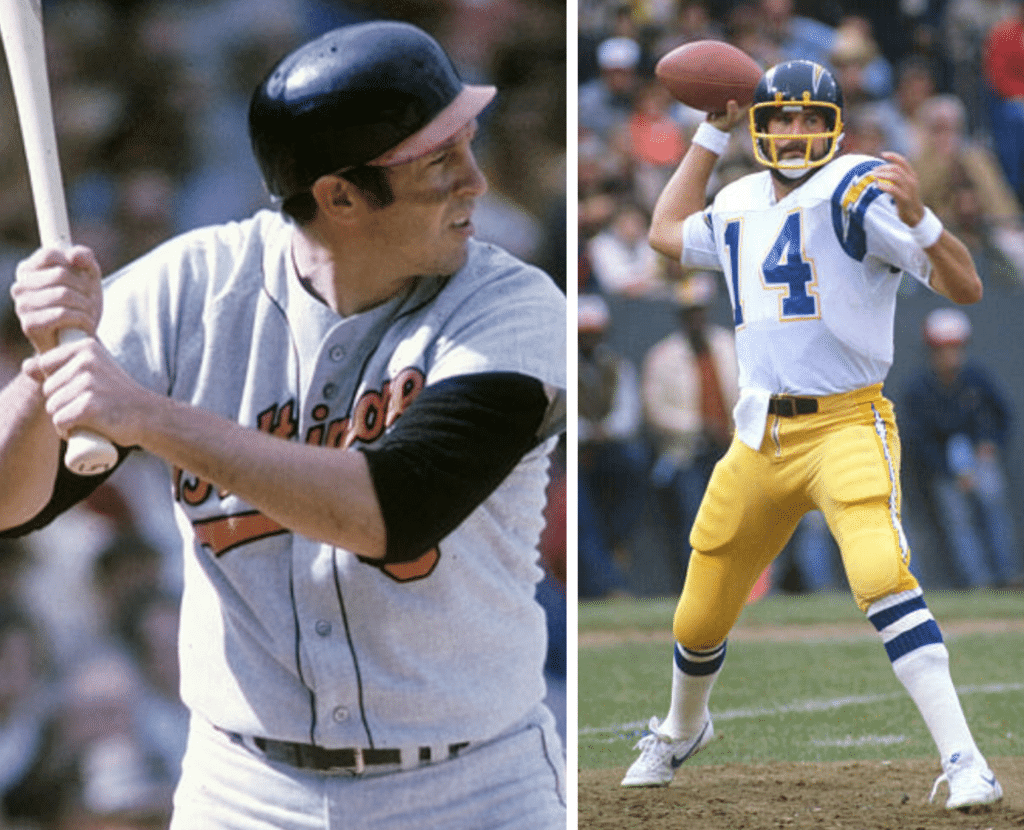
I was talking with a friend a few weeks ago about football. We agreed that whatever else you might think of Tom Brady, he looks like a quarterback. His posture, his body proportions, the way he stands tall in the pocket — there’s a physical charisma to him. He looks like the dictionary definition of the word quarterback, straight out of central casting.
When I was a kid in the 1970s, I felt similarly about Cowboys quarterback Roger Staubach, who looked exactly what I imagined a quarterback should look like — his passing motion, the nimble way he dropped back to pass, the whole package. I hated the Cowboys, and so I resented Staubach’s seeming visual perfection even as I admired it. (I imagine many people feel similarly about Brady.)
Later on, in the 1980s, I developed a similar visual affinity for Randall Cunningham when he was with the Eagles. I even loved his shoulder pads and, if you can believe this, his thigh pads, all of which looked Just Right.
By contrast, I remember when Dan Fouts was tearing up the league during the Chargers’ Air Coryell period. The numbers didn’t lie — Fouts was a devastatingly effective quarterback. But something about him didn’t feel right to me. His proportions were all wrong, his movements lacked fluidity and grace — it was all visually unsatisfying. He may have been a great quarterback, but he didn’t look the part, at least to me. I remember being puzzled by his success — how could he be so good when he didn’t look good? (Obviously, I’d make a terrible scout.)
I didn’t realize it at the time, but in all of these cases I was applying athletics aesthetics at the most basic level, by critiquing the look of the athlete himself.
I was thinking about all of this the other day when I was doing photo research for my Frank Robinson eulogy entry. As I clicked my way through various Robinson pics, I also came across lots of shots of Brooks Robinson. And there’s no getting around it: Brooksie often did not photograph well.
Let me pause here and acknowledge that Brooks Robinson is a Hall of Famer, and deservedly so. He played in the bigs for over 20 years, was the American League’s MVP in 1964 (when he hit .317 and knocked in a whopping 118 runs), hit a respectable .267 for his career, and was, pretty much by universal acclaim, the greatest-fielding third baseman ever, a status reinforced by the 16 consecutive gold gloves he won from 1960 through 1975. In other words, Brooks Robinson was, by any reasonable measure, a world-class athlete.
But he often didn’t look like one, at least at the plate. Let’s start with this photo — look how his hands are separated (!):
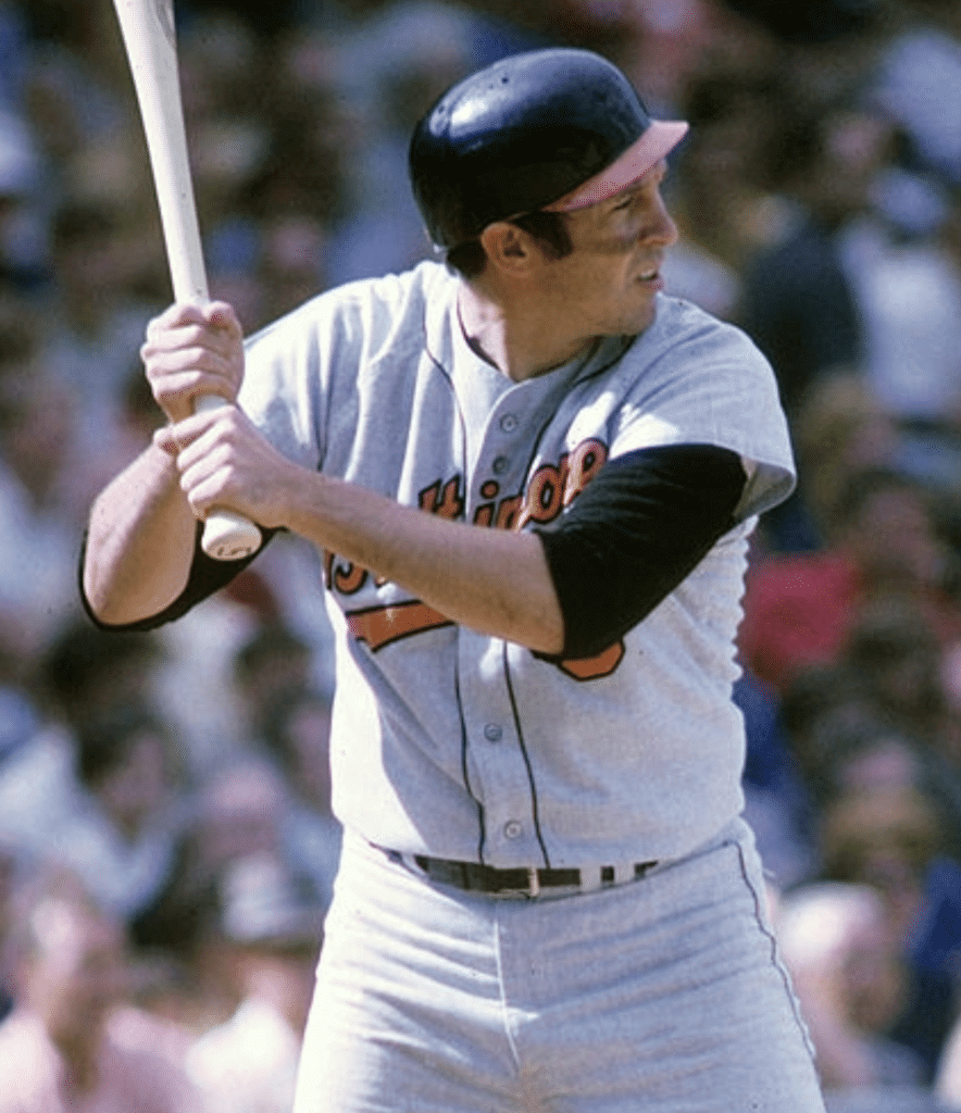
The snub-nosed helmet brim — which he started using after he began wearing an earflapped helmet, because the intersection of the brim and flap cut down on his peripheral vision — just adds to the rinky-dink feeling. Like, get this guy a real helmet and show him how his hands are supposed to go!
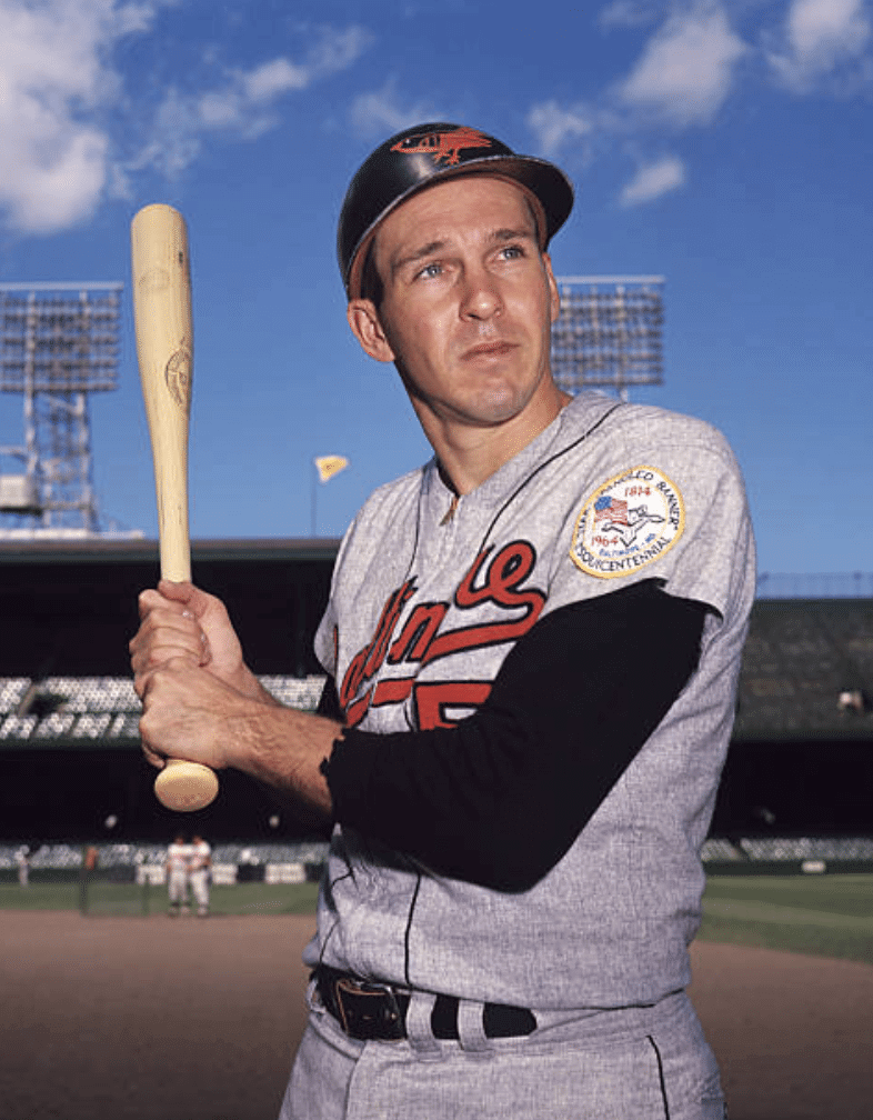
Even in a posed shot, Robinson didn’t exactly look like a guy who’d strike fear into a pitcher’s heart. He looked more like a guy who’d never held a bat in his hands before (as an aside, this shot provides a great view of the Star-Spangled Banner sesquicentennial patch that the Orioles wore in 1964; click to enlarge):
There’s also a surprisingly large number of shots in which Robinson looks off-balance after swinging the bat, as if his bat were too heavy or something. Check these out:
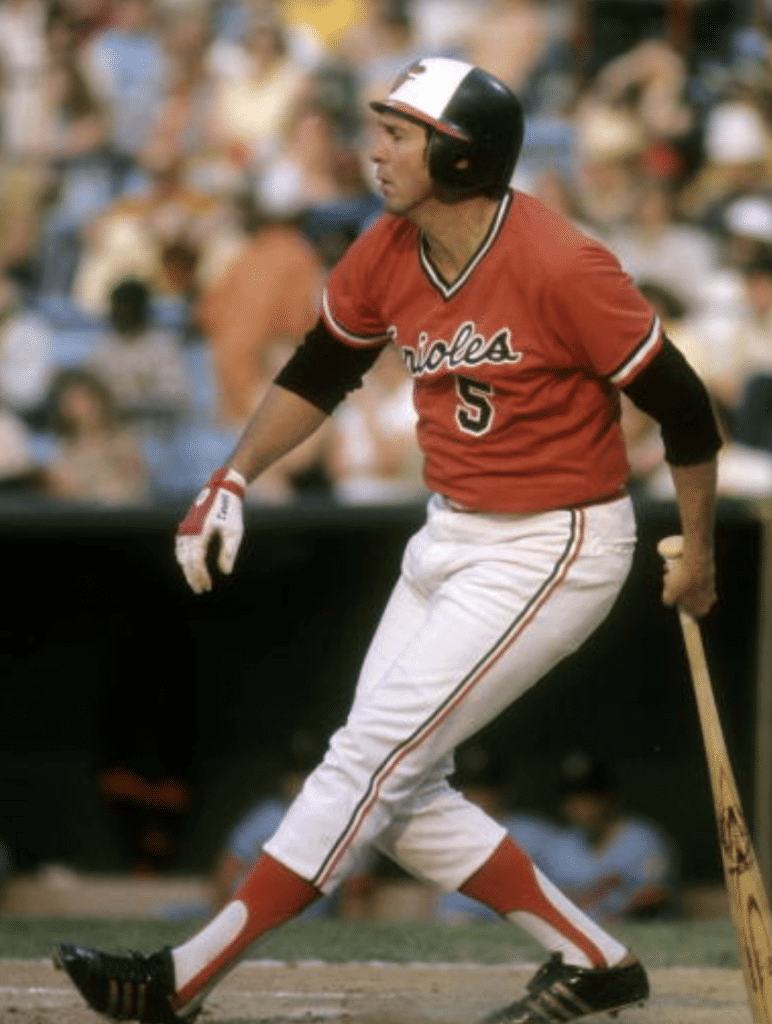
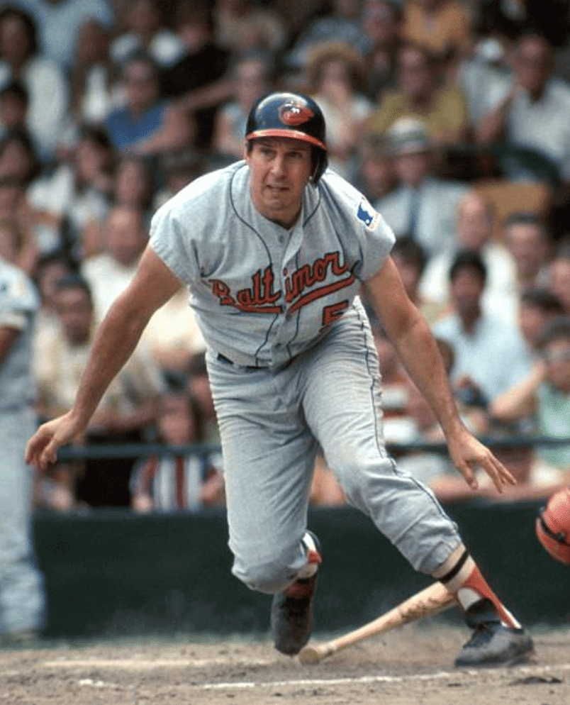
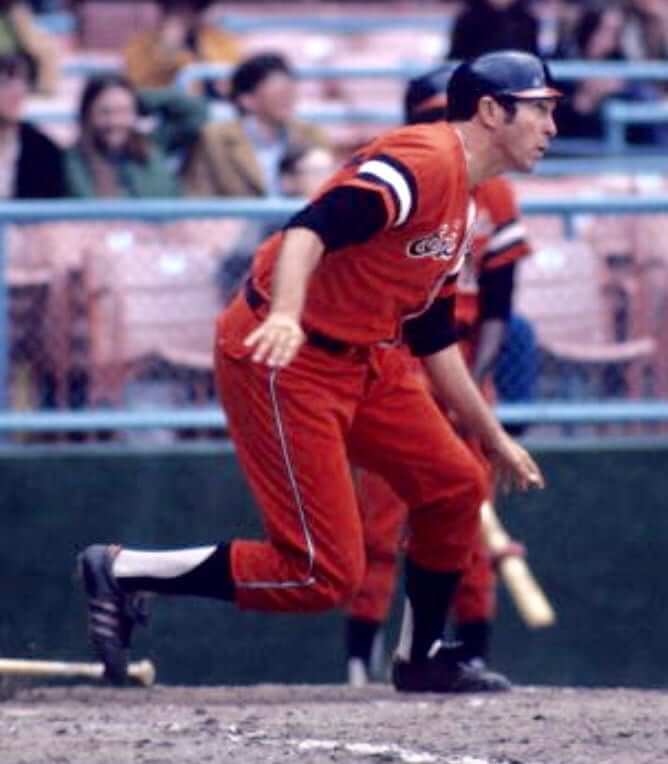
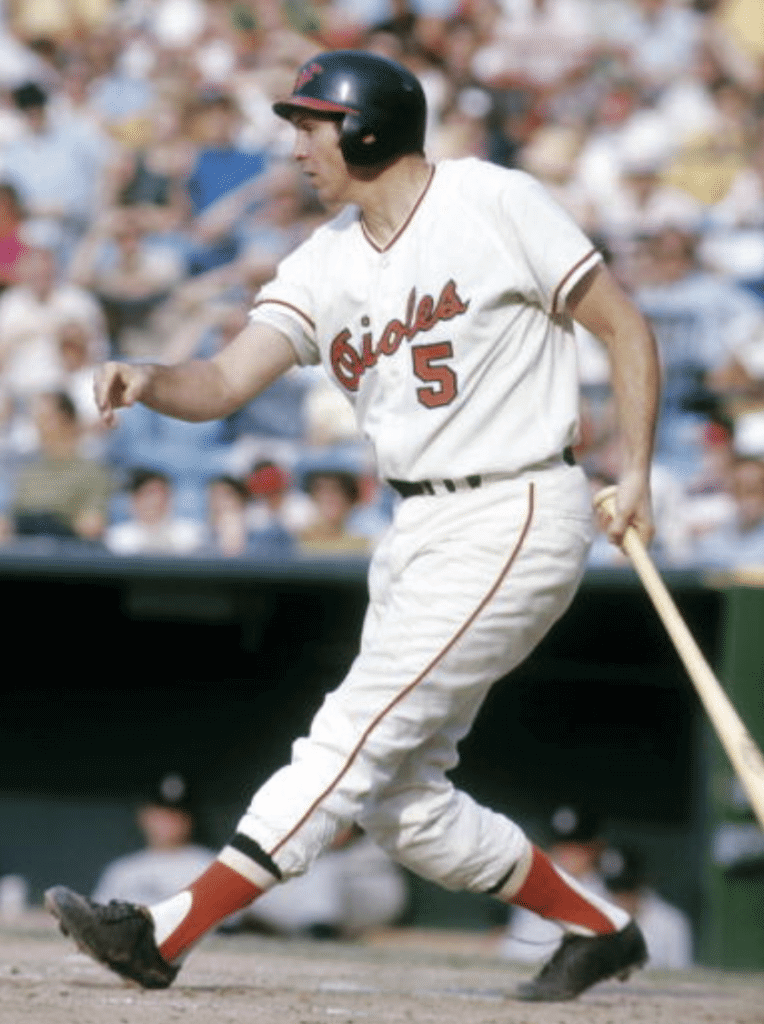
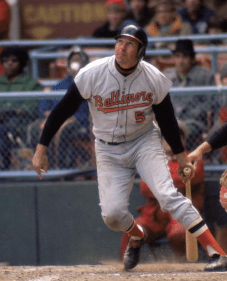
And there’s more where those came from. In a lot of these shots, Robinson doesn’t look like a Hall of Famer. He looks more like someone’s dad trying to fit in at fantasy camp.
I realize some of this probably sounds petty or mean, so please believe me when I say I don’t mean any of it as a criticism of Robinson (who, again, was by any reasonable measure a world-class athlete [and from what I’ve heard is also a decent guy]). If anything, this is a good reminder that aesthetics can be deceiving and that there’s more to competing than just looking the part.
And of course it’s worth remembering that there’s one place where Robinson very much did look the part — at the hot corner. In the interests of equal time, here are some shots of him doing what he did best:
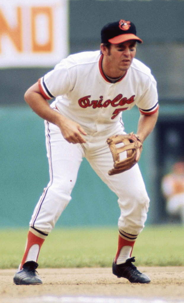
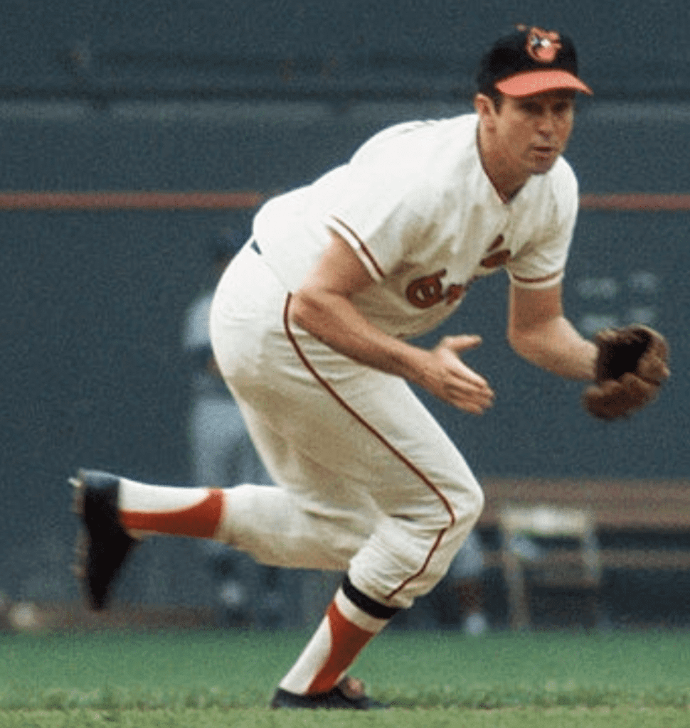
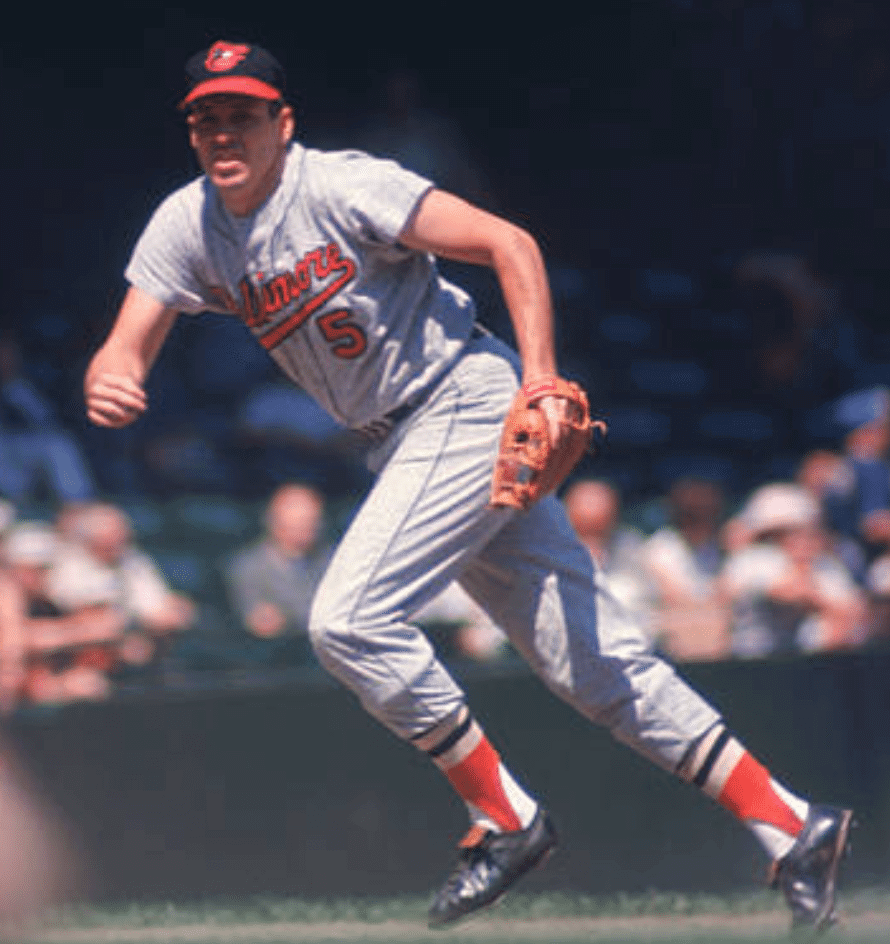
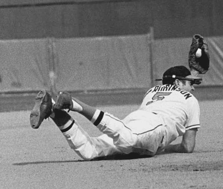
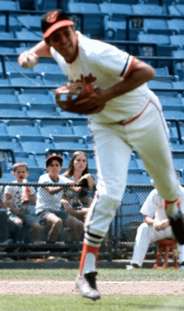
It’s like night and day from the photos of him at the plate, right?
“Looking the part” can work both ways, of course. When I was a kid, I always thought Dodgers catcher Steve Yeager looked like a great hitter at the plate — his stance, his swing, his broad shoulders, the whole package. But again, the numbers don’t lie: He was a terrible hitter. That always puzzled me, just like I was puzzled by Fouts’s success. Just shows that looks can be deceiving, whether you look the part or you don’t.
I think this is an interesting topic that goes beyond the issue of our personal aesthetic tastes. Ultimately, of course, we want the athletes we root for to be successful — that’s the bottom line. But we also mythologize them, and we readily buy into other people mythologizing them. As kids, we stand in front of the mirror and imitate their motions. We want them to look the part.
Or at least I did (and on some level I still do). And I’m pretty sure I’m not the only one. What about you? Are there any players, in any sport, who either looked the part or didn’t, at least by your standards? Did their look correlate with on-field success? Did that matter to you?
Feel free to post your responses in today’s comments — should be an interesting discussion.
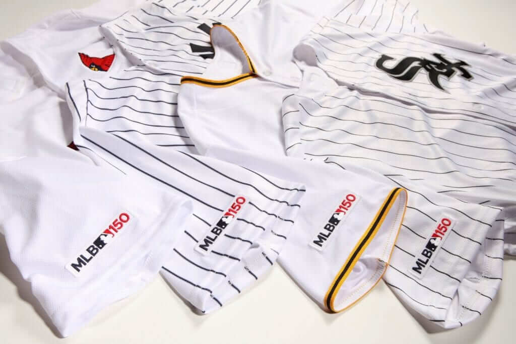
Photos from from Eric Fischer of Sports Business Journal; click to enlarge
ITEM! MLB 150 patch update: Two weeks after the Twins inadvertently leaked MLB’s 150th-anniversary patch, we now have another photo showing how the patch wil look on several other teams’ jerseys. This confirms that the patch will have the same red/white/blue color scheme for every team, and will not be team-colored like the MLB logos that appear on jerseys, caps, and pants.
As previously reported, the patch will appear on jerseys for the entire season, and will be on caps for Opening Day. We now have our first look at the caps:
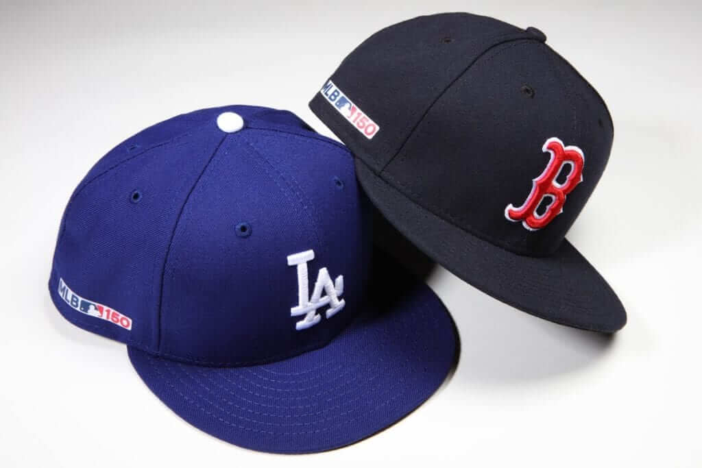
(My thanks to @NYYDJ2 for bringing these photos to my attention.)
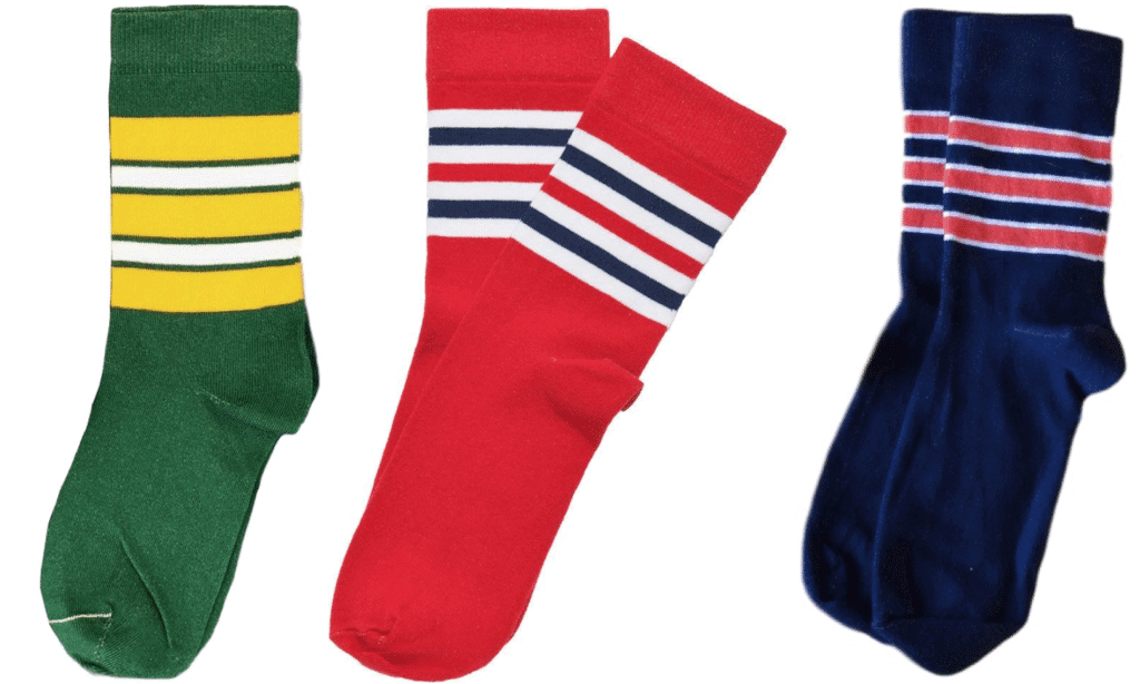
ITEM! StripeRite update/poll: The next batch of StripeRite socks will be a sort of “greatest hits” edition, as we plan to revive the Green Bay, St. Louis, and Chicago designs shown above, all of which were very popular the first time around.
In addition, we’ll add one new design to this batch. We’ve narrowed it down to two choices — Cleveland and Harlem:
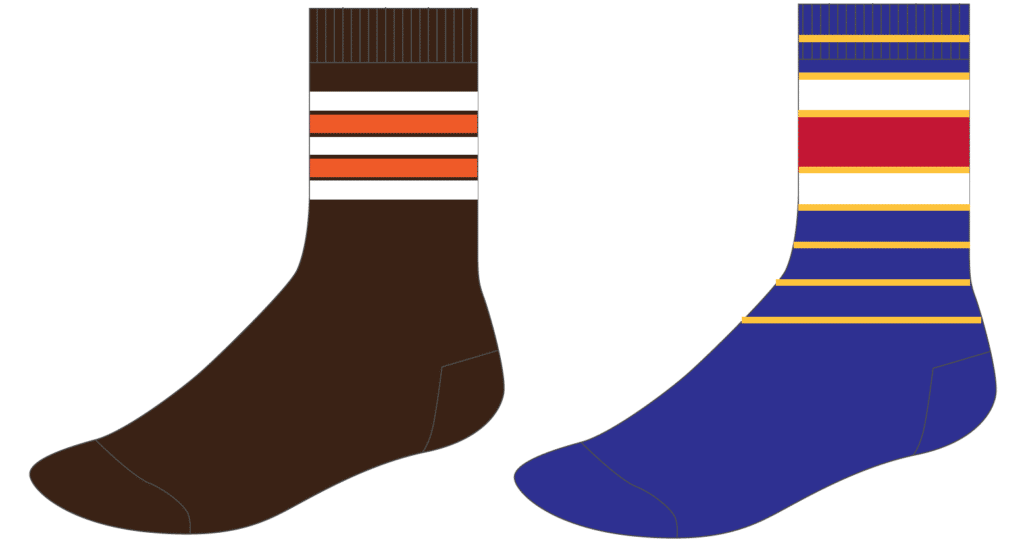
If you’re a potential StripeRite customer, please let us know which design you’d be more interested in purchasing:
[totalpoll id=”106823″]
Thanks for your input — we appreciate it.
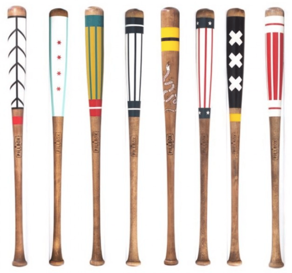

ITEM! Yet another raffle: The Pillbox Bat Co., which has been advertising with us for quite a while now, is now offering a free item from their website for a lucky Uni Watch reader. In addition to beautifully painted bats like the ones shown above, they also have a variety of pennants, apparel, leather goods, and more, so the winner will have a lot of options to choose from.
To enter, send an email to the raffle address by this Thursday, Feb. 14, 7pm Eastern. One entry per person. I’ll announce the winner on Friday. Good luck!
Click to enlarge
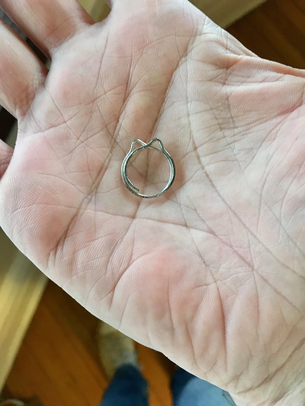
Clip job: There are all sorts of weird paper clip designs out there. The one shown in the photo above was recently given to me by the Tugboat Captain, who found it amongst some early-1930s documents she was researching. I know the manufacturer didn’t intend for it to look like a cat, but of course that’s how I see it. Meow!
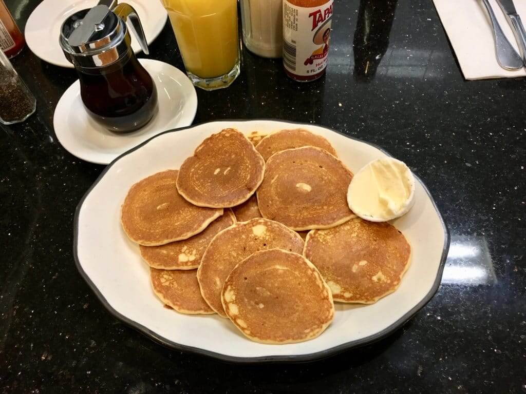
Silver-licious: Silver dollar pancakes don’t show up on menus that often. So if I see them listed, as I did when having breakfast at a Brooklyn diner on Saturday, I almost always order them. I love how bountiful and festive they seem, sort of like there’s an implied exclamation point. Silver dollar pancakes!
As you can see, the silver dollar ’cakes I had on Saturday were significantly larger than actual silver dollars. They always are. So how did the name come about? Did they used to be smaller back in the day, and then they succumbed to portion creep, like so many other restaurant foods? Shouldn’t the guys in the kitchen have a silver dollar taped to the wall for visual reference or something?
Speaking of the guys in the kitchen: I sometimes wonder if short-order cooks hate having to make silver dollar pancakes. So many little things to deal with, instead of one or two big things. I realize they can probably flip them several at a time, and I also realize I shouldn’t feel bad about ordering something that is, after all, listed on the menu. But still, I wonder — when the order arrives in the kitchen, do they cringe and say, “Ah, jeez, not those goddamn silver dollars again”? Can anyone with professional griddle experience weigh in on this?
As long as we’re talking pancakes: So many menus have a regular order of ’cakes and then a smaller order, the latter of which is often called a “short stack.” Now, I love the idea of ordering a “stack” — it’s a very appealing and appetizing word. I’ll have the stack! But the full-size order is rarely if ever called a full stack or a tall stack or a blown stack or even just a regular old stack. It’s just a standard order of pancakes. Why must I get the smaller order if I want to use the word “stack”? Very frustrating!
When I have my own diner, which should happen any day now, the full order of pancakes will be called the stack, plus we’ll have a jumbo-sized option called the giant stack, and of course there’ll be the short stack. Also, our silver dollar pancakes — which will come in a pile, not a stack — will truly be silver dollar-sized (and if they’re not, the customer will get a real silver dollar!). Oh, but nobody will order any of these pancakes anyway because we’ll also have waffles on the menu and everyone knows waffles are better than pancakes, especially when I’m making them because I add all sorts of delicious secret ingredients but that’s another story for another day, the end.
The Ticker
By Jamie Rathjen

Baseball News: Here’s some great color footage of the Yankees’ 1941 spring training camp. Jarring to see someone other than Babe Ruth wearing No. 3, which hadn’t yet been retired. Scroll down to the tweet’s comments to see who wore that and other numbers (from Gil Neumann). … For the second day in a row — the tweet mentioned in yesterday’s Ticker was deleted — a softball tournament hosted by Northern Iowa was played indoors on the UNI-Dome’s football field because of the weather (from Aris Theofanopoulous). … The cap that rapper Travis Scott wore backwards at the Grammys last night was a custom Astros design (from Ignacio Salazar). … Here’s more about all those throwbacks the Reds will be wearing this season (from Sean Thesing).

Football News: The Alliance of American Football’s Memphis Express revealed a white jersey, which makes them the first team in the league to have more than one and contradicts what Paul was told in November, which was that each team would only have one uniform even though half of the AAF teams wear dark colors (from multiple readers).

Hockey News: A few days ago we had Wisconsin throwbacks in the Ticker for the retirement of women’s team coach Mark Johnson’s No. 10; the women wore their throwbacks during warmups and all wore “Johnson” NOBs and No. 10 (from Chad Jorgensen). … The QMJHL played a second outdoor game in Saint-Tite, Que., this weekend, which was color-vs.-color between the Québec Remparts and Shawinigan Cataractes (from Wade Heidt). … Also from Wade: The OHL’s Owen Sound Attack wore teal jerseys because a building in downtown Owen Sound was donated to a local nonprofit. … Somewhere in this article (WaPo link), it’s mentioned that Lester Patrick, an early-20th-century defenseman and the grandfather of Capitals president Dick, and his brother were responsible for player numbering in hockey (from Ted Floss). … In 2017, the Federal Hockey League’s Carolina Thunderbirds wore Veterans Day jerseys with an odd McNOB treatment. That font is called Vanilla Whale (really), and the lowercase letters all have those lines above and below the letterforms (from Matt Campbell and Andrew Sterlachini). … The ECHL’s Newfoundland Growlers wore Iron Man uniforms yesterday (from Mike Lucia). … New alternates yesterday for the Bridgeport Sound Tigers (from Pech Zearce).

Basketball News: This video shows the Vikings’ stadium, which hosts the Final Four this year, being set up for basketball for a tournament in November (from Joel Mathwig). … Iowa’s women wore pink alternates with special NOBs yesterday (from Jake Binggeli). … Syracuse’s men wore new white alternates with “’Cuse” on the front. … The D League’s Canton Charge lost their luggage during a trip to Oshkosh, Wisc., so they wore generic practice uniforms against the Wisconsin Herd (from multiple readers). … New Pelicans F Jason Smith wears No. 14, while new Pacers G Wesley Matthews wears No. 23 (from Etienne Catalan).

Soccer News: German team Werder Bremen wore 120th-anniversary shirts with this season’s green shorts and white socks, perhaps attempting to set a record for most shades of green in one kit (from Christopher Jones). … Italian team Chievo Verona recently wore last season’s first kit, which is almost, but not exactly, the same as this season’s (from Josh Hinton). … The next three are also from Josh: the USL Championship’s Louisville City wore training kits for their last two preseason games because manufacturing issues have prevented this season’s kits from being revealed yet. … New second shirt for Minnesota United. … Three new kits for USL League One’s Chattanooga Red Wolves, including a look at the league’s sleeve patch. … New first shirt for Scottish women’s team Glasgow City. … Premier League officials and most of the league’s teams wore black armbands in memory of striker Emiliano Sala, as did teams in the English Football League. Cardiff City wore daffodils again and at least one team in England’s Women’s Super League participated as well.

Grab Bag: Some Australian Football League players, at least on the women’s side, wear long sleeves to protect against sunburn, including a few on Brisbane’s women’s team; it is also worth noting that Brisbane’s women have a white clash guernsey, but the men do not appear to have worn white in several years (from @torak). … NASCAR driver Corey LaJoie’s car for next week’s Daytona 500 has his face on the hood (from James Gilbert). … New presidential candidate Sen. Amy Klobuchar revealed her campaign logo and it’s blue, which according to an article we had in the Ticker a few days ago is a color that 2020 female presidential candidates have not been using (from @VerbDC). … Carmel High Scholl in Indiana has won 33 consecutive state championships in girls’ swimming, so they made jerseys with No. 33 on them and wore them on the podium (from Derek Linn).
Isn’t the reason the Yankees are wearing road uni’s is because they are playing a game against the Reds?
Oh, right. Probably. Will fix!
Man… The Browns Stripe Rite was in a poll for the last batch and was selected! But then there was a second round for some reason I can’t remember and it lost out. I have been patiently waiting for them to be included in the next batch (y’know, since they narrowly missed out last time) and wouldn’t you know, they’re in another poll, and losing early. #FreeTheBrownsStripeRite
The opening to the MLB150 patch reveal reads “ITME” instead of “ITEM”.
Can you tell I overslept and was scrambling to get today’s post up? Fixed!
No worries, sir! (And, for the record, I hadn’t had enough coffee yet and definitely thought, “Wait, is this a new uni-related acronym I’m not getting?”)
Subconsciously referencing Gritty?
I can only hope that the Browns’ Stripe Right wins out. I can say that they’re great socks. I bought the Bears design for a friend. You can’t get my money fast enough for the Browns’ stripes.
Talk about a quarterback that doesn’t look like a quarterback… growing up watching Bernie Kosar was always interesting.
Talk about a quarterback that doesn’t look like a quarterback… growing up watching Bernie Kosar was always interesting.
Yes, perfect example of not looking the part!
Bernie was the first person I thought of, too (even going back to his college days at Miami with #20).
You could put Vinny Testaverde on that list too
“You’d rather look good and lose rather look bad and win…”
(taken out of context, it fits perfectly in the Uni-world)
Do you listen to Jimi or do you hear him?
I’d be willing to bet some of fouts’ awkward movement you remember was because of his straight back drop back, rather than turning a little to the side and dropping back. I used to think the same thing, but I LOVED it… My first favorite player
Nah, there were other straight-drop QBs who were still much more fluid and graceful than Fouts.
He had a thick body for a QB, and that thickness was accentuated by his flak jacket, which he was among the first to wear.
Is Paul “athletic” shaming Robinson and Fouts? ;)
“Fouts was a devastatingly effective quarterback. But something about him didn’t feel right to me..”
Ummm, the beard!!!!!
Looking the part – I think it’s one of the reasons that i enjoyed watching Junior Griffey at bat. He always “looked the part”. He commanded the plate. Smooth and effortless. And for that matter, I was a huge fan of Bonds as well, even with his armored arm encroaching the strike zone. Frank Thomas “looked the part” as well at the plate.
Not to take away from his talent and his obvious HOF carreer, but I never was a fan of Cal Ripken (blasphemous, as I am from Baltimore). He never looked like he was comfortable at the plate. But similarly to B. Robinson, he redeemed himself in the field. When you think of the wave of big shortstops, to me, it started with Ripken. And he handled SS with a commanding ease.
I agree that Ripken’s swing always looked a bit looping and awkward to me. But it got the job done!
Another great Baltimore sports hero, Johnny Unitas, wasn’t very athletic looking with his slumped shoulders and awkward running style, but he was the ultimate quarterback.
Unitas came to mind immediately. He was as herky jerky as a QB could possibly be but his straight over the top release was a thing of beauty.
“He never looked like he was comfortable at the plate”
Considering Cal was also known for changing his stance all the time, it’s quite likely he never was.
I remember he had a stance where it looked like he was trying to saw his arm off.
I agree with the opinion that Cal Ripken Jr. never looked comfortable at the plate. I think part of the reason may be that he was constantly changing his batting stance. He never seemed to be settled in on one, and was always tweaking it.
Billy Beane’s philosophies about player evaluation are built on the understanding that scouts over-rate and under-rate players based on how they look. He recognized that scouts overrated him as a young player because he looked like the part. This lead him to look for answers in numbers.
The Newfoundland Growlers and Bridgeport Sound Tigers ticker items are in the basketball section instead of hockey.
Got it.
Wow, there is a lot of interesting stuff today! I always think Marshawn Lynch does not look the role. Always untucked and just looking generally sloppy (especially with the Raiders) but he will just run you over like a truck or somehow come out of a pack of defenders and keep running as if he was never touched. And I always thought George Brett was the perfect example of what a baseball player should look like.
Also, ITEM is spelled wrong in the 150 patch item. And the last two items in the basketball section are hockey links.
All fixed.
Did anybody see Lynch’s recent appearance on Real Time With Bill Maher?
I know football players in general are bigger than the average person, but Lynch looked absolutely huge – as in, somebody who didn’t know would have guessed that he was a lineman, not a running back.
Mike Schmidt was a “looks the part” guy. At the plate, he always stood tall, looked confident and had that swagger. His bat always wagged back and forth at that same smooth pace as the pitch came in.
In the field, I doubt there’s ever been another infielder at any position that was as smooth at fielding their position.
Add to that the fact that the Phils always had great-looking unis during his career.
Arizona Hotshots have advertising patch.
As do, I believe, all the AAF teams.
Likewise, I always thought Will Clark “looked the part.” The way he approached the plate from the on-deck circle, his batting stance, even his facial expressions.
Sean Casey, a great hitter, always looked like somebody’s uncle at a family picnic.
Obviously Peyton Manning was a great QB but he never looked the part to me. There was no fluidity in his movement.
For a big tall guy with an incredible arm, Manning looked ridiculously unathletic. When he had to run, he had an awkward loping stride like a baby giraffe, and at least in his latter days, he carried around a bit of a beer gut.
One correction regarding Brooks Robinson: He’s more than a decent guy, he’s probably the most friendly, courteous, considerate and down-to-earth person you would ever want to know. He’s the living definition of a mensch. That’s why he is so revered in Baltimore and throughout the baseball community.
I had issues with Jeff George’s appearance as a quarterback. I didn’t even like the way his helmet fit! link
There is a lot to it. I grew up a Cubs fan and my guy was and still is Ryne Sandberg. I thought he was a great ball player that did things the right way, but I never wanted to look like him at the plate because he always looked like he was in his first year of playing baseball. He seemed off balance and timid. There were other ball players of the ‘80s that I would have rather looked like, so there was something to it then.
Funny thing is, exactly what you have wrote in the story is almost a chapter out of the book Moneyball, about how Billy Bean changed the old way of thinking from scouts about how a player “looked like a ball player” and how that adage became old and obsolete. Bean was more concerned with his numbers than how he looked, and would reference picking up players with high walk numbers and higher on base percentages that scouts specifically noted “he just looks weird”.
Interesting! I confess that I’ve never read Moneyball.
What I remember about Sandberg was he would never dive for balls. Ever. It seemed like an essential move for a middle infielder, but if you can produce a picture of Ryno with a grass stain on his uniform, I’d love to see it.
link
Gotta admit it looks more like grass than dirt! Thanks for taking the time; sometimes feels like I’m yelling down a hole here.
Can think of two ballplayers right off the top that looked very unathletic.
John Kruk had a hanging gut, scraggly beard, stringy hair, and frequently played with torn pants. He we the very antithesis of what a ballpayer should look like. He even had a memorable quote: Lady, I’m not an athlete, I’m a ballplayer!
Second example was Hunter Pence. Spindly legs, he has an uncoordinated look to him. seems like when he swings or throws a baseball, body parts are headed in different directions.
Hunter Pence link like a kid learning to throw a ball for the first time. His swing, link like a kid playing wiffle ball trying to hit it as hard as possible.
And his pants were always about 6-10 inches too short.
I’m an NL guy, and have always had the normal red-blooded American’s disdain for the Yankees, plus most of his career was before my time, but… NOBODY has ever looked more like the platonic ideal of “ballplayer” to me than Mickey Mantle.
Could probably devote a whole article – if you haven’t already – to fat baseball players and how they were not at all flattered by the switchover to pullovers and beltless polyester pants in the 70s.
You really had to be lithe as a gazelle to look good in those things.
Celtics and longtime coach Don Nelson always struck me as the least likely looking basketball player. Everything was awkward. To a lesser degree I always thought Kevin McHale looked like the unfortunate tall geek with no game. Looks are deceiving indeed.
I agree with you on McHale. Great, great player (and that’s hard for me to admit as a Lakers fan), but to me it was just the way that jersey looked on him. It looked similar to the white underwear tank-tops on your grandpa.
The MLB anniversary patch has the advantage of being unobtrusive and small, so yay! On jerseys anyway. .
But as a logo, it’s dreadful. One of the worst such logos I’ve ever seen. At the most basic conceptual level, the purpose of having a logo like MLB’s batterman is that it’s a symbol you can use so that you don’t have to spell out a bunch of stuff you want to say with words and letters. So adding batterman-sized MLB lettering next to the batterman logo is predicated on either 1) The designer’s belief that the batterman logo is a terrible logo that people don’t recognize as standing for MLB; 2) The designer being a terrible designer who doesn’t understand how logos, symbols, or language work; or 3) The design process being run by decisionmakers who don’t understand how design or branding work. Neither possibility speaks well to MLB’s management.
Awkward “bumble bee” players past and present (those who, like the bumble bee, look like they should not be able to do what they do) the top of my head:
MLB — Hunter Pence
NBA — Bobby Jones
NFL –Sebastian Janokowski
-C.
Best description of Janikowski was from an NFL announcer (can’t remember which one) who said during a late October game that he looked like “he got his uniform off the costume rack at Target.”
Priceless!
Too bad the 1966 Miami Dolphins socks weren’t a choice. I would have bought at least 3 or 4 pairs. Oh well, maybe next year.
Even as a native Marylander who grew up watching Brooks & Chuck Thompson do Orioles games, I would begrudgingly admit Mike Schmidt was the better 3B in this region and maybe baseball history.
I think Paul’s paragraphs on Brooks Robinson would have been uncontestable had it said he was baseball’s best FIELDING 3rd baseman ever and not the best 3rd baseman ever. But a great piece and a prompt for a good discussion. Funny that he mentioned Cunningham. I always thought he looked TOO good for a QB.
I think Paul’s paragraphs on Brooks Robinson would have been uncontestable had it said he was baseball’s best FIELDING 3rd baseman ever…
That’s what I meant, sorry.
A waffle edition of Culinary Corner basically has to happen now, right?
I love the conversation of guys who look the part. As an Eagles fan I HATED Emmitt Smith but he LOOKS like a running back. Deion Sanders is what a corner should be. Bruce Smith/Charles Mann were the defensive lineman models.
I’m in my 30s so the NFL of the 80s-00s is the heyday of when I would watch. Guys were wearing VSR-4s and Schutt air helmets. Those are what players look good in to me. I’m still having a hard time adjusting to the Speedflex because it doesn’t have the same “look” that a football player should have.
Maybe it’s a psychological trick that happens in my head because the clip is almost always paired with the famous soundbite “with two bad legs!”, but I will never, ever understand how Kirk Gibson put that ball into the stands with the swing he gave it. I’ve never thought about Googling more of Gibson to see if his non-injured swing was better looking, but that particular swing in the World Series is absolutely the first thing I thought of when this aesthetic topic was presented above of “not looking the part”.
Also, for what it’s worth, Tom Brady’s throwing motion has actually always BUGGED me aesthetically. Too stiff in the legs, and the angle of the ball as it’s thrown to the receiver is always pointing down unless as if he’s throwing to one of his kids at receiver, unless he rears back for a deep ball which hardly ever happens, it seems. Certainly a product of having good over-the-top mechanics, but it’s not interesting for me to watch in my opinion. I much prefer a slower-slot release point to make it look more like the QB is slinging it. Some push-off from the legs is visually pleasing to me as well. Ben Roethlisberger is a good example of this style.
Bernie Kosar is an example of a “did not look the part” guy. He threw basically sidearm and ran like he had a giant rubber band around his ankles. Hard to argue with the results thought. He was very accurate, had pretty good arm strength and led his team to the playoffs his first four years as a starter.
An example of a guy who did “look the part” to a T, was Pavel Datsyuk. The way he skated, stickhandled, shot, passed, pokechecked….everything was textbook and he did it with such fluidity, it was like a human version of a CGI player used as the perfect prototype come to life, everything looked just perfect.
As a teenager Brian Dawkins was, and still is really, my favorite Eagle. The way he wore his uniform combined with the dark tint visor always seemed to me how an elite defensive back should look. And the look complimented his hard hitting intense personality.
I suppose this sorta counts, but I was a Pittsburgh native growing up in the 70s, so I rooted for the 1979 “We Are Family” Pirates. I remember being tremendously, possibly irrationally, disappointed that they replaced Frank Taveras at SS with some random dude who looked like a high-school shop teacher (aka Tim Foli). Porno stache. NERD GLASSES. WHY WOULD YOU DO THIS?
As far as a guy who “looked the part” but never really had the success he should have, JD Drew comes to mind. He had a decent career average (.278), but considering that many pro scouts and many fans alike said he had one of the best looking swings ever, he didn’t live up to that. He played for 14 seasons and didn’t even surpass 1500 career hits. He had that prototypical swing and just looked like a ball player, but never had the success he could have, or probably should have.
Carmel High School
An obvious example of a great ball player of whom I’ve seen too much to think he looked like one: Babe Ruth.
OK, so I know that when you open your Diner you will have GOETTA on the menu, right? Make sure the cook fries it up in thin slices and very crisp. MMMMMMM!
Is that an apostrophe catastrophe on the ‘Cuse jerseys? It’s hard to tell with that font, but it looks like it’s curving the wrong way.
Billy Kilmer didn’t look the part.
But his “looked the partness” got an upgrade when he was injured on the bridge of his nose (thanks, tiny one-bar QB facemask). I think his nose was broken; I know he and wore a band-aid on it and went right out for the next game. And many of the Washington fans wore a band-aid on the nose in tribute.
Speaking of not looking the part, I caought a bit of the AAF and boy, those officials’ jerseys seem designed to make anyone look tubby. (Apologies if this was mentioned here already.)
Sonny and Billy both looked like guys that would chugging beers in a flag football league.
Joe Washington’s uniform/equipment appearance were down-right laughable, but man-oh-man he was practically unstoppable. One of the over-looked greats IMO.
Say what you will about his many, many bad deeds but Bill Romanowski absolutely looked and played the part.
The mention of Fouts’ flak jacket reminded me of a high school teammate who wore one as an offensive lineman (and regularly got his chops busted by other teammates). So it got me thinking about examples of players wearing equipment not commonly associated with their position, such as Johnny Unitas and his high tops. Anyone have any examples of a QB wearing a neck collar??!
Anyone have any examples of a QB wearing a neck collar??!
Steve Grogan!:
link
I always thought the baseball player who most looked the part and backed it up was Andre Dawson. When he stood up at the plate it always looked like he was just going to hit a screaming line drive somewhere. I think NOT looking the part, but still delivering at the plate was Willie McGee. He always had the most awkward looking swings, but usually somehow managed to flick the ball to some open spot on the field.
Totally agree regarding Dawson, one of my favorite players ever.
McGee had a very odd body. High-waisted, long arms. Great player, though.
Fred (Crime dog) McGriff was a looked the part guy also.
Dave Winfield would be my example of a guy who appeared to be put on earth just to wear a baseball uni. And he looked good in the boldest SD uni and the classic pinstripes. Watching him go first to third was a pleasure even when he was on teams I hated.
Dave Winfield would be my example of a guy who appeared to be put on earth just to wear a baseball uni.
Or a basketball uni!
link
link
link
link
For whatever reason, I always find those time-lapse “stadium conversion” videos to be fascinating.
The most interesting feature about the football-to-hoops conversion of the Vikings stadium is that it looks like they had to borrow a court from Sioux Falls (putting large stickers over the baselines and center circle to re-brand it as being the “US BANK STADIUM”.
What is the deal there? You’d assume a billion-dollar domed stadium would have budgeted for it’s own court since hosting basketball games was no doubt always in the plans for the place. (Yes, I am aware that the NCAA provides the customized court for the Final Four, but still…)
Jeff Francouer is definitely the reverse of this scenario. Totally looked the part, not a great player by any means. I think he got 2-3 extra chances because of it. (And also he’d catch fire once in a while too didn’t hurt)
Fantastic lede today. I didn’t have the opportunity to watch Brooks Robinson at all as a youngster, but I read constantly about his amazing skill. Still, when I’d see pictures of him in action I’d sort of subconsciously doubt what I read, because he had a tendency to look so gawky in the photos. I don’t even think I realized that until now!
While I see what Paul is getting at regarding Brooks Robinson, it does seem a bit unfair to only show photos of him having just taken a swing and starting his run towards first base. It seems to me that you could find similar photos of any player looking a bit awkward while in transition from batter to runner,no?
For example, here’s a photo of Robinson in mid-swing. Looks about like what you’d expect of a top baseball player to me…
link
Non-baseball example of looking the part:
The cyclist Chris Froome has a characteristically odd posture (which has been likened to a praying mantis) and a haphazard pedaling style which isn’t as smooth as most probably would expect. Yet, it’s worked out for him pretty well.
Agreed! Another non-baseball example is Usain Bolt. He’s so awkward coming out of the blocks, and his first 20 meters looks like someone who’s never sprinted before. You can’t argue with the results, though!
I had a similar thought about disgraced sprinter Ben Johnson…while most sprinters seem to lean slightly forward during a race, Johnson ran with his back pretty much straight, almost arching backwards a bit. Bolt kind of does this as well.
I always thought 200-meter Olympic champion Michael Johnson ran like a duck.
Great example. And everyone fawned over Alberto Contador, with his dancing pedal style. Given his doping issue, I think he maintained an enormous amount of goodwill just because of his aesthetically pleasing pedaling style (and racing style).
I just thought of another ballplayer who did not look the part and he is perhaps the all-time winner:
Kent Tekulve
Jason Kipnis is the first that comes to mind for me. Solid player, but he just looks so uncomfortable at the plate, like he’s fighting himself to get to into his stance.
Will Shoken was right. Brooks was & is one of the nicest people God put on this earth.
They named a candy bar after Reggie Jackson.
They name babies after Brooks. And Schmidt plays first because third belongs to Brooks.
J
Here’s where you have it wrong about Brooks. As a lifelong Orioles fan, I can tell you with absolute certainty that Brooks was NOT a world class athlete; he was a world class baseball player. He was slow, often looking he was running with an Army pack on his back. He looks off balance in all those pictures because he had the ability to swing and make contact with bad pitches and put them into play. When he was in the field, however, he was smooth and graceful. And he his one of the nicest people ever to wear a professional sports uniform. Some guys are great athletes, and some are great players. Sometimes they are both. Brooks was a great player. And even he would tell you that. He was always self-deprecating as a broadcaster, calling himself “the original bad body”.
I agree. Brooks was a great baseball player. Not necessarily a great athlete. He got his job done, when he was asked to do it.
I would further distinguish “great athlete” from “physical specimen”. I recall two sport college athlete Jim Traber, who played 1B and – gasp! -OF for the Orioles after playing baseball and football at Oklahoma State. His body looked a mess but the Ripken brothers would tell you he was the best at whatever games the teams played. Some people are just good at athletic stuff but don’t have gym bodies.
Players who didn’t “look like QB’s”
Sonny Jergenson
Billy Kilmer
John Unitas
Drew Brees
Brett Favre
Bobby Layne
It may be seen as cruel — not my intention by any stretch — but Jared Lorenzen also comes to mind. In his prime at UK, before his obesity look hold, did not look like a QB. Looks were deceiving. Guy could fling it.
Add Bradshaw to that list of ‘didn’t look the part, but played the part’?
Players who didn’t “look like QB’s” – Canadian rules style!
I think of Wyoming grad Tom Wilkinson. Canadian Football Hall of Famer from his 15-year career CFL career. 5 Grey Cup titles and CFL Most Outstanding Player in 1974.
He was not athletic, but he made up for it with football smarts and leadership. Before his retirement, was there to help mentor Warren Moon when they both quarterbacked the Edmonton Eskimos.
5’11” and a little pudgy – he looked like your average fan rather than the quarterback.
link
Ronnie Lancaster didn’t look a whole lot more athletic than Wilkie. Neither did my personal hero, Don Jonas. They were all great, though. Nobody looked the part more than Warren Moon!
Joe Girardi always struck me as looking Just Right for baseball, in an almost throwback way. He could fit into 1965 as much as he did 1998.
Andrew Luck has that same feel, looks the part of a QB in any era.
Totally agree about Girardi. Actually think he looked *more* like a 1960s player than a modern player.
Goalie that at least looked out of his time and different looking as far as equipment and its general condition (and also somewhat for his height for a goalie at the time) was Arturs Irbe.
Bucking the trend of what an NHL goalie should look like at that time.
That only added to his appeal to me.
Jay Buhner’s odd batting stance also was appealing.
Whether they “look the part” or not, there are several players who had stylistic flair that stood out to me and made watching the games that much more appealing.
Walter Payton: Definitely looked the part, and I loved his high step and how he spatted his cleats.
Dave Henderson: Patrolled CF for my Oakland A’s and it was just fun to watch him play, especially the way he settled under a fly ball and did I can only describe as the fly trap — opening the glove at the last second and closing it just as quickly. Coaches probably hated it.
Kenny Stabler: Didn’t necessarily look like a quarterback, but something about the way he moved around the pocket and patted the football was appealing.
Dennis Eckersley: His pitching motion was always fun to watch.
I could go on with others, but these are my highlights.
Dave Henderson had this tippy-toe way of almost prancing at certain times that I always found amusing.
Dennis Eckersley’s motion: YES! Always loved watching him. Poetry in motion.
Looked the part: Paul Molitor.
Not so much: Gorman Thomas, especially whilst playing center field.
Paul, do you think Robinson would look more “natural” in a traditional baseball uniforms (I.e. Yankees, Cubs, Dodgers, etc.)?
Uhh- didn’t help Yogi, Zimmer or Fernando. And the O’s threads pre-double knit era were pretty darn classic.
Eh, maybe. But no uniform is going to make his separated hands on the bat look good!
This is tangentially related, but I think Rick Barry’s “granny style” foul shot needs to be mentioned. Wilt Chamberlain used the granny style for one year, and it worked great for him, but it was so aesthetically unpleasing that he went back to a normal foul shot, to his detriment.
Andrew McCutchen is an athlete I always thought looked the part. The way he casually bent his knees low and rested the bat lightly on his shoulder just before the pitcher’s wind-up is so satisfying to me (and very imitate-able). Once the pitch starts to come he looks more like a hitter, as the bat is cocked and his leg slightly kicks. But I love the bat rest as he waits for the pitch.
Toronto Blue Jays shortstop Tony Fernandez was always a favorite even if he didn’t look the part of a smooth-fielding, slick-hitting major leaguer. A knock-kneed string bean with a head the size of a melon (and an afro to match), his batting stance and swing was a series of different angles and his throw to first gave Mark Eichhorn a run for the money as side-armer deluxe. I know he grew up in San Pedro de Macoris, D.R., where kids used cut-up cardboard milk cartons for baseball gloves and balled-up socks for balls, and seeing his appearance it looks like he never should have gotten past playing stickball in a dirt and gravel field. But the guy could play!
Uni-watch.
Come for the uniforms, stay for the food!