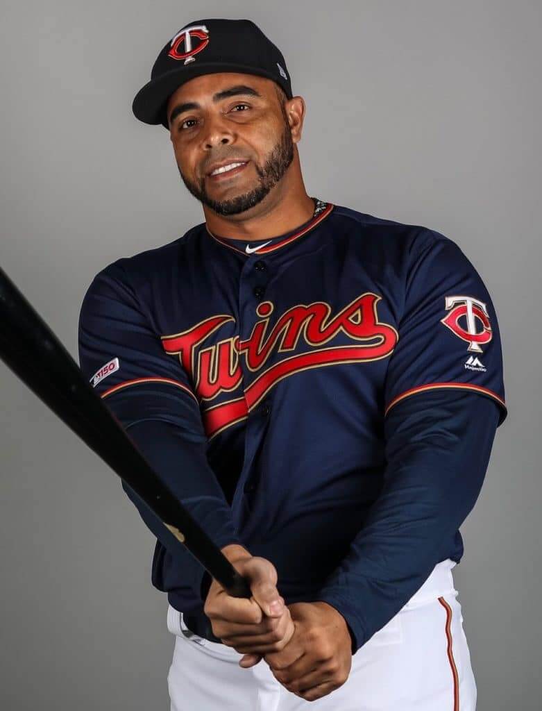
For months now people have been asking me, “Is MLB going to have a 150th-anniversary patch for 2019?” And for months I’ve been responding, “I assume they will, but they haven’t released it yet and I don’t know what it’s going to be.”
With pitchers and catchers just a few weeks away, we may finally have gotten a peek at what the patch will be. Yesterday the Twins tweeted some photos of newly acquired DH Nelson Cruz in his Minnesota gear, and one of the shots (shown above) had something very interesting on the right sleeve. Let’s take a closer look:

Not the most scintillating piece of design. But I’ll tell you what — it’s way better than that crummy NFL centennial logo, simply by virtue of not trying so hard. In a uni-verse where almost everything is overdone, it’s nice to see something so understated. I’m not saying it’s a great logo, but I’m definitely saying it’s not awful in all the usual predictable ways, and that almost (but not quite) feels like a win.
Anyway: Now that the cat’s out of the bag, I assume we’ll soon be hearing more about this logo and how it’ll be used — stay tuned. Meanwhile, I’d like to point out that I made through this entire entry without using the word “sesquicentennial.”
(My thanks to Neal Dorfman and our own Brinke Guthrie for bringing the patch to my attention.)
Click to enlarge
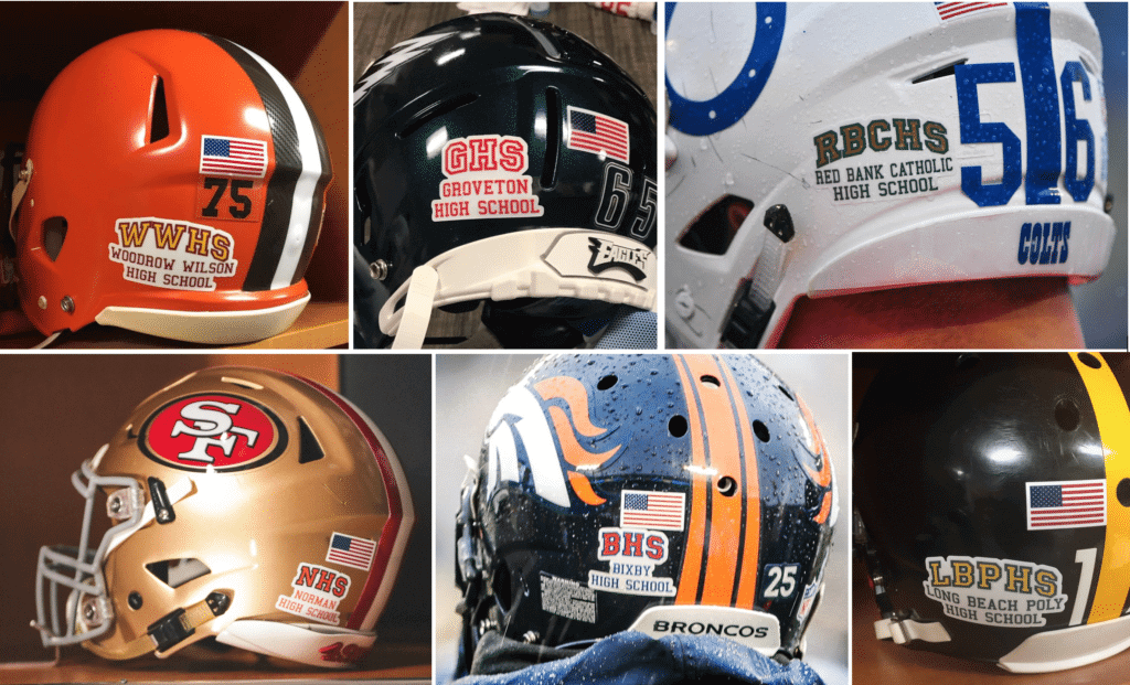
Oh right, the Pro Bowl was yesterday: The big innovation at this year’s Pro Bowl, which you presumably missed because you had better things to do (or at least I hope so, for your sake), is that each player had a helmet decal saluting his hometown high school. Nice enough idea, except that they used the same font for every school, which made the whole thing feel a bit generic.
Bears running back Tariq Cohen took things a bit further by adding a decal with the logo of his high school, Bunn High from Bunn, N.C.:
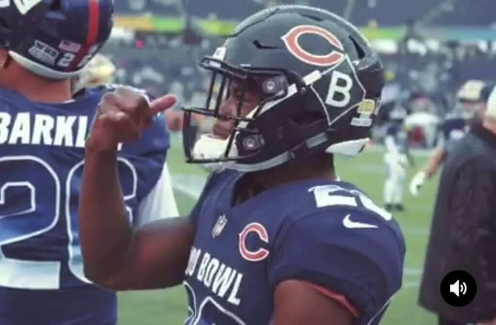
That “B” logo normally appears on Bunn’s helmets.
Also of note: The coaching staffs for the game came from the Chargers (for the AFC) and the Cowboys (NFC). And in case you had trouble remembering that, you could just look the players’ sideline rain ponchos:
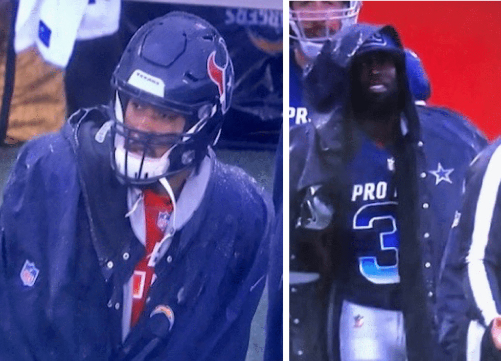
Hard to believe they didn’t have official Pro Bowl ponchos, no?
As for the rest of the game, the uniforms were the same as last season, except this year everyone was getting rained on, which seems like a just punishment for a “game” that really has no reason for existing, even by all-star standards.
After the game, broadcaster Jason Witten broke the game’s MVP trophy, which sums things up quite nicely:
Jason Witten broke the Pro Bowl trophy… pic.twitter.com/U3MaVp5DD7
— FanDuel (@FanDuel) January 27, 2019
(My thanks to Blake Fox, Keith Grinde, Paul Weisner, and our own Brinke Guthrie for their contributions to this section.)
MLS update: A very reliable source told me the following yesterday:
I’ve got the MLS jersey launch calendar on my computer. Houston Dynamo (Jan. 30) and NY Red Bulls (Jan. 31) have upcoming releases. The most anticipated one is Atlanta United on Feb. 15, but that date leaked recently (nothing too crazy going on with their jersey, just more stripes).
FC Cincy will launch their first jersey on Feb. 11. I haven’t seen it, but I know it’s royal blue, and it’s on a previously designed Adidas template. I was told by Adidas that due to the team negotiating colors/crests/etc. with Adidas for so long, they were limited as to what their kit could look like in year one. Apparently there was a dispute about the shade of blue and orange they wanted, as they were going from Nike to Adidas and Adidas probably didn’t want to stock a different shade of royal than what they already stock (which totally makes sense, as VF/Majestic threw a fit at the Marlins when they changed in the early part of the decade since their orange wasn’t the same orange that they stocked for any other team).
FC Cincy’s alt/away kit is super-basic — I believe they said it was literally just a white jersey with the crest on the left chest — but that’ll get replaced in 2020.
Who says I never write about soccer? (Okay, so copying/pasting someone else’s email isn’t really “writing,” but still.)
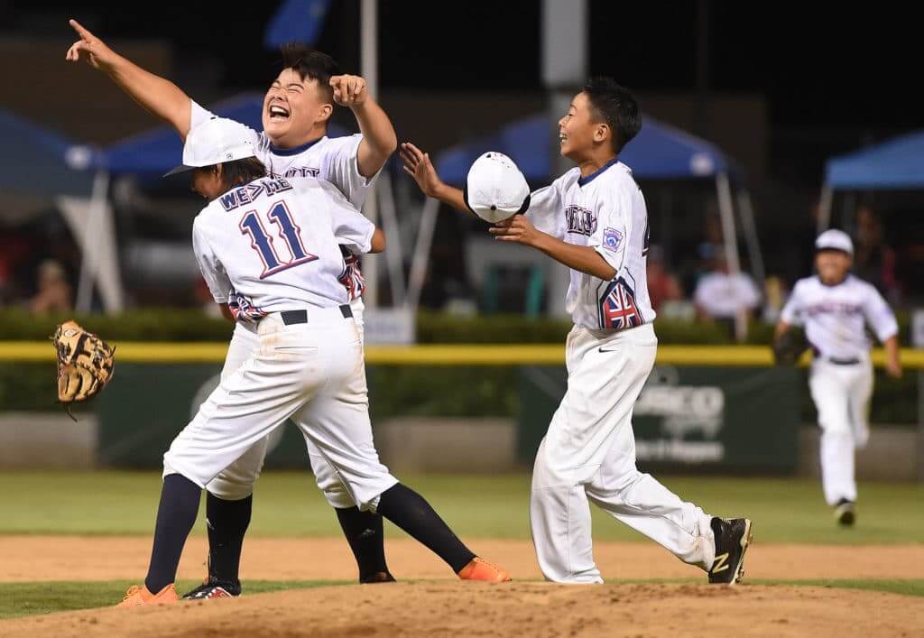
Photo by Will Lester, Inland Valley Daily Bulletin/SCNG; click to enlarge
“WE>ME” follow-up: On Friday I ran an entry about McEachern High School in Georgia, whose basketball team uses a “WE>ME” NOB. In my interview with the team’s coach, Mike Thompson, he said he got the idea from a Little League team that he briefly saw on TV last summer, but he couldn’t remember which team it was.
Reader/commenter Joe Anderson has cleared up that mystery: The Hawaii team wore the same motto on their backs during last year’s Little League World Series. As you can see above, they used a modified Texas Rangers motif for their uniforms, including the NOB lettering.
I passed this info along to Thompson, so now he can properly credit the Hawaiian team when people ask him about his team’s uniform slogan.
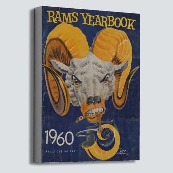

ITEM! New raffle: The good folks at Vintage Brand are using the week leading up to the Super Bowl to run another raffle. The lucky winner will get to choose any item from the Vintage Brand site (like the cool Rams yearbook canvas shown above, for example).
To enter, send an email to the raffle address by this Thursday, Jan. 31, 7pm Eastern. One entry per person. I’ll announce the winner on Friday. Good luck!
Click to enlarge
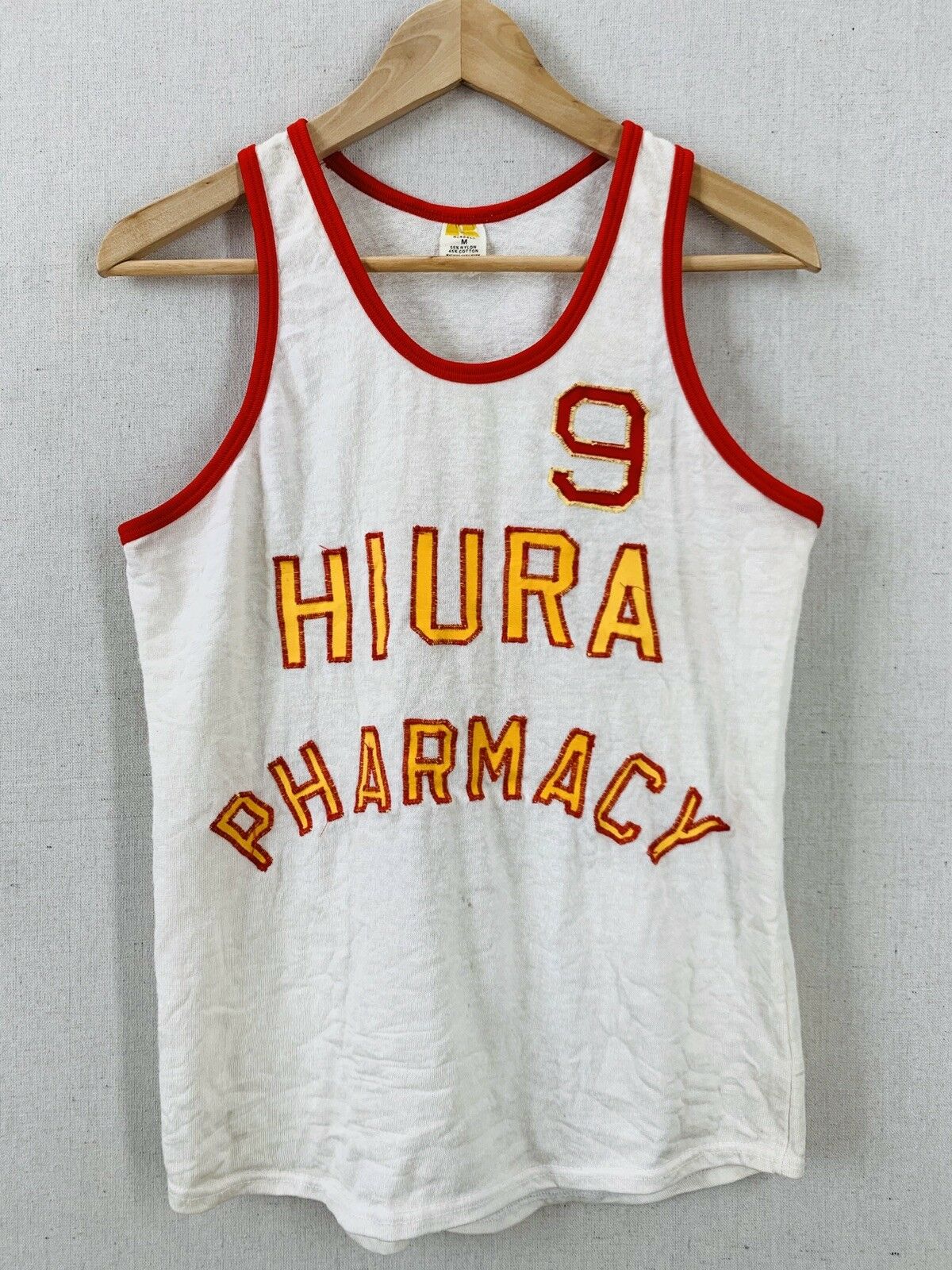
The perfect prescription: I don’t often wear tank tops, but I might make an exception for this tremendous vintage basketball jersey that’s currently available on eBay — if it fit me (alas, it’s too small). What a beauty! Reasonably priced, too. I’d love to see a Uni Watch reader end up with it — here’s the full listing.
If one of you folks snaps it up, let me know and send more photos when you receive the jersey!
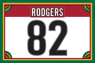
Membership update: We got a really interesting membership request the other day from Tyler Rodgers, who wanted a Carolina Hurricanes treatment but added, “Please include the horrible half-inch or so where the nameplate doesn’t align with the base of the shoulder yoke on the new Adidas template. It’s such an infuriating detail that I, as a ’Canes fan, need to own it.” As you can see at right, we were happy to accommodate his request. I love including that kind of detail!
Tyler’s card is one of a bunch of new designs that have been added to the membership card gallery. I have three slots open on the current sheet, so the next three people to sign up will get their cards very quickly.
Ordering a membership card is a good way to support Uni Watch (which, quite frankly, could use your support these days). And remember, a Uni Watch membership also entitles you to a 15% discount on any of the merchandise in the Uni Watch Teespring shop and the Naming Wrongs shop. (If you’re an existing member and would like to have the discount code, email me.) As always, you can sign up for your own custom-designed card here, you can see all the cards we’ve designed so far here, and you can see how we produce the cards here.
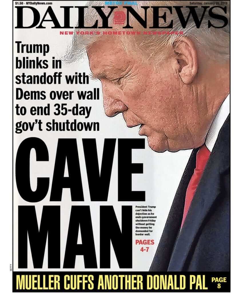
Some thoughts on “caving”: In the wake of president Trump’s decision on Friday to end the government shutdown, there’s been lots of media chatter about how he “caved.” This term, “caved,” has been used in informal conversation for a while now, but the shutdown announcement seems to be an inflection point regarding its use by mainstream media outlets. According to one report, the term “caved” was being used so much in the media over the weekend that there was a spike in people looking up the term’s definition on merriam-webster.com.
“Caved,” of course, refers to caving in, which is what happens due to a weak spot in a ceiling or roof or whatever. So accusing someone of “caving” is accusing them of being weak. The term comes up sometimes in the uni-verse, particularly in the debates regarding Native American imagery — lots of people have told me that the Indians “caved” by agreeing to scrap Chief Wahoo, and ’Skins fans hope that the team won’t “cave” and change its name. Over the past few days I’ve also heard people say that the Padres are finally “caving” to fans’ preferences by bringing back the brown.
It’s hard to express how much I hate this use of “caved,” whether referring to the president, the Padres, or anything else. It reduces every situation to an overly simplistic spectrum of strength vs. weakness, and it serves as a lazy all-purpose indictment of anyone who ever changes their mind. The reality is that changing your mind often entails a lot of thoughtful consideration, acknowledging and learning from your mistakes, listening to opposing viewpoints, and looking at the bigger picture, all of which takes a lot of strength, not weakness.
In the case of the Indians and Wahoo, one could just as easily argue that MLB commish Rob Manfred was the one who “caved,” since he was unable to convince the team to scrap Wahoo simply because it was the right thing to do and instead had to induce them with a valuable bargaining chip (hosting this season’s All-Star Game). Of course, I don’t really believe Manfred “caved” either — I’m just pointing out that this situation, like most situations, is more nuanced than the term “caved” suggests.
In the case of the president and the shutdown, I suppose you could argue that “caved” is appropriate, since he appears to think everything really is a strength-vs.-weakness proposition. Still, he deserves better than to have a complex decision reduced to a boilerplate term of mockery, and we all deserve better than to have this toxic term gain greater public currency.
The Ticker
By Jamie Rathjen

Baseball News: Reader Colleen Haberkorn is hoping that we can help identify the Yankees and White Sox players shown with her dad in these pictures (one is of Mickey Mantle), as well as when the pictures were taken, which is estimated to be the early ’50s. … The new Astros Hall of Fame, which inducts its first class in August, will give inductees orange blazers (from Elan Tavor). … Reader Jeff Wilk sent us a video of the Brooklyn safety cap in action at the 1952 World Series.

Football News: Current and past Ticker-ers Anthony Emerson and Mike Chamernik sent us this ranking of Super Bowl logos. … In response to a question posed in yesterday’s Ticker about how conference-specific Pro Bowl helmets were made before each player just wore their own, reader Brian Anderson tells us that they were indeed the players’ normal helmets painted over, as with this 1968 Packers example. … Here’s the story behind Clemson’s 2018 national championship logo (from Kenneth Fields). … An Iowa helmet appeared on a model at Paris Fashion Week (from Kary Klismet). … In an Alliance of American Football scrimmage, it looks like some Memphis Express players were missing their helmet logo (from Josh Graves). … Here’s some video of former Giants RB Ottis Anderson explaining how he wore practice pants instead of game pants during the team’s Super Bowl XXV championship run.

Hockey News: UMass Lowell wore throwbacks with city-neighborhoods-on-back Saturday against Boston College (from Tommy Coyle). … The WHL’s Kootenay Ice wore partially pink uniforms for an anti-bullying game (from Wade Heidt). … This 1974 article includes info on the Penguins’ Andy Brown being the last NHL goalie to play regularly without a mask (from Jerry Wolper). … Here are some concepts for next season’s Stadium Series game, which is in Colorado Springs between the Avalanche and Kings (from @lilkuzyvert92).

Basketball News: Notre Dame wore green at home Saturday against Virginia. … Virginia’s women brought orange alternates to Friday’s game at Pitt. … Here’s a pair of numbers for NBA call-ups: No. 24 for Cavaliers PG Kobi Simmons and No. 10 for Suns PF Emanuel Terry (from Etienne Catalan). … Raptors F Danny Green nonchalantly lowered his shorts and adjusted his undershorts during a teammate’s free throw yesterday (from Mike Chamernik).

Soccer News: Spanish team Athletic Bilbao now adds match info to its captain’s armbands (from Ryan Maquiñana). … German team Fortuna Düsseldorf wore black throwbacks — with ads, of course — yesterday to commemorate the 100th birthday of goalie Toni Turek, who played for Fortuna when he was the World Cup-winning goalie with West Germany in 1954 (from Elijah Newsome). … The U.S. men’s national team yesterday against Panama wore black armbands for Sigi Schmid, the winningest coach in MLS history, who passed away on Christmas. … USL Championship team El Paso Locomotive have Adidas training wear, but their kits are made by BLK (from Josh Hinton). … Josh also tells us that El Paso’s league-mates Phoenix Rising have an unchanged second shirt for this season, and the shirts featured in yesterday’s Ticker were the first and third shirts. … Most of the way down this article, it’s mentioned that Cardiff City will wear yellow daffodils on Tuesday to honor striker Emiliano Sala, who signed for them from French team Nantes but disappeared with the plane carrying him from Nantes to Cardiff. The yellow daffodil combines Wales’s national flower and Nantes’s primary color. … Cardiff City’s under-18 and women’s teams, the only two teams from the club to play this weekend, both laid wreaths next to the pitch before their matches. … Meanwhile, Nantes’s reserves wore green armbands.

Grab Bag: The Man Booker Prize, the top award for novels published in the UK, actually has an advertiser in its name and the organizers are looking for a new one in time for the 2020 award. … The NLL’s Rochester Knighthawks and Buffalo Bandits both wore Navy-themed uniforms with below-number nameplates (from Wade Heidt). … Reader Tim Dunn sent us a look at the kits for rugby union’s Six Nations, which starts Friday, in which you can also see the competition’s new advertiser. … A Milwaukee artist paints shoes for athletes in various sports (from Kary Klismet).

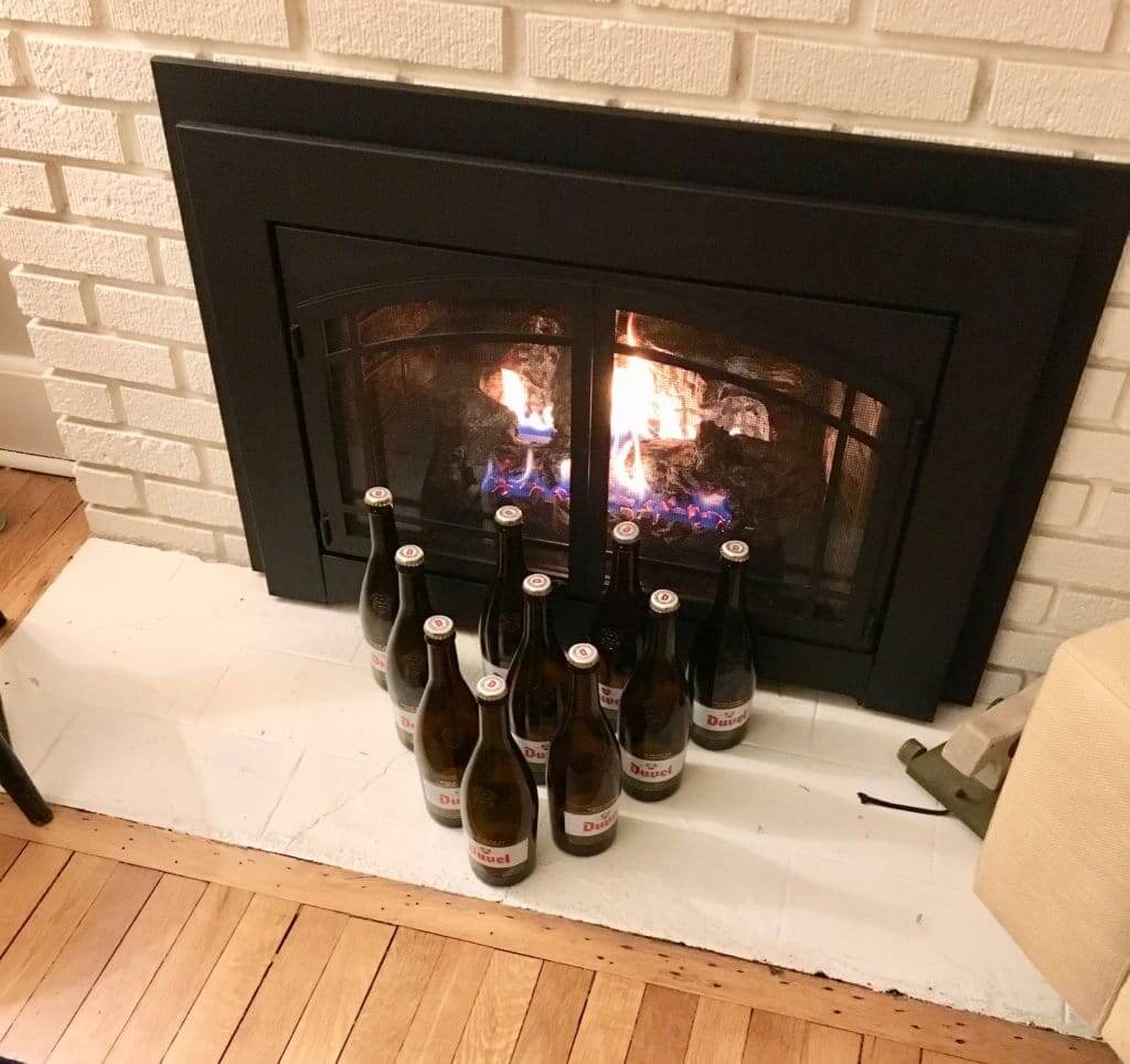
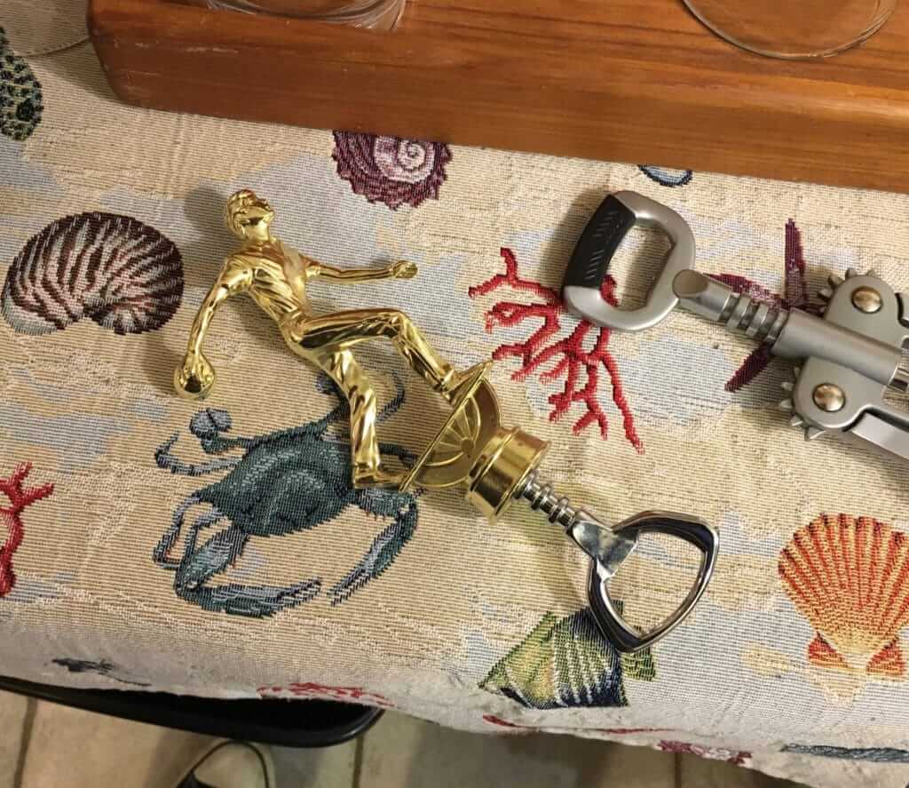
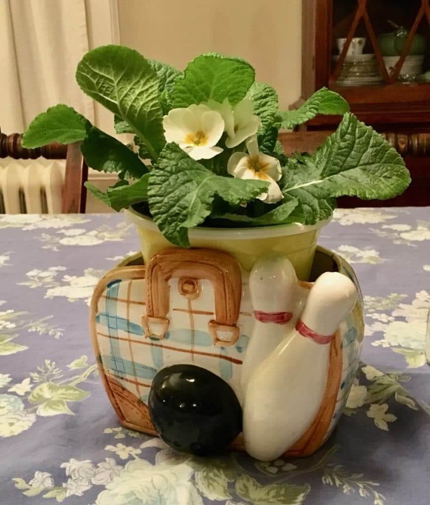
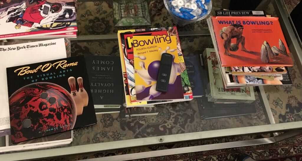
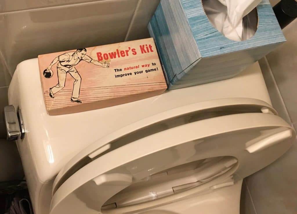
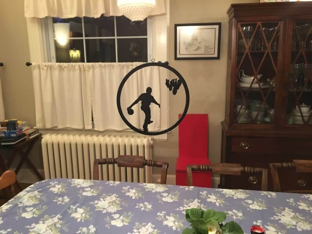
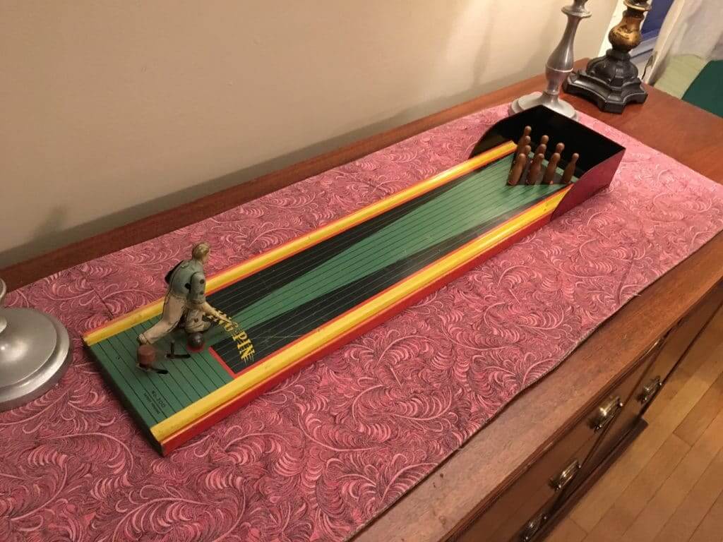
What Paul did last night yesterday: My friend Brian holds an annual two-part party each year on the Sunday before the Super Bowl. The first part is a few hours of bowling at the always awesome Paul’s Bar & Bowling in Paterson, N.J., and then everyone heads over to Brian’s house for a lot of food and drink. Brian always breaks out all sorts of bowling-themed décor for the occasion — here’s what he had on display yesterday (click to enlarge):
There was also this very excellent vintage tin bowling toy, which I shot a (very short) video of:
In the Memphis Express picture, both logoless helmets are VICIS. Makes me wonder if those 2 players are trying the helmet out in a game situation after using a different helmet during camp. You can also see a very slight difference in the shade of red on the VICIS (a la Notre Dame’s golds being different).
When I took a closer look at Clemson’s CFP title logo, I saw the rock and immediately thought of Howard’s Rock instead of Alcatraz. I think that the orange background makes the purple pop. Great job on that logo!
I look forward to FC Cincinnati’s kits being mono-blue and mono-white…
But the source is using “kit” and “jersey” interchangably, so it doesn’t sound like there’s anything in there about the shorts and socks.
Speaking of the caving debate and the Indians. I watched Major League this weekend for the first time in probably 15-20 years. This was my favorite “home sick” movie when I was a kid. I wore out the tape on the VHS since I watched it so often. I loved the fact that they took curse words and essentially made them works of art. Well, since I hadn’t seen it in so long, I never realized how bad the Native American imagery throughout was. From the fans with the head dresses and the band members in the outfield to the commentary by the announcing team and the articles in the newspapers that they showed up close. It was all cringe-worthy. Kinda sad even.
Gonna be super-nitpicky here, but the number and letter font on Tyler Rodgers’s membership card is wrong. Check the NHL Uniform Database.
I’m looking at the NHL Uniform Database right now, and it looks like the card is accurate. In fact, the database’s mock-up for the ’Canes uses the uni number 27, and their “2” clearly matches our “2”:
link
What exactly do you see that isn’t right?
The numbers are right. The name is the wrong font. I can’t give you the specific names, but the one on the card looks like what the Seattle Seahawks used in the Largent/Krieg years. The font the Hurricanes use is a more contemporary font, slightly more compressed horizontally with a few more angles. It’s subtle but it’s not quite right.
In the quick glance I gave those White Sox pictures, I can see in pic #1 Coach Ray Berres, pic #2 Al Lopex, pic #3 Nellie Fox, pic #4 Minnie Minoso, pic #5 Frankie Crosetti and The Mick, pic #6 The House that Ruth Built, pic #7 The Mick!
boxcarvibe
Perfect score.
Photos taken probably taken either in 1960 (WS first team to put NOB on uniforms in 1960 link) or 1961 (Minnie Minoso and Sammy Esposito #14 in background of pic # 3 were teammates with WS during 1960 and 1961).
I’ll take it one step further and say that was in 1961. The Sox were in NY on July 25 for a Tuesday doubleheader, weekday doubleheaders back then were typically twi-nighters. They were also in NY for a twinbill in 1960 on July 24. But that was a Sunday, typically a daytime affair. I’m going with July 25, 1961.
The photo of the outside of Yankee Stadium shows a sign reading, “CHIGO TWI-NITE TONIGHT 8PM” So 61, July 25 twi-night.
Think first picture is with #27 Turk Lown.
Last youtube video is unavailbe
Regarding the “MLB 150” patch:
I’d like to bring it up for discussion as to whether MLB can legitimately claim to be 150 years old. It appears they got this figure from the formation of the first professional baseball team in Cincinnati in 1869. But the current Cincinnati Reds actually began play in 1882 and didn’t join the National League, which had formed in 1876, until 1890.
The American League was founded in 1901, and the two leagues began “cooperating” in 1903. They didn’t become a single legal entity until 2000. (Source for all is is Wikipedia).
I thus will argue that “major league baseball” (lowercase) started most accurately in 1876 and thus they either need to wait a few years to wear that patch or change it to “MLB 143”.
You’re not wrong. But the 1869 date is kinda baked in now, because of the centennial patch in 1969, the 125th-anniversary patch in 1994, etc.
It’s like the Hall of Fame being in Cooperstown. We’re stuck with it, even though it’s bad history.
Based on a myth or not, Cooperstown is a much nicer setting for the HoF than Hoboken. ;)
This is my favorite quote in action:
“When the legend becomes fact, print the legend”
I don’t have a problem with 1869 as the founding year for *professional* baseball; it’s just not the founding year for the major leagues, which began in 1876; the National League may have borrowed some National Association nicknames for its franchises, but they are not continuations of those franchises.
I’ve always liked how the National League logo includes “Since 1876”, and how the Chicago Cubs, a founding member and the only team to play in the league every year without relocating, puts this patch on some of their jerseys.
The 1869 Cincinnati team does still exist today though if you draw a line far back enough, as the Atlanta Braves.
Really nice thoughts on “caving,” Paul. Thanks.
Absolutely. A+ work there. I echo your thoughts completely.
Amazing how context can be everything when you compare the MLB patch to the NFL patch. Also appears to be actually stitching and now the plastic garbage.
Re. ticker item about Emiliano Sala. The plane he was on disappeared while flying over the English Channel on Jan 21. The official search was called off last Thursday, but his family are raised money through donations to fund a private search. Many teams in England wore black armbands on Friday and Saturday before his family asked them not to since he has not been declared dead and they are still hopeful that he will be found.
link
G Andy Brown remained maskless all the way up to his retirement due to injury in November 1976, when he was tending goal for the WHA’s Indianapolis Racers.
He retired due to a spinal injury. Luckily not due to getting hit in the face with a puck.
link
Re: “president deserves better than to have a complex decision reduced to a boilerplate form of mockery.” Seriously, Paul? Just now, this morning, this guy is taunting, like a 2 yr old, someone who is thinking of running for president saying he doesn’t have the guts to run. The word caving is too civil.
My argument has nothing to do with president and everything to do with the language we use to discuss complex situations.
You shouldn’t let the former cloud your view of the latter. (The former will eventually be gone, but we could be stuck with the latter for a long time.)
Newspaper headlines. Aren’t they supposed to be witty and pithy. Like 1975. Ford to City : Drop Dead.
But if you go back and read what I actually wrote, I wasn’t talking about just that one headline (which I agree is in keeping with the tradition of tabloid headlines). I was writing about the larger media landscape and the cultural dialogue.
Got it. Yes. I’m a little slow.
Please tell me that those bottles of Duvel (in front of what I presume is a real fire) were not full. ;-)
Aesthetically pleasing perhaps, but a terrible place to store great beer.
They were empty.
Re: Today’s lead item.
That’s brutal. Terrible. Poorly designed and pointless.
Oh, I was talking about the Twins jersey. The patch is fine.
Would love to see a Super Bowl logo design contest for the unique city – those new logos are so plain.
Not only that, but the latest logos look the they have the wrong number. The Lombardi trophy placement is too similar to a Roman numeral ‘I’. Like Super Bowl LI got skipped.
Also got a bit of look at the referee uniforms for the AAF.
link
Paul, you have the coolest, geekiest friends. Congrats!
It’s true. I can only hope those friends say the same about me!
Interesting article on ‘ninja’ headbands catching on in the NBA link It mentions how its refreshing they are currently free from makers marks.
[from yesterday] is there any way we could entice Gene Sanny to do a youtube video (in the spirit of Bob Ross) showing us exactly how he does that Gouache technique? I would love to learn the way he does it. He has some of the finest sports inspired art I’ve seen and would like to give it a try.
I know Paul wouldn’t agree, but I think the LA Kings should wear their old purple and gold uniforms for the upcoming Stadium Series game.
Actually, I *do* agree!
I Still Call It Forum Blue
They need to go back to it PERMANENTLY. I’m really tired of black/silver/white they adopted when the Raiders were in LA.
And Yes, I still call it Forum Blue as well.
Is there a “I Miss the Fabulous Forum” Shirt?
Looking at the patch: I like how small and unbotrusive it is compared to the ones from 1994. I wish it weren’t white; they should use the color of the jersey as the background color.
But am I the only one who thinks that this Proxima Nova font (or perhaps it’s the very similar Gotham) is way overused these days? And it’s not exactly a callback to the year 1869, or any other year in baseball history. Why not bring back one of the fonts that were in common use then? How about a Fraktur-like font which would remind people of Cincinnati’s “C” from that year?