Click to enlarge
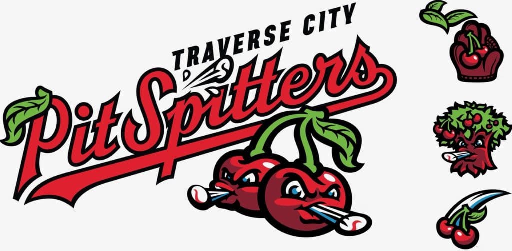
The area around Traverse City, Mich., is known as the Cherry Capital of America (the local airport is even called Cherry Capital Airport), which explains yesterday’s announcement that the town’s new baseball team, slated to play in the college summer/wood-bat Northwoods League, will be called the Traverse City Pit Spitters.
On some level, this is just another boilerplate Brandiose treatment (furrowed-brow mascot, overly thick black lines — check and double-check), but I really like this one. For one thing, pit-spitting is actually a thing in northern Michigan (additional info here and here). For another, I love how the secondary logo shown at top-right uses a baseball glove and some cherry leaves to simulate Michigan’s lower and upper peninsulas. Michiganders often refer to the Lower Peninsula as “the Mitten,” so depicting it as a baseball glove is a clever move. And I’m a fan of just about anything that acknowledges the U.P., which is the most inconspicuous and underappreciated part of the lower 48 states.
I’d like all of this even more if the mascots were more smile-y and less furrowed-brow-y. Still, this is a Brandiose package I can get behind.
Click to enlarge
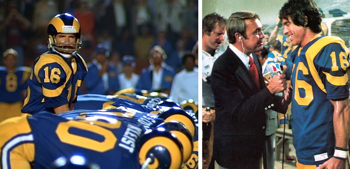
New ESPN column: My annual Uni Watch Super Bowl Preview will be published today, with lots of uni-related tidbits about this Sunday’s big game (including the fact that the Rams will be wearing the same uniform they wore in the Super Bowl in the 1978 movie Heaven Can Wait, as shown above). Link coming soon. Update: My editor just told me that publication has been pushed back to tomorrow. Sorry for the false alarm.
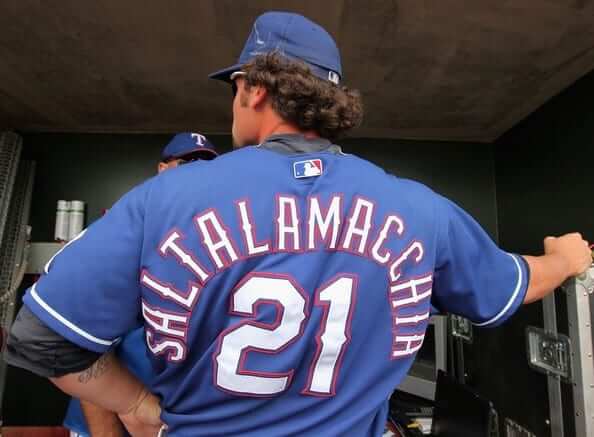
Going out on top: Journeyman catcher Jarrod Saltalamacchia has retired. When he debuted with the Braves in 2007, his 14-letter surname set the record for the longest NOB in MLB history. Twelve years later, he still holds that record.
Salty played for seven teams during his MLB career (none of which, happily, was the Yankees). You can see how all seven of those teams squeezed his name onto the back of a jersey in this Uni Watch post from 2017.
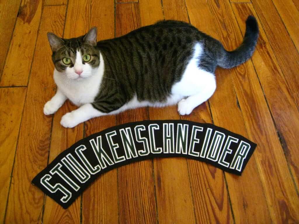
This gives me an excuse to once again post the photo of former A’s farmhand Eric Stuckenschneider’s spring training nameplate. Stucky would have beaten Salty by two letters, but he never made it to the bigs (click to enlarge; R.I.P., Tucker):
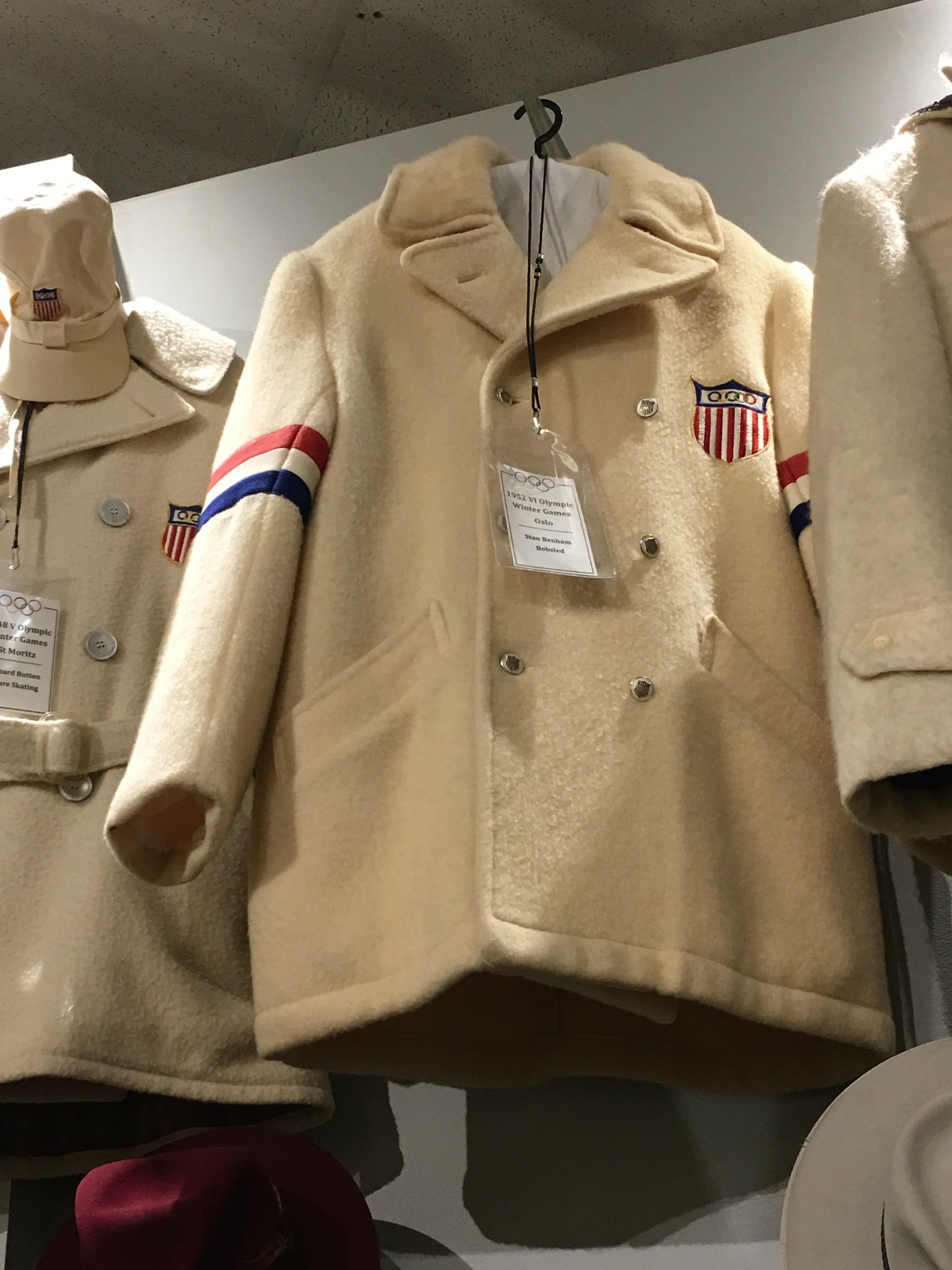
Click to enlarge
Winter (Olympics) wonderland: Reader Steven Marks visited the Lake Placid Olympic Museum earlier this month and photographed a bunch of cool stuff (including the 1952 Team USA jacket shown above).
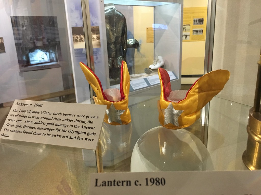
One of the more interesting displays was this set of wings, which Olympic torch bearers wore in 1980 (click to enlarge):
You can see all of Steven’s photos here.
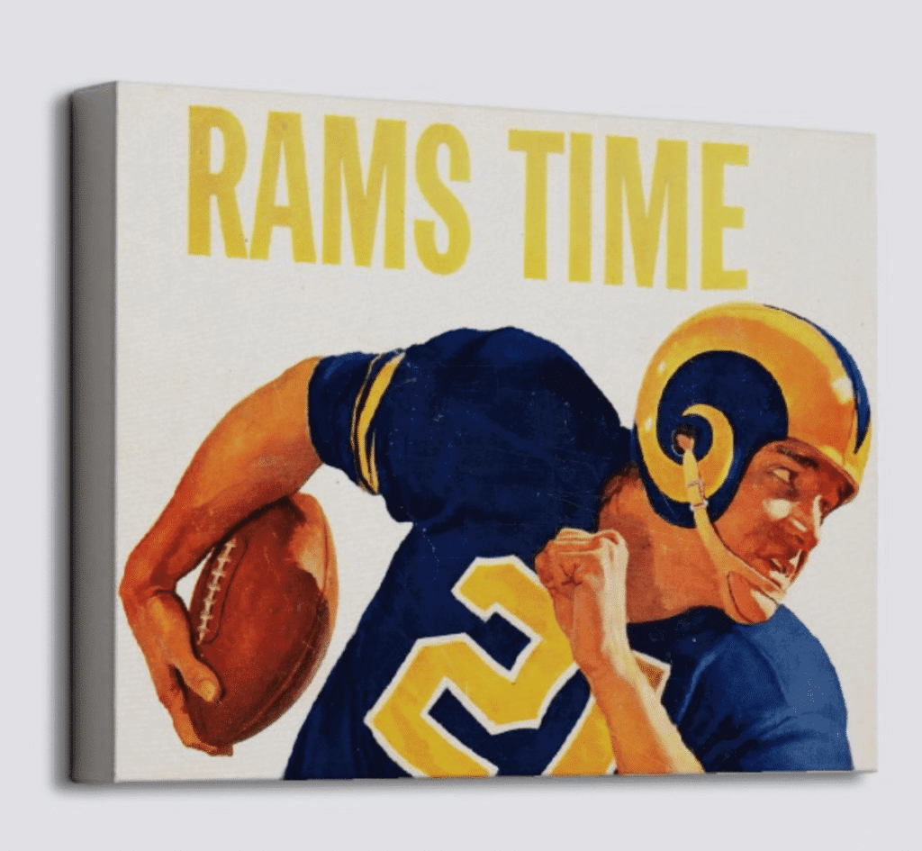

Raffle reminder: The good folks at Vintage Brand are using the week leading up to the Super Bowl to run another raffle. The lucky winner will get to choose any item from the Vintage Brand site (like the cool Rams canvas shown above, for example).
To enter, send an email to the raffle address by this Thursday, Jan. 31, 7pm Eastern. One entry per person. I’ll announce the winner on Friday. Good luck!
The Ticker
By Lloyd Alaban

Baseball News: The Rangers posted a cryptic tweet of two people poring over colored fabric swatches. Could there be a uniform overhaul in the works? (From Jay Burnam.) … Mets P Noah Syndergaard has a pinstriped Mets bathrobe, complete with his number on it (from Jason Criss). … @BSmile found this gif of Pirates SS Honus Wagner in a sharp-looking sweater. … The Fresno Grizzlies, Triple-A affiliate of the Nationals, have a new look (from multiple readers). … Last week, we ran a Ticker item that showed a collage of minor league hats forming the alphabet. Every letter was accounted for except “U” and “X.” Well, now we have all 26 letters (from Malcolm McMillan)! … New uniforms for Gonzaga (from multiple readers). … New unis for Youngstown State. … Cal baseball has raised batting helmet logos decals (from Gilbert Lee). … The Richmond Flying Squirrels, Double-A affiliate of the Giants, will wear cat-themed jerseys for a game in April. Fans will get to vote on which cat will be on the jersey, with proceeds from going to the Richmond SPCA (from Aryn Keen). … The Reading Fightin Phils, Double-A affiliate of the Phillies, will become the Reading Pretzels for select games this season. … Here’s an old photo of the late Rodney Dangerfield in a full Mets uni, next to fellow actor Paul Newman (from Matthew Wilemski). … Ted Bundy is wearing a Mariners T-shirt in this screenshot from the Netflix documentary Conversations with a Killer: The Ted Bundy Tapes (from Ian Irwin). … New uniforms for Arizona softball. … New uniforms for the Japanese team Chunichi Dragons (from Graveyard Baseball). … Here’s some old video footage of Mariners P Matt Young wearing No. 1.

NFL/CFL News: Randy’s Donuts in Inglewood, Calif., painted their famous donut-shaped sign in Rams blue and yellow ahead of the team’s appearance in the Super Bowl. Too bad about the Nike logo (from Andy Garms). … Thanks to Richard Stover, who sent us this picture of a Patriots-themed buoy he took near Scituate and Marshfield, Mass. … According to this tweet, the NFL is considering allowing teams to use tinted visors in-game for the 2019 season (from @WolfeNorthwest). … Looks like the Chiefs may be modifying their Lamar Hunt perma-memorial patch to do double duty as a 60th-season patch next season (from Todd Engle). … This vintage Saints pennant features a haloed Saint — a mascot trope that the team has rarely used (from Russell Goutierez). … Here’s a rare shot of Broncos RB Floyd Little wearing the team’s 1966 uniform. Little was drafted in ’67, so he never wore that uniform in a regular season game, but the team re-used its ’66 unis in the ’67 preseason. … An artist has developed a series of NBA City Edition-inspired NFL jersey concepts (from Taylor Brandine). … A buddy of Bill Schaefer came across this ad featuring the Saints’ black helmet. He says that other papers had the same ad so it was likely a nationwide campaign. … Gregg Elkin found these CFL stickers in a set of Legos he gave to his son. … Here’s a Media Day shot of former Giants TE Howard Cross — the only Giant to play for both the 1990 and 2000 NFC Championship teams — in a gorgeous varsity jacket (from Mike Colvin). … The AAF has been holding scrimmages, which have provided us with our first look at how the league’s uniforms look on the field.

Hockey News: Reader Greg Enright sent us this article about the Penguins changing from double-blue to black and gold in the middle of the 1979-80 season. There are lots of neat little details, including the Bruins protesting the move and the Pens ordering their new unis from the Bruins pro shop. … Speaking of the Pens: Former C and current owner Mario Lemieux wore a gold, logo-accurate jersey for his fantasy camp (from Jared Grubbs). … The Kootenay Ice of the Western Hockey League are moving to Winnipeg to become the Winnipeg Ice. Their logo will remain the same — including the hidden “ice” lettering on the left side of the logo (from multiple readers). … Here’s a “How It’s Made” segment about the production of goalie masks (from Wayne Jones).

NBA News: Nets PG Shabazz Napier made a three-pointer with one-and-a-half shoes last night (from Chris Chmura). … The uniforms for the Rising Stars game during All-Star weekend in Charlotte will be based on the Carolina Cougars’ 1970s unis — which, in case you’ve forgotten, looked like this and this (from Chris Marsicano). … Cross-listed from the football section: An artist has developed a series of NBA City Edition-inspired NFL jersey concepts (from Taylor Brandine). … Lincoln Prep High School in Kansas City, Mo., is poaching the Warriors’ logo (from Ryan Atkinson).

College Hoops News: Here are retail shots of Kansas men’s new uniforms (from Across the State Line). … Here’s a new state-flag-themed uniform for Nevada men’s. … If you’re a follower of Kentucky men’s basketball, you’ve probably noticed some of the players wearing bright, mismatched, multi-colored sneakers. Here’s the story behind them (from Josh Hinton). … Maryland wore red at home against Northwestern last night, and the cheerleaders wore Spider-Man-themed uniforms (from Matt Shevin). … Jeff Flynn found this misspelled Pitt jersey worn by former G Trey Ziegler. … @run_100mi Michigan players have a bump between their shoulder blades. Luke Aaron says it’s a GPS tracker. … Mississippi State G Nick Weatherspoon is blaming the team’s shooting troubles on Nike balls. State uses an Adidas ball for home games but has to use other balls when playing on the road against a Nike- or Under Armour-outfitted team (from Joey Harvey).

Soccer News: New kits for the Portland Timbers (from Jason Schwanz). … It looks like Atlanta United D Franco Escobar has leaked the club’s new shirt. The caption reads, “If we’re talking about perfection…” in Spanish (from Austin Perry). … The new USL Championship franchise set to play in the Oakland area has filed a trademark for “East Bay Tempo FC” (from Josh Hinton).

Grab Bag: Nike is being accused of “insulting Islam” by releasing an Air Max shoe logo that looks like “Allah” in Arabic (from J. Max Weintraub). … Washed Up Goalie showed us this beautiful letterman sweater from the early 1970s. … An increasing number of curling teams are wearing helmets (from Ted Arnold).
interesting note on the ’67 Broncos. Program reminds us that this August exhibition game was held at Denver University stadium since the Broncos were the junior tenant to a minor league baseball team at the building which would eventually be known as Mile High Stadium. how times have changed
As a couple of people remarked on the Twitter feed showing the AAF uniforms in action, it almost looks like they are shooting a remake of Oliver Stone’s Any Given Sunday. I guess in the new film, the Miami Sharks have moved to Birmingham and couldn’t figure out what to replace the shark logo with…
And of course the league in that film was known as the AFFA (Associated Football Franchises of America). Coincidence?
“Looks like the may be modifying their Lamar Hunt…”
(Missing “Chiefs”)
An important word to leave out! Now fixed.
I know I’m in the minority here, but I love those 1970’s era NFL uniforms (like the Rams’ in Heaven Can Wait) because most (if not all) featured gray facemasks on the helmets. There is just something about that look I enjoy. The first season the Patriots used the silver, Flying Elvis helmet they had a gray facemask and I thought it looked much better than when they tweaked it with that red one that sticks out like a sore thumb. – Is it me or would a dark blue one work better? – Again, I know I’m in the minority with this take, but give me the old school look. Thanks Colts/Cardinals/Bills etc.
Agree. Another reason I love the tradition of the USC Trojans uniform.
Mildly interesting about the Atlanta United shirt: it doesn’t have five stripes.
That’s literally their nickname (“The Five Stripes”).
Also, would it have killed the Timbers to wear white shorts?
That’s literally their nickname (“The Five Stripes”).
Looks like that nickname may have to change.
Second link to Cougars’ uniform not working.
Hmmmm.
Try it now.
Cool set of present-day CFL logo stickers in the football ticker today.
Of course, that Alouettes logo will be obsolete on Friday, Feb 1 at 6 pm ET. Heads up – That is when we will see the unveiling of the new logo and uniforms for Montreal.
The best part of that photo of Lemieux in the gold jersey is the Cooper lid. Looks like the same style he wore as a rookie.
Those helmets bring back great hockey memories. Used in major junior hockey for many years. The great thing about those helmets? Many of the junior teams used to have different color side pegs on that helmet model.
link
link
I hadn’t ever seen the ones with different color side pegs. Very cool – thanks for posting!
Some teams had the tri-colour with this model.
Laval Titan:
link
Windsor Spitfires:
link
Great example of “just because you can doesn’t mean you should.”
In addition to the different colour side pegs, you could also use different colours for the front and back of the helmet.
link
I know there were a few teams that did this, the Generals are just the easiest to find because of Lindros
Do you have a link for your ESPN article?
Nevermind sorry
I wonder if in the future those visors could be used for AR.
Hey Paul, I have a ton of family in Michigan and they have always called themselves Michiganders as you did in the first story. But lately there has been some debate on if they should be called Michiganians. I would direct you to my cousin’s husband who is a reporter in Detroit. @chadlivengood on twitter. I prefer Michigander but I’m not a native. I should have asked this on question day, but it always intrigues me what citizens call themselves. Do you consider yourself a Brooklynite or something else?
Yes, I am a Brooklynite and a New Yorker.
I agree, demonyms are interesting. My understanding has always been that Michigan’s demonym is “Michigander.” Didn’t realize there was a counter-movement for “Michiganian.”
I always thought I was a New Jerseyite until I learned I was a New Jerseyan.
Better than Baltimoron … :-)
As a native Michigander, it will always be Michigander.
Those city NFL jerseys are some of the best/cleverest designs ever posted on this site.
I, personally, thank my lucky stars every day that other sports leagues haven’t (yet) followed the NBA’s lead and introduced multiple alternates in non-team colors, so I wouldn’t want to see these implemented. Still, they’re really thoughtful and well executed.
I also liked most of those too, but the Broncos jersey looks too much like the Raiders throwback/early 60s jersey.
And the Washington Football Club one looks a lot like the Saints jersey.
I would have no problem with that Browns jersey.
Couple thoughts:
Brandiose is garbage. Get a new schtick people.
If that 1952 Olympic coat was for sale as a replica I would consider buying one.
The stroke around the icon and secondary and tertiary icons is off-the-charts thick. I find their work to be hard to see. Visually, the details don’t pop. Probably works with embroidery. But their stuff is a visual nightmare on a computer screen and likely in print.
One other little detail I love: The “pits” the cartoon Pit Spitters are spitting are actually little baseballs. As a proud Michigan native (aka Michigander-that’s the right term), this is something I too can get behind!
The furrowed brow on the Pit Spitters logo seems to be fitting here. If you look at the images in the link you shared, it looks like a lot of the pit spitting competitors are pretty focused/furrowed.
The Pit Spitters will play at Wuerfel Park, formerly occupied by the Traverse City Beach Bums.
As a local who doesn’t really care for the new name or logos, here’s a link to a pit spitting contest that actually takes place in Traverse City. By the way, Eau Claire is about as far from Northern Michigan as one can get. :)
link
Apologies. Will swap in your link.
More on the Fresno Grizzlies new uniforms:
link
Lincoln Prep may have used the Warriors logo as an inspiration, but it’s not a total rip-off. The towers are a KC landmark, the Bartle Hall Expo Center.
link
“And I’m a fan of just about anything that acknowledges the U.P., which is the most inconspicuous and underappreciated part of the lower 48 states.”
The Eastern Shore of VA would like a word with you. It is often left of VA state maps, even those made by government bodies who should know better.
The Eastern Shore of VA has been written about on this very website multiple times in the past 14 months!
The Yoop is quite often left off maps, it happens so much, that there is an entire website dedicated to it.
link
Love that second shot of the Carolina ABA uni…one of the few color photos you can find showing the old San Diego Q’s playing at Peterson Gym (on the SDSU campus).
Yeah, I’m an SDSU alum, and I saw that photo and thought “Gee, that place looks familiar,” saw that the Q’s were wearing white and figured it out.
In Terry Pluto’s “Loose Balls,” there was a note that the Conquistadors had a dispute with the Sports Arena, which caused them to move their home games to Peterson. At the same time, SDSU’s team was playing at the Sports Arena.
TCU released new unis today. Purple fest!
link
Had to do a bit of a double-take at that link. Maybe I’m behind the curve, but I didn’t realize teams were doing uni reveals on Adobe Spark now.
I used Spark extensively in grad school and I remember thinking that it would be great for uniform releases lol.
link
Interesting article why the U.P. isn’t part of Wisconsin. Michigan and Ohio were disputing land and before Michigan could gain statehood they had to accept the Ohio claim and received the U.P.. Wisconsin had only been a territory for a very short amount of time when this happened.
Yeah, the U.P. was basically a consolation prize for losing the War of Toledo. Was considered worthless land — until they found all that iron and copper ore. Which led to a huge influx of miners from Cornwall, England. Which is why Cornish pasties are still part of the local food culture. I love stories like that.
The first time I was in Cornwall, the local library in our town had a presentation about the Cornish miners who had settled in Wisconsin. I got to play expert. ;)
The Yoop in exchange for Toledo? Michigan hasn’t won that big over Ohio in years!!
Anyone seen one of these? Brannock device-esque…
link
The Grizzilies’ announcement on Twitter threw some major shade at Sacramento.
With the Rangers moving into a new stadium in 2020, it would be a shock if they weren’t redesigning the uniforms. They’ve work some variation of the current set for almost 20 years now. Chief complaint of most (though not mine) is they use red and blue equally. They’ve always had red, white, and blue as their scheme; hopefully that doesn’t change. And hopefully they don’t change to navy blue. Baseball has plenty of navy blue.
I’d like to see the a return of the bi-color/block T cap and the original RangerS font; keep the powder blues in the rear view.
Was the swoosh on the donut absolutely necessary? Good lord.
So gross.
My guess would be the swoosh is in there because Nike paid for the paint job, though of course that doesn’t excuse it. Their excess branding has really turned me off of their products.
As you can see in this link that I sent in yesterday, the Swoop even extended to the side of the building.
Still amused when the Penguins’ 1980 uni switch comes up and nowhere in the article is mentioned exactly how stupid the Bruins’ attempt to claim sole ownership of their color scheme was. And I’m not talking about the Pirates precedent, either. There are two key points that are never brought up:
1. The Pens have had black and gold in their logo since their inception, so those colors were already part of the franchise.
2. Did the Canadiens protest the Capitals’ choice of uniform colors when they joined the league? Did the Blues gripe about the Sabres going blue and gold like them? Did the Rangers and Islanders complain about the newcomers from the WHA, the Jets and Oilers over their respective colors? As far as I know, no. So there was already precedent for similarly-colored teams, without having to go back to 1925.
Being a Bruins fan, I remember the Penguins uniform “controversy” very well. It was quite silly in retrospect but not so much when I was 21.
What bothered me even more than the Penguins “stealing” the Bruins’ colours was that I absolutely loved their blue unis. So much, in fact, that I have a home white replica with Randy Carlyle’s 25 hanging in my closet.
The last double blue uniforms from 1977-80 were great uniforms. The best of their double blue years. Hey Penguins, the navy blue one would look good as a third if you are looking for ideas for an alternate.
link
I do really like the 1977 navy and Columbia blue unis myself, though I also like their black and gold successors (and the basis for their current unis).
I like the ’67-68 blue Penguins uniforms just because link.
I think Brandiose has become a parody of themselves. And I think the direction minor league names have gone is ridiculous.
Another detail about the cherries-in-glove: Michigan’s a lefty, at least in the field!
The L.P. as a whole is a lefty.
Paul, not sure if you’ve seen this yet, good article about the standardization of Superbowl logos. First I have officially heard that it was (at least partially) due to the hiring of a new design firm.
link
The article behind the curling helmets is behind a paywall. Does anybody know of any reason to wear a helmet for curling?
Um, to protect your head..?
You’re running around on slippery/hard ice, after all. Personally, I’ve never bothered with a helmet while curling, and I don’t really plan to start, but I wouldn’t roll my eyes at anyone else who chose to do so. Perhaps it’ll be one of those things that change over time, like bike helmets. Or maybe not.
I’ve got a friend who wears a bike helmet to curl. I roll my eyes at him every time I see him on the ice. But I’m actually all for head safety on the ice; one of these seasons I’m sure I’ll buy one of the Canadian ballcaps with padding. In the meantime, as a Level 1 instructor, I regularly take newbies onto the ice and walk them through basic instructions to get throwing stones. And my first priority is always safety, so I spend a good deal of time talking about how to fall – if you feel yourself falling, roll with it and don’t try to stand up, and if you’re holding a stone, let go of it – and how to avoid falling while sweeping.
I could see elbow or knee pads helping with falling, but I’ve never seen somebody hit their head while curling. I’m sure it’s happened before, but Sammy Sosa took a ball to the head while in the outfield once too and it would seem kinda silly to have outfielders wear helmets.
I guess it’s one of those things that doesn’t hinder from a performance standpoint, and can only help from a safety standpoint. Like you said, it’ll have to be one of those things that changes over time, and maybe we even get interesting curling helmet designs in the future.
We have a brewpub in Grand Rapids, MI, called The Mitten. I think you would really like it. They brew all their own beer and have awesome pizza. Their name is a play on a baseball mitten and the lower peninsula. They have a bunch of cool decor including original tiger stadium bleachers seats in the lobby. Also the baseball puns for menu items. If you ever make it up to West Michigan it should be one of your stops.
Noteworthy regarding the Spitter’s secondary logo you love. Compare it to a map of MI, The stems come to a point at Traverse City!
I vividly remember Eric Stuckenschneider and his long name; the A’s deserve credit for link on his back and making it look a lot better than what Saltalamacchia has had to endure. (Seriously, Majestic? You’re swimming in money but can’t be bothered to make a condensed font anymore? Back in the lower-budget ’80s it was standard.)
Proofreading…maybe…
The front of the Pitt jersey is obviously misspelled; the back of the jersey has his name listed as Zeigler while the ticker text reads “worn by former G Trey Ziegler.”
Either a typo in the ticker text or they misspelled his NOB, also.
Who stood in for the late Leo Farnsworth to accept the ’78 Super Bowl trophy?