Click to enlarge
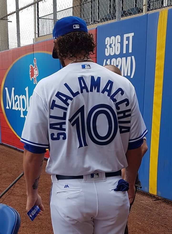
Jarrod Saltalamacchia and his MLB-record 14-letter surname are in Blue Jays camp this spring. As you can see, the Jays are taking the around-the-world approach to his NOB.
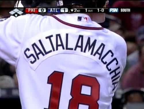
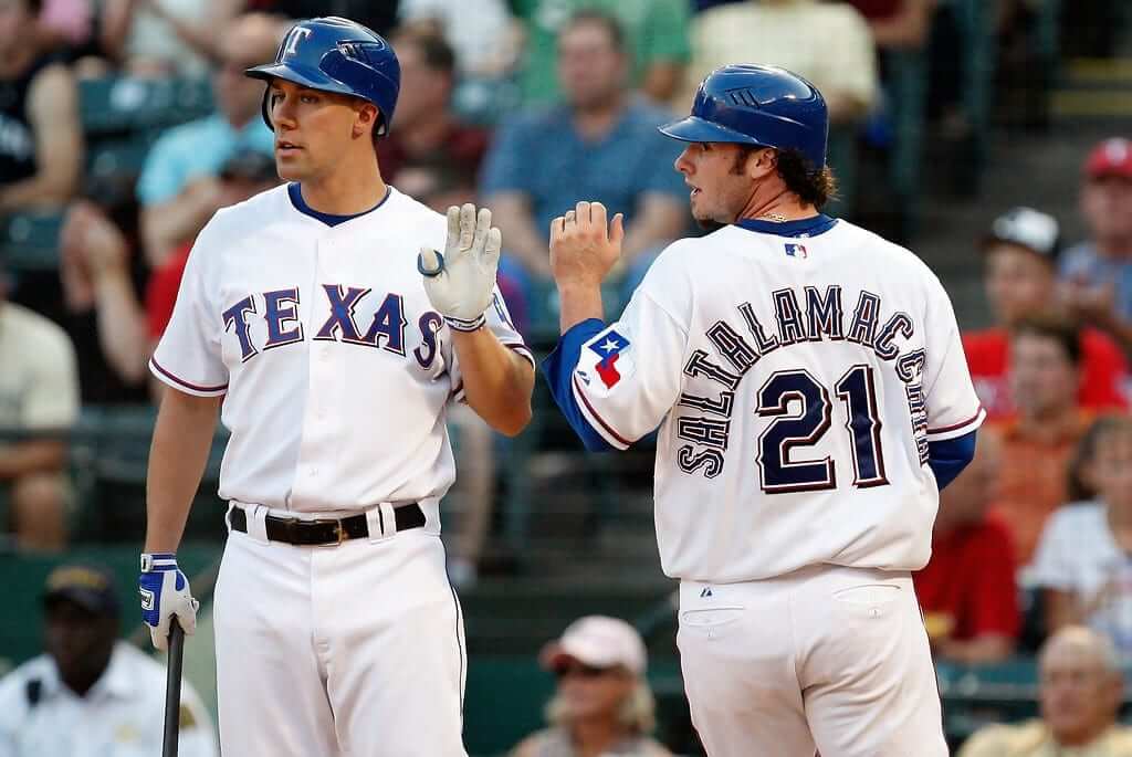
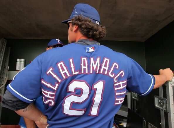
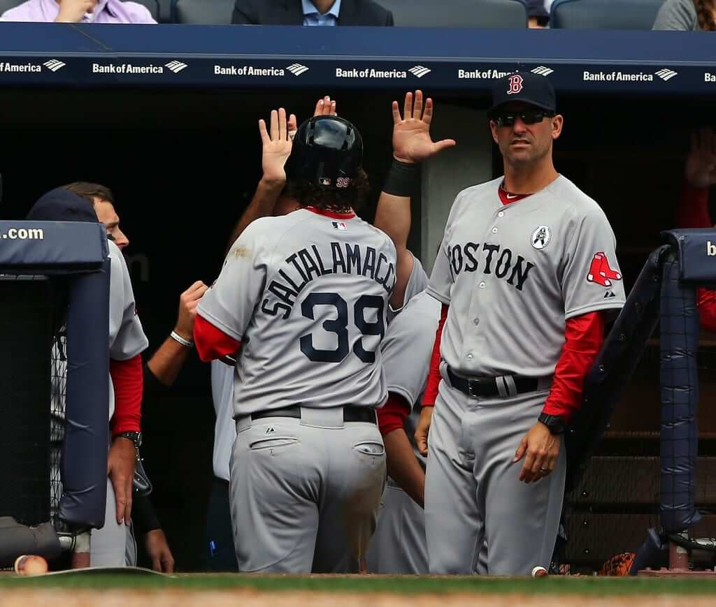
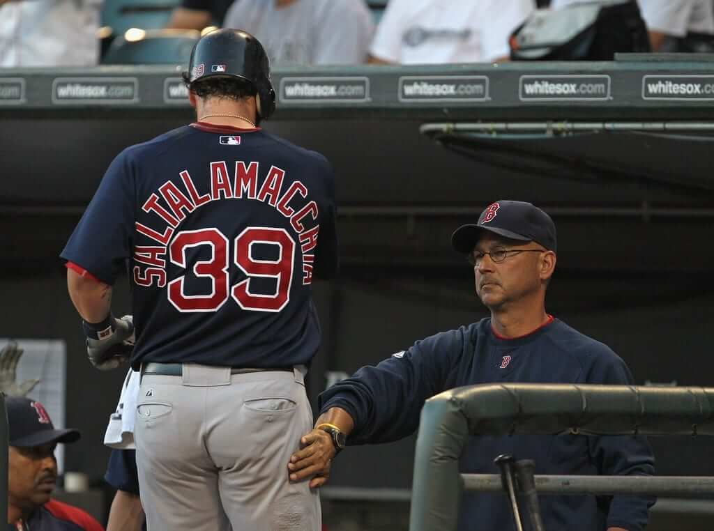
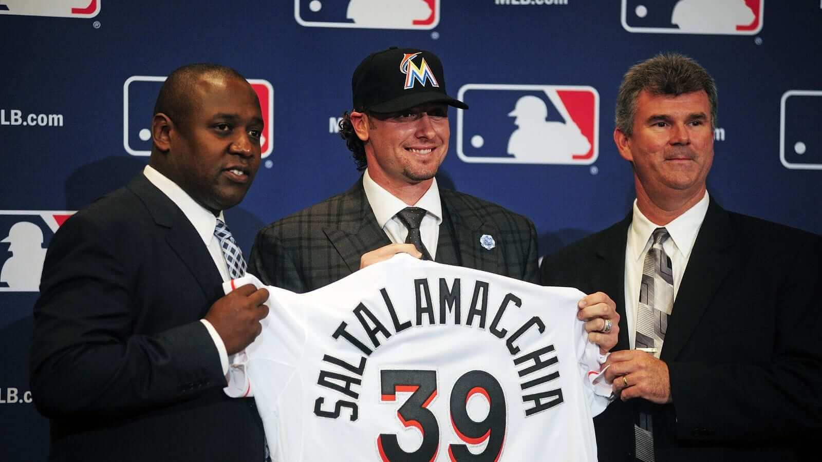
Toronto is Salty’s seventh big league team. How have the other six handled his prodigious NOB? Let’s take a look, going in chronological order throughout his career (for some of these, you can click to enlarge):
Braves
.
Rangers
.
Red Sox
.
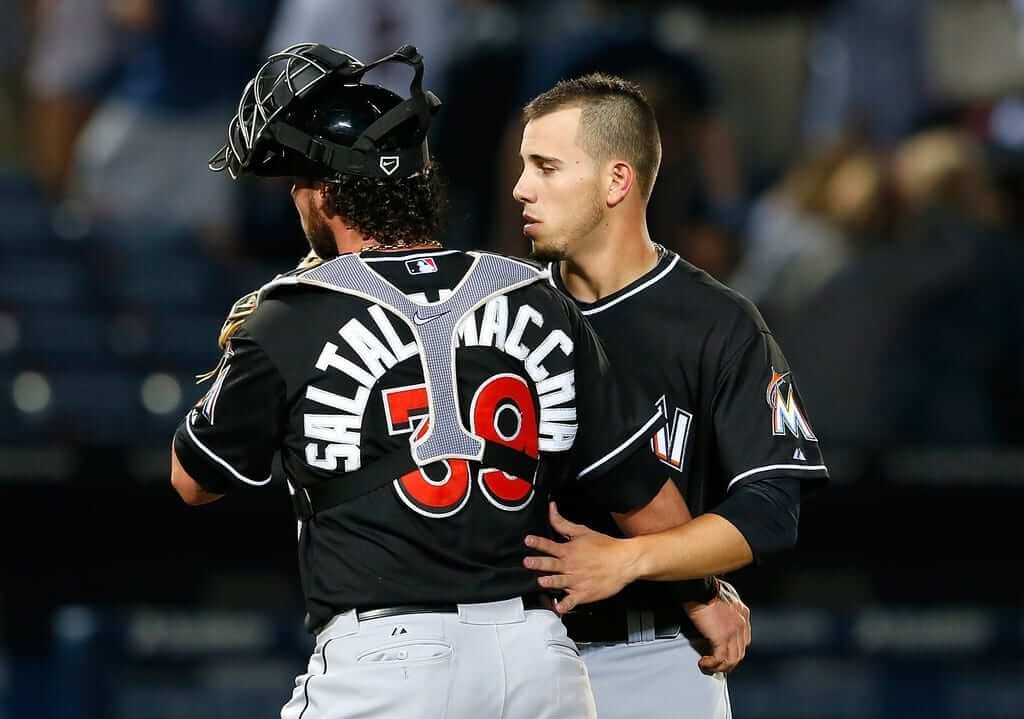
Marlins
.
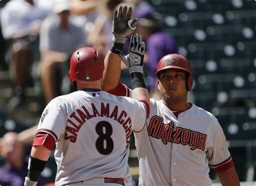
Diamondbacks
.
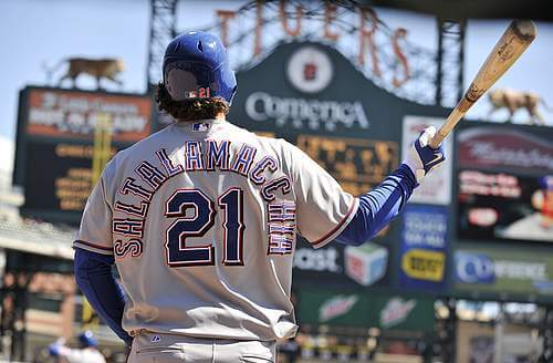
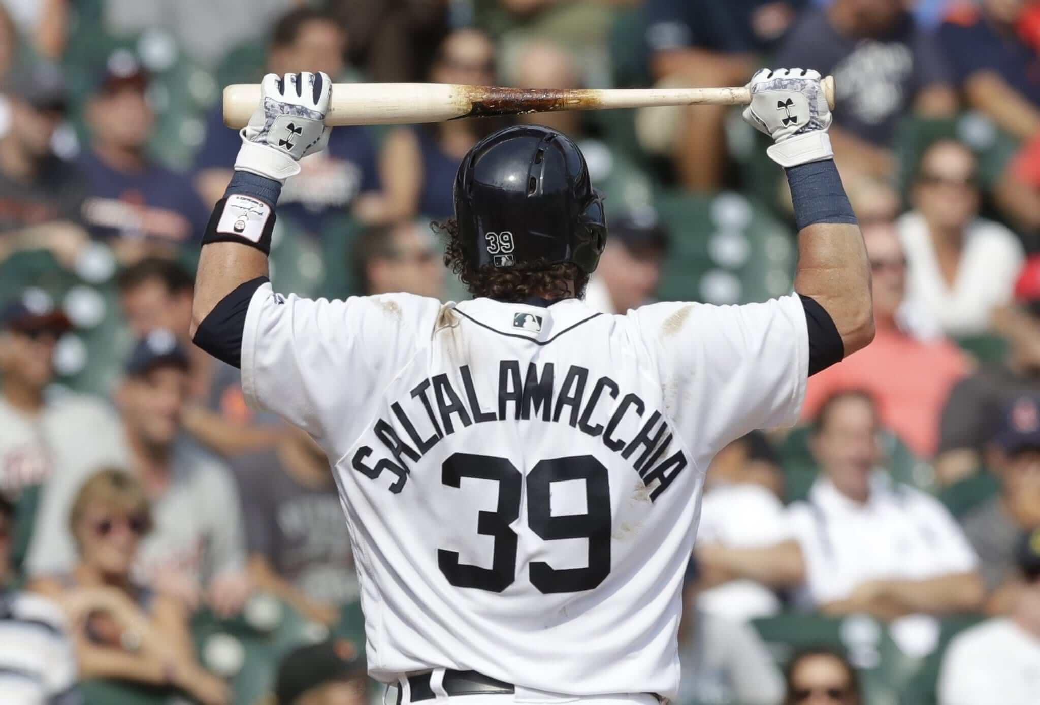
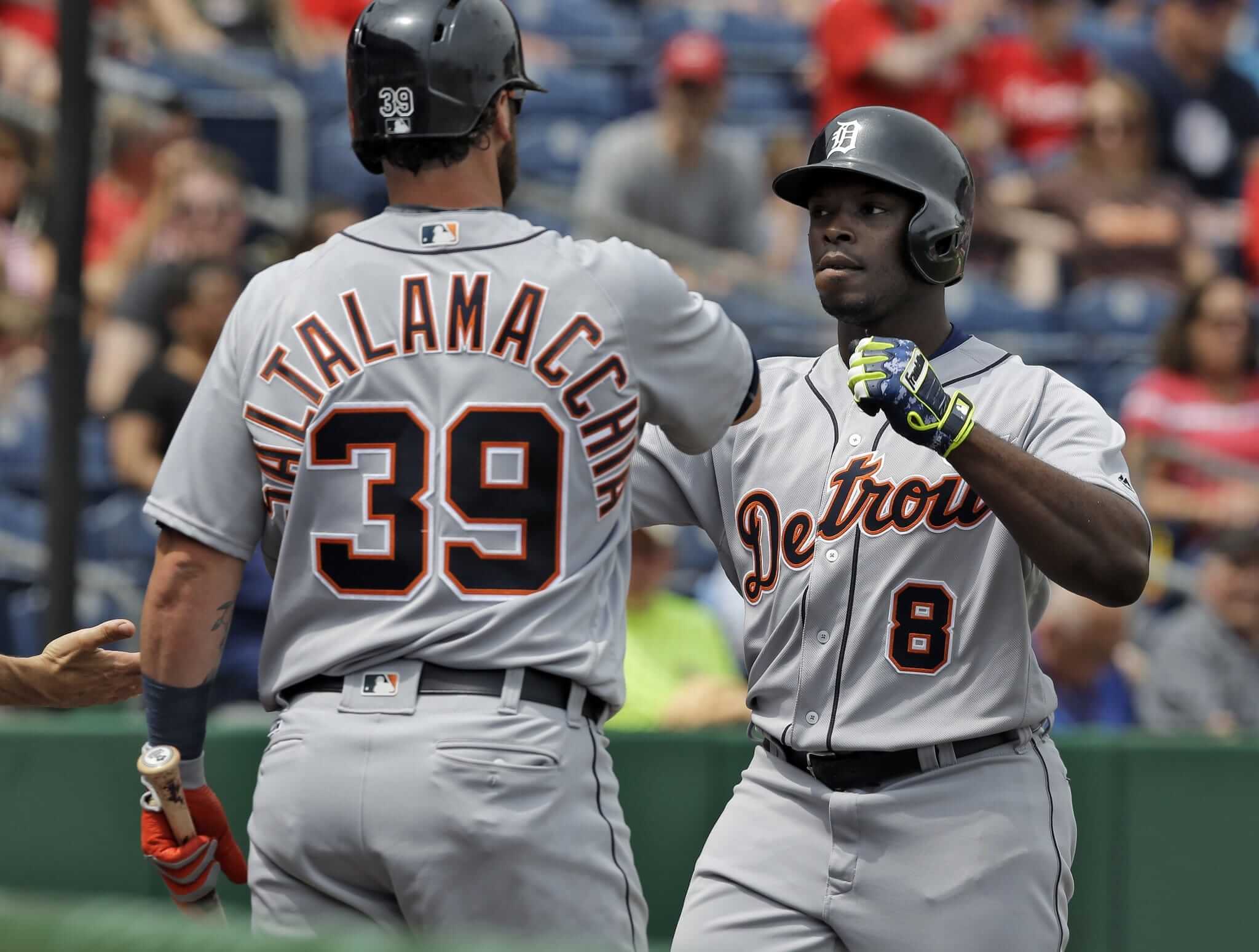
Tigers
———
It’s interesting to see how some NOB fonts are more conducive to long, clunky names than others. Also, I always find it startling to see Detroit’s one-color home lettering/numbering juxtaposed with the three-color road typography. It’s like two completely different teams. (And as an aside, that last Tigers photo shows the road uni with the home helmet — a telltale sign of a spring training game.)

NBA ads — what have we learned so far? We’ve now seen the corporate advertising patches that will be by worn next season by five NBA teams, plus there’s a reputable report of what a sixth one will be. That amounts to 20 percent of the league’s teams, which is a sizable enough sample to draw some preliminary conclusions regarding the ad program. I’ve come up with five takeaways and written about them in a new ESPN piece. Check it out here.
T-shirt reminder: Our latest T-shirt, designed by the great Todd Radom, is now available. Check it out (click to enlarge):
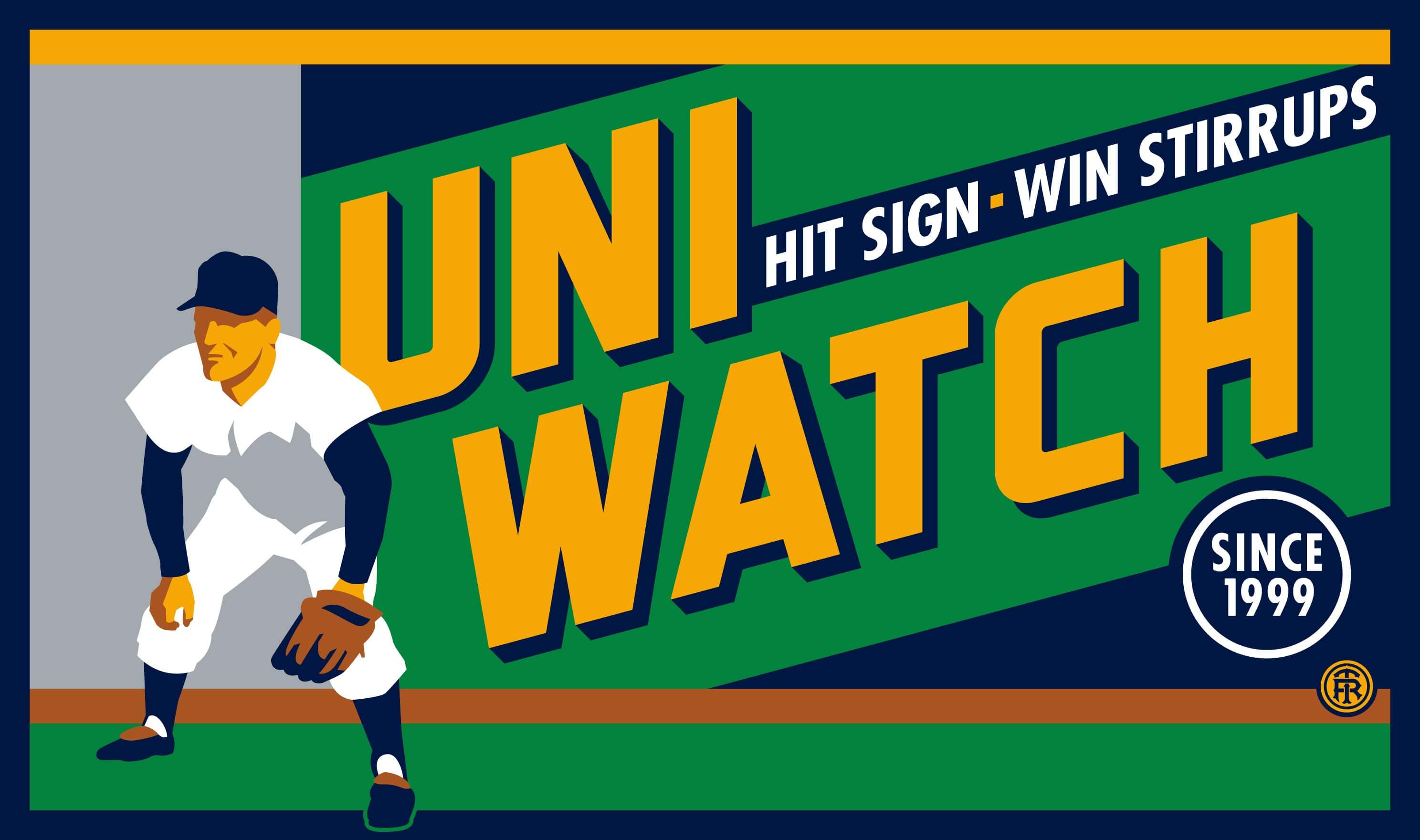
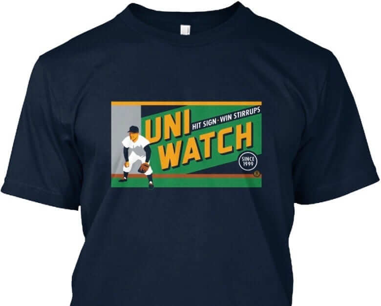
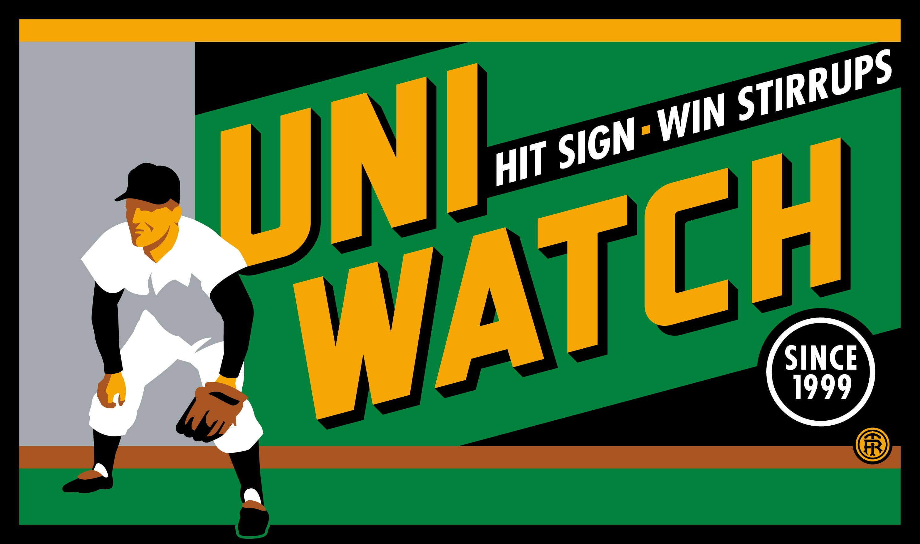
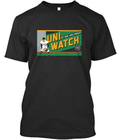
The design takes inspiration from the old Abe Stark sign at Ebbets Field, which read, “Hit Sign, Win Suit.” Please note that we’re using the shirt fabric color to fill in the dark portions of the design — the outfielder’s cap, sleeves, stirrups, and shoes, and the dark parts of the sign behind him. We think it looks best on Teespring’s dark navy shirt, which is the version shown above. But you can also order the shirt in black (yes, go ahead and make all your BFBS jokes), in which case the design will look like this:
There’s also an American Apparel short-sleeved version and a long-sleeved version, both of which come in a slightly lighter shade of navy. You’ll be able to see all of this on the ordering page. Just make sure you choose the shirt and color you like best.
The shirt is available here through next Friday, March 3. My thanks, as always, for your consideration.
The Ticker
By Mike Chamernik

Baseball News: Braves great Dale Murphy is in favor of uniform ads. It’s funny — or maybe sad — that he suggests “tasteful” ads and runs of an image of this monstrosity (from Patrick Lasseter). … Adam Wainwright gave an interesting interview about how he’s been wearing Velcro-closure cleats since he nearly got injured covering first during a game in 2013. His shoelaces got tangled up in the baserunner’s spikes, and he decided not to wear laces anymore. The kicker is that his shoe company didn’t want to provide him with Velcro cleats because they said they’d never be able to sell them. Nice (from Erik Spoonmore). … A fashion designer created colorful baseball jerseys to promote equality and protest President Trump (from several readers). … Everyone can stop holding out hope: The Yankees will indeed have a New Era logo on their caps, just like everyone else (from @mike3783) … When the Rays switched to Flex Base jerseys last year, they made the sunburst in their logo slightly larger. Here is the current home jersey, and one from a few years ago (from Brian Cheung). … The Las Vegas 51 have patches for their 35th season (from @shockz81388). … Don’t like those big “FL” and “AZ” patches on the spring training caps? Colin Valada removed his with a hair dryer set on high. … Texas A&M’s alternate unis have matching sleeve and stirrup stripes (from Glenn Stern). … Here’s something I didn’t know: Softball pitchers wear toe protectors since they put so much pressure on the foot that pushes off the rubber (from Andrew Lehman). … The Royals’ Drew Butera has a red, white, and green catcher’s mitt for Team Italy in the upcoming World Baseball Classic. … Baseball-reference.com underwent a redesign and one of the cool new features is period-appropriate logos from SportsLogos.net. … UAB wore new road greys yesterday (from Ted Chastain). … Check out this 1980s shot of White Sox owner Eddie Einhorn wearing pullover that’s basically a reverse-field version of the team’s beach blanket jersey.

NFL News: I didn’t see the episode so I don’t know if there was a joke behind it, but an awful Jets helmet mailbox appeared on the sitcom Kevin Can Wait earlier this week (from Chris Flinn). … Reader Ryan Connelly created his own NNOB Steelers jersey. He customized it with block numbers and a 50th anniversary patch. More photos here. … A few items have caught Gene Sanny’s eagle eye lately, including he goalposts and tiny Browns wordmark in this photo; Tim Rossovich of the WFL’s Philadelphia Bell with a poof of hair out the back of his helmet; and a few old Wishbook Catalog pages with NFL jerseys, helmets, and T-shirts. … Cardinals kicker Jim Bakken kicked with an unbuckled chinstrap (from reader Chris T). … CNN showed a group of Guatemalan refugees arriving in America, with one of them wearing a phantom “Patriots Perfect Season 19-0” sweatshirt (from Bob C.).

Hockey News: Here’s a brief history of the goalie mask (from Phil). … We saw the Maple Leafs’ new St. Pats throwbacks yesterday, but now we can see the unusual back numbers (from Moe Kahn). … A junior hockey team has been accused of altering replica jerseys to make them look game-worn, and then selling them to collectors (from Tris Wykes). … A girls’ team in Connecticut wears uniforms modeled on the Rangers’ home design (from Josh Fisher). … The cover of a 1954 issue of Blueline magazine has a good shot of Gordie Howe with the pennants of the Red Wings’ rival teams. Note Chicago’s unusual hawk logo, and that Blackhawks was one word. It was Black Hawks until the mid-1980s (from Kevin Vautour and Eric Zweig). … Jerry Wolper took a bunch of photos at a Penguins history exhibition. You can see them by scrolling down through his Twitter feed. “I’ve always been fascinated by the ill-fated Ottawa Civics of the WHA,” says Justin Mckinney. “I had read that after moving from Denver they played in the same uniforms with the Denver Spurs logo removed. I did some digging and found this nice blog that details the account of the club and includes photos from the club’s two home games in Ottawa. Sure enough, they are wearing the Spurs uniforms with the logo.”

Pro Basketball News: Dwight Howard’s Atlanta high school will retire his No. 12. He wears 8 with the Hawks. Quick aside: I wanted to double-check his current number, so I Googled “Howard Hawks.” I didn’t expect the Wikipedia page of a famous filmmaker to turn up. The second sentence reads “Critic Leonard Maltin called him ‘the greatest American director who is not a household name.'” Evidently! [He’s definitely a household name here at Uni Watch HQ. I have three all-time favorite films, and one of them is the Hawks-directed classic His Girl Friday from 1940. ”” PL] … Omri Casspi’s new Pelicans jersey had an upside-down 8 yesterday. It may have only been used for the introductory press conference (from Rich Rauch). … Another BIG3 team has been announced: The Ghost Ballers. … Cavaliers F Richard Jefferson wore a Flat World Champions T-shirt, in reference to the theories teammate Kyrie Irving shared on Jefferson’s podcast last week.

College Hoops News: Louisville wore black alternates last night. … NC State wore black alternates Tuesday night (from Rex Henry). … The logos for the annual ACC Tournament incorporate the host cities’ tallest structures (from James Gilbert). … Kansas retired Brandon Rush’s No. 25 last night. … Throwbacks last night for Maryland.

Soccer News: A designer in Manchester makes creative alternative kit concepts (from Ryan Keberly). … Gambling is much more prominent and socially accepted in the UK, but there are still some issues with betting companies advertising on pro soccer kits (from Saurel Jean). … Hertha BSC is letting fans design their 125th anniversary jersey (from Ed Å»elaski”).

Grab Bag: Dale Earnhardt Jr.’s Monster patch was upside-down during a TV spot the other day (from Dave Buchanan). … Arthur Savokinas came across a coffee mug store shaped like a coffee mug. … A minute-long video shows every front page of the New York Times since 1852 (from Jon Solomonson).
As I said in the comments yesterday, I’m really not a fan of those numbers on the Leafs’ St. Pats throwbacks. The rectangle background may work (or not) on a heavily-striped uniform like the Steelers’ bumblebees, but for a single bold stripe, it just doesn’t look good at all. I really think they should’ve gone with white numbers with an extra-thick green outline.
Properly situating the numbers inside the stripe would have made them too small for today’s NHL, and outlined numbers were extremely rare in this era. I think Boston first used outlined numbers in 1925, and the Rangers followed in 1927, but these St. Pats uniforms predate even those two instances.
Add to that the fact that Toronto has never worn outlined numbers (save for the questionable 1990s/2000s era), and that is why it was decided to go with single color numbers. To solve the overlap issue, we wanted to do something that was appropriate to the period, so we looked to old uniforms from many sports and eventually decided on the blocks. It’s not elegant, but uniforms weren’t always in those days.
There are few, if any images of the backs of these St. Pats sweaters, so thats why we decided to create a number set inspired by the crest. I hand drew each of those numbers on paper before digitizing them so that each would be unique, as if they were hand cut like numbers were back then.
I appreciate the insight on the design process. I don’t think I would’ve gone a similar route in your position, but I understand the challenge and can appreciate the effort.
By the way, I also greatly appreciate that these are not “vintage”/”antique”/cream colored jerseys, and that they’re actually white. I just think making a modern jersey look artificially aged like that looks stupid, and cream over the white ice surface just looks awful. So, thank you for that!
Wishbook Catalog’s youth NFL jerseys: It looks like the number colors came in only two choices: white and black. The black number is not that glaring on the Cleveland jersey, but the black really sticks out for Tampa Bay and Washington. Begs the question: why not make those jerseys in orange, light orange and burgundy, respectively? On the other hand, most of the stripe patterns (even the Bengals tiger stripes and the Eagles unique striping pattern) were relatively accurate for a youth jersey in that era.
Seeing the Wishbook uniforms brings me back to when we played neighborhood football and there was always somebody wearing a team jersey from that book. Damon everyone was jealous!
Typo: “Cardinals kicker Jim Bakker” is Bakken.
Fixed.
Beat me to it. Bakken was a kicker; Bakker is a televangelist.
Tommy Faye Bakken. Played middle linebacker, right?
I’ve always thought that the “BRAVES 18” version of Salty was not centered properly. At first, I thought “maybe just the angle” of that particular photo, but every picture seemed to lead to the same conclusion.
The negative space on the left side of the 1 causes that number to look too far right when metrically centered. It should be moved to the left a little.
The Ghost Ballers are the first Big 3 team to not have a reference to 3 in their name. The other team names that have been announced so far are the 3 Headed Monsters, the Killer 3s, and the Trinity.
Saltalamacchia is a good case for Arched NOB, or atleast to keep your NOB letters simple. The Texas Rangers font reminds me of Miami Hurricanes using their font on the back.
Wouldn’t it be easier to use a smaller letter size? The teams would probably need to have the letters custom made, but it is one player so it shouldn’t be such a big deal.
Yeah, really. It just looks ridiculous.
The Mets used to have a thinner font that they used for long names like Strawberry. I wish more teams would make use of that.
It’s a great name but it looks like shit on a jersey.
Re: Ottawa Civics observation. Seems to be a trend (due to financial difficulty) to have WHA teams relocate during mid-season and change team name. It did happen 2 other times:
New York Golden Blades become Jersey Knights:
link
Michigan Stags become Baltimore Blades:
link
Although the pictures are in black and white, it sure looks like the Civics opted for their orange jerseys for those two games against the Whalers and Aeros, creating color-on-color matchups (orange vs. green and orange vs. blue, respectively).
After watching the first few minutes of a couple episodes after Jeopardy, Kevin Can Wait is even worse than that Jets mailbox
Agreed. It is brutal. Gave up on it after a couple episodes.
Regarding the baseball-reference.com reference, bummer to see how Google doesn’t show period-appropriate logos. Here’s one example, and they couldn’t even take the time to get a proper Oilers logo
link
They couldn’t even take the time to call them the Oilers, for Christ’s sake!
Vertically arching Saltalamacchia’s name would make the seamstress crosseyed.
“Don’t like those big “FL” and “AZ” patches on the spring training caps? Colin Valada removed his with a hair dryer set on high. ”
Why even bother? They sell them already without the FL or AZ patches (And it’s 3 dollars cheaper!): link
I bet that Monster logo on Earnhardt was intentionally flipped since he has sponsorship from Mountain Dew and Amp Energy. Big fail by the corporate toolbag that decided to do that since now we are all focused on the Monster patch.
Hawks is a household name in my household too, as he is to all right-thinking Americans. In addition to his recognized classics Bringing Up Baby, His Girl Friday, Ball of Fire, To Have and Have Not, The Big Sleep, and Red River, I have a real soft spot for one of his later films, Man’s Favorite Sport?, essentially a remake of Bringing Up Baby. It left me with a huge crush on the enormously underrated Paula Prentiss, who played the Hepburn role.
LOVE seeing the period-appropriate logos on Baseball-reference.com – hope Google and others follow suit.
It’s great, but it highlights how important it is that Chris has been constantly improving the accuracy of his site. The database has gotten much better, but it still has some things up that are link, if not link.
I sent Mr.Creamer some things that could be improved about the Mets page and I was basically ignored. I use it as a general guide, but not as gospel.
I love it when former Marinerbroadcaster Ron Fairly used to mispronounce his name, Salmacchia.
Interesting that the girls hockey uniforms worn by Fairfield are not consistent…three of the pictures show the proper “Rangers” drop shadow while two are just outlined.
I wonder if we’ll see any NBA arena sponsors double as uniform sponsors.
I doubt we’ll see banks, as Wells Fargo TD or Barclays certainly would not be happy with the Knicks wearing Chase logos (MSG’s arena sponsor) in Philly, Boston, Brooklyn, etc.
But what about teams with noncompeting arena sponsors like Atlanta (Philips), LA (Staples), Orlando (Amway) and others?
They’re advertisers, not sponsors: link
Kansas retired #25 for Brandon Rush, but not #25 for Danny Manning? It’s not even close who was the better player for Kansas.
I completely agree. That Danny & The Miracles team was my favorite to watch as a kid. I wish ESPN would do a 30 for 30 on them.
Kansas retires jerseys… not numbers. Manning’s jersey had been retired long ago. They keep the numbers in circulation because of the limited number available in college basketball by rule (numbers with digits 0, 1, 2, 3, 4 or 5 only).
In the history of goalie masks article, I assume the reference to Phil Esposito was actually meant to be his brother Tony, former great Blackhawks (Black Hawks when he played) goaltender.
A 14 letter surname I always remember from growing up watching college basketball was Villanova’s Hank Siemiontkowski.
He was a member of the Wildcats 1971 NCAA team that lost to UCLA in the championship game at the Astrodome, and later had their tournament results voided due to Howard Porter having signed a contract with the ABA’s Pittsburgh Condors during his senior season.
Villanova had player’s names on the back of the jerseys in 1971, the lettering vertically arched-looking to boot.
The link below is to the 1971 NCAA Final Four official highlight film on YouTube. There is a good close up of Siemiontkowski’s name on the back of his jersey if you freeze it at 5:48 mark as he sits on the bench. (Could be others, didn’t have more time to look at the film.)
Link:
link
That product placement though. Pepsi/slogan buttons on the KU cheerleader and (ugh) mascot! (From 10:29) Never mind the commercial at 16:53.
And the lighting job on the Astrodome floor. It’s even worse than Boston Garden in the black-and-white era!
Cleveland had the slanted Browns word mark in their end zones for a number of years.
The Steelers badly need to go back to their block numerals.
totally agree.
As a Steeler fan, I agree as well. It needs to match the original font…no serif on the bottom of the 2 TV number as many teams also did not have in the 70s.
link
Today’s has to be the most serendipitous Uni Watch ever for me — just minutes ago I spotted this ridiculous monstrosity of a NOB (worn by poor Al Alburquerque of the Tigers, whose humiliation at having to wear number 62 is only compounded by what they did to his NOB) and couldn’t wait to come here and talk about it!
link
Anyone see the Mets sold the naming right to the stadium in Port St. Lucie again? Now it is First Data Field. I hope it lasts longer than Digital Domain Ballpark.
The fact that the county of St Lucie and it’s tax payers are footing the bill for $60MM of improvements is outrageous. Even worse is the county owns the stadium. How much are they getting? Let’s face facts- the Mets aren’t putting in shit- but they are lining their pockets.
What was wrong with Thomas J. White Stadium anyway? Oh yeah- money… Why should spring training/minor league baseball be different from the bigs.
link
Today’s ESPN column is finally up:
link
…a group of Guatemalan refugees arriving in America, with one of them wearing a phantom “Patriots Perfect Season 19-0” sweatshirt
Welcome to America…but that shirt is not allowed inside our borders. Leave it with security and I’ll send you one of my spare t-shirts.
* spare sweatshirt, that is
Et tu, Murphy? Ads are inevitable. If Dale Murphy is pimping them, we can bet they’re coming. I suggest adopting a stance of radical acceptance.
Kevin James being a huge Mets & Jets fan, I’m sure the joke had something to do with that.
Can you imagine how much worse Salty’s name would’ve looked in the “Black Jays” era? The NOB was a big, puffy, non-condensed typeface that stretched even shorter names from shoulder to shoulder. The number typeface was also unnecessarily baloon-y, and I seriously doubt they’d have a choice beyond running the ends of the name down the sleeve, or maybe… um, hyphenating?
The NOB/number combo was the thing I hated most about that era, even more than having “Blue” Jays in black. That, and the terrible swishy-T alternate cap they introduced. Must be the typography nerd in me.