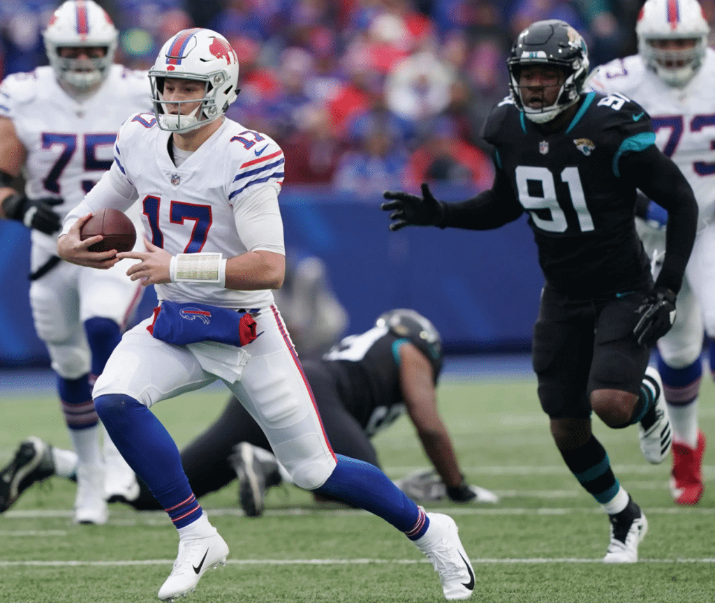
Whether by coincidence or design, it was a very monochromatic day in the NFL yesterday. Let’s start in Buffalo, as the Bills wore their white throwbacks against the mono-black Jaguars, making for a white-vs.-black game. (The Bills have had these throwbacks in their wardrobe since 2012, and I like them just fine, but I don’t understand why they go with white instead of blue. Why not do the throwback in your usual home color?)
And that game was just the start of the solid-color action yesterday, as a slew of teams went mono. Here’s the breakdown:
• The Eagles wore their mono-BFBS alternates. (Yes, I realize black is, technically speaking, an Eagles team color. But by any reasonable standard, this uniform is a textbook example of the BFBS phenomenon.) I’ve never liked this uniform when the Eagles have worn it for night games, and it somehow looks even worse in daylight (click to enlarge):
• The Jets went mono-green (click to enlarge):
• The Panthers went mono-black — this time with blue socks:
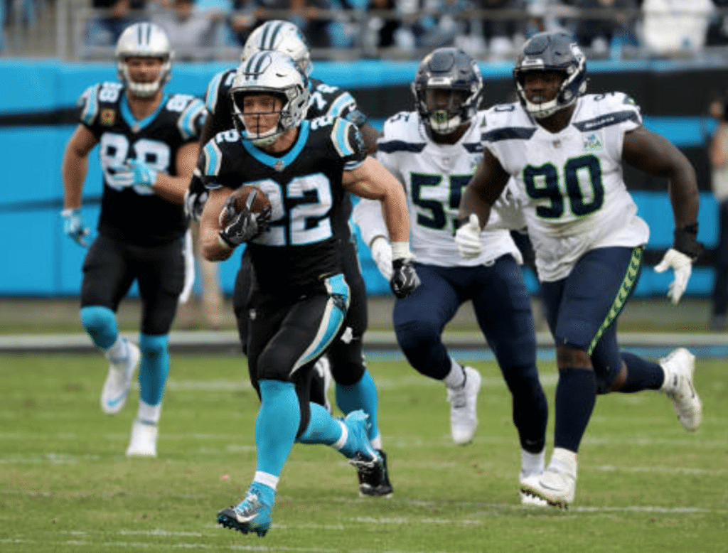
That’s not a new uni combo for Carolina. But in case you missed it last Friday, I ran a little breakdown of all the new uni combos they’ve debuted so far this year.
As an aside, Seattle’s combo from this game — white jersey, blue pants — is by far my favorite of all their looks.
• Not exactly my favorite look in Baltimore, where the Ravens broke out the purple Rash (click to enlarge):
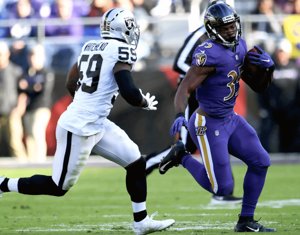
Of course, this mono-purple uniform shouldn’t be confused with their other mono-purple uniform, which they wore five weeks ago:
And the reason a team needs TWO alternate purple over purple unis? 2 jerseys, 2 pants? @UniWatch pic.twitter.com/WPakVf4fmq
— (@NFL_Journal) November 26, 2018
• The Chargers wore their mono-royal alternates (click to enlarge):
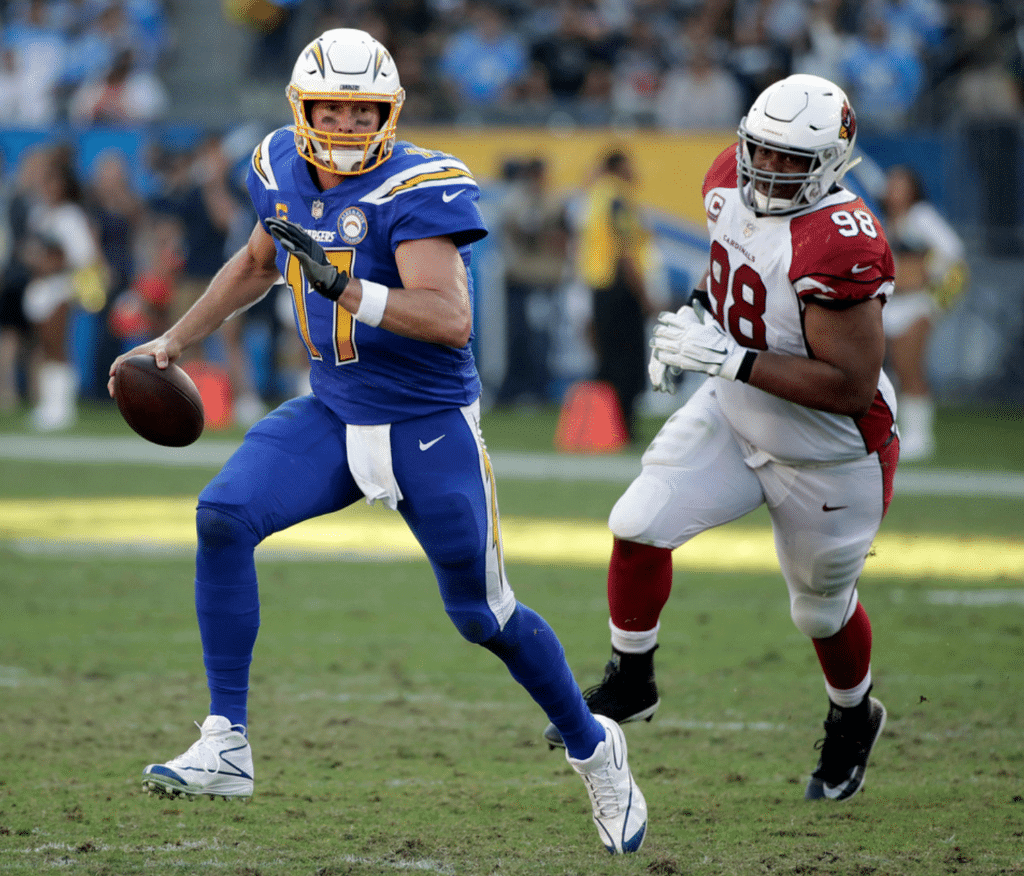
A lot of people seem to like this one. I agree that this shade of blue is way better than the Chargers’ standard navy, but I’d rather see the jersey paired with either white pants or yellow pants.
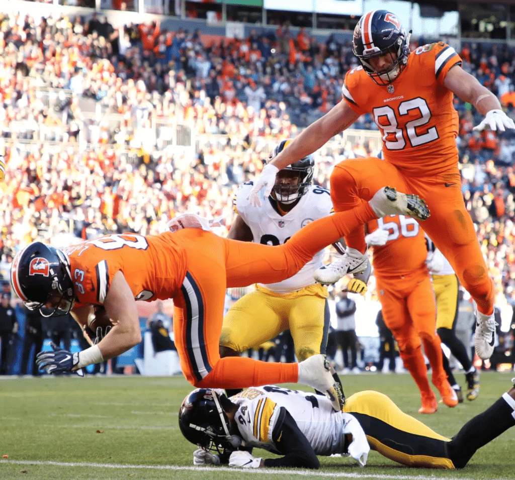
• The Broncos wore their mono-orange alternates, and their throwback helmet logo was also used on the stadium scoreboard (click first photo to enlarge):
Broncos going with the old logo here on the stadium scoreboards to match today's jerseys@UniWatch @PhilHecken pic.twitter.com/TY87IZNM0R
— Zeke Perez Jr. (@NerdsThatZeke) November 25, 2018
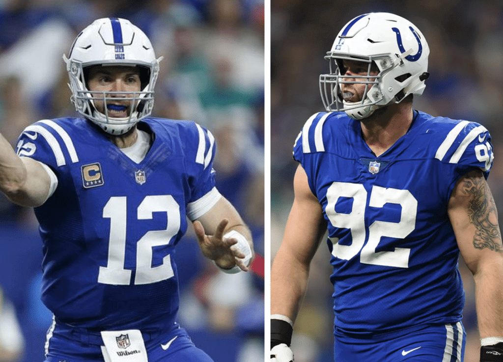
• And then there were the Colts, who wore their mono-blue alternates (click to enlarge):
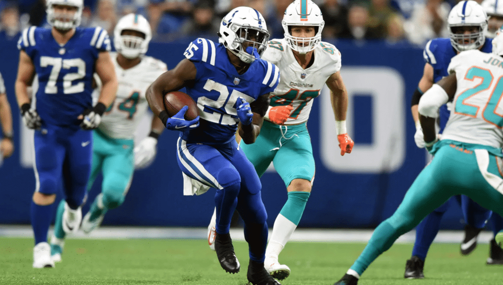
But here’s the weird thing: The Colts’ Color Rash jerseys may look like the team’s primary blue design, but they’re rendered in different tailoring templates, plus there’s a subtle difference between the number fonts. Those two differences were easy to spot yesterday because quarterback Andrew Luck was wearing the standard blue jersey while his teammates were wearing the Rash. Here’s a side-by-side comparison — Luck’s standard jersey on the left and defensive lineman Margus Hunt’s Rash jersey on the right (click to enlarge):
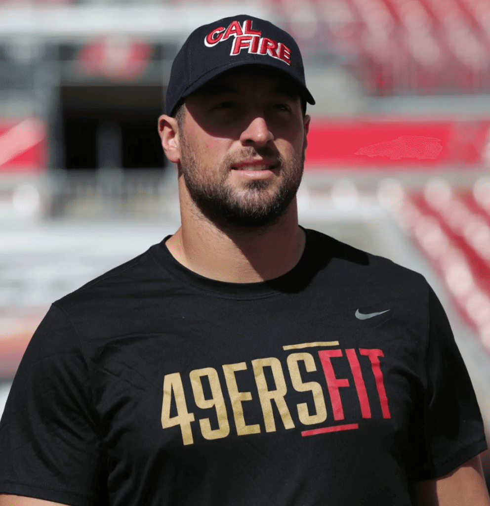
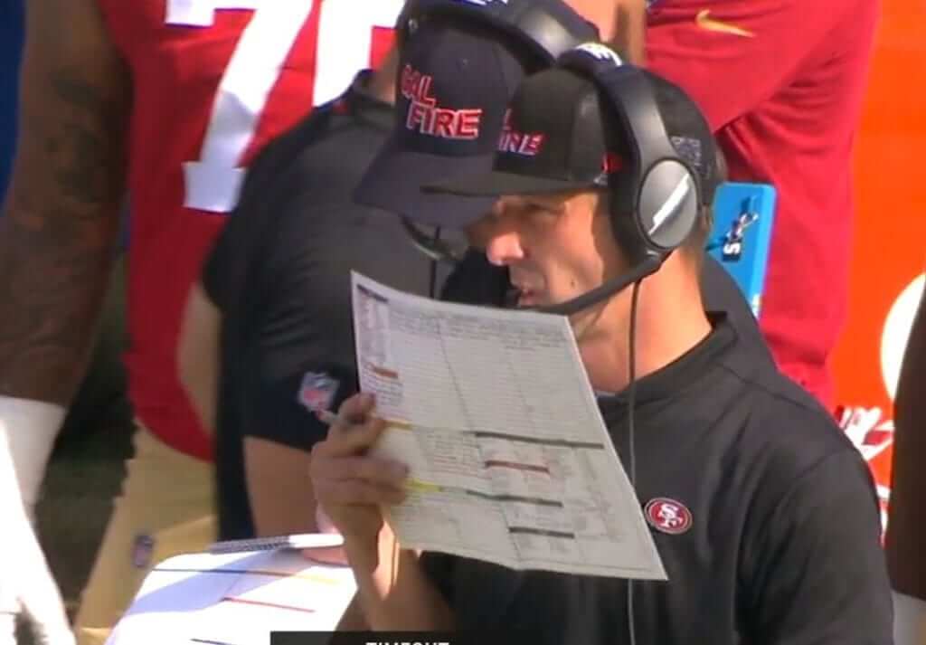
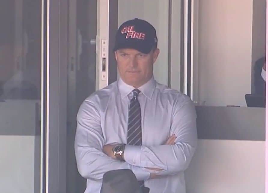
• In non-mono news, 49ers personnel were wearing “Cal Fire” caps before and during the game. GM John Lynch even wore one up in his suite:
• In that same game against the Niners, the Bucs wore their alternate white pants with red trim, instead of the pewter-trimmed pants they usually wear. According to reader Michael Stein (and confirmed by the Gridiron Uniform Database), these red-trimmed pants had previously been worn for a pair of 2017 preseason games against the Bengals and Browns, but they’d never been worn in a regular season game until yesterday. Here’s a comparison — yesterday’s red-trimmed pants on the left, the more commonly worn pewter-trimmed pants on the right (click to enlarge):
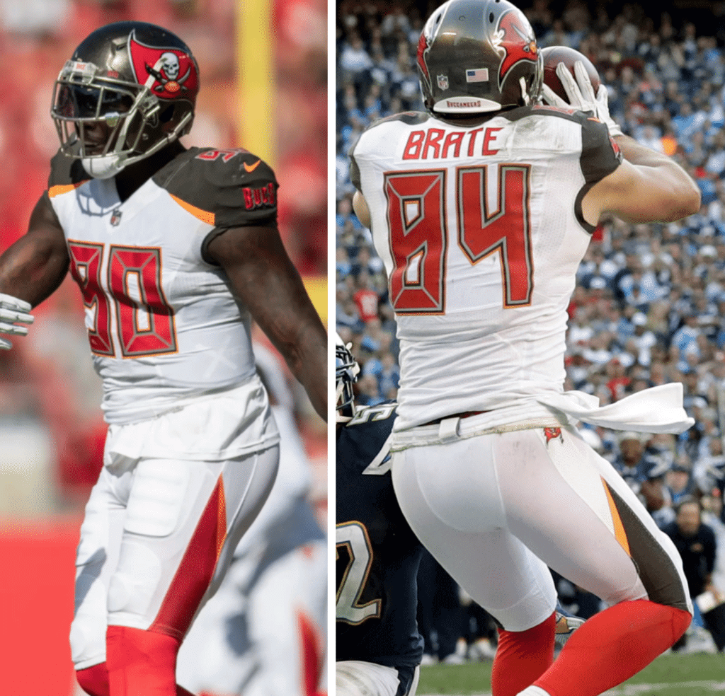
• Speaking of the Bucs: They and the aforementioned Bills were the only two teams to wear white at home.
• Finally, looking ahead to tonight’s Titans/Texans game, Houston has added an “RCM” memorial decal for owner Bob McNair, who died on Friday (click to enlarge):
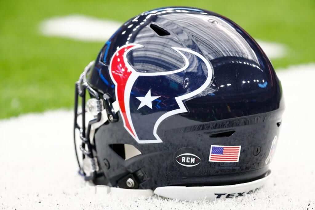
The Texans are also using that decal design as their social media avatar.
(My thanks to our own Brinke Guthrie for the 49ers cap shots.)
Click to enlarge
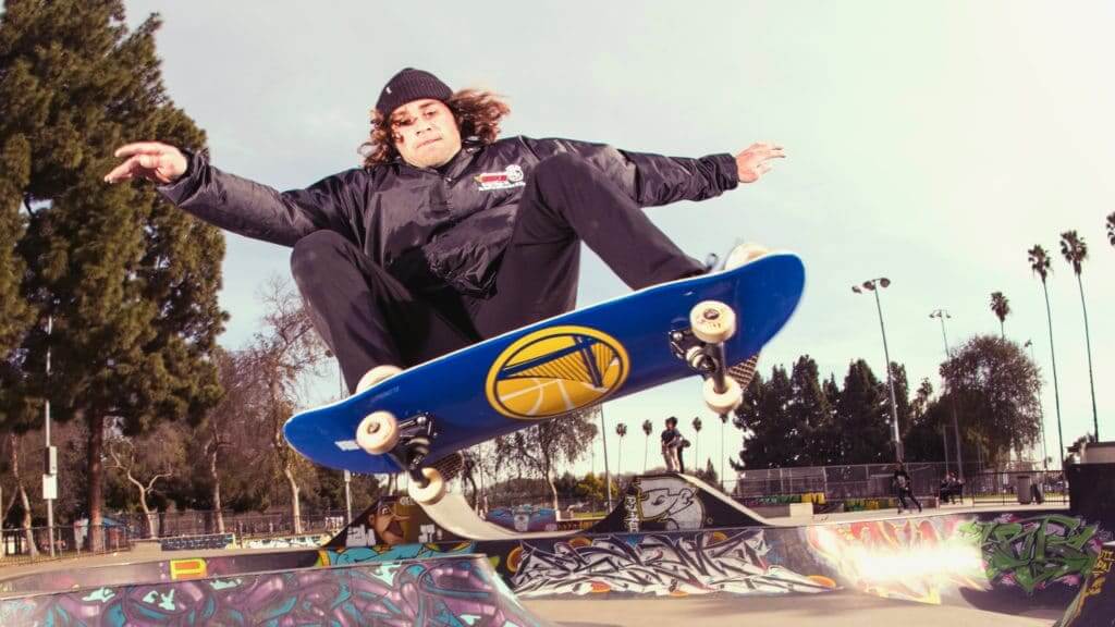
Time for the Gift Guide: My annual Uni Watch Holiday Gift Guide, featuring all sorts of cool uni-related items (including NBA-themed skateboards, shown above), is being published today. Check it out here.
Click to enlarge
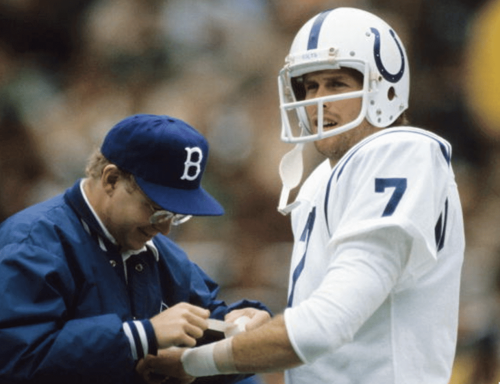
The Brooklyn Colts?: Reader Will Shoken was poking around on Getty Images recently and came across this 1981 shot of Colts quarterback Bert Jones being tended to by a trainer wearing something very similar to a Brooklyn Dodgers cap (but with a blue squatchee, instead of white). Will was curious about the cap, so he contacted a former Colts trainer named John Lopez via the Baltimore Colts Memories Page on Facebook. The two of them then had the following online conversation:
Will Shoken: John Lopez, can you identify the guy wearing the Brooklyn Dodgers cap?
John Lopez: That’s John J. Kasik Sr. He was my intern in 1979. He later came back as my assistant in 1981. He later went on to the Seattle Seahawks then was head athletic trainer for the Carolina Panthers. He’s now associate athletics director for sports medicine at the University of South Carolina.
The Baltimore Colts “B” caps were a one-time deal that Ernie Accorsi [who was the Colts’ assistant GM at the time — PL] and Bob Robert Leffler [the team’s sales director — PL] came up with. Lost mine. Wish I still had it.
WS: Oh, so those caps were made for the Colts? Because they are almost identical to the old Brooklyn Dodgers caps.
JL: Note the slight difference in the “B.” Probably to avoid a lawsuit or copyright infringement.
WS: Yes, also the button on the Colts cap was blue, not white. Although I bet if someone tried to do that today, Major League Baseball would come down on them pretty hard with a cease-and-desist.
JL: In a heartbeat!
———
Interesting. Do any Colts fans remember these caps being worn in 1981? Was there any chatter about them being similar to Brooklyn Dodgers caps?
Uniforms in the wild: For a variety of reasons, I didn’t sign up for our local curling league this year. But my old team, ably skipped by Phil, needed a sub last night, so I happily stepped in. Interestingly, the four members of the opposing team were wearing uniforms — or at least matching sweatshirts — which is something I’d never seen before in our league. Check it out (click to enlarge):
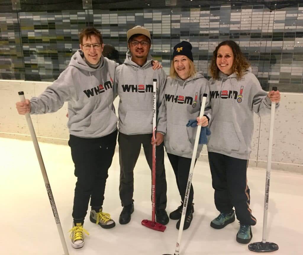
Their team name, Wham!, refers to the sound of a curling stone taking out another stone.
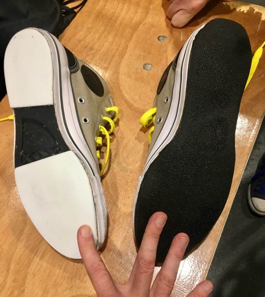
Also: As you can see, the player on the left is wearing Chucks. But not just any Chucks — custom curling Chucks! That player, whose name is Kris Franklin, explained to me that she has narrow feet and couldn’t find curling shoes that fit her properly, so she herself got a slider (which is made of Teflon) and a gripper (rubber), used a band saw to cut them to the proper size, and then glued them to the soles of the sneakers (click to enlarge):
Kris also showed me photos of the entire process. I asked if she’d be willing to share those with Uni Watch and provide a little write-up, and she said sure — but not until the end of the current academic semester (she’s a law professor). So maybe we’ll get to see that during her winter break. Stay tuned.
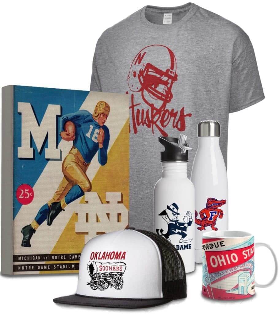
ITEM! New raffle: We’ve done raffles before with the folks at Vintage Brand, who specialize in retro-styled sports stuff (like the items shown at right; click to enlarge), and now they’re generously providing another free item for a lucky Uni Watch reader. The winner will get to choose anything from the Vintage Brand site.
To enter the raffle, send an email to the raffle address by this Thursday, Nov. 29, 7pm Eastern. One entry per person. I’ll announce the winner on Friday.
In addition, Vintage Brand is offering a site-wide 30%-off sale. The discount will automatically be applied to your order at checkout — not bad!
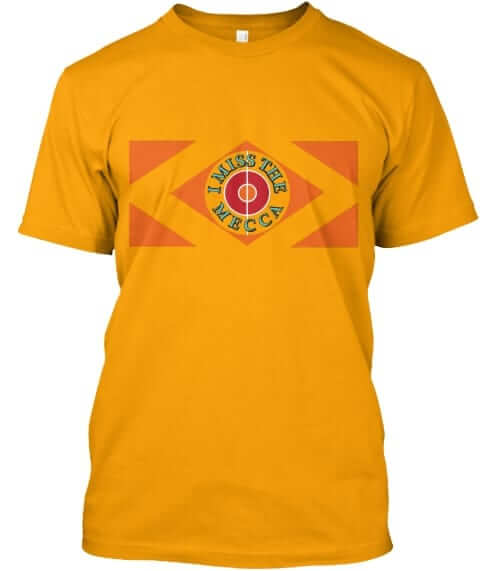
ITEM! Naming Wrongs update: In case you missed it over the weekend, we just launched some new Naming Wrongs shirts. After we did the the Bradley Center shirts (in Bucks and Marquette treatments), we had a lot of requests for MECCA designs, and those are now ready. We have five versions — gold with a court layout, gold with the center-court diamond, green with a Irish rainbow striping, green without the stripes, and grey:
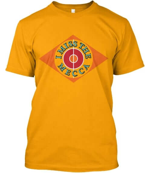
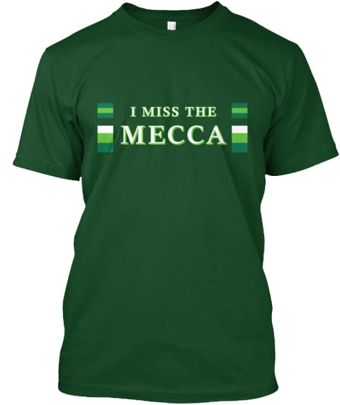
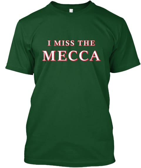
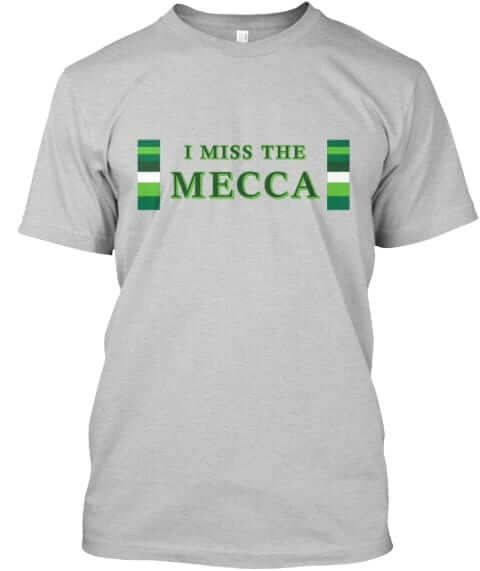
These shirts are now available in the Naming Wrongs shop, where card-carrying Uni Watch members can get a 15% discount. My thanks, as always, for considering our products.

LAST CALL for various sales: Today is the last day to take advantage of several sales that have been going on:
• Our flex-fit Uni Watch alternate cap, originally priced at $29.99, is only $19.99 today. Order yours here.
• Ebbets Field Flannels is running a site-wide sale. For today, you can get 25% off your order by using the checkout code CYBER18. That effectively reduces the price of our Uni Watch classic cap from $49 to $36.75.
• You can get 15% off of our StripeRite socks — and off of everything else on the American Trench website — by using the checkout code BFCM. This discount is available through the end of today. (Regarding the socks, we’ve now sold out of the green design, which means the three-packs are no longer available either. But the blue and black designs are still available.)
You can see all of our other Uni Watch products, including a few that you may have forgotten about, on this handy one-stop-shopping page. My thanks, as always, for your consideration of our products.
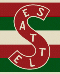
LAST CALL for the Seattle hockey contest: Today is the last day to enter the design contest for the potential new NHL franchise in Seattle. Here’s the skinny:
• Your entry must include a team name, a primary logo, full home and road uniforms (jerseys, pants, socks, helmets), and an inaugural-season logo that can be worn as a patch. If you like, you can also include secondary logos, an alternate uniform, and a center ice design, but those aren’t required.
• You can draw upon Seattle’s rich hockey history or start from scratch. Up to you!
• Your designs can be created in any digital or analog medium (Illustrator, Photoshop, crayon, whatever) and can be submitted in any standard digital format (JPG, PDF, TIFF, etc.). You can also create a video presentation, upload it to YouTube, and submit the YouTube link as your entry.
• The files you submit should be named after yourself (PaulLukas.jpg, for example). If you’re submitting multiple files, please either number them (PaulLukas1.jpg, PaulLukas2.jpg, etc.) or use some other designation (PaulLukas-homeuni.jpg, PaulLukas-logo.jpg, etc.). Files that don’t follow this format will not be considered.
• In keeping with longstanding Uni Watch chromatic policy, entries with even a hint of purple will not be considered.
• Email your entry to Uni Watch HQ (note that this address is just for contest submissions — please don’t use the usual Uni Watch email address). If you have more than one concept, feel free to enter as many times as you like.
• Deadline: Today, 7 p.m. ET.
The best entries will be showcased in one of my upcoming ESPN columns. Good luck!
Click to enlarge
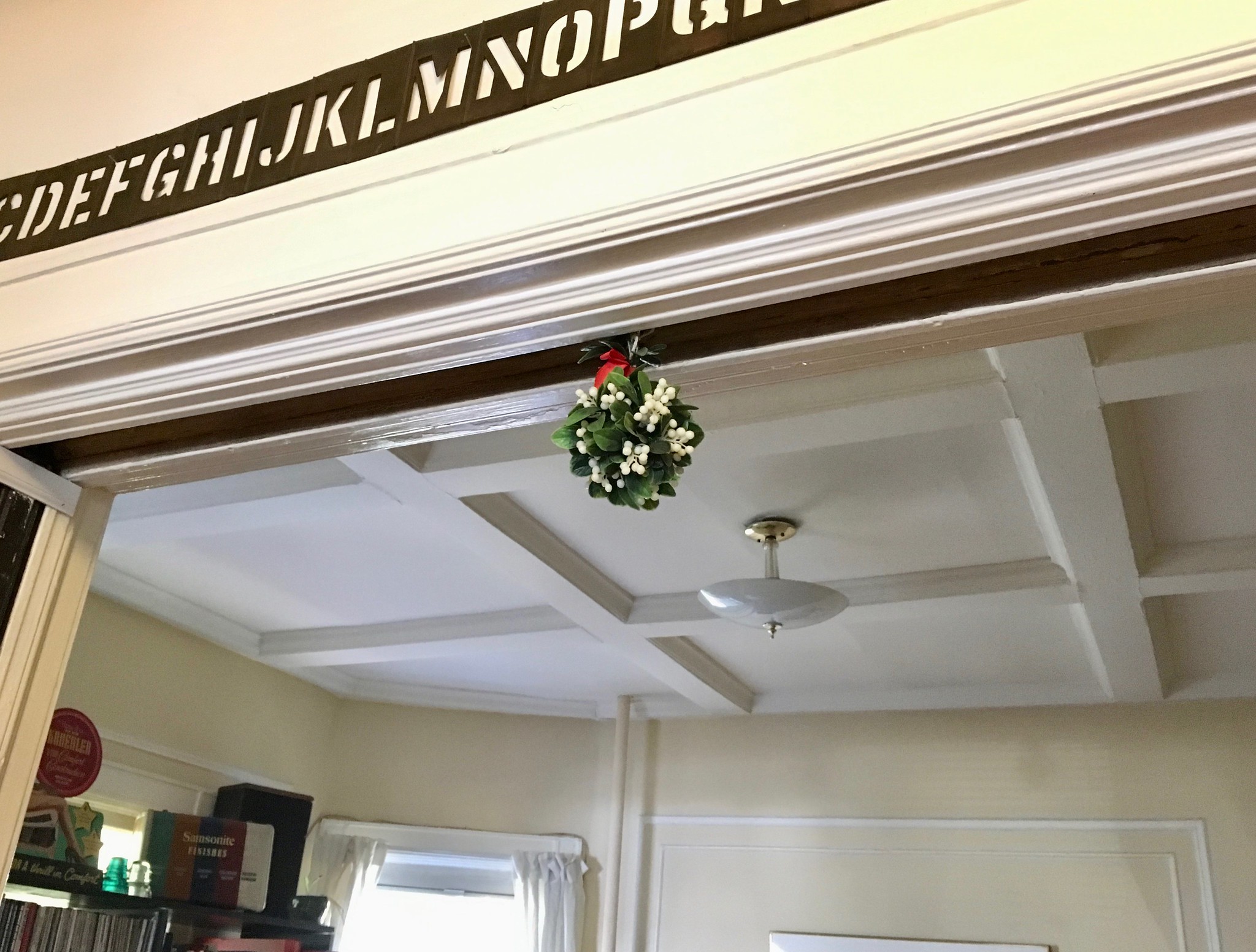
Back for its 26th year: One of my annual holiday rituals is that as soon as Thanksgiving is over, I hang the plastic mistletoe that I bought in 1993 for $2.99 at a now-defunct Woolworth’s in Manhattan. A quarter-century later, it looks as good as ever — best three bucks I ever spent! And since Thanksgiving came early this year, the faux ’toe gets some extra time to cast its alluring spell. Let the yuletide necking commence!
The Ticker
By Jamie Rathjen

Football News: Reader Joe Baka tells us that Northwestern subtly changed their primary helmet decal this weekend to look more like the “official” version of the logo. It was previously bolder with less negative space. … Partially reprinted from yesterday’s comments: Canada’s Laval University hosted and won the Vanier Cup, the university championship, and did so wearing white because the venue was determined in advance and they were the designated away team, even though it was their home field. They also wore alternate gold helmets (from (from Moe Khan and Wade Heidt). … Here is a breakdown by uniform combo of North Carolina’s record from 2012 to 2018, or the tenure of newly fired head coach Larry Fedora (from James Gilbert). … Reader Rand Martin made Seahawks-themed cookies. … Jeremy Edom was digging through his grandfather’s old boxes and found a figurine honoring Arkansas’s 1969 Sugar Bowl win. “It’s not in the best shape, but I love the football player body with a hog’s head,” he says.

Hockey News: New alternates for the OHL’s Barrie Colts (from Phillip denHollander). … The Islanders have changed the captaincy letters on their blue alternate jerseys from orange to white (from @JaredfromLI).

Soccer News: Reader Mark Coale tells us that players in Italy’s Serie A wore red marks on their faces to bring awareness to violence against women. I’m not sure every player or team participated, but here are some examples from yesterday and from Saturday on some Juventus players. There were also matching captain’s armbands. … In the early ’90s, the Japan Football Association used Adidas, Asics, and Puma for the national team’s kits, rotating all three maker’s marks onto the same designs. … Scottish Championship team Greenock Morton (red tartan) changed at home along with League Two’s Peterhead to avoid a clash in a Scottish Cup game, as both teams’ colors are blue and white. … It’s still this season in MLS, but for next season the Chicago Fire might be getting a new advertiser (from Josh Hinton).

Grab Bag: Our own Anthony Emerson found a database of the logos for every congressional candidate this year, filterable by color, font type, and imagery used, as well as by demographic data. … Some players on England’s rugby union team declined to participate in the pro-LGBT Rainbow Laces campaign because they find the laces uncomfortably thick and long. But players on Wales, France, and New Zealand wore them this weekend. … The international team for golf’s Presidents Cup revealed a new logo (from Nick Menta).
Not a fan of the mono look currently plaguing the NFL but some of the jerseys are pseudo throwbacks and would make a great primary. For example, watching the Broncos I couldn’t help but think how clean their jerseys looked with no stupid side panels and a block font but a bit much when paired with the orange pants. If the paired that jersey with pants and some decent socks itd make a great throwback uni albeit with the wrong shade of blue but it does work well with the old logo.
*white pants and decent socks
Man, I wish the Broncos would go to that look full time. Non-monochromatic of course.
Love the Broncos unis yesterday. Pair them with white pants and I say make them permanent!
There is a Baltimore neighborhood named Brooklyn.
The Broncos should just switch their color rush, bit with white pants, already.
What is the name of the throwback Indy number font?
Why don’t the Panthers just switch to a black or blue helmet already? All of their looks would be greatly improved without the silver lids.
…Or just stick to the silver pants as God intended.
Yes! People can say what they like about Jerry Richardson the man, but at least Jerry Richardson the NFL owner understood the concept of creating an identifiable team look by insisting the team didn’t do all the stupid uniform combos.
Noticed something in the Vanier Cup ticker item not mentioned. In the TV screen shot sent in by Moe, Sportsnet has the wrong team logo on the 1st and 10 graphic. Wrong purple team from Ontario. They have the Wilfrid Laurier Golden Hawks logo instead of the Western logo.
As a Northwestern fan (with a purple Uni Watch membership card), I never noticed how the old helmet N looks very much like a white rectangle with two small notches instead of an N.
The new N also looks larger.
That is our classic helmet… so of course it wasn’t worn this season until the final game, given the new varieties of white, BFBS, and GFGS sake helmets with the alternate cat head logo. We wore the N in previous games this year…
link
Liking those Barrie Colts alternate white uniforms. Better than their regular white uniforms, which are extremely busy and suffer from a lingering Reebok Edge hangover.
link
One minor issue is the new alternate jerseys and socks are missing yellow in the trim.
A good idea for the Colts would be to go back to the uniforms they wore during the last decade full time. Classic looking hockey design which incorporates the full team colours.
link
Arizona was not mentioned in the monochromatic teams but they wore white over white with red socks, a similar look to the Panthers and Bills.
I tend not to single out mono-white in mono rundowns, because it’s a traditional look. I only called out the Bills because (a) they were wearing throwbacks and (b) mono-white vs. mono-black is, you know, a very black-and-white affair.
Thanks for clearing that up.
I’m partial to the serif number font that the Colts sort of used yesterday. It reminds me of the 70’s era Cowboys — I thought that their old blue jerseys with the serif numbers was a great look. I am not a big fan of the mono look either but I like the mono-royal blue for the Colts.
The Broncos, on the other hand, were harsh. They looked to me like orange cutout figures on the green background of the field.
Wonder if Luck wearing the standard jersey was an honest mix-up, or if he snuck it by the QC folks on purpose because he may be like Ben Roethlisberger and prefers the older template. Shame his number font didn’t match everyone else though.
Regarding the number font on the Colts jerseys, I believe the change goes back to the Baltimore Colts 1967 – 1968. You can see the change from the 1967 team photo: link
To the 1968 team photo: link
I’m usually against the mono look and I’m not a fan of dark pants paired with any jersey (especially white) but seeing the Colts in mono blue yesterday was a refreshing surprise. If a team like the Colts [who have an all time classic uniform you know they will never change] does this ONCE IN A RARE WHILE – that’s a fun thing. If they start going nuts with it, then yeah, it becomes ridiculous and played. Well done Indy – now put that look in the closet for a long while.
I am sure that this has come up before, but I missed it and was just curious about the helmet rule in the NFL. I saw that Tom Brady switched back to his old helmet this weekend against the Jets. I was under the impression that he and Drew Brees switched helmets this year because their old helmets were now deemed illegal in the NFL. Also, Adrian Peterson currently wears the exact helmet style that Brees wore before this year. What gives? Please shed some light on this for me. Strictly aesthetically speaking, I think the old helmet design worn by Peterson & Brady this week look so much better than the current designs worn by most players. I get the safety concerns, but the new helmets are just plain ugly.
Brady’s old helmet will be banned *next* year. Not this year. He’s been switching back and forth all season.
Dig the Ravens and Chargers alts, and absolutely love the Broncos… but for God’s sake white pants on all 3!
I wish the Ravens would switch to their color rush jerseys as their primary. The gold numbers look much better than the white on purple. For their color-rush, I wish they would do something to make it special. I’d like to see the shield logo on the helmet and the bird logo on the jersey.
Absolutely agree on the gold numbers for the Ravens. I’d like to see pants with that jersey – not the gold they wore previously, but ones with white/purple/white stripes.
…Or gold/yellow for the Chargers.
Paul you legitimately made me LOL with your necking line, good one, much needed on this Monday.
Condensing my comment from last Friday, re: the Panthers’ combos, in the event anyone’s intersted:
A couple other combos I found, according to the GUD & Google:
+ Teal socks with their original black-over-silver look in ’95
+ White jersey, silver pants, and teal socks in ’98 season — apparently the only instance in which they’ve worn their white jerseys with anything other than white pants and teal socks in their 23 seasons prior to 2018
+ Teal-white-teal vs. Miami in the preseason, and vs. Baltimore about a month ago
Not sure how I could represent all three elements easily in a spreadsheet, but this is the best I could come up with:
link
That makes 13 combos we’ve seen out of the 24 possibilities.
Good work, but it’s not teal.
The gift guide is up:
link
Your necking comment reminds me of all those game shows from the 70s and 80s that used to refer to “making whoopee”.
The item about the Texans RCM sticker just reminds me of how awkward that logo looks on the side of the helmet. I’ve never felt it quite fits right.
Also, really looking forward to seeing the Seattle hockey concepts.
The item about the Texans RCM sticker just reminds me of how awkward that logo looks on the side of the helmet. I’ve never felt it quite fits right.
I’ve always felt the same! I can’t explain it — it’s a mirror-image logo, so it should look equally good (or equally bad, or equally whatever) on each side. But for some reason it always feels awkward on that side. Anyone else..?
I think it’s because of the attempt at three-dimensionality. Most logos used in football are either full profile (USC, Michigan State, Redskins), flat representations (Dallas Cowboys, KC Chiefs) or viewed from head on (Raiders, Bears, etc.) The logos that do attempt three dimensions usually do it as if the logo is the whole helmet (Rams, Vikings, Eagles, Colorado State).
The Texans, the bull is facing forward, but at an angle, with its head lowered. The red is the other side of the bulls head that we can’t fully see, so it’s like the bull is looking off to the side.
But that doesn’t explain why it looks OK from one side but much worse from the other side.
I tend to think it looks bad from both sides.
Oh, I thought you meant it looked bad just on that one side. My bad — I misunderstood you.
*I* tend to think it looks fine on the right side (i.e., facing right) but oddly awkward on the left side (facing left). Which makes no sense. But that’s what I’ve always thought. Anyway, carry on!
Also, viewed from the left side, it puts the colors in the opposite order of the Texas flag, with the red on left instead of the right.
The Broncos should pair that orange “color rash” jersey with a pair of white pants with coordinating stripes and make that their full time look (with the old D logo).
Not uni related but Paul what is the letter stencil you have above your mistletoe?
It’s a brass stencil of the alphabet. Used to belong to my brother and sis-in-law. When they died (more than 25 yrs ago), there were a few mementos from their home that I wanted, and that was one of them.
Thank you. I think it’s fantastic
Thank *you*! It’s a hard thing to photograph, because it’s long and thin and up high. But I’ll see if I can get a good shot of the whole thing.
Yes, the Bills should wear the blue throwbacks since they got the striping correct on those, at least the last time we saw them. The stripes on the white jerseys are an awful attempt at recreating the Bills 60’s uniforms. The stripes should look link Compare with the photo from yesterday’s game and… why do we keep calling them “throwbacks?”
No uni news on the CFL’s Grey Cup?
It looked like Texas Tech vs. Texas Tech, except played in the GWN.
Probably my time to step in here. Nothing really uni notable about the Grey Cup game, so not really much to mention.
Calgary Stampeders were designated the home team as they are the Western Champion and the game was hosted by a West Division city. Calgary wore their standard home uniform. Ottawa Redblacks wore white over white:
link
Edmonton did a great job during the week hosting the game. A sellout. Royal Canadian Air Force Snowbirds did a fly over before the game:
link
The field is pretty standard paint job for the Grey Cup. This year’s Grey Cup logo in the centre. Each team having their logo in an end zone. Major Grey Cup advertisers getting the 10 advertising spots available on the field:
link
Calgary Stampeders, often the class of the regular season for the past few years but had trouble winning the big one, did win the big one this year:
link
And hey, if you wear the white horse on the side of your helmet and you become a champion, you might as well ride the white horse as well. DL Ja’Gared Davis did:
link
Amazing write up!! I appreciate it so much. Crazy to see the amount of advertising on the field/jerseys
In terms of sports aesthetics, has their ever been a column on the long forgotten television network jacket? I ask, because this past Saturday, Hockey Night in Canada to raise money for cancer, did a retro night, and all announcers wore these baby blues.
link
But it got me thinking, I think all the networks had jackets in the 70’s, when did they start to disappear, who was the last hold out?
I was going to enter the Seattle contest, but I haven’t been able to come up with anything for a logo.