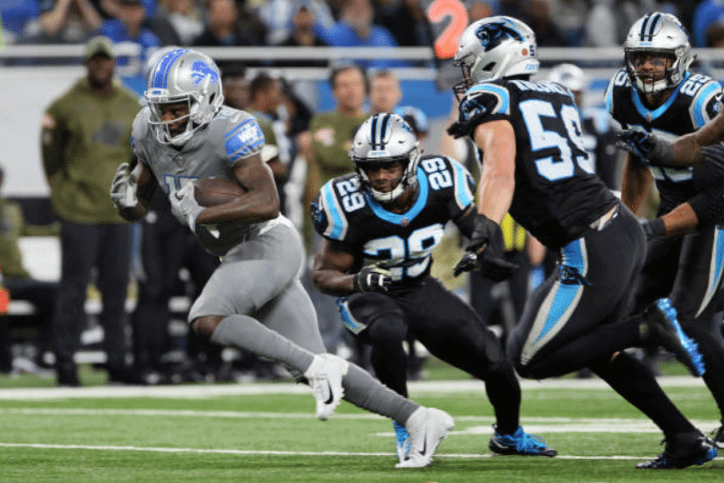
Absolutely brutal-looking game yesterday in Detroit, where the Lions went mono-grey against the visiting Panthers, who went mono-black — ugh. Additional photos here, if you dare.
According to reader Gabe Cornwall, who’s something of a Panthers uni scholar, this was the first time the Panthers have ever worn black socks with their mono-black look. In the past, they’ve always had blue socks:
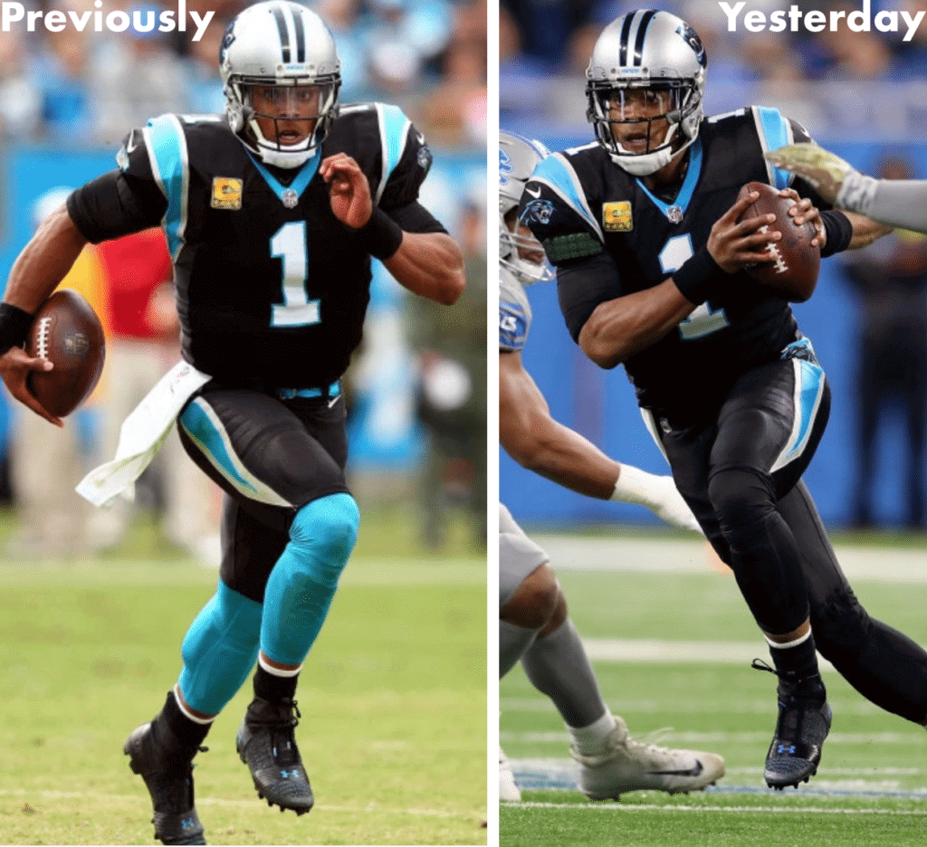
So we can chalk this up as yet another instance of the Panthers wearing a first-ever uni combo. I’ve lost track of how many times they’ve done that this season, but it’s a lot. Interesting case of a team sticking with its current wardrobe but still presenting a lot of new looks.
In other news from around the league on Sunday:
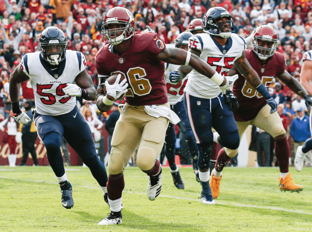
• Washington wore their throwbacks:
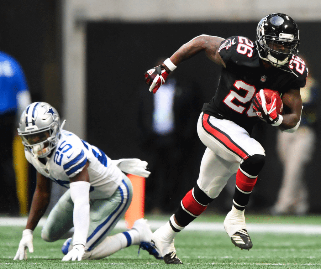
• More retro action in Atlanta, where the Falcons wore their excellent throwbacks (click to enlarge):
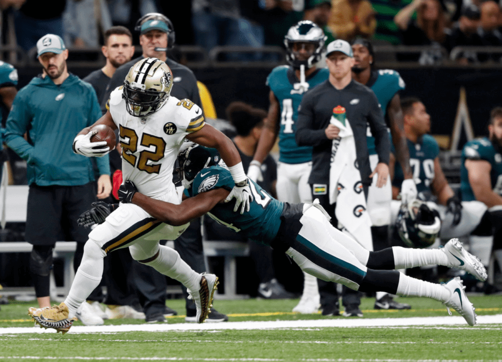
• Saints coach Sean Payton lost a golf bet earlier this year to Eagles coach Doug Pederson, and the payoff was that New Orleans had to wear white at home yesterday against Philly. But instead of wearing their primary white jerseys, they wore their mono-white Rash uniforms, which just about everyone likes (myself included), so Payton’s golf loss was everyone else’s gain.
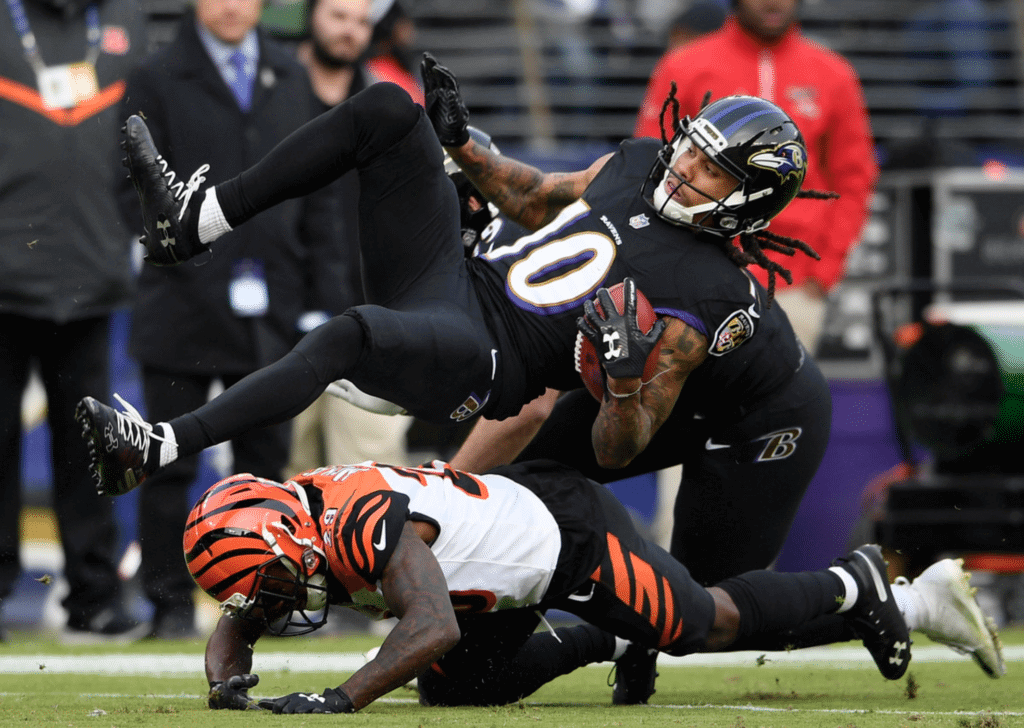
• For the second time in three weeks, the Ravens wore their black alternate jerseys. But unlike Week Nine, when they paired the black jerseys with white pants, this time they went mono-black:
• The Chargers went mono-navy — easily the worst of all their possible looks:
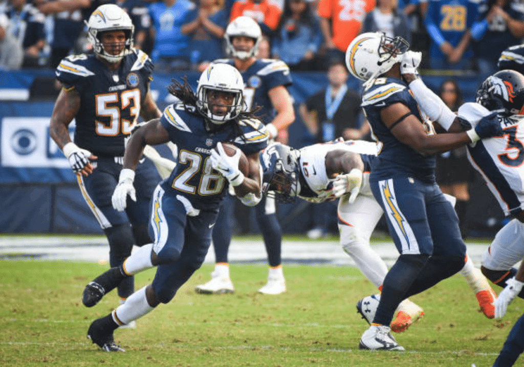
If they insist on going mono, I wish they’d just wear the Rash, which is a much nicer shade of blue.
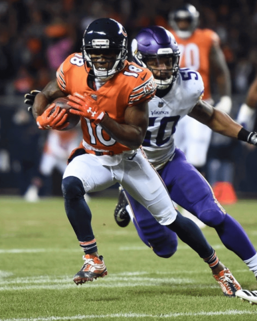
• The Bears wore their orange throwbacks, which made for a very vibrant-colored game against the purple-pantsed Vikings:
• Speaking of the Vikings, wide receiver Adam Thielen apparently changed his socks at halftime:
@PhilHecken Halftime hosiery change for @athielen19. @UniWatch pic.twitter.com/WqXZznz9fB
— Curtis Galvin (@CurtisGalvin) November 19, 2018
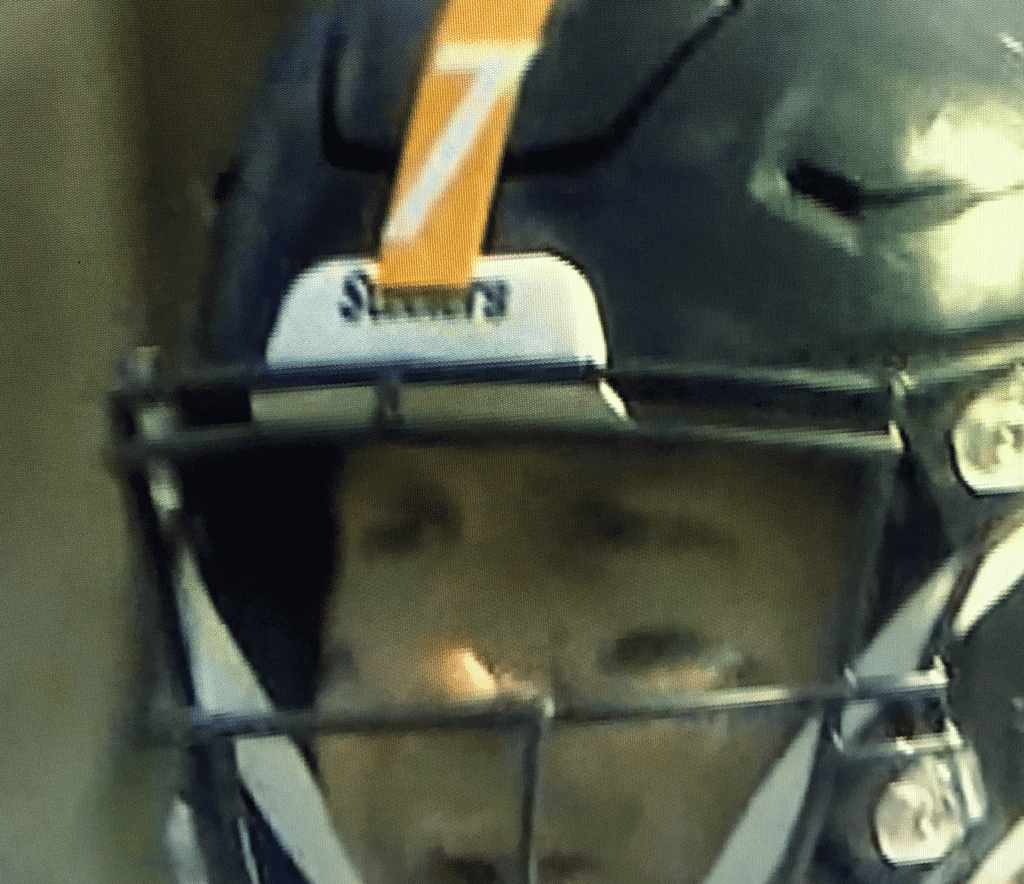
• Steelers quarterback Ben Roethlisberger’s helmet stripe was extending onto his nose bumper:
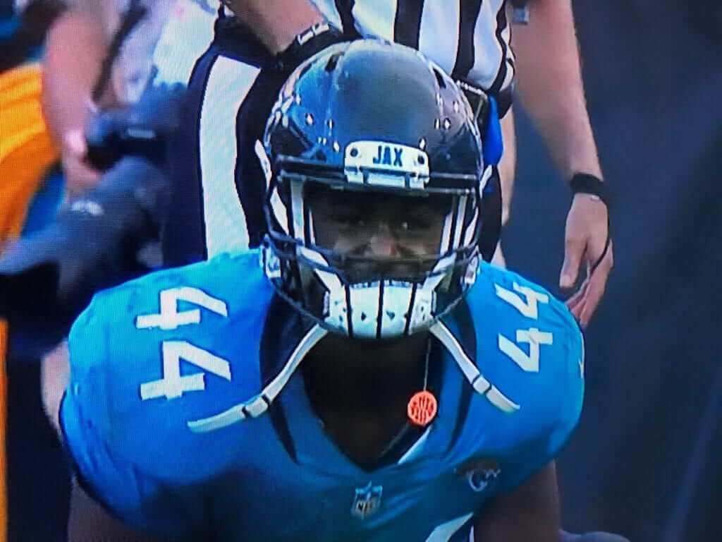
• On the last play of the Steelers/Jags game, Jacksonville linebacker Myles Jack had his internal radio speaker knocked out of his helmet (click to enlarge):
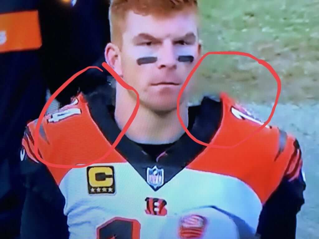
• This isn’t the best screen shot, but Bengals quarterback Andy Dalton appears to have torn his jersey collar on both sides (click to enlarge):
• Only one team wore white at home: the aforementioned Saints.
(My thanks to Curtis Galvin, Mark Johnson, and Jon Solomonson for their contributions to this section.)
Blast from Andy Reid’s past: With Chiefs coach Andy Reid slated to lead his team into Los Angeles to play the Rams at the L.A. Coliseum tonight, longtime sports broadcaster Rich Eisen shared the following post on Instagram over the weekend:
How great is that?! I wonder how many other NFL coaches participated in PP&K.
(Big thanks to Cino Commisso for bringing this one to my attention.)
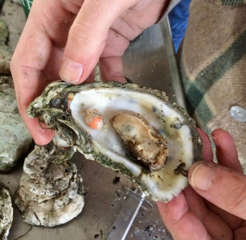
Photo by the Tugboat Captain, click to enlarge
Better than a pearl: In yesterday’s entry I mentioned that I only found one pea crab in the oysters I ate at this year’s Ducks Unlimited Oyster Roast on Virginia’s Eastern Shore. Here’s a photo of the little bugger. It was a sweet little morsel, just like I remembered from last year. Too bad it was the only one I found.
(If you have no idea what I’m talking about, go back and read about my experiences at last year’s oyster roast and the resulting article I ended up writing about pea crabs for the Taste website.)
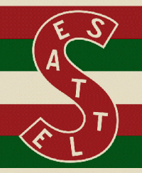
Contest reminder: In case you missed it late last week, ESPN.com’s hockey editor has asked me to have a design contest for the potential new NHL franchise in Seattle. Here’s the skinny:
• Your entry must include a team name, a primary logo, full home and road uniforms (jerseys, pants, socks, helmets), and an inaugural-season logo that can be worn as a patch. If you like, you can also include secondary logos, an alternate uniform, and a center ice design, but those aren’t required.
• You can draw upon Seattle’s rich hockey history or start from scratch. Up to you!
• Your designs can be created in any digital or analog medium (Illustrator, Photoshop, crayon, whatever) and can be submitted in any standard digital format (JPG, PDF, TIFF, etc.). You can also create a video presentation, upload it to YouTube, and submit the YouTube link as your entry.
• The files you submit should be named after yourself (PaulLukas.jpg, for example). If you’re submitting multiple files, please either number them (PaulLukas1.jpg, PaulLukas2.jpg, etc.) or use some other designation (PaulLukas-homeuni.jpg, PaulLukas-logo.jpg, etc.). Files that don’t follow this format will not be considered.
• In keeping with longstanding Uni Watch chromatic policy, entries with even a hint of purple will not be considered.
• Email your entry to Uni Watch HQ (note that this address is just for contest submissions — please don’t use the usual Uni Watch email address). If you have more than one concept, feel free to enter as many times as you like.
• Deadline: Monday, Nov. 26, 7 p.m. ET.
The best entries will be showcased in one of my upcoming ESPN columns. Good luck!
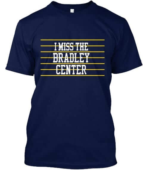
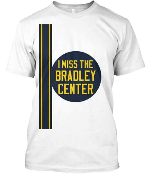
Naming Wrongs update: When I showed you our new green and purple Bradley Center shirts last week, I mentioned that we might also be doing some Marquette-themed versions. Those designs are now ready, in navy, bumblebee-striped, light blue, and white:
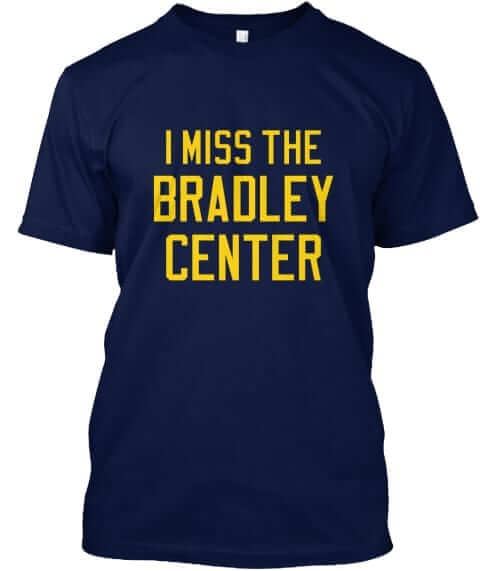
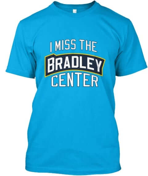
These shirts are now available in the Naming Wrongs shop.
Several people have requested that we also do MECCA shirts, and those are now in the works. Soon!
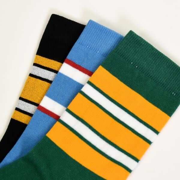
StripeRite update: The folks at American Trench tell me that as of last night we had only four pairs left of the green/yellow design shown at right. We have a bit more of the black/yellow (22 pairs) and the blue/red (51) — not bad considering we started with 12 dozen of each design. So if you’ve been meaning to order, I suggest doing so now.
Then again, you might want to wait until Wednesday, because American Trench will be running a sale from this Wednesday through the following Monday. You can use the checkout code BFCM for 15% off your entire order for anything on the American Trench website (i.e., not limited to our socks).
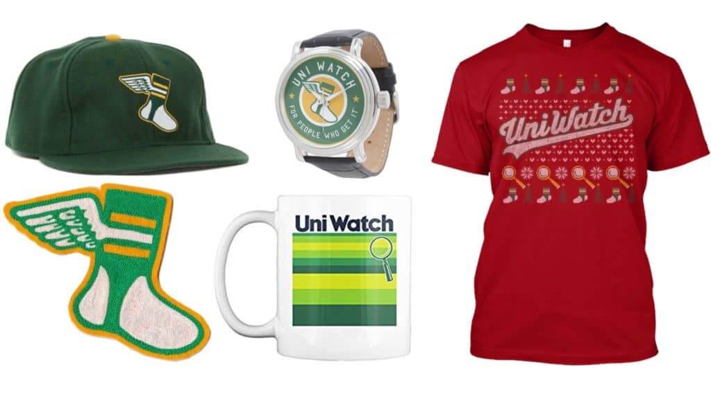
And as long as we’re talking about merch: I’ve updated the Uni Watch Merchandise page so you can see all our current product categories at a glance — perfect for your holiday shopping. Check it out here.
Also: The Uni Watch Teespring shop is no longer carrying Naming Wrongs shirts. Hopefully this will make it easier to shop for the Uni Watch items without slogging through all the Naming Wrongs stuff. (The NW items are still available in the Naming Wrongs shop, and the 15% discount for Uni Watch membership cardholders will work in both shops.)
The Ticker
By Jamie Rathjen

Baseball News: One of the Marlins’ new uniforms appeared on their Arizona Fall League team, and here are the blue alternates (from multiple readers). … Japanese Central League team Chunichi Dragons released their uniforms for next season (from Jeremy Brahm and @GraveyardBaseball). … The Indians will be unveiling some tweaks for next season this morning.

Pro Football News: From the CFL division finals: The Hamilton Tiger-Cats added a yellow stripe to their helmets, as it was reported they would last week, and also wore yellow pants. The Calgary Stampeders wore their alternates (from Wade Heidt). … Reader John Elbertson sent us an Eagles concept.
College Football News: Time for a mini-Sunday Morning Uni Watch: Hawaii wore a No. 65 decal for former guard Vince Manuwai, who passed away this month (from Rob DeMello). … Old Dominion wore a helmet tribute to their stadium, Foreman Field, which is being rebuilt for next season (from @MonarchUnis and Blaise D’Sylva). … New helmets for the FCS’s Bethune-Cookman (from @Trent_PhD) and Georgetown (from Emory Hunt). … The Canadian junior champions, the Saskatoon Hilltops, defended their title and broke the trophy, the Canadian Bowl (from Wade Heidt). … Here’s a maker’s mark you don’t often see: The NAIA’s Saint Xavier (Ill.) University wears Rawlings (from Casey Wieder). … Seeking a change in fortune, Indiana wore powder blue in the 1958 and 1959 seasons (from @MaroonHoosier).

Hockey News: This is an entire Franken-uniform for Sabres winger Jason Pominville, who reached 1,000 NHL games this weekend, split between the Sabres and Wild. The Sabres half is the 2018 Winter Classic uniform. … Ryan Wetstein tells us that every time the WHL’s Portland Winterhawks and Seattle Thunderbirds meet and the game is on TV, it’s color-vs.-color. … Reprinted from Saturday’s comments: the WHL’s Kootenay Ice wore throwbacks to the Cranbrook Colts, a team that existed in the same city at lower levels of junior hockey from 1971 to 1998 (from Wade Heidt). … Also from Wade: Three mascot-ified versions of former Canucks raced around their arena wearing uniforms from their respective eras. … Here’s how the Bruins equipment staff fits the NOB of center Jakob Forsbacka Karlsson on his jersey (from Amol Yajnik). … Michigan debuted navy script alternates (from @netillaman).

Basketball News: South Florida radio announcer Jim Lighthall tells us that their men’s team wore black yesterday for the first time in 20 years. … Hawaii wore throwbacks last night (from Charles George). … Iowa debuted grey alternates with TNOB on Friday. … Much like many Polish soccer teams are visually comemmorating the 100th anniversary of the country’s independence, so are Latvian basketball teams Ventspils and Valmiera for Latvian independence (from Reinis Lācis). … The University of Illinois at Chicago’s arena, long known as the UIC Pavilion, is getting a corporate name (from Tim Shriver).

Soccer News: A new USL League One team in Madison, Wis., is called Forward Madison (from Josh Hinton and Jerry Nitzh). The team also made a sarcastic logo explainer (from @BorchertField and Mike Nessen). … Arsenal’s women’s team wore their third kit against Everton, creating a rather bizarre blue-vs.-blue matchup between teams whose primary colors are blue and red. … England’s Women’s Super League was also the first to begin the Rainbow Laces campaign (see Thursday’s Ticker), which runs for the next two-plus weeks. … Northern Ireland had a tribute to long-serving kit man (i.e., equipment manager) Derek McKinley, who held the role from 1981 to 2011 and passed away this week, before yesterday’s UEFA Nations League game against Austria. … Also from Josh: New third kit for Danish team FC Copenhagen. … Also-also from Josh: Here’s a graphic showing 40 years of Barcelona shirts. … Still from Josh: During last week’s England/U.S. friendly, England goalie Jordan Pickford turned his water bottle into a cheat sheet on potential U.S. penalty takers. … Puma extended its contract with Borussia Dortmund until 2025 (from Ed Żelaski). … Tennessee’s women’s team have checkered shirts and wore them in the NCAA tournament. They’re solid white on the back.

Grab Bag: New kits for Russian volleyball team Zenit Kazan (from Jeremy Brahm). … Here are next season’s kits for all the teams in Major League Rugby, a new North American rugby union competition that started this year. For some reason the teams aren’t labeled in the pictures, but the article is in alphabetical order by team: Austin; Glendale, Colo.; Houston; New Orleans; New York; San Diego; Seattle; Toronto; and Utah (Salt Lake City). … Several new kits appeared at field hockey’s women’s Champions Trophy in China, including white/black for Japan, dark blue for Australia and red for Great Britain, and white/blue for Great Britain. … The girls’ volleyball team at Paradise Adventist Academy — a school in the middle of the Camp Fire in California — was given new uniforms and other gifts by the school they were playing on Saturday night, Forest Lake Christian (from Tris Wykes).
Paul,
I’ve noticed the line leading has been different the past few days between the lede (looks normal) and all other sections (scrunched). Anyone else mentioned anything? Using IPhone IOS.
[just sharing. Not complaining.]
I haven’t noticed this. Are you viewing on mobile or desktop?
We have changed the network we’re using for the ads between the sections, so that could be the cause. If you can email me a screen shot (plukas64@gmail.com), that would help me troubleshoot it. Thanks!
My entire ticker is on a dark green background with black text and blue hyperlinks. Very hard to read. And the sections are all squished together. Was like that yesterday too. I am using Safari on an iPad.
same here. Using Chrome on an Android phone. looks normal on the laptop
Try it now. Any better?
Yes – on mobile, but I had the same issues as the others (green section and compressed spacing). Fixed in mine.
Try it now. Any better?
Sorry I did not get back to this until now. But, yes, it is back to normal now. Thanks, Paul.
Try it now. Any better?
I noticed the weekend type differences, but chalked it up to you working from the road. Today’s is back to normal. .
Yeah, looks normal to me now.
Phew! Glad my troubleshooting worked!!
When I try to use firefox to load your site on my iphone, it just flashes black and white until I get a message that I’m blocked from attempting to access your website. I think it’s trying to load many times and thinks I’m trying to hack you or something.
Also, the Cleveland baseball team is not just announcing tweaks, but also a new alternate at 10AM.
This is happening to me as well.
Try it now. Any better?
Try it now. Any better?
YES!!! It looks just like the desktop site. Thanks for whatever you did!
Are the Falcons’ uniforms (which I love) from yesterday really throwbacks? When they wore black jerseys with the black helmets in the ’90s, they wore gray pants. When they previously wore white pants with black jerseys from 1966-70, they wore red helmets. Seems like the set they wore yesterday is a fauxback set.
Definitely fauxbacks. Or, more accurately, a mashup of different year styles. The jersey/pants are basically their 66-67 unis, except back then they wore the red hats; the black helmet (which, due to the one helmet rule, is all they can wear) is basically the style they wore from 90-02. So fauxback or mashup is probably more appropriate than literal throwback, yes.
I really would like the Indians tweak to be adding a white outline to their generic C logo. At least it’ll look a bit better.
The block C is so boring and generic. Not sure why anyone would think this makes a good cap logo, let alone the primary logo by which they are identified. Still think they should go back to their C from the 20s and 30s:
link
Then come up with a new primary logo based on the crest found in the city flag.
I always liked it because it reminded me of an old school felt applique to a hat that doesn’t look too different from what it would’ve fifty years ago.
This. A thousand times. This.
“Boring” is a subjective judgment, so there’s really no arguing with it. And it’s a perfectly defensible opinion, provided that the person expressing it is previously on record expressing the aesthetically consistent opinion that the Cleveland Browns are also boring and therefore inappropriate for the city of Cleveland.
But “generic” is a less subjective judgment. It’s a word with a precise definition. A fair definition of “generic” might be, “characteristic relating to a class or group of things; not specific.” So, if the block C is generic, then one should be able to point to a class or group of other logos that closely resembles the block C. Where are these other logos that look like the block C?
Most of the time, when people call the block C “generic,” they actually mean to call it “ugly” or “plain” or “boring.” Fair enough, but please let’s say what we mean.
A lifelong Tribe fan, I’m surprised they revived the ‘80s Block C. I prefer it a million times over Wahoo, but am not moved by not. I did like their “script I” caps a few years ago. I wonder why those didn’t “poll well.”
That Forward Wisconsin crest explanation is fantastic.
“Forward,” by the way, is Wisconsin’s single word state motto.
A great graphic, and a very Madison treatment of the whole over-hyped logo “storytelling” thing. And as long as I’ve been preaching the virtues of pink as anunderused team color, it’s great that a team I plan to root for adopted such a bold pink and blue color scheme.
A primer on the signficance of the flamingo in Madison from the local historical society: link
The plastic flamingo is the city of Madison’s official bird (enacted by the city council in 2009).
Further to the WHL’s Kootenay Ice wearing the throwbacks. Sad situation for Cranbrook fans. Rather than throwing back to a team that played in lower levels of junior hockey like this weekend, they may be watching one for real in the near future.
Rumours are hot and heavy for the Kootenay Ice relocating to Winnipeg:
link
Re: Saints wearing white throwbacks
Agreed with most of this community, they look great. They should adopt full time, and a black equivalent.
The problem with their regular look- i.e. the mono black, its looks sloppy and dreary, very much matching the Superdome in general, which has to be one of most poorly lit stadiums in the league. You can barely see the crowd, with the exception of the smiling fans after PAT’s, and unfortunately the stadium is so linked to hurricane Katrina.
Love the white Saints throwbacks. I just wish the helmets were a darker gold to match the jersey numbers and stripes.
Wait; is Reid #34 or #22 in that picture? He was either really huge or really tiny at age 13, so I’ll assume the former….
Read Eisen’s caption! Pretty well answers that question.
Oh, OK, I get it now. I didn’t read it that way the first time.
Has there even been an explanation how the mono (same dark jersey and pants) look became popular in the NFL, and also why teams stopped wearing contrasting socks (whether going mono or not)?
I really don’t get where people think this is a good look, especially in the case of something like Carolina’s mono-black look, where the silver helmet appears completely out of place. Contrasting pants are a staple of so many classic uniforms. I sort of understand the reasoning behind move to all the odd jerseys, which are based teams coming up with designs for merchandise sales vs looking good, but that really doesn’t apply to the pants.
Players were lobbying their coaches for it. As I recall, the Bills were one of the first teams to do it.
I miss UW Sunday.
My god, Phil took one weekend off — give him a break!
I’ll take that Panthers/Lions matchup over a mono-white v. mono-black game anyday- sure, contrasting socks would’ve made Carolina’s uniforms pop a little better, but otherwise the game looked fine on TV during the action and was just different enough to get my attention. The Baltimore/Cincy game was far more offensive to the eyes, imho – too much black on the screen during gameplay.
A light helmet team should never go mono darker. The chargers and panthers looked horrible. The helmet should ALWAYS match one of the other uni elements in the pros. At least at home. Teams that only have one set of pants (Pittsburgh) get a pass.
I get it- similar to avoiding the ‘Northern Lights’ look when wearing a sportcoat, but the Panthers have enough black in their helmet (the logo takes up a sizable chunk of either side even without the center striping) that it didn’t really stand out as lighter during gameplay to me.
I think the two games in questions go down as two of the possible worst looking games possible in the NFL (It would be an interesting top 10 countdown (maybe bottom 10 would be a better way to phrase it)
looks like the Indians chose the “let’s go as bland and uninspired as possible” route
wonder if they are waiting for Nike to do a completed overhaul
This photo of Ben Roethelisberger near the start of the game shows his stripe under his nose guard.
I wonder if he took a shot to the helmet–on the trap door–that might have made the end of the tape pop out.
???
link
Here’s Cleveland’s uniforms for next year.
link
I was watching the Bears Vikings game last night, and as a Bears fan, I haven’t been in love with the orange alternates. Something just looked off. I think if they wore them with navy pants they’d look a lot better but I can’t tell if that’s just me.
I think they’d be better with orange socks instead of navy socks.
agreed.. i think the orange over blue would have made it a great look
I actually really liked it as a night game. Against Minnesota, I don’t think navy pants would have solved the issue. The orange socks totally would have made it.
Bears got it exactly right. Home game=white pants. Orange socks would be too big a commitment to orange. Navy socks match the helmet. Perfect.
That’s what I thought while watching the game but Paul’s suggestion of orange socks really made me think…
I really like the red bill/navy crown Cleveland cap, but those red jerseys with the blue wordmark look like a batting practice jersey. And the midnight navy/block Cleveland road alternate is just objectively bad. This would’ve been a perfect place for a complete redesign/rebranding. Maybe that’s coming with Nike. One can only hope.
Hopefully. I like the new red alternate. I thought that Cleveland was moving away from the red and seeing the new jerseys give me hope that the red will be kept, if and when there is a redesign.
The Block Cleveland on both road jerseys actually makes a ton of P.C. sense, completely remove all offensive references from the road uniform. I actually prefer it from an aesthetic standpoint as well.
Yeah. It is a really nice uniform, even if it is very plain. The question is whether they’ll keep it. I like the blue much better than the greys. We’ll have to see how often they’ll wear each.
The eagles have worn a dark jersey in 9 out of 10 games so far. They still have 3 home games and away games against the Cowboys and the Rams… so they could conceivably end up only wearing white twice this season. Is that some sort of record?
That could be a record for wearing white.
The Chargers wore their blue jerseys for only one game in both 1981 and 1982 (strike shortened), then not at all in 1983 (I assume it was still an option, as the blues did return to the field in 1984).
It’s a lot easier to wear white for every game than not at all. If you choose to wear white for every home game, there is a chance that none of you road opponents will make you wear dark. This is why teams like the cowboys rarely wear blue. But since most teams do not wear white at home, it is highly unlikely that you will wear your dark jerseys for most of your road games.
For NOT wearing white ;)
Panthers looked great yesterday, idk what you’re talkin about
I didn’t say the Panthers looked bad. I said the *game* looked bad. Black vs. grey is awful.
That’s true. I’ve actually liked most of the Panthers new combos. To me, the Lions unis have been a major letdown this year. It seems like every week there’s a better option than the one they wear.
>> The Bears wore their orange throwbacks<<
Those orange jerseys aren't throwbacks, they are just orange versions of the current home home jersey. They don't
"throwback" to any past uniform. (This is perhaps a minor technical quibble, but this sight is about nothing if not engaging in the finest details of sports uniforms…)
Not a minor quibble at all. They’re alternates, not throwbacks.
Well you could definitely say that they are throwbacks to the orange alternates that they wore from 2004 to 2011. They did not wear them from 2012 through 2017. Maybe that isn’t long enough ago to count as a throwback in your book, but technically it IS a throwback to a uniform they previously wore, then stopped wearing.
A day late commenting, but I agree completely about the 1969 baseball unis. What a year for uni-drooling…
-Jet
famous PP and K competitors include:
Wade Wilson: Quarterback for East Texas State Univ. and now Quarterback coach of Dallas Cowboys
Andy Reid: Head coach of Kansas City Chiefs
Kendra Wecker: WNBA player
Chad Kelly: Quarterback for the Ole Miss Rebels
Mike Gminski: Center for Duke University and New Jersey Nets of the NBA
Pat McAfee: Former Punter of the Indianapolis Colts and now CEO of Barstool Indy
On May 1, 2017 it was announced that the NFL Punt, Pass, and Kick competition would be terminated after 56 years. The NFL is seeking other avenues to reach youth football players.
“The NFL is seeking other avenues to reach youth football players.”
Jersey sales?
play station
Man, Miami’s blue alternate looks like a high school jersey, or a very boring BP jersey. I really wanted to like these, but the swung way too far into the “too simple” category for me to. And people will say, “but the Yankees are simple and not boring, same with Chicago and the Red Sox”. There is a fine balance between simple and classic, and too simple. The alternate looks like they went with the cheapest no frills option from a catalog and the roads and home look like they forgot that they were supposed to be bright and colorful…
Interestingly enough I saw a post on social media that made the Marlins red look more pink on the jerseys. Has anyone else seen this?
As expected, the Cardinals unveiled new alternate powder blue jersey. What I did not expect, is it is a Saturday road alternate. I am glad to see they are keeping the blue on the road, as it was originally used.
Fortunately powder blue jersey AND pants. Baseball teams look so much better when their tops and bottoms match.
For the life of me, I don’t know why Nike doesn’t make every Carolina Panthers’ jersey look like Newton’s, with the full, UCLA-style loop around the arms. The other ‘rainbow’ stripes look stupid to begin with, but considering the Panthers have two different styles on the field at the same time, they’re downright embarrassing.
Oh, and those Lions mono-gray uniforms are among the worst, EVER, in any league. Period.
SportsLogos is better. Jewish asshole