A few weeks ago I explored the topic of whether throwbacks and older uniform designs were really better than current designs by asking a simple question: “How many teams’ current uniforms are their best uniforms ever?” I began by answering that question for all 30 MLB teams. Today we’re going to turn our attention to the NFL.
One ground rule, which I alluded to last time: I preferred football uniforms when the jerseys had sleeves, but that’s more of a performance/style issue, not a design issue. So I’m not going to hold today’s tailoring styles against today’s uniforms. I think it’s entirely possible (if not common) for a modern uniform with almost no sleeves to look better than one from 30 years ago, when the jerseys had sleeves — it all depends on the overall design.
Again, here’s our operative question: Is the team’s current uniform set — for the sake of this exercise, we’ll stick to primary whites and colors — the best the team has ever worn?
Here’s my team-by-team answer to that question:
NFC East
Cowboys: Yes, but it’s an old design that they’ve been wearing for decades.
Eagles: No.
Giants: No.
Washington: Yes, but it’s an old design that they’ve been wearing for decades.
NFC North
Bears: Yes, but it’s an old design that they’ve been wearing for decades.
Lions: No.
Vikings: No.
Packers: Yes, but it’s an old design that they’ve been wearing for decades.
NFC South
Buccaneers: No.
Falcons: No.
Panthers: Yes, but it’s the only design they’ve ever had. I guess you could say that some of the new mix/match combos they’ve worn this season have improved things, so that would be sort of like being a “Yes” with a new design.
Saints: No.
NFC West
Cardinals: No.
49ers: Yes, but it’s essentially an old design that they moved away from and then revived.
Rams: No.
Seahawks: No.
AFC East
Bills: Yes, but it’s essentially an old design that they moved away from and then revived.
Dolphins: No.
Jets: Yes, but it’s an old design that they moved away from and then revived.
Patriots: No.
AFC North
Bengals: No.
Browns: Hahahahahahaha.
Ravens: Yes, but it’s essentially the only design they’ve ever had (the short-lived “lawsuit logo” helmet design notwithstanding).
Steelers: No.
AFC South
Colts: Yes, but it’s an old design that they’ve had forever.
Jaguars: No.
Texans: Yes, but it’s the only design they’ve ever had.
Titans: No.
AFC West
Broncos: No.
Chargers: No.
Chiefs: Yes, but it’s an old design that they’ve had forever.
Raiders: Yes, but it’s an old design that they’ve had forever.
———
So from my perspective (which I realize may not necessarily match yours), not a single NFL team is currently wearing a new or new-ish uniform set that qualifies as its best ever. The only one that sorta-kinda comes close is Carolina, which has sort of reinvented itself this season with some new mix/match combos, most of which I think have been net positives.
Most of the other teams fall into one of four categories: Either their current look sucks (Falcons, Cardinals, Browns), or they got it right decades ago and have been smart enough to stick with it (Packers, Colts, Raiders), or they got it right, then veered off-course, and then saw the error of their ways and righted the ship (Jets, 49ers, Bills).
So again, the reason throwbacks often look better than current uniforms is that the older designs are better than the current ones. At least to me.
I realize many of you may disagree. Once again, feel free to debate any or all of this in today’s comments, but with one condition — for today, please restrict the discussion of “Is the current uni the best uni?” to the NFL. We’ll cover the remaining Big Four leagues shortly.

Click to enlarge
Cast a shadow in my direction: We have lots of stray cats in our neighborhood, and a few of them will occasionally visit our porch. This one, which the Tugboat Captain has named Jackface, stopped by yesterday morning, casting a silhouette on one of our (very dirty) living room windows. A nicely spooky way to start the day.
The Ticker
By Yianni Varonis

Baseball News: Yesterday there were multiple sightings, at different locations, of the same design that could be the Marlins’ new logo (from multiple readers). … The Cardinals may be hinting that they’ll wear powder-blue throwbacks next season, and this writer isn’t pleased. … From Phil, here is a short video on the evolution of the Cardinals’ logo … Amateur teams adopting logos from the professional ranks is common, especially if the club is local. But Chipola, a Junior College in Florida, used not one, but two professional logos from Cleveland—the Indians’ Chief Wahoo and the Cavs’ “C,” in its baseball national championship rings (from Matt Burgess). … Speaking of which, here is a photograph of a baseball recruit whose high school mimics the logo of the college (BYU) he is signing a letter of intent to play baseball for (from Matthew Salt). … The Green Bay Bullfrogs, a collegiate, summer league baseball team, will now be renamed the Green Bay Booyah and have new colors and logos (from local reporter Brian Kerhin). … Here’s a piece on the history of Korean baseball team names (from @wetcasements).

NFL News: The Seahawks will go mono-navy against the Packers tonight. There had been some speculation that they might wear their neon alternates. … Recently acquired Saints WR Brandon Marshall will wear No. 15 for his new team (from Mike Chamernik). … Steelers players raided the locker of former teammate Le’Veon Bell, who will no longer report to the club this season (from our own Brinke Guthrie).
College Football News: This Sports Illustrated article asks, “Why Does Notre Dame ever deviate from its iconic uniforms?” … Virginia Tech will go mono-maroon this week vs. Miami (from Andrew Cosentino). … In another example of sports word-art, this piece is an on-campus tribute to the victims of the Marshall plane crash that killed 75 players, coaches, boosters, and administrators 48 years ago yesterday (from Brice Wallace). … Good interview with a former football coach who now makes mini-helmets of high school teams (from Hayden Kyle Barber). … Here are this week’s uni combos for Air Force and Baylor. … Ohio RB AJ Ouellette scored a touchdown last night while wearing one shoe.

Hockey News: Michigan Tech will wear “Copper Country Strong” jerseys on Nov. 23, with the jerseys being auctioned off to benefit the victims of devastating floods that took place earlier this year. All the jerseys will have the nameplate “Thatcher” to honor Thatcher Markham, a 12-year-old boy who died in the floods (from Dave Ellis). … The Blackhawks’ home ice still has the season-opening “NHL Face-Off” logo, which other teams have removed. … Here’s an old shot of Queen frontman Freddie Mercury wearing a Canadiens cap (from Alan Kreit).

NBA News: From Phil, the Thunder debuted their new Native American-themed alternates last night. … Also from Phil, here’s the schedule for the Lakers’ City alternates. … Also in the baseball section: Amateur teams adopting logos from the professional ranks is common, especially if the club is local. But Chipola, a Junior College in Florida, used not one, but two professional logos from Cleveland—the Indians’ Chief Wahoo and the Cavs’ “C,” in its baseball national championship rings (from Matt Burgess). … Nets G Spencer Dinwiddie wore sneakers that paid homage to Stan Lee, the late comic book legend (from Mike Chamernik). … The Suns’ gorilla mascot and cheerleaders went G.I. Joke last night (from @NerdDadAZ).

College Hoops News: North Carolina State will rename Reynolds Coliseum “Valvano Arena” after former men’s basketball HC Jim Valvano (from Andrew Cosentino). … Amazingly, Nebraska has four starters who have JrOB (great catch from @Edsidemanor).

Soccer News: English Premier League clubs will support the LGBT community by featuring multiple rainbow-themed pitch and uniform elements during games between Nov. 30 and Dec. 5 (from Mark Johnson). Here is a list of other participating leagues (from our own Jamie Rathjen). … Which teams have worn the most kits in a single season? Look here (from Mark Coale). … New uniforms for the Kansas City Comets of the MASL (from Marc Viquez). … Adidas has accidentally revealed the ball for the 2018 Club World Cup and the 2019 FIFA Women’s World Cup (from Josh Hinton). … Like other Polish teams, Lech Poznan will wear a jersey commemorating the 100th-anniversary of Poland’s independence (from Ed Zelaski). … An English referee has been suspended for using a game of rock/paper/scissors to determine which team would kick off a women’s Super League match after he forgot the coin he was supposed to flip (from Alex Hider). … Manchester United MF Marouane Fellaini has cut off the afro he’s famously worn for more than a decade (also from Alex Hider). … Steve Ramsey has been traveling in Ascoli Piceno, Italy, where there’s been an exhibit of uniforms worn by the local soccer team, Ascoli Calcio, which plays in the Serie B Italian league. He took a bunch of photos. “What interested me was the evolution of their logo, and their mascot — the woodpecker,” he says. “Ascoli was settled six or seven centuries BC (way pre-Rome) and legend has it that the Piceni people were led to this area by a woodpecker.”

Grab Bag: Amid the wildfires that have devastated communities throughout Northern California, there have also been countless acts of kindness, including a local high school that sought donations to pay for an opponent’s volleyball uniforms and gear before a playoff match. … The North Melbourne Australian-rules football club will celebrate its 150th anniversary with a commemorative uniform featuring elements of the club’s past eight logos. More photographs here (from Will Pike). … For the next six months, American Airlines will field test flight-crew uniforms from its new vendor, Lands’ End. … Louis Vuitton will now let you customize its menswear and sneakers for the first time.
Interesting that the new Marlins logo says the city name instead of the team name.
Having that new Marlins logo next to the Brewers logo really shows how the Marlins M is like a mirror image of the Brewers M. Of course the Brewers have that little flourish on top, but other than that they’re very similar
I guess if Brewers ever officially go back to ball and glove it eliminates the comparison.
I think that new logo looks 100x better than what was circulating as the leaked logo. Still not a great logo, but not as bad as I was expecting.
This logo I would guess is the primary and the leaked logo I think you are talking about I would guess is the cap logo (Marlin+M). Which makes me ask…. 100x’s better? How? They both contain the same elements, one just has the rest of Miami spelled out and some baseball laces.
Exactly right. Notably better than what we’ve previously seen. But still pretty terrible. It’s not just that I find it subjectively ugly. In several important criteria of objective quality, it fails. The type has poor legibility. Every aspect of the logo relies on fine details that don’t scale well. The design of the fish defies the well-known visual form of a marlin. The placement of the logo’s elements obscures the legibility of the middle vowels of the word “Miami”. The size and orientation of the color highlights make it difficult to resolve which colors are used in the logo. Similar elements of the fish are defined by the presence and the absence of outlines and the presence and absence of contrasting color.
In almost every case, details of the newly leaked Marlins logo appear to have begun life with a good design idea turned into bad execution by decisionmakers who lack competence with design. I’d almost guess that someone highly involved in team leadership had the resources to hire a team of good designers and the unwarranted self-regard to wreck their work with pettifogging interference.
There’s a much more in depth article to be had here. For the teams where you’ve said the current look isn’t the best I’d love to know which ones you feel were the best. I’m an Eagles fan so the Randall Cunningham era Kelly greens are absolutely the best they’ve ever worn
I agree. I also agreed with most of those choices. It might be fun to do a poll on the weekend to decide what are the best uniform eras. I’ll admit I have to vote for the current Steelers uni set as their best. A lot of Pittsburghers like the block style, but the switch up of numbers has had a good deal of success associated with them. They’re a font unique to the Steelers and they look good, so I’d vote them the best set in their history.
I’m sort of indifferent on the numerals, my biggest issue is with the logo patch on the chest. No need for it, just adds clutter, they’d be better off dropping that and putting with wordmark bellow collar.
I’d go a step further and say no wordmark either
Much as I love it when the Redskins wear white jerseys and burgandy pants there is NO WAY their current set is better than what they wore in the 1960’s with the spear logo helmet.
I’m not an Eagles fan, but I agree with you on those being their best uniforms.
I like the Vermeil/Jaworski-era sleeve stripes and silver-trimmed numerals.
I think the current design is good, just need some color swapping. Put kelly green in there, emphasize silver more than black and it would be great. Sort of indifferent about their custom font, isn’t great, but I can live with it.
Question. Does OKC use a Native American designer for the homage uniforms? Reason I ask, is that I follow Australian National Rugby League and Australian Football League and they use aboriginal designers for their homage jerseys. I think it would be awesome to have a Native American artist or designer do the OKC, or any other team, design.
I don’t know if they used a Native designer, but I do know they consulted with local tribes.
I thought I read that one of the designers was actually Native American, but that might not be the case.
Me too, but they didn’t ask me, that much is for sure.
Of course when I see turquoise I think of my Abuela’s collection of over the top jewelry including some outrageous necklaces. Now that would look great on a uni
I know I’m in the minority here, but I like the current Giants home and away sets. I think it’s their best look, granted it’s an old design they they revived.
My only complaint with the current Giants set is the red socks and lack of blue on the white jerseys. Go with blue numbers, make the two thin red stripes blue, keeping the larger middle one red, and replicate that stripe pattern on white socks and it would be perfect. Also I’d rather see the wordmark under the collar than the NY logo, but that is less of a problem.
I never understood their current white jerseys considering how the club is affectionately known as “Big Blue”. That jersey should have some blue somewhere on it, even as an accent color.
Well, the helmet is blue. And the Giants have a link of wearing red as a primary color, from 1925-1965.
Personally, I love the Giants’ current road uni. The only flaws are the metallic helmet paint and, arguably, the pants stripes; I like the un-spaced ones better.
That’s probably the most popular opinion amongst fans. It would be a fine look, however I love that the away jersey isn’t just a white version of the home jersey.
The Giants in their current road uniform is a unique look that I think has become a signature look for them.
I agree, I like them just the way they are.
34 year NYG fan here. There current set is perfect (was better with the gray pants). Although if they went from red to blue numbers on the road set I wouldnt complain.
Agree with you on the gray pants, Chris. Maybe because that was my first Giants’ uni and that set brings back childhood memories. (First game I attended was 1959.)
I think the Giants’ current look is adjacent to their all-time best look but it has flaws that knock it down a notch from what they were wearing in link, the closest analogue
1. metallic paint flake on the helmet;
2. blue jersey TV numerals on the shoulders with nothing on the sleeves; and
3. pants stripes.
Then again, I like the block numerals on the helmet front better than the rounded ones they wore back then.
Paul, any intentions on telling us what you think was the best designs from the teams who aren’t currently wearing them? I agree on all front except I think Buffalo looked better with the red helmets from their 90s glory days.
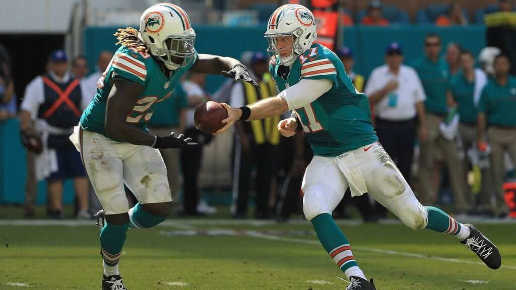
Looking at that Dolphins photo I think it really speaks to what made older designs better; keep it simple! Today’s uniforms are overdesigned for numerous reasons (to stand out, to tell a pointless story, for merchandise). It really seems in the past there was a clear idea of what a uniform looks like, they add the team colors and make minor tweaks, like stripe design. Nobody was overthinking things.
And keeping Miami as an example, they’ve made various updates to their logo (none would be a completely overhaul like say the Bucs did in the 90s), just keep the same uniform and swap in the updated logo.
Would love to but don’t have time for that today, sorry!
We’re agreed though that there needs to be a part 2?
I think I agree with the NFL uniform assessment, for the most part. A few of the classic designs currently in use (like the Packers and 49ers, for example) would be just a little better if they used striped socks, and not the mishmash of stuff today’s socks have turned into. But, that’s nitpicking.
I disagree with the writer who complained about the Cardinals bringing their ’80s road unis back. I loved them when I was a kid and I can’t wait to see them return.
I agree with the writer on many of his points, but these in particular:
– Players in the 70’s/80’s wore those uniforms form-fitting. Today’s players look terrible in pullovers that are baggie. It looks cheap.
– The Cards should NOT wear powder blue at home. It’s a road color. To me, it is jarring on the eye to see a home team sporting away uniforms.
– Not uniform related, but the writer pointed out that Busch Stadium (II) in the early 80’s had hideous mismatched artificial turf. I remember that. They fixed it late in the mid-80’s and ultimately put in grass (which looked amazing), but the era of the powder blues for the Cards was an era of really unpleasing stadium aesthetics.
I guess the Royals and the Phillies must be doing it wrong on some days! LOL
“a short video on the evolution of the Cardinals’ logo … ”
2 THINGS:
Why is it always MALE cardinals?
I imagine the “TM” has only appeared on recent versions of those old logos, eh?
Maybe because female cardinals are brown? And you had the St. Louis Browns, so…confusing?
I say every year they should skip the pastel MLB template and simply put a female cardinals on the bat for Mothers Day.
More on Spencer Dinwiddie (not sure if this is well-known around here, but just in case).
He has his own shoe brand instead of signing with someone else. He wears different shoes every game for different causes. He wore Prince shoes in Minnesota, Univ of Colorado shoes in Denver (his Alma mater), and so on. You can see them all on his Instagram:
link
Great intel. Thanks for sharing.
Loved the Stan Lee tribute concept, but I don’t love the execution.
The NFL is a case where it’s important to distinguish between form and content. NFL uniforms have changed significantly in form this century. So even as a few teams have maintained their uniform designs with little change (each team’s look is the content here), the appearance of their uniforms has changed significantly in the last two decades. Anecdotally, it seems like most people who remember the 1980s prefer the older form of football uniforms, with their longer sleeves and broader surfaces that allowed for the clear repetition of dominant design elements. So take the Packers, are they currently wearing their best uniforms? Not to me, since although the content of their unis has remained consistent, the form has changed for the worse. Show me a picture of a Packers player from the 1960s next to a photo of a current player wearing the same uni combo, and I’ll take the vintage uni every time. The Packers’ uni was designed for and works better on the older form of NFL uniforms.
It seems likely to me that my own general agreement with Paul’s list stems as much from the changing form of NFL uniforms as from the content of any individual team’s designs. Some teams seem to design new uniforms as if the form of the uniform has remained unchanged since the 1960s, and these designs usually fail because they fit the form of current uniforms. A few teams have tried to design for the modern uni form, and I tend to find those designs unsatisfying because I dislike the modern form of football unis. It’s like, I know from personal experience that a 2016 Honda Civic is a superior automobile in every conceivable way to a 1957 Chevy Bel Air, but there’s just something about the shapes of mid-century American cars that I love. So you could apply the most mediocre paint scheme to the Chevy and the most beautiful, original paint scheme to the Honda, and I’ll prefer the look of the Chevy every time. For me, at least, I feel like there’s a lot of that form vs content issue going on with my preferences among NFL uniforms.
Ignoring their number font, I think the Vikings are a team that particularly suffers from this phenomenon. If I weren’t so averse to the shapes and lines of modern football uniforms, I think I’d probably like the current Vikings unis better than their vintage duds. The current design adapts well to the shapes and lines of the current unis. The content is good, maybe even excellent (again, ignoring the numbers), but great content within a crappy form will always seem crappy to me.
link
A Tucker! What a beauty. I think about that car every time I steer around a curve at night in my late-model generic SUV, which has headlights that shift with the steering. Only took like 60 years for the big auto makers to adopt that particular Tucker innovation!
If you get a chance, visit the American Automobile Club of America (AACA) Museum in Hershey, PA. They have a huge collection of Tucker memorabilia, including three of the cars.
For the most part I agree with Paul’s list.
My one minor disagreement is with the Dallas Cowboys. While their white jerseys are basically the same, the team’s navy jerseys (while they’ve been using them for a while) are pretty significantly different from the blue jerseys they wore in past decades. I think those were a better look since they were just blue versions of the white jerseys while the current navy jerseys have that weird white outline around the numbers and the different stripes with the star.
Also, I think for a while in the 80’s the blue jerseys had silver numbers, right?
Agreed, I prefer the 70s-era blue jerseys to the current ones. (And some photos do suggest they briefly had silver numbers with white outlines, but I don’t remember them.)
They had silver numbers on blue jerseys in the late 80s up until Jimmy’s last year coaching.
I disagree about the Cowboys too.
They got it right out of the box:
link
They veered off course decades ago.
Given the criteria that the list was based on the teams’ standard home and road uniforms, you could almost call the Cowboys’ blue jerseys an alternate. Their standard home jersey is white, their standard road jersey is the same, and they almost never wear blue.
The Cowboys first navy jerseys did have really bright silver numbers with kind of thick white outlines for about half the 1981 season, but they were so hard to read in bright light that they changed to more of a gray with blue and white outlines. That lasted through the 1994 season.
In 1985 they wore the blue “modern double star”, and then changed to the current navy jerseys in 1996 – the longest they have worn any blue jersey style.
Damn – typo. They wore the blue “modern double star” in 1995, not 1985.
Washington’s best uniform was the spear helmet with the dark burgundy and gold (not yellow) pants. Unfortunately it has the stink of Spurrier.
The throwbacks they will wear this week are the basic uniform, but no spear logo and the helmets won’t match thanks to the NFL’s helmet rule
That spear-y helmet had the stink of losing on it long before “the Ole football coach” lost in them. That is why when Vinny the Lombardi came on board he changed the uniforms, and set the For*skins on a different path.
“For*skins ”
Me: *starts doing the George McFly laugh*
.
.
link
Lombardi didn’t change the uniforms to remove stink, he changed the uniforms to make them look exactly like the Packers. Burgundy became red, gold became yellow, spear became an R in a circle. Then he died but the ugly uniforms remained, with the R in a circle eventually giving way to the indigenous man in the circle.
link
Preston is correct: Washington’s best uniform was the burgundy and gold with the spear helmet.
Your story about the cat really pains me. I take it they are feral. Not sure how big of a problem it is but they do have programs where they will come around and capture some of these cats and spay/neuter them and then release back out. Eventually, the “herd” gets thinned out in a natural, humane fashion.
Life outside is not a good life for these animals not to mention birds and other small mammals that will be their prey.
I don’t understand why you’ve not tried to justify your preference for the old unis. If you ask me, your stance that there’s no uni versions better than the originals is strictly a case of familiarity bias that has nothing to do with imaginative, creative rebranding.
As a kid growing up in the northeast, I hated watching the Eagles and the Jets games because they both wore the same bland green. The Eagles move to midnight green was a fantastic creative rebranding. The Eagles have their own unique color that is much more dynamic than the lame Kelly green. However, there is the issue of what exactly is midnight green because it has changed since it’s introduction in 1999. Originally it was closer to a forest green, but is now currently a dark teal. I do prefer the original midnight green to the current one, however, this is the one that will always be associated with their first SB.
I love retro unis as much as the next guy, but I really have a problem with the stodgy view that ‘the version I grew up with is still the best’. I mean, c’mon, the Dolphins new logo is so much cooler than that goofy dolphin with a helmet.
One last thing: The Patriots has NEVER had good looking unis. Period.
The fact that you’re leaning heavily on the term “rebranding” indicates that we look at uniforms through very different lenses, Max. Nothing wrong with that (although I think your use of “stodgy” is uncalled for), but I think we’re going to have to agree to disagree.
As I’ve noted before, any look that a team wears long enough will eventually become a “classic”.
Eagles introduced the midnight green in 1996.
Doesn’t that assume that “imaginative, creative rebranding” is necessarily a good thing?
Doesn’t it also assume that “imaginative, creative rebranding” is necessarily better than “familiarity”?
Isn’t that a bias?
…“imaginative, creative rebranding” is neither good or bad or familiar in this case, it is in fact, specifically targeted marketing and design to the 18-35 year old demographic. Those with available coin to spend $200 for a polyester shirt. So of course the older types are gonna not like the newness, it wasn’t designed for them.
You certainly can argue that sometimes the designs are an upgrade – but the reasons for the upgrade and design changes are based on demographics, not the aesthetic – which by the way a totally different discussion – but when you nail it (Yanks, Mets home, GB, Original Rams) it is timeless.
By “Original Rams”, do you mean link?
link?
link?
Or link?
Did you also hate watching Bills and Giants games because they both wore the same bland blue?
Did you hate watching Patriots and Cardinals games because they both wore the same bland red?
Did you hate watching Steelers and Saints games because they both wore the same bland black?
Those are terrible examples
Why?
Different color helmets except pats/cards
That wasn’t part of the quoted equation.
I guess I don’t even know the equation. I think this topic is just too played out.
The thought & explaination put into today’s entry make old bleacher report articles look good.
As much as I dislike the Patriots the Steve Grogan era red unis were beautiful and I have a soft spot for the ones they introduced in 1995 with the huge flying Elvis logo on the shoulders, the Italic numbers and striped jersey.
Re: Current dolphin logo, the modern sleekness of it is better than the original (same amount of sleekness as the 1997 revision) but the design of it is lacking, in that it is no longer jumping up into the air and eclipsing the sun, now it appears to be somehow swimming in mid air in front of the sun. Additionally the helmet added an enjoyable charm. Not all good logos need the toughness aspect, and in general I think it makes for a better logo if a team can find a good way to incorporate aspects of the sport (in this case the helmet) onto an animal themed logo. This is why I prefer the 1997 revision.
Re: Paul having a old is always better bias. I don’t think you can assume that from his post. For instance, I think there is a good chance he might say the Bucs original red and pewter look was better than the creamsicle days.
Re: Eagles midnight green, if you like that better than kelly green that is a subjective call, but calling it more dynamic seems way off. It is a drab color, which is highlighted every time they wear black jerseys. From the live game action angle you can barely distinguish the color from black, I am not sure how that is more dynamic than a bright color like kelly green.
In re: the Dolphins — “Cooler”?
“Cool” changes and is highly subjective. I always found the idea of a dolphin wearing a helmet endearing, while I find the modern one reminiscent of real estate brochure clip art, and utterly forgettable.
Most of the modern “rebrandings” I find are trying too hard to justify the changes. You know what would make a uniform “dynamic” for me? A winning (or even interesting) team wearing them.
Hey, Paul. Anything to report on the New Era MUSA front? Thanks!
Not yet. Asked about it at last night’s event and was told they’d get back to me with more info today.
The only team I disagree with here is the Seahawks, their current sets are by far better than anything they’ve ever worn (no I didn’t like the Steve Largent-era ones). Speaking of the Seahawks, glad to hear they’re not wearing the god awful neon unis.
Agree (somewhat) with Ephraim. Not a Seahawks fan, but I actually loved the old Jim Zorn era color scheme. That said, as modern uniforms go, I think the Seahawks current set is very clean. (Contrast that with the current Dolphins set, which looks like a failed attempt to modernize a great uniform.)
Instead, the Seahawks used a new color scheme and some outside-the-box elements, yet it all ties together nicely. It’s OK to like the classics, but I think the Seahawks current uniform is a good one.
I’m with you there. Seattle is one of the few teams that has made the modern elements work well. I think the knock on them is more a matter of the team’s overwhelming preference for wearing mono-blue at home. That shade doesn’t work well without some contrast. If it were up to me, they’d wear blue over grey at home, mono-white on the road. They were the worst victims of the Color Rash gimmick with that nuclear waste mono-green kit, but green over white would make a nice alternate. I like the irony of a Pacific Northwest team wearing something so Floridian, and anything that sends those green pants into the deepest abyss is a good thing.
The current Seahawks uniforms are some of the few that work with the current shape of NFL uniforms. I like the old Zorn uniforms but their current set is the best.
I find posts like these depressing honestly. This site is sometimes unnecessarily reactionary. This is like the whitest site on the internet that isn’t some kind of right-wing haven.
Has it occurred to you that perhaps my opinions on uniforms are not “reactionary” but are simply my honest and sincere assessments of the designs?
Radical idea, I know.
Hahaha. I guess you don’t pick up on much of Paul’s subtext, based on what I can tell there isn’t much about him that falls under the stereotypical “conservative” banner in the way messy sociopolitical things are discussed today. That you seem to think people who prefer anything the way it was, or more accurately, people who think changes to things don’t always improve them is somehow tied to whiteness is funny to me.
I suppose this isn’t too shocking, as for some people change/progress is a virtue unto itself. Even if the change is making something worse.
Funnier still is that someone’s honest assessment and opinion on the style of uniforms can be linked to “whiteness” is such group think. Perhaps it is less a “whiteness” thing and more generational thing. As has been pointed out numerous times on this site, many people prefer past uniform designs and loathe current designs because past designs were created with the simple intention of looking good on the field, current designs are gearing towards selling merchandise based on what is trendy now, not necessarily what looks good.
To be clear, I have no doubt Paul is arguing in good faith.
The reason the whole “uniforms nowadays are bad because they’re designed to sell” is just a bit depressing isn’t because it’s in bad faith, but because it more or less presupposes bad faith on the part of designers. Designs can’t be the work of designers who are juggling the desires of clients with the desires of fans and personal pride, it’s just “oh, this is just made to sell”.
and while past uniforms weren’t intended as merchandise, they absolutely were intended as branding. the Tequila Sunrise uniforms were part of a concerted rebranding effort to make the Astros the Team of the Future, and yet they were also amazing works of design. (one of the odder trends here is that outre designs of the past get praised, while the rebranding efforts that get praised by far these days are the reactionary, small-c conservative ones)
if I had to sum up my point, it’s that design as an art has always had to coexist with the spheres of marketing and finance, and it’s still possible to evaulate design without presupposing bad faith and considering all modern work tainted
I’ve never once said anything is “tainted” or presented in bad faith.
I’ve simply said that the goals of uniform design 30 years ago and the goals of uniform design today are not the same — because they’re not! The goal 30 years ago (and prior) was to look good on the field; the goal today is to sell merchandise to a specific subset of the fan base. That doesn’t mean one goal is presented in bad faith; it just means it’s different.
Yes, obviously, designers have to respond to their clients. But the clients are asking for something different now (i.e., something salable at retail) than they were in generations past (i.e., something that looks a certain way on the field). And that has an effect on the resulting designs. Personally, I think those changes have largely been for the worse. Maybe you think they’re for the better. But either way, it’s a simple fact that the changes are there for anyone to see.
That’s all.
I really liked their original set, but it was too similar to the Lions having the silver helmet and pants with a blue jersey, which makes it hard for me to consider it a signature look if it looks really similar to a team that already has that look. I actually like a lot of the parts of the current set, navy helmet, navy jersey, and silver/gray pants is a good start. I like using the bright green accents to contrast the navy. I like the Native America design elements. My biggest gripe would be the sleeve stripes going across to the front of the jersey, as well as the lack of symmetry by having the wordmark on one side of said chest stripes. Of course the way Nike designed the sleeves to make their swoosh stand out also brings it down. I think with a few tweaks their current look could be their signature. I also say that their logo should have green on the lower part of the hawk head instead of gray.
Paul,
I expected you to give the Steelers current unis a “yes, but it’s an old design that they’ve had forever”, but you gave it a “no”. Is this due to the change in number font? It seems like a small, lateral change to me that doesn’t greatly affect the overall design. I’d love to hear your thoughts.
Great work as always!
I think their best-ever look was the Batman design.
Probably my least-favorite.
I think you’re assessment of the Browns’ current uniform is the most accurate assessment of ANYTHING, ever, in the history of Earth.
Great list, Paul. My only change would be to asterisk the Bills with a note that the standing buffalo was better (imo)
Paul, what’s the best Giants design if this isn’t it? 1935-36?
IMO, the Redskins spear and feather design and color scheme is vastly better than what they’re currently wearing. But
I prefer the Simms/LT design, mainly because the white jerseys had blue numbers and were worn with blue socks. I’ve never liked the red-centric look for Big Blue.
Absolutely agree with this which why I was kinda surprised that you didn’t rave about the Giants color rush/pseudo throwbacks. They should make that the away jersey and have done with it
The Browns current unis are so ugly I get sad every single game that my team wears those things.
I have no issue with the “hahahahaha” answer to “is this their best uni they’ve had”.
However, I think the same treatment would have been apropos for the Bengals. Their current sets are so comically bad that if the Browns simply extended the pants strip and made the CLEVELAND smaller on the chest, they’d still be better than those Bengals trainwrecks.
Not a fan of bfbs, but the half blackout with the Sailorbear has me excited!
The only deviation the Notre Dame football team should EVER have is the occasional – very, very limited bringing out of the kelly green tops or addition of the shamrock to the helmet. Other than that they should stick with their timeless look. NEVER should they have anything other than a gold helmet. PERIOD. The pinstripe jerseys and navy helmets baffle me. I get it, you’re playing in New York, but you’re definitely NOT “New York” – You’re South Bend, Indiana!!! I’m not sure how this Notre Dame association with New York even started!?!? I would understand an association with Chicago, since it’s very close but New York? Could someone, ANYONE, explain this?
The (comparatively) large Irish-Catholic population in the Northeast at the time combined with heavy coverage bred a lot of Notre Dame fans in that part of the country in the early 20th century and it’s stuck since.
The ND association in NY, and really all along the northeast corridor is due to a few things. First you had catholic and especially irish catholic populations in cities like NY, Boston, and Philly. Secondly the lack of premier college football in the northeast led the cities without a “home” team. Big cities with no top college football teams to root for, large populations of catholics (irish or otherwise), and ND at its peak several decades ago led to their popularity, which has been passed down to the next generations. That said, being a catholic living in the northeast I can’t stand ND, mainly because during most of my lifetime (in my 30s) they are considerably overrated and the legions of fans out here who keep telling me they are in the same league as Alabama, Ohio State, etc.
The following are my favorite nfl uniforms for each team:
Patriots- 1991 as they still had pat the patriot but switched to red face masks.
Bills- 1984 when they switched to the red helmets but had blue face masks.
Jets- 1990-1997 when they switched to black face masks with green helmets.
Chargers- 1984 with the yellow pants, lighter blue jerseys and helmet with the yellow face mask.
Falcons- 1984 with the red helmets and switch to black face masks.
Vikings- Early 80s Vikings when they switched to a white face mask.
Colts- 1995 when they switched to a blue face mask
Dolphins- Uniforms from the 80-90s.
Giants- Uniforms from the 80-90s.
Cowboys- Current uniforms
Redskins- Current uniforms
Eagles- 80s to 95 uniforms
Buccaneers- 80s to 95 uniforms
Steelers- Current uniforms
Packers- Current uniforms
Bears- Current uniforms
Saints- 80s uniforms
Seahawks- 80-90s uniforms
Rams- 80- 90s uniforms
Browns- late 80s to early 90s uniforms
49er- Current uniforms
Raiders- Current uniforms
Chiefs- Current uniforms
Panthers- 1996
Broncos- 80s to 1996 uniforms
Lions- Uniforms of the 80-90s
Titans- 1998 when they were the Tennessee oilers
Cardinals- 1990s uniforms
Bengals- 80-90s uniforms
Ravens- Current uniforms
Texans- Current uniforms
Jaguars- 1996 uniforms
On the Nats Facebook page this morning. The jersey is a beaut.
link
Tim –
Thanks for sharing that. The Nats new ST look would be a fine full-time home uniform. And that includes the new lid. I like the traditional “W” they use now, but having that “Dome & W” on their regular season hats would be an awesome alteration. And fixing their oversized block numerals on the front is waaaaay overdue. That team has such potential for sartorial greatness. Baby steps, I guess.
-C.
Jersey is a beaut, and the cap is terrific. I think it would work just as well with a curly W in the dome, but still. The Nats are looking likely to experience some losing streaks next year, so hopefully they’ll wear the new unis in real games when it comes time for slump-breaking changes.
How does “speculation” that the Seahawks would wear neon green make the ticker?
I spent time on Tuesday & Wednesday trying to track down what they would be wearing for tonight’s game against Green Bay.
I found nary a word from a Seattle Seahawks source about anything to do with the neon green uniforms. Every mention of it was from a fan/blogger/etc. And more like wishful thinking/wild guess than anything. Not one word from the Seahawks themselves.
Lee
The Packers are wearing the Rash tonight, so it was natural and understandable for people to wonder if the Seahawks would also wear the Rash.
The speculation part isn’t exactly what I was wondering about. Yes, it was natural and understandable for people to wonder. I wonder myself each week what every team will wear.
What is more curious to me is how this natural wondering was so strong this week that it became ‘news’ (and I don’t mean just on this site), despite the Seahawks themselves having literally put out no information (that I could find, I looked) indicating they were even considering the green.
I will allow that the last 2 times they played on Thursday, they did wear green.
Just the whole cycle is vaguely interesting to me.
Lee
The hawks color rush looks awful…maybe they’d be better with a helmet change…link
Steelers: Current (yes, even with the italicized #s)
Ravens: 1996 with the old helmet, black pants, and old # outlines
Browns: 90s-early 00s with white facemasks and white pants all the time
Bengals: 80s and 90s
Titans: Early 00s when they wore navy with white more often
Jaguars: Inaugural 90s uniforms
Colts: Blue facemasks
Texans: Better when they were the Oilers, but their one red jersey/blue pants combo is their best by far
Patriots: Current, or at least prior to Nike ruining their collars
Jets: 90s with green helmets
Bills: 90s with Red helmets/white masks and royal jerseys
Dolphins: early 90s with aqua facemasks and no navy outline on the #s
Chiefs: Current
Raiders: Current
Broncos: Early 00s when they wore navy more often (navy/navy is their best combo)
Chargers: Current
Bears: Current
Packers: Current
Lions: 90s/early 00s with blue masks
Vikings: Current (though they’d do well to go back to their prior helmets with the purple masks)
Saints: Current (I like the black/black combo best, gold pants with white jerseys)
Bucs: Prior set with pewter (creamsicles overrated)
Panthers: Older logo was better
Falcons: Their current fauxback with the old logo/white pants is their best look ever. So the previous set is their best, but could do with white pants instead of silver
Eagles: Current
Giants: early 00s with the NY helmet logo but before they went red-centric with road unis
Cowboys: Current
Redskins: Late 60s with the FSU spear helmet
49ers: late 90s/early 00s with the red mask
Seahawks: Previous set wit the gunmetal blue helmets
Cardinals: 90s set with the AZ flag on the sleeve
Rams: royal blue with yellow horns/pants
Throwback uniforms in general might benefit from a kind of survivor bias–i.e., the old uniforms that were mediocre, bad, or unremembered are unlikely to be chosen as throwbacks. As a result, the old unis that DO get chosen are already pre-selected for visual appeal and nostalgia value. It’s kind of like the Golden Age of Television: it looks so golden because no one recalls or rewatches the crappy shows of that era.
At least with the NFL, I think the early league’s more primitive, relatively thrifty designs work in nostalgia’s favor as well. When you don’t lavish much thought or money on unis, you have fewer and simpler design elements. When you have fewer/simpler design elements, you have less that can go badly wrong. You might be less than memorable, but you’ll probably be at least presentable.
Here’s a question about the Colts:
Remember that the Colts did have that interlude in the 80’s where they added silver to their color scheme for half a dozen seasons.
link
link
Does that count as a true diversion from the traditional look? Or do we hold them as the team with the longest design in continuous use?
If we do count the grey as a significant diversion, then the Chiefs have had the uniform which has been in longest continuous use.
Apart from fabric changes and combination choices, its been unchanged (even the facemask color) since 1974.
The real interesting question on uni designs will be Tampa Bay, which clearly had its best uniform design with the previous design, the original platinum helmet, the smaller Jolly Roger on the helmet, lets just call the Sapp era. Anyone who wants to argue that the Creamsicle was good either has 1. No sense of taste; or 2. No sense of history. The Buccaneer original logo was not original at all (they sued and lost a copyright case) and the college block lettering is generic.
Which gets me to their current unis, the Steelers unis, and others who have tweaked theirs in the years. For many Packer faithful, the idea of the three stripes on the sleeve makes the current set not perfect in my eyes. Pittsburgh, however, switching to Futura Condensed for numbering, echoing the use of Futura for the nameplate, is pleasing to my typesetting sensibilities. For Tampa, if they would have come up with a different font for numbering, if they wouldn’t have oversized the flag decal on the helmet, they would have their best uni set and gone against older is better.
Oh, and I would argue that Seattle has their best uni set – Their early years were nothing but a facsimile of a typical jersey set, and the current jersey set is cool and unique. Is it timeless? No, these things will be like watching a movie from the 90s now, but they sure feel NOW…
re: the Seahawks unis being “now”
One of the funnier things I’ve seen recently is that the current England one-day cricket team straight up rips off the Seahawks colors.
oops, forgot the link: link
Unless some entity says “We’re using these colors because so-and-so does”, I don’t know that they can be charged with ripping off someone’s colors.
I agree with the Sapp era Bucs design being the best they’ve had. Though if I was designing their uniform I’d color swap it to white helmet and pants with orange jersey, and the logos swapped out so orange is the primary with red and black as accent colors. I guess I just think of Tampa as an orange and white team, even though the logo and uniform design from the Sapp era was stellar.
I’d take the Steelers’ block numbers, Eagles’ Kelly green, Bucco Bruce in Tampa, Patriot Pat in New England, the Cards and Browns in the unis they had previous to the current set.
One thing I would say about currents, while I have long loved the powder blue Chargers in any version, I think the shade of royal that they use for the color rush is gorgeous and would love that to take over the primary navy jersey.
The Seattle Times reports that the Seattle Mariners have an agreement with T-Mobile for the naming rights for the home field. ($)
link
The story includes that T-Mobile”is known for having aggressive and expensive magenta-filled marketing campaigns”. Almost purple, in other words.
Too bad about the lack of neon kit tonight next door.
Minor Clarification — The arena inside Reynolds Coliseum will be named in honor of Jim Valvano. The entire building will still be called Reynolds Coliseum as it also houses the university’s athletics hall of fame.
link
How’s this name grab you:
Kay Yow Court at James T. Valvano Arena at William Neal Reynolds Coliseum
At least there are no corporations involved…yet.
I wish The Seahawks could use their old hawk logo…of course with a few tweaks link
it could be used as a Native American heritage month
Amazing that there isn’t one current uniform that is better than the original or an earlier version. I would pick the Chargers if they wore the light blue as their primary. Like the helmet better. I also agree that the Cardinals uniform is bad. However their current logo is better than the earlier one. I would love for them to basically have a uniform like the Colts, but in red.
Here’s a question —
Best combo of great uniform/bad team?
Or Bad uniform/great team?
From 1962 thru 1968, the Mets were one of the worst teams in sports history. But they looked great.
…but did they? If you think about it, the Mets look has been a mashup of the teams that came before them. They took their hat logo from the Giants, they took their color scheme from the Giants and Dodgers, they took the pinstripes from the Yankees. The Mets word mark on the jersey is pretty standard…..The logo with the skyline, and Mr. Met, and the Apple – nothing else is really special or unique about the Mets look. I mean is it clean, yes….and another person would say that it would have been a shame if the NY logo would have died when the Giants left, and yeah it is true. Just I think the Mets looked better when they go with piping (again, not original) so they don’t look like they are trying to emulate that other team.
As far as bad look, great team, has to be the Patriots now, right? You squint and you can see the previous Bills look, the numbers are truly hideous..pinstriping and gray panels…ugh
Strongly, strongly disagree regarding the Mets.
What Paul said.
Bad uniform / great team: Patriots, for the past 18 years or however long it’s been
Current Jets and Mets.
Oakland Raiders since 2003.
New Orleans Saints for the first 20 years of their existence.
Great Uniform/Bad Team (generally speaking):
Post-1981 Houston/Tennessee Oilers
The pre-respectability Patriots come to mind.
Sportslogos.net has the link up. Unis to follow tomorrow.
I like the primary logo and the color scheme. The cap logo, not so much.
There’s one error I noticed. The NY Jets are not wearing their old, original Unis. The design is similar, but the original colors were Kelly Green, the current 98-Present Unis are Hunter Green. The original looks better IMO.
The stripes are also only vaguely like the stripes on the originals. The shoulder loop on the original was, going toward the collar from the sleeve, one thick stripe of the body color and one thin stripe of the sleeve color. The current uniforms use the same standardized-construction three-stripe panel the Colts use, among other teams, that has the color arrangement of sleeve-body-sleeve, and it’s far, far less appealing than the original loops.
Agreed. The current set is similar to the original, but it is not.
For a website that dives into such minute detail, this was a big miss.
Jets best was 78 through the 80s. Green and white, no black. Loved that wordmark.
Follow up on the menthol cigarette, littering, demographics thing here. Also, I started paying more attention after this discussion and I think it’s an SES thing, not a racial thing (although of course those factors are confounded).
link
Sorry to be dense, but what is SES?
Socioeconomic status.
Appreciate the Beat Happening reference….
Ah, someone got it! Thanksthanksthanks.
I very much prefer the older, classic uniforms compared to the recent attempts at introducing new designs. Bad number fonts, outlines upon outlines, gratuitous side-paneling and decorations, black-for-black-sake, have all made for some really bad designs. With that said, the Broncos’ rebrand back in the late 90s and the Seahawks’ most recent redesign were instant modern classics for me.
I think that one of the things that cause many of the “classic” NFL uniforms to look so great to many of us is that many of them were designed in the early to mid-1960s which I think was a really great era for commercial design in general.