Click to enlarge
After weeks of teases and rumors, the Marlins finally made it official yesterday, unveiling their new primary and secondary logos. Naturally, they came with an annoying slogan, cringe-inducing color names, and a video that’s straight out of a trying-too-hard tourism campaign, but let’s try to ignore all of that and focus on the designs. Are they any good?
Honestly: I can’t decide. As various leaks have been circulating over the past few weeks, I’ve had trouble feeling strongly one way or the other about this one. Here’s a catalog of my thoughts, with the caveat that any of this could change once we see how everything is deployed on the uniforms:
• I don’t love the colors, which remind me too much of Lite Brite.
• I’m grateful that the script, which I assume will be used on the road jersey, is so straightforward — no beveling, no extraneous flourishes, and so on. But is it too straightforward? Too plain?
• I like the baseball stitching.
• It really bugs me that the marlin doesn’t have an eye. Come on, don’t make him blind!
Here’s how the secondary logo looks on a cap:
#OurColores pic.twitter.com/jGb7pTuJWy
— BitcoinRabbitHole (@Firefighter_) November 15, 2018
Could be worse. But again, I’d like to see the full uniform package. Also, it’s worth noting that I hated the Marlins’ current set when it was unveiled in 2012, but it has grown on me over the years. I’m not exactly sorry to see it go, but I’m not necessarily saying, “Good riddance!” either.
As for the full uniforms, you will get to see them before I do, because they’re slated to be revealed at 9am Eastern today, but I’m going to be behind the wheel of a car at that point, and for a good chunk of the day (more on that at the end of today’s entry), so I’ll miss out on the unveiling. But the jerseys have already leaked:
#Marlins jerseys with the new logo. #OurColores pic.twitter.com/pRt5JtQLn4
— SoFlaMarlins (@SoFlaMarlins) November 16, 2018
New Miami Marlins jerseys: pic.twitter.com/Wfp0WUwS6C
— Fitteds and Flannels (@FittedsFlannels) November 16, 2018
Marlins new home jersey, via https://t.co/JQmlDbbPOx. pic.twitter.com/dIp1mbz8yU
— Paul Lukas (@UniWatch) November 16, 2018
Interesting that they’re going with “Miami,” rather than “Marlins,” on the home jersey.
I’d still like to see the whole uniform on a human being. Our own Alex Hider is monitoring the unveiling situation and will add some links to the new uniforms once they’ve been revealed.
Update: Alex here. As Paul promised, you can see the Marlins’ newly unveiled uniforms.
The team initially teased their new black jerseys around 8 a.m. ET in a tweet, and later officially revealed all the new threads in a hype video. There doesn’t appear to be any surprises.
Good morning. Ready? #OurColores pic.twitter.com/qWzXWiOvjV
— Miami Marlins (@Marlins) November 16, 2018
All of our work and hustle is for the city across our chest. #OurColores pic.twitter.com/xFlzCJKPCj
— Miami Marlins (@Marlins) November 16, 2018
Finally, here’s what MLB.com has to say about the Marlins’ new look.
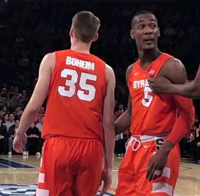
Nobody is immune: Jersey typo for the ages last night at Madison Square Garden, as Syracuse coach Jim Boeheim’s son Buddy Boeheim, of all people, had his name misspelled on his NOB for the game against UConn. Coach couldn’t have been happy about that, but I guess it just goes to show that it really can happen to anyone.
NFL centennial update: As you may recall, several weeks ago the NFL unveiled that crummy logo to mark the league’s 100th anniversary in 2019. About two weeks after that, I followed up with this exclusive report:
A little birdie now tells me that [the centennial logo] will not be worn as a conventional jersey patch next season. Instead, it will replace the NFL logo at the base of the collar.
The exception to this rule, according to my source, is the Bears. They’re celebrating their own centennial next season, so they’ll keep the standard NFL logo on their collar and wear a centennial patch. It’s not yet clear if that patch will be strictly Bears-themed or if it’ll somehow incorporate part of the NFL centennial mark. Stay tuned.
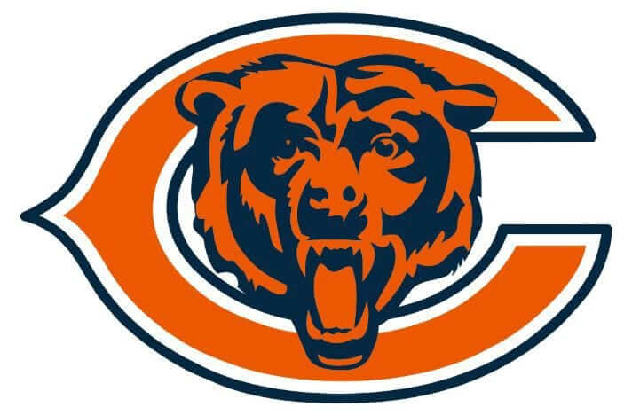
That situation came into sharper focus yesterday, as the Bears unveiled their own centennial logo, which is modeled on the NFL version (click to enlarge):
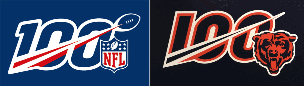
Ay-yi-yi. What’s the point of the diagonal stripe if there’s no football at the end of it? They’ve somehow managed to make the original version even worse.
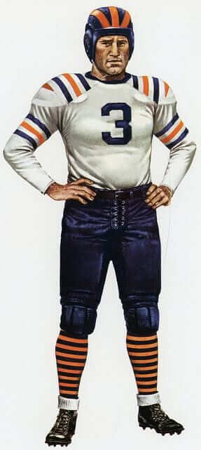
In addition, Bears exec George McCaskey said some sort of throwback is in the works:
George McCaskey says the #Bears are working on a classic uniform for 2019 and are not ready to reveal the details. They will unveil them next year. @PhilHecken @UniWatch
— Zack Pearson (@Zack_Pearson) November 15, 2018
It’s not yet clear if this uniform will be a one- or two-game alternate or if it will be the primary design for the centennial season. I’m assuming the former. Either way, I’m hoping it turns out to be this design (but I’m not holding my breath):
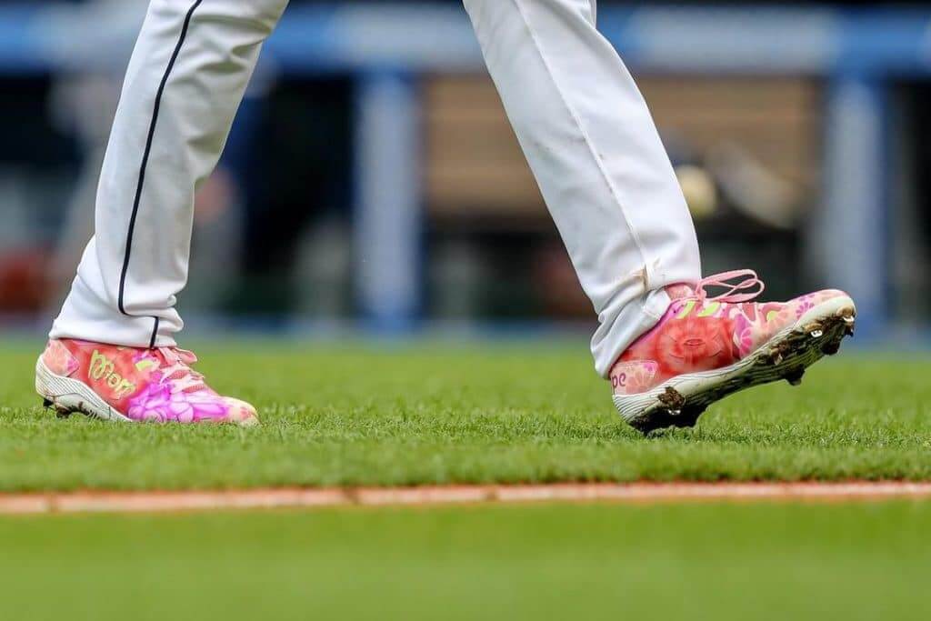
New MLB footwear rules: MLB yesterday became the latest league to throw in the towel regarding the policing of shoe colors. The new rules, which were which were developed by MLB and the players’ union, will allow players to wear shoes in “any of the following colors, in any proportion: (i) black, white, and gray; (ii) any colors displayed on the player’s uniform (and certain variations thereof); and (iii) any additional colors designated by the player’s club.” So no more designated team shoe colors.
Frankly, I’m surprised they didn’t do this sooner. Most players just wear whatever they want anyway (or whatever their shoe companies give them), and policing it has become a losing game of whac-a-mole for MLB, especially since a monetary fine isn’t much of a disincentive for gazillionaire athletes.
Honestly, I don’t think it’ll make thaaaaat big a difference, since so many players were already ignoring the rules. Still, it’ll be interesting to see if any A’s players stick with white, just because it was such an unusual distinction.
(My thanks to @HollarDollar for bringing this to my attention.)
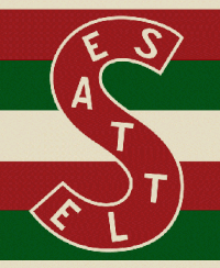
ITEM! New design contest: ESPN.com’s hockey editor has asked me to have a design contest for the potential new NHL franchise in Seattle, so that’s what we’re going to do! Here’s the skinny:
• Your entry must include a team name, a primary logo, full home and road uniforms (jerseys, pants, socks, helmets), and an inaugural-season logo that can be worn as a patch. If you like, you can also include secondary logos, an alternate uniform, and a center ice design, but those aren’t required.
• You can draw upon Seattle’s rich hockey history or start from scratch. Up to you!
• Your designs can be created in any digital or analog medium (Illustrator, Photoshop, crayon, whatever) and can be submitted in any standard digital format (JPG, PDF, TIFF, etc.). You can also create a video presentation, upload it to YouTube, and submit the YouTube link as your entry.
• The files you submit should be named after yourself (PaulLukas.jpg, for example). If you’re submitting multiple files, please either number them (PaulLukas1.jpg, PaulLukas2.jpg, etc.) or use some other designation (PaulLukas-homeuni.jpg, PaulLukas-logo.jpg, etc.). Files that don’t follow this format will not be considered.
• In keeping with longstanding Uni Watch chromatic policy, entries with even a hint of purple will not be considered.
• Email your entry to Uni Watch HQ (note that this address is just for contest submissions — please don’t use the usual Uni Watch email address). If you have more than one concept, feel free to enter as many times as you like.
• Deadline: Monday, Nov. 26, 7 p.m. ET.
The best entries will be showcased in one of upcoming ESPN columns. Good luck!
By Paul

’Skins Watch: Nintendo, responding to negative feedback from gamers, is removing Native American character designs from the video game Super Smash Bros. Ultimate (from our own Yianni Varonis). … Also from Yianni: There’s a guy in Fargo, N.D., who may have been the model for the University of North Dakota’s old Fighting Sioux logo. … Students at McGill University have voted in a non-binding resolution to change the school’s “Redmen” team name, a move that increases pressure on the school to change the name (from Eric Furniss).

Baseball News: I’m not 100% positive about this, but I’m pretty sure Rays P Blake Snell, who was named the American League’s 2018 Cy Young Award winner on Wednesday, is the first Cy Young recipient ever to wear a single-digit number. … In a related item, a Rays fan had promised to get the team’s logo shaved into his head if Snell won the award, and now the team is trying to hold him to that. … The Nationals unveiled a new spring training uniform yesterday. People really seem to like the cap, and I have to agree — it’s a keeper. … Astros 3B Alex Bregman has his own pair of ’Stros cowboy boots (from @SteveinLC). … Speaking of the Astros, check out this Oyo ’Stros bullpen buggy. … The Mariners’ stadium name will now be an ad for T-Mobile. Alas, we won’t be doing an “I Still Call It Safeco” shirt, because we only do shirts that honor non-corporate names, not corporate names like Safeco (from Dean Richard). … New alternate logos and jerseys for the El Paso Chihuahuas (from @ferndog03). … New 80th-anniversary logo for the Roberto Clemente Baseball League in Puerto Rico (from Ignacio Salazar). … New uniforms for the Nashville Sounds.

Pro Football News: The CFL is adding an extra official to watch for illegal hits on the quarterback. … The Ravens will wear their black alternates this Sunday (from Andrew Cosentino). … NFL Fortnite skins are no longer available for download. … The CFL’s Hamilton Tiger Cats have added a yellow helmet stripe for the playoffs (from @RaoneCat). … The Lions practiced in the snow yesterday, with coach Matt Patricia wearing shorts (thanks, Brinke). … The Packers wore their mono-white alternates last night. … Houston coach Major Applewhite got in a tussle with one of his players last night over a sideline jacket (from Jason Hillyer).
College Football News: Here are this week’s uni combos for UNC, Duke, Arizona State, West Virginia (an unusual look for them), Temple, Stony Brook, Utah State, and Virginia (from James Gilbert, Rex Henry, Ethan Dimitroff, Paul Palmer, and our own Jamie Rathjen). … Here’s another look at the pinstriped Notre Dame uniforms costumes that the Irish will be wearing this weekend (from Jason Kurtz). … The player wearing No. 25 for Virginia Tech this week will be RB Steven Peoples (Andrew Cosentino again). … Northwestern State went with a new helmet design last night. … Wisconsin has a skid steer emblazoned with Bucky Badger at Camp Randall Stadium (from Calvin Bruce).

Hockey News: Fun story about how Bruins equipment manager Keith Robinson fit Jakob Forsbacka Karlsson’s NOB onto his jersey (from @tservo42 and Barry Rubinstein). … New 918 Night jerseys — that’s Tulsa’s area code — for the Tulsa Oilers (from Mike Iles). … The Devils will wear camouflage jerseys with stencil-font numbers for Military Appreciation Day this Saturday. … Meanwhile, the Penguins’ camo warm-up tops feature the skating penguin wearing military-style dog tags (from Jerry Wolper). … The WHL’s Vancouver Giants will wear 1946 Vancouver White Spots throwbacks today and Sunday (from Wade Heidt). … The Penguins wore their new alternate uniforms for the first time last night (from Noah Kastroll).

College Hoops News: Cincinnati has added the school’s bicentennial logo above the NOB. “Disappointingly, I couldn’t find anything released by the school saying they were going to do it,” says David Hall. “I just noticed when I was at the game Tuesday.”

Soccer News: The airline Emirates, which sponsors advertises on AC Milan’s jersey, has a new marketing campaign, so of course that meant AC Milan had to get a new kit with the new slogan (from Josh Hinton). … England midfielder Jesse Lingard wore No. 14 last night. “That’s a change from their usual 1-11 non-tournament jersey numbering,” says @trequartbeasta. “This was because it was a charity match for Wayne Rooney, who wore No. 10 off the bench.”

Grab Bag: The logo for the 2023 Rugby World Cup has been revealed. … New 50th-anniversary logo for Dover International Speedway (from Brian Chesnick). … New bicentennial logo for the Maine town of Kennebunk. … Awesome new uniforms for Miami track and cross-country (from Jason Lefkowitz). … Belmont University is changing its interlocking-“BU” logo following a trademark disput with Baylor. … Reprinted from last night’s comments: Remember my recent piece about the disproportionate number of littered Newport cigarette packs I was encountering? That phenomenon may soon be changing, because the FDA has proposed banning menthol cigarettes. … The UCI — that’s the governing body of cycling — has reintroduced rules regarding sock height (from Roger Faso). … Coleman Mullins scored this very cool-looking set of vintage lawn darts at an estate sale. “So excited about all the dangerous stuff we’ll undoubtedly do with them this summer!” he says.
By the time most of you read this, the Tugboat Captain and I, along with our friend Carrie, will be on the highway and heading to Virginia, where we’ll be attending this year’s edition of the annual oyster roast that I attended last year. Full report to follow! Please play nice while I’m on the road today.
I also want to wish a happy birthday to our “Collector’s Corner” columnist Brinke Guthrie, who’s celebrating another trip around the sun today. Hope you get everything you wish for when you blow out the candles, buddy!
Disappointing black is still so prominent. Also hate the “Miami” on the home. If that light blue was the primary colour the uniform and font would pop. Sigh.
Agreed. Though the primary logo looks terrific on black. The color accents pop and feel like neon signage, which I assume was the point, although many of the color elements remain too fine and won’t scale well. And the M logo would be fine as-is if it appeared on a non-black cap. A bright blue cap with that black M logo over a white or gray jersey with the script in bright blue? That would be the best uniform the Marlins have ever worn.
The Goalie also has a remarkable resemblance to the goalies in the table top hockey goalies game I got as a 7 year old back Christmas 1968. The Goalies were mask-less and smiling.
Going to make a prediction….its going to leak that somewhere within MLB that a version had the home jersey with ‘Miami Blue’ script, ‘Client Red’ stroke, and ‘Midnight Black’ shadow, and someone remarked it looks too much like the Mets chest mark…..
And I agree it should say “Marlins” on home jersey…and its not like they don’t already have that for the black alt jersey, so…..
Black has always been prominent on the Marlins’ uniforms. Most of their typography has been that color regardless of what their overall color scheme was, so seeing all that black shouldn’t be a surprise given their history. Also, I don’t have a problem with what insignia is on a jersey, just as long as it looks halfway decent. I’m not sure why having a certain insignia on certain jerseys has to be a hard and fast rule anyway.
Love the way the Vancouver Giant goalie posed in a very old school goalie stance while wearing the retro Jersey.
Yep, definitely cool way to pose for a goalie in a throwback.
The decision to wear this uniform as a throwback is a convenient advertising benefit to Vancouver Giants majority owner Ron Toigo and family. They are also the current owners (since 1982) of White Spot restaurants in BC.
Photo of the White Spots back in the ’40s:
link
Aw, you beat me to it. The kid has a sense of history.
Oh, come on, how could you not love Lite-Brite? ;)
As for the Marlins, meh. Still too much black.
I *did* love Lite Brite! I just don’t think it’s a good motif for a team logo.
So as a by-product of the long-standing policy of no purple in uniform design contests, does this mean that there will never be a contest to re-design uniforms of an existing team that already wears purple? Or, better yet, would it be a contest to specifically design OUT the purple in their uniforms?!?!?
The policy is lifted for redesigns of teams that have traditionally worn purple.
Wasn’t there a redesign the Vikings contest a few years back?
I’ve long had a personal theory, entirely subjective, that football uniforms from the leather helmet era don’t usually translate well to the modern era. I’m thinking now that maybe it’s because of the fact that so many of those uniforms were worn with plain, brown helmets. And in spite of the outside-the-box thinking, the attempts at recreating THAT look with decals on modern helmets just doesn’t do it for me (but again, I give out an “A” for creative thinking). But I think the Bears throwback hopeful that Paul posted probably WOULD look good as a modern uniform (again, maybe it’s because the helmet in that one IS painted). Is there anyone here good with photoshop that could take a stab at putting that uniform design onto a modern template?
The blue jersey could have used numbers on the other side of the front.
Overall it’s not bad, but does it have that feel that the Marlins have finally landed on something more permanent….. not sure.
1. I wish they had done blue script on the black uniforms. Black text on black background gets lost.
2. Miami went all in with the softball top look on the blue uniform.
3. Does it bother anyone else that the Marlin tail goes behind the script of “Miami” but wraps around to the front of the “M” alternate? Especially bothersome that the tail doesn’t close at the point on the alt but does on the primary.
Why do the Marlins misspell colors in “our colors”?
They’re British.
En español.
Spanglish. The first person plural en español is not “our.”
If this were a team I rooted for, I’d have a much easier time getting behind “nuestros colores” than behind “our colores.” Or whatever the proper fully Spanish translation is.
I would have agreed with this before I moved to Florida, but the truth is, people down here routinely speak in mixed sentences made of both English and Spanish, so the phrase “our colores” is actually a unique way of representing that culture.
“There’s a guy in Fargo, N.D., who may have been the model for the University of North Dakota’s old Fighting Sioux logo. ”
Nope.
Marlins new uniforms could have been better.
Too much black. Especially the black jersey, with the script not being able to see clearly.
Going back to the original turquoise would have been better, though the light blue is still good.
Also the original red, on the orange side, was better.
A light blue hat would have been great. Not sure why MLB teams, except Oakland, feel the need to have their primary hats either black, red, or blue (royal or navy).
I had expected to have this reaction to the blue situation, but the more I see the new Marlins look, the more I prefer the blue they went with. It’s brighter and seemingly more saturated than the old teal, and so feels more Miami-esque to me. Which makes it all the more disappointing to me that they relegate it to an accent role behind a primary black that’s almost as dominant as red is for the Reds. What’s the point of choosing a vibrant, unique blue if you’re just going to dress the team in black?
Yeah you may be right about this light blue. And I totally agree with you that this light blue should have been the main color and not black. Nothing unique about a black hat. Again, why does MLB only have black, red, or blue (navy or royal), as their primary colors? Oakland is the only outlier.
Not crazy about the colors the Marlins went with, way too much black, and seems like this was hatched after seeing how popular the Heat’s “VICE” jerseys became. I could be sold on the blue because by itself, without seeing it next to the 1993 era stuff, my mind wants to believe that it’s teal (was dying for a Jays-style original logo revamp, but alas).
The Fish/laces element works much better as the sleeve patch, where the “ball” is enclosed, it looks nice there.
What REALLY irks me though, is that they are the only MLB team that doesn’t use either a recognizable cap logo as their primary, or include the team nickname in the logo. “Marlins” only appears once in the entire identity, in black letters on a black alt so you can’t even read it. The 2012 set did the same thing, only having “Marlins” on an alt (which they didn’t even wear in 2018 – the 3 game throwback set in June was the only time the word “Marlins” appeared on the field).
Which brings me back to a psychological effect they’ve brought upon themselves, and one of the big reasons I think they’ve still struggled drawing fans to the new ballpark. They’ve leaned almost entirely on the “MIAMI!” branding since 2012. The home jerseys say “MIAMI”. The photos they use for promotions are all dominoes, South Beach, downtown Miami, etc. Which would be fine, but they completely ignore the 3.4 million people like myself who live in Broward (Fort Lauderdale) and Palm Beach Counties. There’s a reason Huizenga originally called the team “Florida” way back when. (If he could’ve wrestled another hundred million or two from Broward County we’d probably have ended up with a ballpark by the Panthers arena, and we wouldn’t be having this discussion right now.)
When they moved and rebranded in 2012, they changed literally everything. Logos, colors, location, uniforms. They kept the nickname, but they barely used it anywhere. This wasn’t the team that I grew up loving. The team that won two World Series titles. They might as well have moved to Portland or Vegas because there was almost no connection at all to the team’s history (and any continuity in regards to the roster didn’t last very long either). This rebrand doesn’t fix that.
Has there been any other team that so completely re-invented itself all at once despite moving only like 30 minutes away within the same metro area?
For what it’s worth, at least Jeter’s group has quickly ditched Loria’s orange/black/blue/yellow nightmare which was IMO the worst identity in baseball. But I’m pretty disappointed in this. Was super hyped when they unveiled that 25th Anniversary logo and weekend this past year. The rebrand has fallen short. With some tweaks they can improve it, but I’m not sold on anything they’ve done uniform-wise except the return of 1993 throwback weekend in 2019.
Different sport, but the Brooklyn Nets are extremely severed from the ABA New York/NBA New Jersey days. From red white and blue to black and white, and also a barely visible team name.
I agree that is odd how they over emphasize Miami and deemphasize Marlins. And I say this as a strict traditionalist who thinks (aside from the Phillies) every team should have their city(state) name on road gray jerseys. Also their primary logo saying Miami instead of Marlins just doesn’t look right. They would have been better off taking the fish and baseball logo and putting it in a roundel with both Miami and Marlins on it, similar their original logo.
I’m good with the hues of blue and red they chose, because they look tealish and orangeish. But certainly would have been better if they just restored the original teal and orange colors.
I’d actually like to see the Phillies squeeze Philadelphia on a jersey. It would be a nice change. I agree though in city names on the road jerseys. I’m not a fan of state names for team IE Arizona instead of Phoenix, Colorado instead of Denver, Carolina in place of Charlotte.
The new uniforms are a upgrade but there is too much black. You’re in Miami! Have vibrant colors. They should double down on neon/Miami Vice loo.
I’m with you on state names, about the only one I think it really works for is Minnesota as the twin cities. No reason not to refer to teams from Denver and Phoenix (or Phoenix metro area) as Denver and Phoenix. The Rockies I give a slight pass to only because it works with naming them after the mountain range across Colorado. I especially think it is bad when there are multiple teams in the same state but they still claim the whole state. And while I get the idea behind the Texas Rangers naming, think they should be called Dallas (or Arlington if they preferred).
As far as the Phillies, the only reasons I am good with that is the length of the name could be problematic, Phillies automatically associates with Philadelphia, and when it comes to sports uniforms I do kind of enjoy if one team is the exception to a typical uniform convention, and for the reasons above, it makes the most sense for it to be the Phils.
Nope. Texas Rangers is perfect. Arlington Rangers doesn’t sound right at all. While Dallas Rangers has a better ring to it, they’ve never played in Dallas. There’s a thing we have here that people in the rest of the metroplex don’t really like Dallas. I don’t really know how to explain it to someone who doesn’t live here. It’s like a sibling rivalry. Texas fits. I personally know people who drive in from Austin, Abilene and Lubbock for games. Lubbock is a 5 hour drive.
Maybe Minneapolis and St. Paul are the same? I’ve been told Tampa and St. Petersburg have it. I get what you are saying about Phoenix and Denver though.
I agree. Texas Rangers and Colorado Rockies and even with Minnesota that works. I rather see Denver Avalanche, Phoenix Cardinals again, Diamondbacks and Coyotes again, Miami Panthers, Charlotte Panthers (though they should be Racers).
I like the Brewers jerseys with the script Milwaukee and love the Cerveceros. I miss Tampa Bay being on the Jersey and a better name and color palette. The Phil’s though should have put Philadelphia on the alternative softball ones. San Francisco is the same 12 letters and squeezed on. Los Angeles is 10 letters. It’s more too no Philadelphia baseball club has worn the city name on the front so I’d like seeing it even on just an alternate.
Yeah, the Twin Cities are like that, in that specifying either Minneapolis or St. Paul is most often read as exclusionary. Thus Minnesota for all of the pro teams in St. Paul and Minneapolis.
Conversely, my limited personal experience in the mountain states is that folks are generally more willing to get behind a Denver team than a Colorado team.
Here in Wisconsin, there’s not a lot of love for Milwaukee from anyone who doesn’t live there (and even then …), but that doesn’t seem to be an impediment against people adopting Milwaukee-named sports teams. I’m not sure that the Wisconsin Brewers or Wisconsin Bucks would be any more popular in the rest of the state than they already are.
You’re grinding the axe that I grind too!
Very opposed to use of state/region names in lieu of city names. The metropolitan city is the reason the team exists. Show it proper respect.
In that vein, I’m not even completely happy about teams who now play in outlying areas using the name of the metropolitan city (e.g. the New York Giants who play in neither the city nor even the state so named), but it’s not as bad as completely ghosting the city name (e.g. California Angels). It would be funny to see a tv listing for the Orchard Park Bills v. the Independence Chiefs though.
One of the terms of moving to Marlins Park was to rebrand as the Miami Marlins. If they wanted a new venue, that was part of the gig. Then again, the Marlins had their original geographical identifier pre-Rays anyway.
Derek says everything I was feeling too. I live two hours north of Miami, and grew up the Florida Marlins. While I like the black Florida era better than the original teal era, I hated the Miami rebrand and color changes. The orange alts were better than the black ones, but neither was as good as the old black ones with silver. That’s what I’ll keep wearing to games with my black F hat.
As for these new ones, they aren’t terrible, but I was hoping for more of the past. But it is an upgrade. Black on black doesn’t look good here, and the hat looks like it needs to be brighter. We’ll see how it looks on the field.
Paul, be honest, you suffer from porphyropbia…it’s okay…
Cleveland is unveiling some new baseball uniforms Monday at 10AM. A new uniform option and some “tweaks” to the existing. Of course as we all know, the largest difference will be the elimination of that supremely racist logo.
link
I wish the Marlins would have used the Marlin with the baseball stitching and without the “M” on the caps, which IMO looks better.
I came here to say the same thing. The sleeve patch would make an excellent cap.
Safe travels Paul, look forward to the report!
I love the Marlin’s current uni set and this new set isn’t doing anything for me except to think Derek Jeter needs a cash influx from new merch sales.
That marlins sleeve patch should be on the right sleeve, so the marlin points forward. It’s like the chargers shoulder bolts compared to the helmet bolts…. it’s like they figuratively point their franchise backwards doing that. It might be a weird superstition – like viewpoint, but that type of thing has always bothered me, and on a uniform set that includes black text on a black jersey, THAT is what stuck out to me most if that tells you anything.
Hey Paul, do you know off the top of your head if there are any other MLB teams that use the city name on their home uniforms?
Rangers definitely, Angels arguably, Phillies technically.
Also technically: Every team that wears a city-name initial on its home jersey. So Yankees, Nats, and Tigers.
I get where you are going with the Angels, though they are the opposite and where their nickname on the road grays. I liked it better when they were the Anaheim Angels and wore Anaheim on the road grays.
If they are going to call themselves LA again might as well go back to their early days and start wearing this road jersey similar to this:
link
I think “Los Angeles” link on the current road jersey template.
Just return to being the California Angels already!
link
Cardinals’ Saturday home jerseys have “St Louis” across the chest.
Detroit Tigers did so in the 1930’s:
link
Aside from having Miami rather than Marlins on the home whites I generally like what they did here. And while they are using black, blue, and red, which are incredibly overused, the shades of blue and red, especially as accents on black, are pretty unique for baseball. While not teal, certainly a vibrant, and teal-ish blue, and the red is just light enough to appear simultaneously pink-ish and orange-ish. It was a good way to be traditional with the colors but do just enough to move it into something different and vibrant for Miami. So just put the Marlins wordmark on the white jersey and I’ll give them an A. Certainly an upgrade from their last set.
Some good features, some lame ones.
Good: the logo, the script, the number format, the blue jersey.
Bad: all black hat really? Miami on home jersey. BFBS alt jersey. too little color on road jersey
Marlins’ new logos might look cool with 3D glasses on
I’ll have to see the Marlins’ shade of blue in a game before deciding if I like it or not; I hope it’s something distinctive and not too royal-blue-ish. Vintage turquoise/teal would have been better.
Also, the numbers seem a little too small, particularly compared to the NOBs which thus look too big; the uniforms they had been wearing share this problem. Often when teams make custom number fonts which are a little small, they keep using big NOB fonts which look awful. (See: 2014 Cubs gray road alternates, D-Backs’ last two designs.)
If you’re going to do a custom number font with small numbers, do what the ’90s Phillies did and make the NOBs thinner and/or smaller.
I’ll have to see the Marlins’ shade of blue in a game before deciding if I like it or not
Isn’t that the same shade of blue they’ve been using for a while? link
As a Packer fan, it just doesn’t look right when they aren’t wearing their gold pants.
Agreed. That’s part of the beauty of Lombardi’s uniform: one pair of pants, one pair of socks. Only the jersey changes from home to road.
I don’t understand it at all – it’s the worst of all possible worlds for the Packers. They dilute their classic uniform and muddy the brand, but by not changing their jerseys at all they don’t get a merchandising bump from the Color Rush nonsense.
Now, I love link and really wish they would link. But then they should wear those new white jerseys with the regular gold pants.
Yup, too much black in the new Marlins uniforms. I thought that, more than the orange, was the defining color from Loria’s legacy.
The Nashville Sounds really didn’t need to do an overhaul of their uniforms. Seems silly for them to so quickly de-emphasize the Broadway District aesthetic.
Nice to see El Paso bring back some of the old Diablos look; that muscular chili pepper is straight out of the steroids era.
Happy birthday Brinke!
How different are the Marlins’ non-black colors than the current ones? I’m having trouble telling against the black background.
Anyone see a Pantone chart someplace?
Chris Creamer put one together:
link
I just noticed the new Marlins jerseys now have raglan sleeves. Don’t think they have had that before.
I’m surprised that the main criticism of the new Marlins stuff is “too much black” – to me, that might be the best part, because I do think that (along with bright accent colors) works very well for a Miami team because it is evocative of neon lighting.
What really annoys me though is that they went through this whole thing and still settled on more or less the exact same accent colors as they had before, blue (even if it is a somewhat brighter shade than you usually see) and orange, two colors that we certainly don’t lack for in MLB already. Someone mentioned that it seems like they were inspired by the success of the Heat’s “Vice” program but if that’s true they really blew a chance to go all out with it. For one thing I felt sure at first that we were finally going to get some pink somewhere in pro sports, but no. Also going with some sort of teal or aqua in this design would have been both a callback to their history and more “Miami.” So yeah the heavy black with teal and pink accents would have been the perfect move imo, disappointed that they didn’t do it.
Black logo on a black hat? Really? Why is it so hard to do it right? You’ve got a plethora of rainbow colors to choose from? Make that M pink or something.
I like a hat logo that calls less attention to itself. They’ve gotten too big and obvious in recent years.
I strongly agree–the black on black is not good. It will not stand out on the field. I’d like to see that logo on a teal cap or something.
Love that Nationals cap with the Capitol dome. They should make that their main cap.
That Marlin redesign is a HUGE downgrade. I actually liked the previous set (minus the giant cap logo) as I thought it was something different and fit the area and name (similar to the ‘Stros Tequila Sunrise set). Where it went off the rails for me was the insistence on making the black the primary. The orange and the blues would’ve made more sense.
This re-design is just bad on so many levels. I HATE blue and black together. I just don’t think it works. The logo looks like clipart. The black on black cap. The MIAMI script on the home uniforms. The script itself needs to be on a slant. The way the “I” falls in the button packet. It’s just bad.
I don’t like the loosening of the MLB cleats rules because it doesn’t make the ASG special anymore. Guys will be wearing whatever, whenever.
Regarding the A’s, I would guess we’ll still see some white. White was creeping into so many other guys. Chris Dickerson inexplicably wore white for the Pirates on a home Sunday throwback game (gold jersey/black pants). Plus, the UA promo photos of Bryce Harper’s new signature model are of a white colorway. White as default is returning, as it was for a lot of the 80s in Little League through High School ball.
I don’t hate the new Marlins look, but I don’t love it either. I feel like it would all look much better if the red/orange trim were pink.
Lost in the Nats’ spring training uniform announcement is that the hat appears to be similar to the old diamond-era material from the year before, and not the pro-lite material from this past season or whatever they called it. Is MLB maybe moving back to that after a 1-season experiment with pro-lite? Anyone able to find out more?
The tail draping behind the ‘a’ in Miami makes it look like a ‘q’, so to me it looks like ‘Miqmi’
I didn’t notice that, but you’re right! I’ll never be able to un-see that.
At least the Bears centennial logo is in their number font.
I noticed that too. Don’t need the football, either. The growling Bear IS football.
The Baylor/Belmont thing is ridiculous.
Love the Penguins’ new thirds, and I thoroughly enjoyed watching them in action, despite the fact that the Pens lost (again). However, seeing those unis in addition to the couple of Panthers games I’ve watched this season really drove home to me how much I hate shoulder numbers. They just look awkward.
The funniest part of the Marlins new logo to me is that the stitching looks like someone threw a curveball from back in the distance, and it curved right into the marlin’s crotch, causing the look on his face, with his mouth open in agony. Try unseeing that now :)
LOL…yeah, you’re right. While I’m not sure that a fish has a “crotch” per se, if it did, it would be right there.
Good catch, no pun intended.
I love the Marlins’ new look. Love the clean look of no numbers on the shirtfronts. Like the shape and size of the numbers; the numbers on their most recent unis were too thick and round and didn’t seem to match the rest of the uniform.
The script looks uniquely Miami. Should look nice and clean on the field.
I had one of the original caps as a teen in the kid 90’s. I may grab one of these, better look imo. But it’s just a rip of the heat alternates
The Nashville Sounds’ uniforms would be a hundred times better if they had just slapped the “Sounds” script on the whites and the “Nashville” script on the greys.
Also, the three-star cap should only be paired with Nashville-script jerseys.
For the Marlins, feels like a downgrade. Thinking to your posts on if a team’s jersey is the best the team has ever had, I think the answer here is a resounding no. In fact, I just looked over previous iterations of Marlins jerseys and I think there are at least two looks that I clearly prefer over this new one.
So the Hamilton Tiger-Cats are bringing back the yellow stripe on the helmets for the Eastern Final.
Hey Ticats, how about about bringing back the yellow helmets as the primary look? The way it was during some great time in team history and way it should be. Time to lobby for this before the next uniform redesign.
They did look good when they wore throwbacks in 2010:
link
Arm numbers needed to be bigger (move or eliminate the Reebok), elsewhere (on shoulders), or eliminated.
Another option would be have the white area on the arm go further up the shoulder to have enough space for bigger numbers.
Anything to get closer to this would be great:
link
I agreed about them messing up the sleeves on the 2010 throwback.
My solution for the Tiger-Cats with regards to what should be their full time uniform. The 1960s throwback worn in 2009 which had better sleeve striping and the numbers on the shoulders. This exact uniform with the current-day leaping Ticat logo on the helmet:
link
The new Marlin uni’s are definitely an improvement over the mish-mosh of colors they introduced in 2011. One question though; is that red, red-orange or fushia? Whatever it is, it looks cheesy matched with the teal.
I have no problem with the Marlins Uni’s as ong as they don’t just wear the black jersey 125 times a year like I am sure they will