
[Editor’s Note: Today we have a guest entry from Ron Ruelle, who’s done an admirably deep dive on one of the Denver Nuggets’ alternate logos. Enjoy. — PL]
By Ron Ruelle
The recent redesign of the Denver Nuggets’ uniforms has been bugging me for a while now, for two reasons. First, the old color combo of sky blue and yellow was gorgeous. And second, the skyline logo is all wrong.
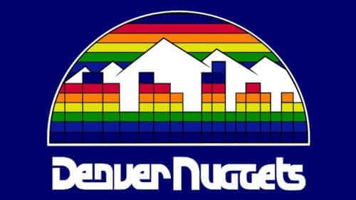
Let me explain, beginning with a look at the Nuggets’ old rainbow skyline logo. This logo was iconic, with generic Atari buildings in front of mountains. Maybe not beautiful, but it worked for years:
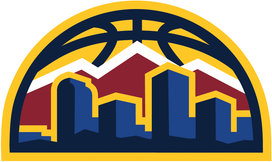
They updated the logo for their new set, with a more 3-D look to the buildings. The buildings themselves are the same generic boxes — except one building stands out, the one on the right with the rounded top and the star at its base:
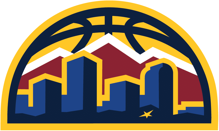
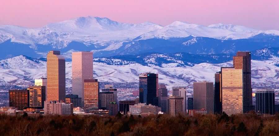
The rounded-top building is meant to represent the most (some would say only) recognizable building in Denver — the Wells Fargo Center, affectionately known around here as the Cash Register Building. Here’s a photo to prove how much it stands out (click to enlarge):
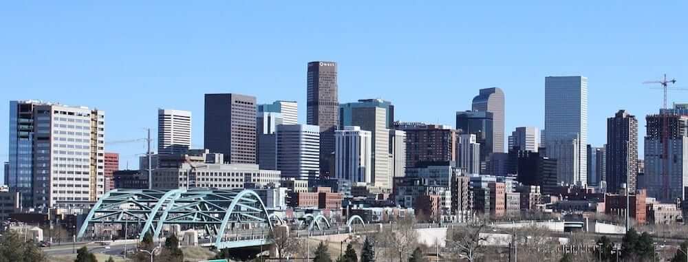
The Pepsi Center, home of the Nuggets and Avalanche, would be in the foreground of this shot, just outside the right edge of the frame. Presumably, that’s what the star in the logo represents. But as you can see, there’s no sign of the mountains in this shot — even though the mountains are shown in the logo.
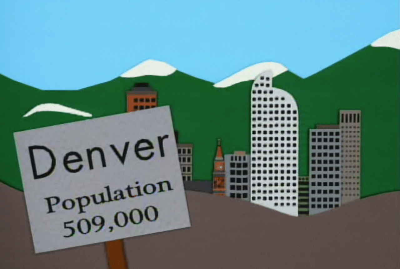
Now, when a cartoonist needs to draw Denver, a bunch of rectangles plus the Cash Register Building does the trick. And some mountains in the background — gotta have those. Here’s an image from South Park, for example (it would work, even without the sign, right?):
However, the Nuggets screwed it up. The new logo shows the buildings as viewed from the west, which would put the mountains behind the viewer. And yet, the mountains are shown in the logo. It doesn’t add up.
Here’s Denver from the east side. Big ol’ mountains, and the Cash Register is on the left side of the frame now. The Pepsi Center is now hidden behind the towers (click to enlarge):
Here’s my hunch: I bet the designer oriented the skyline correctly at first, but then team management had the idea of adding the star for the Pepsi Center, so they flipped it and called it a day, hoping no one would notice. All they have to do is flip it back, and get rid of the star, like this (click to enlarge):
Or just go back to the rainbow design, which is still better.
———
Good stuff! I know we have several very serious Denver fans in the Uni Watch readership. Gregg, Tom — what do you guys think of Ron’s analysis?
And in the bigger picture, what do we all think about a designer (or team executive, or whomever) taking this type of creative license? Does it matter that the logo isn’t 100% geographically accurate, or is the logo more about conveying the idea of Denver rather than the specific reality of Denver? Before you answer, think about how you’d feel if the same sort of thing happened with a logo depicting your own town. It’s an interesting question.
Click to enlarge
Collector’s Corner
By Brinke Guthrie
There are some items I find on eBay that leave me scratching my head, and this is one of those. The above photo is of a Portland Trail Blazers tennis racket. Why were these made? I have no clue, and neither does the seller. Has anyone else ever seen one of these?
Now for the rest of this week’s picks:
• Congratulations to the Boston Red Sox, winners of the 2018 World Series. Collector’s Corner salutes the Sox with this 1970s handcrafted trivet, made in the USA!
• Check out this 1976 ticket for hockey’s “Super Series ’76” exhibition between the Chicago Blackhawks and the Soviet Wings. Looks like they just used the Bears’ logo for the Russians, comrades.
• Ray-Duhz fans, since Halloween is tomorrow night, you won’t be able to get this Raiders pumpkin-carving kit delivered in time. Maybe you can find one locally — no doubt they’re available for all teams.
• Speaking of Halloween, they’ll market anything these days. Exhibit A: this Baltimore Ravens Vampire Gnome, because why not.
• The Chiefs are doing well these season. Commemorate their success with this vintage 1970 poster. I had this one!
• ABA fans will appreciate the great graphics on this 1971-72 Floridians media guide. Cost: one dollar. I remember being so intrigued that their name had morphed to just “Floridians.” My 10-year-old brain doubtlessly thought, “Where’s the city name?”
• One more from Miami’s old ABA team; a Floridians team jacket from Starter. Dig those groovy stripes, man.
• Patriots fans, pack up your tailgate stuff with this 1970s picnic helmet set.
• What goes around comes around: The Rams used the navy helmets with white horns in the 1970s, as shown on this vintage stein, and they’re back to that look again. Well, most of it.
• Outstanding vintage graphics for sure: It was an all-star year back in 1972 for the Atlanta Braves, just like it says on their program cover.
Seen an item on eBay that would be good for Collector’s Corner? Send any submissions here.
Click to enlarge

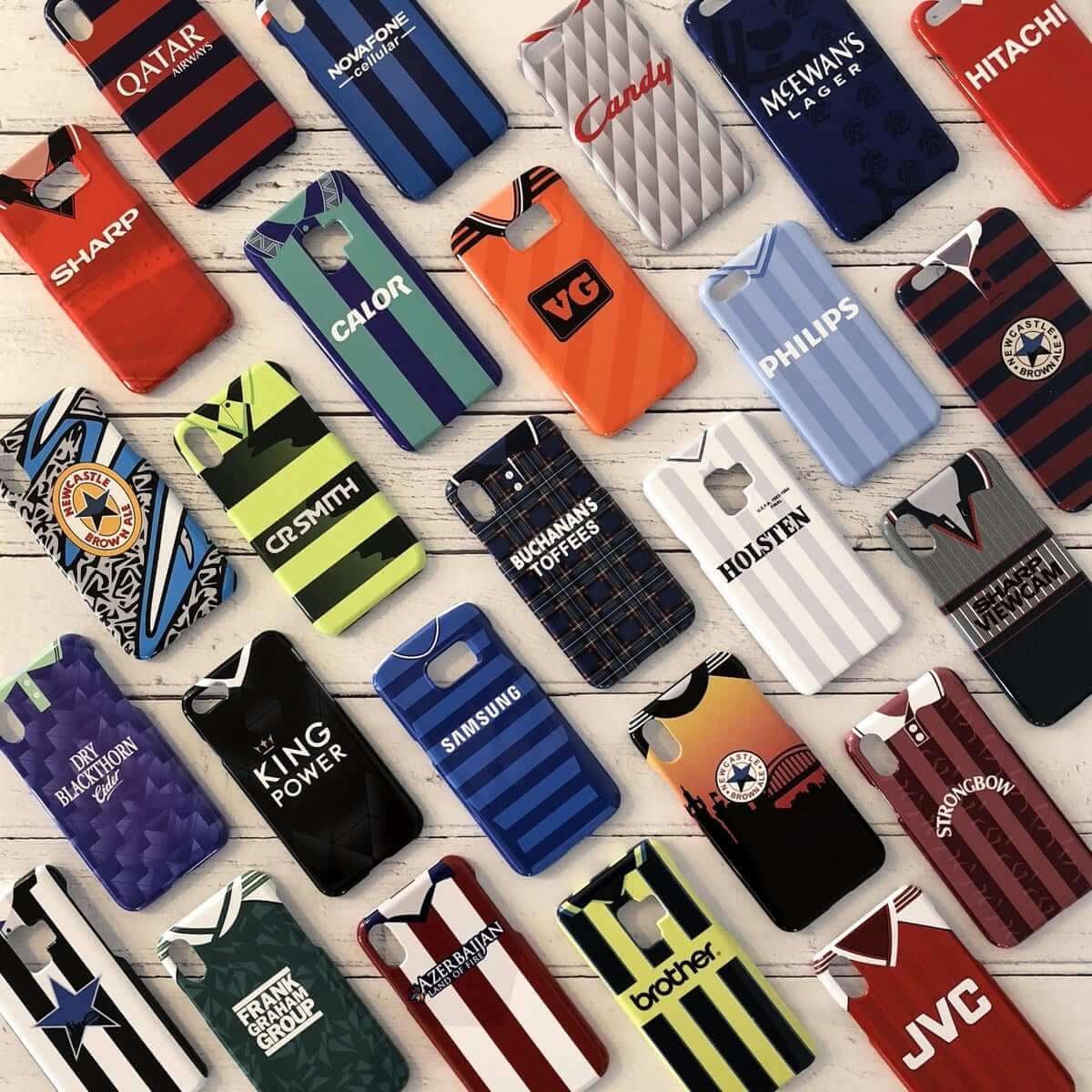
Raffle/discount reminder: In case you missed it on Monday, our friends at Nostalgia Cases are raffling off one of their soccer jersey-based smartphone cases. To enter, send an email to the raffle address by this Friday, Nov. 2, 7pm Eastern. One entry per person. I’ll announce the winner next Monday.
In addition, if you don’t want to wait and see how the raffle plays out, Nostalgia Cases has also extended its 10% discount offer by another week. To get the discount, just go to the Nostalgia Cases site and use the checkout code UNIWATCH.
The Ticker
By Alex Hider

Baseball News: The Rocket City Trash Pandas — the new minor league team in Madison, Ala. — unveiled their new logos the other day, along with their new caps. “Rocket City” refers to northern Alabama’s contribution to the space program, while a “Trash Panda” is a raccoon (from James G.). … The Sam Adams brewery is releasing a Red Sox beer in honor of the team’s World Series championship (from Andrew Cosentino).

NFL News: Panthers coach Ron Rivera wore a T-shirt playing off his “Riverboat” nickname during a press conference yesterday. The shirts support a veteran’s charity he and his wife started (from James Gilbert). … Bengals WR Tyler Boyd gave a game ball to a kid wearing a Buccaneers throwback jersey during Sunday’s game in Cincinnati. Could he have mistaken the orange creamsicle jersey for a Bengals jersey? (From Brian Spiess.) … The Eagles and Jags left behind a mess at Wembley Stadium on Sunday, forcing Manchester City and Tottenham Hotspur to play a soccer match on a torn-up pitch yesterday (thanks to all who shared). … TV drama This Is Us takes place in Pittsburgh and includes some scenes at Steelers games. One of the characters wears a knockoff jersey throughout the series, and you can buy that knockoff jersey at the NBC store in New York because of course you can (from Alan Kreit). … Here are the uniforms for the volunteers at this season’s Super Bowl in Atlanta (from Griffin Smith). … Bob Hansen spotted a car with a Broncos/Vikings mashup logo sticker. … Patriots OL Trent Brown had two sets of sock stripes last night.
College Football News: Those Jordan uniforms that Oregon was hyping? They just turned out to be your standard BFBS design. … Mississippi State will wear grey uniforms on Nov. 17, honoring a school grad who served in WWII (thanks to all who shared). … Southern Miss will wear military appreciation helmets on Saturday (from Brad Logan). … Speaking of military appreciation, Kansas unveiled more photos of the “Salute to Service” uniforms they’ll wear on Nov. 3 (from Phil). … Georgia Tech will wear blue pants this Saturday against North Carolina (from ACC Tracker). … Seven schools outfitted by Under Armour — Auburn, Cincinnati, Hawaii, Maryland, Northwestern, South Carolina, and Utah — will wear camo accessories and sideline gear the next two weekends. … SMU has gone retro with its pregame graphics for this weekend’s homecoming game (from Ignacio).

Other Football News: Wrestler Ric Flair will be at the BC/Hamilton CFL playoff game and will be wearing a personalized Tiger-Cats jersey (from Wade Heidt). … Three high schools in Wilkes-Barre, Pa., are combining into one school called Wilkes-Barre Area High School. The teams will be known as the Wolfpack, and the football team will wear these uniforms.

Hockey News: The Utica Comets of the AHL will wear Purple Heart jerseys on Nov. 9. They are one of seven pro sports teams — and the first hockey team — to be designated as a Purple Heart team (from Ben Birnell and Eric Kowiatek). … A couple of junior hockey teams wore pink this weekend for cancer awareness: The Moncton Wildcats of the QMJHL wore pink sweaters, and the Regina Pats of the WHL wore pink helmets, laces and shin tape (from Wade Heidt).

Basketball News: A blog is speculating that the Spurs could be bringing back the “Fiesta colors” (from Phil). … The men’s and women’s basketball teams at Grand Valley State — a D-II school in Michigan — are known as the Lakers. But on Feb. 23 the team will go by its old nickname, the Sawyers. No word in that story, but I would guess that we’ll see throwback jerseys to go along with the name change (from Joe Hollomon).

Soccer News: Another MLS season is in the books, meaning Kyle Burkholder’s tracker is complete. … Polish club Sandecja Nowy Sącz new badge has a (from Ed Zelaski). … Wembley Stadium hosted an NFL game between the Jaguars and Eagles on Sunday, and the pitch was pretty torn up for yesterday’s Man City/Tottenham match (thanks to all who shared). … Rock Canyon High School (Colorado) is poaching Sporting Kansas City’s badge (from Jordan Wiley).

Grab Bag: More trademarks are being filed than ever before for logos that include a skull (from James Gilbert). … We have another Reddy Kilowatt sighting, thanks to Wafflebored. What an awesome bowling shirt! Paul wrote more about the electric logo earlier this month.
Nicely done Ron. I haven’t followed NBA in about 25 years, so I hadn’t seen this new logo, but woof. trying to be non-generic, but botching it terribly
The South Park drawing – especially including the old Daniels & Fisher tower (the smaller peaked building in the middle) – is a fine representation. The 70s logo has some cachet too
NB: the old logo predates the “cash register” building by nearly a decade (or, as I called it when I worked there many years ago the “slot machine” building)
The Nuggets redesign has been bugging me, too. I understand the new colors are sort of also old colors, but I really miss the powder blue and brighter yellow. The new uniforms also look kind of patchwork. The trim on the jerseys and waistband don’t match, the only use of yellow or red on the shorts is on the logo, and the team name and jersey numbers look weird in different colors. Not to mention that they no longer have the yellow skyline uniforms, one of the best looks in the league. The inconsistency in the actual logo is yet another layer of disappointment in one of the more depressing re-brands in recent years.
Utica plays in the AHL, not the ECHL.
Got it.
Actually, it looks more like something link would have made… ;)
Activision just made certain games, right? Atari made games and the console (if we’re talking 2600)…
Right; Activision made games for the Atari 2600 (a/k/a “VCS”) (and other consoles as well, subsequently) that were generally considered to be superior to Atari’s own software. IIRC, the company was formed by some disgruntled former Atari programmers who knew how to get more out of the system.
heard it had something to do with being paid more, since Atari underpaid staff thinking no one would start a gaming company and they would always be the only employer.
Atari, Activision… actually, I should have said Tetris.
Good call ;)
I loved the powder blue Nuggets unis. I’m a lifelong Bulls fan, but part of me considered getting one because they were just beautiful. It was a color unique to them in the NBA…and then they just dumped it in favor for a redesign with similar colors to other teams and unis that aren’t at all unique.
I’ve never been to Denver, but now that picture that shows the mountains are visible in the other direction will forever be planted in my mind and will ruin this logo that would have be fine flipped the other way.
It’s been since the Bills 2000 era uniforms that I’ve had a uniform to hate with a passion, now I have a new one. Good work Ron! I love learning this sort of stuff.
I used to live just outside New York for years. (Mostly Nassau County, then a little bit of time in Westchester before I left.) So if I think of the Mets skyline logo, there are plenty of artistic licenses there, but I get it. So many recognizable buildings in the skyline, so little space in the circle, throw the bridge up front in color contrast to give it definition, and voila. Beautiful logo, and I’m not a Mets fan.
But I don’t know Denver at all. Never been. Never would have known anything was weird with the Nuggets logo before today. (Thanks so much and great job, Ron!) I’d imagine if I knew Denver, I’d think, “what a really stupid and heinous error,” and I’d be embarrassed. Shoot, I’d rather an impossible stick tape job (looking at you, original San Jose Sharks) over such an inexcusable error about the city.
So I guess it depends. An old art adage is “Learn the rules, play by the rules, and then break the rules with style and intention.” Mets good, Nuggets bad.
Shout out to Ric Flair on another great promo. Stylin’ and profilin’ in # 16, likely to depict the number of world titles one.
Sorry Nature Boy, have to let you know their won’t be 50,000 people in the stands yelling Wooo! as you were hoping. Tim Hortons Field in Hamilton seats about 24,000.
I call it Ivor Wynne ;-)
link
I forgot that that existed, but I’m glad it does!
* world titles won
* there won’t be
Apologies, early morning typing and English problems by me.
I was pretty disappointed it didn’t read “Nature Boy” on the back of Ric Flair’s jersey.
I’m not from Denver per se, but I lived there for a few years, so take my opinion for what it’s worth:
I’m fine with the logo. I think it uses an acceptable amount of artistic license. It’s meant to evoke Denver in the mind of the viewer, not give a literal representation of it. Certainly artistic license can be taken too far, but excessive literalism can be a slippery slope too. Are people going to start complaining about Pittsburgh’s NHL team because real penguins don’t skate and hold hockey sticks?
(Sorry, I guess I ultimately turn everything into a hockey post because that’s the sport whose unis I follow most closely.)
About the Nuggets logo, it is up to the individual’s preference whether they are disappointed the logo is 100% depiction or not. I feel that as a sports logo, it is fine that it conveys the idea of the geographic location. A logo is a work of art. If I want an actual 100% depiction of a city’s skyline, I can refer to a photo.
I draw upon a similar situation with a sports team in my hometown – it never bothered me. Though it was on a couple of goalie masks and not an official team logo. Roberto Luongo’s 2006-07 mask with the Vancouver Canucks features a view north from what would be English Bay. It depicts the idea of Vancouver with the skyline with mountains behind, but far from 100% depiction of the buildings and mountains.
link
Same with Luongo’s mask starting the next year after the uniform change. Sure, the mountains were a bit more detailed. There was the Harbour Centre building depicted, but that building is not taller than others and would not be visible from that viewing location. Gives the idea of Vancouver and far from actual depiction. Especially more creative license considering English Bay is frozen over on that mask!
link
With Boston winning Series final game in navy tops, I wondered, what winning team has worn the most different jerseys. Red Sox have won in white, gray, and now blue. Oakland A’s come to mind. Yankees only white or gray.
The Grand Valley State thing is less of a throwback and more of a “noback”, eh? According to the article Sawyers was never the team’s nickname.
“Grand Valley State was never known as the Sawyers, another word for lumberjacks or someone who saws wood. But it was once one of the proposed names back in 1969. The university pointed out there was a push that year to change the mascot and one of the options was Sawyers.”
Sawyers is a damned good nickname. And if the likes of “Redmen” and “Indians” are going to be removed from the table, “Sawyers” ought to see a lot more use.
It also removes any gender references that change mascot names, in this example: Lumberjacks and Lumberjills.
Probably noticed/noted many times over the years, but there may be a geographic inaccuracy in this Phillies logo:
link
The rendering of Independence Hall depicts the Independence Square(south)-side view:
link
Trees are only visible from the Chestnut Street-side?
link
Personally, I think they need to fix the Nuggets logo so it’s accurate. All I’ll ever see is the fact it’s oriented wrong. When there is a rendering like that and it IS correct, I get a warm fuzzy feeling and I am in my happy place.
PROOFREADING: In soccer, the Polish club has “a”, but what it has is missing. In college football, Mississippi State should have a grad WHO served in WWII.
As for the skyline logo question, as a Mets fan, I’m kind of used to a logo which isn’t geographically accurate. It’s never bothered me. That said, they really could have turned the buildings around and still put the star where the team plays, even if it’s indicating a place behind another building.
Bengals WR Tyler Boyd gave a game ball to a kid wearing a Buccaneers throwback jersey during Sunday’s game in Cincinnati. Could he have mistaken the orange creamsicle jersey for a Bengals jersey?
Or maybe he was, y’know, being nice.
Oh, he was *definitely* being nice. The question is whether the kid he chose to be nice to was chosen because of his orange jersey. That’s all.
Reminds me of this…
“People are giving me a hard time just because he was wearing a Kyle Busch shirt, [as in] were you trying to convert him?” Blaney said. “He just happened to have a Kyle shirt on. I’m just trying to find a kid.”
link
The nuggets skyline within the logo is the type of issue that is scrutinized when released today, but would be considered quaint if it was from the 1930’s.
Is scrutiny necessarily a negative?
Regarding “This Is Us” jersey, the character wears it at a sports bar and also around the house. No scenes take place at a game. The error on the show is that in the late ’70s when the scenes take place, most fans did not have replica jerseys. No biggie, just wanted to clarify.
My first jersey was a Steelers knockoff which looked nearly identical. (Growing up, my next-door neighbors were from Pittsburgh but moved to the heart of Eagles Nation. My dad’s best friend married a Cowboys cheerleader. Go figure! Go Birds!) Instead of the team name, it said “DEFENSE” across the chest and a number 75, white numbers on a black shirt with the Steelers’ athletic gold Northwestern sleeve stripes. Sports apparel wasn’t what it is today in the 1970s.
Geographic misrepresentation happens all the time. Maybe designers are placing more evidence on being iconic and making a logo fit a geometric space, rather than accuracy. For example, this happens to Las Vegas (where I lived the past 5 years) all the time. Whether its “I Voted” stickers, or the Golden Knight’s “Vegas Strong” logo, the Strip landmarks are always placed to fit the space of the logo.
link
link
I wonder why the lady who wrote the article about the Atlanta Super Bowl volunteers neglected to mention that Warrick Dunn was in all the press photos. What was he doing there? Was he paid by the team to show up? Was he there for free because it was an event for volunteers? Or, is he just volunteering at the Super Bowl this year? I’d like to know.
I LOVE the old Nuggets logo, and I really disliked the recent powder blue and yellow uniforms. As great as powder blue looks on UCLA and the Chargers, it just didn’t fit for the Nuggets. I remember, quite fondly, their dark blue jerseys from the past, and was delighted when they unveiled their new uniform set.
The new Mountain logo is okay, but still not nearly as good as the Tetris logo. And now that we know it is geographically incorrect, I do think it should be switched, with the star either left off or put somewhere to indicate the arena’s location.
Someday, I hope they realize their mistakes over the years, and go back to the Tetris logo (and the lettering! What an amazing, incredible font!) full-time.
If you want to see geographic misrepresentation, take a look at literally every map ever made. Artistic license of some kind is inherent in and necessary to all depictions of geography in different dimensions or at different sizes. A small, two-dimensional illustration of the Denver skyline must necessarily take significant liberties to be recognizable at all. Flipping the skyline in the logo wouldn’t make it more accurate, it would make it differently inaccurate.
Yes it matters. Bush league work. No reason the skyline couldn’t be represented without being wholly inaccurate, which it is currently. ^^Nonsense.
The star doesn’t represent the Pepsi center, it represents the Palmer Lake star, an hour south of Denver. Chris creamer’s site even says so
I was born, raised, and still live in Denver. I don’t have an issue with the Nuggets logo not being geographically accurate. Kinda like it doesn’t bother me that the Mets logo isn’t an accurate reflection of the New York skyline. It’s a logo not a geography class.
As for the star, I don’t think it represents the Pepsi Center. I think it represents Denver being the capital of Colorado.
Lastly, with the Nuggets old rainbow skyline logo, I took the third building from the right as being the Cash Register building. If that’s the case, it’s oriented wrong as well. Funny how no one gets upset about that…
The Rockey City Trash Pandas are probably a reference to Rocket Raccoon from the Guardian of the Galaxy.
They do love their raccoons in the Huntsville area. The Stars had a polecat for their mascot, I believe.
Pittsburgh Penguins will wear “Stronger Than Hate” patches for tonight’s game.
link
Loved this entry, as I do with any discussions of skylines.
Any thoughts on most recognizable US skylines? I think New York is a clear #1, but after that it becomes murky. Could be Chicago, or even Seattle if looking at the classic Space Needle shot from Kerry Park.
I have never been to NYC (I’ve been to Parsippany, NJ!).
Without the twin towers I might have a hard time recognizing the NY skyline. Unless i simply looked at the sheer size/width of it.
Am I a dolt?
The most recognizable SKYLINES would be cities like Seattle (Space Needle), Chicago (Sears* Tower), San Francisco (Transamerica Tower) or St Louis (Gateway Arch), where there is one obvious element that identifies what are generally nondescript buildings otherwise. NYC might be identifiable by its sheer size and volume. I can see the Philadelphia skyline from my neighborhood but if I didn’t live here, I don’t know that the 2 Comcast towers and the 2 Liberty Place towers are iconic enough to identify the city. I certainly couldn’t pick out Houston versus Los Angeles versus Minneapolis versus Atlanta without some very telling clues.
Saint Louis and pre-1986 Philly as viewed from atop the Art Museum steps?
PPG Place in Pittsburgh has to be right up there. Instantly identifiable.
I would recognize Dallas and Houston, although color helps with Dallas at night as the Bank of America Plaza does that green thing. Strangely enough, I think the Bank of America Center in Houston is also probably its most recognizable building, although I have a softness for the Rice Lofts as I used to live there.
I think Nashville has an easy to recognize skyline with its batman building.
I understand that the Oregon switch to Jordan is not a huge deal to most, but to the sneaker collecting community, this is exciting. Oregon already had some dope Player Exclusives from Jordan (the Air Jordan Retro 3 “Oregon Pit Crew” joints are going for $7500 right now).
link
I’m semi-retired from the game but I’m excited to see, from a sneaker standpoint, what comes from this!
And just a hair under $10k for a size 12.
I’m totally clueless when it comes to Jordans. I know they’re super-popular, but what makes them so expensive? Demand, I know, but why?
Not at all related to a story.
Including Uniwatch, I read roughly 8 Sports sites per day. On Uniwatch the site times out 2-3 times per viewing, nobody else does.
Any ideas why ?
Been coming here 10+ years. it’s never timed-out on me.
???
It has been doing that on my iPhone lately
Re: Wilkes-Barre Area High School.
This new school is a combination of three existing campuses. This isn’t the first time this has happened; four Roman Catholic schools in the area became Holy Redeemer a few years back.
Wembley Stadium turf was torn up because of 3 NFL Games in 3 weeks, not just because of Jags/Eggles.
Seattle/Oakland was supposed to have been played at the new Tottenham Stadium, not Wembley. However due to construction delays at the new Tottenham stadium (significant electrical problems found last minute which delayed opening from Oct 2018 to sometime in 2019) the Seattle/Oakland game was moved to Wembley.
Indeed! I am a huge soccer fan and I’m not an NFL fan at all! However it seems, to me at least, that NFL sides are getting all of the blame when in fact this is Spurs’ problem, not American football’s! (But, in full disclosure, as a Manchester City supporter I didn’t mind the poor pitch, if only because it cost Eric Lamela an equalizer!)
Alan Kreit watches too much TV.
link Nuggets best logo option.
The star probably represents the state capitol, which is just a few blocks from the cash register building.