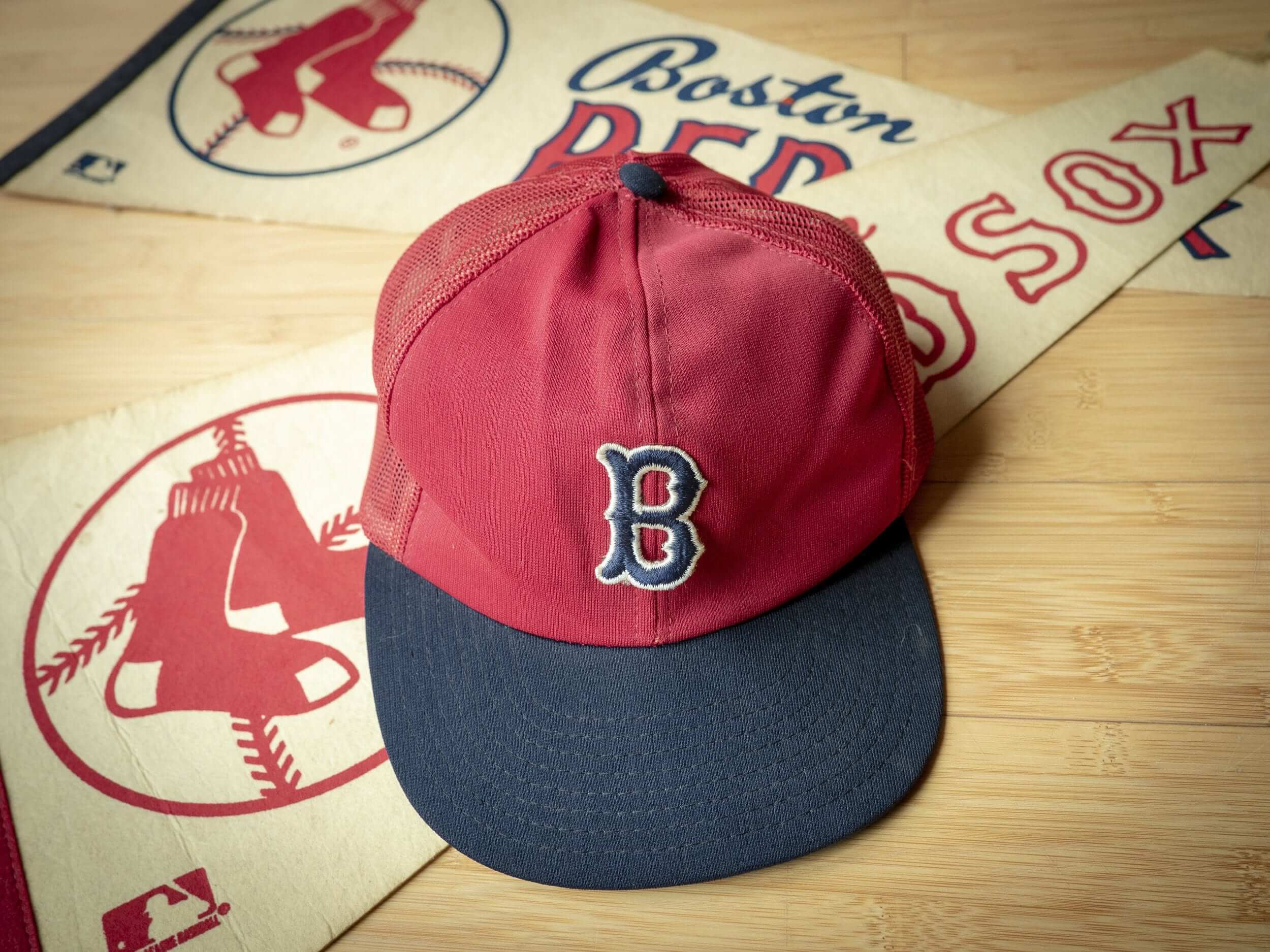
Uniform designer/historian and longtime Uni Watch pal/ally Todd Radom is a Red Sox fan. The cap shown above is the first Sox cap he ever got, back when he was 13 years old. With the Sox set to face off against the Dodgers tonight in Game One of the World Series, Todd has written a really nice piece about the cap, about the Sox, and about his personal history with the team’s postseason ups and downs (including his recent gig applying a pregame coat of white paint to the Fenway Park pitching rubber!). It’s a really nice piece of writing, and I urge all Uni Watch readers to check it out.
As for me, I’ve cobbled together my annual Uni Watch World Series Preview, with 10 uni-related tidbits to watch for during the Fall Classic. You can check it out here.
Meanwhile, here’s a look at the patches for the Series:
Big fan of the new patches. #WorldSeries pic.twitter.com/DGkXpXPTWN
— Boston Red Sox (@RedSox) October 23, 2018
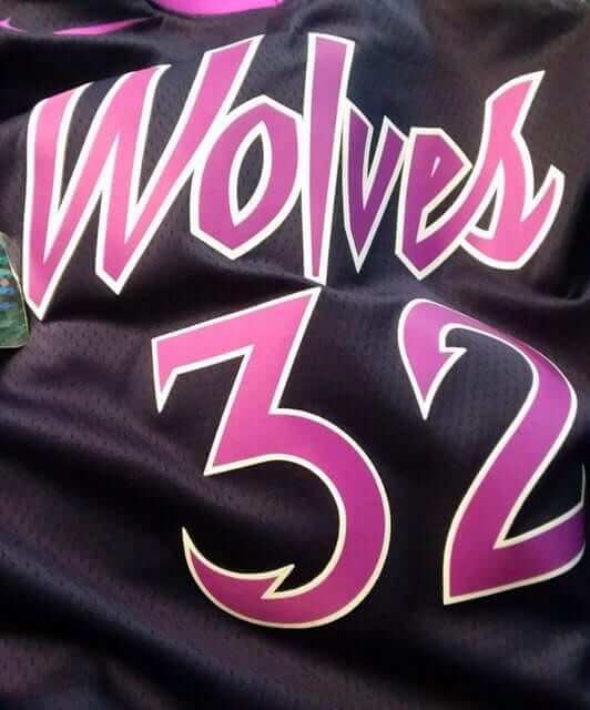
Yet another NBA leak: Twitter-er @TwolvesFRA yesterday posted a photo of what appears to be a Prince-themed Timberwolves jersey. SportsLogos.net quickly confirmed the design as legitimate. LockerVision shows the new City designs starting to be used on-court on Nov. 9, so we’ll presumably see the official unveilings of all these leaked designs soon enough.
Interestingly, designer Tom O’Grady says the numerals shown on the jersey appear to be based on the custom typography he created for the NBA more than 20 years ago when the Nets were thinking about rebranding as the New Jersey SwampDragons (the embed cropping is annoying bad, so click on the black-and-white images for a better look at the original numerals):
Glad to see the @Timberwolves and @NBA finally got around using the NJ SwampDragons custom numbers I designed in 1995. Seriously embarrassing.. @PhilHecken @sportslogosnet @UniWatch pic.twitter.com/5cSJy7T07h
— GameplanCreativeCHI (@GameplanChicago) October 23, 2018
If you’re not familiar with the SwampDragons story, look here.
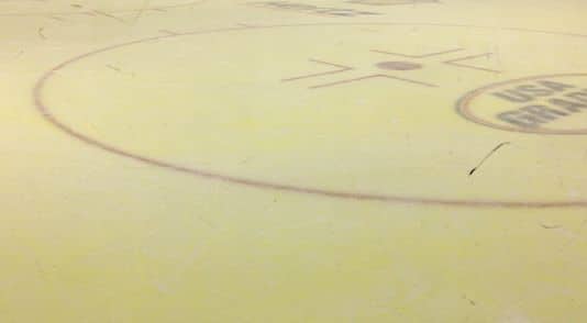
Oh, for fuck’s sake: The Florida Everblades — a Carolina Hurricanes affiliate that plays in the ECHL — sold the naming rights to their arena to Hertz earlier this month. Now they’ve announced that their ice will be dyed yellow, as a nod to Hertz, for the first two games of the season. In addition, Hertz is seeking permission from local authorities “to change the building’s color to ‘sunny’ yellow on the outside.'”
Insert all the obvious jokes about yellow snow here. Also insert my usual rage about the endless encroachment of advertising into every nook and cranny of everything.
(My thanks to Nate Reysen for this one.)
Click to enlarge
Collector’s Corner
By Brinke Guthrie
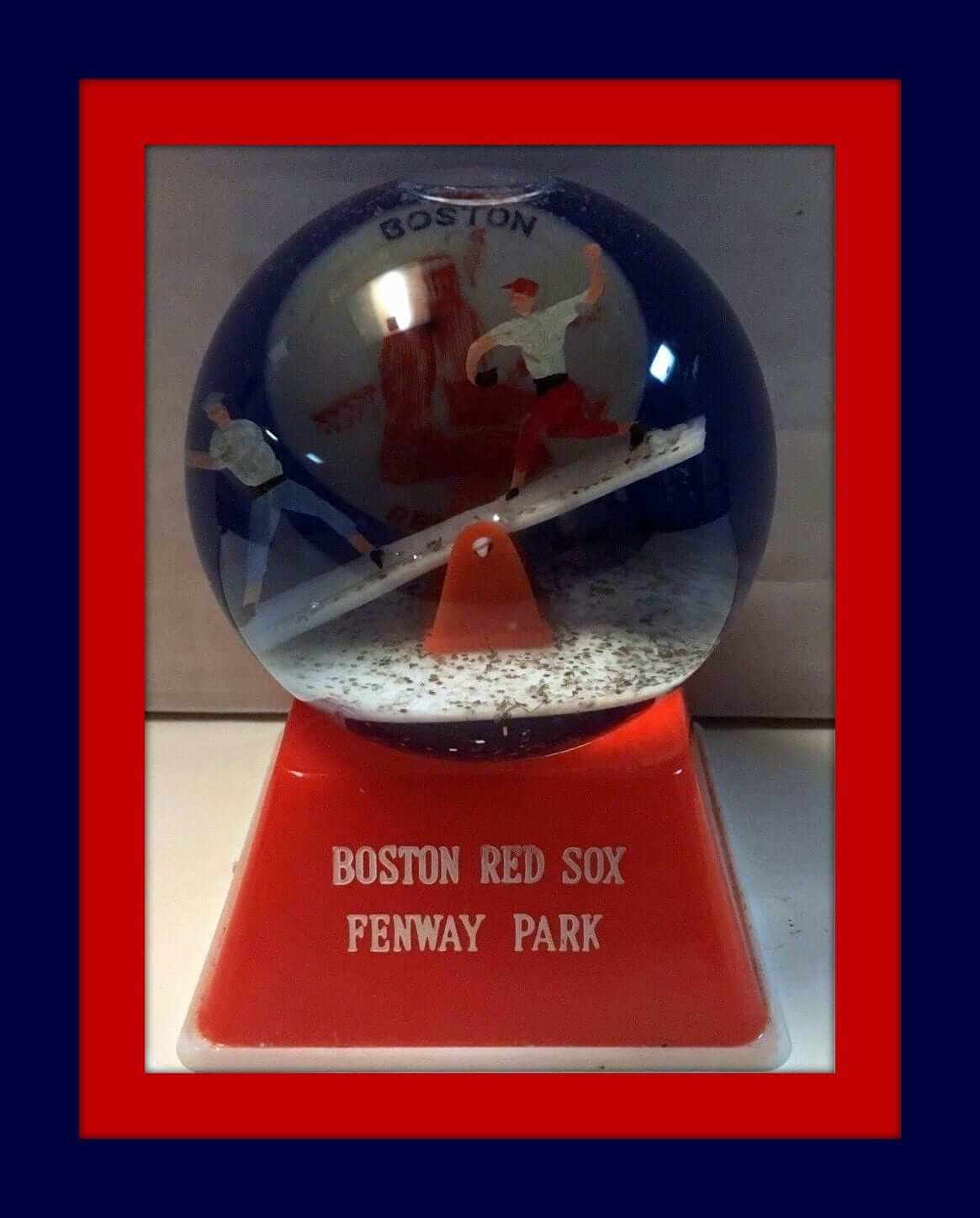
We’ve got a World Series Edition of Collector’s Corner this week, as the Boston Red Sox play host to the L.A. Dodgers tonight at Fenway Park. You can celebrate the Fall Classic with this 1960s Red Sox snow globe — a pitcher and batter on a teeter-totter with the Sox logo in the background.
Now for the rest of this week’s picks:
• Here’s a 1940s Red Sox cocktail/martini set. The logo reads “Boston Red Sox Baseball Club” and “Fenway Park.”
• Can’t you just picture Tommy Lasorda (audio NSFW) waddling out to the mound for a pitching change in this 1970s-1980s Dodgers Starter jacket?
• “Stackable Stars” Red Sox Russian nesting dolls? Um, sure. Why not?
• According to the seller, this 1952 Brooklyn Dodgers National League Champions “presentation plate” was awarded to team members and employees.
• This 1960s Red Sox button says, “This Year, Try It for Us” (try what, exactly?) and “We Are With You Are the Way.”
• Here’s a 1980 varsity-style Dodgers jacket made by Chalk Line.
• Cliff Engle Alert! Check out this 1980s Red Sox sweater with the MLB logo on the sleeve.
• This Brooklyn Dodgers pottery bank dates back to the 1940s. Definitely not uni-correct, but still pretty cool.
• This 1960s Red Sox bobble is described by the seller as a “Moon Face Mini Nodder.”
• Dodgers fans will love these 1980 “puffy stickers.”
Seen an item on eBay that would be good for Collector’s Corner? Send any submissions here.
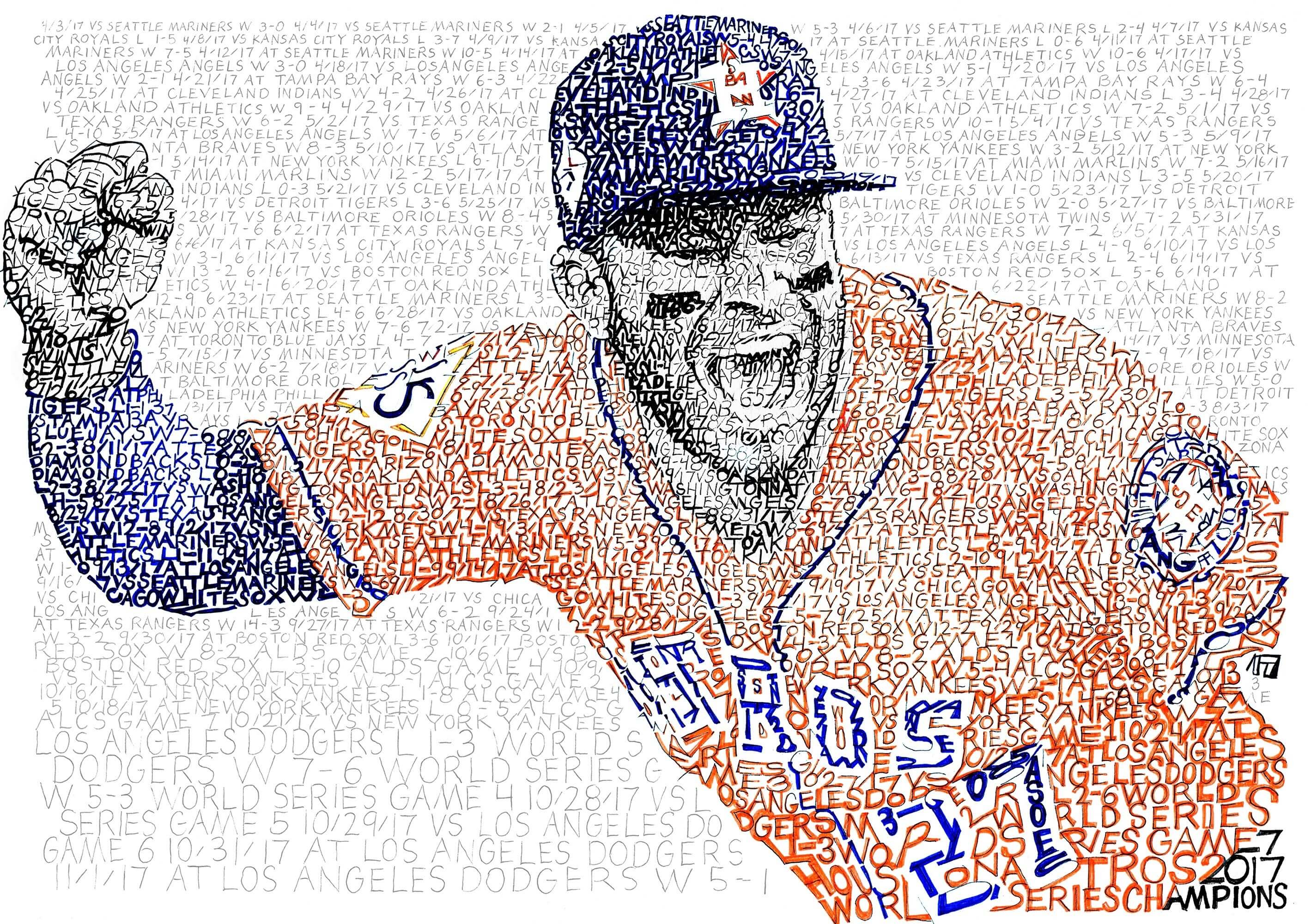
Courtesy of Daniel Duffy/ArtOfWords; click to enlarge

Assorted reminders: In case you’ve missed it over the past few days, here are some things to keep in mind:
• I’m currently raffling off a free print from Art of Words artist Daniel Duffy (like his portrait of Astros star Jose Altuve, shown above, which features the name of every player in Astros history). Full details here.
• Our friends at Nostalgia Cases, a company that sells smartphone cases with designs based on old soccer jerseys, are offering a 10% discount to Uni Watch readers this week. Full details here.
• We recently lowered the price of our flex-fit Uni Watch alternate cap from $29.99 to $24.99. Get yours here.
The Ticker
By Alex Hider

NFL News: Reminder: The Steelers will wear their new throwback uniforms this Sunday against Cleveland. … New Cowboys WR Amari Cooper will wear No. 89. He was traded from the Raiders on Monday afternoon (from Andrew Cosentino). … The NFL stopped fans from buying customized Rae Carruth Panthers jerseys. Carruth was released from prison yesterday after serving nearly 19 years for conspiracy to commit murder (from Michael McLaughlin).
College/High School Football News: Oklahoma State will be wearing 1988 throwbacks this Saturday against Texas. More pictures here (thanks to all who shared). … Georgia Southern usually wears numbers on their helmets, but Thursday they’ll wear alternate helmet logos against App State. … Virginia Tech will wear maroon/maroon/white on Thursday (from Andrew Cosentino). … Texas State shared a graphic yesterday depicting uniforms they’ve worn throughout their history (from Corey Loerwald). … Parkview High and Meadowcreek High, both from Georgia, will play a blue-on-orange color-on-color game on Friday. Unfortunately, they’re billing it as a Color Rash matchup (from Adam Garrison).

Hockey News: The Hurricanes wore their black hurricane flag alternates on the road last night in Detroit, as the Red Wings wore white at home. According to the ’Canes broadcast team, it will be the only time the team will wear their alts on the road this season (from Sam Mills). … This document from 1991 gives exact color specifications for some NHL teams from the era (from Noah Kastroll). … Morgan Doninger was at the NWHL game between the Metropolitan Riveters and the Minnesota White Caps over the weekend and noticed that both teams had a No. 24 decal for Denna Laing, a former Boston Pride player who was paralyzed during a game in 2015. Can we call this a perma-“honor” at this point? … Chris Riz clearly Gets It™️. He took his Rangers Winter Classic jersey to the dry cleaners to have a Winter Classic patch sewn on — but they put it in the wrong spot. Sometimes, if you want a job done right, you’ve gotta do it yourself. Nice work, Chris! … Camouflage jersey upcoming for the Prince Albert Raiders (from Phil).

Basketball News: This year marks the 100th anniversary of the founding of the Akron Wingfoots, who have toured and played in various professional leagues throughout the years. To celebrate, Goodyear — the company that founded the team — is giving away 100 inaugural-season Wingfoots replica jerseys (from Phil). … Southern will wear three different jersey templates this season (from Mike D.).

Soccer News: D.C. United is in the market for a new uniform advertiser (paywalled link) (from John Muir). … Reader Austin Gillis was at an Atlanta restaurant chain that advertises with Atlanta United FC. He noticed that the kids’ menu featured cartoon characters wearing Atlanta United jerseys that included an American Family Insurance and an Adidas ad (though the shorts only included two stripes). … New Bob Marley-themed away jersey for Bohemian FC (from Barry Downes and our own Jamie Rathjen).

Grab Bag: Penn State volleyball will wear pink jerseys for cancer awareness on Friday. … A woman in Minnesota has started her own line of sports hijabs for Muslim girls who want to play sports (from Phil). … Piggybacking off Paul’s recent Newport Cigarette research project, Taylor Workman sends along this minidoc of a designer who combined Nike and Newport for a pair of shoes as an artistic statement. … In this news report about a local shoe store in St. Cloud, Minn., the owner credits his success to the Brannock device (from Jeff Bovitz). … The logo for Colorado’s E-470 toll access highway has some hidden elements — including the color purple, which apparently signifies “tolling” (from Forrest J. Bowlick).
Re: Grab bag I-470 Logo
Purple does signify tolling, per the federally mandated MUTCD:
link
Now why the logo needs to signify tolling when it also has to be surrounded by that color on a road sign is a different story.
Interesting that the Dodgers jacket was manufactured by the person who ran their concessions, Danny Goodwin.
New announcement,Nike will release another special-edition FC Barcelona jersey next year.
link
I absolutely love Todd’s piece on his first Red Sox hat. As Paul said, really fantastic piece of writing.
As much as I like that the Sox are on the more conservative end of the spectrum when it comes to uniforms, I do wish that they would re-institute the 70’s era red crowned hats into the regular uniform set. The red hats for Sunday home games would be really cool.
From the WS preview:
The last blue-free Series was in 2005, when the Astros (who hadn’t yet added navy to their color scheme) faced the White Sox.
… “yet”?!? The Astros had navy in their colors for nearly four decades before switching to their black/brick/sand scheme in 2000. I think you’ve lost your mind, Paul! ;)
Blake Jarwin is currently wearing #89 for the Cowboys. I haven’t seen anything about him being released. Maybe that’s just quick PS work because they had to announce the trade?
“Interestingly, designer Tom O’Grady says the numerals shown on the jersey appear to be based on the custom typography he created for the NBA more than 20 years ago when the Nets were thinking about rebranding as the New Jersey SwampDragons…”
They really don’t appear to be based on that custom typography.
lol at the World Series preview. “Meaningless” stats like WAR, exit velocity and launch angle.
I really wish that Boston would adopt that red cap as their primary. Kind of boggles the mind that a team with the word red in their name would use navy blue for the highest profile part of their uniform.
Time for a team name change??
You can’t tell what color “sox” anyone is wearing anyway nowadays.
Any team that has the word “Sox” in their name has an obligation to go high-cuffed. Besides, if the Red Sox got rid of the Sox in their name, they’d just become the Boston Red. And everyone knows how many problems that would create.
I’d agree if they were the Red Caps. It bothered me more that the Red Sox wore navy stirrups and the White Sox wore black stirrups (though technically, they wear white sanitaries in Chicago)
Yeah, I get that their name implies only the color of their socks, but if you have a color in your name, that should be your primary color. Sort of like the Golden Knights just using gold as an accent color in their uniforms. So they aren’t golden, just regular knights. About the only team I let it slide is the White Sox, because with the nature of sports uniforms it isn’t practical to have white as your primary color.
Real Madrid (among others) might disagree with you.
Perhaps it is just the lighting in the photo, but the Wolves Prince themed alternate appears to be using pink, not purple. Leave it to Nike…
IMO the Timberwolves numbers do not resemble the SwampDragons at all! They are clearly applying reference from the Prince logo to a fairly common serif number application.
I said basically the same thing, but it appears that my comment didn’t make it through moderation.
Same. It is a conspiracy.
Agreed – that’s a bit of a stretch.
Tom O’Grady is high if he thinks the numbers on the Timberwolves jersey are based on the ones he created in 1995. The only thing remotely similar is the hooked end of the number, but the Timberwolves did a much better job at it.
What a World we live in. The NFL has to stop people from buying a Rae Carruth customized jersey. Ugh.
They don’t need to worry. They can still gets Patriots 87 Hernandez, or
Am I the only one who has a problem wit the NFL’s policy on this, as well as with not being able to buy an OJ jersey?
Please don’t bother to spout some bullshit garbage about how by doing so the NFL shows it cares about violence/harassment against women. The NFL doesn’t give a fuck about that. Go to a Jets game and go to the concourse during halftime. The shrieks and bleats of “HEY SLUT SHOW US YOUR FUCKING TITS!!!!! TITS!! TITS!!! TITS!!!” and for those women who don’t comply, “”UPPITY CUNT!!! BITCH!!!” Meanwhile security stands around fondling their dongs and does NOTHING.
And Carruth has served his time. And why can I get a Ravens Ray Rice jersey or Ray Lewis?
“Carruth was released from prison yesterday after serving nearly 19 years for conspiracy to commit murder”
Man, time flies!
probably more for us than for him though (and of course, more for him than for his victims)
Denna Laing needs an i in the ticker.
Got it.
Last night the Falcons wore one of the all-time great NFL uniforms. (IMO the very best one that features red FWIW.) Funny that they usually wear the overwhelmingly worst uni in NFL history.
Sad that the dumb new logo was such a prominent turd in the punchbowl at midfield.
I like those throwbacks, but I think the best option is black jersey and red helmet. Regarding the logo, I think they could have done a much better job modernizing the original than what they have now, sort of how the Seahawks and Panthers did slight updates to their logos.
Edit: according to the email I just got from the teamshop, Cowboys WR Cooper will wear #19.
I have that mini-nodder – one of two (Houston Colts being the other) both acquired at Old Comiskey. No way you could get that from me for a measly $529. And I’m not certain I would go with “moon face”.
Answer to the question of why a random Irish soccer team (Bohemians) have a Bob Marley-themed shirt: he performed at their stadium in 1980.
Yes, the connection is a little tenuous.
What? No comments about the Swamp Dragons yet?
Well, anyway…
“The jerseys where the dragon takes up the whole thing — those would probably have set David Stern back 10 years. It would probably also be a top-seller today with Mitchell & Ness.”
If that doesn’t sum up uni watching in a nutshell, I’m not sure anything does ;-)
The logo with the dragon dribbling the ball is pretty great, perhaps too similar to the Raptors original logo? The teal and purple is a blatant rip off of the Hornets though, I’m shocked they go so far into the process with a design that was a copy of another team in the NBA.
I don’t understand why Nike can successfully put all the stripes on Iowa’s sleeves, but they can’t for the Steelers.
For a throwback they could have gotten that detail correct. Side note, helmet numbers have always been rounded and match current font.
I prefer the Dodgers script LA road jerseys. Anyone know why they rarely wear these anymore? :-(
The 1991 NHL team colour specifications document does list the Vancouver Canucks technically wearing “red” as a trim colour. Definitely an orangey red, as I would simply define that 1991 Canucks trim colour as orange:
link
The colour started to look more red with the change in shade for 1992-93. Which would commonly be referred to as the salmon trim:
link
Thanks for the great article by Todd Radom. Happy anniversary, by the way, to Fisk’s game 6 homer in ‘75.
What’s worse, a blue astro turf football field or piss yellow rink ice?
In general, yellow ice is more heinous. Turf isn’t grass with supernaturally-enhanced photosynthesis, but hockey ice is still, fundamentally, frozen water, albeit manicured with borders. So if turf is less of an approximation of grass, and more like an all out substitute for grass, let it be a funky color if it must, even though there is no reason for football turf to be any color other than green. (So, no, I don’t like pink in the rink either.)
In practice, this particular yellow ice is also a corporate sellout. Not team spirit like the smurf turf. So it’s even more heinous.
TL:DR; yellow ice is worse, especially this yellow ice.
I love the Steelers “Steel Curtain era” throwbacks with the block numbers. I hated when they changed to the racing number font ( or whatever the hell you call it ). It was like drawing a mustache on the Mona Lisa!
The new number font was a total disaster the day it appeared and it still is.