It's a nice day for a…
white webbing pic.twitter.com/KemsJvz2dF
— Phil Hecken (@PhilHecken) July 29, 2017
By Phil Hecken, with Chance Michaels
Follow @PhilHecken
You might say today’s post is a couple years in the making (check out the date of the above tweet).
With the Milwaukee Brewers having won the NL Central title this year, and home field throughout the NL playoffs, today is a nice day to delve into one of the inconsistencies of perhaps the greatest logo in all of professional sports (and in my opinion, the best logo in MLB for sure): Milwaukee’s famous “Ball in Glove,” which of course features the letters “M” and “B” as a part of the design.
But, thanks to my pal, avid Brewers fan, and Uni Watch stalwart, Chance Michaels notes the famous logo the Brew Crew are sporting today isn’t quite what it was when it was introduced.
Ready for a nice, deep dive into another athletic aesthetic? Of course you are!
Here’s Chance with…
It’s a Nice Day For a… White Webbing
By Chance Michaels
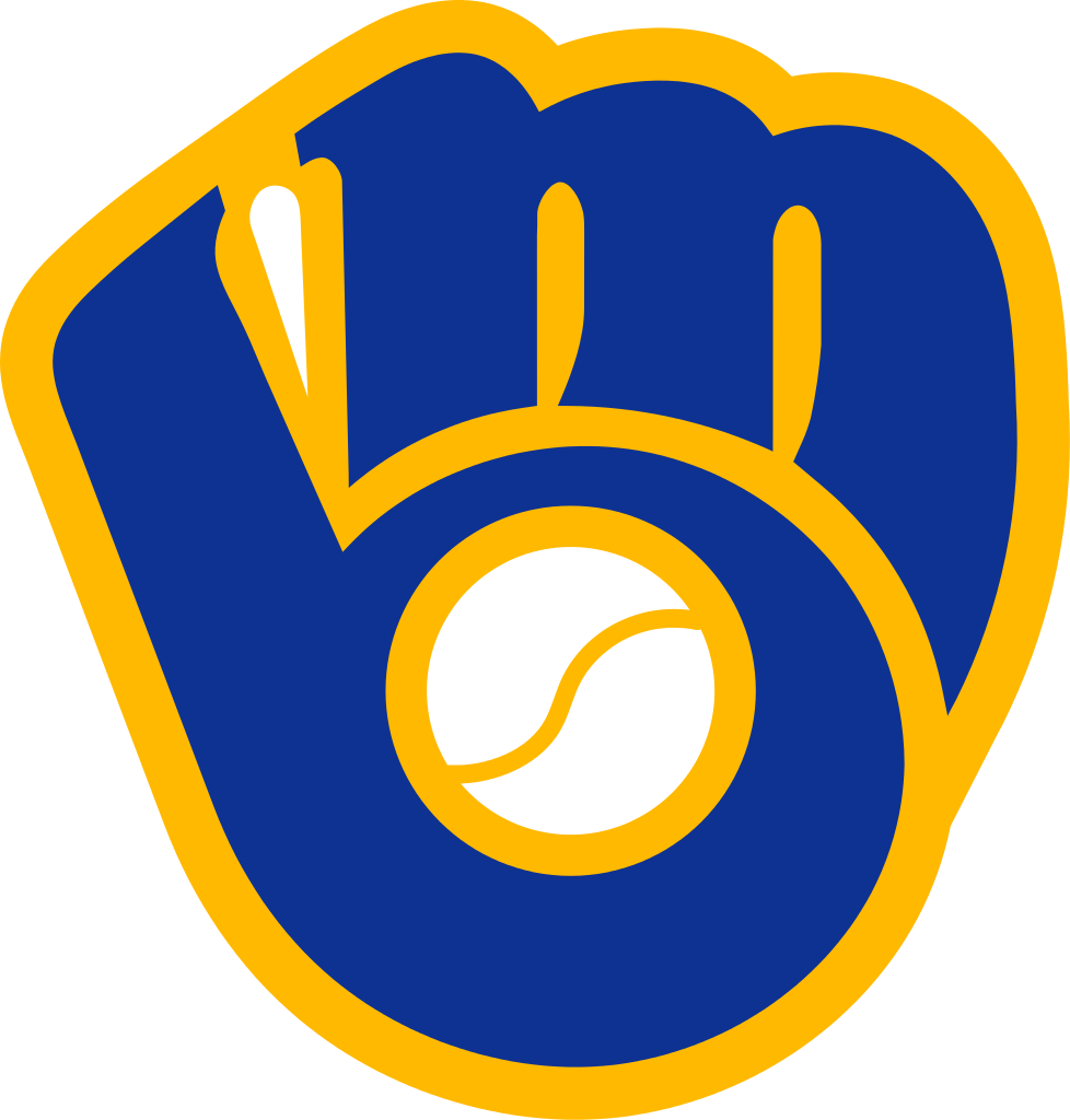
The Brewers’ classic “Ball in Glove” logo (BiG) has been getting a lot of exposure in recent years. This season in particular, as most of the postseason merchandise and graphics feature the old BiG. You may be forgiven for thinking at times that the True Blue Brew Crew has finally wised up and dropped their boring modern logo in favor of the retro look the fans seem to want.
As an old Brewers fan, I would welcome a return to their classic logo. So long as they actually use the classic logo. Until very recently everyone—the Brewers, Major League Baseball, the press, and manufacturers of assorted merchandise—have been using the wrong logo. Or at least an inaccurate one.
Most of us had that “Aha!” moment when we catch the visual trick and realize the glove design incorporates an “m” and “b”. Now there’s another thing I’d like you to look for whenever you come across the classic logo.
From the time of its introduction in 1978, the BiG was characterized by its blue letters outlined in athletic gold, with a white baseball in the center of the glove and white webbing between the two letters.

This logo was retired after the 1993 season, and more or less disappeared for a decade, until the rise of throwback nostalgic merchandise. Sensing its commercial potential, the Brewers brought it back in a major way. If ever-so-slightly altered.
The white webbing had disappeared. The background shone through the gap, be it blue or gold or gray or something else.


I’m telling you, you’ll never not see that again. You’ll forever scan your eyes across Brewers merchandise looking to see if they’re using the right logo or the broken one.
So how did this happen? When did the logo go wrong?
In order to answer that question, we have to go back to the beginning of Major League Baseball Properties’ digital campaign, when the majors were changing over to digital files.
Let’s take a look at Major League Baseball’s digital style guide for 1993. This image is marked as having been last modified on October 1, 1992 (two days before the end of the season). The logo slick shows the Brewers’ primary mark along with the jacket script wordmark in black and white against a blue grid.

The non-repro blue lines making up the background grid are a shade that can’t be picked up by the cameras used to shoot the art. The grid is designed, therefore, to tell the user where the art ends and the background begins.
Now look closely in the upper-left corner of that primary logo.

You can clearly see the non-repro blue line peeking through the window between the thumb and first finger.
The webbing has been removed and the background shows through the hole. Anyone who copies and pastes this logo from the official MLB file, be it for a newspaper ad or a t-shirt, will find their Brewers logo has that transparent section.
I can’t stress enough how common this sort of error was at the time. This was, after all, the dawn of digital art. If you look closely at that 1992 image you can also see that the dot in Milwaukee’s lower-case “i” is also transparent, but that one was so obviously wrong it apparently never fooled anybody.
Now, that wasn’t the first time this particular mistake had been made. Even the league and team had goofed from time to time in the past, perhaps most notably on the 1982 ALCS program and 1984 Media Guide. But the mistake became formalized in the early 1990s, when MLB Properties organized those initial digital files. And when the retro merch boom hit in the early 2000s, those same digital files compounded, reproduced, and cemented the mistake.

When the Brewers brought the retro uniforms back as a regular alternate in 2006, they managed to get the logo right, not only on the caps, but also on the jersey sleeve patch.
Not so much on the undershirts, though.
That was the first time the webbing-less glove found its way to an official on-field uniform, but it wouldn’t be the last; in 2013 New Era introduced the “Diamond Era” batting practice caps. The Brewers’ Sunday alternate version had a gold front panel, like their 1980s caps. Paired with the transparent-webbing logo, unlike their 1980s caps.

So close.
In 2016, the Brewers introduced another throwback-themed alternate uniform, this one featuring the BiG in navy and athletic gold. And for whatever reason, this time New Era used the transparent webbing version.

As did Majestic.
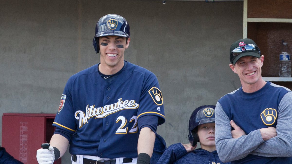
This even carries over to the batting helmets they wear with this set.
I don’t know why they chose this version for the road alts, but they did. Which means, heavens help us, that this piece of merch is perfectly on-field accurate:

But all is not lost. About the time that blue road alt was introduced, MLB was working to correct its initial error. Design god and Friend of Uni Watch Todd Radom was engaged to update and fix the Cooperstown Collection files. We’ve already seen what Todd did to correct the inaccurate Brooklyn Dodgers cap logo, and he worked his magic on the Brew Crew’s BiG too.
By the 2017 season, vendors were cranking out merchandise featuring the original BiG, white webbing and all.
I snapped this picture in a Mitchell International Airport gift shop.
But old habits die hard, and digital files are forever, Nowadays, the old and new logos are used almost interchangeably, even on the diamond. This season, the Brewers doubled down on their recolored navy retro logo with their new “Prolight” rubberized-logo BP caps. The fitted versions use the transparent logo, and the flexfit Spring Training versions use the original white webbing.


It’s not at all uncommon to see both versions of this logo side-by-side. Even at Miller Park.
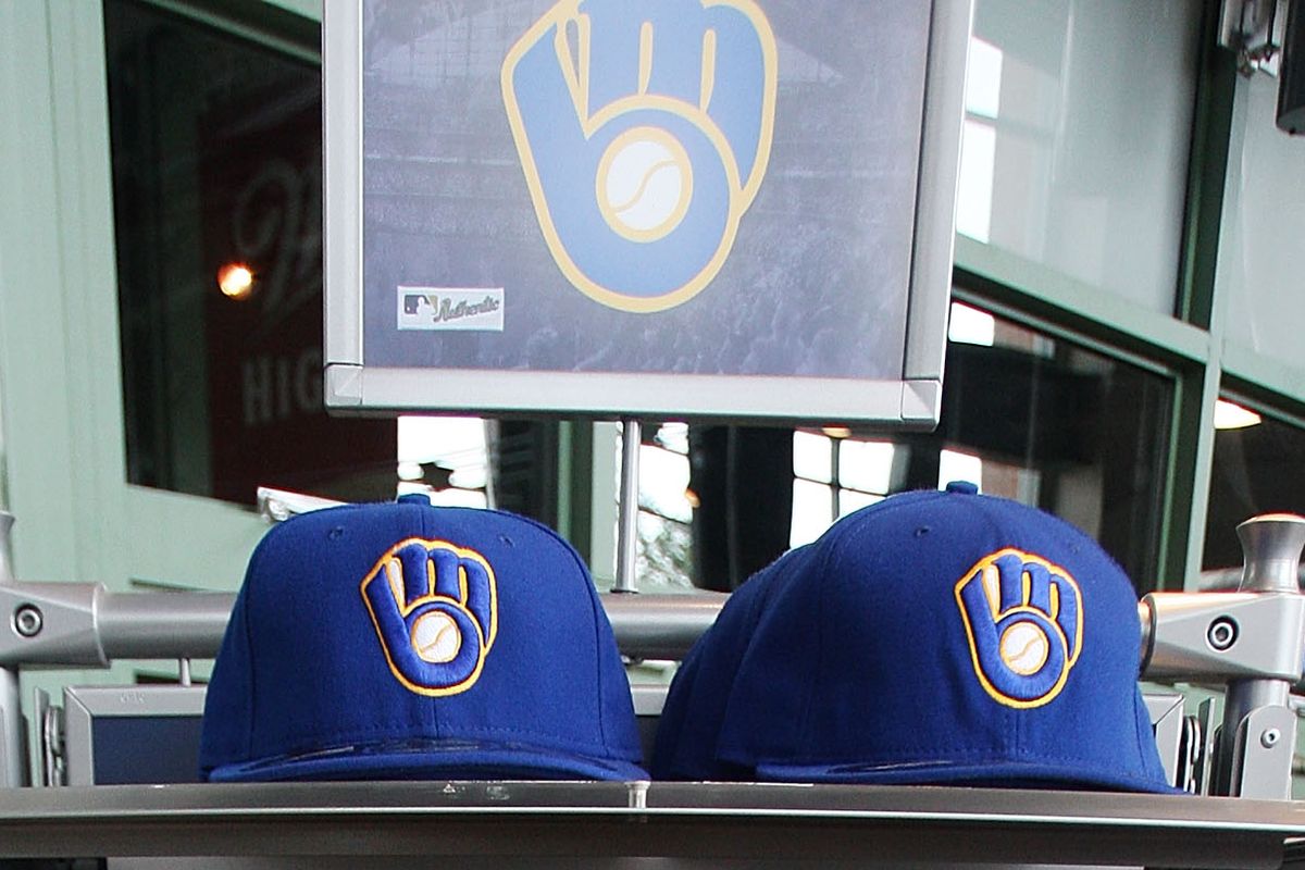
If and when the Brewers do adopt the BiG full-time again, we need to hope they pick the right BiG. But if they do, it’ll be thanks to people like Todd Radom, and everyone at the club who may have noticed the issue and was in a position to do something about it.
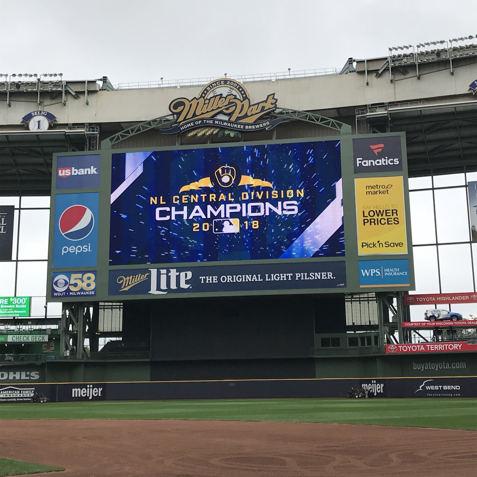
Because with apologies to Billy Idol:
It’s a nice day to start again
It’s a nice day for a white webbing
No apologies needed, Chance — we all love that line! Thanks for the great exploration of the greatest logo in MLB!


Kreindler’s Korner
I had the distinct pleasure of featuring the wonderful artwork of artist Graig Kriendler on two occasions over the summer and fall of 2017, and more recently, in August of 2018.
For those who don’t wish to click the links, Graig paints baseball heroes (and regular guys) from the past, and is an immense talent.
Occasionally, I will be featuring his work on Uni Watch.
Here’s today’s offering (click to enlarge):

Title: “Wax and Wane at Wrigley”
Subject: Wrigley Field, 1945
Medium: Oil on linen
Size: 24″ x 30″Pictured is the scene outside of Wrigley Field early in the morning on October 10th – the seventh game of the 1945 World Series. Tickets for the 1:30 game had gone on sale at 8:30 AM, long after the crowd had gathered with the hopes of scoring tickets to the last game. With temperatures in the upper 40s, the Cubs took the field for the final contest of the series, hoping that the momentum from their dramatic win the previous Monday would carry them to their first title in almost 40 years. Returning from his 4-inning relief performance during Game 6, Hank Borowy was slated to start with less than 48 hours rest. After giving up three straight singles in the opening frame before recording an out however, manager Charlie Grimm pulled Hank, conceding that he had done all that he could for the Cubs that season. In replacing Borowy, Paul Derringer fared little better, giving up a bases-clearing double to catcher Paul Richards, bringing the Tiger run total to five in that first inning alone.
The Cubs would never catch up. Though Detroit’s Newhouser allowed ten hits and three runs, he would also strike out ten Chicago batters. Additionally, the Tigers would all but shut the door in the 7th and 8th innings, with a series of doubles and sacrifice flies, opening the last frame with a 9-3 lead. With two outs and one man on, Cubs second baseman Don Johnson would ground-out to the shortstop, forcing Roy Hughes at second, and ending the game, the 1945 blue ribbon classic, and the Cubs dynasty of that era.
Thanks, Graig! You can (and should!) follow Graig on Twitter.


MLB Playoff Uni Tracking
A few years back, reader Alex Rocklein tracked the MLB Playoffs by uniform — you guys may recall this. Here’s what his 2010 Uni Tracking looked like. Alex also tracked the playoffs for Uni Watch last season as well. Here’s how the 2016 World Series looked, and here’s how the 2017 Playoffs shook out.
We welcome Alex back this year, and he’ll be tracking the unis from the Wild Card games through the Big Dance. Here we go:
Wild Card & Divisional Series

Thanks, Alex.


And Now a Few Words from Paul
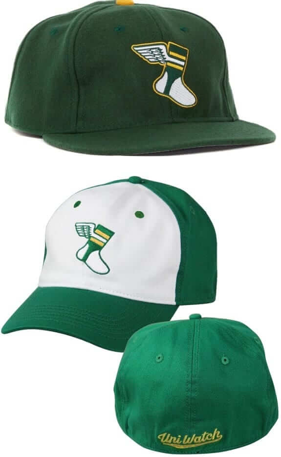
Hi there. In case you missed it over the past week, big savings are on tap for both of our Uni watch caps.
First, our friends at Ebbets Field Flannels are offering a site-wide 20% discount with the checkout code PLAY18. That effectively reduces the price of our solid-green Uni Watch classic cap from $49 to $39. Order yours here.
In addition, we’ve reduced the price of our flex-fit Uni Watch alternate cap from $29.99 to $24.99. You can order that one here.
And while we’re at it, don’t forget that we have a great new T-shirt, designed by Andrew Harrington, that mimics the look of a vintage woven clothing tag. That one, which is available in a wide range of colors and styles, can be ordered here.
Finally, in case you missed it on Friday, my annual Uni Watch NBA Season Preview is now available for your enjoyment. Check it out here.
We now return you to your regularly scheduled Phil-osophizing.


The Ticker
By Anthony Emerson

Baseball News: The Milwaukee Journal Sentinel is holding a Twitter poll on readers’ favorite Brewers logo. There can be only one answer. The poll closes at noon today (from @BorchertField). … The folks at Chase Field are surrendering to the desert and installing artificial turf during the off season (from Tony Andela and Mike Chamernik).

NFL News: Iggles DE Michael Bennett had basically no uni sleeves during Thursday night’s beatdown of the Giants (from Aaron Pinto). … The Seahawks and Raiders are getting B-E-A-utiful throwback-style satin jackets for their London game (from Ignacio Salazar). … Despite Browns coach Hue Jackson and WR Rod Streater saying they’d like to keep wearing the team’s gorgeous color rush jerseys, the NFL’s strict rules will prevent them from breaking them out more than once again this season (thanks, Phil).
College/High School Football News: IU Police’s motorcycle division had custom helmets made in the style of the Hoosiers’ football helmets for homecoming weekend (from @Hoosier_Steve). … For the first time since 2003, Monmouth is wearing white helmets, along with a GFGS uni (from Greg Viscomi). … The following are all from Phil: New uni combo — yellow-white-yellow — for Mizzou in their game against Bama. … Orange-white-white for Florida against Vanderbilt. … Ole Miss is going all white against Arkansas. … Oregon will go full highlighter against Washington. … Illinois will wear their “grey ghost” unis and matte blue helmets during today’s game. … Tulsa went with new, black matte alternate helmets yesterday. … Here’s an article explaining why Memphis switched from a “white-out” to a “blue-out” for their game against UCF. … Lancaster (N.Y.) High has a Halloween-themed midfield logo (from Brian Koperski). … Brad Eenhuis was watching a Georgia high school football game and noticed this weird bump on one of the player’s helmets. Any ideas what this might be?

Hockey News: The ECHL’s Tulsa Oilers are wearing, uh, plumbing-inspired warm-up jerseys tonight. We just loooove the giant advertisement, too (from Mike Iles). … Oregon wore some pretty awesome gloves during their game against Washington (from Michael Sullivan).

NBA News: Yesterday gave us an apparent leak of the Knicks’ as-yet unrevealed City jerseys.
.
.

Soccer News: Olympic sprinter turned soccer player Usain Bolt is wearing No. 95 for Australian club Central Coast Mariners — a reference to his world-record 9.58s in the 100 meter sprint. Bolt has worn a 9.58 uni number during charity matches before, but a triple-digit uni number was probably too much for his professional career (from Brad Serton, Jonathan Keller, Donald Wine II and Gabriel Hurl). … Colombian side Deportes Tolima have revealed their new, ad-inundated kits (from Lucan Denfield).

Grab Bag: John (who declined to give his last name) found this great tag on a jersey in a thrift store. Very nice. … Loras College athletics are finally getting a 21st century logo (thanks, Phil). … Germantown (Pa.) Academy has a new logo. … An NC State women’s volleyball player was wearing long pants during a game against Virginia (from Jim Vilk).


Tulsa wore their BFBS last night against number 23 ranked USF. Ticker indicates the game will be played today.
Fixed.
Alex, I love your uni tracking graphics! Fantastic.
The bump on the players helmet is a mouth piece
The Tulsa plumbing ad would be hilarious if someone would swipe the “Y” and replace it with a “D”
Regarding the digital design of the Brewers’ Ball in Glove logo… It’s likely the outlines that make up the edges of the logo left a hole where the webbing was, and the designer, seeing white on screen, assumed a white fill would always be there. But in reality it’s a transparent space that will show the background color. On the other hand (well, it’s actually the same hand/glove) the baseball is likely a separate element that was dropped into a layer on top of the letter shapes. If that were left transparent, the letter color would show through, which would be obvious on screen. So the designer specifically called out “white” to fill that shape. When rendered on a white background, both spaces appear white, but only one space actually calls for that color to be used as a fill. The transparency of the ball was obvious to the designer and was fixed, but the the transparency of the webbing was not.
In fact, take a look at the Baseball Postseason Uniform Tracker graphic further down today’s page… They show a Rockies’ home uniform with a gray background behind the lower half of the jerse. The gray shows through the jersey portion, but the letters have white fills on the inside. The designer assumed the jersey was filled with white, when in fact, it was transparent. (I hope the Rockies don’t start wearing this look.)
It would actually be nice if the Brewers consistently used blue for the webbing since it would match the color of the glove which is more realistic.
What is the design case for white webbing? It contradicts the glove-ness of the logo, it doesn’t emphasize the M and B lettering, and it detracts from the visual impact of the ball. One can make a reasonable design argument in favor of the webbing matching the letters, to emphasize the glove-ness of the logo; one can make a reasonable design argument in favor of the webbing matching the outline, to emphasize the letter shapes; or one can make a reasonable design argument in favor of the webbing matching the background color, as that elides the somewhat awkward question of webbing entirely. But the webbing should never be white.
Completely understand that reasoning, but from a purely aesthetic standpoint, the white webbing just LOOKS better.
It provides contrast.
But A) It shouldn’t provide contrast; and B) What contrast does it provide? The outline doesn’t need contrast; it’s the outline. The M and the B already have contrast in the form of the outline and the white ball. Making the webbing a contrasting element just makes it look less like webbing, and thus less like a glove. To my eye, the white webbing doesn’t add contrast, it merely extends the color of the ball in a way that detracts from the impact of the ball, detracts from the shape of the glove, and fails to emphasize the shapes of the M and the B. I’m all for the BiG having more contrast. The blue-on-blue thing is the least good thing about the BiG as a cap logo. But the way to accomplish that is to make the letters gold instead of blue, not to color random minor elements white. Or to use a gold front cap panel. Or to mix royal and navy between the cap and the BiG logo.
Don’t know why Chase Field is going to keep the dirt for the warning track, the infield, and the path between the mound and home plate. If they’re going to install artificial grass, they should go all the way and install “artificial dirt,” too; that is, a full carpet with the dirt parts colored brown.
Also, consider installing a portable mound that can be put away when it’s time for the college football bowl game:
link
link
Leaving the warning track as dirt does make sense. That way an outfielder sprinting toward the wall while tracking a ball in flight will feel a distinct change in steps. The outfielder is getting the “warning” that they are close to the wall without taking their eye off the ball. A brown carpeted warning track, made of the same material as the green outfield would not demonstrate a change.
You’re right; leaving the warning track as dirt is crucial for its purpose in a field of artificial turf—or even in a field of grass. But leaving everything else as artificial turf is still something to consider.
What about base runners sliding into bases? Shouldn’t the area around the bases be dirt, too?
So evidently the Brewers are only going to wear softball tops this postseason (they did again last night, in gm 1)… ugh. Here’s to hoping common sense prevails for the Sox & ‘Stros; I’d hate to see red vs. orange (which is what both teams have worn at home & on the road, respectively, so far).
On the other hand, the fact that two teams can wear the same color without causing significant problems in the play of the game is something unique to baseball and should be celebrated IMO.
Nonsense, it’s still ideal to have contrast between the teams. The Cubs-Indians Game 7 was brutal two years ago.
I know I’m in the minority here, but the Brewers should leave the BiG logo in the past. I like the use of letters as logos in the MLB. Personally, the current uniform design is nice in its simplicity. Especially if they would use the whites and grays more instead of the softball tops. My biggest complaint is the the grays don’t have the city name on them.
…but the BiG logo is composed of letters…
In that pic with Molitor and Yount, #17 is wearing two different shoe styles.
Georgia HS helmet bump is a mouthpiece tucked into one of the vents on the helmet.
Those are not “road alts” for the Brewers – They wear that hat & those tops both on the road & at home.
Question for Graig Kriendler: was the model for the car you painted in front of Wrigley a link or link Sedan Coupe? This car nerd wants to know.
Great Brewers info today. Superb details
Love those Raiders and Seahawks jackets linked today….would love to buy one for the Philadelphia Eagles game being played in London in a couple weeks….sadly don’t think that’s an option.
Thank you for not discussing and barely mentioning the Brewers look in the 90’s. Not my favorite. Blue, athletic gold and white are their colors.
That’s Todd’s logo – & while I agree with you, I also think he did a good job given the direction they gave him. I’m 35, so I grew up with that logo in the 90’s so it’s something I’ll always identify with. Bring on game 2.
I guess it’s just a timing thing. It’s a well executed look and is very classic, it’s just not the Brewers to me.
What an annoying number of times to make the same stupid “white webbing” joke. Sheesh.
Interesting story though, I’ll give you that.
Oi, Bolt, no… 9.58 rounds to 9.6 not 9.5.
I think the logo looks better without the white webbing, for basically all the reasons RS Rogers mentioned above. And IMO aesthetics is more important than historical accuracy, so I say ditch the webbing and be done with it. (If historical accuracy is that important to you, then just call it a “new” logo rather than a “throwback”, and all will be well.)
But regardless of which side you’re on about the webbing, this statement is a bit ridiculous:
“I would welcome a return to their classic logo. So long as they actually use the classic logo.”
You’d honestly rather the team wear an ugly logo than a slightly tweaked version of a great logo? That seems a bit petty.
What’s with the Red Sox wearing these softball jerseys at home for the ALCS?
They wore them vs. the Yankees in the ALDS and it was hoped they would wear the traditional Red Sox white jersey vs. the Astros.
But no. They persist in their pursuit of in-game sartorial sacrilege. For that sin alone, Houston should win this thing in about five games.
the bump on the helmet is a mouthguard stuck in one of the vent holes in the helmet. Solved !